With {Theme} comes many custom shortcodes for VC that are used to show content created in {Theme}. Below you will find short information about this VisualComposer elements:
Button for Disrupt
This theme come with VC item that gave you option to create buttons that can be used in the theme.
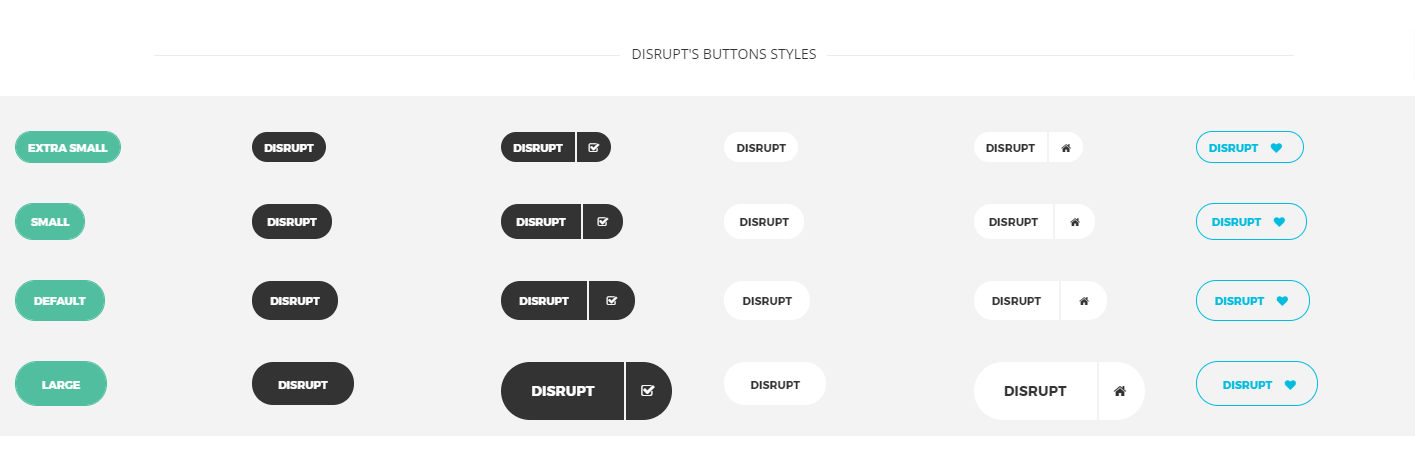
Disrupt buttons
This item contains many variation that will let you create button that will suit you best.
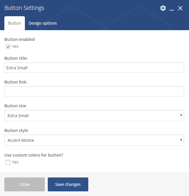
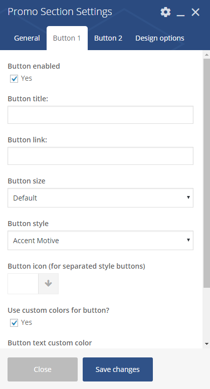
Button Settings
Button
- Button enabled – check Yes to enabled the button
- Button title
- Button link
- Button size
- Default
- Extra Small
- Estato Success
- Small
- Large
- Button style
- Accent Motive
- Dark
- Dark Separated
- White
- White Separated
- Transparent
- Use Custom colors for button – check Yes to be able to choose button text and button background custom color
Contact Box

Contact Box
You can customise this element with options visible below:
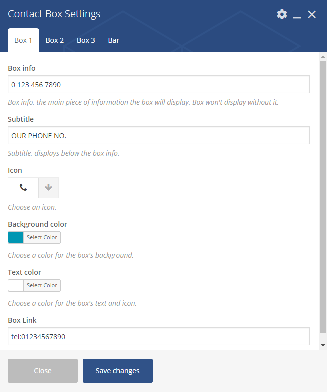
Contact Box Settings – Boxes
Box 1, Box 2, Box 3
- Box info – add the bar information
- Subtitle – add subtitle text
- Icon
- Background color
- Text color
- Box Link – add link to the box
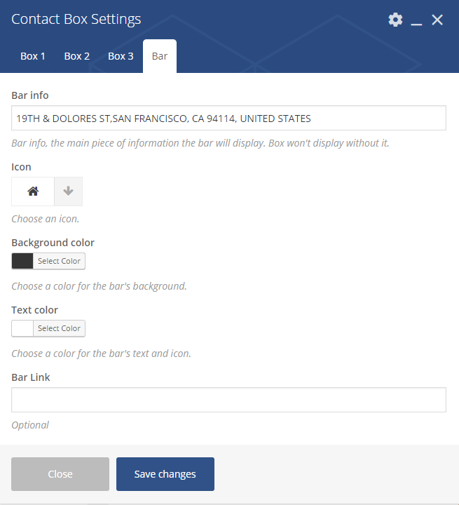
Contact Box Settings – Box
Bar
- Bar info – add the bar information
- Icon
- Background color
- Text color
- Bar Link – add link to the bar (optional)
Styled Google Maps
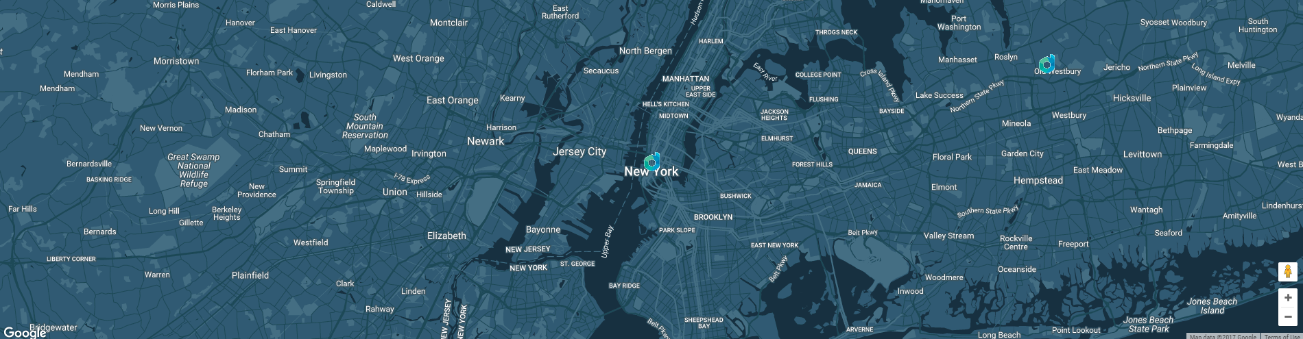
Styled Google Maps
You can customise this element with options visible below:
Styled Google Maps Settings
General
- Address – set adress of the marker on the map
- Lattitude
- Longitude
- Custom map height – set height of the map
- Zoom
- Map Market – set image for the marker
- Map style code – use style from snazzymaps for the map.
Icon Box
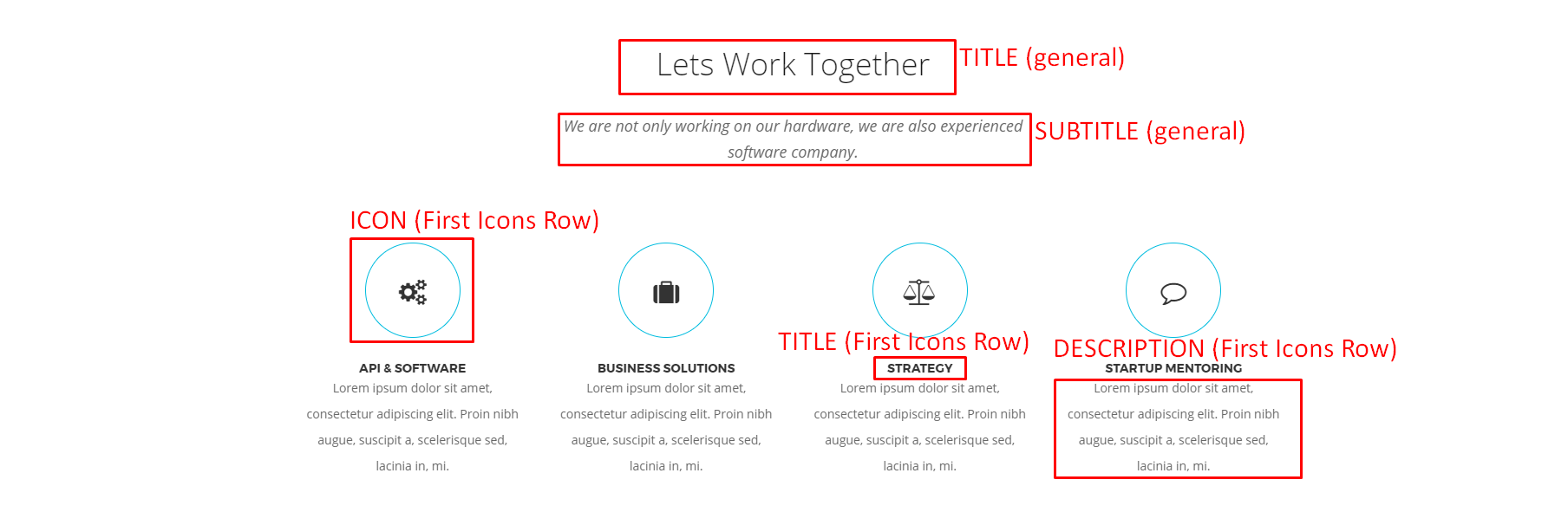
Icon Box
Icon Box Settings
General
- Title
- Subtitle
- Number of icon rows: (1 or 2 )
- Style
- Icon color
- Icon title color
- Icon subtitle color
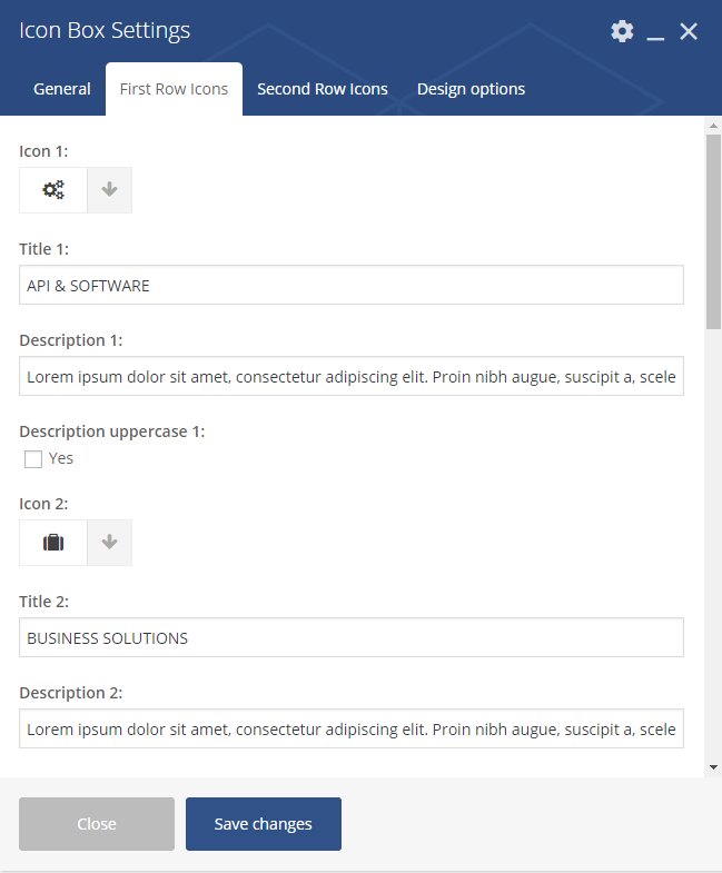
Icon Box Settings 2
First Row Icons, Second Row Icons (avaliable 6 in each row)
- Icon 1
- Title 1
- Description 1
- Description uppercase 1 – Check Yes to make all the description text uppercase
Image carousel
Image carousel
You can customise this element with options visible below:
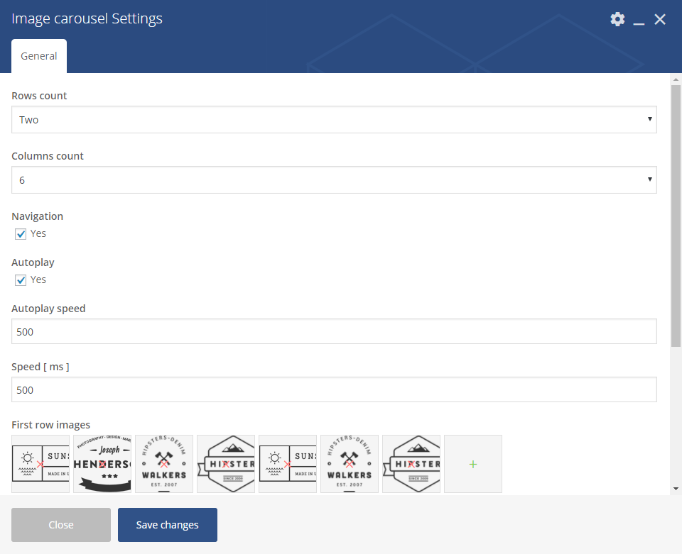
Image carousel settings
General
- Layout
- One
- Two
- Columns count – from 1 to 10
- Navigation – check Yes to show navigation
- Autoplay – check Yes to turn on autoplay
- Autoplay speed – set delay for the autoplay in (ms)
- Speed [ms]
- First row images – choose image for the first row
- Images labels – set the label for each image (visible after hover)
Image Features
Image Features
You can customise this element with options visible below:
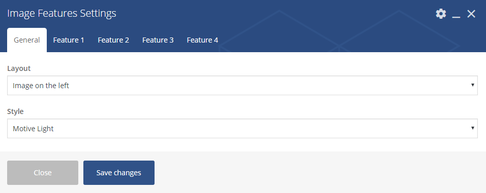
Image Features settings – General
General
- Layout
- Image on the left
- Image on the right
- Style
- Motive Light
- Motive Dark
- White
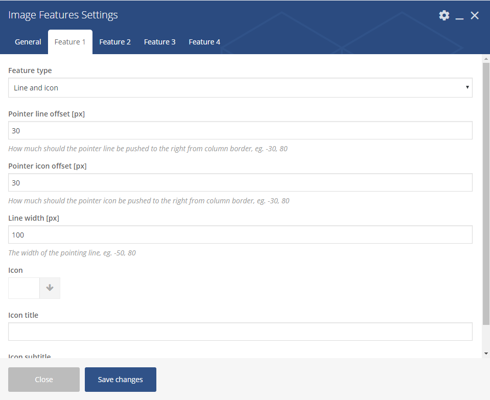
Image Features settings
Feature 1, Feature 2, Feature 3, Feature 4
- Feature type
- None (skip this feature)
- Text
- Line
- Icon
- Line and icon
- Button
- Pointer line offset
- Pointer icon offset
- Line width
- Icon
- Icon title
- Icon subtitle
Image gallery
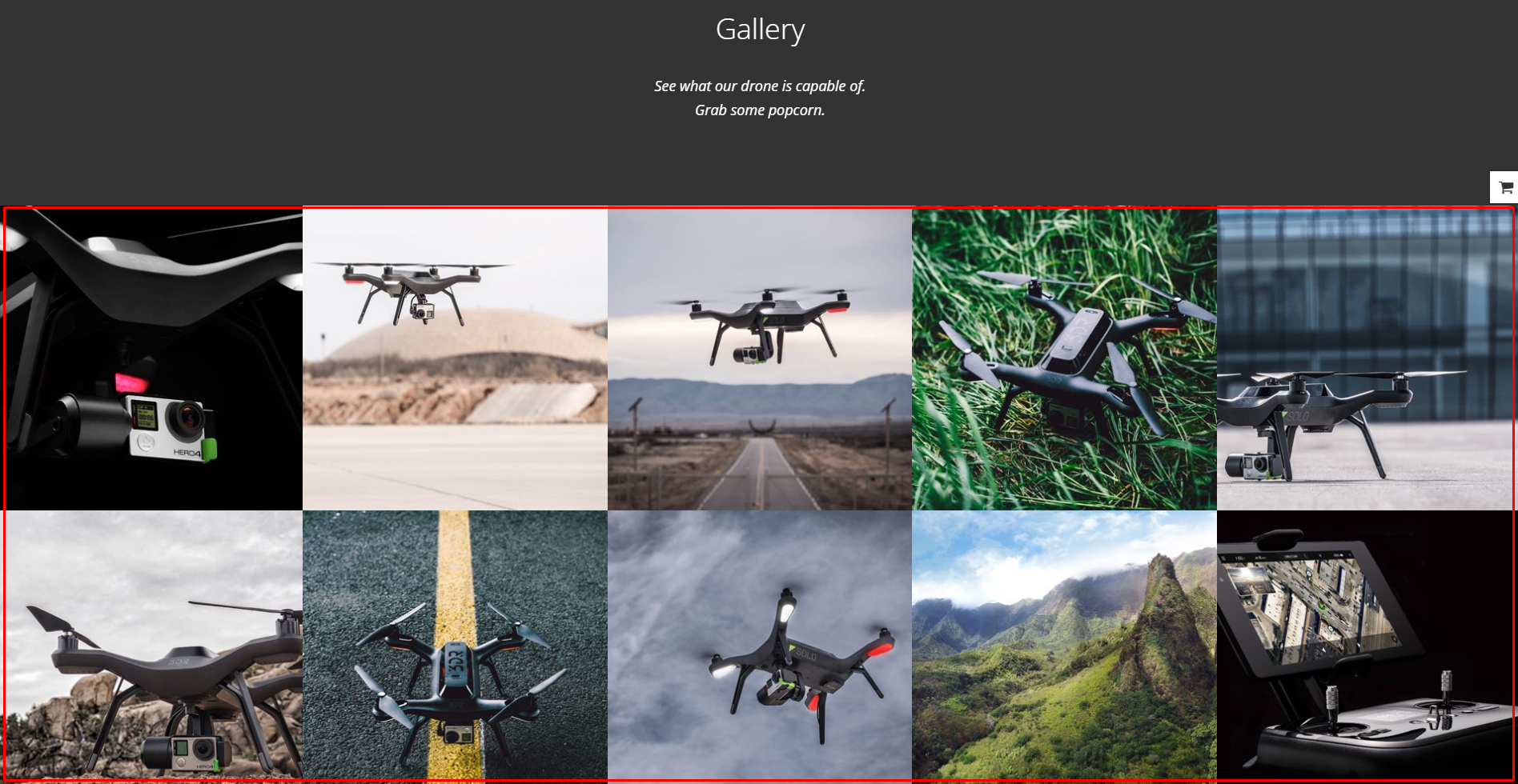
Image gallery
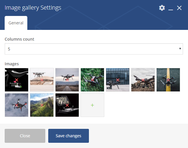
Image Gallery Settings
General
- Columns count – choose how many images will be added to single column (from 1 to 5)
- Images – choose the images from the ones added to Media Gallery
Link to section
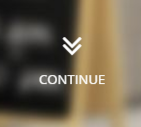
Link to Section
Link to Section Settings
General
- Section to scroll to
- Text label
- Motive
- Light
- Dark
- Motive
Promo Icons
Promo Icons
You can customise this element with options visible below:
Promo Icons settings – General
General
- Style
- Transparent
- Vertical
- Horizontal
- Custom CSS class – add custo class to style the element
Promo Icons settings – Icons
Icon 1, Icon 2, Icon 3, Icon 4, Icon 5, Icon 6
- Icon – set the icon for the button
- Image – set the backgroun for the icon box
- Icon color
- Icon text color
- Button enabled
- Button title
- Button link
- Button size
- Button style
- Button icon – avaliable for separated style buttons only
- Use custom colors for button? – check Yes if you wish to create button with custom colors
- Button text custom color
- Button background custom color
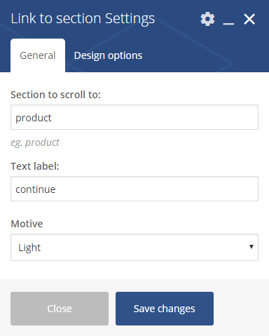
Promo Section

Promo Section with e-mail input
Promo Section Settings
General
- Background color
- Image
- Title
- Subtitle
- Layout
- Buttons
- Email input
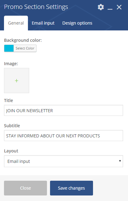
Promo Section Settings 2
Email input (when Email input chosen in Layout option)
- Email input Contact Form id
Promo Section Settings 3
Button 1, Button 2 (when Buttons input chosen in Layout option)
- Button enable – Check Yes to enable
- Button title
- Button link
- Button size
- Default
- Extra Small
- Estato Success
- Small
- Large
- Button style
- Accent Motive
- Dark
- Dark Separated
- White
- White Separated
- Transparent
- Button icon (for separated style buttons)
- Use custom colors for button? – Check Yes to use
- Button text custom color
- Button background custom color
Where to find Email input Contact Form ID?
Open the settings page for Contact Form 7, and then open the contact form you want to add. Each contact form has its own shortcode. Just copy the ID from the contatc form and use for Email input Contact Form id.

Contact form ID
Disrupt Socials
Disrupt Socials
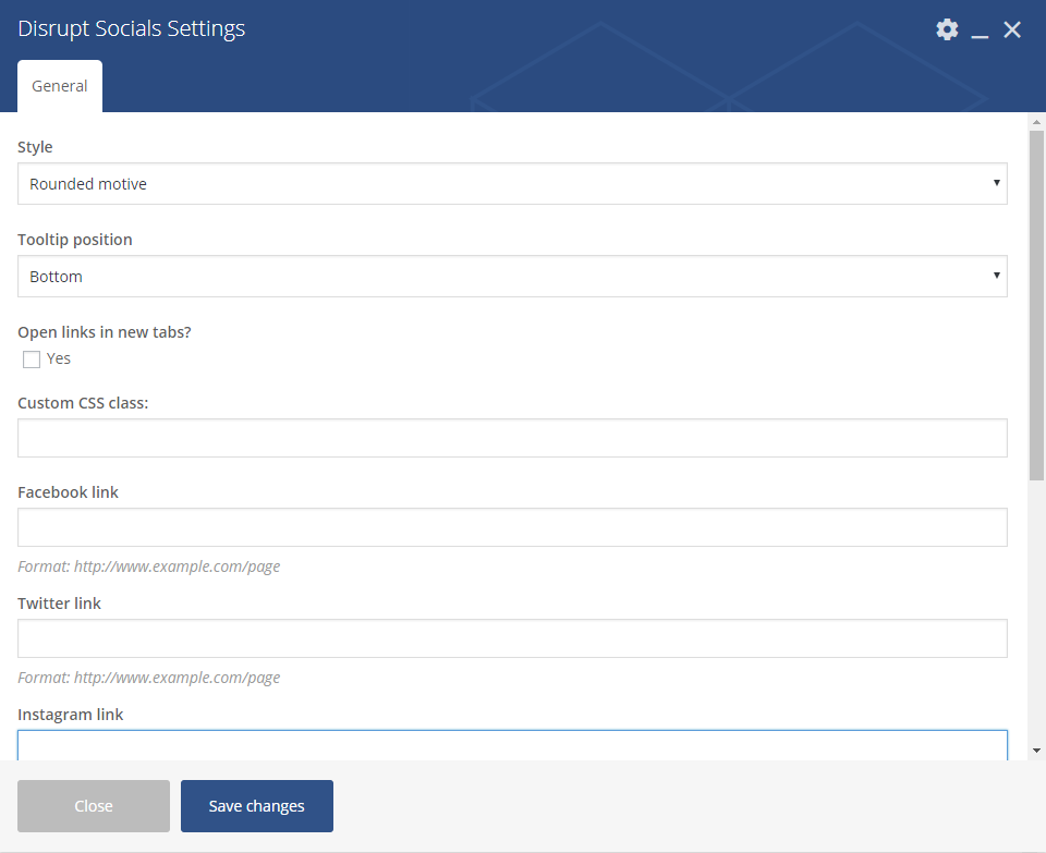
Disrupt Socials Settings
General
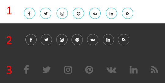
- Style
- Rounded motive
- Runded black
- Footer motive
- Tooltip position
- Bottom
- Top
- Right
- Left
- Hidden tooltip
- Open links in new tabs? – check Yes to enable the option
- Custom CSS class – add custom css class to style the Socials
- Facebook link, Twitter link, Instagram link, Pinterest link, Vkontakte link, Linkedin link, Rss linkn – add full link address to your social account
List
List
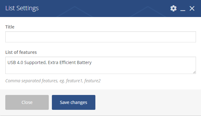
List Settings
- Title
- List of features – create a list of features by adding them with a comma separated
Video
Video
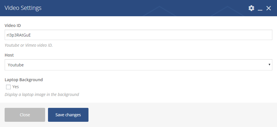
Video Settings
- Video – add the ID of the video you want to show on your site
- Host – choose between Youtube and Vimeo video
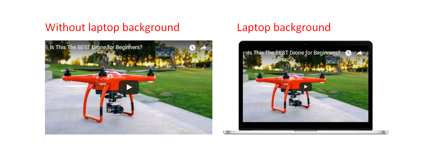
- Laptop Background – check yes if you want the video to be shown in a laptop background
Where to find ID of your Video?
-
- Youtube – It is very simple to find your YouTube video ID. First, go to the YouTube webpage. Look at the URL of that page, and at the end of it, you should see a combination of numbers and letters after an equal sign (=). This is the code you need to enter into your YouTube stack.

- Vimeo
- To find your Video ID, go to the Vimeo page and find the video you want to put on your website.
- Once it is loaded, look at the URL and look for the numbers that come after the slash (/).
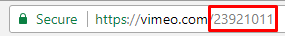
- This number is the Video ID and what you will use in your stack settings.
- Youtube – It is very simple to find your YouTube video ID. First, go to the YouTube webpage. Look at the URL of that page, and at the end of it, you should see a combination of numbers and letters after an equal sign (=). This is the code you need to enter into your YouTube stack.
Woo Promo Section

Woo Promo Section
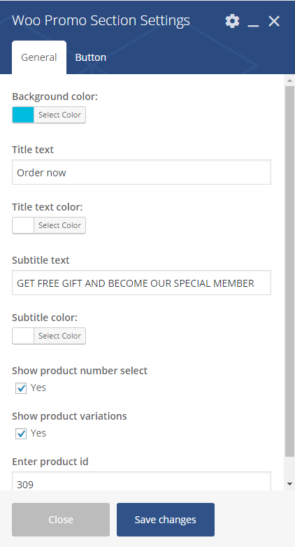
Woo Promo Section Settings
General
- Background color
- Title text
- Title text color
- Subtitle text
- Subtitle text
- Show product number select – Check Yes to show
- Show product variations – Check Yes to show
- Enter product id
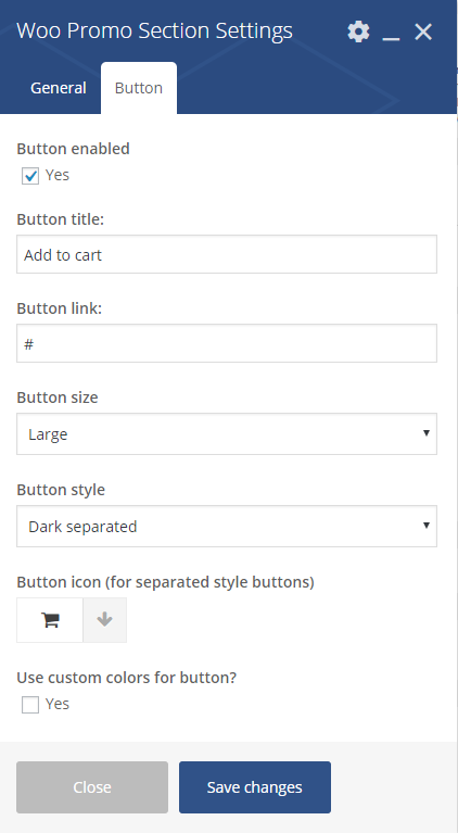
Woo Promo Section Settings 2
Button
- Button enabled
- Button title
- Button link
- Button size
- Defaukt
- Extra Small
- Small
- Large
- Button syle
- Accent motive
- Dark
- Dark separated
- White
- White separated
- Transparent
- Button icon (for separated style buttons)
- Use custom color for button – Check Yes to show
- Button text custom color: (avaliable only when Use custom color for button is checked)
- Button backgroun custom color: (avaliable only when Use custom color for button is checked)
Where to find product ID?
A WooCommerce Product ID is sometimes needed when using shortcodes, widgets and links. To find the ID, go to 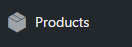 and hover over the product you need the ID for. The product ID number is displayed.
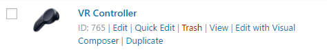
Product with ID
FAQ
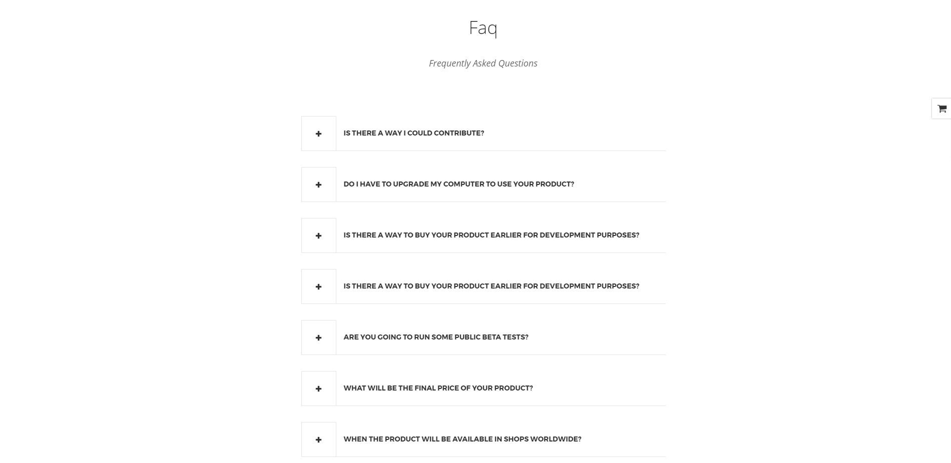
Faq
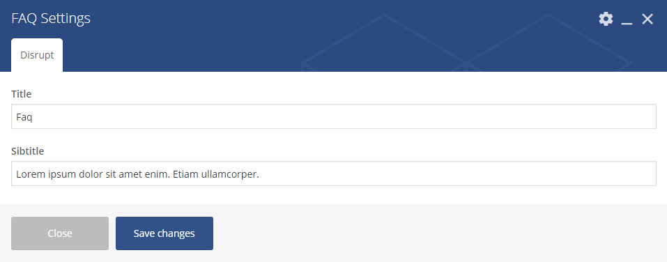
Faq Settings
Disrupt
- Title
- Subtitle
Shop locator
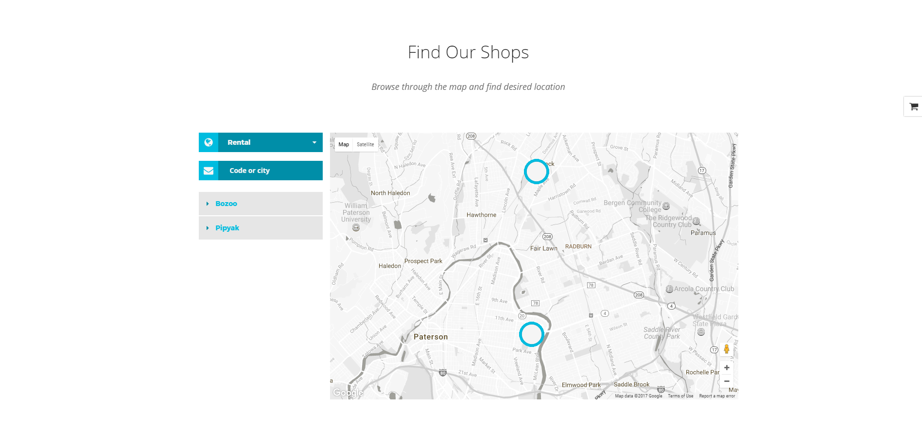
Shop Locator
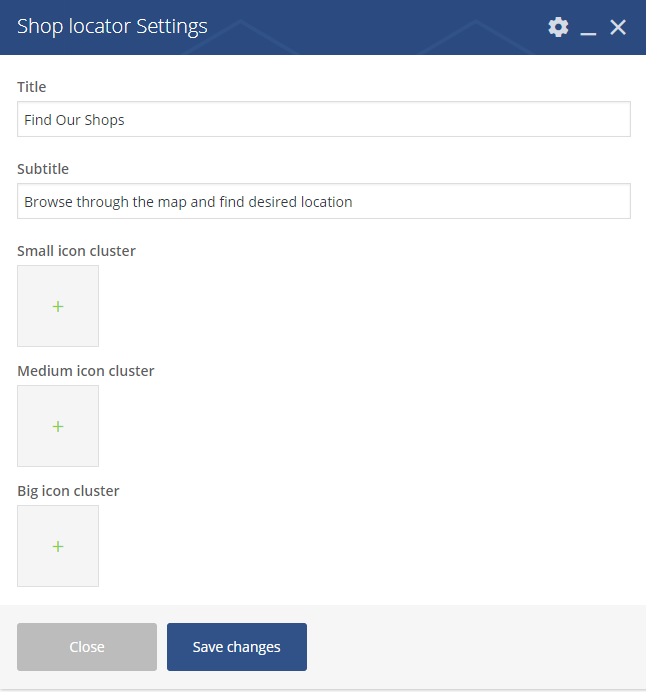
Shop Locator Settings
Avaliable option that can be set via this shortcode:
- Title
- Subtitle
- Small icon cluster
- Medium icon cluster
- Big icon cluster