Checkout
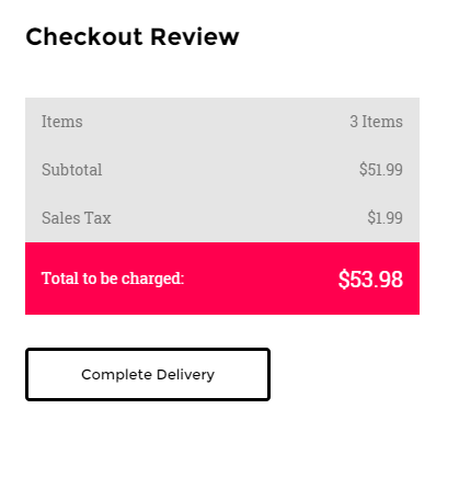
Checkout table
Checkout item

Datepicker

Form row
Form row 2
|
1 2 3 4 5 6 7 8 9 10 11 12 13 14 15 16 17 18 19 20 21 22 23 24 25 26 27 28 29 30 31 32 33 34 35 36 37 38 39 40 41 42 43 44 45 46 47 48 49 50 51 52 53 54 55 56 57 58 59 60 61 62 63 64 65 66 67 68 69 70 71 72 73 74 75 76 77 78 79 80 81 82 83 84 85 86 87 88 89 90 91 92 93 94 95 96 97 98 99 100 101 102 103 104 105 106 107 108 109 110 111 112 113 114 115 116 117 118 119 120 121 122 123 124 125 126 127 128 129 130 131 132 133 134 135 136 137 138 139 140 141 142 143 144 145 146 147 148 149 150 151 152 153 |
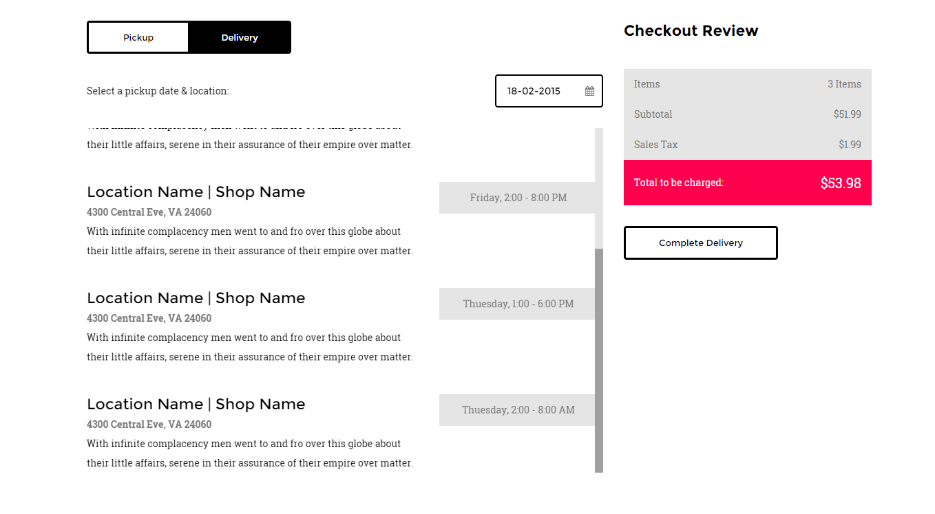
<div class="tab-content ct-checkout"> <div id="a2" class="tab-pane fade in active"> <div class="row"> <div class="col-md-12"> <div class="ct-u-displayTableVertical ct-u-marginBottom30"> <div class="ct-u-displayTableCell"><span class="ct-u-colorBlack">Select a pickup date & location:</span></div> <div class="ct-u-displayTableCell"> <div class="input-append date pull-right" data-date="12-02-2012" data-date-format="dd-mm-yyyy"> <input class="form-control-3" size="16" type="text" value="12-02-2012"> <span class="add-on"><i class="fa fa-calendar"></i></span> </div> </div> </div> <div class="ct-checkout-item"> <div class="row ct-u-paddingTop40"> <div class="col-md-8"> <h5>Location Name | Shop Name</h5> <p class="ct-fw-600">4300 Central Eve, VA 24060</p> <p class="ct-u-colorBlack">With infinite complacency men went to and fro over this globe about their little affairs, serene in their assurance of their empire over matter. </p> </div> <div class="col-md-4"> <div class="ct-btn-checkbox"> <label> <input type="checkbox" value="18-02-2015" data-value="Thursday, 3:00 - 10:00 PM" name="checkout"> <span>Thursday, 3:00 - 10:00 PM</span> </label> </div> </div> </div> <div class="col-md-8"> <h5>Location Name | Shop Name</h5> <p class="ct-fw-600">4300 Central Eve, VA 24060</p> <p class="ct-u-colorBlack">With infinite complacency men went to and fro over this globe about their little affairs, serene in their assurance of their empire over matter. </p> </div> <div class="col-md-4"> <div class="ct-btn-checkbox"> <label> <input type="checkbox" value="9-02-2015" data-value="Thuesday, 2:00 - 8:00 AM" name="checkout"> <span>Thuesday, 2:00 - 8:00 AM</span> </label> </div> </div> </div> </div> </div> </div> </div> <div class="row"> <div class="col-md-12"> <div class="ct-u-displayTableVertical ct-u-marginBottom30"> <div class="ct-u-displayTableCell"><span class="ct-u-colorBlack">Select a delivery date & location:</span></div> <div class="ct-u-displayTableCell"> <div class="input-append date pull-right" data-date="12-02-2012" data-date-format="dd-mm-yyyy"> <input class="form-control-3" size="16" type="text" value="12-02-2012"> <span class="add-on"><i class="fa fa-calendar"></i></span> </div> </div> </div> <div class="ct-checkout-item"> <div class="row ct-u-paddingTop40"> <div class="col-md-8"> <h5>Location Name | Shop Name</h5> <p class="ct-fw-600">4300 Central Eve, VA 24060</p> <p class="ct-u-colorBlack">With infinite complacency men went to and fro over this globe about their little affairs, serene in their assurance of their empire over matter. </p> </div> <div class="col-md-4"> <div class="ct-btn-checkbox"> <label> <input type="checkbox" value="18-02-2015" data-value="Thursday, 3:00 - 10:00 PM" name="checkout"> <span>Thursday, 3:00 - 10:00 PM</span> </label> </div> </div> </div> <div class="row ct-u-paddingTop40"> <div class="col-md-8"> <h5>Location Name | Shop Name</h5> <p class="ct-fw-600">4300 Central Eve, VA 24060</p> <p class="ct-u-colorBlack">With infinite complacency men went to and fro over this globe about their little affairs, serene in their assurance of their empire over matter. </p> </div> <div class="col-md-4"> <div class="ct-btn-checkbox"> <label> <input type="checkbox" value="11-02-2015" data-value="Wednesday, 3:00 - 4:00 PM" name="checkout"> <span>Wednesday, 3:00 - 4:00 PM</span> </label> </div> </div> </div> <div class="row ct-u-paddingTop40"> <div class="col-md-8"> <h5>Location Name | Shop Name</h5> <p class="ct-fw-600">4300 Central Eve, VA 24060</p> <p class="ct-u-colorBlack">With infinite complacency men went to and fro over this globe about their little affairs, serene in their assurance of their empire over matter. </p> </div> <div class="col-md-4"> <div class="ct-btn-checkbox"> <label> <input type="checkbox" value="11-02-2015" data-value="Friday, 2:00 - 8:00 PM" name="checkout"> <span>Friday, 2:00 - 8:00 PM</span> </label> </div> </div> </div> <div class="row ct-u-paddingTop40"> <div class="col-md-8"> <h5>Location Name | Shop Name</h5> <p class="ct-fw-600">4300 Central Eve, VA 24060</p> <p class="ct-u-colorBlack">With infinite complacency men went to and fro over this globe about their little affairs, serene in their assurance of their empire over matter. </p> </div> <div class="col-md-4"> <div class="ct-btn-checkbox"> <label> <input type="checkbox" value="8-02-2015" data-value="Thuesday, 1:00 - 6:00 PM" name="checkout"> <span>Thuesday, 1:00 - 6:00 PM</span> </label> </div> </div> </div> <div class="row ct-u-paddingTop40"> <div class="col-md-8"> <h5>Location Name | Shop Name</h5> <p class="ct-fw-600">4300 Central Eve, VA 24060</p> <p class="ct-u-colorBlack">With infinite complacency men went to and fro over this globe about their little affairs, serene in their assurance of their empire over matter. </p> </div> <div class="col-md-4"> <div class="ct-btn-checkbox"> <label> <input type="checkbox" value="9-02-2015" data-value="Thuesday, 2:00 - 8:00 AM" name="checkout"> <span>Thuesday, 2:00 - 8:00 AM</span> </label> </div> </div> </div> </div> </div> </div> </div> </div> |
ct-checkout: Base class for checkout.
tab-content: Hide tab panels at start, show them when .active.
The ‘.datepicker’ component consist of fallowing HTML markup:
|
1 2 3 4 |
<div class="input-append date pull-right" data-date="12-02-2012" data-date-format="dd-mm-yyyy"> <input class="form-control-3" size="16" type="text" value="12-02-2012"> <span class="add-on"><i class="fa fa-calendar"></i></span> </div> |
CSS Classes :
‘.input-append‘, ‘.date‘ are the classes necessary to get datepicker plugin to work and be displayed.
I also requires the following js files:
<script> $('.input-append').datepicker();</script>
The ‘ct-checkout’ component consist of ‘datepicker‘ and ‘ct-checkout-item‘ items.
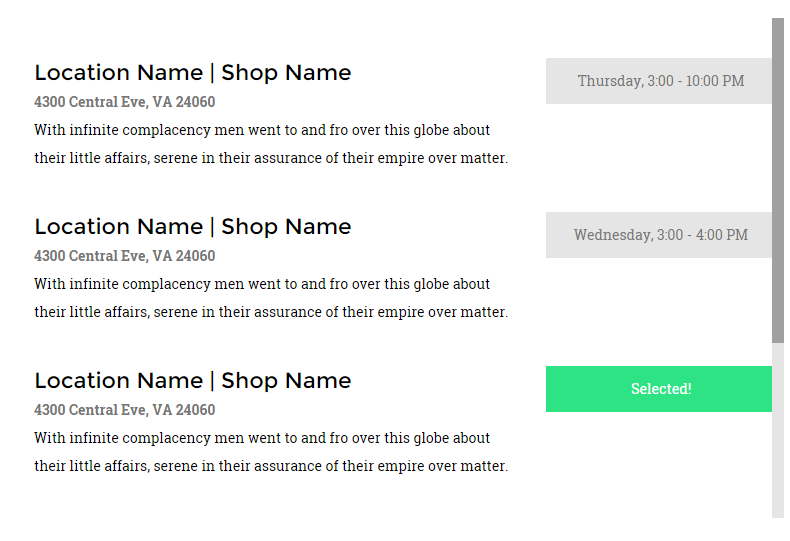
The ‘ct-checkout-item’ selects a prticular date in ‘.datepicker’ component by clicking CHECKBOX BUTTON.
CHECKBOX BUTTON :
It always comes with the following markup :
|
1 2 3 4 5 6 |
<div class="ct-btn-checkbox"> <label> <input type="checkbox" value="18-02-2015" data-value="Thursday, 3:00 - 10:00 PM" name="checkout"> <span>Thursday, 3:00 - 10:00 PM</span> </label> </div> |
ct-btn-checkbox: It’s a type of a button, reserved just for checkout section.
Input field receive two attributes, which is ‘value’ and ‘data-value’. The ‘value’ attribute
sets the ‘datepicker’ component to particular date. The ‘data-value’ is text of a button that
will be displayed after clicking twice on the button. First click will inform user that button was clicked
by displaying thext ‘Selected!’. Second click will take value from ‘data-value’ attribute.
USED UTILITIES CLASSES:
|
1 2 3 4 5 6 7 8 9 10 11 12 13 |
.ct-u-displayTableVertical{ display: table; .ct-u-displayTableCell{ vertical-align: middle. } } .ct-u-displayTable{ display: table; } .ct-u-displayTableCell{ display: table-cell } |