

Tours & Tickets HTML – Responsive HTML5 Template
Thank you for purchasing this theme. If you have any questions that are beyond the scope of this help file, please feel free to start new ticket on this page. Thanks so much!
Scope of free support
We can help you with:
- Responding to questions or problems regarding the item and its features
- Fixing any discovered item’s bugs
- Providing updates to ensure compatibility with new software versions
Was this article helpful ?
HTML Structure
This theme is built upon bootstrap framework and is fully responsive. It adapts to window resolution and looks good on all devices including iPad and iPhone.
See for yourself (resize your browser).
If you would like to read more
about bootstrap framework click here :
Grid System and Single row structure
The default Bootstrap grid system utilizes 12 columns. It’s responsive grid and adapts to viewport. Below 767px viewports, the columns become fluid and stack vertically. The fluid grid system uses percents instead of pixels for column widths. Each row always include 12 columns (for example col-md-8 + col-md-4 = col-md-12).
Bootstrap documentation: here
Basic grid HTML:
|
1 2 3 4 5 6 7 8 9 10 11 12 13 14 15 16 17 18 19 20 21 22 23 24 25 26 27 |
<div class="row"> <div class="col-md-1">.col-md-1</div> <div class="col-md-1">.col-md-1</div> <div class="col-md-1">.col-md-1</div> <div class="col-md-1">.col-md-1</div> <div class="col-md-1">.col-md-1</div> <div class="col-md-1">.col-md-1</div> <div class="col-md-1">.col-md-1</div> <div class="col-md-1">.col-md-1</div> <div class="col-md-1">.col-md-1</div> <div class="col-md-1">.col-md-1</div> <div class="col-md-1">.col-md-1</div> <div class="col-md-1">.col-md-1</div> </div> <div class="row"> <div class="col-md-8">.col-md-8</div> <div class="col-md-4">.col-md-4</div> </div> <div class="row"> <div class="col-md-4">.col-md-4</div> <div class="col-md-4">.col-md-4</div> <div class="col-md-4">.col-md-4</div> </div> <div class="row"> <div class="col-md-6">.col-md-6</div> <div class="col-md-6">.col-md-6</div> </div> |
Page structure
Below you will find default page structure :
|
1 2 3 4 5 6 7 8 9 10 11 12 13 14 15 16 17 18 19 20 21 22 23 24 25 26 27 28 29 30 31 32 33 34 35 36 |
<!DOCTYPE html> <html> <head> [css] </head> <body> [header] [main menu] <!-- main container --> <div id="wrapper"> [component 1] <!-- fullwidth element --> </div> [fullwidth parallax] <div class="container"> <!-- / fullwidth element --> [component 6] </div> <!-- / main container --> [footer] [javascripts] </body> </html> |
Was this article helpful ?
CSS files and structure
If you would like to edit the color, font, or style of any elements, you would do the following:
|
1 |
#primaryContent a {color: #someColor;} |
If you find that your new style is not overriding, it is most likely because of a specificity problem. Scroll down in your CSS file and make sure that there isn’t a similar style that has more weight.
I.E.
|
1 |
#wrap #primaryContent a {color: #someColor;} |
So, to ensure that your new styles are applied, make sure that they carry enough “weight” and that there isn’t a style lower in the CSS file that is being applied after yours.
Colors
The theme includes a css file wich you can use to edit the colors.
You just need to add the corresponding CSS file to the head of the page like this:
|
1 2 3 4 5 |
<head> (..) <link rel="stylesheet" type="text/css" href="css/motive.css"> (..) </head> |
Icons
We’ve included 360+ font icons.
Awesome Icons – http://fontawesome.io/icons/
HTML markup:
|
1 2 |
<!-- Awesome Icons --> <i class="fa fa-cog"></i> |
CSS Files & Structure
We’ve included 2 files.
bootstrap.css contains Bootstrap 3 Library.
style.css file contains general styles.
style.less
1. Font Awesome
2. Et line Font
3. Variables
4. Slick
5. Selectize
6. Starrr
7. Magnific Popup
8. Isotope
9. Mixins
10. Portfolio
11. Animate css
12. Typography
13. Utilities
14. Media Sections
15. NstSlider
16. Beat Picker
17. Yamm
18. Menu
19. Forms
20. Buttons
21. Font Awesome
22. Boxed
23. Google Maps
24. Tickets Button
25. Section Shadow
26. Breadcumbs
27. Dividers
28. FAQ thumbnail
29. Testimonials
30. Image container
31. Headings
32. Media Box
33. InfoBox
34. PersonBox
35. ProductBox
36. IconBox
37. Tabs
38. Accordion
39. Gallery
40. Blog
41. Blocquote
42. Footer
43. Widgets
44. Media Queries
For more advanced user – we included also folder with less files – under assets/less you will find the following files:
— file for motive styling
motive-parties.less
motive-tourist.less
motive-wedding.less
motive-tours.less
— file for buttons styling (colors, sizes etc.)
buttons.less
Was this article helpful ?
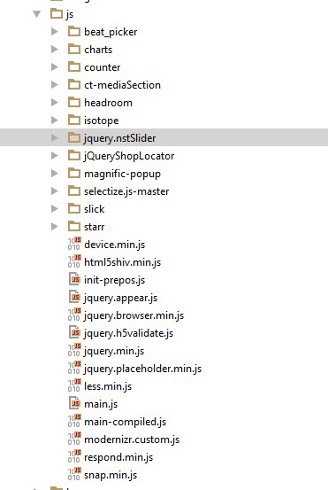
Javascript Components
JavaScript files:
- /charts/ – script for canvas charts animating
- /counters/ – Files needed for initialising the animation number after loading pages.
- /ct-mediaSection/ – Media sections where we can add parralax, kenburns or video to the section. Dynamical content of medias..
- /headroom/ – Animated/fixed navbars. Plugin needed for detecting scrollbar and attaching animations for menu.
- /magnificpopup/ – Needed for galleries and their popups images where we can review them with slides via arrows.
- /selectize.js-master/ – Plugin which creates select box for select tag in the page. It generates html code via javascript so that each browser can have the same select box.
- /slick/ – Files which initialize sliders in the page.
- /main.js/ – The main javascript initializaions and other major snippets.
- /selectize/ – plugin for select https://brianreavis.github.io/selectize.js/
- /nstSlider/ – plugin for range slider http://lokku.github.io/jquery-nstslider/
- /starrr/ – plugin for stars in products https://github.com/dobtco/starrr
Screenshot
jquery.appear
This plugin call function when element appear in viewport. This is used in custom animation, progress bars, counter timer.
Documentation: https://github.com/bas2k/jquery.appear/
|
1 2 3 4 5 6 7 8 9 10 11 12 13 |
if (jQuery().appear) { if (device.mobile()) { // disable animation on mobile jQuery("body").removeClass("withAnimation"); } else { jQuery('.withAnimation .animated').appear(function () { jQuery(this).each(function () { jQuery(this).addClass('activate'); jQuery(this).addClass($(this).data('fx')); }); }, {accY: -150}); } } |
Charts.js
This plugin is used to make graphics.
Documentation: http://www.chartjs.org/
Was this article helpful ?
Navigation
Css styles:
.yamm
.ct-headroom–scrollUpMenu
.ct-headroom–scrollUpTopBar
.ct-headroom–scrollUpBoth
.ct-headroom–fixedTopBar
.ct-headroom–fixedMenu
.ct-headroom–fixedBoth
.ct-headroom–hideMenu
Screenshot:

Navigation
Markup:
|
1 2 3 4 5 6 7 8 9 10 11 12 13 14 15 16 17 18 19 20 21 22 23 24 25 26 27 28 29 30 31 32 33 34 35 36 37 38 39 40 41 42 43 44 45 46 47 48 49 50 51 52 53 54 55 56 57 58 59 |
<nav class="navbar yamm text-uppercase"> <div class="container"> <div class="navbar-header"><a href="index.html"><img src="assets/images/demo-content/logo.png" alt="logo"></a></div> <ul class="nav navbar-nav ct-navbar--fadeInUp pull-right"> <li class="dropdown"><a href="index.html">home</a> <ul class="dropdown-menu"> <li><a href="adventure.html">Adventure</a><a href="adventure2.html">Adventure - next</a><a href="travel.html">Travel</a><a href="travel-deals.html">Travel Deals</a></li> </ul> </li> <li class="dropdown yamm-fw"><a href="index.html">private tours</a> <ul class="dropdown-menu"> <li> <div class="yamm-content"> <div class="container"> <div class="row"> <div class="col-sm-4"><a href="basic-package.html">Basic Package</a></div> <div class="col-sm-4"><a href="basic-package-single.html">home</a></div> <div class="col-sm-4"><a href="index.html">home</a></div> </div> </div> </div> </li> </ul> </li> <li class="dropdown yamm-fw"><a href="itinerary.html">Itinerary</a></li> <li class="dropdown yamm-fw"><a href="index.html">Pages</a> <ul class="dropdown-menu"> <li> <div class="yamm-content"> <div class="container"> <div class="row"> <div class="col-sm-4"><a href="index.html">home</a></div> <div class="col-sm-4"><a href="index.html">home</a></div> <div class="col-sm-4"><a href="index.html">home</a></div> </div> </div> </div> </li> </ul> </li> <li class="dropdown yamm-fw"><a href="index.html">Features</a> <ul class="dropdown-menu"> <li> <div class="yamm-content"> <div class="container"> <div class="row"> <div class="col-sm-4"><a href="index.html">home</a></div> <div class="col-sm-4"><a href="index.html">home</a></div> <div class="col-sm-4"><a href="index.html">home</a></div> </div> </div> </div> </li> </ul> </li> <li class="dropdown"><a href="contact.html">Contact</a></li> </ul> </div> </nav> |
The following javascripts are required for the effects above:
|
1 2 3 |
<script src="assets/plugins/headroom/headroom.js"></script> <script src="assets/plugins/headroom/jQuery.headroom.js"></script> <script src="assets/plugins/headroom/init.js"></script> |
You fill find whole documentation of plugin in < script src="assets/plugins/headroom/init.js"></script>
Was this article helpful ?
Headings
Tours & Tickets HTML has three types of heading:
Css styles:
–With border:
.ct-heading–withBorder
.ct-heading–withBorderGrey
.ct-heading–withBorderGreyDark
–Striped:
.ct-heading–striped
–With arrow:
.ct-heading–withArrow
Heading with border
Screenshot:

Heading with border
Markup:
|
1 2 3 4 |
<div class="ct-heading--withBorder ct-heading--withBorderGrey ct-u-marginBottom40"> <h4 class="ct-u-colorMotive text-uppercase ct-u-marginBottom10">our staff</h4> <p>Lorem ipsum dolor sit amet, consectetur adipiscing elit. Integer sed arcu ac ligula volutpat tincidunt vel ut mauris. Fusce nec ultrices leo.</p> </div> |
Heading striped
Screenshot:

Heading striped
Markup:
|
1 2 3 4 5 |
<div class="ct-heading--striped text-uppercase text-capitalize ct-u-top-50 ct-u-marginBottom20"> <h4 class="pull-left">View Our Other Wedding Themes</h4><a href="#" class="btn btn-default btn-xs pull-right">start today</a> <div class="clearfix"></div> <div class="ct-right-extension"></div> </div> |
Heading with arrow
Screenshot:

Heading with arrow
Markup :
|
1 2 3 |
<div class="ct-heading--withArrow ct-u-colorWhite"> <h6 class="text-uppercase">This week's bestsellers</h6> </div> |
Was this article helpful ?
Testimonials
Css styles:
.ct-testimonials–withBigImage
.ct-testimonials–inline
Testimonials with big image
Screenshot

Tetsimonial with big image
Markup (ct-testimonials–withBigImage) – example for one item:
|
1 2 3 4 5 6 7 8 9 10 11 12 13 14 15 16 |
<div class="ct-testimonials--withBigImage"><img src="assets/images/demo-content/testimonials-background.jpg" alt="testimonials"> <div class="ct-testimonials-slider"> <div data-adaptiveHeight="false" data-animations="true" data-autoplay="true" data-infinite="true" data-autoplaySpeed="3000" data-draggable="true" data-touchMove="false" data-arrows="false" data-XSitems="1" data-SMitems="2" data-MDitems="2" data-LGitems="3" data-items="1" class="ct-slick ct-js-slick ct-slick--arrowsTopBlue text-center"> <div class="item"> <div class="ct-slick-inner ct-u-marginBoth50"> <div class="ct-slick-content"> <div class="ct-personBox ct-personBox--titleTop"> <div class="ct-personBox-image"><img src="assets/images/demo-content/personBox-testimonials.jpg" alt="person"></div> <div class="ct-personBox-description"> <h5 class="ct-personBox-title">gabrielle memphis</h5> <p>My friends couldn't believe the price. The hotels were top of the line, and our guide was great. </p> </div> </div> </div> </div> </div> |
Testimonials – inline
Screenshot
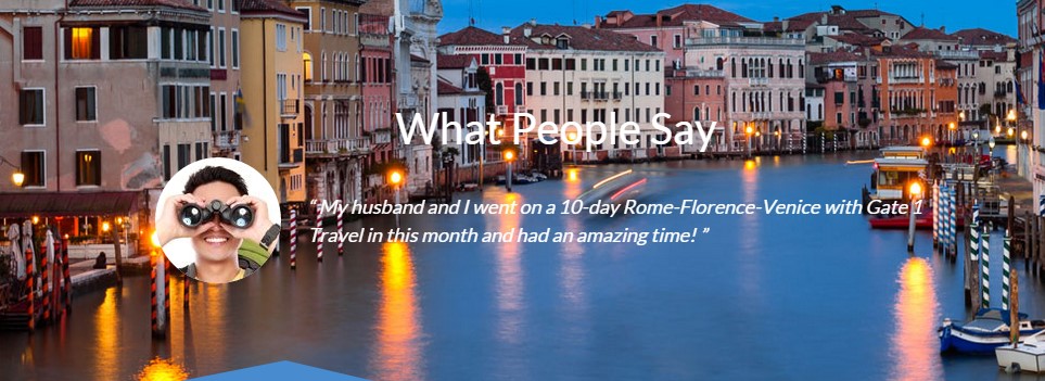
Testimonials inline
Markup (ct-testimonials–inline) – example for one item:
|
1 2 3 4 5 6 7 8 9 10 11 12 13 14 |
<div data-adaptiveHeight="true" data-animations="true" data-autoplay="true" data-infinite="true" data-autoplaySpeed="6000" data-draggable="true" data-touchMove="false" data-arrows="false" data-items="1" class="ct-slick ct-js-slick ct-u-marginBottom10"> <div class="item"> <div class="ct-slick-inner"> <div class="ct-slick-content"> <div class="ct-testimonials--inline"> <div class="ct-testimonials-image"><img src="assets/images/demo-content/testimonials2.jpg" alt="testimonials"></div> <div class="ct-testimonials-description"> “ My husband and I went on a 10-day Rome-Florence-Venice with Gate 1 Travel in this month and had an amazing time! ” </div> </div> </div> </div> </div> |
JavaScript
<script src=”../assets/js/slick/js/slick.js”></script>
Was this article helpful ?
Slick Slider
There are three version of this slider in the Tours & Tickets HTML depending on the navigation class that will be used.
Css styles:
— Core classes for slick plugin
.ct-slick
.ct-js-slick
— Different navigations:
.ct-slick–arrowsTop
.ct-slick–arrowsTopBlue
.ct-slick–arrowsTopBlue-style2
.ct-slick–arrowsNoBorder
.ct-slick–arrowsCircle
.ct-slick–arrowsCustom
.ct-slick–arrowsSquare
.ct-slick–lightBlue
This classes you add to div with class .ct-slick, it adds different look for navigations.
Screenshot:
Slick
Example of HTML markup:
|
1 2 3 |
<div data-adaptiveHeight="true" data-animations="true" data-autoplay="true" data-infinite="true" data-autoplaySpeed="6000" data-draggable="true" data-touchMove="false" data-arrows="true" data-items="1" class="ct-slick ct-js-slick"> <div data-bg="assets/images/demo-content/sliderImage.jpg" class="item"> .. some content .. |
JavaScript markup:
— Script path: assets/js/slick/init.js, assets/js/slick/slick.js
|
1 2 3 4 5 6 7 8 9 10 11 12 13 14 15 16 17 18 19 20 21 22 23 24 25 26 27 28 29 30 31 32 33 34 35 36 37 38 39 40 41 42 43 44 45 46 47 48 49 50 51 52 53 54 55 56 57 58 59 60 61 62 63 64 65 66 67 68 69 70 71 72 73 74 75 76 77 78 79 80 81 82 83 84 85 86 87 88 89 90 91 92 93 94 95 96 |
(function ($) { "use strict"; var $slick = $(".ct-js-slick"); var $devicewidth = (window.innerWidth > 0) ? window.innerWidth : screen.width; function validatedata($attr, $defaultValue) { "use strict"; if ($attr !== undefined) { return $attr } return $defaultValue; } function parseBoolean(str, $defaultValue) { "use strict"; if (str == 'true') { return true; } else if (str == "false") { return false; } return $defaultValue; } $(document).ready(function () { if ($().slick) { // Responsive Breakpoins var $widthLG = 1200, $widthMD = 900, $widthSM = 600, $widthXS = 0; if ($slick.length > 0) { $slick.each(function () { var $this = $(this), ctanimations = validatedata($this.attr("data-animations"), true), // variable from main.js $slickheight = $this.attr('data-height'); if (ctanimations === false || $devicewidth < 768 || device.mobile() || device.ipad() || device.androidTablet()) { // Disable scroll animation on mobile $slick.find('.animated').each(function () { $(this).removeClass('animated'); }); } else { // Slider init animations $('.cssAnimate .animated').appear(function () { var $this = $(this); $this.each(function () { if ($this.data('time') !== undefined) { setTimeout(function () { $this.addClass('activate'); $this.addClass($this.data('fx')); }, $this.data('time')); } else { $this.addClass('activate'); $this.addClass($this.data('fx')); } }); }, {accX: 50, accY: -200}); } // slider height if ($this.attr('data-height')) { $this.css({height: $slickheight}); $this.find('.slick-list').css({height: $slickheight}); $this.find('.slick-track').css({height: $slickheight}); $this.find('.item').each(function () { $(this).css({height: $slickheight}) }); } // item height $this.find('.item').each(function () { var $item = $(this), $height = $item.attr('data-height'); $item.css({ height: $height }) }); // Background Image // ------------------------------- $this.find(".item").each(function () { var $slide_item = $(this); var bg = validatedata($slide_item.attr('data-bg'), false); if (bg) { $slide_item.css('background-image', 'url("' + bg + '")'); } }); |
|
1 2 3 4 5 6 7 8 9 10 11 12 13 14 15 16 17 18 19 20 21 22 23 24 25 26 27 28 29 30 31 32 33 34 35 36 37 38 39 40 41 42 43 44 45 46 47 48 49 50 51 52 53 54 55 56 57 58 59 60 61 62 63 64 65 66 67 68 69 70 71 72 73 74 75 76 77 78 79 80 81 82 83 84 85 86 87 88 89 90 91 92 93 94 95 96 97 98 99 100 101 102 103 104 105 106 107 108 109 110 111 112 113 114 115 116 117 118 119 120 121 122 123 124 125 126 127 128 129 130 131 132 133 134 135 136 137 138 139 140 141 142 143 144 145 146 |
var ctslidesToShow = parseInt(validatedata($this.attr("data-items"), 1), 10), // Non Responsive slidesXS = parseInt(validatedata($this.attr("data-XSitems"), ctslidesToShow), 10), slidesSM = parseInt(validatedata($this.attr("data-SMitems"), slidesXS), 10), // Default Item from data-items; slidesMD = parseInt(validatedata($this.attr("data-MDitems"), slidesSM), 10), // Default Item from smaller Device; slidesLG = parseInt(validatedata($this.attr("data-LGitems"), slidesMD), 10), // Default Item from smaller Device; ctaccessibility = parseBoolean($this.attr("data-accessibility"), true), ctadaptiveHeight = parseBoolean($this.attr("data-adaptiveHeight"), false), ctautoplay = parseBoolean($this.attr("data-autoplay"), false), ctautoplaySpeed = parseInt(validatedata($this.attr("data-autoplaySpeed"), 5000), 10), ctarrows = parseBoolean($this.attr("data-arrows"), true), ctasNavFor = validatedata($this.attr("data-asNavFor")), ctappendArrows = validatedata($this.attr("data-appendArrows")), ctprevArrow = validatedata($this.attr("data-prevArrow"), '<button type="button" class="slick-prev">Previous</button>'), ctnextArrow = validatedata($this.attr("data-nextArrow"), '<button type="button" class="slick-next">Next</button>'), ctcenterMode = parseBoolean($this.attr("data-centerMode"), false), ctcenterPadding = validatedata($this.attr("data-centerPadding"), '50px'), ctcssEase = validatedata($this.attr("data-cssEase"), 'ease'), ctdots = parseBoolean($this.attr("data-dots"), false), ctdraggable = parseBoolean($this.attr("data-draggable"), true), ctfade = parseBoolean($this.attr("data-fade"), false), ctfocusOnSelect = parseBoolean($this.attr("data-focusOnSelect"), false), cteasing = validatedata($this.attr("data-easing"), 'linear'), ctedgeFriction = parseInt(validatedata($this.attr("data-edgeFriction"), 0.15), 10), ctinfinite = parseBoolean($this.attr("data-infinite"), true), ctinitialSlide = parseInt(validatedata($this.attr("data-initialSlide"), 0), 10), ctlazyLoad = validatedata($this.attr("data-lazyLoad"), 'ondemand'), ctmobileFirst = parseBoolean($this.attr("data-mobileFirst"), true), ctpauseOnHover = parseBoolean($this.attr("data-pauseOnHover"), true), ctpauseOnDotsHover = parseBoolean($this.attr("data-pauseOnDotsHover"), false), ctrespondTo = validatedata($this.attr("data-respondTo"), 'window'), ctslide = validatedata($this.attr("data-slide")), ctslidesToScroll = parseInt(validatedata($this.attr("data-slidesToScroll"), 1), 10), ctspeed = parseInt(validatedata($this.attr("data-speed"), 300), 10), ctswipe = parseBoolean($this.attr("data-swipe"), true), ctswipeToSlide = parseBoolean($this.attr("data-swipeToSlide"), false), cttouchMove = parseBoolean($this.attr("data-touchMove"), true), cttouchThreshold = parseInt(validatedata($this.attr("data-touchThreshold"), 5), 10), ctuseCSS = parseBoolean($this.attr("data-useCSS"), true), ctvariableWidth = parseBoolean($this.attr("data-variableWidth"), false), ctvertical = parseBoolean($this.attr("data-vertical"), false), ctrtl = parseBoolean($this.attr("data-rtl"), false); //$this.on('init', function (event, slick) { // console.log(slick) // if (!($('html').is('.ie8'))){ // // Selectize.js // ---------------------------------------------------------------- // var $selectize = $(slick).find('.ct-js-selectize-slick'); // $selectize.each(function(){$(this).selectize();}) // } //}); // Slick Init $this.slick({ slidesToShow: ctslidesToShow, accessibility: ctaccessibility, // Enables tabbing and arrow key navigation adaptiveHeight: ctadaptiveHeight, // Enables adaptive height for single slide horizontal carousels. autoplay: ctautoplay, // Enables Autoplay autoplaySpeed: ctautoplaySpeed, // Autoplay Speed in milliseconds arrows: ctarrows, // Prev/Next Arrows asNavFor: ctasNavFor, // Set the slider to be the navigation of other slider (Class or ID Name) appendArrows: ctappendArrows, // Change where the navigation arrows are attached (Selector, htmlString, Array, Element, jQuery object) prevArrow: ctprevArrow, // Allows you to select a node or customize the HTML for the "Previous" arrow. nextArrow: ctnextArrow, // Allows you to select a node or customize the HTML for the "Next" arrow. centerMode: ctcenterMode, // Enables centered view with partial prev/next slides. Use with odd numbered slidesToShow counts. centerPadding: ctcenterPadding, // Side padding when in center mode (px or %) cssEase: ctcssEase, // CSS3 Animation Easing dots: ctdots, // Show dot indicators draggable: ctdraggable, // Enable mouse dragging fade: ctfade, // Enable fade focusOnSelect: ctfocusOnSelect, // Enable focus on selected element (click) easing: cteasing, // Add easing for jQuery animate. Use with easing libraries or default easing methods edgeFriction: ctedgeFriction, // Resistance when swiping edges of non-infinite carousels infinite: ctinfinite, // Infinite loop sliding initialSlide: ctinitialSlide, // Slide to start on lazyLoad: ctlazyLoad, // Set lazy loading technique. Accepts 'ondemand' or 'progressive' mobileFirst: ctmobileFirst, // Responsive settings use mobile first calculation pauseOnHover: ctpauseOnHover, // Pause Autoplay On Hover pauseOnDotsHover: ctpauseOnDotsHover,// Pause Autoplay when a dot is hovered respondTo: ctrespondTo, // Width that responsive object responds to. Can be 'window', 'slider' or 'min' (the smaller of the two) slide: ctslide, // Element query to use as slide slidesToScroll: ctslidesToScroll, // Number of slides to scroll speed: ctspeed, // Slide/Fade animation speed swipe: ctswipe, // Enable swiping swipeToSlide: ctswipeToSlide, // Allow users to drag or swipe directly to a slide irrespective of slidesToScroll touchMove: cttouchMove, // Enable slide motion with touch touchThreshold: cttouchThreshold, // To advance slides, the user must swipe a length of (1/touchThreshold) * the width of the slide useCSS: ctuseCSS, // Enable/Disable CSS Transitions variableWidth: ctvariableWidth, // Variable width slides vertical: ctvertical, // Vertical slide mode rtl: ctrtl, // Change the slider's direction to become right-to-left responsive: [ // Responsive Breakpoints { breakpoint: $widthLG, // Desktop settings: { slidesToShow: slidesLG } }, { breakpoint: $widthMD, // Laptop settings: { slidesToShow: slidesMD } }, { breakpoint: $widthSM, // Tablet settings: { slidesToShow: slidesSM } }, { breakpoint: $widthXS, // Mobile settings: { slidesToShow: slidesXS } } ] // end Responsive Breakpoints }); //end $this.slick $this.on('beforeChange', function () { if (ctanimations) { $this.find(".slick-slide [data-fx]").each(function () { var $content = $(this); $content.removeClass($content.data('fx')).removeClass("activate"); }); setTimeout(function () { $this.find(".slick-active [data-fx]").each(function () { var $content = $(this); if ($content.data('time') !== undefined) { setTimeout(function () { $content.addClass($content.data('fx')).addClass("activate"); }, $content.data('time')); } else { $content.addClass($content.data('fx')).addClass("activate"); } }); }, 150); } }); }); // end each functions } // end length if } // end Slick }); // end Doc Ready }(jQuery)); |
Was this article helpful ?
Section decoration
In Tours & Tickets HTML you can add decoration for the element.
Css styless:
.ct-u-decoration–triangleBefore
Screenshot:

Decoration T&T
Markup:
|
1 |
<section class="ct-u-decoration--triangleBefore"></section> |
Was this article helpful ?
Faq thumbnails
Css styles:
.ct-squareThumbnail
.ct-squareThumbnail–withHover
Standard faq thumbnails
Screenshot:
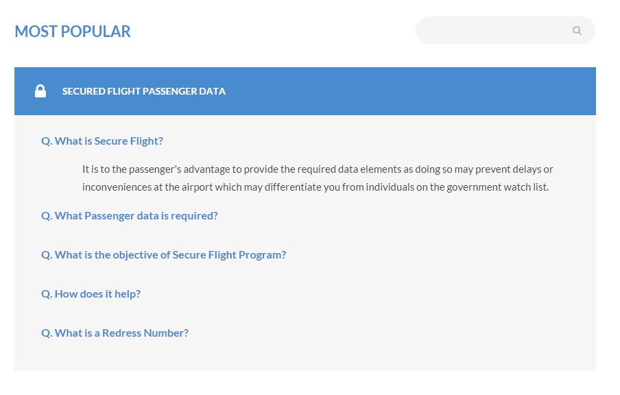
Faq thumbnails default
Markup:
|
1 2 3 4 5 6 7 8 9 10 |
<div class="ct-squareThumbnail"> <div class="ct-squareThumbnail-body"> <div class="ct-squareThumbnail-title"><span class="ct-fw-700 text-uppercase">secured flight passenger data</span><i class="fa fa-lock"></i></div> <div class="ct-squareThumbnail-content"> . . . </div> </div> </div> |
Faq thumbnails with special hover
Screenshot:
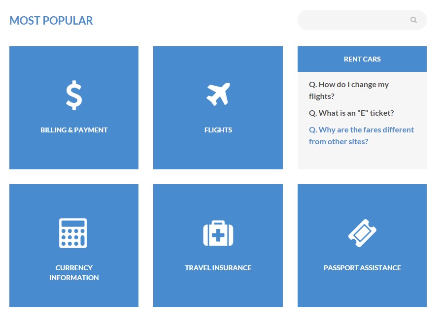
Faq thumbnails with hover
Markup:
|
1 2 3 4 5 6 7 8 9 10 11 12 13 14 15 16 |
<div class="ct-squareThumbnail ct-squareThumbnail--withHover ct-u-marginBottom30"> <div class="ct-squareThumbnail-body"> <div class="ct-squareThumbnail-title text-center"><span class="ct-fw-700">BILLING & PAYMENT</span></div> <div class="ct-squareThumbnail-content"> <ul class="list-unstyled"> <li><a href="#" class="ct-fw-700">Q. How do I change my flights?</a></li> <li><a href="#" class="ct-fw-700">Q. What is an "E" ticket?</a></li> <li><a href="#" class="ct-fw-700">Q. Why are the fares different from other sites?</a></li> </ul> </div> <div class="ct-squareThumbnail-button"><a href="#"></a></div> </div> <div class="ct-squareThumbnail-mask"><i class="fa ct-u-marginBottom30 fa-dollar"></i> <div class="ct-squareThumbnail-text"><span class="ct-fw-700">BILLING & PAYMENT</span></div> </div> </div> |
Was this article helpful ?
Dividers
Tours & Tickets HTML have three type of dividers:
Css styles:
.ct-divider–grey
.ct-divider–greyLight
.ct-divider–greyBig
Dividers grey type
Screenshot:

Divider – grey
Markup:
|
1 |
<div class="ct-divider--grey"></div> |
Dividers grey light type
Screenshot:

Divider – grey light
Markup:
|
1 |
<div class="ct-divider--greyLight"></div> |
Dividers grey big type
Screenshot:
Divider – grey big
Markup:
|
1 |
<div class="ct-divider--greyBig"></div> |
Was this article helpful ?
Google Map Plugin
Maps in Tours & Tickets HTML are created with our premium Map plugin. Here: link you will fin full plugins documentation.
Was this article helpful ?
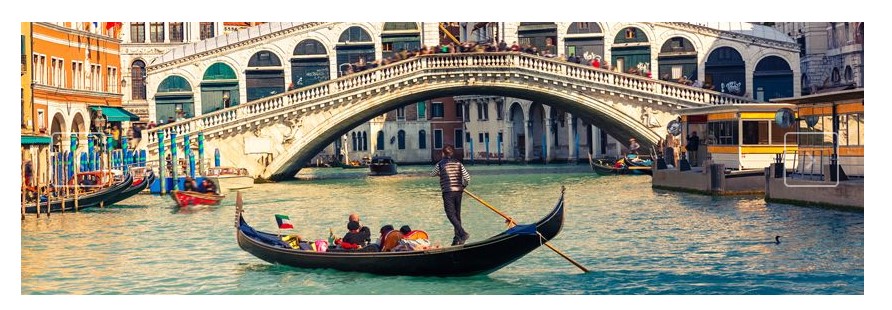
Images Containers
Css styles:
.ct-image-container–GiftCard
.ct-image–border
.ct-image–hover
.ct-image–steps
.ct-featuredItem
Gift card image containert
Screenshot:
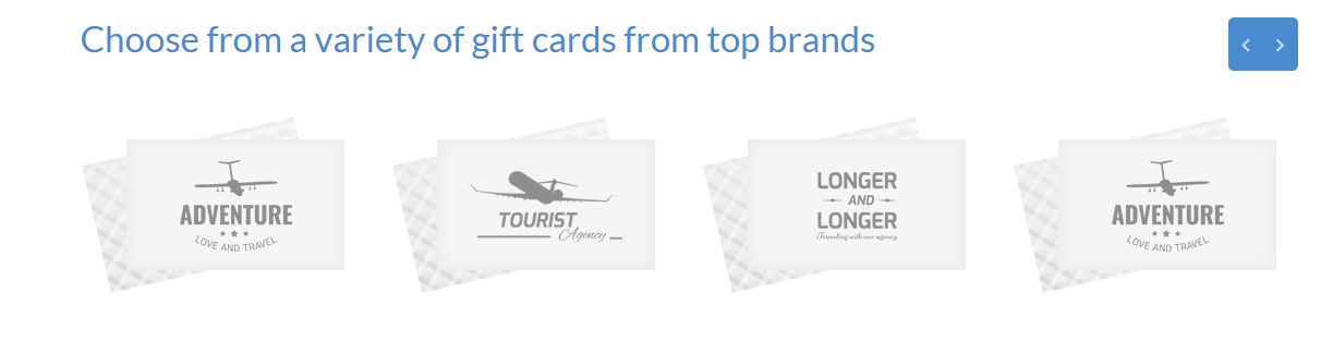
Image container – gift card
Markup:
|
1 2 3 |
<div class="ct-image-container--GiftCard"> <div class="ct-image-container--mainBody"><img src="assets/images/demo-content/gift-icon.png"></div> </div> |
Border image container
Screenshot:

Image container – border
Markup:
|
1 |
<div class="ct-image--border"><img src="assets/images/demo-content/random-image.jpg" alt="image"></div> |
Steps image containert
Screenshot:
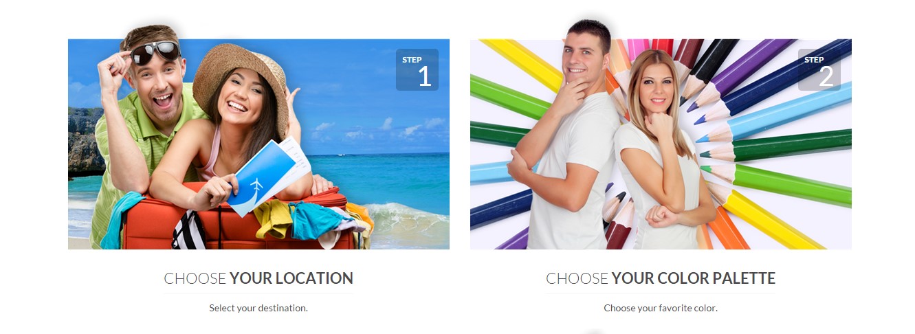
Image container – steps
Markup:
|
1 2 3 4 5 |
<div class="ct-image--steps text-center"> <div class="ct-image-container"><img src="assets/images/demo-content/wedding.png" alt=""> <div class="ct-stepsBox"><span class="text-left text-uppercase ct-fw-700">step</span><span class="text-right ct-number">1</span></div> </div><span class="h4 ct-fw-300 text-uppercase ct-image-title">choose <span class="ct-fw-600">your location</span></span><span>Select your destination.</span> </div> |
Featured items image containert with hover
Screenshot:
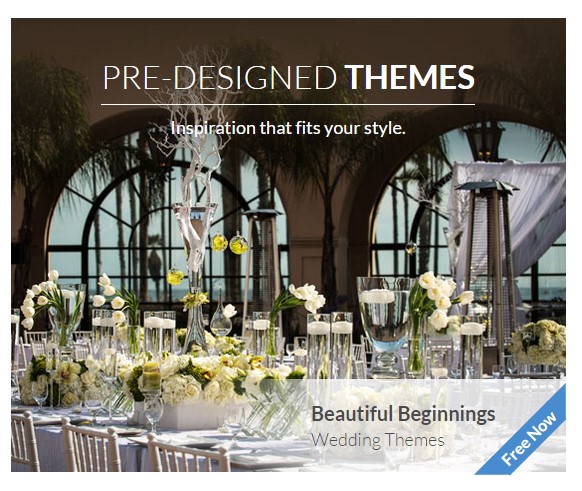
Image container – feature image
Markup:
|
1 2 3 4 5 6 7 8 9 10 11 12 |
<div class="ct-image--hover"><a href="#"><img src="assets/images/demo-content/package2.jpg" alt=""></a> <div class="ct-image-text"><span class="h3 ct-fw-300 text-uppercase">pre-designed <span class="ct-fw-600">themes</span></span> <div class="image-label">Inspiration that fits your style.</div> </div> <div class="ct-featuredItem"> <div class="ct-featuredItem-inner"><span class="ct-featuredItem-title ct-fw-700">Beautiful Beginnings</span><span class="ct-featuredItem-tag ct-fw-300">Wedding Themes</span> <div class="ct-strip"> <div class="ct-strip-inner">Free Now</div> </div> </div> </div> </div> |
Was this article helpful ?
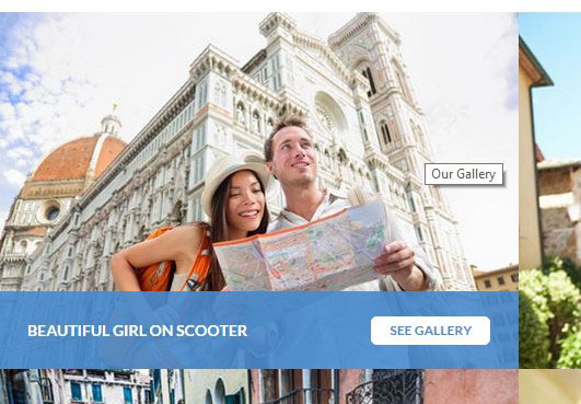
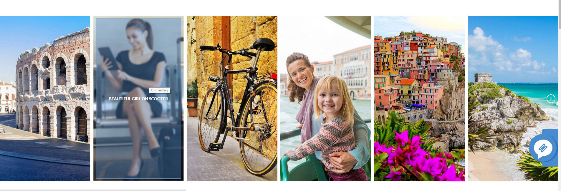
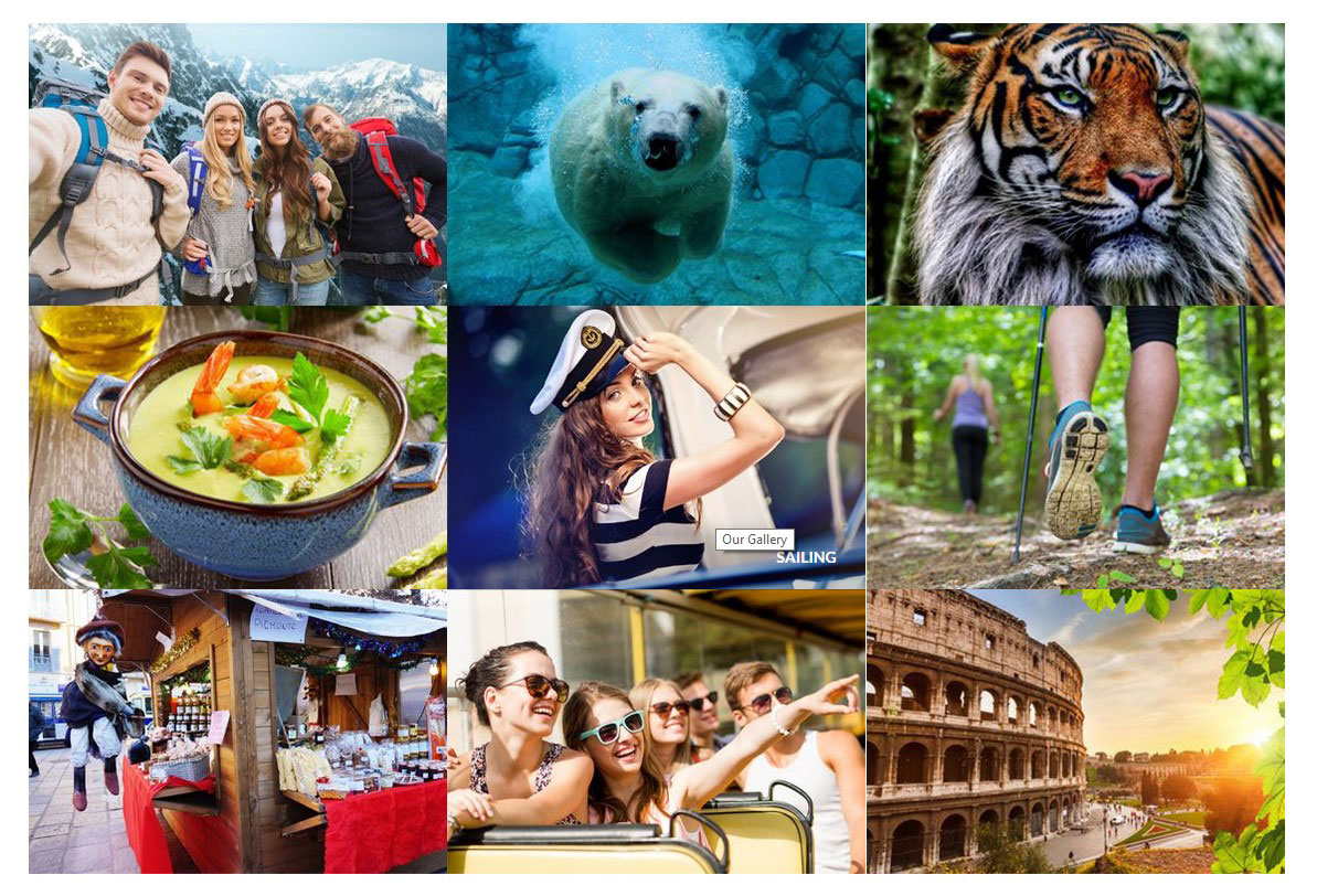
Gallery
Tours & Tickets HTML has four types of hover that you can use by just adding one of hover classes to your markup.
Css styles:
.ct-gallery-filters (isotope navigation)
.ct-gallery
.ct-gallery–col1
.ct-gallery–col2
.ct-gallery–col3
.ct-gallery–col4
.ct-gallery–col5
Different types of hover for .ct-gallery-item.
.ct-gallery-itemDefaultHover
.ct-gallery-itemShadowHover
.ct-gallery-itemShadowHoverLeft
.ct-gallery-itemHoverSquare
Markup (example):
|
1 2 3 4 5 6 7 8 9 10 |
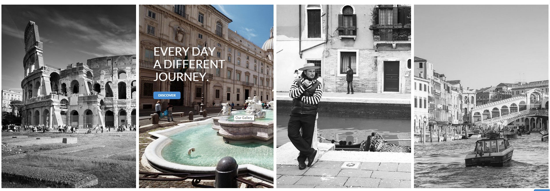
<div id="ct-gallery" class="ct-gallery ct-js-gallery ct-js-magnificPortfolioPopupGroup ct-gallery--col3 ct-u-marginBottom80"><a href="assets/images/demo-content/galleryImage9.jpg" title="Our Gallery" class="ct-js-magnificPopupImage ct-gallery-itemShadowHover"> <figure class="ct-gallery-item"><img src="assets/images/demo-content/galleryImage9.jpg" alt="gallery"> <figcaption class="ct-u-colorWhite text-uppercase"> <div class="ct-u-displayTableVertical"> <div class="ct-u-displayTableCell text-left"> <h6 class="ct-gallery-itemTitle ct-fw-700">EXPEDITIONS</h6> </div> </div> </figcaption> </figure></a> |
Gallery with default hover
Screenshot:
Gallery default hover
Gallery with hover square
Screenshot:
Gallery hover square
Gallery with shadow hover
Screenshot:
Gallery shadow hover
Gallery with shadow hover left
Screenshot:
Gallery shadow hover left
Was this article helpful ?
Buttons
Tours & Tickets HTML have several variations for button styles:
Css styles:
.btn-default
.btn-primary
.btn-primaryDark
.btn-grey
.btn-success
.btn-info
.btn-warning
.btn-danger
.btn-dark
.btn-link
.btn-transparent
.btn-bordered–dark
.btn-bordered–Light
Buttons screenshot:
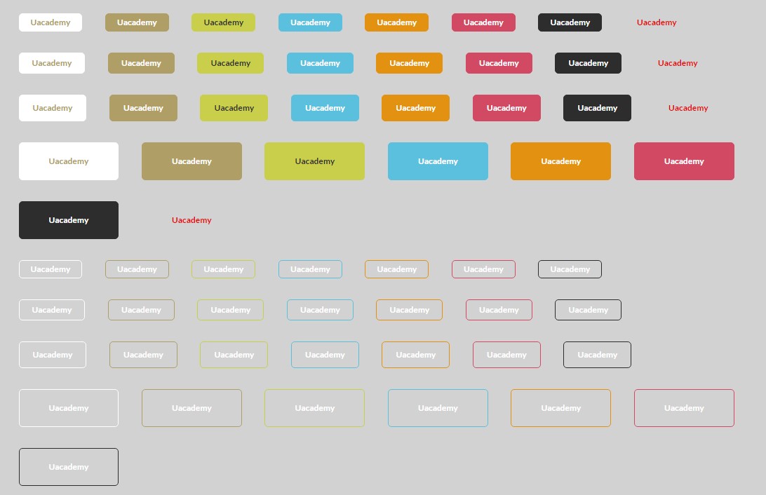
Buttons
Exampl of markup:
|
1 |
<a class="btn btn-lg btn-default btn-transparent text-uppercase">more details</a> |
Was this article helpful ?
Product Box
Tours & Tickets HTML have several types of product box
CSS styless:
.ct-productBox
.ct-productBox–style2
.ct-productBox–grey
.ct-productBox–moreInfo
.ct-productBox–moreInfo-inline
.ct-productBox–vertical
.ct-productBox–inline
.ct-productBox–verticalSmall
.ct-productBox–mini
Product box – default
Screenshot:
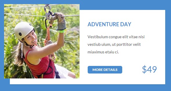
Markup:
|
1 2 3 4 5 6 7 8 9 10 11 12 13 14 |
<div class="ct-productBox ct-u-marginBottom50"> <div class="ct-productBox-image"> <div class="ct-productBox-imageContainer"><a href="#"><img src="assets/images/demo-content/product-image.jpg" alt="Product"></a></div> </div> <div class="ct-productBox-Description"> <div class="ct-productBox-DescriptionInner"><a href="#"> <h5 class="text-uppercase ct-u-marginBottom20 ct-fw-700">adventure day</h5></a> <p>Vestibulum congue elit vitae nisi vestiub ulum, ut porttitor velit miaximus etaiu ci.</p> </div> <div class="ct-productBox-Meta"><a href="#" class="btn btn-primary btn-xs text-uppercase ct-u-marginBoth10">more details</a><span class="ct-price">$49</span> <div class="clearfix"></div> </div> </div> </div> |
Product box – style 2
Screenshot:
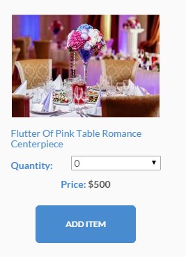
Product box – style 2
Markup:
|
1 2 3 4 5 6 7 8 9 10 11 12 13 14 15 16 17 18 |
<div class="ct-productBox ct-productBox--inline ct-productBox--style2 ct-u-marginBottom50"> <div class="ct-productBox-image"> <div class="ct-productBox-imageContainer"><a href="#"><img src="assets/images/demo-content/product-image14.jpg" alt="Product"></a></div> </div> <div class="ct-productBox-Description text-center"> <div class="ct-productBox-DescriptionInner"><a href="#"> <h6 class="text-capitalize ct-u-marginBottom10 ct-fw-400 text-left">Flutter of Pink Table Romance Centerpiece</h6></a><span class="ct-fw-600 ct-u-colorMotive ct-select-label">Quantity:</span> <select class="ct-select ct-js-selectize-slick ct-select--type2 ct-u-marginBottom10"> <option value="0">0</option> <option value="1">1</option> <option value="2">2</option> </select> <div class="clearfix"></div> <div class="ct-u-marginBottom20"><span class="ct-u-colorMotive ct-fw-700">Price: </span><span class="ct-fw-700 ct-js-price">$500</span></div> <button type="submit" class="btn btn-primary btn-lg">ADD ITEM</button> </div> </div> </div> |
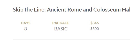
Product box – more info
Screenshot:

Product box – more info
Markup:
|
1 2 3 4 5 6 7 8 9 10 11 12 13 14 15 16 17 18 19 20 21 22 23 24 25 26 27 |
<div class="ct-productBox ct-productBox--moreInfo ct-productBox--moreInfo-inline"> <h4 class="h4 ct-u-marginBottom30">Skip the Line: Ancient Rome and Colosseum Half-Day Walking Tour</h4> <div class="ct-productBox-Description"> <div class="ct-productBox-image"> <div class="ct-productBox-imageContainer"><a href="#"><img src="assets/images/demo-content/trip.jpg" alt="Product"></a></div> </div> <div class="ct-productBox-Meta text-center"> <div class="ct-productBox-deliveryInformation"> <div class="ct-u-displayTableRow"> <div class="ct-productBox-MetaItem"><span class="ct-u-colorMotive ct-fw-700 text-uppercase">Days</span><span class="h5 text-uppercase ct-days">8</span></div> <div class="ct-productBox-MetaItem"><span class="ct-u-colorMotive ct-fw-700 text-uppercase">package</span><span class="h5 text-uppercase">BASIC</span></div> <div class="ct-productBox-MetaItem"> <div class="ct-productBox-price"><span class="ct-discount">$346</span><span class="ct-currency">$300</span></div> </div> </div> <div class="ct-u-displayTableRow"> <div class="ct-productBox-date ct-productBox-MetaItem"><span class="ct-u-colorMotive"><i class="fa fa-calendar"></i>Date</span><span class="ct-date">7/05/2015</span></div> <div class="ct-productBox-departure ct-productBox-MetaItem"><span class="ct-u-colorMotive"><i class="fa fa-plane"></i>Departure</span><span>AZ</span></div> <div class="ct-productBox-MetaItem"> <div data-rating="3" class="starrr"></div> </div> </div> </div><a href="#" class="btn btn-primary btn-sm text-uppercase ct-u-marginTop20">view trip</a> </div> </div> <p class="ct-u-marginTop20">Leave the crowds behind and head straight inside the Colosseum with your skip-the-line entrance ticket! In a group of no more than 25 people, explore the first...</p> </div> |
Product box – vertical product box
Screenshot:
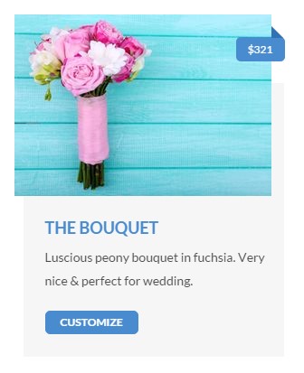
Product box – vertical
Markup:
|
1 2 3 4 5 6 7 8 9 10 11 12 13 14 |
<div class="ct-productBox ct-productBox--vertical ct-productBox--verticalSmall ct-productBox--grey"> <div class="ct-productBox-image"> <div class="ct-productBox-imageContainer"><a href="#"><img src="assets/images/demo-content/product-small.jpg" alt="Product"></a> <div class="ct-ribbon text-uppercase"><span>$321</span></div> </div> </div> <div class="ct-productBox-Description"> <div class="ct-productBox-DescriptionInner"><a href="#"> <h5 class="text-uppercase ct-u-marginBottom10 ct-fw-700">the bouquet</h5></a> <p class="ct-u-marginBottom10">Luscious peony bouquet in fuchsia. Very nice & perfect for wedding.</p> </div> <div class="ct-productBox-Meta"><a href="#" class="btn btn-primary btn-xs text-uppercase">customize</a></div> </div> </div> |
Product box – mini product box
Screenshot:

Product box – mini
Markup:
|
1 2 3 4 5 6 7 8 9 10 11 12 13 |
<div class="ct-productBox ct-productBox--mini"> <div class="ct-productBox-image"><img src="assets/images/demo-content/product-mini.jpg" alt="" class="ct-u-marginBottom20"> <div class="ct-productBox-price"> <div class="ct-productBox-iconBackground"><span class="ct-price"><span class="ct-currency">$</span>45</span></div> </div> </div> <div class="ct-productBox-Description"> <div class="ct-productBox-DescriptionInner"><a href="#"> <h5 class="text-uppercase ct-fw-700">The Grand Package</h5></a> <p class="ct-u-marginBottom10 ct-fw-700">Starting from $8 per person</p><a href="#" class="btn btn-primary btn-xs text-uppercase">book now</a> </div> </div> </div> |
Was this article helpful ?
Person Box
Tours & Tickets HTML has three versions of person box.
CSS classes:
.ct-personBox
.ct-personBox–withHover
.ct-personBox–titleTop
Default person box
Screenshot:

Person box default
Markup:
|
1 2 3 4 5 6 |
<div class="ct-personBox"> <div class="ct-personBox-image"><img src="assets/images/demo-content/personBox.jpg" alt="person"></div> <div class="ct-personBox-description"> <h5 class="ct-personBox-title">Kareb Dhonson</h5><span class="ct-personBox-meta">The ceo</span> </div> </div> |
Tite top person box
Screenshot:

Person box title top
Markup:
|
1 2 3 4 5 6 7 |
<div class="ct-personBox ct-personBox--titleTop"> <div class="ct-personBox-image"><img src="assets/images/demo-content/personBox-testimonials.jpg" alt="person"></div> <div class="ct-personBox-description"> <h5 class="ct-personBox-title">gabrielle memphis</h5> <p>My friends couldn't believe the price. The hotels were top of the line, and our guide was great. </p> </div> </div> |
Person box with hover
Screenshot:
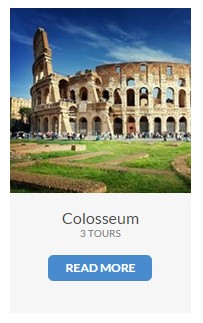
Person box with hover
Markup:
|
1 2 3 4 5 6 |
<div class="ct-personBox ct-personBox--withHover"> <div class="ct-personBox-image"><img src="assets/images/demo-content/todo1.jpg" alt="person"></div> <div class="ct-personBox-description"> <h5 class="ct-personBox-title">Colosseum</h5><span class="ct-personBox-meta">3 tours</span><a href="#" class="btn btn-primary btn-xs text-uppercase">read more</a> </div> </div> |
Was this article helpful ?
Media box
Tours & Tickets HTML has four types of media boxes that you can use by just adding one of .ct-mediaBox element to your markup.
CSS styles:
.ct-mediaBox
add this to .ct-mediaBox element for different look:
.ct-mediaBox–inline
.ct-mediaBox–grey
.ct-mediaBox–right
.ct-mediaBox–inlineType2
Markup:
|
1 2 3 4 5 6 7 |
<div class="ct-mediaBox text-center ct-u-marginBottom50"> <div class="ct-mediaBox-mediaContainer"><img src="assets/images/demo-content/mediaBox2.jpg" alt="media"></div> <div class="ct-mediaBox-description"> <h4 class="ct-u-marginBottom20 ct-u-colorMotive text-capitalize">Local Leader</h4> <p>All of our Basic-style adventures are led by a local leader whose specialty is getting you from A to B, showing you the sights and letting you in on the secrets that make their region tick.</p> </div> </div> |
Media box default
Screenshots:
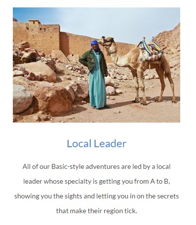
Media box default
Media box inline type 2 right

Media box inline type 2 + right
Media box inline grey
Media box inline + grey
Was this article helpful ?
Info Box
Css styles:
.ct-infoBox
.ct-infoBox–vertical
Info Box default
Screenshot:
Info box default
Markup:
|
1 2 3 4 5 6 7 |
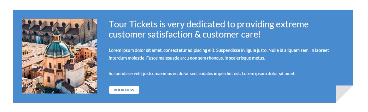
<div class="ct-infoBox ct-u-marginBottom70"> <div class="ct-infoBox-image"><img src="assets/images/demo-content/infoBox.jpg" alt="image"></div> <div class="ct-infoBox-description"> <h3 class="ct-infoBox-title">Tour Tickets is very dedicated to providing extreme customer satisfaction & customer care!</h3> <p>Lorem ipsum dolor sit amet, consectetur adipiscing elit. Suspendisse in ligula justo. Nulla id aliquam sem. In laoreet interdum molestie. Fusce malesuada arcu non sem rhoncus, in scelerisque metus.<br><br>Suspendisse velit justo, maximus eu dolor sed, sodales imperdiet est. Lorem ipsum dolor sit amet.</p><a href="#" class="btn btn-default btn-xs text-uppercase">book now</a> </div> </div> |
Info Box vertical
Screenshot:
Info box vertical
Markup:
|
1 2 3 4 5 6 7 8 9 10 11 12 13 |
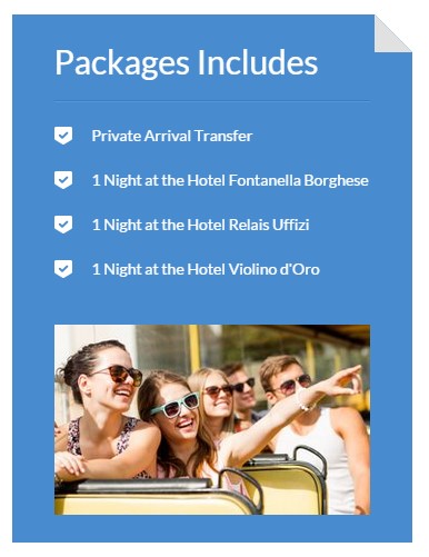
<div class="ct-infoBox ct-infoBox--vertical ct-u-marginBottom70"> <div class="ct-infoBox-description"> <h3 class="ct-infoBox-title">Packages Includes</h3> <div class="ct-divider--doubleBorder"></div> <ul class="list-unstyled ct-list--WithIcons ct-u-marginBottom30"> <li><img src="assets/images/icon-check2.png" alt="icon">Private Arrival Transfer</li> <li><img src="assets/images/icon-check2.png" alt="icon">1 Night at the Hotel Fontanella Borghese</li> <li><img src="assets/images/icon-check2.png" alt="icon">1 Night at the Hotel Relais Uffizi</li> <li><img src="assets/images/icon-check2.png" alt="icon">1 Night at the Hotel Violino d'Oro</li> </ul> </div> <div class="ct-infoBox-image"><img src="assets/images/demo-content/infoBox2.jpg" alt="image"></div> </div> |
Was this article helpful ?
Icon Box
Css styles:
.ct-iconBox
.ct-iconBox–withImage
.ct-iconBox–big
Icon Box with image
Screenshot:

Icon box with image
Markup:
|
1 2 3 4 5 6 7 |
<div class="ct-iconBox ct-u-marginBottom20 ct-iconBox--withImage"><a href="#"> <div class="ct-iconBox-icon"><img src="assets/images/demo-content/icon.png" alt="icon"> </div> <div class="ct-iconBox-description"> <h5 class="text-uppercase ct-fw-700 ct-u-colorMotive ct-u-marginBottom20">see & do</h5> <p>Explore the perfect combination of city buzz & peaceful nature</p> </div></a></div> |
Icon Box big
Screenshot:

Icon box – big
Markup:
|
1 2 3 4 5 6 7 |
<div class="ct-iconBox ct-u-marginBottom20 ct-iconBox--big"><a href="#"> <div class="ct-iconBox-icon"><i class="fa fa-plane"></i> </div> <div class="ct-iconBox-description"> <h6 class="text-uppercase ct-fw-700 ct-u-marginBottom10">see & do</h6> <p>Explore the perfect combination of city buzz & peaceful nature</p> </div></a></div> |
Was this article helpful ?
Contact Form
Template comes with ready to use:
- Contact Form
All needed files are in /form directory.
Remember to includeon page.
To configure form just edit form/config.php and change e-mails to your own :
|
1 2 |
$to = "mail@example.com"; $from = "mail@example.com"; |
That’s it!
Screenshot:
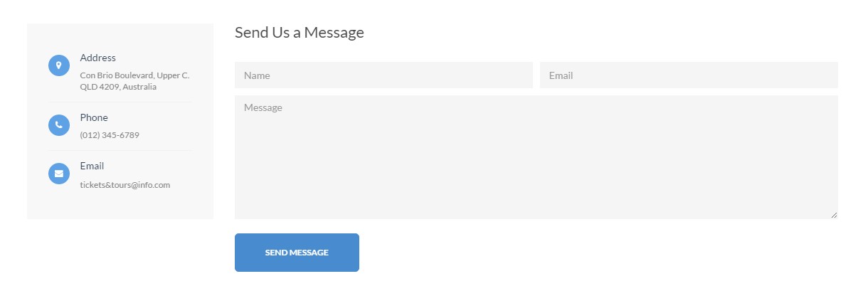
Contact form
Markup:
|
1 2 3 4 5 6 7 8 9 10 11 12 13 14 |
<form action="assets/form/send.php" method="POST" class="validateIt ct-u-marginBottom30 ct-form ct-form-grey"> <div class="row"> <div class="col-md-6"> <input id="contact_name" data-error-message="Name" placeholder="Name" type="text" required="" name="field[]" class="form-control input--withBorder ct-u-marginBottom10 input-focusMotive"> <label for="contact_name" class="sr-only"></label> </div> <div class="col-md-6"> <input id="contact_email" data-error-message="Email" placeholder="Email" type="email" required="" name="field[]" class="form-control input--withBorder ct-u-marginBottom10 input-focusMotive"> <label for="contact_email" class="sr-only"></label> </div> </div> <textarea id="contact_message" data-error-message="Message is required" placeholder="Message" rows="8" required="" name="field[]" title="Message" class="form-control input--withBorder ct-u-marginBottom20 input-focusMotive ct-u-marginBottom20"></textarea> <button class="btn btn-primary btn-lg text-uppercase">send message</button> </form> |
Was this article helpful ?
Sources & Credits
The following sources and files have been used to build up this theme
Twitter Bootstrap – http://twitter.github.com/bootstrap/
jQuery – http://www.jquery.com
Was this article helpful ?