

Actly – Responsive HTML5 Template
Thank you for purchasing this theme. If you have any questions that are beyond the scope of this help file, please feel free to start new ticket on this page. Thanks so much!
Scope of free support
We can help you with:
- Responding to questions or problems regarding the item and its features
- Fixing any discovered item’s bugs
- Providing updates to ensure compatibility with new software versions
Was this article helpful ?
HTML Structure
This theme is built upon bootstrap framework and is fully responsive. It adapts to window resolution and looks good on all devices including iPad and iPhone.
See for yourself (resize your browser).
If you would like to read more
about bootstrap framework click here :
Grid System and Single row structure
The default Bootstrap grid system utilizes 12 columns. It’s responsive grid and adapts to viewport. Below 767px viewports, the columns become fluid and stack vertically. The fluid grid system uses percents instead of pixels for column widths. Each row always include 12 columns (for example col-md-8 + col-md-4 = col-md-12).
Bootstrap documentation: here
Basic grid HTML:
|
1 2 3 4 5 6 7 8 9 10 11 12 13 14 15 16 17 18 19 20 21 22 23 24 25 26 27 |
<div class="row"> <div class="col-md-1">.col-md-1</div> <div class="col-md-1">.col-md-1</div> <div class="col-md-1">.col-md-1</div> <div class="col-md-1">.col-md-1</div> <div class="col-md-1">.col-md-1</div> <div class="col-md-1">.col-md-1</div> <div class="col-md-1">.col-md-1</div> <div class="col-md-1">.col-md-1</div> <div class="col-md-1">.col-md-1</div> <div class="col-md-1">.col-md-1</div> <div class="col-md-1">.col-md-1</div> <div class="col-md-1">.col-md-1</div> </div> <div class="row"> <div class="col-md-8">.col-md-8</div> <div class="col-md-4">.col-md-4</div> </div> <div class="row"> <div class="col-md-4">.col-md-4</div> <div class="col-md-4">.col-md-4</div> <div class="col-md-4">.col-md-4</div> </div> <div class="row"> <div class="col-md-6">.col-md-6</div> <div class="col-md-6">.col-md-6</div> </div> |
Page structure
Below you will find default page structure :
|
1 2 3 4 5 6 7 8 9 10 11 12 13 14 15 16 17 18 19 20 21 22 23 24 25 26 27 28 29 30 31 32 33 34 35 36 |
<!DOCTYPE html> <html> <head> [css] </head> <body> [header] [main menu] <!-- main container --> <div id="wrapper"> [component 1] <!-- fullwidth element --> </div> [fullwidth parallax] <div class="container"> <!-- / fullwidth element --> [component 6] </div> <!-- / main container --> [footer] [javascripts] </body> </html> |
Was this article helpful ?
CSS files and structure
If you would like to edit the color, font, or style of any elements, you would do the following:
|
1 |
#primaryContent a {color: #someColor;} |
If you find that your new style is not overriding, it is most likely because of a specificity problem. Scroll down in your CSS file and make sure that there isn’t a similar style that has more weight.
I.E.
|
1 |
#wrap #primaryContent a {color: #someColor;} |
So, to ensure that your new styles are applied, make sure that they carry enough “weight” and that there isn’t a style lower in the CSS file that is being applied after yours.
Colors
The theme includes a css file wich you can use to edit the colors.
You just need to add the corresponding CSS file to the head of the page like this:
|
1 2 3 4 5 |
<head> (..) <link rel="stylesheet" type="text/css" href="css/motive.css"> (..) </head> |
Main Menu structure
Just change brand name, upload your logo to images/content/ folder and you’re ready to go!
|
1 2 3 4 5 6 7 8 9 10 11 12 13 14 15 16 17 18 19 20 21 22 23 24 25 26 27 28 29 30 31 32 33 |
<nav class="navbar ct-navbar navbar-default yamm ct-navbar--fadeIn" role="navigation"> <div class="container"> <div class="ct-navbarContainer"> <div class="navbar-header"> <a class="navbar-brand" href="index.html"><img id="ct-js-logo" src="assets/images/demo-content/logo.png" alt="FISHtank"></a> <!-- + --> </div> <ul class="nav navbar-nav"> <li role="presentation" class="dropdown"> <a class="dropdown-toggle" href="about.html" role="button" aria-expanded="true"> Home <span class="caret"></span> </a> <ul class="dropdown-menu"> <li> <div class="yamm-content"> </div> </li> </ul> </li> <li><a href="contact.html">Contact Us</a></li> </ul> <ul class="nav navbar-nav yamm ct-navbar--right"> <li><a href="login.html">My Account</a></li> </ul> </div> </div> </nav> |
In order to create mega menus read the documentation here:
Icons
We’ve included 360+ font icons.
Awesome Icons – http://fontawesome.io/icons/
HTML markup:
|
1 2 |
<!-- Awesome Icons --> <i class="fa fa-cog"></i> |
CSS Files & Structure
We’ve included 2 files.
bootstrap.css contains Bootstrap 3 Library.
style.css file contains general styles.
CSS Files & Structure
1. variables
2. mixins
3. datepicker
4. fonts
5. sections
6. animate
7. utilities
8. motive
9. typography
10. menu
11. buttons
12. lists
13. iconbox
14. icon
15. skills
16. blockquote
17. pricing
18. table
19. cta
10. tooltip
21. accordion
22. tabs
23. footer
24. copyright
25. form
26. breadcrumbs
27. flexslider
28. magnificpopup
29. slider
30. testimonial
31. courselist
32. coursesgallery
33. dropdown
34. sidebarcolumn
35. badge
36. choiceviev
37. graph
38. team
39. newsletter
40. singlecourse
41. headersection
42. pagination
43. mediasections
44. memberpage
45. mainparallax
46. tweet
47. videowachers
48. teacherbox
49. blogcontent
50. singlearticle
51. comments
52. program
53. contactpage
54. loginpage
55. socialicons
56. videoarchive
57. portfolio
58. maps
59. intro-effects
60. snap
Utilities
Utility classes are low-level structural and positional traits. Utilities can be applied directly to any element, multiple utilities can be used tohether and utilities can be used alongsie component classes.
Utilities are intended for frequently used CSS properties and patterns, like: floats, containing floats, vertical alignemnt, text tryncation. Relying on utilities can help to reduce repetition and provide consistend implementations.
- Actly uses utilities for the following categories:
- Typography
- Display Types
- Paddings
- Margins
- Colors
- Font Colors
- Borders
- Backgrounds Colors
- Font Sizes
- Triangles
Was this article helpful ?
Media Sections
Actly supports media sections with Parallax, KenBurns effect and videos.
Parallax Section
|
1 2 3 4 5 6 7 8 9 10 11 12 13 14 15 16 17 18 19 20 21 22 23 24 25 26 27 28 29 30 31 |
<section class="ct-mediaSection ct-u-paddingBoth70" data-stellar-background-ratio="0.3" data-height="650" data-type="parallax" data-bg-image="./assets/images/demo-content/bigImage1.jpg" data-bg-image-mobile="./assets/images/demo-content/bigImage1-mobile.jpg" style="min-height: 650px; height: 650px; background-image: url(http://orlando.html.themeforest.createit.pl/light/assets/images/demo-content/bigImage1.jpg); background-position: 50% 50%;"> <div class="ct-mediaSection-inner"> <div class="container"> <div class="row"> <div class="col-sm-4"> <header class="ct-pageSectionHeader"> <h3 class="text-lowercase ct-fw-600"> Parallax <small class="ct-fw-700 text-uppercase">Yes, we are the absolute best in the business </small> </h3> </header> </div> <div class="col-sm-8"> <p> Donec justo mauris, sagittis sed vulputate ut, commodo dapibus massa. Class aptent taciti sociosqu ad litora torquent per conubia nostra, per inceptos himenaeos. Cras ut mi lacus. Morbi accumsan mauris ac posuere vehicula. Donec bibendum tellus rutrum turpis varius dictum. Maecenas tristique arcu sed rhoncus laoreet. Praesent eget fermentum nisi. Donec ac velit aliquet, bibendum sem in, convallis est. Phasellus sodales ultricies cursus. Vivamus leo nunc, pretium vitae dictum a, mollis ut sapien. Cum sociis natoque penatibus et magnis dis parturient montes, nascetur ridiculus mus. Donec porttitor tristique sem, dictum vehicula nisi accumsan eget. Pellentesque habitant morbi tristique senectus et netus. </p> <a href="contact.html" class="btn btn-primary ct-btn--rounded text-uppercase">Contact Us</a> <a href="features-p-tables.html" class="btn ct-btn--black ct-btn--rounded text-uppercase">Pricing Options</a> </div> </div> </div> </div> </section> |
We are using stellar.js for the parallax effect. Check their documentation to check which attributes you can use in each parallax section.
http://markdalgleish.com/projects/stellar.js/docs/
Our custom data-attributes for the parallax section are:
- data-height: Define the minimun height for the sections
- data-type: Type of Media Section (parallax/kenburns/video)
- data-image: Background image for the section.
- data-image-mobile: Fallback image (Should be smaller than the original) that is loaded for small devices. This will help you with the bandwidth, you’re welcome! 🙂
Ken Burns Sections
|
1 2 3 4 5 6 7 8 9 10 11 12 13 14 15 16 17 18 19 20 21 22 23 24 25 26 27 28 29 30 31 32 33 34 35 36 37 |
<section class="ct-mediaSection ct-u-paddingBoth70 ct-u-colorWhite" data-height="650" data-type="kenburns" data-bg-image-mobile="./assets/images/demo-content/bigImage5-mobile.jpg" style="min-height: 650px; height: 650px;"> <div class="ct-mediaSection-kenburnsImageContainer"> <img src="./assets/images/demo-content/bigImage5.jpg" alt="demo image" class="fx"> <img src="./assets/images/demo-content/bigImage4.jpg" alt="demo image" class=""> <img src="./assets/images/demo-content/bigImage5.jpg" alt="demo image" class="fx"> </div> <div class="ct-mediaSection-inner"> <div class="container"> <div class="row"> <div class="col-sm-4"> <header class="ct-pageSectionHeader"> <h3 class="text-lowercase ct-fw-600 ct-u-colorWhite"> Ken Burns <small class="ct-fw-700 text-uppercase ct-u-colorWhite">Yes, we are the absolute best in the business </small> </h3> </header> </div> <div class="col-sm-8"> <p> Donec justo mauris, sagittis sed vulputate ut, commodo dapibus massa. Class aptent taciti sociosqu ad litora torquent per conubia nostra, per inceptos himenaeos. Cras ut mi lacus. Morbi accumsan mauris ac posuere vehicula. Donec bibendum tellus rutrum turpis varius dictum. Maecenas tristique arcu sed rhoncus laoreet. Praesent eget fermentum nisi. Donec ac velit aliquet, bibendum sem in, convallis est. Phasellus sodales ultricies cursus. Vivamus leo nunc, pretium vitae dictum a, mollis ut sapien. Cum sociis natoque penatibus et magnis dis parturient montes, nascetur ridiculus mus. Donec porttitor tristique sem, dictum vehicula nisi accumsan eget. Pellentesque habitant morbi tristique senectus et netus. </p> <a href="contact.html" class="btn btn-primary ct-btn--rounded text-uppercase">Contact Us</a> <a href="features-p-tables.html" class="btn btn-default ct-btn--rounded text-uppercase">Pricing Options</a> </div> </div> </div> </div> </section> |
KenBurns section supports one or more images that you should add inside .media-section-image-container
Our custom data-attributes for the kenburns section are:
- data-height: Define the minimun height for the sections
- data-type: Type of Media Section (parallax/kenburns/video)
- data-image-mobile: Fallback image (Should be smaller than the original) that is loaded for small devices. Kenburns it too much for ipads, iphones and so on, so we allow you to fallback to a normal image section. This way your browser won’t crash 🙂
Video Sections
|
1 2 3 4 5 6 7 8 9 10 11 12 13 14 15 16 17 18 19 20 21 22 23 24 25 26 27 28 29 30 31 32 33 34 35 36 37 38 39 40 41 42 43 44 |
<section class="ct-mediaSection ct-u-paddingBoth70 ct-u-colorWhite" data-height="700" data-type="video" data-bg-image-mobile="./assets/images/demo-content/bigImage3-mobile.jpg" style="min-height: 700px; height: 700px;"> <div class="ct-mediaSection-video embed-responsive embed-responsive-16by9"> <!-- in order for video to be muted you must add &api=1&player_id=vimeoplayer1 to the end of the video src If you have more than one video, make sure that player_id and id have dif names on each video --> <video id="video1" muted="" loop="" autoplay="autoplay" preload="auto"> <source src="http://orlando.html.themeforest.createit.pl/light/assets/videos/loopbookeh.mp4" type="video/mp4"> <source src="http://orlando.html.themeforest.createit.pl/light/assets/videos/loopbookeh.webm" type="video/webm"> </video> </div> <div class="ct-u-displayTable" style="height: 700px;"> <div class="ct-mediaSection-inner"> <div class="container"> <div class="row"> <div class="col-sm-4"> <header class="ct-pageSectionHeader"> <h3 class="text-lowercase ct-fw-600 ct-u-colorWhite"> Video <small class="ct-fw-700 text-uppercase ct-u-colorWhite">Yes, we are the absolute best in the business </small> </h3> </header> </div> <div class="col-sm-8"> <p> Donec justo mauris, sagittis sed vulputate ut, commodo dapibus massa. Class aptent taciti sociosqu ad litora torquent per conubia nostra, per inceptos himenaeos. Cras ut mi lacus. Morbi accumsan mauris ac posuere vehicula. Donec bibendum tellus rutrum turpis varius dictum. Maecenas tristique arcu sed rhoncus laoreet. Praesent eget fermentum nisi. Donec ac velit aliquet, bibendum sem in, convallis est. Phasellus sodales ultricies cursus. Vivamus leo nunc, pretium vitae dictum a, mollis ut sapien. Cum sociis natoque penatibus et magnis dis parturient montes, nascetur ridiculus mus. Donec porttitor tristique sem, dictum vehicula nisi accumsan eget. Pellentesque habitant morbi tristique senectus et netus. </p> <a href="contact.html" class="btn btn-primary ct-btn--rounded text-uppercase">Contact Us</a> <a href="features-p-tables.html" class="btn btn-default ct-btn--rounded text-uppercase">Pricing Options</a> </div> </div> </div> </div> </div> </section> |
We recommend you to use html5 video instead of vimeo, since in some specific browsers the sound won’t be muted.
Our custom data-attributes for the video section are:
- data-height: Define the minimun height for the sections
- data-type: Type of Media Section (parallax/kenburns/video)
- data-image-mobile: Fallback image (Should be smaller than the original) that is loaded for small devices. Phones don’t autoplay video, so we just replace it for an image
Was this article helpful ?
Buttons
Buttons
There are 6 types of section buttons – each for every template style, but feel free to use them wherever you want.
To add button, use the following HTML markup:
|
1 |
<a href="#" class="btn btn-primary btn-sm btn-center btn-block ct-btn-motive">Button</a> |
variable color types can be create with the following CSS classes:
- btn-link
- btn-primary
- btn-default
- btn-icon-right
- btn-block active
- btn-block btn-disabled

Buttons
Was this article helpful ?
Progress Bars
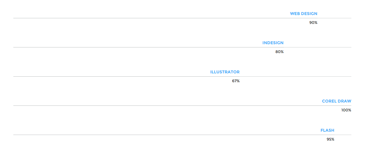
To create progress bar use the following HTML markup:
|
1 2 3 4 5 |
<div class="progress"> <div class="progress-bar animating" role="progressbar" data-percentage="90" aria-valuenow="90" aria-valuemin="0" aria-valuemax="100"> <span>Web Design <strong>90%</strong></span> </div> </div> |
Progress Bars
Also don’t forget to include the javascript code:
|
1 2 3 4 5 6 7 8 9 10 11 12 13 14 15 16 17 18 19 20 21 22 23 24 25 26 27 28 29 30 31 32 33 34 35 36 37 38 |
(function ($) { "use strict"; $(document).ready(function(){ // Progress Bar // ------------------------------------------------------------------------------------------------------------------------------------------------------------------------------------------- //$('.progress-bar').progressbar(); if (jQuery().appear && jQuery("body").hasClass("cssAnimate")) { jQuery('.progress').appear(function () { var $this = jQuery(this); $this.each(function () { var $innerbar = $this.find(".progress-bar"); var percentage = $innerbar.attr("data-percentage"); $innerbar.addClass("animating").css("width", percentage + "%"); $innerbar.on('transitionend webkitTransitionEnd oTransitionEnd otransitionend MSTransitionEnd', function () { $innerbar.find(".pull-right").fadeIn(900); }); }); }, {accY: -100}); } else { jQuery('.progress').each(function () { var $this = jQuery(this); var $innerbar = $this.find(".progress-bar"); var percentage = $innerbar.attr("data-percentage"); $innerbar.addClass("animating").css("width", percentage + "%"); $innerbar.on('transitionend webkitTransitionEnd oTransitionEnd otransitionend MSTransitionEnd', function () { $innerbar.find(".pull-right").fadeIn(900); }); }); } }); // /document.ready })(jQuery); |
Was this article helpful ?
Progress Icons
You can present progress made also with Progress Icons
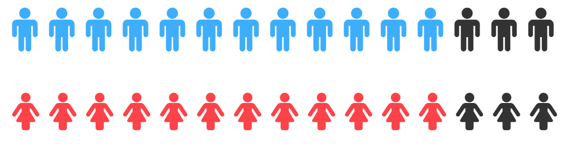
Progress Icons
You can use them with the following HTML markup:
|
1 2 3 4 5 6 7 8 |
<div class="ct-u-paddingBottom80"> <div class="progress-icons" data-font-size="90" data-icon-color="#3eaefa" data-active="12" data-total="15" data-icon="fa-male" data-delay="200"></div> </div> <div class="ct-u-paddingBottom80"> <div class="progress-icons" data-font-size="77" data-icon-color="#fc4349" data-active="12" data-total="15" data-icon="fa-female" data-delay="250"></div> </div> |
Also remember to include required javascript:
|
1 2 3 4 5 6 7 8 9 10 11 12 13 14 15 16 17 18 19 20 21 22 23 24 25 26 27 28 29 30 31 32 33 34 35 36 37 38 39 40 41 42 43 44 45 46 47 48 49 |
(function ($) { "use strict"; $(document).ready(function () { // Progress Icons // ------------------------------------------------------------------------------------------------------------------------------------------------------------------------------------------- $('.progress-icons').each(function () { var $this = $(this); var $total = $this.attr("data-total"); var $icon = $this.attr("data-icon"); var htmldata = ""; $this.css("font-size", ($this.attr("data-font-size") + "px")); var i; for (i = 0; i < $total; i++) { htmldata += '<i class="fa ' + $icon + '"></i> '; } $this.html(htmldata); if (($().appear) && ($("body").hasClass("cssAnimate"))) { $('.progress-icons').appear(function () { var $this = $(this); var $active = $this.attr("data-active"); var $icons = $this.find('i:lt(' + $active + ')'); var $delay = parseInt(validatedata($this.attr("data-delay"), 20)) var delay = $delay; for (i = 0; i < $icons.length; i++) { setTimeout((function (i) { return function () { i.style.color = $this.attr("data-icon-color"); } })($icons[i]), delay); delay += $delay; } }, {accY: -100}); } else { $this.each(function () { var $active = $this.attr("data-active"); var $icons = $this.find('i:lt(' + $active + ')'); $icons.css('color', $this.attr("data-icon-color")) }); } }) }) }(jQuery)); |
Was this article helpful ?
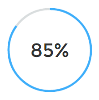
Charts
In Actly you can create a chart with the simple HTML markup:
|
1 2 |
<canvas width="130" height="130" class="ct-js-pieChart" data-ct-percentage="85" data-ct-middleSpace="95" data-ct-secondColor="#d9ddde" data-ct-firstColor="#3eaefa"></canvas> <span class="ct-graphBox-graphPercentage">85%</span> |
And the following javascript snippet:
|
1 2 3 4 5 6 7 8 9 10 11 12 13 14 15 16 17 18 19 20 21 22 23 24 25 26 27 28 29 30 31 32 |
(function ($) { "use strict"; $(window).load(function () { /* ==================== */ /* ==== PIE CHARTS ==== */ $('.ct-js-pieChart').each(function () { var $this = $(this); var $color = validatedata($(this).attr('data-ct-firstColor'), "#2b8be9"); var $color2 = validatedata($(this).attr('data-ct-secondColor'), "#eeeeee"); var $cutout = validatedata($(this).attr('data-ct-middleSpace'), 90); var $stroke = validatedata($(this).attr('data-ct-showStroke'), false); var options = { responsive: true, percentageInnerCutout: $cutout, segmentShowStroke: $stroke, showTooltips: false } var doughnutData = [{ value: parseInt($this.attr('data-ct-percentage')), color: $color, label: false }, { value: parseInt(100 - $this.attr('data-ct-percentage')), color: $color2 }]; if (($().appear) && ($("body").hasClass("cssAnimate"))) { $('.ct-js-pieChart').appear(function () { var ctx = $this[0].getContext("2d"); window.myDoughnut = new Chart(ctx).Doughnut(doughnutData, options); }); } else { var ctx = $this[0].getContext("2d"); window.myDoughnut = new Chart(ctx).Doughnut(doughnutData, options); } }) }) })(jQuery); |
Chart
Was this article helpful ?
Socials
You can choose from two types and seven colors of Socials:
- ct-socialIcons–circle
- ct-socialIcons–circlelg
- ct-socialIcons–bgMotive
- ct-socialIcons–fgrey
- ct-socialIcons–fwhite
- ct-socialIcons–fgreySm
- ct-socialIcons-bgDarkBlue
- ct-socialIcons-bgRed
- ct-socialIcons-bgBlue
Was this article helpful ?
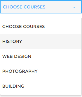
Select
Create nice selects with the following HTML markup:
|
1 2 3 4 5 6 7 8 9 |
<div class="form-group"> <select id="s1" class="form-control text-uppercase "> <option>Choose courses</option> <option>History</option> <option>Web Design</option> <option>Photography</option> <option>Building</option> </select> </div> |
And javascript code:
|
1 |
$('#s1').select2(); |
Select
Was this article helpful ?
Google Map
With Actly you can easily create Google Map:
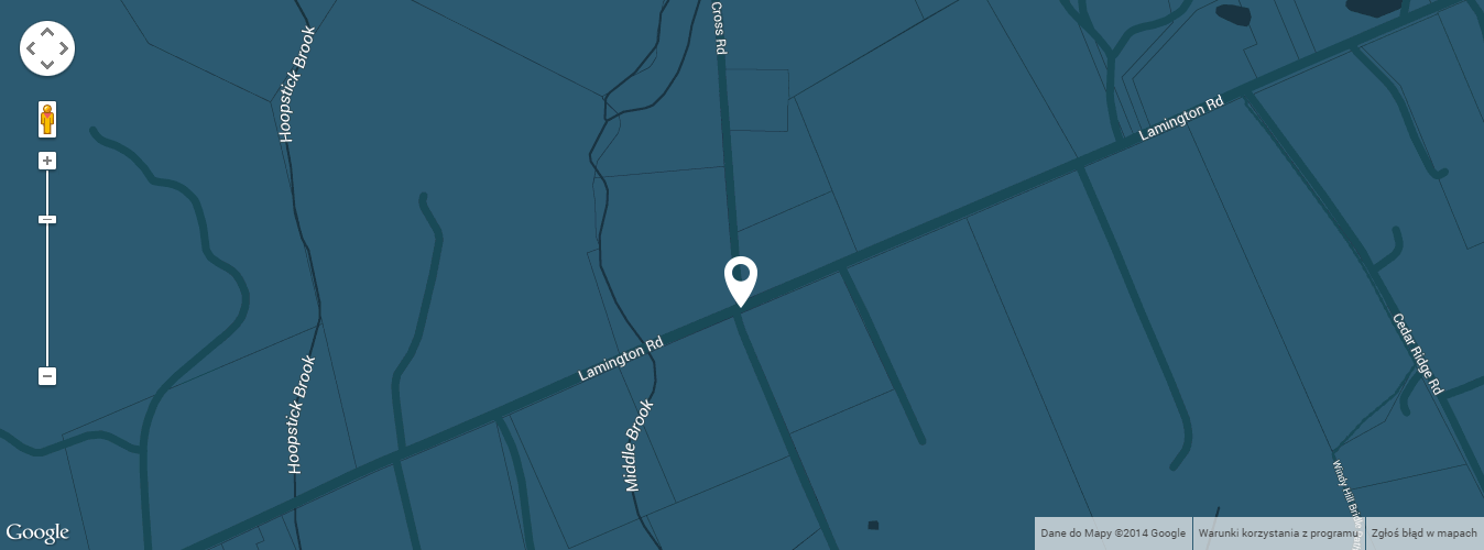
Google Map
Just use simple HTML markup:
|
1 2 3 4 5 6 7 |
<div class="ct-mediaSection"> <div class="ct-mediaSection-inner"> <div class="googlemapcontainer"> <div class="ct-googleMap" data-location="Bedminster" data-height="500" data-offset="0" data-zoom="16"></div> </div> </div><!-- /ct-mediaSection-inner --> </div> |
And don’t forget to include the following javascript in gmaps/init.js:
|
1 2 3 4 5 6 7 8 9 10 11 12 13 14 15 16 17 18 19 20 21 22 23 24 25 26 27 28 29 30 31 32 33 34 35 36 37 38 39 40 41 42 43 44 45 46 47 48 49 50 51 52 53 54 55 56 57 58 59 60 61 62 63 64 65 66 67 68 69 70 71 72 73 74 75 76 77 78 79 80 81 82 83 84 85 86 87 88 89 90 91 92 93 94 95 96 97 98 99 100 101 102 103 104 105 106 107 108 109 110 111 112 113 114 115 116 117 118 119 120 121 122 123 124 125 126 127 128 129 130 131 132 133 134 135 136 137 138 139 140 141 142 143 144 145 146 147 148 149 150 151 152 153 154 155 156 157 158 159 160 161 162 163 164 165 166 167 168 169 170 171 172 173 |
function initmap() { if (($(".ct-googleMap").length > 0) && (typeof google === 'object' && typeof google.maps === 'object')) { $('.ct-googleMap').each(function () { var atcenter = ""; var $this = $(this); var location = $this.data("location"); var zoom = $this.data("zoom"); var offset = -30; if (validatedata($this.data("offset"))) { offset = $this.data("offset"); } if (validatedata(location)) { $this.gmap3({ marker: { //latLng: [40.616439, -74.035540], address: location, options: { //visible: false icon: new google.maps.MarkerImage("assets/images/marker.png") }, callback: function (marker) { atcenter = marker.getPosition(); } }, map: { options: { //maxZoom:11, zoom: zoom, mapTypeId: google.maps.MapTypeId.ROADMAP, // ('ROADMAP', 'SATELLITE', 'HYBRID','TERRAIN'); scrollwheel: false, disableDoubleClickZoom: false, draggable: false, //disableDefaultUI: true, mapTypeControlOptions: { //mapTypeIds: [google.maps.MapTypeId.ROADMAP, google.maps.MapTypeId.HYBRID], //style: google.maps.MapTypeControlStyle.HORIZONTAL_BAR, //position: google.maps.ControlPosition.RIGHT_CENTER mapTypeIds: [] }, styles: [ { "featureType": "water", "elementType": "geometry", "stylers": [ { "color": "#193341" } ] }, { "featureType": "landscape", "elementType": "geometry", "stylers": [ { "color": "#2c5a71" } ] }, { "featureType": "road", "elementType": "geometry", "stylers": [ { "color": "#29768a" }, { "lightness": -37 } ] }, { "featureType": "poi", "elementType": "geometry", "stylers": [ { "color": "#406d80" } ] }, { "featureType": "transit", "elementType": "geometry", "stylers": [ { "color": "#406d80" } ] }, { "elementType": "labels.text.stroke", "stylers": [ { "visibility": "on" }, { "color": "#3e606f" }, { "weight": 2 }, { "gamma": 0.84 } ] }, { "elementType": "labels.text.fill", "stylers": [ { "color": "#ffffff" } ] }, { "featureType": "administrative", "elementType": "geometry", "stylers": [ { "weight": 0.6 }, { "color": "#1a3541" } ] }, { "elementType": "labels.icon", "stylers": [ { "visibility": "off" } ] }, { "featureType": "poi.park", "elementType": "geometry", "stylers": [ { "color": "#2c5a71" } ] } ] }, events: { idle: function () { if (!$this.data('idle')) { $this.gmap3('get').panBy(0, offset); $this.data('idle', true); } } } }, overlay: { address: location, options: { offset: { y: -100, x: -25 } } } //},"autofit" }); // center on resize google.maps.event.addDomListener(window, "resize", function () { //var userLocation = new google.maps.LatLng(53.8018,-1.553); setTimeout(function () { $this.gmap3('get').setCenter(atcenter); $this.gmap3('get').panBy(0, offset); }, 400); }); // set height $this.css("min-height", $this.data("height") + "px"); } if ($this.parent().parent().hasClass('hidemap')) { $this.parent().animate({height: '0px'}, 500); } }) } } |
Was this article helpful ?
Javascript Actly
All javascripts are placed in folder /js. In main.js file we implement all functions calls.
This theme uses following Javascript scripts:
- Bootstrap v 3 framework (powerful front-end framework for faster and easier web development)
- jQuery v1.10.2 (A fast javascript library that Foodtruckifies how to traverse HTML documents, handle events, perform animations.)
- jQuery FlexSlider v2.2.0
- GMAP3 Plugin for JQuery v. 5.1.1
- jQuery.appear
- isotope (http://isotope.metafizzy.co/)
- ct-mediaSections(with stellar.js)
- snap.js
- jquery.easing.1.3
- device
- jquery.pagescroller.lite
- chart.min
- jquery.countTo
- jquery.magnificpopup.min
- animate.css
- gmaps
- infinitescroll.min
- select2
jquery.appear
This plugin call function when element appear in viewport. This is used in custom animation, progress bars, counter timer.
Documentation: https://github.com/bas2k/jquery.appear/
|
1 2 3 4 5 6 7 8 9 10 11 12 13 |
if (jQuery().appear) { if (device.mobile()) { // disable animation on mobile jQuery("body").removeClass("withAnimation"); } else { jQuery('.withAnimation .animated').appear(function () { jQuery(this).each(function () { jQuery(this).addClass('activate'); jQuery(this).addClass($(this).data('fx')); }); }, {accY: -150}); } } |
Was this article helpful ?
Flexslider
To create Flexslider use the following HTML markup:
|
1 2 3 4 5 6 7 8 9 10 11 12 13 14 15 16 17 18 19 20 21 22 23 24 25 26 27 28 29 30 |
<div class="flexslider ct-flexslider--fw ct-js-flexslider ct-flexslider" data-pauseonaction="false" data-directionnav="true" data-animations="true" data-height="100%" data-controlnav="true" data-animationloop="true" data-slideshow="true"> <ul class="slides"> <li data-bg="assets/images/demo-content/iconboxleft-bg.jpg"> <div class="inner"> <div class="inner-content animated" data-fx="pulse"> [content] </div> </div> </li> <li data-bg="assets/images/demo-content/iconboxleft-bg.jpg"> <div class="inner"> <div class="inner-content animated" data-fx="pulse"> [content] </div> </div> </li> <li data-bg="assets/images/demo-content/iconboxleft-bg.jpg"> <div class="inner-content animated" data-fx="pulse"> [content] </div> </li> </ul> </div> |

Flexslider
Was this article helpful ?
Forms
Template comes with ready to use:
- Contact Form
- Newsletter Form
All needed files are in /form directory.
Remember to includeon page.
To configure form just edit form/form.php and change e-mails to your own :
|
1 2 |
$to = "mail@example.com"; $from = "mail@example.com"; |
That’s it!
Contact Form
HTML Markup:
Newsletter Form
HTML markup:
|
1 2 3 4 5 6 7 8 9 10 11 12 13 14 15 16 17 |
<div class="ct-newsletter ct-u-bgdark-lightfont text-center"> <h2 class="text-uppercase">Newsletter subscribe</h2> <div class="successMessage alert alert-success" style="display: none"> <button type="button" class="close" data-dismiss="alert" aria-hidden="true">×</button> Thank You! </div> <div class="errorMessage alert alert-danger" style="display: none"> <button type="button" class="close" data-dismiss="alert" aria-hidden="true">×</button> Ups! An error occured. Please try again later. </div> <form role="form" class="ct-form--newsletter validateIt" action="assets/form/send.php" method="post" data-email-subject="Newsletter Form" data-show-errors="true" data-hide-form="true"> <div class="form-group animated" data-fx="fadeInUp" data-time="0"> <input type="email" class="form-control" id="exampleInputEmail2" name="field[]" required placeholder="Your Email Address"> </div> <button type="submit" class="btn btn-primary btn-padding btn-center animated" data-fx="fadeInUp" data-time="0">Complete Course List</button> </form> </div> |
Was this article helpful ?
Modern Form
Actly comes with extended Modern Form
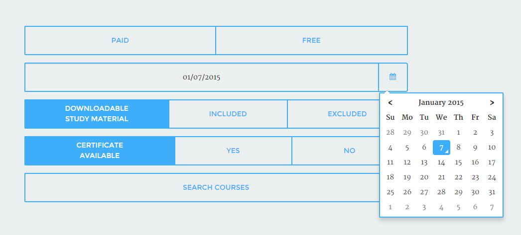
Modern Form
You can use it with the following HTML markup:
|
1 2 3 4 5 6 7 |
<form> <div class="input-group date ct-js-datetimePicker" id="datetimepicker"> <input type="text" id="inpcal" class="form-control ct-u-fontDarkgrey" /> label for="inpcal" class="input-group-addon"><i class="fa fa-calendar"></i> </label> </div> </form> |
Notice to include also the following javascript:
|
1 2 3 4 5 6 7 8 |
(function ($) { "use strict"; $(document).ready(function(){ $('.ct-js-datetimePicker').datetimepicker({ pickTime: false }); }) }(jQuery)); |
Was this article helpful ?
Twitter Feed
This is live twitter feed. This plugin will grab your latest tweets and display them on page.
Configuration: – just edit twitter/config.php file :
|
1 2 3 4 5 6 7 8 9 |
$config = array( 'username' => "XXX", //username 'limit' => 3, //how many tweets we would like to display? 'with_replies' => true, //show replies? true or false 'oauth_access_token' => 'TOKEN', 'oauth_access_token_secret' => 'TOKEN_SECRET', 'consumer_key' => 'KEY', 'consumer_secret' => 'KEY_SECRET', ); |
Where can I get these keys, tokens, etc?
Twitter API requires authentication to display tweets from your account.
To twiiter feed work you need to create the ‘application’
and generate 4 special keys for your twitter account via https://dev.twitter.com/apps:
– Consumer key (key)
– Consumer secret (secret)
– Access token (token)
– Access token secret (token_secret)
Video tutorial : “How to create Twitter App”
http://vimeo.com/60891535
Was this article helpful ?
Sources & Credits
The following sources and files have been used to build up this theme
- Twitter Bootstrap – http://twitter.github.com/bootstrap/
- jQuery – http://www.jquery.com
Was this article helpful ?