

Estato – Responsive HTML5 Template
Thank you for purchasing this theme. If you have any questions that are beyond the scope of this help file, please feel free to start new ticket on this page. Thanks so much!
Scope of free support
We can help you with:
- Responding to questions or problems regarding the item and its features
- Fixing any discovered item’s bugs
- Providing updates to ensure compatibility with new software versions
Was this article helpful ?
HTML Structure
This theme is built upon bootstrap framework and is fully responsive. It adapts to window resolution and looks good on all devices including iPad and iPhone.
See for yourself (resize your browser).
If you would like to read more
about bootstrap framework click here :
Grid System and Single row structure
The default Bootstrap grid system utilizes 12 columns. It’s responsive grid and adapts to viewport. Below 767px viewports, the columns become fluid and stack vertically. The fluid grid system uses percents instead of pixels for column widths. Each row always include 12 columns (for example col-md-8 + col-md-4 = col-md-12).
Bootstrap documentation: here
Basic grid HTML:
|
1 2 3 4 5 6 7 8 9 10 11 12 13 14 15 16 17 18 19 20 21 22 23 24 25 26 27 |
<div class="row"> <div class="col-md-1">.col-md-1</div> <div class="col-md-1">.col-md-1</div> <div class="col-md-1">.col-md-1</div> <div class="col-md-1">.col-md-1</div> <div class="col-md-1">.col-md-1</div> <div class="col-md-1">.col-md-1</div> <div class="col-md-1">.col-md-1</div> <div class="col-md-1">.col-md-1</div> <div class="col-md-1">.col-md-1</div> <div class="col-md-1">.col-md-1</div> <div class="col-md-1">.col-md-1</div> <div class="col-md-1">.col-md-1</div> </div> <div class="row"> <div class="col-md-8">.col-md-8</div> <div class="col-md-4">.col-md-4</div> </div> <div class="row"> <div class="col-md-4">.col-md-4</div> <div class="col-md-4">.col-md-4</div> <div class="col-md-4">.col-md-4</div> </div> <div class="row"> <div class="col-md-6">.col-md-6</div> <div class="col-md-6">.col-md-6</div> </div> |
Page structure
Below you will find default page structure :
|
1 2 3 4 5 6 7 8 9 10 11 12 13 14 15 16 17 18 19 20 21 22 23 24 25 26 27 28 29 30 31 32 33 34 35 36 |
<!DOCTYPE html> <html> <head> [css] </head> <body> [header] [main menu] <!-- main container --> <div id="wrapper"> [component 1] <!-- fullwidth element --> </div> [fullwidth parallax] <div class="container"> <!-- / fullwidth element --> [component 6] </div> <!-- / main container --> [footer] [javascripts] </body> </html> |
Was this article helpful ?
CSS Files and structure
If you would like to edit the color, font, or style of any elements, you would do the following:
|
1 |
#primaryContent a {color: #someColor;} |
If you find that your new style is not overriding, it is most likely because of a specificity problem. Scroll down in your CSS file and make sure that there isn’t a similar style that has more weight.
I.E.
|
1 |
#wrap #primaryContent a {color: #someColor;} |
So, to ensure that your new styles are applied, make sure that they carry enough “weight” and that there isn’t a style lower in the CSS file that is being applied after yours.
Colors
The theme includes a css file wich you can use to edit the colors.
You just need to add the corresponding CSS file to the head of the page like this:
|
1 2 3 4 5 |
<head> (..) <link rel="stylesheet" type="text/css" href="css/motive.css"> (..) </head> |
Icons
We’ve included 360+ font icons.
Awesome Icons – http://fontawesome.io/icons/
HTML markup:
|
1 2 |
<!-- Awesome Icons --> <i class="fa fa-cog"></i> |
CSS Files & Structure
We’ve included 2 files.
bootstrap.css contains Bootstrap 3 Library.
style.css file contains general styles.
Table of contents:
1. Mixins
2. Animate.css
3. Select2
4. Slider
5. Datepicker
6. Yamm
7. Menu
8. Typography
9. Forms
10. Buttons
11. Utilities
12. Owl Corusel
13. Media Sections
14. Portfolio
15. Magnific Popup
16. Font Awesome
17. Wrapper
18. Headroom
19. Socials
20. Slider
21. Header
22. Sections
23. Submission Steps
24. Icon Box
25. Synchronized slider(Single Product Page)
26. Person Box
27. Pricing Box
28. Product Single
29. Testimonials Tabs
30. Footer
31. Product Items
32. Sorting Bars
33. Google Map (Infobox and Navigation)
34. Custom Animation (Maintenance Page)
35. Blog (Sidebar)
36. Media Queries
Utilities
Utility classes are low-level structural and positional traits. Utilities can be applied directly to any element, multiple utilities can be used tohether and utilities can be used alongsie component classes.
Utilities are intended for frequently used CSS properties and patterns, like: floats, containing floats, vertical alignemnt, text tryncation. Relying on utilities can help to reduce repetition and provide consistend implementations.
Estato uses utilities for the following categories:
Typography
|
1 2 3 4 5 6 7 8 9 10 11 12 13 14 15 16 17 18 19 20 21 22 23 24 25 26 27 28 29 30 31 32 33 34 35 36 37 |
.ct-fw-300{ font-weight: 300; } .ct-fw-400{ font-weight: 400; } .ct-fw-500{ font-weight: 500; } .ct-fw-600{ font-weight: 600; } .ct-fw-700{ font-weight: 700; } .ct-fw-800{ font-weight: 800; } .ct-fw-900{ font-weight: 900; } .ct-fs-i{ font-style: italic; } .ct-fs-n{ font-style: normal; } .ct-u-size20{ font-size: 20px; } .ct-u-underline:hover{ padding-bottom: 5px; } |
|
1 2 3 4 5 6 7 8 9 10 11 12 13 14 15 16 17 18 19 |
.ct-u-displayTable, .ct-u-displayTableVertical{ display: table; width: 100%; } .ct-u-displayTableVertical{ height: 100%; .ct-u-displayTableCell{ vertical-align: middle; } } .ct-u-displayTableRow{ display: table-row; } .ct-u-displayTableCell{ display: table-cell; } |
|
1 2 3 4 5 6 7 8 9 10 11 12 13 14 15 16 17 18 19 20 21 22 23 24 25 26 27 28 29 30 31 32 33 34 35 36 37 38 39 40 41 42 43 44 45 46 47 48 49 50 51 52 53 54 55 56 57 58 59 60 61 62 63 64 65 66 67 68 69 70 71 72 73 74 75 76 77 78 79 80 81 82 83 84 85 86 87 88 89 90 91 92 93 94 95 96 97 98 99 100 101 102 103 104 105 106 107 108 109 110 111 112 113 114 115 116 117 118 |
.ct-u-padding0{ padding: 0!important; } .ct-u-paddingBoth10{ padding-top: 10px; padding-bottom: 10px; } .ct-u-paddingTop10{ padding-top: 10px; } .ct-u-paddingBottom10{ padding-bottom: 10px; } .ct-u-paddingBoth20{ padding-top: 20px; padding-bottom: 20px; } .ct-u-paddingTop20{ padding-top: 20px; } .ct-u-paddingBottom20{ padding-bottom: 20px; } .ct-u-paddingBoth30{ padding-top: 30px; padding-bottom: 30px; } .ct-u-paddingTop30{ padding-top: 30px; } .ct-u-paddingBottom30{ padding-bottom: 30px; } .ct-u-paddingBoth40{ padding-top: 40px; padding-bottom: 40px; } .ct-u-paddingTop40{ padding-top: 40px; } .ct-u-paddingBottom40{ padding-bottom: 40px; } .ct-u-paddingBoth50{ padding-top: 50px; padding-bottom: 50px; } .ct-u-paddingTop50{ padding-top: 50px; } .ct-u-paddingBottom50{ padding-bottom: 50px; } .ct-u-paddingBoth60{ padding-top: 60px; padding-bottom: 60px; } .ct-u-paddingTop60{ padding-top: 60px; } .ct-u-paddingBottom60{ padding-bottom: 60px; } .ct-u-paddingBoth70{ padding-top: 70px; padding-bottom: 70px; } .ct-u-paddingTop70{ padding-top: 70px; } .ct-u-paddingBottom70{ padding-bottom: 70px; } .ct-u-paddingBoth80{ padding-top: 80px; padding-bottom: 80px; } .ct-u-paddingTop80{ padding-top: 80px; } .ct-u-paddingBottom80{ padding-bottom: 80px; } .ct-u-paddingBoth90{ padding-top: 90px; padding-bottom: 90px; } .ct-u-paddingTop90{ padding-top: 90px; } .ct-u-paddingBottom90{ padding-bottom: 90px; } .ct-u-paddingBoth100{ padding-top: 100px; padding-bottom: 100px; } .ct-u-paddingTop100{ padding-top: 100px; } .ct-u-paddingBottom100{ padding-bottom: 100px; } .ct-u-paddingBoth150{ padding-top: 150px; padding-bottom: 150px; } .ct-u-paddingTop150{ padding-top: 150px; } .ct-u-paddingBottom150{ padding-bottom: 150px; } .ct-u-paddingRight30{ padding-right: 30px; } |
|
1 2 3 4 5 6 7 8 9 10 11 12 13 14 15 16 17 18 19 20 21 22 23 24 25 26 27 28 29 30 31 32 33 34 35 36 37 38 39 40 41 42 43 44 45 46 47 48 49 50 51 52 53 54 55 56 57 58 59 60 61 62 63 64 65 66 67 68 69 70 71 72 73 74 75 76 77 78 79 80 81 82 83 84 85 86 87 88 89 90 91 92 93 94 95 96 97 98 99 100 101 102 103 104 105 106 107 108 109 110 111 112 113 114 115 |
.ct-u-margin0{ margin: 0!important; } .ct-u-marginBoth10{ margin-top: 10px; margin-bottom: 10px; } .ct-u-marginTop10{ margin-top: 10px; } .ct-u-marginBottom10{ margin-bottom: 10px; } .ct-u-marginBoth20{ margin-top: 20px; margin-bottom: 20px; } .ct-u-marginTop20{ margin-top: 20px; } .ct-u-marginBottom20{ margin-bottom: 20px; } .ct-u-marginBoth30{ margin-top: 30px; margin-bottom: 30px; } .ct-u-marginTop30{ margin-top: 30px; } .ct-u-marginBottom30{ margin-bottom: 30px; } .ct-u-marginBoth40{ margin-top: 40px; margin-bottom: 40px; } .ct-u-marginTop40{ margin-top: 40px; } .ct-u-marginBottom40{ margin-bottom: 40px; } .ct-u-marginBoth50{ margin-top: 50px; margin-bottom: 50px; } .ct-u-marginTop50{ margin-top: 50px; } .ct-u-marginBottom50{ margin-bottom: 50px; } .ct-u-marginBoth60{ margin-top: 60px; margin-bottom: 60px; } .ct-u-marginTop60{ margin-top: 60px; } .ct-u-marginBottom60{ margin-bottom: 60px; } .ct-u-marginBoth70{ margin-top: 70px; margin-bottom: 70px; } .ct-u-marginTop70{ margin-top: 70px; } .ct-u-marginBottom70{ margin-bottom: 70px; } .ct-u-marginBoth80{ margin-top: 80px; margin-bottom: 80px; } .ct-u-marginTop80{ margin-top: 80px; } .ct-u-marginBottom80{ margin-bottom: 80px; } .ct-u-marginBoth90{ margin-top: 90px; margin-bottom: 90px; } .ct-u-marginTop90{ margin-top: 90px; } .ct-u-marginBottom90{ margin-bottom: 90px; } .ct-u-marginBoth100{ margin-top: 100px; margin-bottom: 100px; } .ct-u-marginTop100{ margin-top: 100px; } .ct-u-marginBottom100{ margin-bottom: 100px; } .ct-u-marginBoth150{ margin-top: 150px; margin-bottom: 150px; } .ct-u-marginTop150{ margin-top: 150px; } .ct-u-marginBottom150{ margin-bottom: 150px; } |
|
1 2 3 4 5 6 7 8 9 10 11 12 13 14 15 16 17 18 19 20 21 22 23 24 25 26 27 28 29 30 |
.ct-u-letterSpacing1{ letter-spacing: 1px; } .ct-u-letterSpacing2{ letter-spacing: 2px; } .ct-u-letterSpacing3{ letter-spacing: 3px; } .ct-u-letterSpacing4{ letter-spacing: 4px; } .ct-u-letterSpacing5{ letter-spacing: 5px; } .ct-u-letterSpacing6{ letter-spacing: 6px; } .ct-u-letterSpacing7{ letter-spacing: 7px; } .ct-u-letterSpacing8{ letter-spacing: 8px; } .ct-u-letterSpacing9{ letter-spacing: 9px; } .ct-u-letterSpacing10{ letter-spacing: 10px; } |
|
1 2 3 4 5 6 7 8 9 10 11 |
.ct-u-line-height24{ line-height: 24px; } .ct-u-line-height26{ line-height: 26px; } .ct-u-line-height30{ line-height: 30px; } |
|
1 2 3 4 5 6 7 8 9 10 11 12 13 14 15 16 17 18 19 |
.ct-u-text--white{ color: #fff; } .ct-u-text--motive{ color: @ct-motive; } .ct-u-text--green{ color: #a2bf52; } .ct-u-text--orange{ color: #eb8a21; } .ct-u-text--dark{ color: #333; } |
|
1 2 3 4 5 6 7 8 |
.ct-u-borderTop--white{ border-top: 1px solid #fff; padding: 30px 0; } .ct-u-borderBottom--grey{ border-bottom: 1px solid #e6e6e6; } |
|
1 2 3 |
.ct-u-positionRelative{ position: relative; } |
Was this article helpful ?
Topbar
There are two available types of topbar:
- .ct-topBar
- .ct-topBar–darkStyle
To use any of them, first use the following HTML markup:
|
1 2 3 4 5 6 7 8 9 10 11 12 13 14 15 16 17 18 19 20 21 22 23 24 25 26 27 28 29 30 31 32 33 34 35 36 37 38 39 40 41 42 43 44 45 46 47 48 49 50 51 52 53 54 55 56 57 58 59 60 |
<div class="ct-topBar ct-topBar--darkStyle"> <div class="container"> <div class="row"> <div class="col-sm-7 col-md-7"> <div class="ct-panel--contact ct-panel--left"> <div class="ct-panel--item ct-email"> <a href="#"><i class="fa fa-envelope-o"></i> example@example.com</a> </div> <ul class="nav navbar-nav ct-switcher--language"> <li class="dropdown"> <a href="#"> <i class="fa fa-globe"></i> English <i class="fa fa-angle-down"></i> </a> <ul class="dropdown-menu"> <li> <a href="#"> English </a> </li> <li> <a href="#"> Spanish </a> </li> <li> <a href="#"> German </a> </li> </ul> </li> </ul> <div id="ct-js-navSearch"> <i class="fa fa-search"></i> <input placeholder="Search ..." required type="text" name="field[]" class="form-control input-lg ct-input--search"> </div> <div class="ct-navbar-search"> <form role="form"> <button class="ct-navbar-search-button" type="submit"> <i class="fa fa-search fa-fw"></i> </button> <div class="form-group"> <input id="search" placeholder="Search ..." required type="text" class="form-control input-lg"> </div> </form> </div> </div> </div> <div class="col-sm-5 col-md-5"> <div class="ct-panel--right text-right"> <div class="ct-panel--item"> <h6 class="ct-fw-600">Welcome to Estato Agency, we are at your disposal</h6> </div> </div> </div> </div> </div> </div> |
Was this article helpful ?
Navigation menu
You can change navigation menu bar by adding the following classes to body tag:
- .ct-headroom–scrollUpMenu – navigation menu is hidden with delay,
- .ct-headroom–scrollUpTopBar – top bar is hidden with delay,
- .ct-headroom–scrollUpBoth – both top bar and navigation menu is hidden with delay
- .ct-headroom–fixedTopBar – top bar is always visible at the top of the screen.
- .ct-headroom–fixedMenu – menu is always visible at the top of the screen

Fixed Menu
- .ct-headroom–fixedBoth – both top bar and navigation menu are always visible,
- .ct-headroom–hideMenu – top bar is always visible on the top of the screen, navigation menu is hidden after scroll

Hide Menu
HTML markup:
|
1 2 3 4 5 6 7 8 9 10 11 12 13 14 15 16 17 18 19 20 21 22 23 24 25 26 27 28 29 30 31 32 33 34 35 36 37 38 39 40 41 42 43 44 45 46 47 48 49 50 51 52 53 54 55 56 57 58 59 60 61 62 63 64 65 66 67 68 69 70 71 72 73 74 75 76 77 78 79 80 81 82 83 84 85 86 87 88 89 90 91 92 93 94 95 96 97 98 99 100 101 102 103 104 105 106 107 108 109 110 111 112 113 114 115 116 117 118 119 120 121 122 123 124 125 126 127 128 129 130 131 132 133 134 135 136 137 138 139 140 141 142 143 144 145 146 147 148 149 150 151 |
<body class="ct-headroom--scrollUpBoth cssAnimate"> <nav class="navbar yamm" role="navigation" data-heighttopbar="40px" data-startnavbar="0"> <div class="container"> <div class="navbar-header ct-panel--navbar"> <a href="index.html"> <img src="assets/images/demo-content/logo.png" alt="logo"> </a> </div> <div class="ct-panelBox"> <div class="ct-panel--text ct-panel--navbar ct-fw-600"><a href="#">8 534 Listings</a></div> <ul class="ct-panel--socials ct-panel--navbar list-inline list-unstyled"> <li><a href="https://www.facebook.com/createITpl"><div class="ct-socials ct-socials--circle"><i class="fa fa-facebook"></i></div></a></li> <li><a href="https://twitter.com/createitpl"><div class="ct-socials ct-socials--circle"><i class="fa fa-twitter"></i></div></a></li> <li><a href="#"><div class="ct-socials ct-socials--circle"><i class="fa fa-instagram"></i></div></a></li> </ul> </div> <div class="collapse navbar-collapse"> <ul class="nav navbar-nav ct-navbar--fadeInUp"> <li class="dropdown active"><a href="index.html">Home<span class="caret"></span></a> <ul class="dropdown-menu"> <li> <div class="yamm-content"> <div class="ct-u-displayTableVertical"> <div class="ct-u-displayTableCell"> <ul class="list-unstyled pull-left"> <li><a href="index.html">Home V1 - Portal Slider</a></li> <li><a href="index2.html">Home V2 - Portal Map</a></li> <li><a href="index3.html">Home V3 - Portal Map (Light)</a></li> <li><a href="index4.html">Home V4 - Real Estate Agency</a></li> <li><a href="index5.html">Home V5 - Property Slider</a></li> <li><a href="index6.html">Home V6 - Simple Onepager</a></li> </ul> </div> <div class="ct-u-displayTableCell"> <img class="pull-right" src="assets/images/demo-content/megamenu-image.jpg" alt=""> </div> </div> <div class="ct-menuBrand ct-u-displayTableVertical"> <div class="ct-u-displayTableCell"> <a href="index.html"> <img src="assets/images/demo-content/logo.png" alt="logo"> </a> </div> <div class="ct-u-displayTableCell"> <div class="ct-panel--text ct-panel--navbar ct-fw-600"><a href="#">Real Estate Theme</a></div> </div> </div> </div> </li> </ul> </li> <li class="dropdown"><a href="properties.html">Properties<span class="caret"></span></a> <ul class="dropdown-menu"> <li> <div class="yamm-content"> <div class="ct-u-displayTableVertical"> <div class="ct-u-displayTableCell"> <ul class="list-unstyled pull-left"> <li><a href="product-single.html">Property Page V1</a></li> <li><a href="product-single2.html">Property Page V2</a></li> <li><a href="search-grid.html">Properties Page - Grid</a></li> <li><a href="search-list.html">Properties Page - Listing</a></li> <li><a href="properties.html">My Properties Page</a></li> </ul> </div> <div class="ct-u-displayTableCell"> <ul class="list-unstyled pull-left"> <li><a href="product-singleEdit.html">Front Editing - Property Page V1</a></li> <li><a href="product-single2Edit.html">Front Editing - Property Page V2</a></li> </ul> </div> <div class="ct-u-displayTableCell"> <img class="pull-right" src="assets/images/demo-content/megamenu-image-2.jpg" alt=""> </div> </div> <div class="ct-menuBrand ct-u-displayTableVertical"> <div class="ct-u-displayTableCell"> <a href="index.html"> <img src="assets/images/demo-content/logo.png" alt="logo"> </a> </div> <div class="ct-u-displayTableCell"> <div class="ct-panel--text ct-panel--navbar ct-fw-600"><a href="#">Real Estate Theme</a></div> </div> </div> </div> </li> </ul> </li> <li class="dropdown ct-yamm--dropdownRight"><a href="agent.html">Agents<span class="caret"></span></a> <ul class="dropdown-menu"> <li> <div class="yamm-content"> <div class="ct-u-displayTableVertical"> <div class="ct-u-displayTableCell"> <img class="pull-right" src="assets/images/demo-content/megamenu-image-3.jpg" alt=""> </div> <div class="ct-u-displayTableCell middle-element"> <ul class="list-unstyled pull-left"> <li><a href="agency.html">Agency Page</a></li> <li><a href="agent.html">Agent's Profile</a></li> <li><a href="about.html">About Us</a></li> </ul> </div> <div class="ct-u-displayTableCell"> <ul class="list-unstyled pull-left"> <li><a href="agency-edit.html">Front Editing - Agency Page</a></li> <li><a href="agent-edit.html">Front Editing - Agent's Profile</a></li> </ul> </div> </div> <div class="ct-menuBrand ct-u-displayTableVertical"> <div class="ct-u-displayTableCell"> <a href="index.html"> <img src="assets/images/demo-content/logo.png" alt="logo"> </a> </div> <div class="ct-u-displayTableCell"> <div class="ct-panel--text ct-panel--navbar ct-fw-600"><a href="#">Real Estate Theme</a></div> </div> </div> </div> </li> </ul> </li> <li class="dropdown"><a href="pricing.html">Features<span class="caret"></span></a> <ul class="dropdown-menu"> <li><a href="pricing.html">Pricing Tables</a></li> </ul> </li> <li class="dropdown"><a href="about.html">Pages<span class="caret"></span></a> <ul class="dropdown-menu"> <li><a href="faq.html">FAQ</a></li> <li><a href="terms.html">Terms</a></li> <li><a href="policy.html">Privacy Policy</a></li> <li><a href="blog.html">Blog</a></li> <li><a href="blog-single.html">Blog Single</a></li> <li><a href="registration.html">Registration</a></li> <li><a href="404.html">404</a></li> <li><a href="maintenance.html">Maintenance</a></li> </ul> </li> <li><a href="contact.html">Contact Us</a></li> </ul> <a class="btn btn-primary btn-transparent--border ct-u-text--motive" href="properties.html">List Property</a> </div> <div class="clearfix"></div> <div class="ct-shapeBottom"></div> </div> </nav> |
Was this article helpful ?
Footer
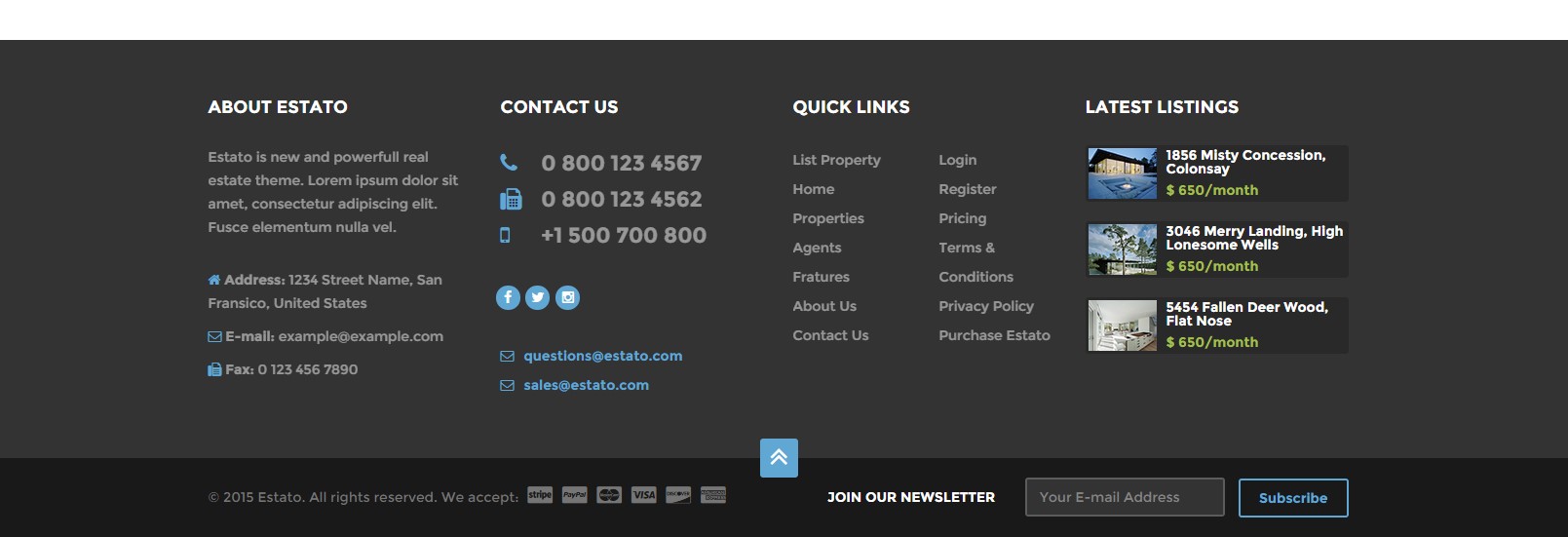
Footer
You can use the following variations of footer:
- .ct-footer–light (add it for change style to to change styles to light version)
- .ct-footer–extended
- .ct-postFooter
HTML markup:
|
1 2 3 4 5 6 7 8 9 10 11 12 13 14 15 16 17 18 19 20 21 22 23 24 25 26 27 28 29 30 31 32 33 34 35 36 37 38 39 40 41 42 43 44 45 46 47 48 49 50 51 52 53 54 55 56 57 58 59 60 61 62 63 64 65 66 67 68 69 70 71 72 73 74 75 76 77 78 79 80 81 82 83 84 85 86 87 88 89 90 91 92 93 94 95 96 97 98 99 100 101 102 103 104 105 106 107 108 109 110 111 112 113 114 115 116 117 118 119 120 121 122 123 124 125 126 127 128 129 130 131 132 133 134 135 136 137 138 139 140 141 142 143 144 145 146 147 148 149 150 151 152 153 154 155 156 157 158 159 160 161 162 163 164 165 166 167 168 169 170 171 172 173 |
<footer class="ct-mediaSection ct-footer--light" data-stellar-background-ratio="0.3" data-height="375" data-type="parallax" data-bg-image="assets/images/demo-content/footer-parallax.jpg" data-bg-image-mobile="assets/images/demo-content/footer-parallax.jpg"> <div class="ct-footer--extended ct-u-paddingBoth60"> <div class="container"> <div class="row"> <div class="col-sm-6 col-md-6 col-lg-3"> <h4 class="text-uppercase ct-u-marginBottom30">About estato</h4> <div class="ct-u-marginBottom30"> <span>Estato is new and powerfull real estate theme. Lorem ipsum dolor sit amet, consectetur adipiscing elit. Fusce elementum nulla vel.</span> </div> <ul class="list-unstyled"> <li class="ct-u-marginBottom10"> <i class="fa fa-home"></i> <span class="ct-fw-600">Address:</span><span> 1234 Street Name, San Fransico, United States</span> </li> <li class="ct-u-marginBottom10"> <i class="fa fa-envelope"></i> <span class="ct-fw-600">E-mail:</span><span> example@example.com</span> </li> <li> <i class="fa fa-fax"></i> <span class="ct-fw-600">Fax:</span><span> 0 123 456 7890</span> </li> </ul> </div> <div class="col-sm-6 col-md-6 col-lg-3"> <h4 class="text-uppercase ct-u-marginBottom30">Contact us</h4> <ul class="list-unstyled ct-phoneNumbers ct-u-marginBottom30"> <li> <i class="fa fa-phone"></i> <span class="ct-fw-600">0 800 123 4567</span> </li> <li> <i class="fa fa-fax"></i> <span class="ct-fw-600">0 800 123 4562</span> </li> <li> <i class="fa fa-mobile"></i> <span class="ct-fw-600">+1 500 700 800</span> </li> </ul> <ul class="ct-panel--socials ct-panel--navbar list-inline list-unstyled ct-u-marginBottom30"> <li><a href="https://www.facebook.com/createITpl"><div class="ct-socials ct-socials--circle"><i class="fa fa-facebook"></i></div></a></li> <li><a href="https://twitter.com/createitpl"><div class="ct-socials ct-socials--circle"><i class="fa fa-twitter"></i></div></a></li> <li><a href="#" data-toggle="tooltip"><div class="ct-socials ct-socials--circle"><i class="fa fa-instagram"></i></div></a></li> </ul> <div class="ct-contactList "> <a href="#"><i class="fa fa-envelope-o"></i>questions@estato.com</a> <a href="#"><i class="fa fa-envelope-o"></i>sales@estato.com</a> </div> </div> <div class="col-sm-6 col-md-6 col-lg-3 "> <h4 class="text-uppercase ct-u-marginBottom30">Quick links</h4> <div class="row"> <div class="ct-links"> <div class="col-md-6"> <a class="text-capitalize" href="#">List Property</a> <a class="text-capitalize" href="#">Home</a> <a class="text-capitalize" href="#">Properties</a> <a class="text-capitalize" href="#">Agents</a> <a class="text-capitalize" href="#">Fratures</a> <a class="text-capitalize" href="#">About Us</a> <a class="text-capitalize" href="#">Contact Us</a> </div> <div class="col-md-6"> <a class="text-capitalize" href="#">Login</a> <a class="text-capitalize" href="#">Register</a> <a class="text-capitalize" href="#">Pricing</a> <a class="text-capitalize" href="#">Terms & Conditions</a> <a class="text-capitalize" href="#">Privacy Policy</a> <a class="text-capitalize" href="#">Purchase Estato</a> </div> </div> </div> </div> <div class="col-sm-6 col-md-6 col-lg-3"> <h4 class="text-uppercase ct-u-marginBottom30">Latest Listings</h4> <div class="ct-itemProducts--small ct-itemProducts--small-type1"> <a href="product-single.html"> <div class="ct-main-content"> <div class="ct-imageBox"> <img src="assets/images/demo-content/recently-reduced-thumbnail-4.jpg" alt=""> </div> <div class="ct-main-text"> <div class="ct-product--tilte"> 15421 Southwest 39th Terrace </div> <div class="ct-product--price"> <span>$ 650/month</span> </div> </div> </div> </a> </div> <div class="ct-itemProducts--small ct-itemProducts--small-type1"> <a href="product-single.html"> <div class="ct-main-content"> <div class="ct-imageBox"> <img src="assets/images/demo-content/recently-reduced-thumbnail-5.jpg" alt=""> </div> <div class="ct-main-text"> <div class="ct-product--tilte"> 15421 Southwest 39th Terrace </div> <div class="ct-product--price"> <span>$ 650/month</span> </div> </div> </div> </a> </div> <div class="ct-itemProducts--small ct-itemProducts--small-type1"> <a href="product-single.html"> <div class="ct-main-content"> <div class="ct-imageBox"> <img src="assets/images/demo-content/recently-reduced-thumbnail-6.jpg" alt=""> </div> <div class="ct-main-text"> <div class="ct-product--tilte"> 15421 Southwest 39th Terrace </div> <div class="ct-product--price"> <span>$ 650/month</span> </div> </div> </div> </a> </div> </div> </div> </div> </div> <div class="ct-postFooter ct-u-paddingBoth20"> <a href="#" class="ct-scrollUpButton ct-js-btnScrollUp"> <span class="ct-sectioButton--square"> <i class="fa fa-angle-double-up"></i> </span> </a> <div class="container"> <div class="row"> <div class="col-sm-6 col-md-6 col-sm-push-6"> <div class="ct-newsletter text-right"> <span class="text-uppercase ct-u-text--white ct-fw-600">Join our newsletter</span> <input id="newsletter" placeholder="Your E-mail Address" required type="text" name="field[]" class="form-control input-lg"> <button type="submit" class="btn btn-primary btn-transparent--border ct-u-text--motive text-capitalize">Subscribe</button> </div> </div> <div class="col-sm-6 col-md-6 col-sm-pull-6"> <span class="ct-copyright">© 2015 Estato. All rights reserved. We accept: </span> <ul class="icons list-unstyled list-inline"> <li> <i class="fa fa-cc-stripe" data-toggle="tooltip" data-placement="top" title="Stripe"></i> </li> <li> <i class="fa fa-cc-paypal" data-toggle="tooltip" data-placement="top" title="PayPal"></i> </li> <li> <i class="fa fa-cc-mastercard" data-toggle="tooltip" data-placement="top" title="Mastercard"></i> </li> <li> <i class="fa fa-cc-visa" data-toggle="tooltip" data-placement="top" title="Visa"></i> </li> <li> <i class="fa fa-cc-discover" data-toggle="tooltip" data-placement="top" title="Discover"></i> </li> <li> <i class="fa fa-cc-amex" data-toggle="tooltip" data-placement="top" title="Amex"></i> </li> </ul> </div> </div> </div> </div> </footer> |
Was this article helpful ?
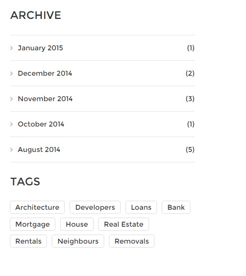
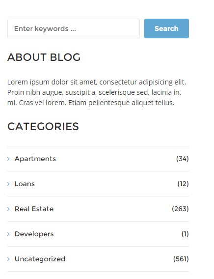
Sidebar
You can use the following Sidebar widgets:
- .ct-widget-latestPosts
- .ct-text-widget
- .ct-search-widget
- .ct-widget–calculator
- .ct-widget–recentlyReduced
- .ct-widget–featuredItems
- .datepicker (learn more here: https://bootstrap-datepicker.readthedocs.org/en/release/markup.html)
Blog widgets

Blog widgets
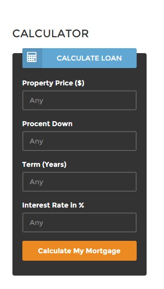
Calculator
Categories widget
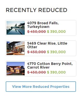
Recently reduced widget
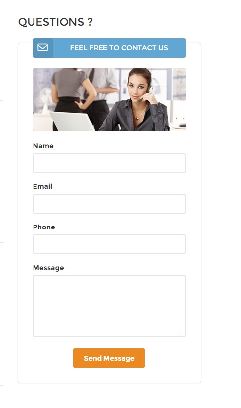
Contact form in sidebar
|
1 2 3 4 5 6 7 8 9 10 11 12 13 14 15 16 17 18 19 20 21 22 23 24 25 26 27 28 29 30 31 32 33 34 35 36 37 38 39 40 41 42 43 44 45 46 47 48 49 50 51 52 53 54 55 56 57 58 59 60 61 62 63 64 65 66 67 68 69 70 71 72 73 74 75 76 77 78 79 80 81 82 83 84 85 86 87 88 89 90 91 92 93 94 95 96 97 98 99 100 101 102 103 104 105 106 107 108 109 110 111 112 113 114 115 116 117 118 119 120 121 122 123 124 125 126 127 128 129 130 131 132 133 134 135 136 137 138 139 140 141 142 143 144 145 146 147 148 149 150 151 152 153 154 155 156 157 158 159 160 161 162 163 164 165 166 167 168 169 170 171 172 173 174 175 176 177 178 179 180 181 182 183 184 185 186 187 188 189 190 191 192 193 194 195 196 197 198 199 200 201 202 203 204 205 206 207 208 209 210 211 212 213 214 215 216 217 218 219 220 221 222 223 224 225 226 227 228 229 230 231 232 233 234 235 236 237 238 239 240 241 242 243 244 245 246 247 248 249 250 251 252 253 254 255 256 257 258 259 260 261 262 263 264 265 266 267 268 269 270 271 272 273 274 275 276 277 278 279 280 281 282 283 284 285 286 287 288 289 290 291 292 293 294 295 296 297 298 |
//Latest Posts <div class="col-sm-6 col-md-12"> <section class="widget ct-widget-latestPosts"> <div class="widget-inner"> <h4 class="text-uppercase">Latest Posts</h4> <ul class="list-unstyled"> <li> <div class="widget-latest-posts-left"> <a href="blog-single.html"> <img src="assets/images/demo-content/latest-post-widget.jpg" alt=""> </a> </div> <div class="widget-latest-posts-content"> <a href="blog-single.html"> Expectations for 2015 </a> <span class="text-uppercase">Posted on january 9th, 2015</span> </div> </li> <li> <div class="widget-latest-posts-content"> <a href="blog-single.html"> Real Estate market most probably going to bloom in early 2016 </a> <span class="text-uppercase">Posted on january 5th, 2015</span> </div> </li> <li> <div class="widget-latest-posts-left"> <a href="blog-single.html"> <img src="assets/images/demo-content/latest-post-widget-1.jpg" alt=""> </a> </div> <div class="widget-latest-posts-content"> <a href="blog-single.html"> Trending in architecture leads us towards better standards </a> <span class="text-uppercase">Posted on january 9th, 2015</span> </div> </li> </ul> </div> </section> </div> //text widget <div class="col-sm-6 col-md-12"> <section class="widget"> <div class="widget-inner"> <div class="ct-text-widget"> <h4 class="text-uppercase">About Blog</h4> <p> Lorem ipsum dolor sit amet, consectetur adipisicing elit. Proin nibh augue, suscipit a, scelerisque sed, lacinia in, mi. Cras vel lorem. Etiam pellentesque aliquet tellus. </p> </div> </div> </section> </div> //search widget <div class="col-sm-6 col-md-12"> <section class="widget"> <div class="widget-inner"> <div class="ct-search-widget"> <div class="form-group"> <input id="search2" placeholder="Enter keywords ..." required type="text" name="field[]" class="form-control input-lg ct-input--border"> <button class="btn btn-primary pull-right"> Search </button> </div> </div> </div> </section> </div> //Calculator widget <div class="col-sm-6 col-md-12"> <div class="widget ct-widget--calculator ct-calculator--whiteStyle"> <div class="widget-inner"> <h4 class="text-uppercase">Calculator</h4> <form role="form"> <div class="form-group"> <div class="ct-form--label--type2"> <div class="ct-u-displayTableVertical"> <div class="ct-u-displayTableCell"> <div class="ct-input-group-btn"> <button class="btn btn-primary"> <i class="fa fa-calculator"></i> </button> </div> </div> <div class="ct-u-displayTableCell text-center"> <span class="text-uppercase">Calculate Loan</span> </div> </div> </div> <div class="ct-form--item"> <label>Property Price ($)</label> <input type="text" required class="form-control input-lg" placeholder=""> </div> <div class="ct-form--item"> <label>Procent Down</label> <input type="text" required class="form-control input-lg" placeholder=""> </div> <div class="ct-form--item"> <label>Term (Years)</label> <input type="text" required class="form-control input-lg" placeholder=""> </div> <div class="ct-form--item"> <label>Interest Rate in %</label> <input type="text" required class="form-control input-lg" placeholder=""> </div> <div class="ct-form--item last"> <button type="submit" class="btn btn-warning">Calculate My Mortgage</button> </div> </div> </form> </div> </div> </div> //Recently Reduced <div class="col-sm-6 col-md-12"> <div class="widget ct-widget--recentlyReduced"> <div class="widget-inner"> <h4 class="text-uppercase">Recently Reduced</h4> <div class="ct-itemProducts--small ct-itemProducts--small-type7"> <a href="product-single.html"> <div class="ct-main-content"> <div class="ct-imageBox"> <img src="assets/images/demo-content/recently-reduced-thumbnail-1.jpg" alt=""> </div> <div class="ct-main-text"> <div class="ct-product--tilte"> 15421 Southwest 39th Terrace </div> <div class="ct-product--price"> <span class="ct-price--Old">$ 450,000</span> <span>$ 390,000</span> </div> </div> </div> </a> </div> <div class="ct-itemProducts--small ct-itemProducts--small-type1"> <a href="product-single.html"> <div class="ct-main-content"> <div class="ct-imageBox"> <img src="assets/images/demo-content/recently-reduced-thumbnail-8.jpg" alt=""> </div> <div class="ct-main-text"> <div class="ct-product--tilte"> 15421 Southwest 39th Terrace </div> <div class="ct-product--price"> <span class="ct-price--Old">$ 450,000</span> <span>$ 390,000</span> </div> </div> </div> </a> </div> <div class="ct-itemProducts--small ct-itemProducts--small-type1"> <a href="product-single.html"> <div class="ct-main-content"> <div class="ct-imageBox"> <img src="assets/images/demo-content/recently-reduced-thumbnail-9.jpg" alt=""> </div> <div class="ct-main-text"> <div class="ct-product--tilte"> 15421 Southwest 39th Terrace </div> <div class="ct-product--price"> <span class="ct-price--Old">$ 450,000</span> <span>$ 390,000</span> </div> </div> </div> </a> </div> <a class="btn btn-primary btn-transparent--border ct-u-text--motive" href="properties.html">View More Reduced Properties</a> </div> </div> </div> //Featured Items <div class="col-sm-6 col-md-12"> <div class="widget ct-widget--featuredItems"> <div class="widget-inner"> <h4 class="text-uppercase">Featured</h4> <div class="ct-itemProducts--small ct-itemProducts--small-type1"> <a href="product-single.html"> <div class="ct-main-content"> <div class="ct-imageBox"> <img src="assets/images/demo-content/recently-reduced-thumbnail-1.jpg" alt=""> </div> <div class="ct-main-text"> <div class="ct-product--tilte"> 15421 Southwest 39th Terrace </div> <div class="ct-product--price"> <span>$ 450,000</span> </div> </div> </div> </a> </div> <div class="ct-itemProducts--small ct-itemProducts--small-type1"> <a href="product-single.html"> <div class="ct-main-content"> <div class="ct-imageBox"> <img src="assets/images/demo-content/recently-reduced-thumbnail-2.jpg" alt=""> </div> <div class="ct-main-text"> <div class="ct-product--tilte"> 15421 Southwest 39th Terrace </div> <div class="ct-product--price"> <span>$ 450,000</span> </div> </div> </div> </a> </div> <div class="ct-itemProducts--small ct-itemProducts--small-type1"> <a href="product-single.html"> <div class="ct-main-content"> <div class="ct-imageBox"> <img src="assets/images/demo-content/recently-reduced-thumbnail-3.jpg" alt=""> </div> <div class="ct-main-text"> <div class="ct-product--tilte"> 15421 Southwest 39th Terrace </div> <div class="ct-product--price"> <span>$ 450,000</span> </div> </div> </div> </a> </div> <div class="ct-itemProducts--small ct-itemProducts--small-type1"> <a href="product-single.html"> <div class="ct-main-content"> <div class="ct-imageBox"> <img src="assets/images/demo-content/recently-reduced-thumbnail-4.jpg" alt=""> </div> <div class="ct-main-text"> <div class="ct-product--tilte"> 15421 Southwest 39th Terrace </div> <div class="ct-product--price"> <span>$ 450,000</span> </div> </div> </div> </a> </div> <div class="ct-itemProducts--small ct-itemProducts--small-type1"> <a href="product-single.html"> <div class="ct-main-content"> <div class="ct-imageBox"> <img src="assets/images/demo-content/recently-reduced-thumbnail-5.jpg" alt=""> </div> <div class="ct-main-text"> <div class="ct-product--tilte"> 15421 Southwest 39th Terrace </div> <div class="ct-product--price"> <span>$ 450,000</span> </div> </div> </div> </a> </div> </div> </div> </div> //Calendar(datapicker) <div class="col-sm-6 col-md-12"> <section class="widget"> <div class="widget-inner"> <div class="ct-widget-categories ct-js-datetimePicker"> <h4 class="text-uppercase">Calendar</h4> <div></div> </div> </div> </section> </div> |
and javascript:
|
1 2 3 4 5 6 7 8 |
(function ($) { "use strict"; $(document).ready(function(){ $('.ct-js-datetimePicker div').datepicker({ todayHighlight: true }); }) }(jQuery)); |
Was this article helpful ?
Forms
Estato comes several variations of form, available with the following CSS classes:
Classes:
- .ct-formSearch–extended
- .ct-searchFormMobile
- .ct-formRegister
- .ct-formContact–map
- .ct-contactForm–small
- .ct-form–label–type1
- .ct-form–label–type2
- .ct-popupForm
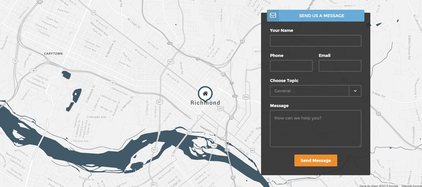
Contact Form
Search Form
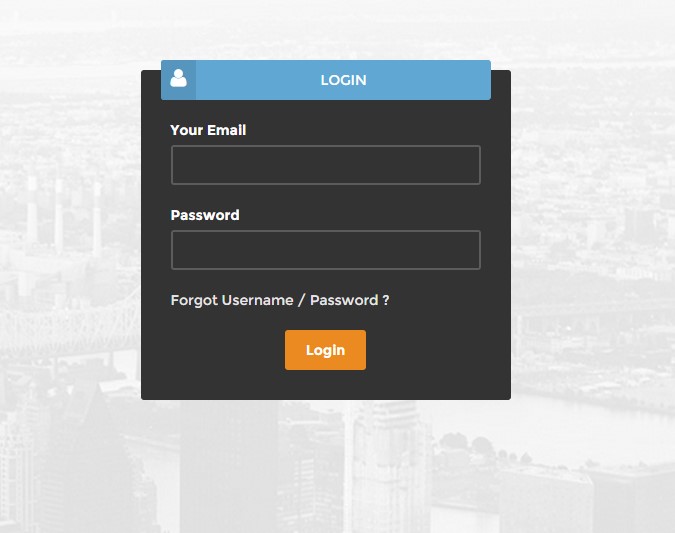
Login form
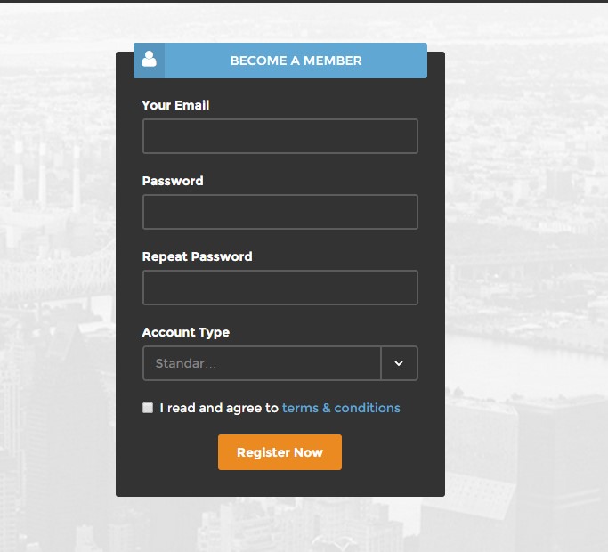
Register form
Wide search form
To use form you need to configure your mail data in form/config.php file and use the following HTML markup:
|
1 2 3 4 5 6 7 8 9 10 11 12 13 14 15 16 17 18 19 20 21 22 23 24 25 26 27 28 29 |
<form class="ct-formRegister pull-right"> <div class="form-group"> <div class="ct-form--label--type2"> <div class="ct-u-displayTableVertical"> <div class="ct-u-displayTableCell"> <div class="ct-input-group-btn"><button class="btn btn-primary"> <i class="fa fa-user"></i> </button></div> </div> <div class="ct-u-displayTableCell text-center"><span class="text-uppercase">Become a member</span></div> </div> </div> <div class="ct-form--item ct-u-marginBottom20"><label>Your Email</label> <input class="form-control input-lg" required="" type="text" placeholder="" /></div> <div class="ct-form--item ct-u-marginBottom20"><label>Password</label> <input class="form-control input-lg" required="" type="text" placeholder="" /></div> <div class="ct-form--item ct-u-marginBottom20"><label>Repeat Password</label> <input class="form-control input-lg" required="" type="text" placeholder="" /></div> <div class="ct-form--item ct-u-marginBottom20"><label>Account Type</label> <select class="ct-js-select ct-select-lg"><option value="standard">Standard User</option><option value="premium">Premium User</option></select></div> <div class="ct-form--item ct-u-marginBottom20"> <div class="checkbox"><label> <input type="checkbox" value="" /> I read and agree to<a href="terms.html"> terms & conditions</a> </label></div> </div> <div class="ct-form--item"><button class="btn btn-warning center-block" type="submit">Register Now</button></div> </div> </form> |
|
1 2 3 4 5 6 7 8 9 10 11 12 13 14 15 16 17 18 19 20 21 22 23 24 25 26 27 28 29 30 31 32 33 34 35 36 37 38 39 40 41 42 43 44 45 46 47 |
<div class="ct-popupForm ct-js-productForm--main infinite-left"><form> <div class="form-group"> <div class="ct-form-content"> <div class="ct-content--left pull-left"> <h3 class="text-uppercase">Edit Address</h3> <label>First Line</label> <input class="form-control input-lg" required="" type="text" value="15421 Southwest 39th Terrace" placeholder="" /> <label>Second Line</label> <input class="form-control input-lg" required="" type="text" value="San Francisco, CA 55689" placeholder="" /> <label>Property ID</label> <input class="form-control input-lg" required="" type="text" value="828219" placeholder="" /> </div> <div class="ct-content--right pull-right"> <h3 class="text-uppercase">Edit Description</h3> <label>Text</label> <textarea class="form-control" name="field[]" required="" placeholder="">Lorem ipsum dolor sit amet, consectetur adipisicing elit. Proin nibh augue, suscipit a, scelerisque sed, lacinia in, mi. Cras vel lorem. Etiam pellentesque aliquet tellus. Phasellus pharetra nulla ac diam. Quisque semper justo at risus. Donec venenatis, turpis vel hendrerit interdum, dui ligula ultricies purus, sed posuere.</textarea> </div> <div class="clearfix"></div> <h3 class="text-uppercase">Edit Summary</h3> <div class="ct-content--left pull-left"><label>Price</label> <input class="form-control input-lg" required="" type="text" value="$ 1 450 000" placeholder="" /> <label>Area</label> <input class="form-control input-lg" required="" type="text" value="185 m2" placeholder="" /> <label>Status</label> <input class="form-control input-lg" required="" type="text" value="Sale" placeholder="" /> <label>Type</label> <input class="form-control input-lg" required="" type="text" value="House" placeholder="" /> <label>Location</label> <input class="form-control input-lg" required="" type="text" value="San Francisco, CA 55689" placeholder="" /></div> <div class="ct-content--right pull-right"><label>Beds</label> <input class="form-control input-lg" required="" type="text" value="4" placeholder="" /> <label>Baths</label> <input class="form-control input-lg" required="" type="text" value="2" placeholder="" /> <label>Garage</label> <input class="form-control input-lg" required="" type="text" value="1" placeholder="" /> <label>Pool</label> <input class="form-control input-lg" required="" type="text" value="yes" placeholder="" /> <button class="btn btn-primary" type="button"><i class="fa fa-plus"></i></button></div> <div class="clearfix"></div> <button class="btn btn-success" type="submit">Save changes</button> </div> <div class="ct-form-close"></div> </div> </form></div> |
|
1 2 3 4 5 6 7 8 9 10 11 12 13 14 15 16 17 18 19 20 21 22 23 24 25 26 27 28 29 30 31 32 33 34 35 36 37 38 39 40 41 42 43 44 45 46 47 48 49 |
var $popupForm = $(".ct-popupForm"); var $popupMain = $(".ct-js-productForm--main"); var $popupMap = $(".ct-js-productForm--map"); var $popupDetails = $(".ct-js-productForm--details"); var $popupAgents = $(".ct-js-productForm--agents"); var $popupProperties = $(".ct-js-productForm--properties"); var $popupmask = $(".mask"); var $popupclose = $(".ct-form-close"); var $btnEditMain = $(".ct-js-btnEdit--Main"); var $btnEditMap = $(".ct-js-btnEdit--Map"); var $btnEditDetails = $(".ct-js-btnEdit--Details"); var $btnEditAgents = $(".ct-js-btnEdit--Agents"); var $btnEditProperties = $(".ct-js-btnEdit--Properties"); $btnEditMain.on("click", function(){ $popupMain.removeClass("infinite-left"); $popupmask.removeClass("infinite-left"); centerForm($popupMain); }); $btnEditMap.on("click", function(){ $popupMap.removeClass("infinite-left"); $popupmask.removeClass("infinite-left"); centerForm($popupMap); }); $btnEditDetails.on("click", function(){ $popupDetails.removeClass("infinite-left"); $popupmask.removeClass("infinite-left"); centerForm($popupDetails); }); $btnEditAgents.on("click", function(){ $popupAgents.removeClass("infinite-left"); $popupmask.removeClass("infinite-left"); centerForm($popupAgents); }); $btnEditProperties.on("click", function(){ $popupProperties.removeClass("infinite-left"); $popupmask.removeClass("infinite-left"); centerForm($popupProperties); }); $popupmask.on("click", function(){ $popupForm.addClass("infinite-left"); $popupmask.addClass("infinite-left"); }); $popupclose.on("click", function(){ $popupForm.addClass("infinite-left"); $popupmask.addClass("infinite-left"); }); |
Was this article helpful ?
Javascript
All javascripts are placed in folder /js. In main.js file we implement all functions calls.
This theme uses following Javascript scripts:
- 1. Media Sections
2. Datepicker – I use this for calendar widget in blog sidebar.
3. Gmaps
4. Headroom – Plugin for navbar options, same is in Diana.
5. Magnific Popup.
6. Pagescroller – Onepager navigation.
7. Owl Corusel – slider
8. Isotope – gallery categories sorting.
9. Select2 – overwrite a standard select.
10. Slider Bootstrap – amount slider.
11. Device.js – check what device we use.
12. Appear.js – check a status of element(is in viewport or not)
13. browser.js – check what browser we use
14. snap.js – snap event on mobile device
jquery.appear
This plugin call function when element appear in viewport. This is used in custom animation, progress bars, counter timer.
Documentation: https://github.com/bas2k/jquery.appear/
|
1 2 3 4 5 6 7 8 9 10 11 12 13 |
if (jQuery().appear) { if (device.mobile()) { // disable animation on mobile jQuery("body").removeClass("withAnimation"); } else { jQuery('.withAnimation .animated').appear(function () { jQuery(this).each(function () { jQuery(this).addClass('activate'); jQuery(this).addClass($(this).data('fx')); }); }, {accY: -150}); } } |
Was this article helpful ?
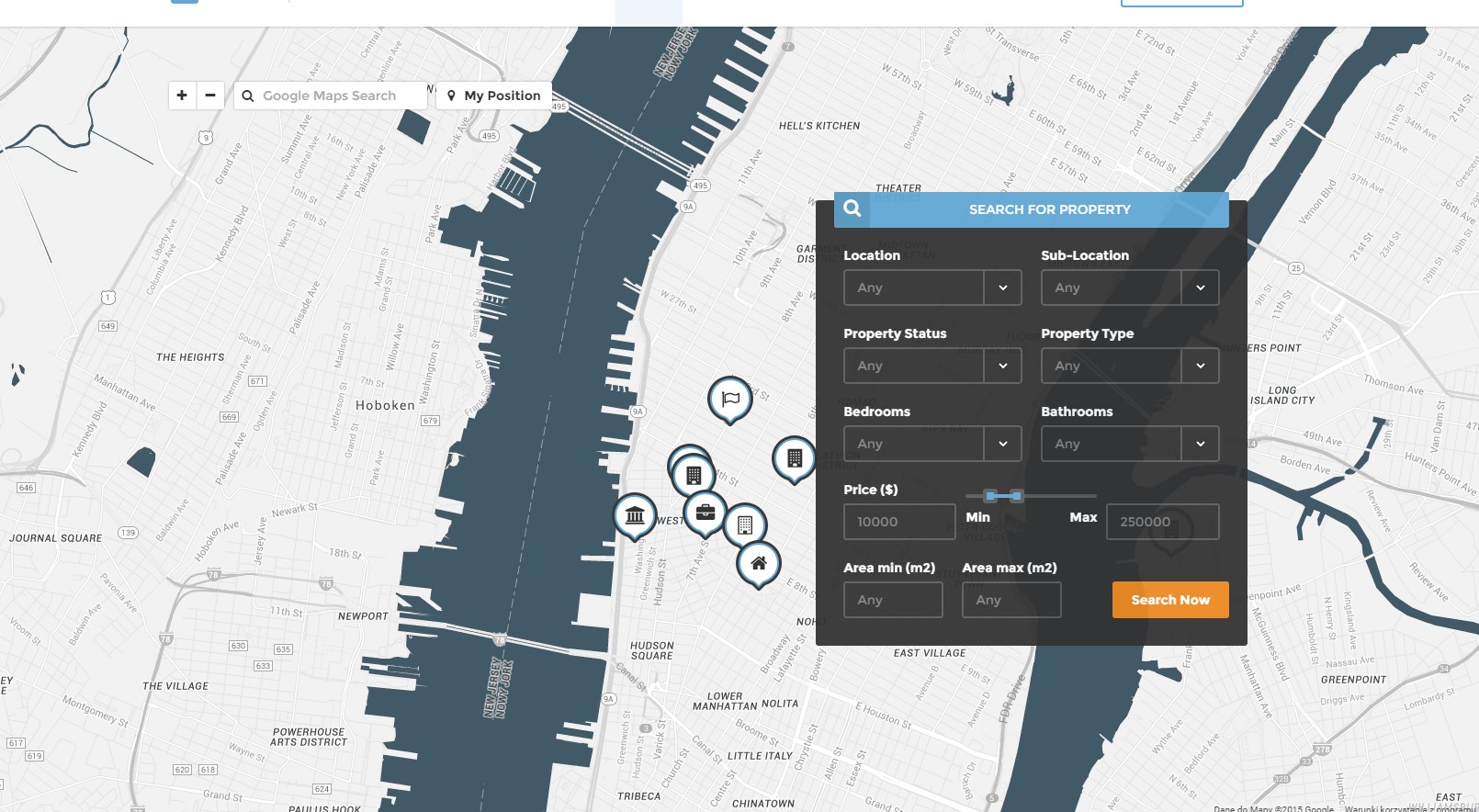
Google Map
Available parameters:
- .ct-js-googleMap
- .ct-js-googleMap–single
data:
- data-location
- data-zoom
- data-icon
- data-offset
- .ct-js-googleMap–group
data:
- data-display-desc (yes/no infowindow)
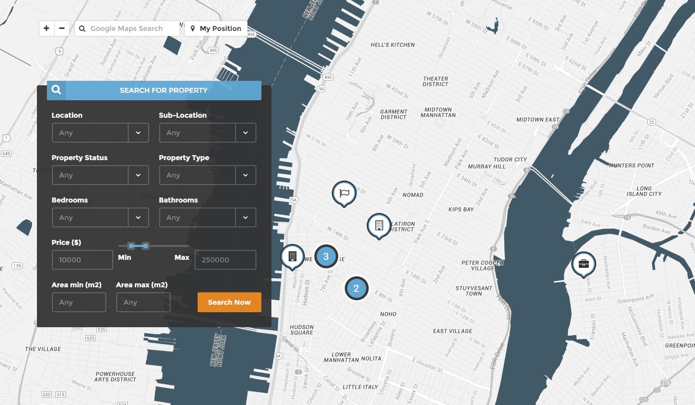
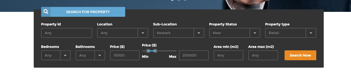
Google map with search form
|
1 2 3 4 5 6 7 8 9 10 11 |
var data = JSON.parse('[' + '{"address":"301 w 4th Street, New York","image":"assets/images/demo-content/property-1.jpg","icon":"assets/images/marker-apartment.png", "price":"450,000", "status":"House for sale", "bedrooms":"3", "bathrooms":"2", "area":"140"},' + '{"address":"128 7th Ave S, New York","image":"assets/images/demo-content/property-2.jpg","icon":"assets/images/marker-commercial.png", "price":"650,000", "status":"House for sale", "bedrooms":"4", "bathrooms":"3", "area":"100"},' + '{"address":"Eve 55 W 8th St, New York","image":"assets/images/demo-content/property-3.jpg","icon":"assets/images/marker-flat.png", "price":"400,000", "status":"House for sale", "bedrooms":"3", "bathrooms":"2", "area":"140"},' + '{"address":"21 W 16th St New York","image":"assets/images/demo-content/property-4.jpg","icon":"assets/images/marker-apartment.png", "price":"700,000", "status":"House for sale", "bedrooms":"3", "bathrooms":"2", "area":"140"},' + '{"address":"Washington Square Fountain, New York","image":"assets/images/demo-content/property-5.jpg","icon":"assets/images/marker-house.png", "price":"350,000", "status":"House for sale", "bedrooms":"3", "bathrooms":"2", "area":"140"},' + '{"address":"Pinkberry - Chelsea 170 8th Ave, New York","image":"assets/images/demo-content/property-6.jpg","icon":"assets/images/marker-land.png", "price":"750,000", "status":"House for sale", "bedrooms":"3", "bathrooms":"2", "area":"140"},' + '{"address":"8 Charles Ln New York","image":"assets/images/demo-content/property-7.jpg","icon":"assets/images/marker-villa.png", "price":"300,000", "status":"House for sale", "bedrooms":"3", "bathrooms":"2", "area":"140"},' + '{"address":"74 Green St Brooklyn","image":"assets/images/demo-content/property-8.jpg","icon":"assets/images/marker-apartment.png", "price":"800,000", "status":"House for sale", "bedrooms":"3", "bathrooms":"2", "area":"140"},' + '{"address":"321 w 4th Street, New York","image":"assets/images/demo-content/property-9.jpg","icon":"assets/images/marker-commercial.png", "price":"1,000,000", "status":"House for sale", "bedrooms":"3", "bathrooms":"2", "area":"140"}' + ']'); |
HTML markup:
|
1 |
<div class="ct-js-googleMap ct-googleMap ct-js-googleMap--group" data-display-desc="true" data-height="860" id="map"></div> |
Javascript:
|
1 2 3 4 5 6 7 8 9 10 11 12 13 14 15 16 17 18 19 20 21 22 23 24 25 26 27 28 29 30 31 32 33 34 35 36 37 38 39 40 41 42 43 44 45 46 47 48 49 50 51 52 53 54 55 56 57 58 59 60 61 62 63 64 65 66 67 68 69 70 71 72 73 74 75 76 77 78 79 80 81 82 83 84 85 86 87 88 89 90 91 92 93 94 95 96 97 98 99 100 101 102 103 104 105 106 107 108 109 110 111 112 113 114 115 116 117 118 119 120 121 122 123 124 125 126 127 128 129 130 131 132 133 134 135 136 137 138 139 140 141 142 143 144 145 146 147 148 149 150 151 152 153 154 155 156 157 158 159 160 161 162 163 164 165 166 167 168 169 170 171 172 173 174 175 176 177 178 179 180 181 182 183 184 185 186 187 188 189 190 191 192 193 194 195 196 197 198 199 200 201 202 203 204 205 206 207 208 209 210 211 212 213 214 215 216 217 218 219 220 221 222 223 224 225 226 227 228 229 230 231 232 233 234 235 236 237 238 239 240 241 242 243 244 245 246 247 248 249 250 251 252 253 254 255 256 257 258 259 260 261 262 263 264 265 266 267 268 269 270 271 272 273 274 275 276 277 278 279 280 281 282 283 284 285 286 287 288 289 290 291 292 293 294 295 296 297 298 299 300 301 302 303 304 305 306 307 308 309 310 311 312 313 314 315 316 317 318 319 320 321 322 323 324 325 326 327 328 329 330 331 332 333 334 335 336 337 338 339 340 341 342 343 344 345 346 347 348 349 350 351 352 353 354 355 356 357 358 359 360 361 362 363 364 365 366 367 368 369 370 371 372 373 374 375 376 377 378 379 380 381 382 383 384 385 386 387 388 389 390 391 392 393 394 395 396 397 398 399 400 401 402 403 404 405 406 407 408 409 410 411 412 413 414 415 416 417 418 419 420 421 422 423 424 425 426 427 428 429 430 431 432 433 434 435 436 437 |
(function ($) { "use strict"; /* ============================================= */ /* ==== GOOGLE MAP ==== */ var mapStyles = [{"featureType":"administrative","elementType":"labels.text.fill","stylers":[{"color":"#444444"}]},{"featureType":"landscape","elementType":"all","stylers":[{"color":"#f2f2f2"}]},{"featureType":"poi","elementType":"all","stylers":[{"visibility":"off"}]},{"featureType":"road","elementType":"all","stylers":[{"saturation":-100},{"lightness":45}]},{"featureType":"road.highway","elementType":"all","stylers":[{"visibility":"simplified"}]},{"featureType":"road.arterial","elementType":"labels.icon","stylers":[{"visibility":"off"}]},{"featureType":"transit","elementType":"all","stylers":[{"visibility":"off"}]},{"featureType":"water","elementType":"all","stylers":[{"color":"#425a68"},{"visibility":"on"}]}]; function initmap() { if (($(".ct-js-googleMap").length > 0) && (typeof google === 'object' && typeof google.maps === 'object')) { var draggable = true; if (device.mobile() || device.tablet()) { draggable = false; } $('.ct-js-googleMap--single').each(function () { var atcenter = ""; var $this = $(this); var location = $this.data("location"); var zoom = $this.data("zoom"); var icongmap = $this.attr('data-icon'); var offset = -30; if (validatedata($this.data("offset"))) { offset = $this.data("offset"); } if (validatedata(location)) { $this.gmap3({ marker: { //latLng: [40.616439, -74.035540], address: location, options: { //visible: false icon: new google.maps.MarkerImage(icongmap) }, callback: function (marker) { atcenter = marker.getPosition(); } }, map: { options: { //maxZoom:11, zoom: zoom, styles:mapStyles, mapTypeId: google.maps.MapTypeId.ROADMAP, // ('ROADMAP', 'SATELLITE', 'HYBRID','TERRAIN'); scrollwheel: false, disableDoubleClickZoom: false, draggable: false, //disableDefaultUI: true, disableDefaultUI: true, mapTypeControlOptions: { //mapTypeIds: [google.maps.MapTypeId.ROADMAP, google.maps.MapTypeId.HYBRID], //style: google.maps.MapTypeControlStyle.HORIZONTAL_BAR, //position: google.maps.ControlPosition.RIGHT_CENTER mapTypeIds: [] } }, events: { idle: function () { if (!$this.data('idle')) { $this.gmap3('get').panBy(offset, 0); $this.data('idle', true); } } } }, overlay: { address: location, options: { offset: { y: -100, x: -25 } } } //},"autofit" }); // center on resize google.maps.event.addDomListener(window, "resize", function () { //var userLocation = new google.maps.LatLng(53.8018,-1.553); setTimeout(function () { $this.gmap3('get').setCenter(atcenter); $this.gmap3('get').panBy(0, offset); }, 400); }); // set height $this.css("min-height", $this.data("height") + "px"); } if ($this.parent().parent().hasClass('hidemap')) { $this.parent().animate({height: '0px'}, 500); } }), jQuery('.ct-js-googleMap--group').each(function () { var $this = jQuery(this); var $display_desc = validatedata(parseBoolean($this.attr("data-display-desc")), false); // JSON var data = JSON.parse('[' + '{"address":"301 w 4th Street, New York","image":"assets/images/demo-content/property-1.jpg","icon":"assets/images/marker-apartment.png", "price":"450,000", "status":"House for sale", "bedrooms":"3", "bathrooms":"2", "area":"140"},' + '{"address":"128 7th Ave S, New York","image":"assets/images/demo-content/property-2.jpg","icon":"assets/images/marker-commercial.png", "price":"650,000", "status":"House for sale", "bedrooms":"4", "bathrooms":"3", "area":"100"},' + '{"address":"Eve 55 W 8th St, New York","image":"assets/images/demo-content/property-3.jpg","icon":"assets/images/marker-flat.png", "price":"400,000", "status":"House for sale", "bedrooms":"3", "bathrooms":"2", "area":"140"},' + '{"address":"21 W 16th St New York","image":"assets/images/demo-content/property-4.jpg","icon":"assets/images/marker-apartment.png", "price":"700,000", "status":"House for sale", "bedrooms":"3", "bathrooms":"2", "area":"140"},' + '{"address":"Washington Square Fountain, New York","image":"assets/images/demo-content/property-5.jpg","icon":"assets/images/marker-house.png", "price":"350,000", "status":"House for sale", "bedrooms":"3", "bathrooms":"2", "area":"140"},' + '{"address":"Pinkberry - Chelsea 170 8th Ave, New York","image":"assets/images/demo-content/property-6.jpg","icon":"assets/images/marker-land.png", "price":"750,000", "status":"House for sale", "bedrooms":"3", "bathrooms":"2", "area":"140"},' + '{"address":"8 Charles Ln New York","image":"assets/images/demo-content/property-7.jpg","icon":"assets/images/marker-villa.png", "price":"300,000", "status":"House for sale", "bedrooms":"3", "bathrooms":"2", "area":"140"},' + '{"address":"74 Green St Brooklyn","image":"assets/images/demo-content/property-8.jpg","icon":"assets/images/marker-apartment.png", "price":"800,000", "status":"House for sale", "bedrooms":"3", "bathrooms":"2", "area":"140"},' + '{"address":"321 w 4th Street, New York","image":"assets/images/demo-content/property-9.jpg","icon":"assets/images/marker-commercial.png", "price":"1,000,000", "status":"House for sale", "bedrooms":"3", "bathrooms":"2", "area":"140"}' + ']'); console.log($display_desc); if($display_desc == false){ $this.gmap3({ map:{ options:{ center:[40.742803, -74.002424], zoom: 14, scrollwheel: false, disableDoubleClickZoom: false, draggable: draggable, //disableDefaultUI: true, disableDefaultUI: true, mapTypeId: google.maps.MapTypeId.ROADMAP, // ('ROADMAP', 'SATELLITE', 'HYBRID','TERRAIN'); styles:mapStyles } }, marker:{ values: [ { address:"301 w 4th Street, New York", options:{ icon: "assets/images/marker-villa.png" } }, { address:"128 7th Ave S, New York", options:{ icon: "assets/images/marker-apartment.png" } }, { address:"Eve 55 W 8th St, New York", options:{ icon: "assets/images/marker-commercial.png" } }, { address:"21 W 16th St New York", options:{ icon: "assets/images/marker-flat.png" } }, { address:"Washington Square Fountain, New York", options:{ icon: "assets/images/marker-house.png" } }, { address:"Pinkberry - Chelsea 170 8th Ave, New York", options:{ icon: "assets/images/marker-land.png" } }, { address:"8 Charles Ln New York", options:{ icon: "assets/images/marker-apartment.png" } }, { address:"74 Green St Brooklyn", options:{ icon: "assets/images/marker-commercial.png" } }, { address:"321 w 4th Street, New York", options:{ icon: "assets/images/marker-house.png" } } ], cluster:{ radius: 50, 0: { content: "<div class='ct-markerCluster'>CLUSTER_COUNT</div>", width: 53, height: 52 }, 2: { content: "<div class='ct-markerCluster'>CLUSTER_COUNT</div>", width: 56, height: 55 }, 50: { content: "<div class='ct-markerCluster'>CLUSTER_COUNT</div>", width: 66, height: 65 } } } }) } else{ $this.gmap3({ map:{ options:{ center:[40.742803, -74.002424], zoom: 14, scrollwheel: false, disableDoubleClickZoom: false, draggable: draggable, //disableDefaultUI: true, mapTypeId: google.maps.MapTypeId.ROADMAP, disableDefaultUI: true, styles:mapStyles // ('ROADMAP', 'SATELLITE', 'HYBRID','TERRAIN'); }, events:{ click: function(map, event, context){ gmap_clear_markers(); } } } }) $.each(data, function(key, val) { $this.gmap3({ marker:{ values:[{ address:val.address, options:{ icon: val.icon }, events: { click: function() { gmap_clear_markers(); $this.gmap3({ overlay:{ address:val.address, options:{ content: "<div class='ct-itemProducts ct-hover ct-itemProducts--boxed ct-gmapProduct'>"+ "<a href='product-single.html'>"+ "<div class='ct-main-content'>" + "<div class='ct-imageBox'>"+ "<img src='"+val.image+"' alt=''>"+ "<i class='fa fa-eye'></i>"+ "</div>"+ "<div class='ct-main-text'>"+ "<div class='ct-product--tilte'>"+ val.address+ "</div>"+ "<div class='ct-product--price'>"+ "<span>$ "+val.price+"</span>"+ //"<span class='ct-price--Old'>$ 450,000</span>"+ "</div>"+ "</div>"+ "<div class='ct-product--meta'>"+ "<div class='ct-status'><span class='ct-fw-600'>Status</span> "+val.status+"</div>"+ "<div class='ct-icons'>"+ "<span>"+ "<i class='fa fa-bed'></i> "+ val.bedrooms+ "</span>"+ "<span>"+ "<i class='fa fa-cutlery'></i> "+ val.bathrooms+ "</span>"+ "</div>"+ "<div class='ct-text'>"+ "<span> Area: <span>"+val.area+" m2</span></span>"+ "</div>"+ "</div>"+ "</div>"+ "<div class='ct-bottomArrow'></div>"+ "</a>"+ "</div>", offset:{ y:-340, x:-140 } } } }); } } }], cluster:{ radius: 20, 0: { content: "<div class='ct-markerCluster'>CLUSTER_COUNT</div>", width: 53, height: 52 }, 2: { content: "<div class='ct-markerCluster'>CLUSTER_COUNT</div>", width: 56, height: 55 }, 50: { content: "<div class='ct-markerCluster'>CLUSTER_COUNT</div>", width: 66, height: 65 } } } }); }); }; // Function Clear Markers function gmap_clear_markers() { $('.ct-gmapProduct').each(function() { $(this).remove(); }); } var map = $(".ct-js-googleMap").gmap3({ get: { name:"map" } }); //Navigation $('#zoomin').on("click", function(){ var newCenter = map.getZoom(); map.setZoom(newCenter+1); }) $('#zoomout').on("click", function(){ var newCenter = map.getZoom(); map.setZoom(newCenter-1); }) $('#geolocation').on("click", function(){ // Try HTML5 geolocation if(navigator.geolocation) { navigator.geolocation.getCurrentPosition(function(position) { var pos = new google.maps.LatLng(position.coords.latitude, position.coords.longitude); $(".ct-js-googleMap").gmap3({ circle:{ options:{ center: pos, radius : 800, fillColor : "#60a7d4", strokeColor : "#333333" }, callback: function(){ $(this).gmap3('get').setZoom(15); } } }); map.setCenter(pos); }, function() { handleNoGeolocation(true); }); } else { // Browser doesn't support Geolocation handleNoGeolocation(false); } }) function handleNoGeolocation(errorFlag) { if (errorFlag) { var content = 'Error: The Geolocation service failed.'; } else { var content = 'Error: Your browser doesn\'t support geolocation.'; } } function searchauto() { var locations = []; // Create the search box and link it to the UI element. var input = (document.getElementById('searchGmaps')); var searchBox = new google.maps.places.SearchBox( /** @type {HTMLInputElement} */(input)); // Listen for the event fired when the user selects an item from the // pick list. Retrieve the matching places for that item. google.maps.event.addListener(searchBox, 'places_changed', function() { var places = searchBox.getPlaces(); if (places.length == 0) { return; } for (var i = 0, location; location = locations[i]; i++) { location.setMap(null); } // For each place, get the icon, place name, and location. locations = []; var bounds = new google.maps.LatLngBounds(); for (var i = 0, place; place = places[i]; i++) { var image = { url: "assets/images/marker-land.png", //size: new google.maps.Size(71, 71), origin: new google.maps.Point(0, 0), anchor: new google.maps.Point(17, 34) //scaledSize: new google.maps.Size(25, 25) }; bounds.extend(place.geometry.location); } map.fitBounds(bounds); }); google.maps.event.addListener(map, 'bounds_changed', function() { var bounds = map.getBounds(); searchBox.setBounds(bounds); }); } searchauto(); // set height $this.css("min-height", $this.data("height") + "px"); }) } } initmap(); }) |
Was this article helpful ?
Slider
- .ct-js-owl
- .ct-owl-controls–type2
- .ct-owl-controls–type3
Slider
To use slider you need to use simple HTML markup:
|
1 2 3 4 5 6 7 8 9 10 |
<div class="ct-js-owl" data-items="6" data-navigation="false" data-autoPlay="true" data-single="false" data-pagination="false"> <div class="item"><img src="assets/images/demo-content/content-partners-1.png" alt=""></div> <div class="item"><img src="assets/images/demo-content/content-partners-2.png" alt=""></div> <div class="item"><img src="assets/images/demo-content/content-partners-3.png" alt=""></div> <div class="item"><img src="assets/images/demo-content/content-partners-4.png" alt=""></div> <div class="item"><img src="assets/images/demo-content/content-partners-5.png" alt=""></div> <div class="item"><img src="assets/images/demo-content/content-partners-6.png" alt=""></div> <div class="item"><img src="assets/images/demo-content/content-partners-1.png" alt=""></div> <div class="item"><img src="assets/images/demo-content/content-partners-2.png" alt=""></div> </div> |
|
1 2 3 4 5 6 7 8 9 10 11 12 13 14 15 16 17 18 19 20 21 22 23 24 25 26 27 28 29 30 31 32 33 34 35 36 37 38 39 40 41 42 43 44 45 46 47 48 49 50 51 52 53 54 55 56 57 58 59 60 61 62 63 64 65 66 67 68 69 70 71 72 73 74 75 76 77 78 79 80 81 82 83 84 85 86 87 88 89 90 91 92 93 94 95 96 97 98 99 100 101 102 103 104 105 106 107 108 109 110 111 112 113 114 115 116 117 118 119 120 121 122 123 124 125 126 127 128 129 130 131 132 133 134 135 136 137 138 139 140 141 142 143 144 145 146 147 148 149 150 151 152 153 154 155 156 157 158 159 160 161 162 163 164 165 166 167 168 169 170 171 172 173 174 175 176 177 178 179 180 181 182 183 184 185 186 187 188 189 190 191 192 193 194 195 196 197 198 199 200 201 202 203 204 205 206 207 208 209 210 211 212 213 214 215 216 217 218 219 220 221 222 223 224 225 226 227 228 229 230 231 232 233 234 235 236 237 238 239 240 241 242 243 244 245 246 247 248 249 250 251 252 253 254 255 256 257 258 259 260 261 262 263 264 265 266 267 268 269 270 271 272 273 274 275 276 277 278 279 280 281 282 283 284 285 286 287 |
(function ($) { "use strict"; $(document).ready(function () { /* ====================== */ /* ==== OWL CAROUSEL ==== */ if($().owlCarousel){ if ($(".ct-js-owl").length > 0) { $(".ct-js-owl").each(function (){ var $this = $(this); var ctanimations = validatedata($this.attr("data-animations"), false); if($devicewidth < 768 || device.mobile() || device.ipad() || device.androidTablet()){ ctanimations = false; } var ctitems = parseInt(validatedata($this.attr("data-items"), 5)); var $lgItems = parseInt(validatedata($this.attr("data-lgItems"), 4)); var $mdItems = parseInt(validatedata($this.attr("data-mdItems"), 3)); var $smItems = parseInt(validatedata($this.attr("data-smItems"), 2)); var $xsItems = parseInt(validatedata($this.attr("data-xsItems"), 1)); var ctsingleitem = parseBoolean($this.attr("data-single"), true); var ctscaleitems = parseBoolean($this.attr("data-scaleUp"), false); var ctslidespeed = parseInt(validatedata($this.attr("data-slideSpeed"), 200)); var ctpagspeed = parseInt(validatedata($this.attr("data-paginationSpeed"), 800)); var ctrewindspeed = parseInt(validatedata($this.attr("data-rewindSpeed"), 1000)); var ctautoplay = parseBoolean($this.attr("data-autoPlay"), false); if($this.attr("data-autoPlaySpeed") != null){ ctautoplay = parseInt(validatedata($this.attr("data-autoPlaySpeed"), 5000)); } var ctstophover = parseBoolean($this.attr("data-stopOnHover"), false); var ctnavigation = parseBoolean($this.attr("data-navigation"), true); var ctrewindnav = parseBoolean($this.attr("data-rewindNav"), true); var ctscrollperpage = parseBoolean($this.attr("data-scrollPerPage"), false) var ctpagination = parseBoolean($this.attr("data-pagination"), true); var ctpaginationnumbers = parseBoolean($this.attr("data-paginationNumbers"), false); var ctresponsive = parseBoolean($this.attr("data-responsive"), true); var ctlazyload = parseBoolean($this.attr("data-lazyLoad"), false); var ctautoheight = parseBoolean($this.attr("data-autoHeight"), false); var ctmouse = parseBoolean($this.attr("data-mouse"), true); var cttouch = parseBoolean($this.attr("data-touch"), true); var cttransition = validatedata($this.attr("data-cttransition"), "fade"); $this.owlCarousel({ // Most important owl features items : ctitems, //This variable allows you to set the maximum amount of items displayed at a time with the widest browser width itemsDesktop : [$lgWidth,$lgItems], //This allows you to preset the number of slides visible with a particular browser width. The format is [x,y] whereby x=browser width and y=number of slides displayed. For example [1199,4] means that if(window<=1199){ show 4 slides per page} Alternatively use itemsDesktop: false to override these settings. itemsDesktopSmall : [$mdWidth,$mdItems], //As above. itemsTablet: [$smWidth,$smItems], // As above. itemsMobile : [$xsWidth,$xsItems], // As above. singleItem : ctsingleitem, // Display only one item. itemsScaleUp : ctscaleitems, // Option to not stretch items when it is less than the supplied items. //Basic Speeds slideSpeed : ctslidespeed, // Slide speed in milliseconds paginationSpeed : ctpagspeed, // Pagination speed in milliseconds rewindSpeed : ctrewindspeed, // Rewind speed in milliseconds //Autoplay autoPlay : ctautoplay, // Change to any integrer for example autoPlay : 5000 to play every 5 seconds. If you set autoPlay: true default speed will be 5 seconds. stopOnHover : ctstophover, // Stop autoplay on mouse hover // Navigation navigation : ctnavigation, // Display "next" and "prev" buttons. navigationText : ['<i class="fa fa-angle-left"></i>','<i class="fa fa-angle-right"></i>'], // You can customize your own text for navigation. To get empty buttons use navigationText : false. Also HTML can be used here rewindNav : ctrewindnav, // Slide to first item. Use rewindSpeed to change animation speed. scrollPerPage : ctscrollperpage, // Scroll per page not per item. This affect next/prev buttons and mouse/touch dragging. //Pagination pagination : ctpagination, // Show pagination. paginationNumbers: ctpaginationnumbers, // Show numbers inside pagination buttons // Responsive responsive: ctresponsive, // You can use Owl Carousel on desktop-only websites too! Just change that to "false" to disable resposive capabilities responsiveRefreshRate : 200, // Check window width changes every 200ms for responsive actions responsiveBaseWidth: window, // Owl Carousel check window for browser width changes. You can use any other jQuery element to check width changes for example ".owl-demo". Owl will change only if ".owl-demo" get new width. // CSS Styles baseClass : "owl-carousel", // Automaticly added class for base CSS styles. Best not to change it if you don't need to. theme : "owl-theme", // Default Owl CSS styles for navigation and buttons. Change it to match your own theme //Lazy load lazyLoad : ctlazyload, // Delays loading of images. Images outside of viewport won't be loaded before user scrolls to them. Great for mobile devices to speed up page loadings. IMG need special markup class="lazyOwl" and data-src="your img path". See example. lazyFollow : true, // When pagination used, it skips loading the images from pages that got skipped. It only loads the images that get displayed in viewport. If set to false, all images get loaded when pagination used. It is a sub setting of the lazy load function. lazyEffect : "fade", // Default is fadeIn on 400ms speed. Use false to remove that effect. //Auto height autoHeight : ctautoheight, //JSON jsonPath : false, jsonSuccess : false, //Mouse Events dragBeforeAnimFinish : true, mouseDrag : ctmouse, touchDrag : cttouch, //Transitions transitionStyle : cttransition, // Add CSS3 transition style. Works only with one item on screen. // Other addClassActive : true, // Add "active" classes on visible items. Works with any numbers of items on screen. //Callbacks beforeUpdate : false, afterUpdate : false, beforeInit: function () { }, afterInit: function(){ if(ctanimations) { $this.css('min-height', $this.attr('data-height')); $this.css('height', $this.attr('data-height')); $this.find('.owl-wrapper-outer').css('min-height', $this.attr('data-height')); $this.find('.owl-wrapper-outer').css('height', $this.attr('data-height')); $this.find('.owl-wrapper').css('min-height', $this.attr('data-height')); $this.find('.owl-wrapper').css('height', $this.attr('data-height')); $this.find(".item").each(function () { var $slide_item = $(this); var bg = validatedata($slide_item.attr('data-bg'), false); if (bg) { $slide_item.css('background-image', 'url("' + bg + '")'); } }) setTimeout(function () { $this.find(".owl-item.active > .item [data-fx]").each(function () { var $content = $(this); if ($content.data('time') != undefined) { setTimeout(function () { $content.addClass($content.data('fx')).addClass("activate"); }, $content.data('time')); } else{ $content.addClass($content.data('fx')).addClass("activate"); } }) }, 650); } }, beforeMove: false, afterMove: false, afterAction: function(){ if(ctanimations){ $this.find(".owl-item > .item [data-fx]").each(function () { var $content = $(this); $content.removeClass($content.data('fx')).removeClass("activate"); }) setTimeout(function () { $this.find(".owl-item.active > .item [data-fx]").each(function () { var $content = $(this); if ($content.data('time') != undefined) { setTimeout(function () { $content.addClass($content.data('fx')).addClass("activate"); }, $content.data('time')); } else{ $content.addClass($content.data('fx')).addClass("activate"); } }) }, 150); } }, startDragging : false, afterLazyLoad : false }) }) } } }) $(document).ready(function() { var sync1 = $("#sync1"); var sync2 = $("#sync2"); if($(".ct-owl--background").hasClass("ct-mediaSection")){ //Fix for autoplay video in owl $(this).find('video').get(0).play(); } function syncPosition(el){ var current = this.currentItem; sync2 .find(".owl-item") .removeClass("synced") .eq(current) .addClass("synced") if(sync2.data("owlCarousel") !== undefined){ center(current) } } function center(number){ var sync2visible = sync2.data("owlCarousel").owl.visibleItems; var num = number; var found = false; for(var i in sync2visible){ if(num === sync2visible[i]){ found = true; } } if(found===false){ if(num>sync2visible[sync2visible.length-1]){ sync2.trigger("owl.goTo", num - sync2visible.length+2) }else{ if(num - 1 === -1){ num = 0; } sync2.trigger("owl.goTo", num); } } else if(num === sync2visible[sync2visible.length-1]){ sync2.trigger("owl.goTo", sync2visible[1]) } else if(num === sync2visible[0]){ sync2.trigger("owl.goTo", num-1) } } if(sync1 && sync2){ if(sync1.hasClass("ct-js-owl--propertySlider1")){ sync1.owlCarousel({ singleItem : true, slideSpeed : 1000, pagination: true, navigation: true, navigationText : ['<i class="fa fa-angle-left"></i>','<i class="fa fa-angle-right"></i>'], afterAction : syncPosition, responsiveRefreshRate : 200 }); } else{ sync1.owlCarousel({ singleItem : true, slideSpeed : 1000, pagination:false, afterAction : syncPosition, responsiveRefreshRate : 200 }); } if(sync2.hasClass("ct-js-owl--propertySlider2")){ sync2.owlCarousel({ singleItem : true, slideSpeed : 1000, navigation: true, navigationText : ['<i class="fa fa-angle-left"></i>','<i class="fa fa-angle-right"></i>'], pagination:false, responsiveRefreshRate : 100, afterInit : function(el){ el.find(".owl-item").eq(0).addClass("synced"); } }); } else{ sync2.owlCarousel({ items : 5, itemsDesktop : [1199,4], itemsDesktopSmall : [979,3], itemsTablet : [768,5], itemsMobile : [479,3], navigation: true, navigationText : ['<i class="fa fa-angle-left"></i>','<i class="fa fa-angle-right"></i>'], pagination:false, responsiveRefreshRate : 100, afterInit : function(el){ el.find(".owl-item").eq(0).addClass("synced"); } }); sync2.on("click", ".owl-item", function(e){ e.preventDefault(); var number = $(this).data("owlItem"); sync1.trigger("owl.goTo",number); }); } } }); } |
Was this article helpful ?
Portfolio
We are using Isotope and Magnific Popup for portfolio. You can change number of portfolio columns and/or add portfolio filters with following classes:
- .ct-gallery-filters (isotope navigation)
- .ct-gallery
- .ct-gallery–col1
- .ct-gallery–col2
- .ct-gallery–col3
- .ct-gallery–col4
- .ct-gallery–col5

Portfolio
|
1 2 3 4 5 6 7 8 9 10 11 12 13 14 15 16 17 18 19 20 21 22 23 24 25 26 27 |
<section id="portfolio" class="section"> <div class="ct-mediaSection ct-u-paddingBoth100 ct-u-text--white text-center" data-stellar-background-ratio="0.3" data-height="295" data-type="parallax" data-bg-image="assets/images/demo-content/portfolio-parallax.jpg" data-bg-image-mobile="assets/images/demo-content/portfolio-parallax.jpg"> <div class="container"> <div class="ct-heading text-uppercase ct-u-marginBottom30"> <h2>Our work</h2> </div> <ul class="ct-gallery-filters list-unstyled list-inline"> <li><a data-filter="*" class="btn btn-default btn-transparent--border ct-u-text--white active">All</a></li> <li><a data-filter=".creative" class="btn btn-default btn-transparent--border ct-u-text--white">Creative</a></li> <li><a data-filter=".development" class="btn btn-default btn-transparent--border ct-u-text--white">Development</a></li> <li><a data-filter=".print" class="btn btn-default btn-transparent--border ct-u-text--white">Print</a></li> </ul> </div> </div> <div id="ct-gallery" class="ct-gallery ct-gallery--col4"> <div class="ct-gallery-item ct-gallery-item--masonry hidden development"> <div class="ct-gallery-itemInner"> <a href="assets/images/demo-content/portfolio-image-1.jpg" class="ct-js-magnificPopupImage"> <img src="assets/images/demo-content/portfolio-thumbnail-1.jpg" alt="Portfolio"> <div class="ct-galleryBox-overlay"></div> <div class="ct-hover--text text-uppercase"> <h4 class="ct-fw-600">Project name goes here</h4> <span class="ct-fw-600">Creative</span> </div> </a> </div> </div> |
Javascript:
|
1 2 3 4 5 6 7 8 9 10 11 12 13 14 15 16 17 18 19 20 21 22 23 24 25 26 27 28 29 30 31 32 33 34 35 36 37 38 39 |
jQuery(window).load(function () { if ($().isotope && ($('.ct-gallery').length > 0)) { var $container = $('.ct-gallery'), // object that will keep track of options isotopeOptions = {}, // defaults, used if not explicitly set in hash defaultOptions = { filter: '*', itemSelector: '.ct-gallery-item', // set columnWidth to a percentage of container width masonry: { } }; // set up Isotope $container.isotope(defaultOptions); $container.imagesLoaded().progress(function (instance, image) { if (!image.isLoaded) { return; } var p = $(image.img).closest('.hidden'); p.removeClass('hidden'); $container.addClass('is-loaded') $container.isotope('layout'); }) $('.ct-gallery-filters a').click(function () { $('.ct-gallery-filters .active').removeClass('active'); $(this).addClass('active'); var selector = $(this).attr('data-filter'); $container.isotope({ filter: selector, animationOptions: { duration: 750, easing: 'linear', queue: false } }); return false; }); } }); |
Was this article helpful ?
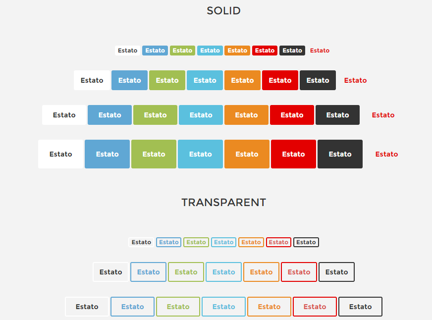
Buttons
There are the following colors variations of buttons:
- .btn-default
- .btn-primary
- .btn-success
- .btn-info
- .btn-warning
- .btn-danger
- .btn-dark
- .btn-edit
- .btn-transparent–border
- .ct-sectioButton–square (footer)
You can also use different buttons sizes:
- btn-xs,
- btn-sm,
- btn-lg
Just add a class to simple HTML markup:
|
1 |
<a class="btn btn-primary btn-transparent--border ct-u-text--motive" href="properties.html">List Property</a> |
Buttons
Was this article helpful ?
Icon Box
Estato comes with the following variations for icon boxes:
- .ct-iconBox
- .ct-iconBox–2col
- .ct-iconBoxContainer
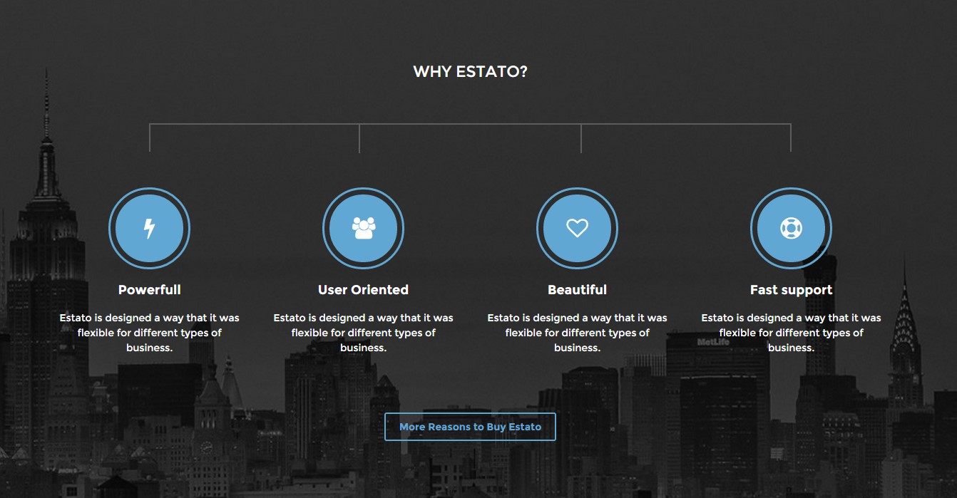
Icon boxes

Icon boxes 2 columns
|
1 2 3 4 5 6 7 8 9 10 11 12 13 14 15 16 17 18 19 20 21 22 23 24 25 26 27 28 29 30 31 32 33 34 35 36 37 38 39 40 41 42 43 44 45 46 47 48 49 50 51 52 53 54 55 56 57 58 59 60 |
<div class="ct-iconBox"> <div class="ct-icon ct-iconContainer--circle center-block ct-u-marginBottom30"> <i class="fa fa-bolt"></i> </div> <div class="ct-iconBox--description"> <span class="ct-title ct-u-marginBottom20 ct-fw-600">Powerfull</span> <span class="ct-text ct-u-marginBottom20">Estato is designed a way that it was flexible for different types of business.</span> </div> </div> ---------------------------- <div class="ct-iconBox ct-u-marginBottom40 ct-iconBox--2col pull-left"> <div class="ct-icon text-center ct-iconContainer--circle pull-left"> <i class="fa fa-users"></i> </div> <div class="ct-iconBox--description pull-right"> <span class="ct-title text-uppercase ct-fw-600">Get more users</span> <span class="ct-text">Thanks to our content optimization you will get more visits to your property page.</span> </div> </div> --------------------------------- <div class="ct-iconBoxContainer center-block"> <div class="col-md-4"> <div class="ct-iconBox"> <div class="ct-icon ct-iconContainer--circle center-block ct-u-marginBottom30"> <i class="fa fa-mobile"></i> </div> <div class="ct-iconBox--description"> <span class="ct-title ct-u-marginBottom20 ct-fw-600 text-uppercase">Responsive</span> <span class="ct-text ct-u-marginBottom20">Estato is designed a way that it was flexible for different types of business.</span> </div> </div> </div> <div class="col-md-4"> <div class="ct-iconBox"> <div class="ct-icon ct-iconContainer--circle center-block ct-u-marginBottom30"> <i class="fa fa-rocket"></i> </div> <div class="ct-iconBox--description"> <span class="ct-title ct-u-marginBottom20 ct-fw-600 text-uppercase">Innovative</span> <span class="ct-text ct-u-marginBottom20">Estato is designed a way that it was flexible for different types of business.</span> </div> </div> </div> <div class="col-md-4"> <div class="ct-iconBox"> <div class="ct-icon ct-iconContainer--circle center-block ct-u-marginBottom30"> <i class="fa fa-clock-o"></i> </div> <div class="ct-iconBox--description"> <span class="ct-title ct-u-marginBottom20 ct-fw-600 text-uppercase">Optimised</span> <span class="ct-text ct-u-marginBottom20">Estato is designed a way that it was flexible for different types of business.</span> </div> </div> </div> <div class="clearfix"></div> </div> |
Was this article helpful ?
Person Box
There are two types of person boxes:
- .ct-personBox
- .ct-personBox–extended
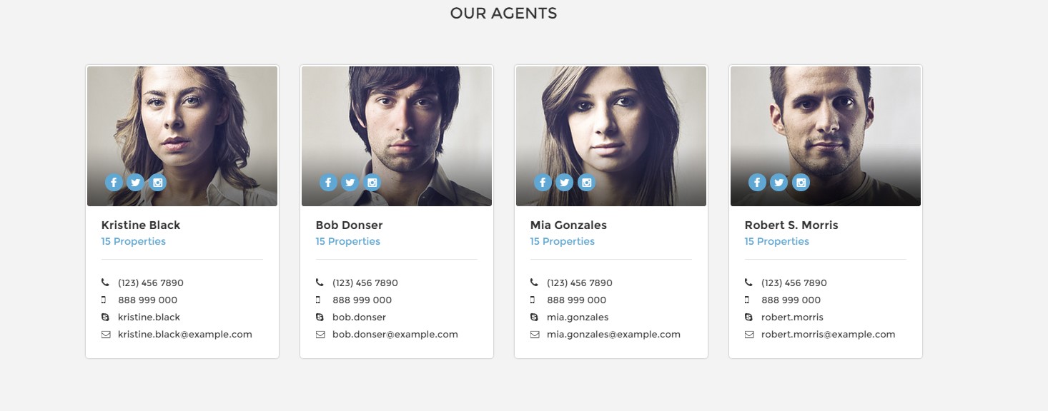
Person box default

Person box extended
HTML markup:
|
1 2 3 4 5 6 7 8 9 10 11 12 13 14 15 16 17 18 19 20 21 22 23 24 25 26 27 28 29 30 31 32 33 34 35 36 37 38 39 40 41 42 43 44 45 46 47 48 49 50 51 52 53 54 55 56 57 58 59 60 61 62 63 64 65 66 67 68 69 70 71 72 73 |
<div class="ct-personBox text-left"> <div class="ct-imagePerson"> <img src="assets/images/demo-content/agents-1.jpg" alt=""> <ul class="ct-panel--socials list-inline list-unstyled"> <li><a href="https://www.facebook.com/createITpl"><div class="ct-socials ct-socials--circle"><i class="fa fa-facebook"></i></div></a></li> <li><a href="https://twitter.com/createitpl"><div class="ct-socials ct-socials--circle"><i class="fa fa-twitter"></i></div></a></li> <li><a href="#"><div class="ct-socials ct-socials--circle"><i class="fa fa-instagram"></i></div></a></li> </ul> </div> <div class="ct-personContent"> <div class="ct-personName ct-u-paddingBottom10 ct-u-marginBottom20"> <h5 class="ct-fw-600">Kristine Black</h5> <a href="">15 Properties</a> </div> <div class="ct-personDescription"> <ul class="list-unstyled ct-contactPerson"> <li> <i class="fa fa-phone"></i> <span>(123) 456 7890</span> </li> <li> <i class="fa fa-mobile"></i> <span>888 999 000</span> </li> <li> <a href=""><i class="fa fa-skype"></i> kristine.black</a> </li> <li> <a href=""><i class="fa fa-envelope-o"></i> kristine.black@example.com</a> </li> </ul> </div> </div> </div> <div class="ct-personBox ct-personBox--extended text-left"> <div class="ct-imagePerson"> <img src="assets/images/demo-content/logo--agency.png" alt=""> <ul class="ct-panel--socials list-inline list-unstyled"> <li><a href="https://www.facebook.com/createITpl"><div class="ct-socials ct-socials--circle"><i class="fa fa-facebook"></i></div></a></li> <li><a href="https://twitter.com/createitpl"><div class="ct-socials ct-socials--circle"><i class="fa fa-twitter"></i></div></a></li> <li><a href="#"><div class="ct-socials ct-socials--circle"><i class="fa fa-instagram"></i></div></a></li> </ul> </div> <div class="ct-personContent"> <div class="ct-personName ct-u-paddingBoth10 text-uppercase"> <h2>Agency Name</h2> <a href="">154 properties on estato <i class="fa fa-external-link"></i></a> </div> <div class="ct-personDescription pull-right ct-u-paddingBoth20"> <ul class="list-unstyled ct-contactPerson pull-right"> <li> <i class="fa fa-phone"></i> <span>(123) 456 7890</span> </li> <li> <a href=""><i class="fa fa-skype"></i> kristine.black</a> </li> <li> <i class="fa fa-mobile"></i> <span>888 999 000</span> </li> <li> <a href=""><i class="fa fa-envelope-o"></i> kristine.black@example.com</a> </li> </ul> </div> <div class="ct-buttonPanel text-capitalize ct-u-paddingBoth20 pull-right"> <a href="index.html" class="btn btn-default btn-transparent--border ct-u-text--white">Visit Our Website</a> <a href="properties.html" class="btn btn-default btn-transparent--border ct-u-text--white">View Properties</a> </div> </div> </div> |
Was this article helpful ?
Testimonials
There are two types of testimonials:
- .ct-testimonials
- .ct-testimonials–light
.ct-testimonials is a standard class for default styling, if you add .ct-testimonials–light it will change decoration to motive color.

Testimonials
HTML markup:
|
1 2 3 4 5 6 7 8 9 10 11 12 13 14 15 16 17 18 19 20 21 22 23 24 25 26 27 28 29 30 31 32 33 34 35 36 37 38 39 40 41 42 43 44 45 46 47 48 49 50 |
<div class="ct-testimonials"> <div class="row ct-u-marginBottom60"> <ul class="list-unstyled" role="tablist"> <li role="presentation" class="col-xs-2 active ct-u-paddingBottom60"><a href="#testimonials-01" role="tab" data-toggle="tab"><img class="img-responsive" draggable="false" src="assets/images/demo-content/content-testimonials-1.png" alt="Team Member"></a></li> <li role="presentation" class="col-xs-2 ct-u-paddingBottom60"><a href="#testimonials-02" role="tab" data-toggle="tab"><img class="img-responsive" src="assets/images/demo-content/content-testimonials-2.png" alt="Team Member"></a></li> <li role="presentation" class="col-xs-2 ct-u-paddingBottom60"><a href="#testimonials-03" role="tab" data-toggle="tab"><img class="img-responsive" draggable="false" src="assets/images/demo-content/content-testimonials-3.png" alt="Team Member"></a></li> <li role="presentation" class="col-xs-2 ct-u-paddingBottom60"><a href="#testimonials-04" role="tab" data-toggle="tab"><img class="img-responsive" src="assets/images/demo-content/content-testimonials-4.png" alt="Team Member"></a></li> <li role="presentation" class="col-xs-2 ct-u-paddingBottom60"><a href="#testimonials-05" role="tab" data-toggle="tab"><img class="img-responsive" draggable="false" src="assets/images/demo-content/content-testimonials-5.png" alt="Team Member"></a></li> <li role="presentation" class="col-xs-2 ct-u-paddingBottom60"><a href="#testimonials-06" role="tab" data-toggle="tab"><img class="img-responsive" src="assets/images/demo-content/content-testimonials-6.png" alt="Team Member"></a></li> </ul> </div> <div class="tab-content center-block"> <div role="tabpanel" class="tab-pane row" id="testimonials-01"> <div class="animated fadeIn"> <p class="">Totally impressed with Estato. Very easy to use and it really has a lot of features.</p> <span class="">John Doe - Company inc.</span> </div> </div> <div role="tabpanel" class="tab-pane active row" id="testimonials-02"> <div class="animated fadeIn"> <p class="">Totally impressed with Estato. Very easy to use and it really has a lot of features.</p> <span class="">Anna Ferguson - Company inc.</span> </div> </div> <div role="tabpanel" class="tab-pane row" id="testimonials-03"> <div class="animated fadeIn"> <p class="">Totally impressed with Estato. Very easy to use and it really has a lot of features.</p> <span class="">Jane Foster - Company inc.</span> </div> </div> <div role="tabpanel" class="tab-pane row" id="testimonials-04"> <div class="animated fadeIn"> <p class=" ct-u-marginBottom0">Totally impressed with Estato. Very easy to use and it really has a lot of features.</p> <span class="">John Doe - Company inc.</span> </div> </div> <div role="tabpanel" class="tab-pane row" id="testimonials-05"> <div class="animated fadeIn"> <p class="">Totally impressed with Estato. Very easy to use and it really has a lot of features.</p> <span class="">John Doe - Company inc.</span> </div> </div> <div role="tabpanel" class="tab-pane row" id="testimonials-06"> <div class=" animated fadeIn"> <p class="">Totally impressed with Estato. Very easy to use and it really has a lot of features.</p> <span class="">John Doe - Company inc.</span> </div> </div> </div> </div> |
Remember to attach to HTML also the following script:
|
1 2 3 4 5 6 7 8 9 10 11 12 13 14 15 16 17 18 |
var tabChange = function(){ var tabs = $('.ct-testimonials > .row > ul > li'); var active = tabs.filter('.active'); var next = active.next('li').length ? active.next('li').find('a') : tabs.filter(':first-child').find('a'); next.tab('show'); }; var tabCycle = setInterval(tabChange, 5000); //-------------------------------------------------------------------------------------- $('.ct-testimonials > .row > ul > li > a').on('click', function (e) { e.preventDefault(); // Stop the cycle clearInterval(tabCycle); // Show the clicked tabs associated tab-pane $(this).tab('show'); // Start the cycle again in a predefined amount of time tabCycle = setInterval(tabChange, 5000); return false; }); |
Was this article helpful ?
Price Box
Create a price box with the simple HTML markup:
|
1 2 3 4 5 6 7 8 9 10 11 12 13 14 15 |
<div class="ct-priceBox text-center"> <div class="ct-priceSection ct-fw-600 ct-u-text--white"> <h4 class="text-uppercase">Free</h4> <div class="ct-pricebox ct-u-border--solid"> <span class="ct-price">$ 0.00</span> <span>monthly</span> </div> </div> <div class="ct-contentSection"> <span>No Agents</span> <span>0 Listings Monthly</span> <span>Whishlist Access</span> <a href="register.html" class="btn btn-warning text-capitalize">Register Now</a> </div> </div> |
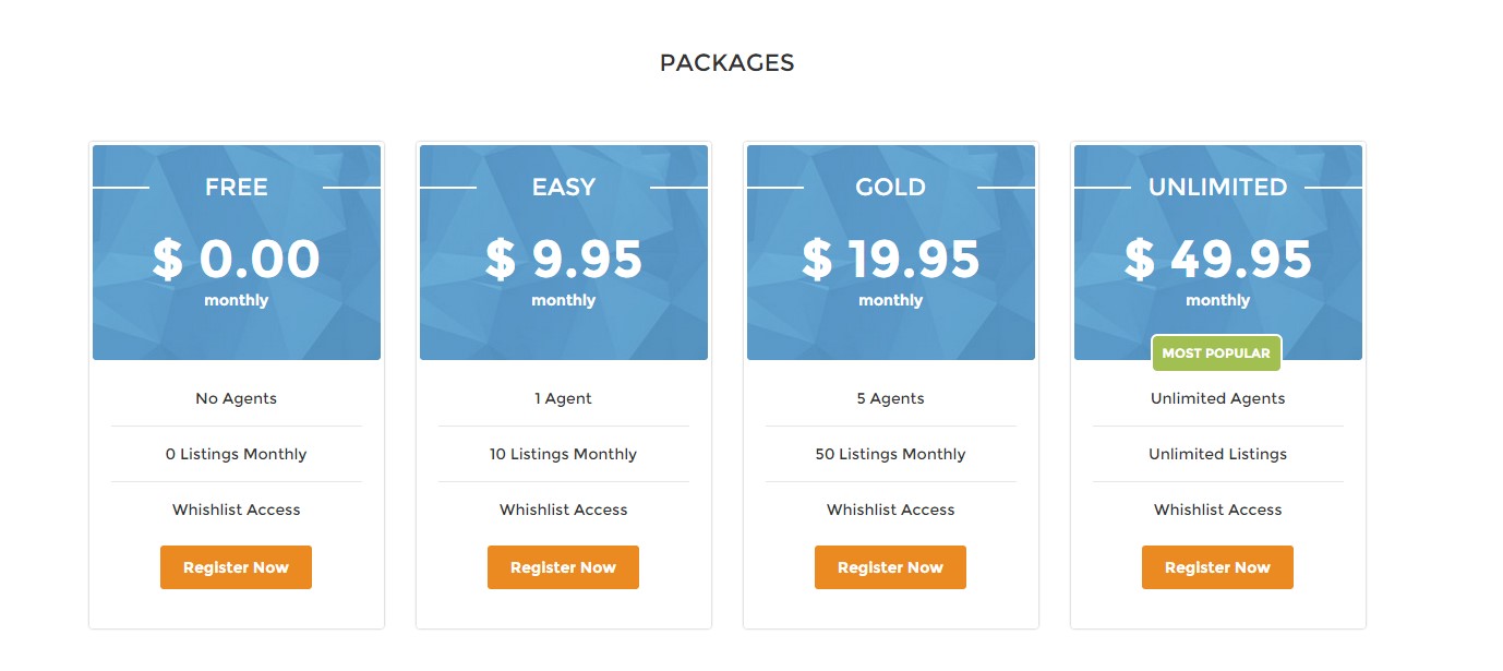
Price Box
Was this article helpful ?
Product Box
You can use one of the following types of product box:
- .ct-itemProducts
- .ct-itemProducts–small
- .ct-itemProducts–small-type1 (light style)
- .ct-itemProducts–small-type2 (dark style)
- .ct-itemProducts–boxed
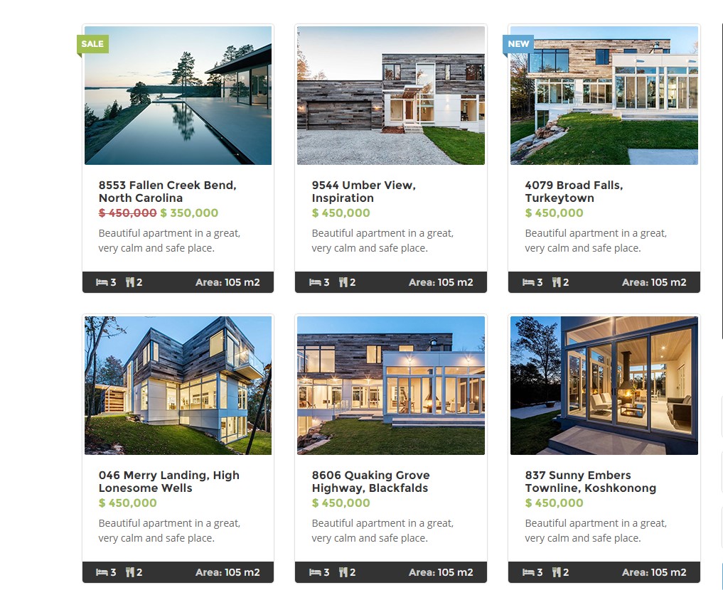
Product boxes
Use the following HTML markup to create a boxes:
|
1 2 3 4 5 6 7 8 9 10 11 12 13 14 15 16 17 18 19 20 21 22 23 24 25 26 27 28 29 30 31 32 33 34 35 36 37 38 39 40 41 42 43 44 45 46 47 48 49 50 51 52 53 54 55 56 57 58 59 60 61 62 63 64 65 66 67 68 69 70 71 72 73 74 75 76 77 78 79 80 81 82 83 84 85 86 87 88 89 90 91 92 93 94 95 |
<div class="ct-itemProducts ct-u-marginBottom30 ct-hover"> <label class="control-label sale"> Sale </label> <a href="product-single.html"> <div class="ct-main-content"> <div class="ct-imageBox"> <img src="assets/images/demo-content/property-1.jpg" alt=""><i class="fa fa-eye"></i> </div> <div class="ct-main-text"> <div class="ct-product--tilte"> 15421 Southwest 39th Terrace </div> <div class="ct-product--price"> <span class="ct-price--Old">$ 450,000</span> <span>$ 350,000</span> </div> <div class="ct-product--description"> Beautiful apartment in a great, very calm and safe place. </div> </div> </div> <div class="ct-product--meta"> <div class="ct-icons"> <span> <i class="fa fa-bed"></i> 3 </span> <span> <i class="fa fa-cutlery"></i> 2 </span> </div> <div class="ct-text"> <span> Area: <span>105 m2</span></span> </div> </div> </a> </div> ------------------------------ <div class="ct-itemProducts--small ct-itemProducts--small-type1"> <a href="product-single.html"> <div class="ct-main-content"> <div class="ct-imageBox"> <img src="assets/images/demo-content/recently-reduced-thumbnail-1.jpg" alt=""> </div> <div class="ct-main-text"> <div class="ct-product--tilte"> 15421 Southwest 39th Terrace </div> <div class="ct-product--price"> <span class="ct-price--Old">$ 450,000</span> <span>$ 390,000</span> </div> </div> </div> </a> </div> ------------------------------------ <div class="ct-itemProducts ct-u-marginBottom30 ct-hover ct-itemProducts--boxed"> <label class="control-label sale"> Sale </label> <a href="product-single.html"> <div class="ct-main-content"> <div class="ct-imageBox"> <img src="assets/images/demo-content/property-11.jpg" alt=""><i class="fa fa-eye"></i> </div> <div class="ct-main-text"> <div class="ct-product--tilte"> 15421 Southwest 39th Terrace </div> <div class="ct-product--price"> <span>$ 450,000</span> <span class="ct-price--Old">$ 500,000</span> </div> </div> </div> <div class="ct-product--meta"> <div class="ct-icons"> <span> <i class="fa fa-bed"></i> 3 </span> <span> <i class="fa fa-cutlery"></i> 2 </span> </div> <div class="ct-text"> <span> Area: <span>105 m2</span></span> </div> </div> </a> </div> |
Was this article helpful ?
Product page
There are two types of product details pages:
- .ct-productDetails
- .ct-productDetails–type2
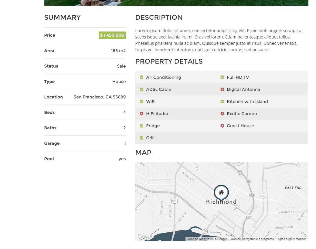
Product details
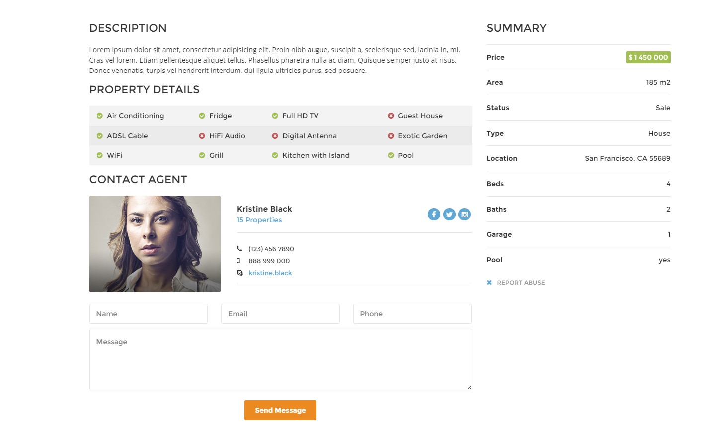
Product details type 2
You can use the with the following HTML markup:
|
1 2 3 4 5 6 7 8 9 10 11 12 13 14 15 16 17 18 19 20 21 22 23 24 25 26 27 28 29 30 31 32 33 34 35 36 37 38 39 40 41 42 43 44 45 46 47 48 49 50 51 52 53 54 55 56 57 58 59 60 61 62 63 64 65 66 67 68 69 70 71 72 73 74 75 76 77 78 79 80 81 82 83 84 85 86 87 88 89 90 91 92 93 94 95 96 97 98 99 100 101 102 103 104 105 106 107 108 109 110 111 112 113 114 115 116 117 118 119 120 121 122 123 124 125 126 127 128 129 130 131 132 133 134 135 136 137 138 139 140 141 142 143 144 145 146 147 148 149 150 151 152 |
<div class="col-md-8 col-lg-9"> <div class="row"> <div class="col-md-4"> <div class="ct-heading ct-u-marginBottom20"> <h3 class="text-uppercase">Summary</h3> </div> <div class="ct-u-displayTableVertical ct-productDetails"> <div class="ct-u-displayTableRow"> <div class="ct-u-displayTableCell"> <span class="ct-fw-600">Price</span> </div> <div class="ct-u-displayTableCell text-right"> <span class="ct-price">$ 1 450 000</span> </div> </div> <div class="ct-u-displayTableRow"> <div class="ct-u-displayTableCell"> <span class="ct-fw-600">Area</span> </div> <div class="ct-u-displayTableCell text-right"> <span>185 m2</span> </div> </div> <div class="ct-u-displayTableRow"> <div class="ct-u-displayTableCell"> <span class="ct-fw-600">Status</span> </div> <div class="ct-u-displayTableCell text-right"> <span>Sale</span> </div> </div> <div class="ct-u-displayTableRow"> <div class="ct-u-displayTableCell"> <span class="ct-fw-600">Type</span> </div> <div class="ct-u-displayTableCell text-right"> <span>House</span> </div> </div> <div class="ct-u-displayTableRow"> <div class="ct-u-displayTableCell"> <span class="ct-fw-600">Location</span> </div> <div class="ct-u-displayTableCell text-right"> <span>San Francisco, CA 55689</span> </div> </div> <div class="ct-u-displayTableRow"> <div class="ct-u-displayTableCell"> <span class="ct-fw-600">Beds</span> </div> <div class="ct-u-displayTableCell text-right"> <span>4</span> </div> </div> <div class="ct-u-displayTableRow"> <div class="ct-u-displayTableCell"> <span class="ct-fw-600">Baths</span> </div> <div class="ct-u-displayTableCell text-right"> <span>2</span> </div> </div> <div class="ct-u-displayTableRow"> <div class="ct-u-displayTableCell"> <span class="ct-fw-600">Garage</span> </div> <div class="ct-u-displayTableCell text-right"> <span>1</span> </div> </div> <div class="ct-u-displayTableRow"> <div class="ct-u-displayTableCell"> <span class="ct-fw-600">Pool</span> </div> <div class="ct-u-displayTableCell text-right"> <span>yes</span> </div> </div> </div> </div> <div class="col-md-8"> <div class="ct-heading ct-u-marginBottom20"> <h3 class="text-uppercase">Description</h3> </div> <p class="ct-u-marginBottom20"> Lorem ipsum dolor sit amet, consectetur adipisicing elit. Proin nibh augue, suscipit a, scelerisque sed, lacinia in, mi. Cras vel lorem. Etiam pellentesque aliquet tellus. Phasellus pharetra nulla ac diam. Quisque semper justo at risus. Donec venenatis, turpis vel hendrerit interdum, dui ligula ultricies purus, sed posuere. </p> <div class="ct-heading ct-u-marginBottom20"> <h3 class="text-uppercase">Property Details</h3> </div> <div class="ct-u-displayTableVertical ct-productDetails--type2 ct-u-marginBottom20"> <div class="ct-u-displayTableCell"> <ul class="list-unstyled"> <li> <i class="fa fa-check-circle"></i> <span class="text-capitalize">air conditioning</span> </li> <li> <i class="fa fa-check-circle"></i> <span class="text-capitalize">ADSL cable</span> </li> <li> <i class="fa fa-check-circle"></i> <span class="text-capitalize">WiFi</span> </li> <li> <i class="fa fa-times-circle negative"></i> <span class="text-capitalize">HiFi audio</span> </li> <li> <i class="fa fa-check-circle"></i> <span class="text-capitalize">fridge</span> </li> <li> <i class="fa fa-check-circle"></i> <span class="text-capitalize">grill</span> </li> </ul> </div> <div class="ct-u-displayTableCell"> <ul class="list-unstyled"> <li> <i class="fa fa-check-circle"></i> <span class="text-capitalize">Full HD TV</span> </li> <li> <i class="fa fa-times-circle negative"></i> <span class="text-capitalize">Digital antenna</span> </li> <li> <i class="fa fa-check-circle"></i> <span>Kitchen with Island</span> </li> <li> <i class="fa fa-times-circle negative"></i> <span class="text-capitalize">exotic garden</span> </li> <li> <i class="fa fa-times-circle negative"></i> <span class="text-capitalize">guest house</span> </li> </ul> </div> </div> <div class="ct-heading ct-u-marginBottom20"> <h3 class="text-uppercase">Map</h3> </div> <div class="ct-js-googleMap ct-googleMap ct-js-googleMap--single" data-offset="1" data-location="Richmond" data-icon="assets/images/marker-house.png" data-zoom="14" data-height="260" id="map"></div> </div> </div> </div> |
Was this article helpful ?
Search results
You can select between the following Search results types:
- .ct-sortingBar
- .ct-showProducts–list
- .ct-showProducts–default
Use the following HTML markup:
|
1 2 3 4 5 6 7 8 9 10 11 12 13 14 15 16 17 18 19 20 21 22 23 24 25 26 27 28 29 30 31 32 33 34 35 36 37 38 39 40 41 42 43 44 45 46 47 48 49 50 51 52 53 54 55 56 57 58 59 60 61 62 63 64 65 66 67 68 69 70 71 72 73 74 75 76 77 78 79 80 81 82 83 84 85 86 87 88 |
//sorting bar <div class="ct-sortingBar ct-u-paddingRight10 ct-u-paddingLeft10 ct-u-marginBottom30"> <div class="ct-sortingTitle pull-left"> <h4 class="text-uppercase">Search Results<span> (231)</span></h4> </div> <ul class="list-inline list-unstyled pull-right ct-u-paddingBoth15"> <li> <form> <select class="ct-js-select"> <option value="price">Sort by</option> <option value="price">Price</option> <option value="newness">Newness</option> <option value="rating">Rating</option> <option value="popularity">Popularity</option> </select> </form> </li> <li> <form> <select class="ct-js-select"> <option value="nine">12 items</option> <option value="eighteen">15 items</option> <option value="eighteen">21 items</option> <option value="twentyseven">36 items</option> <option value="fourtyfive">45 items</option> <option value="ninety">90 items</option> </select> </form> </li> </ul> <ul class="ct-showPages list-inline list-unstyled pull-right ct-u-paddingBoth15"> <li class="ct-showElements is-active" id="ct-js-showTiles"> <a href="#"> <i class="fa fa-th fa-fw"></i> </a> </li> <li class="ct-showElements" id="ct-js-showList"> <a href="#"> <i class="fa fa-th-list fa-fw"></i> </a> </li> </ul> <div class="clearfix"></div> </div> //products diff display <div class="row ct-js-search-results ct-showProducts--default"> <div class="col-sm-6 col-md-6 col-lg-4"> <div class="ct-itemProducts ct-u-marginBottom30 ct-hover"> <label class="control-label sale"> Sale </label> <a href="product-single.html"> <div class="ct-main-content"> <div class="ct-imageBox"> <img src="assets/images/demo-content/property-10.jpg" alt=""><i class="fa fa-eye"></i> </div> <div class="ct-main-text"> <div class="ct-product--tilte"> 15421 Southwest 39th Terrace </div> <div class="ct-product--price"> <span class="ct-price--Old">$ 450,000</span> <span>$ 350,000</span> </div> <div class="ct-product--description"> Beautiful apartment in a great, very calm and safe place. </div> </div> </div> <div class="ct-product--meta"> <div class="ct-icons"> <span> <i class="fa fa-bed"></i> 3 </span> <span> <i class="fa fa-cutlery"></i> 2 </span> </div> <div class="ct-text"> <span> Area: <span>105 m2</span></span> </div> </div> </a> </div> </div> |
After click on sorting panel we switch class “ct-showProducts–default” and “.ct-showProducts–list”.
This classes change styles of boxes.
We are using the following javascript for search:
|
1 2 3 4 5 6 7 8 9 10 11 12 13 14 15 16 17 18 19 20 21 22 23 24 25 26 27 28 29 30 31 32 33 34 35 36 37 |
var $tilesItems = $("#ct-js-showTiles"); var $listItems = $("#ct-js-showList"); var $showProducts = $(".ct-js-search-results"); if($tilesItems && $listItems){ $tilesItems.click(function(e){ e.preventDefault(); var $existListClass = $(".ct-showProducts--list"); if($existListClass){ $showProducts.removeClass("ct-showProducts--list"); $showProducts.addClass("ct-showProducts--default"); $showProducts.css("display", "none"); $showProducts.fadeIn(); $(this).addClass("is-active"); $listItems.removeClass("is-active"); } }); $listItems.click(function(e){ e.preventDefault(); var $existDefaultClass = $(".ct-showProducts--list"); if($existDefaultClass){ $showProducts.removeClass("ct-showProducts--default"); $showProducts.addClass("ct-showProducts--list"); $showProducts.css("display", "none"); $showProducts.fadeIn(); $(this).addClass("is-active"); $tilesItems.removeClass("is-active"); } }); } |
Was this article helpful ?
Sources & Credits
The following sources and files have been used to build up this theme
- Twitter Bootstrap – http://twitter.github.com/bootstrap/
- jQuery – http://www.jquery.com
Was this article helpful ?