

Exico – Responsive HTML5 Template
Thank you for purchasing this theme. If you have any questions that are beyond the scope of this help file, please feel free to start new ticket on this page. Thanks so much!
Scope of free support
We can help you with:
- Responding to questions or problems regarding the item and its features
- Fixing any discovered item’s bugs
- Providing updates to ensure compatibility with new software versions
Was this article helpful ?
HTML Structure
This theme is built upon bootstrap framework and is fully responsive. It adapts to window resolution and looks good on all devices including iPad and iPhone.
See for yourself (resize your browser).
If you would like to read more
about bootstrap framework click here :
Grid System and Single row structure
The default Bootstrap grid system utilizes 12 columns. It’s responsive grid and adapts to viewport. Below 767px viewports, the columns become fluid and stack vertically. The fluid grid system uses percents instead of pixels for column widths. Each row always include 12 columns (for example col-md-8 + col-md-4 = col-md-12).
Bootstrap documentation: here
Basic grid HTML:
|
1 2 3 4 5 6 7 8 9 10 11 12 13 14 15 16 17 18 19 20 21 22 23 24 25 26 27 |
<div class="row"> <div class="col-md-1">.col-md-1</div> <div class="col-md-1">.col-md-1</div> <div class="col-md-1">.col-md-1</div> <div class="col-md-1">.col-md-1</div> <div class="col-md-1">.col-md-1</div> <div class="col-md-1">.col-md-1</div> <div class="col-md-1">.col-md-1</div> <div class="col-md-1">.col-md-1</div> <div class="col-md-1">.col-md-1</div> <div class="col-md-1">.col-md-1</div> <div class="col-md-1">.col-md-1</div> <div class="col-md-1">.col-md-1</div> </div> <div class="row"> <div class="col-md-8">.col-md-8</div> <div class="col-md-4">.col-md-4</div> </div> <div class="row"> <div class="col-md-4">.col-md-4</div> <div class="col-md-4">.col-md-4</div> <div class="col-md-4">.col-md-4</div> </div> <div class="row"> <div class="col-md-6">.col-md-6</div> <div class="col-md-6">.col-md-6</div> </div> |
Page structure
Below you will find default page structure :
|
1 2 3 4 5 6 7 8 9 10 11 12 13 14 15 16 17 18 19 20 21 22 23 24 25 26 27 28 29 30 31 32 33 34 35 36 |
<!DOCTYPE html> <html> <head> [css] </head> <body> [header] [main menu] <!-- main container --> <div id="wrapper"> [component 1] <!-- fullwidth element --> </div> [fullwidth parallax] <div class="container"> <!-- / fullwidth element --> [component 6] </div> <!-- / main container --> [footer] [javascripts] </body> </html> |
Was this article helpful ?
CSS Files and structure
If you would like to edit the color, font, or style of any elements, you would do the following:
|
1 |
#primaryContent a {color: #someColor;} |
If you find that your new style is not overriding, it is most likely because of a specificity problem. Scroll down in your CSS file and make sure that there isn’t a similar style that has more weight.
I.E.
|
1 |
#wrap #primaryContent a {color: #someColor;} |
So, to ensure that your new styles are applied, make sure that they carry enough “weight” and that there isn’t a style lower in the CSS file that is being applied after yours.
Colors
The theme includes a css file wich you can use to edit the colors.
You just need to add the corresponding CSS file to the head of the page like this:
|
1 2 3 4 5 |
<head> (..) <link rel="stylesheet" type="text/css" href="css/motive.css"> (..) </head> |
Main Menu structure
Just change brand name, upload your logo to images/content/ folder and you’re ready to go!
|
1 2 3 4 5 6 7 8 9 10 11 12 13 14 15 16 17 18 19 20 21 22 23 24 25 26 27 28 29 30 31 32 33 34 35 36 37 38 39 40 41 42 43 44 45 46 47 48 49 50 51 52 53 54 55 56 57 58 59 60 61 62 63 64 65 66 67 68 69 70 71 72 73 74 75 76 77 78 79 80 81 82 83 84 85 86 87 88 89 90 91 92 93 94 95 |
<nav class="navbar navbar-white" role="navigation"> <!--</div>--> <div class="container"> <ul class="nav navbar-nav yamm ct-navbar--fadeIn"> <li class="dropdown"> <a class="dropdown-toggle"><i class="fa fa-bars"></i><span>Navigation</span></a> <ul class="dropdown-menu"> <li class="dropdown-submenu"><a class="active">Home</a> <ul class="dropdown-menu"> <li><a class="active" href="index.html">Home Parallax</a></li> <li><a href="index-2.html">Home KenBurns</a></li> <li><a href="index-3.html">Home Video</a></li> <li><a href="index-4.html">Home Slider</a></li> </ul> </li> <li class="dropdown"><a href="about-us.html">About us</a></li> <li class="dropdown"><a href="services.html">Service</a></li> <li class="dropdown-submenu"><a>Portfolio</a> <ul class="dropdown-menu"> <li><a href="portfolio-1.html">Portfolio 1</a></li> <li><a href="portfolio-2.html">Portfolio 2</a></li> <li><a href="portfolio-details.html">Portfolio Details</a></li> </ul> </li> <li class="dropdown-submenu"><a>Shop</a> <ul class="dropdown-menu"> <li><a href="shop.html">Shop</a></li> <li><a href="product-details.html">Products</a></li> </ul> </li> <li class="dropdown-submenu"><a>Blog</a> <ul class="dropdown-menu"> <li><a href="blog-1.html">Blog 1</a></li> <li><a href="blog-2.html">Blog 2</a></li> <li><a href="blog-post-single-1.html">Single 1</a></li> <li><a href="blog-post-single-2.html">Single 2</a></li> </ul> </li> <li class="dropdown-submenu"><a>FAQ</a> <ul class="dropdown-menu"> <li><a href="faq-1.html">FAQ 1</a></li> <li><a href="faq-2.html">FAQ 2</a></li> </ul> </li> <li class="dropdown"><a href="contact-us.html">Contact</a></li> </ul> </li> </ul> <ul class="nav navbar-nav ct-navbar--options"> <li> <a class="ct-js-navSearch ct-navbar-navSearch" href="#"> <i class="fa fa-search"></i> </a> </li> </ul> <div class="navbar-header"> <a class="navbar-brand" href="index.html"> <img src="assets/images/demo-content/exico.png" alt="exico"> </a> </div> <div class="pull-right"> <ul class="ct-socials list-inline list-unstyled"> <li> <a href="https://www.facebook.com/createITpl" data-toggle="tooltip" data-placement="left" title="facebook"> <i class="fa fa-facebook"></i> </a> </li> <li> <a href="https://twitter.com/createitpl" data-toggle="tooltip" data-placement="left" title="twitter"> <i class="fa fa-twitter"></i> </a> </li> </ul> </div> <div class="ct-navbar-search"> <form role="form"> <div class="form-group"> <input id="search" required="" type="text" name="field[]" class="form-control" placeholder="Search..."> <button class="ct-navbar-search-button" type="submit"> <i class="fa fa-search fa-fw"></i> </button> </div> </form> </div> </div> </nav> |
In order to create mega menus read the documentation here:
Icons
We’ve included 360+ font icons.
Awesome Icons – http://fontawesome.io/icons/
HTML markup:
|
1 2 |
<!-- Awesome Icons --> <i class="fa fa-cog"></i> |
Appearing with Animation when element in viewport
Animation can be turn off just be remove “withAnimation” class from body.
Usage:
– add “animated” class to element and data-fx=”animation-type”. That’s it.
Available animation : http://daneden.github.io/animate.css/
- data-fx=”hinge”
- data-fx=”bounce”
- data-fx=”flash”
- data-fx=”pulse”
- data-fx=”shake”
- data-fx=”swing”
- data-fx=”tada”
- data-fx=”wobble”
- data-fx=”bounceIn”
- data-fx=”bounceInDown”
- data-fx=”bounceInLeft”
- data-fx=”bounceInRight”
- data-fx=”bounceInUp”
- data-fx=”bounceOut”
- data-fx=”bounceOutDown”
- data-fx=”bounceOutLeft”
- data-fx=”bounceOutRight”
- data-fx=”bounceOutUp”
- data-fx=”fadeIn”
- data-fx=”fadeInDown”
- data-fx=”fadeInDownBig”
- data-fx=”fadeInLeft”
- data-fx=”fadeInLeftBig”
- data-fx=”fadeInRight”
- data-fx=”fadeInRightBig”
- data-fx=”fadeInUp”
- data-fx=”fadeInUpBig”
- data-fx=”fadeOut”
- data-fx=”fadeOutDown”
- data-fx=”fadeOutDownBig”
- data-fx=”fadeOutLeft”
- data-fx=”fadeOutLeftBig”
- data-fx=”fadeOutRight”
- data-fx=”fadeOutRightBig”
- data-fx=”fadeOutUp”
- data-fx=”fadeOutUpBig”
- data-fx=”flip”
- data-fx=”flipInX”
- data-fx=”flipInY”
- data-fx=”flipOutX”
- data-fx=”flipOutY”
- data-fx=”lightSpeedIn”
- data-fx=”lightSpeedOut”
- data-fx=”rotateIn”
- data-fx=”rotateInDownLeft”
- data-fx=”rotateInDownRight”
- data-fx=”rotateInUpLeft”
- data-fx=”rotateInUpRight”
- data-fx=”rotateOut”
- data-fx=”rotateOutDownLeft”
- data-fx=”rotateOutDownRight”
- data-fx=”rotateOutUpLeft”
- data-fx=”rotateOutUpRight”
- data-fx=”slideInDown”
- data-fx=”slideInLeft”
- data-fx=”slideInRight”
- data-fx=”slideOutLeft”
- data-fx=”slideOutRight”
- data-fx=”slideOutUp”
- data-fx=”rollIn”
- data-fx=”rollOut”
CSS Files & Structure
We’ve included 2 files.
bootstrap.css contains Bootstrap 3 Library.
style.css file contains general styles.
01. Imports
a) Variables
b) font awesome
c) Typography
d) Mediasection
e) Portfolio
f) Buttons
g) Hover
h) Mixins
i) Animate
j) Utilities
k) Menu
l) Gallery
m) Accordion
n) Widget
o) Toggables
p) Form
q) Datepicker
r) Magnific popup
s) Slick slider
02 .Wrapper and Snap.js
03. Media section
04. Checkout
05. Thumbnails
06. ImageBoxes
07. PersonBoxes
08. Pricing Box
09. Icon box
10. Socials
11. Google map
12. Header
13. footer
14. Last Works
15. Article Boxes
16. Image wrappers
17. Shop
18. Raiting
19. Text box
20. Comment Box
21. Lists
22. Video
23. Preloader
24. Scrollbar
25. Animation
Utilities
Utility classes are low-level structural and positional traits. Utilities can be applied directly to any element, multiple utilities can be used tohether and utilities can be used alongsie component classes.
Utilities are intended for frequently used CSS properties and patterns, like: floats, containing floats, vertical alignemnt, text tryncation. Relying on utilities can help to reduce repetition and provide consistend implementations.
Exico uses utilities for the following categories:
- Font size:
- .ct-u-size13{
font-size: 13px;
} - .ct-u-size13{
font-size: 13px;
}
- .ct-u-size13{
- Paddings – the following values of padding can be added to any element you want: 10px, 20px, 30px. 40px, 50px, 60px, 70px, 80px, 90px, 100px, 110px, 120px, 130px, 140px, 150px – each value can be added to bottom, top or both top and bottom paddings, according to the following CSS class naming scheme:
- .ct-u-paddingBoth10
- .ct-u-paddingTop10
- .ct-u-paddingBottom10
- .ct-u-paddingBoth20
- .ct-u-paddingTop20
- .ct-u-paddingBottom20
- .ct-u-paddingBoth30
- .ct-u-paddingBoth30
- .ct-u-paddingBottom30
Just add class with padding value to any HTML element.
- Margins – the following values of margins can be added to any element you want: 10px, 20px, 30px. 40px, 50px, 60px, 70px, 80px, 90px, 100px, 110px, 120px, 130px, 140px, 150px – each value can be added as bottom, top or both top and bottom margin, according to the following CSS class naming scheme:
- .ct-u-marginBoth10
- .ct-u-marginTop10
- .ct-u-marginBottom10
- .ct-u-marginBoth20
- .ct-u-marginTop20
- .ct-u-marginBottom20
- .ct-u-marginBoth150
- .ct-u-marginBoth150
- .ct-u-marginBottom150
- Colors
- .ct-u-colorWhite
- .ct-u-colorFaint{
.ct-m-opacity(0.4);
} - .ct-u-colorBlack{
color: #000000;
} - .ct-u-colorInfo{ color: @alert-info-text;
} - .ct-u-colorSuccess{ color: @alert-success-text;
} - .ct-u-colorWarning{ color: @alert-warning-text;
} - .ct-u-colorDanger{ color: @alert-danger-text;
} - .ct-u-colorBody{ color: @body-color;
}
- Fonts
- .ct-u-fontType-1{
font-family: “PT Sans”,sans-serif;
} - .ct-u-fontType-2{
font-family: “Roboto Slab”, sans-serif;
} - .ct-u-fontType-3{
font-family: “Montserrat”, sans-serif;
}
- .ct-u-fontType-1{
- Background Colors
- .ct-u-backgroundWhite{
background-color: #ffffff;
} - .ct-u-backgroundGray{
background-color: #cacaca;
} - .ct-u-backgroundBody{
background-color: @body-color;
} - .ct-u-backgroundSuccess{
background-color: @alert-success-bg;
h1,.h1,h2,.h2,h3,.h3,h4,.h4,h5,.h5,h6,.h6{
color: @alert-success-bg;
}
} - .ct-u-backgroundWarning{
background-color: @alert-warning-bg;
h1,.h1,h2,.h2,h3,.h3,h4,.h4,h5,.h5,h6,.h6{
color: @alert-warning-bg;
}
} - .ct-u-backgroundDanger{
background-color: @alert-danger-bg;
h1,.h1,h2,.h2,h3,.h3,h4,.h4,h5,.h5,h6,.h6{
color: @alert-danger-bg;
}
} - .ct-u-backgroundInfo{
background-color: @alert-info-bg;
h1,.h1,h2,.h2,h3,.h3,h4,.h4,h5,.h5,h6,.h6{
color: @alert-info-bg;
}
} - .ct-u-backgroundBlack{
background-color: #000000;
h1,.h1,h2,.h2,h3,.h3,h4,.h4,h5,.h5,h6,.h6{
color: #ffffff;
}
.ct-raiting{
color: #ffffff;
}.lead{
.fa-star.ct-u-colorBlack{
color: #ffffff;
}
}
}
- .ct-u-backgroundWhite{
- Overflow
- .ct-u-overflow-show{
overflow: visible;
} - .ct-u-overflow-hide{
overflow: hidden;
}
- .ct-u-overflow-show{
- Display types
- .ct-u-displayTable, .ct-u-displayTableVertical, .ct-u-displayTableBottom , .ct-u-displayTableTop{
display: table;
width: 100%;
} - .ct-u-displayTableVertical, .ct-u-displayTableBottom, .ct-u-displayTableTop{
height: 100%;
} - .ct-u-displayTableTop{
.ct-u-displayTableCell{
vertical-align: top;
}
} - .ct-u-displayTableVertical{
.ct-u-displayTableCell{
vertical-align: middle;
}
} - .ct-u-displayTableBottom{
.ct-u-displayTableCell{
vertical-align: bottom;
}
} - .ct-u-displayTableRow{
display: table-row;
} - .ct-u-displayTableCell{
display: table-cell;
}
- .ct-u-displayTable, .ct-u-displayTableVertical, .ct-u-displayTableBottom , .ct-u-displayTableTop{
- Borders
- .ct-u-colorWhite{
.ct-u-borderAll{
border-color: #ffffff
}
} - .ct-u-borderAll{
border: 1px solid;
.ct-u-colorWhite{
border-color: #ffffff;
}
}
- .ct-u-colorWhite{
Was this article helpful ?
Article
Article – type 1
HTML markup:
|
1 2 3 4 5 6 7 8 9 10 11 12 13 14 15 16 17 18 19 20 21 22 23 24 25 26 27 28 29 30 31 32 33 34 35 36 |
<div class="ct-articleBox"> <div class="ct-articleBox-media"> <div class="ct-galleryBox"> <div class="ct-galleryBox-image "> <a class="ct-js-magnificPopupImage"> <img src="assets/images/portfolio1.jpg" alt=""> </a> </div> <div class="ct-galleryBox-overlay"> <div class="ct-u-displayTableVertical"> <div class="ct-u-displayTableCell"> <div class="ct-galleryBox-icons"> <div class="btn-group ct-btn-group--rounded ct-u-colorWhite" role="group" aria-label="..."> <a class="btn ct-btn--transparent" data-toggle="tooltip" data-placement="left" title="09/04/2015"><i class="fa fa-calendar"></i></a> <a class="btn ct-btn--transparent">Details</a> <a href="assets/images/portfolio1-lg.jpg" class="btn ct-btn--transparent ct-js-magnificPopupImage"><i class="fa fa-search"></i></a> </div> </div> </div> </div> </div> </div> </div> <h3 class=" ct-u-paddingTop30"> <a class="btn btn-link">No one would have believed in the last years</a> </h3> <div class="ct-articleBox-description"> <p class="ct-u-paddingTop20"> No one would have believed in the last years of the nine- teenth century that this world was being watched keenly and closely by intelligences greater than man’s and yet as mor- tal as his own; that as men busied themselves about their vari- ous concerns they were scrutinised and </p> </div> </div> |
Article – type 2
|
1 2 3 4 5 6 7 8 9 10 11 12 13 14 15 16 17 18 19 20 21 22 23 |
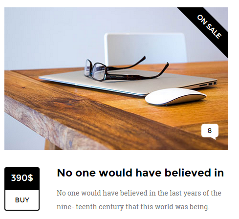
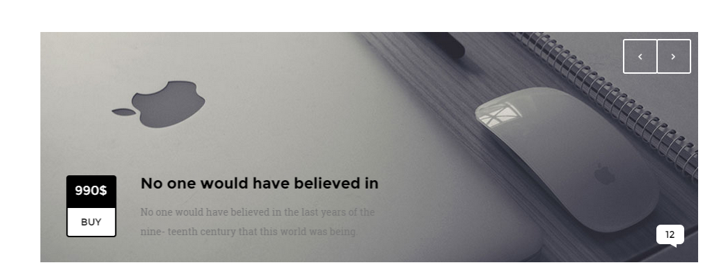
<div class="ct-articleBox"> <div class="ct-articleBox-media"> <img src="assets/images/article-10.jpg" alt=""/> <div class="ct-tag">on sale</div> <span class="ct-link"> <a href="#">8</a> </span> </div> <div class="media ct-u-paddingTop20"> <div class="media-left"> <div class="media-object ct-articleBox-info"> <div class="info-1">390$</div> <div class="info-2"><a href="#">BUY</a></div> </div> </div> <div class="media-body"> <h3 class="media-heading ct-u-paddingBottom10 ct-fw-600">No one would have believed in</h3> <p> No one would have believed in the last years of the nine- teenth century that this world was being. </p> </div> </div> </div> |
CSS classes:
ct-articleBox: Base class for article.
ct-articleBox-media: Images,videos or other media that can be used in article.
ct-articleBox-description: Description of an article.
ct-link: number of comments displayed in bubble speech.
ct-tag: Tag for announcments, like “brand new”.
ct-u-paddingTop20: adds 20px padding on top.
ct-u-paddingTop30: adds 30px padding on top.
media, media-left, media-heading, media-object ,media-body – Bootstrap classes for creating media.
ct-articleBox-info: article info box wrapper that contain such information like date,price or is simply a button.
info-1: ‘ct-articleBox-info‘ subclass.
info-2: ‘ct-articleBox-info‘ subclass.
An article may be a part of a gallery:
ct-galleryBox: wrapper for gallery media.
ct-galleryBox-image: wrapper for gallery image.
ct-js-magnificPopupImage: Indicates that light box is in use. (Magnific pop-up)
btn: button class.
btn-link: button link style.
ct-btn–transparent: adds transparency to button.
Was this article helpful ?
Blockquote
Blockquotes
HTML Markup:
Standard bootstrap markup
|
1 2 3 4 5 6 7 8 |
<blockquote> <p> Yokohama is called Benten, after the goddess of the sea, who is worshipped on the islands round about. There Passepartout beheld beautiful fir and cedar groves, sacred gates of a singular architecture, bridges half hid in the midst of bamboos and reeds, temples shaded by immense cedar-trees, holy retreats where were sheltered </p> </blockquote> |
Style 1 for class “ct-blockquote-1”
|
1 2 3 4 5 6 7 8 |
<blockquote class="ct-blockquote-1"> <p> The planet Mars, I scarcely need remind the reader, revolves about the sun at a mean distance of 140,000,000 miles, and the light and heat it receives from the sun is barely half of that received by this world. It must be, if the nebular hypothesis has any truth, older than our world; and long before this earth ceased to be molten. </p> </blockquote> |
Style 2 for class “ct-blockquote-2”
|
1 2 3 4 5 6 |
<blockquote class="ct-blockquote-2"> <p> Yokohama is called Benten, after the goddess of the sea, who is worshipped on the islands round about. There Passepartout beheld beautiful fir and cedar groves. </p> </blockquote> |
Was this article helpful ?
Buttons
Button groups

Button wrapper
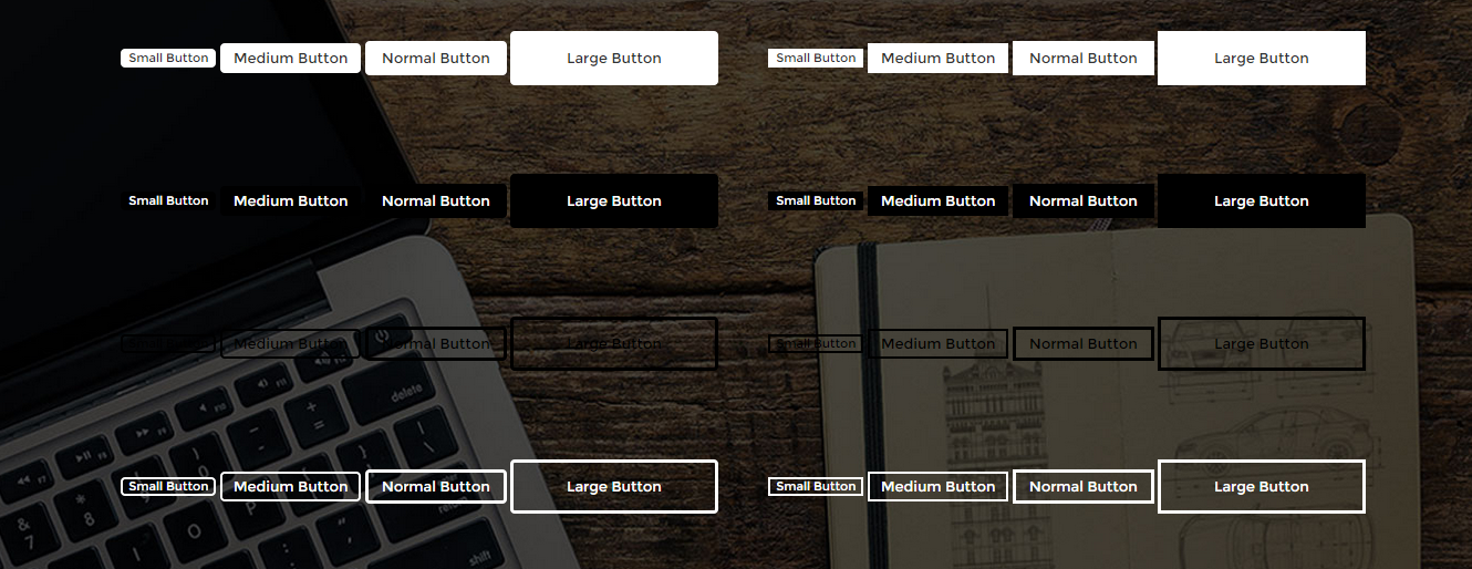
Buttons
HTML Markup:
Single buttons:
|
1 2 3 |
<a href="#" class="btn btn-xs btn-default ct-btn-rounded"> Small Button </a> |
|
1 2 3 |
<a href="#" class="btn btn-sm btn-primary ct-btn-rounded"> Medium Button </a> |
|
1 2 3 |
<a href="#" class="btn ct-btn--transparent ct-btn-rounded"> Normal Button </a> |
Description:
btn – this is a base class that is obligatory for every button.
ct-btn–transparent – adds transparency to button leaving only borders.
btn-xs,.btn-sm… etc. these classes gives size to a button.
ct-btn-rounded – this class makes button rounded.
‘btn-primary‘ and ‘btn-default‘ – types of buttons, which change color to: black and white .
Notice:
if class ‘ct-u-colorWhite‘ is a wrapping class e.g.
|
1 2 3 4 5 |
<div class="ct-u-colorWhite"> <a class="btn btn-lg btn-primary"> Click me ! </a> </div> |
It changes properties of this button to white.
Some buttons may keep the properties of a link. It’s strongly adviced to create them by using
‘
<a> ‘ attribute.
|
1 |
<a class="btn btn-link btn-link--white">Link</a> |
Button groups
|
1 2 3 4 5 |
<div class="btn-group ct-btn-group--rounded btn-group--equal ct-u-colorWhite" role="group" aria-label="..."> <a class="btn ct-btn--transparent">Left</a> <a class="btn ct-btn--transparent">Center</a> <a class="btn ct-btn--transparent">Right</a> </div> |
Button wrapper
|
1 2 3 4 |
<div class="ct-btn-wrapper"> <a class="btn ct-btn--transparent ct-btn-rounded ct-js-magnificPopupImage" href="assets/images/top-product-1-lg.jpg"><i class="fa fa-search"></i></a> <a class="btn ct-btn--transparent ct-btn-rounded" href="#"><i class="fa fa-shopping-cart"></i></a> </div> |
CSS Classes:
ct-btn-rounded: Gives border radius to button.
ct-u-colorWhite: changes button’s color properties to white.
ct-btn–transparent, btn-primary, btn-default, btn-link: button types.
btn-link–white: Gives white color properties to a link.
ct-btn-wrapper: Wraps buttons if they are dsplayed on image.
Group buttons :
ct-btn-group–rounded: Gives border radius to a button group.
btn-group–equal: Buttons in button group are equal.
Button sizes:
btn-xs,.btn-sm,.btn-lg,.btn-lg-2: button size.
ct-btn–full: full width button.
Button types:
btn-default, btn-primary, btn-link: Button types.
btn-link–white: variation to change ‘btn-link’ properties to white.
Was this article helpful ?
Call to action box

Call to action
|
1 2 3 4 5 6 7 8 9 10 11 12 13 14 15 16 17 18 19 20 21 22 23 24 25 26 27 28 29 30 |
<section class="ct-mediaSection ct-u-paddingBoth120" data-stellar-background-ratio="0.3" data-type="parallax" data-bg-image="assets/images/background-4.jpg" data-bg-image-mobile="assets/images/background-4.jpg"> <div class="ct-mediaSection-inner"> <div class="container"> <div class="row"> <div class="col-md-6"> <h5 class="ct-u-colorWhite">No one would have believed in the last years of the nineteenth century that this world was being watched </h5> </div> </div> <div class="row"> <div class="col-md-7 ct-u-colorWhite"> <p class="ct-u-colorFaint ct-u-paddingBoth20"> No one would have believed in the last years of the nine- teenth century that this world was being watched keenly and closely by intelligences greater than man’s and yet as mortal as his </p> <a class="btn btn-lg ct-btn-rounded ct-btn--transparent" href="contact-us.html"> Get in touch! </a> </div> <div class="col-md-5"></div> </div> </div> </div> </section> |
CSS Classes:
ct-u-paddingBoth120: adds 120px padding both to top and buttom.
ct-u-paddingBoth20: adds 20px padding both to top and bottom.
ct-u-colorFaint: changes the opacity.
ct-u-colorWhite: gives white color to component.
ct-mediaSection, ct-mediaSection-inner: are common throughout all our templates.
You can edit section parameters with the following data-attributes:
data-type: indicates the parralax effect for section.
data-stellar-background-ratio: how fast will background image change its position with parallax effect.
data-bg-image-mobile: define image, which should be displayed on mobile devices.
Was this article helpful ?
Google Map
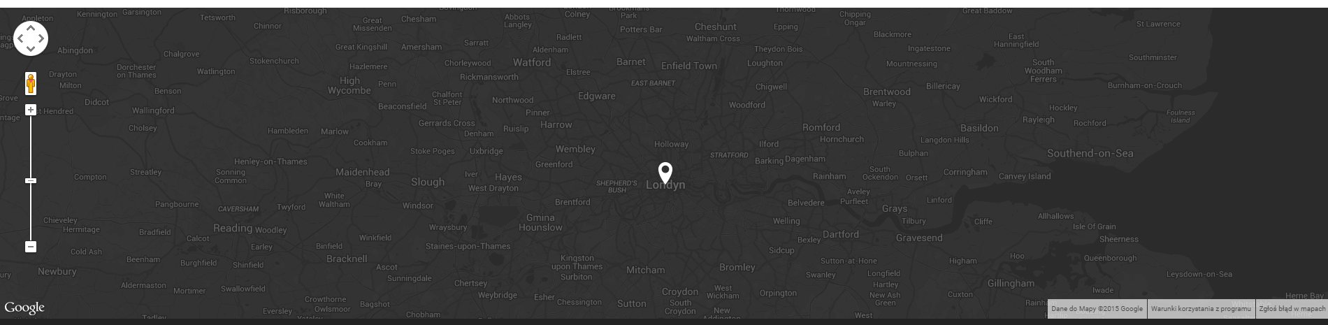
Google Map
HTML Markup:
|
1 |
<div class="ct-js-googleMap ct-googleMap" data-location="London" data-zoom="10" data-height="445"></div> |
You can change map location with:
data-location=" " attribute – just add here your current location.
Make sure to include the following scripts in map page:
|
1 2 3 |
<script src="http://maps.google.com/maps/api/js?sensor=false"></script> <script src="assets/js/gmaps/gmap3.min.js"></script> <script src="assets/js/gmaps/init.js"></script> |
Was this article helpful ?
Icon Box
HTML Markup :
Icon box 1
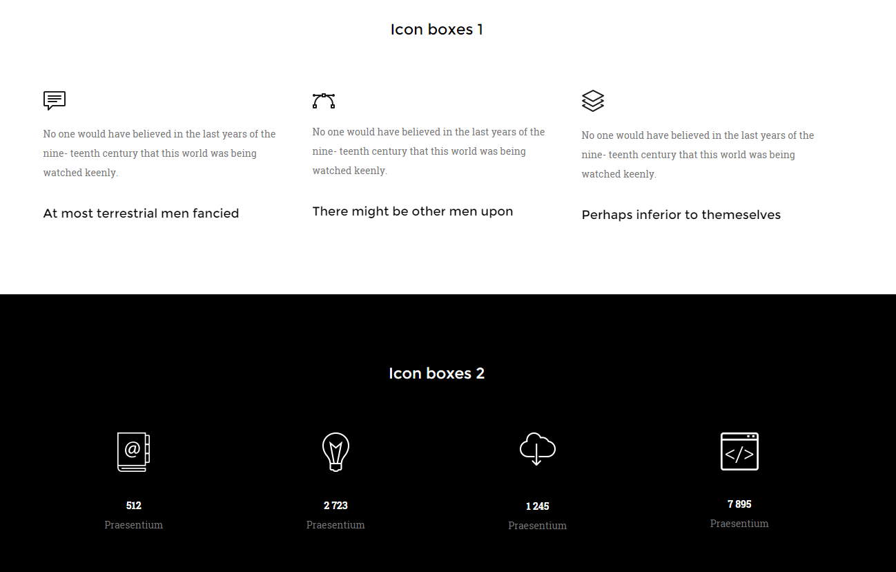
Icon Box
|
1 2 3 4 5 6 7 8 9 10 11 12 13 14 |
<div class="ct-iconBox-1"> <div class="ct-icon"> <img src="assets/images/Speach.png" alt=""/> </div> <p class="ct-u-paddingBoth20"> No one would have believed in the last years of the nine- teenth century that this world was being watched keenly. </p> <h6> <a class="btn btn-link"> At most terrestrial men fancied </a> </h6> </div> |
Icon box 2 – animated counter
|
1 2 3 4 5 6 7 8 |
<div class="ct-iconBox-2"> <div class="ct-icon animated activate pulse infinite"> <img src="assets/images/notebook-icon.png" alt=""/> </div> <span class="ct-fw-700 ct-u-colorWhite ct-js-counter" data-ct-to="512" data-ct-speed="5000">0</span> <p>Praesentium</p> </div> |
Icon box 3
|
1 2 3 4 5 6 7 8 9 10 11 12 13 14 15 |
<div class="ct-u-displayTableVertical"> <div class="ct-u-displayTableCell"> <div class="ct-iconBox-3"> <div class="ct-img-wrapper-2"> <img src="assets/images/progress-1.jpg" alt=""/> <i class="fa fa-angle-right animated activate pulse infinite"></i> </div> <h5 class="ct-fw-600 ct-u-paddingTop30 ct-u-paddingBottom20">Perspiciatis unde</h5> <p class="ct-content"> No one would have believed in the last years of the nine- teenth century that this world was being watched keenly </p> </div> </div> </div> |
CSS Classes
ct-iconBox-1, .ct-iconBox-2, .ct-iconBox-3: Icon boxes type.
ct-icon: Sets size for image or icon.
ct-img-wrapper-2: Sets position relative.
ct-img-wrapper-2: returns position relative.
ct-fw-700: font weight 700.
|
1 2 3 4 5 6 7 8 9 10 11 12 13 14 |
ct-u-displayTableVertical{ display: table; .ct-u-displayTableCell{ vertical-align: middle; } } .ct-u-displayTableRow{ display: table-row; } .ct-u-displayTableCell{ display: table-cell; } |
animated, activate, pulse, infinite: Add animation to the icon, requires using ‘cssAnimate‘ class in body HTML attribute.
Class ‘pulse‘ can be replaced with other class like ‘wobble‘ or ‘shake‘ to receive different animation
ct-content: some description, text, etc.
ct-u-colorWhite: gives white color to a component.
Icon boxes may be used as counters, therefore js classes are required.
To create a counter, remember to attach “ct-js-counter” class to counter component like below:
|
1 2 |
<span class="ct-js-counter" data-ct-to="512" data-ct-speed="5000">0</span> |
You can edit counter settings with the following data attributes:
data-ct-to: Max value for counter to count.
data-ct-speed: Counter speed.
Remember to attach the following script to your HTML page, when you want to use a counter:
|
1 2 |
<script src="assets/js/counter/jquery.countTo.js"></script>, <script src="assets/js/counter/init.js"></script> |
Was this article helpful ?
Person box
Person box:
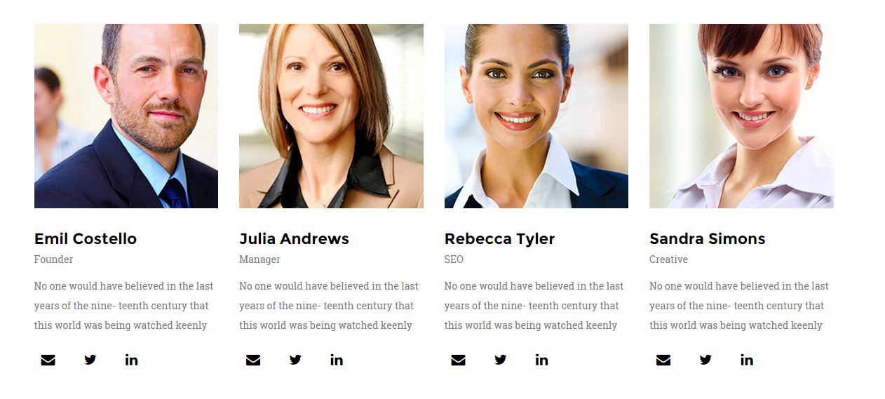
Person Box
|
1 2 3 4 5 6 7 8 9 10 11 12 13 14 15 16 17 18 19 20 21 22 |
<div class="ct-personBox"> <div class="ct-img-wrapper-2"> <div class="ct-img-wrapper-3"> <div class="ct-u-displayTableVertical"> <div class="ct-u-displayTableCell ct-u-colorWhite text-center"> <a class="btn btn-lg ct-btn--transparent ct-btn-rounded" href="#">See Profile</a> </div> </div> </div> <img src="assets/images/demo-content/team-1.jpg" alt=""> </div> <div> <h5 class="ct-fw-600 ct-u-paddingTop30">Emil Costello</h5> <p>Founder</p> <p>No one would have believed in the last years of the nine- teenth century that this world was being watched keenly</p> <ul class="list-inline ct-socials ct-u-size20 ct-u-paddingTop10"> <li><a href="#"><i class="fa fa-envelope" data-toggle="tooltip" data-placement="top" title="" data-original-title="linkedin"></i></a></li> <li><a href="https://twitter.com/createitpl" data-toggle="tooltip" data-placement="top" title="" data-original-title="twitter"><i class="fa fa-twitter"></i></a></li> <li><a href="#"><i class="fa fa-linkedin" data-toggle="tooltip" data-placement="top" title="" data-original-title="linkedin"></i></a></li> </ul> </div> </div> |
Widget person box:
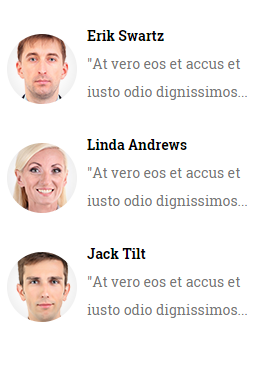
Person box – widget
|
1 2 3 4 5 6 7 8 9 10 11 12 13 14 15 16 |
<div class="widget"> <div class="widget-inner"> <div class="media"> <div class="media-left media-middle"> <a href="#"> <img class="media-object" src="assets/images/demo-content/person-1.png" alt=""> </a> </div> <div class="media-body"> <span class="media-heading">Erik Swartz</span> <p>"At vero eos et accus et iusto odio dignissimos...</p> </div> </div> </div> </div> |
ct-personBox: Person box style.
ct-img-wrapper-2: Gives position relative.
ct-img-wrapper-3: Gives position absolute and sets top: 0, bottom: 0, right: 0,left:0.
btn, btn-link, btn-lg, ct-btn–transparent, ct-btn-rounded: button classes.
Was this article helpful ?
Portfolio slider

Portfolio
|
1 2 3 4 5 6 7 8 9 10 11 12 13 14 15 16 17 18 19 20 21 22 23 24 25 26 27 28 29 30 31 32 33 34 35 36 37 38 39 40 41 42 43 44 45 46 47 48 49 |
HTML Markup : <section class="ct-mediaSection" data-bg-image="assets/images/background-2.jpg" data-stellar-background-ratio="0.3" data-type="parallax"> <div class="ct-mediaSection-inner"> <div class="container"> <div class="ct-js-slick ct-slick-1 ct-slick-arrow-1" data-animations="true" data-autoplay="false" data-arrows="true" data-items="1" data-XSitems="1" data-SMitems="1" data-MDitems="1"> <div class="item"> <img class="ct-u-marginTop70" src="assets/images/portfolio-details-slider-person-1.jpg" alt=""/> <p class="ct-u-marginTop30"> “No one would have believed in the last years of the nine- teenth century that this world was being watched keenly and closely by intelligences greater than man’s and yet as mortal as his own limet norma ipsum delient century looper that as men busied” </p> <p class="ct-name ct-u-marginTop20 ct-u-marginBottom100">Maria Barnett - CEO</p> </div> <div class="item"> <img class="ct-u-marginTop70" src="assets/images/portfolio-details-slider-person-1.jpg" alt=""/> <p class="ct-u-marginTop30"> “No one would have believed in the last years of the nine- teenth century that this world was being watched keenly and closely by intelligences greater than man’s and yet as mortal as his own limet norma ipsum delient century looper that as men busied” </p> <p class="ct-name ct-u-marginTop20 ct-u-marginBottom100">Maria Barnett - CEO</p> </div> <div class="item"> <img class="ct-u-marginTop70" src="assets/images/portfolio-details-slider-person-1.jpg" alt=""/> <p class="ct-u-marginTop30"> “No one would have believed in the last years of the nine- teenth century that this world was being watched keenly and closely by intelligences greater than man’s and yet as mortal as his own limet norma ipsum delient century looper that as men busied” </p> <p class="ct-name ct-u-marginTop20 ct-u-marginBottom100" >Maria Barnett - CEO</p> </div> </div> </div> </div> </section> |
Change sliders navigation position by adding one of the following CSS classes to HTML markup:
- ct-slick-arrow-1,
- ct-slick-arrow-1–above,
- ct-slick-arrow-2,
- ct-slick-arrow-3,
- ct-slick-arrow-3–leftTop
- ct-slick-arrow-3–leftBottom,
- ct-slick-arrow-3–rightTop
- ct-slick-arrow-3–rightBottom,
- ct-slick-arrow-3–under
Was this article helpful ?
Photo stream
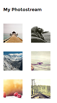
Photostream
|
1 2 3 4 5 6 7 8 9 10 11 12 13 14 15 16 17 18 19 |
<div class="widget"> <div class="widget-inner"> <h6 class="ct-fw-600 ct-u-paddingBoth40">My Photostream</h6> <ul class="list-unstyled ct-photostream"> <li class="ct-u-paddingBottom30"> <div class="ct-u-displayTableCell"><a class="ct-img-wrapper-2" href="portfolio-2.html"><img src="assets/images/photostream-small-1.jpg" alt=""/></a></div> <div class="ct-u-displayTableCell"><a class="ct-img-wrapper-2" href="portfolio-2.html"><img src="assets/images/photostream-small-2.jpg" alt=""/></a></div> </li> <li class="ct-u-paddingBottom30"> <div class="ct-u-displayTableCell"><a class="ct-img-wrapper-2" href="portfolio-2.html"><img src="assets/images/photostream-small-3.jpg" alt=""/></a></div> <div class="ct-u-displayTableCell"><a class="ct-img-wrapper-2" href="portfolio-2.html"><img src="assets/images/photostream-small-4.jpg" alt=""/></a></div> </li> <li class="ct-u-paddingBottom30"> <div class="ct-u-displayTableCell"><a class="ct-img-wrapper-2" href="portfolio-2.html"><img src="assets/images/photostream-small-5.jpg" alt=""/></a></div> <div class="ct-u-displayTableCell"><a class="ct-img-wrapper-2" href="portfolio-2.html"><img src="assets/images/photostream-small-6.jpg" alt=""/></a></div> </li> </ul> </div> </div> |
Was this article helpful ?
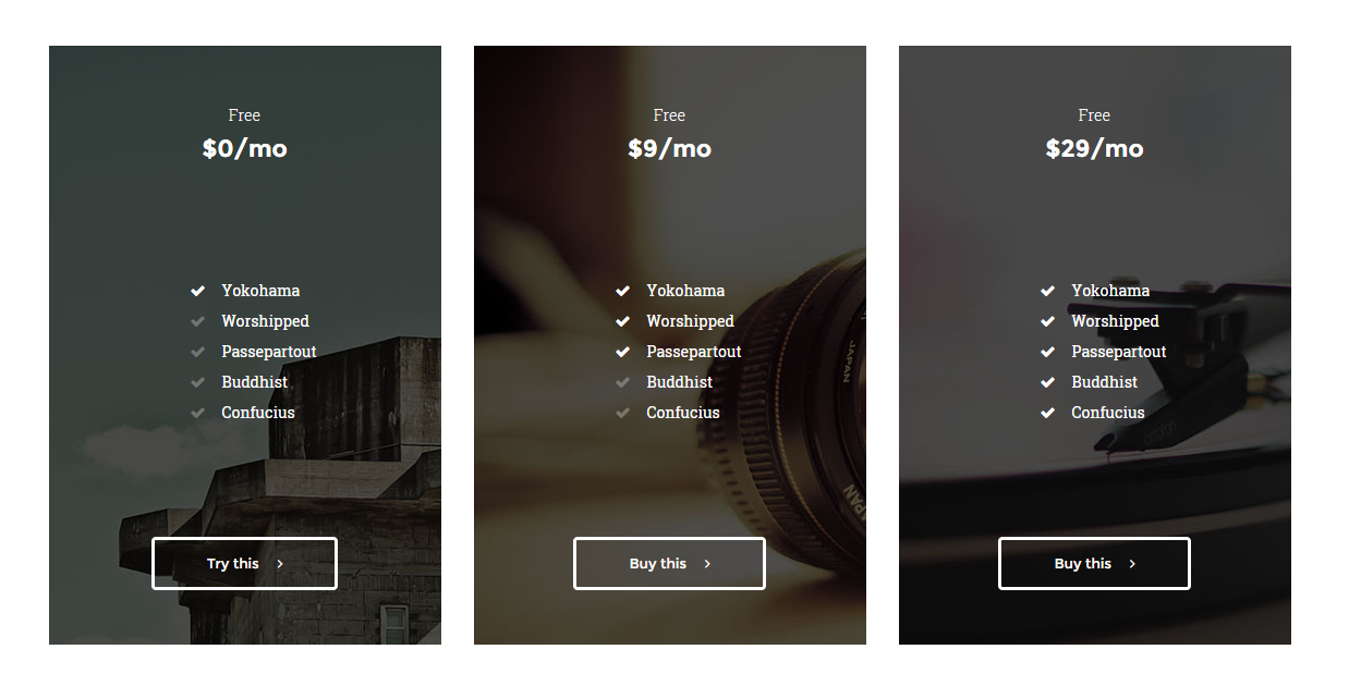
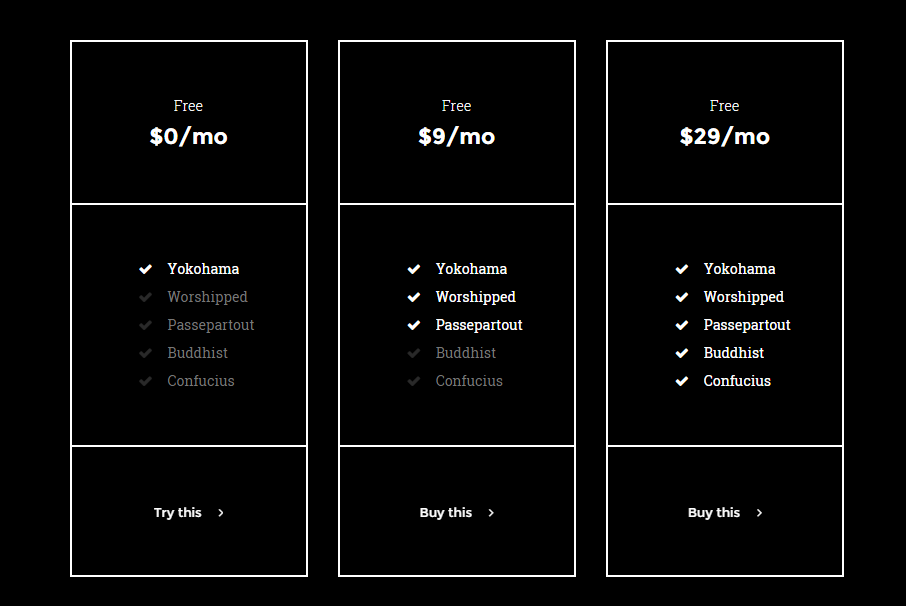
Pricing Tables
Pricing table 1

|
1 2 3 4 5 6 7 8 9 10 11 12 13 14 15 16 17 18 19 20 21 22 23 24 25 26 |
<div class="ct-pricing-1"> <div class="ct-u-displayTableVertical"> <div class="ct-u-displayTableRow"> <div class="ct-u-displayTableCell"> <span class="ct-fw-300">Free</span> <h3 class="ct-fw-600">$0/mo</h3> </div> </div> <div class="ct-u-displayTableRow"> <div class="ct-u-displayTableCell"> <ul class="list-unstyled"> <li class="ct-u-colorBlack">Yokohama</li> <li>Worshipped</li> <li>Passepartout</li> <li>Buddhist</li> <li>Confucius</li> </ul> </div> </div> <div class="ct-u-displayTableRow"> <div class="ct-u-displayTableCell"> <a class="btn btn-link" href="#"><span>Try this</span><i class="fa fa-angle-right"></i></a> </div> </div> </div> </div> |
Pricing table 2
|
1 2 3 4 5 6 7 8 9 10 11 12 13 14 15 16 17 18 19 20 21 22 23 24 25 26 |
<div class="ct-pricing-2" data-bg-image="assets/images/pricing-1.jpg"> <div class="ct-u-displayTableVertical"> <div class="ct-u-displayTableRow"> <div class="ct-u-displayTableCell"> <span class="ct-fw-300">Free</span> <h3 class="ct-fw-600">$0/mo</h3> </div> </div> <div class="ct-u-displayTableRow"> <div class="ct-u-displayTableCell"> <ul class="list-unstyled"> <li class="ct-u-colorWhite">Yokohama</li> <li>Worshipped</li> <li>Passepartout</li> <li>Buddhist</li> <li>Confucius</li> </ul> </div> </div> <div class="ct-u-displayTableRow"> <div class="ct-u-displayTableCell ct-u-colorWhite"> <a class="btn btn-lg ct-btn--transparent ct-btn-rounded" href="#"><span>Try this</span><i class="fa fa-angle-right"></i></a> </div> </div> </div> </div> |
Background image can be change with data attribute:
data-bg-image – just define url to your image,
Pricing table 3 – inverse
|
1 2 3 4 5 |
<div class="ct-u-backgroundBlack> //Pricing table </div> |
Pricing table 4 – Counter

|
1 2 3 4 5 6 7 8 9 10 11 12 13 14 15 16 17 18 19 20 21 22 23 24 25 26 27 28 29 30 31 32 33 34 35 |
<div class="ct-pricing-2" data-bg-image="assets/images/pricing-1.jpg"> <div class="ct-u-displayTableVertical"> <div class="ct-u-displayTableRow"> <div class="ct-u-displayTableCell"> <span class="ct-fw-300">Free</span> //Counter --> <h3>$</h3> <h3 class="ct-u-colorWhite ct-js-counter" data-ct-to="2134" data-ct-speed="5000">$0</h3> <h3>/mo</h3> //Counter <-- </div> </div> <div class="ct-u-displayTableRow"> <div class="ct-u-displayTableCell"> <ul class="list-unstyled"> <li class="ct-u-colorWhite">Yokohama</li> <li>Worshipped</li> <li>Passepartout</li> <li>Buddhist</li> <li>Confucius</li> </ul> </div> </div> <div class="ct-u-displayTableRow"> <div class="ct-u-displayTableCell ct-u-colorWhite"> <a class="btn btn-lg ct-btn--transparent ct-btn-rounded" href="#"><span>Try this</span><i class="fa fa-angle-right"></i></a> </div> </div> </div> </div> |
Script required for Pricing table 4 – Counter:
|
1 2 |
<script src="assets/js/counter/jquery.countTo.js"></script> , <script src="assets/js/counter/init.js"></script> |
Was this article helpful ?
Shop slider
Shop slider
HTML markup:
|
1 2 3 4 5 6 7 8 9 10 11 12 13 14 15 16 17 18 19 20 21 22 23 24 25 26 27 28 29 30 31 32 33 34 35 36 37 38 39 40 41 42 43 44 45 46 47 48 49 50 51 52 53 54 55 56 57 |
<div class="ct-articleBox ct-js-slick ct-slick-arrow-3 ct-slick-arrow-3--rightTop ct-u-marginBottom60" data-animations="true" data-autoplay="true" data-autoplaySpeed="9000" data-arrows="true" data-items="1"> <div class="item"> <div class="ct-articleBox-media"> <img src="assets/images/shop-slider.jpg" alt=""/> <span class="ct-link"><a href="#">12</a></span> <div class="media animated" data-fx="slideInLeft"> <div class="media-left"> //Article info box --> <div class="media-object ct-articleBox-info"> <div class="info-1">990$</div> <div class="info-2"><a href="#">BUY</a></div> </div> //Article info box <-- </div> <div class="media-body"> <h3 class="media-heading ct-u-paddingBottom10 ct-fw-600">No one would have believed in</h3> <p> No one would have believed in the last years of the nine- teenth century that this world was being. </p> </div> </div> </div> </div> <div class="item"> <div class="ct-articleBox-media"> <img src="assets/images/shop-slider-2.jpg" alt=""/> <span class="ct-link"><a href="#">23</a></span> <div class="media animated" data-fx="slideInLeft"> <div class="media-left"> //Article info box --> <div class="media-object ct-articleBox-info"> <div class="info-1">1000$</div> <div class="info-2"><a href="#">BUY</a></div> </div> //Article info box <-- </div> <div class="media-body"> <h3 class="media-heading ct-u-paddingBottom10 ct-fw-600">No one would have believed in</h3> <p> No one would have believed in the last years of the nine- teenth century that this world was being. </p> </div> </div> </div> </div> </div> |
.ct-articleBox: Base class for article.
.ct-articleBox-media: Images,Videos for article.
.ct-js-slick: class for slick slider.
.ct-articleBox-info : article info box wrapper.
.info-1 : ‘.ct-articleBox-info’ subclass.
.info-2 : ‘.ct-articleBox-info’ subclass.
NAVIGATION PLACEMENT – change where sliders navigation should be displayed by adding one of the following CSS classes to HTML markup:
- .ct-slick-arrow-1,
- .ct-slick-arrow-1–above,
- .ct-slick-arrow-2,
- .ct-slick-arrow-3,
- .ct-slick-arrow-3–leftTop,
- .ct-slick-arrow-3–leftBottom,
- .ct-slick-arrow-3–rightTop,
- .ct-slick-arrow-3–rightBottom,
- .ct-slick-arrow-3–under
Was this article helpful ?
Shop product
HTML markup:
Shop product
|
1 2 3 4 5 6 7 8 9 10 11 12 13 14 15 16 17 18 19 20 21 22 23 24 25 26 27 28 29 30 31 32 33 34 35 36 37 38 39 40 41 42 43 44 45 46 47 48 49 |
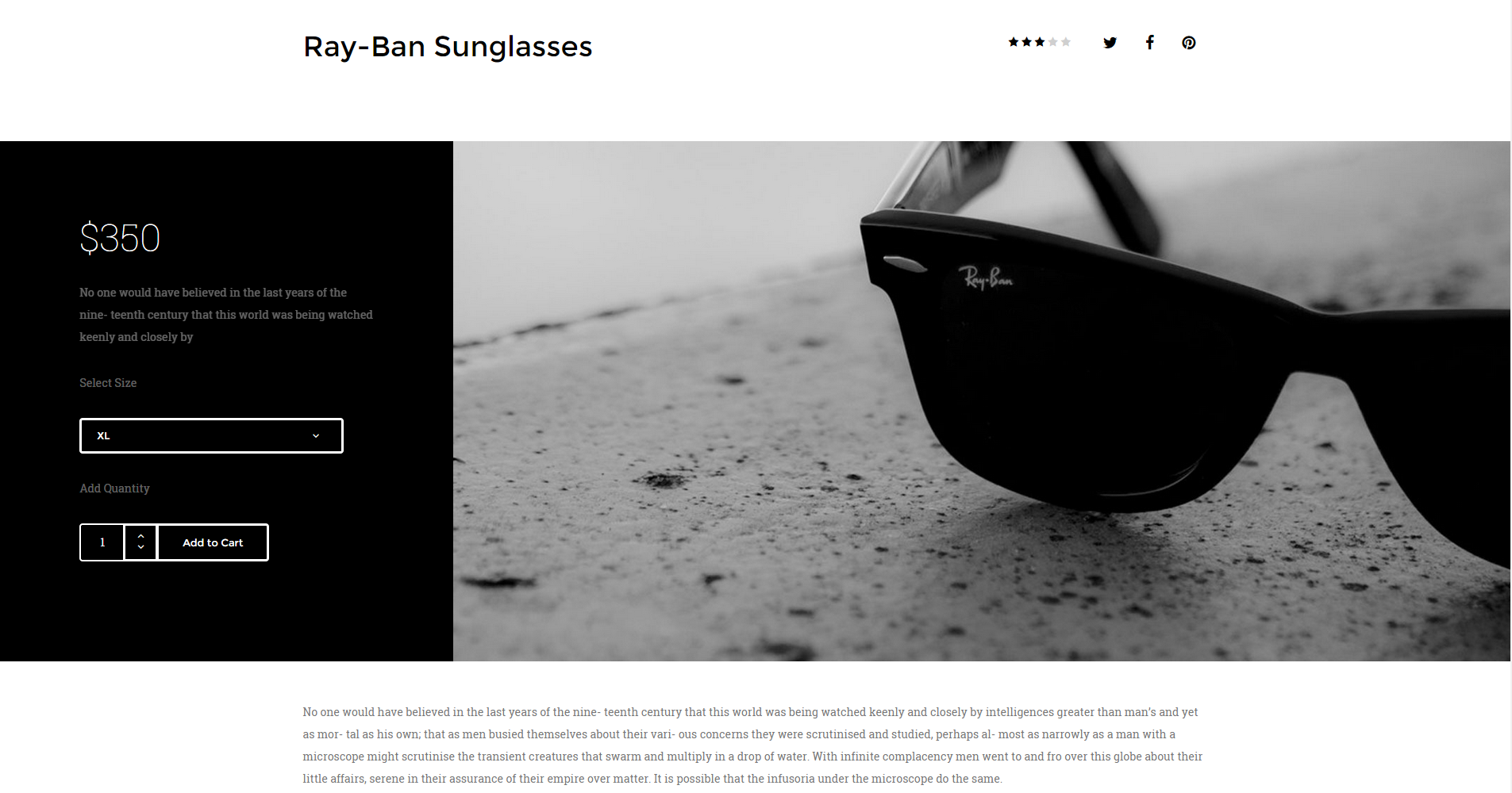
<div class="ct-productBox"> <div class="ct-u-displayTableVertical"> <div class="ct-u-displayTableCell ct-productBox-cart ct-u-colorWhite"> <div class="row"> <div class="col-md-12 col-lg-8 col-md-offset-2"> <h3 class="ct-fw-100 ct-u-fontType-2 ct-u-paddingBottom30">$350</h3> <p class="ct-u-colorFaint"> No one would have believed in the last years of the nine- teenth century that this world was being watched keenly and closely by </p> <p class="ct-u-colorFaint ct-u-paddingBoth20">Select Size</p> <div class="btn-group ct-btn--full ct-btn-group--rounded ct-dropdown ct-dropdown--borderOff ct-u-colorWhite"> <a class="btn ct-btn--transparent uppercase dropdown-toggle-target"> XL </a> <a class="btn ct-btn--transparent uppercase dropdown-toggle" data-toggle="dropdown"><i class="fa fa-angle-down"></i></a> <ul class="dropdown-menu" role="menu"> <li><a class="btn">XL</a></li> <li><a class="btn">L</a></li> <li><a class="btn">M</a></li> <li><a class="btn">S</a></li> </ul> </div> <p class="ct-u-colorFaint ct-u-paddingBottom20 ct-u-paddingTop30">Add Quantity</p> <div class="input-group spinner spinner-lg spinner-rounded ct-u-marginBottom30"> <input type="text" class="form-control-4" value="1"> <div class="input-group-btn-vertical"> <button class="btn ct-btn--transparent"><i class="fa fa-angle-up"></i></button> <button class="btn ct-btn--transparent"><i class="fa fa-angle-down"></i></button> </div> <a class="btn ct-btn--transparent" href="#">Add to Cart</a> </div> </div> </div> </div> <div class="ct-u-displayTableCell ct-productBox-product"> <div class="row"> <div class="col-md-12 col-lg-12"> <img src="assets/images/product-1-lg.jpg" alt=""/> </div> </div> </div> </div> </div> |
Was this article helpful ?
Cart menu
Cart menu
|
1 2 3 4 5 6 7 8 9 10 11 12 13 14 15 16 17 18 19 20 21 22 23 24 25 26 27 28 |
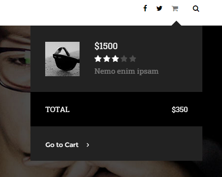
<div class="ct-cart-tag" data-placement="left"> <i class="fa fa-shopping-cart"></i> <div class="ct-cart-window"> <div class="ct-cart-product"><img src="assets/images/cart-sm.jpg" alt=""/></div> <div class="ct-cart-details"> <span class="h6 ct-u-fontType-2 ct-u-colorWhite">$1500</span> <div class="ct-raiting ct-u-colorWhite"> <i class="fa fa-star"></i> <i class="fa fa-star"></i> <i class="fa fa-star"></i> <i class="fa fa-star ct-u-colorFaint"></i> <i class="fa fa-star ct-u-colorFaint"></i> </div> <span class="ct-u-colorWhite ct-u-colorFaint">Nemo enim ipsam</span> </div> <div class="ct-cart-total ct-u-marginTop30"> <div class="ct-u-displayTable ct-u-colorWhite"> <div class="ct-u-displayTableCell text-uppercase">Total</div> <div class="ct-u-displayTableCell ct-cart-total--price">$350</div> </div> </div> <div> <button class="btn btn-link btn-link--white ct-u-colorWhite"> <span>Go to Cart</span><i class="fa fa-angle-right"></i> </button> </div> </div> </div> |
CSS Classes:
ct-cart-tag: Base class for cart window.
ct-cart-window: It displays cart window.
ct-cart-product: Wrapper for product image.
ct-cart-details: Wrapper for Cart’s product content.
ct-cart-total: Total price for all products.
ct-cart-total–price: style for price.
ct-u-colorWhite: gives white color to component.
ct-u-colorFaint: Lowers component opacity.
|
1 2 3 4 5 6 |
.ct-u-displayTable{ display: table; } .ct-u-displayTableCell{ display: table-cell } |
fa, fa-star: font awesome classes used to display stars in ratings.
Was this article helpful ?
Checkout
Checkout
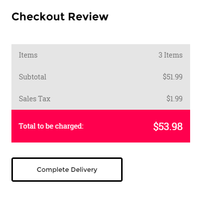
Checkout table
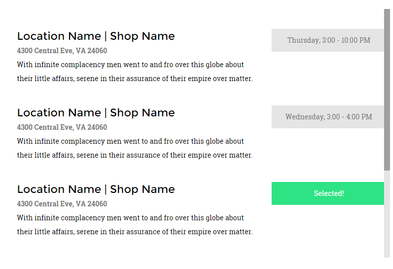
Checkout item

Datepicker

Form row
Form row 2
|
1 2 3 4 5 6 7 8 9 10 11 12 13 14 15 16 17 18 19 20 21 22 23 24 25 26 27 28 29 30 31 32 33 34 35 36 37 38 39 40 41 42 43 44 45 46 47 48 49 50 51 52 53 54 55 56 57 58 59 60 61 62 63 64 65 66 67 68 69 70 71 72 73 74 75 76 77 78 79 80 81 82 83 84 85 86 87 88 89 90 91 92 93 94 95 96 97 98 99 100 101 102 103 104 105 106 107 108 109 110 111 112 113 114 115 116 117 118 119 120 121 122 123 124 125 126 127 128 129 130 131 132 133 134 135 136 137 138 139 140 141 142 143 144 145 146 147 148 149 150 151 152 153 |
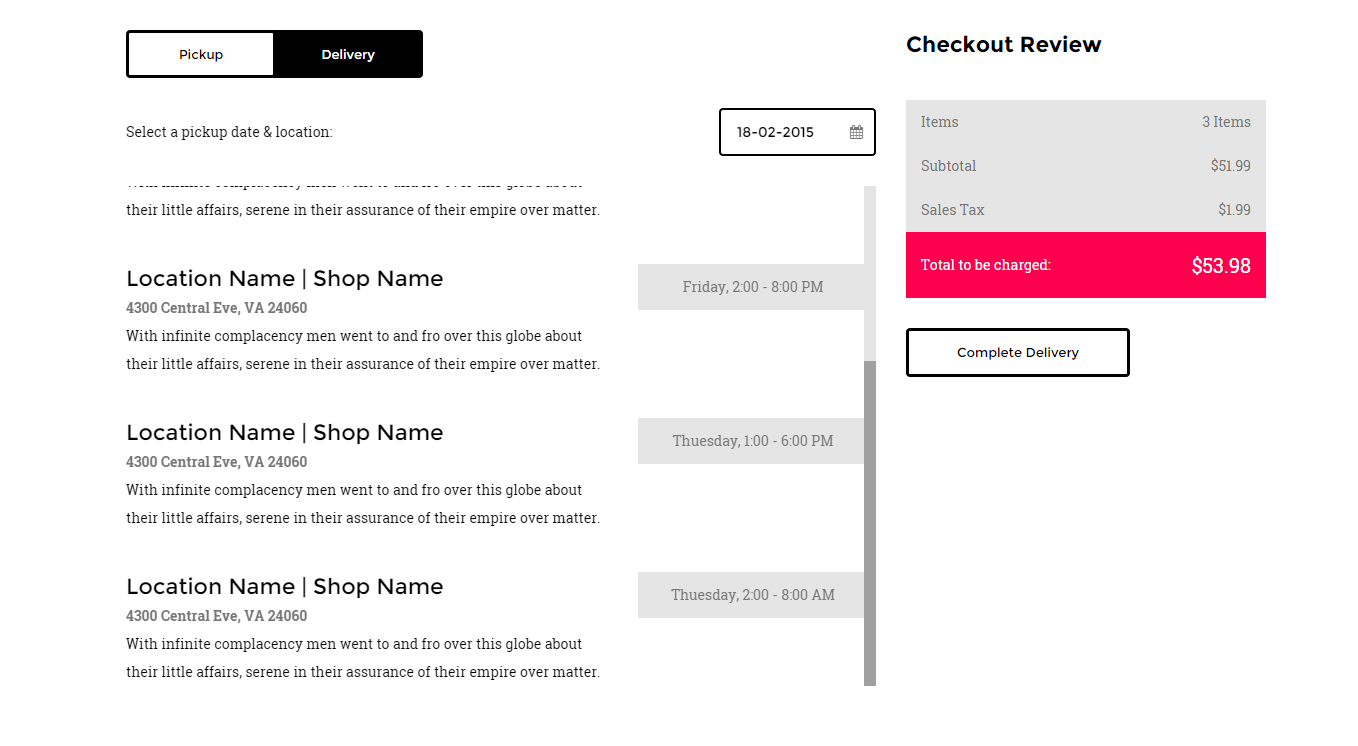
<div class="tab-content ct-checkout"> <div id="a2" class="tab-pane fade in active"> <div class="row"> <div class="col-md-12"> <div class="ct-u-displayTableVertical ct-u-marginBottom30"> <div class="ct-u-displayTableCell"><span class="ct-u-colorBlack">Select a pickup date & location:</span></div> <div class="ct-u-displayTableCell"> <div class="input-append date pull-right" data-date="12-02-2012" data-date-format="dd-mm-yyyy"> <input class="form-control-3" size="16" type="text" value="12-02-2012"> <span class="add-on"><i class="fa fa-calendar"></i></span> </div> </div> </div> <div class="ct-checkout-item"> <div class="row ct-u-paddingTop40"> <div class="col-md-8"> <h5>Location Name | Shop Name</h5> <p class="ct-fw-600">4300 Central Eve, VA 24060</p> <p class="ct-u-colorBlack">With infinite complacency men went to and fro over this globe about their little affairs, serene in their assurance of their empire over matter. </p> </div> <div class="col-md-4"> <div class="ct-btn-checkbox"> <label> <input type="checkbox" value="18-02-2015" data-value="Thursday, 3:00 - 10:00 PM" name="checkout"> <span>Thursday, 3:00 - 10:00 PM</span> </label> </div> </div> </div> <div class="col-md-8"> <h5>Location Name | Shop Name</h5> <p class="ct-fw-600">4300 Central Eve, VA 24060</p> <p class="ct-u-colorBlack">With infinite complacency men went to and fro over this globe about their little affairs, serene in their assurance of their empire over matter. </p> </div> <div class="col-md-4"> <div class="ct-btn-checkbox"> <label> <input type="checkbox" value="9-02-2015" data-value="Thuesday, 2:00 - 8:00 AM" name="checkout"> <span>Thuesday, 2:00 - 8:00 AM</span> </label> </div> </div> </div> </div> </div> </div> </div> <div class="row"> <div class="col-md-12"> <div class="ct-u-displayTableVertical ct-u-marginBottom30"> <div class="ct-u-displayTableCell"><span class="ct-u-colorBlack">Select a delivery date & location:</span></div> <div class="ct-u-displayTableCell"> <div class="input-append date pull-right" data-date="12-02-2012" data-date-format="dd-mm-yyyy"> <input class="form-control-3" size="16" type="text" value="12-02-2012"> <span class="add-on"><i class="fa fa-calendar"></i></span> </div> </div> </div> <div class="ct-checkout-item"> <div class="row ct-u-paddingTop40"> <div class="col-md-8"> <h5>Location Name | Shop Name</h5> <p class="ct-fw-600">4300 Central Eve, VA 24060</p> <p class="ct-u-colorBlack">With infinite complacency men went to and fro over this globe about their little affairs, serene in their assurance of their empire over matter. </p> </div> <div class="col-md-4"> <div class="ct-btn-checkbox"> <label> <input type="checkbox" value="18-02-2015" data-value="Thursday, 3:00 - 10:00 PM" name="checkout"> <span>Thursday, 3:00 - 10:00 PM</span> </label> </div> </div> </div> <div class="row ct-u-paddingTop40"> <div class="col-md-8"> <h5>Location Name | Shop Name</h5> <p class="ct-fw-600">4300 Central Eve, VA 24060</p> <p class="ct-u-colorBlack">With infinite complacency men went to and fro over this globe about their little affairs, serene in their assurance of their empire over matter. </p> </div> <div class="col-md-4"> <div class="ct-btn-checkbox"> <label> <input type="checkbox" value="11-02-2015" data-value="Wednesday, 3:00 - 4:00 PM" name="checkout"> <span>Wednesday, 3:00 - 4:00 PM</span> </label> </div> </div> </div> <div class="row ct-u-paddingTop40"> <div class="col-md-8"> <h5>Location Name | Shop Name</h5> <p class="ct-fw-600">4300 Central Eve, VA 24060</p> <p class="ct-u-colorBlack">With infinite complacency men went to and fro over this globe about their little affairs, serene in their assurance of their empire over matter. </p> </div> <div class="col-md-4"> <div class="ct-btn-checkbox"> <label> <input type="checkbox" value="11-02-2015" data-value="Friday, 2:00 - 8:00 PM" name="checkout"> <span>Friday, 2:00 - 8:00 PM</span> </label> </div> </div> </div> <div class="row ct-u-paddingTop40"> <div class="col-md-8"> <h5>Location Name | Shop Name</h5> <p class="ct-fw-600">4300 Central Eve, VA 24060</p> <p class="ct-u-colorBlack">With infinite complacency men went to and fro over this globe about their little affairs, serene in their assurance of their empire over matter. </p> </div> <div class="col-md-4"> <div class="ct-btn-checkbox"> <label> <input type="checkbox" value="8-02-2015" data-value="Thuesday, 1:00 - 6:00 PM" name="checkout"> <span>Thuesday, 1:00 - 6:00 PM</span> </label> </div> </div> </div> <div class="row ct-u-paddingTop40"> <div class="col-md-8"> <h5>Location Name | Shop Name</h5> <p class="ct-fw-600">4300 Central Eve, VA 24060</p> <p class="ct-u-colorBlack">With infinite complacency men went to and fro over this globe about their little affairs, serene in their assurance of their empire over matter. </p> </div> <div class="col-md-4"> <div class="ct-btn-checkbox"> <label> <input type="checkbox" value="9-02-2015" data-value="Thuesday, 2:00 - 8:00 AM" name="checkout"> <span>Thuesday, 2:00 - 8:00 AM</span> </label> </div> </div> </div> </div> </div> </div> </div> </div> |
ct-checkout: Base class for checkout.
tab-content: Hide tab panels at start, show them when .active.
The ‘.datepicker’ component consist of fallowing HTML markup:
|
1 2 3 4 |
<div class="input-append date pull-right" data-date="12-02-2012" data-date-format="dd-mm-yyyy"> <input class="form-control-3" size="16" type="text" value="12-02-2012"> <span class="add-on"><i class="fa fa-calendar"></i></span> </div> |
CSS Classes :
‘.input-append‘, ‘.date‘ are the classes necessary to get datepicker plugin to work and be displayed.
I also requires the following js files:
<script> $('.input-append').datepicker();</script>
The ‘ct-checkout’ component consist of ‘datepicker‘ and ‘ct-checkout-item‘ items.
The ‘ct-checkout-item’ selects a prticular date in ‘.datepicker’ component by clicking CHECKBOX BUTTON.
CHECKBOX BUTTON :
It always comes with the following markup :
|
1 2 3 4 5 6 |
<div class="ct-btn-checkbox"> <label> <input type="checkbox" value="18-02-2015" data-value="Thursday, 3:00 - 10:00 PM" name="checkout"> <span>Thursday, 3:00 - 10:00 PM</span> </label> </div> |
ct-btn-checkbox: It’s a type of a button, reserved just for checkout section.
Input field receive two attributes, which is ‘value’ and ‘data-value’. The ‘value’ attribute
sets the ‘datepicker’ component to particular date. The ‘data-value’ is text of a button that
will be displayed after clicking twice on the button. First click will inform user that button was clicked
by displaying thext ‘Selected!’. Second click will take value from ‘data-value’ attribute.
USED UTILITIES CLASSES:
|
1 2 3 4 5 6 7 8 9 10 11 12 13 |
.ct-u-displayTableVertical{ display: table; .ct-u-displayTableCell{ vertical-align: middle. } } .ct-u-displayTable{ display: table; } .ct-u-displayTableCell{ display: table-cell } |
Was this article helpful ?
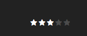
Ratings
HTML Markup:
Rating box 1
|
1 2 3 4 5 6 7 |
<div class="ct-raiting ct-u-colorWhite"> <i class="fa fa-star"></i> <i class="fa fa-star"></i> <i class="fa fa-star"></i> <i class="fa fa-star ct-u-colorFaint"></i> <i class="fa fa-star ct-u-colorFaint"></i> </div> |
Rating box 2
|
1 2 3 4 5 6 7 |
<div class="ct-lead--wrapper"> <span class="ct-title">Rank</span> <div class="lead ct-u-paddingBoth10"> <div id="stars" class="starrr"></div> </div> </div> |
CSS Classes:
.fa .fa-star: Bootstrap classes. They display ‘star’ tag.
.ct-u-colorFaint: lowers opacity of a font.
.ct-rating: Rating box style.
.ct-u-colorWhite: changes rating box color to white.
ct-lead–wrapper: Wrapper for a rating box.
Javascript:
.lead, .starrr, .stars: classes are required for rating plugin.
Raiting init file is required to make ‘rating’ plugin working.
|
1 |
<script src="assets/js/raiting/init.js"></script> |
Was this article helpful ?
Contact Form
Template comes with ready to use:
- Contact Form
- Newsletter Form
All needed files are in /form directory.
Remember to includeon page.
To configure form just edit form/config.php and change e-mails to your own :
|
1 2 |
$to = "mail@example.com"; $from = "mail@example.com"; |
That’s it!
Contact Form
HTML Markup:
|
1 2 3 4 5 6 7 8 9 10 11 12 13 14 15 16 17 18 19 20 21 22 23 24 25 26 27 28 29 30 31 32 33 34 35 36 37 38 39 40 41 42 43 |
<div class="ct-contactForm"> <div class="successMessage alert alert-success" style="display: none"> <button type="button" class="close" data-dismiss="alert" aria-hidden="true">×</button> Thank You! </div> <div class="errorMessage alert alert-danger" style="display: none"> <button type="button" class="close" data-dismiss="alert" aria-hidden="true">×</button> Ups! An error occured. Please try again later. </div> <form role="form" action="./assets/form/send.php" method="post" class="contactForm validateIt" data-email-subject="Contact Form" data-show-errors="true"> <div class="row"> <div class="col-md-6"> <div class="form-group"> <input id="contact_name" placeholder="Name" required="" type="text" name="field[]" class="form-control"> <label for="contact_name">Name</label> </div> <div class="form-group"> <input id="contact_email" placeholder="Email" required="" type="email" name="field[]" class="form-control"> <label for="contact_email">Email</label> </div> <div class="form-group"> <input id="contact_subject" placeholder="Subject" required="" type="text" name="field[]" class="form-control"> <label for="contact_subject">Subject</label> </div> </div> </div> <div class="row"> <div class="col-xs-12"> <div class="form-group"> <textarea id="contact_message" placeholder="Message" class="form-control" rows="8" name="field[]" required=""></textarea> <label for="contact_message">Message</label> </div> </div> </div> <div class="row"> <div class="col-xs-12"> <button type="submit" class="btn ct-btn--perspective btn-primary btn-lg text-uppercase pull-right"><i class="fa fa-paper-plane"></i> Send Message </button> </div> </div> </form> </div> |
Was this article helpful ?
PSD Files
We understand that you might have ideas for improving our project design. Feel free to change the design to better suit your needs. Layered PSD files are available here
Was this article helpful ?
Sources & Credits
The following sources and files have been used to build up this theme
- Twitter Bootstrap – http://twitter.github.com/bootstrap/
- jQuery – http://www.jquery.com
Was this article helpful ?