

Fishtank – Responsive HTML5 Template
Thank you for purchasing this theme. If you have any questions that are beyond the scope of this help file, please feel free to start new ticket on this page. Thanks so much!
Scope of free support
We can help you with:
- Responding to questions or problems regarding the item and its features
- Fixing any discovered item’s bugs
- Providing updates to ensure compatibility with new software versions
Was this article helpful ?
HTML Structure
This theme is built upon bootstrap framework and is fully responsive. It adapts to window resolution and looks good on all devices including iPad and iPhone.
See for yourself (resize your browser).
If you would like to read more
about bootstrap framework click here :
Grid System and Single row structure
The default Bootstrap grid system utilizes 12 columns. It’s responsive grid and adapts to viewport. Below 767px viewports, the columns become fluid and stack vertically. The fluid grid system uses percents instead of pixels for column widths. Each row always include 12 columns (for example col-md-8 + col-md-4 = col-md-12).
Bootstrap documentation: here
Basic grid HTML:
|
1 2 3 4 5 6 7 8 9 10 11 12 13 14 15 16 17 18 19 20 21 22 23 24 25 26 27 |
<div class="row"> <div class="col-md-1">.col-md-1</div> <div class="col-md-1">.col-md-1</div> <div class="col-md-1">.col-md-1</div> <div class="col-md-1">.col-md-1</div> <div class="col-md-1">.col-md-1</div> <div class="col-md-1">.col-md-1</div> <div class="col-md-1">.col-md-1</div> <div class="col-md-1">.col-md-1</div> <div class="col-md-1">.col-md-1</div> <div class="col-md-1">.col-md-1</div> <div class="col-md-1">.col-md-1</div> <div class="col-md-1">.col-md-1</div> </div> <div class="row"> <div class="col-md-8">.col-md-8</div> <div class="col-md-4">.col-md-4</div> </div> <div class="row"> <div class="col-md-4">.col-md-4</div> <div class="col-md-4">.col-md-4</div> <div class="col-md-4">.col-md-4</div> </div> <div class="row"> <div class="col-md-6">.col-md-6</div> <div class="col-md-6">.col-md-6</div> </div> |
Page structure
Below you will find default page structure :
|
1 2 3 4 5 6 7 8 9 10 11 12 13 14 15 16 17 18 19 20 21 22 23 24 25 26 27 28 29 30 31 32 33 34 35 36 |
<!DOCTYPE html> <html> <head> [css] </head> <body> [header] [main menu] <!-- main container --> <div id="wrapper"> [component 1] <!-- fullwidth element --> </div> [fullwidth parallax] <div class="container"> <!-- / fullwidth element --> [component 6] </div> <!-- / main container --> [footer] [javascripts] </body> </html> |
Was this article helpful ?
CSS Files and Structure
If you would like to edit the color, font, or style of any elements, you would do the following:
|
1 |
#primaryContent a {color: #someColor;} |
If you find that your new style is not overriding, it is most likely because of a specificity problem. Scroll down in your CSS file and make sure that there isn’t a similar style that has more weight.
I.E.
|
1 |
#wrap #primaryContent a {color: #someColor;} |
So, to ensure that your new styles are applied, make sure that they carry enough “weight” and that there isn’t a style lower in the CSS file that is being applied after yours.
Colors
The theme includes a css file wich you can use to edit the colors.
You just need to add the corresponding CSS file to the head of the page like this:
|
1 2 3 4 5 |
<head> (..) <link rel="stylesheet" type="text/css" href="css/motive.css"> (..) </head> |
Main Menu structure
Just change brand name, upload your logo to images/content/ folder and you’re ready to go!
|
1 2 3 4 5 6 7 8 9 10 11 12 13 14 15 16 17 18 19 20 21 22 23 24 25 26 27 28 29 30 31 32 33 |
<nav class="navbar ct-navbar navbar-default yamm ct-navbar--fadeIn" role="navigation"> <div class="container"> <div class="ct-navbarContainer"> <div class="navbar-header"> <a class="navbar-brand" href="index.html"><img id="ct-js-logo" src="assets/images/demo-content/logo.png" alt="FISHtank"></a> <!-- + --> </div> <ul class="nav navbar-nav"> <li role="presentation" class="dropdown"> <a class="dropdown-toggle" href="about.html" role="button" aria-expanded="true"> Home <span class="caret"></span> </a> <ul class="dropdown-menu"> <li> <div class="yamm-content"> </div> </li> </ul> </li> <li><a href="contact.html">Contact Us</a></li> </ul> <ul class="nav navbar-nav yamm ct-navbar--right"> <li><a href="login.html">My Account</a></li> </ul> </div> </div> </nav> |
In order to create mega menus read the documentation here:
Icons
We’ve included 360+ font icons.
Awesome Icons – http://fontawesome.io/icons/
HTML markup:
|
1 2 |
<!-- Awesome Icons --> <i class="fa fa-cog"></i> |
CSS Files & Structure
We’ve included 2 files.
bootstrap.css contains Bootstrap 3 Library.
style.css file contains general styles.
1. Snap.js
2. Top Container with Shadows
3. Flexslider
4. Owl Carousel
5. Section Headers
6. Image Overlay
7. Tabs
8. Products
9. Promo Section
10. Numbered Rows
11. Collections
12. Flip Containers
13. Team Members Boxes
14. Testimonials
15. Logo Slider
16. Lists
17. Tags
18. Popover
19. Footer
20. Icon Boxes
21. Media Boxes
22. Vertical Image Section
23. Slide In Sections
24. Portfolio Gallery Buttons
25. Photo Gallery
26. 404 Text
27. Blog
28. Counter Blocks
29. Graph Boxes
30. Progress Icons
31. Google Maps
32. One Pager
33. Twitter
34. Animations
35. Magnific Popup
Utilities
Utility classes are low-level structural and positional traits. Utilities can be applied directly to any element, multiple utilities can be used tohether and utilities can be used alongsie component classes.
Utilities are intended for frequently used CSS properties and patterns, like: floats, containing floats, vertical alignemnt, text tryncation. Relying on utilities can help to reduce repetition and provide consistend implementations.
- Fishtank uses utilities for the following categories:
- Typography
- Display Types
- Paddings
- Margins
- Line height
- Borders
- Colors
- Transform
- Section elements
Was this article helpful ?
Media Sections
Fishtank supports media sections with Parallax, KenBurns effect and videos.
Parallax Section
|
1 2 3 4 5 6 7 8 9 10 11 12 13 14 15 16 17 18 19 20 21 22 23 24 25 26 27 28 29 30 31 |
<section class="ct-mediaSection ct-u-paddingBoth70" data-stellar-background-ratio="0.3" data-height="650" data-type="parallax" data-bg-image="./assets/images/demo-content/bigImage1.jpg" data-bg-image-mobile="./assets/images/demo-content/bigImage1-mobile.jpg" style="min-height: 650px; height: 650px; background-image: url(http://orlando.html.themeforest.createit.pl/light/assets/images/demo-content/bigImage1.jpg); background-position: 50% 50%;"> <div class="ct-mediaSection-inner"> <div class="container"> <div class="row"> <div class="col-sm-4"> <header class="ct-pageSectionHeader"> <h3 class="text-lowercase ct-fw-600"> Parallax <small class="ct-fw-700 text-uppercase">Yes, we are the absolute best in the business </small> </h3> </header> </div> <div class="col-sm-8"> <p> Donec justo mauris, sagittis sed vulputate ut, commodo dapibus massa. Class aptent taciti sociosqu ad litora torquent per conubia nostra, per inceptos himenaeos. Cras ut mi lacus. Morbi accumsan mauris ac posuere vehicula. Donec bibendum tellus rutrum turpis varius dictum. Maecenas tristique arcu sed rhoncus laoreet. Praesent eget fermentum nisi. Donec ac velit aliquet, bibendum sem in, convallis est. Phasellus sodales ultricies cursus. Vivamus leo nunc, pretium vitae dictum a, mollis ut sapien. Cum sociis natoque penatibus et magnis dis parturient montes, nascetur ridiculus mus. Donec porttitor tristique sem, dictum vehicula nisi accumsan eget. Pellentesque habitant morbi tristique senectus et netus. </p> <a href="contact.html" class="btn btn-primary ct-btn--rounded text-uppercase">Contact Us</a> <a href="features-p-tables.html" class="btn ct-btn--black ct-btn--rounded text-uppercase">Pricing Options</a> </div> </div> </div> </div> </section> |
We are using stellar.js for the parallax effect. Check their documentation to check which attributes you can use in each parallax section.
http://markdalgleish.com/projects/stellar.js/docs/
Our custom data-attributes for the parallax section are:
- data-height: Define the minimun height for the sections
- data-type: Type of Media Section (parallax/kenburns/video)
- data-image: Background image for the section.
- data-image-mobile: Fallback image (Should be smaller than the original) that is loaded for small devices. This will help you with the bandwidth, you’re welcome! 🙂
Ken Burns Sections
|
1 2 3 4 5 6 7 8 9 10 11 12 13 14 15 16 17 18 19 20 21 22 23 24 25 26 27 28 29 30 31 32 33 34 35 36 37 |
<section class="ct-mediaSection ct-u-paddingBoth70 ct-u-colorWhite" data-height="650" data-type="kenburns" data-bg-image-mobile="./assets/images/demo-content/bigImage5-mobile.jpg" style="min-height: 650px; height: 650px;"> <div class="ct-mediaSection-kenburnsImageContainer"> <img src="./assets/images/demo-content/bigImage5.jpg" alt="demo image" class="fx"> <img src="./assets/images/demo-content/bigImage4.jpg" alt="demo image" class=""> <img src="./assets/images/demo-content/bigImage5.jpg" alt="demo image" class="fx"> </div> <div class="ct-mediaSection-inner"> <div class="container"> <div class="row"> <div class="col-sm-4"> <header class="ct-pageSectionHeader"> <h3 class="text-lowercase ct-fw-600 ct-u-colorWhite"> Ken Burns <small class="ct-fw-700 text-uppercase ct-u-colorWhite">Yes, we are the absolute best in the business </small> </h3> </header> </div> <div class="col-sm-8"> <p> Donec justo mauris, sagittis sed vulputate ut, commodo dapibus massa. Class aptent taciti sociosqu ad litora torquent per conubia nostra, per inceptos himenaeos. Cras ut mi lacus. Morbi accumsan mauris ac posuere vehicula. Donec bibendum tellus rutrum turpis varius dictum. Maecenas tristique arcu sed rhoncus laoreet. Praesent eget fermentum nisi. Donec ac velit aliquet, bibendum sem in, convallis est. Phasellus sodales ultricies cursus. Vivamus leo nunc, pretium vitae dictum a, mollis ut sapien. Cum sociis natoque penatibus et magnis dis parturient montes, nascetur ridiculus mus. Donec porttitor tristique sem, dictum vehicula nisi accumsan eget. Pellentesque habitant morbi tristique senectus et netus. </p> <a href="contact.html" class="btn btn-primary ct-btn--rounded text-uppercase">Contact Us</a> <a href="features-p-tables.html" class="btn btn-default ct-btn--rounded text-uppercase">Pricing Options</a> </div> </div> </div> </div> </section> |
KenBurns section supports one or more images that you should add inside .media-section-image-container
Our custom data-attributes for the kenburns section are:
- data-height: Define the minimun height for the sections
- data-type: Type of Media Section (parallax/kenburns/video)
- data-image-mobile: Fallback image (Should be smaller than the original) that is loaded for small devices. Kenburns it too much for ipads, iphones and so on, so we allow you to fallback to a normal image section. This way your browser won’t crash 🙂
Video Sections
|
1 2 3 4 5 6 7 8 9 10 11 12 13 14 15 16 17 18 19 20 21 22 23 24 25 26 27 28 29 30 31 32 33 34 35 36 37 38 39 40 41 42 43 44 |
<section class="ct-mediaSection ct-u-paddingBoth70 ct-u-colorWhite" data-height="700" data-type="video" data-bg-image-mobile="./assets/images/demo-content/bigImage3-mobile.jpg" style="min-height: 700px; height: 700px;"> <div class="ct-mediaSection-video embed-responsive embed-responsive-16by9"> <!-- in order for video to be muted you must add &api=1&player_id=vimeoplayer1 to the end of the video src If you have more than one video, make sure that player_id and id have dif names on each video --> <video id="video1" muted="" loop="" autoplay="autoplay" preload="auto"> <source src="http://orlando.html.themeforest.createit.pl/light/assets/videos/loopbookeh.mp4" type="video/mp4"> <source src="http://orlando.html.themeforest.createit.pl/light/assets/videos/loopbookeh.webm" type="video/webm"> </video> </div> <div class="ct-u-displayTable" style="height: 700px;"> <div class="ct-mediaSection-inner"> <div class="container"> <div class="row"> <div class="col-sm-4"> <header class="ct-pageSectionHeader"> <h3 class="text-lowercase ct-fw-600 ct-u-colorWhite"> Video <small class="ct-fw-700 text-uppercase ct-u-colorWhite">Yes, we are the absolute best in the business </small> </h3> </header> </div> <div class="col-sm-8"> <p> Donec justo mauris, sagittis sed vulputate ut, commodo dapibus massa. Class aptent taciti sociosqu ad litora torquent per conubia nostra, per inceptos himenaeos. Cras ut mi lacus. Morbi accumsan mauris ac posuere vehicula. Donec bibendum tellus rutrum turpis varius dictum. Maecenas tristique arcu sed rhoncus laoreet. Praesent eget fermentum nisi. Donec ac velit aliquet, bibendum sem in, convallis est. Phasellus sodales ultricies cursus. Vivamus leo nunc, pretium vitae dictum a, mollis ut sapien. Cum sociis natoque penatibus et magnis dis parturient montes, nascetur ridiculus mus. Donec porttitor tristique sem, dictum vehicula nisi accumsan eget. Pellentesque habitant morbi tristique senectus et netus. </p> <a href="contact.html" class="btn btn-primary ct-btn--rounded text-uppercase">Contact Us</a> <a href="features-p-tables.html" class="btn btn-default ct-btn--rounded text-uppercase">Pricing Options</a> </div> </div> </div> </div> </div> </section> |
We recommend you to use html5 video instead of vimeo, since in some specific browsers the sound won’t be muted.
Our custom data-attributes for the video section are:
- data-height: Define the minimun height for the sections
- data-type: Type of Media Section (parallax/kenburns/video)
- data-image-mobile: Fallback image (Should be smaller than the original) that is loaded for small devices. Phones don’t autoplay video, so we just replace it for an image
Was this article helpful ?
Boxes
Fishtank comes with several types of boxes:
Icon Boxes
-
Icon Left:
Icon box left
HTML markup:
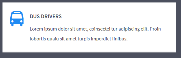
12345<div class="ct-iconBox ct-iconBox--leftIcon"><i class="ct-u-motive ct-u-size50 fa fa-bus"></i><h4 class="text-uppercase ct-fw-600 ct-u-size18">Bus Drivers</h4><p>Lorem ipsum dolor sit amet, coinsectei tur adipiscing elit. Proin lobortis quaiu sit amet turpis imperdiet finibus. </p></div> -
Icon Right:
Icon box right
HTML markup:
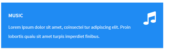
12345<div class="ct-iconBox ct-iconBox-motive ct-iconBox--rightIcon"><i class="ct-u-motive ct-u-size50 fa fa-music"></i><h4 class="text-uppercase ct-fw-600 ct-u-size18">Music</h4><p>Lorem ipsum dolor sit amet, coinsectei tur adipiscing elit. Proin lobortis quaiu sit amet turpis imperdiet finibus. </p></div>
Media Boxes
-
Video (with Magnific Popup):

Video Box
HTML markup:
12345<div class="ct-mediaBox"><a href="http://mazwai.com/system/posts/videos/000/000/086/preview_mp4_2/trim_hawaii--under_the_sea.mp4?1407079699" class="ct-js-magnificPopupMedia"><video muted="" class="ct-js-video" src="http://mazwai.com/system/posts/videos/000/000/086/preview_mp4_2/trim_hawaii--under_the_sea.mp4?1407079699"></video></a></div> -
Image (with Magnific Popup):
Image Box
HTML markup:
12345<div class="ct-mediaBox"><a href="assets/images/demo-content/FreshVideoImage02.png" class="ct-js-magnificPopupImage"><img src="assets/images/demo-content/FreshVideoImage02.png"></a></div> -
Text:
HTML markup:
Text Box
1234<div class="ct-mediaBox ct-mediaBox--text"><h3 class="text-uppercase">Media Boxes</h3><a href="http://mazwai.com/system/posts/videos/000/000/086/preview_mp4_2/trim_hawaii--under_the_sea.mp4?1407079699" class="ct-js-magnificPopupMedia"><span>view</span></a></div>
Counter Boxes
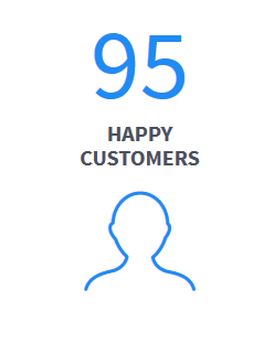
Counter Box
HTML markup:
|
1 2 3 4 5 |
<div class="ct-counterBox"> <span class="ct-counterBox-number ct-js-counter" data-ct-to="95" data-ct-speed="50">95</span> <h5 class="ct-counterBox-title text-uppercase ct-fw-700">Happy<br>Customers</h5> <span class="ct-counterBox-icon"><i class="icon-profile-male"></i> </span> </div> |
Count Down Boxes
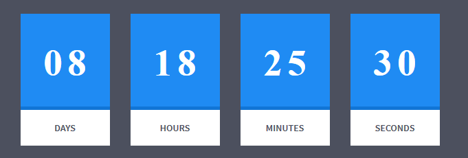
Countdown Box
|
1 2 3 4 5 6 |
<div class="row centered text-center ct-u-paddingBoth30" id="counter"></div> <script src="assets/js/countdown/jquery.mb-comingsoon.min.js"></script> <script type="text/javascript"> $('#counter').mbComingsoon({expiryDate: new Date(2015, 0, 1, 9, 30), speed: 950}); </script> |
Numbered Boxes

Numbered box
|
1 2 3 4 5 6 7 8 9 10 11 |
<div class="ct-numberedBox"> <div class="ct-numberedBox-head"> <div class="ct-line ct-line--1 animated activate bounceInLeft ct-show" data-fx="bounceInLeft ct-show" data-time="0"></div> <div class="ct-line ct-line--2 animated activate bounceInLeft ct-show" data-fx="bounceInLeft ct-show" data-time="250"></div> <div class="ct-line ct-line--3 animated activate bounceInLeft ct-show" data-fx="bounceInLeft ct-show" data-time="500"></div> <h2 class="ct-fw-300 ct-u-positionRelative"><span class="">01</span></h2> </div> <h4 class="ct-fw-400">Offers Only For Members</h4> <p class="ct-u-paddingBottom20">Duis eu venenatis uturipis, uaiteui mu uopre itiium imetiusi. Nuillam iquiiis urt lacus faucimu bustum.</p> <button class="btn btn-motive"><span>Learn More <i class="fa fa-location-arrow"></i></span></button> </div> |
Was this article helpful ?
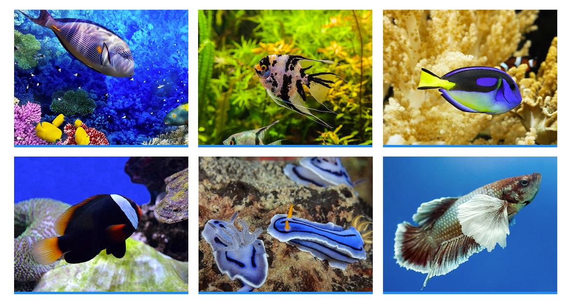
Portfolio
Filters

Portfolio filters
|
1 2 3 4 5 6 7 8 9 10 11 |
<div class="ct-u-backgroundDarkMotive clearfix ct-js-fixOnScroll"> <div class="text-center"> <ul class="ct-gallery-filters list-unstyled list-inline ct-gallery-buttons ct-u-marginBottom50"> <li><a data-filter="*" class="btn btn-motiveDark ct-u-marginTop20 active"><span>All</span></a></li> <li><a data-filter=".aggresive" class="btn btn-motiveDark ct-u-marginTop20"><span>Aggresive</span></a></li> <li><a data-filter=".boiserous" class="btn btn-motiveDark ct-u-marginTop20"><span>Boiserous</span></a></li> <li><a data-filter=".passive" class="btn btn-motiveDark ct-u-marginTop20"><span>Passive</span></a></li> </ul> <div class="clearfix"></div> </div> </div> |
Structure
- 4 Columns:
 HTML markup
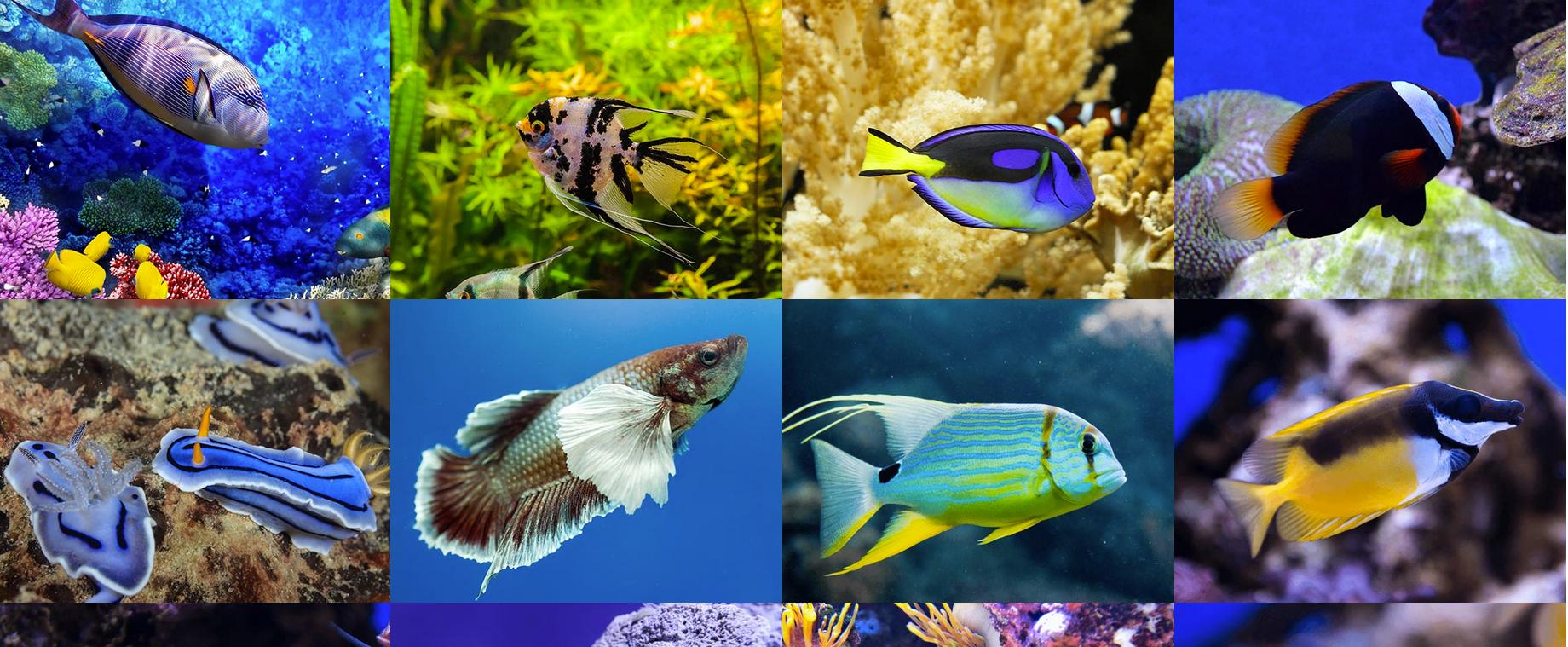
Portfolio 4 columns
1234567891011121314151617<div id="ct-gallery" class="ct-gallery ct-gallery--col4 ct-js-magnificPortfolioPopupGroup"><div class="ct-gallery-item ct-gallery-item--masonry ct-gallery-item--default hidden ct-gallery-item--normal passive"><div class="ct-gallery-itemInner"><img class="" src="assets/images/demo-content/portfolio-small-01.jpg" alt=""></div></div><div class="ct-gallery-item ct-gallery-item--masonry ct-gallery-item--default hidden ct-gallery-item--normal passive"><div class="ct-gallery-itemInner"><img class="" src="assets/images/demo-content/portfolio-small-01.jpg" alt=""></div></div>...</div> - 3 Columns:
HTML markupPortfolio 3 Columns
123<div id="ct-gallery" class="ct-gallery ct-gallery--col3 ct-js-magnificPortfolioPopupGroup">...</div> - 2 Columns:
HTML markup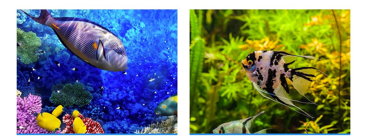
Portfolio 2 Columns
123<div id="ct-gallery" class="ct-gallery ct-gallery--col2 ct-js-magnificPortfolioPopupGroup">...</div> - Single Column:
HTML markup
Portfolio Single Column
…
Was this article helpful ?
Magnific Popup
Static state
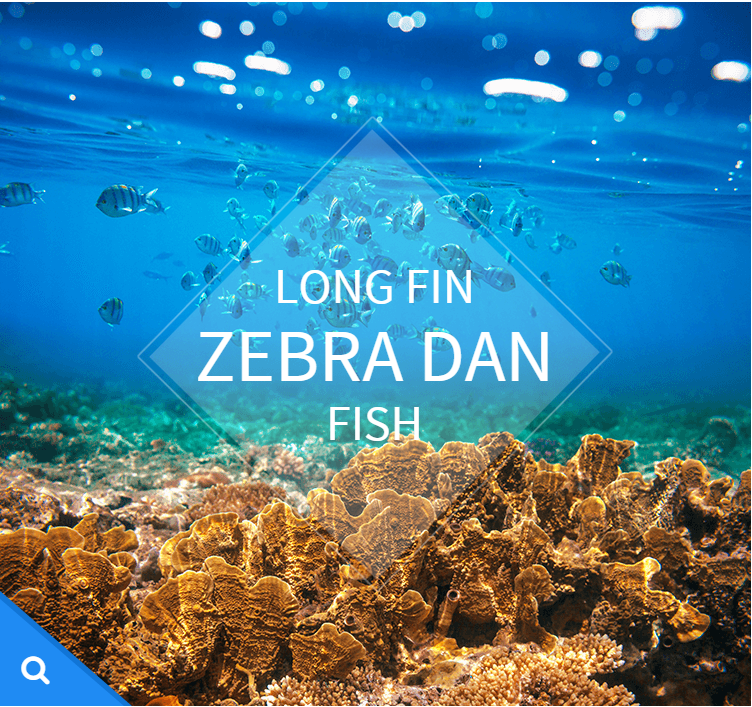
Hover state
HTML markup
|
1 2 3 4 5 6 7 8 9 10 11 12 13 |
<a href="assets/images/demo-content/portfolio-large-17.jpg" class="ct-js-magnificPopupImage"> <div class="ct-imageOverlay-container"> <div class="ct-imageButton"></div> <div class="ct-imageOverlay"> <div class="ct-imageOverlay-text"> <h3 class="text-center text-uppercase ct-fw-300">LONG FIN</h3> <h3 class="text-center text-uppercase ct-fw-300"><span class="ct-fw-500">ZEBRA DAN</span></h3> <h3 class="text-center text-uppercase ct-fw-300">FISH</h3> </div> </div> <img class="ct-img100" src="assets/images/demo-content/portfolio-small-17.jpg" alt=""> </div> </a> |
Was this article helpful ?
Person Box
Team Member Box

Person Box
|
1 2 3 4 5 6 7 8 9 10 11 12 13 14 15 16 17 |
<div class="ct-teamMember"> <a href="#"> <img src="assets/images/demo-content/team-01.png" alt="Team Member"> <div class="ct-teamMember--bg ct-u-paddingBoth20"> <p class="text-uppercase text-center ct-fw-600">Janet Dolorison</p> <p class="ct-fw-400 text-center">Sales Manager</p> </div> <div class="ct-u-motiveDark"> <p class="text-center ct-u-paddingTop15 ct-u-paddingBottom60">Lorem ipsum dolor sit amet, mei consectetur adipiscing elit. Nuic imperdiet consectetuir.</p> <div class="ct-curlPlus-wrapper"> <div class="ct-curlPlus ct-curlPlus--topleft"></div> <div class="ct-curlPlus ct-curlPlus--bottomright"></div> <span>+</span> </div> </div> </a> </div> |
Was this article helpful ?
Charts
Progress Bars
This theme has 2 types of layout and all you have to do is change one class. Also, everything is done via data attribute.
|
1 2 3 4 5 6 7 8 |
<div class="progress"> <div class="progress-bar animating" role="progressbar" aria-valuenow="60" aria-valuemin="0" aria-valuemax="100" style="width: 60%;"> <span class="ct-progressBar-text">60% Complete</span> <div class="ct-progressBar-tr"></div> </div> </div> </div> |
|
1 2 3 4 5 6 7 8 |
<div class="progress"> <div class="progress-bar progress-bar-success progress-bar-striped animating" role="progressbar" aria-valuenow="40" aria-valuemin="0" aria-valuemax="100" style="width: 40%;"> <span class="ct-progressBar-text">40% Complete (success)</span> <div class="ct-progressBar-tr"></div> </div> </div> </div> |
- aria-valuenow: Percentage this bar should have
- aria-valuemax: Max value
- aria-valuemin: Min value
Was this article helpful ?
Javascript
All javascripts are placed in folder /js. In main.js file we implement all functions calls.
This theme uses following Javascript files:
- Bootstrap v 3 framework (powerful front-end framework for faster and easier web development)
- jQuery v1.10.2 (A fast javascript library that Foodtruckifies how to traverse HTML documents, handle events, perform animations.)
- jQuery FlexSlider v2.2.0
- GMAP3 Plugin for JQuery v. 5.1.1
- jQuery.appear
- jQuery Stellar
- jQuery tweet
- Modernizr 2.0.6
- PageScroller
- final-countdown.js
- snap.js
- device.js 0.1.58
- chart.js
Google Map (GMAP3 Plugin)
This is google map with custom marker, you can define couple parameters:
- data-location – address to show
- data-height – map height (if undefined height will be 220px)
- data-offset – by how many map should be repositioned from marker center point (default -30)
It uses gmap3 plugin.
Documentation: here
HTML Markup:
|
1 |
<div class="ct-googleMap" data-location="Narbutta 24, Warsaw" data-zoom="15" data-height="500"></div> |
All javascript code can be found in js/main.js file.
jquery.appear
This plugin call function when element appear in viewport. This is used in custom animation, progress bars, counter timer.
Documentation: https://github.com/bas2k/jquery.appear/
|
1 2 3 4 5 6 7 8 9 10 11 12 13 |
if (jQuery().appear) { if (device.mobile()) { // disable animation on mobile jQuery("body").removeClass("withAnimation"); } else { jQuery('.withAnimation .animated').appear(function () { jQuery(this).each(function () { jQuery(this).addClass('activate'); jQuery(this).addClass($(this).data('fx')); }); }, {accY: -150}); } } |
Charts.js
This plugin is used to make graphics.
Documentation: http://www.chartjs.org/
Was this article helpful ?
Flexslider
Main Slider with inset container (with Progress Bar):
HTML markup
|
1 2 3 4 5 6 7 8 9 10 11 12 13 14 |
<div class="flexslider ct-flexslider--mainSlider ct-js-flexslider"> <div class="ct-containerAbsolute"> <div class="ct-flexslider-progress"> <div class="ct-flexslider-progressBar"></div> </div> <div class="ct-containerAbsolute-inside"></div> </div> <ul class="slides"> <li></li> <li></li> <li></li> </ul> </div> |
Full Screen Slider (with Progress Bar):
HTML markup
|
1 2 3 4 5 6 7 8 9 10 |
<div class="flexslider ct-flexslider--mainSlider ct-js-flexslider"> <div class="ct-flexslider-progress"> <div class="ct-flexslider-progressBar"></div> </div> <ul class="slides"> <li></li> <li></li> <li></li> </ul> </div> |
Arrow Types:
HTML markup
ct-flexslider–arrowType1 – default one
ct-flexslider–arrowType2
ct-flexslider–arrowType3
Controls Type:
HTML markup
ct-flexslider–controls1 – default
ct-flexslider–controls2
ct-flexslider–controls3
Flexslider
Content / Images Slider.
Each parameter can be defined as data attribute :
- data-namespace
- data-selector
- data-animation
- data-easing
- data-direction
- data-reverse
- data-animationloop
- data-smoothheight
- data-startat
- data-slideshow
- data-slideshowspeed
- data-animationspeed
- data-initdelay
- data-randomize
- data-thumbcaptions
- data-pauseonaction
- data-pauseonhover
- data-pauseinvisible
- data-usecss
- data-touch
- data-video
- data-controlnav
- data-directionnav
- data-prevtext
- data-nexttext
- data-keyboard
- data-multiplekeyboard
- data-mousewheel
- data-pauseplay
- data-pausetext
- data-playtext
- data-itemwidth
- data-itemmargin
- data-minitems
- data-maxitems
- data-move
- data-allowoneslide
- data-controlscontainer
- data-manualcontrols
- data-sync
- data-asnavfor
Read the documentation here:
And js initialization (js/main.js file), there you can change slider parameters:
|
1 2 3 4 5 6 7 8 9 10 11 12 13 14 15 16 17 18 19 20 21 22 23 24 25 26 27 28 29 30 31 32 33 34 35 36 37 38 39 40 41 42 43 44 45 46 47 48 49 50 51 52 53 54 55 56 57 58 59 60 61 62 63 64 65 66 67 68 69 70 71 72 73 74 75 76 77 78 79 80 81 82 83 84 85 86 87 88 89 90 91 92 93 94 95 96 97 98 99 100 101 102 103 104 105 106 107 108 109 110 111 112 113 114 115 116 117 118 119 120 121 122 123 |
/* ==================== */ /* ==== FLEXSLIDER ==== */ if(jQuery().flexslider){ if (jQuery(".flexslider").length > 0) { jQuery(".flexslider").each(function(){ $this=jQuery(this); var ctnamespace = validatedata($this.attr("data-namespace"),"flex-"); var ctselector = validatedata($this.attr("data-selector"),".slides > li"); var ctanimation = validatedata($this.attr("data-animation"),"slide"); var cteasing = validatedata($this.attr("data-easing"),"swing"); var ctdirection = validatedata($this.attr("data-direction"),"horizontal"); var ctreverse = parseBoolean($this.attr("data-reverse"), false); var ctanimationloop = parseBoolean($this.attr("data-animationloop"), false); var ctsmoothheight = parseBoolean($this.attr("data-smoothheight"), false); var ctstartat = parseInt(validatedata($this.attr("data-startat"), 0)); var ctslideshow = parseBoolean($this.attr("data-slideshow"), true); var ctslideshowspeed = parseInt(validatedata($this.attr("data-slideshowspeed"), 7000)); var ctanimationspeed = parseInt(validatedata($this.attr("data-animationspeed"), 600)); var ctinitdelay= parseInt(validatedata($this.attr("data-initdelay"), 0)); var ctrandomize = parseBoolean($this.attr("data-randomize"), false); var ctthumbcaptions = parseBoolean($this.attr("data-thumbcaptions"), false); var ctpauseonaction= parseBoolean($this.attr("data-pauseonaction"), true); var ctpauseonhover = parseBoolean($this.attr("data-pauseonhover"), false); var ctpauseinvisible= parseBoolean($this.attr("data-pauseinvisible"), true); var ctusecss= parseBoolean($this.attr("data-usecss"), true); var cttouch= parseBoolean($this.attr("data-touch"), true); if(device.mobile()){ cttouch = false; } var ctvideo = parseBoolean($this.attr("data-video"), false); var ctcontrolnav= parseBoolean($this.attr("data-controlnav"), true); if(ctcontrolnav == false){ $this.addClass("no-margin"); } var ctdirectionnav= parseBoolean($this.attr("data-directionnav"), false); var ctprevtext = validatedata($this.attr("data-prevtext"),"Previous"); var ctnexttext = validatedata($this.attr("data-nexttext"),"Next"); var ctkeyboard= validatedata(parseBoolean($this.attr("data-keyboard")), true); var ctmultiplekeyboard= parseBoolean($this.attr("data-multiplekeyboard"), false); var ctmousewheel= parseBoolean($this.attr("data-mousewheel"), false); var ctpauseplay= parseBoolean($this.attr("data-pauseplay"), false); var ctpausetext = validatedata($this.attr("data-pausetext"),"Pause"); var ctplaytext = validatedata($this.attr("data-playtext"),"Play"); var ctitemwidth= parseInt(validatedata($this.attr("data-itemwidth"), 0)); var ctitemmargin= parseInt(validatedata($this.attr("data-itemmargin"), 0)); var ctminitems= parseInt(validatedata($this.attr("data-minitems"), 0)); var ctmaxitems= parseInt(validatedata($this.attr("data-maxitems"), 0)); var ctmove= parseInt(validatedata($this.attr("data-move"), 0)); var ctallowoneslide= parseBoolean($this.attr("data-allowoneslide"), false); var ctcontrolscontainer= validatedata($this.attr("data-controlscontainer"), ""); var ctmanualcontrols= validatedata($this.attr("data-manualcontrols"), ""); var ctsync = validatedata($this.attr("data-sync"), ""); var ctasnavfor = validatedata($this.attr("data-asnavfor"), ""); $this.flexslider({ namespace: ctnamespace, //{NEW} String: Prefix string attached to the class of every element generated by the plugin selector: ctselector, //{NEW} Selector: Must match a simple pattern. "{container} > {slide}" -- Ignore pattern at your own peril animation: ctanimation, //String: Select your animation type, "fade" or "slide" easing: cteasing , //{NEW} String: Determines the easing method used in jQuery transitions. jQuery easing plugin is supported! direction: ctdirection, //String: Select the sliding direction, "horizontal" or "vertical" reverse: ctreverse, //{NEW} Boolean: Reverse the animation direction animationLoop: ctanimationloop, //Boolean: Should the animation loop? If false, directionNav will received "disable" classes at either end smoothHeight: ctsmoothheight, //{NEW} Boolean: Allow height of the slider to animate smoothly in horizontal mode startAt: ctstartat, //Integer: The slide that the slider should start on. Array notation (0 = first slide) slideshow: ctslideshow, //Boolean: Animate slider automatically slideshowSpeed: ctslideshowspeed, //Integer: Set the speed of the slideshow cycling, in milliseconds animationSpeed: ctanimationspeed, //Integer: Set the speed of animations, in milliseconds initDelay: ctinitdelay, //{NEW} Integer: Set an initialization delay, in milliseconds randomize: ctrandomize, //Boolean: Randomize slide order thumbCaptions: ctthumbcaptions, //Boolean: Whether or not to put captions on thumbnails when using the "thumbnails" controlNav. // Usability features pauseOnAction: ctpauseonaction, //Boolean: Pause the slideshow when interacting with control elements, highly recommended. pauseOnHover: ctpauseonhover, //Boolean: Pause the slideshow when hovering over slider, then resume when no longer hovering pauseInvisible: ctpauseinvisible, //{NEW} Boolean: Pause the slideshow when tab is invisible, resume when visible. Provides better UX, lower CPU usage. useCSS: ctusecss, //{NEW} Boolean: Slider will use CSS3 transitions if available touch: cttouch, //{NEW} Boolean: Allow touch swipe navigation of the slider on touch-enabled devices video: ctvideo, //{NEW} Boolean: If using video in the slider, will prevent CSS3 3D Transforms to avoid graphical glitches // Primary Controls controlNav: ctcontrolnav, //Boolean: Create navigation for paging control of each clide? Note: Leave true for manualControls usage directionNav: ctdirectionnav, //Boolean: Create navigation for previous/next navigation? (true/false) prevText: ctprevtext, //String: Set the text for the "previous" directionNav item nextText: ctnexttext, //String: Set the text for the "next" directionNav item // Secondary Navigation keyboard: ctkeyboard, //Boolean: Allow slider navigating via keyboard left/right keys multipleKeyboard: ctmultiplekeyboard, //{NEW} Boolean: Allow keyboard navigation to affect multiple sliders. Default behavior cuts out keyboard navigation with more than one slider present. mousewheel: ctmousewheel, //{UPDATED} Boolean: Requires jquery.mousewheel.js (https://github.com/brandonaaron/jquery-mousewheel) - Allows slider navigating via mousewheel pausePlay: ctpauseplay, //Boolean: Create pause/play dynamic element pauseText: ctpausetext, //String: Set the text for the "pause" pausePlay item playText: ctplaytext, //String: Set the text for the "play" pausePlay item // Special properties controlsContainer: ctcontrolscontainer, //{UPDATED} jQuery Object/Selector: Declare which container the navigation elements should be appended too. Default container is the FlexSlider element. Example use would be $(".flexslider-container"). Property is ignored if given element is not found. manualControls: ctmanualcontrols, //{UPDATED} jQuery Object/Selector: Declare custom control navigation. Examples would be $(".flex-control-nav li") or "#tabs-nav li img", etc. The number of elements in your controlNav should match the number of slides/tabs. sync: ctsync, //{NEW} Selector: Mirror the actions performed on this slider with another slider. Use with care. asNavFor: ctasnavfor, //{NEW} Selector: Internal property exposed for turning the slider into a thumbnail navigation for another slider // Carousel Options itemWidth: ctitemwidth, //{NEW} Integer: Box-model width of individual carousel items, including horizontal borders and padding. itemMargin: ctitemmargin, //{NEW} Integer: Margin between carousel items. minItems: ctminitems, //{NEW} Integer: Minimum number of carousel items that should be visible. Items will resize fluidly when below this. maxItems: ctmaxitems, //{NEW} Integer: Maxmimum number of carousel items that should be visible. Items will resize fluidly when above this limit. move: ctmove, //{NEW} Integer: Number of carousel items that should move on animation. If 0, slider will move all visible items. allowOneSlide: ctallowoneslide //{NEW} Boolean: Whether or not to allow a slider comprised of a single slide }) }) } |
Was this article helpful ?
Owl Carousel
Fishtank comes with Owl Carousel component – plugin documentation available here
How to use it
To enable plugin on your page include the following HTML code to your page:
|
1 |
<script src="assets/owl-carousel/owl.carousel.js"></script> |
Set up your HTML
You don’t need any special markup. All you need is to wrap your divs(owl works with any type element) inside the container element
|
1 2 3 4 5 6 7 8 9 10 |
<div id="owl-example" class="owl-carousel"> <div> Your Content </div> <div> Your Content </div> <div> Your Content </div> <div> Your Content </div> <div> Your Content </div> <div> Your Content </div> <div> Your Content </div> ... </div> |
Now call the Owl initializer function and your carousel is ready.
|
1 2 3 4 5 |
$(document).ready(function() { $("#owl-example").owlCarousel(); }); |
Customizing
-
Options
All of the options below are available to customize Owl Carousel
12345678910111213141516171819202122232425262728293031323334353637383940Variable Default Type Descriptionitems 5 int This variable allows you to set the maximum amount of items displayed at a time with the widest browser widthitemsDesktop [1199,4] array This allows you to preset the number of slides visible with a particular browser width. The format is [x,y] whereby x=browser width and y=number of slides displayed. For example [1199,4] means that if(window<=1199){ show 4 slides per page} Alternatively use itemsDesktop: false to override these settings. Check my Custom DemoitemsDesktopSmall [979,3] array As above.itemsTablet [768,2] array As above.itemsTabletSmall false array As above. Default value is disabled.itemsMobile [479,1] array As aboveitemsCustom false array This allow you to add custom variations of items depending from the width If this option is set, itemsDeskop, itemsDesktopSmall, itemsTablet, itemsMobile etc. are disabled For better preview, order the arrays by screen size, but it's not mandatory Don't forget to include the lowest available screen size, otherwise it will take the default one for screens lower than lowest available.Example:[[0, 2], [400, 4], [700, 6], [1000, 8], [1200, 10], [1600, 16]]For more information about structure of the internal arrays see itemsDesktop. Check my Custom DemosingleItem false boolean Display only one item. See demoitemsScaleUp false boolean Option to not stretch items when it is less than the supplied items. See demoslideSpeed 200 int Slide speed in millisecondspaginationSpeed 800 int Pagination speed in millisecondsrewindSpeed 1000 int Rewind speed in millisecondsautoPlay false int/boolean Change to any integrer for example autoPlay : 5000 to play every 5 seconds. If you set autoPlay: true default speed will be 5 seconds.stopOnHover false boolean Stop autoplay on mouse hovernavigation false boolean Display "next" and "prev" buttons.navigationText ["prev","next"] array You can cusomize your own text for navigation. To get empty buttons use navigationText : false. Also HTML can be used hererewindNav true boolean Slide to first item. Use rewindSpeed to change animation speed.scrollPerPage false boolean Scroll per page not per item. This affect next/prev buttons and mouse/touch dragging.pagination true boolean Show pagination.paginationNumbers false boolean Show numbers inside pagination buttonsresponsive true boolean You can use Owl Carousel on desktop-only websites too! Just change that to "false" to disable resposive capabilitiesresponsiveRefreshRate 200 int Check window width changes every 200ms for responsive actionsresponsiveBaseWidth window jQuery selector Owl Carousel check window for browser width changes. You can use any other jQuery element to check width changes for example ".owl-demo". Owl will change only if ".owl-demo" get new width.baseClass "owl-carousel" string Automaticly added class for base CSS styles. Best not to change it if you don't need to.theme "owl-theme" string Default Owl CSS styles for navigation and buttons. Change it to match your own themelazyLoad false boolean Delays loading of images. Images outside of viewport won't be loaded before user scrolls to them. Great for mobile devices to speed up page loadings. IMG need special markup class="lazyOwl" and data-src="your img path". See example.lazyFollow true boolean When pagination used, it skips loading the images from pages that got skipped. It only loads the images that get displayed in viewport. If set to false, all images get loaded when pagination used. It is a sub setting of the lazy load function.lazyEffect "fade" boolean / string Default is fadeIn on 400ms speed. Use false to remove that effect.autoHeight false boolean Add height to owl-wrapper-outer so you can use diffrent heights on slides. Use it only for one item per page setting.jsonPath false string Allows you to load directly from a jSon file. The JSON structure you use needs to match the owl JSON structure used here. To use custom JSON structure see jsonSuccess option.jsonSuccess false function Success callback for $.getJSON build in into carousel. See demo with custom JSON structure here.dragBeforeAnimFinish true boolean Ignore whether a transition is done or not (only dragging).mouseDrag true boolean Turn off/on mouse events.touchDrag true boolean Turn off/on touch events.addClassActive false boolean Add "active" classes on visible items. Works with any numbers of items on screen.transitionStyle false string Add CSS3 transition style. Works only with one item on screen. See Demo -
Callbacks
12345678910Variable Default Type DescriptionbeforeUpdate false function Before responsive update callbackafterUpdate false function After responsive update callbackbeforeInit false function Before initialization callbackafterInit false function After initialization callbackbeforeMove false function Before move callbackafterMove false function After move callbackafterAction false function After startup, move and update callbackstartDragging false function Call this function while dragging.afterLazyLoad false function Call this function after lazyLoad. -
Defaults
Carousel default settings
12345678910111213141516171819202122232425262728293031323334353637383940414243444546474849505152535455565758596061626364656667686970717273747576$("#owl-example").owlCarousel({// Most important owl featuresitems : 5,itemsCustom : false,itemsDesktop : [1199,4],itemsDesktopSmall : [980,3],itemsTablet: [768,2],itemsTabletSmall: false,itemsMobile : [479,1],singleItem : false,itemsScaleUp : false,//Basic SpeedsslideSpeed : 200,paginationSpeed : 800,rewindSpeed : 1000,//AutoplayautoPlay : false,stopOnHover : false,// Navigationnavigation : false,navigationText : ["prev","next"],rewindNav : true,scrollPerPage : false,//Paginationpagination : true,paginationNumbers: false,// Responsiveresponsive: true,responsiveRefreshRate : 200,responsiveBaseWidth: window,// CSS StylesbaseClass : "owl-carousel",theme : "owl-theme",//Lazy loadlazyLoad : false,lazyFollow : true,lazyEffect : "fade",//Auto heightautoHeight : false,//JSONjsonPath : false,jsonSuccess : false,//Mouse EventsdragBeforeAnimFinish : true,mouseDrag : true,touchDrag : true,//TransitionstransitionStyle : false,// OtheraddClassActive : false,//CallbacksbeforeUpdate : false,afterUpdate : false,beforeInit: false,afterInit: false,beforeMove: false,afterMove: false,afterAction: false,startDragging : falseafterLazyLoad : false}) -
Custom Events
Owl Carousel handles a few basic events. Mainly use them for custom navigation.
123456"owl.prev" //Go to previous"owl.next" //Go to next"owl.play" //Autoplay, also this event accept autoPlay speed as second parameter"owl.stop" //Stop"owl.goTo" //goTo provided item"owl.jumpTo" //jumpTo provided item. Without slide animation. -
Owl Data methods
To use Owl Carousel $.data use delegate function.
123456789101112131415161718192021//Initialize Plugin$(".owl-carousel").owlCarousel()//get carousel instance data and store it in variable owlvar owl = $(".owl-carousel").data('owlCarousel');//Public methodsowl.next() // Go to next slideowl.prev() // Go to previous slideowl.goTo(x) // Go to x slideowl.jumpTo(x) // Go to x slide without slide animation//Auto Playowl.play() // Autoplayowl.stop() // Autoplay Stop//Manipulation methods. See demo.owl.addItem(htmlString [,targetPosition])owl.removeItem(targetPosition)owl.destroy()owl.reinit(newOptions)
Was this article helpful ?
Contact Form
Template comes with ready to use:
- Contact Form
- Newsletter Form
All needed files are in /form directory.
Remember to includeon page.
To configure form just edit form/config.php and change e-mails to your own :
|
1 2 |
$to = "mail@example.com"; $from = "mail@example.com"; |
That’s it!
Contact Form
HTML Markup:
|
1 2 3 4 5 6 7 8 9 10 11 12 13 14 15 16 17 18 19 20 21 22 23 24 25 26 27 28 29 30 31 32 33 34 35 36 37 38 39 40 41 42 43 |
<div class="ct-contactForm"> <div class="successMessage alert alert-success" style="display: none"> <button type="button" class="close" data-dismiss="alert" aria-hidden="true">×</button> Thank You! </div> <div class="errorMessage alert alert-danger" style="display: none"> <button type="button" class="close" data-dismiss="alert" aria-hidden="true">×</button> Ups! An error occured. Please try again later. </div> <form role="form" action="./assets/form/send.php" method="post" class="contactForm validateIt" data-email-subject="Contact Form" data-show-errors="true"> <div class="row"> <div class="col-md-6"> <div class="form-group"> <input id="contact_name" placeholder="Name" required="" type="text" name="field[]" class="form-control"> <label for="contact_name">Name</label> </div> <div class="form-group"> <input id="contact_email" placeholder="Email" required="" type="email" name="field[]" class="form-control"> <label for="contact_email">Email</label> </div> <div class="form-group"> <input id="contact_subject" placeholder="Subject" required="" type="text" name="field[]" class="form-control"> <label for="contact_subject">Subject</label> </div> </div> </div> <div class="row"> <div class="col-xs-12"> <div class="form-group"> <textarea id="contact_message" placeholder="Message" class="form-control" rows="8" name="field[]" required=""></textarea> <label for="contact_message">Message</label> </div> </div> </div> <div class="row"> <div class="col-xs-12"> <button type="submit" class="btn ct-btn--perspective btn-primary btn-lg text-uppercase pull-right"><i class="fa fa-paper-plane"></i> Send Message </button> </div> </div> </form> </div> |
Was this article helpful ?
Twitter Feed
This is live twitter feed. This plugin will grab your latest tweets and display them on page.
Configuration: – just edit twitter/config.php file :
|
1 2 3 4 5 6 7 8 9 |
$config = array( 'username' => "XXX", //username 'limit' => 3, //how many tweets we would like to display? 'with_replies' => true, //show replies? true or false 'oauth_access_token' => 'TOKEN', 'oauth_access_token_secret' => 'TOKEN_SECRET', 'consumer_key' => 'KEY', 'consumer_secret' => 'KEY_SECRET', ); |
Where can I get these keys, tokens, etc?
Twitter API requires authentication to display tweets from your account.
To twiiter feed work you need to create the ‘application’
and generate 4 special keys for your twitter account via https://dev.twitter.com/apps:
– Consumer key (key)
– Consumer secret (secret)
– Access token (token)
– Access token secret (token_secret)
Video tutorial : “How to create Twitter App”
http://vimeo.com/60891535
Was this article helpful ?
Sources & Credits
The following sources and files have been used to build up this theme
- Twitter Bootstrap – http://twitter.github.com/bootstrap/
- jQuery – http://www.jquery.com
Was this article helpful ?