Houses – Responsive HTML5 Template
Thank you for purchasing this theme. If you have any questions that are beyond the scope of this help file, please feel free to start new ticket on this page. Thanks so much!
Scope of free support
We can help you with:
- Responding to questions or problems regarding the item and its features
- Fixing any discovered item’s bugs
- Providing updates to ensure compatibility with new software versions
Was this article helpful ?
HTML Structure
This theme is built upon bootstrap framework and is fully responsive. It adapts to window resolution and looks good on all devices including iPad and iPhone.
See for yourself (resize your browser).
If you would like to read more
about bootstrap framework click here :
Grid System and Single row structure
The default Bootstrap grid system utilizes 12 columns. It’s responsive grid and adapts to viewport. Below 767px viewports, the columns become fluid and stack vertically. The fluid grid system uses percents instead of pixels for column widths. Each row always include 12 columns (for example col-md-8 + col-md-4 = col-md-12).
Bootstrap documentation: here
Basic grid HTML:
|
1 2 3 4 5 6 7 8 9 10 11 12 13 14 15 16 17 18 19 20 21 22 23 24 25 26 27 |
<div class="row"> <div class="col-md-1">.col-md-1</div> <div class="col-md-1">.col-md-1</div> <div class="col-md-1">.col-md-1</div> <div class="col-md-1">.col-md-1</div> <div class="col-md-1">.col-md-1</div> <div class="col-md-1">.col-md-1</div> <div class="col-md-1">.col-md-1</div> <div class="col-md-1">.col-md-1</div> <div class="col-md-1">.col-md-1</div> <div class="col-md-1">.col-md-1</div> <div class="col-md-1">.col-md-1</div> <div class="col-md-1">.col-md-1</div> </div> <div class="row"> <div class="col-md-8">.col-md-8</div> <div class="col-md-4">.col-md-4</div> </div> <div class="row"> <div class="col-md-4">.col-md-4</div> <div class="col-md-4">.col-md-4</div> <div class="col-md-4">.col-md-4</div> </div> <div class="row"> <div class="col-md-6">.col-md-6</div> <div class="col-md-6">.col-md-6</div> </div> |
Page structure
Below you will find default page structure :
|
1 2 3 4 5 6 7 8 9 10 11 12 13 14 15 16 17 18 19 20 21 22 23 24 25 26 27 28 29 30 31 32 33 34 35 36 |
<!DOCTYPE html> <html> <head> [css] </head> <body> [header] [main menu] <!-- main container --> <div id="wrapper"> [component 1] <!-- fullwidth element --> </div> [fullwidth parallax] <div class="container"> <!-- / fullwidth element --> [component 6] </div> <!-- / main container --> [footer] [javascripts] </body> </html> |
Was this article helpful ?
CSS Files and Structure
If you would like to edit the color, font, or style of any elements, you would do the following:
|
1 |
#primaryContent a {color: #someColor;} |
If you find that your new style is not overriding, it is most likely because of a specificity problem. Scroll down in your CSS file and make sure that there isn’t a similar style that has more weight.
I.E.
|
1 |
#wrap #primaryContent a {color: #someColor;} |
So, to ensure that your new styles are applied, make sure that they carry enough “weight” and that there isn’t a style lower in the CSS file that is being applied after yours.
Colors
The theme includes a css file wich you can use to edit the colors.
You just need to add the corresponding CSS file to the head of the page like this:
|
1 2 3 4 5 |
<head> (..) <link rel="stylesheet" type="text/css" href="css/motive.css"> (..) </head> |
Icons
We’ve included 360+ font icons.
Awesome Icons – http://fontawesome.io/icons/
HTML markup:
|
1 2 |
<!-- Awesome Icons --> <i class="fa fa-cog"></i> |
CSS Files & Structure
We’ve included 2 files.
bootstrap.css contains Bootstrap 3 Library.
style.css file contains general styles.
- Animations
- Divided Section
- List Box
- Promo
- Divided Widget
- Counter Box
- Ratings
- Weather
- Board
- Google Map
- Headroom
- Blog Box
- Pagination
- Lists
- Bootsrap Media
- Categories
- Dividers
- Media section, owl thumbnails
- Divided Media Sections
- Info Boxes
- Calendar
- Divider slider
- Testimonial
- Date picker
- Contact
- Gallery Container
Was this article helpful ?
Navigation Menu
Scroll page down to see animated fixed menu.

What you need to do is put the proper class to the body for example (ct-headroom–scrollUpMenu):
|
1 |
<body class="cssAnimate ct-headroom--scrollUpMenu"> |
We han have fixed menu, animated, hided etc. We can add the moment when navbar should disappear, show itself etc.
Javascript
|
1 2 3 |
<script src="../assets/plugins/headroom/headroom.js"></script> <script src="../assets/plugins/headroom/jQuery.headroom.js"></script> <script src="../assets/plugins/headroom/init.js"></script> |
The whole docs how to use ir properly, is in the_../assets/plugins/headroom/init.js
Was this article helpful ?
Booking
There are 3 pages for houses listing:
- book slider
- book 2 columns
- book 3 columns
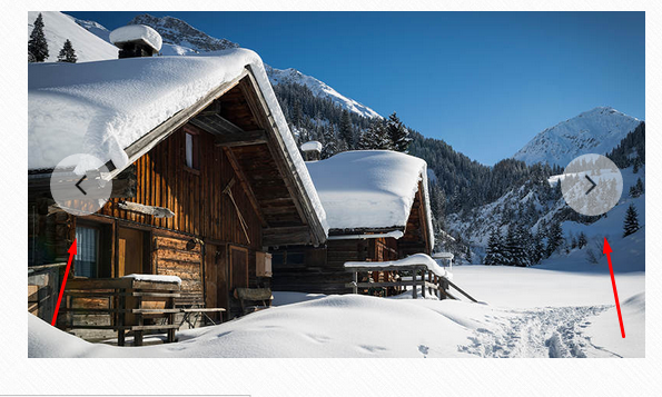
EXAMPLE (book slider):

And there is common book page.

Was this article helpful ?
Ratings
Use one of two elements dedicated for ratings:
- ratingBox
- rating stars:
|
1 2 3 4 5 6 7 8 9 10 11 12 |
<ul class="ct-ratingBox list-unstyled ct-u-paddingBottom10"> <li> <span class="ct-fw-700">Overal Rating:</span> <ul class="ct-stars ct-stars--overall list-unstyled list-inline"> <li><i class="fa fa-star"></i></li> <li><i class="fa fa-star"></i></li> <li><i class="fa fa-star"></i></li> <li><i class="fa fa-star"></i></li> <li class="empty"><i class="fa fa-star"></i></li> </ul> </li> </ul> |

Was this article helpful ?
Board and wallBox
Houses comes with board content on the top of the footer and wallBox elements:

|
1 2 3 4 5 6 7 8 9 10 11 12 13 14 |
<div class="ct-board"> <div class="container ct-board-content"> <div class="ct-wallBox text-center"> <a href="blog-single.html"><img src="../assets/images/demo-content/country-board-item1.jpg" alt="Board Image 1"></a> <div class="ct-wallBox-date">Posted by <a href="#">Admin</a> / 19 March, 2015</div> <a href="#"><h4>The Living Room</h4></a> <p>Lorem ipsum dolor sit amet, consectetur es adipiscing elit. Donec fermentum nullamus vitae sapien pellentesque porta. Duis quisu laoreet nulla. Pellentesque felis nisl, cresiti maximus vitae dolor sit amet.</p> <a class="btn btn-transparent" href="blog-single.html">Read Article</a> </div> <div class="ct-wallBox text-center">...</div> <div class="ct-wallBox text-center">...</div> <div class="ct-wallBox text-center">...</div> </div> </div> |
Was this article helpful ?
Info Box
Info box.

|
1 2 3 4 5 6 7 8 9 10 |
<div class="ct-infoBox"> <div class="ct-infoBox-media"> <a href="blog-single.html"><img src="../assets/images/demo-content/country-infoslider-item1.jpg" alt="Info Slider Picture 1"></a> </div> <div class="ct-infoBox-content"> <a href="blog-single.html"><h3>At Ride</h3></a> <p>In addition to the foyer, the entrance area of the villa, you will find the Dining.</p> <a href="blog-single.html" class="btn btn-primary">Read More</a> </div> </div> |
Was this article helpful ?
Blog
We have few kinds of blogs in {Theme):
- normal index blog
- blog sidebar left
- blog full width
- blog single post.
Common blog post looks like:
|
1 2 3 4 5 6 7 8 9 10 11 12 13 |
<div class="ct-blogBox"> <div class="ct-blogBox-media"> <a href="blog-single.html"><img src="../assets/images/demo-content/country-blog-item1.jpg" alt="Blog Picture 1"></a> </div> <div class="ct-blogBox-description"> <a href="blog-single.html"><h5>This is a standard post format with preview picture</h5></a> <div class="ct-blogBox-description-posted"> By <a href="#">Karen Mei</a> in <a href="#">Early 2015</a> on March 14, 2015 - <a href="#">23 Comments</a> </div> <p>Lorem ipsum dolor sit ametum, consectetur adipiscing elit. Sed ves tibulum mattis ex, eget ullamcorper purus sempeui vel. Maecenas non dictum mauris. Class aptent taciti sociosqu ad litora torquent per conubia nostr.</p> <a href="blog-single.html" class="btn btn-primary">Read More</a> </div> </div> |
We can put there any images, video, audio or slider medias. An example:

After entering any blog to blog single post we’ll get full blog post.
Was this article helpful ?
Pagination
Navigate between blog posts with simple pagination:
|
1 2 3 4 5 6 7 8 9 10 11 12 |
<div class="ct-pagination"> <a href="#"> <span class="ct-pagination-older pull-left"> <i class="fa fa-long-arrow-left"></i> Older Posts </span> </a> <a href="#"> <span class="ct-pagination-next pull-right"> Next Posts <i class="fa fa-long-arrow-right"></i></span> </a> <div class="clearfix"></div> </div> |
How it looks?

Was this article helpful ?
Widgets
Widgets can be used in footer and sidebar.
Widgets:
|
1 2 3 4 5 6 7 8 |
<div class="widget"> <div class="widget-title"><i class="fa fa-map-marker fa-fw"></i> Poland</div> <address> ul. Uziembły Henryka 119<br> 31-998 Kraków<br> 79 181 63 18<br> </address> </div> |

Sidebar widgets:
|
1 2 3 4 5 6 7 8 9 10 11 12 13 14 15 16 17 18 19 20 21 22 |
<div class="widgetSidebar"> <div class="widgetSidebar-title">Top Posts</div> <div class="widgetSidebar-inner"> <ul class="ct-list list-unstyled"> <li> <a href="blog-single.html"><i class="fa fa-long-arrow-right fa-fw"></i> Beautiful Garden With Flower</a> </li> <li> <a href="blog-single.html"><i class="fa fa-long-arrow-right fa-fw"></i> Let’s Stay In The Sun</a> </li> <li> <a href="blog-single.html"><i class="fa fa-long-arrow-right fa-fw"></i> Inside Our Lovely Home</a> </li> <li> <a href="blog-single.html"><i class="fa fa-long-arrow-right fa-fw"></i> Big Wooden Bathroom</a> </li> <li> <a href="blog-single.html"><i class="fa fa-long-arrow-right fa-fw"></i> Sunny Day For A Barbeque</a> </li> </ul> </div> </div> |
Was this article helpful ?
Bootstrap media
Houses comes with several variations for Bootstrap media – read more about Bootstrap media object:
- media
- media-slider
- media-sidebar
- media-author
- media-comment
Code snippet:
|
1 2 3 4 5 6 7 8 9 |
<div class="media media-slider ct-u-paddingBoth10"> <div class="media-left"> <img class="media-object" src="../assets/images/demo-content/blog-single-comment-author3.jpg" alt="Reference"> </div> <div class="media-body"> <span class="media-heading">Dana Pourquois</span> <span>France</span> </div> </div> |
media-slider

media-sidebar

media-author

media-comment

All media can be nested inside its parent media-body.
Was this article helpful ?
Sliders
All sliders included in Houses have the following common HTML markup:
|
1 2 3 4 |
<div class="ct-js-owl owl-carousel owl-carousel--arrowsType2 ct-js-popupGallery" data-single="true" data-autoPlay="false" data-pagination="false" data-navigation="true" data-items="1" data-snap-ignore="true"> <div class="item"> <a href="../assets/images/demo-content/country-latest-offer-item1.jpg" class="ct-js-magnificPopupImage" title="Beautifull House"><img src="../assets/images/demo-content/country-latest-offer-item1.jpg" alt="Latest Offer 1"></a> </div> |
There are three types of slider basis on this markup. To select each type you need to add one of the following CSS classes to <div class="item"> tag:
owl-carousel–arrowsType1
owl-carousel–arrowsType2
owl-carousel–arrowsOutside – navigation arrows will be displayed outside the slider content
Remember to include the following script in page with slider:
|
1 2 |
<script src="../assets/plugins/owl/owl.carousel.min.js"></script> <script src="../assets/plugins/owl/init.js"></script> |
Learn more:
Check slider advanced option in plugin documentation.
Was this article helpful ?
Gallery and Magnific Popup Image
Use gallery with Magnific Popup Images with simple HTML markup:
|
1 2 3 4 5 6 7 8 9 10 11 |
<div class="ct-galleryContainer ct-js-popupGallery ct-u-paddingBoth50"> <div class="ct-galleryContainer-image"> <a href="../assets/images/demo-content/country-gallery-backyard.jpg" class="ct-js-magnificPopupImage" title="Backyard"><img src="../assets/images/demo-content/country-gallery-category1.jpg" alt="Category"></a> <a href="../assets/images/demo-content/country-gallery-backyard2.jpg" class="ct-js-magnificPopupImage" title="Backyard"></a> <a href="../assets/images/demo-content/country-gallery-backyard3.jpg" class="ct-js-magnificPopupImage" title="Backyard"></a> <a href="../assets/images/demo-content/country-gallery-backyard4.jpg" class="ct-js-magnificPopupImage" title="Backyard"></a> <a href="../assets/images/demo-content/country-gallery-backyard5.jpg" class="ct-js-magnificPopupImage" title="Backyard"></a> <a href="../assets/images/demo-content/country-gallery-backyard6.jpg" class="ct-js-magnificPopupImage" title="Backyard"></a> </div> <h4>Backyard</h4> </div> |

Inside the gallery:

We put ct-js-popupGallery to the container which is going to be parent of certain gallery. And then we add one image and other images with empty links so that is why we can achieve effect of many galliers in one pages after one click.
Javascript
|
1 |
<script src="../assets/js/magnific-popup/jquery.magnific-popup.min.js"></script> |
Was this article helpful ?
Gallery Box
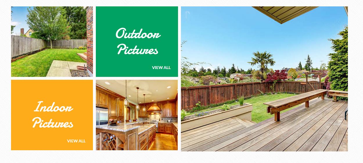
Put any image in columns in Gallery Box and you’ll get equal elements as images.
HTML markup:
|
1 2 3 4 5 6 7 8 9 |
<div class="ct-galleryBox ct-galleryBox--image"> <a href="gallery-outdoor.html"> <div class="ct-u-displayTableVertical"> <div class="ct-u-displayTableCell"> <img src="../assets/images/demo-content/country-index-gallery-outdoor-item1.jpg" alt="Outdoor Image 1"> </div> </div> </a> </div> |
Was this article helpful ?
Lists
There are several available variations of List Elements :
- ct-list
- ct-list–extended
- ct-list–tagged
- ct-list–colour
- ct-list–taggedNoBorder
Common HTML markup:
|
1 2 3 4 5 6 7 8 9 10 11 12 13 14 15 16 17 18 19 20 |
<ul class="ct-list ct-list--colour list-unstyled"> <li> <i class="fa fa-long-arrow-right fa-fw"></i> Mary56 on <a href="blog-single.html">Rent Me House</a> </li> <li> <i class="fa fa-long-arrow-right fa-fw"></i> Doloris888 on <a href="blog-single.html">Renting</a> </li> <li> <i class="fa fa-long-arrow-right fa-fw"></i> Gerry Mad on <a href="blog-single.html">Lovely Home</a> </li> <li> <i class="fa fa-long-arrow-right fa-fw"></i> MeredithG on <a href="blog-single.html">Wooden Bath</a> </li> <li> <i class="fa fa-long-arrow-right fa-fw"></i> FergusonY on <a href="blog-single.html">Barbeque</a> </li> <li> <i class="fa fa-long-arrow-right fa-fw"></i> KevinGT on <a href="blog-single.html">Sunny Day</a> </li> </ul> |
ct-list

ct-list ct-list–extended

ct-list ct-list–tagged

ct-list ct-list–colour

ct-list ct-list–taggedNoBorder

Was this article helpful ?
Testimonials
Each testimonial containes user’s feedback and his/her picture.
|
1 2 3 4 5 6 7 8 9 10 11 12 13 14 |
<div class="col-md-4 text-center"> <div class="ct-testimonial ct-u-paddingBoth10"> <p>As a tenant, I am impressed and grateful that I am treated with both warmth and respect at Warshaw. I have just received friendly prompt and efficient service thus far and would highly recommend them to anyone. It's good to know that they consider their tenants just as important as their landlords.</p> </div> <div class="media media-slider ct-u-paddingBoth10"> <div class="media-left"> <img class="media-object" src="../assets/images/demo-content/blog-single-comment-author1.jpg" alt="Reference"> </div> <div class="media-body"> <span class="media-heading">Margareta Gonzalez</span> <span>Spain</span> </div> </div> </div> |

Was this article helpful ?
Buttons
Use the simple HTML markup to create a button:
|
1 |
<a href="book.html" class="btn btn-link">Book Now</a> |
Define button size by adding one of the following classes to HTML:
- btn
- btn-xs
- btn-sm
- btn-lg
And select one of the following color variations:
- btn-default
- btn-primary
- btn-secondary
- btn-link
- btn-transparent
Was this article helpful ?
Socials
Houses comes with two types of socials. Each type has it’s CSS variation:
ct-socials
ct-socials–small
Both types have the same basic HTML markup:
|
1 2 3 4 |
<ul class="ct-socials list-inline list-unstyled"> <li><a href="https://www.facebook.com/createITpl" data-toggle="tooltip" data-placement="top" title="Facebook"><i class="fa fa-facebook"></i></a></li> <li><a href="https://twitter.com/createitpl" data-toggle="tooltip" data-placement="top" title="Twitter"><i class="fa fa-twitter"></i></a></li> </ul><div class="ct-contact-right"> |
Was this article helpful ?
Tooltip
We’re using tooltips for each social button.
Tooltip can be added with the following HTML markup:
|
1 |
<a href="https://www.facebook.com/createITpl" data-toggle="tooltip" data-placement="top" title="Facebook"><i class="fa fa-facebook"></i></a> |
You can change tooltip placement also to:
- bottom,
- left,
- right,
Was this article helpful ?
Media Sections
There are three types if media sections:
- Parallax,
- Video,
- Kenburns
Inside each of them you can add your custom content.
Parralax
We recommend you to use at least 1900px widht image as background
HTML markup:
|
1 2 3 4 5 |
<div class="ct-mediaSection" data-stellar-background-ratio="0.3" data-type="parallax" data-bg-image="path/to/the/picture" data-bg-image-mobile="path/to/the/picture"> <div class="ct-mediaSection-inner"> //content </div> </div> |
Video
Consider having to 2 extended files: mp4 and webm.
HTML markup:
|
1 2 3 4 5 6 7 8 |
<div class="ct-mediaSection" id="header" data-type="video" data-height="650" data-bg-image-mobile="path/to/the/image"> <div class="ct-mediaSection-video embed-responsive embed-responsive-16by9"> <video id="video1" muted="" loop="loop" autoplay="autoplay" preload="auto"> <source src="path/to/the/video.mp4" type="video/mp4"> <source src="path/to/the/video.webm" type="video/webm"> </video> </div> </div> |
Kenburns
In kenburs we can add 3 images.
HTML markup:
|
1 2 3 4 5 6 7 8 9 |
<div class="ct-mediaSection" data-height="460" data-type="kenburns" data-bg-image-mobile="path/to/the/picture.jpg"> <div class="ct-mediaSection-kenburnsImageContainer"> <img src="path/to/the/picture.jpg" alt="Picture"> <img src="path/to/the/picture.jpg" alt="Picture"> <img src="path/to/the/picture.jpg" alt="Picture"> </div> //content </div |
Require scripts for Media sections:
|
1 2 |
<script src="../assets/plugins/ct-mediaSection/js/jquery.stellar.min.js"></script> <script src="../assets/plugins/ct-mediaSection/js/init.js"></script> |
Was this article helpful ?
Divided Section
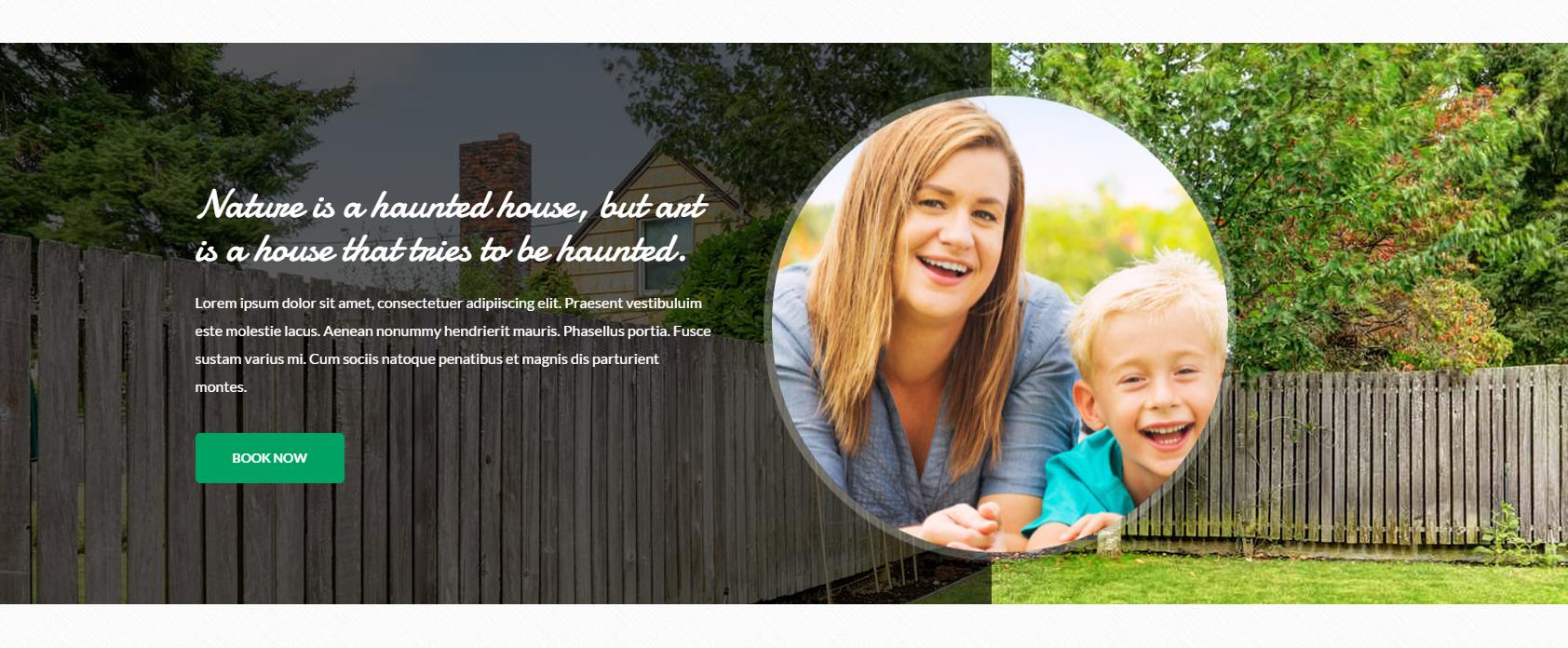
We have two divided sections on media sections:
– ct-dividedSection–primary
|
1 2 3 4 5 6 7 8 9 10 11 12 13 14 15 16 17 |
<div class="ct-dividedSection ct-dividedSection--primary"> <div class="ct-scaleImage"> <img src="../assets/images/demo-content/country-divided-section-middle.jpg" alt="Chairs"> </div> <div class="container"> <div class="row"> <div class="col-sm-4 col-sm-offset-8"> <div class="ct-dividedSection-content ct-u-paddingBoth55"> <h3 class="ct-u-paddingBottom10">Property you won’t find anywhere else.</h3> <p>We have direct access to the lake Guzowy furnace and a unique view of both of our homes for a wide panorama of the lake.</p> <a href="book.html" class="btn btn-link">Book Now</a> </div> </div> </div> </div> <div class="ct-dividedSection-mask"></div> </div> |

– ct-dividedSection–secondary
|
1 2 3 4 5 6 7 8 9 10 11 12 13 14 15 16 17 |
<div class="ct-dividedSection ct-dividedSection--secondary"> <div class="ct-scaleImage"> <img class="ct-dividedSection-image" src="../assets/images/demo-content/country-divided-section-middle2.jpg" alt="Chairs"> </div> <div class="container"> <div class="row"> <div class="col-sm-6"> <div class="ct-dividedSection-content ct-u-paddingBoth130"> <h3 class="ct-u-paddingBottom10">Nature is a haunted house, but art is a house that tries to be haunted.</h3> <p>Lorem ipsum dolor sit amet, consectetuer adipiiscing elit. Praesent vestibuluim este molestie lacus. Aenean nonummy hendrierit mauris. Phasellus portia. Fusce sustam varius mi. Cum sociis natoque penatibus et magnis dis parturient montes.</p> <a href="book.html" class="btn btn-link">Book Now</a> </div> </div> </div> </div> <div class="ct-dividedSection-mask"></div> </div> |
Was this article helpful ?
Divided Media Section
We have divided media section where on the left side there is a video frame.
|
1 2 3 4 5 6 7 8 9 10 11 12 13 14 15 16 17 18 19 20 21 22 23 24 25 26 27 28 29 30 31 32 33 34 35 36 |
<div class="ct-dividedMediaSection ct-u-marginBottom80"> <div class="ct-dividedMediaSection-left"> <iframe src="https://player.vimeo.com/video/63226515"></iframe> </div> <div class="ct-dividedMediaSection-right"> <h3>Our list of Amenities</h3> <ul class="ct-listBox ct-listBox--divided list-unstyled"> <li> <span><i class="fa fa-tree"></i> Nature</span> <span><i class="fa fa-bomb"></i> Grill</span> <div class="clearfix"></div> </li> <li> <span><i class="fa fa-cloud"></i> Close to a lake</span> <span><i class="fa fa-dollar"></i> Equipment rental</span> <div class="clearfix"></div> </li> <li> <span><i class="fa fa-fire"></i> Fireplace</span> <span><i class="fa fa-soccer-ball-o"></i> Pitch</span> <div class="clearfix"></div> </li> <li> <span><i class="fa fa-users"></i> No crowds</span> <span><i class="fa fa-play-circle-o"></i> TV room</span> <div class="clearfix"></div> </li> <li> <span><i class="fa fa-heart"></i> Friendly places</span> <span><i class="fa fa-gamepad"></i> Game room</span> <div class="clearfix"></div> </li> </ul> </div> <div class="clearfix"></div> </div> |

Was this article helpful ?
Divided Section Widget (simpleWeather)
There is divided section widget where we have plugin weather on the right side.

To add weather to any element we inject this code snippet:
|
1 2 3 |
<div class="ct-dividedWidget-right-title">Weather Now</div> <div id="ct-js-weather" class="ct-weather"></div> </div> |
Javascript markup (in main.js file)
|
1 2 3 4 5 6 7 8 9 10 11 12 13 14 15 16 17 |
if(typeof $.simpleWeather === "function"){ $.simpleWeather({ location: 'New York', woeid: '', unit: 'c', success: function(weather) { var html = '<h2><i class="icon-'+weather.code+'"></i> '+weather.temp+'°'+weather.units.temp+'</h2>'; html += '<ul><li>'+weather.city+', '+weather.region+'</li>'; html += '<li class="currently">'+weather.currently+'</li>'; $("#ct-js-weather").html(html); }, error: function(error) { $("#ct-js-weather").html('<p>'+error+'</p>'); } }); } |
To set your location insert the name of the location or the latitude/longitude param.
Script Source
|
1 |
<script src="../assets/js/jquery.simpleWeather.min.js"></script> |
Was this article helpful ?
Javascript
All javascripts are placed in folder /js.
In main.js file we implement all functions calls.
This theme uses following Javascript scripts:
/counter/
Files needed for initialising the animation number after loading pages.
/data-picker/
Scripts for choosing the date from small calendar and attaching it to the input form.
/full-calendar/
This calendar is devoted to planning the events in the calendar. User can put some events there and review them between e.g. months, years etc.
/gmaps/
Plugin needed for displaying google map on the page.
/magnific-popup/
Needed for galleries and their popups images where we can review them with slides via arrows.
/select2/
Plugin which creates select box for select tag in the page. It generates html code via javascript so that each browser can have the same select box.
/zweatherfeed/
Weather plugin where we can see weathe on live.
externals.min.js
One big file where are minifixed javascript files:_ 1.jquery 2.boostrap 3.placeholder 4. easing 5. device.min.js 6. jquery browser 7.Snap min JS 8. jquery appear_
main.js
The main javascript initializaions and other major snippets.
/plugins/ct-mediaSections/
Media sections where we can add parralax, kenburns or video to the section. Dynamical content of medias.
/headroom/
Animated/fixed navbars. Plugin needed for detecting scrollbar and attaching animations for menu.
/owl/
Files which initialize sliders in the page.
jquery.appear
This plugin call function when element appear in viewport. This is used in custom animation, progress bars, counter timer.
Documentation: https://github.com/bas2k/jquery.appear/
|
1 2 3 4 5 6 7 8 9 10 11 12 13 |
if (jQuery().appear) { if (device.mobile()) { // disable animation on mobile jQuery("body").removeClass("withAnimation"); } else { jQuery('.withAnimation .animated').appear(function () { jQuery(this).each(function () { jQuery(this).addClass('activate'); jQuery(this).addClass($(this).data('fx')); }); }, {accY: -150}); } } |
Was this article helpful ?
Calendar
Houses comes extenden calendar where you can attach any info events into it in javascript. If you want to invoke calendar, the only one thing is to put the code snippet in HTML:
Javascript Example of events, how to add:
|
1 2 3 4 5 6 7 8 9 10 11 12 13 14 15 16 17 18 19 |
$(document).ready(function() { // page is now ready, initialize the calendar... $('#calendar').fullCalendar({ events: [ { title: 'All Day Event', start: '2015-04-01' }, { title: 'Long Event', start: '2015-04-07', end: '2015-04-10' }, ] }); }); |

Javascript
|
1 2 3 |
<script src="../assets/js/fullcalendar/moment.min.js"></script> <script src="../assets/js/fullcalendar/fullcalendar.min.js"></script> <script src="../assets/js/fullcalendar/init.js"></script> |
Full calendar documentation: http://fullcalendar.io/docs/
Was this article helpful ?
Sources & Credits
The following sources and files have been used to build up this theme
- Twitter Bootstrap – http://twitter.github.com/bootstrap/
- jQuery – http://www.jquery.com
Was this article helpful ?


