

Rentica – Responsive HTML5 Template
Thank you for purchasing this theme. If you have any questions that are beyond the scope of this help file, please feel free to start new ticket on this page. Thanks so much!
Scope of free support
We can help you with:
- Responding to questions or problems regarding the item and its features
- Fixing any discovered item’s bugs
- Providing updates to ensure compatibility with new software versions
Was this article helpful ?
HTML Structure
This theme is built upon bootstrap framework and is fully responsive. It adapts to window resolution and looks good on all devices including iPad and iPhone.See for yourself (resize your browser).If you would like to read more about bootstrap framework click here: Bootstrap Documentation.
1.1. Grid System and Single row structure
The default Bootstrap grid system utilizes 12 columns. It’s responsive grid and adapts to viewport. Below 767px viewports, the columns become fluid and stack vertically. The fluid grid system uses percents instead of pixels for column widths. Each row always include 12 columns (for example col-md-8 + col-md-4 = col-md-12).
Bootstrap documentation: here
Basic grid HTML:
|
1 2 3 4 5 6 7 8 9 10 11 12 13 14 15 16 17 18 19 20 21 22 23 24 25 26 27 |
<div class="row"> <div class="col-md-1">.col-md-1</div> <div class="col-md-1">.col-md-1</div> <div class="col-md-1">.col-md-1</div> <div class="col-md-1">.col-md-1</div> <div class="col-md-1">.col-md-1</div> <div class="col-md-1">.col-md-1</div> <div class="col-md-1">.col-md-1</div> <div class="col-md-1">.col-md-1</div> <div class="col-md-1">.col-md-1</div> <div class="col-md-1">.col-md-1</div> <div class="col-md-1">.col-md-1</div> <div class="col-md-1">.col-md-1</div> </div> <div class="row"> <div class="col-md-8">.col-md-8</div> <div class="col-md-4">.col-md-4</div> </div> <div class="row"> <div class="col-md-4">.col-md-4</div> <div class="col-md-4">.col-md-4</div> <div class="col-md-4">.col-md-4</div> </div> <div class="row"> <div class="col-md-6">.col-md-6</div> <div class="col-md-6">.col-md-6</div> </div> |
1.2. Page structure
Below you will find default page structure (default.hbs files):
|
1 2 3 4 5 6 7 8 9 10 11 12 13 14 15 16 17 18 19 20 21 22 23 24 25 26 27 28 29 30 31 32 33 34 35 36 37 38 39 40 41 42 43 44 45 46 47 48 49 50 51 52 53 54 55 56 57 58 59 60 61 62 63 64 65 66 67 68 69 70 71 72 73 74 75 76 77 78 79 80 81 82 83 84 85 86 87 88 89 90 91 92 93 94 95 96 97 98 99 |
<!DOCTYPE html> <html> <head> {{! Document Settings }} <meta charset="utf-8" /> <meta http-equiv="X-UA-Compatible" content="IE=edge" /> {{! Page Meta }} <title>Orlando - Blog</title> <meta name="description" content="{{meta_description}}" /> <meta name="HandheldFriendly" content="True" /> <meta name="viewport" content="width=device-width, initial-scale=1.0" /> <link rel="shortcut icon" href="{{asset "/favicon.ico"}}"> {{! Styles'n'Scripts }} <link rel="stylesheet" type="text/css" href="{{asset "css/bootstrap.css"}}" /> <link rel="stylesheet" type="text/css" href="{{asset "css/mb-slider.css"}}"> <link rel="stylesheet" type="text/css" href="{{asset "css/style.css"}}" /> <link rel="stylesheet" type="text/css" href="//fonts.googleapis.com/css?family=Merriweather:300,700,700italic,300italic|Open+Sans:700,400" /> <!-- HTML5 shim and Respond.js IE8 support of HTML5 elements and media queries --> <!--[if lt IE 9]> <script src="{{asset "bootstrap/js/html5shiv.min.js"}}"></script> <script src="{{asset "bootstrap/js/respond.min.js"}}"></script> <![endif]--> <script src="{{asset "js/modernizr.custom.js"}}"></script> <script src="{{asset "js/device.min.js"}}"></script> {{! Ghost outputs important style and meta data with this tag }} {{ghost_head}} </head> <!-------------------TYPES OF MENU------------------> <!--If you want to can change the type of menu here. Just add or remove the class: ct-navbar--fixedTop ct-navbar--fixedBottom ct-navbar-isTransparent-toDefault ct-navbar-isTransparent-toInverse ct-navbar--logoright - user can use logo on the right or on the left side ct-js-navbarMakeSmaller - user may decide if he wants the navbar to be smaller or not on scroll ct-js-enableWayPoints - user may decide if he wants the waypoints sections to appear or not .ct-js-wayPoint added to header ct--darkMotive - dar flavour option <!---------------------------------------------------> <body class="cssAnimate ct-navbar--fixedTop ct-js-navbarMakeSmaller ct-js-enableWayPoints"> {{> responsive-menu}} {{> menu}} {{{body}}} {{ghost_foot}} {{! The main JavaScript file for Corpress }} <script type="text/javascript" src="{{asset "js/jquery.min.js"}}"></script> <script type="text/javascript" src="{{asset "bootstrap/js/bootstrap.min.js"}}"></script> <script type="text/javascript" src="{{asset "js/jquery.placeholder.min.js"}}"></script> <script type="text/javascript" src="{{asset "js/jquery.easing.1.3.js"}}"></script> <script type="text/javascript" src="{{asset "js/jquery.appear.js"}}"></script> <script type="text/javascript" src="{{asset "js/counter/jquery.countTo.js"}}"></script> <script type="text/javascript" src="{{asset "js/counter/init.js"}}"></script> <script type="text/javascript" src="{{asset "js/jquery.browser.min.js"}}"></script> <script type="text/javascript" src="{{asset "js/snap.min.js"}}"></script> <script type="text/javascript" src="{{asset "js/waypoints.min.js"}}"></script> <script type="text/javascript" src="{{asset "js/waypoints-sticky.min.js"}}"></script> <script type="text/javascript" src="{{asset "js/ct-mediaSection/jquery.stellar.min.js"}}"></script> <script type="text/javascript" src="{{asset "js/ct-mediaSection/init.js"}}"></script> <script type="text/javascript" src="{{asset "js/charts/Chart.min.js"}}"></script> <script type="text/javascript" src="{{asset "js/charts/init.js"}}"></script> <!--Flexslider below--> <script type="text/javascript" src="{{asset "js/flexslider/jquery.flexslider-min.js"}}"></script> <script type="text/javascript" src="{{asset "js/flexslider/init.js"}}"></script> <script type="text/javascript" src="{{asset "js/jquery.fitvids.js"}}"></script> <!--This is main files--> <script type="text/javascript" src="{{asset "js/main.js"}}"></script> <!-- Google Maps --> <script src="http://maps.google.com/maps/api/js?sensor=false"></script> <script type="text/javascript" src="{{asset "js/gmaps/gmap3.min.js"}}"></script> <script type="text/javascript" src="{{asset "js/gmaps/init.js"}}"></script> <!--This is for picture--> <script type="text/javascript" src="{{asset "js/magnific-popup/jquery.magnific-popup.min.js"}}"></script> <script type="text/javascript" src="{{asset "js/magnific-popup/init.js"}}"></script> <!-- Contact form validation --> <script type="text/javascript" src="{{asset "form/js/contact-form.js"}}"></script> <!--This is ghost slider--> <script type="text/javascript" src="{{asset "js/mb-ghost-slider.js"}}"></script> <!--Files needed for portfolio--> <script type="text/javascript" src="{{asset "js/portfolio/jquery.isotope.min.js"}}"></script> <script type="text/javascript" src="{{asset "js/portfolio/imagesloaded.js"}}"></script> <script type="text/javascript" src="{{asset "js/portfolio/infinitescroll.min.js"}}"></script> <script type="text/javascript" src="{{asset "js/portfolio/init.js"}}"></script> <script type="text/javascript" src="{{asset "js/uniqueTags.js"}}"></script> <script type="text/javascript" src="{{asset "js/less.min.js"}}"></script> </body> </html> |
The most important pages in ghost are home.hbs and index.hbs. The pages are almost the same. Below you can see how looks like the structure of those pages:
|
1 2 3 4 5 6 7 8 9 10 11 12 13 14 15 16 17 18 19 20 21 22 23 24 25 26 27 28 29 30 31 32 33 34 35 36 37 38 39 40 41 42 43 44 45 46 47 48 49 50 51 |
<!-- This is home.hbs page--> {{!< default}} <!-- If you would like to have a push effect, just change a class to ct-pageWrapper ct-intro--push--> <!-- If you would like to have a slice effect, just change a class to ct-pageWrapper ct-intro--sliced--> <!-- If you would like to have a flexslider effect or particles effect, just change a class to " "--> <div id="ct-js-wrapper" class="ct-pageWrapper ct-intro--push"> <header class="ct-pageHeader ct-pageHeader--motive ct-pageHeader--hasDescription ct-u-paddingBoth10"> <div class="container ct-u-triangleBottomLeft"> <div class="row"> <div class="col-md-8"> <h1 class=" ct-fw-600 ct-u-colorWhite"> Welcome<sup><i class="fa fa-paper-plane"></i></sup> </h1> </div> <div class="col-md-4"> <span class="ct-u-size20 ct-u-colorWhite"> Aliquam erat volutpat. in vitae gravida sem. praesent nec fermentum erat. </span> </div> </div> </div> </header> {{!>simply-slider2}} <!--This is simply slider, tis is the same slider like in page-office.hbs file--> {{!> flexslider-effect}} <!--This is the big slider on the main side of tha page, if you want to enable the effect just remove ! and change the wrapper class to " "--> {{!> slice-effect}} <!--this is slice effect, if you want to enable the effect just remove ! and change the wrapper class to ct-pageWrapper ct-intro--sliced and add this class ct-intro-content below --> {{!> push-effect}} <!--this is push effect, if you want to enable the effect just remove ! and change the wrapper class to ct-pageWrapper ct-intro--push and add this class ct-intro-content below--> {{!>particles-effect}} <!--This is the particles effect, if you want to enable the effect just remove ! and change the wrapper class to " "--> <!--If we use a effect like slice or push, all the content must be in this section--> <!--If you have to use a effect like above , you have add this class ct-intro-content--> {{>blog_infinity}} <!--Here you can eneable infinity blog, This type of blog is different than else, so it must be activate here--> <div class="ct-u-paddingBoth100 ct-u-diagonalBottomRight"> <div class=""> <!--THIS EFECT IS ONLY FOR THE PUSH AND SLICE EFFECT, IF YOU WANT TO USE PARTICLES YOU MUST DELETE THIS CLASS--> <div class="container"> <div class="row"> {{!> blog_default}} <!--if you want to have a default blog on your page--> {{!> blog_secundary}} <!--if you want to have a secundary blog on your page--> {{!> blog_masonry}} <!--if you want to have a blog small on your page--> </div> </div> </div> </div> {{> footer}} </div> |
This is index.hbs page. Here you can set the four types of blog and the effect for second,3,4..n pages of blog.
|
1 2 3 4 5 6 7 8 9 10 11 12 13 14 15 16 17 18 19 |
<!-- This is index.hbs page--> {{!< default}} <div id="ct-js-wrapper" class="ct-pageWrapper"> {{>main-header}} {{>blog_infinity}} <!--Here you can eneable infinity blog, This type of blog is different than else, so it must be activate here--> <div class=""> <!--If you have to use a effect like above , you have add this class ct-intro-content--> <div class="ct-u-paddingBoth100 ct-u-diagonalBottomRight"> <div class="container"> <div class="row"> {{!> blog_default}} <!--if you want to have a default blog on your page--> {{!> blog_secundary}} <!--if you want to have a secundary blog on your page--> {{!> blog_masonry}} <!--if you want to have a blog small on your page--> </div> </div> </div> {{> footer}} </div> </div> |
Author page in ghost is the page has information about the author, locatiom, posts… Below you can see the structure of the page:
|
1 2 3 4 5 6 7 8 9 10 11 12 13 14 15 16 17 18 19 20 21 22 23 24 25 26 27 28 29 30 31 32 33 |
<link rel="stylesheet" type="text/css" href="{{asset "css/author_style.css"}}"/> {{!< default}} <div id="ct-js-wrapper" class="ct-pageWrapper"> {{>main-header}} <div class="ct-u-paddingBoth100 ct-u-diagonalTopLeft ct-u-diagonalBottomRight"> <div class="container"> <div class="row"> <div class="col-sm-10 col-sm-offset-1"> {{#author}} <section class="author-profile2 inner2"> {{#if image}} <figure class="author-image2"> <div class="img" style="background-image: url({{image}})"><span class="hidden">{{name}}'s Picture</span></div> </figure> {{/if}} <h1 class="author-title2">{{name}}</h1> <h2 class="author-bio2">{{bio}}</h2> <div class="author-meta"> {{#if location}}<span class="fa fa-home fa fa-lg"></span> {{location}}{{/if}} {{#if website}}<span class=""><a href="{{website}}">{{website}}</a></span>{{/if}} <span class="author-stats" style="padding-left: 10px;"><i class="fa fa-bar-chart fa fa-lg"></i> {{plural ../pagination.total empty='No posts' singular='% post' plural='% posts'}}</span> </div> </section> {{/author}} {{! This is the post loop - each post will be output using this markup }} </div> {{>loop}} </div> </div> </div> {{> footer}} </div> |
Was this article helpful ?
Navbar
There are three color variations of navigation menu:
- navbar-default
- navbar-motive
- navbar-inverse
To use each of them you need to add proper class to: <nav class="">...</nav>

Navigation bar
|
1 2 3 4 5 6 7 8 9 10 11 12 13 14 15 16 17 18 19 20 21 22 23 24 25 26 27 28 29 30 31 32 33 34 35 36 37 38 39 40 41 42 43 44 45 46 47 48 49 50 51 52 53 54 55 56 |
<nav class="navbar navbar-default ct-navbar ct-shadow ct-shadow--type1"> <div class="navbar-header"> <a class="ct-logoDark" href="#"><img src="../assets/images/demo-content/logo.png" alt=""/></a> <a class="ct-logoWhite" href="#"><img src="../assets/images/demo-content/logo2.png" alt=""/></a> </div> <div class="container"> <div class="ct-navbarBox"> <a href="../cars/login.html" class="ct-login"><span>Login</span><i class="fa fa-lock"></i></a> <div class="ct-navbarBox-meta"> <div class="ct-navSearch-box"> <a class="ct-js-navSearch ct-navSearch" href="#"><i class="fa fa-search"></i></a> <div class="ct-navbar-search"> <form role="form"> <div class="form-group ct-input--type2"> <input id="searchM" required="" type="text" name="field[]" placeholder="Search website..." class="form-control"> <label for="searchM"><span>Search</span></label> <button class="ct-navbar-search-button" type="submit"> <i class="fa fa-search fa-fw"></i> </button> </div> </form> </div> </div> <div class="ct-langPicker"> <div class="ct-langPicker-content"> <a href="#"><img src="../assets/images/demo-content/flag-01.jpg" alt=""/></a> <ul class="ct-langPicker-list"> <li><a href="#">English <img src="../assets/images/demo-content/flag-01.jpg" alt=""/></a></li> <li><a href="#">Español <img src="../assets/images/demo-content/flag-03.jpg" alt=""/></a></li> <li><a href="#">Italiano <img src="../assets/images/demo-content/flag-02.jpg" alt=""/></a></li> </ul> </div> </div> </div> <button type="button" class="navbar-toggle"> <span class="sr-only">Toggle navigation</span> <span class="icon-bar"></span> <span class="icon-bar"></span> <span class="icon-bar"></span> </button> </div> <ul class="nav navbar-nav ct-navbar--fadeIn"> <li class="dropdown"><a href="box-icons.html"><div class="ct-textEffect"><span data-content="Boxes">Boxes</span></div></a> <ul class="dropdown-menu"> <li><a href="box-icons.html"><span>Icon Boxes</span></a></li> ... </ul> </li> </ul> </div> </nav> |
Was this article helpful ?
Page Header

Page header
HTML markup:
|
1 2 3 |
<section class="ct-mediaSection ct-mediaSection--desktop ct-u-paddingTop60 ct-u-paddingBottom40" data-height="340" data-type="parallax" data-stellar-background-ratio="0.3" data-bg-image="../assets/images/demo-content/boats/mediaHeader-01.jpg" data-bg-image-mobile="../assets/images/demo-content/boats/mediaHeader-01.jpg"> <div class="ct-mediaSection-inner ct-mediaSection-inner--bottom" data-stellar-ratio="0.7"><h2 class="ct-fw-lighter ct-u-hr ct-u-hr--wide text-center">Header Parallax</h2></div> </section> |
Was this article helpful ?
Rent item
Rent item page is created with several elements, which can be used together or separately:
Date Picker
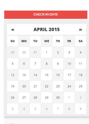
Date picker
HTML markup:
|
1 2 3 4 |
<form class="ct-form-group ct-u-marginBottom30 input-daterange input-group" id="datepicker"> <input type="text" class="form-control" placeholder="Check In Date" name="start" title="from"/> <!-- LABEL TODO --> <input type="text" class="form-control" placeholder="Check Out Date" name="end" title="to"/> </form> |
Scripts:
|
1 2 |
<script src="../assets/plugins/datepicker/js/bootstrap-datepicker.min.js"></script> <script>jQuery('.input-daterange').datepicker({});</script> |
Radioboxes
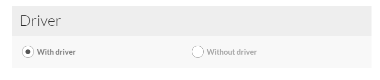
Radioboxes
HTML markup:
|
1 2 3 4 5 6 7 8 9 10 11 12 13 14 15 16 |
<form id="ct-js-driverCheckbox" class="ct-js-radio-group ct-widget-content"> <div class="ct-u-displayTableVertical"> <div class="ct-u-displayTableCell"> <div class="ct-checkbox ct-checkbox--rounded"> <input data-price="2100" name="Driver" id="checkbox5" type="radio" checked> <label for="checkbox5" class="checkbox-inline">With driver</label> </div> </div> <div class="ct-u-displayTableCell"> <div class="ct-checkbox ct-checkbox--rounded"> <input data-price="0" name="Driver" id="checkbox6" type="radio"> <label for="checkbox6" class="checkbox-inline">Without driver</label> </div> </div> </div> </form> |
Checkboxes
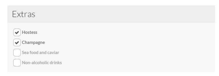
Checkboxes
HTML markup:
|
1 2 3 4 5 6 7 8 9 10 11 12 13 14 15 16 17 18 |
<form class="ct-widget-content ct-js-checkbox-group"> <div class="ct-checkbox ct-u-marginBottom10"> <input data-price="450" name="Hostess" id="checkbox1" type="checkbox" checked="checked"> <label for="checkbox1" class="checkbox-inline">Hostess</label> </div> <div class="ct-checkbox ct-u-marginBottom10"> <input data-price="200" name="Champagne" id="checkbox2" type="checkbox" checked="checked"> <label for="checkbox2" class="checkbox-inline">Champagne</label> </div> <div class="ct-checkbox ct-u-marginBottom10"> <input data-price="725" name="Sea-food-and-caviar" id="checkbox3" type="checkbox"> <label for="checkbox3" class="checkbox-inline">Sea food and caviar</label> </div> <div class="ct-checkbox"> <input data-price="50" name="Non-alcoholic-drinks" id="checkbox4" type="checkbox"> <label for="checkbox4" class="checkbox-inline">Non-alcoholic drinks</label> </div> </form> |
Checkout Box
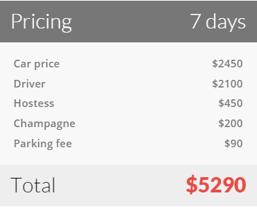
Checkout box
HTML markup:
|
1 2 3 4 5 6 7 8 9 10 11 12 13 14 15 16 |
<div id="ct-js-checkoutBox" class="ct-widget ct-widget-pricing ct-u-marginBottom30"> <h3 class="ct-widget-header ct-widget-header--dark">Pricing <span id="datepickerOutput" class="pull-right">0 days</span></h3> <div class="ct-widget-content"> <ul id="ct-js-checkout-list" class="ct-widget-list"> <li data-name="Car-Price" data-itemPrice="350">Car price<span class="pull-right data-currency">$0</span></li> <li data-name="ct-js-driverCheckbox">Driver<span class="pull-right">0</span></li> <li data-name="Hostess">Hostess<span class="pull-right">0</span></li> <li data-name="Sea-food-and-caviar">Sea food and caviar<span class="pull-right">0</span></li> <li data-name="Non-alcoholic-drinks">Non-alcoholic drinks<span class="pull-right">0</span></li> <li data-name="Champagne">Champagne<span class="pull-right">0</span></li> <li data-name="Parking-fee">Parking fee<span class="pull-right">$90</span></li> </ul> <h4 class="ct-checkout-error"><small>Please select a date</small></h4> </div> <h3 class="ct-widget-footer">Total <span id="ct-js-checkout-price" class="ct-widget-price pull-right">$0</span></h3> </div> |
- dataItemPrice – product price per day;
Notice:
data-price – Every checkbox and radiobox should have specified this attribute, otherwise script responsible for total price calculating won’t work correctly;
data-name – For radioboxes this attribute should have the same value as form’s ID containing a group of radio inputs.
For checkboxes this attribute should have the same value as input’s [name] attribute.
Required javascript:
|
1 |
<script src="../assets/js/shop.js"></script> |
Was this article helpful ?
Media Sections
Rentica supports media sections with Parallax, KenBurns effect and videos.
Parallax Section
|
1 2 3 4 5 6 7 8 9 10 11 12 13 14 15 16 17 18 19 20 21 22 23 24 25 26 27 28 29 30 31 |
<section class="ct-mediaSection ct-u-paddingBoth70" data-stellar-background-ratio="0.3" data-height="650" data-type="parallax" data-bg-image="./assets/images/demo-content/bigImage1.jpg" data-bg-image-mobile="./assets/images/demo-content/bigImage1-mobile.jpg" style="min-height: 650px; height: 650px; background-image: url(http://orlando.html.themeforest.createit.pl/light/assets/images/demo-content/bigImage1.jpg); background-position: 50% 50%;"> <div class="ct-mediaSection-inner"> <div class="container"> <div class="row"> <div class="col-sm-4"> <header class="ct-pageSectionHeader"> <h3 class="text-lowercase ct-fw-600"> Parallax <small class="ct-fw-700 text-uppercase">Yes, we are the absolute best in the business </small> </h3> </header> </div> <div class="col-sm-8"> <p> Donec justo mauris, sagittis sed vulputate ut, commodo dapibus massa. Class aptent taciti sociosqu ad litora torquent per conubia nostra, per inceptos himenaeos. Cras ut mi lacus. Morbi accumsan mauris ac posuere vehicula. Donec bibendum tellus rutrum turpis varius dictum. Maecenas tristique arcu sed rhoncus laoreet. Praesent eget fermentum nisi. Donec ac velit aliquet, bibendum sem in, convallis est. Phasellus sodales ultricies cursus. Vivamus leo nunc, pretium vitae dictum a, mollis ut sapien. Cum sociis natoque penatibus et magnis dis parturient montes, nascetur ridiculus mus. Donec porttitor tristique sem, dictum vehicula nisi accumsan eget. Pellentesque habitant morbi tristique senectus et netus. </p> <a href="contact.html" class="btn btn-primary ct-btn--rounded text-uppercase">Contact Us</a> <a href="features-p-tables.html" class="btn ct-btn--black ct-btn--rounded text-uppercase">Pricing Options</a> </div> </div> </div> </div> </section> |
We are using stellar.js for the parallax effect. Check their documentation to check which attributes you can use in each parallax section.
http://markdalgleish.com/projects/stellar.js/docs/
Our custom data-attributes for the parallax section are:
- data-height: Define the minimun height for the sections
- data-type: Type of Media Section (parallax/kenburns/video)
- data-image: Background image for the section.
- data-image-mobile: Fallback image (Should be smaller than the original) that is loaded for small devices. This will help you with the bandwidth, you’re welcome! 🙂
Ken Burns Sections
|
1 2 3 4 5 6 7 8 9 10 11 12 13 14 15 16 17 18 19 20 21 22 23 24 25 26 27 28 29 30 31 32 33 34 35 36 37 |
<section class="ct-mediaSection ct-u-paddingBoth70 ct-u-colorWhite" data-height="650" data-type="kenburns" data-bg-image-mobile="./assets/images/demo-content/bigImage5-mobile.jpg" style="min-height: 650px; height: 650px;"> <div class="ct-mediaSection-kenburnsImageContainer"> <img src="./assets/images/demo-content/bigImage5.jpg" alt="demo image" class="fx"> <img src="./assets/images/demo-content/bigImage4.jpg" alt="demo image" class=""> <img src="./assets/images/demo-content/bigImage5.jpg" alt="demo image" class="fx"> </div> <div class="ct-mediaSection-inner"> <div class="container"> <div class="row"> <div class="col-sm-4"> <header class="ct-pageSectionHeader"> <h3 class="text-lowercase ct-fw-600 ct-u-colorWhite"> Ken Burns <small class="ct-fw-700 text-uppercase ct-u-colorWhite">Yes, we are the absolute best in the business </small> </h3> </header> </div> <div class="col-sm-8"> <p> Donec justo mauris, sagittis sed vulputate ut, commodo dapibus massa. Class aptent taciti sociosqu ad litora torquent per conubia nostra, per inceptos himenaeos. Cras ut mi lacus. Morbi accumsan mauris ac posuere vehicula. Donec bibendum tellus rutrum turpis varius dictum. Maecenas tristique arcu sed rhoncus laoreet. Praesent eget fermentum nisi. Donec ac velit aliquet, bibendum sem in, convallis est. Phasellus sodales ultricies cursus. Vivamus leo nunc, pretium vitae dictum a, mollis ut sapien. Cum sociis natoque penatibus et magnis dis parturient montes, nascetur ridiculus mus. Donec porttitor tristique sem, dictum vehicula nisi accumsan eget. Pellentesque habitant morbi tristique senectus et netus. </p> <a href="contact.html" class="btn btn-primary ct-btn--rounded text-uppercase">Contact Us</a> <a href="features-p-tables.html" class="btn btn-default ct-btn--rounded text-uppercase">Pricing Options</a> </div> </div> </div> </div> </section> |
KenBurns section supports one or more images that you should add inside .media-section-image-container
Our custom data-attributes for the kenburns section are:
- data-height: Define the minimun height for the sections
- data-type: Type of Media Section (parallax/kenburns/video)
- data-image-mobile: Fallback image (Should be smaller than the original) that is loaded for small devices. Kenburns it too much for ipads, iphones and so on, so we allow you to fallback to a normal image section. This way your browser won’t crash 🙂
Video Sections
|
1 2 3 4 5 6 7 8 9 10 11 12 13 14 15 16 17 18 19 20 21 22 23 24 25 26 27 28 29 30 31 32 33 34 35 36 37 38 39 40 41 42 43 44 |
<section class="ct-mediaSection ct-u-paddingBoth70 ct-u-colorWhite" data-height="700" data-type="video" data-bg-image-mobile="./assets/images/demo-content/bigImage3-mobile.jpg" style="min-height: 700px; height: 700px;"> <div class="ct-mediaSection-video embed-responsive embed-responsive-16by9"> <!-- in order for video to be muted you must add &api=1&player_id=vimeoplayer1 to the end of the video src If you have more than one video, make sure that player_id and id have dif names on each video --> <video id="video1" muted="" loop="" autoplay="autoplay" preload="auto"> <source src="http://orlando.html.themeforest.createit.pl/light/assets/videos/loopbookeh.mp4" type="video/mp4"> <source src="http://orlando.html.themeforest.createit.pl/light/assets/videos/loopbookeh.webm" type="video/webm"> </video> </div> <div class="ct-u-displayTable" style="height: 700px;"> <div class="ct-mediaSection-inner"> <div class="container"> <div class="row"> <div class="col-sm-4"> <header class="ct-pageSectionHeader"> <h3 class="text-lowercase ct-fw-600 ct-u-colorWhite"> Video <small class="ct-fw-700 text-uppercase ct-u-colorWhite">Yes, we are the absolute best in the business </small> </h3> </header> </div> <div class="col-sm-8"> <p> Donec justo mauris, sagittis sed vulputate ut, commodo dapibus massa. Class aptent taciti sociosqu ad litora torquent per conubia nostra, per inceptos himenaeos. Cras ut mi lacus. Morbi accumsan mauris ac posuere vehicula. Donec bibendum tellus rutrum turpis varius dictum. Maecenas tristique arcu sed rhoncus laoreet. Praesent eget fermentum nisi. Donec ac velit aliquet, bibendum sem in, convallis est. Phasellus sodales ultricies cursus. Vivamus leo nunc, pretium vitae dictum a, mollis ut sapien. Cum sociis natoque penatibus et magnis dis parturient montes, nascetur ridiculus mus. Donec porttitor tristique sem, dictum vehicula nisi accumsan eget. Pellentesque habitant morbi tristique senectus et netus. </p> <a href="contact.html" class="btn btn-primary ct-btn--rounded text-uppercase">Contact Us</a> <a href="features-p-tables.html" class="btn btn-default ct-btn--rounded text-uppercase">Pricing Options</a> </div> </div> </div> </div> </div> </section> |
We recommend you to use html5 video instead of vimeo, since in some specific browsers the sound won’t be muted.
Our custom data-attributes for the video section are:
- data-height: Define the minimun height for the sections
- data-type: Type of Media Section (parallax/kenburns/video)
- data-image-mobile: Fallback image (Should be smaller than the original) that is loaded for small devices. Phones don’t autoplay video, so we just replace it for an image
Was this article helpful ?
Section Header
Use headers with separator to highlight your sections content.

Section header
HTML markup:
|
1 2 3 4 5 6 7 8 9 10 |
<div class="ct-sectionHeader"> <h2 class="ct-sectionHeader-title"><small>Awesome <span>header</span></small></h2> <div class="ct-sectionHeader-separator"> <span class="minus"></span> <span class="slash">/</span> <span class="slash">/</span> <span class="minus"></span> </div> <p>Aliquam lectus sem, semper in hendrerit eget, iaculis eu neque suspendisse pharetra</p> </div> |
Was this article helpful ?
Icon Boxes
We prepared for you three types of icon boxes.
Type 1
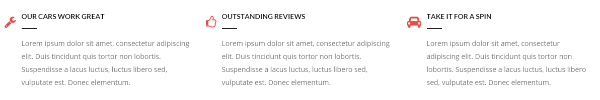
Icon Box – type 1
HTML markup:
|
1 2 3 4 5 6 7 8 |
<div class="ct-iconBox media ct-u-marginBottom50"> <div class="h3 ct-iconBox-icon media-left"><small><i class="fa fa-wrench"></i></small></div> <div class="ct-iconBox-content media-body"> <h6 class="ct-iconBox-header ct-u-hr ct-u-hr--left">Our cars work great</h6> <p>Lorem ipsum dolor sit amet, consectetur adipiscing elit. Duis tincidunt quis tortor non lobortis. Suspendisse a lacus luctus, luctus libero sed, vulputate est. Donec elementum.</p> </div> </div> |
Type 2
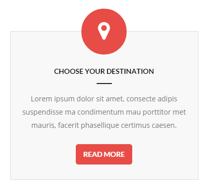
Icon Box type 2
HTML markup:
|
1 2 3 4 5 6 7 8 |
<div class="ct-iconBox ct-iconBox--type2 ct-u-marginBottom80"> <div class="h2 ct-iconBox-icon"><small><i class="fa fa-map-marker"></i></small></div> <div class="ct-iconBox-content"> <h6 class="ct-iconBox-header ct-u-hr ct-u-hr--center">Choose your destination</h6> <p>Lorem ipsum dolor sit amet, consecte adipis suspendisse ma condimentum mau porttitor met mauris, facerit phasellique certimus caesen.</p> <a href="#" class="btn btn-motive"><span>Read More</span></a> </div> </div> |
Type 3
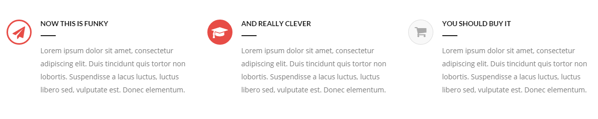
Icon Box – type 3
HTML markup:
|
1 2 3 4 5 6 7 8 |
<div class="ct-iconBox ct-iconBox--type3 media ct-u-marginBottom50"> <div class="h3 ct-iconBox-icon media-left"><small><i class="fa fa-send"></i></small></div> <div class="ct-iconBox-content media-body"> <h6 class="ct-iconBox-header ct-u-hr ct-u-hr--left">Now this is funky</h6> <p>Lorem ipsum dolor sit amet, consectetur adipiscing elit. Duis tincidunt quis tortor non lobortis. Suspendisse a lacus luctus, luctus libero sed, vulputate est. Donec elementum.</p> </div> </div> |
Was this article helpful ?
Person Box
Introduce the team with nice and simple person boxes!
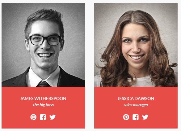
Person Boxes
Use simple html markup, with Team Member picture, name, position and links to social media. Each element can be easily modified:
|
1 2 3 4 5 6 7 8 9 10 11 |
<div class="ct-personBox"> <div class="ct-personBox-image"><img src="../assets/images/demo-content/boats/person-02.jpg" alt=""/></div> <div class="ct-personBox-content"> <h6 class="ct-personBox-header">Jessica Dawson <small>sales manager</small></h6> <ul class="ct-socials"> <li><a data-toggle="tooltip" data-placement="top" title="pinterest" href="#"><i class="fa fa-pinterest"></i></a></li> <li><a data-toggle="tooltip" data-placement="top" title="facebook" href="#"><i class="fa fa-facebook-square"></i></a></li> <li><a data-toggle="tooltip" data-placement="top" title="twitter" href="#"><i class="fa fa-twitter"></i></a></li> </ul> </div> </div> |
Was this article helpful ?
Progress icons
Indicate progress a little bit different.
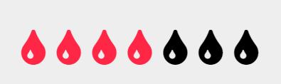
Progress icons
All parameters can be easily edited in simple HTML markup:
|
1 2 |
<div class="progress-icons" data-font-size="25" data-icon-color="#ffa500" data-active="17" data-total="18" data-icon="fa fa-tint" data-delay="200"></div> |
You can use the following data-attributes to change settings:
- data-font-size=”icon size in pixels”
- data-icon-color=”color of your active icons”
- data-active=”how many icons should be activated?”
- data-total=”number of all displayed icons”
- data-icon=”CSS class of Font Awesome icon, you want to use”
- data-delay=”how fast icon should be activated?”
Was this article helpful ?
Progress bars
Show the progress with clean and simple progress bars.
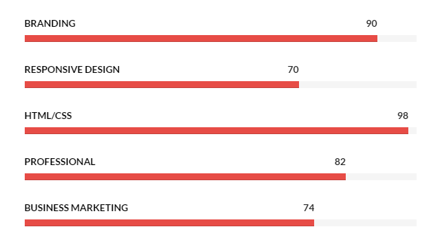
Progress bars
Use the simple HTML markup:
|
1 2 3 4 5 6 7 8 |
<div class="ct-progressBar"> <div class="ct-progressBar-name">Responsive Design</div> <div class="progress progress-motive"> <div class="progress-bar" role="progressbar" aria-valuenow="70" aria-valuemin="0" aria-valuemax="100"> <div class="ct-progressBar-tr">70</div> </div> </div> </div> |
Was this article helpful ?
Inputs
There are two types of inputs in Rentica:
Type 1
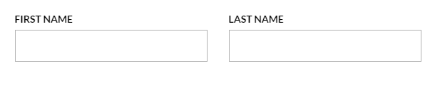
First type of inputs
HTML markup:
|
1 2 3 4 |
<div class="form-group"> <label for="first_name">First Name</label> <input id="first_name" class="form-control form-control--type2"> </div |
Type 2
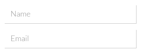
Second type of inputs
HTML markup:
|
1 2 3 |
<div class="form-group ct-input--type2 ct-u-marginBottom20"> <input id="contact_name" placeholder="Name" type="text" required="" name="field[]" class="form-control" title="Name"> </div> |
Was this article helpful ?
Accordions
With the Rentica you can use two types of accordions.
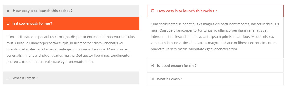
Accordions
Just use the followoing HTML markup:
|
1 2 3 4 5 6 7 8 9 10 11 12 13 14 15 16 |
<div class="panel-group ct-u-marginTop50" id="accordion"> <div class="panel panel-motive"> <div class="panel-heading"> <div class="panel-title"> <a class="h5 collapsed" data-toggle="collapse" data-parent="#accordion" href="#collapseOne"> <small>How easy is to launch this rocket ?</small> </a> </div> </div> <div id="collapseOne" class="panel-collapse collapse"> <div class="panel-body"> ... </div> </div> </div> </div> |
If you would like to change accordion style to the Second one
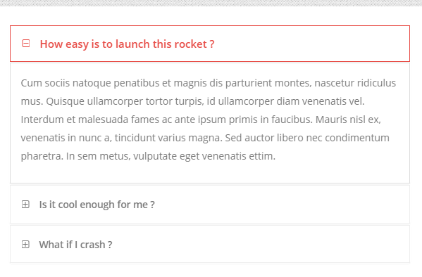
Accordion
Replace class .panel-motive from the markup above with panel-motive-o
Was this article helpful ?
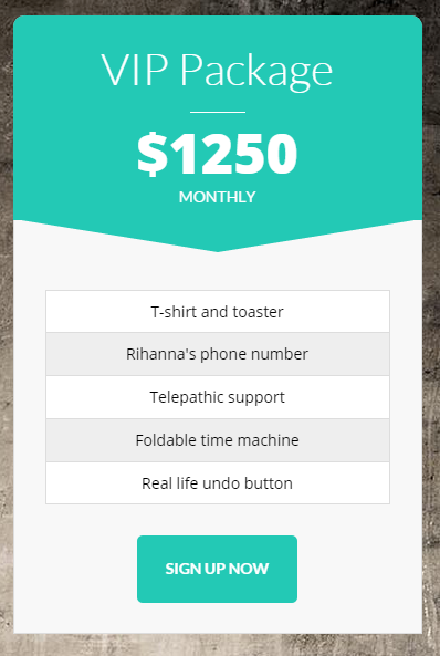
Pricing Tables
Create multiple Pricing Tables with different color variations with the simple HTML markup:
|
1 2 3 4 5 6 7 8 9 10 11 12 13 14 15 16 17 18 19 20 |
<div class="ct-pricingBox ct-pricingBox--graydarker ct-u-marginBoth50"> <div class="ct-pricingBox-header"> <h2 class="ct-pricingBox-title ct-u-hr ct-u-hr--wide"><small>Funky Package</small></h2> <h2 class="ct-pricingBox-price"><b>$750</b></h2> <h6 class="ct-pricingBox-subtitle">Monthly</h6> </div> <svg viewBox="0 0 100 100" preserveAspectRatio="none"> <path d="M0,0 L 50,50 100,0 Z"/> </svg> <div class="ct-pricingBox-content"> <ul class="ct-pricingBox-list"> <li>T-shirt and toaster</li> <li>Rihanna's phone number</li> <li>Telepathic support</li> <li>Foldable time machine</li> <li>Real life undo button</li> </ul> </div> <a href="login.html" class="btn btn-lg btn-graydarker"><span>Sign Up Now</span></a> </div> |
If you would like to use table with different color replace ct-pricingBox--graydarker with one of the following CSS classes:
- ct-pricingBox–motive
- ct-pricingBox–gray
- ct-pricingBox–graylighter
Was this article helpful ?
Pie Charts
Rentica comes with two types of pie charts.
Type 1
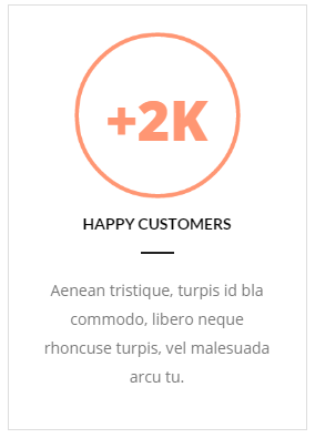
Pie Chart – type 1
HTML markup:
|
1 2 3 4 5 6 7 8 9 10 11 12 13 14 |
<div class="ct-graphBox ct-graphBox--default"> <div class="ct-graphBox-graph"> <canvas width="150" height="150" class="ct-js-pieChart" data-ct-percentage="100" data-ct-middleSpace="95" data-ct-secondColor="#ddd" data-ct-firstColor="#ff9673"></canvas> <span class="h2 ct-graphBox-number"><b>+2K</b></span> </div> <div class="ct-graphBox-content ct-u-paddingTop10"> <h6 class="ct-u-hr ct-u-hr--center text-uppercase text-center ct-fw-bold">happy customers</h6> <p class="text-center"> Aenean tristique, turpis id bla commodo, libero neque rhoncuse turpis, vel malesuada arcu tu. </p> </div> </div> |
Type 2 – Graph Box
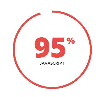
Graph Box
HTML markup:
|
1 2 3 4 5 6 7 8 9 10 11 12 13 14 15 |
<div class="ct-graphBox ct-graphBox--type2"> <div class="ct-graphBox-graph"> <canvas width="150" height="150" class="ct-js-pieChart" data-ct-percentage="65" data-ct-middleSpace="95" data-ct-secondColor="#fff" data-ct-firstColor="#c25d7b"></canvas> <div class="ct-graphBox-graph-content"> <div class="ct-u-displayTableVertical"> <div class="ct-u-displayTableCell"> <div class="ct-graphBox-number">95<span>%</span></div> <h6 class="ct-graphBox-title">JAVASCRIPT</h6> </div> </div> </div> </div> </div> |
Remember to include the following scripts to your HTML page, otherwise pie charts won’t work correctly.
|
1 2 |
<script src="../assets/js/charts/Chart.min.js"></script> <script src="../assets/js/charts/init.js"></script> |
Was this article helpful ?
Figure box
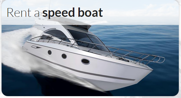
Figure box
Create image with caption with simple HTML markup:
|
1 2 3 4 5 6 |
<figure class="ct-figureBox"> <img src="../assets/images/demo-content/boats/rent-01.jpg" alt=""> <figcaption> <h2 class="ct-figureBox-header"><small>Rent a <span>luxury yacht</span><i class="ct-figureBox-icon fa fa-chevron-right"></i></small></h2> </figcaption> </figure> |
Was this article helpful ?
Buttons
Rentica comes with number of variations for buttons.
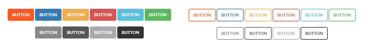
Buttons
Use simple HTML markup:
|
1 |
<a href="#" class="btn btn-motive"><span>Button</span></a> |
To change button color add one of the following classes after btn class:
- btn-motive
- btn-primary
- btn-warning
- btn-danger
- btn-info
- btn-success
- btn-graygraydarker
- btn-graylighter
- btn-inverse
- btn-default
If you would like to use button with transparent background and color only in border and text, add to the class, which defines color suffix -o, for example:
btn-motive-o
You can also change button size with the following classes:
- btn-xs
- btn-lg
Add btn-wide to create full width button.
Was this article helpful ?
Slider
We are using Slick carousel script in our slider.
Just use the simple HTML markup:
|
1 2 3 4 5 6 7 8 9 10 11 |
<div class="ct-slick ct-js-slick"> <div class="item"> ... </div> <div class="item"> ... </div> <div class="item"> ... </div> </div> |
And add as many items as you want. In plugin documentation you will find available settings and examples of usage.
Don’t forget to include the following scripts in your html page:
|
1 2 |
<script src="../assets/plugins/slick/slick.min.js"></script> <script src="../assets/plugins/slick/init.js"></script> |
Was this article helpful ?
Javascript
All javascripts are placed in folder /js. In main.js file we implement all functions calls.
This theme uses following Javascript scripts:
- 1. Media Sections
2. Datepicker – I use this for calendar widget in blog sidebar.
3. Gmaps
4. Headroom – Plugin for navbar options, same is in Diana.
5. Magnific Popup.
6. Pagescroller – Onepager navigation.
7. Owl Corusel – slider
8. Isotope – gallery categories sorting.
9. Select2 – overwrite a standard select.
10. Slider Bootstrap – amount slider.
11. Device.js – check what device we use.
12. Appear.js – check a status of element(is in viewport or not)
13. browser.js – check what browser we use
14. snap.js – snap event on mobile device
jquery.appear
This plugin call function when element appear in viewport. This is used in custom animation, progress bars, counter timer.
Documentation: https://github.com/bas2k/jquery.appear/
|
1 2 3 4 5 6 7 8 9 10 11 12 13 |
if (jQuery().appear) { if (device.mobile()) { // disable animation on mobile jQuery("body").removeClass("withAnimation"); } else { jQuery('.withAnimation .animated').appear(function () { jQuery(this).each(function () { jQuery(this).addClass('activate'); jQuery(this).addClass($(this).data('fx')); }); }, {accY: -150}); } } |
Was this article helpful ?
Counters
Rentica comes with two element with counting functions.
Counter
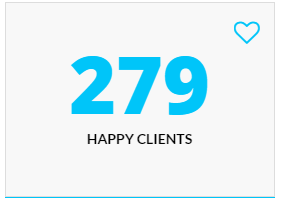
Counter
HTML markup:
|
1 2 3 4 5 |
<div class="ct-counterBox" data-color="#00c5f9"> <span class="ct-counterBox-number ct-js-counter" data-ct-to="279" data-ct-speed="50">0</span> <h6 class="ct-counterBox-title">Happy Clients</h6> <span class="ct-counterBox-icon"><i class="fa fa-heart-o"></i></span> </div> |
JS scripts:
|
1 2 |
<script src="../assets/js/counter/jquery.countTo.js"></script> <script src="../assets/js/counter/init.js"></script> |
Count Down
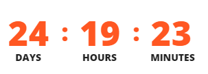
Count down
HTML markup:
|
1 |
<div id="ct-counter"></div> |
JS scripts:
|
1 2 3 4 |
<script src="../assets/plugins/mb-comingsoon/jquery.mb-comingsoon.min.js"></script> <script type="text/javascript"> $('#ct-counter').mbComingsoon({expiryDate: new Date(2015, 3, 24, 12, 40), speed: 950}); </script> |
Was this article helpful ?
Sources & Credits
The following sources and files have been used to build up this theme
- Twitter Bootstrap – http://twitter.github.com/bootstrap/
- jQuery – http://www.jquery.com
Was this article helpful ?