

HTML Structure
This theme is built upon bootstrap framework and is fully responsive. It adapts to window resolution and looks good on all devices including iPad and iPhone.
See for yourself (resize your browser).
If you would like to read more
about bootstrap framework click here :
Grid System and Single row structure
The default Bootstrap grid system utilizes 12 columns. It’s responsive grid and adapts to viewport. Below 767px viewports, the columns become fluid and stack vertically. The fluid grid system uses percents instead of pixels for column widths. Each row always include 12 columns (for example col-md-8 + col-md-4 = col-md-12).
Bootstrap documentation: here
Basic grid HTML:
|
1 2 3 4 5 6 7 8 9 10 11 12 13 14 15 16 17 18 19 20 21 22 23 24 25 26 27 |
<div class="row"> <div class="col-md-1">.col-md-1</div> <div class="col-md-1">.col-md-1</div> <div class="col-md-1">.col-md-1</div> <div class="col-md-1">.col-md-1</div> <div class="col-md-1">.col-md-1</div> <div class="col-md-1">.col-md-1</div> <div class="col-md-1">.col-md-1</div> <div class="col-md-1">.col-md-1</div> <div class="col-md-1">.col-md-1</div> <div class="col-md-1">.col-md-1</div> <div class="col-md-1">.col-md-1</div> <div class="col-md-1">.col-md-1</div> </div> <div class="row"> <div class="col-md-8">.col-md-8</div> <div class="col-md-4">.col-md-4</div> </div> <div class="row"> <div class="col-md-4">.col-md-4</div> <div class="col-md-4">.col-md-4</div> <div class="col-md-4">.col-md-4</div> </div> <div class="row"> <div class="col-md-6">.col-md-6</div> <div class="col-md-6">.col-md-6</div> </div> |
Page structure
Below you will find default page structure :
|
1 2 3 4 5 6 7 8 9 10 11 12 13 14 15 16 17 18 19 20 21 22 23 24 25 26 27 28 29 30 31 32 33 34 35 36 |
<!DOCTYPE html> <html> <head> [css] </head> <body> [header] [main menu] <!-- main container --> <div id="wrapper"> [component 1] <!-- fullwidth element --> </div> [fullwidth parallax] <div class="container"> <!-- / fullwidth element --> [component 6] </div> <!-- / main container --> [footer] [javascripts] </body> </html> |
Was this article helpful ?
CSS files and structures
If you would like to edit the color, font, or style of any elements, you would do the following:
|
1 |
#primaryContent a {color: #someColor;} |
If you find that your new style is not overriding, it is most likely because of a specificity problem. Scroll down in your CSS file and make sure that there isn’t a similar style that has more weight.
I.E.
|
1 |
#wrap #primaryContent a {color: #someColor;} |
So, to ensure that your new styles are applied, make sure that they carry enough “weight” and that there isn’t a style lower in the CSS file that is being applied after yours.
Colors
The theme includes a css file wich you can use to edit the colors.
You just need to add the corresponding CSS file to the head of the page like this:
|
1 2 3 4 5 |
<head> (..) <link rel="stylesheet" type="text/css" href="css/red.css"> (..) </head> |
Main Menu structure
Just change brand name, upload your logo to images/content/ folder and you’re ready to go!
|
1 2 3 4 5 6 7 8 9 10 11 12 13 14 15 16 17 18 19 20 21 22 23 24 25 26 27 28 29 30 |
<nav class="navbar ct-navbar--transparent ct-navbar--logoright" role="navigation"> <div class="container"> <!-- Brand and toggle get grouped for better mobile display --> <div class="navbar-header"> <a class="navbar-brand" href="index.html"><img src="./assets/images/logo.png" alt="Orlando Logo"> </a> </div> <!-- Collect the nav links, forms, and other content for toggling --> <div class="collapse navbar-collapse"> <ul class="nav navbar-nav ct-navbarNav--defaultActive ct-navbar--fadeIn yamm"> <li class="dropdown yamm-fw active"> <a href="index.html">Home <i class="fa fa-angle-double-down"></i></a> <ul class="dropdown-menu"> </ul> </div> <!-- /.navbar-collapse --> <div class="ct-navbar-search"> <form role="form"> <div class="form-group"> <input type="text" class="form-control" placeholder="Please type keywords..." required> </div> <button class="ct-navbar-search-button" type="submit"> <i class="fa fa-search fa-fw"></i> </button> </form> </div> </div> <!-- /.container --> </nav> |
In order to create mega menus read the documentation here:
Icons
We’ve included 360+ font icons.
Awesome Icons – http://fontawesome.io/icons/
HTML markup:
|
1 2 |
<!-- Awesome Icons --> <i class="fa fa-cog"></i> |
CSS Files & Structure
We’ve included 2 files.
bootstrap.css contains Bootstrap 3 Library.
style.css file contains general styles.
1. Fonts/Imports
2. Body
3. Preloader
4. Icon Box
5. Dividers
6. CTA
7. Accordion
8. Product Box
9. Slick Corusel
10. Gallery
11. Modal
12. Footer
13. Hovers
14. Lists
15. Person Box
16. Blog
17. Twitter
18. Custom Checkbox
19. Contact
20. Comments
21. Counter
22. Progress Bars
23. Media Query
Utilities
Utility classes are low-level structural and positional traits. Utilities can be applied directly to any element, multiple utilities can be used tohether and utilities can be used alongsie component classes.
Utilities are intended for frequently used CSS properties and patterns, like: floats, containing floats, vertical alignemnt, text tryncation. Relying on utilities can help to reduce repetition and provide consistend implementations.
- UAcademy uses utilities for the following categories:
- Typography
- Display Types
- Paddings
- Margins
- Text Decorations
- Font Style
- Colors
- Border
- Position
- Background Colors
- Images
- Text Size
Was this article helpful ?
Topbar
There are four variations of top bar:
Default (no extra class needed)
Screenshot

Topbar – Default color version
Classes:
— ct-topBar
HTML markup
|
1 2 3 4 5 6 7 8 9 10 11 12 13 14 15 16 17 18 19 20 21 22 23 24 25 26 |
<div class="ct-topBar text-center"> <div class="container"> <ul class="ct-panel--user list-inline text-uppercase pull-left"> <li><a href="#">login<i class="fa fa-lock"></i></a></li> <li><a href="#">sign up<i class="fa fa-user"></i></a></li> </ul> <div class="ct-widget--group pull-right"> <ul class="ct-widget--socials list-inline text-uppercase"> <li><a href="https://www.facebook.com/createITpl"><i class="fa fa-facebook"></i></a></li> <li><a href="https://twitter.com/createitpl"><i class="fa fa-twitter"></i></a></li> <li><a href="http://www.createit.pl/"><i class="fa fa-wordpress"></i></a></li> </ul> <div class="btn-group"> <button type="button" class="btn btn-md dropdown-toggle" data-toggle="dropdown" aria-expanded="false"> <img src="assets/images/flags/png/england.png" alt="UK">English <i class="fa fa-angle-down"></i> </button> <ul class="dropdown-menu" role="menu"> <li><a href="#"><img src="assets/images/flags/png/england.png" alt="UK">English</a></li> <li><a href="#"><img src="assets/images/flags/png/de.png" alt="GER">German</a></li> <li><a href="#"><img src="assets/images/flags/png/pl.png" alt="PL">Polish</a></li> </ul> </div> </div> <div class="clearfix"></div> </div> </div> |
Dark (ct-topBar–dark)
Screenshot

Topbar – Dark color version
Classes:
— ct-topBar
— ct-topBar–dark
HTML markup
|
1 2 3 4 5 6 7 8 9 10 11 12 13 14 15 16 17 18 19 20 21 22 23 24 25 26 |
<div class="ct-topBar ct-topBar--dark text-center"> <div class="container"> <ul class="ct-panel--user list-inline text-uppercase pull-left"> <li><a href="#">login<i class="fa fa-lock"></i></a></li> <li><a href="#">sign up<i class="fa fa-user"></i></a></li> </ul> <div class="ct-widget--group pull-right"> <ul class="ct-widget--socials list-inline text-uppercase"> <li><a href="https://www.facebook.com/createITpl"><i class="fa fa-facebook"></i></a></li> <li><a href="https://twitter.com/createitpl"><i class="fa fa-twitter"></i></a></li> <li><a href="http://www.createit.pl/"><i class="fa fa-wordpress"></i></a></li> </ul> <div class="btn-group"> <button type="button" class="btn btn-md dropdown-toggle" data-toggle="dropdown" aria-expanded="false"> <img src="assets/images/flags/png/england.png" alt="UK">English <i class="fa fa-angle-down"></i> </button> <ul class="dropdown-menu" role="menu"> <li><a href="#"><img src="assets/images/flags/png/england.png" alt="UK">English</a></li> <li><a href="#"><img src="assets/images/flags/png/de.png" alt="GER">German</a></li> <li><a href="#"><img src="assets/images/flags/png/pl.png" alt="PL">Polish</a></li> </ul> </div> </div> <div class="clearfix"></div> </div> </div> |
Motive (ct-topBar–motive)
Screenshot

Topbar – Motive color version
Classes:
— ct-topBar
— ct-topBar–motive
HTML markup
|
1 2 3 4 5 6 7 8 9 10 11 12 13 14 15 16 17 18 19 20 21 22 23 24 25 26 |
<div class="ct-topBar ct-topBar--motive text-center"> <div class="container"> <ul class="ct-panel--user list-inline text-uppercase pull-left"> <li><a href="#">login<i class="fa fa-lock"></i></a></li> <li><a href="#">sign up<i class="fa fa-user"></i></a></li> </ul> <div class="ct-widget--group pull-right"> <ul class="ct-widget--socials list-inline text-uppercase"> <li><a href="https://www.facebook.com/createITpl"><i class="fa fa-facebook"></i></a></li> <li><a href="https://twitter.com/createitpl"><i class="fa fa-twitter"></i></a></li> <li><a href="http://www.createit.pl/"><i class="fa fa-wordpress"></i></a></li> </ul> <div class="btn-group"> <button type="button" class="btn btn-md dropdown-toggle" data-toggle="dropdown" aria-expanded="false"> <img src="assets/images/flags/png/england.png" alt="UK">English <i class="fa fa-angle-down"></i> </button> <ul class="dropdown-menu" role="menu"> <li><a href="#"><img src="assets/images/flags/png/england.png" alt="UK">English</a></li> <li><a href="#"><img src="assets/images/flags/png/de.png" alt="GER">German</a></li> <li><a href="#"><img src="assets/images/flags/png/pl.png" alt="PL">Polish</a></li> </ul> </div> </div> <div class="clearfix"></div> </div> </div> |
Transparent (ct-topBar–transparent)
Screenshot

Topbar – Transparent color version
Classes:
— ct-topBar
— ct-topBar–transparent
HTML markup
|
1 2 3 4 5 6 7 8 9 10 11 12 13 14 15 16 17 18 19 20 21 22 23 24 25 26 |
<div class="ct-topBar ct-topBar--transparent text-center"> <div class="container"> <ul class="ct-panel--user list-inline text-uppercase pull-left"> <li><a href="#">login<i class="fa fa-lock"></i></a></li> <li><a href="#">sign up<i class="fa fa-user"></i></a></li> </ul> <div class="ct-widget--group pull-right"> <ul class="ct-widget--socials list-inline text-uppercase"> <li><a href="https://www.facebook.com/createITpl"><i class="fa fa-facebook"></i></a></li> <li><a href="https://twitter.com/createitpl"><i class="fa fa-twitter"></i></a></li> <li><a href="http://www.createit.pl/"><i class="fa fa-wordpress"></i></a></li> </ul> <div class="btn-group"> <button type="button" class="btn btn-md dropdown-toggle" data-toggle="dropdown" aria-expanded="false"> <img src="assets/images/flags/png/england.png" alt="UK">English <i class="fa fa-angle-down"></i> </button> <ul class="dropdown-menu" role="menu"> <li><a href="#"><img src="assets/images/flags/png/england.png" alt="UK">English</a></li> <li><a href="#"><img src="assets/images/flags/png/de.png" alt="GER">German</a></li> <li><a href="#"><img src="assets/images/flags/png/pl.png" alt="PL">Polish</a></li> </ul> </div> </div> <div class="clearfix"></div> </div> </div> |
Was this article helpful ?
Nawigation
Screenshoot

Nawigation example
Classes
There are several options for menu and topbar scrolling effects
.yamm
.ct-headroom–scrollUpMenu
.ct-headroom–scrollUpTopBar
.ct-headroom–scrollUpBoth
.ct-headroom–fixedTopBar
.ct-headroom–fixedMenu
.ct-headroom–fixedBoth
.ct-headroom–hideMenu
HTML markup
|
1 2 3 4 5 6 7 8 9 10 11 12 13 14 15 16 17 18 19 20 21 22 23 24 25 26 27 28 29 30 31 32 33 34 35 36 37 38 39 40 41 42 43 44 45 46 47 48 49 50 51 52 53 54 55 56 57 58 59 60 61 62 63 64 65 66 67 68 69 70 71 72 73 74 75 76 77 78 79 80 81 82 83 84 85 86 87 88 89 90 91 92 93 94 95 96 97 98 99 100 101 102 103 104 105 106 107 108 109 110 111 112 113 114 115 116 117 118 119 120 121 122 123 124 125 126 127 128 129 130 131 132 133 134 135 136 137 138 139 140 141 142 143 144 145 146 147 148 149 150 151 152 153 154 155 156 157 158 159 160 161 162 163 164 165 166 167 168 169 170 171 172 173 174 175 176 177 178 179 180 181 182 183 184 185 186 187 188 189 190 191 192 193 194 195 196 197 198 199 200 201 202 203 204 205 206 207 208 209 210 211 212 |
<nav class="navbar navbar-default yamm " data-heighttopbar="60px" data-startnavbar="0"> <div class="container"> <div class="navbar-header"> <a href="index.html"><img src="assets/images/demo-content/logo.png" alt="logo"/></a> </div> <div class="ct-navbar--fluid pull-right"> <ul class="nav navbar-nav ct-navbar--fadeInUp"> <li class="active dropdown yamm-fw "><a href="index.html">Home</a> <ul class="dropdown-menu"> <li> <div class="yamm-content"> <div class="row"> <div class="col-sm-3"> <a class="active" href="index.html">Home Page V1</a> <a href="index2.html">Home Page V2</a> <a href="index3.html">Home Page V3</a> <a href="index4.html">Home Page V4</a> <a href="index5.html">Home Page V5</a> </div> <div class="col-sm-3"> <a href="index6.html">Home Page V6</a> <a href="index7.html">Home Page V7</a> <a href="index8.html">Home Page V8</a> <a href="index9.html">Home Page V9</a> <a href="index10.html">Home Page V10</a> </div> <div class="col-sm-3"> <a href="index11.html">Home Page V11</a> <a href="index12.html">Home Page V12</a> <a href="index13.html">Home Page V13</a> <a href="index14.html">Home Page V14</a> </div> <div class="col-sm-3"> <a href="index15.html">Home Page V15</a> <a href="index16.html">Home Page V16</a> <a href="index17.html">Home Page V17</a> <a href="index18.html">Home Page V18</a> </div> </div> </div> </li> </ul> </li> <li class="dropdown yamm-fw"><a href="index.html">Courses</a> <ul class="dropdown-menu"> <li> <div class="yamm-content"> <div class="row"> <div class="col-sm-4"> <a href="course-single.html">Single Course V1</a> <a href="course-single2.html">Single Course V2</a> <a href="course-single3.html">Single Course V3</a> </div> <div class="col-sm-4"> <a href="course-single4.html">Single Course V4</a> <a href="course-single5.html">Single Course V5</a> <a href="course-single6.html">Single Course V6</a> </div> <div class="col-sm-4"> <a href="course-single7.html">Single Course V7</a> <a href="course-single8.html">Single Course V8</a> <a href="course-single9.html">Single Course V9</a> </div> </div> </div> </li> </ul> </li> <li class="dropdown yamm-fw"><a href="index.html">Pages</a> <ul class="dropdown-menu"> <li> <div class="yamm-content"> <div class="row"> <div class="col-sm-3"> <a href="members.html">List of Members</a> <a href="member-single.html">Single Member V1</a> <a href="member-single2.html">Single Member V2</a> </div> <div class="col-sm-3"> <a href="blog.html">Blog V1</a> <a href="blog2.html">Blog V2</a> <a href="blog-single.html">Blog Single V1</a> </div> <div class="col-sm-3"> <a href="blog-single2.html">Blog Single V2</a> <a href="contact.html">Contact V1</a> <a href="contact2.html">Contact V2</a> </div> <div class="col-sm-3"> <a href="404-v1.html">404 V1</a> <a href="404-v2.html">404 V2</a> <a href="404-v3.html">404 V3</a> </div> </div> </div> </li> </ul> </li> <li class="dropdown yamm-fw"> <a href="features-typography.html">Features</a> <ul class="dropdown-menu"> <li> <div class="yamm-content"> <div class="row"> <div class="col-sm-4"> <ul class="list-unstyled"> <li><a href="features-grid.html"><i class="fa fa-fw fa-th"></i> Grid System</a></li> <li><a href="features-typography.html"><i class="fa fa-fw fa-font"></i> Typography</a></li> <li><a href="features-buttons.html"><i class="fa fa-fw fa-link"></i> Buttons</a></li> <li><a href="features-forms.html"><i class="fa fa-fw fa-align-justify"></i> Forms</a></li> <li><a href="features-tables.html"><i class="fa fa-fw fa-table"></i> Tables</a></li> <li><a href="features-sliders.html"><i class="fa fa-fw fa-navicon"></i> Sliders</a></li> </ul> </div> <div class="col-sm-4"> <ul class="list-unstyled"> <li><a href="features-pricetables.html"><i class="fa fa-fw fa-money"></i> Pricing Tables</a> </li> <li><a href="features-iconboxes.html"><i class="fa fa-fw fa-th-large"></i> Icon Boxes</a> </li> <li><a href="features-personboxes.html"><i class="fa fa-fw fa-users"></i> Person Boxes</a> </li> <li><a href="features-counters.html"><i class="fa fa-fw fa-plus"></i> Counters</a></li> <li><a href="features-toggable.html"><i class="fa fa-fw fa-toggle-on"></i> Toggables</a> </li> <li><a href="features-m-sections.html"><i class="fa fa-fw fa-play"></i> Media Sections</a> </li> </ul> </div> <div class="col-sm-4"> <ul class="list-unstyled"> <li><a href="features-charts.html"><i class="fa fa-fw fa-area-chart"></i> Charts</a></li> <li><a href="features-p-bars.html"><i class="fa fa-fw fa-bars"></i> Progress Bars</a></li> <li><a href="features-p-icons.html"><i class="fa fa-fw fa-star-half-full"></i> Progress Icons</a></li> <li><a href="features-lists.html"><i class="fa fa-fw fa-list"></i> Lists Simple</a></li> <li><a href="features-lists2.html"><i class="fa fa-fw fa-list"></i> Lists Icons</a></li> <li><a href="features-developers.html"><i class="fa fa-fw fa-code"></i> For developers</a> </li> </ul> </div> </div> </div> </li> </ul> </li> <li class="dropdown"><a href="contact.html">Contact</a></li> </ul> <div class="ct-navbarCart"> <i class="fa fa-shopping-cart"></i> <div class="ct-navbarCart--Info"> <div class="media ct-navbarCart--Item ct-u-displayTable ct-hoverImage--rectangle"> <a href="course-single.html"> <div class="media-left"> <img class="media-object" src="assets/images/demo-content/itemCart1.jpg" alt="Item Cart"> </div> <div class="media-body"> <h5 class="ct-navbarCart--itemName ct-fw-400">Your Product Name</h5> <span class="ct-navbarCart--itemPrice ct-u-colorMotive">90x3</span> </div> </a> </div> <div class="media ct-navbarCart--Item ct-u-displayTable ct-hoverImage--rectangle"> <a href="course-single.html"> <div class="media-left"> <img class="media-object" src="assets/images/demo-content/itemCart2.jpg" alt="Item Cart"> </div> <div class="media-body"> <h5 class="ct-navbarCart--itemName ct-fw-400">Your Product Name</h5> <span class="ct-navbarCart--itemPrice ct-u-colorMotive">90x3</span> </div> </a> </div> <div class="media ct-navbarCart--Item ct-u-displayTable ct-hoverImage--rectangle"> <a href="course-single.html"> <div class="media-left"> <img class="media-object" src="assets/images/demo-content/itemCart3.jpg" alt="Item Cart"> </div> <div class="media-body"> <h5 class="ct-navbarCart--itemName ct-fw-400">Your Product Name</h5> <span class="ct-navbarCart--itemPrice ct-u-colorMotive">90x3</span> </div> </a> </div> <div class="ct-navbarCart--summary"> <div class="pull-left"> <a class="ct-fw-400" href=""><i class="fa fa-trash-o"></i> Clear The Cart</a> </div> <div class="pull-right"> Total: $54.30 </div> <div class="clearfix"></div> </div> <a href="" class="btn btn-primaryDark ct-fw-600 text-uppercase ct-u-marginTop30">Checkout</a> </div> </div> <div id="ct-js-navSearch" class="ct-navbarSearch--icon"> <i class="fa fa-search"></i> </div> <div class="ct-navbar-search"> <form role="form"> <button class="ct-navbar-search-button" type="submit"> <i class="fa fa-search fa-fw"></i> </button> <div class="form-group"> <input id="search" placeholder="Search ..." required type="text" class="form-control input-lg"> </div> </form> </div> </div> </div> </nav> |
The following javascripts are required for the effects above:
|
1 2 3 |
<script src="assets/plugins/headroom/headroom.js"></script> <script src="assets/plugins/headroom/jQuery.headroom.js"></script> <script src="assets/plugins/headroom/init.js"></script> |
You fill find whole documentation of plugin in < script src="assets/plugins/headroom/init.js"></script>
Was this article helpful ?
Buttons

Button
There are four sizes of buttons:
- btn
- btn-xs
- btn-sm
- btn-lg
Each can have one of the following variations:
- .btn-default
- .btn-primary
- .btn-primaryDark
- .btn-success
- .btn-info
- .btn-warning
- .btn-danger
- .btn-dark
- .btn-link
- .btn-loadMore
- .btn-transparent
- .btn-bordered–dark
- .btn-bordered–Light
HTML markup:
|
1 |
<a href="#" class="btn btn-primary btn-sm ct-u-marginBottom30">Uacademy</a> |
Was this article helpful ?
Slick Slider
There are three version of this slider in the UAcademy
Default (no extra class needed)
Screenshoot

Slick Slider – Default version
HTML markup
|
1 2 3 4 5 6 7 8 9 10 11 12 13 14 15 16 17 18 19 20 21 22 23 24 25 26 27 28 29 30 31 32 33 34 35 36 37 38 |
<div class="ct-slick ct-js-slick text-center" data-adaptiveHeight="true" data-animations="true" data-autoplay="true" data-infinite="false" data-autoplaySpeed="6000" data-draggable="true" data-touchMove="false" data-arrows="false" data-XSitems="4" data-SMitems="8" data-MDitems="12" data-LGitems="12" data-items="1"> <div class="item"> <a href="#"><i class="fa fa-apple"></i></a> </div> <div class="item"> <a href="#"><i class="fa fa-yelp"></i></a> </div> <div class="item"> <a href="#"><i class="fa fa-behance"></i></a> </div> <div class="item"> <a href="#"><i class="fa fa-digg"></i></a> </div> <div class="item"> <a href="#"><i class="fa fa-delicious"></i></a> </div> <div class="item"> <a href="#"><i class="fa fa-drupal"></i></a> </div> <div class="item"> <a href="#"><i class="fa fa-dropbox"></i></a> </div> <div class="item"> <a href="#"><i class="fa fa-dribbble"></i></a> </div> <div class="item"> <a href="#"><i class="fa fa-foursquare"></i></a> </div> <div class="item"> <a href="#"><i class="fa fa-github"></i></a> </div> <div class="item"> <a href="#"><i class="fa fa-google-plus"></i></a> </div> <div class="item"> <a href="#"><i class="fa fa-linkedin-square"></i></a> </div> </div> |
Title bigger font size (ct-slick–titleAboveBig)
Screenshoot

Slick Slider – Title bigger font size version
HTML markup
|
1 2 3 4 5 6 7 8 9 10 11 12 13 14 15 16 17 18 19 20 21 22 23 24 25 26 27 28 29 30 31 32 33 34 35 36 37 38 |
<div class="ct-slick ct-js-slick text-center ct-slick--titleAboveBig" data-adaptiveHeight="true" data-animations="true" data-autoplay="true" data-infinite="false" data-autoplaySpeed="6000" data-draggable="true" data-touchMove="false" data-arrows="false" data-XSitems="4" data-SMitems="8" data-MDitems="12" data-LGitems="12" data-items="1"> <div class="item"> <a href="#"><i class="fa fa-apple"></i></a> </div> <div class="item"> <a href="#"><i class="fa fa-yelp"></i></a> </div> <div class="item"> <a href="#"><i class="fa fa-behance"></i></a> </div> <div class="item"> <a href="#"><i class="fa fa-digg"></i></a> </div> <div class="item"> <a href="#"><i class="fa fa-delicious"></i></a> </div> <div class="item"> <a href="#"><i class="fa fa-drupal"></i></a> </div> <div class="item"> <a href="#"><i class="fa fa-dropbox"></i></a> </div> <div class="item"> <a href="#"><i class="fa fa-dribbble"></i></a> </div> <div class="item"> <a href="#"><i class="fa fa-foursquare"></i></a> </div> <div class="item"> <a href="#"><i class="fa fa-github"></i></a> </div> <div class="item"> <a href="#"><i class="fa fa-google-plus"></i></a> </div> <div class="item"> <a href="#"><i class="fa fa-linkedin-square"></i></a> </div> </div> |
Title smaller font size (ct-slick–titleAboveSmall)
Screenshoot

Slick Slider – Title smaller font size version
HTML markup
|
1 2 3 4 5 6 7 8 9 10 11 12 13 14 15 16 17 18 19 20 21 22 23 24 25 26 27 28 29 30 31 32 33 34 35 36 37 38 |
<div class="ct-slick ct-js-slick text-center ct-slick--titleAboveSmall" data-adaptiveHeight="true" data-animations="true" data-autoplay="true" data-infinite="false" data-autoplaySpeed="6000" data-draggable="true" data-touchMove="false" data-arrows="false" data-XSitems="4" data-SMitems="8" data-MDitems="12" data-LGitems="12" data-items="1"> <div class="item"> <a href="#"><i class="fa fa-apple"></i></a> </div> <div class="item"> <a href="#"><i class="fa fa-yelp"></i></a> </div> <div class="item"> <a href="#"><i class="fa fa-behance"></i></a> </div> <div class="item"> <a href="#"><i class="fa fa-digg"></i></a> </div> <div class="item"> <a href="#"><i class="fa fa-delicious"></i></a> </div> <div class="item"> <a href="#"><i class="fa fa-drupal"></i></a> </div> <div class="item"> <a href="#"><i class="fa fa-dropbox"></i></a> </div> <div class="item"> <a href="#"><i class="fa fa-dribbble"></i></a> </div> <div class="item"> <a href="#"><i class="fa fa-foursquare"></i></a> </div> <div class="item"> <a href="#"><i class="fa fa-github"></i></a> </div> <div class="item"> <a href="#"><i class="fa fa-google-plus"></i></a> </div> <div class="item"> <a href="#"><i class="fa fa-linkedin-square"></i></a> </div> </div> |
Standard navigation for slider (ct-slick-defaultNavigation)
Screenshoot

Slick Slider – Default navigation
HTML markup
|
1 2 3 4 5 6 7 8 9 10 11 12 13 14 15 16 17 18 19 20 21 22 23 24 25 26 27 28 29 30 31 32 33 34 35 36 37 38 |
<div class="ct-slick ct-js-slick text-center ct-slick-defaultNavigation" data-adaptiveHeight="true" data-animations="true" data-autoplay="true" data-infinite="false" data-autoplaySpeed="6000" data-draggable="true" data-touchMove="false" data-arrows="false" data-XSitems="4" data-SMitems="8" data-MDitems="12" data-LGitems="12" data-items="1"> <div class="item"> <a href="#"><i class="fa fa-apple"></i></a> </div> <div class="item"> <a href="#"><i class="fa fa-yelp"></i></a> </div> <div class="item"> <a href="#"><i class="fa fa-behance"></i></a> </div> <div class="item"> <a href="#"><i class="fa fa-digg"></i></a> </div> <div class="item"> <a href="#"><i class="fa fa-delicious"></i></a> </div> <div class="item"> <a href="#"><i class="fa fa-drupal"></i></a> </div> <div class="item"> <a href="#"><i class="fa fa-dropbox"></i></a> </div> <div class="item"> <a href="#"><i class="fa fa-dribbble"></i></a> </div> <div class="item"> <a href="#"><i class="fa fa-foursquare"></i></a> </div> <div class="item"> <a href="#"><i class="fa fa-github"></i></a> </div> <div class="item"> <a href="#"><i class="fa fa-google-plus"></i></a> </div> <div class="item"> <a href="#"><i class="fa fa-linkedin-square"></i></a> </div> </div> |
JavaScript markup for all of the sliders
|
1 2 3 4 5 6 7 8 9 10 11 12 13 14 15 16 17 18 19 20 21 22 23 24 25 26 27 28 29 30 31 32 33 34 35 36 37 38 39 40 41 42 43 44 45 46 47 48 49 50 51 52 53 54 55 56 57 58 59 60 61 62 63 64 65 66 67 68 69 70 71 72 73 74 75 76 77 78 79 80 81 82 83 84 |
(function ($) { "use strict"; var $slick = $(".ct-js-slick"); var $devicewidth = (window.innerWidth > 0) ? window.innerWidth : screen.width; function validatedata($attr, $defaultValue) { "use strict"; if ($attr !== undefined) { return $attr } return $defaultValue; } function parseBoolean(str, $defaultValue) { "use strict"; if (str == 'true') { return true; } else if (str == "false") { return false; } return $defaultValue; } $(document).ready(function () { if ($().slick) { // Responsive Breakpoins var $widthLG = 1200, $widthMD = 900, $widthSM = 600, $widthXS = 0; if ($slick.length > 0) { $slick.each(function () { var $this = $(this), ctanimations = validatedata($this.attr("data-animations"), true), // variable from main.js $slickheight = $this.attr('data-height'); if (ctanimations === false || $devicewidth < 768 || device.mobile() || device.ipad() || device.androidTablet()) { // Disable scroll animation on mobile $slick.find('.animated').each(function () { $(this).removeClass('animated'); }); } else { // Slider init animations $('.cssAnimate .animated').appear(function () { var $this = $(this); $this.each(function () { if ($this.data('time') !== undefined) { setTimeout(function () { $this.addClass('activate'); $this.addClass($this.data('fx')); }, $this.data('time')); } else { $this.addClass('activate'); $this.addClass($this.data('fx')); } }); }, {accX: 50, accY: -200}); } // slider height if ($this.attr('data-height')) { $this.css({height: $slickheight}); $this.find('.slick-list').css({height: $slickheight}); $this.find('.slick-track').css({height: $slickheight}); $this.find('.item').each(function () { $(this).css({height: $slickheight}) }); } // item height $this.find('.item').each(function () { var $item = $(this), $height = $item.attr('data-height'); $item.css({ height: $height }) }); |
|
1 2 3 4 5 6 7 8 9 10 11 12 13 14 15 16 17 18 19 20 21 22 23 24 25 26 27 28 29 30 31 32 33 34 35 36 37 38 39 40 41 42 43 44 45 46 47 48 49 50 51 52 53 54 55 56 57 58 59 60 61 62 63 64 65 66 67 68 69 70 71 72 73 74 75 76 77 78 79 80 81 82 83 84 85 86 87 88 89 90 91 92 93 94 95 96 97 98 99 100 101 102 103 104 105 106 107 108 109 110 111 112 113 114 115 116 117 118 119 120 121 122 123 124 125 126 127 128 129 130 131 132 133 134 135 136 137 138 139 |
var ctslidesToShow = parseInt(validatedata($this.attr("data-items"), 1), 10), // Non Responsive slidesXS = parseInt(validatedata($this.attr("data-XSitems"), ctslidesToShow), 10), slidesSM = parseInt(validatedata($this.attr("data-SMitems"), slidesXS), 10), // Default Item from data-items; slidesMD = parseInt(validatedata($this.attr("data-MDitems"), slidesSM), 10), // Default Item from smaller Device; slidesLG = parseInt(validatedata($this.attr("data-LGitems"), slidesMD), 10), // Default Item from smaller Device; ctaccessibility = parseBoolean($this.attr("data-accessibility"), true), ctadaptiveHeight = parseBoolean($this.attr("data-adaptiveHeight"), false), ctautoplay = parseBoolean($this.attr("data-autoplay"), false), ctautoplaySpeed = parseInt(validatedata($this.attr("data-autoplaySpeed"), 5000), 10), ctarrows = parseBoolean($this.attr("data-arrows"), true), ctasNavFor = validatedata($this.attr("data-asNavFor")), ctappendArrows = validatedata($this.attr("data-appendArrows")), ctprevArrow = validatedata($this.attr("data-prevArrow"), '<button type="button" class="slick-prev">Previous</button>'), ctnextArrow = validatedata($this.attr("data-nextArrow"), '<button type="button" class="slick-next">Next</button>'), ctcenterMode = parseBoolean($this.attr("data-centerMode"), false), ctcenterPadding = validatedata($this.attr("data-centerPadding"), '50px'), ctcssEase = validatedata($this.attr("data-cssEase"), 'ease'), ctdots = parseBoolean($this.attr("data-dots"), false), ctdraggable = parseBoolean($this.attr("data-draggable"), true), ctfade = parseBoolean($this.attr("data-fade"), false), ctfocusOnSelect = parseBoolean($this.attr("data-focusOnSelect"), false), cteasing = validatedata($this.attr("data-easing"), 'linear'), ctedgeFriction = parseInt(validatedata($this.attr("data-edgeFriction"), 0.15), 10), ctinfinite = parseBoolean($this.attr("data-infinite"), true), ctinitialSlide = parseInt(validatedata($this.attr("data-initialSlide"), 0), 10), ctlazyLoad = validatedata($this.attr("data-lazyLoad"), 'ondemand'), ctmobileFirst = parseBoolean($this.attr("data-mobileFirst"), true), ctpauseOnHover = parseBoolean($this.attr("data-pauseOnHover"), true), ctpauseOnDotsHover = parseBoolean($this.attr("data-pauseOnDotsHover"), false), ctrespondTo = validatedata($this.attr("data-respondTo"), 'window'), ctslide = validatedata($this.attr("data-slide")), ctslidesToScroll = parseInt(validatedata($this.attr("data-slidesToScroll"), 1), 10), ctspeed = parseInt(validatedata($this.attr("data-speed"), 300), 10), ctswipe = parseBoolean($this.attr("data-swipe"), true), ctswipeToSlide = parseBoolean($this.attr("data-swipeToSlide"), false), cttouchMove = parseBoolean($this.attr("data-touchMove"), true), cttouchThreshold = parseInt(validatedata($this.attr("data-touchThreshold"), 5), 10), ctuseCSS = parseBoolean($this.attr("data-useCSS"), true), ctvariableWidth = parseBoolean($this.attr("data-variableWidth"), false), ctvertical = parseBoolean($this.attr("data-vertical"), false), ctrtl = parseBoolean($this.attr("data-rtl"), false); // Slick Init $this.slick({ slidesToShow: ctslidesToShow, accessibility: ctaccessibility, // Enables tabbing and arrow key navigation adaptiveHeight: ctadaptiveHeight, // Enables adaptive height for single slide horizontal carousels. autoplay: ctautoplay, // Enables Autoplay autoplaySpeed: ctautoplaySpeed, // Autoplay Speed in milliseconds arrows: ctarrows, // Prev/Next Arrows asNavFor: ctasNavFor, // Set the slider to be the navigation of other slider (Class or ID Name) appendArrows: ctappendArrows, // Change where the navigation arrows are attached (Selector, htmlString, Array, Element, jQuery object) prevArrow: ctprevArrow, // Allows you to select a node or customize the HTML for the "Previous" arrow. nextArrow: ctnextArrow, // Allows you to select a node or customize the HTML for the "Next" arrow. centerMode: ctcenterMode, // Enables centered view with partial prev/next slides. Use with odd numbered slidesToShow counts. centerPadding: ctcenterPadding, // Side padding when in center mode (px or %) cssEase: ctcssEase, // CSS3 Animation Easing dots: ctdots, // Show dot indicators draggable: ctdraggable, // Enable mouse dragging fade: ctfade, // Enable fade focusOnSelect: ctfocusOnSelect, // Enable focus on selected element (click) easing: cteasing, // Add easing for jQuery animate. Use with easing libraries or default easing methods edgeFriction: ctedgeFriction, // Resistance when swiping edges of non-infinite carousels infinite: ctinfinite, // Infinite loop sliding initialSlide: ctinitialSlide, // Slide to start on lazyLoad: ctlazyLoad, // Set lazy loading technique. Accepts 'ondemand' or 'progressive' mobileFirst: ctmobileFirst, // Responsive settings use mobile first calculation pauseOnHover: ctpauseOnHover, // Pause Autoplay On Hover pauseOnDotsHover: ctpauseOnDotsHover,// Pause Autoplay when a dot is hovered respondTo: ctrespondTo, // Width that responsive object responds to. Can be 'window', 'slider' or 'min' (the smaller of the two) slide: ctslide, // Element query to use as slide slidesToScroll: ctslidesToScroll, // Number of slides to scroll speed: ctspeed, // Slide/Fade animation speed swipe: ctswipe, // Enable swiping swipeToSlide: ctswipeToSlide, // Allow users to drag or swipe directly to a slide irrespective of slidesToScroll touchMove: cttouchMove, // Enable slide motion with touch touchThreshold: cttouchThreshold, // To advance slides, the user must swipe a length of (1/touchThreshold) * the width of the slide useCSS: ctuseCSS, // Enable/Disable CSS Transitions variableWidth: ctvariableWidth, // Variable width slides vertical: ctvertical, // Vertical slide mode rtl: ctrtl, // Change the slider's direction to become right-to-left responsive: [ // Responsive Breakpoints { breakpoint: $widthLG, // Desktop settings: { slidesToShow: slidesLG } }, { breakpoint: $widthMD, // Laptop settings: { slidesToShow: slidesMD } }, { breakpoint: $widthSM, // Tablet settings: { slidesToShow: slidesSM } }, { breakpoint: $widthXS, // Mobile settings: { slidesToShow: slidesXS } } ] // end Responsive Breakpoints }); //end $this.slick $this.on('beforeChange', function () { if (ctanimations) { $this.find(".slick-slide [data-fx]").each(function () { var $content = $(this); $content.removeClass($content.data('fx')).removeClass("activate"); }); setTimeout(function () { $this.find(".slick-active [data-fx]").each(function () { var $content = $(this); if ($content.data('time') !== undefined) { setTimeout(function () { $content.addClass($content.data('fx')).addClass("activate"); }, $content.data('time')); } else { $content.addClass($content.data('fx')).addClass("activate"); } }); }, 150); } }); }); // end each functions } // end length if } // end Slick }); // end Doc Ready }(jQuery)); |
Was this article helpful ?
Sidebar
This sidebar is used in the UAcademy blog page
Screenshoot
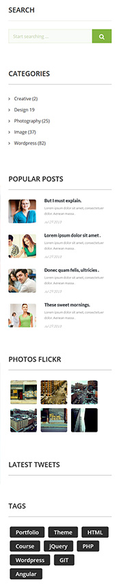
Blog Sidebar
Classes (widgets):
— ct-search-widget (class used for search bar)
— ct-widget-categories (class used for categories in blog)
— ct-widget-latestPosts (class used to show latests posts)
— widget-flickr (class used to show flickr)
— tagcloud (class used to show tags)
HTML markup
|
1 2 3 4 5 6 7 8 9 10 11 12 13 14 15 16 17 18 19 20 21 22 23 24 25 26 27 28 29 30 31 32 33 34 35 36 37 38 39 40 41 42 43 44 45 46 47 48 49 50 51 52 53 54 55 56 57 58 59 60 61 62 63 64 65 66 67 68 69 70 71 72 73 74 75 76 77 78 79 80 81 82 83 84 85 86 87 88 89 90 91 92 93 94 95 96 97 98 99 100 101 102 103 104 105 106 107 108 109 110 111 112 113 114 115 116 117 118 119 120 121 122 123 124 125 126 127 128 129 130 131 132 133 134 135 136 137 138 139 140 141 142 143 144 145 146 147 148 149 150 |
<div class="ct-sidebar"> <div class="row"> <div class="col-sm-6 col-md-12"> <section class="widget ct-search-widget ct-u-marginBottom100"> <div class="widget-inner"> <h4 class="text-uppercase ct-u-textNormal ct-fw-900">Search</h4> <div class="ct-divider ct-u-marginBoth30"></div> <div class="form-group"> <input id="search2" placeholder="Start searching ..." required type="text" name="field[]" class="form-control input-lg"> <button class="btn btn-primary"> <i class="fa fa-search"></i> </button> </div> </div> </section> </div> <div class="col-sm-6 col-md-12"> <section class="widget ct-widget-categories ct-u-marginBottom100"> <div class="widget-inner"> <h4 class="text-uppercase ct-u-textNormal ct-fw-900">Categories</h4> <div class="ct-divider--dark ct-u-marginBoth30"></div> <ul class="list-unstyled ct-fw-400"> <li><a href="#"><i class="fa fa-angle-right"></i>Creative (2)</a></li> <li><a href="#"><i class="fa fa-angle-right"></i>Design 19</a></li> <li><a href="#"><i class="fa fa-angle-right"></i>Photography (25)</a></li> <li><a href="#"><i class="fa fa-angle-right"></i>Image (37)</a></li> <li><a href="#"><i class="fa fa-angle-right"></i>Wordpress (82)</a></li> </ul> </div> </section> </div> <div class="col-sm-6 col-md-12"> <section class="widget ct-widget-latestPosts ct-u-marginBottom100"> <div class="widget-inner"> <h4 class="text-uppercase ct-u-textNormal ct-fw-900">Popular posts</h4> <div class="ct-divider--dark ct-u-marginBoth30"></div> <ul class="list-unstyled"> <li> <div class="widget-latest-posts-left"> <a href="blog-single.html"> <img src="assets/images/demo-content/popular-post1.jpg" alt=""> </a> </div> <div class="widget-latest-posts-content"> <a href="blog-single.html"> <h5 class="ct-fw-900">But I must explain.</h5> </a> <p class="ct-fw-400 ct-u-marginBottom10"> Lorem ipsum dolor sit amet, consectetuer dolor. Aenean massa . </p> <span class="ct-fw-300">Jul 29 2013</span> </div> </li> <li> <div class="widget-latest-posts-left"> <a href="blog-single.html"> <img src="assets/images/demo-content/popular-post2.jpg" alt=""> </a> </div> <div class="widget-latest-posts-content"> <a href="blog-single.html"> <h5 class="ct-fw-900">Lorem ipsum dolor sit amet .</h5> </a> <p class="ct-fw-400 ct-u-marginBottom10"> Lorem ipsum dolor sit amet, consectetuer dolor. Aenean massa . </p> <span class="ct-fw-300">Jul 29 2013</span> </div> </li> <li> <div class="widget-latest-posts-left"> <a href="blog-single.html"> <img src="assets/images/demo-content/popular-post3.jpg" alt=""> </a> </div> <div class="widget-latest-posts-content"> <a href="blog-single.html"> <h5 class="ct-fw-900">Donec quam felis, ultricies .</h5> </a> <p class="ct-fw-400 ct-u-marginBottom10"> Lorem ipsum dolor sit amet, consectetuer dolor. Aenean massa . </p> <span class="ct-fw-300">Jul 29 2013</span> </div> </li> <li> <div class="widget-latest-posts-left"> <a href="blog-single.html"> <img src="assets/images/demo-content/popular-post4.jpg" alt=""> </a> </div> <div class="widget-latest-posts-content"> <a href="blog-single.html"> <h5 class="ct-fw-900">These sweet mornings.</h5> </a> <p class="ct-fw-400 ct-u-marginBottom10"> Lorem ipsum dolor sit amet, consectetuer dolor. Aenean massa . </p> <span class="ct-fw-300">Jul 29 2013</span> </div> </li> </ul> </div> </section> </div> <div class="col-sm-6 col-md-12"> <section class="widget widget-flickr"> <div class="widget-inner"> <h4 class="text-uppercase ct-u-textNormal ct-fw-900">Photos Flickr</h4> <div class="ct-divider--dark ct-u-marginBoth30"></div> <div class="flickr_badge"> <script type="text/javascript" src="http://www.flickr.com/badge_code_v2.gne?count=6&display=latest&size=s&layout=x&source=user_set&set=72157612872346179"></script> </div> </div> </section> </div> <div class="col-sm-6 col-md-12"> <section class="widget widget-flickr ct-u-marginBoth100"> <div class="widget-inner"> <h4 class="text-uppercase ct-u-textNormal ct-fw-900">Latest Tweets</h4> <div class="ct-divider--dark ct-u-marginBoth30"></div> <div class="ct-twitter ct-js-twitter"></div> </div> </section> </div> <div class="col-sm-6 col-md-12"> <section class="widget"> <div class="widget-inner"> <h4 class="text-uppercase ct-u-textNormal ct-fw-900">Tags</h4> <div class="ct-divider--dark ct-u-marginBoth30"></div> <div class="tagcloud"> <a href="">Portfolio</a> <a href="">Theme</a> <a href="">HTML</a> <a href="">Course</a> <a href="">jQuery</a> <a href="">PHP</a> <a href="">Wordpress</a> <a href="">GIT</a> <a href="">Angular</a> </div> </div> </section> </div> </div> </div> |
Was this article helpful ?
Product box
This UAcademy has 2 versions of Product box
Default (no extra class needed)
Screenshoot

Product Box – Default version

HTML markup
|
1 2 3 4 5 6 7 8 9 10 11 12 13 14 15 16 17 18 19 20 21 22 23 24 25 26 27 |
<div class="ct-productBox"> <a href="#"> <div class="ct-productImage"> <img src="assets/images/demo-content/productBox-5.jpg" alt="Product"> </div> <div class="ct-productDescription"> <h5 class="ct-fw-600 ct-u-marginBottom10">Developing Mobile Apps</h5> <span>Lorem ipsum dolor sit amet, consectetuer adipiscing elit. Aenean .</span> </div> </a> <div class="ct-productMeta"> <div class="ct-u-displayTableVertical"> <div class="ct-u-displayTableCell"> <div class="starrr" data-rating="4"><i class="fa fa-star"></i><i class="fa fa-star"></i><i class="fa fa-star"></i><i class="fa fa-star"></i><i class="fa-star-o fa"></i></div> </div> <div class="ct-u-displayTableCell"> <span class="ct-u-colorMotive">190$</span> <span class="ct-u-textLineThrough">290$</span> </div> <a href="#"> <div class="ct-u-displayTableCell"> 15 <i class="fa fa-user"></i> </div> </a> </div> </div> </div> |
Inline (ct-productBox–inline)
This style will set the image to the left and content on the right side.
Screenshoot
Product Box – Inline version
HTML markup
|
1 2 3 4 5 6 7 8 9 10 11 12 13 14 15 16 17 18 19 20 21 22 23 24 25 26 27 28 29 30 31 32 33 34 35 36 |
<div class="ct-productBox ct-productBox--inline ct-u-displayTable ct-u-marginBottom30"> <div class="ct-u-displayTableCell"> <div class="ct-productImage"> <a href="course-single.html"> <img src="assets/images/demo-content/product-inline1.jpg" alt="Product"> </a> </div> </div> <div class="ct-u-displayTableCell"> <div class="ct-productDescription"> <h5 class="ct-fw-600 ct-u-marginBottom10">Developing Mobile Apps</h5> <span> Lorem ipsum dolor sit amet, consectetuer adipiscing But I mu explain to you how all this mistaken idea of denouncing pleas ure and praising pain was born and I will give you a complete elit. Aenean . </span> </div> <div class="ct-productMeta"> <div class="ct-u-displayTableVertical"> <div class="ct-u-displayTableCell"> <div class="starrr" data-rating="4"><i class="fa fa-star"></i><i class="fa fa-star"></i><i class="fa fa-star"></i><i class="fa fa-star"></i><i class="fa-star-o fa"></i></div> </div> <div class="ct-u-displayTableCell"> <span class="ct-u-colorMotive">190$</span> <span class="ct-u-textLineThrough">290$</span> </div> <div class="ct-u-displayTableCell"> <a href="#"> 15 <i class="fa fa-user"></i> </a> </div> </div> </div> </div> </div> |
Was this article helpful ?
Price Box
Screenshoot
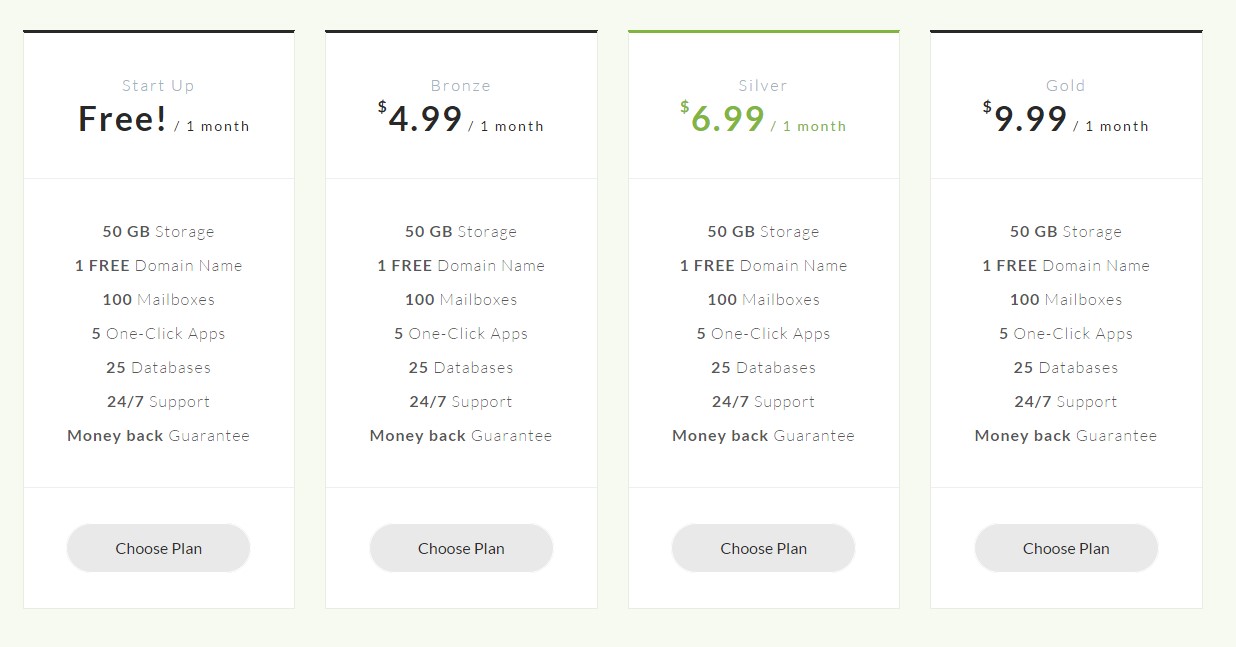
Pricing Box
HTML markup
|
1 2 3 4 5 6 7 8 9 10 11 12 13 14 15 16 17 18 19 20 21 |
<div class="ct-priceBox text-center"> <div class="ct-priceSection ct-priceBox-section"> <h5 class="ct-fw-300">Start Up</h5> <div class="ct-priceBox-fullPrice"> <span class="ct-main-price ct-fw-700">Free!</span> <span class="ct-month">/ 1 month</span> </div> </div> <div class="ct-contentSection ct-priceBox-section"> <span class="ct-fw-300"><span class="ct-fw-600">50 GB</span> Storage</span> <span class="ct-fw-300"><span class="ct-fw-600">1 FREE</span> Domain Name</span> <span class="ct-fw-300"><span class="ct-fw-600">100</span> Mailboxes</span> <span class="ct-fw-300"><span class="ct-fw-600">5</span> One-Click Apps</span> <span class="ct-fw-300"><span class="ct-fw-600">25</span> Databases</span> <span class="ct-fw-300"><span class="ct-fw-600">24/7</span> Support</span> <span class="ct-fw-300"><span class="ct-fw-600">Money back</span> Guarantee</span> </div> <div class="ct-priceBox-section"> <a href="#" class="btn btn-default text-capitalize">Choose Plan</a> </div> </div> |
Was this article helpful ?
Portfolio
Portfolio in UAcademy is using Isotope + Magnigic Popup
Screenshoot
Classes
.ct-gallery-filters (isotope navigation)
.ct-gallery
.ct-gallery–col1
.ct-gallery–col2
.ct-gallery–col3
.ct-gallery–col4
.ct-gallery–col5
HTML markup
|
1 2 3 4 5 6 7 8 9 10 11 12 13 14 15 16 17 18 19 20 21 22 23 24 25 26 27 28 29 30 31 32 33 34 35 36 37 38 39 40 41 42 43 44 45 46 47 48 49 50 51 52 53 54 55 56 57 58 59 60 61 62 63 64 65 66 67 68 69 70 71 72 73 74 75 76 77 78 79 80 81 82 83 84 85 86 87 88 89 90 91 92 93 94 95 96 97 98 99 100 101 102 103 104 105 106 107 108 109 110 111 112 113 114 115 116 117 118 119 120 121 122 123 124 125 126 127 128 129 130 131 132 133 134 135 136 137 138 139 140 141 142 143 144 145 146 147 148 149 150 151 152 153 154 155 156 157 158 159 160 161 162 163 164 165 166 167 168 169 170 171 172 173 174 175 176 177 178 179 180 181 182 183 184 185 186 187 188 189 190 191 192 193 194 195 196 197 198 |
<div id="ct-gallery" class="ct-gallery ct-gallery--rounded ct-gallery--arrowBottom row ct-js-magnificPortfolioPopupGroup"> <a class="ct-js-magnificPopupImage" href="assets/images/demo-content/header2.jpg" title="Our Gallery"> <div class="ct-gallery-item ct-u-marginBottom30 col-sm-4 wordpress"> <figure class="ct-u-relative "> <img src="assets/images/demo-content/gallery1.jpg" alt=""> <figcaption class="ct-u-colorWhite"> <div class="ct-u-displayTable ct-gallery-meta"> <div class="ct-u-displayTableCell text-left"> <h4>Project name</h4> <div class="text-left"> <span>Logo, </span> <span>Design</span> </div> </div> <div class="ct-u-displayTableCell text-right"> <i class="fa fa-heart"></i> </div> </div> </figcaption> </figure> </div> </a> <a class="ct-js-magnificPopupImage" href="assets/images/demo-content/header.jpg" title="Our Gallery"> <div class="ct-gallery-item ct-u-marginBottom30 col-sm-4 marketing"> <figure class="ct-u-relative "> <img src="assets/images/demo-content/gallery2.jpg" alt=""> <figcaption class="ct-u-colorWhite"> <div class="ct-u-displayTable ct-gallery-meta"> <div class="ct-u-displayTableCell text-left"> <h4>Project name</h4> <div class="text-left"> <span>Logo, </span> <span>Design</span> </div> </div> <div class="ct-u-displayTableCell text-right"> <i class="fa fa-heart"></i> </div> </div> </figcaption> </figure> </div> </a> <a class="ct-js-magnificPopupImage" href="assets/images/demo-content/header4.jpg" title="Our Gallery"> <div class="ct-gallery-item ct-u-marginBottom30 col-sm-4 graphic"> <figure class="ct-u-relative "> <img src="assets/images/demo-content/gallery3.jpg" alt=""> <figcaption class="ct-u-colorWhite"> <div class="ct-u-displayTable ct-gallery-meta"> <div class="ct-u-displayTableCell text-left"> <h4>Project name</h4> <div class="text-left"> <span>Logo, </span> <span>Design</span> </div> </div> <div class="ct-u-displayTableCell text-right"> <i class="fa fa-heart"></i> </div> </div> </figcaption> </figure> </div> </a> <a class="ct-js-magnificPopupImage" href="assets/images/demo-content/header5.jpg" title="Our Gallery"> <div class="ct-gallery-item ct-u-marginBottom30 col-sm-4 graphic"> <figure class="ct-u-relative "> <img src="assets/images/demo-content/gallery4.jpg" alt=""> <figcaption class="ct-u-colorWhite"> <div class="ct-u-displayTable ct-gallery-meta"> <div class="ct-u-displayTableCell text-left"> <h4>Project name</h4> <div class="text-left"> <span>Logo, </span> <span>Design</span> </div> </div> <div class="ct-u-displayTableCell text-right"> <i class="fa fa-heart"></i> </div> </div> </figcaption> </figure> </div> </a> <a class="ct-js-magnificPopupImage" href="assets/images/demo-content/header6.jpg" title="Our Gallery"> <div class="ct-gallery-item ct-u-marginBottom30 col-sm-4 web"> <figure class="ct-u-relative "> <img src="assets/images/demo-content/gallery5.jpg" alt=""> <figcaption class="ct-u-colorWhite"> <div class="ct-u-displayTable ct-gallery-meta"> <div class="ct-u-displayTableCell text-left"> <h4>Project name</h4> <div class="text-left"> <span>Logo, </span> <span>Design</span> </div> </div> <div class="ct-u-displayTableCell text-right"> <i class="fa fa-heart"></i> </div> </div> </figcaption> </figure> </div> </a> <a class="ct-js-magnificPopupImage" href="assets/images/demo-content/gallery1.jpg" title="Our Gallery"> <div class="ct-gallery-item ct-u-marginBottom30 col-sm-4 wordpress"> <figure class="ct-u-relative "> <img src="assets/images/demo-content/gallery6.jpg" alt=""> <figcaption class="ct-u-colorWhite"> <div class="ct-u-displayTable ct-gallery-meta"> <div class="ct-u-displayTableCell text-left"> <h4>Project name</h4> <div class="text-left"> <span>Logo, </span> <span>Design</span> </div> </div> <div class="ct-u-displayTableCell text-right"> <i class="fa fa-heart"></i> </div> </div> </figcaption> </figure> </div> </a> <a class="ct-js-magnificPopupImage" href="assets/images/demo-content/header7.jpg" title="Our Gallery"> <div class="ct-gallery-item ct-u-marginBottom30 col-sm-4 marketing"> <figure class="ct-u-relative "> <img src="assets/images/demo-content/gallery7.jpg" alt=""> <figcaption class="ct-u-colorWhite"> <div class="ct-u-displayTable ct-gallery-meta"> <div class="ct-u-displayTableCell text-left"> <h4>Project name</h4> <div class="text-left"> <span>Logo, </span> <span>Design</span> </div> </div> <div class="ct-u-displayTableCell text-right"> <i class="fa fa-heart"></i> </div> </div> </figcaption> </figure> </div> </a> <a class="ct-js-magnificPopupImage" href="assets/images/demo-content/gallery8.jpg" title="Our Gallery"> <div class="ct-gallery-item ct-u-marginBottom30 col-sm-4 web"> <figure class="ct-u-relative "> <img src="assets/images/demo-content/gallery8.jpg" alt=""> <figcaption class="ct-u-colorWhite"> <div class="ct-u-displayTable ct-gallery-meta"> <div class="ct-u-displayTableCell text-left"> <h4>Project name</h4> <div class="text-left"> <span>Logo, </span> <span>Design</span> </div> </div> <div class="ct-u-displayTableCell text-right"> <i class="fa fa-heart"></i> </div> </div> </figcaption> </figure> </div> </a> <a class="ct-js-magnificPopupImage" href="assets/images/demo-content/gallery9.jpg" title="Our Gallery"> <div class="ct-gallery-item ct-u-marginBottom30 col-sm-4 marketing"> <figure class="ct-u-relative "> <img src="assets/images/demo-content/gallery9.jpg" alt=""> <figcaption class="ct-u-colorWhite"> <div class="ct-u-displayTable ct-gallery-meta"> <div class="ct-u-displayTableCell text-left"> <h4>Project name</h4> <div class="text-left"> <span>Logo, </span> <span>Design</span> </div> </div> <div class="ct-u-displayTableCell text-right"> <i class="fa fa-heart"></i> </div> </div> </figcaption> </figure> </div> </a> </div> |
Was this article helpful ?
Person Box
This UAcademy has three versions of Person Box
Default
Screenshoot

Person Box – Default version
HTML markup
|
1 2 3 4 5 6 7 8 9 10 11 12 13 14 15 16 17 18 19 20 21 22 23 24 |
<div class="ct-personBox ct-u-marginBottom30"> <div class="ct-personMedia"> <div class="ct-personImage"> <a href="member-single.html"> <img src="assets/images/demo-content/member1.jpg" alt="person"> </a> </div> <div class="ct-personName"> <h4 class="ct-personName--title ct-fw-600"> Mohamed Said </h4> <span class="ct-personName--meta ct-u-colorMotive"> Web Designer </span> </div> </div> <div class="ct-personDescription"> <p> Ut enim ad minima veniam, quis nostrum exercitationem ullamcorpor suscipit laboriosam </p> </div> </div> |
Inline
Screenshoot

Person Box – Inline version
HTML markup
|
1 2 3 4 5 6 7 8 9 10 11 12 13 14 15 16 17 18 19 20 21 22 23 24 25 26 27 28 |
<div class="ct-personBox ct-personBox--inline"> <div class="ct-personMedia ct-u-displayTableVertical"> <div class="ct-u-displayTableCell"> <div class="ct-personImage"> <img src="assets/images/demo-content/personBoxImage1-circle.jpg" alt="person"> </div> </div> <div class="ct-u-displayTableCell"> <div class="ct-personName"> <span class="ct-personName--title ct-fw-700"> Mohamed Said </span> <span class="ct-personName--meta text-lowercase"> senior ui ux designer </span> </div> </div> </div> <div class="ct-personDescription"> <p> In just 2 years Victor has become one of the most successful instructors on the web. Victor's incred ble rising story has been covered on the Wall Stre et Journal, MIT Journal, Slate and the Sydney Mo rning Herald <a href="#">Moree..</a> </p> </div> </div> |
Inline Description
Screenshoot

Person Box – Inline Description version
HTML markup
|
1 2 3 4 5 6 7 8 9 10 11 12 13 14 15 16 17 18 19 20 21 22 23 24 25 26 27 28 29 30 31 32 33 34 35 36 37 |
<div class="ct-personBox ct-personBox--inline ct-personBox--inlineDescription"> <div class="container"> <div class="ct-personMedia ct-u-displayTableVertical"> <div class="ct-u-displayTableCell"> <div class="ct-personImage"> <img src="assets/images/demo-content/single-member.jpg" alt="person"> </div> </div> <div class="ct-u-displayTableCell"> <div class="ct-personName ct-u-marginBottom20"> <span class="ct-personName--title ct-fw-700 ct-u-marginBottom20"> Mohamed Said </span> <span class="ct-personName--meta ct-fw-600"> Web Designer </span> </div> <div class="ct-personDescription"> <p class="ct-fw-300"> Lorem ipsum dolor sit amet, consectetuer adipiscing elit. Aenean commodo ligula eget dolor. Aenean massa. Cum sociis et magnis dis parturient montes, nascetur ridiculus mus. Donec quam felis, ultricies nec, pellentesque eu, pretium quis massa quis enim. Donec pede justo, fringilla vel, aliquet nec, vulputate eget, arcu. In enim justo, rhoncus ut imperdiet a, venenatis vitae, justo. </p> </div> </div> <div class="ct-u-displayTableCell"> <ul class="ct-socials--singleMember list-unstyled"> <li><a href="http://www.createit.pl/"><i class="fa fa-wordpress"></i></a></li> <li><a href="#"><i class="fa fa-cloud"></i></a></li> <li><a href="https://twitter.com/createitpl"><i class="fa fa-twitter"></i></a></li> <li><a href="#"><i class="fa fa-google-plus"></i></a></li> </ul> </div> </div> </div> </div> |
Was this article helpful ?
Icon Box
UAcademy comes with several types of Icon Boxes:
Screenshots for button variations
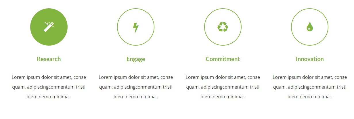
iconBox – Transparent version
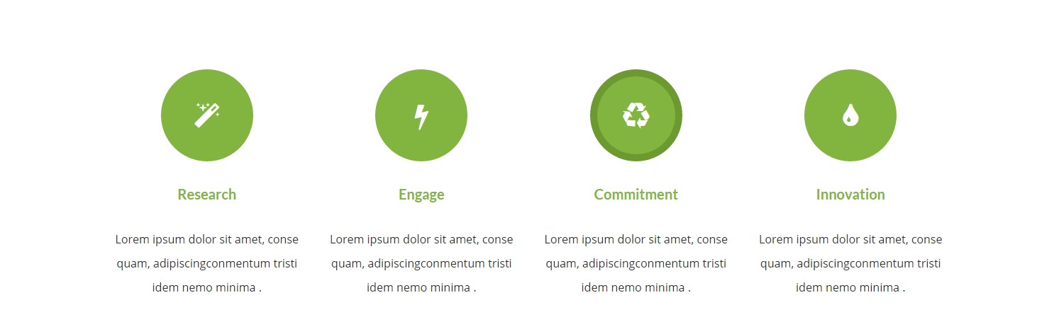
iconBox – Solid border version
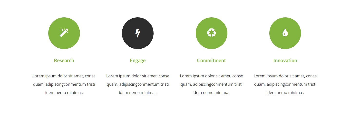
iconBox – Solid big version
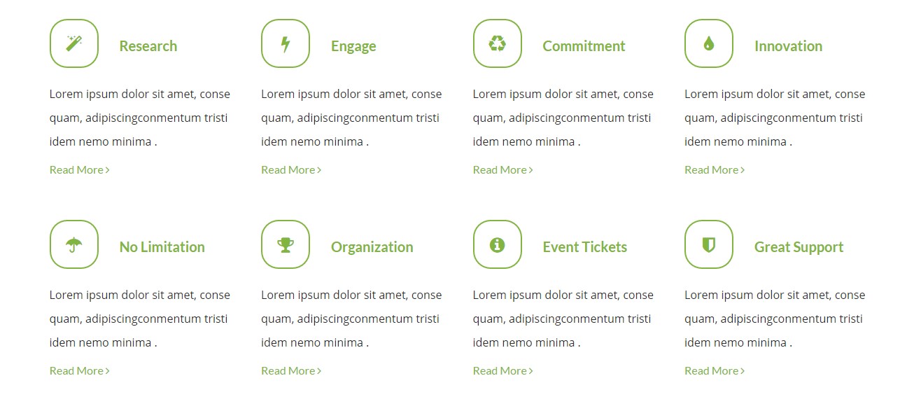
iconBox – Small transparent inline round version
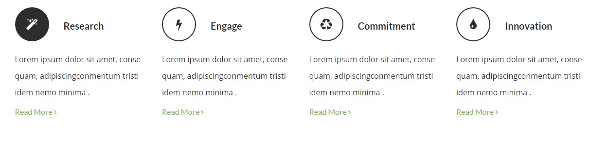
iconBox – Small transparent dark inline version
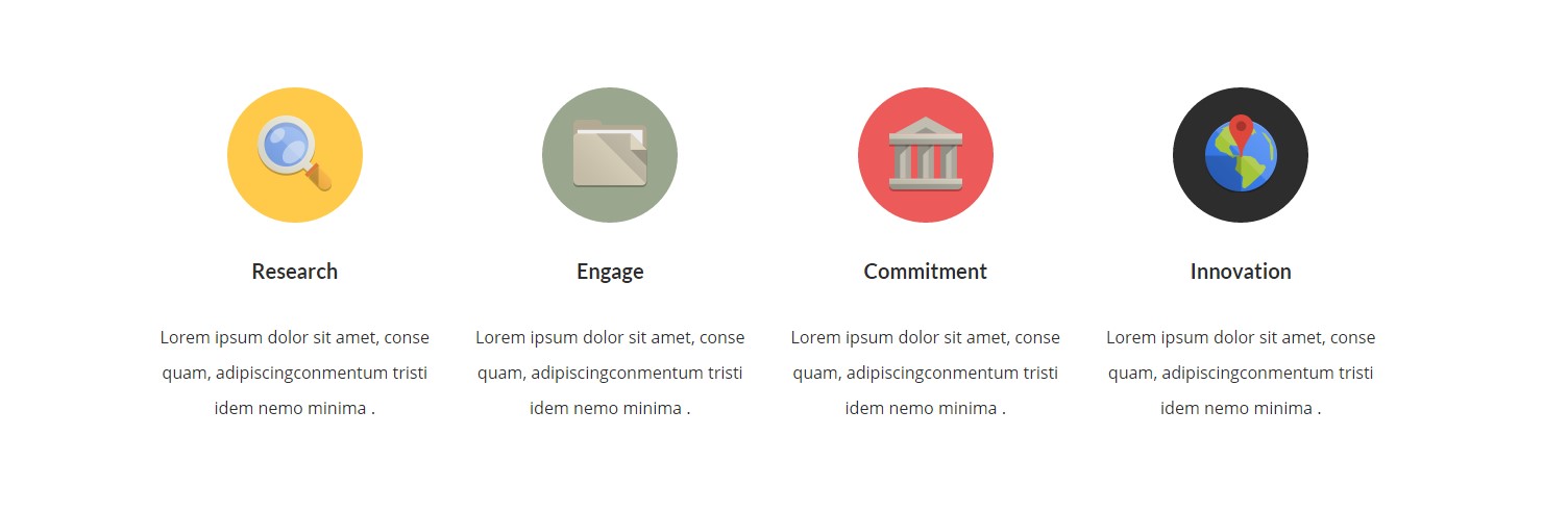
iconBox – Image version
Classes
— ct-iconBox (core class)
— ct-iconBox–small (define size of iconbox)
— ct-iconBox–Big (define size of iconbox)
— ct-iconBox–solidBorder (on hover border changed to dark green)
— ct-iconBox–solid (on hover background to black)
— ct-iconBox–solidBlue (different background, hover to black)
— ct-iconBox–solidYellow (different background, hover to black)
— ct-iconBox–solidRed (different background, hover to black)
— ct-iconBox–solidDark (different background, hover to black)
— ct-iconBox–withImageGreyScale (grayscale on hover)
— ct-iconBox–transparent (transparent background)
— ct-iconBox–inline (icon to the left, title to right)
Example of markup
|
1 2 3 4 5 6 7 8 9 10 11 12 |
<div class="ct-iconBox ct-iconBox--small ct-iconBox--transparent ct-iconBox--inline"> <div class="ct-icon"> <i class="fa fa-magic"></i> </div> <div class="ct-icon--description"> <h4 class="ct-fw-600 ct-u-colorMotive">Research</h4> <p class="ct-fw-400">Lorem ipsum dolor sit amet, conse quam, adipiscingconmentum tristi idem nemo minima .</p> <a href="course-single.html">Read More <i class="fa fa-angle-right"></i></a> </div> </div> |
Was this article helpful ?
Footer
Screenshot
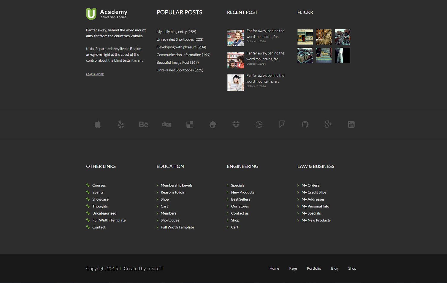
Footer
One type with different sections
— ct-prefooter
— ct-footer
HTML markup
|
1 2 3 4 5 6 7 8 9 10 11 12 13 14 15 16 17 18 19 20 21 22 23 24 25 26 27 28 29 30 31 32 33 34 35 36 37 38 39 40 41 42 43 44 45 46 47 48 49 50 51 52 53 54 55 56 57 58 59 60 61 62 63 64 65 66 67 68 69 70 71 72 73 74 75 76 77 78 79 80 81 82 83 84 85 86 87 88 89 90 91 92 93 94 95 96 97 98 99 100 101 102 103 104 105 106 107 108 109 110 111 112 113 114 115 116 117 118 119 120 121 122 123 124 125 126 127 128 129 130 131 132 133 134 135 136 137 138 139 140 141 142 143 144 145 146 147 148 149 150 151 152 153 154 155 156 157 158 159 160 161 162 163 164 165 166 167 168 169 170 171 172 173 174 175 176 177 178 179 180 181 182 183 184 185 186 187 188 189 190 191 192 193 194 195 196 197 198 199 200 201 202 203 204 205 206 207 208 209 210 211 212 213 214 215 216 217 218 219 220 221 222 223 224 225 226 227 228 229 230 231 232 233 234 235 236 237 238 239 |
<footer> <div class="ct-prefooter"> <div class="ct-u-paddingTop100 ct-u-paddingBottom80"> <div class="container"> <div class="row"> <div class="col-sm-6 col-md-3"> <div class="widget"> <div class="widget-inner"> <img class="ct-u-marginBottom30" src="assets/images/demo-content/logo-footer.png" alt="logo"> <p class="ct-u-marginBottom40"> Far far away, behind the word mount ains, far from the countries Vokalia <span class="ct-fw-300 center-block ct-u-marginTop30"> texts. Separated they live in Bookm arksgrove right at the coast of the control about the blind texts it is an . </span> </p> <a class="ct-u-textUnderline" href="">LEARN MORE</a> </div> </div> </div> <div class="col-sm-6 col-md-3"> <div class="widget"> <div class="widget-inner"> <h3 class="text-uppercase ct-fw-400 ct-u-marginBottom50">popular posts</h3> <ul class="list-unstyled"> <li><a class="ct-u-lineHeight33" href="blog.html">My daily blog entry (259)</a></li> <li><a class="ct-u-lineHeight33" href="blog.html">Unrevealed Shortcodes (223)</a></li> <li><a class="ct-u-lineHeight33" href="blog.html">Developing with pleasure (204)</a></li> <li><a class="ct-u-lineHeight33" href="blog.html">Communication information (199)</a></li> <li><a class="ct-u-lineHeight33" href="blog.html">Beautiful Image Post (167)</a></li> <li><a class="ct-u-lineHeight33" href="blog.html">Unrevealed Shortcodes (223)</a></li> </ul> </div> </div> </div> <div class="clearfix visible-sm"></div> <div class="col-sm-6 col-md-3"> <div class="widget widget-latestPosts"> <div class="widget-inner"> <h4 class="text-uppercase ct-fw-400 ct-u-marginBottom50">recent post</h4> <div class="media ct-u-displayTable ct-hoverImage--rectangle"> <a href="blog-single.html"> <div class="media-left"> <img class="media-object" src="assets/images/demo-content/recentPost-1.jpg" alt="recent post"> </div> <div class="media-body"> <p class="ct-fw-300 ct-u-lineHeight25 ct-textInHover"> Far far away, behind the word mountains, far. </p> <span class="center-block ct-u-colorWhiteLight">October 1,2014</span> </div> </a> </div> <div class="media ct-u-displayTable ct-hoverImage--rectangle"> <a href="blog-single.html"> <div class="media-left"> <img class="media-object" src="assets/images/demo-content/recentPost-2.jpg" alt="recent post"> </div> <div class="media-body"> <p class="ct-fw-300 ct-u-lineHeight25 ct-textInHover"> Far far away, behind the word mountains, far. </p> <span class="center-block ct-u-colorWhiteLight">October 1,2014</span> </div> </a> </div> <div class="media ct-u-displayTable ct-hoverImage--rectangle"> <a href="blog-single.html"> <div class="media-left"> <img class="media-object" src="assets/images/demo-content/recentPost-3.jpg" alt="recent post"> </div> <div class="media-body"> <p class="ct-fw-300 ct-u-lineHeight25 ct-textInHover"> Far far away, behind the word mountains, far. </p> <span class="center-block ct-u-colorWhiteLight">October 1,2014</span> </div> </a> </div> </div> </div> </div> <div class="col-sm-6 col-md-3"> <div class="widget widget-flickr "> <div class="widget-inner"> <h4 class="text-uppercase ct-fw-400 ct-u-marginBottom50">Flickr</h4> <div class="flickr_badge"> <script type="text/javascript" src="http://www.flickr.com/badge_code_v2.gne?count=6&display=latest&size=s&layout=x&source=user_set&set=72157612872346179"></script> </div> </div> </div> </div> <div class="clearfix visible-sm"></div> </div> </div> </div> <div class="widget widget-socialsFullWidth"> <div class="widget-inner"> <div class="container"> <div class="ct-slick ct-js-slick text-center" data-adaptiveHeight="true" data-animations="true" data-autoplay="true" data-infinite="false" data-autoplaySpeed="6000" data-draggable="true" data-touchMove="false" data-arrows="false" data-XSitems="4" data-SMitems="8" data-MDitems="12" data-LGitems="12" data-items="1"> <div class="item"> <a href="#"><i class="fa fa-apple"></i></a> </div> <div class="item"> <a href="#"><i class="fa fa-yelp"></i></a> </div> <div class="item"> <a href="#"><i class="fa fa-behance"></i></a> </div> <div class="item"> <a href="#"><i class="fa fa-digg"></i></a> </div> <div class="item"> <a href="#"><i class="fa fa-delicious"></i></a> </div> <div class="item"> <a href="#"><i class="fa fa-drupal"></i></a> </div> <div class="item"> <a href="#"><i class="fa fa-dropbox"></i></a> </div> <div class="item"> <a href="#"><i class="fa fa-dribbble"></i></a> </div> <div class="item"> <a href="#"><i class="fa fa-foursquare"></i></a> </div> <div class="item"> <a href="#"><i class="fa fa-github"></i></a> </div> <div class="item"> <a href="#"><i class="fa fa-google-plus"></i></a> </div> <div class="item"> <a href="#"><i class="fa fa-linkedin-square"></i></a> </div> </div> </div> </div> </div> <div class="ct-u-paddingBoth100"> <div class="container"> <div class="row"> <div class="col-sm-6 col-md-3"> <h4 class="text-uppercase ct-fw-400 ct-u-marginBottom50">Other links</h4> <div class="widget widget-links"> <div class="widget-inner"> <ul class="ct-list-hyperlink list-unstyled"> <li><a href="#">Courses</a></li> <li><a href="#">Events</a></li> <li><a href="#">Showcase</a></li> <li><a href="#">Thoughts</a></li> <li><a href="#">Uncategorized</a></li> <li><a href="#">Full Width Template</a></li> <li><a href="#">Contact</a></li> </ul> </div> </div> </div> <div class="col-sm-6 col-md-3"> <h4 class="text-uppercase ct-fw-400 ct-u-marginBottom50">Education</h4> <div class="widget widget-links"> <div class="widget-inner"> <ul class="ct-list-default list-unstyled"> <li><a href="#">Membership Levels</a></li> <li><a href="#">Reasons to join</a></li> <li><a href="#">Shop</a></li> <li><a href="#">Cart</a></li> <li><a href="#">Members</a></li> <li><a href="#">Shortcodes</a></li> <li><a href="#">Full Width Template</a></li> </ul> </div> </div> </div> <div class="clearfix visible-sm"></div> <div class="col-sm-6 col-md-3"> <h4 class="text-uppercase ct-fw-400 ct-u-marginBottom50">Engineering</h4> <div class="widget widget-links"> <div class="widget-inner"> <ul class="ct-list-default list-unstyled"> <li><a href="#">Specials</a></li> <li><a href="#">New Products</a></li> <li><a href="#">Best Sellers</a></li> <li><a href="#">Our Stores</a></li> <li><a href="#">Contact us</a></li> <li><a href="#">Shop</a></li> <li><a href="#">Cart</a></li> </ul> </div> </div> </div> <div class="col-sm-6 col-md-3"> <h4 class="text-uppercase ct-fw-400 ct-u-marginBottom50">Law & Business</h4> <div class="widget widget-links"> <div class="widget-inner"> <ul class="ct-list-default list-unstyled"> <li><a href="#">My Orders</a></li> <li><a href="#">My Credit Slips</a></li> <li><a href="#">My Addresses</a></li> <li><a href="#">My Personal Info</a></li> <li><a href="#">My Specials</a></li> <li><a href="#">My New Products</a></li> </ul> </div> </div> </div> <div class="clearfix visible-sm"></div> </div> </div> </div> </div> <div class="ct-footer"> <div class="container"> <div class="row"> <div class="col-md-6 col-md-push-6"> <ul class="list-unstyled list-inline text-right ct-fw-300 ct-navbar--footer"> <li><a href="index.html">Home</a></li> <li><a href="index.html">Page</a></li> <li><a href="index.html">Portfolio</a></li> <li><a href="blog.html">Blog</a></li> <li><a href="index.html">Shop</a></li> </ul> </div> <div class="col-md-6 col-md-pull-6"> <ul class="list-unstyled list-inline ct-copyright"> <li>Copyright 2015</li> <li>Created by <a href="http://www.createit.pl/">createIT</a></li> </ul> </div> </div> </div> </div> </footer> |
Was this article helpful ?
Forms
Template comes with ready to use:
- Contact Form
All needed files are in /form directory.
Remember to includeon page.
To configure form just edit form/config.php and change e-mails to your own :
|
1 2 |
$to = "mail@example.com"; $from = "mail@example.com"; |
That’s it!
Screenshot
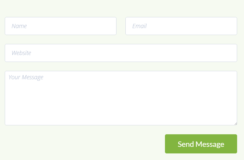
Markup
|
1 2 3 4 5 6 7 8 9 10 11 12 13 14 15 16 17 18 19 20 21 22 23 24 25 26 27 |
<form role="form" action="assets/form/send.php" method="POST" class="validateIt"> <div class="row"> <div class="col-sm-6"> <div class="form-group ct-u-marginBottom30"> <input id="contact_name" data-error-message="Name" placeholder="Name" type="text" required="" name="field[]" class="form-control ct-input--type1 input-hg" title="Name"> <label for="contact_name" class="sr-only"></label> </div> </div> <div class="col-sm-6"> <div class="form-group ct-u-marginBottom30"> <input id="contact_email" data-error-message="Email" placeholder="Email" required="" name="field[]" type="email" class="form-control ct-input--type1 input-hg h5-email" title="Email"> <label for="contact_email" class="sr-only"></label> </div> </div> </div> <div class="form-group ct-u-marginBottom30"> <input id="contact_phone" placeholder="Website" name="field[]" type="tel" class="form-control h5-phone ct-input--type1 input-hg" title="Phone"> <label for="contact_phone" class="sr-only"></label> </div> <div class="form-group ct-u-marginBottom30"> <textarea id="contact_message" data-error-message="Message is required" placeholder="Your Message" class="form-control ct-input--type1" rows="6" name="field[]" required="" title="Message"></textarea> <label for="contact_message" class="sr-only"></label> </div> <button type="submit" class="btn btn-primary btn-lg pull-right"><span>Send Message</span></button> <div class="clearfix"></div> </form> |
Options (can be changed in HTML) :
Mail Subject – just change value in :
Success Message – change successMessage div content
Error Message – change errorMessage div content
Common Problems
Where I can edit my contact form/newsletter email addres?
You can define where we should send messages from your contact form and newsletter in file HTML/assets/form/config.php
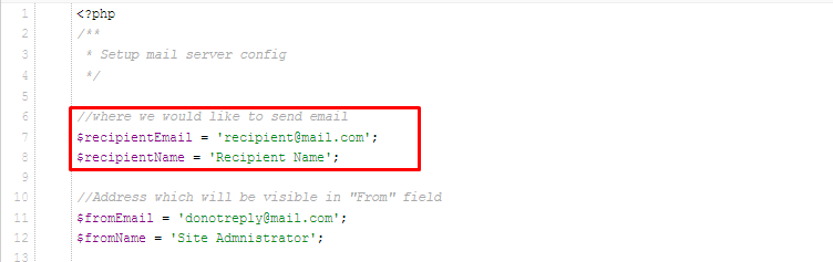
Form config
Add your email address instead of recipient@mail.com and it’s ready to use!
Was this article helpful ?
Google Map Plugin
Maps in UAcademy are created with our premium Map plugin. Here: link you will fin full plugins documentation.
Was this article helpful ?
Sources & Credits
The following sources and files have been used to build up this theme
- Twitter Bootstrap – http://twitter.github.com/bootstrap/
- jQuery – http://www.jquery.com
Was this article helpful ?