

HTML Structure
This theme is built upon bootstrap framework and is fully responsive. It adapts to window resolution and looks good on all devices including iPad and iPhone.
See for yourself (resize your browser).
If you would like to read more
about bootstrap framework click here :
Grid System and Single row structure
The default Bootstrap grid system utilizes 12 columns. It’s responsive grid and adapts to viewport. Below 767px viewports, the columns become fluid and stack vertically. The fluid grid system uses percents instead of pixels for column widths. Each row always include 12 columns (for example col-md-8 + col-md-4 = col-md-12).
Bootstrap documentation: here
Basic grid HTML:
|
1 2 3 4 5 6 7 8 9 10 11 12 13 14 15 16 17 18 19 20 21 22 23 24 25 26 27 |
<div class="row"> <div class="col-md-1">.col-md-1</div> <div class="col-md-1">.col-md-1</div> <div class="col-md-1">.col-md-1</div> <div class="col-md-1">.col-md-1</div> <div class="col-md-1">.col-md-1</div> <div class="col-md-1">.col-md-1</div> <div class="col-md-1">.col-md-1</div> <div class="col-md-1">.col-md-1</div> <div class="col-md-1">.col-md-1</div> <div class="col-md-1">.col-md-1</div> <div class="col-md-1">.col-md-1</div> <div class="col-md-1">.col-md-1</div> </div> <div class="row"> <div class="col-md-8">.col-md-8</div> <div class="col-md-4">.col-md-4</div> </div> <div class="row"> <div class="col-md-4">.col-md-4</div> <div class="col-md-4">.col-md-4</div> <div class="col-md-4">.col-md-4</div> </div> <div class="row"> <div class="col-md-6">.col-md-6</div> <div class="col-md-6">.col-md-6</div> </div> |
Page structure
Below you will find default page structure :
|
1 2 3 4 5 6 7 8 9 10 11 12 13 14 15 16 17 18 19 20 21 22 23 24 25 26 27 28 29 30 31 32 33 34 35 36 |
<!DOCTYPE html> <html> <head> [css] </head> <body> [header] [main menu] <!-- main container --> <div id="wrapper"> [component 1] <!-- fullwidth element --> </div> [fullwidth parallax] <div class="container"> <!-- / fullwidth element --> [component 6] </div> <!-- / main container --> [footer] [javascripts] </body> </html> |
Was this article helpful ?
CSS files and structure
If you would like to edit the color, font, or style of any elements, you would do the following:
|
1 |
#primaryContent a {color: #someColor;} |
If you find that your new style is not overriding, it is most likely because of a specificity problem. Scroll down in your CSS file and make sure that there isn’t a similar style that has more weight.
I.E.
|
1 |
#wrap #primaryContent a {color: #someColor;} |
So, to ensure that your new styles are applied, make sure that they carry enough “weight” and that there isn’t a style lower in the CSS file that is being applied after yours.
Colors
The theme includes a css file wich you can use to edit the colors.
You just need to add the corresponding CSS file to the head of the page like this:
|
1 2 3 4 5 |
<head> (..) <link rel="stylesheet" type="text/css" href="css/red.css"> (..) </head> |
Main Menu structure
Just change brand name, upload your logo to images/content/ folder and you’re ready to go!
|
1 2 3 4 5 6 7 8 9 10 11 12 13 14 15 16 17 18 19 20 21 22 23 24 25 26 27 28 29 30 |
<nav class="navbar ct-navbar--transparent ct-navbar--logoright" role="navigation"> <div class="container"> <!-- Brand and toggle get grouped for better mobile display --> <div class="navbar-header"> <a class="navbar-brand" href="index.html"><img src="./assets/images/logo.png" alt="Orlando Logo"> </a> </div> <!-- Collect the nav links, forms, and other content for toggling --> <div class="collapse navbar-collapse"> <ul class="nav navbar-nav ct-navbarNav--defaultActive ct-navbar--fadeIn yamm"> <li class="dropdown yamm-fw active"> <a href="index.html">Home <i class="fa fa-angle-double-down"></i></a> <ul class="dropdown-menu"> </ul> </div> <!-- /.navbar-collapse --> <div class="ct-navbar-search"> <form role="form"> <div class="form-group"> <input type="text" class="form-control" placeholder="Please type keywords..." required> </div> <button class="ct-navbar-search-button" type="submit"> <i class="fa fa-search fa-fw"></i> </button> </form> </div> </div> <!-- /.container --> </nav> |
In order to create mega menus read the documentation here:
Icons
We’ve included 360+ font icons.
Awesome Icons – http://fontawesome.io/icons/
HTML markup:
|
1 2 |
<!-- Awesome Icons --> <i class="fa fa-cog"></i> |
CSS Files & Structure
We’ve included 2 files.
bootstrap.css contains Bootstrap 3 Library.
style.css file contains general styles.
1. Font Awesome
2. Animate.css
3. Typography
4. Buttons
5. Menu
6. Forms
7. Hovers
8. Tables
9. Utilities
10. Media Sections – video/parallax/kenburns
11. Accordions
12. Progress Bar
13. Tabs
14. Mixins
15. Select2
16. Wrapper
17. Page Header
18. Footer
19. Socials Types
20. Counter
21. Blog
22. Blog Panel
23. Blog Comments
24. Pricing Boxes
25. Blockquote
26. Sliders
27. Google Maps
28. Widgets
29. Magnific Popup
30. After & before slider(twentytwenty)
31. Templates
Utilities
Utility classes are low-level structural and positional traits. Utilities can be applied directly to any element, multiple utilities can be used tohether and utilities can be used alongsie component classes.
Utilities are intended for frequently used CSS properties and patterns, like: floats, containing floats, vertical alignemnt, text tryncation. Relying on utilities can help to reduce repetition and provide consistend implementations.
- {Theme} uses utilities for the following categories:
- Typography
- Display Types
- Paddings
- Margins
- Line height
- Borders
- Colors
- Transform
- Section elements
Was this article helpful ?
Media Sections
{Theme} supports media sections with Parallax, KenBurns effect and videos.
Parallax Section
|
1 2 3 4 5 6 7 8 9 10 11 12 13 14 15 16 17 18 19 20 21 22 23 24 25 26 27 28 29 30 31 |
<section class="ct-mediaSection ct-u-paddingBoth70" data-stellar-background-ratio="0.3" data-height="650" data-type="parallax" data-bg-image="./assets/images/demo-content/bigImage1.jpg" data-bg-image-mobile="./assets/images/demo-content/bigImage1-mobile.jpg" style="min-height: 650px; height: 650px; background-image: url(http://orlando.html.themeforest.createit.pl/light/assets/images/demo-content/bigImage1.jpg); background-position: 50% 50%;"> <div class="ct-mediaSection-inner"> <div class="container"> <div class="row"> <div class="col-sm-4"> <header class="ct-pageSectionHeader"> <h3 class="text-lowercase ct-fw-600"> Parallax <small class="ct-fw-700 text-uppercase">Yes, we are the absolute best in the business </small> </h3> </header> </div> <div class="col-sm-8"> <p> Donec justo mauris, sagittis sed vulputate ut, commodo dapibus massa. Class aptent taciti sociosqu ad litora torquent per conubia nostra, per inceptos himenaeos. Cras ut mi lacus. Morbi accumsan mauris ac posuere vehicula. Donec bibendum tellus rutrum turpis varius dictum. Maecenas tristique arcu sed rhoncus laoreet. Praesent eget fermentum nisi. Donec ac velit aliquet, bibendum sem in, convallis est. Phasellus sodales ultricies cursus. Vivamus leo nunc, pretium vitae dictum a, mollis ut sapien. Cum sociis natoque penatibus et magnis dis parturient montes, nascetur ridiculus mus. Donec porttitor tristique sem, dictum vehicula nisi accumsan eget. Pellentesque habitant morbi tristique senectus et netus. </p> <a href="contact.html" class="btn btn-primary ct-btn--rounded text-uppercase">Contact Us</a> <a href="features-p-tables.html" class="btn ct-btn--black ct-btn--rounded text-uppercase">Pricing Options</a> </div> </div> </div> </div> </section> |
We are using stellar.js for the parallax effect. Check their documentation to check which attributes you can use in each parallax section.
http://markdalgleish.com/projects/stellar.js/docs/
Our custom data-attributes for the parallax section are:
- data-height: Define the minimun height for the sections
- data-type: Type of Media Section (parallax/kenburns/video)
- data-image: Background image for the section.
- data-image-mobile: Fallback image (Should be smaller than the original) that is loaded for small devices. This will help you with the bandwidth, you’re welcome! 🙂
Ken Burns Sections
|
1 2 3 4 5 6 7 8 9 10 11 12 13 14 15 16 17 18 19 20 21 22 23 24 25 26 27 28 29 30 31 32 33 34 35 36 37 |
<section class="ct-mediaSection ct-u-paddingBoth70 ct-u-colorWhite" data-height="650" data-type="kenburns" data-bg-image-mobile="./assets/images/demo-content/bigImage5-mobile.jpg" style="min-height: 650px; height: 650px;"> <div class="ct-mediaSection-kenburnsImageContainer"> <img src="./assets/images/demo-content/bigImage5.jpg" alt="demo image" class="fx"> <img src="./assets/images/demo-content/bigImage4.jpg" alt="demo image" class=""> <img src="./assets/images/demo-content/bigImage5.jpg" alt="demo image" class="fx"> </div> <div class="ct-mediaSection-inner"> <div class="container"> <div class="row"> <div class="col-sm-4"> <header class="ct-pageSectionHeader"> <h3 class="text-lowercase ct-fw-600 ct-u-colorWhite"> Ken Burns <small class="ct-fw-700 text-uppercase ct-u-colorWhite">Yes, we are the absolute best in the business </small> </h3> </header> </div> <div class="col-sm-8"> <p> Donec justo mauris, sagittis sed vulputate ut, commodo dapibus massa. Class aptent taciti sociosqu ad litora torquent per conubia nostra, per inceptos himenaeos. Cras ut mi lacus. Morbi accumsan mauris ac posuere vehicula. Donec bibendum tellus rutrum turpis varius dictum. Maecenas tristique arcu sed rhoncus laoreet. Praesent eget fermentum nisi. Donec ac velit aliquet, bibendum sem in, convallis est. Phasellus sodales ultricies cursus. Vivamus leo nunc, pretium vitae dictum a, mollis ut sapien. Cum sociis natoque penatibus et magnis dis parturient montes, nascetur ridiculus mus. Donec porttitor tristique sem, dictum vehicula nisi accumsan eget. Pellentesque habitant morbi tristique senectus et netus. </p> <a href="contact.html" class="btn btn-primary ct-btn--rounded text-uppercase">Contact Us</a> <a href="features-p-tables.html" class="btn btn-default ct-btn--rounded text-uppercase">Pricing Options</a> </div> </div> </div> </div> </section> |
KenBurns section supports one or more images that you should add inside .media-section-image-container
Our custom data-attributes for the kenburns section are:
- data-height: Define the minimun height for the sections
- data-type: Type of Media Section (parallax/kenburns/video)
- data-image-mobile: Fallback image (Should be smaller than the original) that is loaded for small devices. Kenburns it too much for ipads, iphones and so on, so we allow you to fallback to a normal image section. This way your browser won’t crash 🙂
Video Sections
|
1 2 3 4 5 6 7 8 9 10 11 12 13 14 15 16 17 18 19 20 21 22 23 24 25 26 27 28 29 30 31 32 33 34 35 36 37 38 39 40 41 42 43 44 |
<section class="ct-mediaSection ct-u-paddingBoth70 ct-u-colorWhite" data-height="700" data-type="video" data-bg-image-mobile="./assets/images/demo-content/bigImage3-mobile.jpg" style="min-height: 700px; height: 700px;"> <div class="ct-mediaSection-video embed-responsive embed-responsive-16by9"> <!-- in order for video to be muted you must add &api=1&player_id=vimeoplayer1 to the end of the video src If you have more than one video, make sure that player_id and id have dif names on each video --> <video id="video1" muted="" loop="" autoplay="autoplay" preload="auto"> <source src="http://orlando.html.themeforest.createit.pl/light/assets/videos/loopbookeh.mp4" type="video/mp4"> <source src="http://orlando.html.themeforest.createit.pl/light/assets/videos/loopbookeh.webm" type="video/webm"> </video> </div> <div class="ct-u-displayTable" style="height: 700px;"> <div class="ct-mediaSection-inner"> <div class="container"> <div class="row"> <div class="col-sm-4"> <header class="ct-pageSectionHeader"> <h3 class="text-lowercase ct-fw-600 ct-u-colorWhite"> Video <small class="ct-fw-700 text-uppercase ct-u-colorWhite">Yes, we are the absolute best in the business </small> </h3> </header> </div> <div class="col-sm-8"> <p> Donec justo mauris, sagittis sed vulputate ut, commodo dapibus massa. Class aptent taciti sociosqu ad litora torquent per conubia nostra, per inceptos himenaeos. Cras ut mi lacus. Morbi accumsan mauris ac posuere vehicula. Donec bibendum tellus rutrum turpis varius dictum. Maecenas tristique arcu sed rhoncus laoreet. Praesent eget fermentum nisi. Donec ac velit aliquet, bibendum sem in, convallis est. Phasellus sodales ultricies cursus. Vivamus leo nunc, pretium vitae dictum a, mollis ut sapien. Cum sociis natoque penatibus et magnis dis parturient montes, nascetur ridiculus mus. Donec porttitor tristique sem, dictum vehicula nisi accumsan eget. Pellentesque habitant morbi tristique senectus et netus. </p> <a href="contact.html" class="btn btn-primary ct-btn--rounded text-uppercase">Contact Us</a> <a href="features-p-tables.html" class="btn btn-default ct-btn--rounded text-uppercase">Pricing Options</a> </div> </div> </div> </div> </div> </section> |
We recommend you to use html5 video instead of vimeo, since in some specific browsers the sound won’t be muted.
Our custom data-attributes for the video section are:
- data-height: Define the minimun height for the sections
- data-type: Type of Media Section (parallax/kenburns/video)
- data-image-mobile: Fallback image (Should be smaller than the original) that is loaded for small devices. Phones don’t autoplay video, so we just replace it for an image
Was this article helpful ?
Magnific popup
{Theme} comes with Magnific popup gallery.
Magnific Popup
To use ajax gallery with Magnific popup, please use the following HTML markup:
|
1 2 3 4 5 6 7 8 9 10 11 12 13 14 15 16 17 18 19 20 21 22 |
<div class="row ct-gallery"> <div class="col-sm-6 col-md-4 ct-u-paddingBottom50 ct-js-magnificPortfolioPopupGroup"> <a href="galleryajax.html" title="Tailoring a men's shirt"> <figure class="ct-hover ct-hover-type5"> <img src="../assets/images/tailor/demo-content/examples-1.jpg" alt=""> <figcaption> <h2>We make it with passion.</h2> </figcaption> </figure> </a> </div> <div class="col-sm-6 col-md-4 ct-u-paddingBottom50 ct-js-magnificPortfolioPopupGroup"> <a href="galleryajax2.html" title="Tailoring a men's shirt"> <figure class="ct-hover ct-hover-type5"> <img src="../assets/images/tailor/demo-content/examples-4.jpg" alt=""> <figcaption> <h2>We make it with passion.</h2> </figcaption> </figure> </a> </div> </div> |
You can use one 15 hover types:
Check hovers demo here.
You can change hover effects with the following CSS classes:
- .ct-hover-type1,
- .ct-hover-type2,
- .ct-hover-type3,
- .ct-hover-type4,
- .ct-hover-type5,
- .ct-hover-type6,
- .ct-hover-type7,
- .ct-hover-type8,
- .ct-hover-type9,
- .ct-hover-type10,
- .ct-hover-type11,
- .ct-hover-type12,
- .ct-hover-type13,
- .ct-hover-type14,
- .ct-hover-type15
Was this article helpful ?
Animations
You can load your HTML conent with awesome animations enabled on scroll.
To animate your HTML element, use the markup below:
|
1 2 3 4 |
<header class="ct-pageSectionHeader text-center ct-js-animationDynamic"> <h2 class="ct-js-animation--item" data-when="span" data-from="0.5" data-to="0" data-opacity="0" data-translatey="-50">Let's</h2> <h3 class="ct-u-text--white ct-js-animation--item ct-u-hdr3" data-when="span" data-from="0.5" data-to="0" data-opacity="0" data-translatey="50">GET IN TOUCH</h3> </header> |
You can adjust animations with the following data-attributes:
- data-when
- data-from
- data-to
- data-easing
- data-crop
- data-opacity
- data-scale
- data-scalex
- data-scaley
- data-scalez
- data-rotatex
- data-rotatey
- data-rotatez
- data-translatex
- data-translatey
- data-translatez
And CSS classes:
- .ct-js-animationDynamic,
- .ct-js-animation–item
Here you will find full plugin documentation.
Was this article helpful ?
Section buttons
There are 7 types of section buttons – each for every template style, but feel free to use them wherever you want.
To add button, use the following HTML markup:
|
1 2 3 4 5 6 7 8 9 10 11 |
<div class="ct-header-arrow--circleD"> <div class="ct-arrow--outer"> <a class="ct-js-btnScroll" href="#about"> <div class="ct-arrow--inner"> <div class="ct-arrow--icon"> <div class="ct-arrow"></div> </div> </div> </a> </div> </div> |
and CSS classes:
- .ct-header-arrow–circle,
- .ct-header-arrow–circleD,
- .ct-header-arrow–circleDecoration,
- .ct-header-arrow–circleDecoration2,
- .ct-header-arrow–circleDecoration3,
- .ct-header-arrow–triangle,
- .ct-header-arrow–shape
Was this article helpful ?
Decorations types
In {Theme} you can use one of 7 decoration types. Every styles has it’s own rotate variation.
Use the following HTML markup:
|
1 2 |
<section class="ct-mediaSection ct-decoration--type1 ct-u-paddingBoth80 ct-glyph--text scroll" <section class="ct-mediaSection ct-u-paddingBoth80 ct-decoration--type1-rotate scroll" id="prices"> |
And choose your type with CSS classes:
- .ct-decoration–type1,
- .ct-decoration–type1-rotate,
- .ct-decoration–type2,
- .ct-decoration–type2-rotate,
- .ct-decoration–type3,
- .ct-decoration–type3-rotate,
- .ct-decoration–type4,
- .ct-decoration–type4-rotate,
- .ct-decoration–type5,
- .ct-decoration–type5-rotate,
- .ct-decoration–type6,
- .ct-decoration–type6-rotate,
- .ct-decoration–type7,
- .ct-decoration–type7-rotate
Was this article helpful ?
Socials
You can choose from 3 types of Socials:
- -rounded
- -square
- -square with rounded border
Use the following HTML markup to add socials:
|
1 2 3 4 5 6 7 |
<div class="ct-item--contact ct-socials--contact"> <span class="ct-header--contact">Follow me</span> <a href="index.html" class="ct-socials--circle"><i class="fa fa-facebook"></i></a> <a href="index.html" class="ct-socials--circle"><i class="fa fa-twitter"></i></a> <a href="index.html" class="ct-socials--circle"><i class="fa fa-google-plus"></i></a> <a href="index.html" class="ct-socials--circle"><i class="fa fa-pinterest"></i></a> </div> |
And adjust it with CSS classes:
- .ct-socials–circle,
- .ct-socials–square,
- .ct-socials–square-rounded
Was this article helpful ?
Dividers
{Theme} comes with 7 types of dividers. We designed one for each template style, but feel free to use theme wherever you want.
To add Divider use the following HTML markup:
|
1 2 3 4 5 6 7 8 9 10 11 |
<div class="row"> <div class="ct-header-text col-md-12 text-center ct-js-animationDynamic"> <h1 class="ct-js-animation--item" data-when="span" data-from="0" data-to="0.5" data-opacity="0" data-translatey="-100">Hello<br><span class="ct-u-hdr2 ct-js-animation--item">I'M ELLEN HOLGATE<br>& I SEW STUFF</span></h1> <div class="ct-divider ct-divider--type1 ct-js-animation--item" data-when="span" data-from="0" data-to="0.5" data-opacity="0" data-translatey="100"> <div class="ct-line ct-line--left"></div> <i class="icon-button"></i> <div class="ct-line ct-line--right"></div> </div> <a href="#prices" class="btn btn-default ct-js-btnScroll btn--radius ct-js-animation--item" data-when="span" data-from="0" data-to="0.5" data-opacity="0" data-translatey="100">SEE WHAT I CAN OFFER YOU</a> </div> </div> |
You can adjust divider style with the following CSS classes:
- .ct-divider–type1,
- .ct-divider–type2,
- .ct-divider–type3,
- .ct-divider–type4,
- .ct-divider–type5,
- .ct-divider–type6,
- .ct-divider–type7
Was this article helpful ?
Javascript
All javascripts are placed in folder /js. In main.js file we implement all functions calls.
This theme uses following Javascript scripts:
- Bootstrap
- jQuery
- counter(jquery.countTo.js)
- ct-mediaSections(with stellar.js)
- flexslider
- gmaps API
- isotope (http://isotope.metafizzy.co/)
- magnific-popup (http://dimsemenov.com/plugins/magnific-popup/)
- scrollme(jquery.scrollme.js)
- select2.js http://ivaynberg.github.io/select2/
- stacktable.js (http://johnpolacek.github.io/stacktable.js/)
- before & after slider(jquery.twentytwenty.js)
- device.js
- jquery.appear.js
- jquery.pagescroller.lite.js
- smoothscroll.js
- snap.js
- animate.css
jquery.appear
This plugin call function when element appear in viewport. This is used in custom animation, progress bars, counter timer.
Documentation: https://github.com/bas2k/jquery.appear/
|
1 2 3 4 5 6 7 8 9 10 11 12 13 |
if (jQuery().appear) { if (device.mobile()) { // disable animation on mobile jQuery("body").removeClass("withAnimation"); } else { jQuery('.withAnimation .animated').appear(function () { jQuery(this).each(function () { jQuery(this).addClass('activate'); jQuery(this).addClass($(this).data('fx')); }); }, {accY: -150}); } } |
Was this article helpful ?
Flexslider
Flexslider
Content / Images Slider.
Flexslider
Each parameter can be defined as data attribute :
- data-namespace
- data-selector
- data-animation
- data-easing
- data-direction
- data-reverse
- data-animationloop
- data-smoothheight
- data-startat
- data-slideshow
- data-slideshowspeed
- data-animationspeed
- data-initdelay
- data-randomize
- data-thumbcaptions
- data-pauseonaction
- data-pauseonhover
- data-pauseinvisible
- data-usecss
- data-touch
- data-video
- data-controlnav
- data-directionnav
- data-prevtext
- data-nexttext
- data-keyboard
- data-multiplekeyboard
- data-mousewheel
- data-pauseplay
- data-pausetext
- data-playtext
- data-itemwidth
- data-itemmargin
- data-minitems
- data-maxitems
- data-move
- data-allowoneslide
- data-controlscontainer
- data-manualcontrols
- data-sync
- data-asnavfor
Read the documentation here:
|
1 2 3 |
div class="flexslider" data-animation="slide" data-height="100" data-loop="true" data-smooth="true" data-slideshow="true" data-speed="15000" data-animspeed="550" data-controls="true" data-dircontrols="true" data-controlscontainer=".controls"> (...) </div> |
|
1 2 3 4 5 6 7 8 9 10 11 12 13 14 15 16 17 18 19 20 21 22 23 24 25 26 27 28 29 30 31 32 33 34 35 36 37 38 39 40 41 42 43 44 45 46 47 48 49 50 51 52 53 54 55 56 57 58 59 60 61 62 63 64 65 66 67 68 69 70 71 72 73 74 75 76 77 78 79 80 81 82 83 84 85 86 87 88 89 90 91 92 93 94 95 96 97 98 99 100 101 102 103 104 105 106 107 108 109 110 111 112 113 114 115 116 117 118 119 120 121 122 123 |
/* ==================== */ /* ==== FLEXSLIDER ==== */ if(jQuery().flexslider){ if (jQuery(".flexslider").length > 0) { jQuery(".flexslider").each(function(){ $this=jQuery(this); var ctnamespace = validatedata($this.attr("data-namespace"),"flex-"); var ctselector = validatedata($this.attr("data-selector"),".slides > li"); var ctanimation = validatedata($this.attr("data-animation"),"slide"); var cteasing = validatedata($this.attr("data-easing"),"swing"); var ctdirection = validatedata($this.attr("data-direction"),"horizontal"); var ctreverse = parseBoolean($this.attr("data-reverse"), false); var ctanimationloop = parseBoolean($this.attr("data-animationloop"), false); var ctsmoothheight = parseBoolean($this.attr("data-smoothheight"), false); var ctstartat = parseInt(validatedata($this.attr("data-startat"), 0)); var ctslideshow = parseBoolean($this.attr("data-slideshow"), true); var ctslideshowspeed = parseInt(validatedata($this.attr("data-slideshowspeed"), 7000)); var ctanimationspeed = parseInt(validatedata($this.attr("data-animationspeed"), 600)); var ctinitdelay= parseInt(validatedata($this.attr("data-initdelay"), 0)); var ctrandomize = parseBoolean($this.attr("data-randomize"), false); var ctthumbcaptions = parseBoolean($this.attr("data-thumbcaptions"), false); var ctpauseonaction= parseBoolean($this.attr("data-pauseonaction"), true); var ctpauseonhover = parseBoolean($this.attr("data-pauseonhover"), false); var ctpauseinvisible= parseBoolean($this.attr("data-pauseinvisible"), true); var ctusecss= parseBoolean($this.attr("data-usecss"), true); var cttouch= parseBoolean($this.attr("data-touch"), true); if(device.mobile()){ cttouch = false; } var ctvideo = parseBoolean($this.attr("data-video"), false); var ctcontrolnav= parseBoolean($this.attr("data-controlnav"), true); if(ctcontrolnav == false){ $this.addClass("no-margin"); } var ctdirectionnav= parseBoolean($this.attr("data-directionnav"), false); var ctprevtext = validatedata($this.attr("data-prevtext"),"Previous"); var ctnexttext = validatedata($this.attr("data-nexttext"),"Next"); var ctkeyboard= validatedata(parseBoolean($this.attr("data-keyboard")), true); var ctmultiplekeyboard= parseBoolean($this.attr("data-multiplekeyboard"), false); var ctmousewheel= parseBoolean($this.attr("data-mousewheel"), false); var ctpauseplay= parseBoolean($this.attr("data-pauseplay"), false); var ctpausetext = validatedata($this.attr("data-pausetext"),"Pause"); var ctplaytext = validatedata($this.attr("data-playtext"),"Play"); var ctitemwidth= parseInt(validatedata($this.attr("data-itemwidth"), 0)); var ctitemmargin= parseInt(validatedata($this.attr("data-itemmargin"), 0)); var ctminitems= parseInt(validatedata($this.attr("data-minitems"), 0)); var ctmaxitems= parseInt(validatedata($this.attr("data-maxitems"), 0)); var ctmove= parseInt(validatedata($this.attr("data-move"), 0)); var ctallowoneslide= parseBoolean($this.attr("data-allowoneslide"), false); var ctcontrolscontainer= validatedata($this.attr("data-controlscontainer"), ""); var ctmanualcontrols= validatedata($this.attr("data-manualcontrols"), ""); var ctsync = validatedata($this.attr("data-sync"), ""); var ctasnavfor = validatedata($this.attr("data-asnavfor"), ""); $this.flexslider({ namespace: ctnamespace, //{NEW} String: Prefix string attached to the class of every element generated by the plugin selector: ctselector, //{NEW} Selector: Must match a simple pattern. "{container} > {slide}" -- Ignore pattern at your own peril animation: ctanimation, //String: Select your animation type, "fade" or "slide" easing: cteasing , //{NEW} String: Determines the easing method used in jQuery transitions. jQuery easing plugin is supported! direction: ctdirection, //String: Select the sliding direction, "horizontal" or "vertical" reverse: ctreverse, //{NEW} Boolean: Reverse the animation direction animationLoop: ctanimationloop, //Boolean: Should the animation loop? If false, directionNav will received "disable" classes at either end smoothHeight: ctsmoothheight, //{NEW} Boolean: Allow height of the slider to animate smoothly in horizontal mode startAt: ctstartat, //Integer: The slide that the slider should start on. Array notation (0 = first slide) slideshow: ctslideshow, //Boolean: Animate slider automatically slideshowSpeed: ctslideshowspeed, //Integer: Set the speed of the slideshow cycling, in milliseconds animationSpeed: ctanimationspeed, //Integer: Set the speed of animations, in milliseconds initDelay: ctinitdelay, //{NEW} Integer: Set an initialization delay, in milliseconds randomize: ctrandomize, //Boolean: Randomize slide order thumbCaptions: ctthumbcaptions, //Boolean: Whether or not to put captions on thumbnails when using the "thumbnails" controlNav. // Usability features pauseOnAction: ctpauseonaction, //Boolean: Pause the slideshow when interacting with control elements, highly recommended. pauseOnHover: ctpauseonhover, //Boolean: Pause the slideshow when hovering over slider, then resume when no longer hovering pauseInvisible: ctpauseinvisible, //{NEW} Boolean: Pause the slideshow when tab is invisible, resume when visible. Provides better UX, lower CPU usage. useCSS: ctusecss, //{NEW} Boolean: Slider will use CSS3 transitions if available touch: cttouch, //{NEW} Boolean: Allow touch swipe navigation of the slider on touch-enabled devices video: ctvideo, //{NEW} Boolean: If using video in the slider, will prevent CSS3 3D Transforms to avoid graphical glitches // Primary Controls controlNav: ctcontrolnav, //Boolean: Create navigation for paging control of each clide? Note: Leave true for manualControls usage directionNav: ctdirectionnav, //Boolean: Create navigation for previous/next navigation? (true/false) prevText: ctprevtext, //String: Set the text for the "previous" directionNav item nextText: ctnexttext, //String: Set the text for the "next" directionNav item // Secondary Navigation keyboard: ctkeyboard, //Boolean: Allow slider navigating via keyboard left/right keys multipleKeyboard: ctmultiplekeyboard, //{NEW} Boolean: Allow keyboard navigation to affect multiple sliders. Default behavior cuts out keyboard navigation with more than one slider present. mousewheel: ctmousewheel, //{UPDATED} Boolean: Requires jquery.mousewheel.js (https://github.com/brandonaaron/jquery-mousewheel) - Allows slider navigating via mousewheel pausePlay: ctpauseplay, //Boolean: Create pause/play dynamic element pauseText: ctpausetext, //String: Set the text for the "pause" pausePlay item playText: ctplaytext, //String: Set the text for the "play" pausePlay item // Special properties controlsContainer: ctcontrolscontainer, //{UPDATED} jQuery Object/Selector: Declare which container the navigation elements should be appended too. Default container is the FlexSlider element. Example use would be $(".flexslider-container"). Property is ignored if given element is not found. manualControls: ctmanualcontrols, //{UPDATED} jQuery Object/Selector: Declare custom control navigation. Examples would be $(".flex-control-nav li") or "#tabs-nav li img", etc. The number of elements in your controlNav should match the number of slides/tabs. sync: ctsync, //{NEW} Selector: Mirror the actions performed on this slider with another slider. Use with care. asNavFor: ctasnavfor, //{NEW} Selector: Internal property exposed for turning the slider into a thumbnail navigation for another slider // Carousel Options itemWidth: ctitemwidth, //{NEW} Integer: Box-model width of individual carousel items, including horizontal borders and padding. itemMargin: ctitemmargin, //{NEW} Integer: Margin between carousel items. minItems: ctminitems, //{NEW} Integer: Minimum number of carousel items that should be visible. Items will resize fluidly when below this. maxItems: ctmaxitems, //{NEW} Integer: Maxmimum number of carousel items that should be visible. Items will resize fluidly when above this limit. move: ctmove, //{NEW} Integer: Number of carousel items that should move on animation. If 0, slider will move all visible items. allowOneSlide: ctallowoneslide //{NEW} Boolean: Whether or not to allow a slider comprised of a single slide }) }) } |
Was this article helpful ?
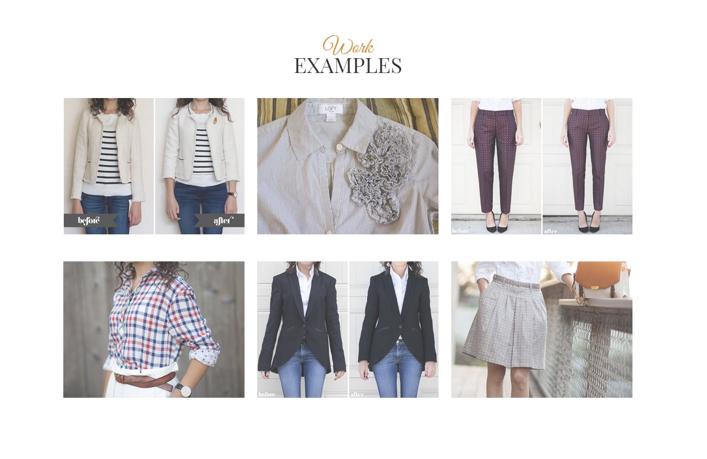
Before & After slider
You can use Before & After slider with magnific popup(Ajax).
HTML markup:
|
1 2 3 4 |
<div class="ct-slider-afterANDbefore center-block"> <img src="../assets/images/tailor/demo-content/sample-before.jpg"> <img src="../assets/images/tailor/demo-content/sample-after.jpg"> </div> |
CSS class:
- .ct-slider-afterANDbefore
Javascripts:
|
1 2 3 |
$(window).load(function(){ $(".ct-slider-afterANDbefore").twentytwenty(); }); |
Options:
- default_offset_pct: 0.7, // How much of the before image is visible when the page loads
- orientation: ‘vertical’ // Orientation of the before and after images (‘horizontal’ or ‘vertical’)
Was this article helpful ?
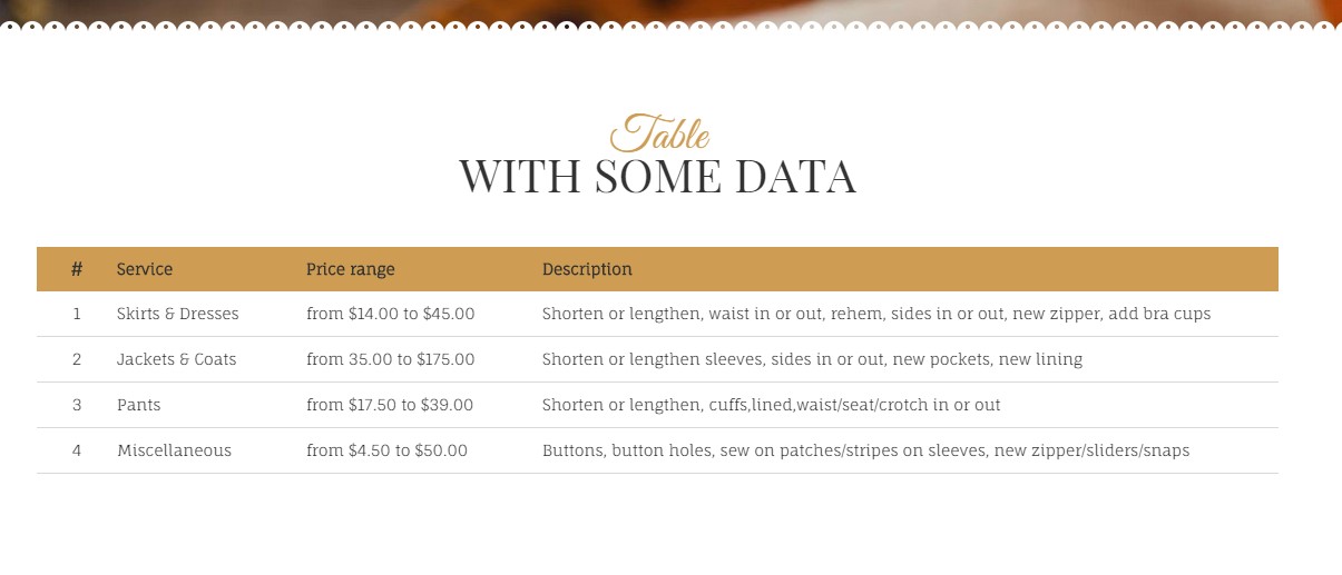
Responsive tables
In {Theme} we used responsive tables from http://johnpolacek.github.io/stacktable.js/
Responsive Tables
HTML markup:
|
1 2 3 4 5 6 7 8 9 10 11 12 13 14 15 16 17 18 19 20 21 22 23 24 25 26 27 28 29 30 31 32 |
<table class="ct-js-table-stack"> <tr> <th class="ct-u-paddingBoth10 text-center">#</th> <th class="ct-u-paddingBoth10">Service</th> <th class="ct-u-paddingBoth10">Price range</th> <th class="ct-u-paddingBoth10">Description</th> </tr> <tr> <td class="text-center">1</td> <td>Skirts & Dresses</td> <td>from $14.00 to $45.00</td> <td>Shorten or lengthen, waist in or out, rehem, sides in or out, new zipper, add bra cups</td> </tr> <tr> <td class="text-center">2</td> <td>Jackets & Coats</td> <td>from 35.00 to $175.00</td> <td>Shorten or lengthen sleeves, sides in or out, new pockets, new lining</td> </tr> <tr> <td class="text-center">3</td> <td>Pants</td> <td>from $17.50 to $39.00</td> <td>Shorten or lengthen, cuffs,lined,waist/seat/crotch in or out </td> </tr> <tr> <td class="text-center">4</td> <td>Miscellaneous</td> <td>from $4.50 to $50.00</td> <td>Buttons, button holes, sew on patches/stripes on sleeves, new zipper/sliders/snaps</td> </tr> </table> |
CSS classes:
- .ct-js-table-stack
Javascripts:
|
1 2 3 4 5 6 7 |
(function ($) { "use strict"; $(document).ready(function () { $('.ct-js-table-stack').stacktable(); }) }(jQuery)); |
Was this article helpful ?
Google Map
Google Map (GMAP3 Plugin)
This is google map with custom marker, you can define couple parameters:
- data-location – address to show
- data-height – map height (if undefined height will be 220px)
- data-offset – by how many map should be repositioned from marker center point (default -30)
- data-icon – adding custom icon to map in html
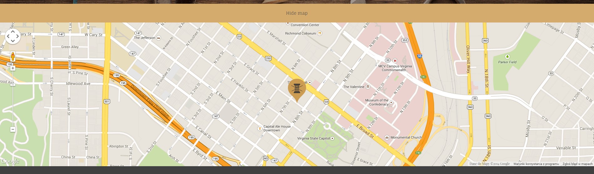
Google Map
It uses gmap3 plugin.
Documentation: here
HTML Markup:
|
1 2 3 4 5 6 7 8 |
<div class="hidemap"> <button class="mapToggle"> SHOW THE MAP </button> <div class="googlemapcontainer"> <div class="ct-googleMap" data-location="Richmond" data-height="460" data-offset="0" data-zoom="16" data-icon="../assets/images/tailor/map-marker-tailor.png"></div> </div> </div> |
|
1 2 3 4 5 6 7 8 9 10 11 12 13 14 15 16 17 18 19 20 21 22 23 24 25 26 |
function initmap() { var icongmap = $('.ct-googleMap').attr('data-icon'); if (($(".ct-googleMap").length > 0) && (typeof google === 'object' && typeof google.maps === 'object')) { $('.ct-googleMap').each(function () { var atcenter = ""; var $this = $(this); var location = $this.data("location"); var zoom = $this.data("zoom"); var offset = -30; if (validatedata($this.data("offset"))) { offset = $this.data("offset"); } if (validatedata(location)) { $this.gmap3({ marker: { //latLng: [40.616439, -74.035540], address: location, options: { //visible: false icon: new google.maps.MarkerImage(icongmap) }, callback: function (marker) { atcenter = marker.getPosition(); } |
Was this article helpful ?
Contact form
Template comes with ready to use:
- Contact Form
- Newsletter Form
All needed files are in /form directory.
Remember to includeon page.
To configure form just edit form/config.php and change e-mails to your own :
|
1 2 |
$to = "mail@example.com"; $from = "mail@example.com"; |
That’s it!
Contact Form
HTML Markup:
|
1 2 3 4 5 6 7 8 9 10 11 12 13 14 15 16 17 18 19 20 21 22 23 24 25 26 27 28 29 30 31 32 33 34 35 36 37 38 39 40 41 42 43 |
<div class="ct-contactForm"> <div class="successMessage alert alert-success" style="display: none"> <button type="button" class="close" data-dismiss="alert" aria-hidden="true">×</button> Thank You! </div> <div class="errorMessage alert alert-danger" style="display: none"> <button type="button" class="close" data-dismiss="alert" aria-hidden="true">×</button> Ups! An error occured. Please try again later. </div> <form role="form" action="./assets/form/send.php" method="post" class="contactForm validateIt" data-email-subject="Contact Form" data-show-errors="true"> <div class="row"> <div class="col-md-6"> <div class="form-group"> <input id="contact_name" placeholder="Name" required="" type="text" name="field[]" class="form-control"> <label for="contact_name">Name</label> </div> <div class="form-group"> <input id="contact_email" placeholder="Email" required="" type="email" name="field[]" class="form-control"> <label for="contact_email">Email</label> </div> <div class="form-group"> <input id="contact_subject" placeholder="Subject" required="" type="text" name="field[]" class="form-control"> <label for="contact_subject">Subject</label> </div> </div> </div> <div class="row"> <div class="col-xs-12"> <div class="form-group"> <textarea id="contact_message" placeholder="Message" class="form-control" rows="8" name="field[]" required=""></textarea> <label for="contact_message">Message</label> </div> </div> </div> <div class="row"> <div class="col-xs-12"> <button type="submit" class="btn ct-btn--perspective btn-primary btn-lg text-uppercase pull-right"><i class="fa fa-paper-plane"></i> Send Message </button> </div> </div> </form> </div> |
Newsletter Form
HTML Markup:
|
1 2 3 4 5 6 7 8 9 10 11 12 13 |
<h4 class="uppercase motive section-top">Subscribe to Newsletter</h4> <div class="successMessage alert alert-success" style="display: none;"><button class="close" type="button" data-dismiss="alert">×</button> Thank You!</div> <div class="errorMessage alert alert-danger" style="display: none;"><button class="close" type="button" data-dismiss="alert">×</button> Ups! An error occured. Please try again later.</div> <form class="form-inline validateIt" action="../../assets/form/send.php" method="post" data-email-subject="Newsletter Form" data-show-errors="true" data-hide-form="true"> <div class="input-group"><input class="form-control" name="field[]" type="email" placeholder="Enter your email address" /> <input name="msg_subject" type="hidden" value="New Newsletter subscription" /> <span class="input-group-btn"> <button class="btn btn-brick" type="submit">GO</button> </span></div> </form> |
Options (can be changed in HTML) :
- Mail Subject – just change value in :
- Success Message – change successMessage div content
- Error Message – change errorMessage div content
Was this article helpful ?
Sources & Credits
The following sources and files have been used to build up this theme
- Twitter Bootstrap – http://twitter.github.com/bootstrap/
- jQuery – http://www.jquery.com
Was this article helpful ?