

Youth Hostel – Responsive HTML5 Template
Thank you for purchasing this theme. If you have any questions that are beyond the scope of this help file, please feel free to start new ticket on this page. Thanks so much!
Scope of free support
We can help you with:
- Responding to questions or problems regarding the item and its features
- Fixing any discovered item’s bugs
- Providing updates to ensure compatibility with new software versions
Was this article helpful ?
HTML Structure
This theme is built upon bootstrap framework and is fully responsive. It adapts to window resolution and looks good on all devices including iPad and iPhone.
See for yourself (resize your browser).
If you would like to read more
about bootstrap framework click here :
Grid System and Single row structure
The default Bootstrap grid system utilizes 12 columns. It’s responsive grid and adapts to viewport. Below 767px viewports, the columns become fluid and stack vertically. The fluid grid system uses percents instead of pixels for column widths. Each row always include 12 columns (for example col-md-8 + col-md-4 = col-md-12).
Bootstrap documentation: here
Basic grid HTML:
|
1 2 3 4 5 6 7 8 9 10 11 12 13 14 15 16 17 18 19 20 21 22 23 24 25 26 27 |
<div class="row"> <div class="col-md-1">.col-md-1</div> <div class="col-md-1">.col-md-1</div> <div class="col-md-1">.col-md-1</div> <div class="col-md-1">.col-md-1</div> <div class="col-md-1">.col-md-1</div> <div class="col-md-1">.col-md-1</div> <div class="col-md-1">.col-md-1</div> <div class="col-md-1">.col-md-1</div> <div class="col-md-1">.col-md-1</div> <div class="col-md-1">.col-md-1</div> <div class="col-md-1">.col-md-1</div> <div class="col-md-1">.col-md-1</div> </div> <div class="row"> <div class="col-md-8">.col-md-8</div> <div class="col-md-4">.col-md-4</div> </div> <div class="row"> <div class="col-md-4">.col-md-4</div> <div class="col-md-4">.col-md-4</div> <div class="col-md-4">.col-md-4</div> </div> <div class="row"> <div class="col-md-6">.col-md-6</div> <div class="col-md-6">.col-md-6</div> </div> |
Page structure
Below you will find default page structure :
|
1 2 3 4 5 6 7 8 9 10 11 12 13 14 15 16 17 18 19 20 21 22 23 24 25 26 27 28 29 30 31 32 33 34 35 36 |
<!DOCTYPE html> <html> <head> [css] </head> <body> [header] [main menu] <!-- main container --> <div id="wrapper"> [component 1] <!-- fullwidth element --> </div> [fullwidth parallax] <div class="container"> <!-- / fullwidth element --> [component 6] </div> <!-- / main container --> [footer] [javascripts] </body> </html> |
Was this article helpful ?
CSS files and structure
If you would like to edit the color, font, or style of any elements, you would do the following:
|
1 |
#primaryContent a {color: #someColor;} |
If you find that your new style is not overriding, it is most likely because of a specificity problem. Scroll down in your CSS file and make sure that there isn’t a similar style that has more weight.
I.E.
|
1 |
#wrap #primaryContent a {color: #someColor;} |
So, to ensure that your new styles are applied, make sure that they carry enough “weight” and that there isn’t a style lower in the CSS file that is being applied after yours.
Colors
The theme includes a css file wich you can use to edit the colors.
You just need to add the corresponding CSS file to the head of the page like this:
|
1 2 3 4 5 |
<head> (..) <link rel="stylesheet" type="text/css" href="css/motive.css"> (..) </head> |
Icons
We’ve included 360+ font icons.
Awesome Icons – http://fontawesome.io/icons/
HTML markup:
|
1 2 |
<!-- Awesome Icons --> <i class="fa fa-cog"></i> |
CSS Files & Structure
We’ve included 2 files.
bootstrap.css contains Bootstrap 3 Library.
style.css file contains general styles.
style.less
1. Animations
2. Utilities
3. Font awesome
4. Fontello
5. Menu
6. Slick slider
7. Media Sections
8. Selectize
9. Bootstrap datepicker
10. Headroom
11. Magnificpopup
12. Typography
13. Section header
14. Portfolio
15. Icon box
16. Article box
17. Blockquote
18. Lists
19. Buttons
20. Line break
21. Slick navigation
22. Socials
23. Footer
24. Flag box
25. Main slider
26. Booking box
27. Forms
28. Date picker
29. Image box
30. Divided icon wall
31. Page header
32. Accordions
33. Pricing box
34. Testimonials
35. Product box
36. Gallery container
37. Blog
38. Pagination
39. Puzzle box
40. Google maps
41. Info box
42. Video poster
43. Pre loader
44. Progress bar
45. Tabs
46. Counters
47. Tables
48. Onepager
49. Person box
50. Icons
For more advanced user – we included also folder with less files – under assets/less you will find the following files:
plugins.less – file for plugins styling
motive.less – file for motive styling
buttons.less – file for buttons styling (colors, sizes etc.)
pageheader.less – file for page header styling
Was this article helpful ?
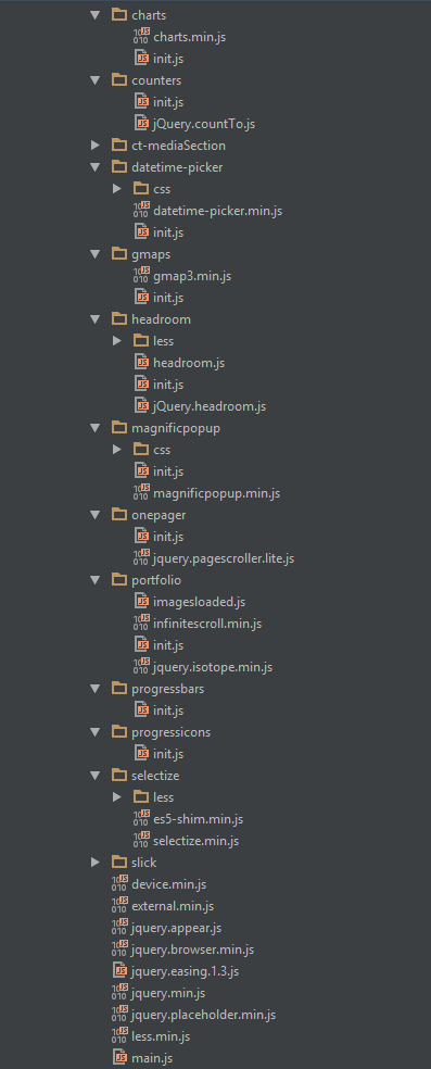
Javascript Components
JavaScript files:
- /charts/ – script for canvas charts animating
- /counters/ – Files needed for initialising the animation number after loading pages.
- /ct-mediaSection/ – Media sections where we can add parralax, kenburns or video to the section. Dynamical content of medias.
- /datetime-picker/ -Scripts for choosing the date from small calendar and attaching it to the input form.
- /gmaps/ – Plugin needed for displaying google map on the page.
- /headroom/ – Animated/fixed navbars. Plugin needed for detecting scrollbar and attaching animations for menu.
- /magnificpopup/ – Needed for galleries and their popups images where we can review them with slides via arrows.
- /onepager/ – scripts for onepager.html only
- /portfolio/ – scripts for gallery isotope
- /progressbars/ – files needed for initialising the animation bars after loading pages
- /progressicons/ – files needed for initialising the animation icons after loading pages
- /selectize/ – Plugin which creates select box for select tag in the page. It generates html code via javascript so that each browser can have the same select box.
- /slick/ – Files which initialize sliders in the page.
- /external.js/ – One big file where are minifixed javascript files:_ 1.jquery 2.boostrap 3.placeholder 4. easing 5. device.min.js 6. jquery browser 7.Snap min JS 8. jquery appear_
- /main.js/ – The main javascript initializaions and other major snippets.
Screenshot
Google Map (GMAP3 Plugin)
This is google map with custom marker, you can define couple parameters:
- data-location – address to show
- data-height – map height (if undefined height will be 220px)
- data-offset – by how many map should be repositioned from marker center point (default -30)
It uses gmap3 plugin.
Documentation: here
HTML Markup:
|
1 |
<span class="html-tag"><div <span class="html-attribute-name">class</span>="<span class="html-attribute-value">ct-googleMap</span>" <span class="html-attribute-name">data-location</span>="<span class="html-attribute-value">54.3178115,16.5529038</span>" <span class="html-attribute-name">data-height</span>="<span class="html-attribute-value">415</span>" <span class="html-attribute-name">data-zoom</span>="<span class="html-attribute-value">10</span>" <span class="html-attribute-name">data-marker</span>="<span class="html-attribute-value">false</span>" <span class="html-attribute-name">data-mapImage</span>="<span class="html-attribute-value">./assets/images/demo-content/map-image.png</span>"></span><span class="html-tag"></div></span> |
All javascript code can be found in js/main.js file.
jquery.appear
This plugin call function when element appear in viewport. This is used in custom animation, progress bars, counter timer.
Documentation: https://github.com/bas2k/jquery.appear/
|
1 2 3 4 5 6 7 8 9 10 11 12 13 |
if (jQuery().appear) { if (device.mobile()) { // disable animation on mobile jQuery("body").removeClass("withAnimation"); } else { jQuery('.withAnimation .animated').appear(function () { jQuery(this).each(function () { jQuery(this).addClass('activate'); jQuery(this).addClass($(this).data('fx')); }); }, {accY: -150}); } } |
Charts.js
This plugin is used to make graphics.
Documentation: http://www.chartjs.org/
Was this article helpful ?
Slick Slider Navigation
Slick Slider in Youth Hostel have two types navigation with three (dots) and four (arrows) variations
Dots
ct-slick-dots–type1
This type has the following positions:
— ct-slick-dots–rightTop
— ct-slick-dots–rightBottom
— ct-slick-dots–centerBottom
— ct-slick-dots–leftTop
— ct-slick-dots–rightTop
— ct-slick-dots–centerTop
HTML markup
|
1 2 3 |
<div class="ct-js-slick ct-slick ct-slick-dots--type1 ct-slick-dots--centerTop slick-initialized slick-slider"> [ -- ] </div> |
Screenshot

Example of dots slider nav
ct-slick-dots–type2
HTML markup
|
1 2 3 |
<div class="ct-js-slick ct-slick ct-slick-dots--type2 slick-initialized slick-slider"> [ -- ] </div> |
Screenshot

Example of dots slider nav 2
ct-slick-dots–type3
This type has the following positions:
1. ct-slick-dots–rightTop
2. ct-slick-dots–rightBottom
3. ct-slick-dots–centerBottom
4. ct-slick-dots–leftTop
5. ct-slick-dots–rightTop
6. ct-slick-dots–centerTop
HTML markup
|
1 2 3 |
<div class="ct-js-slick ct-slick ct-slick-dots--type3 ct-slick-dots--rightBottom"> [ -- ] </div> |
Screenshot

Arrows
ct-slick-arrows–type1
This type has the following positions
1. ct-slick-arrows–position1
HTML markup
|
1 2 3 |
<div class="ct-js-slick ct-slick ct-slick-arrows--type1 ct-slick-arrow--position1r"> [ -- ] </div> |
Screenshot

Example of arrow slider nav
ct-slick-arrows–type2
This type has the following positions (vertical align middle, arrow on the left side (content), arrow on the right side (content))
1. ct-slickarrow–middleCorners (vertical align middle, arrow on the left side (body), arrow on the right side (body))
HTML markup
|
1 2 3 |
<div class="ct-js-slick ct-slick ct-slick-arrows--type2 ct-slickarrow--middleCorners slick-initialized slick-slider"> [ -- ] </div> |
Image:

Example of arrow slider nav 2
ct-slick-arrows–type3
This type has the following positions:
This type has a extra another class “ct-slick-arrows–motive”, which one changing our arrow color on hover into motive color
1. ct-slick-arrows–position1 (vertical align middle, arrow on the left side, arrow on the right side)
2. ct-slick-arrows–position2 (vertical align bottom, and arrows on the middle)
3. ct-slick-arrows–position4 (vertical align bottom, and arrows on the right side)
4. ct-slick-arrows–position5 (vertical align bottom, and arrows on the left side)
5. ct-slick-arrows–position8 (vertical align top, and arrows on the middle)
HTML markup
|
1 2 3 |
<div class="ct-js-slick ct-slick ct-slick-arrows--type2 ct-slickarrow--middleCorners"> [ -- ] </div> |
Screenshot

Example of arrow slider nav 3
ct-slick-arrows–type4
This type has the following positions
1. ct-slick-arrows–position1
2. ct-slick-arrows–position2
3. ct-slick-arrows–position3
4. ct-slick-arrows–position4
5. ct-slick-arrows–position5
6. ct-slick-arrows–position7
HTML markup
|
1 2 3 |
<div class="ct-js-slick ct-slick ct-slick-arrows--type4 ct-slick-arrows--position7 slick-initialized slick-slider"> [ -- ] </div> |
Screenshot

Example of dots slider nav 4
Was this article helpful ?
Main Slider
HTML markup
|
1 2 3 4 5 6 7 8 9 10 11 12 13 14 15 16 17 18 19 20 21 22 23 24 25 26 27 28 29 30 31 32 33 34 35 36 37 38 39 40 41 42 43 44 45 46 47 48 49 50 51 52 53 54 55 56 57 58 59 60 61 62 63 64 65 66 67 68 69 |
<div class="ct-mainSlider ct-u-backgroundMotive"> <div class="ct-mainSlider--rightSide ct--col-md-push-7"> <div class="ct-js-slick ct-slick ct-slick-dots--type3 ct-slick-dots--rightBottom" data-adaptiveHeight="true" data-dots="true" data-arrows="false" data-infinite="true"> <div class="item"><!-- item [1] --> <img src="../assets/images/demo-content/hostel-1.jpg" alt="Hostel"/> </div> <div class="item"><!-- item [2] --> <img src="../assets/images/demo-content/hostel-1.jpg" alt="Hostel"/> </div> <div class="item"><!-- item [3] --> <img src="../assets/images/demo-content/hostel-1.jpg" alt="Hostel"/> </div> </div> </div> <div class="ct-mainSlider--leftSide ct--col-md-pull-5"> <div class="ct-mainSlider-miniImage hidden-xs"> <img src="../assets/images/demo-content/mini-hostel.jpg" alt=""/> </div> <div class="ct-bookingBox-fix ct-u-paddingTop30"> <div class="ct-bookingBox"> <div class="ct-bookingBox-inner"> <h2 class="ct-bookingBox-title ct-u-marginBottom30">Book a bed</h2> <div class="clearfix"></div> <form action="../assets/form/send.php" method="post" class="contactForm validateIt contactForm--type3" data-email-subject="Book a bed" data-show-errors="true"> <div class="form-group"> <select class="demo-default ct-js-selectize" name="hostel"> <option value="">Select a Hostel</option> <option value="1">The Sydney Harbour</option> <option value="2">Casa Caracol</option> <option value="3">The Clayzy House</option> <option value="4">RE B&B</option> <option value="5">CamelBackpackers</option> <option value="6">Fauzi Azar Inn</option> </select> </div> <div class="form-group"> <div class="ct-datePicker"> <input type="text" class="form-control ct-js-datePicker" placeholder="Select Date"> </div> </div> <div class="form-group"> <select class="demo-default ct-js-selectize"> <option value="">Number of Nights</option> <option value="1">1</option> <option value="2">2</option> <option value="3">3</option> <option value="4">4</option> <option value="5">5</option> <option value="6">6</option> </select> </div> <div class="form-group"> <select class="demo-default ct-js-selectize"> <option value="">Currency</option> <option value="1">Dollar</option> <option value="2">Euro</option> <option value="3">Franc</option> <option value="6">Zloty</option> </select> </div> <div class="ct-u-paddingTop20"> <button type="submit" class="btn btn-link text-uppercase">Book now <span><i class="icon-right-small"></i></span></button> </div> </form> </div> </div> </div> </div> <div class="clearfix"></div> |
JavaScript
<script src=”../assets/js/slick/js/slick.js”></script>
<script src=”../assets/js/slick/js/init.js”></script>
<script src=”../assets/js/selectize/selectize.min.js”></script>
Screenshot

Main slider
Was this article helpful ?
Video poster
HTML markup
|
1 2 3 4 5 6 7 8 9 10 11 12 13 14 15 |
<div class="ct-videoPoster text-right animated" data-fx="fadeInRight"> <div class="ct-videoPoster-content"> <img src="../assets/images/demo-content/video-frame.png" alt="Image"/> <div class="ct-videoPoster-frame"> <img src="../assets/images/demo-content/video-poster.jpg" alt="Image"/> <a href="https://www.youtube.com/watch?v=rYbtBXhMFAQ" class="ct-js-videoPlay"><img src="../assets/images/demo-content/video-play.png" alt="Image"/></a> </div> </div> <div class="ct-videoPoster--mobile ct-u-paddingBottom70 ct-u-paddingTop20"> <div class="ct-videoPoster-frame"> <img src="../assets/images/demo-content/video-poster.jpg" alt="Image"/> <a href="https://www.youtube.com/watch?v=rYbtBXhMFAQ" class="ct-js-videoPlay"><img src="../assets/images/demo-content/video-play.png" alt="Image"/></a> </div> </div> </div> |
JavaScript
<script src=”../assets/js/magnificpopup/magnificpopup.min.js”></script><script src=”../assets/js/magnificpopup/init.js”></script>
Screenshot

Video poster
Was this article helpful ?
Divided icon wall
HTML markup
|
1 2 3 4 5 6 7 8 9 10 11 12 13 14 15 16 17 18 19 20 21 22 23 24 25 26 27 28 29 30 31 32 33 34 35 36 37 38 39 40 41 42 43 44 45 46 47 48 49 50 51 52 53 54 55 56 57 |
<section class="ct-mediaSection" data-type="parallax" data-height="863" data-background="../assets/images/demo-content/media-section-2.jpg" data-stellar-background-ratio="0.2" data-background-mobile="../assets/images/demo-content/media-section-2.jpg"> <div class="ct-mediaSection-inner"> <div class="container"> <div class="col-sm-8 ct-u-backgroundDark"> <div class="ct-sectionHeader ct-sectionHeader--type2 ct-u-marginBottom50 text-center"> <h3 class="ct-sectionHeader-title text-uppercase text-center ct-u-colorWhite"> Our room types</h3> </div> <div class="media ct-iconBox ct-iconBox--type3"> <div class="media-left"> <span class="media-object ct-iconBox-icon ct-icon-bedSingle" role="presentation"></span> </div> <div class="media-body"> <h5 class="media-heading ct-u-colorWhite">Single private ensuite</h5> <p class="ct-u-colorWhite ct-iconBox-description">Contains 1 single bed, bathroom, desk, flat screen tv, wifi access, hair dryer, wardrobe & towels.</p> </div> </div> <div class="media ct-iconBox ct-iconBox--type3"> <div class="media-left"> <span class="media-object ct-iconBox-icon ct-icon-bedDouble" role="presentation"></span> </div> <div class="media-body"> <h5 class="media-heading ct-u-colorWhite">Double room ensuite</h5> <p class="ct-u-colorWhite ct-iconBox-description">Contains 1 single bed, bathroom, desk, flat screen tv, wifi access, hair dryer, wardrobe & towels.</p> </div> </div> <div class="media ct-iconBox ct-iconBox--type3"> <div class="media-left"> <span class="media-object ct-iconBox-icon ct-icon-bedTwin" role="presentation"></span> </div> <div class="media-body"> <h5 class="media-heading ct-u-colorWhite">Twin private ensuite</h5> <p class="ct-u-colorWhite ct-iconBox-description">Contains 1 single bed, bathroom, desk, flat screen tv, wifi access, hair dryer, wardrobe & towels.</p> </div> </div> <div class="media ct-iconBox ct-iconBox--type3"> <div class="media-left"> <span class="media-object ct-iconBox-icon ct-icon-bedTriple" role="presentation"></span> </div> <div class="media-body"> <h5 class="media-heading ct-u-colorWhite">Triple private ensuite</h5> <p class="ct-u-colorWhite ct-iconBox-description">Contains 1 single bed, bathroom, desk, flat screen tv, wifi access, hair dryer, wardrobe & towels.</p> </div> </div> <div class="media ct-iconBox ct-iconBox--type3"> <div class="media-left"> <span class="media-object ct-iconBox-icon ct-icon-bedTwin" role="presentation"></span> </div> <div class="media-body"> <h5 class="media-heading ct-u-colorWhite">4, 6 or 8 bed dorm / bunk bed</h5> <p class="ct-u-colorWhite ct-iconBox-description">All beds come with private reading lamp, fleece blankets and pillows. Each bed has its own storage locker that can be locked. Bed linen is provided.</p> </div> </div> </div> <img src="../assets/images/demo-content/chambermaid.png" class="ct-mediaSection-Subimage animated hidden-sm" data-fx="fadeInUp" data-time="1000" alt="Chambermaid"/> </div> </div> </section> |
JavaScript
<script src=”../assets/js/ct-mediaSection/js/smoothScroll.js”></script><script src=”../assets/js/ct-mediaSection/js/jquery.stellar.min.js”></script>
<script src=”../assets/js/ct-mediaSection/js/media-section.js”></script>
Screenshot

Divided icon wall
Was this article helpful ?
Blockquote
HTML markup
|
1 2 3 |
<blockquote class="ct-blockquote ct-blockquote--motive"> Keep your dreams alive. Understand to achieve anything requires faith and belief in yourself, vision, hard work, determination, and dedication. Remember all things are possible for those who believe. </blockquote> |
Screenshot

Blockquote
Was this article helpful ?
Article box
Youth Hostel have 3 types of Article boxes
Article box – type 1
HTML markup
|
1 2 3 4 5 6 7 8 9 10 11 12 |
<div class="ct-articleBox text-center"> <a href="single-blog-post.html"> <figure> <img src="../assets/images/demo-content/article-thumbnail-1.jpg" alt="Image"/> <figcaption> <span class="ct-articleBox-date">Thursday, July 02, 2015</span> <h4 class="ct-articleBox-title">Our Impecable Cleaning Services & Staff</h4> </figcaption> </figure> <span class="btn btn-primary text-uppercase ct-articleBox-link"><strong>Read</strong> article</span> </a> </div> |
Screenshot

Article box 1
Article box – type 2
HTML markup
|
1 2 3 4 5 6 7 8 9 10 |
<div class="ct-articleBox ct-articleBox--type2 ct-u-marginBottom40"> <a href="single-blog-post.html" class="ct-articleBox-image"> <img src="../assets/images/demo-content/image-9.jpg" alt="Image"/> <span class="btn btn-primary text-uppercase ct-articleBox-link">Read article</span> </a> <span class="h6"><small class="ct-articleBox-meta">Wednesday, July 10, 2015</small></span> <span class="ct-hr ct-hr--type1 ct-u-marginTop20 ct-u-marginBottom10" data-background="#f7f7f7">Line break</span> <h4 class="ct-articleBox-title"><a href="single-blog-post.html">The dream dorm: best bunkmates</a></h4> <p>A few of the HI team give their two cents on the destinations they wanderlust...</p> </div> |
Screenshot

Artickle box 2
Article box – type 3
HTML markup
|
1 2 3 4 5 6 7 8 9 10 11 12 |
<div class="media ct-articleBox ct-articleBox--type3"> <a href="single-blog-post.html" class="media-left ct-articleBox-image"> <img class="media-object" src="../assets/images/demo-content/image-10.jpg" alt="Image"> <span class="btn btn-primary text-uppercase ct-articleBox-link">Read article</span> </a> <div class="media-body"> <span class="h6"><small class="ct-articleBox-meta">Wednesday, July 09, 2015</small></span> <span class="ct-hr ct-hr--type1 ct-u-marginTop20 ct-u-marginBottom20" data-background="#f7f7f7">Line break</span> <h4 class="ct-articleBox-title"><a href="single-blog-post.html">Hostel of the Week: The Hat, Madrid</a></h4> <p>Looking for a bit of hostel luxury in Europe?</p> </div> </div> |
Screenshot

Artickle box 3
Was this article helpful ?
Puzzle box
Youth Hostel have two types of puzzle boxes
Puzzle box – type1
HTML markup
|
1 2 3 4 5 |
<div class="ct-puzzleBox" data-height="566"> <img src="../assets/images/demo-content/puzzleBox-1.jpg" alt="Image" class="ct-puzzleBox--image1 animated" data-fx="zoomIn" data-time="1000"/> <img src="../assets/images/demo-content/puzzleBox-2.jpg" alt="Image" class="ct-puzzleBox--image2 animated" data-fx="fadeInRight"/> <img src="../assets/images/demo-content/puzzleBox-3.jpg" alt="Image" class="ct-puzzleBox--image3 animated" data-fx="fadeInLeft"/> </div> |
Screenshot
Puzzle box 1
Puzzle box – type2
HTML markup
|
1 2 3 4 5 6 |
<div class="ct-puzzleBox ct-puzzleBox--type2"> <img src="../assets/images/demo-content/image-4.jpg" alt="Image"/> <img src="../assets/images/demo-content/image-5.jpg" alt="Image"/> <img src="../assets/images/demo-content/image-6.jpg" alt="Image"/> <img src="../assets/images/demo-content/image-7.jpg" alt="Image"/> </div> |
Screenshot

Puzzle box 2
Was this article helpful ?
Buttons
Youth Hostel have three sizes of buttons:
- btn
- btn-xs
- btn-sm
Each can have one of the following variations:
Standard button
Screenshot

Standard button
HTML markup
|
1 |
<a href="#" class="btn btn-xs btn-primary">Button</a> |
Button with beating arrow
Screenshot

Button with beating arrow
HTML markup
|
1 |
<a href="#" class="btn btn-xs btn-primary">Button<span><i class="icon-right-small"></i></span></a> |
Button with arrow and icon
Screenshot

Button with arrow and icon
HTML markup
|
1 |
<a href="#" class="btn btn-xs btn-primary btn--icon"><i class="fa fa-twitter"></i>Button<span><i class="icon-right-small"></i></span></a> |
Was this article helpful ?
Icon Box
Youth Hostel have four types of icon boxes.
Icon box version 1
HTML markup
|
1 2 3 4 5 6 7 8 |
<div class="ct-iconBox ct-iconBox--type2 ct-u-marginBottom50"> <span class="ct-iconBox-icon"> <i class="fa fa-map-marker"></i> </span> <h3 class="ct-iconBox-title text-uppercase">Map &<br> DIRECTIONS</h3> <p class="ct-iconBox-description">Located in the middle of the historical centre of Poland only 2 minutes away. Very easy to find.</p> <a href="#" class="btn btn-primary ct-u-marginTop10">Learn more <span><i class="icon-right-small"></i></span></a> </div> |
Screenshot

Icon box 1
Icon box version 2
HTML markup
|
1 2 3 4 5 6 |
<a href="#" class="ct-iconBox ct-iconBox--circle text-center ct-u-marginBottom50"> <span class="ct-iconBox-icon">1</span> <h5 class="ct-iconBox-title">Free Outdoor Swimming Pool</h5> <p class="ct-iconBox-description">Our outdoor swimming pool with waterfall is perfect to laze by on those 35 degree days when lining up at a museum.</p> <span class="btn btn-primary ct-iconBox-linkHelper">Book now</span> </a> |
Screenshot

Icon box 2
Icon box version 3
HTML markup
|
1 2 3 4 5 6 7 8 9 |
<div class="media ct-iconBox ct-iconBox--type3"> <div class="media-left"> <span class="media-object ct-iconBox-icon ct-icon-bedSingle" role="presentation"></span> </div> <div class="media-body"> <h5 class="media-heading">Single private ensuite</h5> <p class="ct-iconBox-description">Contains 1 single bed, bathroom, desk, flat screen tv, wifi access, hair dryer, wardrobe & towels.</p> </div> </div> |
Screenshot

Icon box 3
Icon box version 4
HTML markup
|
1 2 3 4 |
<div class="ct-iconBox ct-iconBox--type4"> <span class="ct-iconBox-icon"><i class="fa fa-wifi"></i></span> <p class="ct-iconBox-title">Free Wi-Fi</p> </div> |
Screenshot

Icon box 4
Was this article helpful ?
Top bar
HTML markup (example for one item)
|
1 2 3 4 5 6 7 8 9 10 11 12 13 14 15 16 17 18 |
<div class="ct-topBar ct-u-paddingBoth10 ct-u-positionRelative" data-background="#f6f6f6"> <div class="container"> <div class="row"> <div class="col-sm-12 ct-u-positionStatic"> <div class="ct-js-slick ct-slick ct-slick-arrows--type2 ct-slickarrow--middleCorners" data-LGitems="7" data-MDitems="5" data-SMitems="3" data-XSitems="2" data-adaptiveHeight="true" data-dots="false" data-arrows="true"> <div class="item"><!-- item [1] --> <a href="#" class="ct-flagBox ct-u-centered"> <figure> <img src="../assets/images/demo-content/flag-italy.jpg" alt="Flag"/> <figcaption class="text-uppercase">Italy</figcaption> </figure> </a> </div> </div> </div> </div> </div> </div> |
JavaScript
<script src=”../assets/js/slick/js/slick.js”></script>
<script src=”../assets/js/slick/js/init.js”></script>
Screenshot
Top bar
Was this article helpful ?
Media sections
You can arrange your content with the following Media sections types:
HTML markup – for parallax
|
1 2 3 4 5 |
<section class="ct-mediaSection" data-type="parallax" data-height="600" data-background="../path/to/image/image-name" data-background-mobile="../path/to/image/image-name"> <div class="ct-mediaSection-inner"> [ -- ] </div> </section> |
HTML markup – for kenburns
|
1 2 3 4 5 6 7 8 9 10 |
<section class="ct-mediaSection" data-type="kenburns" data-height="600" data-background-mobile="../path/to/image/image-name"> <div class="ct-mediaSection-kenburns"> <img src="../path/to/image/image-name" alt="Image" class="singlefx"> <img src="../path/to/image/image-name" alt="Image" class="singlefx"> <img src="../path/to/image/image-name" alt="Image" class="singlefx"> </div> <div class="ct-mediaSection-inner"> [ -- ] </div> </section> |
HTML markup – for video
|
1 2 3 4 5 6 7 8 |
<section class="ct-mediaSection" data-type="video" data-height="600" data-background-mobile="../path/to/image/image-name"> <div class="ct-mediaSection-video embed-responsive embed-responsive-16by9"> <iframe src="../path/to/video"></iframe> </div> <div class="ct-mediaSection-inner"> [ -- ] </div> </section> |
Description
data-type – determines the type of media section
data-height – determines the height of media section
data-background – this attribute allows you to insert image for desktop devices
data-background-mobile – this attribute allows you to insert image for mobile devices
JavaScript
<script src=”../assets/js/ct-mediaSection/js/smoothScroll.js”></script>
<script src=”../assets/js/ct-mediaSection/js/jquery.stellar.min.js”></script>
<script src=”../assets/js/ct-mediaSection/js/media-section.js”></script>
Was this article helpful ?
Product box
Product box – type 1
HTML markup
|
1 2 3 4 5 6 7 8 9 10 |
<div class="media ct-productBox ct-productBox--type1"> <div class="media-left"> <img class="media-object" src="../assets/images/demo-content/product-1.jpg" alt="Image"> </div> <div class="media-body"> <h5 class="media-heading">French</h5> <p class="ct-productBox-description">1 Croissant, Butter, Jam or <br>Honey</p> <span class="ct-productBox-price">4, 50 €</span> </div> </div> |
Screenshot

Product box 1
Product box – type 2
HTML markup
|
1 2 3 4 5 6 7 8 9 10 11 12 13 14 15 16 17 18 19 20 21 22 23 24 25 26 27 |
<div class="ct-productBox ct-productBox--type2 ct-u-paddingBottom40"> <div class="row"> <div class="col-md-8"> <img src="../assets/images/demo-content/product-7.jpg" class="center-block ct-u-left--sm ct-u-marginBottom30" alt="Image"/> </div> <div class="col-md-4"> <div class="ct-productBox-content"> <div class="ct-productBox-header"> <h4 class="text-capitalize ct-productBox-title">Single Room</h4> <p>A comfortable and quiet room facing the inner courtyard.</p> <span class="ct-hr ct-hr--type1 ct-u-marginTop20 ct-u-marginBottom20" data-background="#f7f7f7">Line break</span> </div> <div class="ct-productBox-price"> <span>from</span> <p>25.00€ / night</p> </div> <ul class="list-unstyled ct-list--type2 ct-list--striped ct-icon--motive ct-u-paddingTop25"> <li><i class="fa fa-check-circle-o"></i>Shower / WC</li> <li><i class="fa fa-check-circle-o"></i>TV</li> <li><i class="fa fa-check-circle-o"></i>Breakfast buffet incl.</li> <li><i class="fa fa-check-circle-o"></i>Parking sticker incl.</li> </ul> <a href="#section8" class="btn btn-primary ct-u-marginTop20 ct-js-btnScroll">Book now</a> </div> </div> </div> </div> |
Screenshot

Product box 2
Was this article helpful ?
Google maps
Google maps without any marker
HTML markup
|
1 |
<div class="ct-googleMap ct-mapBox--disabled" data-location="Des Allemands" data-height="350" data-zoom="8" data-marker="false"></div> |
Description
Class “ct-mapBox–disabled” – responsible for not displaying google marker in the form box.
Attribute data-marker=”false” – makes marker invisible (if you want make it visible use value “true”)
Screenshot

Google map without any marker
Google maps with mapBox
HTML markup
|
1 |
<div class="ct-googleMap" data-location="54.3178115,16.5529038" data-height="415" data-zoom="10" data-marker="false" data-mapImage="../assets/images/demo-content/map-image.png"></div> |
description
Attribute data-mapImage=”../assets/images/demo-content/map-image.png” – allows you to set any photo into mapBox
Screenshot

Google map with mapBox
Google maps – data attributes explanation
— data-location – use it for display your location on the Google map (e.g. can be a string: “New York”, or cords: 40.7198584,-74.0021416)
— data-height – use it for height adjustment
— data-zoom – use it to set the zoom
JavaScript – for both version
<script src=”http://maps.google.com/maps/api/js?sensor=false”></script>
<script src=”../assets/js/gmaps/gmap3.min.js”></script>
<script src=”../assets/js/gmaps/init.js”></script>
Was this article helpful ?
Headers
The header in Youth Hostel can be:
– static
– paralax
– kenburns
– video
The header title can be placed:
– ct-pageHeader-center (center)
– ct-pageHeader-right (right-side)
– ct-pageHeader-left (left-side)
HTML markup – example for static header with header title at center
|
1 2 3 4 5 6 7 8 9 10 11 12 13 |
<header class="ct-pageHeader ct-pageHeader-center ct-mediaSection" data-height="151" data-background="../assets/images/demo-content/header.jpg" data-background-mobile="../assets/images/demo-content/header.jpg" > <div class="ct-mediaSection-inner"> <div class="container"> <div class="row"> <div class="col-sm-12"> <div class="ct-sectionHeader ct-sectionHeader--type1"> <h3 class="ct-sectionHeader-title text-capitalize ct-u-colorWhite">Comfortable & Quiet Rooms</h3> </div> </div> </div> </div> </div> </header> |
JavaScript
– for static header:
<script src=”../assets/js/ct-mediaSection/js/media-section.js”></script>
– for parallax, kenburns, video headers:
<script src=”../assets/js/ct-mediaSection/js/smoothScroll.js”></script>
<script src=”../assets/js/ct-mediaSection/js/jquery.stellar.min.js”></script>
<script src=”../assets/js/ct-mediaSection/js/media-section.js”></script>
Screenshot

Header
Was this article helpful ?
Person Box
Youth Hostel have 2 types of Person box
Person box – type1
HTML markup
|
1 2 3 4 5 6 7 8 9 10 11 12 13 14 |
<div class="ct-personBox ct-personBox--type1"> <figure class="ct-personBox-image"> <img src="../assets/images/demo-content/person-1.jpg" alt="Image"/> <ul class="list-unstyled list-inline ct-socials ct-socials--type2"> <li><a href="#"><i class="fa fa-twitter"></i></a></li> <li><a href="#"><i class="fa fa-facebook"></i></a></li> <li><a href="#"><i class="fa fa-dribbble"></i></a></li> <li><a href="#"><i class="fa fa-linkedin"></i></a></li> </ul> </figure> <h5 class="ct-personBox-name">Aleksandra Weis</h5> <p class="ct-personBox-job">Hotel guest</p> <p class="ct-personBox-description">Seded ut perspiciatis unde omnis iste natus error sit voluptatem accusantium</p> </div> |
Screenshot

Person box 1
Person box – type2
HTML markup
|
1 2 3 4 5 6 7 8 9 10 11 12 13 14 15 16 |
<div class="ct-personBox ct-personBox--type2"> <header class="ct-personBox-header"> <h5 class="ct-personBox-name">Lisa Donalds</h5> <p class="ct-personBox-job">Hotel manager</p> </header> <figure class="ct-personBox-image"> <img src="../assets/images/demo-content/person-1.jpg" alt="Image"/> <ul class="list-unstyled list-inline ct-socials ct-socials--type2"> <li><a href="#"><i class="fa fa-twitter"></i></a></li> <li><a href="#"><i class="fa fa-facebook"></i></a></li> <li><a href="#"><i class="fa fa-dribbble"></i></a></li> <li><a href="#"><i class="fa fa-linkedin"></i></a></li> </ul> </figure> <p class="ct-personBox-description">Seded ut perspiciatis unde omnis iste natus error sit voluptatem accusantium</p> </div> |
Screenshot

Person box 2
Was this article helpful ?
Counters
Counters Icons
HTML markup
|
1 2 3 4 5 6 7 8 9 |
<div class="text-center ct-counterBox-icon"><!-- Counter '1 --> <div class="ct-counter-icon"> <i class="fa fa-desktop fa-2x"></i> </div> <div class="ct-counter-content"> <span class="ct-counter-base ct-fw-300 ct-js-counter" data-ct-to="459984" data-ct-speed="400">459 984</span> <p class="ct-counter-description text-capitalize">Pixels Crafted so far</p> </div> </div> |
JavaScript
<script src=”../assets/js/counters/jQuery.countTo.js”></script>
<script src=”../assets/js/counters/init.js”></script>
Screenshot

Counter Icons
Counters down
HTML markup
|
1 2 3 4 5 6 |
<div class="text-center ct-counterBox"><!-- Counter '1a --> <div class="ct-counter-content"> <span class="ct-counter-base ct-fw-300 ct-js-counter" data-ct-to="34" data-ct-speed="10">34</span> <p class="ct-counter-description text-uppercase">Days</p> </div> </div> |
JavaScript
<script src=”../assets/js/counters/jQuery.countTo.js”></script>
<script src=”../assets/js/counters/init.js”></script>
Screenshot

Counters Down
Was this article helpful ?
Progress Icons
HTML markup
|
1 |
<div class="ct-js-progressIcons" data-font-size="115" data-icon-color="#DD673E" data-active="4" data-total="7" data-icon="fa-globe" data-delay="400"></div> |
Desription – list of attributes
data-font-size=”115″ – it allows you to adjust the size of icon
data-icon-color=”#DD673E” – it allows you to adjust the color of icon
data-active=”4″ – it allows you to adjust the number of active icons
data-total=”7″ – it allows you to adjust the number of total icons which will be displayed
data-icon=”fa-globe” – you can select here appropriate icon
data-delay=”400″ – you can set here delay between each icons which will be displayed
JavaScript
<script src=”../assets/js/progressicons/init.js”></script>
Screenshot

Progress icons
Was this article helpful ?
Progress Bars
Indicate progress with three versions of Progress Bars!
Screenshots
— ct-progressBar–type1

Progress bar type1
— ct-progressBar–type2

Progress bar type2
— ct-progressBar–type3

Progress bar type3
You can edit bars values and colors with data-attributes used with the following HTML markup
|
1 2 3 4 5 6 7 8 9 10 |
<div class="ct-progressBar ct-progressBar--type1"><!-- Progress Bar type 1 --> <div class="ct-progressBar-title">WebDesign</div> <div class="progress"> <div class="progress-bar animating" role="progressbar" aria-valuenow="51" aria-valuemin="0" aria-valuemax="100"> <div class="ct-progressBar-content"> <span class="ct-progressBar-text">51%</span> </div> </div> </div> </div> |
Java Script
|
1 |
<script src="../assets/js/progressbars/init.js"></script> |
Was this article helpful ?
Accordions
HTML markup – for one item
|
1 2 3 4 5 6 7 8 9 10 11 12 13 14 15 16 17 18 19 |
<div class="ct-accordion"> <div class="panel-group" id="accordion" role="tablist" aria-multiselectable="true"> <div class="panel panel-default"><!-- [1] --> <div class="panel-heading" role="tab" id="headingOne"> <h4 class="panel-title"> <a role="button" data-toggle="collapse" data-parent="#accordion" href="#collapseOne" aria-expanded="true" aria-controls="collapseOne"> When can I check in? When is check out? </a> </h4> </div> <div id="collapseOne" class="panel-collapse collapse in" role="tabpanel" aria-labelledby="headingOne"> <div class="panel-body"> We serve a continental buffet breakfast from 07:00-12:00 which is included in the room tariff. You can pay with cash or one of these cards: Girocard, Maestro, Visa, Mastercard, Amex or JCB. All taxes are included in the price. </div> </div> </div> </div> </div> |
Available variations
For Youth Hostel there is available two variations:
— ct-accordion
|
1 2 3 |
<div class="ct-accordion"> [ -- ] </div> |
— ct-accordion–type2
|
1 2 3 |
<div class="ct-accordion ct-accordion--type2"> [ -- ] </div> |
Screenshots
— ct-accordion

Accordion variation 1
— ct-accordion–type2

- Accardin variation 2
Was this article helpful ?
Tabs
HTML markup – for one item (tabs type1)
|
1 2 3 4 5 6 7 8 9 10 11 12 13 14 15 16 17 18 19 20 |
<div class="ct-tabs ct-tabs--type1"> <ul class="nav nav-tabs" role="tablist"><!-- Tabs nav --> <li role="presentation" class="active"> <a href="#elegant-interiors" aria-controls="elegant-interiors" role="tab" data-toggle="tab"> <div class="nav-tabs-icon"><span><i class="fa fa-home"></i></span></div> <h6 class="nav-tabs-title">Elegant Interiors</h6> </a> </li> </ul> <div class="tab-content"><!-- Tabs content --> <div role="tabpanel" class="tab-pane active animated" data-fx="fadeInRight" id="elegant-interiors"> <!-- place for rest content [example below] --> <div class="ct-js-slick ct-slick ct-slick-arrows--type4 ct-slick-arrows--position7" data-LGitems="1" data-XSitems="1" data-adaptiveHeight="true" data-dots="false" data-arrows="true"> <div class="item"> <img src="../assets/images/demo-content/hostel-1.jpg" alt="Image"> </div> </div> </div> </div> </div> |
Available variations
There is in Youth Hostel available two variations:
— ct-tabs–type1
|
1 2 3 |
<div class="ct-tabs ct-tabs--type1"> [ -- ] </div> |
— ct-tabs–type2
|
1 2 3 |
<div class="ct-tabs ct-tabs--type2"> [ -- ] </div> |
Screenshots
— ct-tabs–type1

Tabs type 1
— ct-tabs–type2

Tabs type 2
Was this article helpful ?
Socials
HTML markup – example for one social
|
1 2 3 4 5 6 7 |
<ul class="list-inline ct-js-socials ct-socials ct-socials--type1 ct-socials-tooltip text-center"> <li> <a href="#" class="ct-social-link" data-social-hover-color="#3B5998"><i class="fa fa-facebook"></i> <span class="ct-tooltipContent">Facebook</span> </a> </li> </ul> |
Description
Attribute data-social-hover-color=”” responsible for social item color which one is already hovering. This allows you to set a different color to each social item.
example:
data-social-hover-color=”#000000″ – corresponds to the black color
JavaScript
Code responsible for this component is in the file: <script src=”../assets/js/main.js”></script>
Screenshots

Social Section

Social section – hover
Was this article helpful ?
Gallery
HTML markup
|
1 2 3 4 5 6 7 8 9 10 11 12 13 14 15 16 17 |
<div class="ct-galleryContainer ct-js-popupGallery"> <a href="../assets/images/demo-content/gallery-1-sm.jpg" class="ct-js-magnificPopupImage" data-effect="mfp-zoom-in"> <figure> <img src="../assets/images/demo-content/gallery-1-sm.jpg" alt="Image"/> <figcaption> <span class="ct-galleryContainer-inStock">(14 pictures)</span> <h4 class="text-capitalize ct-galleryContainer-title">Grand New Opening Of Our Hostel</h4> <span class="btn btn-link ct-u-marginTop20"><strong>See</strong> gallery<span><i class="icon-right-small"></i></span></span> </figcaption> </figure> </a> <a href="../assets/images/demo-content/gallery-1-sm.jpg" class="ct-js-magnificPopupImage"></a> <a href="../assets/images/demo-content/gallery-2-sm.jpg" class="ct-js-magnificPopupImage"></a> <a href="../assets/images/demo-content/gallery-3-sm.jpg" class="ct-js-magnificPopupImage"></a> <a href="../assets/images/demo-content/gallery-4-sm.jpg" class="ct-js-magnificPopupImage"></a> <a href="../assets/images/demo-content/gallery-5-sm.jpg" class="ct-js-magnificPopupImage"></a> </div> |
JavaScript
<script src=”../assets/js/magnificpopup/magnificpopup.min.js”></script>
<script src=”../assets/js/magnificpopup/init.js”></script>
Screenshot

Gallery
Was this article helpful ?
Testimonials
HTML markup – example for one item
|
1 2 3 4 5 6 7 8 9 10 11 12 13 14 15 16 17 18 19 20 21 22 23 24 25 26 27 28 29 30 31 32 33 34 35 36 37 |
<div class="ct-testimonials"> <div class="container"> <div class="row"> <div class="col-sm-12"> <div class="ct-testimonials-nav"> <div class="ct-slick slider-nav" data-snap-ignore="true"> <div class="item"> <img src="../assets/images/demo-content/testimonial-thumb-1.jpg" class="center-block" alt="Image"> </div> </div> </div> </div> </div> </div> <div class="ct-testimonials-content"> <div class="ct-slick slider-for" data-snap-ignore="true"> <div class="item"> <div class="ct-testimonials-description"> <div class="ct-testimonials-textContent"> <header class="ct-testimonials-header"> <h2 class="ct-testimonial-author text-capitalize">Serena Jhonsons</h2> <p class="ct-testimonial-citation ct-fs-i">“It was more than we expected or hoped for.”</p> </header> <p class="ct-u-marginBoth30 ct-u-colorWhite">After three nights at Youth Hostel we had a great time, I was very impressed with the way the hostel is managed, all the personnel at the front desk were very nice and helpful, some of them were very excited that they were able to practice their Spanish.</p> <p class="ct-u-marginBottom30 ct-u-colorWhite">The rooms and bathrooms were clean. I was very happy and I will use your facilities again in the future.</p> <a href="#" class="btn btn-link ct-js-seeNext"><strong>See</strong> next<span><i class="icon-right-small"></i></span></a> </div> </div> <div class="ct-testimonials-image"> <div class="ct-mediaSection" data-height="650" data-background="../assets/images/demo-content/testimonial-bg-1.jpg"> <img src="../assets/images/demo-content/testimonials-person-1.png" class="animated" data-fx="fadeInRight" alt="Image"/> </div> </div> </div> </div> </div> </div> |
Description
Attribute data-background=”” – it allows you to set background as a picture or color (if you want to set the background color use data-background=”#color”)
example:
data-background=”../path/to/image/image-name” – for background image
data-background=”#000000″ – for background color (#000000 – hexadecimal equivalent of black color)
The main person image can be animated. If you want to do this, add to img class “animated” and in attribute data-fx=”” add the name of the animation – the list of available animation can be found here: https://daneden.github.io/animate.css/
JavaScript
<script src=”../assets/js/slick/js/slick.js”></script>
Screenshot

Testimonials
Was this article helpful ?
Pricing box
HTML markup
|
1 2 3 4 5 6 7 8 9 10 11 12 13 14 15 16 17 18 19 |
<div class="ct-pricingBox"> <div class="ct-pricingBox-header"> <h4 class="ct-pricingBox-title">Single room</h4> <span class="ct-pricingBox-price"><sup>€</sup>25<sub>/ night</sub></span> <svg viewBox="0 0 100 100" preserveAspectRatio="none"> <path d="M0,50 L 100,50 100,0 Z"></path> </svg> </div> <ul class="ct-pricingBox-content list-unstyled"> <li class="ct-pricinBox-item ct-u-paddingTop40"><i class="fa fa-check-square-o"></i>Peak Season (3/1 - 10/31) <span><sup>€</sup>27</span></li> <li class="ct-pricinBox-item"><i class="fa fa-check-square-o"></i>Off-Season (11/1 - 2/28) <span><sup>€</sup>25</span></li> </ul> <div class="ct-pricingBox-footer text-center"> <svg viewBox="0 0 100 100" preserveAspectRatio="none"> <path d="M0,50 L 100,50 0,0 Z"></path> </svg> <a href="#" class="btn btn-link"><strong>Book</strong> now <span><i class="icon-right-small"></i></span></a> </div> </div> |
HTML markup (for pricing box with tooltip)
|
1 2 3 4 5 6 7 |
<div class="ct-pricingBox ct-pricingBox--special"> <div class="ct-pricingBox-header"> <div class="ct-pricingBox-tooltip"> <span><i class="fa fa-cc-visa"></i> No credit cards</span> </div> [ -- ] [ -- ] |
Available variations
There is available special pricing box with static tooltip on the top.
– new class required: ct-pricingBox–special
– new html markup required (example above)
We have here also a variation with a change of color for pricingBox.
– new class required: ct-pricingBox–switchColors
example
|
1 2 3 |
<div class="ct-pricingBox ct-pricingBox--switchColors"> [ -- ] </div> |
Screenshot

Pricing Box
Was this article helpful ?
Contact Form
Template comes with ready to use:
- Contact Form
All needed files are in /form directory.
Remember to includeon page.
To configure form just edit form/config.php and change e-mails to your own :
|
1 2 |
$to = "mail@example.com"; $from = "mail@example.com"; |
That’s it!
Contact Form
HTML Markup
|
1 2 3 4 5 6 7 8 9 10 11 12 13 14 15 16 17 18 19 20 21 22 23 24 25 26 27 28 29 30 31 32 33 34 35 36 37 38 39 40 41 42 43 44 45 46 47 48 49 50 51 52 53 54 55 56 57 58 59 60 61 62 63 64 65 66 67 68 69 70 71 72 73 74 75 76 77 78 79 80 81 82 83 84 85 86 87 88 89 90 91 92 93 94 95 96 97 98 99 100 101 102 103 |
<form action="./assets/form/send.php" method="post" class="ct-u-paddingBottom30 contactForm validateIt contactForm--type3" data-hide-form="false" data-email-subject="Contact Form" data-show-errors="true"> <div class="row"> <div class="col-sm-12"> <div class="successMessage alert alert-success ct-u-marginTop30" style="display: none"> <button type="button" class="close" data-dismiss="alert" aria-hidden="true">×</button> Thank You! </div> <div class="errorMessage alert alert-danger ct-u-marginTop30" style="display: none"> <button type="button" class="close" data-dismiss="alert" aria-hidden="true">×</button> Ups! An error occured. Please try again later. </div> </div> </div> <div class="row"> <div class="col-sm-12"> <div class="form-group"> <select class="ct-js-selectize"> <option value="">Enquiry</option> <option value="1">The Sydney Harbour</option> <option value="2">Casa Caracol</option> <option value="3">The Clayzy House</option> <option value="4">RE B&B</option> <option value="5">CamelBackpackers</option> <option value="6">Fauzi Azar Inn</option> </select> </div> </div> </div> <div class="row"> <div class="col-sm-12"> <div class="form-group"> <select class="ct-js-selectize"> <option value="">Enquiry</option> <option value="1">The Sydney Harbour</option> <option value="2">Casa Caracol</option> <option value="3">The Clayzy House</option> <option value="4">RE B&B</option> <option value="5">CamelBackpackers</option> <option value="6">Fauzi Azar Inn</option> </select> </div> </div> </div> <div class="row"> <div class="col-sm-12"> <div class="form-group"> <label for="email" class="sr-only">Your email</label> <input type="email" id="email" class="form-control input-lg" name="field[email]" placeholder="Your email" required/> </div> </div> </div> <div class="row"> <div class="col-sm-12"> <div class="form-group"> <label for="name" class="sr-only">Your name</label> <input type="text" id="name" class="form-control input-lg" name="field[name]" placeholder="Your name" required/> </div> </div> </div> <div class="row"> <div class="col-sm-12"> <div class="form-group"> <label for="subject" class="sr-only">Subject</label> <input type="text" id="subject" class="form-control input-lg" name="field[subject]" placeholder="Subject" required/> </div> </div> </div> <div class="row"> <div class="col-sm-12"> <div class="form-group"> <textarea class="form-control" rows="3" name="field[message]" placeholder="Your message" required></textarea> </div> </div> </div> <div class="row"> <div class="col-sm-12"> <div class="form-group"> <select required="" class="ct-js-selectize"> <option value="">How did you hear about us?</option> <option value="1">The Sydney Harbour</option> <option value="2">Casa Caracol</option> <option value="3">The Clayzy House</option> <option value="4">RE B&B</option> <option value="5">CamelBackpackers</option> <option value="6">Fauzi Azar Inn</option> </select> </div> </div> </div> <div class="row"> <div class="col-sm-12"> <div class="checkbox ct-u-marginTop10"> <input type="checkbox" id="checkbox1" name="field[subscribe]"> <label for="checkbox1">subscribe to our newsletter</label> </div> </div> </div> <div class="row"> <div class="col-sm-12"> <button type="submit" class="btn btn-primary ct-u-marginTop20">Send now<span><i class="icon-right-small"></i></span></button> </div> </div> </form> |
Options (can be changed in HTML) :
Mail Subject – just change value in :
Success Message – change successMessage div content
Error Message – change errorMessage div content
Was this article helpful ?
Sources & Credits
The following sources and files have been used to build up this theme
Twitter Bootstrap – http://twitter.github.com/bootstrap/
jQuery – http://www.jquery.com
Was this article helpful ?