

Zappy – Responsive HTML5 Template
Thank you for purchasing this theme. If you have any questions that are beyond the scope of this help file, please feel free to start new ticket on this page. Thanks so much!
Scope of free support
We can help you with:
- Responding to questions or problems regarding the item and its features
- Fixing any discovered item’s bugs
- Providing updates to ensure compatibility with new software versions
Was this article helpful ?
HTML Structure
This theme is built upon bootstrap framework and is fully responsive. It adapts to window resolution and looks good on all devices including iPad and iPhone.
See for yourself (resize your browser).
If you would like to read more
about bootstrap framework click here :
Grid System and Single row structure
The default Bootstrap grid system utilizes 12 columns. It’s responsive grid and adapts to viewport. Below 767px viewports, the columns become fluid and stack vertically. The fluid grid system uses percents instead of pixels for column widths. Each row always include 12 columns (for example col-md-8 + col-md-4 = col-md-12).
Bootstrap documentation: here
Basic grid HTML:
|
1 2 3 4 5 6 7 8 9 10 11 12 13 14 15 16 17 18 19 20 21 22 23 24 25 26 27 |
<div class="row"> <div class="col-md-1">.col-md-1</div> <div class="col-md-1">.col-md-1</div> <div class="col-md-1">.col-md-1</div> <div class="col-md-1">.col-md-1</div> <div class="col-md-1">.col-md-1</div> <div class="col-md-1">.col-md-1</div> <div class="col-md-1">.col-md-1</div> <div class="col-md-1">.col-md-1</div> <div class="col-md-1">.col-md-1</div> <div class="col-md-1">.col-md-1</div> <div class="col-md-1">.col-md-1</div> <div class="col-md-1">.col-md-1</div> </div> <div class="row"> <div class="col-md-8">.col-md-8</div> <div class="col-md-4">.col-md-4</div> </div> <div class="row"> <div class="col-md-4">.col-md-4</div> <div class="col-md-4">.col-md-4</div> <div class="col-md-4">.col-md-4</div> </div> <div class="row"> <div class="col-md-6">.col-md-6</div> <div class="col-md-6">.col-md-6</div> </div> |
Page structure
Below you will find default page structure :
|
1 2 3 4 5 6 7 8 9 10 11 12 13 14 15 16 17 18 19 20 21 22 23 24 25 26 27 28 29 30 31 32 33 34 35 36 |
<!DOCTYPE html> <html> <head> [css] </head> <body> [header] [main menu] <!-- main container --> <div id="wrapper"> [component 1] <!-- fullwidth element --> </div> [fullwidth parallax] <div class="container"> <!-- / fullwidth element --> [component 6] </div> <!-- / main container --> [footer] [javascripts] </body> </html> |
Was this article helpful ?
CSS Files and Structure
If you would like to edit the color, font, or style of any elements, just do the following:
|
1 |
#primaryContent a {color: #someColor;} |
If you find that your new style is not overriding, it is most likely because of a specificity problem. Scroll down in your CSS file and make sure that there isn’t a similar style that has more weight.
I.E.
|
1 |
#wrap #primaryContent a {color: #someColor;} |
So, to ensure that your new styles are applied, make sure that they carry enough “weight” and that there isn’t a style lower in the CSS file that is being applied after yours.
Colors
The theme includes a css file wich you can use to edit the colors.
You just need to add the corresponding CSS file to the head of the page like this:
|
1 2 3 4 5 |
<head> (..) <link rel="stylesheet" type="text/css" href="css/motive.css"> (..) </head> |
Main Menu structure
|
1 2 3 4 5 6 7 8 9 10 11 12 13 |
<nav class="navbar"role="navigation"> <li role="presentation"class="dropdown"> <a class="dropdown-toggle"role="button"aria-expanded="true"href="index.html">Home</a> <ul class="dropdown-menu ct-dropdown-menu"> <li> <ul class="list-unstyled"> <li><a href="#">Lorem ipsum</a></li> ... </ul> </li> </ul> </li> </nav> |
Just change brand name, upload your logo to images/content/ folder and you’re ready to go!
In order to create mega menus read the documentation here:
Icons
We’ve included 360+ font icons.
Awesome Icons – http://fontawesome.io/icons/
HTML markup:
|
1 2 |
<!-- Awesome Icons --> <i class="fa fa-cog"></i> |
Appearing with Animation when element in viewport
Animation can be turn off just be remove “withAnimation” class from body.
Usage:
– add “animated” class to element and data-fx=”animation-type”. That’s it.
Available animation : http://daneden.github.io/animate.css/
- data-fx=”hinge”
- data-fx=”bounce”
- data-fx=”flash”
- data-fx=”pulse”
- data-fx=”shake”
- data-fx=”swing”
- data-fx=”tada”
- data-fx=”wobble”
- data-fx=”bounceIn”
- data-fx=”bounceInDown”
- data-fx=”bounceInLeft”
- data-fx=”bounceInRight”
- data-fx=”bounceInUp”
- data-fx=”bounceOut”
- data-fx=”bounceOutDown”
- data-fx=”bounceOutLeft”
- data-fx=”bounceOutRight”
- data-fx=”bounceOutUp”
- data-fx=”fadeIn”
- data-fx=”fadeInDown”
- data-fx=”fadeInDownBig”
- data-fx=”fadeInLeft”
- data-fx=”fadeInLeftBig”
- data-fx=”fadeInRight”
- data-fx=”fadeInRightBig”
- data-fx=”fadeInUp”
- data-fx=”fadeInUpBig”
- data-fx=”fadeOut”
- data-fx=”fadeOutDown”
- data-fx=”fadeOutDownBig”
- data-fx=”fadeOutLeft”
- data-fx=”fadeOutLeftBig”
- data-fx=”fadeOutRight”
- data-fx=”fadeOutRightBig”
- data-fx=”fadeOutUp”
- data-fx=”fadeOutUpBig”
- data-fx=”flip”
- data-fx=”flipInX”
- data-fx=”flipInY”
- data-fx=”flipOutX”
- data-fx=”flipOutY”
- data-fx=”lightSpeedIn”
- data-fx=”lightSpeedOut”
- data-fx=”rotateIn”
- data-fx=”rotateInDownLeft”
- data-fx=”rotateInDownRight”
- data-fx=”rotateInUpLeft”
- data-fx=”rotateInUpRight”
- data-fx=”rotateOut”
- data-fx=”rotateOutDownLeft”
- data-fx=”rotateOutDownRight”
- data-fx=”rotateOutUpLeft”
- data-fx=”rotateOutUpRight”
- data-fx=”slideInDown”
- data-fx=”slideInLeft”
- data-fx=”slideInRight”
- data-fx=”slideOutLeft”
- data-fx=”slideOutRight”
- data-fx=”slideOutUp”
- data-fx=”rollIn”
- data-fx=”rollOut”
CSS Files & Structure
We’ve included 2 files.
bootstrap.css contains Bootstrap 3 Library.
style.css file contains general styles.
1.IMPORTS
2.VARIABLES
3.SWITCHER
4.HEADER AND GENERAL SETTINGS
5.TESTIMONIALS
6.SERVICES
7.PRICING PLAN
8.404 AND PAGE TITLE
9.MAINTENANCE
10.ACCORDION
11.ARTICLES
12.BLOG
13.BLOG WIDE & MASONRY
14.BLOG WIDE
15.BLOG MASONRY
16.PAGINATION
17.PERSON BOX
18.SPECIAL OFFERS
19.FOOTER
20.SOCIAL ICONS
21.ICON BOX
22.SECONDARY ICONBOX
23.GALLERY
24.ADVERT
25.GOOGLE MAP
26.CONTACT DETAILS
27.SERVICE ICON
28.EXCEPTIONAL QUALITY
29.OUR HISTORY
30.POPULAR TIPS
31.CALL TO ACTION
32.SCHEDULE TABLE
33.ANIMATION
34.VIDEO
35.FEATURES
36.CHARTS
Utilities
Utility classes are low-level structural and positional traits. Utilities can be applied directly to any element, multiple utilities can be used together and utilities can be used alongside component classes.
Utilities are intended for frequently used CSS properties and patterns, like: floats, containing floats, vertical alignment, text truncation. Relying on utilities can help to reduce repetition and provide consistend implementations.
Was this article helpful ?
Navigation bar
Navigation bar can be created with the simple HTML markup:
|
1 2 3 4 5 6 7 8 9 10 11 12 13 14 15 16 17 |
<section class="header ct-topBar"> ... <nav class="navbar" role="navigation"> <li role="presentation" class="dropdown"> <a class="dropdown-toggle" role="button" aria-expanded="true" href="index.html">Home</a> <ul class="dropdown-menu ct-dropdown-menu"> <li> <ul class="list-unstyled"> <li><a href="#">Lorem ipsum</a></li> ... </ul> </li> </ul> </li> </nav> ... </section> |
Was this article helpful ?
Gallery

Gallery
Create beautiful gallery of your works. Filter your pictures by Categories with Isotope.
If you want to use isotope filters – please add the following markup above your gallery container:
|
1 2 3 4 5 6 7 8 9 |
<div class="ct-gallery-filters-container"> <ul class="ct-gallery-filters list-unstyled"> <li><a data-filter="*" class="">All</a></li> <li><a data-filter=".furnaces" class="">Furnaces</a></li> <li><a data-filter=".boilers" class="">Boilers</a></li> <li><a data-filter=".fireplaces" class="">Fireplaces</a></li> <li><a data-filter=".controls" class="">Controls</a></li> </ul> </div> |
Than create your gallery:
|
1 2 3 4 5 6 7 8 9 10 11 12 13 14 15 16 17 18 19 20 21 22 23 24 25 26 27 28 29 30 31 |
<div id="ct-gallery" class="ct-gallery ct-gallery--col4 ct-gallery--withSpacing"> <!-- gallery item starts here --> <div class="ct-gallery-item ct-gallery-item--masonry ct-gallery-item--default hidden ct-gallery-item--normal controls"> <div class="ct-gallery-itemInner"> <div class="ct-galleryBox ct-galleryBox--type2 ct-galleryBox--primary"> <div class="ct-galleryBox-image"> <a href="./assets/images/demo-content/construction/gallery-v1-1row1-large.jpg" class="ct-js-magnificPopupImage"> <img src="./assets/images/demo-content/construction/gallery-v1-1row1.jpg" alt="Zappy"> </a> </div> <div class="ct-galleryBox-overlay"> <div class="ct-u-displayTableVertical"> <div class="ct-u-displayTableCell"> <div class="ct-galleryBox-icons"> <a href="./assets/images/demo-content/construction/gallery-v1-1row1-large.jpg" class="ct-js-magnificPopupImage"> <div class="ct-galleryBox-overlayIcon"> <span>Quick View</span> </div> </a> </div> </div> </div> </div> </div> </div> <!-- gallery item ends here --> </div> |
If you want to assign portfolio item to a particular filter add the corresponding class to portfolio item.

Isotope filter class
You can use several variations for main gallery container:
- .ct-gallery,
- .ct-gallery–col4,
- .ct-gallery–withSpacing,
- .ct-gallery–col7 – enable to display 7 gallery items in a row.
Remember to attach the following JS files to your gallery page:
|
1 2 3 |
<script src="../assets/js/portfolio/jquery.isotope.min.js"></script> <script src="../assets/js/portfolio/imagesloaded.js"></script> <script src="../assets/js/portfolio/init.js"></script> |
Was this article helpful ?
Gallery Item
Inside your Isotope Gallery you can put as many gallery items as you want. Just use the following HTML markup for every item:
|
1 2 3 4 5 6 7 8 9 10 11 12 13 14 15 16 17 18 19 20 21 22 23 24 25 26 27 28 29 30 |
<!--GALLERY ITEM--> <div class="ct-gallery-item ct-gallery-item--masonry ct-gallery-item--default hidden ct-gallery-item--normal controls"> <div class="ct-gallery-itemInner"> <div class="ct-galleryBox ct-galleryBox--type2 ct-galleryBox--primary"> <div class="ct-galleryBox-image"> <a href="../assets/images/cleaning/TwoWomenCleaningCarpetGV1.png" class="ct-js-magnificPopupImage"> <img src="../assets/images/cleaning/TwoWomenCleaningCarpetGV1.png" alt="Zappy"> </a> </div> <div class="ct-galleryBox-overlay"> <div class="ct-u-displayTableVertical"> <div class="ct-u-displayTableCell"> <div class="ct-galleryBox-icons"> <a href="../assets/images/cleaning/TwoWomenCleaningCarpetGV1.png" class="ct-js-magnificPopupImage"> <div class="ct-galleryBox-overlayIcon"> <span>Quick View</span> </div> </a> </div> </div> </div> </div> </div> </div> </div> |
Gallery Item
You can select between several different options to change your gallery items appearance, just use combination of the following variations:
- .ct-gallery-item,
- .ct-gallery-item–masonry,
- .ct-gallery-item–default hidden,
- .ct-gallery-item–normal,
- .controls,
- .ct-gallery-itemInner,
- .ct-galleryBox,
- .ct-galleryBox–type2,
- .ct-galleryBox–primary,
- .ct-galleryBox-image,
- .ct-galleryBox-overlay,
- .ct-galleryBox-icons,
- .ct-galleryBox-overlayIcon
Remember to attach the following JS files:
|
1 2 |
<script src="../assets/js/magnific-popup/jquery.magnific-popup.min.js"></script> <script src="../assets/js/magnific-popup/init.js"></script> |
Was this article helpful ?
Call To Action

Call to action
Create Call To Action box with simple HTML markup:
|
1 2 3 4 5 6 7 8 9 10 11 12 |
<section class="ct-js-section" data-bg-color="2b2b2b"> <div class="row"> <div class="col-md-12 text-center"> <a class="h3 ct-u-hrLeft ct-u-colorWhite" href="#"> <div class="ct-u-paddingBoth40"> Ways to save money, courtesy of Zappy Cleaning Service Company! <i class="fa fa-location-arrow"></i> </div> </a> </div> </div> </section> |
You can choose between the following text variations classes:
- .ct-u-hrLeft,
- .ct-u-hrMid,
- .ct-u-hrRight
Was this article helpful ?
Tabs
Tabs
Our tabs are created on Bootstrap tabs basis. You can use them with the following HTML markup:
|
1 2 3 4 5 6 7 8 9 10 11 12 13 14 15 16 17 18 19 20 21 22 23 24 25 26 27 28 29 30 31 32 33 34 35 36 37 38 39 40 41 42 43 44 45 46 47 48 49 50 51 52 53 54 55 56 57 58 59 60 61 62 63 64 65 66 67 |
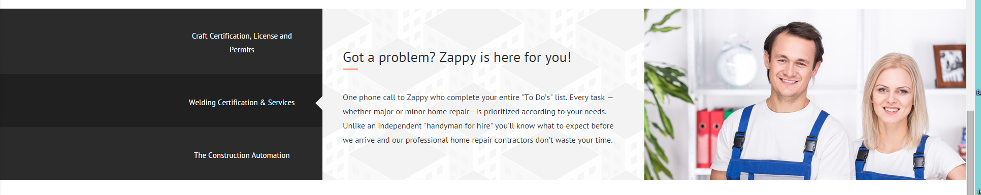
<div class="ct-tab-wrapper" data-bg-color="ffffff" data-bg-image="../assets/images/cleaning/pattern.png"> <div class="row"> <div class="col-xs-12 col-sm-4 col-md-3"> <ul class="nav nav-tabs"> <li class="active"> <a href="#a" data-toggle="tab"> Woodwork washing (doors, windowsills, cabinets) <div class="ct-u-extender"></div> </a> </li> <li> <a href="#b" data-toggle="tab"> Interior appliance cleaning <div class="ct-u-extender"></div> </a> </li> <li> <a href="#c" data-toggle="tab"> Carpet & upholstery cleaning <div class="ct-u-extender"></div> </a> </li> </ul> </div> <div class="col-xs-12 col-sm-8 col-md-9"> <div class="tab-content"> <div class="tab-pane fade active in" id="a"> <h3 class="tab-pane-title ct-u-hrLeft ct-u-autoAlignment--center"> Zappy is ready to fix all your problems! </h3> <p class="tab-pane-text"> One phone call to Zappy who complete your entire "To Do’s" list. Every task —whether major or minor home repair—is prioritized according to your needs. Unlike an independent "handyman for hire" you'll know what to expect before we arrive and our professional home repair contractors don't waste your time. </p> </div> <div class="tab-pane fade" id="b"> <p class="tab-pane-text"> Secondo sed ac orci quis tortor imperdiet venenatis. Duis elementum auctor accumsan. Aliquam in felis sit amet augue. </p> </div> <div class="tab-pane fade" id="c"> <p class="tab-pane-text"> Thirdamuno, ipsum dolor sit amet, consectetur adipiscing elit. Duis pharetra varius quam sit amet vulputate. Quisque mauris augue, molestie tincidunt condimentum vitae. </p> </div> </div> </div> </div> <!-- /row --> </div> |
Was this article helpful ?
Testimonials
There are several types of available Testimonials.
Sidebar Widget
Testimonial widget
HTML markup:
|
1 2 3 4 5 6 7 8 9 10 11 12 13 14 15 16 17 18 19 20 21 22 23 |
<div class="ct-testimonial-sidebar ct-u-autoAlignment--center"> <h3 class="ct-u-hrLeft ct-u-autoAlignment--center">Testimonials</h3> <div class="ct-testimonial-sidebar-item ct-u-hrLeft"> <h5>Dana Kevins</h5> <p>You installed new sinks, installed water heater, fixed leaks in the shower, and also installed pipes.If you are going to face with repair tasks, and don't have the time or the ability to deal with it, I give my highest recommendation. </p> <div class="ct-socialIcon-wrapper ct-u-autoAlignment--center"> <a href="https://www.facebook.com/createITpl" class="ct-socialIcon ct-socialIcon-circle"><i class="fa fa-facebook"></i></a> <a href="https://twitter.com/createitpl" class="ct-socialIcon ct-socialIcon-circle"><i class="fa fa-twitter"></i></a> </div> </div> ... </div> |
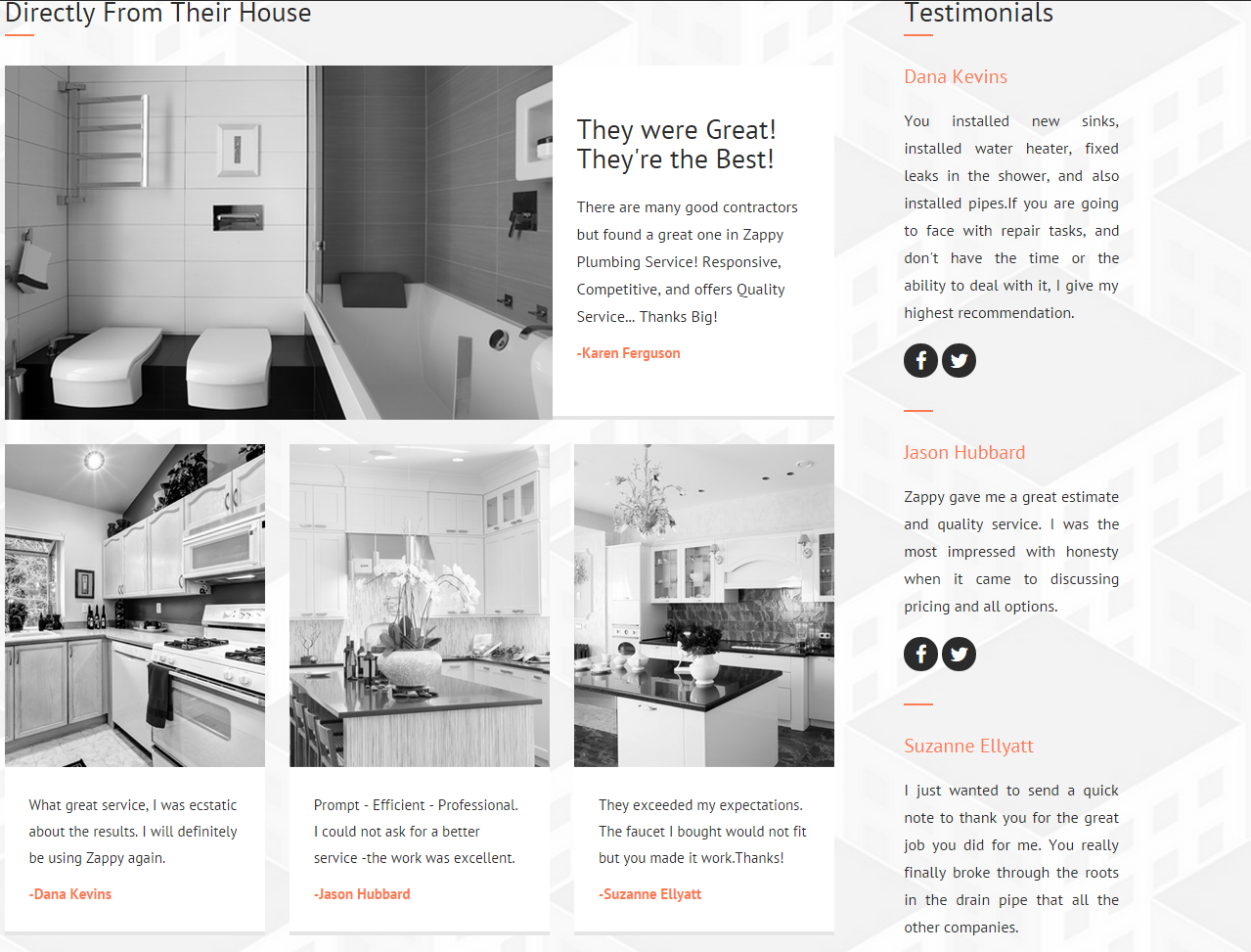
IMAGE TESTIMONIAL
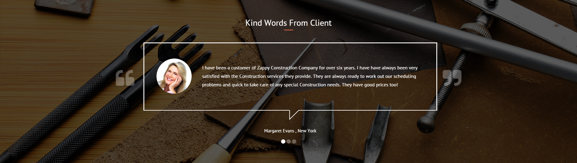
Image testimonial
HTML markup:
|
1 2 3 4 5 6 7 8 9 10 11 12 13 14 15 16 17 18 19 20 21 22 23 24 25 |
<div class="ct-testimonial"> <h3 class="ct-u-hrLeft ct-u-autoAlignment--center">Directly From Their House</h3> <div class="ct-testimonial-item"> <div class="ct-u-displayTable"> <div class="ct-u-displayTableCell"> <a href="#"><img src="../assets/images/cleaning/BathRoomTestimonialsBig.png"></a> </div> <div class="ct-u-displayTableCell ct-testimonial-item--inner"> <h3>They were Great!</h3> <h3>They're the Best!</h3> <p class="ct-u-paddingTop20"> There are many good contractors but found a great one in Zappy Plumbing Service! Responsive, Competitive, and offers Quality Service... Thanks Big! </p> <span>Karen Ferguson</span> </div> </div> </div> ... </div> |
PERSON BOXES TESTIMONIAL
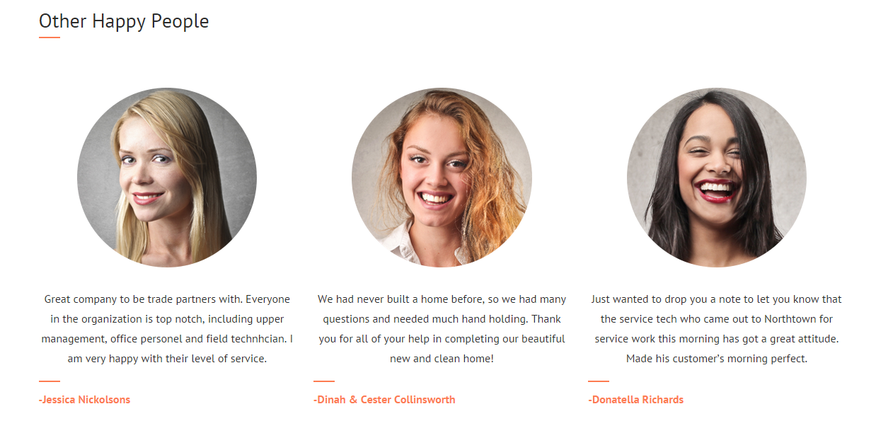
Testimonial with person boxes
HTML markup:
|
1 2 3 4 5 6 7 8 9 10 11 12 13 14 |
<div class="ct-personBox ct-personBox--testimonial"> <img class="ct-u-paddingBottom30" src="../assets/images/cleaning/PersonBox01Blonde.png" alt="Team Member 1"> <p class="ct-u-hrLeft text-justify"> Great company to be trade partners with. Everyone in the organization is top notch, including upper management, office personel and field technhcian. I am very happy with their level of service. </p> <p>Jessica Nickolsons</p> </div> |
Available CSS classes:
.ct-testimonial: Indicates testimonial’s display properties.
.ct-testimonial-item: Testimonial’s element;
.ct-testimonial-item–inner: Inner content of Testimonial’s element.
.ct-testimonial-sidebar: Indicates testimonial’s display properties for sidebar.
.ct-testimonial-sidebar-item: Testimonial’s sidebar item.
.ct-personBox–testimonial: person box for testimonials.
Was this article helpful ?
Event article

Event article
Use the following HTML markup to insert event article:
|
1 2 3 4 5 6 7 8 9 10 11 12 13 14 |
<article> <h6 class="ct-u-paddingBottom10">Recent Event</h6> <h1 class="ct-u-paddingBottom40"><a href="#">01/01/2015</a></h1> <p>Found a new fixture at Home Depot or Lowes but are not able to transport it home? We are here to help you. Just let us know which toilet, water heater, faucet you want and we will purchase it. </p> <a class="btn btn-lg btn-default" href="#"><span>Learn more</span> <i class="fa fa-location-arrow"></i> </a> </article> |
Available CSS classes:
- .ct-articleBox : Indicates display properties for an article element.
- .ct-articleBox–default : Default display properties.
- .ct-articleBox-media : An article media like images or video.
- .ct-articleBox-description : Article’s description.
Was this article helpful ?
Buttons
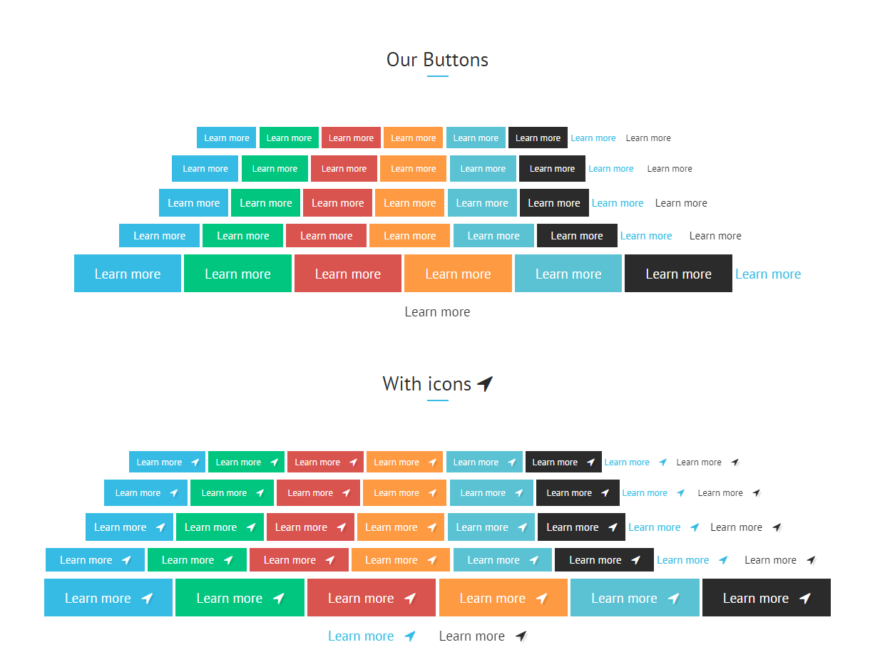
Buttons
Dozens of variations to select any button you want! Use the simple HTML markup:
|
1 2 3 4 5 6 |
<a class="btn btn-lg btn-primary pull-left" href="#"> <span> Learn More </span> <i class="fa fa-location-arrow"></i> </a> |
And adjust button appearance with the following variations:
- .btn-primary,
- .btn-success,
- .btn-danger,
- .btn-warning,
- .btn-white,
- .btn-info,
- .btn-transparent,
- .btn-default,
- .btn-lg,
- .btn-sm,
- .btn-xs,
Was this article helpful ?
Table
We prepared custom tables with simple HTML markup:
|
1 2 3 4 5 6 7 8 9 10 11 12 13 14 |
<div class="ct-schedule"> <div class=">Opening Hours</div> <div class="ct-u-displayTable"> <div class="ct-u-displayTableRow--equal"> <div class="ct-u-displayTableCell">Mon</div> <div class="ct-u-displayTableCell text-right">8.00am - 6.30pm</div> </div> ... </div> </div> |
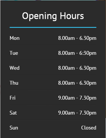
Opening Hours table
Was this article helpful ?
Icon Box
There are two main types of icon boxes:
Default
– can be created with class .ct-iconBox, used in the following markup:
|
1 2 3 4 5 6 7 8 9 10 11 12 13 14 15 16 17 18 19 |
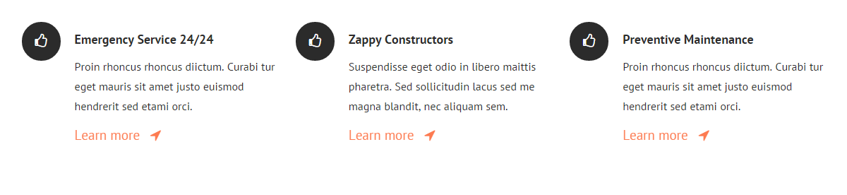
<div class="ct-iconBox ct-iconBox--mid"> <a class="ct-iconBox-icon ct-iconBox-icon--verylarge ct-iconBox-icon--circle ct-iconBox-icon--dark ct-u-marginBottom30"> <i class="fa fa-truck"></i> </a> <div class="ct-iconBox-content"> <h6 class="ct-iconBox-title ct-fw-600 ct-u-paddingBottom20"> Plumbing & Installation </h6> <p class="ct-u-paddingBottom30"> Praesent at porttitor mi. Inteu ger convallis gravida arcu auc hendrerit vivamus. </p> <a class="btn btn-lg btn-primary" href="#">Learn More <i class="fa fa-location-arrow"></i> </a> </div> </div> |
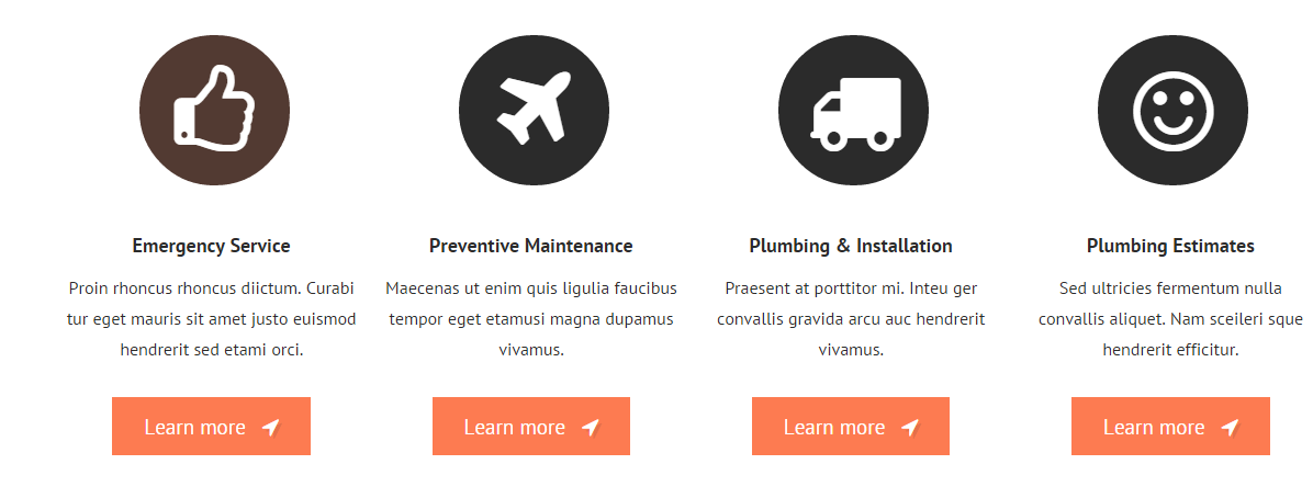
Default icon boxes
Secondary
– can be created with the class .ct-iconBox–secondary, used in the following HTML markup:
|
1 2 3 4 5 6 7 8 9 |
<div class="ct-iconBox ct-iconBox--secondary ct-iconBox-icon--dark"> <i class="fa fa-headphones"></i> <div class="pull-right ct-u-paddingTop50"> <span class="">Plumbing Emergency</span> <h2 class="ct-u-hrLeft ct-u-paddingTop10">We’re available 24/7.</h2> <h6 class="text-uppercase ct-u-paddingBoth20">Call service zappy today</h6> There <span>-(12) 345-6789</span> </div> </div> |
Secondary icon boxes
Both types can be also adjusted with the following CSS variations:
.ct-iconBox-icon,
.ct-iconBox–default,
.ct-iconBox-title,
.ct-iconBox–mid,
.ct-iconBox-icon–verylarge,
.ct-iconBox–left,
.ct-iconBox-content,
.ct-iconBox-icon–dark,
Was this article helpful ?
Worksample slider

Worksample slider
Create a slider with the simple HTML markup:
|
1 2 3 4 5 6 7 8 9 10 11 12 13 14 15 16 17 18 19 20 21 22 23 24 25 26 27 28 29 30 31 32 33 34 35 36 37 38 39 40 |
<div class="ct-worksample"> <div class="col-lg-3"> <div class="ct-worksample-sidebar"> <h3 class="ct-u-hrLeft">Sampels of my work</h3> <p> Our values are knowledge, professionalism, safety, and efficiency. Our goal is to not only help you build and/or repair your home, but to make the process very easy and affordable for you. We are a company with a wide range of experience. </p> <a class="btn btn-lg btn-transparent" href="#">View Project <i class="fa fa-location-arrow"></i> </a> </div> </div> <div class="col-lg-9"> <div class="ct-js-owl ct-worksample-slider" data-animations="true" data-items="3" data-navigation="true" data-pagination="false" data-single="false" data-lgItems="3"> <!------------------------------------------------------------------------------------------------------------------------> <div class="item"> <img src="../assets/images/cleaning/worksample-slider/OwlTwoWomenCleaningCarpet.png"> <div class="ct-u-displayTable"> <h5 class=" ct-u-marginBottom50">Water, drain and gas systems (repipes)</h5> <a class="btn btn-lg btn-transparent" href="#">View Project <i class="fa fa-location-arrow"></i> </a> </div> </div> ... </div> </div> </div> |
You can select between two variations:
.ct-worksample-sidebar,
.ct-worksample-slider.
Was this article helpful ?
Welcome visitor

Welcome Visitor
Create Welcome! section with the simple HTML markup:
|
1 2 3 4 5 6 7 8 9 10 11 12 13 14 15 16 17 18 19 20 21 22 23 24 25 26 27 28 29 30 |
<section class="ct-js-section ct-advert ct-u-marginTop70" data-bg-color="f5f6f9"> <div class="container"> <div class="row"> <div class="col-sm-7"> <div class="ct-u-paddingTop130"> <a class="h1 ct-u-colorPrimary">Welcome Visitor!</a> </div> <p class="h4 ct-u-paddingTop30">Professional Cleaning Services for You</p> <p class="ct-u-paddingBoth40"> Proin rhoncus rhoncus dictum. Curabitur eget mauris sit amet justo euismod hendrerit sed etuiu etami orci. Suspendisse ac risus turpis. Integer convallis sed erat consectetur. </p> <a class="btn btn-lg btn-default ct-u-marginBottom110 animated" data-fx="fadeInUp" href="#"><span>Learn more</span> <i class="fa fa-location-arrow"></i> </a> </div> <div class="ct-u-imgWrapper"> <img src="../assets/images/demo-content/cleaning/welcomevisitor-img.png" alt=""> </div> </div> </div> </section> |
Was this article helpful ?
Gallery Slider
Gallery slider
Use the following HTML markup to insert slider:
|
1 2 3 4 5 6 7 8 9 10 11 12 13 14 15 16 17 18 19 20 21 22 23 24 25 26 27 28 29 30 31 32 |
<div class="ct-gallery-slider"> <div class="ct-gallery"> <div class="ct-js-owl ct-sliderbuttons-middle" data-animations="true" data-items="5" data-navigation="true" data-pagination="false" data-single="false"> <div> <div class="ct-galleryBox ct-galleryBox--type2 ct-galleryBox--primary"> <a href="../assets/images/cleaning/slider-gallery/row1/1.png" class="ct-js-magnificPopupImage"> <img src="../assets/images/cleaning/slider-gallery/row1/1.png" alt="Zappy"> </a> <div class="ct-galleryBox-overlay"> <div class="ct-u-displayTableVertical"> <div class="ct-u-displayTableCell"> <div class="ct-galleryBox-icons"> <a href="../assets/images/cleaning/TwoWomenCleaningCarpetGV1.png" class="ct-js-magnificPopupImage"> <div class="ct-galleryBox-overlayIcon"> <span>Quick View</span> </div> </a> </div> </div> </div> </div> </div> </div> </div> </div> |
You can modify slider settings using the following CSS classes for variations:
.ct-gallery-slider – Type for gallery slider. It indicates general display properties for the whole type of slider.
.ct-gallery,
.ct-galleryBox-icons,
.ct-js-magnificPopupImage.ct-galleryBox-overlay,
.ct-galleryBox–primary,
.ct-galleryBox-overlayIcon,
.ct-js-owl – Idicates owl-slider.
.ct-u-displayTableCell – Element displayed as ‘table-cell’.
.ct-galleryBox–type2 – Indicates gallery item properties.
.ct-galleryBox–primary – Indicates color for ‘.ct-galleryBox’ content.
.ct-u-displayTableVertical – Indicates element that acquires height 100% and every nested element in ‘display-cell’ mode is vertically aligned to ‘middle’.
.ct-sliderbuttons-top – Indicates position of buttons in the top of a slider. Buttons are placed on the far left and right side.
.ct-sliderbuttons-middle – Indicates position of buttons in the middle of a slider. Buttons are placed on the far left and right side.
.ct-sliderbuttons-bottom – Indicates position of buttons in the bottom of a slider. Buttons are placed on the far left and right side.
.ct-sliderbuttons-top2 – Parent class. Indicates position of buttons in the top of a slider.Buttons are attached to each other.
.ct-sliderbuttons-bottom2 – Parent class. Indicates position of buttons in the bottom of a slider.Buttons are attached to each other.
.ct-sliderbuttons-top2–left – Descendant class.Buttons are placed on the top-left of a slider.
.ct-sliderbuttons-top2–middle – Descendant class. Buttons are place on the top-middle of a slider.
.ct-sliderbuttons-top2–right – Descendant class. Buttons are place on the top-right of a slider.
Was this article helpful ?
Chess slider

Chess slider
Create beautiful chess slider with the simple HTML markup:
|
1 2 3 4 5 6 7 8 9 10 11 12 13 14 15 16 17 18 19 20 21 22 23 24 25 26 27 28 29 30 31 32 33 34 35 36 37 |
<div class="ct-js-owl ct-chess-slider ct-sliderbuttons-bottom" data-animations="true" data-items="3" data-lgItems="2" data-mdItems="2" data-smItems="1" data-navigation="true" data-pagination="false" data-single="false"> <div class="item"> <div class="ct-u-displayTable"> <div class="ct-u-displayTableRow"> <div class="ct-u-displayTableCell"> <i class="fa fa-cog"></i> <p>Cleaning Green</p> </div> <div class="ct-u-displayTableCell"> Lorem ipsum tiouidoi lor siti amet, cosecim tetr aidip iscing etiui elita ei. </div> </div> <div class="ct-u-displayTableRow"> <div class="ct-u-displayTableCell"> <i class="fa fa-coffee"></i> <p>Carpet Cleaning</p> </div> <div class="ct-u-displayTableCell"> Lorem ipsum tiouidoi lor siti amet, cosecim tetr aidip iscing etiui elita ei. </div> </div> </div> </div> ... </div> |
You can easily change slider settings with the following CSS variations:
.ct-chess-slider – Type for chess slider. It indicates general display properties for the whole type of slider.
.ct-u-displayTableCell – Element displayed as ‘table-cell’.
.ct-u-displayTableRow – Element displayed as ‘table-row’.
.ct-sliderbuttons-top – Indicates position of buttons in the top of a slider. Buttons are placed on the far left and right side.
.ct-sliderbuttons-middle – Indicates position of buttons in the middle of a slider. Buttons are placed on the far left and right side.
.ct-sliderbuttons-bottom – Indicates position of buttons in the bottom of a slider. Buttons are placed on the far left and right side.
.ct-sliderbuttons-top2 – Parent class. Indicates position of buttons in the top of a slider.Buttons are attached to each other.
.ct-sliderbuttons-bottom2 – Parent class. Indicates position of buttons in the bottom of a slider.Buttons are attached to each other.
.ct-sliderbuttons-top2–left – Descendant class.Buttons are placed on the top-left of a slider.
.ct-sliderbuttons-top2–middle – Descendant class. Buttons are place on the top-middle of a slider.
.ct-sliderbuttons-top2–right – Descendant class. Buttons are place on the top-right of a slider.
Was this article helpful ?
Javascript Components
All javascripts are placed in folder /js. In main.js file we implement all functions calls.
This theme uses following Javascript files:
- js/charts/init.js – chart display.
- js/countdown/jquery.mb-comingsoon.min.js – Date counter (e.g. ‘Under Maintenance’ page)
- js/counter/init.js,
- js/counter/jquery.countTo.js – Counter display.
- js/ct-mediaSection/init.js,
- js/ct-mediaSection/jquery.frogaloop.min.js,
- js/ct-mediaSection/jquery.stellar.min.js – Media section preformance.
- js/gmaps/init.js,
- js/gmaps/gmap3.min.js – Google maps display.
- js/magnific-popup/init.js,
- js/magnific-popup/jquery.magnific-popup.min.js – portfolio item display.
- js/owl/init.js,
- js/owl/owl.carousel.js – Owl carousel.
- js/portfolio/init.js,
- js/portfolio/imagesloaded.js,
- js/portfolio/jquery.isotope.min.js – Portfolio performance.
- js/progressbars/init.js – Progress bars display.
- js/progressicons/init.js – Progress icons performance.
- js/jquery.stellar.min.js,
- js/init.js – Parallax effect.
- js/device.min.js,
- js/snap.min.js,
- js/jquery.appear.js – Menu in mobile devices.
- bootstrap/js/bootstrap.min.js – compiled bootstrap plugin.
- js/less.min.js – less compilation.
- js/placeholder.min.js – old browsers support for placeholders.
- js/easing.1.3.js – easing animations.
- js/browser.min.js – browser identification.
Google Map (GMAP3 Plugin)
This is google map with custom marker, you can define couple parameters:
- data-location – address to show
- data-height – map height (if undefined height will be 220px)
- data-offset – by how many map should be repositioned from marker center point (default -30)
It uses gmap3 plugin.
Documentation: here
HTML Markup:
|
1 |
<div class="ct-googleMap" data-location="Narbutta 24, Warsaw" data-zoom="15" data-height="500"></div> |
All javascript code can be found in js/main.js file.
jquery.appear
This plugin call function when element appear in viewport. This is used in custom animation, progress bars, counter timer.
Documentation: https://github.com/bas2k/jquery.appear/
|
1 2 3 4 5 6 7 8 9 10 11 12 13 |
if (jQuery().appear) { if (device.mobile()) { // disable animation on mobile jQuery("body").removeClass("withAnimation"); } else { jQuery('.withAnimation .animated').appear(function () { jQuery(this).each(function () { jQuery(this).addClass('activate'); jQuery(this).addClass($(this).data('fx')); }); }, {accY: -150}); } } |
Charts.js
This plugin is used to make graphics.
Documentation: http://www.chartjs.org/
Was this article helpful ?
Sources & Credits
The following sources and files have been used to build up this theme
- Twitter Bootstrap – http://twitter.github.com/bootstrap/
- jQuery – http://www.jquery.com
Was this article helpful ?