95% of recent themes on themeforest are using this great and popular font-end framework to efficiently scale projects with one code base, from phones to tablets to desktops.
Grid system
Bootstrap includes a responsive, mobile first fluid grid system that appropriately scales up to 12 columns as the device or viewport size increases. It includes predefined classes for easy layout options, as well as powerful mixins for generating more semantic layouts.
Introduction
Grid systems are used for creating page layouts through a series of rows and columns that house your content. Here’s how the Bootstrap grid system works:
- Rows must be placed within a .container (fixed-width) or .container-fluid (full-width) for proper alignment and padding.
- Use rows to create horizontal groups of columns.
- Content should be placed within columns, and only columns may be immediate children of rows.
- Predefined grid classes like .row and .col-xs-4 are available for quickly making grid layouts. Less mixins can also be used for more semantic layouts.
- Columns create gutters (gaps between column content) via padding. That padding is offset in rows for the first and last column via negative margin on .rows.
- Grid columns are created by specifying the number of twelve available columns you wish to span. For example, three equal columns would use three .col-xs-4.
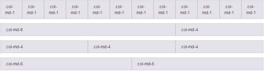
Grid layout system
|
1 2 3 4 5 6 7 8 9 10 11 12 13 14 15 16 17 18 19 20 21 22 23 24 25 26 27 28 29 |
<div class="container"> <div class="row"> <div class="col-md-1">.col-md-1</div> <div class="col-md-1">.col-md-1</div> <div class="col-md-1">.col-md-1</div> <div class="col-md-1">.col-md-1</div> <div class="col-md-1">.col-md-1</div> <div class="col-md-1">.col-md-1</div> <div class="col-md-1">.col-md-1</div> <div class="col-md-1">.col-md-1</div> <div class="col-md-1">.col-md-1</div> <div class="col-md-1">.col-md-1</div> <div class="col-md-1">.col-md-1</div> <div class="col-md-1">.col-md-1</div> </div> <div class="row"> <div class="col-md-8">.col-md-8</div> <div class="col-md-4">.col-md-4</div> </div> <div class="row"> <div class="col-md-4">.col-md-4</div> <div class="col-md-4">.col-md-4</div> <div class="col-md-4">.col-md-4</div> </div> <div class="row"> <div class="col-md-6">.col-md-6</div> <div class="col-md-6">.col-md-6</div> </div> </div> |
Mobile and desktop
Don’t want your columns to simply stack in smaller devices? Use the extra small and medium device grid classes by adding
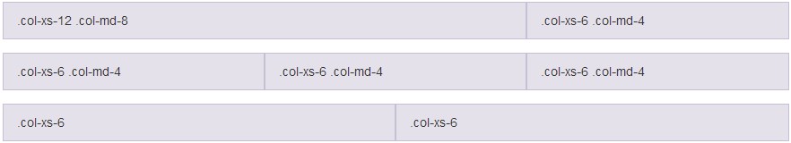
Responsive grid layout
|
1 2 3 4 5 6 7 8 9 10 11 12 13 14 15 16 17 18 |
<!-- Stack the columns on mobile by making one full-width and the other half-width --> <div class="row"> <div class="col-xs-12 col-md-8">.col-xs-12 .col-md-8</div> <div class="col-xs-6 col-md-4">.col-xs-6 .col-md-4</div> </div> <!-- Columns start at 50% wide on mobile and bump up to 33.3% wide on desktop --> <div class="row"> <div class="col-xs-6 col-md-4">.col-xs-6 .col-md-4</div> <div class="col-xs-6 col-md-4">.col-xs-6 .col-md-4</div> <div class="col-xs-6 col-md-4">.col-xs-6 .col-md-4</div> </div> <!-- Columns are always 50% wide, on mobile and desktop --> <div class="row"> <div class="col-xs-6">.col-xs-6</div> <div class="col-xs-6">.col-xs-6</div> </div> |
Offsetting columns
Move columns to the right using
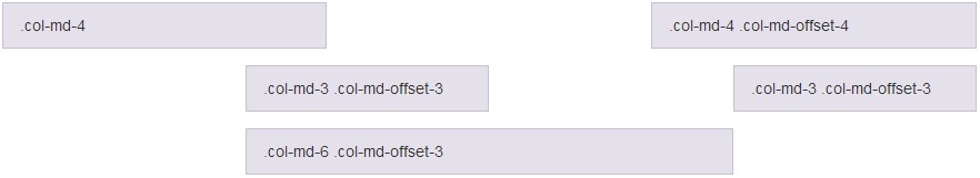
Add spacing between your columns
|
1 2 3 4 5 6 7 8 9 10 11 |
<div class="row"> <div class="col-md-4">.col-md-4</div> <div class="col-md-4 col-md-offset-4">.col-md-4 .col-md-offset-4</div> </div> <div class="row"> <div class="col-md-3 col-md-offset-3">.col-md-3 .col-md-offset-3</div> <div class="col-md-3 col-md-offset-3">.col-md-3 .col-md-offset-3</div> </div> <div class="row"> <div class="col-md-6 col-md-offset-3">.col-md-6 .col-md-offset-3</div> </div> |
Responsive utilities
For faster mobile-friendly development, use these utility classes for showing and hiding content by device via media query. Also included are utility classes for toggling content when printed.
Try to use these on a limited basis and avoid creating entirely different versions of the same site. Instead, use them to complement each device’s presentation. Responsive utilities are currently only available for block and table toggling. Use with inline and table elements is currently not supported.
Available classes
Use a single or combination of the available classes for toggling content across viewport breakpoints.
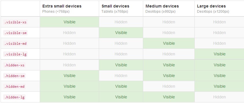
Using these classes will help you show or hide content on your website, depending on the user screen size.
More information here: http://getbootstrap.com/