{Theme} comes with an advanced customizer, which allows to edit most of the theme elements in one place. If you want to use it, navigate to Appearance > Customize
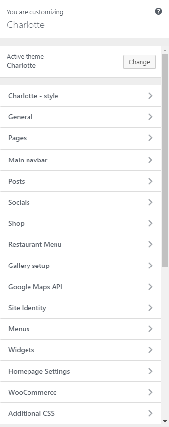
Charlotte Customizer
Charlotte – style
You can pick the color scheme of the site here.
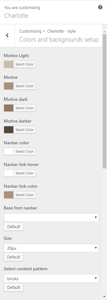
Charlotte – style
- Motive Light – A light motive color of the site.
- Motive – The main color scheme of the site.
- Motive dark – A dark motive color of the site.
- Motive darker – A darker motive color of the site.
- Navbar color – The font color of the words in the Navigation bar.
- Navbar link hover – The font color of the words with links when hovered.
- Navbar link color – The font color of words with links in the Navigation bar.
- Base font navbar – The font style of the words with links in the Navigation bar.
- Size – The font size of the words with links in the Navigation bar.
- Select content pattern – The background pattern of the site.
General
Here you will have the option to customize your site’s identity or how it can be viewed by people.
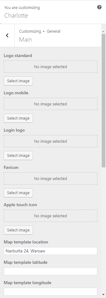
General
- Logo standard – Logo in the Navigation bar.
- Logo mobile – Logo shown in mobile version.
- Login logo – logo shown in the login section.
- Favicon – Icon used as the image in the tab of the site.
- Apple touch icon
- Map template location – Address for the map template.
- Map template latitude – Latitude coordinate for the location in the map.
- Map template longitude – Longitude coordinate for the location in the map.
- Search icon in navbar – Option to shoe or hide the search icon in the navigation bar.
- Page 404 sidebar background image – Image used as the background for the 404 page’s sidebar.
- Page 404 sidebar background style – Style of the 404 page’s sidebar background.
- Page 404 sidebar animated background – Option to add animation on the 404 page’s sidebar background.
Pages
Pages is divided into 2:

Pages
Page sidebar options
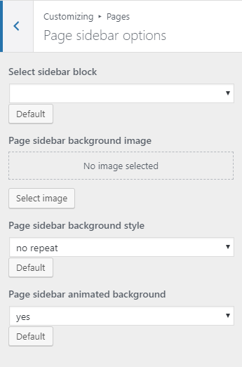
Page sidebar options
- Select sidebar block – What the side bar will show.
- Page sidebar background image – Set an image as the background for the sidebar.
- Page sidebar background style – The background style of the sidebar.
- Page sidebar animated background – Option to add animation on the sidebar background.
Header
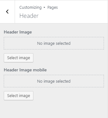
Header
- Header Image – Image set as the Header background.
- Header Image mobile – Image set as the Header background in the mobile version.
Main navbar
You can customize the navigation bar’s look.

Style
- Navbar background image – Set a background image for the sidebar.
- Top divider background – Add a top divider image.
- Bottom divider background – Add a bottom divider image.
- Top divider background style – Top divider background style.
- Bottom divider background style – Bottom divider background style.
- Bottom sidebar – Option to show bottom widgets area.
Posts
Posts is divided into 3:
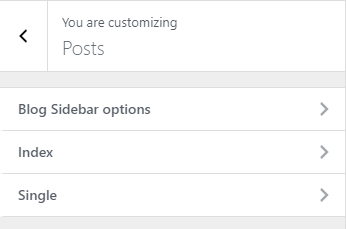
Posts
Blog Sidebar options
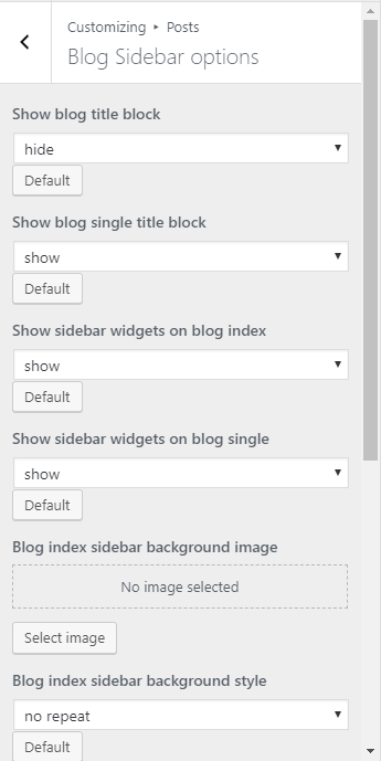
Blog Sidebar options
- Show blog title block – Option to show the blog title block.
- Show blog single title block – Option to show the blog single title block.
- Show sidebar widgets on blog index – Option to show sidebar widgets on blog index.
- Show sidebar widgets on blog single – Option to show sidebar widgets on blog single.
- Blog index sidebar background image – Set the background image of the blog index sidebar.
- Blog index sidebar background style – The style of the background image of the blog index sidebar.
- Blog single sidebar background image – Set the background image of the blog single sidebar.
- Blog single sidebar background style – The style of the background image of the blog single sidebar.
- Blog index sidebar animated background – Option to add animation on the background of the blog index sidebar.
- Blog single sidebar animated background – Option to add animation on the background of the blog single sidebar.
Index
Index
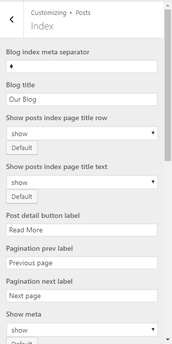
- Blog index meta separator – Icon/sign that separates the information about the blog.
- Blog title – Title of the blog page.
- Show posts index page title row – Option to show posts index page title row.
- Show posts index page title text – Option to show posts index page title text.
- Post detail button label – What is written in the post detail button.
- Pagination prev label – Label for the pagination of previous page.
- Pagination next label – Label for the pagination of next page.
- Show meta – Show the meta details of the blog posts.
- Tags label – Label for tags.
- Date – Option to show the date when the blog is posted.
- Show featured media on blog index – Option to show media (images, videos, etc.,) that is in the blog post in the blog index.
- Title / quote author – Option to show the author of the post.
- Comments count – Option to show comment count.
- Post text – Set what the post text will show.
- Author link – Option to show author link.
- Show read more button? – Option to show read more button.
Single
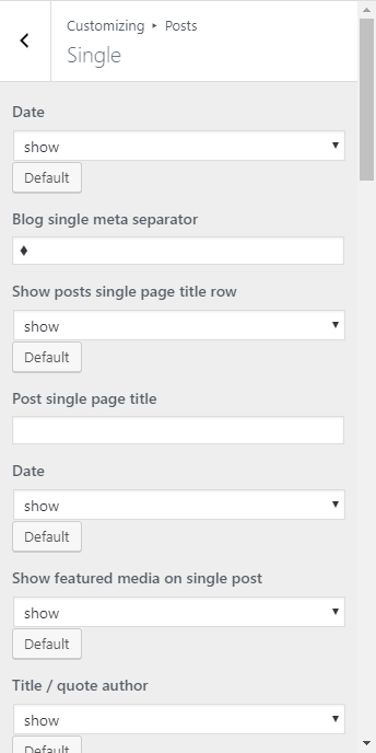
Single
- Date – Option to show the date of the blog.
- Blog single meta separator – Icon/sign that separates the information about the blog.
- Show posts single page title row – Option to show posts single page title row.
- Post single page title – Option to show posts single page title text.
- Date – Option to show the date of the blog.
- Show featured media on single post – Option to show media (images, videos, etc.,) that is in the blog post in the blog index.
- Title / quote author – Option to show the author of the post.
- Content – Option to show the content of the blog.
- Author link – Option to show author link.
- Comments – Option to allow comment in blog post.
- Comment form – Option to show the comment form for the blog.
- Tag cloud – Option to show tags of the blog.
- Categories – Option to show blog category.
- Show author box
- Pagination – Option to show pagination.
- Tags label – Label for tags.
- Previous post label – Label for the pagination of previous post.
- Next post label – Label for the pagination of next post.
- By label – Label of by.
- Comment reply label – Label of reply.
- Leave a comment label – Label for Leave a comment.
- Comment Form submit label – Label Comment Form Submit.
- Comment Form name placeholder – Label Comment Form name.
- Comment Form email placeholder – Label Comment Form email.
- Comment Form message placeholder – Label Comment Form message.
- Bottom divider – Add a bottom divider image.
- Bottom divider background style – Bottom divider background style.
- Comments top divider – Top divider for the comments.
- Comments top divider background style – Top divider background style for the comments.
- Comments bottom divider – Bottom divider for the comments.
- Comments bottom divider background style – Bottom divider background style for the comments.
- Comment Form divider background style – Comment form divider background style for the comments.
Socials
This is where you can set your socials account.
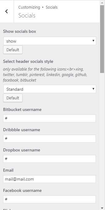
Socials
- Show socials box – Option to show social box in the header.
- Select header socials style – What the style of the header socials will look.
- Bitbucket username – Account for the site.
- Dribbble username – Account for the site.
- Dropbox username – Account for the site.
- Email – Email address for the site.
- Facebook – Account for the site.
- Twitter – Account for the site.
- Pinterest – Account for the site.
- Instagram – Account for the site.
- RSS – Account for the site.
- LinkedIn – Account for the site.
- Google Plus – Account for the site.
- Tumblr – Account for the site.
- Skype – Account for the site.
- Dribble – Account for the site.
- Dropbox – Account for the site.
- Flickr – Account for the site.
- Github – Account for the site.
Shop
Shop is divided to 3:

Shop
Shop Sidebar options
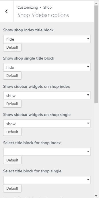
Shop Sidebar options
- Shop index sidebar background style –
- Shop single sidebar background style
Shop index options
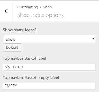
Shop index options
- Show share icons? – Option to show share icons.
- Top navbar Basket label – Label for the navigation bar basket.
- Top navbar Basket empty label – Label when the navigation bar is empty.
Shop index options
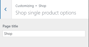
Shop single product option
- Page title – Title for the single product page.
Restaurant Menu
Restaurant Menu is divided into 3:
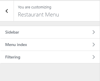
Restaurant Menu
Sidebar
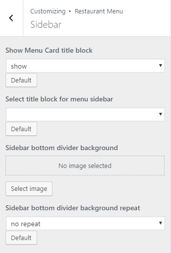
Sidebar
Menu index
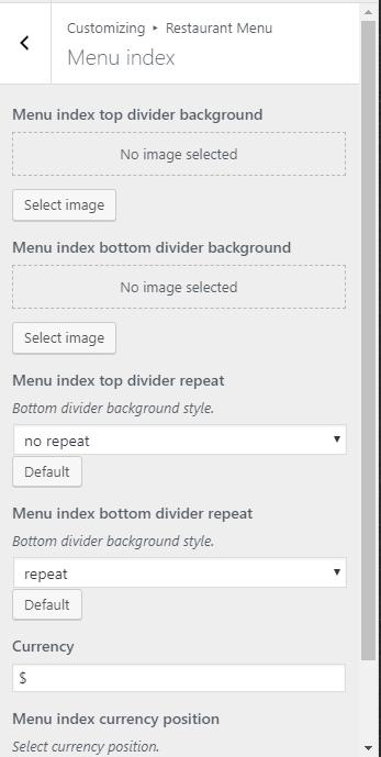
Menu index
Filtering
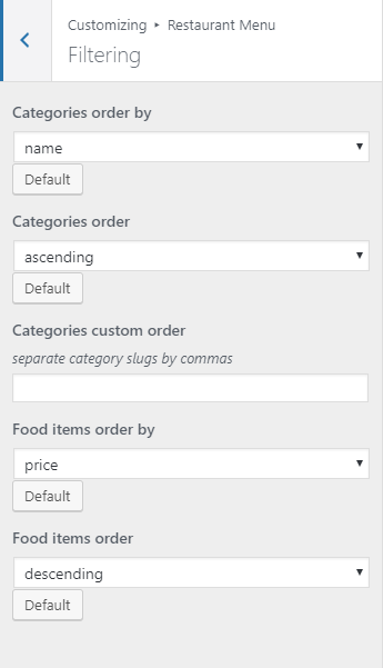
Filtering
Gallery Setup
Gallery Setup is divided into 4:
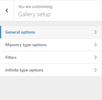
Gallery Setup
General options
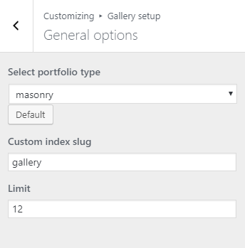
General options
- Select portfolio type – How the gallery/portfolio is going to look.
- Custom index slug – Slug for the page.
- Limit – Number of items in the gallery/portfolio that will show.
Masonry type options

Masonry type options
- Columns – Number of post per column.
- Pagination prev label – Label for the pagination previous page.
- Pagination next label – Label for the pagination next page.
Filters
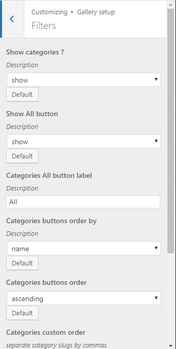
Filters
- Separate category slugs by commas.
Infinite type options

Infinite type options
- Columns – Number of column post per row.
- Random sizes – Option to show the images with random sizes.
Google Maps API

Google Maps API Config
- Google maps API key – API key set for the google maps.
Site Identity

Site Identity
- Site Title – The title of the site you created.
- Tagline – The slogan/catchphrase for you site. What people will remember if they see your site.
- Site Icon – The icon used as a browser icon. Icons must be square, and at least 512 pixels wide and tall.
Menus
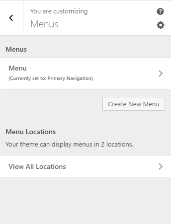
Menus
- Menus – These are the menus made by you. You can make/add a new menu or delete it here.
- Menu Location – {Theme} supports 2 menus: Primary Menu and Sidebar Menu
- Top primary menu – Choose which menu in the Menus you would like to use as the primary menu.
- Secondary menu in left sidebar – Choose which menu in the Menus would like to use as the sidebar menu.
Widgets
You can customize what is inside the widgets on the page. If a widget is placed on the page you see on the preview, it will be listed on the left side under widgets.
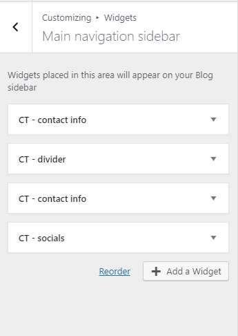
Widgets
Notice:
You can also do the same thing by going to Appearance > Widgets.
Homepage Settings
Option for the front page is shown here.
-
Front page displays – Options on how the front page/home page looks like.
-
Your latest posts – Show the latest post on your blogs.
-
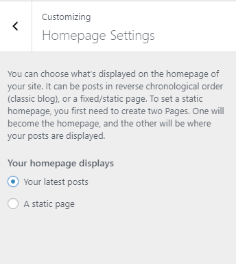
Homepage Setting 1
-
- A static page – Set a page that would stay the same until the page is replaced manually.

Homepage Settings 2
Notice:
You can also do this by going to Settings > Reading.
WooCommerce
WooCommerce is divided into 3:
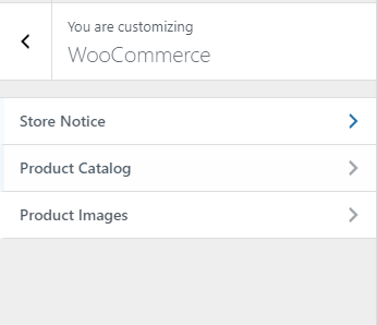
WooCommerce
Store Notice
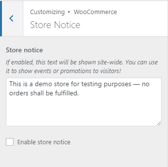
Store Notice
- Store notice – If enabled, this text will be shown site-wide. You can use it to show events or promotions to visitors.
- Enable store notice – Option to enable Store notice on the site.
Product Catalog
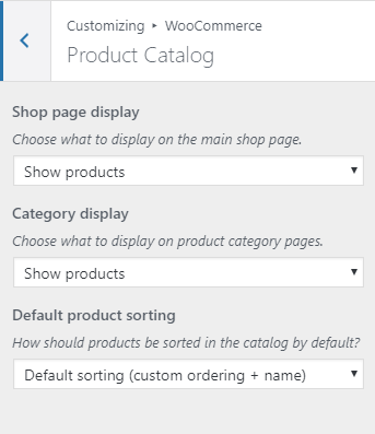
Product Catalog
- Choose what to display on the main shop page.
- Choose what to display on product category pages.
- How should products be sorted in the catalog by default?
Product Images

Product Images
- Image size used for the main image on single product pages. These images will remain uncropped.
- Image size used for products in the catalog and product gallery thumbnails.
- Thumbnail cropping
Additional CSS
You can add your own CSS code for your site.
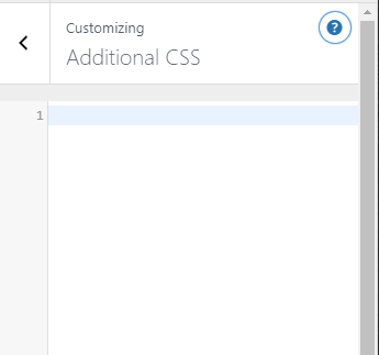
Additional CSS
Notice:
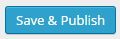
All changes made with customizer will only be applied when you click on