All sliders included in {Theme} have the following common HTML markup:
|
1 2 3 4 |
<div class="ct-js-owl owl-carousel owl-carousel--arrowsType2 ct-js-popupGallery" data-single="true" data-autoPlay="false" data-pagination="false" data-navigation="true" data-items="1" data-snap-ignore="true"> <div class="item"> <a href="../assets/images/demo-content/country-latest-offer-item1.jpg" class="ct-js-magnificPopupImage" title="Beautifull House"><img src="../assets/images/demo-content/country-latest-offer-item1.jpg" alt="Latest Offer 1"></a> </div> |
There are three types of slider basis on this markup. To select each type you need to add one of the following CSS classes to <div class="item"> tag:
owl-carousel–arrowsType1

Slider -type 1
owl-carousel–arrowsType2
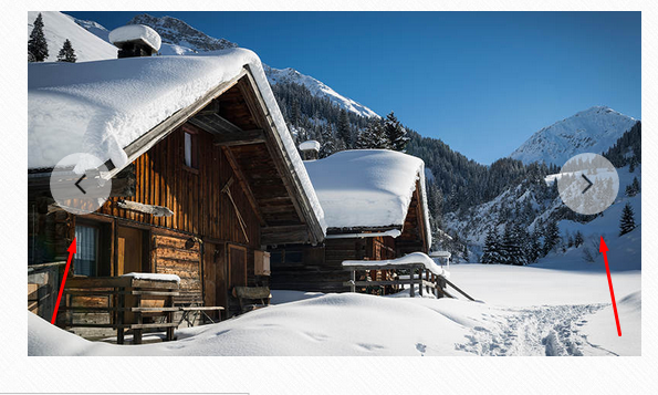
Slider – type 2
owl-carousel–arrowsOutside – navigation arrows will be displayed outside the slider content
Remember to include the following script in page with slider:
|
1 2 |
<script src="../assets/plugins/owl/owl.carousel.min.js"></script> <script src="../assets/plugins/owl/init.js"></script> |
Learn more:
Check slider advanced option in plugin documentation.