{Theme} comes with several types of Icon Boxes:
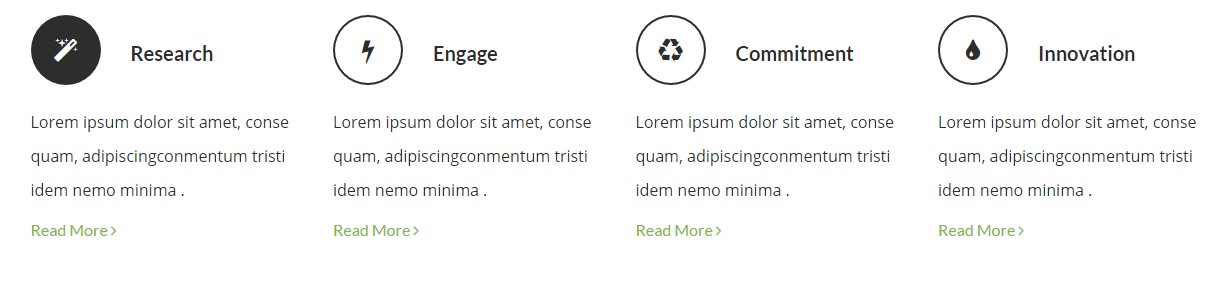
Screenshots for button variations
iconBox – Transparent version
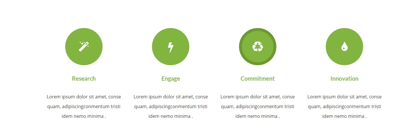
iconBox – Solid border version
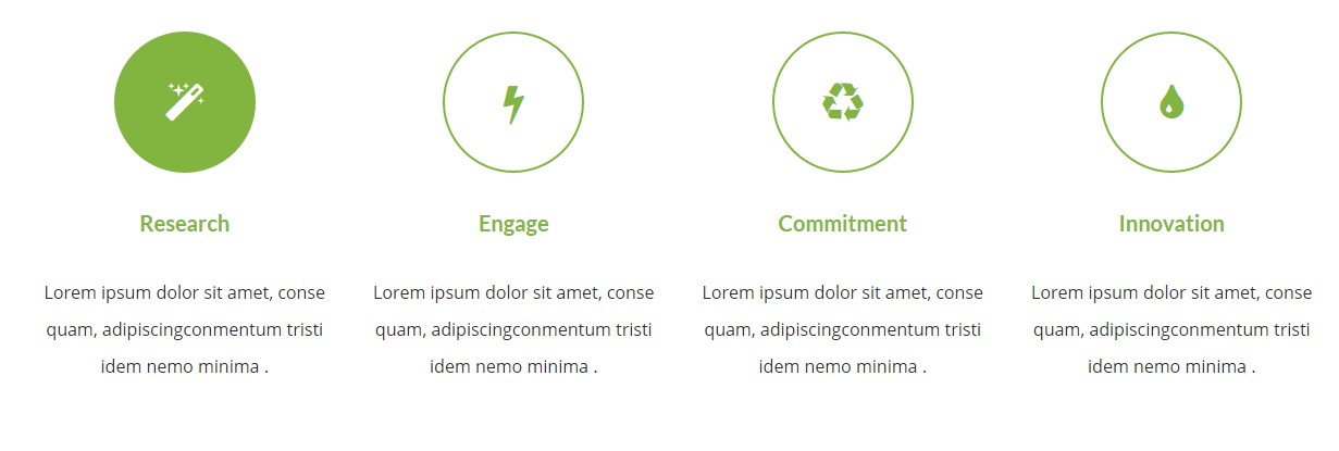
iconBox – Solid big version
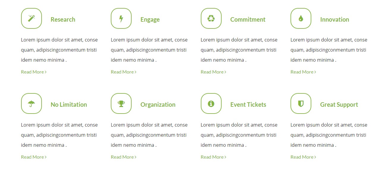
iconBox – Small transparent inline round version
iconBox – Small transparent dark inline version
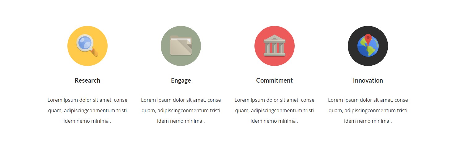
iconBox – Image version
Classes
— ct-iconBox (core class)
— ct-iconBox–small (define size of iconbox)
— ct-iconBox–Big (define size of iconbox)
— ct-iconBox–solidBorder (on hover border changed to dark green)
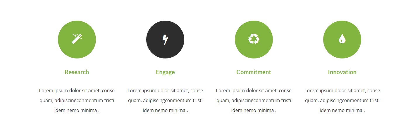
— ct-iconBox–solid (on hover background to black)
— ct-iconBox–solidBlue (different background, hover to black)
— ct-iconBox–solidYellow (different background, hover to black)
— ct-iconBox–solidRed (different background, hover to black)
— ct-iconBox–solidDark (different background, hover to black)
— ct-iconBox–withImageGreyScale (grayscale on hover)
— ct-iconBox–transparent (transparent background)
— ct-iconBox–inline (icon to the left, title to right)
Example of markup
|
1 2 3 4 5 6 7 8 9 10 11 12 |
<div class="ct-iconBox ct-iconBox--small ct-iconBox--transparent ct-iconBox--inline"> <div class="ct-icon"> <i class="fa fa-magic"></i> </div> <div class="ct-icon--description"> <h4 class="ct-fw-600 ct-u-colorMotive">Research</h4> <p class="ct-fw-400">Lorem ipsum dolor sit amet, conse quam, adipiscingconmentum tristi idem nemo minima .</p> <a href="course-single.html">Read More <i class="fa fa-angle-right"></i></a> </div> </div> |