There are two main types of icon boxes:
Default
– can be created with class .ct-iconBox, used in the following markup:
|
1 2 3 4 5 6 7 8 9 10 11 12 13 14 15 16 17 18 19 |
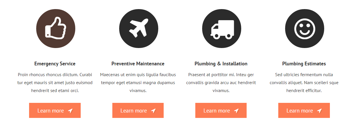
<div class="ct-iconBox ct-iconBox--mid"> <a class="ct-iconBox-icon ct-iconBox-icon--verylarge ct-iconBox-icon--circle ct-iconBox-icon--dark ct-u-marginBottom30"> <i class="fa fa-truck"></i> </a> <div class="ct-iconBox-content"> <h6 class="ct-iconBox-title ct-fw-600 ct-u-paddingBottom20"> Plumbing & Installation </h6> <p class="ct-u-paddingBottom30"> Praesent at porttitor mi. Inteu ger convallis gravida arcu auc hendrerit vivamus. </p> <a class="btn btn-lg btn-primary" href="#">Learn More <i class="fa fa-location-arrow"></i> </a> </div> </div> |
Default icon boxes
Secondary
– can be created with the class .ct-iconBox–secondary, used in the following HTML markup:
|
1 2 3 4 5 6 7 8 9 |
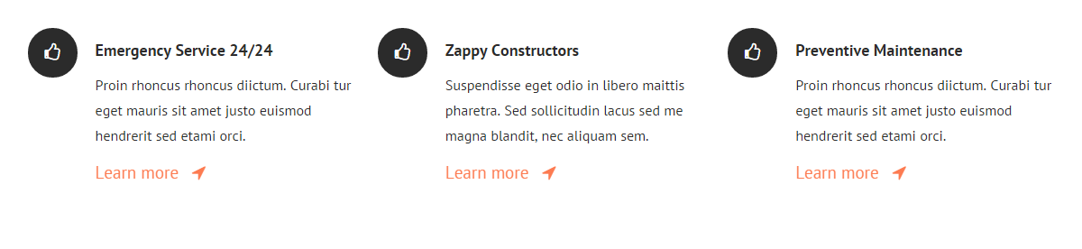
<div class="ct-iconBox ct-iconBox--secondary ct-iconBox-icon--dark"> <i class="fa fa-headphones"></i> <div class="pull-right ct-u-paddingTop50"> <span class="">Plumbing Emergency</span> <h2 class="ct-u-hrLeft ct-u-paddingTop10">We’re available 24/7.</h2> <h6 class="text-uppercase ct-u-paddingBoth20">Call service zappy today</h6> There <span>-(12) 345-6789</span> </div> </div> |
Secondary icon boxes
Both types can be also adjusted with the following CSS variations:
.ct-iconBox-icon,
.ct-iconBox–default,
.ct-iconBox-title,
.ct-iconBox–mid,
.ct-iconBox-icon–verylarge,
.ct-iconBox–left,
.ct-iconBox-content,
.ct-iconBox-icon–dark,