Section is essential element of page structure – it comes with number of structural and styles option. Below you will find main sections functionalities, which allow you to manage pages content easier.
To add new section – select Row from list of available components.
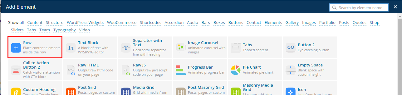
Add new section row
Once Row is selected you will see the list of the following options
- Type – you can choose between the following types: Divider, Parallax, Kenburns, Video, Default
- ID – section ID can be used if you want to create Onepager page – define custom ID for each section and corresponding /#section-id-name link in navigation menu
- Height – define custom section height,
- Divider color – this parameter will be displayed only if you selected Divider section type. Select background color for right (divided) column of the section
- Background mobile – this parameter will be displayed only if you selected Parallax or Kenburns section types – it allows you to select section background image, will be displayed on mobile devices,
- Background – this parameter will be displayed only if you selected Parallax or Kenburns section types – it allows you to select section background image,
- With container – select this option, if you want to keep your content in Bootstrap container, otherwise content will be full width (adjusted to browser window),
- Content centered – center align container content,
- Next section scroll button – creates button with arrow and link to different section (you can define, which sections it should be by its ID)
- Onepager element – select only if you want to create Onepager page and only for sections, which will be linked in your navigation menu
Section Types
Divider
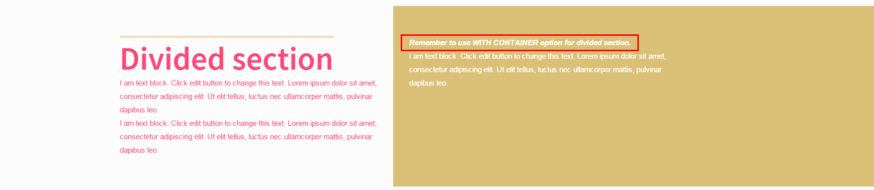
Divided section
Creates section, which is divided to two columns with different background. Left column has always default backgroud. For right you can select your color with Divider color parameter.
Notice: you will get the best effect if you will enable With Container option for divided section.
Default

Default section
Basic version of section. You can divide it for any number of columns. It’s by default has no background and text inside has Primary (motive) color.
Parallax

Parallax section
Define background image with Parallax effect. You can modify parallax ratio and section height with additional section parameters. You can use any content you want in Parallax section.
Kenburns
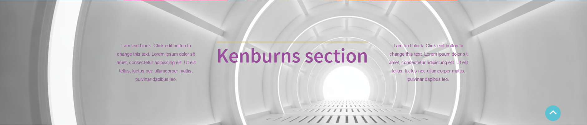
Kenburns section
Creates animated background with images, which are transits one to another.
Notice: to keep your pages structure responsive – every page page element should be inside Row (section) element.