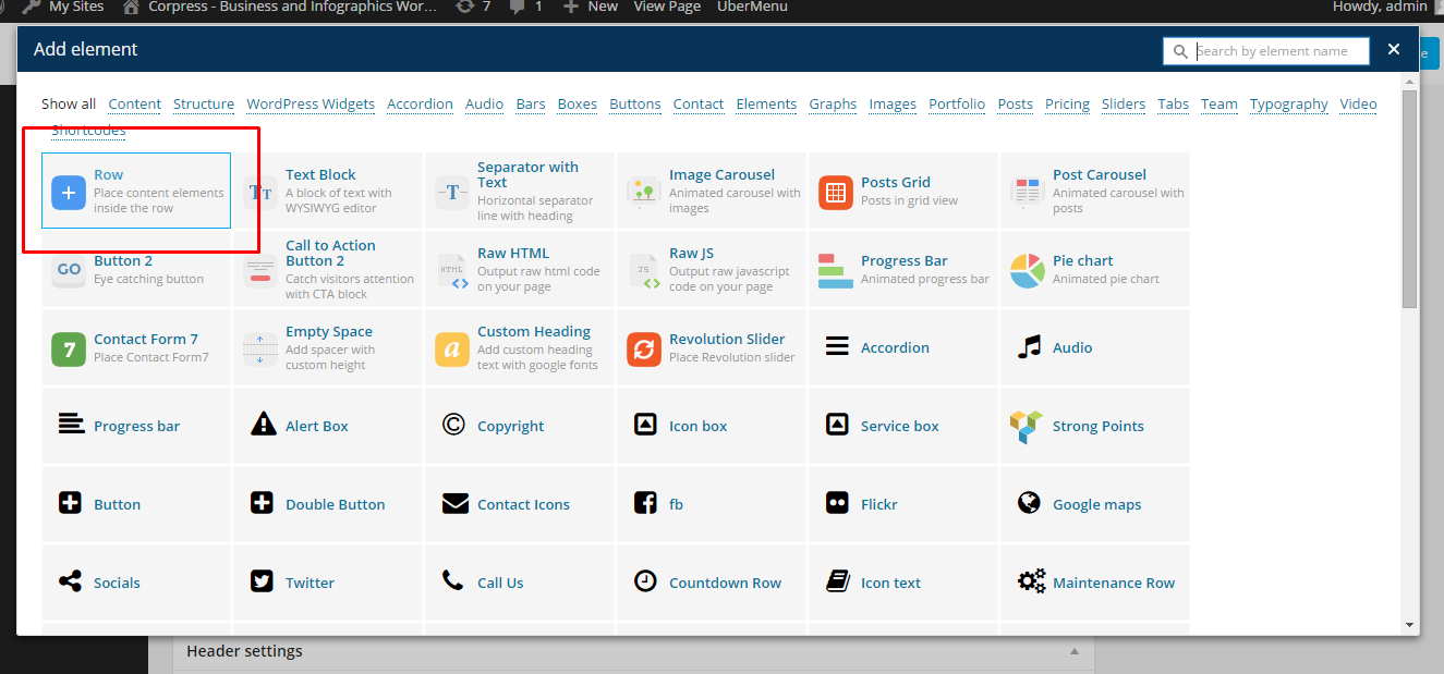
{Theme} can be easily customized with Visual Composer.
Simply drag and drop elements to build your page content. We prepared components which will help you determine main structure of the webpage – easily set up backgrounds, colors and styles for whole sections as well as lots of various smaller components which you can freely put wherever you want.
How to start?
We recommend you to use row as essential element of page structure.
Row
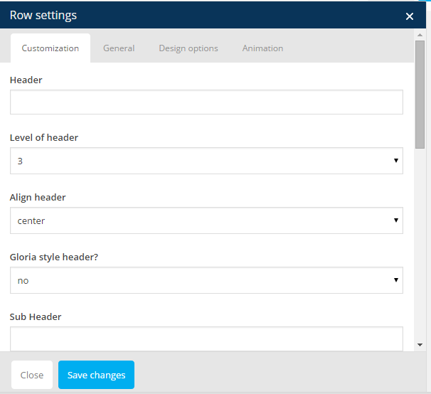
You can edit following row attributes:
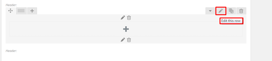
Click pen to open edition tools
- Header text
- Level of header
- Header alignment
- Header font style
- Section type – determines section background, you can choose from predefined color styles: white, grey, dark grey, dark blue, motive or effects: pattern, parallax, kenburns, video
- Padding – top, bottom or both
- Padding size – if you don’t want to have padding, choose None
- Section height
- Type of section layout – boxed or wide
- Onepager element and ID – if you want to use section for scroll-to-section navigation
- Custom class – if you want add custom CSS styles for element
You can also check additional options in tabs: General, Design Options and Animations
Row parameters
Once your section row is created you can choose number of columns in section, their width and optionally offset value.
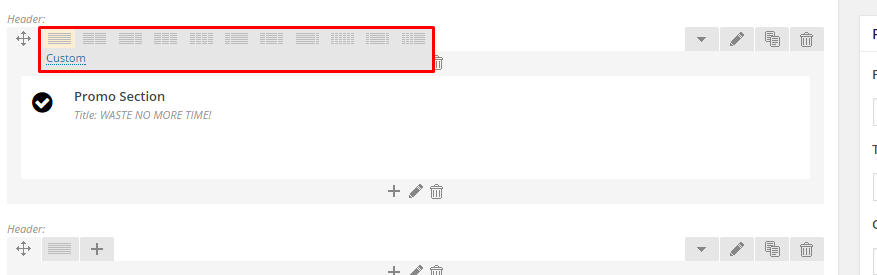
Section grid
If you want to create full_width element you need to choose 1 column greed in section and set it as full_width element.
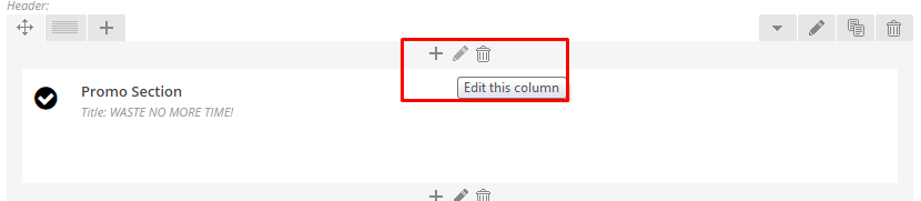
Click pen to edit column.
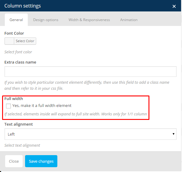
Full width column
Once you set up your section – you can put inside it as many components as you want.
Learn more:
For more information about Visual Composer, please check articles below:
How to install Visual Composer
Visual Composer demo
Visual Documentation