On every created Size Guide you can either use the global settings or adjust them separately.
Go to WooCommerce > Settings > Size guide tab
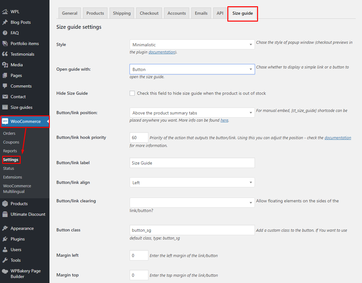
WooCommerce > Settings > Size guide tab
Options to choose from:
Style
You can choose one of the existing styles or create a new one (details in Creating a style section):
Classic
Minimalistic
Modern
Hide Size Guide
Check this field to hide size guide when the product is out of stock.
Size guide will be displayed if you allow backorders in products settings.
Open guide with
Choose whether to display a simple link or a button to open the size guide.
Button/link position
You can display it either above the product summary tabs (Description, Reviews etc.), after the ‘add to cart’ button, as a tab or use the [ct_size_guide] shortcode on the Single Product page.
Button/link hook priority
Priority of the action that outputs the button/link. Priority is “Used to specify the order in which the functions associated with a particular action are executed. Lower numbers correspond to earlier execution, and functions with the same priority are executed in the order in which they were added to the action.”
If you choose to display the Size Guide above the product summary tabs or after the ‘add to cart’ button this might help you change the position. The final outcome might depend on other plugins and theme features that use the given hooks. ‘woocommerce_after_add_to_cart_button’ hook is not used often, but the ‘woocommerce_single_product_summary’ is commonly used. The basic actions hooked in (almost) every WooCommerce theme are:
woocommerce_template_single_title – 5
woocommerce_template_single_price – 10
woocommerce_template_single_excerpt – 20
woocommerce_template_single_add_to_cart – 30
woocommerce_template_single_meta – 40
woocommerce_template_single_sharing – 50
where the numbers mean the priority. The lower the digit is, the earlier the action will be executed. For example, if you display the Size Guide above the product summary tabs, you can display it right under the title by setting the priority to 7 (or anywhere between 5 and 10) or after the price by setting it to 15 and so on.
Button/link label
Enter the text to be displayed in the link/button. Default: Size Guide.
Button/link align
Choose if the button should be aligned left or right.
Button/link clearing
Allow or disallow floating elements on the sides of the link/button.
More advanced users: if set to no, this option will add a ‘clearfix’ after the button/link.
Button class
You can add any custom class to the button.
Margins
Set the margins on the sides of the link/button.
Popup overlay color
Set the color of the background behind the Size Guide popup window.
Paddings
Set the paddings inside the Size Guide popup window.
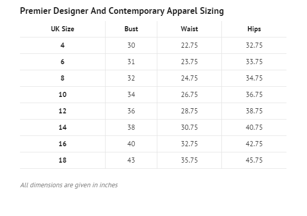
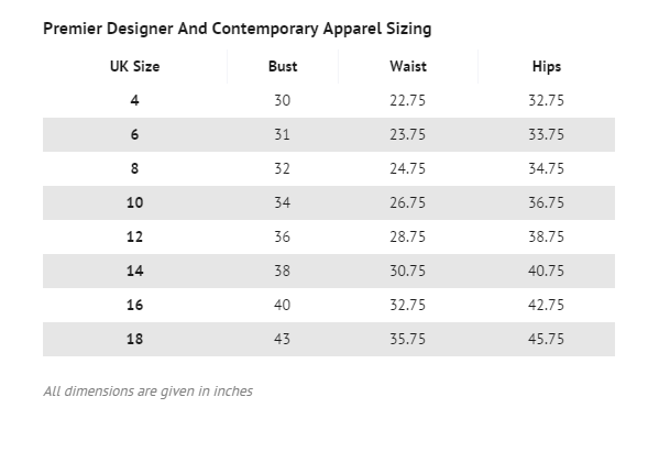
Table hover
Option to enable hover effect on the Size Guide table.
Background for hover line
The BG color of the rows and columns of the cell you are hovering.
Background for hover active cell on hover
The BG color of the cell you are hovering.
Responsive tables
Option to enable/disable the responsive view of the table in the Size Guide.
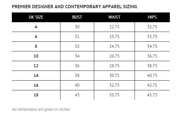
Size Guide Sample with Hover