{Theme} has four types of hover that you can use by just adding one of hover classes to your markup.
Css styles:
.ct-gallery-filters (isotope navigation)
.ct-gallery
.ct-gallery–col1
.ct-gallery–col2
.ct-gallery–col3
.ct-gallery–col4
.ct-gallery–col5
Different types of hover for .ct-gallery-item.
.ct-gallery-itemDefaultHover
.ct-gallery-itemShadowHover
.ct-gallery-itemShadowHoverLeft
.ct-gallery-itemHoverSquare
Markup (example):
|
1 2 3 4 5 6 7 8 9 10 |
<div id="ct-gallery" class="ct-gallery ct-js-gallery ct-js-magnificPortfolioPopupGroup ct-gallery--col3 ct-u-marginBottom80"><a href="assets/images/demo-content/galleryImage9.jpg" title="Our Gallery" class="ct-js-magnificPopupImage ct-gallery-itemShadowHover"> <figure class="ct-gallery-item"><img src="assets/images/demo-content/galleryImage9.jpg" alt="gallery"> <figcaption class="ct-u-colorWhite text-uppercase"> <div class="ct-u-displayTableVertical"> <div class="ct-u-displayTableCell text-left"> <h6 class="ct-gallery-itemTitle ct-fw-700">EXPEDITIONS</h6> </div> </div> </figcaption> </figure></a> |
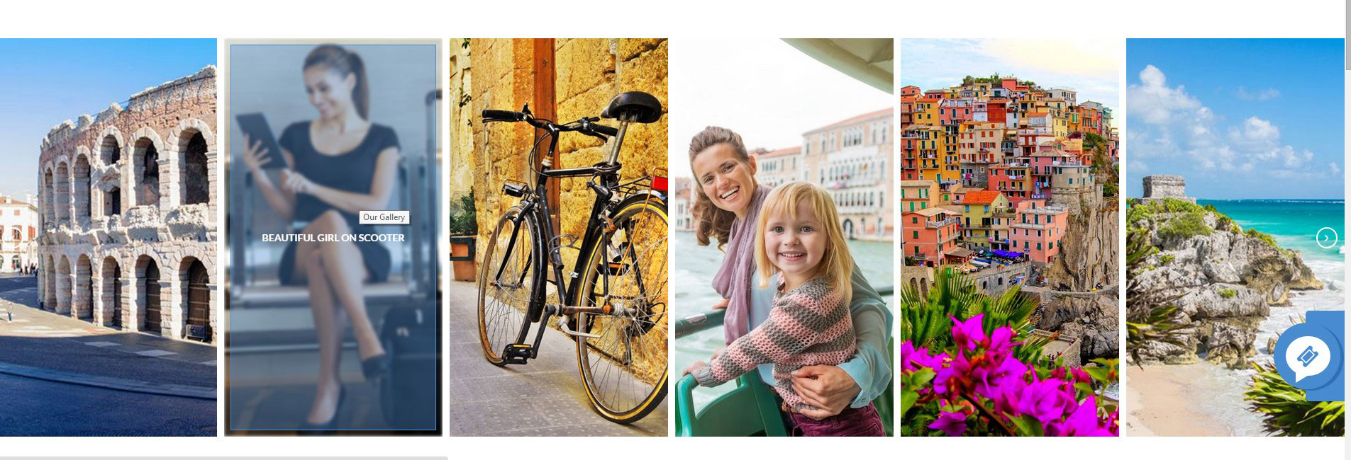
Gallery with default hover
Screenshot:
Gallery default hover
Gallery with hover square
Screenshot:
Gallery hover square
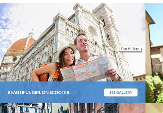
Gallery with shadow hover
Screenshot:

Gallery shadow hover
Gallery with shadow hover left
Screenshot:
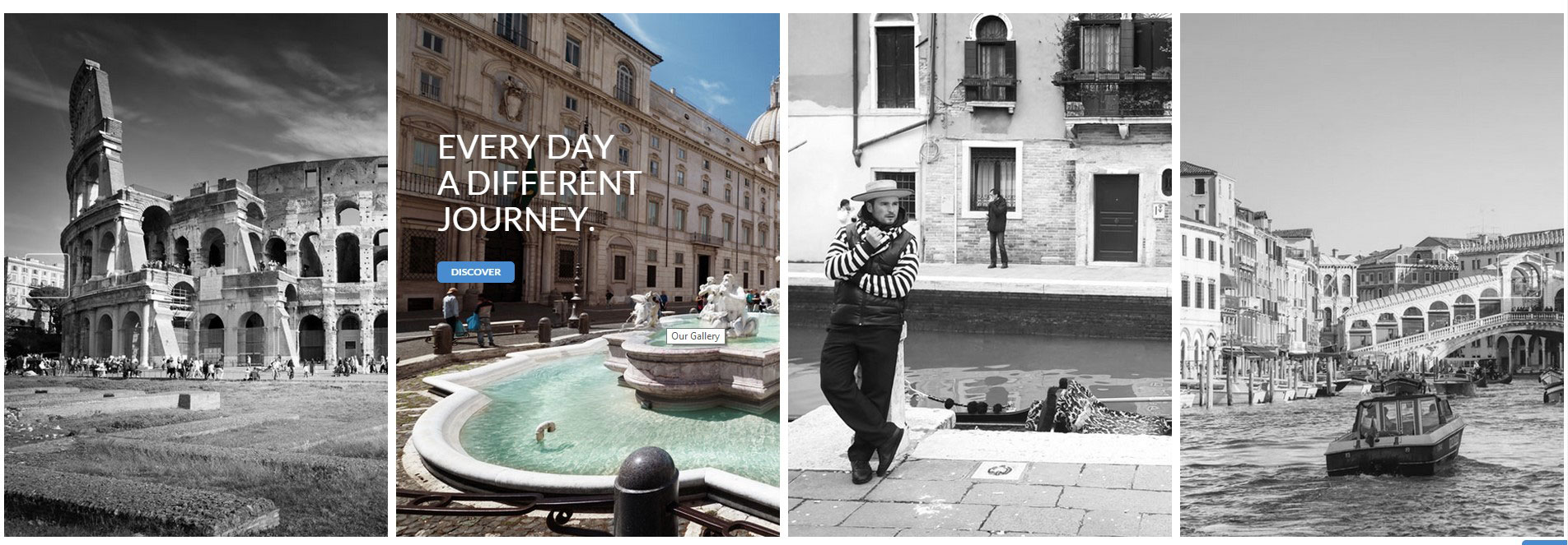
Gallery shadow hover left