

General information
Thank you for purchasing Estato! We’re very pleased that you have chosen our plugin to extend your website. We’re doing our best not to disappoint you! Before you get started, please check out these documentation pages. Estato can only be used with WordPress and we assume that you already have it installed and ready to go. If you don’t, please see WordPress Codex to get started.
Was this article helpful ?
Requirements for Estato
Before using Estato, please meet the following requirements:
- essentials to run WordPress – here you can find more information – in case any doubts regarding the server, contact your host provider,
- latest version of WordPress, which you can download here,
- create secure FTP and Database.
Was this article helpful ?
What’s Included
When purchasing our theme from Themeforest, you need to download the Estato files from your Themeforest account. Navigate to downloads tab on Themeforest and find Estato. Below you’ll find a full list of what is included the .zip file, along with a brief description of each item.
Estato Folder contains:
- estato-theme.zip – main installation folder
Was this article helpful ?
Installation via Administration Panel
If Estato files are downloaded from your Themeforest account, you can start an installation using WordPress administration panel.
Here you can find instructions how to proceed with 4.7.0 and lower versions of WordPress.If you’re using newer version, follow steps below to install the theme:
- Step 1 – Once you’ve logged in to your administration panel, go to My Sites > Network Admin.

Network Admin
- Step 2 – Then click on Themes > Add New, you will be directed to a page where you can choose available themes.

Add New Theme
- Step 3 – Once directed to the page, on the upper left side of the screen click on Upload Theme button.
- Step 4 – Choose the estato-theme.zip file from your computer, then click Install Now.

Upload Theme and Install
- Step 5 – Click on My Sites then go to Appearance > Themes and Activate Estato.

Activate Estato
- Step 6 – After activating Estato, you will be sent to Theme Installation Instruction steps. By following this steps you will be asked to install required plugins, activate them, import demo content (required) and install sample of WPL content.

Theme Installation Instructions
Common Install Error: Are You Sure You Want To Do This?
If you get the following question message when installing Estato.zip file via WordPress, it means that you have an upload file size limit. Install the theme via FTP or call your hosting company and ask them to increase the limit.
Was this article helpful ?
Installation via FTP
To install Estato via FTP, follow steps below:
- Step 1 – Unarchive estato-theme.zip file
- Step 2 – Access your host web server using FTP client
- Step 3 – Find directory wp-content > themes
- Step 4 – Put folder Estato in directory wp-content > themes
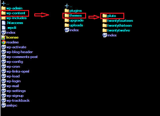
Installation directory
Learn more:
Was this article helpful ?
Activating plugins
Estato comes with number of custom features like:
- Portfolio items
- FAQ items
- Testimonials
- Estato custom shortcodes
- SASS compiler
For the correct operation of Estato you have to install and activate them for Estato:
After activating Estato you will also get the information about all of theplugins that you should or can install and activate for the full experience of the Theme. You can find this information on path Appearance > Theme Installation.
Also the information about all required plugins that should be installed and activated you will find in WordPress dashboard on path Appearance > Theme Installation
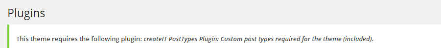
Theme installation instruction
With these plugins your custom post types will be saved in your admin panel, even if you change your WordPress theme.
Notice: Plugin must be installed and activated right after you install and activate the Estato – otherwise you might be encountered problems with correct theme functioning.
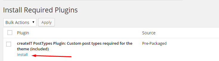
Install plugin
Was this article helpful ?
How to Update Bundled Plugins
Bundled Plugins are plugins that comes with the theme when you buy it. Since the plugins are bundled with the theme, updates for the plugins are provided once the theme itself is updated.
Update a Bundled Plugin
When you update a theme and a plugin needs to be updated, you will see a notice at the top that a plugin could be updated.

You can also check for updates in your Dashboard by navigating to Plugins > Installed Plugins.

Follow these steps to update:
- Step 1 – Update the theme first in the Dashboard by navigating to Appearance > Themes then update the theme.
- Step 2 – Once the theme is updated, check if there are available updates for the plugins.
- Step 3 – If there are updates available, you will see a notification on top of the page or go to Plugins > Installed Plugins and follow the instruction to install updates.
Update Error for WPBakery Page Builder and Revolution Slider plugins (Update package not available)
If you get this error, try these troubleshooting methods first:
- Go to Appearance > Installed Plugins, refresh the page and try again.
- If it doesn’t work, try disabling/deleting the plugin, this is to ensure that there aren’t any issue with plugin’s update. Once disabled/deleted, try to re-run/install the plugin.
- If you still get the error message that the update package is not available, its probably because your server permissions are set to strict and you’ll need to alter your server settings or update the plugins via FTP.
- If issue still persist, click here for support.
Automatic Updates
Automatic updates are done if the plugin is purchased separately from the plugin developer. There are premium features that you can get if you purchase the plugin from the developer.
However, it’s not required to purchase the plugin for the theme to work since the plugins are bundled with the theme.
Was this article helpful ?
Import demo content
The fastest and easiest way to import our demo content is to use the Theme Options Demo Content Install. It will import all pages and posts, several sample sliders, widgets, theme options, assigned pages, and more.
We recommend this approach on a newly installed WordPress. It will replace the content you currently have on your website. However, we create a backup of your current content in (Tools > Backup). You can restore the backup from there at any time in the future.

To import our demo content, please follow the steps below:
- Step 1 – Install and activate plugins listed in Theme Installation Instructions message.
- Step 2 – In Dashboard go to Unyson and make sure that Backup & Demo Content Extensions is activated.

- Step 3 – Navigate to Tools > Demo Content Install, where after activating the Unyson Extensions, Demo Content Install option will be available.

- Step 4 – Choose the import option you want to use from the available options.
- Step 5 – Wait until the content will be installed.

Importing can take a few minutes. Please be patient and wait for it to complete. Once it will be loading, you will see message with indicating progress.
Properties Listing Demo
Demo Properties Listing is not automatically added by the demo.

For you to get the demo Properties Listing, follow these steps:
- Step 1 – Navigate your Dashboard to WPL > Settings and look for Sample Properties.

- Step 2 – Click on the Add Sample Properties button to add sample properties. Wait until download is finished.
- Step 3 – Once the loading icon is gone, the download is done. You will see the sample properties in WPL > Listing Management.

Was this article helpful ?
Support
All of our items comes with free support. Free support is limited to questions regarding the themes features or problems. We provide premium support for code customisation or third-party plugins.
For issues and concern, you can reach us through these support methods:
- E-mail – support@createit.pl
- Help Desk – Click here to go to our support website. Just click on the Submit Ticket button and follow instructions to create a ticket.
- Forum – Comment/Post on the product you have issues/queries in ThemeForest or CodeCanyon websites.
Before You Post on a Forum
We urge you to follow the steps below, before you post a new topic on the forum, to speed up your request. It’s in everyones interest and will benefit in making the entire forum more efficient:
- Step 1 – Always check the Documentation and the Knowledgebase Section. Most questions are already answered in those areas.
- Step 2 – If your question hasn’t been brought up on the forum, please post a new topic. Always be as specific as possible. Creating a topic requires entering the live URL to your home page or page that shows the issue in question. It also has bars for WP and FTP login info, which aren’t required, however, providing us with your login information can save a lot of time for both of us. Login credentials are securely stored and accessible only by our support staff.
- Step 3 – We usually answer questions in 24 hours on working days. However, if you don’t get any answer within 72 hours bump up your question or send us an e-mail.
For all support methods, you will receive confirmations and replies on your queries through e-mail or by tracking your ticket which you will also get through e-mail. To track your ticket, please click here.
Once we reply to your query, each ticket will be open for 7 days without a reply from you. On the 6th day without a reply, an e-mail will be sent to notify you of the ticket’s inactivity. To make the ticket active again, you simply need to reply or follow the steps in the e-mail. If you won’t make the ticket active within 7 days, on the 8th day the ticket will automatically be closed.
Our support hours: 10:00 AM – 6:00 PM UTC +1 on Monday to Friday.
Was this article helpful ?
Pages
You can use Pages to organize and manage any content on your website. You can create multiple pages on your website for different types of content or setup onepager with scroll-to-section menu.
Was this article helpful ?
Create pages in Estato WP
To create a new Page in Estato follow the steps below:
- Step 1 – In Dashboard, navigate to Pages > Add New. You will be directed to a page where you can add details on the page.

- Step 2 – Add the Title of the page.
- Step 3 – Add content – we recommend you to create page content using Visual Composer or by modifying demo content.

- Step 4 – Choose page attributes.

- Parent – If you want to create this page as a subpage.
- Template – You can choose one of defined page templates
- Order – The order of the page.
- Step 5 – After adding all the contents of the page, click on the Publish button.
Was this article helpful ?
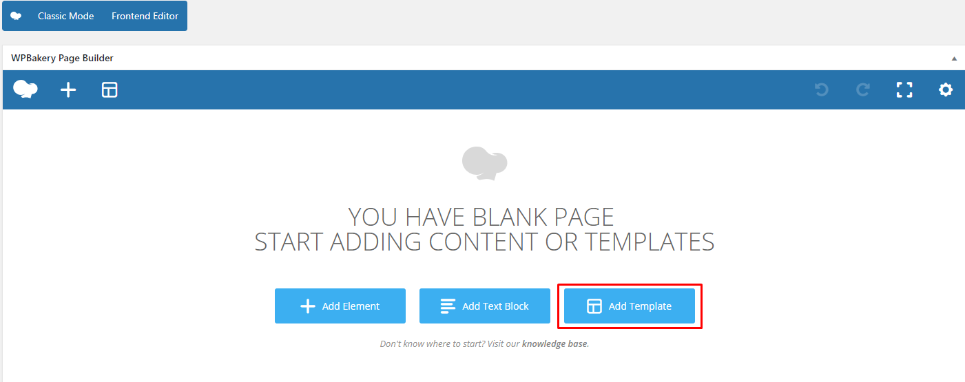
Create Page using Visual Composer
When using Visual Composer to add content, you have 2 Editor options, the Backend Editor and Frontend Editor.

Backend Editor

Frontend Editor
In adding contents to the page, there are many options to choose from. Some of the options are:
- Elements – You will be able to choose elements that are needed and used on the page.

- Text Block – This is where you add Text to the page.

- Template – Use a premade template for the layout of the page.

- Row – An area where you can add elements.

Was this article helpful ?
Homepage setup
If you have added some pages via Pages > Add new you can choose one and set it up as a homepage. Use Static front page tool in Settings > Reading and choose from the list your homepage. Remember to click Save changes at the end of editing.

Static front page
Was this article helpful ?
Onepager setup in Estato


To create a Onepager site using Estato, follow these steps:
- Step 1 – Navigate to the Pages section of your Dashboard and click Add New.
- Step 2 – In the new page, use the Backend or Frontend editor to create a row.

- Step 3 – Use the row in making sections in the section menu. Click on the Edit this row option in every row section you create and look for Row ID. The Row ID will serve as the anchor of the menu. Make sure that the ID is unique to that row.

- Step 4 – You can change the General and Design Options as you see fit for your site.
- Step 5 – Add the contents in the rows. You can add Text and Elements inside the rows. Click on Publish button to save.

You can see in the sample above that each row has different Row IDs.
- Step 6 – Set this page as the Front Page by navigating to Settings > Reading > Front page display. Click on A static page option then select the page for the onepager then click on the Save Changes button.

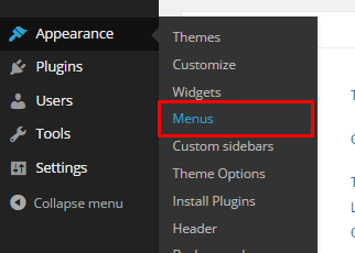
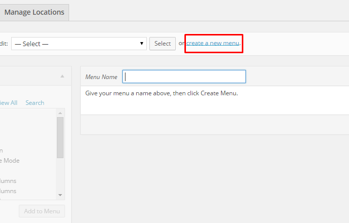
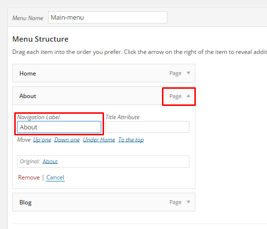
- Step 7 – To make the Menu for the Onepager, navigate in the Dashboard Appearance > Menus. Look for create a new menu, add the Menu Name then click on the Create Menu button.

- Step 8 – You will see options on what to put inside your new menu. Look for Custom Links in the options. If you don’t see that option, at the upper-right side of the page you will see Screen Options option, click on that and you will see options with check boxes. Check the box beside Custom Links.

- Step 9 – Using the Custom Links option, write the row section’s Row ID inside the URL textbox and the name of the link inside the Link Text textbox. Then Click on the Add to Menu button. After adding all the navigation menu, Click on Save Menu to save.


- Step 10 – Click on the Manage Locations option, change the Main menu to the menu that was made for the onepager. Click on the Save Changes to save.
- Step 11 – Go back to the Edit Menu option, Look for the Max Mega Menu Settings then check on Enable and change Theme option to EstatoStyle Onepager. Change other options as you see fit then click the Save Menu button.

Was this article helpful ?
Estato Custom Shortcodes
With Estato comes many custom shortcodes for (Visual Composer) VC that are used to show content created in Estato. Below you will find short information about this Visual Composer elements:
-
Button for Estato

- This theme comes with VC element that give you the option to create buttons that can be used in the theme.
- These are how the buttons using the Button for Estato element looks like:

-
Icon Box for Estato
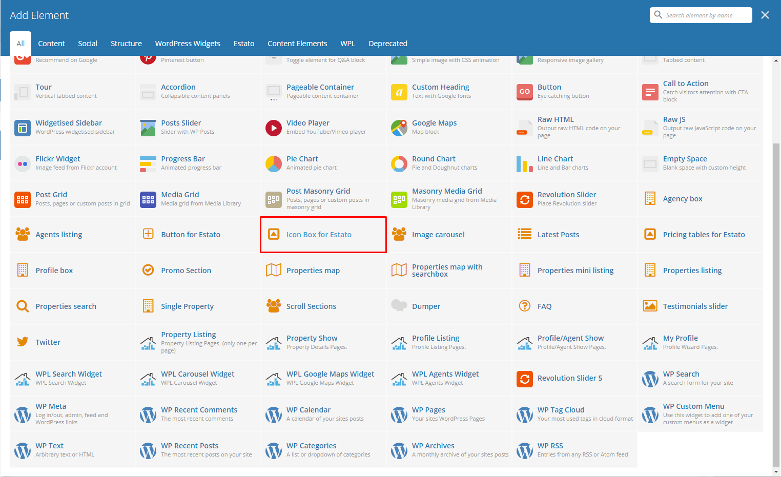
Below you will see all the available options that can/need to be set to use Icon Box for Estato element on a page:
- – General Tab –
- Number of icons – you can set here number of icons visible in row (1, 2, 3, 4). We recommend to use one Pricing table for Estato element in single row to get the best effect using this element.
- Motive – Choose color style used for this element: Light or Dark
- Title – Set the title for this Icon Box.

- – Columns Tab – (number of columns tab depends on the number of icons set in General tab)
- Title – Title for the icon inside the Icon Box.
- Icon – Choose an Icon to present.
- Description – Description of the icon.

- – Button Tab – (Add Button under Icon Boxes)
For sample in creating Icon Box, see “Create Sample Icon Box” below.
-
Image Carousel

Below you will see all the available options that can/need to be set to use Image carousel for Estato element on page:
- Title – Title for the Image Carousel in the page.
- Display navigation – Check Yes to show the navigation of the carousel.
- Items count – Number of images shown at once on the page (this option will not work on the mobile version of the carousel)
- Pagination – Check Yes pagination to show it.
- Autoplay – Check Yes to make the carousel move automatically.
- Images – Add images to be shown in the carousel from the Media Library or Upload Files from your computer.

Remember to Publish/Update the changes on the page to save them.
-
Latest Posts

This will show the latest posts posted in the blog. You can custom this element using options from the Latest Posts settings as shown below:
– General Tab –
-
- Title – Title for the posts.
- Limit – Number of blog posts inside the Latest Posts.
- Custom class
- Order – How the posts order looks.
- Ascending
- Descending
- Order by – How the posts are ordered.

– Button Tab –
Remember to Publish/Update the changes on the page to save them.
-
Promo Section

To create your own promo section, you can choose options as below:
– General Tab –
-
- Background color – Set the background color of the Promo Section.
- Image – Image for the promo.
- Promo text – Describing the promo.
- Promo text color – Text color of the Promo Text.

– Buttons Tab – (Maximum of 3 buttons which can be disabled if not used.)
Remember to Publish/Update the changes on the page to save them.
For sample in creating Promo Section, see “Create Sample Promo Section” below.
-
Pricing Tables for Estato

Below you will see all the available options that can/need to be set to use Pricing tables for Estato element on page:
– General Tab –
-
- Title – Set the title visible above the pricing tables.
- Number of tables – You can set the number of tables visible in row (1, 2, 3, 4). We recommend to use one Pricing tables for Estato element in single row to get the best effect using this element.

– Columns Tab – (number of Columns tab depends on the number of tables set in General tab)
-
- Title – Title of the pricing listed.
- Value – Value of the pricing listed.
- Subvalue – Another value to compare with the value of the listing.
- Tag – A tag to make it unique.
- Features – Descriptions and features of the item listed.
- Button enabled – check Yes to show button.
- Button title – Title of the button inside the listing.
- Button link – Where the button is linked.
- Button size – Button attribute.
- Button style – Button attribute.
- Transparent Estato style for button? – Check Yes option if you want the transparent style.
- Custom CSS class for button – Set your custom class to style the button.

Remember to Publish/Update the changes on the page to save them.
-
Twitter

Below you will see all the available options that can or need to be set to use Twitter in your Estato theme:
Twitter Settings
-
- Title – set the title for header
- username – twitter username
- customer key
- customer secret
- token
- token secret
- limit – limit of visible tweets
- Tweets per slide
- follow us button – follow us button label (leave blank to hide it)
- new window? – Yes/No
- parse url
- parse media
- parse url id? – Yes/No
- parse hashtag? – Yes/No
- embed images? – Yes/No
- size of embedded images?
- tweet length limit
- cache results for X seconds – cache Twitter feeds for better performance.

The information how to generate twitter keys and tokens can be found here.
Remember to Publish/Update the changes on the page to save them.
For sample in creating Twitter Section with Background, see “Create Sample Twitter Section with Background Image” below.
-
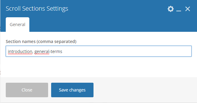
Scroll Section

This element will let you create a page menu to let the user move between the section page.

The only option available in Scroll Sections Settings is Section names that will let you create menu links for custom sections. This element is used on Terms & Conditions page of Estato WP theme.
Remember to Publish/Update the changes on the page to save them.
For sample in creating Scroll Sections, see “Create Sample Scroll Sections” below.
-
FAQ

FAQ element will let you show all the created FAQs Items on the site. This version of FAQ doesn’t have a menu like the one created via Customise options, but it will let you add other contents on the same site unlike the customise one.

Remember to Publish/Update the changes on the page to save them.
-
Testimonials slider

Testimonial slider will gives you an option to show people Testimonial Items that are made on your site.
Testimonial slider Settings
-
- Style of slider – This would depend on the style/color of the background of this slider.
- Additional title – Check Yes if you want to display title.
- Title – Title of the slider.
- Order – The order in which the testimonials are shown.⦁ Order – The order in which the testimonials are shown.
- Order by – The order of the testimonial that are shown.
- Limit – Number of testimonials shown.

Remember to Publish/Update the changes on the page to save them.
For sample in creating Testimonial slider on a page, see “Create Sample Testimonial slider” below.
Was this article helpful ?
Estato custom shortcodes for WPL
With Estato comes many custom shortcodes for (Visual Composer) VC that are used to show content created in WPL plugin. Below you will find short information about this Visual Composer elements:
-
Agency Box
This element have a single tab with options to customise the way the agency box will be shown. This element lets you show all the information and the logo used by the Agency.

– Agent ID – it can be checked in WPL in User Manager section by navigating to: WPL > User Manager . Copy one of the WPL’s user Id to the Agency box Settings.


– Style – choose the style of the element: Light or Dark
-
Agents Listing

This element have two tabs with options to customise the way how the multiple profiles of the agents will be visible on the site.

– General Tab –
- Title – set the title for this section
- CSS Class – add custom css class

– Sort and Limit-- Order by – Set the order of the agents.
- Order – Set how the order of the agents are shown.
- Limit – Set limit of the agents visible on the site

Sample Agent Listing
-
Profile Box

This element will let you show all the information about the WPL User chosen by its ID. Profile Box have two available options to customise this element.

– Default profile id – it can be checked in WPL in User Manager section by navigating to: WPL > User Manager . Copy one of the WPL’s user Id to the Agency box Settings.
– Style – choose the style of the element: Light or Dark
-
Properties map with searchbox

This element will let you show all the information about the WPL User chosen by its ID. Profile Box have two available options to customise this element.

- Custom map Style – Use one of custom maps styles available on Snazzy Maps site (this option is not compatible with Map Type control).
- Custom map height – Enter map height (in pixels or leave empty for responsive map).
- Zoom value – Set custom zoom value, eg. 10. Please note the map will automatically expand to show all markers.
- Map Type control
- Scale control – Choose between Yes/No
- Google Maps search control – Choose between Yes/No
- My position control – Choose between Yes/No (Works only with https)
- Use custom markers for this map – choose between Yes/No. This way you can add your own custom markers from Media library. Another way to add your custom markers is via Realtyna. This markers can be added on path WPL > Data structure > Listing Types. You will be able to add there your own markers and assing them to Listing type.

By Properties map element you will display a map with markers showing all of the estate locations. The information of the location can be added on path WPL > Add Listing > Address Map by changing location of the marker. You can also edit the location of already existing property by going to WPL > Listing Manager > Edit > Address Map.

-
Properties mini listing

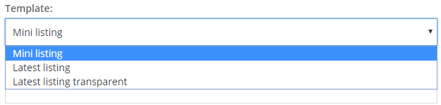
This element gives the option to show a mini list of properties created in WPL plugin on path WPL > Listing Manager.This element have 4 tabs with options to customise how the list of the properties will be shown.

– General Tab –- Template – 1) Mini listing 2) Latest listing 3) Latest listing transparent
- View more text – Add text that’s for View more.
- View more link – Add link that’s for View more.
- CSS class – Add custom CSS class you want to use to style this element.

– Filter Properties –- Kind (only available option: Property)
- Listing – choose which listing will be shown
- Property type – choose visible types
- Listing IDs (Comma Separated) – add which properties will be shown based on the ID
- Agent id – the id of the agent assigned.
- Only Featured – choose between Yes/No
- Only Hot Offer – choose between Yes/No
- Only Open House – choose between Yes/No
- Only Foreclosure – choose between Yes/No

– Sort and Limit –- Order by – Gives you option on the order of the listing.
- Order – Gives you the option on how the listing is shown.
- Number of properties – Set number of properties visible on a single page.
– Buttons –
- Enabled – Choose between Yes/No
- Title – Button visible inside the button
- Link – Set a link for the button.
- Size – Button sizes
- Style – Buttons style
- Transparent Estato Style – Choose between Yes/No
- Custom CSS class – Add custom CSS class you want to use to style this element
- Template – 1) Mini listing 2) Latest listing 3) Latest listing transparent
-
Properties listing

This element gives the option to show list of properties created in WPL plugin on path WPL > Listing Manager.
This element have 3 tabs with options to customise how the list of the properties will be shown.

- – General –
- Title – Set title for the list.
- Type listing view – Choose between two views : Grid or List

Grid

List
- CSS Class – Add custom css class you want to use to style this element
- View more text – Change text that will be shown for view more link
- View more link – Add link that for View more
- Columns count in grid view – Set number of columns avaliable for grid view
- Show additional options
- Boxes size
- – Filter Properties –
- Kind (only available option: Property)
- Listing – Choose which listing will be shown
- Property type – Choose visible types
- Listing IDs (Comma Separated) – Add which properties will be shown based on the ID
- Agent id
- Random – Randomise visible list
- Only Featured – Choose between Yes/No
- Only Hot Offer – Choose between Yes/No
- Only Open House – Choose between Yes/No
- Only Foreclosure – Choose between Yes/No
- – Sort and Limit –
- Order by – Gives you option on the order of the listing.
- Order – Gives you the option on how the listing is shown.
- Number of properties – set the number of properties visible on a single page.
-
Properties search

With the use of this element on your site, you will be able to search for estates available on your site. Below you will find information how to customise this elements.
This element isn’t customisable via Visual composer, all the changes to this element can be added by WPL.
For more information on How to Customize the Searchbox, click here.
Was this article helpful ?
Create Sample of Shortcode Elements
Create Sample Icon Box
To make Icon Box the same as below, follow these steps:

- Step 1 – Create a row section.
- Step 2 – Click on Edit Row option, in the Design Options Tab add the background image from the Media Library.

- Step 3 – Add Icon Box for Estato element inside the row created using the Add Element option.
- Step 4 – Set the elements options as you wish.
- Step 5 – Once satisfied with the result, click on Publish button to save.
Create Sample Promo Section
To make a full width Promo Section, follow these steps:
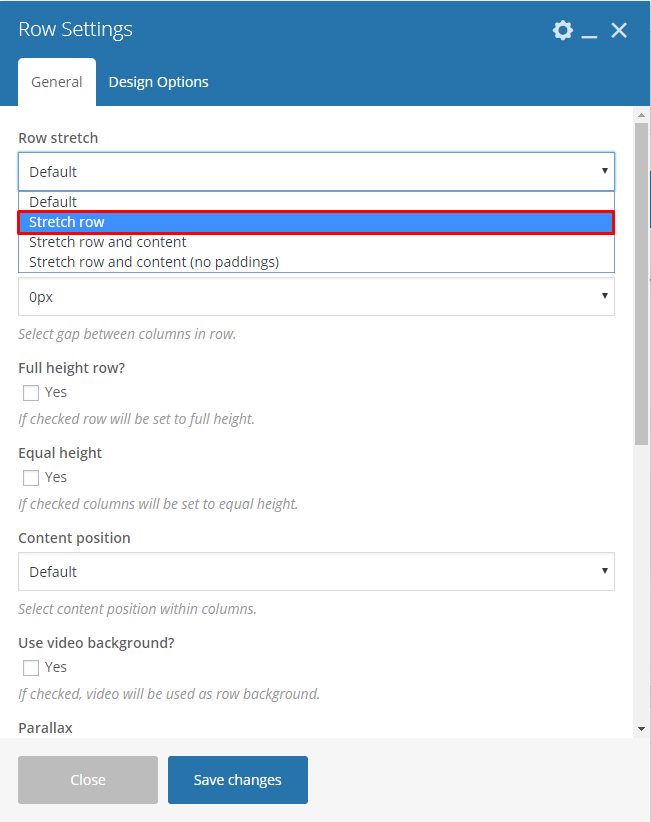
- Step 1 – Create a row section. Click on the Edit Row option, the Row Settings will pop-up. In the General Tab change the Row stretch to Stretch row and content.

- Step 2 – Add Promo Section element inside the row created.
- Step 3 – Set the options as you like.
- Step 4 – Once satisfied with the result, click on Publish button to save.
Create Sample Twitter Section with Background Image
To create a Twitter Section with a static background image, follow these steps:
- Step 1 – Create a row section then click on the Edit row option.
- Step 2 – In the Design Options tab of the Row Settings, add the background image from the Media Library or Upload an image.

- Step 3 – Add Twitter Element to the row and set options as needed.
- Step 4 – Once satisfied with the result, click on Publish button to save.
Create Sample Scroll Sections

To create a Scroll Section the same as the one above, follow these steps:
- Step 1 – Add row to your page and change the Row Layout to 1/4 + 3/4. This way you will be able to add Scroll Section and the content to different columns and set them next to each other.

- Step 2 – Add any content you want to the columns on the right.

- Step 3 – Add an ID to each Inner Row Settings section you want your menu to be able to move to. Remember: Each created ID must be unique, and it is valid as w3c specification: link (Must not have spaces)

- Step 4 – Add Scroll Section Settings item to the columns on the right and for the Section names use the same names as the one used for the Row’s id.
- Step 5 – Once satisfied with the result, click on Publish button to save.
Remember: to make this element work correctly you must copy the exact same names as used in the ID and add them in the same order as they are set in the right section.
Create Sample Testimonial slider

To recreate the same slider on your own, follow these steps:
- Step 1 – Create a row section, then click on the Edit row option.

- Step 2 – In the General tab, set the Row stretch option to Stretch row and content.

- Step 3 – Go to Design Options tab and set the Background color of your choice. The one used in our demo is : #60a7d4

- Step 4 – Add Testimonial slider element inside the row created. Set the options as you like.
- Step 5 – Once satisfied with the result, click on Publish button to save.
Was this article helpful ?
Change image size in a single listing page
To change the size of the image shown in the single listing page:

Single Listing Page Sample before changing the size.
- Step 1 – In your Dashboard, navigate to WPL > Activity Manager. You will be directed to the Activity Manager page.

- Step 2 – In the Activity Manager page, you will see the all the activity created. Look for the Gallery of the listing, then click on the edit button.

- Step 3 – The Modify Activity will pop-up.

- Change the option of Resize to Yes.
- Change the Image width & Image height as you prefer.
Note: Resize must be set to Yes for the image to change its size.
- Step 4 – Once the changes are done, click on the Save button.

Sample Result After Image Size Change
Was this article helpful ?
Blog
Estato is loaded with options for the blog. It offers many different options for you to present your blog posts, along with several different blog post layouts. In addition, there are numerous theme options and shortcode options that allow you to customize how posts are displayed.
There are several ways to display your blog posts, we will cover each method as well as describe blog post types, post options and theme options. The following sections will cover each of these aspects of the blog.
Was this article helpful ?
Create Blog post for Estato
No matter which method you use to display your blog posts, first thing you need to do is create them.
Estato offers several blog post formats:

Follow the steps below to create a blog post:
- Step 1 – Navigate to Blog Posts > Add New on the Dashboard.

- Step 2 – Create a title and insert your post content in the editing field. You can use any of our shortcode elements inside the post. If you want to use some additional fields, choose them from Screen Options at the top of the screen.

- Step 3 – Add Blog Categories on the right side. Categories are meant for broad grouping of your posts, think of these as general topics. Categories are hierarchical, so you can add sub-categories. Sub-categories are made when a Category is added to a Parent Category . To assign it to the post, check the box next to the Category name.

- Step 4 – To add Tags, write the Tags at the textbox below the Blog Categories. Tags are meant to describe specific details of your posts. They are the micro-data that you can use to micro-categorize your content. Tags are not hierarchical. Type the name of the tag in the field, separate multiple tags with commas.

- Step 5 – For a single image, click the Featured Image box, select an image and click Set Featured Image.

To add more than one image, use Image Gallery (Visual Composer element) , each image will be a slide in the gallery slideshow. Gallery can be created by adding images from Media gallery or by adding External links of the images that will be used.

- Step 6 – To post video, use Video Player (Visual Composer element) and paste the direct video URL from Youtube, Vimeo or Dailymotion and more.
- Step 7 – to post audio, use Video Player (Visual Composer element) and paste the direct audio URL from Soundcloud, Mixcloud and more.

- Step 8 – For Quotation, use WordPress Blockquote option (Shift + Alt + Q)

- Step 9 – For Links, use WordPress Inser/edit link (Ctrl + K) option

- Step 10 – Create an excerpt – Excerpts are optional hand-crafted summaries of your content that can be used in your theme. Learn more about manual excerpts.
- Step 11 – Once finished, click Publish to save the post.
Was this article helpful ?
Blog index page
The most popular way of displaying blog posts is to setup blog index page. There all of your posts will be displayed and ordered by publish date.
To set the page as your post page, navigate to Posts page tool in Settings > Reading and choose Blog index page from the ones you created.

Blog Index page
Notice:
On Blog index page you will see only your posts, so don’t add any other content to it.
Was this article helpful ?
Index Blog page

Blog settings
In Blog content tab you can define the following settings for Blog Index page.:

Blog Index
- Display blog sidebar – Check Yes if you want to display sidebar with widgets on blog page.

Blog Index page – sidebar right
- Place to display sidebar – Chose place for blog sidebar
- Left side
- Right side
- Display breadcrumbs – Check Yes if you want to show them on the top of the blog page

Breadcrumbs from Blog index page
- Display head section blog – Check Yes if you want to display head section on the blog page

Head section for Index page
- Head section type
- Parallax
- Video
- Ken Burns
- Mobile background image – select the image that will be displayed on mobile devices
- Background image – select image to display in head section
- Second background image – this image will be visible only if the Ken burnshead section type will be selected
- Third background image – this image will be visible only if the Ken burnshead section type will be selected
- Head height
- Parallax ratio
- Video url – will only work when the head section type is set to Video
- Video file type
- Mp4 direct link
- Webm direct link
Notice:
All changes made with customizer will only be applied when you click on
Was this article helpful ?
Single blog post

Single Blog post settings
In Blog content tab you can define the following settings for Blog single page.:

Single blog pages
- Display blog sidebar – Check Yes if you want to display sidebar with widgets on blog page.

Single blog post – sidebar right
- Place to display sidebar – Chose place for blog sidebar
- Left side
- Right side
- Display breadcrumbs – Check Yes if you want to show them on the top of the blog page

Breadcrumbs from Blog single post
- Display head section in blog – Check Yes if you want to display head section on the blog page

Head for Blog Single post section
- Head section type
- Parallax
- Video
- Ken Burns
- Mobile background image – select the image that will be displayed on mobile devices
- Background image – select image to display in head section
- Second background image – this image will be visible only if the Ken burnshead section type will be selected
- Third background image – this image will be visible only if the Ken burnshead section type will be selected
- Head height
- Parallax ratio
- Video url – will only work when the head section type is set to Video
- Video file type
- Mp4 direct link
- Webm direct link
- Tags after post – check Yes if you want to show tags after post
- Social share – check Yes if you want to show social share
- Social share – check social icons you want to show on your post page
- Post author info – check Yes if you want to show information about the author of this post
- Display comments after post
Notice:
All changes made with customizer will only be applied when you click on
Was this article helpful ?
Portfolio Item
Create Portfolio Item

Portfolio item
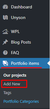
To create new Portfolio item, navigate in WordPress dashboard to Portfolio items > Add New
For new Portfolio item you can define:
- Title,
- Editor container (images visible on portfolio item page) – content visible in the Editor container is added with use of
 option,
 - Portfolio Categories (optional) – assign to already existing category or add new one.
- Tags (optional)
- Featured Image (visible on ‘Our Projects’ page)
- Portfolio settings
- Client
- Client website
- Details
- Start date
- End date
- Multilingual Content Setup – check box to make ‘Portfolio items’ translatable (Available only when WPML plugin is in use)
After every modification click on Update to keep your changes saved.

Creating Portfolio Item
Creating Portfolio Categories
Categories are very convenient way to organize your porfolio items, that can be added to more than just one category.
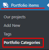
To create new Portfolio category, navigate in WordPress dashboard to Portfolio items > Portfolio Categories
Creating new Portfolio Categories
For new FAQ item you can define:
- Name
- Slug

FAQ category
After every modification click on Update to keep your changes saved.
Was this article helpful ?
Create Portfolio Page
Portfolio page of Estato is built using Visual Composer. Theme is supporting 3 version of this page:
- 3 Columns
- 4 Columns
- 6 Columns
The Visual Composer Backend editor of the page look like this:

To create a new portfolio page follow the steps below:
- Step 1 – Create new page, then add row using the Visual Composer.

- Step 2 – Click on Edit this row icon in the row created, then the Row Settings will pop-up. Under General tab, change the Row stretch to Stretch row and content.

- Step 3 – After, click on Design Options tab, where set padding and border values for this element can be changed and add Background image (optional).

- Step 4 – Click on the Add Element icon at the center of the row created. Add a Text Block inside the row, the Text Block Setting will pop-up.

- Step 5 – In the Text Block Setting’s General tab, Click on the Text tab under Text. Delete the default content in the Text Block and replace it with :
1<h3 style="text-align: center;"><span style="color: #ffffff;">OUR PROJECTS</span></h3>
Then save changes.
- Step 6 – Set options as below if you wish to recreate the look of ‘our Projects’ from Estato:
Add a Post Masonry Grid inside the same row from Add Elements, the Post Masonry Grid Setting will pop-up.
- Step 7 – Change the following information in Post Masonry Grid Setting.

General Tab
- Data source – Ct-portfolio (setting this option images will be taken from Portfolio item)
- Total items – choose number of elements that will be visible on the site
- Display Style – Show all
- Show filter – Yes Grid elements per row – choose 3, 4 or 6 Elements per row
- Gap – 30px
- Initial loading animation – Default
- Extra class name – add ct-vcMasonryGrid–portfolio class to have the same style of the portfolio like on Estato demo

Item Design Tab
- Grid element template – Masonry grid: Overlay with rotation

Design Options Tab
- Css box – margin-bottom: 20px
Was this article helpful ?
Single portfolio
In Single portfolio content tab you can define the following settings for single portfolio page.:

Single Portfolio settings

Portfolio single page
- Display sidebar – check Yes to display sidebar
- Place to display sidebar
- Left side
- Right side
- Display breadcrumbs – check Yes if you want to display breadcrumbs in top of the page
- Display head section – check Yes if you want to display header in top of the page
- Head section type
- Parallax
- Video
- Ken Burns
- Mobile background image – select the image that will be displayed on mobile devices
- Background image – select image to display in head section
- Second background image – this image will be visible only if the Kenburns head section type will be selected
- Third background image – this image will be visible only if the Kenburns head section type will be selected
- Head height
- Parallax ratio
- Parallax vertical offset
- Parallax horizontal offset
- Video url – will only work when the head section type is set to Video
- Video file type
- Mp4 direct link
- Webm direct link
Notice:
All changes made with customizer will only be applied when you click on
Was this article helpful ?
Portfolio

Portfolio settings
In Portfolio content tab you can define the following settings for Portfolio Index page.:

Portfolio Index page
- Display sidebar – check Yes to display sidebar
- Place to display sidebar
- Left side
- Right side
- Display breadcrumbs – check Yes if you want to display breadcrumbs in top of the page

Breadcrumbs from portfolio index page
- Display head section – check Yes if you want to display header in top of the page

Head Section from Portfolio Index
- Head section type
- Parallax
- Video
- Ken Burns
- Mobile background image – select the image that will be displayed on mobile devices
- Background image – select image to display in head section
- Second background image – this image will be visible only if the Kenburns head section type will be selected
- Third background image – this image will be visible only if the Kenburns head section type will be selected
- Head height
- Parallax ratio
- Parallax vertical offset
- Parallax horizontal offset
- Video url – will only work when the head section type is set to Video
- Video file type
- Mp4 direct link
- Webm direct link
Notice:
All changes made with customizer will only be applied when you click on
Was this article helpful ?
Creating Testimonials
To create a Testimonial go to Testimonials > Add New, where you will be able to create a new Testimonials item.

When creating a new Testimonials item you will be able to add the following:

- A) Title
- B) Content
- C) Author
- D) Featured Image
After adding all of the information to the Testimonials item, remember to click on the Publish button.
Was this article helpful ?
Creating New Property in Admin Panel
To create a new Property item in Estato, follow the steps:
Note: All information that has an (*) is required.
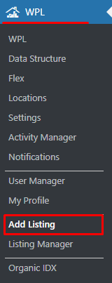
- Step 1 – To start creating this element, please go to WPL > Add listing in your WordPress Dashboard. The page Add/Edit Property will show.
- Step 2 – In the Basic Details tab, add the information about the new property that will be useful and important. Information like Meta description and Meta keywords will be added automatically.

- Step 3 – In the Features tab, add the property features.

- Step 4 – In the Appliances tab, specify all appliances that are available in the property.

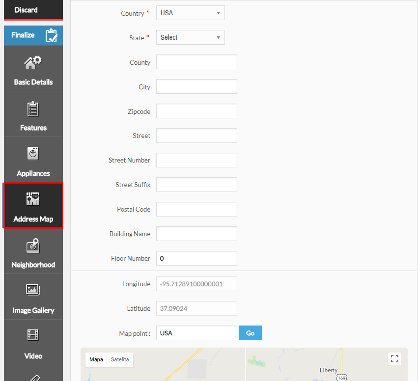
- Step 5 – In the Address Map tab, add the property’s address that will be shown on the map.
- Step 6 – The Neighbourhood tab is where you can add information about the important landmarks in the property’s neighbourhood.
- Step 7 – You can add images of the property in the Image Gallery tab.
 Add details about the image that is added for the property.
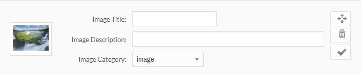
- Step 8 – If you wish to attach a video or file, go to Video and Attachments tabs. You can also select options from the Specialties tab.

- Step 9 – After all the information are added click on Finalize, so all the changes will be saved.

Was this article helpful ?
Listing Manager
In the Listing Manager, you can Edit, Publish, Delete Temporarily, Restore, and Delete Permanently a Property Listing.
-
Edit
To edit Listing Information, follow the steps:
Step 1 – Navigate to WPL > Listing Manager in your WordPress Dashboard. The page Property Manager will show.

Step 2 – Choose the Property Listing that you would like to change the information and click the Edit button.

Step 3 – The Add/Edit Property page will show. You can Edit the information that you want to change. After changing all the information, click Finalize to save.

-
Published
The Published button is to change a status of a listing from Unpublished to Published.

-
Trash
The Trash button can change a listings status to Unpublished and store it in a Recycle Bin like state where you have the option to Restore the said listing.

-
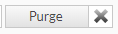
Purge
The Purge button can delete the listing permanently.
Was this article helpful ?
Single property page
In Single property page content tab you can define the following settings for Single Property element: 

Single property page Customizer

Property single page
- Display breadcrumbs – check Yes if you want to display breadcrumbs in top of the page

Breadcrumbs from agent single page
- Display head section – check Yes if you want to display header in top of the page

Head section for property single agent page
- Head section type
- Parallax
- Video
- Ken Burns
- Head section title – Title to display in head section.
- Mobile background image – select the image that will be displayed on mobile devices
- Background image – select image to display in head section
- Second background image – this image will be visible only if the Kenburns head section type will be selected
- Third background image – this image will be visible only if the Kenburns head section type will be selected
- Head height
- Parallax ratio
- Parallax vertical offset
- Parallax horizontal offset
- Video url – Will only work when the head section type is set to Video
- Video file type
- Mp4 direct link
- Webm direct link
- Displays infos – Displays the information about the Images/Video if there is any.
- Publish info – display info about publish date

Publish info
- Update info – check Yes if you want to show update date

Update info
- Report abuse link – check Yes if you want to show abuse link

Report abuse link
- Report Abuse page – choose page to which user will be send, after clicking ‘report abuse’ link
Notice:
All changes made with customizer will only be applied when you click on
Was this article helpful ?
Creating Property Page
Property pages created via Estato will give you options to show a page containing all the needed information about your property.
The Property page visible on Estato demo, can be divided into two Estato elements Single Property and Property mini listing. Here we will concentrate on all the needed information and what options to be set to receive the same look on the page.
If you wish to find more information about the Estato shortcodes using information from WPL plugin please check Estato Custom shortcode for WPL section, where you will find more information about Single Property and Property mini listing elements
Below you will find information on how to create this pages on your own:

- Step 1 – Go to Pages > Add New and create a new page, make sure that the Template you are using is Default Template, or use already created page that is using the same Template.

- Step 2 – Create a row section in the page, then add a Single Property element inside the row.

- Step 3 – Click on the Edit Single Property option and the Single Property Settings will pop-up.

- Step 4 – In the Single Property Settings, set the Listing ID of the property that will be shown in the page and set the Property template to Full width map. To find the Listing ID, click here.

- Step 5 – Create a second row, click on the Edit this row option on the 2nd row created. In the General tab, change the Row Stretch to Stretch row.

- Step 6 – In the Design Options tab, add 40px for top margin and set background color to: #f3f3f3

- Step 7 – Add a Properties mini listing element inside the 2nd row. The Properties mini listing Settings will pop-up. In the General tab, set the Template to Latest listing transparent. A Title can also be added in this element option where it is visible on the site.

- Step 8 – After doing the steps, click on Publish button to save the page.
Was this article helpful ?
Where to find Listing ID
The Listing ID that can be used to locate a Property Listing is found in WPL > Listing Manager where you can find the list of all the properties added to the WPL.

Choose the Property Listing that you want to show and click the Edit button. The Add/Edit Property page will show.

In the Add/Edit Property page you will find Listing ID in the Basic Details tab.

Was this article helpful ?
Create Page with Multiple Listing

To create a page with Multiple Listing the same as the sample above, follow steps:
- Step 1 – Create new page by navigating to Pages > Add New.

- Step 2 – Create row then change Custom Layout of the row to 1/2 + 1/2.

- Step 3 – In the left side row, add a Properties Search element.

- Step 4 – In the same row, add a Properties Listing element. The Properties listing Settings will pop-up.

- Step 5 – In the Properties listing Settings, set the Type listing view to List and add a Title for the list, then click Save changes button to save.

- Step 6 – Now on the right side row, add a Properties map element. The Properties map Settings will pop-up.

- Step 7 – In the Properties map Settings, you can change the details inside the settings. In the Icon tab you have the option to change the icon for the Map marker.

- Step 8 – Once steps are done, click Publish to save the page.
Was this article helpful ?
Create Agent Single Page (Agent’s Profile)
On Agent page you can show information about one of your property agents and all estates attached to them with the use of single WPL shortcode.
By default, WordPress users are not WPL users. This provides you better managerial supervision for distinguishing between the agents and the basic users such as subscribers, authors, etc.
You can activate users in WPL simply by going to WPL > User Manager and then clicking on the “Tick” or “Plus” icon. For specifying user access and limits you should click on the “Edit” icon, change the settings and save it.

Activate User in WPL
If you don’t know how to create a new WP user account please check this link.
Each agent have their own profile page and they can edit the information to be shown on the “Agent Activities” or “Listing Details” page. Uploading a profile picture and company logo is highly recommended so it is good to request that your agents upload their pictures.
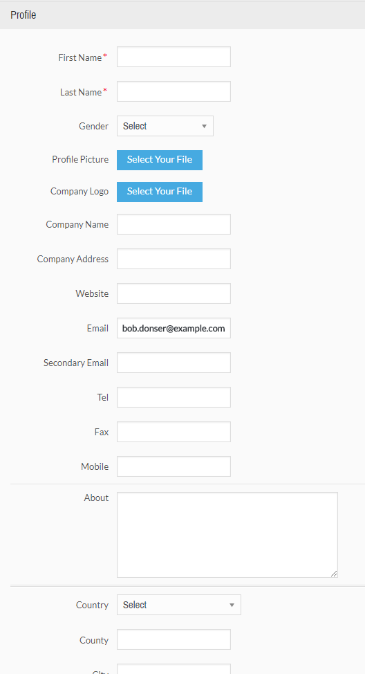
Agent’s profile settings
Do not forget to click on the finalize button after filling the profile page.
Was this article helpful ?
Single agents pages

Single agents page settings
In Single Agent page content tab you can define the following settings for Agents Index page.:

Agent single page
- Display breadcrumbs – check Yes if you want to display breadcrumbs in top of the page

Single agent’s breadcrumbs
- Display head section – check Yes if you want to display header in top of the page

Head section from agent single page
- Head section type
- Parallax
- Video
- Kenburns
- Mobile background image – select the image that will be displayed on mobile devices
- Background image – select image to display in head section
- Second background image – this image will be visible only if the Ken burnshead section type will be selected
- Third background image – this image will be visible only if the Ken burnshead section type will be selected
- Head height
- Parallax ratio
- Parallax vertical offset
- Parallax horizontal offset
- Video url – will only work when the head section type is set to Video
- Video file type
- Mp4 direct link
- Webm direct link
Notice:
All changes made with customizer will only be applied when you click on
Was this article helpful ?
Avaliable Templates
What are Estato Templates?
If you are not interested in downloading the whole content via Unyson demo import, but still want to use some of the pages from the demo you can use the VisualComposer Templates option.
How to use them?
- Create new page going to Pages > Add New
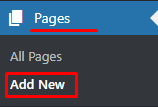
Add New Page
- Go to Visual Composer Backend Editor and choose Templates option.
Templates options
- Choose from My Template tab one of the templates you want to use and click add template

Avaliable templates
- The Template content will be added to the page. Now you can click Publish and it’s done! Or you can start editing content of your page.
Avaliables Types
- Contatc Us
- Home V1 – Portal slider
- Home V2 – Portal Map
- Home V3 – Portal Map (Light)
- Home V4 – Real Estate Agency
- Home V5 – Property Slider
- Home V6 – Simple Onepager
- Home V7 – Onepager Video
- Home V8 – Side Map
- Privacy Policy
- Terms and Conditions
Template avaliable via slug
a) Maintenance – can be used by creating empty page with maintance slug

Was this article helpful ?
Menu setup
Depending on which version of content arrangement you choose, you can create onepager or multipage navigation menu.
To create navigation menu dedicated to multipage websites, please follow the steps below:
- Step 1 – Navigate to Appearance > Menus
Manage your menus
- Step 2 – Click on create a new menu, enter menu Name and click on Create Menu button
Add new menu
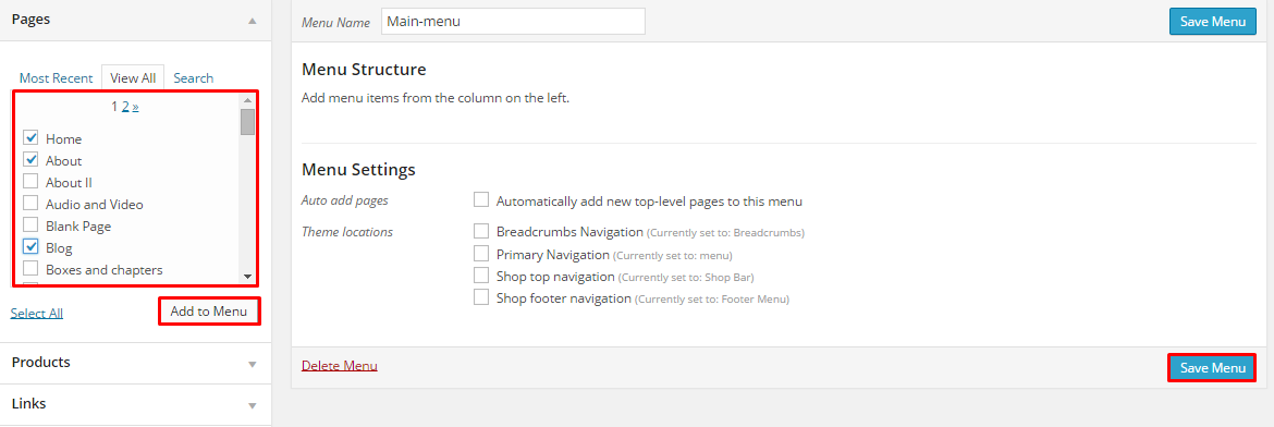
- Step 3 – From the right side choose pages that you want to add to your menu and click on Add to Menu. Once menu items are added, you can reorder or nest them via drag and drop tool. Remember to click Save Menu when you finish to keep your changes saved.
Add Page to menu
- Step 4 – You can easily rename every menu item in item details.
Rename your menu items
- Step 5 – Optionally you can add to menu other items, like Links or Categories
- Step 6 – Check your menu as Main menu to set one of available location.

Primary navigation
- Main Menu – will be visible on top of each page
Main menu Example
- Mobile menu – this menu will be visible on mobile devices (in Estato this menu is created without MaxMegaMenu plugin)
Mobile menu example
- Main Menu – will be visible on top of each page
- Step 7 (optional) – Enable Max Mega Menu for Theme Location

Max Mega menu Settings
- Step 8 – Always click Save Menu after providing any changes
Menus can be also shown in widgets section of Dashboard. After creating the menu you want to use, go to Appearance > Widgets and set the menu on your site using Custom Menu widget like in the example below.
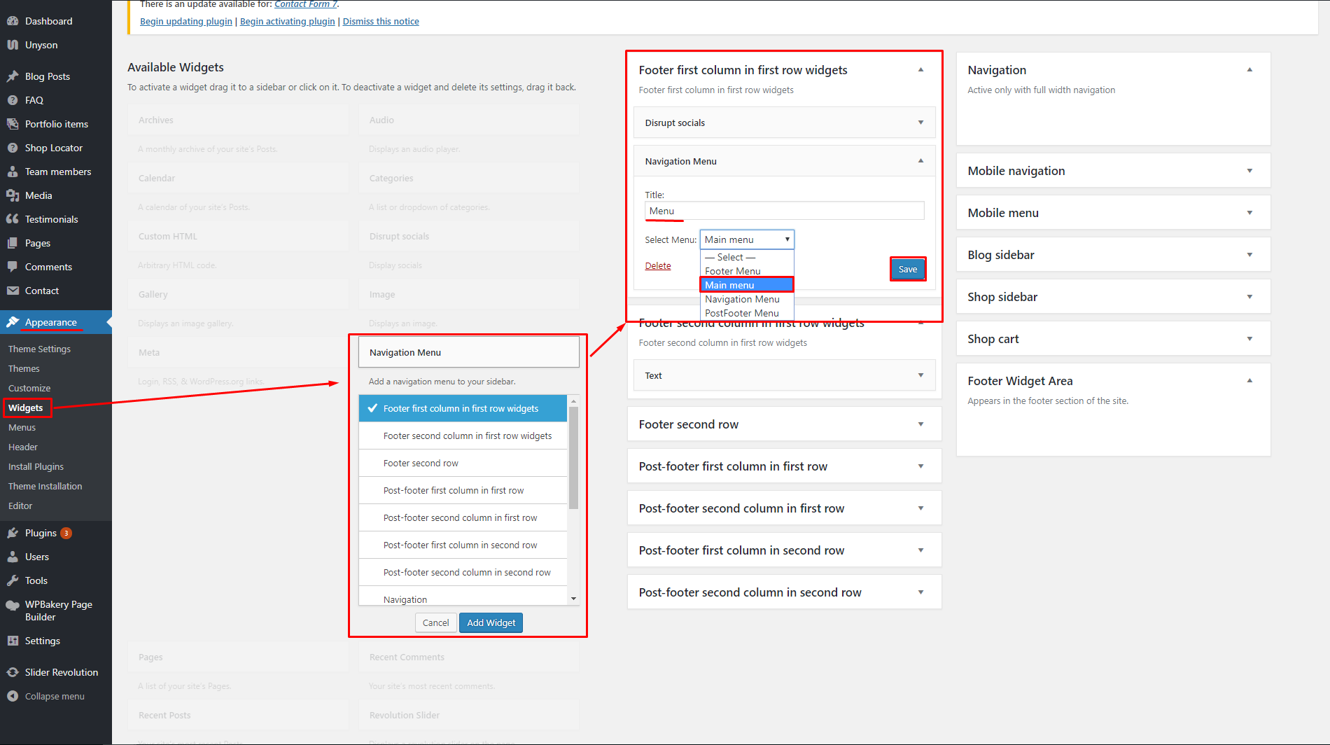
Set menu as a widget
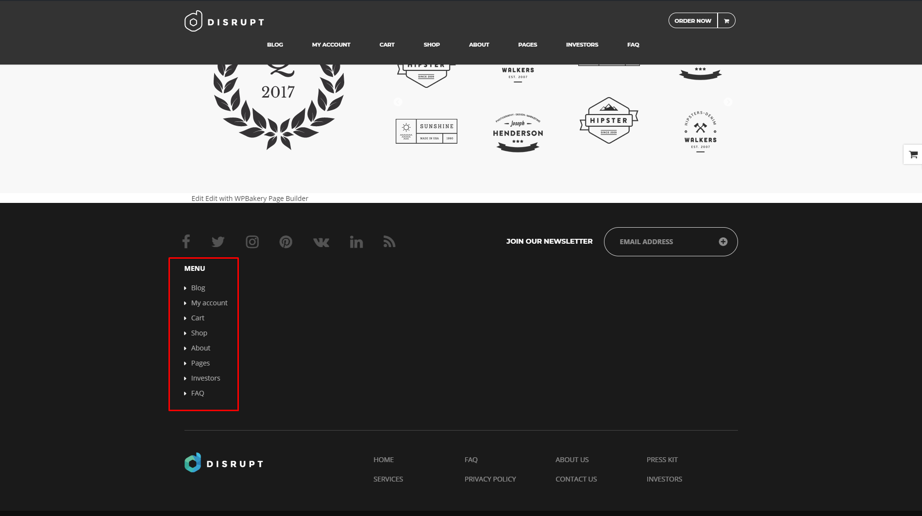
Menu added to the site via widget
Was this article helpful ?
Faq Page

FAQ page
Frequently Asked Questions (FAQ) of Estato is generated by the theme from Faq items. This type of page can be created by going to Appearance > Customize > Faq and adding there the slug and title the page will use.
Adding Faq slug and title
Was this article helpful ?
Create FAQ Item
Frequently Asked Questions (FAQ) of Estato is generated by the theme from FAQ items.
To create a new FAQ item, navigate in WordPress dashboard to FAQ > Add New.

For new FAQ item you can define:
- Title – The FAQ’s question should be written as the title.
- Editor container – where the answers for the question is added.
- FAQ Categories (optional) – assign to preexisting category or add a new one.

- Once done, click on Publish button.
Was this article helpful ?
FAQ
In Faq content tab you can define the following settings for Faq page.:

Faq settings

Faq Index page
- Display breadcrumbs – check Yes if you want to display breadcrumbs in top of the page

Breadcrumbs from index faq page
- Display head section in faq – check Yes if you want to display header in top of the page

Head section for index
- Head section type
- Parallax
- Video
- Ken Burns
- Mobile background image – select the image that will be displayed on mobile devices
- Background image – select image to display in head section
- Second background image – this image will be visible only if the Kenburns head section type will be selected
- Third background image – this image will be visible only if the Kenburns head section type will be selected
- Head height
- Parallax ratio
- Parallax vertical offset
- Parallax horizontal offset
- Video url – will only work when the head section type is set to Video
- Video file type
- Mp4 direct link
- Webm direct link
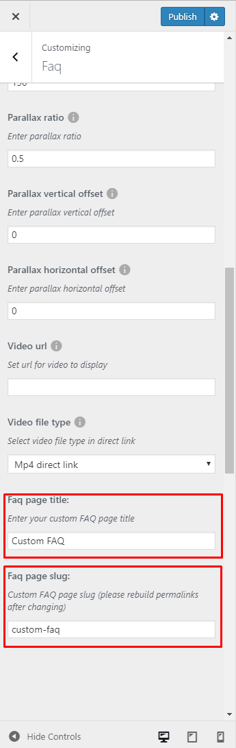
- Faq page title – create title for main FAQ page
- Faq page slug – create FAQ page slug (remember to rebuild permalinks after changing it)
Notice:
All changes made with customizer will only be applied when you click on
Was this article helpful ?
Contact forms
Contact forms in Estato are created with the use of Contact Form 7 Plugin. Below you will find information how to recreate Contact forms used in our theme by adding the correct markup for the Form section of this plugin.

Contact form markup added to Form
If you never before used this plugin I suggest you to check Getting Started with ContactForm 7.
Calculate Loan
This contact form come with two color versions, than can be achieved by adding custom css class to Inner column Settings in VisualComposer when creating page with form:

Adding custom class
- Dark version (with custom class ct-contact-claculatorFormContainer)

Calculator loan dark
- Light version (no custom class)

Calculator loan light
Calculator can be recreated by using this markup for contact form:
|
1 2 3 4 5 6 7 8 9 10 11 12 13 14 15 16 17 18 19 20 21 22 23 24 |
<div class="ct-contact-form"> <h3 class="ct-formTitle ct-contactPage"> Calculate Loan </h3> <label> Property Price ($) [text* propertyprice] </label> <label> Percent Down [text* percentdown] </label> <label> Terms (Months) [text* terms] </label> <label> Interest Rate in % [text* Rate] </label> [submit "Calculate My Mortage"] </div> <script> document.addEventListener( 'wpcf7mailsent', function( event ) { location = location.href + '/calculate-loan/'; jQuery('.wpcf7-response-output').remove(); }, false ); </script> |
Feel Free to Contact Us

Feel free to contact us
To recreate this contact form please use:
|
1 2 3 4 5 6 7 8 9 10 11 12 13 14 15 16 17 18 19 |
<div class="ct-contactForm-main"> <h3 class="ct-formTitle"> Feel Free To Contact Us </h3> <img class="ct-formImage" src="/wp-content/themes/estato/theme/assets/images/demo-content/questions.jpg"> <label> Name [text* your-name] </label> <label> Email [email* your-email] </label> <label> Phone [text phone] </label> <label> Message [textarea your-message class:ct-contactForm-main--message] </label> [submit "Send Message"] </div> |
Newsletter

Newsletter form
To recreate this Newsletter form please use:
|
1 2 3 4 5 6 7 8 9 |
<div class="ct-contact-form ct-newsletter ct-newsletter--page"> <h3 class="ct-formTitle ct-contactPage"> Join our newsletter </h3> <label><span class="sr-only"> Your Email (required)</span> [email* your-email placeholder "Your E-mail Address"] </label> <p class=text-right> [submit class:btn class:btn-primary class:btn-transparent--border class:ct-u-text--motive class:text-capitalize "Subscribe"] </p> </div> |
Newsletter-footer
This is a contatc form that will let you recived e-mails from user that want to Subscribe your site.

Footer contact form
To show your contatc form in footer, go to Appearance > Widgets by adn you can add there ContactForm7 shortcode to Text widget

Adding footer contact form
To recreate the look of this contact form please use this markup:
|
1 2 3 4 5 6 7 8 9 10 11 |
<div class="ct-newsletter text-right"> <span class="text-uppercase ct-u-text--white ct-fw-600">Join our newsletter</span> <label><span class="sr-only"> Your Email (required)</span> [email* your-email placeholder "Your E-mail Address"] </label> [submit class:btn class:btn-primary class:btn-transparent--border class:ct-u-text--motive class:text-capitalize "Subscribe"] </div> |
Send us a Message

Contact form on map
Markup used for this contact form:
|
1 2 3 4 5 6 7 8 9 10 11 12 13 14 15 16 17 |
<div class="ct-contact-form"> <h3 class="ct-formTitle ct-contactPage"> SEND US A MESSAGE </h3> <label> Name [text* your-name] </label> <label> Email [email* your-email] </label> <label> Phone [text phone] </label> <label> Message [textarea your-message] </label> [submit "Send Message"] </div> |
To display this contact form on a map, you need to create two Rows Like on the image below.

Creating section
and add :
- ct-contact-map–Container custom class for Google map Row
- ct-contact-formContainer ct-contact-multiPage custom class for Contact form Row

Adding custom CSS class
Was this article helpful ?
Theme Settings
Theme Settings is an option that will allow you to set basic options that can be crucial when creating your Estate page. Theme Settings can be found in Dashboard on path Appearance > Theme Settings that contains 3 Tabs:

Theme Settings
– General –
- Cut property descriptions after x character – The limit for the number of characters used in the description for a property.

General tab
– Pages –
- Agent Profile page – allow you to choose Agent profile page and extra style it with Customise options
- Agent listing page – allow you to choose Agent listing page and extra style it with Customise options

Pages tab
– Searchbox – option that will allow you to set the searchbox.
- Title – set title for the Searchbox
- Kind – set the kind from the avaliables options
- Layout – layout type (only simple avaliable)
- Target page – page where this searchbox will be shown
- CSS Class – add custom class to style the element

Searchbox tab
How to configure the Searchbox for Estato
To configure the Searchbox, follow these steps:
-
- Step 1 – Navigate in Dashboard to Appearance > Theme Settings > Searchbox tab.
- Step 2 – Click the View Fields buttton, the Search Fields Configurations will pop-up.

Searchbox Tab
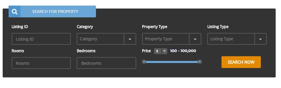
- Step 3 – Here you will see all the fields that will be visible in the Searchbox.

Fields in the Searchbox
- Step 4 – To customize the look of this element you can:
- Remove already added fields – Click on the X button on top of the field that you want to remove.

Remove
- Add new one – Click on the tabs on top to choose the categories of fields you want to add. You can see the fields at the bottom. Drag the field that you want and drop it at the center.

Add New Fields
- Choose type of data – The data type of what the field will use to search.

Data Type
- Add range of the data – This could be used if the data type option is numerical. Setting the range in number.

Data Range
- Remove already added fields – Click on the X button on top of the field that you want to remove.
- Step 5 – You have the option to change the order of the fields at the right side by drag and drop.
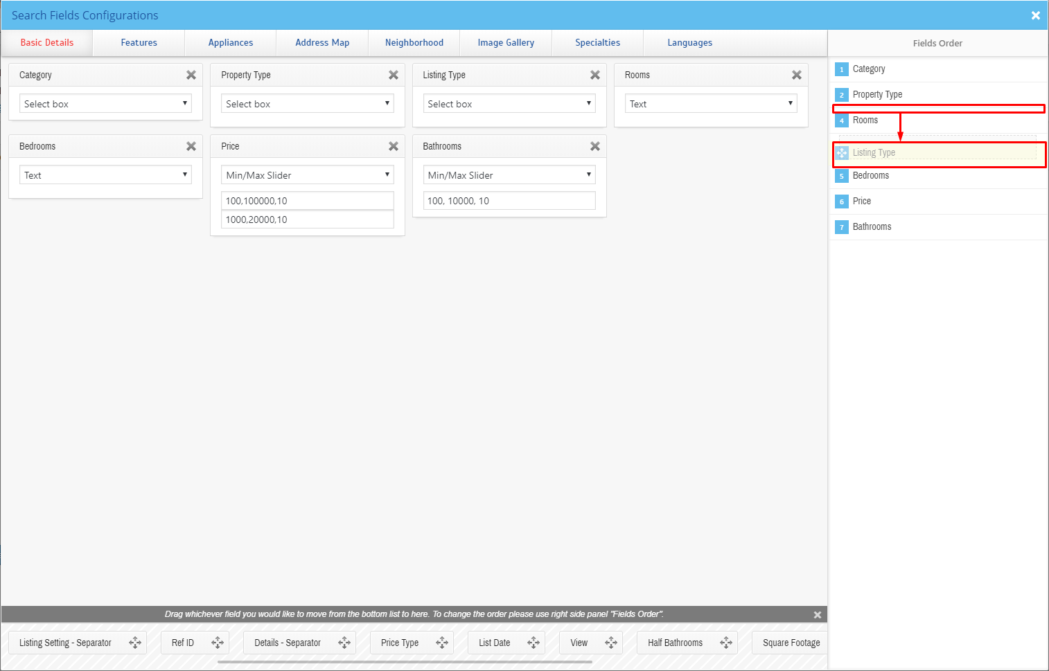
Fields Order
All the changes you will make will be saved automatically.
Was this article helpful ?
Estato Customize
Estato comes with an advanced customizer, which allows to edit most of the theme elements in one place. If you want to use it, navigate to Appearance > Customize

Estato Customizer
It will display a panel with tabs corresponding to all theme sections, such as:
- Style
- Widgets
- Header
- Footer
- Blog
- Single blog post
- Portfolio
- Faq
- Template pages
- Properties page
- Single agent page
- Agent page
You will also find the main style settings:
- General
- Colors
- Header Image
- Background Image
In General you can turn off/on preloader on the site, check onepager option if you want to have onepager site (more info about onepager site HERE).

General settings
In Estato Color section you can choose colors used in the theme

Color settings
In Header Image section you can edit logo on the site

Header Image settings
Customize option will also give you option to set image as a background for the theme:

Background Image settings
Notice:
All changes made with customizer will only be applied when you click on
Was this article helpful ?
Header

Header settings
In Header content tab you can define the following settings:
- Header behavior
- Scroll Up Both
- Scroll Up Menu
- Scroll Up TopBar
- Fixed both – Menu & TopBar – menu and TopBar fixed to the top when scrolling
- Hide Menu – menu hidden when scrolling, TopBar will be fixed to the top
- Fixed Menu – menu fixed to the top when scrolling (if TopBar is displayed it will be hidden after scrolling)
- Header type
- Equal TopBar and Navbra
- Small TopBar, big NavBar
- TopBar – Check if you want to display TopBar

TopBar section
- TopBar motive – choose color TopBar pattern
- Light motive
- Dark motive
- TopBar motive – choose to display login on text in TopBar
- Text
- Login option
- Text in TopBar – write text to display in TopBar
- E-mail adress in TopBar – add e-mail adress that will be visible in the TopBar

E-mail adress in TopBar
- Search in TopBar

Search option avaliable in TopBar
- Bottom line – check Yes if you want to display bottom line
- Border at menu – check Yes if you want to show border at top menu
- Button in NavBar – add or hide button

Button in TopBar
- Button title – add text visible in the button
- Button link – add link to were you want the button to lead to
- Open link in new window – check Yes to display button link in new window
Notice:
All changes made with customizer will only be applied when you click on
Was this article helpful ?
Homepage Settings
In Static Front Page content tab you can define which of the created Pages will be used as a site Home page and which page will be used as a Blog page (avaliable for static page option).

Homepage Settings
- Front page display
- Your latest posts – latest posts will be shown on the Front page
- A static page – Home page and Blog index page will be chosen from list of static pages.
- Front page – avaliable if A static page option is chosen, set page that will be shown as a Front page
- Posts page – avaliable if A static page option is chosen, set page that will be shown as a Posts page
Notice:
All changes made with customizer will only be applied when you click on
Was this article helpful ?
Footer
In Footer content tab you can define the following settings:

Footer settings

Footer section
- Footer display – check Yes if you want to display footer

Footer – 4 columns/dark motive
- Footer color
- Light Motive

Footer Light motive
- Dark Motive
- Light Motive
- Background image – set background image for footer.
- Number of footer columns
- One column
- Two columns
- Three columns
- Four columns
- Post footer display – check Yes if you want to display post footer on site

Post Footer – 2 columns
- Number of post footer columns (will work only if the Post footer display opion will be checked)
- One column
- Two columns
Notice:
All changes made with customizer will only be applied when you click on
Was this article helpful ?
Template pages
In Template pages content tab you can define the following settings for template pages: Terms & Conditions, Private Policy, Contact Us:

Template pages settings

Faq Index page
- Display breadcrumbs – check Yes if you want to display breadcrumbs in top of the page

Breadcrumbs from index faq page
- Display head section in template pages – check Yes if you want to display header in top of the page

Head section for index
- Head section type
- Parallax
- Video
- Ken Burns
- Mobile background image – select the image that will be displayed on mobile devices
- Background image – select image to display in head section
- Second background image – this image will be visible only if the Kenburns head section type will be selected
- Third background image – this image will be visible only if the Kenburns head section type will be selected
- Head height
- Parallax ratio
- Parallax vertical offset
- Parallax horizontal offset
- Video url – will only work when the head section type is set to Video
- Video file type
- Mp4 direct link
- Webm direct link
Notice:
All changes made with customizer will only be applied when you click on
Was this article helpful ?
Calculator landing page
In Calculator landing page content tab you can define the following settings for Calculate Loan template page.:

Calculator landing page settings
- Background image – Image for background in landing page
- Section height
- Background image for second column – Image for second column in landing page
- First title

First title text example
- Second title

Second title text example
- Text – text use for landing page

Text example
Notice:
All changes made with customizer will only be applied when you click on
Here you will find information how to create contact form visible on this site.
Was this article helpful ?
Realtyna WPL Basic – Estato
What is WPL?
WPL (WordPress Property Listing) is a great plugin for real estate agents and agencies. It is the most feature-rich, flexible, scalable and extendable WordPress plugin for creating Real Estate websites / portals.
Estato Compability
Estato comes with the Realtyna WPL Basic version but the theme is also fully compatible with the WPL Pro version. HERE you can check all the differences betwen WPL Basic and WPL PRO version to decide if you want to use the bundled version or rather buy the Pro version of the plugin.
Plugin installation
WPL is one of the requested to insall plugin and it should be installed after you install and activate the Estato – otherwise you might be encountered problems with correct theme functioning. After it installation this plugin will be automatically activated.
Due to plugin bug it need to be activated individually
Reinstalling the plugin:
If you are using multisite or you are having blog on your site and want to reset the site you won’t be able to correctly activate WPL plugin then. To use the plugin again you will need to reinstall the plugin, to do so please go to the plugins folder in your WordPress and remove the plugin folder from there. After doing that you will be able to install and use this plugin again.
How does the WPL shortcode wizard work?
WPL has a feature for generating shortcodes automatically based on your configuration. You can find it on the WordPress editor:

WPL shortcode wizard
After clicking on the [W] icon, you will see the below wizard:

WPL View options
This wizard can generate Property Listing, Property show (single property page), Profile/Agent Listing, Profile/Agent Show, My Profile and the Widget Shortcode (PRO members). You can select one of these shortcodes using the “View” option.

Configure options
Each Shortcode (“View” option) has its own configuration form. You can set the configuration form if needed and click on “insert” to see the generated shortcode into your post/page content.

Add Shortcode to WordPress editor
If you are using VisualComposer plugin to use the WPL shortcodes on page, you can add them to the Text block shortcode:

Visual Composer view
Available shortcodes
- Property Listing allows you to show the list of properties to site visitors with pagination, sort options. You can add different types of property listings: a menu for showing sale properties or rental properties, specify the default page size and default sort type, etc
- Property Show allows you to add property to your site page.
To check all available listings, please navigate to WPL > Listing Manager page in your admin panel. Click Edit next to the listing you would like to add:
Edit Properties
- Profile/Agent Listing is used for creating a profile listing view. It is used to list the agents. Enter the following settings to shortcode wizard: Layout, User Type, Target Page, Page Size, Order by and Order settings
- Profile/Agent Show is used to display the profile of a specific user/agent.
- Select Profile/Agent Show from the View drop down.
- Set up layout by selecting option from Layout drop down.
- On the next step choose user you would like to add to the page.
- Select target page for your user link:
- My Profile is used to display the profile form of a user/agent in frontend. Select My Profile from the View drop down. Click Insert button. In order to change profile information, open WPL > My Profile page in your WordPress admin panel. Here you can change agent name, upload photo, change contact details.
Was this article helpful ?
Using widgets
Widgets are small blocks of content, which you can find in theme footer or sidebar. They were originally designed to provide a simple and easy-to-use way of giving design and structure control of the WordPress Theme to the user, which is now available on WordPress Themes to include the header, footer, and elsewhere in the WordPress design and structure. Widgets require no code experience or expertise. They can be added, removed, and rearranged on the WordPress Administration Appearance > Widgets panel.
Just drag and drop the widgets you want, into the right hand side where your sidebars and footer widgets are listed. Simply drag your widgets over to the sidebar or footer column, and then populate the content.
There are various fields and settings you can choose for each individual widget and all are self explanatory. You can also use multiple widgets per footer column, just drag and drop them into place. And you can put as many widgets as you want inside sidebar. Once you have finished populating the widgets, always make sure to hit the Save button to save the settings.
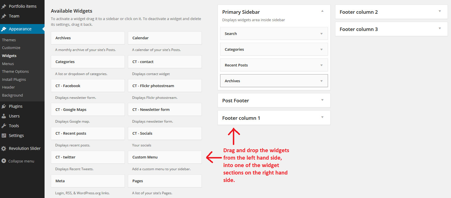
Just drag widget from the left hand side and drop it on the right
Was this article helpful ?
Available Sidebars
While widget areas typically occur in webpage sidebars, a theme can place widget areas in many places on a page. For example, besides the usual sidebar locations, the Estato theme has a widget area in the footer of every page.
The content of the sidebars will depend on what widgets are added to that said sidebar. You can add by dragging a widget inside the sidebar to which you want that widget to show.

Sample on adding widget to sidebar
To add a widget on other areas on the page other than the sidebars, you can use the Wigetised Sidebar element. Just set the type of sidebar you would like to show.

This is a list of sidebars available for Estato
- Primary Sidebar
- Page Sidebar
- Header left column
- Footer column 1
- Footer column 2
- Footer column 3
- Footer column 4
- Post Footer column 1
- Post Footer column 2
- Blog Sidebar 1
- Single sidebar 1
- Property Show Bottom
- Profile Show Top
- Property Listing Top
- Profile Listing Top
- WPL Hidden
- Property Listing Bottom
- Footer Widgets Area
- Max Mega Menu Widgets
These are sample images for the sidebars:

Header left column

Blog sidebar 1

Footers
Was this article helpful ?
Plugins
Some functionalities of the Estato are available because of plugins we used to create it. Once Estato is activated in your WordPress admin panel you should see notification about bundled plugins we recommend to install – they are included in Estato package – so you don’t have to do anything more than click install and activate.
Notice:
We can’t guarantee Estato’s compatibility with third party plugins. If you want to avoid unexpected bugs and errors use as little plugins as possible.
Below you will find the list of plugins we recommend you to use with Estato.
Was this article helpful ?
Estato Plugin
Plugin dedicated for Estato WordPress Theme that will allow you number of custom features like:
- Portfolio items
- FAQ items
- Testimonials
- Estato WP Custom Visual Composer shortcodes
- Estato WP shortcodes for WPL
Was this article helpful ?
Unyson plugin
Getting started
Unyson is a framework for WordPress that facilitates development of a theme. This framework was created from the ground up by the team behind ThemeFuse from the desire to empower developers to build outstanding WordPress themes fast and easy. This documentation is heavily modified by createIT to ensure all custom extensions are well documented.
This documentation assumes you have a working knowledge of WordPress. If you haven’t, please start by reading WordPress Documentation.
Minimum Requirements
- WordPress 4.0 or greater
- PHP version 5.2.4 or greater
- MySQL version 5.0 or greater
Installation
Unyson is included in Estato package – so you don’t have to do anything more than click install and activate.
You can also install the plugin manually:
- Upload the unyson folder to the /wp-content/plugins/ directory
- Activate the Unyson plugin through the ‘Plugins’ menu
- Configure the plugin by going to the Unyson menu and activating the following extensions:
- Custom options type
- Estato FAQ
- Estato Portfolio
- Visual Composer
- Estato Testimonials
- Estato Plugin

Unyson Extensions
License
The licenses for most software are designed to take away your freedom to share and change it. By contrast, the GNU General Public License is intended to guarantee your freedom to share and change free software. Unyson inherits the General Public License (GPL) from WordPress.
Was this article helpful ?
Visual Composer
Estato can be easily customized with Visual Composer.
Simply drag and drop elements to build your page content. We prepared components which will help you determine main structure of the webpage – easily set up backgrounds, colors and styles for whole sections as well as lots of various smaller components which you can freely put wherever you want.
How to start?
We recommend you to use row as essential element of page structure.
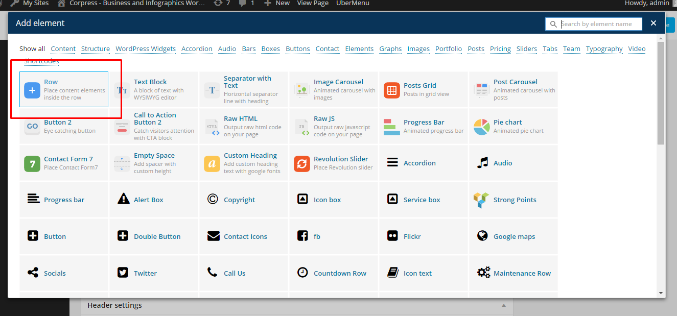
Row

What we grow page
You can edit following row attributes:

Click pen to open edition tools
– General tab –
- Row stretch:
- Default
- Strech row
- Strech row and content
- Strech row and content (no paddings)
- Column gap – Gap between columns.
- Full height row – If checked Yes, row will be set to full height.
- Equal height – If checked Yes, column height will be equal to the longest column height.
- Content position – the position of the content can be set to Default, Top, Middle and Bottom.
- Use Video Background – If checked, video will be used as row background.
- Parallax – Use Parallax as a background.
- CSS Animation – How the content of the row is animated.
- Row ID – If you want to use section for scroll-to-section navigation.
- Disable row – If checked, the row won’t be visible on the public side of your website.
- Extra class name – Add extra class name for the row.

General Tab of Row Settings
– Design Option – How the row would look/designed.
- Border color
- Border style
- Border radius
- Background
- Box Controls

Design Tab of Row Settings
Once your section row is created you can choose number of columns in section, their width and optionally offset value.

Section grid
Learn more:
For more information about Visual Composer, please check articles below:
How to install Visual Composer
Visual Composer demo
Visual Documentation
Was this article helpful ?
Revolutions Slider
Estato is fully compatible with Revolution slider version that comes with Theme package avaliable on Envato Market

Revolution Slider example
How to install plugin?
Revolution Slider is included in Estato package – so you don’t have to do anything more than click install and activate.
Creating a new Slider
Information hot to create custom Slider can be find in Plugin Documentation.
Common questions:
How to update the plugin when it was packaged with your theme?
Was this article helpful ?
Max Mega Menu
Enabling Max Mega Menu for Theme Location
Estato navigation menu can be built with Max Mega Menu plugin, which allows you to create expanded Mega Menu.
Once plugin is activated, you can go to the Appearance > Menus > Create a New Menu or used one created before.
On the left hand you should see a Max Mega Menu Settings box like the one below. Check the “Enable” checkbox and choose from the Theme option “EstatoStyle” and click Save, your menu will now be converted into a Mega Menu for the relevant Theme Location and will be using style dedicated for Estato
Max Mega menu Settings
The basic setup for Max Mega Menu has been completed!!
If you are looking for more information about using Max Mega Menu plugin please go to the official Max Mega Menu Documentation site.
Was this article helpful ?
Theme Translator
Each of our Themes could be translated by using translation editor like: Poedit.
To translate the theme, it will need a POT (Portable Object Template) file to work.
POT is generated from theme files and contain all phrases from the theme that can be translated to a different language.
*In Estato WP the file is called estato-theme.pot and the path to it is estato > language instead.

The translation editor will create PO (Portable Object) and MO (Machine Object) file from the theme POT file. The only file we are able to edit is the PO file.
In the PO file, we are saving both English and the translations for this phrases. All translations you created are added there. Saving the changes there will also update the MO file that is used by the theme.
How to translate theme using Poedit
-
- Copy the estato_theme.pot file from /wp-content/themes/estato-theme/language/. Paste it on the desktop of your computer.
- Using the Poedit application, open the PO file that is on the desktop.

-
- The PO file will be opened by Poedit application. Click on the “Create new translation” button to start creating your translation.

- The PO file will be opened by Poedit application. Click on the “Create new translation” button to start creating your translation.
-
- You will be ask what language to translate the file into, choose the language as to what you need.
- You will see at the Poedit application that at the left side are the Source Text (English words) and at the right side are the Translations.
- When you click on a word from the source text, at the very right side you will see Translation Suggestions for the word that was clicked.
- Click on the best of the suggested translations of the word. The suggested translation will show at the Translations side.

-
- Click on a word from the source text one by one and translate.
- Once done translating the words on the Source text, save the file.
- When saving a file, “ct_theme-” should be added to the default file name.

- Once saved, it will create a PO and MO file.
- Copy the PO and MO file to the WordPress language directory located at /wp-content/languages/themes/.

-
- In your WP, activate estato theme. Once activated, navigate your dashboard to Settings > General.
- You will see the General Settings of your site. To activate the translation, look for the Site Language and select the one that you like.

- After selecting the site language, click the Save Changes button and a loading icon will show. Once the loading icon disappear, the translation should be done.
For more information on how to translate a theme using Poedit, click this link.
Was this article helpful ?
Translate using the WordPress Settings
WordPress can change the language of the words that are found in the PO and MO files located in the language directory. If the words are not found in the PO and MO files, it will stay the same and won’t be translated.
To change WordPress language, navigate your WP Dashboard to Settings > General.

You will be directed to the General Settings page. In this page, you have options to change the format of the time, date, email, tagline, etc,.
To change the language, look for Site Language. Change the language to what you would like, then click Save Changes to save and a loading icon will show. Once the loading icon is gone, WP should have changed its language.

Was this article helpful ?
Translate WPL (Realtyna)
WPL already have language files in its folder. It can be found on this path: /wp-content/plugins/real-estate-listing-realtyna-wpl/languages.
You can find the PO and MO files of the available languages that WPL have provided.

To translate WPL in WordPress, copy the PO and MO file of the language you would like to use. Then Paste the file in the WP language folder, path: /wp-content/languages/plugins.

To active the language translation, follow Translate using WordPress Settings tutorial.
For Languages that are not found in the WPL Language Folder
If the language you would want to translate your WPL is not found in the WPL language folder, you can make a new PO and MO file using Poedit.
To use Poedit, follow these steps:
- Step 1 – Install Poedit software on your computer.
- Step 2 – Copy a PO file of the default language used by WPL (e.i. wpl-en_US.po), and rename it.
- Step 3 – Using the Poedit software, open the renamed PO file and then translate the strings.
- Step 4 – Once done translating the strings, save the file. Once saved, it will create a PO and MO file.
- Step 5 – Copy the new PO and MO file to the WordPress language directory, then change the language of WP to activate.
Was this article helpful ?