With {Theme} comes many custom shortcodes for (Visual Composer) VC that are used to show content created in {Theme}. Below you will find short information about this Visual Composer elements:
-
Button for {Theme}

- This theme comes with VC element that give you the option to create buttons that can be used in the theme.
- These are how the buttons using the Button for {Theme} element looks like:

-
Icon Box for {Theme}
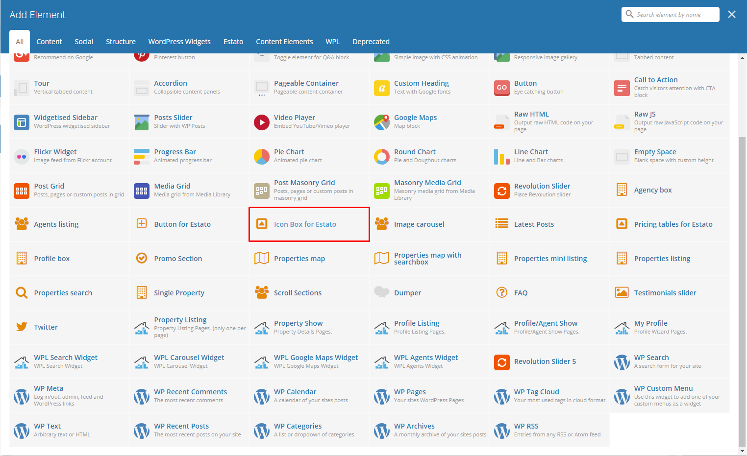
Below you will see all the available options that can/need to be set to use Icon Box for {Theme} element on a page:
- – General Tab –
- Number of icons – you can set here number of icons visible in row (1, 2, 3, 4). We recommend to use one Pricing table for {Theme} element in single row to get the best effect using this element.
- Motive – Choose color style used for this element: Light or Dark
- Title – Set the title for this Icon Box.

- – Columns Tab – (number of columns tab depends on the number of icons set in General tab)
- Title – Title for the icon inside the Icon Box.
- Icon – Choose an Icon to present.
- Description – Description of the icon.

- – Button Tab – (Add Button under Icon Boxes)
For sample in creating Icon Box, see “Create Sample Icon Box” below.
-
Image Carousel

Below you will see all the available options that can/need to be set to use Image carousel for {Theme} element on page:
- Title – Title for the Image Carousel in the page.
- Display navigation – Check Yes to show the navigation of the carousel.
- Items count – Number of images shown at once on the page (this option will not work on the mobile version of the carousel)
- Pagination – Check Yes pagination to show it.
- Autoplay – Check Yes to make the carousel move automatically.
- Images – Add images to be shown in the carousel from the Media Library or Upload Files from your computer.

Remember to Publish/Update the changes on the page to save them.
-
Latest Posts

This will show the latest posts posted in the blog. You can custom this element using options from the Latest Posts settings as shown below:
– General Tab –
-
- Title – Title for the posts.
- Limit – Number of blog posts inside the Latest Posts.
- Custom class
- Order – How the posts order looks.
- Ascending
- Descending
- Order by – How the posts are ordered.

– Button Tab –
Remember to Publish/Update the changes on the page to save them.
-
Promo Section

To create your own promo section, you can choose options as below:
– General Tab –
-
- Background color – Set the background color of the Promo Section.
- Image – Image for the promo.
- Promo text – Describing the promo.
- Promo text color – Text color of the Promo Text.

– Buttons Tab – (Maximum of 3 buttons which can be disabled if not used.)
Remember to Publish/Update the changes on the page to save them.
For sample in creating Promo Section, see “Create Sample Promo Section” below.
-
Pricing Tables for Estato

Below you will see all the available options that can/need to be set to use Pricing tables for {Theme} element on page:
– General Tab –
-
- Title – Set the title visible above the pricing tables.
- Number of tables – You can set the number of tables visible in row (1, 2, 3, 4). We recommend to use one Pricing tables for Estato element in single row to get the best effect using this element.

– Columns Tab – (number of Columns tab depends on the number of tables set in General tab)
-
- Title – Title of the pricing listed.
- Value – Value of the pricing listed.
- Subvalue – Another value to compare with the value of the listing.
- Tag – A tag to make it unique.
- Features – Descriptions and features of the item listed.
- Button enabled – check Yes to show button.
- Button title – Title of the button inside the listing.
- Button link – Where the button is linked.
- Button size – Button attribute.
- Button style – Button attribute.
- Transparent {Theme} style for button? – Check Yes option if you want the transparent style.
- Custom CSS class for button – Set your custom class to style the button.

Remember to Publish/Update the changes on the page to save them.
-
Twitter

Below you will see all the available options that can or need to be set to use Twitter in your {Theme} theme:
Twitter Settings
-
- Title – set the title for header
- username – twitter username
- customer key
- customer secret
- token
- token secret
- limit – limit of visible tweets
- Tweets per slide
- follow us button – follow us button label (leave blank to hide it)
- new window? – Yes/No
- parse url
- parse media
- parse url id? – Yes/No
- parse hashtag? – Yes/No
- embed images? – Yes/No
- size of embedded images?
- tweet length limit
- cache results for X seconds – cache Twitter feeds for better performance.

The information how to generate twitter keys and tokens can be found here.
Remember to Publish/Update the changes on the page to save them.
For sample in creating Twitter Section with Background, see “Create Sample Twitter Section with Background Image” below.
-
Scroll Section

This element will let you create a page menu to let the user move between the section page.

The only option available in Scroll Sections Settings is Section names that will let you create menu links for custom sections. This element is used on Terms & Conditions page of {Theme} WP theme.
Remember to Publish/Update the changes on the page to save them.
For sample in creating Scroll Sections, see “Create Sample Scroll Sections” below.
-
FAQ

FAQ element will let you show all the created FAQs Items on the site. This version of FAQ doesn’t have a menu like the one created via Customise options, but it will let you add other contents on the same site unlike the customise one.

Remember to Publish/Update the changes on the page to save them.
-
Testimonials slider

Testimonial slider will gives you an option to show people Testimonial Items that are made on your site.
Testimonial slider Settings
-
- Style of slider – This would depend on the style/color of the background of this slider.
- Additional title – Check Yes if you want to display title.
- Title – Title of the slider.
- Order – The order in which the testimonials are shown.⦁ Order – The order in which the testimonials are shown.
- Order by – The order of the testimonial that are shown.
- Limit – Number of testimonials shown.

Remember to Publish/Update the changes on the page to save them.
For sample in creating Testimonial slider on a page, see “Create Sample Testimonial slider” below.