

General Information
Thank you for purchasing Test! We’re very pleased that you have chosen our theme to build your website and we’re trying our best not to disappoint you! Before you get started, please check out these documentation pages. Test can only be use with WordPress which we assume you already have installed and ready to go. If not, please check out WordPress Codex.
Was this article helpful ?
Requirements for Test
Before using Test, please meet the following requirements:
- essentials to run WordPress – here you can find more information – in case any doubts regarding the server, contact your host provider,
- latest version of WordPress, which you can download here,
- create secure FTP and Database.
Was this article helpful ?
What’s Included
When purchasing our theme from Themeforest, you need to download the Test files from your Themeforest account. Navigate to downloads tab on Themeforest and find Test. Below you’ll find a full list of what is included the .zip file, along with a brief description of each item.
Test Folder contains:
- {theme}.zip – main installation folder
- {PSD_included}
Was this article helpful ?
Support
All of our items come with free support. For some help you can reach to our dedicated support forum. Free support is limited to questions regarding the themes features or problems. We provide premium support for code customizations or third-party plugins. If you need help with anything other than minor customizations of your theme, feel free to contact us on premium@createit.pl.
For free support, follow the steps below
- Step 1 – Click Here to create a free forum account. You’ll need your Themeforest purchase code, which can only be received when purchasing the theme from Themeforest.net.
- Step 2 – Enter your Themeforest Purchase Code, an e-mail and a password.
- Step 3 – Once you have an account, sign in to the forum and get started.
- Step 4 – Find your theme on a forum home page.
- Step 5 – Create new issue by clicking on a button at the right.
Before You Post On a Forum
We urge you to follow the steps below, before you post a new topic on the forum, to speed up your request. It’s in everyones interest and will benefit in making the entire forum more efficient:
- Step 1 – Always check the Documentation and the Knowledgebase Section. Most questions are already answered in those areas.
- Step 2 – Always use our Forum Search before you post, it’s possible that your issue has already been brought up and answered.
- Step 3 – If your question hasn’t been brought up, please post a new topic. Always be as specific as possible. Creating a topic requires entering the live URL to your home page or page that shows the issue in question. It also has bars for WP and FTP login info, which aren’t required, however, providing us with your login information can save a lot of time for both of us. Login credentials are securely stored and accessible only by our support staff.
- Step 4 – We usually answer questions in 24 hours on working days. However if you don’t get any answer in 72 hours bump up your question or send us an e-mail.
Our support hours: 10:00 AM – 6:00 PM UTC +1 on Monday to Friday.
Premium Support
We can create your website from scratch, redesign it or just extend the current ones. For more information, please take a look at our website.
Typical issues covered by Premium Support:
- Custom CSS
- Support for third party software and plug-ins
- WordPress Installation with Theme configuration
- Server configuration
- Site structure modifications
- Graphic adjustments, etc.
- WordPress general howto’s
Was this article helpful ?
Installation
There are two ways to install the theme: through WordPress, or via FTP. But first, you need to download the Test files from your Themeforest account. Navigate to downloads tab on Themeforest and find Test. Click the download button.
For more information check also this article from Knowledge Base.
Was this article helpful ?
Installation via Administration Panel
If Test files are downloaded from your Themeforest account, you can start an installation by using WordPress administration panel.
Once you’ve logged in to your administration panel go to Appearance > Themes. Depending on your version of WordPress you’ll see Add New or two other tabs: Manage Themes and Install Themes.
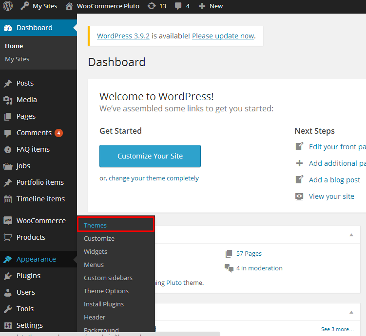
Themes section
Here you’ll find instructions how to proceed with 3.9.0 and lower versions of WordPress.
If you’re using newer version, follow steps below to install the theme:
- Step 1 – click on Install Themes tab
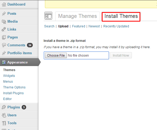
Install Themes tab
- Step 2 – choose Upload option to upload .zip file
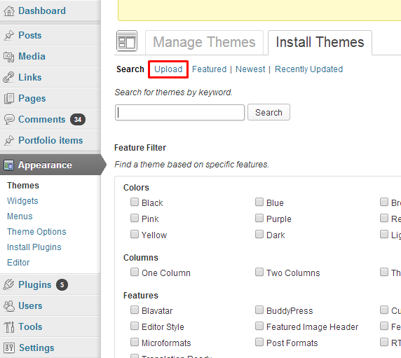
Upload theme
- Step 3 – choose {theme}.zip from you computer.
- Step 4 – once the file is chosen click Install Now
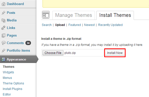
Install theme
Common Install Error: Are You Sure You Want To Do This?
If you get the following question message when installing Test.zip file via WordPress, it means, that you have an upload file size limit. Install the theme via FTP or call your hosting company and ask them to increase the limit.
Was this article helpful ?
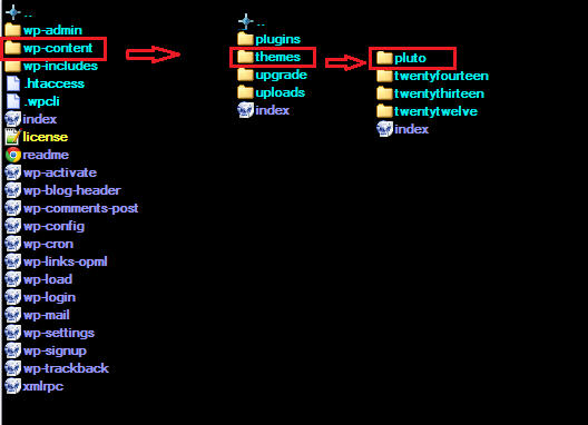
Installation via FTP
To install Test via FTP, follow steps below:
- Step 1 – Unarchive {theme}.zip file
- Step 2 – Access your host web server using FTP client
- Step 3 – Find directory wp-content > themes
- Step 4 – Put folder Test in directory wp-content > themes
Installation directory
Learn more:
Was this article helpful ?
Import demo content
The fastest and easiest way to import our demo content is to use Theme Options 1-click Demo Importer. It will import all pages and posts, several sample sliders, widgets, theme options, assigned pages, and more. We recommend this approach on a newly installed WordPress. It will not replace content such as posts, pages, portfolio, etc. and delete current menus, but configure them and replace theme options. By that, if you have created some posts, pages or portfolio content before an import, you won’t loose them.
To import our demo content, please follow the steps below:
- Step 1 – install and activate plugins listed in Recommended Plugins message {warning}

Recommended plugins
and WooCoomerce plugin, if you’d like to use shop functionalities.
- Step 2 – setup Media thumbnails sizes in Settings > Media to recommended values:
- Thumbnail size: {thumbnail_size}
- Medium size: {medium_size}
- Large size: {large_size}
If you’re using WooCommerce product images sizes in WooCoomerce > Settings > Products
- Step 3 – navigate to Appearance > Theme Options > General – 1-click Demo Import
- Step 4 – click the Import demo content button with multipage or onepager version.
(WARNING:The image below is only an example of how the 1-Click Demo section might look like. Depending on the theme, the amount of images and/or tabs of the import demo contents, this option might look different.)

1 click to import demo content
- Step 5 – importing can take a few minutes. Please be patient and wait for it to complete. Once it will be loading, you will see message with indicating progress.
Learn more:
Common errors with “1-Click Demo Import”
Was this article helpful ?
Pages
You can use Pages to organize and manage any content on your website. You can create multiple pages on your website for different types of content or setup onepager with scroll-to-section menu.
Was this article helpful ?
Create pages
To create a new Page follow the steps below:
- Step 1 – select Pages > Add New
- Step 2 – add Title
- Step 3 – add content – we recommend you to create page content using shortcode generator or by modifying demo content
- Step 4 – choose page attributes:
- Parent – if you want to create subpage
- Template – you can choose one of defined page templates: {templates}
- Page order
- Step 5 – choose template settings
- Step 6 – click Publish to make your page public.
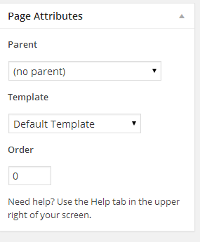
Page attributes
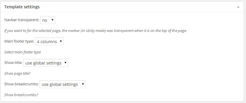
Template settings
Learn more:
Was this article helpful ?
Onepager setup
Test has the ability to make one page site with a scrolling to sections menu. Most sites are traditionally setup with individual pages, each page with its own content. One page site allows you to put all the content on one page, and the menu items will link to each different section of the page. Think of it as a full site but all on one page. Please read below for information on how to set this up.
Create A New Page With Your Content And Anchor Points
- Step 1 – Navigate to the Pages section of your admin and click Add New.
- Step 2 – Create page with all sections. Each section should begin with [chapter] shortcode or any other html element with unique id, for example :
123456[chapter id="work"](...) content (...)[chapter id="services"](...) content (...)[chapter id="about"](...) content (...) - Step 3 – 2. In Appearance > Menus create new main menu (using Custom Links option), where URL will be section id with “/#” sign, for example : /#services or /#about.
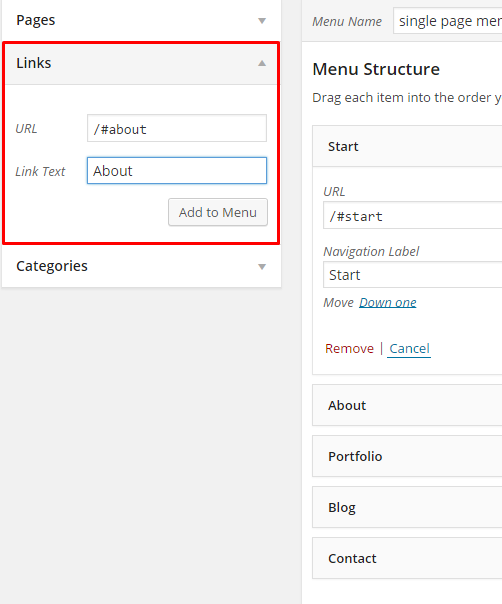
Add new menu item
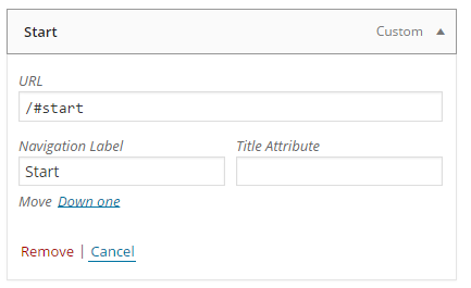
Item details
And your onepager menu is ready. Remember to choose Theme Location Primary Navigation to your menu.
Was this article helpful ?
Homepage setup
If you have added some pages via Pages > Add new you can choose one and set it up as a homepage. Use {homepage_setup} and choose from the list your homepage. Remember to click Save changes at the end of editing.
{homepage-screenshot}
Was this article helpful ?
Pages Theme Options
To create a standardized template for each page some of the settings you can set globally. You need to go to Appearance > Theme Options > Pages and choose from several options:
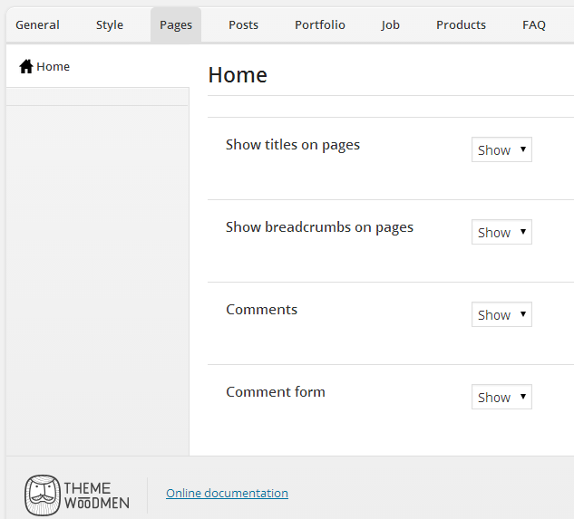
Pages Theme Options
You can change the following settings:
- show title on pages
- show breadcrumbs on pages
- show comments
- show comment form
Was this article helpful ?
Blog
Test is loaded with options for the blog. It offers many different options for you to present your blog posts, along with several different blog post layouts. In addition, there are numerous theme options and shortcode options that allow you to customize how posts are displayed.
There are several ways to display your blog posts, we will cover each method as well as describe blog post types, post options and theme options. The following sections will cover each of these aspects of the blog.
Was this article helpful ?
Creating blog posts
No matter which method you use to display your blog posts, first thing you need to do is create them.
Test offers several blog post types:
- Standard
- Aside
- Image
- Video
- Audio
- Quote
- Link
- Gallery
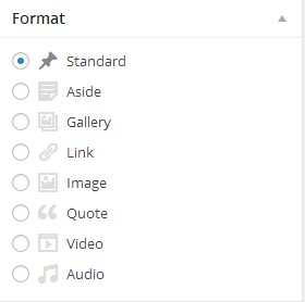
Post formats
Follow the steps below to create a blog post
- Step 1 – navigate to Posts in your WordPress admin.
- Step 2 – click on Add New to make a new post. Create a title and insert your post content in the editing field. You can use any of our VisualComposer elements inside the post.

Add new post
If you want to use some additional fields, choose them from screen options at the top of the screen.

Screen options
- Step 3 – add Categories from the right side. To assign it to the post, check the box next to the Category name.
- Step 4 – add Tags from the right side. Type the name of the tag in the field, separate multiple tags with commas.
- Step 5 – for a single image, click the Featured Image box, select an image and click Set Featured Image.
- Step 6 – for a Gallery, insert more than one Featured Image, each image will be a slide in the gallery slideshow. Slides will be order by the date when the images was added to Media
- Step 7 – for a video post, paste the iFrame embed into the Video Embed Code field, file url to M4V file url or OGV File URL or Direct video url from Youtube, Vimeo or Dailymotion
- Step 8 – create an excerpt – Excerpts are optional hand-crafted summaries of your content that can be used in your theme. Learn more about manual excerpts
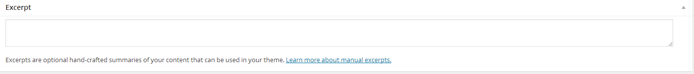
Excerpt
- Step 9 – once you finished, click Publish to save the post.
Was this article helpful ?
Blog index page
The most popular way of displaying blog posts is to setup blog index page. There all of your posts will be displayed and ordered by publish date.
To set the page as your post page, navigate to {blog_setup} and choose Blog index page from the ones you created.
{blog-screenshot}
Notice:
On Blog index page you will see only your posts, so don’t add any other content to it.
Was this article helpful ?
Blog Theme Options
When using the assigned blog page as described above, all the options you can select are located in Appearance > Theme Options on the Posts tab. There are dozens of options to choose from such as layout, categories, dates, etc. There are general blog options and single post page options. Each one has a title and descriptions to help you understand what they do. Any type of blog options you need to set will be set here in theme options when using the assigned blog page.
- Index – these are mainly for the assigned blog page, you change here:
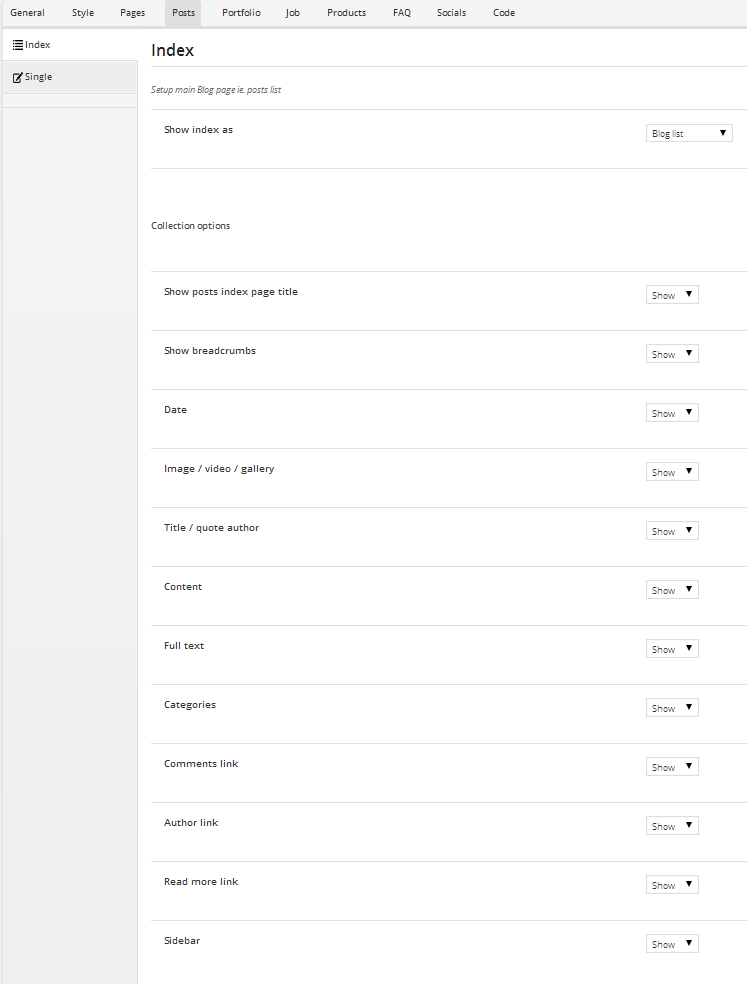
Blog index theme options
- Single – these options all apply to the single post page, not the main archive page.
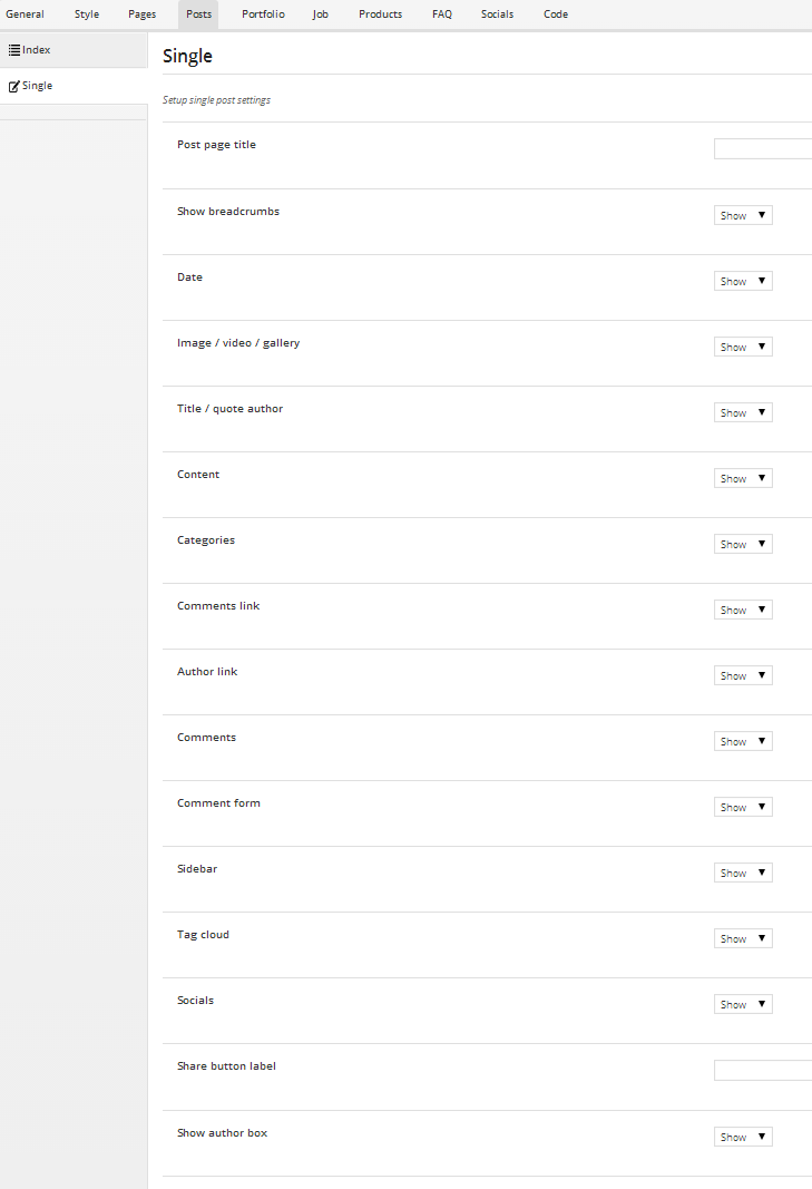
Single Post Theme Options
Was this article helpful ?
Recent Post Shortcode
The second blog method that we cover is our custom recent post shortcode. This shortcode is unique because it offers more compact design options that can work more efficently on pages with other content. This short code is a fantastic method because it allows you to place your blog posts on any page, assign custom categories to display, and so much more. You can use the short code as many times as you want, and on any page or post.
Below you can see how Recent Post shortcode will be displayed on your page:
{recent-posts}
Was this article helpful ?
Portfolio
The theme comes with a custom post type for portfolio. Portfolio pages configuration is described in Options section.
Was this article helpful ?
Creating portfolio items
Test is loaded with several options for displaying portfolio items. It offers many different options for you to present your portfolio. In addition there are numerous theme options and shortcodes options that allow you to customize how portfolio is displayed.
But first, you need to create your portfolio items. To do that, please follow the steps below:
- Step 1 – navigate to Portfolio items and click Add New
- Step 2 – create Portfolio Item title and content – you can use Test shortcodes to build content
- Step 3 – add Tags from the right side.
- Step 4 – add Categories from the right side. To assign it to the post, check the box next to the Category name.
- Step 5 – set portfolio item an order number if you want to display your portfolio item in a specific order
- Step 6 – choose featured image in Featured Image box
- Step 7 – set as many Portfolio settings as you want
- Step 8 – click Publish to save portfolio item
Learn more:
How to add multiple images to portfolio gallery?
Was this article helpful ?
Portfolio index page
One of the many ways of displaying portfolio items is to setup portfolio page. All of your portfolio items will be displayed there, ordered by publish date.
To set the page as your portfolio index page, navigate to Appearance > Theme Options – Portfolio and choose Portfolio index page from pages that you created.
Was this article helpful ?
Portfolio Theme Options
Test includes a highly advanced theme options panel organized into sections that allows users to customize many different aspects of the theme. There is a Portfolio section of theme options that allows you to personalize different forms of the portfolio items; the date formats, single post page settings, and so much more. The posts tab is organized into 2 sections; General Portfolio Options, Single Portfolio Options. See the information below for the description and screenshot of each section.
- General portfolio options – these are mainly for the assigned portfolio index page because the portfolio shortcode has many of them built in. However some do apply.
- Portfolio item options – these options all apply to the single portfolio page, not the main index page. They apply to both assigned portfolio page, and the portfolio shortcode.
Was this article helpful ?
Portfolio shortcodes
If you want to display your portfolio items in more places than portfolio index page – you can do it in several ways by Portfolio shortcodes.
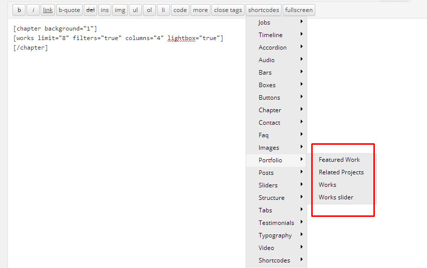
Portfolio shortcodes
Every shortcode goes with several parameters, that allows you to sort or filter items in a few ways. On the following screenshots you can find part of available options.
Full of possibilities you can find on our demo page – you can preview parameters that we used after importing demo content. You can also use shortcode generator and use as many Advanced filter options as you want.
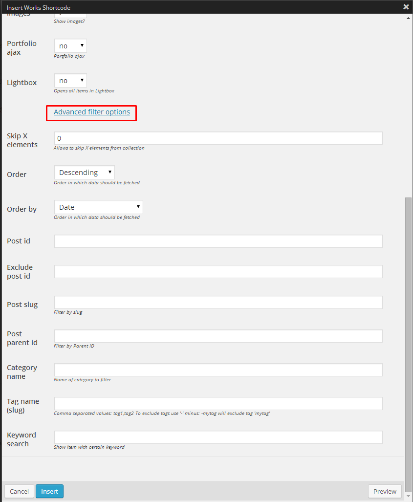
Advanced filter options
Was this article helpful ?
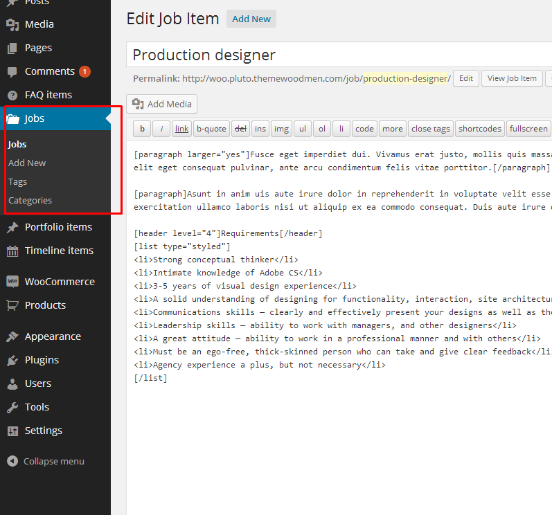
Jobs
You will find Jobs section in main WordPress sidebar – above Portfolio
Jobs section
Was this article helpful ?
Create jobs items
Test is loaded with several options for displaying jobs items and offers many different options for you to present it. In addition there are numerous theme options and shortcode options that allow you to customize how jobs are displayed.
- To create jobs item, follow the steps below:
- Step 1 – navigate to Jobs and click Add New
- Step 2 – create Job Item title and content – you can use shortcodes to build content
- Step 3 – add Tags from the right side.
- Step 4 – add Categories from the right side. To assign it to the post, check the box next to the Category name.
- Step 5 – set job item an order number if you want to display your jobs items in a specific order
- Step 6 – choose featured image in Featured Image box
- Step 7 – set as many Job settings as you want
- Step 8 – click Publish to save job item
Was this article helpful ?
Jobs index page
One of the ways of displaying jobs items is to setup Career page. All of your jobs items will be displayed there, ordered by publish date.
To set the page as your jobs index page, navigate to Appearance > Theme Options – Job and choose Jobs index page from pages, that you created.
Was this article helpful ?
Jobs Theme Options
Test includes a theme options panel organized into sections that allows users to customize many different aspects of the theme. There is a Job section of theme options that allows you to customize different aspects of the jobs items; date formats, single post page settings, and so much more. The job tab is organized into 2 sections; General Options and Single Item Options. See the information below for a description and screenshot of each section.
- General jobs options – these are mainly for the assigned jobs index page.
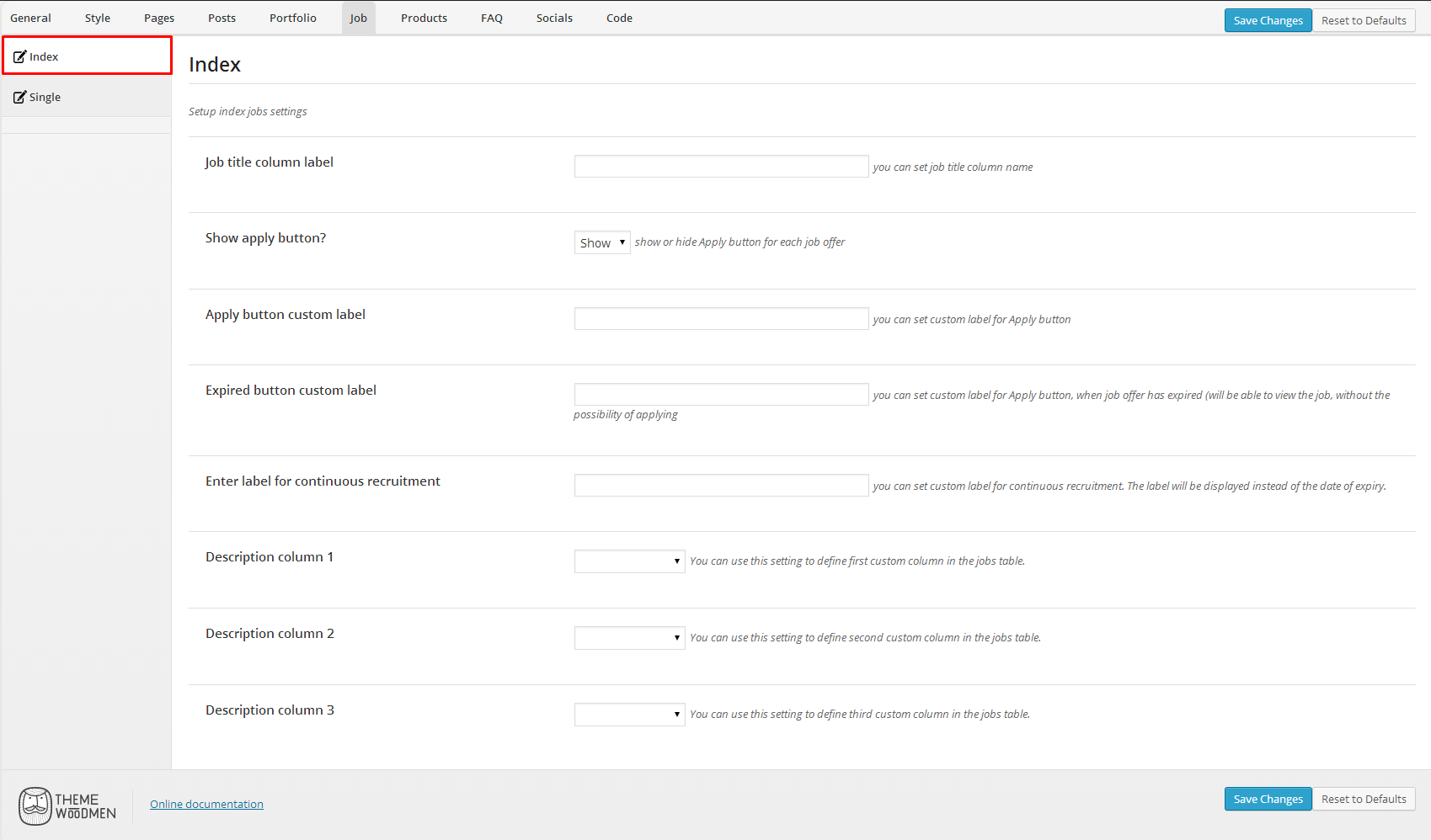
Jobs – general options
- Jobs item options – these options all apply to the single job page, not the main index page. They apply for both assigned jobs index page, or the jobs shortcode.
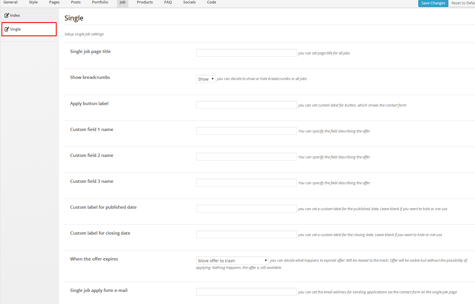
Single Job options
Was this article helpful ?
Jobs shortcode
Below you can see how Jobs shortcode will be displayed on your page:
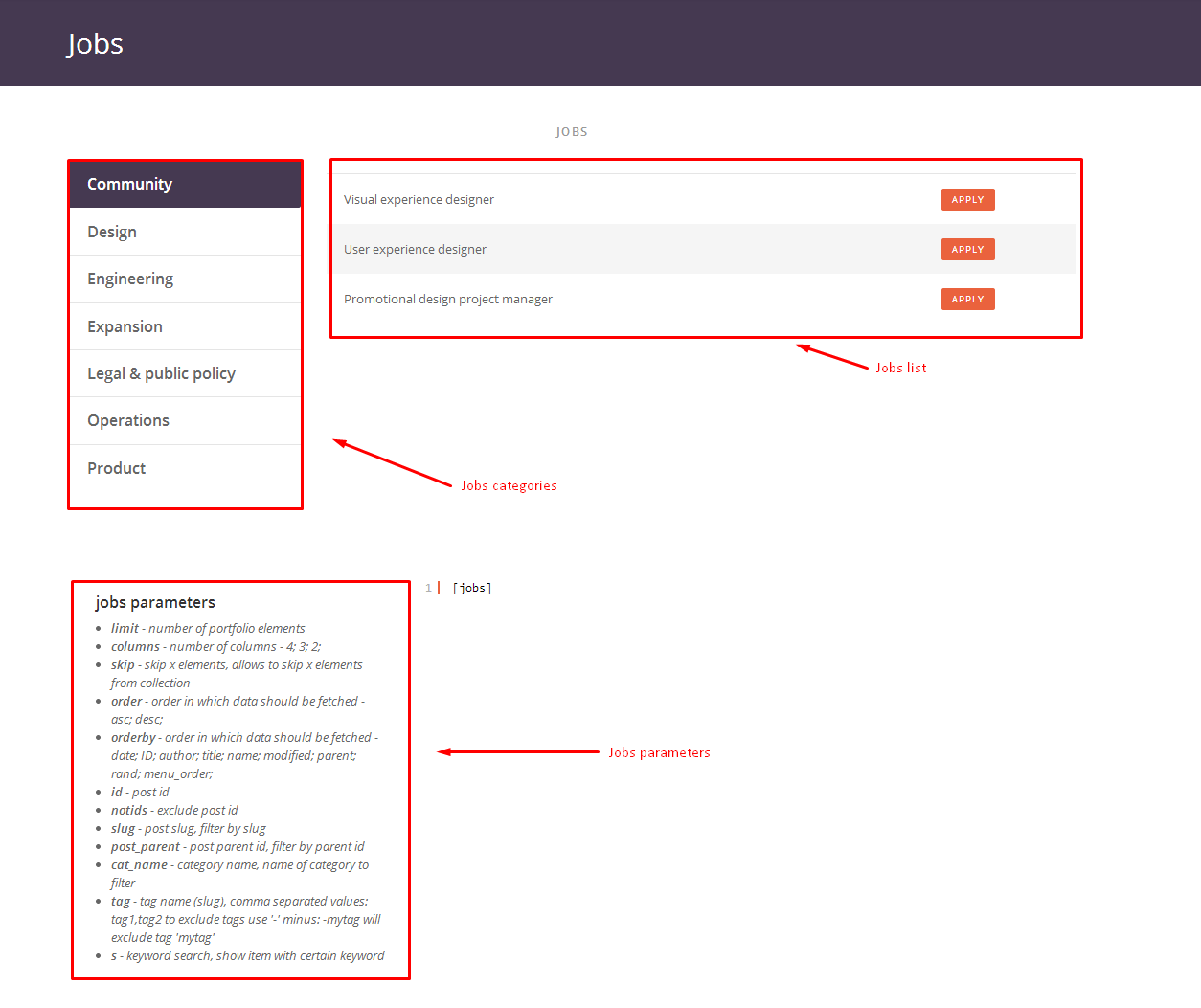
Jobs shortcode
Was this article helpful ?
General Overview

Surely you can not wait to start working on your new website. And reading documentation is probably the last thing you want at the moment. Guess what? We prepared a little shortcut for you! If you feel intimidated by the number of features that this theme offers, you can use this simple screenshot-description to easily customize your website. Check out this link {general-overview-link}.
Was this article helpful ?
Plugins
Some functionalities of the Test are available because of plugins we used to create it. Once Test is activated in your WordPress admin panel you should see notification about bundled plugins we recommend to install – they are included in Test package – so you don’t have to do anything more than click install and activate.
Notice:
We can’t guarantee Test’s compatibility with third party plugins. If you want to avoid unexpected bugs and errors use as little plugins as possible.
Below you will find the list of plugins we recommend you to use with Test.
Was this article helpful ?
Visual Composer
Test can be easily customized with Visual Composer.
Simply drag and drop elements to build your page content. We prepared components which will help you determine main structure of the webpage – easily set up backgrounds, colors and styles for whole sections as well as lots of various smaller components which you can freely put wherever you want.
How to start?
We recommend you to use row as essential element of page structure.
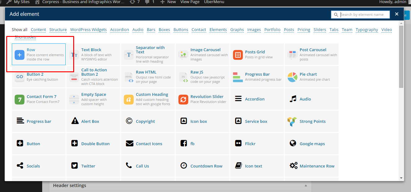
Row
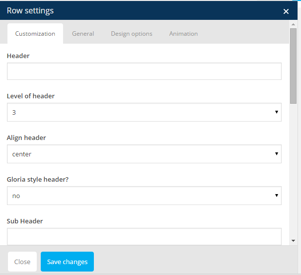
You can edit following row attributes:
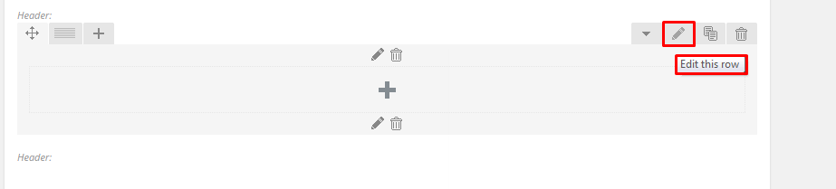
Click pen to open edition tools
- Header text
- Level of header
- Header alignment
- Header font style
- Section type – determines section background, you can choose from predefined color styles: white, grey, dark grey, dark blue, motive or effects: pattern, parallax, kenburns, video
- Padding – top, bottom or both
- Padding size – if you don’t want to have padding, choose None
- Section height
- Type of section layout – boxed or wide
- Onepager element and ID – if you want to use section for scroll-to-section navigation
- Custom class – if you want add custom CSS styles for element
You can also check additional options in tabs: General, Design Options and Animations
Row parameters
Once your section row is created you can choose number of columns in section, their width and optionally offset value.
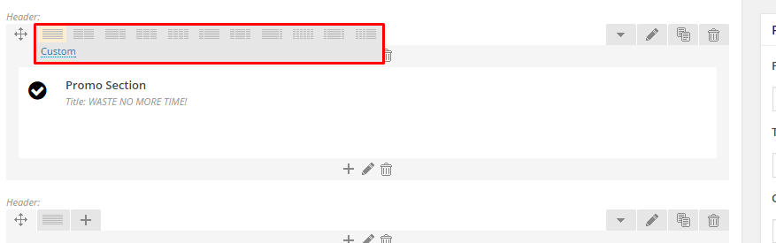
Section grid
If you want to create full_width element you need to choose 1 column greed in section and set it as full_width element.
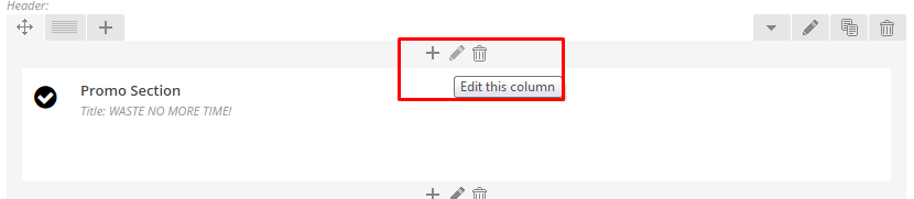
Click pen to edit column.
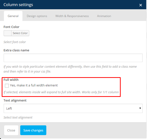
Full width column
Once you set up your section – you can put inside it as many components as you want.
Learn more:
For more information about Visual Composer, please check articles below:
How to install Visual Composer
Visual Composer demo
Visual Documentation
Was this article helpful ?
WooCommerce
Installation
- Activate plugin “WooCommerce”
After activation you will see notification about installing WooCommerce pages:
Click on Install to import following WooCommerce pages:
WooCommerce pages
- My Account
- Checkout
- Cart
- Shop
- Configure WooCommerce settings
- Learn more about WooCommerce
- Step 1 – add products
- Step 2 – setup your products
- Step 3 – sell what you’ve got
- Step 4 – setup shipping options
- Step 5 – manage your orders
Translation
WooCommerce plugin can be translated to any language. Here you can find instructions how to do that.
Was this article helpful ?
Customization
Test appearance, which you can see on our {demo-page}, is one of many available options. You have a couple of alternatives to customize the way you want it, except changing components’ appearance.
- Theme Customizer – navigate to Appearance > Themes and click Customize to open customization panel with options to change colors and backgrounds
- Use Custom CSS
- Create your own shortcodes
- Contact us – we can create your website from scratch, redesign it or just extend existing one – just send us an mail to premium@createit.pl
Was this article helpful ?
Uber Menu
Test navigation menu is built with Uber Menu plugin, which allows you to create expanded Mega Menu.
Uber Menu plugin is not bundled with Test files and therefore it needs to be bought separately here. Detailed information regarding plugin installation can be found on Uber Menu online documentation.
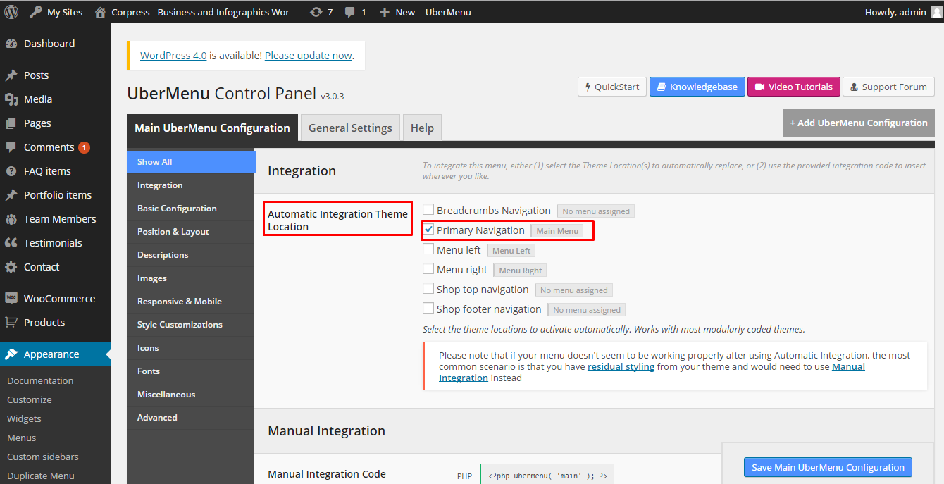
Once plugin is activated, please create your menu just like any other WordPress menu and select theme location to apply UberMenu to. We recommend you to choose automatic integration to Primary Navigation
UberMenu settings
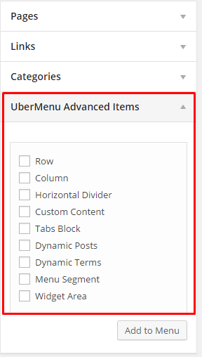
Now you can create your Menu in Appearance > Menus > Create a New Menu. Additional tab with advanced UberMenu elements, like: row, columns, tabs, dividers, etc. will help you to create expanded menu structure.
Advanced UberMenu elements
Additionally you can edit every menu item individually, by clicking Uber after hovering over an element.
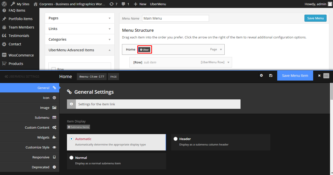
Advanced UberMenu options
Notice:
If you want to use navigation menu imported with 1 click demo import and you are not using UberMenu plugin remember to select Standard Menu as Primary Navigation.
Learn more:
Was this article helpful ?
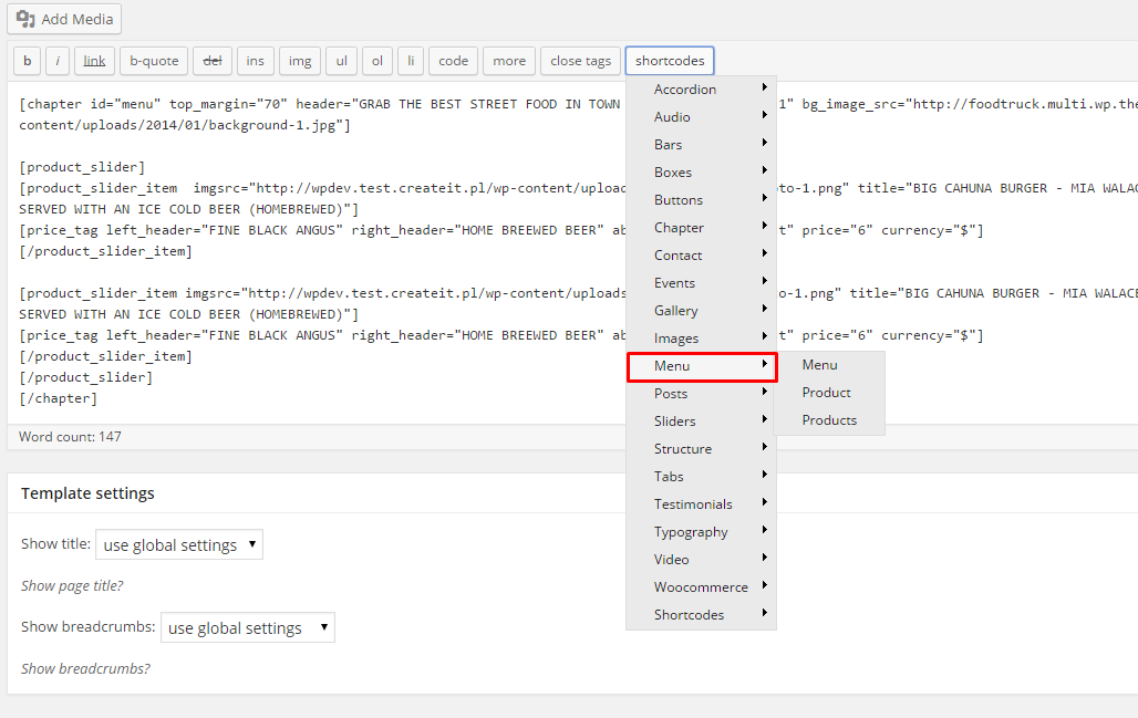
Menu Products
Test is dedicated for restaurants and food truck owners. That’s why, the most important section is Menu Products. You can easily add new dishes served in your local. Group them using tags, categories and display anywhere you want in your page content.
Was this article helpful ?
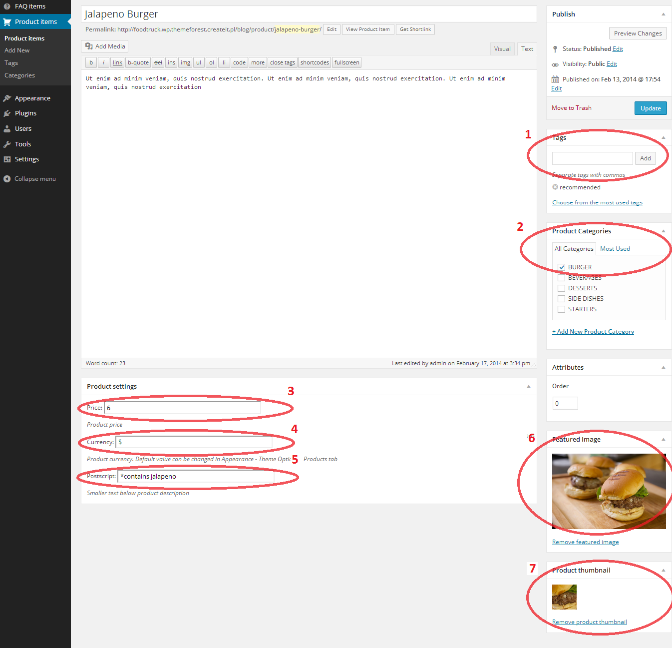
Creating menu products
Follow the steps below to create a Menu Product items
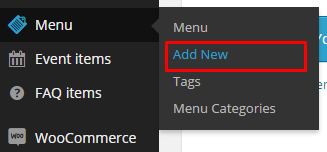
- Step 1 – navigate to Menu in your WordPress admin.
Add new menu product
- Step 2 – click on Add New to make a new product. Create a title and insert your description.
- Step 3 – add image via Featured Image
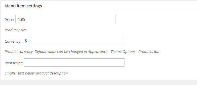
- Step 4 – set product price, currency and postscript in Menu item setting
Menu item settings
- Step 5 – add menu categories, tags and order (optional) – on the right hand side of Menu edition page.
- Step 6 – click Publish to save you settings
For every menu item you can define:
1. Product Tags
2. Product Categories
3. Price
4. Currency
5. Postscript – a small text below product description (e.g. *contains nuts)
6. Featured image
7. Product thumbnail image – Multiple Featured Images plugin must be activated
Menu item options
Learn more:
- Menu currency can be also edited globally for all Menu items via
Appearance > Theme Options > Menu
- .
Was this article helpful ?
Menu shortcodes
Once your menu items are created you can display them in your page using Menu shortcodes.
Menu shortcodes
Make it easy
- by [products tag=”recommended” limit=”3″] – 3 product items with tag “recommended” will be displayed.
Products will have custom appearance for every active theme. Please note that products need to be tagged as
“recommended’ - by [cat_name=”starters”] display every item with assigned category “starters”.
EXAMPLES:
Burger Lover items with tag “recommended”:
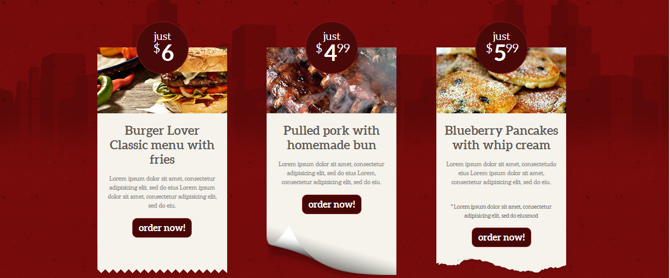
Burger Lover Recommended products
Seabreeze items with tag “recommended”:
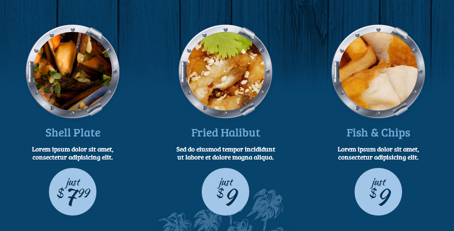
Seabreeze recommended items
Seabreeze items with category “starters”:
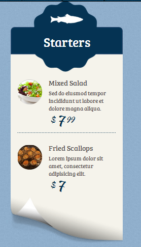
Seabreeze starters
Cupcake items with category “Salty Cakes”:
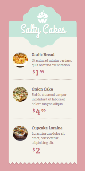
Salty cakes
Setting Product order in the menu
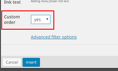
Creating your menu you are able to set the order in which the products will show up on the list. Just check this few easy steps!
- Creating Menu with the use of the Menu shortocde choose yes for Custom order, like on the image below.
Using custom order
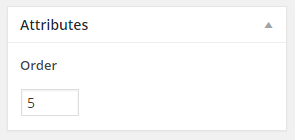
- Now you are able to set the order of every single product by:
- Going from the WordPress dashboard to the

- Creating new product or or choosing from the ones arleady created
- Setting in the Attributes order of the product:
Order of the product
- Going from the WordPress dashboard to the
Or check our advanced filter options
in shortcodes > Menu > Products > Advanced filter option
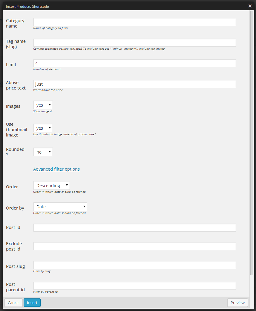
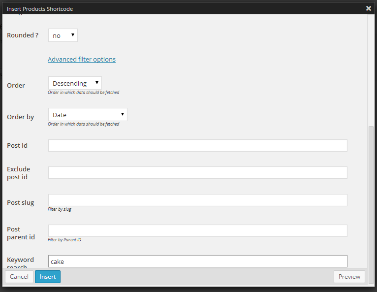
Advanced filter options
EXAMPLE:
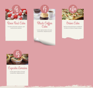
Display all product with “cake” in title or description. Start from the latest one.
Was this article helpful ?
WooCommerce for Food Truck
Notice:
If you were using Food Truck version 2.8 or lower – you will notice some structure changes due to WooCommerce products. You will find your products under the Menu tab on the sidebar menu in admin panel as well as in shortcodes.
All of your previously created products will be saved with their settings, but under new tab – Menu.
Products are now only WooCommerce products.
WooCommerce Products
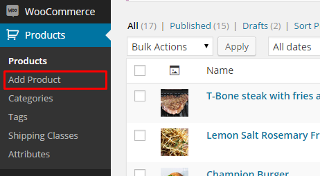
You can add WooCommerce Product via Products > Add Product
Add New Product
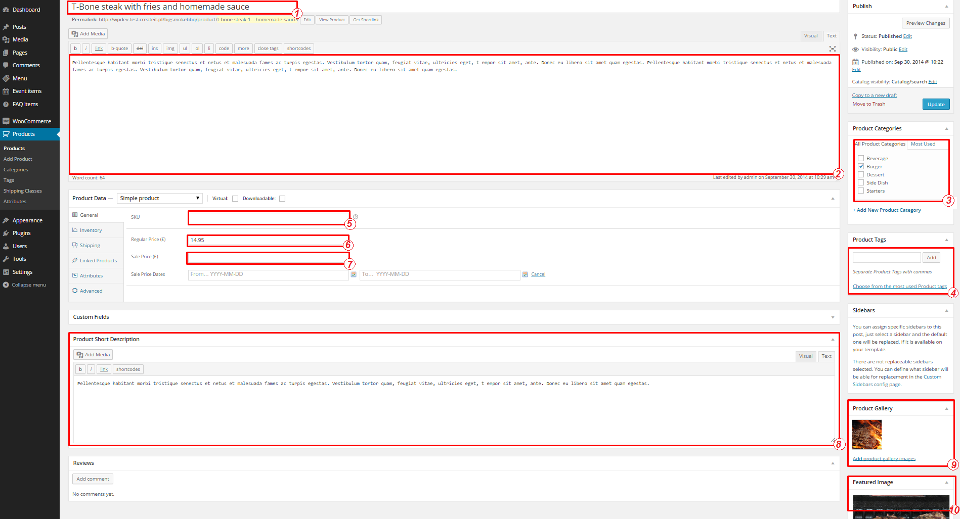
You can use Simple Product option and add only basic information:
- Product Name
- Description
- Category
- Tag
- Stock keeping unit
- Regular Price
- Sale Price
- Product short description
- Product gallery
- Product feature image
Product general settings
Variable Product
You can also use more advanced product settings, and show available product variables. To use that option, first create a product Attributes.
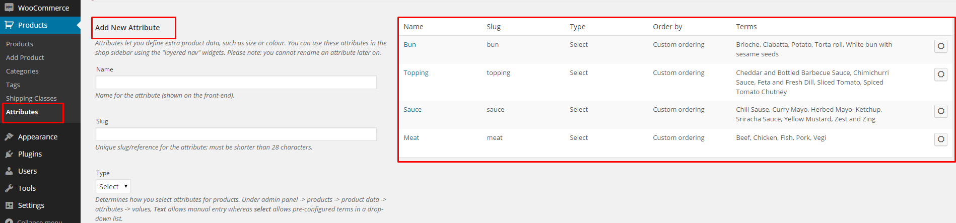
Product attributes
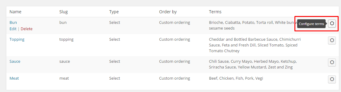
To every attribute are assigned terms, which you will use to create product variations.
Attributes terms
Once you have attributes and terms, you can go to product item edition to create product variations.
- Choose from product data Variable Product
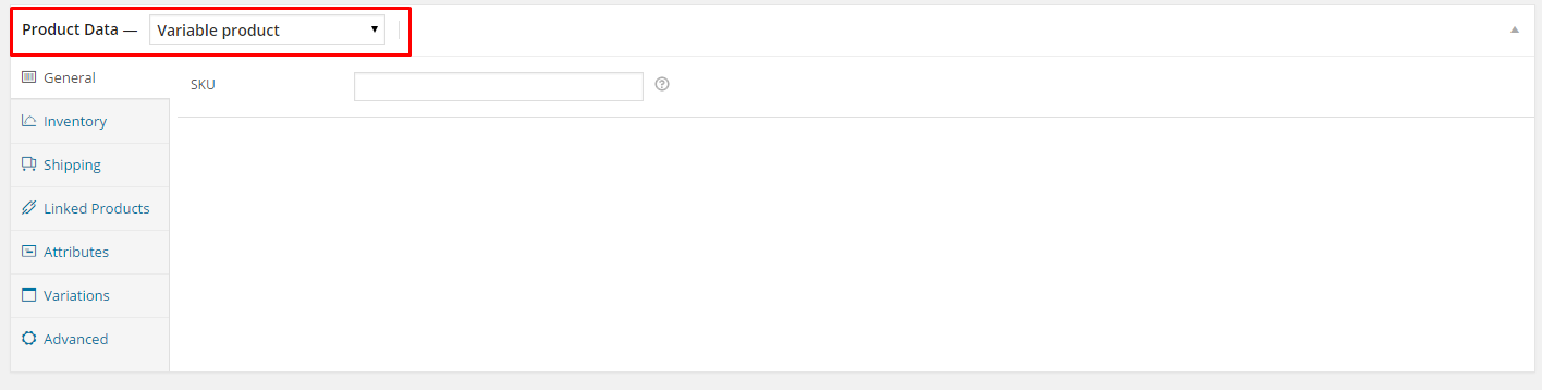
Variable product
- Go to Attributes tab and select your attributes
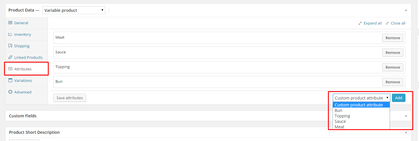
Product attributes
- Add product variations and click Link all variations once you’re finished
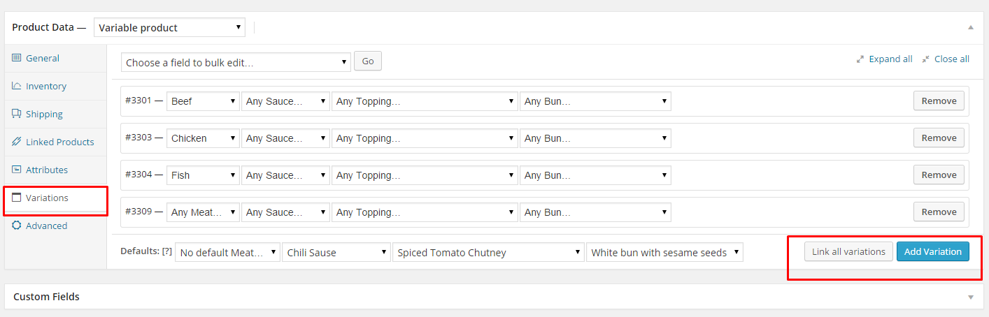
Setup variations
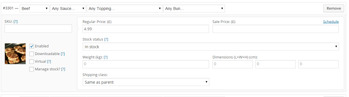
- Customize your product alternative by expanding variation tab – you can add here different image, dimensions, weight, price, status and shipping class
- Remember to save changes once you have finished product edition – now you can see how your product looks:
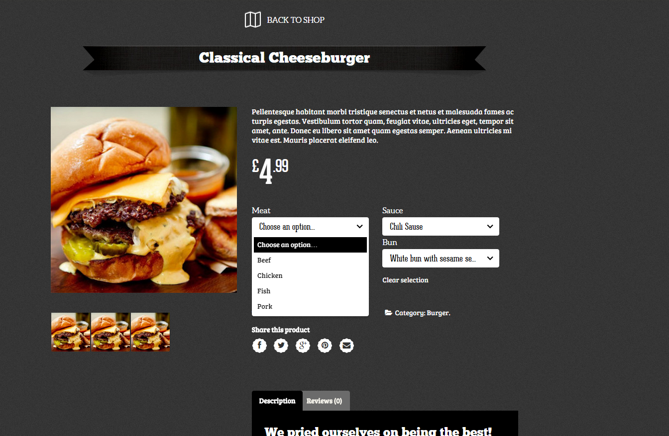
Variable product
Add products to Shop page
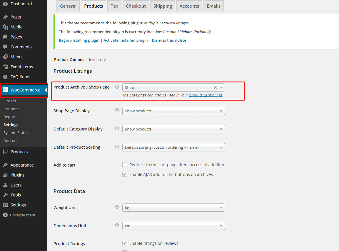
Once your products are created you can add them to your website. Setup your products index page via WooCommerce > Settings > Products
Shop page
Or add your product elsewhere on the website using Shop Shortcodes:
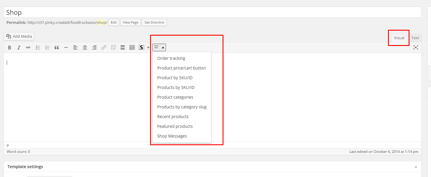
Shop Shortcodes
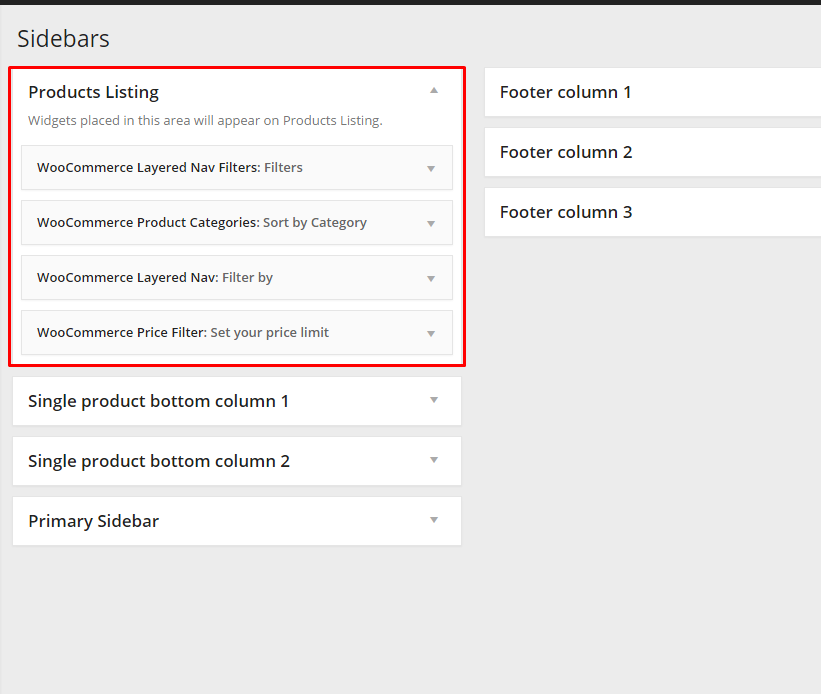
Products Listing Widgets
WooCommerce comes with several widgets dedicated to filter your products. You can easily set them in Products Listing Sidebar, which is by default displayed on Shop page:
Shop Widgets
Thanks to widgets your customers will be able to filter and sort products:
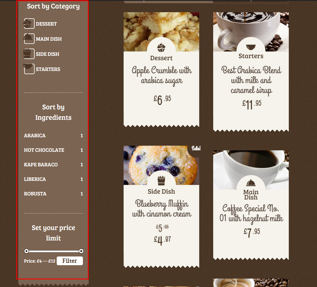
Shop Widgets
WooCommerce Theme Options
You can edit some of WooCommerce settings via Appearance > Theme Options. In WooCommerce tab you will find Global and Cart settings.

Global Theme Options
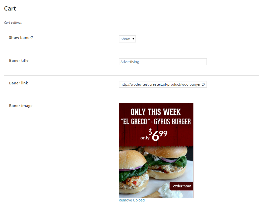
Cart Theme Options
How to disable WooCommerce?
If you don’t want to use WooCommerce Shop and you are interested only in displaying your product in catalog mode just deactivate the plugin in Plugins section:
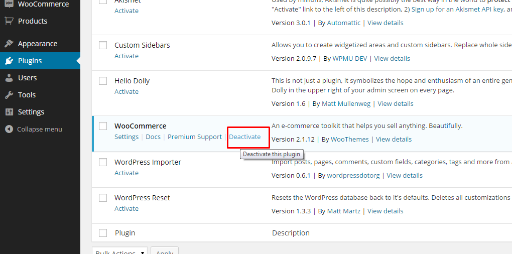
Deactivate WooCommerce
Notice:
If you deactivate WooCommerce plugin – Shop shortcodes will no longer work.
Was this article helpful ?
Menu setup
Depending on which version of content arrangement you choose, you can create onepager or multipage navigation menu.
To create navigation menu dedicated to multipage websites, please follow the steps below:
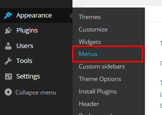
- Step 1 – Navigate to Appearance > Menus
Manage your menus
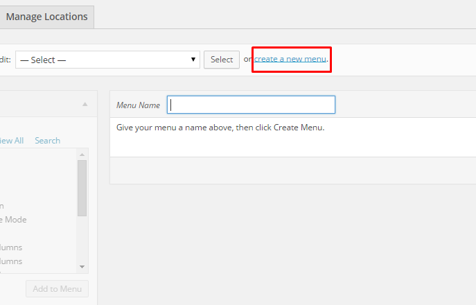
- Step 2 – Click on create a new menu, enter menu Name and click on Create Menu button
Add new menu
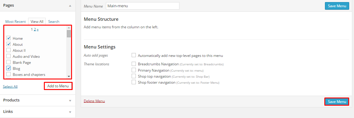
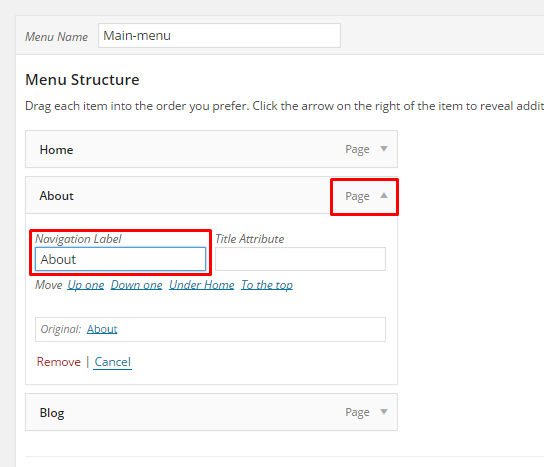
- Step 3 – From the right side choose pages that you want to add to your menu and click on Add to Menu. Once menu items are added, you can reorder or nest them via drag and drop tool. Remember to click Save Menu when you finish to keep your changes saved.
Add pages to menu
- Step 4 – You can easily rename every menu item in item details.
Rename your menu items
- Step 5 – Optionally you can add to menu other items, like Links or Categories
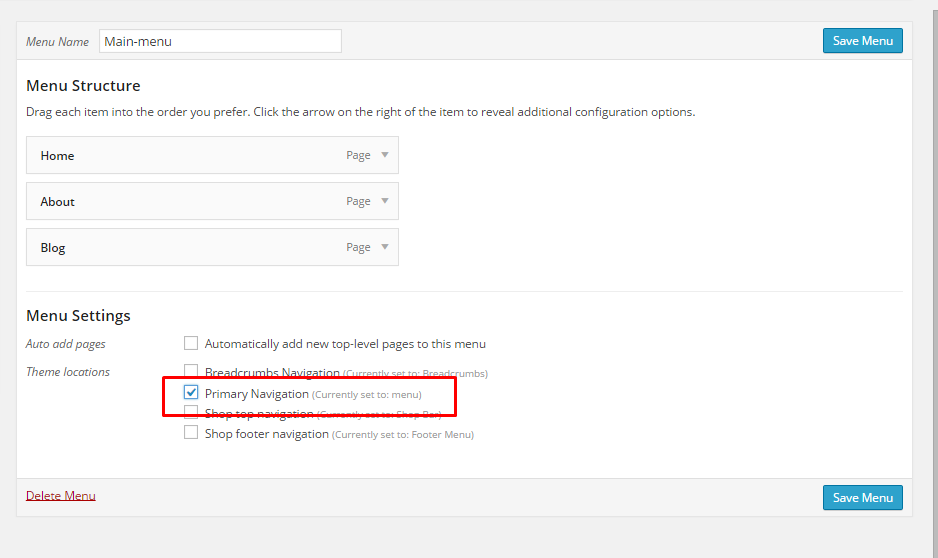
- Step 6 – Check your menu as Primary Navigation to set it up as main menu.
Primary navigation
- Step 7 – Always click Save Menu after providing any changes.
Was this article helpful ?
Using shortcodes
Test is build with shortcodes. Shortcode is a WordPress-specific code that lets you do nifty things with very little effort. Shortcodes can embed files or create objects in just one line, that would normally require lots of complicated and ugly code. Shortcode = shortcut.
You don’t have to know Shortcodes list, syntax or available parameters, if you decide to create your website content using shortcode generator, which you can find in your window toolbar. Generator allows you to simply put your images, text and other content to input fields and choose display options from self-explanatory boxes.
In shortcode generator you will find shortcodes for any page content element that you can see on the demo page.
Below you will find description for a few basic shortcodes types, which should give you an idea of the shortcodes possibilities.
Structure
Page structure elements: columns, rows, spacers are shortcodes – check Structure section with shortcodes, which help you to create your page grid. Layout generator can be very useful here.
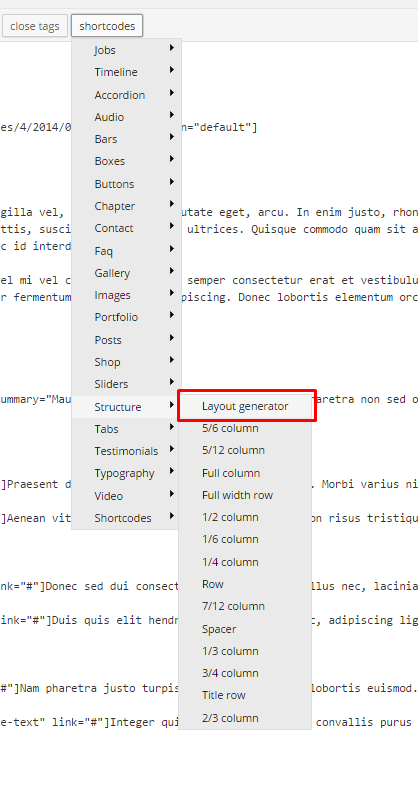
Layout generator
Typography
Do you want to add to your page sections headers, blockquotes, a list or simply a link? In section Typography you will find all options available in Test to format text elements.
Contact
If you want to put any element to let your users contact or follow you or your profile inside your page content, you will find that in Contact shortcode section. You can easily configure elements like: Google Map, Contact form, Newsletter Form, Social buttons and put them anywhere on your page.
Sliders
Our themes come with several types of sliders. You can see preview for them on demo page. All available sliders are always in Sliders the section of shortcode generator.
In the shortcode generator you can find also several types for buttons, boxes, portfolio items, bars and other elements. We encourage you to experiment with all available options.
Was this article helpful ?
Using widgets
Widgets are small blocks of content, which you can find in theme footer or sidebar. They were originally designed to provide a simple and easy-to-use way of giving design and structure control of the WordPress Theme to the user, which is now available on WordPress Themes to include the header, footer, and elsewhere in the WordPress design and structure. Widgets require no code experience or expertise. They can be added, removed, and rearranged on the WordPress Administration Appearance > Widgets panel.
Just drag and drop the widgets you want, into the right hand side where your sidebars and footer widgets are listed. Simply drag your widgets over to the sidebar or footer column, and then populate the content.
There are various fields and settings you can choose for each individual widget and all are self explanatory. You can also use multiple widgets per footer column, just drag and drop them into place. And you can put as many widgets as you want inside sidebar. Once you have finished populating the widgets, always make sure to hit the Save button to save the settings.
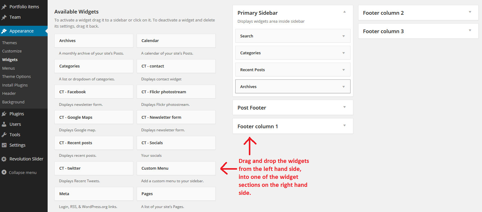
Just drag widget from the left hand side and drop it on the right
Was this article helpful ?
Installation and activation
Installation via Administration Panel
When {Plugin} files are downloaded from your CodeCanyon account. You can start installation using WordPress administration panel.
Once you’ve logged into your administration panel go to Plugins > Add New
Then:

Chose Upload (1), click Select a file (2), {plugin} from your hard drive and click Install Now (3)
Installation via FTP
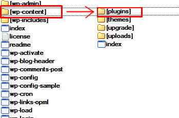
To install {Plugin} via FTP follow step below:
- Step 1 – Unarchive {plugin} file
- Step 2 – Access your host web server using FTP client
- Step 3 – Find directory wp-content > plugins
- Step 4 – Put folder {plugin} in directory wp-content > plugins
Was this article helpful ?
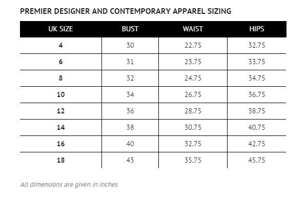
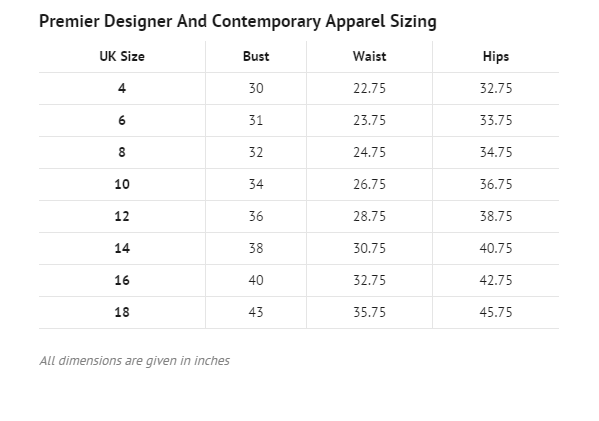
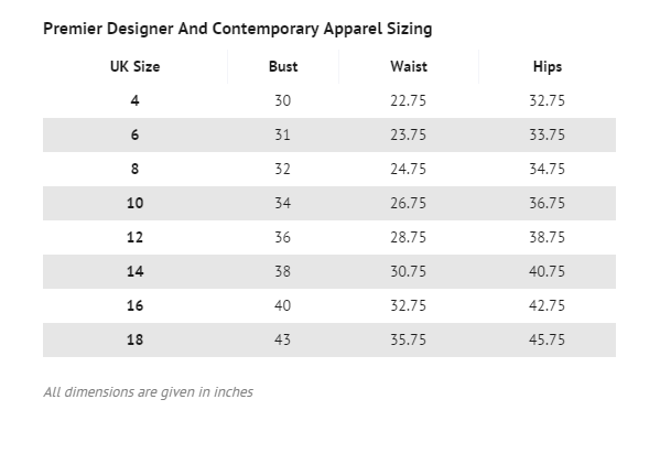
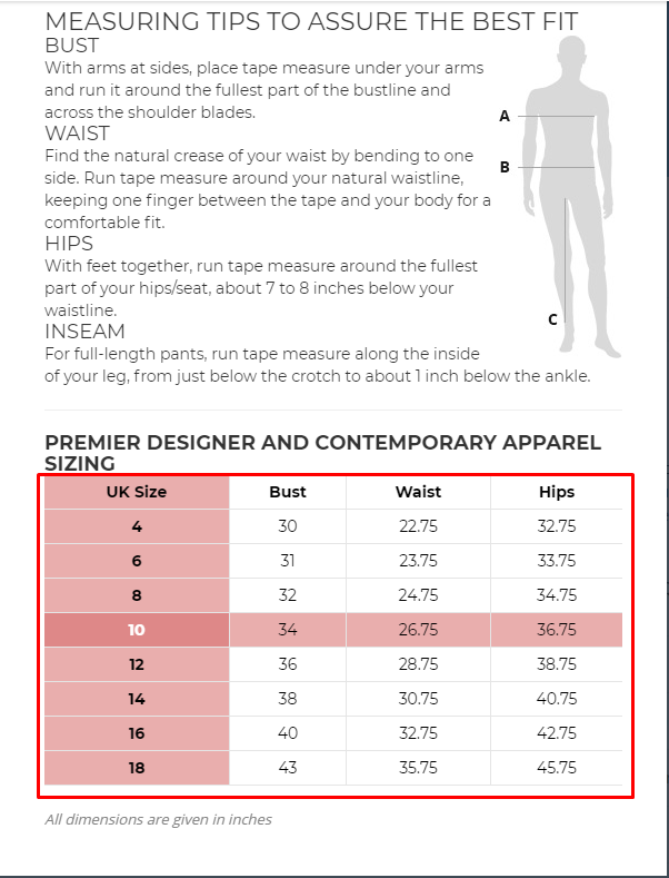
Creating a size guide
Please note that upon plugin activation there are two sample size guides created, for a quick start you can just edit them!
To create a new size guide:
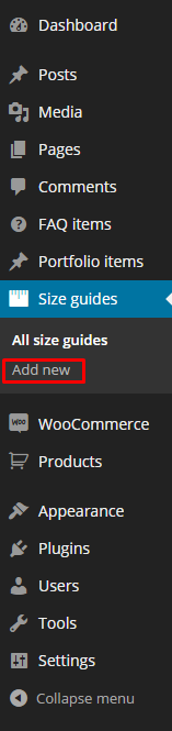
Go to Size guides > Add new in your WordPress Admin Panel
Create a new size guide
Insert a title and content
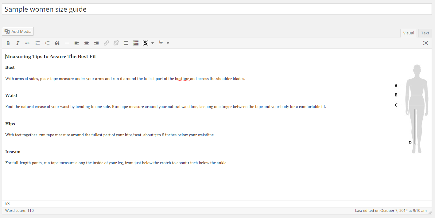
Fill size guide content
Title will be the name of the size guide. In the content, you can for example describe how a customer can measure its sizes properly.
Fill the size guide

Fill the size guide table content
In the sections 1 and 3 you can specify a table header and a caption.
To add/remove columns and rows just use the plus/minus buttons (inside red squares on the screenshot). Right, it’s as simple as that!
Fill table cells by just clicking on them and inputing the text.
Everytime you create a size guide there is a basic 4×4 table attached to make your work easier.
If you wish to add or remove added extra table use the Add Table or the Remove Table button (2)
Publish it and go to the next section
Publish the size guide
Was this article helpful ?
Assigning a size guide to a product
There are two ways to get the size guide displayed:
You can assign a size guide to one category or a few, by selecting a category on the size guide editing screen
Assign a size guide to a category
Once size guide is assigned to the whole product category or categories you can still disable it for single products by checking option Hide size guide from this product
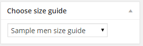
Or you can assign a size guide to a particular product by using the “Choose size guide” box on the product editing screen:
Assign a size guide to a product
If you select a size guide for a particular product, it will be attached to that product even if the products category has its own size guide assigned.
Was this article helpful ?
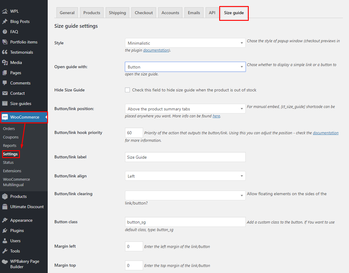
Size guide settings
On every created Size Guide you can either use the global settings or adjust them separately.
Go to WooCommerce > Settings > Size guide tab
WooCommerce > Settings > Size guide tab
Options to choose from:
Style
You can choose one of the existing styles or create a new one (details in Creating a style section):
Classic
Minimalistic
Modern
Hide Size Guide
Check this field to hide size guide when the product is out of stock.
Size guide will be displayed if you allow backorders in products settings.
Open guide with
Choose whether to display a simple link or a button to open the size guide.
Button/link position
You can display it either above the product summary tabs (Description, Reviews etc.), after the ‘add to cart’ button, as a tab or use the [ct_size_guide] shortcode on the Single Product page.
Button/link hook priority
Priority of the action that outputs the button/link. Priority is “Used to specify the order in which the functions associated with a particular action are executed. Lower numbers correspond to earlier execution, and functions with the same priority are executed in the order in which they were added to the action.”
If you choose to display the Size Guide above the product summary tabs or after the ‘add to cart’ button this might help you change the position. The final outcome might depend on other plugins and theme features that use the given hooks. ‘woocommerce_after_add_to_cart_button’ hook is not used often, but the ‘woocommerce_single_product_summary’ is commonly used. The basic actions hooked in (almost) every WooCommerce theme are:
woocommerce_template_single_title – 5
woocommerce_template_single_price – 10
woocommerce_template_single_excerpt – 20
woocommerce_template_single_add_to_cart – 30
woocommerce_template_single_meta – 40
woocommerce_template_single_sharing – 50
where the numbers mean the priority. The lower the digit is, the earlier the action will be executed. For example, if you display the Size Guide above the product summary tabs, you can display it right under the title by setting the priority to 7 (or anywhere between 5 and 10) or after the price by setting it to 15 and so on.
Button/link label
Enter the text to be displayed in the link/button. Default: Size Guide.
Button/link align
Choose if the button should be aligned left or right.
Button/link clearing
Allow or disallow floating elements on the sides of the link/button.
More advanced users: if set to no, this option will add a ‘clearfix’ after the button/link.
Button class
You can add any custom class to the button.
Margins
Set the margins on the sides of the link/button.
Popup overlay color
Set the color of the background behind the Size Guide popup window.
Paddings
Set the paddings inside the Size Guide popup window.
Table hover
Option to enable hover effect on the Size Guide table.
Background for hover line
The BG color of the rows and columns of the cell you are hovering.
Background for hover active cell on hover
The BG color of the cell you are hovering.
Responsive tables
Option to enable/disable the responsive view of the table in the Size Guide.
Size Guide Sample with Hover
Was this article helpful ?
Creating a style
You can add your own stylesheet to the settings tab using ct_sizeguide_styles filter.
Example:
add_filter(‘ct_sizeguide_styles’ , ‘add_sizeguide_style’);
function add_sizeguide_style($current){
$StylesheetURL = ‘http://www.example.com/assets/sg_style.css’; //link to the stylesheet
$label = ‘My custom style’; //name of the style to be displayed in the settings
$current[$StylesheetURL] = $label;
return $current;
}
This code should go to your functions.php file (or anywhere else you wish).
If you are developing a theme and want your style to be selected upon the plugin activation, simply change the body of the function to:
$current = array($StylesheetURL => $label) + $current;
return $current;
Was this article helpful ?
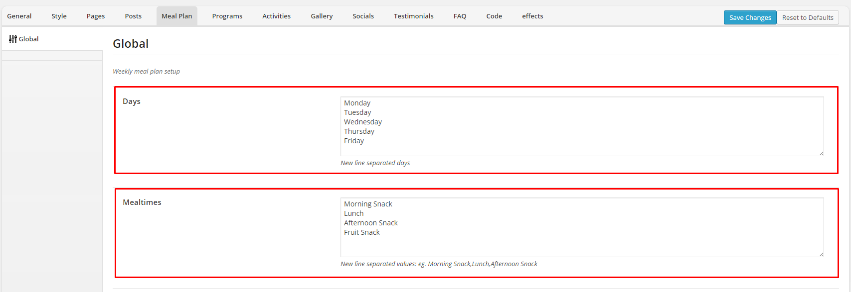
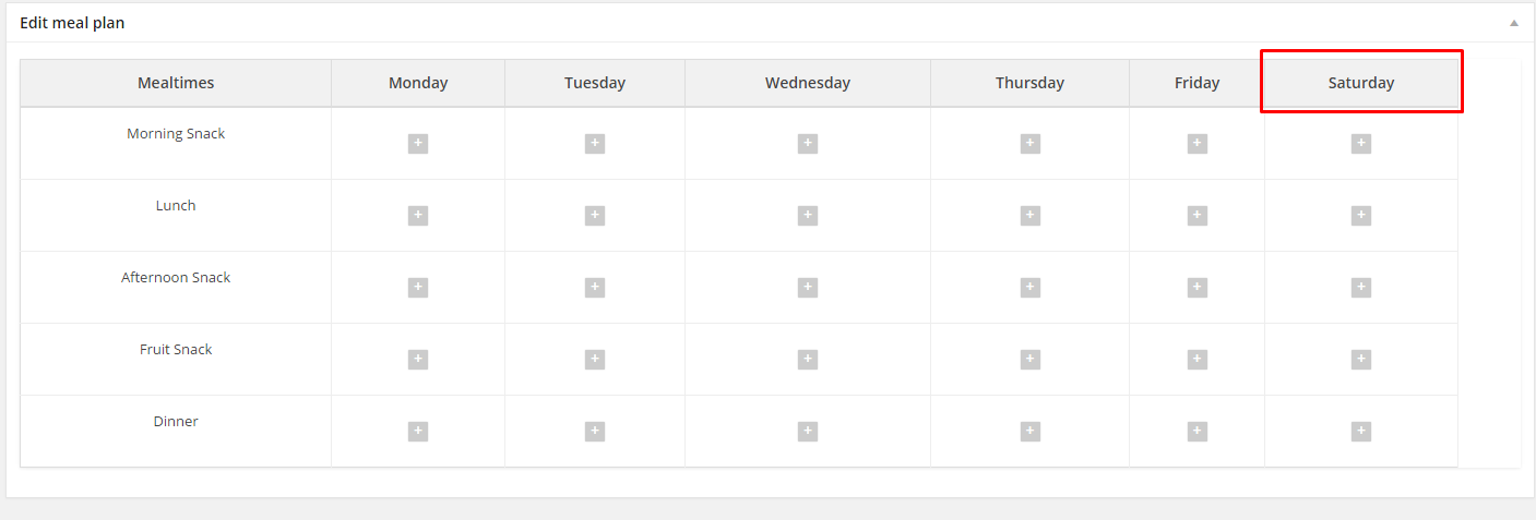
Creating Weekly Meal Plans
Test comes with custom post types dedicated to create and publish on website Weekly Meal Plans. From previously created Menu items you can build meal plans for as many weeks as you want to. Every meal plan by default contains areas for every four meal on five days a week, but number of meals, days and their labels can be easily edited in Theme Options.
Just navigate to Appearance > Theme Options > Meal Plan and define you options.
On the image above you can check how to edit days and mealtimes in your meal plans. You can easily edit both here.
Examples
Example 1
Your Weekly Meal Plans should contain areas for the following mealtimes: Morning Snack, Lunch, Afternoon Snack, Fruit Snack, for every day since Monday till Friday. Options should look like the following:
How to define mealtimes and days?
Effect:
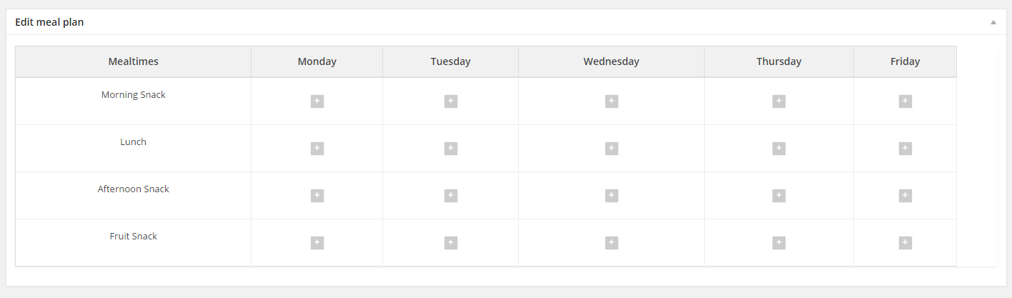
Meals for 5 days.
Example 2
If you want to add additional mealtime: Dinner, you need to edit Theme Options (new mealtime always has to be in separate line):
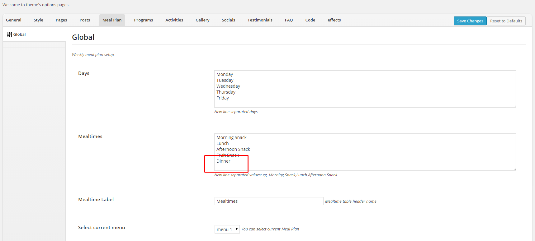
Theme Options configuration for additional mealtime
Effect:
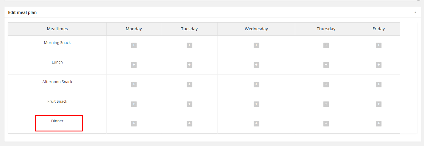
Additional mealtime – Dinner
Example 3
If you want to add one more day with meals to Meal Plans. Navigate to Theme Options, and add new line in Days section.

Theme Options configuration for additional day.
Effect:
Six days meal plan
Theme Options
In Theme Options you can also choose, which created Menu Plan should be displayed strightaway and which one next week. Here you can choose two options:
Repeat current – to have the same Meal Plan displayed also next week, or Loop all menus – if you created more than one Menu Plan you can display all of them, one by one.
Was this article helpful ?
Creating Menu items
Test allows you to create menu items, which are components of Weekly Meal Plans. You can add here single products, for example: Oranges, Potatos, Chicken Breast. In that way every single menu item can be used in several meals of your meal plan, so it’s more universal. However your menu item base might be larger.
But single menu item can also exist as a whole meal – you can add a description what’s inside. That way, you can add a whole meal to your plan with a single click while creating the Weekly Meal plan.
To create Menu Item – navigate to Menu > Add New
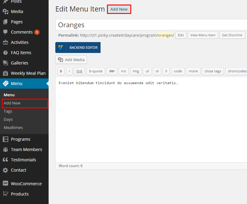
How to add menu item?
Here you can define a Menu item Title and Description. You can also add featured image to the Menu item. It will be visible after hovering the product in Weekly Meal Plan.
After your menu item is created – remember to click “Publish” to save your changes. Also, after every modification you need to click “Update” to save changes.
Was this article helpful ?
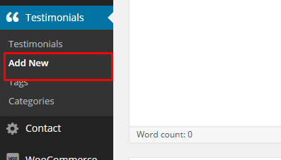
Creating Testimonials
To create new Testimonial, navigate to Testimonials > Add New
How to add new testimonial?
In every testimonial, you can define:
- Title
- Description
- Author
- Socials – add usernames/nicks to social, that you want to display wih this testimonial
- Featured image
Remember to click Publish to save your testimonial or Update after every item modification.
Theme Options
In Appearance > Theme Options – Testimonials you can set global options for all Testimonials:
- Show or hide Tweet button
- Show or hide Facebook Share button
- Show socials icons
- Default tweet share message
- Add post permalink to tweet message?

Theme Options for testimonials
Remember to always click Save Changes when you finish your changes in Theme Options.
Was this article helpful ?
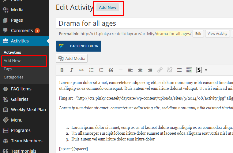
Creating Activity
To create new acitivity, navigate to Activities > Add New.
How to add new activity?
- Title
- Description
- Activity Summary
- Socials – add usernames/nicks to social, that you want to display wih this testimonial
- Tags
- Categories
- Featured image
Remember to click Publish to save your testimonial or Update after every item modification.
Theme Options
In Appearance > Theme Options – Activities – Index you can set global options for all Activities index page:
- Choose the index page
- Define label for More button
- Show or hide pagination
- Define number of displayed activities
- Define labels for meta options
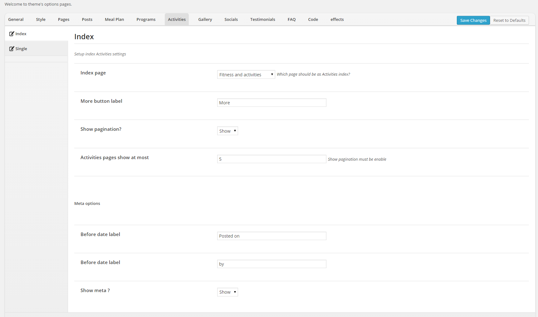
Theme Options for Activities index page
In Appearance > Theme Options > Activities – Single you can set options for every Activity single page:
- Page title
- Show or hide breadcrumbs
- Show Tweet button
- Show Facebook Share button
- Show socials icons?
- Default tweet share message
- Image displayed on the page top and its’ position
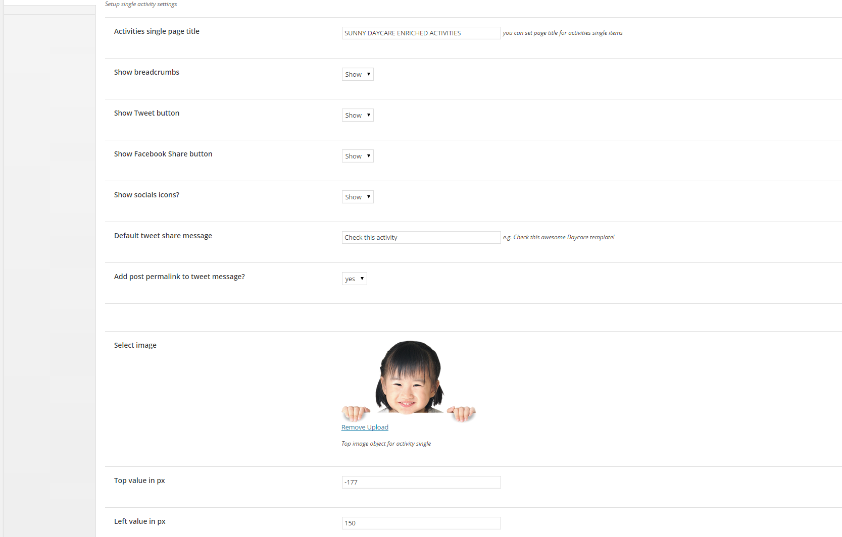
Theme Options for Activity single page
Remember to always click Save Changes when you finish your changes in Theme Options.
Was this article helpful ?
Creating Galleries
To create new Gallery, navigate to Galleries > Add New
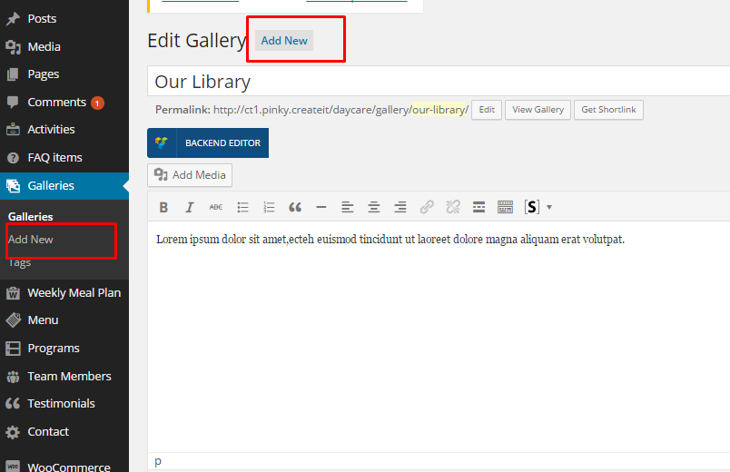
How to add new gallery?
In every gallery, you can define:
- Title
- Description
- Tags
- Gallery Images:
- Click on Set featured image
- Click Upload files to upload images for the gallery
Remember to click Publish to save your Gallery or Update after every item modification.
Theme Options
In Appearance > Theme Options – Gallery you can set global options for all Galleries:
- Galleries index page
- Gallery index thumbs limit – Number of images displayed in single gallery section on gallery index page
- Gallery single page title
- Image displayed on the top of the page and it’s position
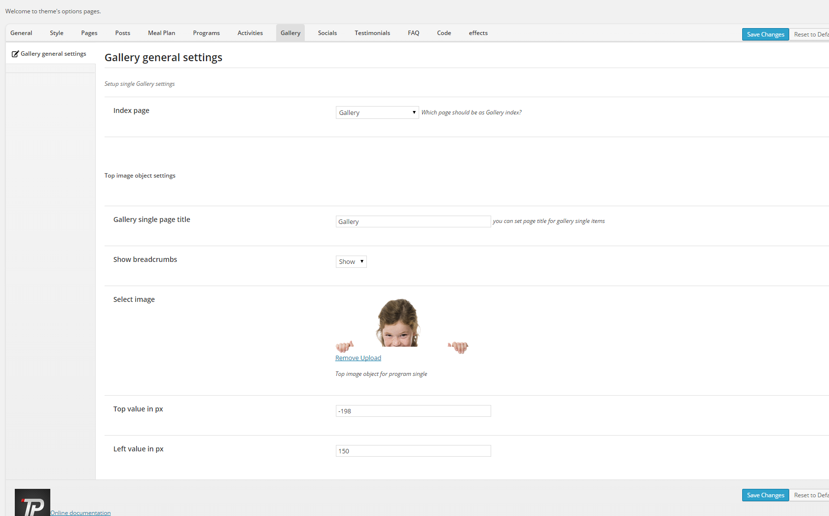
Remember to always click Save Changes when you finish your changes in Theme Options.
Was this article helpful ?
Creating Programs
To create new acitivity, navigate to Programs > Add New.
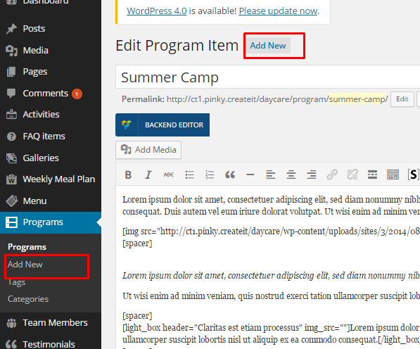
How to add new program?
In every activity, you can define:
- Title
- Description
- Activity Summary
- Socials – add usernames/nicks to social, that you want to display wih this testimonial
- Tags
- Categories
- Featured image
Remember to click Publish to save your testimonial or Update after every item modification.
Theme Options
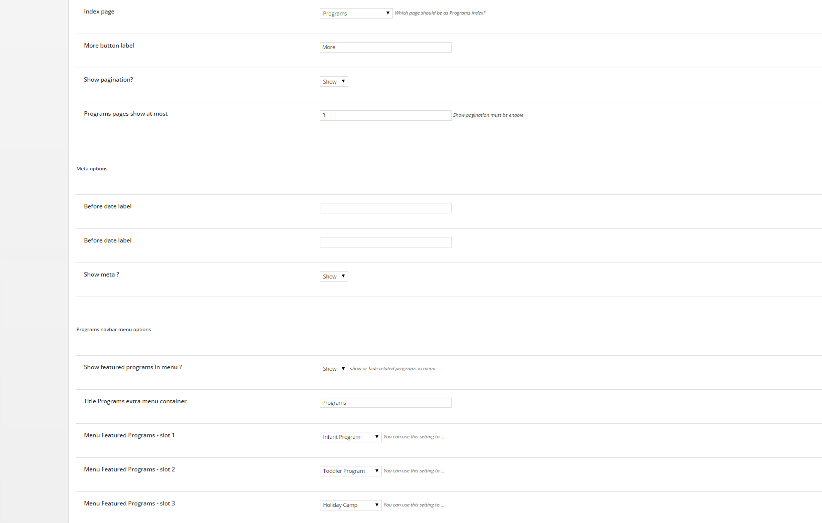
In Appearance > Theme Options – Programs – Index you can set global options for all Activities index page:
- Programs index page
- Define label for More button
- Show or hide pagination
- Define number of displayed activities
- Define labels for meta options
- Programs navbar menu options:
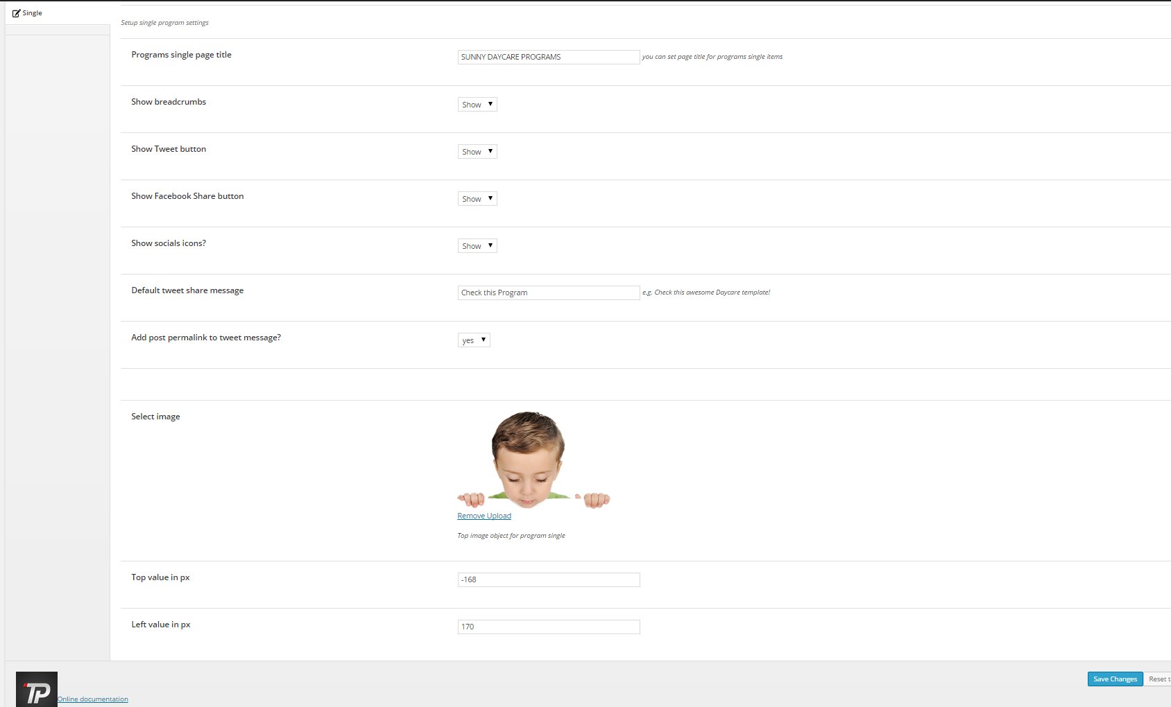
In Appearance > Theme Options > Activities – Single you can set options for every Activity single page:
- Page title
- Show or hide breadcrumbs
- Show Tweet button
- Show Facebook Share button
- Show socials icons?
- Default tweet share message
- Image displayed on the page top and it’s position
Remember to always click Save Changes once you finished changes in Theme Options.
Was this article helpful ?
HTML Structure
This theme is built upon bootstrap framework and is fully responsive. It adapts to window resolution and looks good on all devices including iPad and iPhone.
See for yourself (resize your browser).
If you would like to read more
about bootstrap framework click here :
Grid System and Single row structure
The default Bootstrap grid system utilizes 12 columns. It’s responsive grid and adapts to viewport. Below 767px viewports, the columns become fluid and stack vertically. The fluid grid system uses percents instead of pixels for column widths. Each row always include 12 columns (for example col-md-8 + col-md-4 = col-md-12).
Bootstrap documentation: here
Basic grid HTML:
|
1 2 3 4 5 6 7 8 9 10 11 12 13 14 15 16 17 18 19 20 21 22 23 24 25 26 27 |
<div class="row"> <div class="col-md-1">.col-md-1</div> <div class="col-md-1">.col-md-1</div> <div class="col-md-1">.col-md-1</div> <div class="col-md-1">.col-md-1</div> <div class="col-md-1">.col-md-1</div> <div class="col-md-1">.col-md-1</div> <div class="col-md-1">.col-md-1</div> <div class="col-md-1">.col-md-1</div> <div class="col-md-1">.col-md-1</div> <div class="col-md-1">.col-md-1</div> <div class="col-md-1">.col-md-1</div> <div class="col-md-1">.col-md-1</div> </div> <div class="row"> <div class="col-md-8">.col-md-8</div> <div class="col-md-4">.col-md-4</div> </div> <div class="row"> <div class="col-md-4">.col-md-4</div> <div class="col-md-4">.col-md-4</div> <div class="col-md-4">.col-md-4</div> </div> <div class="row"> <div class="col-md-6">.col-md-6</div> <div class="col-md-6">.col-md-6</div> </div> |
Page structure
Below you will find default page structure :
|
1 2 3 4 5 6 7 8 9 10 11 12 13 14 15 16 17 18 19 20 21 22 23 24 25 26 27 28 29 30 31 32 33 34 35 36 |
<!DOCTYPE html> <html> <head> [css] </head> <body> [header] [main menu] <!-- main container --> <div id="wrapper"> [component 1] <!-- fullwidth element --> </div> [fullwidth parallax] <div class="container"> <!-- / fullwidth element --> [component 6] </div> <!-- / main container --> [footer] [javascripts] </body> </html> |
Was this article helpful ?
Test – Responsive HTML5 Template
Thank you for purchasing this theme. If you have any questions that are beyond the scope of this help file, please feel free to start new ticket on this page. Thanks so much!
Scope of free support
We can help you with:
- Responding to questions or problems regarding the item and its features
- Fixing any discovered item’s bugs
- Providing updates to ensure compatibility with new software versions
Was this article helpful ?
CSS Files and Structure
If you would like to edit the color, font, or style of any elements, you would do the following:
|
1 |
#primaryContent a {color: #someColor;} |
If you find that your new style is not overriding, it is most likely because of a specificity problem. Scroll down in your CSS file and make sure that there isn’t a similar style that has more weight.
I.E.
|
1 |
#wrap #primaryContent a {color: #someColor;} |
So, to ensure that your new styles are applied, make sure that they carry enough “weight” and that there isn’t a style lower in the CSS file that is being applied after yours.
Colors
The theme includes a css file wich you can use to edit the colors.
You just need to add the corresponding CSS file to the head of the page like this:
|
1 2 3 4 5 |
<head> (..) <link rel="stylesheet" type="text/css" href="css/motive.css"> (..) </head> |
Main Menu structure
Just change brand name, upload your logo to images/content/ folder and you’re ready to go!
|
1 2 3 4 5 6 7 8 9 10 11 12 13 14 15 16 17 18 19 20 21 22 23 24 25 26 27 28 29 30 |
<nav class="navbar ct-navbar--transparent ct-navbar--logoright" role="navigation"> <div class="container"> <!-- Brand and toggle get grouped for better mobile display --> <div class="navbar-header"> <a class="navbar-brand" href="index.html"><img src="./assets/images/logo.png" alt="Orlando Logo"> </a> </div> <!-- Collect the nav links, forms, and other content for toggling --> <div class="collapse navbar-collapse"> <ul class="nav navbar-nav ct-navbarNav--defaultActive ct-navbar--fadeIn yamm"> <li class="dropdown yamm-fw active"> <a href="index.html">Home <i class="fa fa-angle-double-down"></i></a> <ul class="dropdown-menu"> </ul> </div> <!-- /.navbar-collapse --> <div class="ct-navbar-search"> <form role="form"> <div class="form-group"> <input type="text" class="form-control" placeholder="Please type keywords..." required> </div> <button class="ct-navbar-search-button" type="submit"> <i class="fa fa-search fa-fw"></i> </button> </form> </div> </div> <!-- /.container --> </nav> |
In order to create mega menus read the documentation here:
Icons
We’ve included 360+ font icons.
Awesome Icons – http://fontawesome.io/icons/
HTML markup:
|
1 2 |
<!-- Awesome Icons --> <i class="fa fa-cog"></i> |
Appearing with Animation when element in viewport
Animation can be turn off just be remove “withAnimation” class from body.
Usage:
– add “animated” class to element and data-fx=”animation-type”. That’s it.
Available animation : http://daneden.github.io/animate.css/
- data-fx=”hinge”
- data-fx=”bounce”
- data-fx=”flash”
- data-fx=”pulse”
- data-fx=”shake”
- data-fx=”swing”
- data-fx=”tada”
- data-fx=”wobble”
- data-fx=”bounceIn”
- data-fx=”bounceInDown”
- data-fx=”bounceInLeft”
- data-fx=”bounceInRight”
- data-fx=”bounceInUp”
- data-fx=”bounceOut”
- data-fx=”bounceOutDown”
- data-fx=”bounceOutLeft”
- data-fx=”bounceOutRight”
- data-fx=”bounceOutUp”
- data-fx=”fadeIn”
- data-fx=”fadeInDown”
- data-fx=”fadeInDownBig”
- data-fx=”fadeInLeft”
- data-fx=”fadeInLeftBig”
- data-fx=”fadeInRight”
- data-fx=”fadeInRightBig”
- data-fx=”fadeInUp”
- data-fx=”fadeInUpBig”
- data-fx=”fadeOut”
- data-fx=”fadeOutDown”
- data-fx=”fadeOutDownBig”
- data-fx=”fadeOutLeft”
- data-fx=”fadeOutLeftBig”
- data-fx=”fadeOutRight”
- data-fx=”fadeOutRightBig”
- data-fx=”fadeOutUp”
- data-fx=”fadeOutUpBig”
- data-fx=”flip”
- data-fx=”flipInX”
- data-fx=”flipInY”
- data-fx=”flipOutX”
- data-fx=”flipOutY”
- data-fx=”lightSpeedIn”
- data-fx=”lightSpeedOut”
- data-fx=”rotateIn”
- data-fx=”rotateInDownLeft”
- data-fx=”rotateInDownRight”
- data-fx=”rotateInUpLeft”
- data-fx=”rotateInUpRight”
- data-fx=”rotateOut”
- data-fx=”rotateOutDownLeft”
- data-fx=”rotateOutDownRight”
- data-fx=”rotateOutUpLeft”
- data-fx=”rotateOutUpRight”
- data-fx=”slideInDown”
- data-fx=”slideInLeft”
- data-fx=”slideInRight”
- data-fx=”slideOutLeft”
- data-fx=”slideOutRight”
- data-fx=”slideOutUp”
- data-fx=”rollIn”
- data-fx=”rollOut”
CSS Files & Structure
We’ve included 2 files.
bootstrap.css contains Bootstrap 3 Library.
style.css file contains general styles.
1.A. Google Fonts
1.B. Revolution Slider styles
1.C. Magnific popup styles
1.D. Font Awesome styles
1.E Yamm styles
1.F Flexslider styles
1.G Animate css styles
2. GENERAL STYLES
3. Typography
4. Buttons
5. Pagination
6. Alerts
7. Inputs
8. Pophover
9. Header styles
10. Navbar styles
11. Call to action
12. Sections
13. Media sections – video/parallax/kenburns
14. Process circles
15. Person box
16. Service box
17. Pre footer section
18. Footer
19. Articles
20. Counters
21. Blockquote
22. Tabs
23. Images widget
24. Project single
25. Project images
26. Lists
27. Pricing box
28. Accordion
29. Socials
30. Square icons
31. Charts
32. Progress bar
33. Twitter
34. Google map
35. Flexslider
36. Revslider
37. Time circle counter
38. Thumbnail scroller
39. Magnific popup
40. Isotope
41. Helpers
42. D3 swimmers
43. WordPress
44. Media queries, adjustments
45. Motive colors
Utilities
Utility classes are low-level structural and positional traits. Utilities can be applied directly to any element, multiple utilities can be used tohether and utilities can be used alongsie component classes.
Utilities are intended for frequently used CSS properties and patterns, like: floats, containing floats, vertical alignemnt, text tryncation. Relying on utilities can help to reduce repetition and provide consistend implementations.
- Test uses utilities for the following categories:
- Typography
- Display Types
- Paddings
- Margins
- Colors
- Borders
- Background Colors
- Triangles
- Diagonals
- Shadows
Was this article helpful ?
Media Sections
Test supports media sections with Parallax, KenBurns effect and videos.
Parallax Section
|
1 2 3 4 5 6 7 8 9 10 11 12 13 14 15 16 17 18 19 20 21 22 23 24 25 26 27 28 29 30 31 |
<section class="ct-mediaSection ct-u-paddingBoth70" data-stellar-background-ratio="0.3" data-height="650" data-type="parallax" data-bg-image="./assets/images/demo-content/bigImage1.jpg" data-bg-image-mobile="./assets/images/demo-content/bigImage1-mobile.jpg" style="min-height: 650px; height: 650px; background-image: url(http://orlando.html.themeforest.createit.pl/light/assets/images/demo-content/bigImage1.jpg); background-position: 50% 50%;"> <div class="ct-mediaSection-inner"> <div class="container"> <div class="row"> <div class="col-sm-4"> <header class="ct-pageSectionHeader"> <h3 class="text-lowercase ct-fw-600"> Parallax <small class="ct-fw-700 text-uppercase">Yes, we are the absolute best in the business </small> </h3> </header> </div> <div class="col-sm-8"> <p> Donec justo mauris, sagittis sed vulputate ut, commodo dapibus massa. Class aptent taciti sociosqu ad litora torquent per conubia nostra, per inceptos himenaeos. Cras ut mi lacus. Morbi accumsan mauris ac posuere vehicula. Donec bibendum tellus rutrum turpis varius dictum. Maecenas tristique arcu sed rhoncus laoreet. Praesent eget fermentum nisi. Donec ac velit aliquet, bibendum sem in, convallis est. Phasellus sodales ultricies cursus. Vivamus leo nunc, pretium vitae dictum a, mollis ut sapien. Cum sociis natoque penatibus et magnis dis parturient montes, nascetur ridiculus mus. Donec porttitor tristique sem, dictum vehicula nisi accumsan eget. Pellentesque habitant morbi tristique senectus et netus. </p> <a href="contact.html" class="btn btn-primary ct-btn--rounded text-uppercase">Contact Us</a> <a href="features-p-tables.html" class="btn ct-btn--black ct-btn--rounded text-uppercase">Pricing Options</a> </div> </div> </div> </div> </section> |
We are using stellar.js for the parallax effect. Check their documentation to check which attributes you can use in each parallax section.
http://markdalgleish.com/projects/stellar.js/docs/
Our custom data-attributes for the parallax section are:
- data-height: Define the minimun height for the sections
- data-type: Type of Media Section (parallax/kenburns/video)
- data-image: Background image for the section.
- data-image-mobile: Fallback image (Should be smaller than the original) that is loaded for small devices. This will help you with the bandwidth, you’re welcome! 🙂
Ken Burns Sections
|
1 2 3 4 5 6 7 8 9 10 11 12 13 14 15 16 17 18 19 20 21 22 23 24 25 26 27 28 29 30 31 32 33 34 35 36 37 |
<section class="ct-mediaSection ct-u-paddingBoth70 ct-u-colorWhite" data-height="650" data-type="kenburns" data-bg-image-mobile="./assets/images/demo-content/bigImage5-mobile.jpg" style="min-height: 650px; height: 650px;"> <div class="ct-mediaSection-kenburnsImageContainer"> <img src="./assets/images/demo-content/bigImage5.jpg" alt="demo image" class="fx"> <img src="./assets/images/demo-content/bigImage4.jpg" alt="demo image" class=""> <img src="./assets/images/demo-content/bigImage5.jpg" alt="demo image" class="fx"> </div> <div class="ct-mediaSection-inner"> <div class="container"> <div class="row"> <div class="col-sm-4"> <header class="ct-pageSectionHeader"> <h3 class="text-lowercase ct-fw-600 ct-u-colorWhite"> Ken Burns <small class="ct-fw-700 text-uppercase ct-u-colorWhite">Yes, we are the absolute best in the business </small> </h3> </header> </div> <div class="col-sm-8"> <p> Donec justo mauris, sagittis sed vulputate ut, commodo dapibus massa. Class aptent taciti sociosqu ad litora torquent per conubia nostra, per inceptos himenaeos. Cras ut mi lacus. Morbi accumsan mauris ac posuere vehicula. Donec bibendum tellus rutrum turpis varius dictum. Maecenas tristique arcu sed rhoncus laoreet. Praesent eget fermentum nisi. Donec ac velit aliquet, bibendum sem in, convallis est. Phasellus sodales ultricies cursus. Vivamus leo nunc, pretium vitae dictum a, mollis ut sapien. Cum sociis natoque penatibus et magnis dis parturient montes, nascetur ridiculus mus. Donec porttitor tristique sem, dictum vehicula nisi accumsan eget. Pellentesque habitant morbi tristique senectus et netus. </p> <a href="contact.html" class="btn btn-primary ct-btn--rounded text-uppercase">Contact Us</a> <a href="features-p-tables.html" class="btn btn-default ct-btn--rounded text-uppercase">Pricing Options</a> </div> </div> </div> </div> </section> |
KenBurns section supports one or more images that you should add inside .media-section-image-container
Our custom data-attributes for the kenburns section are:
- data-height: Define the minimun height for the sections
- data-type: Type of Media Section (parallax/kenburns/video)
- data-image-mobile: Fallback image (Should be smaller than the original) that is loaded for small devices. Kenburns it too much for ipads, iphones and so on, so we allow you to fallback to a normal image section. This way your browser won’t crash 🙂
Video Sections
|
1 2 3 4 5 6 7 8 9 10 11 12 13 14 15 16 17 18 19 20 21 22 23 24 25 26 27 28 29 30 31 32 33 34 35 36 37 38 39 40 41 42 43 44 |
<section class="ct-mediaSection ct-u-paddingBoth70 ct-u-colorWhite" data-height="700" data-type="video" data-bg-image-mobile="./assets/images/demo-content/bigImage3-mobile.jpg" style="min-height: 700px; height: 700px;"> <div class="ct-mediaSection-video embed-responsive embed-responsive-16by9"> <!-- in order for video to be muted you must add &api=1&player_id=vimeoplayer1 to the end of the video src If you have more than one video, make sure that player_id and id have dif names on each video --> <video id="video1" muted="" loop="" autoplay="autoplay" preload="auto"> <source src="http://orlando.html.themeforest.createit.pl/light/assets/videos/loopbookeh.mp4" type="video/mp4"> <source src="http://orlando.html.themeforest.createit.pl/light/assets/videos/loopbookeh.webm" type="video/webm"> </video> </div> <div class="ct-u-displayTable" style="height: 700px;"> <div class="ct-mediaSection-inner"> <div class="container"> <div class="row"> <div class="col-sm-4"> <header class="ct-pageSectionHeader"> <h3 class="text-lowercase ct-fw-600 ct-u-colorWhite"> Video <small class="ct-fw-700 text-uppercase ct-u-colorWhite">Yes, we are the absolute best in the business </small> </h3> </header> </div> <div class="col-sm-8"> <p> Donec justo mauris, sagittis sed vulputate ut, commodo dapibus massa. Class aptent taciti sociosqu ad litora torquent per conubia nostra, per inceptos himenaeos. Cras ut mi lacus. Morbi accumsan mauris ac posuere vehicula. Donec bibendum tellus rutrum turpis varius dictum. Maecenas tristique arcu sed rhoncus laoreet. Praesent eget fermentum nisi. Donec ac velit aliquet, bibendum sem in, convallis est. Phasellus sodales ultricies cursus. Vivamus leo nunc, pretium vitae dictum a, mollis ut sapien. Cum sociis natoque penatibus et magnis dis parturient montes, nascetur ridiculus mus. Donec porttitor tristique sem, dictum vehicula nisi accumsan eget. Pellentesque habitant morbi tristique senectus et netus. </p> <a href="contact.html" class="btn btn-primary ct-btn--rounded text-uppercase">Contact Us</a> <a href="features-p-tables.html" class="btn btn-default ct-btn--rounded text-uppercase">Pricing Options</a> </div> </div> </div> </div> </div> </section> |
We recommend you to use html5 video instead of vimeo, since in some specific browsers the sound won’t be muted.
Our custom data-attributes for the video section are:
- data-height: Define the minimun height for the sections
- data-type: Type of Media Section (parallax/kenburns/video)
- data-image-mobile: Fallback image (Should be smaller than the original) that is loaded for small devices. Phones don’t autoplay video, so we just replace it for an image
Was this article helpful ?
Charts
Progress Bars
This theme has 2 types of layout and all you have to do is change one class. Also, everything is done via data attribute.
|
1 2 3 4 5 6 7 8 |
<div class="progress"> <div class="progress-bar animating" role="progressbar" aria-valuenow="60" aria-valuemin="0" aria-valuemax="100" style="width: 60%;"> <span class="ct-progressBar-text">60% Complete</span> <div class="ct-progressBar-tr"></div> </div> </div> </div> |
|
1 2 3 4 5 6 7 8 |
<div class="progress"> <div class="progress-bar progress-bar-success progress-bar-striped animating" role="progressbar" aria-valuenow="40" aria-valuemin="0" aria-valuemax="100" style="width: 40%;"> <span class="ct-progressBar-text">40% Complete (success)</span> <div class="ct-progressBar-tr"></div> </div> </div> </div> |
- aria-valuenow: Percentage this bar should have
- aria-valuemax: Max value
- aria-valuemin: Min value
Was this article helpful ?
Typography
We use google font service to include fonts or font face sets.
Ligh Font used: Open Sans
Credits:
Open Sans
Was this article helpful ?
JavaScript
All javascripts are placed in folder /js. In main.js file we implement all functions calls.
This theme uses following Javascript files:
- Bootstrap v 3 framework (powerful front-end framework for faster and easier web development)
- jQuery v1.10.2 (A fast javascript library that Foodtruckifies how to traverse HTML documents, handle events, perform animations.)
- jQuery FlexSlider v2.2.0
- GMAP3 Plugin for JQuery v. 5.1.1
- jQuery.appear
- FitVids 1.0.3
- jQuery Stellar
- jQuery tweet
- Modernizr 2.0.6
- PageScroller
- final-countdown.js
- snap.js
- device.js 0.1.58
- chart.js
Google Map (GMAP3 Plugin)
This is google map with custom marker, you can define couple parameters:
- data-location – address to show
- data-height – map height (if undefined height will be 220px)
- data-offset – by how many map should be repositioned from marker center point (default -30)
It uses gmap3 plugin.
Documentation: here
HTML Markup:
|
1 |
<div class="ct-googleMap" data-location="Narbutta 24, Warsaw" data-zoom="15" data-height="500"></div> |
All javascript code can be found in js/main.js file.
Flexslider
Content / Images Slider.
Each parameter can be defined as data attribute :
- data-namespace
- data-selector
- data-animation
- data-easing
- data-direction
- data-reverse
- data-animationloop
- data-smoothheight
- data-startat
- data-slideshow
- data-slideshowspeed
- data-animationspeed
- data-initdelay
- data-randomize
- data-thumbcaptions
- data-pauseonaction
- data-pauseonhover
- data-pauseinvisible
- data-usecss
- data-touch
- data-video
- data-controlnav
- data-directionnav
- data-prevtext
- data-nexttext
- data-keyboard
- data-multiplekeyboard
- data-mousewheel
- data-pauseplay
- data-pausetext
- data-playtext
- data-itemwidth
- data-itemmargin
- data-minitems
- data-maxitems
- data-move
- data-allowoneslide
- data-controlscontainer
- data-manualcontrols
- data-sync
- data-asnavfor
Read the documentation here:
|
1 2 3 |
div class="flexslider" data-animation="slide" data-height="100" data-loop="true" data-smooth="true" data-slideshow="true" data-speed="15000" data-animspeed="550" data-controls="true" data-dircontrols="true" data-controlscontainer=".controls"> (...) </div> |
And js initialization (js/main.js file), there you can change slider parameters:
|
1 2 3 4 5 6 7 8 9 10 11 12 13 14 15 16 17 18 19 20 21 22 23 24 25 26 27 28 29 30 31 32 33 34 35 36 37 38 39 40 41 42 43 44 45 46 47 48 49 50 51 52 53 54 55 56 57 58 59 60 61 62 63 64 65 66 67 68 69 70 71 72 73 74 75 76 77 78 79 80 81 82 83 84 85 86 87 88 89 90 91 92 93 94 95 96 97 98 99 100 101 102 103 104 105 106 107 108 109 110 111 112 113 114 115 116 117 118 119 120 121 122 123 |
/* ==================== */ /* ==== FLEXSLIDER ==== */ if(jQuery().flexslider){ if (jQuery(".flexslider").length > 0) { jQuery(".flexslider").each(function(){ $this=jQuery(this); var ctnamespace = validatedata($this.attr("data-namespace"),"flex-"); var ctselector = validatedata($this.attr("data-selector"),".slides > li"); var ctanimation = validatedata($this.attr("data-animation"),"slide"); var cteasing = validatedata($this.attr("data-easing"),"swing"); var ctdirection = validatedata($this.attr("data-direction"),"horizontal"); var ctreverse = parseBoolean($this.attr("data-reverse"), false); var ctanimationloop = parseBoolean($this.attr("data-animationloop"), false); var ctsmoothheight = parseBoolean($this.attr("data-smoothheight"), false); var ctstartat = parseInt(validatedata($this.attr("data-startat"), 0)); var ctslideshow = parseBoolean($this.attr("data-slideshow"), true); var ctslideshowspeed = parseInt(validatedata($this.attr("data-slideshowspeed"), 7000)); var ctanimationspeed = parseInt(validatedata($this.attr("data-animationspeed"), 600)); var ctinitdelay= parseInt(validatedata($this.attr("data-initdelay"), 0)); var ctrandomize = parseBoolean($this.attr("data-randomize"), false); var ctthumbcaptions = parseBoolean($this.attr("data-thumbcaptions"), false); var ctpauseonaction= parseBoolean($this.attr("data-pauseonaction"), true); var ctpauseonhover = parseBoolean($this.attr("data-pauseonhover"), false); var ctpauseinvisible= parseBoolean($this.attr("data-pauseinvisible"), true); var ctusecss= parseBoolean($this.attr("data-usecss"), true); var cttouch= parseBoolean($this.attr("data-touch"), true); if(device.mobile()){ cttouch = false; } var ctvideo = parseBoolean($this.attr("data-video"), false); var ctcontrolnav= parseBoolean($this.attr("data-controlnav"), true); if(ctcontrolnav == false){ $this.addClass("no-margin"); } var ctdirectionnav= parseBoolean($this.attr("data-directionnav"), false); var ctprevtext = validatedata($this.attr("data-prevtext"),"Previous"); var ctnexttext = validatedata($this.attr("data-nexttext"),"Next"); var ctkeyboard= validatedata(parseBoolean($this.attr("data-keyboard")), true); var ctmultiplekeyboard= parseBoolean($this.attr("data-multiplekeyboard"), false); var ctmousewheel= parseBoolean($this.attr("data-mousewheel"), false); var ctpauseplay= parseBoolean($this.attr("data-pauseplay"), false); var ctpausetext = validatedata($this.attr("data-pausetext"),"Pause"); var ctplaytext = validatedata($this.attr("data-playtext"),"Play"); var ctitemwidth= parseInt(validatedata($this.attr("data-itemwidth"), 0)); var ctitemmargin= parseInt(validatedata($this.attr("data-itemmargin"), 0)); var ctminitems= parseInt(validatedata($this.attr("data-minitems"), 0)); var ctmaxitems= parseInt(validatedata($this.attr("data-maxitems"), 0)); var ctmove= parseInt(validatedata($this.attr("data-move"), 0)); var ctallowoneslide= parseBoolean($this.attr("data-allowoneslide"), false); var ctcontrolscontainer= validatedata($this.attr("data-controlscontainer"), ""); var ctmanualcontrols= validatedata($this.attr("data-manualcontrols"), ""); var ctsync = validatedata($this.attr("data-sync"), ""); var ctasnavfor = validatedata($this.attr("data-asnavfor"), ""); $this.flexslider({ namespace: ctnamespace, //{NEW} String: Prefix string attached to the class of every element generated by the plugin selector: ctselector, //{NEW} Selector: Must match a simple pattern. "{container} > {slide}" -- Ignore pattern at your own peril animation: ctanimation, //String: Select your animation type, "fade" or "slide" easing: cteasing , //{NEW} String: Determines the easing method used in jQuery transitions. jQuery easing plugin is supported! direction: ctdirection, //String: Select the sliding direction, "horizontal" or "vertical" reverse: ctreverse, //{NEW} Boolean: Reverse the animation direction animationLoop: ctanimationloop, //Boolean: Should the animation loop? If false, directionNav will received "disable" classes at either end smoothHeight: ctsmoothheight, //{NEW} Boolean: Allow height of the slider to animate smoothly in horizontal mode startAt: ctstartat, //Integer: The slide that the slider should start on. Array notation (0 = first slide) slideshow: ctslideshow, //Boolean: Animate slider automatically slideshowSpeed: ctslideshowspeed, //Integer: Set the speed of the slideshow cycling, in milliseconds animationSpeed: ctanimationspeed, //Integer: Set the speed of animations, in milliseconds initDelay: ctinitdelay, //{NEW} Integer: Set an initialization delay, in milliseconds randomize: ctrandomize, //Boolean: Randomize slide order thumbCaptions: ctthumbcaptions, //Boolean: Whether or not to put captions on thumbnails when using the "thumbnails" controlNav. // Usability features pauseOnAction: ctpauseonaction, //Boolean: Pause the slideshow when interacting with control elements, highly recommended. pauseOnHover: ctpauseonhover, //Boolean: Pause the slideshow when hovering over slider, then resume when no longer hovering pauseInvisible: ctpauseinvisible, //{NEW} Boolean: Pause the slideshow when tab is invisible, resume when visible. Provides better UX, lower CPU usage. useCSS: ctusecss, //{NEW} Boolean: Slider will use CSS3 transitions if available touch: cttouch, //{NEW} Boolean: Allow touch swipe navigation of the slider on touch-enabled devices video: ctvideo, //{NEW} Boolean: If using video in the slider, will prevent CSS3 3D Transforms to avoid graphical glitches // Primary Controls controlNav: ctcontrolnav, //Boolean: Create navigation for paging control of each clide? Note: Leave true for manualControls usage directionNav: ctdirectionnav, //Boolean: Create navigation for previous/next navigation? (true/false) prevText: ctprevtext, //String: Set the text for the "previous" directionNav item nextText: ctnexttext, //String: Set the text for the "next" directionNav item // Secondary Navigation keyboard: ctkeyboard, //Boolean: Allow slider navigating via keyboard left/right keys multipleKeyboard: ctmultiplekeyboard, //{NEW} Boolean: Allow keyboard navigation to affect multiple sliders. Default behavior cuts out keyboard navigation with more than one slider present. mousewheel: ctmousewheel, //{UPDATED} Boolean: Requires jquery.mousewheel.js (https://github.com/brandonaaron/jquery-mousewheel) - Allows slider navigating via mousewheel pausePlay: ctpauseplay, //Boolean: Create pause/play dynamic element pauseText: ctpausetext, //String: Set the text for the "pause" pausePlay item playText: ctplaytext, //String: Set the text for the "play" pausePlay item // Special properties controlsContainer: ctcontrolscontainer, //{UPDATED} jQuery Object/Selector: Declare which container the navigation elements should be appended too. Default container is the FlexSlider element. Example use would be $(".flexslider-container"). Property is ignored if given element is not found. manualControls: ctmanualcontrols, //{UPDATED} jQuery Object/Selector: Declare custom control navigation. Examples would be $(".flex-control-nav li") or "#tabs-nav li img", etc. The number of elements in your controlNav should match the number of slides/tabs. sync: ctsync, //{NEW} Selector: Mirror the actions performed on this slider with another slider. Use with care. asNavFor: ctasnavfor, //{NEW} Selector: Internal property exposed for turning the slider into a thumbnail navigation for another slider // Carousel Options itemWidth: ctitemwidth, //{NEW} Integer: Box-model width of individual carousel items, including horizontal borders and padding. itemMargin: ctitemmargin, //{NEW} Integer: Margin between carousel items. minItems: ctminitems, //{NEW} Integer: Minimum number of carousel items that should be visible. Items will resize fluidly when below this. maxItems: ctmaxitems, //{NEW} Integer: Maxmimum number of carousel items that should be visible. Items will resize fluidly when above this limit. move: ctmove, //{NEW} Integer: Number of carousel items that should move on animation. If 0, slider will move all visible items. allowOneSlide: ctallowoneslide //{NEW} Boolean: Whether or not to allow a slider comprised of a single slide }) }) } |
jquery.appear
This plugin call function when element appear in viewport. This is used in custom animation, progress bars, counter timer.
Documentation: https://github.com/bas2k/jquery.appear/
|
1 2 3 4 5 6 7 8 9 10 11 12 13 |
if (jQuery().appear) { if (device.mobile()) { // disable animation on mobile jQuery("body").removeClass("withAnimation"); } else { jQuery('.withAnimation .animated').appear(function () { jQuery(this).each(function () { jQuery(this).addClass('activate'); jQuery(this).addClass($(this).data('fx')); }); }, {accY: -150}); } } |
fitVids
Just make video responsive.
Documentation: http://fitvidsjs.com/
HTML Markup:
|
1 2 3 |
<div class="fit-video"> <iframe width="853" height="480" src="//www.youtube.com/embed/HJ2F7eptn_A?rel=0" frameborder="0" allowfullscreen></iframe> </div> |
and js:
|
1 2 3 4 5 |
/* ================================= */ /* ==== FIT VIDEOS TO CONTAINER ==== */ if (($().fitVids)){ $(".fit-video").fitVids(); } |
Charts.js
This plugin is used to make graphics.
Documentation: http://www.chartjs.org/
Was this article helpful ?
Flexslider
Below you will find HTML markup for flexslider:
|
1 2 3 4 5 |
<div class="flexslider ct-flexslider--controlsVertical ct-flexslider--controlsWhite ct-js-flexslider" data-animations="true" data-height="100%"> (...) </div> |
You can change number of flexslider parameters using javascript – learn more about parameters.
Was this article helpful ?
Contact form
Template comes with ready to use:
- Contact Form
- Newsletter Form
All needed files are in /form directory.
Remember to includeon page.
To configure form just edit form/config.php and change e-mails to your own :
|
1 2 |
$to = "mail@example.com"; $from = "mail@example.com"; |
That’s it!
Contact Form
HTML Markup:
|
1 2 3 4 5 6 7 8 9 10 11 12 13 14 15 16 17 18 19 20 21 22 23 24 25 26 27 28 29 30 31 32 33 34 35 36 37 38 39 40 41 42 43 |
<div class="ct-contactForm"> <div class="successMessage alert alert-success" style="display: none"> <button type="button" class="close" data-dismiss="alert" aria-hidden="true">×</button> Thank You! </div> <div class="errorMessage alert alert-danger" style="display: none"> <button type="button" class="close" data-dismiss="alert" aria-hidden="true">×</button> Ups! An error occured. Please try again later. </div> <form role="form" action="./assets/form/send.php" method="post" class="contactForm validateIt" data-email-subject="Contact Form" data-show-errors="true"> <div class="row"> <div class="col-md-6"> <div class="form-group"> <input id="contact_name" placeholder="Name" required="" type="text" name="field[]" class="form-control"> <label for="contact_name">Name</label> </div> <div class="form-group"> <input id="contact_email" placeholder="Email" required="" type="email" name="field[]" class="form-control"> <label for="contact_email">Email</label> </div> <div class="form-group"> <input id="contact_subject" placeholder="Subject" required="" type="text" name="field[]" class="form-control"> <label for="contact_subject">Subject</label> </div> </div> </div> <div class="row"> <div class="col-xs-12"> <div class="form-group"> <textarea id="contact_message" placeholder="Message" class="form-control" rows="8" name="field[]" required=""></textarea> <label for="contact_message">Message</label> </div> </div> </div> <div class="row"> <div class="col-xs-12"> <button type="submit" class="btn ct-btn--perspective btn-primary btn-lg text-uppercase pull-right"><i class="fa fa-paper-plane"></i> Send Message </button> </div> </div> </form> </div> |
Newsletter Form
HTML Markup:
|
1 2 3 4 5 6 7 8 9 10 11 12 13 |
<h4 class="uppercase motive section-top">Subscribe to Newsletter</h4> <div class="successMessage alert alert-success" style="display: none;"><button class="close" type="button" data-dismiss="alert">×</button> Thank You!</div> <div class="errorMessage alert alert-danger" style="display: none;"><button class="close" type="button" data-dismiss="alert">×</button> Ups! An error occured. Please try again later.</div> <form class="form-inline validateIt" action="../../assets/form/send.php" method="post" data-email-subject="Newsletter Form" data-show-errors="true" data-hide-form="true"> <div class="input-group"><input class="form-control" name="field[]" type="email" placeholder="Enter your email address" /> <input name="msg_subject" type="hidden" value="New Newsletter subscription" /> <span class="input-group-btn"> <button class="btn btn-brick" type="submit">GO</button> </span></div> </form> |
Options (can be changed in HTML) :
- Mail Subject – just change value in :
- Success Message – change successMessage div content
- Error Message – change errorMessage div content
Was this article helpful ?
Twitter Feed
This is live twitter feed. This plugin will grab your latest tweets and display them on page.
Configuration: – just edit twitter/config.php file :
|
1 2 3 4 5 6 7 8 9 |
$config = array( 'username' => "XXX", //username 'limit' => 3, //how many tweets we would like to display? 'with_replies' => true, //show replies? true or false 'oauth_access_token' => 'TOKEN', 'oauth_access_token_secret' => 'TOKEN_SECRET', 'consumer_key' => 'KEY', 'consumer_secret' => 'KEY_SECRET', ); |
Where can I get these keys, tokens, etc?
Twitter API requires authentication to display tweets from your account.
To twiiter feed work you need to create the ‘application’
and generate 4 special keys for your twitter account via https://dev.twitter.com/apps:
– Consumer key (key)
– Consumer secret (secret)
– Access token (token)
– Access token secret (token_secret)
Video tutorial : “How to create Twitter App”
http://vimeo.com/60891535
Was this article helpful ?
Sources & Credits
The following sources and files have been used to build up this theme
- Twitter Bootstrap – http://twitter.github.com/bootstrap/
- jQuery – http://www.jquery.com
Was this article helpful ?
Creating Header Blocks
Using Test allows you to add custom area above main content container. In this place you may display the selected Header Block. To every page you can assign separate Header Block.
Header Block
To create your blocks navigate in main admin menu to Header Blocks > Add New
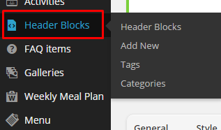
Creating header block
Add title and content to your new header block. In block content you can use all elements available in Test. Use for it Visual Composer or Shortcodes.
Notice:
Using Full width option in column settings allows you to create full width Header Block
Full Width Column with Visual Composer
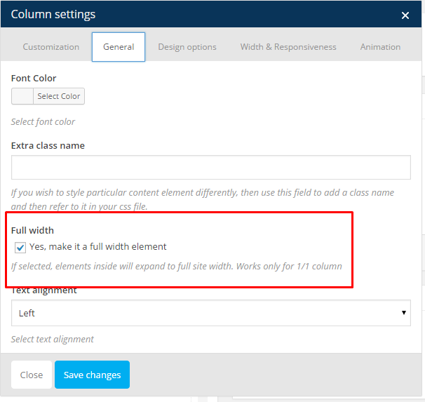
Assign Header Block to page
You can assign to each page different Header Block. Just go to Template Settings while you are editing your page and choose Header Block.
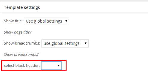
Select Header Block
Remember to click Update once Header Block is assigned to page.
Was this article helpful ?
Settings
Upon plugin activation the {Plugin} will be enabled. Every product will be by default displayed without Add to cart button, price and without any custom button for {Plugin} information.
To change the catalog mode settings go to WooCommerce > Settings > Catalog mode tab.
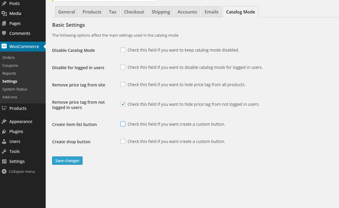
General Settings
Settings Options:
- Disable Catalog Mode – You can check this field to disable the catalog mode on all screens, the Add to cart button and all the cart functionalities will be enabled again.
- Disable for logged in users – Check this field if you want to disable catalog mode for logged in users.
- Remove Price Tag From Site – Remove the price from all products
- Remove price tag from not logged in users – Check this field if you want to hide price tag from not logged in users.
- Create Item list Button – Enable the single product button and his styles.
- Create shop list Button – Enable the shop list button and its styles.
Was this article helpful ?
Catalog Mode Button
When the button is enabled the corresponding area will be displayed below the main settings.
Here you can add your custom styles for a button.
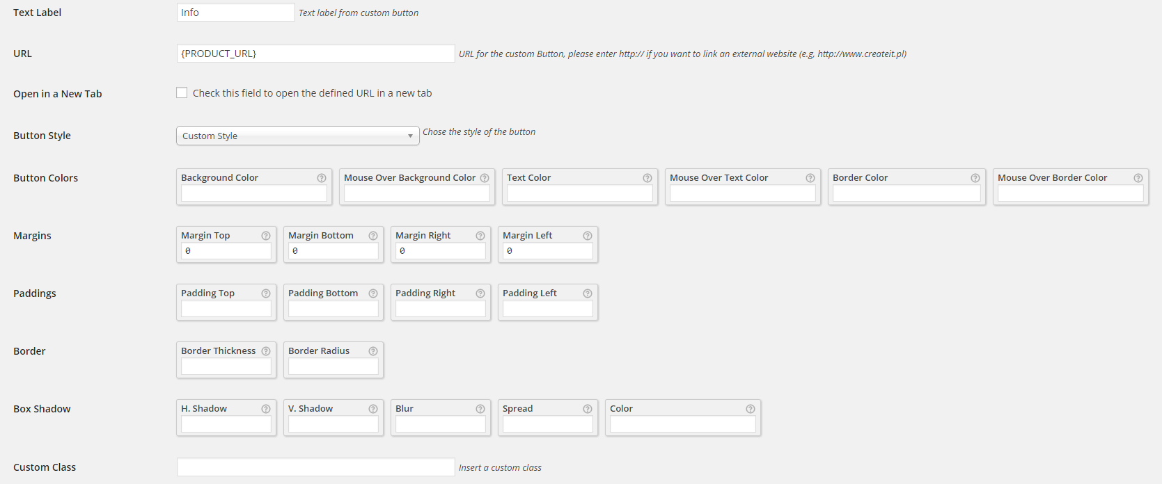
Button custom styles
The style settings are the same for both item and shop buttons, but the values can be changed separately.
There are 8 buttons included on the plugin:
- WooCommerce Default – only supports margins, paddings and custom class,
- flat,
- minimalistic,
- basic,
- rounded,
- slick,
- volume
- solid
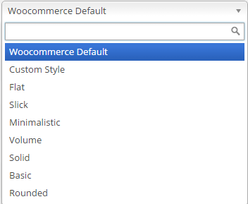
Predefined button styles
They can be selected from the field Button Style, it’s possible to change the default button’s styles by filling the desired field.
Was this article helpful ?
Custom style
To add a custom style, the Custom style needs to be selected in Button style field.
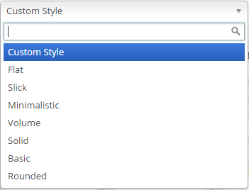
Custom style
After that fill the style fields and click Save.
All custom styles including the defaults from the plugin can be added with a custom class, simply add the class string to the Custom class field.

Custom class name
Was this article helpful ?
Single product settings
Every single product have the option to enable or disable catalog mode or use global settings from the woocommerce setting bar. You can also disable Catalog Mode for logged in users.
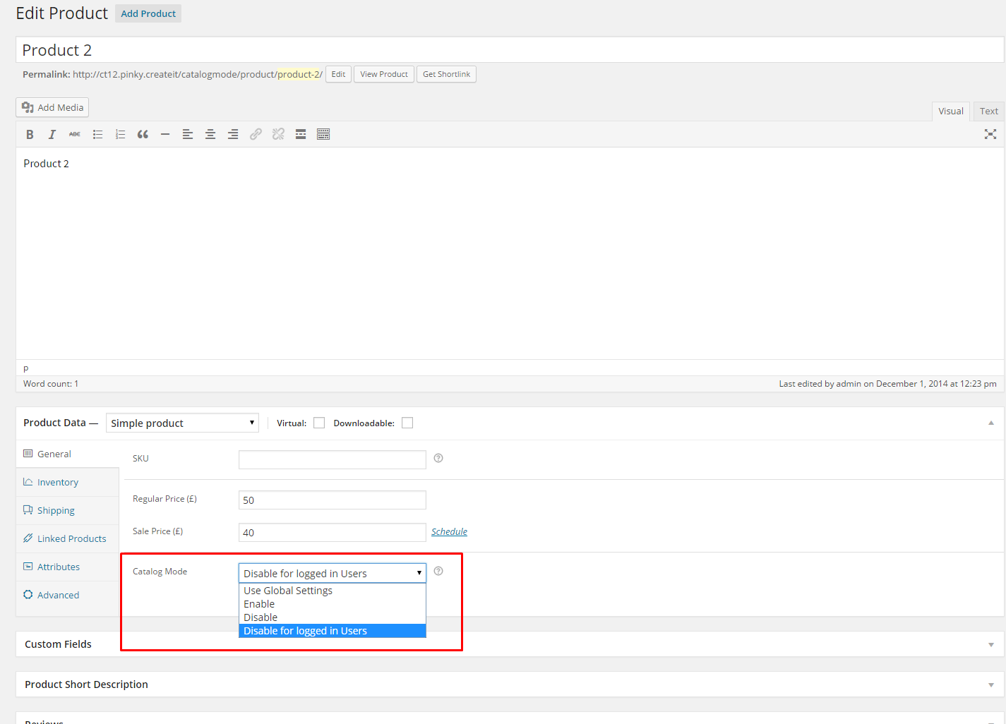
Single Product Settings
With this options the products will be differentiated, for example one product can have the “add to cart button” and the price enabled if the option of the catalog mode is set to disable and the other products will continue to have the normal settings.
Was this article helpful ?
PlugIn Hooks
The default button can be changed with the ct_catalog.css_template.default (path) hook
If you want to minify the buttons CSS this hook will do it for you,
|
1 |
ct_catalog.css.minify(true) |
by default the minify functionality is set to true.
Add custom template button
With the ct_catalog.css_template hook can be added new templates to the plugin
Example:
Lets add a new button style to the settings select list:
|
1 2 3 4 5 6 7 8 9 10 11 12 13 14 15 16 17 18 |
add_filter('ct_catalog.css_template.styles','addCatalogstyleSelect'); function 'addCatalogstyleSelect'($list){ $list['custom-style-name'] = __('New Button Style','custom'); return $list; } Once we have the button on the list lets add the path for the stylesheet file add_filter('ct_catalog.css_template','addCatalogStyle',10,2); function 'addCatalogStyle'($current,$name){ if ($name=='custom-style-name'){ $current ='http://www.example.com/assets/custom_style.css'; } return $current; } |
All done, now have button will have your custom stylsheet.
If for some reason the price need to be hidden or shown there is a hook for that too:
|
1 |
‘ct_catalog.price.enable’ |
On this example lets hide a price if the value is bigger than 5
|
1 2 3 4 5 6 7 8 9 10 11 |
add_filter('ct_catalog.price.enable', 'changePriceVisibility', 10, 2); function changePriceVisibility($status, $price) { $status = 'yes'; if ($price > 5) { $status = 'no'; } return $status; } |
Was this article helpful ?
Theme Flavours
As you can see on our Demo page Test comes with {variations}.
{parent-theme} is a main theme, which always needs to be installed if you want your website to work correctly. Styles such as {child-theme-1} and {child-theme-2} are child themes, which can be installed additionally (once {parent-theme} is installed) if you want to use {child-theme-1} or {child-theme-2} style on your website.
Child Theme installation is analogous process to Main Theme installation. Every child theme has its own zip package with installation files, which you will find in downloaded package.
Example:
You downloaded .zip package with theme files from ThemeForest and want to use on you website {child-theme-2} version of Test.
STEP BY STEP
- STEP 1: Unarchive downloaded package from ThemeForest
- STEP 2: Install {theme}.zip file via Administration Panel or FTP
- STEP 3: install {child-theme-2}.zip package via Administration Panel or FTP
- STEP 4: go to Appearance > Themes and activate {child-theme-2}
- STEP 5: Import demo content for {child-theme-2} Theme
And it’s ready to customize! In analogous way you can install every child theme.
Was this article helpful ?
Global settings
You can change View360 plugin options via View360 > Global Settings
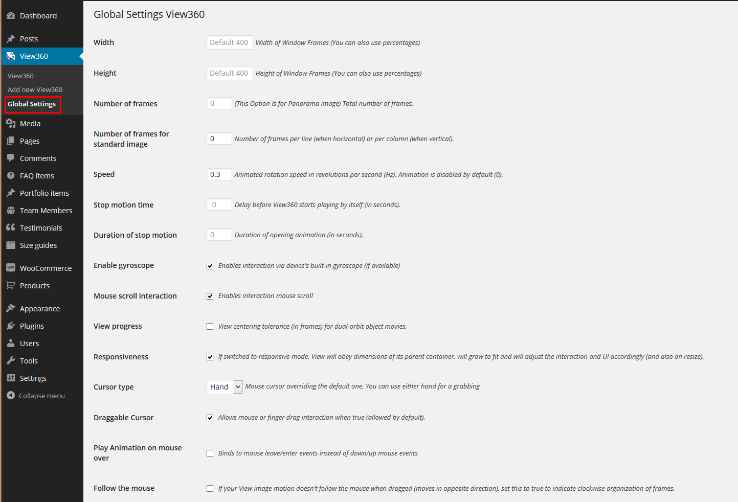
Global settings
You can manage there the following options:
- Width – You can change Width of Window Frames (You can also use percentages);
- Height – You can change Height of Window Frames (You can also use percentages);
- Number of frames – You can change Height of Window Frames (You can also use percentages);
- Number of frames for standard image – Number of frames per line (when horizontal) or per column (when vertical);
- Speed – You Can change Animated rotation speed;
- Duration of stop motion – Duration of opening animation (in seconds);
- Stop motion time – Delay before View360 starts playing by itself (in seconds);
- Enable gyroscope – You can switch on the box to enable interaction via device’s built-in gyroscope;
- Mouse scroll interaction – You can switch on the box to enable interaction mouse scroll;
- View progress – You can switch on the box if you want to see you strip progress;
- Responsiveness – If switched to responsive mode, View will obey dimensions of its parent container, will grow to fit and will adjust the interaction and UI accordingly (and also on resize);
- Cursor type – You can select which cursor to be Hand or Arrow;
- Draggable Cursor – You can switch on the box if you want switch off the ability to interact;
- Play Animation on mouse over – You can switch on the box if you want to interact PUT after driving over a photo (Draggable Cursor option is required);
- Follow the mouse – If your View image motion doesn’t follow the mouse when dragged (moves in opposite direction), set this to true to indicate clockwise organization of frames;
Was this article helpful ?
Button Settings
You can set also custom settings for a plugin button:
- Open view with – select how you want your button: Link, Button or Icon;
- Button/link position – choose where be placed your button (Above the product summary tabs ,After Add To Cart button,Make it a tab, Embed manually (shortcode), Add Button to Product Gallery);
- Add Buttons Control – add buttons to control the View360 right and left;
- Button/link label – enter the text to be displayed in the link/button. Default: view360
- Button/link align – choose if the button should be aligned left or right
- Button class – you can add yours class for button (if you add Button_ct you make change color button/border/text);
- Button/link align – choose if the button should be aligned left or right;
- Button color – set the background color;
- Border/Text button color – set the borders and text color;
- Margins – add marigns;
- Paddings – add paddings;
Woocommerce Integration
Replace default gallery image – if you want to use View360 as a single product gallery – use the code generated in textarea.
Was this article helpful ?
Add new View360
To create new View360 navigate to View360 > Add New in your WordPress admin panel.
Add new
Define a title – it will be name for your new View360
Define a title
Choose Gallery images for View360:
Add images
You can setup the following settings for every View360
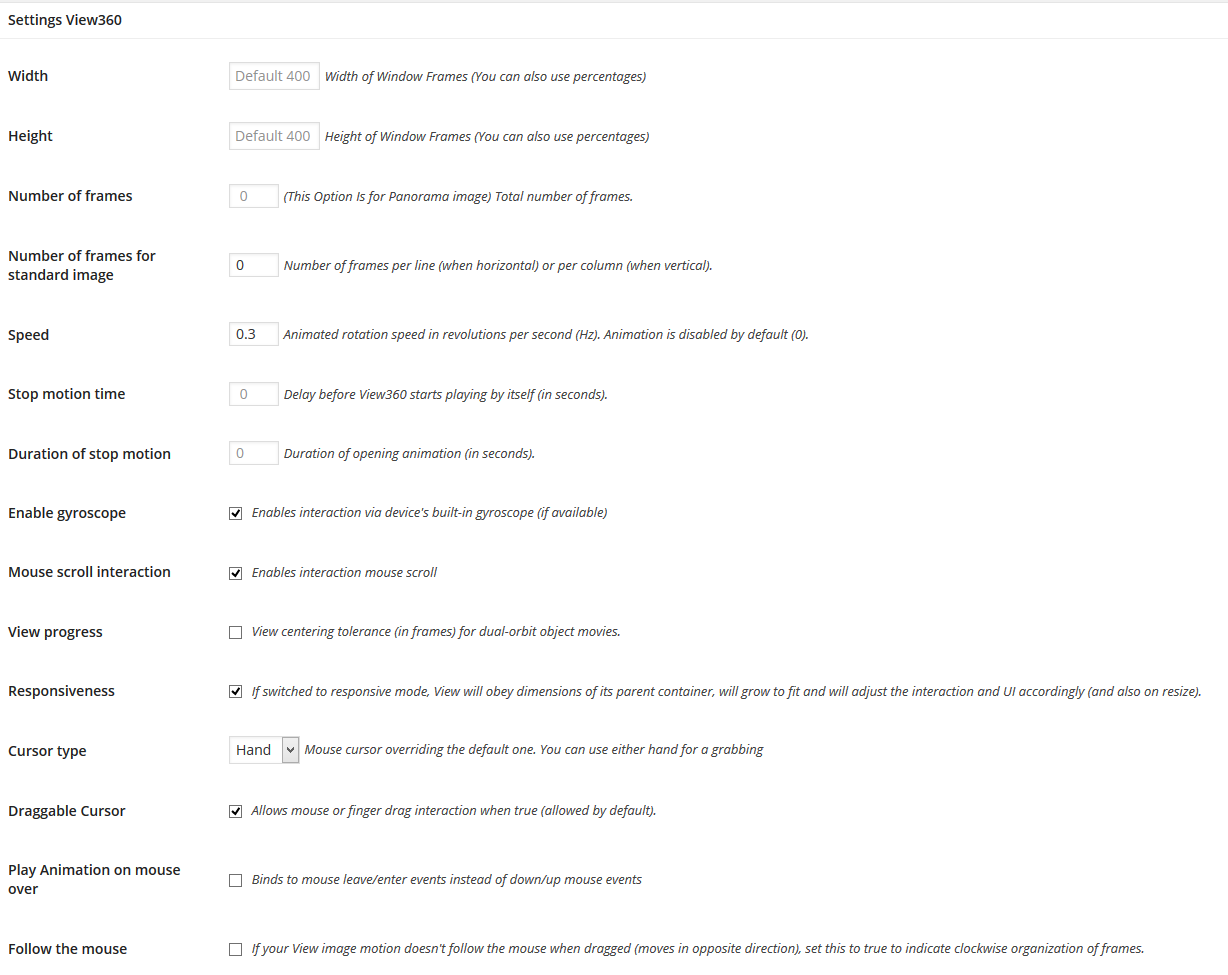
View360 Settings
Was this article helpful ?
Assign View360
You can display View360 as a product gallery in product edition page using Choose Gallery for View360 box:
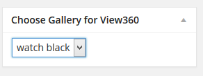
Assign View360 to a product
Using the Choose location add View360 allows you to setup Button View360 location.

Button position
You can create a gallery for each product for View360 in box on the product edition page:
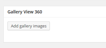
Create new gallery
Was this article helpful ?
Product category settings
Since version 1.4 Catalog Mode gives you an option to enable or disable the plugin for every product category or subcategory. By default all categories will get global settings, defined via WooCommerce > Settings – Catalog Mode. However you can change this settings per product category or subcategory.
To enable or disable Catalog Mode per product category you need to navigate to Products > Catogories and choose the category, that you want to edit.
On the left hand side, below the category Description you will find Catalog Mode settings:

Product category settings
You can choose one of:
- Use Global Settings – selected category will get settings from WooCoomerce > Settings – Catalog Mode;
- Enable – Catalog Mode for products from selected category will be enabled;
- Disable – Catalog Mode for products from selected cateogry will be disabled;
Notice: if you are editing subcategory instead of Use Global Settings you can choose Use Parents Settings – subcategory will use the closest parents settings then.
Notice:
If a product has more than one category, and assigned categories has different Catalog Mode settings (for example 1 category has enabled category and second one has disabled Catalog Mode) – Catalog Mode will be enabled.
Was this article helpful ?
CSS files and structure
If you would like to edit the color, font, or style of any elements, you would do the following:
|
1 |
#primaryContent a {color: #someColor;} |
If you find that your new style is not overriding, it is most likely because of a specificity problem. Scroll down in your CSS file and make sure that there isn’t a similar style that has more weight.
I.E.
|
1 |
#wrap #primaryContent a {color: #someColor;} |
So, to ensure that your new styles are applied, make sure that they carry enough “weight” and that there isn’t a style lower in the CSS file that is being applied after yours.
Colors
The theme includes a css file wich you can use to edit the colors.
You just need to add the corresponding CSS file to the head of the page like this:
|
1 2 3 4 5 |
<head> (..) <link rel="stylesheet" type="text/css" href="css/red.css"> (..) </head> |
Main Menu structure
Just change brand name, upload your logo to images/content/ folder and you’re ready to go!
|
1 2 3 4 5 6 7 8 9 10 11 12 13 14 15 16 17 18 19 20 21 22 23 24 25 26 27 28 29 30 |
<nav class="navbar ct-navbar--transparent ct-navbar--logoright" role="navigation"> <div class="container"> <!-- Brand and toggle get grouped for better mobile display --> <div class="navbar-header"> <a class="navbar-brand" href="index.html"><img src="./assets/images/logo.png" alt="Orlando Logo"> </a> </div> <!-- Collect the nav links, forms, and other content for toggling --> <div class="collapse navbar-collapse"> <ul class="nav navbar-nav ct-navbarNav--defaultActive ct-navbar--fadeIn yamm"> <li class="dropdown yamm-fw active"> <a href="index.html">Home <i class="fa fa-angle-double-down"></i></a> <ul class="dropdown-menu"> </ul> </div> <!-- /.navbar-collapse --> <div class="ct-navbar-search"> <form role="form"> <div class="form-group"> <input type="text" class="form-control" placeholder="Please type keywords..." required> </div> <button class="ct-navbar-search-button" type="submit"> <i class="fa fa-search fa-fw"></i> </button> </form> </div> </div> <!-- /.container --> </nav> |
In order to create mega menus read the documentation here:
Icons
We’ve included 360+ font icons.
Awesome Icons – http://fontawesome.io/icons/
HTML markup:
|
1 2 |
<!-- Awesome Icons --> <i class="fa fa-cog"></i> |
CSS Files & Structure
We’ve included 2 files.
bootstrap.css contains Bootstrap 3 Library.
style.css file contains general styles.
1. Font Awesome
2. Animate.css
3. Typography
4. Buttons
5. Menu
6. Forms
7. Hovers
8. Tables
9. Utilities
10. Media Sections – video/parallax/kenburns
11. Accordions
12. Progress Bar
13. Tabs
14. Mixins
15. Select2
16. Wrapper
17. Page Header
18. Footer
19. Socials Types
20. Counter
21. Blog
22. Blog Panel
23. Blog Comments
24. Pricing Boxes
25. Blockquote
26. Sliders
27. Google Maps
28. Widgets
29. Magnific Popup
30. After & before slider(twentytwenty)
31. Templates
Utilities
Utility classes are low-level structural and positional traits. Utilities can be applied directly to any element, multiple utilities can be used tohether and utilities can be used alongsie component classes.
Utilities are intended for frequently used CSS properties and patterns, like: floats, containing floats, vertical alignemnt, text tryncation. Relying on utilities can help to reduce repetition and provide consistend implementations.
- Test uses utilities for the following categories:
- Typography
- Display Types
- Paddings
- Margins
- Line height
- Borders
- Colors
- Transform
- Section elements
Was this article helpful ?
Magnific popup
Test comes with Magnific popup gallery.
Magnific Popup
To use ajax gallery with Magnific popup, please use the following HTML markup:
|
1 2 3 4 5 6 7 8 9 10 11 12 13 14 15 16 17 18 19 20 21 22 |
<div class="row ct-gallery"> <div class="col-sm-6 col-md-4 ct-u-paddingBottom50 ct-js-magnificPortfolioPopupGroup"> <a href="galleryajax.html" title="Tailoring a men's shirt"> <figure class="ct-hover ct-hover-type5"> <img src="../assets/images/tailor/demo-content/examples-1.jpg" alt=""> <figcaption> <h2>We make it with passion.</h2> </figcaption> </figure> </a> </div> <div class="col-sm-6 col-md-4 ct-u-paddingBottom50 ct-js-magnificPortfolioPopupGroup"> <a href="galleryajax2.html" title="Tailoring a men's shirt"> <figure class="ct-hover ct-hover-type5"> <img src="../assets/images/tailor/demo-content/examples-4.jpg" alt=""> <figcaption> <h2>We make it with passion.</h2> </figcaption> </figure> </a> </div> </div> |
You can use one 15 hover types:
Check hovers demo here.
You can change hover effects with the following CSS classes:
- .ct-hover-type1,
- .ct-hover-type2,
- .ct-hover-type3,
- .ct-hover-type4,
- .ct-hover-type5,
- .ct-hover-type6,
- .ct-hover-type7,
- .ct-hover-type8,
- .ct-hover-type9,
- .ct-hover-type10,
- .ct-hover-type11,
- .ct-hover-type12,
- .ct-hover-type13,
- .ct-hover-type14,
- .ct-hover-type15
Was this article helpful ?
Animations
You can load your HTML conent with awesome animations enabled on scroll.
To animate your HTML element, use the markup below:
|
1 2 3 4 |
<header class="ct-pageSectionHeader text-center ct-js-animationDynamic"> <h2 class="ct-js-animation--item" data-when="span" data-from="0.5" data-to="0" data-opacity="0" data-translatey="-50">Let's</h2> <h3 class="ct-u-text--white ct-js-animation--item ct-u-hdr3" data-when="span" data-from="0.5" data-to="0" data-opacity="0" data-translatey="50">GET IN TOUCH</h3> </header> |
You can adjust animations with the following data-attributes:
- data-when
- data-from
- data-to
- data-easing
- data-crop
- data-opacity
- data-scale
- data-scalex
- data-scaley
- data-scalez
- data-rotatex
- data-rotatey
- data-rotatez
- data-translatex
- data-translatey
- data-translatez
And CSS classes:
- .ct-js-animationDynamic,
- .ct-js-animation–item
Here you will find full plugin documentation.
Was this article helpful ?
Dividers
Test comes with 7 types of dividers. We designed one for each template style, but feel free to use theme wherever you want.
To add Divider use the following HTML markup:
|
1 2 3 4 5 6 7 8 9 10 11 |
<div class="row"> <div class="ct-header-text col-md-12 text-center ct-js-animationDynamic"> <h1 class="ct-js-animation--item" data-when="span" data-from="0" data-to="0.5" data-opacity="0" data-translatey="-100">Hello<br><span class="ct-u-hdr2 ct-js-animation--item">I'M ELLEN HOLGATE<br>& I SEW STUFF</span></h1> <div class="ct-divider ct-divider--type1 ct-js-animation--item" data-when="span" data-from="0" data-to="0.5" data-opacity="0" data-translatey="100"> <div class="ct-line ct-line--left"></div> <i class="icon-button"></i> <div class="ct-line ct-line--right"></div> </div> <a href="#prices" class="btn btn-default ct-js-btnScroll btn--radius ct-js-animation--item" data-when="span" data-from="0" data-to="0.5" data-opacity="0" data-translatey="100">SEE WHAT I CAN OFFER YOU</a> </div> </div> |
You can adjust divider style with the following CSS classes:
- .ct-divider–type1,
- .ct-divider–type2,
- .ct-divider–type3,
- .ct-divider–type4,
- .ct-divider–type5,
- .ct-divider–type6,
- .ct-divider–type7
Was this article helpful ?
Section buttons
There are 7 types of section buttons – each for every template style, but feel free to use them wherever you want.
To add button, use the following HTML markup:
|
1 2 3 4 5 6 7 8 9 10 11 |
<div class="ct-header-arrow--circleD"> <div class="ct-arrow--outer"> <a class="ct-js-btnScroll" href="#about"> <div class="ct-arrow--inner"> <div class="ct-arrow--icon"> <div class="ct-arrow"></div> </div> </div> </a> </div> </div> |
and CSS classes:
- .ct-header-arrow–circle,
- .ct-header-arrow–circleD,
- .ct-header-arrow–circleDecoration,
- .ct-header-arrow–circleDecoration2,
- .ct-header-arrow–circleDecoration3,
- .ct-header-arrow–triangle,
- .ct-header-arrow–shape
Was this article helpful ?
Decorations types
In Test you can use one of 7 decoration types. Every styles has it’s own rotate variation.
Use the following HTML markup:
|
1 2 |
<section class="ct-mediaSection ct-decoration--type1 ct-u-paddingBoth80 ct-glyph--text scroll" <section class="ct-mediaSection ct-u-paddingBoth80 ct-decoration--type1-rotate scroll" id="prices"> |
And choose your type with CSS classes:
- .ct-decoration–type1,
- .ct-decoration–type1-rotate,
- .ct-decoration–type2,
- .ct-decoration–type2-rotate,
- .ct-decoration–type3,
- .ct-decoration–type3-rotate,
- .ct-decoration–type4,
- .ct-decoration–type4-rotate,
- .ct-decoration–type5,
- .ct-decoration–type5-rotate,
- .ct-decoration–type6,
- .ct-decoration–type6-rotate,
- .ct-decoration–type7,
- .ct-decoration–type7-rotate
Was this article helpful ?
Socials
You can choose from 3 types of Socials:
- -rounded
- -square
- -square with rounded border
Use the following HTML markup to add socials:
|
1 2 3 4 5 6 7 |
<div class="ct-item--contact ct-socials--contact"> <span class="ct-header--contact">Follow me</span> <a href="index.html" class="ct-socials--circle"><i class="fa fa-facebook"></i></a> <a href="index.html" class="ct-socials--circle"><i class="fa fa-twitter"></i></a> <a href="index.html" class="ct-socials--circle"><i class="fa fa-google-plus"></i></a> <a href="index.html" class="ct-socials--circle"><i class="fa fa-pinterest"></i></a> </div> |
And adjust it with CSS classes:
- .ct-socials–circle,
- .ct-socials–square,
- .ct-socials–square-rounded
Was this article helpful ?
Javascript
All javascripts are placed in folder /js. In main.js file we implement all functions calls.
This theme uses following Javascript scripts:
- Bootstrap
- jQuery
- counter(jquery.countTo.js)
- ct-mediaSections(with stellar.js)
- flexslider
- gmaps API
- isotope (http://isotope.metafizzy.co/)
- magnific-popup (http://dimsemenov.com/plugins/magnific-popup/)
- scrollme(jquery.scrollme.js)
- select2.js http://ivaynberg.github.io/select2/
- stacktable.js (http://johnpolacek.github.io/stacktable.js/)
- before & after slider(jquery.twentytwenty.js)
- device.js
- jquery.appear.js
- jquery.pagescroller.lite.js
- smoothscroll.js
- snap.js
- animate.css
jquery.appear
This plugin call function when element appear in viewport. This is used in custom animation, progress bars, counter timer.
Documentation: https://github.com/bas2k/jquery.appear/
|
1 2 3 4 5 6 7 8 9 10 11 12 13 |
if (jQuery().appear) { if (device.mobile()) { // disable animation on mobile jQuery("body").removeClass("withAnimation"); } else { jQuery('.withAnimation .animated').appear(function () { jQuery(this).each(function () { jQuery(this).addClass('activate'); jQuery(this).addClass($(this).data('fx')); }); }, {accY: -150}); } } |
Was this article helpful ?
Google Map
Google Map (GMAP3 Plugin)
This is google map with custom marker, you can define couple parameters:
- data-location – address to show
- data-height – map height (if undefined height will be 220px)
- data-offset – by how many map should be repositioned from marker center point (default -30)
- data-icon – adding custom icon to map in html
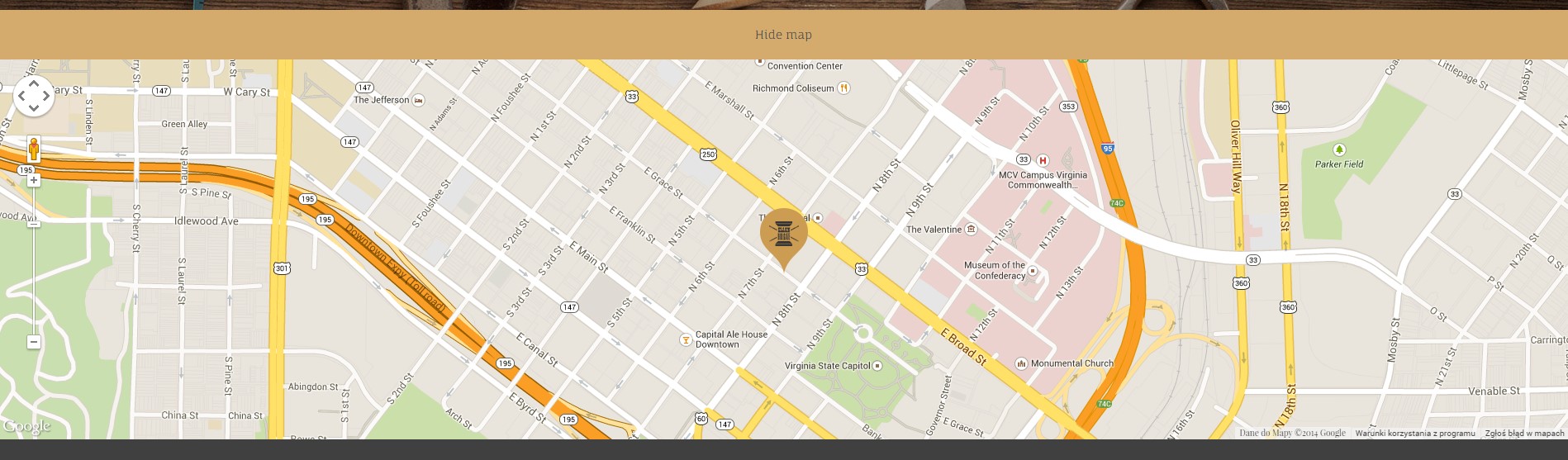
Google Map
It uses gmap3 plugin.
Documentation: here
HTML Markup:
|
1 2 3 4 5 6 7 8 |
<div class="hidemap"> <button class="mapToggle"> SHOW THE MAP </button> <div class="googlemapcontainer"> <div class="ct-googleMap" data-location="Richmond" data-height="460" data-offset="0" data-zoom="16" data-icon="../assets/images/tailor/map-marker-tailor.png"></div> </div> </div> |
|
1 2 3 4 5 6 7 8 9 10 11 12 13 14 15 16 17 18 19 20 21 22 23 24 25 26 |
function initmap() { var icongmap = $('.ct-googleMap').attr('data-icon'); if (($(".ct-googleMap").length > 0) && (typeof google === 'object' && typeof google.maps === 'object')) { $('.ct-googleMap').each(function () { var atcenter = ""; var $this = $(this); var location = $this.data("location"); var zoom = $this.data("zoom"); var offset = -30; if (validatedata($this.data("offset"))) { offset = $this.data("offset"); } if (validatedata(location)) { $this.gmap3({ marker: { //latLng: [40.616439, -74.035540], address: location, options: { //visible: false icon: new google.maps.MarkerImage(icongmap) }, callback: function (marker) { atcenter = marker.getPosition(); } |
Was this article helpful ?
Flexslider
Flexslider
Content / Images Slider.
Flexslider
Each parameter can be defined as data attribute :
- data-namespace
- data-selector
- data-animation
- data-easing
- data-direction
- data-reverse
- data-animationloop
- data-smoothheight
- data-startat
- data-slideshow
- data-slideshowspeed
- data-animationspeed
- data-initdelay
- data-randomize
- data-thumbcaptions
- data-pauseonaction
- data-pauseonhover
- data-pauseinvisible
- data-usecss
- data-touch
- data-video
- data-controlnav
- data-directionnav
- data-prevtext
- data-nexttext
- data-keyboard
- data-multiplekeyboard
- data-mousewheel
- data-pauseplay
- data-pausetext
- data-playtext
- data-itemwidth
- data-itemmargin
- data-minitems
- data-maxitems
- data-move
- data-allowoneslide
- data-controlscontainer
- data-manualcontrols
- data-sync
- data-asnavfor
Read the documentation here:
|
1 2 3 |
div class="flexslider" data-animation="slide" data-height="100" data-loop="true" data-smooth="true" data-slideshow="true" data-speed="15000" data-animspeed="550" data-controls="true" data-dircontrols="true" data-controlscontainer=".controls"> (...) </div> |
|
1 2 3 4 5 6 7 8 9 10 11 12 13 14 15 16 17 18 19 20 21 22 23 24 25 26 27 28 29 30 31 32 33 34 35 36 37 38 39 40 41 42 43 44 45 46 47 48 49 50 51 52 53 54 55 56 57 58 59 60 61 62 63 64 65 66 67 68 69 70 71 72 73 74 75 76 77 78 79 80 81 82 83 84 85 86 87 88 89 90 91 92 93 94 95 96 97 98 99 100 101 102 103 104 105 106 107 108 109 110 111 112 113 114 115 116 117 118 119 120 121 122 123 |
/* ==================== */ /* ==== FLEXSLIDER ==== */ if(jQuery().flexslider){ if (jQuery(".flexslider").length > 0) { jQuery(".flexslider").each(function(){ $this=jQuery(this); var ctnamespace = validatedata($this.attr("data-namespace"),"flex-"); var ctselector = validatedata($this.attr("data-selector"),".slides > li"); var ctanimation = validatedata($this.attr("data-animation"),"slide"); var cteasing = validatedata($this.attr("data-easing"),"swing"); var ctdirection = validatedata($this.attr("data-direction"),"horizontal"); var ctreverse = parseBoolean($this.attr("data-reverse"), false); var ctanimationloop = parseBoolean($this.attr("data-animationloop"), false); var ctsmoothheight = parseBoolean($this.attr("data-smoothheight"), false); var ctstartat = parseInt(validatedata($this.attr("data-startat"), 0)); var ctslideshow = parseBoolean($this.attr("data-slideshow"), true); var ctslideshowspeed = parseInt(validatedata($this.attr("data-slideshowspeed"), 7000)); var ctanimationspeed = parseInt(validatedata($this.attr("data-animationspeed"), 600)); var ctinitdelay= parseInt(validatedata($this.attr("data-initdelay"), 0)); var ctrandomize = parseBoolean($this.attr("data-randomize"), false); var ctthumbcaptions = parseBoolean($this.attr("data-thumbcaptions"), false); var ctpauseonaction= parseBoolean($this.attr("data-pauseonaction"), true); var ctpauseonhover = parseBoolean($this.attr("data-pauseonhover"), false); var ctpauseinvisible= parseBoolean($this.attr("data-pauseinvisible"), true); var ctusecss= parseBoolean($this.attr("data-usecss"), true); var cttouch= parseBoolean($this.attr("data-touch"), true); if(device.mobile()){ cttouch = false; } var ctvideo = parseBoolean($this.attr("data-video"), false); var ctcontrolnav= parseBoolean($this.attr("data-controlnav"), true); if(ctcontrolnav == false){ $this.addClass("no-margin"); } var ctdirectionnav= parseBoolean($this.attr("data-directionnav"), false); var ctprevtext = validatedata($this.attr("data-prevtext"),"Previous"); var ctnexttext = validatedata($this.attr("data-nexttext"),"Next"); var ctkeyboard= validatedata(parseBoolean($this.attr("data-keyboard")), true); var ctmultiplekeyboard= parseBoolean($this.attr("data-multiplekeyboard"), false); var ctmousewheel= parseBoolean($this.attr("data-mousewheel"), false); var ctpauseplay= parseBoolean($this.attr("data-pauseplay"), false); var ctpausetext = validatedata($this.attr("data-pausetext"),"Pause"); var ctplaytext = validatedata($this.attr("data-playtext"),"Play"); var ctitemwidth= parseInt(validatedata($this.attr("data-itemwidth"), 0)); var ctitemmargin= parseInt(validatedata($this.attr("data-itemmargin"), 0)); var ctminitems= parseInt(validatedata($this.attr("data-minitems"), 0)); var ctmaxitems= parseInt(validatedata($this.attr("data-maxitems"), 0)); var ctmove= parseInt(validatedata($this.attr("data-move"), 0)); var ctallowoneslide= parseBoolean($this.attr("data-allowoneslide"), false); var ctcontrolscontainer= validatedata($this.attr("data-controlscontainer"), ""); var ctmanualcontrols= validatedata($this.attr("data-manualcontrols"), ""); var ctsync = validatedata($this.attr("data-sync"), ""); var ctasnavfor = validatedata($this.attr("data-asnavfor"), ""); $this.flexslider({ namespace: ctnamespace, //{NEW} String: Prefix string attached to the class of every element generated by the plugin selector: ctselector, //{NEW} Selector: Must match a simple pattern. "{container} > {slide}" -- Ignore pattern at your own peril animation: ctanimation, //String: Select your animation type, "fade" or "slide" easing: cteasing , //{NEW} String: Determines the easing method used in jQuery transitions. jQuery easing plugin is supported! direction: ctdirection, //String: Select the sliding direction, "horizontal" or "vertical" reverse: ctreverse, //{NEW} Boolean: Reverse the animation direction animationLoop: ctanimationloop, //Boolean: Should the animation loop? If false, directionNav will received "disable" classes at either end smoothHeight: ctsmoothheight, //{NEW} Boolean: Allow height of the slider to animate smoothly in horizontal mode startAt: ctstartat, //Integer: The slide that the slider should start on. Array notation (0 = first slide) slideshow: ctslideshow, //Boolean: Animate slider automatically slideshowSpeed: ctslideshowspeed, //Integer: Set the speed of the slideshow cycling, in milliseconds animationSpeed: ctanimationspeed, //Integer: Set the speed of animations, in milliseconds initDelay: ctinitdelay, //{NEW} Integer: Set an initialization delay, in milliseconds randomize: ctrandomize, //Boolean: Randomize slide order thumbCaptions: ctthumbcaptions, //Boolean: Whether or not to put captions on thumbnails when using the "thumbnails" controlNav. // Usability features pauseOnAction: ctpauseonaction, //Boolean: Pause the slideshow when interacting with control elements, highly recommended. pauseOnHover: ctpauseonhover, //Boolean: Pause the slideshow when hovering over slider, then resume when no longer hovering pauseInvisible: ctpauseinvisible, //{NEW} Boolean: Pause the slideshow when tab is invisible, resume when visible. Provides better UX, lower CPU usage. useCSS: ctusecss, //{NEW} Boolean: Slider will use CSS3 transitions if available touch: cttouch, //{NEW} Boolean: Allow touch swipe navigation of the slider on touch-enabled devices video: ctvideo, //{NEW} Boolean: If using video in the slider, will prevent CSS3 3D Transforms to avoid graphical glitches // Primary Controls controlNav: ctcontrolnav, //Boolean: Create navigation for paging control of each clide? Note: Leave true for manualControls usage directionNav: ctdirectionnav, //Boolean: Create navigation for previous/next navigation? (true/false) prevText: ctprevtext, //String: Set the text for the "previous" directionNav item nextText: ctnexttext, //String: Set the text for the "next" directionNav item // Secondary Navigation keyboard: ctkeyboard, //Boolean: Allow slider navigating via keyboard left/right keys multipleKeyboard: ctmultiplekeyboard, //{NEW} Boolean: Allow keyboard navigation to affect multiple sliders. Default behavior cuts out keyboard navigation with more than one slider present. mousewheel: ctmousewheel, //{UPDATED} Boolean: Requires jquery.mousewheel.js (https://github.com/brandonaaron/jquery-mousewheel) - Allows slider navigating via mousewheel pausePlay: ctpauseplay, //Boolean: Create pause/play dynamic element pauseText: ctpausetext, //String: Set the text for the "pause" pausePlay item playText: ctplaytext, //String: Set the text for the "play" pausePlay item // Special properties controlsContainer: ctcontrolscontainer, //{UPDATED} jQuery Object/Selector: Declare which container the navigation elements should be appended too. Default container is the FlexSlider element. Example use would be $(".flexslider-container"). Property is ignored if given element is not found. manualControls: ctmanualcontrols, //{UPDATED} jQuery Object/Selector: Declare custom control navigation. Examples would be $(".flex-control-nav li") or "#tabs-nav li img", etc. The number of elements in your controlNav should match the number of slides/tabs. sync: ctsync, //{NEW} Selector: Mirror the actions performed on this slider with another slider. Use with care. asNavFor: ctasnavfor, //{NEW} Selector: Internal property exposed for turning the slider into a thumbnail navigation for another slider // Carousel Options itemWidth: ctitemwidth, //{NEW} Integer: Box-model width of individual carousel items, including horizontal borders and padding. itemMargin: ctitemmargin, //{NEW} Integer: Margin between carousel items. minItems: ctminitems, //{NEW} Integer: Minimum number of carousel items that should be visible. Items will resize fluidly when below this. maxItems: ctmaxitems, //{NEW} Integer: Maxmimum number of carousel items that should be visible. Items will resize fluidly when above this limit. move: ctmove, //{NEW} Integer: Number of carousel items that should move on animation. If 0, slider will move all visible items. allowOneSlide: ctallowoneslide //{NEW} Boolean: Whether or not to allow a slider comprised of a single slide }) }) } |
Was this article helpful ?
Before & After slider
You can use Before & After slider with magnific popup(Ajax).
HTML markup:
|
1 2 3 4 |
<div class="ct-slider-afterANDbefore center-block"> <img src="../assets/images/tailor/demo-content/sample-before.jpg"> <img src="../assets/images/tailor/demo-content/sample-after.jpg"> </div> |
CSS class:
- .ct-slider-afterANDbefore
Javascripts:
|
1 2 3 |
$(window).load(function(){ $(".ct-slider-afterANDbefore").twentytwenty(); }); |
Options:
- default_offset_pct: 0.7, // How much of the before image is visible when the page loads
- orientation: ‘vertical’ // Orientation of the before and after images (‘horizontal’ or ‘vertical’)
Was this article helpful ?
Responsive tables
In Test we used responsive tables from http://johnpolacek.github.io/stacktable.js/
Responsive Tables
HTML markup:
|
1 2 3 4 5 6 7 8 9 10 11 12 13 14 15 16 17 18 19 20 21 22 23 24 25 26 27 28 29 30 31 32 |
<table class="ct-js-table-stack"> <tr> <th class="ct-u-paddingBoth10 text-center">#</th> <th class="ct-u-paddingBoth10">Service</th> <th class="ct-u-paddingBoth10">Price range</th> <th class="ct-u-paddingBoth10">Description</th> </tr> <tr> <td class="text-center">1</td> <td>Skirts & Dresses</td> <td>from $14.00 to $45.00</td> <td>Shorten or lengthen, waist in or out, rehem, sides in or out, new zipper, add bra cups</td> </tr> <tr> <td class="text-center">2</td> <td>Jackets & Coats</td> <td>from 35.00 to $175.00</td> <td>Shorten or lengthen sleeves, sides in or out, new pockets, new lining</td> </tr> <tr> <td class="text-center">3</td> <td>Pants</td> <td>from $17.50 to $39.00</td> <td>Shorten or lengthen, cuffs,lined,waist/seat/crotch in or out </td> </tr> <tr> <td class="text-center">4</td> <td>Miscellaneous</td> <td>from $4.50 to $50.00</td> <td>Buttons, button holes, sew on patches/stripes on sleeves, new zipper/sliders/snaps</td> </tr> </table> |
CSS classes:
- .ct-js-table-stack
Javascripts:
|
1 2 3 4 5 6 7 |
(function ($) { "use strict"; $(document).ready(function () { $('.ct-js-table-stack').stacktable(); }) }(jQuery)); |
Was this article helpful ?
HTML Structure
This theme is built upon bootstrap framework and is fully responsive. It adapts to window resolution and looks good on all devices including iPad and iPhone.See for yourself (resize your browser).If you would like to read more about bootstrap framework click here: Bootstrap Documentation.
1.1. Grid System and Single row structure
The default Bootstrap grid system utilizes 12 columns. It’s responsive grid and adapts to viewport. Below 767px viewports, the columns become fluid and stack vertically. The fluid grid system uses percents instead of pixels for column widths. Each row always include 12 columns (for example col-md-8 + col-md-4 = col-md-12).
Bootstrap documentation: here
Basic grid HTML:
|
1 2 3 4 5 6 7 8 9 10 11 12 13 14 15 16 17 18 19 20 21 22 23 24 25 26 27 |
<div class="row"> <div class="col-md-1">.col-md-1</div> <div class="col-md-1">.col-md-1</div> <div class="col-md-1">.col-md-1</div> <div class="col-md-1">.col-md-1</div> <div class="col-md-1">.col-md-1</div> <div class="col-md-1">.col-md-1</div> <div class="col-md-1">.col-md-1</div> <div class="col-md-1">.col-md-1</div> <div class="col-md-1">.col-md-1</div> <div class="col-md-1">.col-md-1</div> <div class="col-md-1">.col-md-1</div> <div class="col-md-1">.col-md-1</div> </div> <div class="row"> <div class="col-md-8">.col-md-8</div> <div class="col-md-4">.col-md-4</div> </div> <div class="row"> <div class="col-md-4">.col-md-4</div> <div class="col-md-4">.col-md-4</div> <div class="col-md-4">.col-md-4</div> </div> <div class="row"> <div class="col-md-6">.col-md-6</div> <div class="col-md-6">.col-md-6</div> </div> |
1.2. Page structure
Below you will find default page structure (default.hbs files):
|
1 2 3 4 5 6 7 8 9 10 11 12 13 14 15 16 17 18 19 20 21 22 23 24 25 26 27 28 29 30 31 32 33 34 35 36 37 38 39 40 41 42 43 44 45 46 47 48 49 50 51 52 53 54 55 56 57 58 59 60 61 62 63 64 65 66 67 68 69 70 71 72 73 74 75 76 77 78 79 80 81 82 83 84 85 86 87 88 89 90 91 92 93 94 95 96 97 98 99 |
<!DOCTYPE html> <html> <head> {{! Document Settings }} <meta charset="utf-8" /> <meta http-equiv="X-UA-Compatible" content="IE=edge" /> {{! Page Meta }} <title>Orlando - Blog</title> <meta name="description" content="{{meta_description}}" /> <meta name="HandheldFriendly" content="True" /> <meta name="viewport" content="width=device-width, initial-scale=1.0" /> <link rel="shortcut icon" href="{{asset "/favicon.ico"}}"> {{! Styles'n'Scripts }} <link rel="stylesheet" type="text/css" href="{{asset "css/bootstrap.css"}}" /> <link rel="stylesheet" type="text/css" href="{{asset "css/mb-slider.css"}}"> <link rel="stylesheet" type="text/css" href="{{asset "css/style.css"}}" /> <link rel="stylesheet" type="text/css" href="//fonts.googleapis.com/css?family=Merriweather:300,700,700italic,300italic|Open+Sans:700,400" /> <!-- HTML5 shim and Respond.js IE8 support of HTML5 elements and media queries --> <!--[if lt IE 9]> <script src="{{asset "bootstrap/js/html5shiv.min.js"}}"></script> <script src="{{asset "bootstrap/js/respond.min.js"}}"></script> <![endif]--> <script src="{{asset "js/modernizr.custom.js"}}"></script> <script src="{{asset "js/device.min.js"}}"></script> {{! Ghost outputs important style and meta data with this tag }} {{ghost_head}} </head> <!-------------------TYPES OF MENU------------------> <!--If you want to can change the type of menu here. Just add or remove the class: ct-navbar--fixedTop ct-navbar--fixedBottom ct-navbar-isTransparent-toDefault ct-navbar-isTransparent-toInverse ct-navbar--logoright - user can use logo on the right or on the left side ct-js-navbarMakeSmaller - user may decide if he wants the navbar to be smaller or not on scroll ct-js-enableWayPoints - user may decide if he wants the waypoints sections to appear or not .ct-js-wayPoint added to header ct--darkMotive - dar flavour option <!---------------------------------------------------> <body class="cssAnimate ct-navbar--fixedTop ct-js-navbarMakeSmaller ct-js-enableWayPoints"> {{> responsive-menu}} {{> menu}} {{{body}}} {{ghost_foot}} {{! The main JavaScript file for Corpress }} <script type="text/javascript" src="{{asset "js/jquery.min.js"}}"></script> <script type="text/javascript" src="{{asset "bootstrap/js/bootstrap.min.js"}}"></script> <script type="text/javascript" src="{{asset "js/jquery.placeholder.min.js"}}"></script> <script type="text/javascript" src="{{asset "js/jquery.easing.1.3.js"}}"></script> <script type="text/javascript" src="{{asset "js/jquery.appear.js"}}"></script> <script type="text/javascript" src="{{asset "js/counter/jquery.countTo.js"}}"></script> <script type="text/javascript" src="{{asset "js/counter/init.js"}}"></script> <script type="text/javascript" src="{{asset "js/jquery.browser.min.js"}}"></script> <script type="text/javascript" src="{{asset "js/snap.min.js"}}"></script> <script type="text/javascript" src="{{asset "js/waypoints.min.js"}}"></script> <script type="text/javascript" src="{{asset "js/waypoints-sticky.min.js"}}"></script> <script type="text/javascript" src="{{asset "js/ct-mediaSection/jquery.stellar.min.js"}}"></script> <script type="text/javascript" src="{{asset "js/ct-mediaSection/init.js"}}"></script> <script type="text/javascript" src="{{asset "js/charts/Chart.min.js"}}"></script> <script type="text/javascript" src="{{asset "js/charts/init.js"}}"></script> <!--Flexslider below--> <script type="text/javascript" src="{{asset "js/flexslider/jquery.flexslider-min.js"}}"></script> <script type="text/javascript" src="{{asset "js/flexslider/init.js"}}"></script> <script type="text/javascript" src="{{asset "js/jquery.fitvids.js"}}"></script> <!--This is main files--> <script type="text/javascript" src="{{asset "js/main.js"}}"></script> <!-- Google Maps --> <script src="http://maps.google.com/maps/api/js?sensor=false"></script> <script type="text/javascript" src="{{asset "js/gmaps/gmap3.min.js"}}"></script> <script type="text/javascript" src="{{asset "js/gmaps/init.js"}}"></script> <!--This is for picture--> <script type="text/javascript" src="{{asset "js/magnific-popup/jquery.magnific-popup.min.js"}}"></script> <script type="text/javascript" src="{{asset "js/magnific-popup/init.js"}}"></script> <!-- Contact form validation --> <script type="text/javascript" src="{{asset "form/js/contact-form.js"}}"></script> <!--This is ghost slider--> <script type="text/javascript" src="{{asset "js/mb-ghost-slider.js"}}"></script> <!--Files needed for portfolio--> <script type="text/javascript" src="{{asset "js/portfolio/jquery.isotope.min.js"}}"></script> <script type="text/javascript" src="{{asset "js/portfolio/imagesloaded.js"}}"></script> <script type="text/javascript" src="{{asset "js/portfolio/infinitescroll.min.js"}}"></script> <script type="text/javascript" src="{{asset "js/portfolio/init.js"}}"></script> <script type="text/javascript" src="{{asset "js/uniqueTags.js"}}"></script> <script type="text/javascript" src="{{asset "js/less.min.js"}}"></script> </body> </html> |
The most important pages in ghost are home.hbs and index.hbs. The pages are almost the same. Below you can see how looks like the structure of those pages:
|
1 2 3 4 5 6 7 8 9 10 11 12 13 14 15 16 17 18 19 20 21 22 23 24 25 26 27 28 29 30 31 32 33 34 35 36 37 38 39 40 41 42 43 44 45 46 47 48 49 50 51 |
<!-- This is home.hbs page--> {{!< default}} <!-- If you would like to have a push effect, just change a class to ct-pageWrapper ct-intro--push--> <!-- If you would like to have a slice effect, just change a class to ct-pageWrapper ct-intro--sliced--> <!-- If you would like to have a flexslider effect or particles effect, just change a class to " "--> <div id="ct-js-wrapper" class="ct-pageWrapper ct-intro--push"> <header class="ct-pageHeader ct-pageHeader--motive ct-pageHeader--hasDescription ct-u-paddingBoth10"> <div class="container ct-u-triangleBottomLeft"> <div class="row"> <div class="col-md-8"> <h1 class=" ct-fw-600 ct-u-colorWhite"> Welcome<sup><i class="fa fa-paper-plane"></i></sup> </h1> </div> <div class="col-md-4"> <span class="ct-u-size20 ct-u-colorWhite"> Aliquam erat volutpat. in vitae gravida sem. praesent nec fermentum erat. </span> </div> </div> </div> </header> {{!>simply-slider2}} <!--This is simply slider, tis is the same slider like in page-office.hbs file--> {{!> flexslider-effect}} <!--This is the big slider on the main side of tha page, if you want to enable the effect just remove ! and change the wrapper class to " "--> {{!> slice-effect}} <!--this is slice effect, if you want to enable the effect just remove ! and change the wrapper class to ct-pageWrapper ct-intro--sliced and add this class ct-intro-content below --> {{!> push-effect}} <!--this is push effect, if you want to enable the effect just remove ! and change the wrapper class to ct-pageWrapper ct-intro--push and add this class ct-intro-content below--> {{!>particles-effect}} <!--This is the particles effect, if you want to enable the effect just remove ! and change the wrapper class to " "--> <!--If we use a effect like slice or push, all the content must be in this section--> <!--If you have to use a effect like above , you have add this class ct-intro-content--> {{>blog_infinity}} <!--Here you can eneable infinity blog, This type of blog is different than else, so it must be activate here--> <div class="ct-u-paddingBoth100 ct-u-diagonalBottomRight"> <div class=""> <!--THIS EFECT IS ONLY FOR THE PUSH AND SLICE EFFECT, IF YOU WANT TO USE PARTICLES YOU MUST DELETE THIS CLASS--> <div class="container"> <div class="row"> {{!> blog_default}} <!--if you want to have a default blog on your page--> {{!> blog_secundary}} <!--if you want to have a secundary blog on your page--> {{!> blog_masonry}} <!--if you want to have a blog small on your page--> </div> </div> </div> </div> {{> footer}} </div> |
This is index.hbs page. Here you can set the four types of blog and the effect for second,3,4..n pages of blog.
|
1 2 3 4 5 6 7 8 9 10 11 12 13 14 15 16 17 18 19 |
<!-- This is index.hbs page--> {{!< default}} <div id="ct-js-wrapper" class="ct-pageWrapper"> {{>main-header}} {{>blog_infinity}} <!--Here you can eneable infinity blog, This type of blog is different than else, so it must be activate here--> <div class=""> <!--If you have to use a effect like above , you have add this class ct-intro-content--> <div class="ct-u-paddingBoth100 ct-u-diagonalBottomRight"> <div class="container"> <div class="row"> {{!> blog_default}} <!--if you want to have a default blog on your page--> {{!> blog_secundary}} <!--if you want to have a secundary blog on your page--> {{!> blog_masonry}} <!--if you want to have a blog small on your page--> </div> </div> </div> {{> footer}} </div> </div> |
Author page in ghost is the page has information about the author, locatiom, posts… Below you can see the structure of the page:
|
1 2 3 4 5 6 7 8 9 10 11 12 13 14 15 16 17 18 19 20 21 22 23 24 25 26 27 28 29 30 31 32 33 |
<link rel="stylesheet" type="text/css" href="{{asset "css/author_style.css"}}"/> {{!< default}} <div id="ct-js-wrapper" class="ct-pageWrapper"> {{>main-header}} <div class="ct-u-paddingBoth100 ct-u-diagonalTopLeft ct-u-diagonalBottomRight"> <div class="container"> <div class="row"> <div class="col-sm-10 col-sm-offset-1"> {{#author}} <section class="author-profile2 inner2"> {{#if image}} <figure class="author-image2"> <div class="img" style="background-image: url({{image}})"><span class="hidden">{{name}}'s Picture</span></div> </figure> {{/if}} <h1 class="author-title2">{{name}}</h1> <h2 class="author-bio2">{{bio}}</h2> <div class="author-meta"> {{#if location}}<span class="fa fa-home fa fa-lg"></span> {{location}}{{/if}} {{#if website}}<span class=""><a href="{{website}}">{{website}}</a></span>{{/if}} <span class="author-stats" style="padding-left: 10px;"><i class="fa fa-bar-chart fa fa-lg"></i> {{plural ../pagination.total empty='No posts' singular='% post' plural='% posts'}}</span> </div> </section> {{/author}} {{! This is the post loop - each post will be output using this markup }} </div> {{>loop}} </div> </div> </div> {{> footer}} </div> |
Was this article helpful ?
CSS Files and Structure
If you would like to edit the color, font, or style of any elements, you would do the following:
|
1 |
1#primaryContent a {color: #someColor;} |
If you find that your new style is not overriding, it is most likely because of a specificity problem. Scroll down in your CSS file and make sure that there isn’t a similar style that has more weight.
|
1 |
2. I.E #wrap #primaryContent a {color: #someColor;} |
So, to ensure that your new styles are applied, make sure that they carry enough “weight” and that there isn’t a style lower in the CSS file that is being applied after yours.
2.1. Main Menu structure
If you would like to change your logo, just go to the ghost administrative panel and change it. If you can you are able to change brand name. In orlando ghost we have different types of menu: typical menu for desktops and menu for tablets and phones:
Typical menu for desktop:
|
1 2 3 4 5 6 7 8 9 10 11 12 13 14 15 16 17 18 19 20 21 22 23 24 25 26 27 28 29 30 31 32 33 34 35 36 37 38 39 40 41 42 43 44 45 46 47 48 49 50 51 52 53 54 55 56 57 58 59 60 61 62 63 64 65 |
<!--You can edit your navbar. Change the classs of nav like below: navbar navbar-inverse ct-navbar--logoright navbar ct-navbar--motive ct-navbar--logoright navbar-default navbar-inverse ct-navbar--transparent ct-navbar--motive If you changed the navbar you have to change the logo in ghost administrative panel--> <nav class="navbar navbar-inverse ct-navbar--logoright" role="navigation"> <div class="container"> <!-- Brand and toggle get grouped for better mobile display --> <div class="navbar-header"> <a class="navbar-brand" href="/"> {{#if @blog.logo}} <img src="{{@blog.logo}}" title="companyname" alt="companyname"> {{/if}} </a> </div> <div class="collapse navbar-collapse"> <!--If you want to have a big space between the logo and text, just change the class like below: nav navbar-nav navbar-right ct-navbarNav--secundaryActive nav navbar-nav ct-navbarNav--defaultActive ct-navbar--fadeIn yamm--> <ul class="nav navbar-nav ct-navbarNav--defaultActive ct-navbar--fadeIn yamm"> <li><a href="/">Home</a></li> <li class="dropdown"> <a href="/about-us/">Pages <i class="fa fa-angle-double-down"></i></a> <ul class="dropdown-menu"> <li> <div class="yamm-content"> <div class="row"> <div class="col-sm-6"> <h5 class="text-uppercase ct-fw-600 ct-menu-header">Normal Pages <small>Beautiful Pages</small> </h5> <ul class="list-unstyled"> <li><a href="/about-us/"><i class="fa fa-fw fa-chevron-right"></i> About Us</a></li> <li><a href="/services/"><i class="fa fa-fw fa-chevron-right"></i> Services</a></li> <li><a href="/Contact-us/"><i class="fa fa-fw fa-chevron-right"></i> Contact Us</a></li> <li><a href="/Our-office/"><i class="fa fa-fw fa-chevron-right"></i> Our Office</a></li> </ul> </div> <div class="col-sm-6"> <h5 class="text-uppercase ct-fw-600 ct-menu-header">Special Pages</h5> <ul class="list-unstyled"> <li><a href="/maintenance/"><i class="fa fa-fw fa-cogs"></i> Maintenance</a></li> <li><a href="/blank/"><i class="fa fa-fw fa-file-o"></i> Blank Page</a></li> </ul> </div> </div> </div> </li> </ul> </li> <li><a href="/Contact-us/">Contact</a></li> </ul> </div> </div> </nav> |
Responsive menu for tablets and phones:
|
1 2 3 4 5 6 7 8 9 10 11 12 13 14 15 16 17 18 19 20 21 22 23 24 25 26 27 28 29 30 |
<div class="ct-navbarMobile ct-navbarMobile--inverse"> <a class="navbar-brand" href="/"><img src="{{asset "images/demo-content/logo.png"}}" alt="Orlando Logo"> </a> <button type="button" class="navbar-toggle"> <span class="sr-only">Toggle navigation</span> <span class="icon-bar"></span> <span class="icon-bar"></span> <span class="icon-bar"></span> </button> </div> <div class="ct-menuMobile"> <ul class="ct-menuMobile-navbar"> <li> <a href="/" data-target="dropdown">Home</a> </li> <li class="dropdown"> <a href="/about-us/">Pages <i class="fa fa-angle-double-down"></i></a> <ul class="dropdown-menu"> <li><a href="/about-us/"><i class="fa fa-fw fa-chevron-right"></i> About Us</a></li> <li><a href="/services/"><i class="fa fa-fw fa-chevron-right"></i> Services</a></li> <li><a href="/Contact-us/"><i class="fa fa-fw fa-chevron-right"></i> Contact Us</a></li> <li><a href="/Our-office/"><i class="fa fa-fw fa-chevron-right"></i> Our Office</a></li> <li><a href="/maintenance/"><i class="fa fa-fw fa-cogs"></i> Maintenance</a></li> <li><a href="/blank/"><i class="fa fa-fw fa-file-o"></i> Blank Page</a></li> </ul> </li> <li><a href="/Contact-us/">Contact</a></li> </ul> </div> |
In order to create mega menus read the documentation here: Yamm 3 Documentation
2.2. Blog Options
This sections shows three methods of displaying the posts:
- Blog Default
- Blog Secundary
- Blog Masonry
- Blog Infinity
1. Blog Default:
|
1 2 3 4 5 6 7 8 9 10 11 12 13 14 15 16 17 18 19 20 21 22 23 24 25 26 27 28 29 30 31 32 33 34 35 36 37 38 39 40 41 42 43 44 45 46 47 |
<!--This is default blog--> <div class="col-md-10 col-md-offset-1"> {{#foreach posts}} <article class="ct-articleBox ct-articleBox--default animated" data-fx="fadeInUp"> <div class="ct-articleBox-date"> <div class="ct-articleBox-dateDay"> {{date published_at format="DD"}} </div> <div class="ct-articleBox-dateMonth"> {{date published_at format="MMM"}} </div> </div> <div class="ct-articleBox-media"> {{#if image}} <div class=""> <a href="{{url}}"><img src="{{image}}" alt="{{title}}"></a> </div> {{else}} <div class="mbslider embed-responsive embed-responsive-16by9 text-center"> <a href="{{url}}" title="{{title}}">{{content words="0"}}</a> </div> {{/if}} </div> <div class="ct-articleBox-titleBox"> <h4><a href="{{url}}">{{{title}}}</a></h4> <div class="ct-articleBox-meta"> Posted on {{date published_at format="MMMM DD YYYY"}} </div> </div> <div class="ct-articleBox-description"> <div class="mbslider-source" style="display:none"> {{content}} </div> <p> {{excerpt words="100"}} </p> </div> <a class="text-uppercase ct-fw-600 pull-right ct-articleBox-button" href="{{url}}">Read More <i class="fa fa-long-arrow-right"></i></a> <div class="clearfix"></div> </article> {{/foreach}} {{#if pagination}} {{{pagination}}} {{/if}} </div> |
2. Blog Secondary:
|
1 2 3 4 5 6 7 8 9 10 11 12 13 14 15 16 17 18 19 20 21 22 23 24 25 26 27 28 29 30 31 32 33 34 35 36 37 38 39 40 41 42 43 44 45 46 47 48 49 50 51 52 53 54 55 56 57 58 59 60 61 |
<!--This is secondary blog--> <div class="col-md-10 col-md-offset-1"> {{#foreach posts}} <article class="ct-articleBox ct-articleBox--secundary animated" data-fx="fadeInUp"> <div class="ct-articleBox-date"> <div class="ct-articleBox-dateDay"> {{date published_at format="DD"}} </div> <div class="ct-articleBox-dateMonth"> {{date published_at format="MMM"}} </div> </div> <div class="ct-articleBox-media"> {{#if image}} <div class=""> <a href="{{url}}"><img src="{{image}}" alt="{{title}}"></a> </div> {{else}} <div class="mbslider embed-responsive embed-responsive-16by9 text-center"> <a href="{{url}}" title="{{title}}">{{content words="0"}}</a> </div> {{/if}} </div> <div class="ct-articleBox-titleBox"> <h4><a href="{{url}}">{{{title}}}</a></h4> <div class="ct-articleBox-meta"> Posted on {{date published_at format="MMMM DD YYYY"}} </div> <div class="ct-articleBox-icon"> {{#has tag="picture, image"}} <i class="fa fa-picture-o"></i> {{else}} {{#has tag="video, wideo, film, movie"}} <i class="fa fa-youtube-play"></i> {{else}} {{#has tag="gallery"}} <i class="fa fa-refresh"></i> {{else}} {{#has tag="music"}} <i class="fa fa-music"></i> {{else}} {{#has tag="text"}} <i class="fa fa-font"></i> {{else}} <i class=""></i> {{/has}} {{/has}} {{/has}} {{/has}} {{/has}} </div> </div> <div class="ct-articleBox-description"> <div class="mbslider-source" style="display:none"> {{content}} </div> <p> {{excerpt words="100"}} </p> </div> <a class="text-uppercase ct-fw-600 pull-right ct-articleBox-button" href="{{url}}">Read More <i class="fa fa-long-arrow-right"></i></a> <div class="clearfix"></div> </article> {{/foreach}} {{#if pagination}} {{{pagination}}} {{/if}} </div> |
3. Blog Masonry:
|
1 2 3 4 5 6 7 8 9 10 11 12 13 14 15 16 17 18 19 20 21 22 23 24 25 26 27 28 29 30 31 32 33 34 35 36 37 38 39 40 41 42 43 44 |
<!--This is masonry blog--> <div class="col-md-12"> {{#foreach posts}} <div class="ct-js-blogMasonry"> <div class="col-md-4 ct-js-blogMasonry-item"> <article class="ct-articleBox ct-articleBox--thumbnail"> <div class="ct-articleBox-date"> <div class="ct-articleBox-dateDay"> {{date published_at format="DD"}} </div> <div class="ct-articleBox-dateMonth"> {{date published_at format="MMM"}} </div> </div> <div class="ct-articleBox-media"> {{#if image}} <div class=""> <a href="{{url}}"><img src="{{image}}" alt="{{title}}"></a> </div> {{else}} <div class="mbslider embed-responsive embed-responsive-16by9 text-center"> <a href="{{url}}" title="{{title}}">{{content words="0"}}</a> </div> {{/if}} </div> <div class="ct-articleBox-titleBox"> <h4><a href="{{url}}">{{{title}}}</a></h4> </div> <div class="ct-articleBox-description"> <div class="mbslider-source" style="display:none"> {{content}} </div> <p> {{excerpt words="40"}} </p> </div> </article> </div> </div> {{/foreach}} </div> {{#if pagination}} {{{pagination}}} {{/if}} |
4. Blog Infinity:
|
1 2 3 4 5 6 7 8 9 10 11 12 13 14 15 16 17 18 19 20 21 22 23 24 25 26 27 28 29 30 31 32 33 34 35 36 37 38 39 40 41 42 43 44 45 46 |
<div class="ct-u-backgroundDarkMotive clearfix ct-js-fixOnScroll"> <div class="text-center"> <ul id="my_tags" class="ct-gallery-filters list-unstyled list-inline"> <!--tags generated from js--> </ul> <div class="clearfix"></div> </div> </div> <div id="ct-gallery" class="ct-gallery ct-gallery--col5 ct-js-magnificPortfolioPopupGroup"> {{#foreach posts}} <div class="ct-gallery-item ct-gallery-item--masonry ct-gallery-item--default ct-gallery-item--normal ct-js-galleryTags"> <!--here should be the name of tgat that you would like to display--> <div class="ct-gallery-itemInner"> <a class="ct-js-magnificPortfolioPopup" href="{{url}}"> <div class="ct-gallery-itemImage "> {{#if image}} <a href="{{url}}"><img src="{{image}}" alt="{{title}}"></a> {{else}} <a href="{{url}}"><img src="{{asset "images/demo-content/no_image.gif"}}" alt="no-image" /></a> {{/if}} </div> <div class="ct-gallery-itemDescription"> <span class="ct-gallery-itemDescription-title"><a href="{{url}}">{{{title}}}</a></span> <span class="ct-gallery-itemDescription-category"> {{#if tags}} <i class="fa fa-long-arrow-right"></i> {{tags separator=", "}} {{else}} <i class=""></i> {{/if}} </span> </div> </a> </div> </div> <div class="ct-js-hiddenTags hidden"> {{tags}} </div> {{/foreach}} </div> {{#if pagination}} {{{pagination}}} {{/if}} |
How to make available the blog in home.hbs and index.hbs?
|
1 2 3 4 5 6 7 8 9 10 11 12 13 14 |
{{>blog_infinity}} <!--Here you can eneable infinity blog, This type of blog is different than else, so it must be activate here--> <div class="ct-u-paddingBoth100 ct-u-diagonalBottomRight"> <div class=""> <!--THIS EFECT IS ONLY FOR THE PUSH AND SLICE EFFECT, IF YOU WANT TO USE PARTICLES YOU MUST DELETE THIS CLASS--> <div class="container"> <div class="row"> {{!> blog_default}} <!--if you want to have a default blog on your page--> {{!> blog_secundary}} <!--if you want to have a secundary blog on your page--> {{!> blog_masonry}} <!--if you want to have a blog small on your page--> </div> </div> </div> </div> |
2.4. Icons
We’ve included 360+ font icons. Awesome Icons – http://fontawesome.io/icons/
HTML markup:
|
1 2 |
<!-- Awesome Icons --> <i class="fa fa-cog"></i> |
Appearing with Animation when element in viewport
Animation can be turn off just be remove “withAnimation” class from body.
Usage: – add “animated” class to element and data-fx=”animation-type”. That’s it.
Available animation : http://daneden.github.io/animate.css/
- data-fx=”hinge”
- data-fx=”bounce”
- data-fx=”flash”
- data-fx=”pulse”
- data-fx=”shake”
- data-fx=”swing”
- data-fx=”tada”
- data-fx=”wobble”
- data-fx=”bounceIn”
- data-fx=”bounceInDown”
- data-fx=”bounceInLeft”
- data-fx=”bounceInRight”
- data-fx=”bounceInUp”
- data-fx=”bounceOut”
- data-fx=”bounceOutDown”
- data-fx=”bounceOutLeft”
- data-fx=”bounceOutRight”
- data-fx=”bounceOutUp”
- data-fx=”fadeIn”
- data-fx=”fadeInDown”
- data-fx=”fadeInDownBig”
- data-fx=”fadeInLeft”
- data-fx=”fadeInLeftBig”
- data-fx=”fadeInRight”
- data-fx=”fadeInRightBig”
- data-fx=”fadeInUp”
- data-fx=”fadeInUpBig”
- data-fx=”fadeOut”
- data-fx=”fadeOutDown”
- data-fx=”fadeOutDownBig”
- data-fx=”fadeOutLeft”
- data-fx=”fadeOutLeftBig”
- data-fx=”fadeOutRight”
- data-fx=”fadeOutRightBig”
- data-fx=”fadeOutUp”
- data-fx=”fadeOutUpBig”
- data-fx=”flip”
- data-fx=”flipInX”
- data-fx=”flipInY”
- data-fx=”flipOutX”
- data-fx=”flipOutY”
- data-fx=”lightSpeedIn”
- data-fx=”lightSpeedOut”
- data-fx=”rotateIn”
- data-fx=”rotateInDownLeft”
- data-fx=”rotateInDownRight”
- data-fx=”rotateInUpLeft”
- data-fx=”rotateInUpRight”
- data-fx=”rotateOut”
- data-fx=”rotateOutDownLeft”
- data-fx=”rotateOutDownRight”
- data-fx=”rotateOutUpLeft”
- data-fx=”rotateOutUpRight”
- data-fx=”slideInDown”
- data-fx=”slideInLeft”
- data-fx=”slideInRight”
- data-fx=”slideOutLeft”
- data-fx=”slideOutRight”
- data-fx=”slideOutUp”
- data-fx=”rollIn”
- data-fx=”rollOut”
2.5. CSS Files & Structure
We’ve included 2 files.
bootstrap.css contains Bootstrap 3 Library.
style.css file contains general styles.
|
1 2 3 4 5 6 7 8 9 10 11 12 13 14 15 16 17 18 19 20 21 22 23 24 25 26 27 28 29 30 31 32 33 34 35 36 37 38 39 40 41 42 43 44 45 46 47 48 49 50 51 |
1.A. Google Fonts 1.B. Revolution Slider styles 1.C. Magnific popup styles 1.D. Font Awesome styles 1.E Yamm styles 1.F Flexslider styles 1.G Animate css styles 2. GENERAL STYLES 3. Typography 4. Buttons 5. Pagination 6. Alerts 7. Inputs 8. Pophover 9. Header styles 10. Navbar styles 11. Call to action 12. Sections 13. Media sections – video/parallax/kenburns 14. Process circles 15. Person box 16. Service box 17. Pre footer section 18. Footer 19. Articles 20. Counters 21. Blockquote 22. Tabs 23. Images widget 24. Project single 25. Project images 26. Lists 27. Pricing box 28. Accordion 29. Socials 30. Square icons 31. Charts 32. Progress bar 33. Twitter 34. Google map 35. Flexslider 36. Revslider 37. Time circle counter 38. Thumbnail scroller 39. Magnific popup 40. Isotope 41. Helpers 42. D3 swimmers 43. WordPress 44. Media queries, adjustments 45. Motive colors |
2.6. Utilities
Utility classes are low-level structural and positional traits. Utilities can be applied directly to any element, multiple utilities can be used tohether and utilities can be used alongsie component classes.
Utilities are intended for frequently used CSS properties and patterns, like: floats, containing floats, vertical alignemnt, text tryncation. Relying on utilities can help to reduce repetition and provide consistend implementations.
Orlando uses utilities for the following categories:
- Typography
- Display Types
- Paddings
- Margins
- Colors
- Borders
- Background Colors
- Triangles
- Diagonals
- Shadows
Was this article helpful ?
Features
3.1. Media Sections
Orlando supports media sections with Slice effect, Push effect, Particles effect, slider effect, Parallax, KenBurns effect and videos.
3.1.1. Slice Effect:
|
1 2 3 4 5 6 7 8 9 10 11 12 13 14 |
<!--This is the slice effect--> <header class="ct-intro-topImage"> <div class="bg-img"><img src="{{@blog.cover}}" alt="Background Image"/></div> <div class="ct-intro-title"> <h1 class="ct-u-colorWhite ct-fw-600">welcome. <small class="ct-u-colorMotive ct-fw-300">We have a passion for design and code</small> </h1> </div> <div class="bg-img"><img src="{{@blog.cover}}" alt="Background Image"/></div> </header> <button class="trigger" data-info="Continue"><span>Trigger</span></button> <script type="text/javascript" src="{{asset "js/intro-effects/classie.js"}}"></script> <script type="text/javascript" src="{{asset "js/intro-effects/slice.js"}}"></script> |
3.1.2. Push Effect:
|
1 2 3 4 5 6 7 8 9 10 11 12 13 14 15 16 |
<!--This is the push effect--> <header class="ct-intro-topImage"> <div class="bg-img"><img src="{{@blog.cover}}" alt="Background Image"/></div> <div class="ct-intro-title"> <h3 class="ct-u-colorMotive ct-fw-600 ct-u-hrMid"> <small class="text-uppercase ct-u-colorWhite">We create unique and inovative</small> <span class="ct-fw-300">User</span> Xperiences </h3> <p class="ct-u-colorWhite">Lorem ipsum dolor sit amet, consectetur adipiscing elit dont<br>emet suspendisse, condimentum porttitor cursus duis neclim.</p> </div> </header> <button class="trigger" data-info="Continue"><span>Trigger</span></button> <script type="text/javascript" src="{{asset "js/intro-effects/classie.js"}}"></script> <script type="text/javascript" src="{{asset "js/intro-effects/push.js"}}"></script> |
3.1.3. Particles Effect:
|
1 2 3 4 5 6 7 8 9 10 11 12 13 14 15 16 17 18 19 20 21 22 23 24 25 26 27 28 29 30 |
<!--this is particle effect--> <section class="ct-mediaSection ct-u-borderMotiveBottom" data-height="100%"> <div class="ct-mediaSection-inner"> <div id="particles-js"></div> <div class="ct-u-displayTableVertical"> <div class="ct-u-displayTableCell"> <div class="container text-center" data-stellar-ratio="0.5"> <h3 class="ct-u-colorMotive ct-fw-600 ct-u-hrMid"> <small class="text-uppercase ct-u-colorWhite">We create unique and inovative</small> <span class="ct-fw-300">User</span> Xperiences </h3> <p class="ct-u-colorWhite">Lorem ipsum dolor sit amet, consectetur adipiscing elit dont<br>emet suspendisse, condimentum porttitor cursus duis neclim.</p> </div> </div> </div> </div> <a class="ct-sectionButton ct-js-btnScroll" href="#section1"><span class="ct-sectionButton-circle animated pulse activate infinite"><i class="fa fa-angle-down animated activate bounce infinite"></i></span>Continue</a> </section> <div id="section1"></div> <script type="text/javascript" src="{{asset "js/jquery.min.js"}}"></script> <script type="text/javascript" src="{{asset "js/ct-mediaSection/jquery.stellar.min.js"}}"></script> <script type="text/javascript" src="{{asset "js/ct-mediaSection/init.js"}}"></script> <script type="text/javascript" src="{{asset "js/particles/particles.js"}}"></script> <script type="text/javascript" src="{{asset "js/particles/init.js"}}"></script> |
3.1.4. Flexslider:
|
1 2 3 4 5 6 7 8 9 10 11 12 13 14 15 16 17 18 19 20 21 22 23 24 25 26 27 28 29 30 31 32 33 34 35 36 37 38 39 40 41 42 43 44 45 46 47 48 49 50 51 52 53 54 55 56 57 58 59 60 61 62 63 64 65 66 67 68 69 70 71 72 73 74 75 76 77 78 79 80 81 82 83 84 85 86 87 88 89 90 91 92 93 94 95 96 97 98 99 100 101 102 103 104 105 106 107 108 |
<!--this is flexslider effect--> <section class="ct-mediaSection ct-u-borderMotiveBottom" data-height="100%"> <div class="flexslider ct-flexslider--controlsVertical ct-flexslider--controlsWhite ct-js-flexslider" data-animations="true" data-height="100%"> <ul class="slides"> <li data-bg="{{asset "images/demo-content/bigImage4.jpg"}}"> <div class="inner ct-u-paddingBoth100"> <div class="container"> <div class="row"> <div class="col-sm-6 col-md-5"> <span class="h2 ct-fw-300 ct-u-colorMotive animated" data-fx="zoomIn">01</span> <h3 class="ct-u-colorWhite ct-u-hrLeft animated" data-fx="fadeInUp"> <small class="text-uppercase ct-u-colorWhite">We create unique and inovative</small> <span class="ct-fw-300">User</span> Experiences </h3> <p class="ct-u-colorWhite animated" data-fx="zoomInDown">Lorem ipsum dolor sit amet, consectetur adipiscing elit dont emet suspendisse, condimentum porttitor cursus duis neclim.</p> <a href="../demo/buy.php" class="btn ct-btn--rounded btn-primary text-uppercase animated" data-fx="fadeInUp" data-time="800">Buy Orlando Ghost</a> <a href="/about-us/" class="btn ct-btn--rounded btn-default text-uppercase animated" data-fx="fadeInUp" data-time="1250">About us</a> </div> </div> </div> </div> </li> <li data-bg="{{asset "images/demo-content/orlando-slider-image-2.jpg"}}"> <div class="inner ct-u-paddingBoth100"> <div class="container"> <div class="row"> <div class="col-sm-6 col-md-5"> <span class="h2 ct-fw-300 ct-u-colorMotive animated" data-fx="zoomIn">02</span> <h3 class="ct-u-colorWhite ct-u-hrLeft animated" data-fx="fadeInUp"> <small class="text-uppercase ct-u-colorWhite">We create unique and inovative</small> <span class="ct-fw-300">User</span> Experiences </h3> <p class="ct-u-colorWhite animated" data-fx="zoomInDown">Lorem ipsum dolor sit amet, consectetur adipiscing elit dont emet suspendisse, condimentum porttitor cursus duis neclim.</p> <a href="../demo/buy.php" class="btn ct-btn--rounded btn-primary text-uppercase animated" data-fx="fadeInUp" data-time="800">Buy Orlando Ghost</a> <a href="/about-us/" class="btn ct-btn--rounded btn-default text-uppercase animated" data-fx="fadeInUp" data-time="1250">About us</a> </div> </div> </div> </div> </li> <li data-bg="{{asset "images/demo-content/orlando-slider-image-3.jpg"}}"> <div class="inner ct-u-paddingBoth100"> <div class="container"> <div class="row"> <div class="col-sm-6 col-md-5"> <span class="h2 ct-fw-300 ct-u-colorMotive animated" data-fx="zoomIn">03</span> <h3 class="ct-u-colorWhite ct-u-hrLeft animated" data-fx="fadeInUp"> <small class="text-uppercase ct-u-colorWhite">We create unique and inovative</small> <span class="ct-fw-300">User</span> Experiences </h3> <p class="ct-u-colorWhite animated" data-fx="zoomInDown">Lorem ipsum dolor sit amet, consectetur adipiscing elit dont emet suspendisse, condimentum porttitor cursus duis neclim.</p> <a href="../demo/buy.php" class="btn ct-btn--rounded btn-primary text-uppercase animated" data-fx="fadeInUp" data-time="800">Buy Orlando Ghost</a> <a href="/about-us/" class="btn ct-btn--rounded btn-default text-uppercase animated" data-fx="fadeInUp" data-time="1250">About us</a> </div> </div> </div> </div> </li> <li data-bg="{{asset "images/demo-content/orlando-slider-image-4.jpg"}}"> <div class="inner ct-u-paddingBoth100"> <div class="container"> <div class="row"> <div class="col-sm-6 col-md-5"> <span class="h2 ct-fw-300 ct-u-colorMotive animated" data-fx="zoomIn">04</span> <h3 class="ct-u-colorWhite ct-u-hrLeft animated" data-fx="fadeInUp"> <small class="text-uppercase ct-u-colorWhite">We create unique and inovative</small> <span class="ct-fw-300">User</span> Experiences </h3> <p class="ct-u-colorWhite animated" data-fx="zoomInDown">Lorem ipsum dolor sit amet, consectetur adipiscing elit dont emet suspendisse, condimentum porttitor cursus duis neclim.</p> <a href="/services/" class="btn ct-btn--rounded btn-primary text-uppercase animated" data-fx="fadeInUp" data-time="800">Services</a> <a href="/about-us/" class="btn ct-btn--rounded btn-default text-uppercase animated" data-fx="fadeInUp" data-time="1250">About us</a> </div> </div> </div> </div> </li> </ul> </div> <a class="ct-sectionButton ct-js-btnScroll" href="#section1"><span class="ct-sectionButton-circle animated pulse activate infinite"><i class="fa fa-angle-down animated activate bounce infinite"></i></span>Continue</a> </section> <div id="section1"></div> |
3.1.5. Parallax Section:
|
1 2 3 4 5 6 7 8 9 10 11 12 13 14 15 16 17 18 19 20 21 22 |
<header class="ct-mediaSection" data-stellar-background-ratio="0.3" data-height="400" data-type="parallax" data-bg-image="{{asset "images/demo-content/bigImage3.jpg"}}" data-bg-image-mobile="{{asset "images/demo-content/bigImage3-mobile.jpg"}}"> <div class="ct-mediaSection-inner"> <header class="ct-pageHeader ct-pageHeader--type5 ct-pageHeader--hasDescription ct-u-paddingTop150" data-stellar-ratio="0.5"> <div class="container"> <div class="row"> <div class="col-md-8"> <h1 class="ct-fw-600 text-uppercase"> Blog </h1> </div> <div class="col-md-4"> <span> Aliquam erat volutpat. in vitae gravida sem. praesent nec fermentum erat. </span> </div> </div> </div> </header> </div> </header> |
http://markdalgleish.com/projects/stellar.js/docs/
Our custom data-attributes for the parallax section are:
- data-height: Define the minimun height for the sections
- data-type: Type of Media Section (parallax/kenburns/video)
- data-image: Background image for the section.
- data-image-mobile: Fallback image (Should be smaller than the original) that is loaded for small devices. This will help you with the bandwidth, you’re welcome! 🙂
3.1.6. Ken Burns Section:
|
1 2 3 4 5 6 7 8 9 10 11 12 13 14 15 16 17 18 19 20 21 22 23 24 25 26 |
<section class="ct-mediaSection" data-height="400" data-type="kenburns" data-bg-image-mobile="{{asset "images/demo-content/bigImage4-mobile.jpg"}}"> <div class="ct-mediaSection-kenburnsImageContainer"> <img src="{{asset "images/demo-content/bigImage4.jpg"}}" alt="demo image"> <img src="{{asset "images/demo-content/bigImage5.jpg"}}" alt="demo image"> <img src="{{asset "images/demo-content/bigImage4.jpg"}}" alt="demo image"> </div> <div class="ct-mediaSection-inner"> <header class="ct-pageHeader ct-pageHeader--type5 ct-pageHeader--hasDescription ct-u-paddingTop150" data-stellar-ratio="0.5"> <div class="container"> <div class="row"> <div class="col-md-8"> <h1 class="ct-fw-600 text-uppercase"> Blog </h1> </div> <div class="col-md-4"> <span> Aliquam erat volutpat. in vitae gravida sem. praesent nec fermentum erat. </span> </div> </div> </div> </header> </div> </section> |
Our custom data-attributes for the kenburns section are:
- data-height: Define the minimun height for the sections
- data-type: Type of Media Section (parallax/kenburns/video)
- data-image-mobile: Fallback image (Should be smaller than the original) that is loaded for small devices. Kenburns it too much for ipads, iphones and so on, so we allow you to fallback to a normal image section. This way your browser won’t crash 🙂
3.1.7. Video Section:
|
1 2 3 4 5 6 7 8 9 10 11 12 13 14 15 16 17 18 19 20 21 22 23 24 25 26 27 28 29 30 |
<header class="ct-mediaSection" data-height="400" data-type="video" data-bg-image-mobile="../assets/images/demo-content/bigImage3-mobile.jpg"> <div class="ct-mediaSection-video embed-responsive embed-responsive-16by9"> <video id="video1" muted loop autoplay="autoplay" preload="auto"> <source src='http://orlando.html.themeforest.createit.pl/light/assets/videos/loopbookeh.mp4' type='video/mp4'/> <source src='http://orlando.html.themeforest.createit.pl/light/assets/videos/loopbookeh.webm' type='video/webm'/> </video> </div> <div class="ct-u-displayTable"> <div class="ct-mediaSection-inner"> <header class="ct-pageHeader ct-pageHeader--type5 ct-pageHeader--hasDescription ct-u-paddingTop150" data-stellar-ratio="0.5"> <div class="container"> <div class="row"> <div class="col-md-8"> <h1 class="ct-fw-600 text-uppercase"> Blog </h1> </div> <div class="col-md-4"> <span> Aliquam erat volutpat. in vitae gravida sem. praesent nec fermentum erat. </span> </div> </div> </div> </header> </div> </div> </header> |
Our custom data-attributes for the video section are:
- data-height: Define the minimun height for the sections
- data-type: Type of Media Section (parallax/kenburns/video)
- data-image-mobile: Fallback image (Should be smaller than the original) that is loaded for small devices. Phones don’t autoplay video, so we just replace it for an image
3.1.3. How to make available the effect (fragment of Home.hbs file)
|
1 2 3 4 5 6 7 8 |
{{!>simply-slider2}} <!--This is simply slider, tis is the same slider like in page-office.hbs file--> {{!> flexslider-effect}} <!--This is the big slider on the main side of tha page, if you want to enable the effect just remove ! and change the wrapper class to " "--> {{!> slice-effect}} <!--this is slice effect, if you want to enable the effect just remove ! and change the wrapper class to ct-pageWrapper ct-intro--sliced and add this class ct-intro-content below --> {{!> push-effect}} <!--this is push effect, if you want to enable the effect just remove ! and change the wrapper class to ct-pageWrapper ct-intro--push and add this class ct-intro-content below--> {{!>particles-effect}} <!--This is the particles effect, if you want to enable the effect just remove ! and change the wrapper class to " "--> <!--If we use a effect like slice or push, all the content must be in this section--> <!--If you have to use a effect like above , you have add this class ct-intro-content--> |
Was this article helpful ?
Javascript
4.1. Javascrpt library and files
All javascripts are placed in folder /js. In main.js file we implement all functions calls.
This theme uses following Javascript files:
- Bootstrap v 3 framework (powerful front-end framework for faster and easier web development)
- jQuery v1.10.2 (A fast javascript library that Foodtruckifies how to traverse HTML documents, handle events, perform animations.)
- jQuery FlexSlider v2.2.0
- GMAP3 Plugin for JQuery v. 5.1.1
- jQuery.appear
- FitVids 1.0.3
- jQuery Stellar
- jQuery tweet
- Modernizr 2.0.6
- PageScroller
- final-countdown.js
- snap.js
- device.js 0.1.58
- chart.js
4.2. Google Map (GMAP3 Plugin)
This is google map with custom marker, you can define couple parameters:
- data-location – address to show
- data-height – map height (if undefined height will be 220px)
- data-offset – by how many map should be repositioned from marker center point (default -30)
It uses gmap3 plugin. Documentation: here
HTML Markup:
|
1 |
<div class="ct-googleMap" data-location="Narbutta 24, Warsaw" data-zoom="15" data-height="500"></div> |
All javascript code can be found in js/main.js file.
Content / Images Slider.
Each parameter can be defined as data attribute :
- data-namespace
- data-selector
- data-animation
- data-easing
- data-direction
- data-reverse
- data-animationloop
- data-smoothheight
- data-startat
- data-slideshow
- data-slideshowspeed
- data-animationspeed
- data-initdelay
- data-randomize
- data-thumbcaptions
- data-pauseonaction
- data-pauseonhover
- data-pauseinvisible
- data-usecss
- data-touch
- data-video
- data-controlnav
- data-directionnav
- data-prevtext
- data-nexttext
- data-keyboard
- data-multiplekeyboard
- data-mousewheel
- data-pauseplay
- data-pausetext
- data-playtext
- data-itemwidth
- data-itemmargin
- data-minitems
- data-maxitems
- data-move
- data-allowoneslide
- data-controlscontainer
- data-manualcontrols
- data-sync
- data-asnavfor
Read the documentation here: Flexslider Documentation
|
1 2 3 |
<div class="flexslider" data-animation="slide" data-height="100" data-loop="true" data-smooth="true" data-slideshow="true" data-speed="15000" data-animspeed="550" data-controls="true" data-dircontrols="true" data-controlscontainer=".controls"> (...) </div> |
And js initialization (js/main.js file), there you can change slider parameters:
|
1 2 3 4 5 6 7 8 9 10 11 12 13 14 15 16 17 18 19 20 21 22 23 24 25 26 27 28 29 30 31 32 33 34 35 36 37 38 39 40 41 42 43 44 45 46 47 48 49 50 51 52 53 54 55 56 57 58 59 60 61 62 63 64 65 66 67 68 69 70 71 72 73 74 75 76 77 78 79 80 81 82 83 84 85 86 87 88 89 90 91 92 93 94 95 96 97 98 99 100 101 102 103 104 105 106 107 108 109 110 111 112 113 114 115 116 117 118 119 120 121 122 123 |
* ==================== */ /* ==== FLEXSLIDER ==== */ if(jQuery().flexslider){ if (jQuery(".flexslider").length > 0) { jQuery(".flexslider").each(function(){ $this=jQuery(this); var ctnamespace = validatedata($this.attr("data-namespace"),"flex-"); var ctselector = validatedata($this.attr("data-selector"),".slides > li"); var ctanimation = validatedata($this.attr("data-animation"),"slide"); var cteasing = validatedata($this.attr("data-easing"),"swing"); var ctdirection = validatedata($this.attr("data-direction"),"horizontal"); var ctreverse = parseBoolean($this.attr("data-reverse"), false); var ctanimationloop = parseBoolean($this.attr("data-animationloop"), false); var ctsmoothheight = parseBoolean($this.attr("data-smoothheight"), false); var ctstartat = parseInt(validatedata($this.attr("data-startat"), 0)); var ctslideshow = parseBoolean($this.attr("data-slideshow"), true); var ctslideshowspeed = parseInt(validatedata($this.attr("data-slideshowspeed"), 7000)); var ctanimationspeed = parseInt(validatedata($this.attr("data-animationspeed"), 600)); var ctinitdelay= parseInt(validatedata($this.attr("data-initdelay"), 0)); var ctrandomize = parseBoolean($this.attr("data-randomize"), false); var ctthumbcaptions = parseBoolean($this.attr("data-thumbcaptions"), false); var ctpauseonaction= parseBoolean($this.attr("data-pauseonaction"), true); var ctpauseonhover = parseBoolean($this.attr("data-pauseonhover"), false); var ctpauseinvisible= parseBoolean($this.attr("data-pauseinvisible"), true); var ctusecss= parseBoolean($this.attr("data-usecss"), true); var cttouch= parseBoolean($this.attr("data-touch"), true); if(device.mobile()){ cttouch = false; } var ctvideo = parseBoolean($this.attr("data-video"), false); var ctcontrolnav= parseBoolean($this.attr("data-controlnav"), true); if(ctcontrolnav == false){ $this.addClass("no-margin"); } var ctdirectionnav= parseBoolean($this.attr("data-directionnav"), false); var ctprevtext = validatedata($this.attr("data-prevtext"),"Previous"); var ctnexttext = validatedata($this.attr("data-nexttext"),"Next"); var ctkeyboard= validatedata(parseBoolean($this.attr("data-keyboard")), true); var ctmultiplekeyboard= parseBoolean($this.attr("data-multiplekeyboard"), false); var ctmousewheel= parseBoolean($this.attr("data-mousewheel"), false); var ctpauseplay= parseBoolean($this.attr("data-pauseplay"), false); var ctpausetext = validatedata($this.attr("data-pausetext"),"Pause"); var ctplaytext = validatedata($this.attr("data-playtext"),"Play"); var ctitemwidth= parseInt(validatedata($this.attr("data-itemwidth"), 0)); var ctitemmargin= parseInt(validatedata($this.attr("data-itemmargin"), 0)); var ctminitems= parseInt(validatedata($this.attr("data-minitems"), 0)); var ctmaxitems= parseInt(validatedata($this.attr("data-maxitems"), 0)); var ctmove= parseInt(validatedata($this.attr("data-move"), 0)); var ctallowoneslide= parseBoolean($this.attr("data-allowoneslide"), false); var ctcontrolscontainer= validatedata($this.attr("data-controlscontainer"), ""); var ctmanualcontrols= validatedata($this.attr("data-manualcontrols"), ""); var ctsync = validatedata($this.attr("data-sync"), ""); var ctasnavfor = validatedata($this.attr("data-asnavfor"), ""); $this.flexslider({ namespace: ctnamespace, //{NEW} String: Prefix string attached to the class of every element generated by the plugin selector: ctselector, //{NEW} Selector: Must match a simple pattern. "{container} > {slide}" -- Ignore pattern at your own peril animation: ctanimation, //String: Select your animation type, "fade" or "slide" easing: cteasing , //{NEW} String: Determines the easing method used in jQuery transitions. jQuery easing plugin is supported! direction: ctdirection, //String: Select the sliding direction, "horizontal" or "vertical" reverse: ctreverse, //{NEW} Boolean: Reverse the animation direction animationLoop: ctanimationloop, //Boolean: Should the animation loop? If false, directionNav will received "disable" classes at either end smoothHeight: ctsmoothheight, //{NEW} Boolean: Allow height of the slider to animate smoothly in horizontal mode startAt: ctstartat, //Integer: The slide that the slider should start on. Array notation (0 = first slide) slideshow: ctslideshow, //Boolean: Animate slider automatically slideshowSpeed: ctslideshowspeed, //Integer: Set the speed of the slideshow cycling, in milliseconds animationSpeed: ctanimationspeed, //Integer: Set the speed of animations, in milliseconds initDelay: ctinitdelay, //{NEW} Integer: Set an initialization delay, in milliseconds randomize: ctrandomize, //Boolean: Randomize slide order thumbCaptions: ctthumbcaptions, //Boolean: Whether or not to put captions on thumbnails when using the "thumbnails" controlNav. // Usability features pauseOnAction: ctpauseonaction, //Boolean: Pause the slideshow when interacting with control elements, highly recommended. pauseOnHover: ctpauseonhover, //Boolean: Pause the slideshow when hovering over slider, then resume when no longer hovering pauseInvisible: ctpauseinvisible, //{NEW} Boolean: Pause the slideshow when tab is invisible, resume when visible. Provides better UX, lower CPU usage. useCSS: ctusecss, //{NEW} Boolean: Slider will use CSS3 transitions if available touch: cttouch, //{NEW} Boolean: Allow touch swipe navigation of the slider on touch-enabled devices video: ctvideo, //{NEW} Boolean: If using video in the slider, will prevent CSS3 3D Transforms to avoid graphical glitches // Primary Controls controlNav: ctcontrolnav, //Boolean: Create navigation for paging control of each clide? Note: Leave true for manualControls usage directionNav: ctdirectionnav, //Boolean: Create navigation for previous/next navigation? (true/false) prevText: ctprevtext, //String: Set the text for the "previous" directionNav item nextText: ctnexttext, //String: Set the text for the "next" directionNav item // Secondary Navigation keyboard: ctkeyboard, //Boolean: Allow slider navigating via keyboard left/right keys multipleKeyboard: ctmultiplekeyboard, //{NEW} Boolean: Allow keyboard navigation to affect multiple sliders. Default behavior cuts out keyboard navigation with more than one slider present. mousewheel: ctmousewheel, //{UPDATED} Boolean: Requires jquery.mousewheel.js (https://github.com/brandonaaron/jquery-mousewheel) - Allows slider navigating via mousewheel pausePlay: ctpauseplay, //Boolean: Create pause/play dynamic element pauseText: ctpausetext, //String: Set the text for the "pause" pausePlay item playText: ctplaytext, //String: Set the text for the "play" pausePlay item // Special properties controlsContainer: ctcontrolscontainer, //{UPDATED} jQuery Object/Selector: Declare which container the navigation elements should be appended too. Default container is the FlexSlider element. Example use would be $(".flexslider-container"). Property is ignored if given element is not found. manualControls: ctmanualcontrols, //{UPDATED} jQuery Object/Selector: Declare custom control navigation. Examples would be $(".flex-control-nav li") or "#tabs-nav li img", etc. The number of elements in your controlNav should match the number of slides/tabs. sync: ctsync, //{NEW} Selector: Mirror the actions performed on this slider with another slider. Use with care. asNavFor: ctasnavfor, //{NEW} Selector: Internal property exposed for turning the slider into a thumbnail navigation for another slider // Carousel Options itemWidth: ctitemwidth, //{NEW} Integer: Box-model width of individual carousel items, including horizontal borders and padding. itemMargin: ctitemmargin, //{NEW} Integer: Margin between carousel items. minItems: ctminitems, //{NEW} Integer: Minimum number of carousel items that should be visible. Items will resize fluidly when below this. maxItems: ctmaxitems, //{NEW} Integer: Maxmimum number of carousel items that should be visible. Items will resize fluidly when above this limit. move: ctmove, //{NEW} Integer: Number of carousel items that should move on animation. If 0, slider will move all visible items. allowOneSlide: ctallowoneslide //{NEW} Boolean: Whether or not to allow a slider comprised of a single slide }) }) } |
4.4. Jquery.appear
This plugin call function when element appear in viewport. This is used in custom animation, progress bars, counter timer.
Documentation: https://github.com/bas2k/jquery.appear/
|
1 2 3 4 5 6 7 8 9 10 11 12 |
if (device.mobile()) { // disable animation on mobile jQuery("body").removeClass("withAnimation"); } else { jQuery('.withAnimation .animated').appear(function () { jQuery(this).each(function () { jQuery(this).addClass('activate'); jQuery(this).addClass($(this).data('fx')); }); }, {accY: -150}); } } |
4.5. fitVids
Just make video responsive. Documentation: http://fitvidsjs.com/
HTML Markup:
|
1 2 3 |
<div class="fit-video"> <iframe width="853" height="480" src="//www.youtube.com/embed/HJ2F7eptn_A?rel=0" frameborder="0" allowfullscreen></iframe> </div> |
and js:
|
1 2 3 4 |
/* ==== FIT VIDEOS TO CONTAINER ==== */ if (($().fitVids)){ $(".fit-video").fitVids(); } |
4.6. Charts
This plugin is used to make graphics. Documentation: http://www.chartjs.org/
Was this article helpful ?
Contact Form
Template comes with ready to use:
- Contact Form
- Newsletter Form
All needed files are in /form directory.
Remember to includeon page.
To configure form just edit form/form.php and change e-mails to your own:
|
1 2 |
$to = "mail@example.com"; $from = "mail@example.com |
|
1 2 3 4 5 6 7 8 9 10 11 12 13 14 15 16 17 18 19 20 21 22 23 24 25 26 27 28 29 30 31 32 33 34 35 36 37 38 39 40 41 42 43 |
<div class="ct-contactForm"> <div class="successMessage alert alert-success" style="display: none"> <button type="button" class="close" data-dismiss="alert" aria-hidden="true">×</button> Thank You! </div> <div class="errorMessage alert alert-danger" style="display: none"> <button type="button" class="close" data-dismiss="alert" aria-hidden="true">×</button> Ups! An error occured. Please try again later. </div> <form role="form" action="./assets/form/send.php" method="post" class="contactForm validateIt" data-email-subject="Contact Form" data-show-errors="true"> <div class="row"> <div class="col-md-6"> <div class="form-group"> <input id="contact_name" placeholder="Name" required="" type="text" name="field[]" class="form-control"> <label for="contact_name">Name</label> </div> <div class="form-group"> <input id="contact_email" placeholder="Email" required="" type="email" name="field[]" class="form-control"> <label for="contact_email">Email</label> </div> <div class="form-group"> <input id="contact_subject" placeholder="Subject" required="" type="text" name="field[]" class="form-control"> <label for="contact_subject">Subject</label> </div> </div> </div> <div class="row"> <div class="col-xs-12"> <div class="form-group"> <textarea id="contact_message" placeholder="Message" class="form-control" rows="8" name="field[]" required=""></textarea> <label for="contact_message">Message</label> </div> </div> </div> <div class="row"> <div class="col-xs-12"> <button type="submit" class="btn ct-btn--perspective btn-primary btn-lg text-uppercase pull-right"><i class="fa fa-paper-plane"></i> Send Message </button> </div> </div> </form> </div> |
Was this article helpful ?
Sources & Credits
The following sources and files have been used to build up this theme
Twitter Bootstrap – http://twitter.github.com/bootstrap/
jQuery – http://www.jquery.com
Was this article helpful ?
Boxes
Test comes with several types of boxes:
Icon Boxes
-
Icon Left:
Icon box left
HTML markup:
12345<div class="ct-iconBox ct-iconBox--leftIcon"><i class="ct-u-motive ct-u-size50 fa fa-bus"></i><h4 class="text-uppercase ct-fw-600 ct-u-size18">Bus Drivers</h4><p>Lorem ipsum dolor sit amet, coinsectei tur adipiscing elit. Proin lobortis quaiu sit amet turpis imperdiet finibus. </p></div> -
Icon Right:
Icon box right
HTML markup:
12345<div class="ct-iconBox ct-iconBox-motive ct-iconBox--rightIcon"><i class="ct-u-motive ct-u-size50 fa fa-music"></i><h4 class="text-uppercase ct-fw-600 ct-u-size18">Music</h4><p>Lorem ipsum dolor sit amet, coinsectei tur adipiscing elit. Proin lobortis quaiu sit amet turpis imperdiet finibus. </p></div>
Media Boxes
-
Video (with Magnific Popup):

Video Box
HTML markup:
12345<div class="ct-mediaBox"><a href="http://mazwai.com/system/posts/videos/000/000/086/preview_mp4_2/trim_hawaii--under_the_sea.mp4?1407079699" class="ct-js-magnificPopupMedia"><video muted="" class="ct-js-video" src="http://mazwai.com/system/posts/videos/000/000/086/preview_mp4_2/trim_hawaii--under_the_sea.mp4?1407079699"></video></a></div> -
Image (with Magnific Popup):
Image Box
HTML markup:
12345<div class="ct-mediaBox"><a href="assets/images/demo-content/FreshVideoImage02.png" class="ct-js-magnificPopupImage"><img src="assets/images/demo-content/FreshVideoImage02.png"></a></div> -
Text:
HTML markup:
Text Box
1234<div class="ct-mediaBox ct-mediaBox--text"><h3 class="text-uppercase">Media Boxes</h3><a href="http://mazwai.com/system/posts/videos/000/000/086/preview_mp4_2/trim_hawaii--under_the_sea.mp4?1407079699" class="ct-js-magnificPopupMedia"><span>view</span></a></div>
Counter Boxes
Counter Box
HTML markup:
|
1 2 3 4 5 |
<div class="ct-counterBox"> <span class="ct-counterBox-number ct-js-counter" data-ct-to="95" data-ct-speed="50">95</span> <h5 class="ct-counterBox-title text-uppercase ct-fw-700">Happy<br>Customers</h5> <span class="ct-counterBox-icon"><i class="icon-profile-male"></i> </span> </div> |
Count Down Boxes
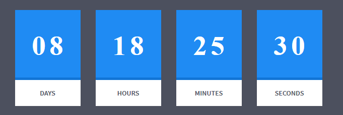
Countdown Box
|
1 2 3 4 5 6 |
<div class="row centered text-center ct-u-paddingBoth30" id="counter"></div> <script src="assets/js/countdown/jquery.mb-comingsoon.min.js"></script> <script type="text/javascript"> $('#counter').mbComingsoon({expiryDate: new Date(2015, 0, 1, 9, 30), speed: 950}); </script> |
Numbered Boxes

Numbered box
|
1 2 3 4 5 6 7 8 9 10 11 |
<div class="ct-numberedBox"> <div class="ct-numberedBox-head"> <div class="ct-line ct-line--1 animated activate bounceInLeft ct-show" data-fx="bounceInLeft ct-show" data-time="0"></div> <div class="ct-line ct-line--2 animated activate bounceInLeft ct-show" data-fx="bounceInLeft ct-show" data-time="250"></div> <div class="ct-line ct-line--3 animated activate bounceInLeft ct-show" data-fx="bounceInLeft ct-show" data-time="500"></div> <h2 class="ct-fw-300 ct-u-positionRelative"><span class="">01</span></h2> </div> <h4 class="ct-fw-400">Offers Only For Members</h4> <p class="ct-u-paddingBottom20">Duis eu venenatis uturipis, uaiteui mu uopre itiium imetiusi. Nuillam iquiiis urt lacus faucimu bustum.</p> <button class="btn btn-motive"><span>Learn More <i class="fa fa-location-arrow"></i></span></button> </div> |
Was this article helpful ?
Headers
Section Header:

Section Header
HTML markup:
|
1 2 3 4 |
<div class="ct-sectionHeader"> <h2>Latest Photos</h2> <h3>Types of Tropical Fish</h3> </div> |
Page Section Header:

Page Section Header
HTML markup:
|
1 2 3 4 5 6 7 |
<div class="ct-pageSectionHeader"> <h3>FISH <span>COLLECTIONS</span></h3> <a href="#"> <h4 class="ct-fw-300 ct-u-motiveLight ct-u-displayInline">See all Species</h4> <div class="ct-ListDiamond"><i class="fa fa-chevron-right"></i></div> </a> </div> |
Section Header:
-
Left
HTML markup: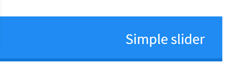
Slide to left section header
123<div class="ct-slideInLeftSection ct-slideInLeftSection-motive ct-slideInLeftSection--featured ct-u-paddingBoth20 animated" data-fx="bounceInLeft"><div class="ct-pageSectionHeader pull"><h4 class="text-right">Simple slider</h4></div></div> -
Right
HTML markup:
Slide to right section header
Was this article helpful ?
CSS Files and Structure
If you would like to edit the color, font, or style of any elements, you would do the following:
|
1 |
#primaryContent a {color: #someColor;} |
If you find that your new style is not overriding, it is most likely because of a specificity problem. Scroll down in your CSS file and make sure that there isn’t a similar style that has more weight.
I.E.
|
1 |
#wrap #primaryContent a {color: #someColor;} |
So, to ensure that your new styles are applied, make sure that they carry enough “weight” and that there isn’t a style lower in the CSS file that is being applied after yours.
Colors
The theme includes a css file wich you can use to edit the colors.
You just need to add the corresponding CSS file to the head of the page like this:
|
1 2 3 4 5 |
<head> (..) <link rel="stylesheet" type="text/css" href="css/motive.css"> (..) </head> |
Main Menu structure
Just change brand name, upload your logo to images/content/ folder and you’re ready to go!
|
1 2 3 4 5 6 7 8 9 10 11 12 13 14 15 16 17 18 19 20 21 22 23 24 25 26 27 28 29 30 31 32 33 |
<nav class="navbar ct-navbar navbar-default yamm ct-navbar--fadeIn" role="navigation"> <div class="container"> <div class="ct-navbarContainer"> <div class="navbar-header"> <a class="navbar-brand" href="index.html"><img id="ct-js-logo" src="assets/images/demo-content/logo.png" alt="FISHtank"></a> <!-- + --> </div> <ul class="nav navbar-nav"> <li role="presentation" class="dropdown"> <a class="dropdown-toggle" href="about.html" role="button" aria-expanded="true"> Home <span class="caret"></span> </a> <ul class="dropdown-menu"> <li> <div class="yamm-content"> </div> </li> </ul> </li> <li><a href="contact.html">Contact Us</a></li> </ul> <ul class="nav navbar-nav yamm ct-navbar--right"> <li><a href="login.html">My Account</a></li> </ul> </div> </div> </nav> |
In order to create mega menus read the documentation here:
Icons
We’ve included 360+ font icons.
Awesome Icons – http://fontawesome.io/icons/
HTML markup:
|
1 2 |
<!-- Awesome Icons --> <i class="fa fa-cog"></i> |
CSS Files & Structure
We’ve included 2 files.
bootstrap.css contains Bootstrap 3 Library.
style.css file contains general styles.
1. Snap.js
2. Top Container with Shadows
3. Flexslider
4. Owl Carousel
5. Section Headers
6. Image Overlay
7. Tabs
8. Products
9. Promo Section
10. Numbered Rows
11. Collections
12. Flip Containers
13. Team Members Boxes
14. Testimonials
15. Logo Slider
16. Lists
17. Tags
18. Popover
19. Footer
20. Icon Boxes
21. Media Boxes
22. Vertical Image Section
23. Slide In Sections
24. Portfolio Gallery Buttons
25. Photo Gallery
26. 404 Text
27. Blog
28. Counter Blocks
29. Graph Boxes
30. Progress Icons
31. Google Maps
32. One Pager
33. Twitter
34. Animations
35. Magnific Popup
Utilities
Utility classes are low-level structural and positional traits. Utilities can be applied directly to any element, multiple utilities can be used tohether and utilities can be used alongsie component classes.
Utilities are intended for frequently used CSS properties and patterns, like: floats, containing floats, vertical alignemnt, text tryncation. Relying on utilities can help to reduce repetition and provide consistend implementations.
- Test uses utilities for the following categories:
- Typography
- Display Types
- Paddings
- Margins
- Line height
- Borders
- Colors
- Transform
- Section elements
Was this article helpful ?
Owl Carousel
Test comes with Owl Carousel component – plugin documentation available here
How to use it
To enable plugin on your page include the following HTML code to your page:
|
1 |
<script src="assets/owl-carousel/owl.carousel.js"></script> |
Set up your HTML
You don’t need any special markup. All you need is to wrap your divs(owl works with any type element) inside the container element
|
1 2 3 4 5 6 7 8 9 10 |
<div id="owl-example" class="owl-carousel"> <div> Your Content </div> <div> Your Content </div> <div> Your Content </div> <div> Your Content </div> <div> Your Content </div> <div> Your Content </div> <div> Your Content </div> ... </div> |
Now call the Owl initializer function and your carousel is ready.
|
1 2 3 4 5 |
$(document).ready(function() { $("#owl-example").owlCarousel(); }); |
Customizing
-
Options
All of the options below are available to customize Owl Carousel
12345678910111213141516171819202122232425262728293031323334353637383940Variable Default Type Descriptionitems 5 int This variable allows you to set the maximum amount of items displayed at a time with the widest browser widthitemsDesktop [1199,4] array This allows you to preset the number of slides visible with a particular browser width. The format is [x,y] whereby x=browser width and y=number of slides displayed. For example [1199,4] means that if(window<=1199){ show 4 slides per page} Alternatively use itemsDesktop: false to override these settings. Check my Custom DemoitemsDesktopSmall [979,3] array As above.itemsTablet [768,2] array As above.itemsTabletSmall false array As above. Default value is disabled.itemsMobile [479,1] array As aboveitemsCustom false array This allow you to add custom variations of items depending from the width If this option is set, itemsDeskop, itemsDesktopSmall, itemsTablet, itemsMobile etc. are disabled For better preview, order the arrays by screen size, but it's not mandatory Don't forget to include the lowest available screen size, otherwise it will take the default one for screens lower than lowest available.Example:[[0, 2], [400, 4], [700, 6], [1000, 8], [1200, 10], [1600, 16]]For more information about structure of the internal arrays see itemsDesktop. Check my Custom DemosingleItem false boolean Display only one item. See demoitemsScaleUp false boolean Option to not stretch items when it is less than the supplied items. See demoslideSpeed 200 int Slide speed in millisecondspaginationSpeed 800 int Pagination speed in millisecondsrewindSpeed 1000 int Rewind speed in millisecondsautoPlay false int/boolean Change to any integrer for example autoPlay : 5000 to play every 5 seconds. If you set autoPlay: true default speed will be 5 seconds.stopOnHover false boolean Stop autoplay on mouse hovernavigation false boolean Display "next" and "prev" buttons.navigationText ["prev","next"] array You can cusomize your own text for navigation. To get empty buttons use navigationText : false. Also HTML can be used hererewindNav true boolean Slide to first item. Use rewindSpeed to change animation speed.scrollPerPage false boolean Scroll per page not per item. This affect next/prev buttons and mouse/touch dragging.pagination true boolean Show pagination.paginationNumbers false boolean Show numbers inside pagination buttonsresponsive true boolean You can use Owl Carousel on desktop-only websites too! Just change that to "false" to disable resposive capabilitiesresponsiveRefreshRate 200 int Check window width changes every 200ms for responsive actionsresponsiveBaseWidth window jQuery selector Owl Carousel check window for browser width changes. You can use any other jQuery element to check width changes for example ".owl-demo". Owl will change only if ".owl-demo" get new width.baseClass "owl-carousel" string Automaticly added class for base CSS styles. Best not to change it if you don't need to.theme "owl-theme" string Default Owl CSS styles for navigation and buttons. Change it to match your own themelazyLoad false boolean Delays loading of images. Images outside of viewport won't be loaded before user scrolls to them. Great for mobile devices to speed up page loadings. IMG need special markup class="lazyOwl" and data-src="your img path". See example.lazyFollow true boolean When pagination used, it skips loading the images from pages that got skipped. It only loads the images that get displayed in viewport. If set to false, all images get loaded when pagination used. It is a sub setting of the lazy load function.lazyEffect "fade" boolean / string Default is fadeIn on 400ms speed. Use false to remove that effect.autoHeight false boolean Add height to owl-wrapper-outer so you can use diffrent heights on slides. Use it only for one item per page setting.jsonPath false string Allows you to load directly from a jSon file. The JSON structure you use needs to match the owl JSON structure used here. To use custom JSON structure see jsonSuccess option.jsonSuccess false function Success callback for $.getJSON build in into carousel. See demo with custom JSON structure here.dragBeforeAnimFinish true boolean Ignore whether a transition is done or not (only dragging).mouseDrag true boolean Turn off/on mouse events.touchDrag true boolean Turn off/on touch events.addClassActive false boolean Add "active" classes on visible items. Works with any numbers of items on screen.transitionStyle false string Add CSS3 transition style. Works only with one item on screen. See Demo -
Callbacks
12345678910Variable Default Type DescriptionbeforeUpdate false function Before responsive update callbackafterUpdate false function After responsive update callbackbeforeInit false function Before initialization callbackafterInit false function After initialization callbackbeforeMove false function Before move callbackafterMove false function After move callbackafterAction false function After startup, move and update callbackstartDragging false function Call this function while dragging.afterLazyLoad false function Call this function after lazyLoad. -
Defaults
Carousel default settings
12345678910111213141516171819202122232425262728293031323334353637383940414243444546474849505152535455565758596061626364656667686970717273747576$("#owl-example").owlCarousel({// Most important owl featuresitems : 5,itemsCustom : false,itemsDesktop : [1199,4],itemsDesktopSmall : [980,3],itemsTablet: [768,2],itemsTabletSmall: false,itemsMobile : [479,1],singleItem : false,itemsScaleUp : false,//Basic SpeedsslideSpeed : 200,paginationSpeed : 800,rewindSpeed : 1000,//AutoplayautoPlay : false,stopOnHover : false,// Navigationnavigation : false,navigationText : ["prev","next"],rewindNav : true,scrollPerPage : false,//Paginationpagination : true,paginationNumbers: false,// Responsiveresponsive: true,responsiveRefreshRate : 200,responsiveBaseWidth: window,// CSS StylesbaseClass : "owl-carousel",theme : "owl-theme",//Lazy loadlazyLoad : false,lazyFollow : true,lazyEffect : "fade",//Auto heightautoHeight : false,//JSONjsonPath : false,jsonSuccess : false,//Mouse EventsdragBeforeAnimFinish : true,mouseDrag : true,touchDrag : true,//TransitionstransitionStyle : false,// OtheraddClassActive : false,//CallbacksbeforeUpdate : false,afterUpdate : false,beforeInit: false,afterInit: false,beforeMove: false,afterMove: false,afterAction: false,startDragging : falseafterLazyLoad : false}) -
Custom Events
Owl Carousel handles a few basic events. Mainly use them for custom navigation.
123456"owl.prev" //Go to previous"owl.next" //Go to next"owl.play" //Autoplay, also this event accept autoPlay speed as second parameter"owl.stop" //Stop"owl.goTo" //goTo provided item"owl.jumpTo" //jumpTo provided item. Without slide animation. -
Owl Data methods
To use Owl Carousel $.data use delegate function.
123456789101112131415161718192021//Initialize Plugin$(".owl-carousel").owlCarousel()//get carousel instance data and store it in variable owlvar owl = $(".owl-carousel").data('owlCarousel');//Public methodsowl.next() // Go to next slideowl.prev() // Go to previous slideowl.goTo(x) // Go to x slideowl.jumpTo(x) // Go to x slide without slide animation//Auto Playowl.play() // Autoplayowl.stop() // Autoplay Stop//Manipulation methods. See demo.owl.addItem(htmlString [,targetPosition])owl.removeItem(targetPosition)owl.destroy()owl.reinit(newOptions)
Was this article helpful ?
Tabs
Full Width Tabs

Full width tabs
|
1 2 3 4 5 6 7 8 9 10 |
<div class="ct-tabHeader ct-tabHeader--motive ct-u-marginBottom30" role="tabpanel"> <ul class="list-unstyled text-uppercase ct-fw-600" role="tablist"> <li role="presentation" class="active"><div class="ct-tabBorder"><a role="tab" data-toggle="tab">Tab #1</a></div><div class="mini-triangle"></div></li> <li role="presentation"><div class="ct-tabBorder"><a role="tab" data-toggle="tab">Tab #2</a></div><div class="mini-triangle"></div></li> <li role="presentation"><div class="ct-tabBorder"><a role="tab" data-toggle="tab">Tab #3</a></div><div class="mini-triangle"></div></li> <li role="presentation"><div class="ct-tabBorder"><a role="tab" data-toggle="tab">Tab #4</a></div><div class="mini-triangle"></div></li> <li role="presentation"><div class="ct-tabBorder"><a role="tab" data-toggle="tab">Tab #5</a></div><div class="mini-triangle"></div></li> <li role="presentation"><div class="ct-tabBorder"><a role="tab" data-toggle="tab">Tab #6</a></div><div class="mini-triangle"></div></li> </ul> </div> |
Full Width Tabs inside Container

Full Width Tabs inside Container
|
1 2 3 4 5 6 7 8 9 10 11 |
<div class="container"> <div class="ct-tabHeader ct-tabHeader--motive ct-u-marginBottom30" role="tabpanel"> <ul class="list-unstyled text-uppercase ct-fw-600" role="tablist"> <li role="presentation"><div class="ct-tabBorder"><a role="tab" data-toggle="tab">Tab #1</a></div><div class="mini-triangle"></div></li> <li role="presentation" class="active"><div class="ct-tabBorder"><a role="tab" data-toggle="tab">Tab #2</a></div><div class="mini-triangle"></div></li> <li role="presentation"><div class="ct-tabBorder"><a role="tab" data-toggle="tab">Tab #3</a></div><div class="mini-triangle"></div></li> <li role="presentation"><div class="ct-tabBorder"><a role="tab" data-toggle="tab">Tab #4</a></div><div class="mini-triangle"></div></li> <li role="presentation"><div class="ct-tabBorder"><a role="tab" data-toggle="tab">Tab #5</a></div><div class="mini-triangle"></div></li> <li role="presentation"><div class="ct-tabBorder"><a role="tab" data-toggle="tab">Tab #6</a></div><div class="mini-triangle"></div></li> </ul> </div> |
Media Tabs

Media tabs

Media tabs on mouse over
|
1 2 3 4 5 6 7 8 |
<div role="tabpanel"> <!-- Nav tabs --> <ul class="nav nav-tabs nav-stacked ct-mediaTabs ct-u-paddingBottom15" role="tablist"> <li role="presentation" class="active"><a href="#care-advice2" role="tab" data-toggle="tab"><img src="assets/images/demo-content/patrickstar-01.jpg" alt="mediaTab"></a></li> <li role="presentation"><a href="#easy-to-use2" role="tab" data-toggle="tab"><img src="assets/images/demo-content/patrickstar-02.jpg" alt="mediaTab"></a></li> <li role="presentation"><a href="#different-choices2" role="tab" data-toggle="tab"><img src="assets/images/demo-content/patrickstar-03.jpg" alt="mediaTab"></a></li> </ul> </div> |
Tabs With Icon
Tabs With Icon
|
1 2 3 4 5 6 7 8 |
<div role="tabpanel"> <!-- Nav tabs --> <ul class="nav nav-tabs nav-stacked ct-tabStacked ct-u-paddingBottom40" role="tablist"> <li role="presentation" class="active"><a href="#care-advice" role="tab" data-toggle="tab"><i class="fa fa-comments"></i><span>Care Advice</span></a></li> <li role="presentation"><a href="#easy-to-use" role="tab" data-toggle="tab"><i class="fa fa-heart"></i><span>Easy to Use</span></a></li> <li role="presentation"><a href="#different-choices" role="tab" data-toggle="tab"><i class="fa fa-align-left"></i><span>Different Choice</span></a></li> </ul> </div> |
Was this article helpful ?
Portfolio
Filters

Portfolio filters
|
1 2 3 4 5 6 7 8 9 10 11 |
<div class="ct-u-backgroundDarkMotive clearfix ct-js-fixOnScroll"> <div class="text-center"> <ul class="ct-gallery-filters list-unstyled list-inline ct-gallery-buttons ct-u-marginBottom50"> <li><a data-filter="*" class="btn btn-motiveDark ct-u-marginTop20 active"><span>All</span></a></li> <li><a data-filter=".aggresive" class="btn btn-motiveDark ct-u-marginTop20"><span>Aggresive</span></a></li> <li><a data-filter=".boiserous" class="btn btn-motiveDark ct-u-marginTop20"><span>Boiserous</span></a></li> <li><a data-filter=".passive" class="btn btn-motiveDark ct-u-marginTop20"><span>Passive</span></a></li> </ul> <div class="clearfix"></div> </div> </div> |
Structure
- 4 Columns:
 HTML markup
Portfolio 4 columns
1234567891011121314151617<div id="ct-gallery" class="ct-gallery ct-gallery--col4 ct-js-magnificPortfolioPopupGroup"><div class="ct-gallery-item ct-gallery-item--masonry ct-gallery-item--default hidden ct-gallery-item--normal passive"><div class="ct-gallery-itemInner"><img class="" src="assets/images/demo-content/portfolio-small-01.jpg" alt=""></div></div><div class="ct-gallery-item ct-gallery-item--masonry ct-gallery-item--default hidden ct-gallery-item--normal passive"><div class="ct-gallery-itemInner"><img class="" src="assets/images/demo-content/portfolio-small-01.jpg" alt=""></div></div>...</div> - 3 Columns:
HTML markupPortfolio 3 Columns
123<div id="ct-gallery" class="ct-gallery ct-gallery--col3 ct-js-magnificPortfolioPopupGroup">...</div> - 2 Columns:
HTML markup
Portfolio 2 Columns
123<div id="ct-gallery" class="ct-gallery ct-gallery--col2 ct-js-magnificPortfolioPopupGroup">...</div> - Single Column:
HTML markup
Portfolio Single Column
…
Was this article helpful ?
Contact Form
Template comes with ready to use:
- Contact Form
- Newsletter Form
All needed files are in /form directory.
Remember to includeon page.
To configure form just edit form/config.php and change e-mails to your own :
|
1 2 |
$to = "mail@example.com"; $from = "mail@example.com"; |
That’s it!
Contact Form
HTML Markup:
|
1 2 3 4 5 6 7 8 9 10 11 12 13 14 15 16 17 18 19 20 21 22 23 24 25 26 27 28 29 30 31 32 33 34 35 36 37 38 39 40 41 42 43 |
<div class="ct-contactForm"> <div class="successMessage alert alert-success" style="display: none"> <button type="button" class="close" data-dismiss="alert" aria-hidden="true">×</button> Thank You! </div> <div class="errorMessage alert alert-danger" style="display: none"> <button type="button" class="close" data-dismiss="alert" aria-hidden="true">×</button> Ups! An error occured. Please try again later. </div> <form role="form" action="./assets/form/send.php" method="post" class="contactForm validateIt" data-email-subject="Contact Form" data-show-errors="true"> <div class="row"> <div class="col-md-6"> <div class="form-group"> <input id="contact_name" placeholder="Name" required="" type="text" name="field[]" class="form-control"> <label for="contact_name">Name</label> </div> <div class="form-group"> <input id="contact_email" placeholder="Email" required="" type="email" name="field[]" class="form-control"> <label for="contact_email">Email</label> </div> <div class="form-group"> <input id="contact_subject" placeholder="Subject" required="" type="text" name="field[]" class="form-control"> <label for="contact_subject">Subject</label> </div> </div> </div> <div class="row"> <div class="col-xs-12"> <div class="form-group"> <textarea id="contact_message" placeholder="Message" class="form-control" rows="8" name="field[]" required=""></textarea> <label for="contact_message">Message</label> </div> </div> </div> <div class="row"> <div class="col-xs-12"> <button type="submit" class="btn ct-btn--perspective btn-primary btn-lg text-uppercase pull-right"><i class="fa fa-paper-plane"></i> Send Message </button> </div> </div> </form> </div> |
Was this article helpful ?
Person Box
Team Member Box
Person Box
|
1 2 3 4 5 6 7 8 9 10 11 12 13 14 15 16 17 |
<div class="ct-teamMember"> <a href="#"> <img src="assets/images/demo-content/team-01.png" alt="Team Member"> <div class="ct-teamMember--bg ct-u-paddingBoth20"> <p class="text-uppercase text-center ct-fw-600">Janet Dolorison</p> <p class="ct-fw-400 text-center">Sales Manager</p> </div> <div class="ct-u-motiveDark"> <p class="text-center ct-u-paddingTop15 ct-u-paddingBottom60">Lorem ipsum dolor sit amet, mei consectetur adipiscing elit. Nuic imperdiet consectetuir.</p> <div class="ct-curlPlus-wrapper"> <div class="ct-curlPlus ct-curlPlus--topleft"></div> <div class="ct-curlPlus ct-curlPlus--bottomright"></div> <span>+</span> </div> </div> </a> </div> |
Was this article helpful ?
Magnific Popup
Static state
Hover state
HTML markup
|
1 2 3 4 5 6 7 8 9 10 11 12 13 |
<a href="assets/images/demo-content/portfolio-large-17.jpg" class="ct-js-magnificPopupImage"> <div class="ct-imageOverlay-container"> <div class="ct-imageButton"></div> <div class="ct-imageOverlay"> <div class="ct-imageOverlay-text"> <h3 class="text-center text-uppercase ct-fw-300">LONG FIN</h3> <h3 class="text-center text-uppercase ct-fw-300"><span class="ct-fw-500">ZEBRA DAN</span></h3> <h3 class="text-center text-uppercase ct-fw-300">FISH</h3> </div> </div> <img class="ct-img100" src="assets/images/demo-content/portfolio-small-17.jpg" alt=""> </div> </a> |
Was this article helpful ?
Javascript
All javascripts are placed in folder /js. In main.js file we implement all functions calls.
This theme uses following Javascript files:
- Bootstrap v 3 framework (powerful front-end framework for faster and easier web development)
- jQuery v1.10.2 (A fast javascript library that Foodtruckifies how to traverse HTML documents, handle events, perform animations.)
- jQuery FlexSlider v2.2.0
- GMAP3 Plugin for JQuery v. 5.1.1
- jQuery.appear
- jQuery Stellar
- jQuery tweet
- Modernizr 2.0.6
- PageScroller
- final-countdown.js
- snap.js
- device.js 0.1.58
- chart.js
Google Map (GMAP3 Plugin)
This is google map with custom marker, you can define couple parameters:
- data-location – address to show
- data-height – map height (if undefined height will be 220px)
- data-offset – by how many map should be repositioned from marker center point (default -30)
It uses gmap3 plugin.
Documentation: here
HTML Markup:
|
1 |
<div class="ct-googleMap" data-location="Narbutta 24, Warsaw" data-zoom="15" data-height="500"></div> |
All javascript code can be found in js/main.js file.
jquery.appear
This plugin call function when element appear in viewport. This is used in custom animation, progress bars, counter timer.
Documentation: https://github.com/bas2k/jquery.appear/
|
1 2 3 4 5 6 7 8 9 10 11 12 13 |
if (jQuery().appear) { if (device.mobile()) { // disable animation on mobile jQuery("body").removeClass("withAnimation"); } else { jQuery('.withAnimation .animated').appear(function () { jQuery(this).each(function () { jQuery(this).addClass('activate'); jQuery(this).addClass($(this).data('fx')); }); }, {accY: -150}); } } |
Charts.js
This plugin is used to make graphics.
Documentation: http://www.chartjs.org/
Was this article helpful ?
Flexslider
Main Slider with inset container (with Progress Bar):
HTML markup
|
1 2 3 4 5 6 7 8 9 10 11 12 13 14 |
<div class="flexslider ct-flexslider--mainSlider ct-js-flexslider"> <div class="ct-containerAbsolute"> <div class="ct-flexslider-progress"> <div class="ct-flexslider-progressBar"></div> </div> <div class="ct-containerAbsolute-inside"></div> </div> <ul class="slides"> <li></li> <li></li> <li></li> </ul> </div> |
Full Screen Slider (with Progress Bar):
HTML markup
|
1 2 3 4 5 6 7 8 9 10 |
<div class="flexslider ct-flexslider--mainSlider ct-js-flexslider"> <div class="ct-flexslider-progress"> <div class="ct-flexslider-progressBar"></div> </div> <ul class="slides"> <li></li> <li></li> <li></li> </ul> </div> |
Arrow Types:
HTML markup
ct-flexslider–arrowType1 – default one
ct-flexslider–arrowType2
ct-flexslider–arrowType3
Controls Type:
HTML markup
ct-flexslider–controls1 – default
ct-flexslider–controls2
ct-flexslider–controls3
Flexslider
Content / Images Slider.
Each parameter can be defined as data attribute :
- data-namespace
- data-selector
- data-animation
- data-easing
- data-direction
- data-reverse
- data-animationloop
- data-smoothheight
- data-startat
- data-slideshow
- data-slideshowspeed
- data-animationspeed
- data-initdelay
- data-randomize
- data-thumbcaptions
- data-pauseonaction
- data-pauseonhover
- data-pauseinvisible
- data-usecss
- data-touch
- data-video
- data-controlnav
- data-directionnav
- data-prevtext
- data-nexttext
- data-keyboard
- data-multiplekeyboard
- data-mousewheel
- data-pauseplay
- data-pausetext
- data-playtext
- data-itemwidth
- data-itemmargin
- data-minitems
- data-maxitems
- data-move
- data-allowoneslide
- data-controlscontainer
- data-manualcontrols
- data-sync
- data-asnavfor
Read the documentation here:
And js initialization (js/main.js file), there you can change slider parameters:
|
1 2 3 4 5 6 7 8 9 10 11 12 13 14 15 16 17 18 19 20 21 22 23 24 25 26 27 28 29 30 31 32 33 34 35 36 37 38 39 40 41 42 43 44 45 46 47 48 49 50 51 52 53 54 55 56 57 58 59 60 61 62 63 64 65 66 67 68 69 70 71 72 73 74 75 76 77 78 79 80 81 82 83 84 85 86 87 88 89 90 91 92 93 94 95 96 97 98 99 100 101 102 103 104 105 106 107 108 109 110 111 112 113 114 115 116 117 118 119 120 121 122 123 |
/* ==================== */ /* ==== FLEXSLIDER ==== */ if(jQuery().flexslider){ if (jQuery(".flexslider").length > 0) { jQuery(".flexslider").each(function(){ $this=jQuery(this); var ctnamespace = validatedata($this.attr("data-namespace"),"flex-"); var ctselector = validatedata($this.attr("data-selector"),".slides > li"); var ctanimation = validatedata($this.attr("data-animation"),"slide"); var cteasing = validatedata($this.attr("data-easing"),"swing"); var ctdirection = validatedata($this.attr("data-direction"),"horizontal"); var ctreverse = parseBoolean($this.attr("data-reverse"), false); var ctanimationloop = parseBoolean($this.attr("data-animationloop"), false); var ctsmoothheight = parseBoolean($this.attr("data-smoothheight"), false); var ctstartat = parseInt(validatedata($this.attr("data-startat"), 0)); var ctslideshow = parseBoolean($this.attr("data-slideshow"), true); var ctslideshowspeed = parseInt(validatedata($this.attr("data-slideshowspeed"), 7000)); var ctanimationspeed = parseInt(validatedata($this.attr("data-animationspeed"), 600)); var ctinitdelay= parseInt(validatedata($this.attr("data-initdelay"), 0)); var ctrandomize = parseBoolean($this.attr("data-randomize"), false); var ctthumbcaptions = parseBoolean($this.attr("data-thumbcaptions"), false); var ctpauseonaction= parseBoolean($this.attr("data-pauseonaction"), true); var ctpauseonhover = parseBoolean($this.attr("data-pauseonhover"), false); var ctpauseinvisible= parseBoolean($this.attr("data-pauseinvisible"), true); var ctusecss= parseBoolean($this.attr("data-usecss"), true); var cttouch= parseBoolean($this.attr("data-touch"), true); if(device.mobile()){ cttouch = false; } var ctvideo = parseBoolean($this.attr("data-video"), false); var ctcontrolnav= parseBoolean($this.attr("data-controlnav"), true); if(ctcontrolnav == false){ $this.addClass("no-margin"); } var ctdirectionnav= parseBoolean($this.attr("data-directionnav"), false); var ctprevtext = validatedata($this.attr("data-prevtext"),"Previous"); var ctnexttext = validatedata($this.attr("data-nexttext"),"Next"); var ctkeyboard= validatedata(parseBoolean($this.attr("data-keyboard")), true); var ctmultiplekeyboard= parseBoolean($this.attr("data-multiplekeyboard"), false); var ctmousewheel= parseBoolean($this.attr("data-mousewheel"), false); var ctpauseplay= parseBoolean($this.attr("data-pauseplay"), false); var ctpausetext = validatedata($this.attr("data-pausetext"),"Pause"); var ctplaytext = validatedata($this.attr("data-playtext"),"Play"); var ctitemwidth= parseInt(validatedata($this.attr("data-itemwidth"), 0)); var ctitemmargin= parseInt(validatedata($this.attr("data-itemmargin"), 0)); var ctminitems= parseInt(validatedata($this.attr("data-minitems"), 0)); var ctmaxitems= parseInt(validatedata($this.attr("data-maxitems"), 0)); var ctmove= parseInt(validatedata($this.attr("data-move"), 0)); var ctallowoneslide= parseBoolean($this.attr("data-allowoneslide"), false); var ctcontrolscontainer= validatedata($this.attr("data-controlscontainer"), ""); var ctmanualcontrols= validatedata($this.attr("data-manualcontrols"), ""); var ctsync = validatedata($this.attr("data-sync"), ""); var ctasnavfor = validatedata($this.attr("data-asnavfor"), ""); $this.flexslider({ namespace: ctnamespace, //{NEW} String: Prefix string attached to the class of every element generated by the plugin selector: ctselector, //{NEW} Selector: Must match a simple pattern. "{container} > {slide}" -- Ignore pattern at your own peril animation: ctanimation, //String: Select your animation type, "fade" or "slide" easing: cteasing , //{NEW} String: Determines the easing method used in jQuery transitions. jQuery easing plugin is supported! direction: ctdirection, //String: Select the sliding direction, "horizontal" or "vertical" reverse: ctreverse, //{NEW} Boolean: Reverse the animation direction animationLoop: ctanimationloop, //Boolean: Should the animation loop? If false, directionNav will received "disable" classes at either end smoothHeight: ctsmoothheight, //{NEW} Boolean: Allow height of the slider to animate smoothly in horizontal mode startAt: ctstartat, //Integer: The slide that the slider should start on. Array notation (0 = first slide) slideshow: ctslideshow, //Boolean: Animate slider automatically slideshowSpeed: ctslideshowspeed, //Integer: Set the speed of the slideshow cycling, in milliseconds animationSpeed: ctanimationspeed, //Integer: Set the speed of animations, in milliseconds initDelay: ctinitdelay, //{NEW} Integer: Set an initialization delay, in milliseconds randomize: ctrandomize, //Boolean: Randomize slide order thumbCaptions: ctthumbcaptions, //Boolean: Whether or not to put captions on thumbnails when using the "thumbnails" controlNav. // Usability features pauseOnAction: ctpauseonaction, //Boolean: Pause the slideshow when interacting with control elements, highly recommended. pauseOnHover: ctpauseonhover, //Boolean: Pause the slideshow when hovering over slider, then resume when no longer hovering pauseInvisible: ctpauseinvisible, //{NEW} Boolean: Pause the slideshow when tab is invisible, resume when visible. Provides better UX, lower CPU usage. useCSS: ctusecss, //{NEW} Boolean: Slider will use CSS3 transitions if available touch: cttouch, //{NEW} Boolean: Allow touch swipe navigation of the slider on touch-enabled devices video: ctvideo, //{NEW} Boolean: If using video in the slider, will prevent CSS3 3D Transforms to avoid graphical glitches // Primary Controls controlNav: ctcontrolnav, //Boolean: Create navigation for paging control of each clide? Note: Leave true for manualControls usage directionNav: ctdirectionnav, //Boolean: Create navigation for previous/next navigation? (true/false) prevText: ctprevtext, //String: Set the text for the "previous" directionNav item nextText: ctnexttext, //String: Set the text for the "next" directionNav item // Secondary Navigation keyboard: ctkeyboard, //Boolean: Allow slider navigating via keyboard left/right keys multipleKeyboard: ctmultiplekeyboard, //{NEW} Boolean: Allow keyboard navigation to affect multiple sliders. Default behavior cuts out keyboard navigation with more than one slider present. mousewheel: ctmousewheel, //{UPDATED} Boolean: Requires jquery.mousewheel.js (https://github.com/brandonaaron/jquery-mousewheel) - Allows slider navigating via mousewheel pausePlay: ctpauseplay, //Boolean: Create pause/play dynamic element pauseText: ctpausetext, //String: Set the text for the "pause" pausePlay item playText: ctplaytext, //String: Set the text for the "play" pausePlay item // Special properties controlsContainer: ctcontrolscontainer, //{UPDATED} jQuery Object/Selector: Declare which container the navigation elements should be appended too. Default container is the FlexSlider element. Example use would be $(".flexslider-container"). Property is ignored if given element is not found. manualControls: ctmanualcontrols, //{UPDATED} jQuery Object/Selector: Declare custom control navigation. Examples would be $(".flex-control-nav li") or "#tabs-nav li img", etc. The number of elements in your controlNav should match the number of slides/tabs. sync: ctsync, //{NEW} Selector: Mirror the actions performed on this slider with another slider. Use with care. asNavFor: ctasnavfor, //{NEW} Selector: Internal property exposed for turning the slider into a thumbnail navigation for another slider // Carousel Options itemWidth: ctitemwidth, //{NEW} Integer: Box-model width of individual carousel items, including horizontal borders and padding. itemMargin: ctitemmargin, //{NEW} Integer: Margin between carousel items. minItems: ctminitems, //{NEW} Integer: Minimum number of carousel items that should be visible. Items will resize fluidly when below this. maxItems: ctmaxitems, //{NEW} Integer: Maxmimum number of carousel items that should be visible. Items will resize fluidly when above this limit. move: ctmove, //{NEW} Integer: Number of carousel items that should move on animation. If 0, slider will move all visible items. allowOneSlide: ctallowoneslide //{NEW} Boolean: Whether or not to allow a slider comprised of a single slide }) }) } |
Was this article helpful ?
Brick Blog Theme Options
When using the assigned blog page as described above, all the options you can select for it are located in Appearance > Theme Options on the Posts tab. There are dozens of options to choose from like layout, categories, dates, etc. There are general blog options and single post page options. Each one has title and descriptions to help you better understand what they do. Any type of blog options you need to set will be set here in theme options when using the assigned blog page.
- Index – these are mainly for the assigned blog page, you change here:
Main index page options:
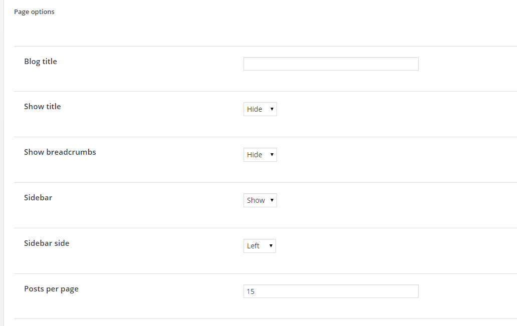
Page Options
Main index posts options:
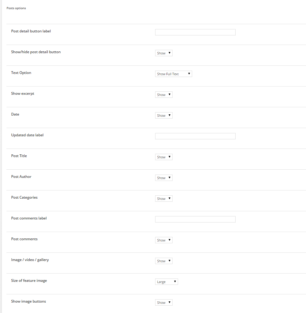
Blog posts options
- Single – these options all apply to the single post page, not the main archive page.

Single post displaying option
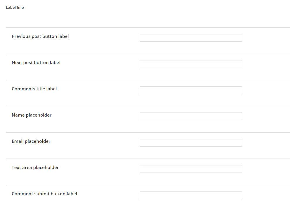
Single post label information
Was this article helpful ?
Brick Header Blocks
To create a standardized template for each page some of the settings you can set globally. You need to go to Appearance > Theme Options > Pages and choose from several options:
- Show/Hide title on pages
- Show/hide breadcrumbs on page
Using Test allows you to add custom area above main content container. In this place you may display the selected Header Block. To main pages types you can assign separate Header Block in Appearance > Theme Options – Pages.
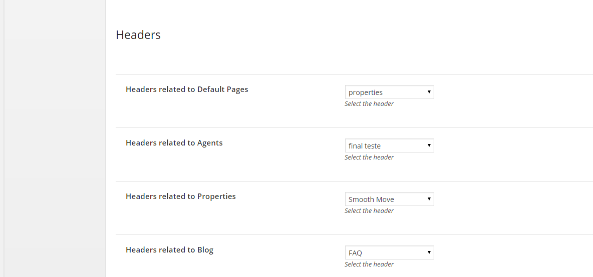
Assign header blocks
To create your blocks navigate in main admin menu to Header Blocks > Add New
Notice:
Using Full width option in column settings allows you to create full width Header Block
Full Width Column with Visual Composer
Remember to click Update once Header Block is assigned to page.
Was this article helpful ?
Creating properties
Test comes with ability to creating Properties custom post types. To create new property navigate to Property > Add New
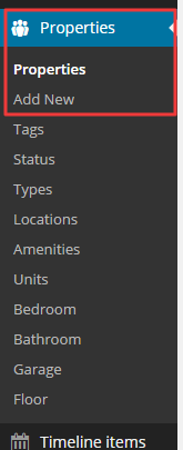
Add new property
To every Property you can assign number of variables, which can be defined in Property menu (see attachemnt above) or added directly from Property edition page. You can define and assign the following variables:
- Tags
- Status
- Types
- Locations
- Amenitites (including featured amenities, like: number of Bedrooms, Bathrooms, Garage – which will be displayed on every property preview – you can define them separately)
- Property Floor
All information can be displayed in Property details page:
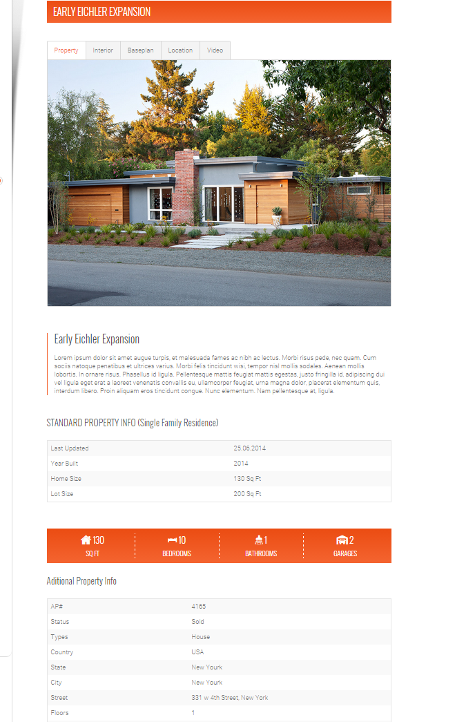
Property single page
Was this article helpful ?
Properties Theme Options
In Appearance > Theme Options – Property you will find three tabs, each with number of options for Properties pages:
- Form
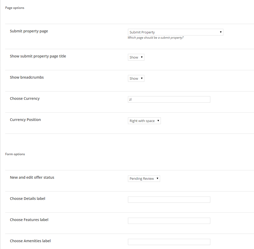
Properties Form Theme Options
- Single
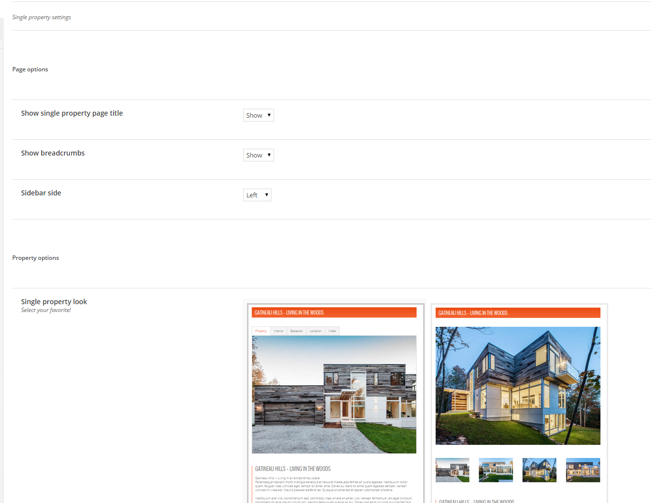
Single Property Theme Options
Additionally in Single Property Theme Options you can decide, which of defined amenitites should be displayed on every Property page.
- Search:
Including additional options for available view types.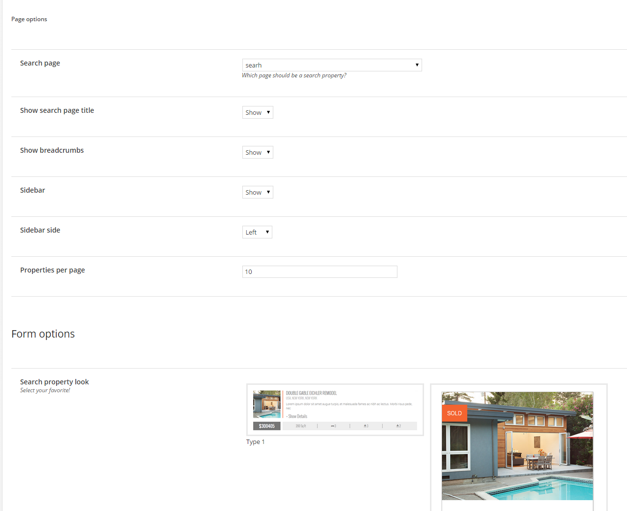
Search Property theme options
Was this article helpful ?
Creating agents
Test is a real estate Theme, which allows you to create custom user accounts for Estate Agents. You can create Agent account via administration panel in Users section
Creating agent account
Remember to select Agent role for every user created for estate agents.
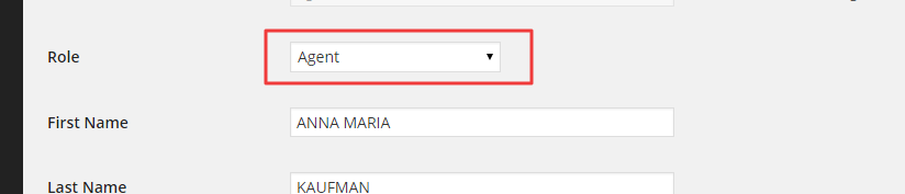
Agent role
Users can also register via frontend button Login/Register
Agents registration
Notice:
Frontend registration will work only if you check Anyone can register in WordPress Settings > General:
Anyone can register
We recommend you to setup New user default role to Agent

Was this article helpful ?
Taxonomy images
Our property map is created using Taxonomy Images plugin. Thanks to it you are able to define different map markers for Property types.
Custom markers for each property type
To define your custom markers navigate to Properties > Types and with “+” add new Map Marker image, which should be diplayed for selected Property type.
Define custom markers
You can add new property type with Add New Property Types buttons.
Vistin plugin website for more information – here.
Was this article helpful ?
Contact Form 7
Creating forms was never that easy!
Contact Form 7 can manage multiple contact forms, plus you can customize the form and the mail contents flexibly with simple markup. The form supports Ajax-powered submitting, CAPTCHA, Akismet spam filtering and so on.
Visit plugin site for more information.
Was this article helpful ?
Counter
Test comes with easy to customize Counter
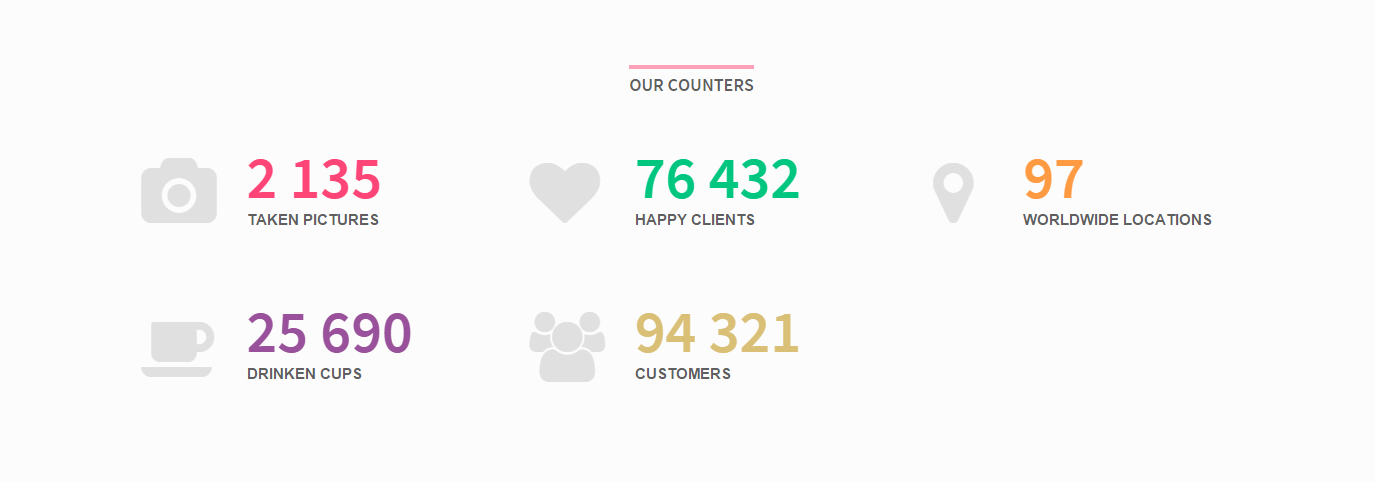
Counter
You can add it anywhere you want with simple HTML markup:
|
1 |
<span class="ct-iconBox-counter ct-js-counter" data-ct-to="2135" data-ct-speed="5000">2 135</span> |
You can also relate the counter to IconBox with the following markup:
|
1 2 3 4 5 6 7 8 9 10 11 |
<div class="ct-iconBox ct-iconBox--type2 ct-iconBox--primary"> <div class="ct-iconBox-icon"> <i class="fa fa-fw fa-camera"></i> </div> <div class="ct-iconBox-content"> <span class="ct-iconBox-counter ct-js-counter" data-ct-to="2135" data-ct-speed="5000">2 135</span> <p class="ct-iconBox-description text-uppercase ct-fw-600"> taken pictures </p> </div> </div> |
Was this article helpful ?
Accordion
You can create Accordions with number of panel with the simple HTML markup:
|
1 2 3 4 5 6 7 8 9 10 11 12 13 14 15 |
<div class="panel-group" id="accordion"> <div class="panel panel-default"> <div class="panel-heading"> <h4 class="panel-title"> <a data-toggle="collapse" data-parent="#accordion" href="#collapseOne"> (panel title) </a> </h4> </div> <div id="collapseOne" class="panel-collapse collapse in"> <div class="panel-body"> (panel content) </div> </div> </div> |
There are several predefined colors variables for accordion:
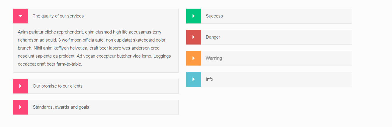
Accordions
You can change colors with the following CSS classes:
- panel-primary
- panel-success
- panel-danger
- panel-warning
- panel-info
Was this article helpful ?
Call To Action Box
Use simple HTML markup to create Call to Action box:
|
1 2 3 4 5 |
<a href="#" class="ct-callToActionBox ct-callToActionBox--green"> <small>Click here &</small><br> See Our Products <img src="assets/images/demo-content/pageImage5.png" alt="Box of Macaroons"> </a> |
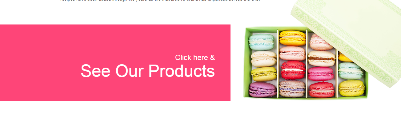
Call To Action Box
You can select from several color variables – just change one CSS class:
- ct-callToActionBox–primary
- ct-callToActionBox–green
- ct-callToActionBox–orange
- ct-callToActionBox–blue
- ct-callToActionBox–gold
- ct-callToActionBox–purple
- ct-callToActionBox–gray
Was this article helpful ?
Socials
You can easily create Socials with simple HTML markup:
|
1 2 3 4 5 6 7 8 9 10 11 12 13 14 |
<ul class="ct-socials ct-socials--primary list-inline list-unstyled text-center"> <li> <a href="https://www.facebook.com/createITpl" data-toggle="tooltip" data-placement="top" title="" data-original-title="Facebook"><i class="fa fa-fw fa-facebook-square"></i></a> </li> <li> <a href="https://twitter.com/createitpl" data-toggle="tooltip" data-placement="top" title="" data-original-title="Twitter"><i class="fa fa-fw fa-twitter"></i></a> </li> <li> <a href="#" data-toggle="tooltip" data-placement="top" title="" data-original-title="Pinterest"><i class="fa fa-fw fa-pinterest"></i></a> </li> <li> <a href="#" data-toggle="tooltip" data-placement="top" title="" data-original-title="LinkedIn"><i class="fa fa-fw fa-linkedin"></i></a> </li> </ul> |
Use one of Awesome Icons to create your own Socials.
And modify colors with simple CSS classes:
ct-socials–primary
ct-socials–blue
ct-socials–green
ct-socials–orange
ct-socials–purple
ct-socials–gold
ct-socials–gray

Socials
Was this article helpful ?
Person Box
Create Person Boxes in two awesome variations:
- ct-personBox–thumb
- ct-personBox–left
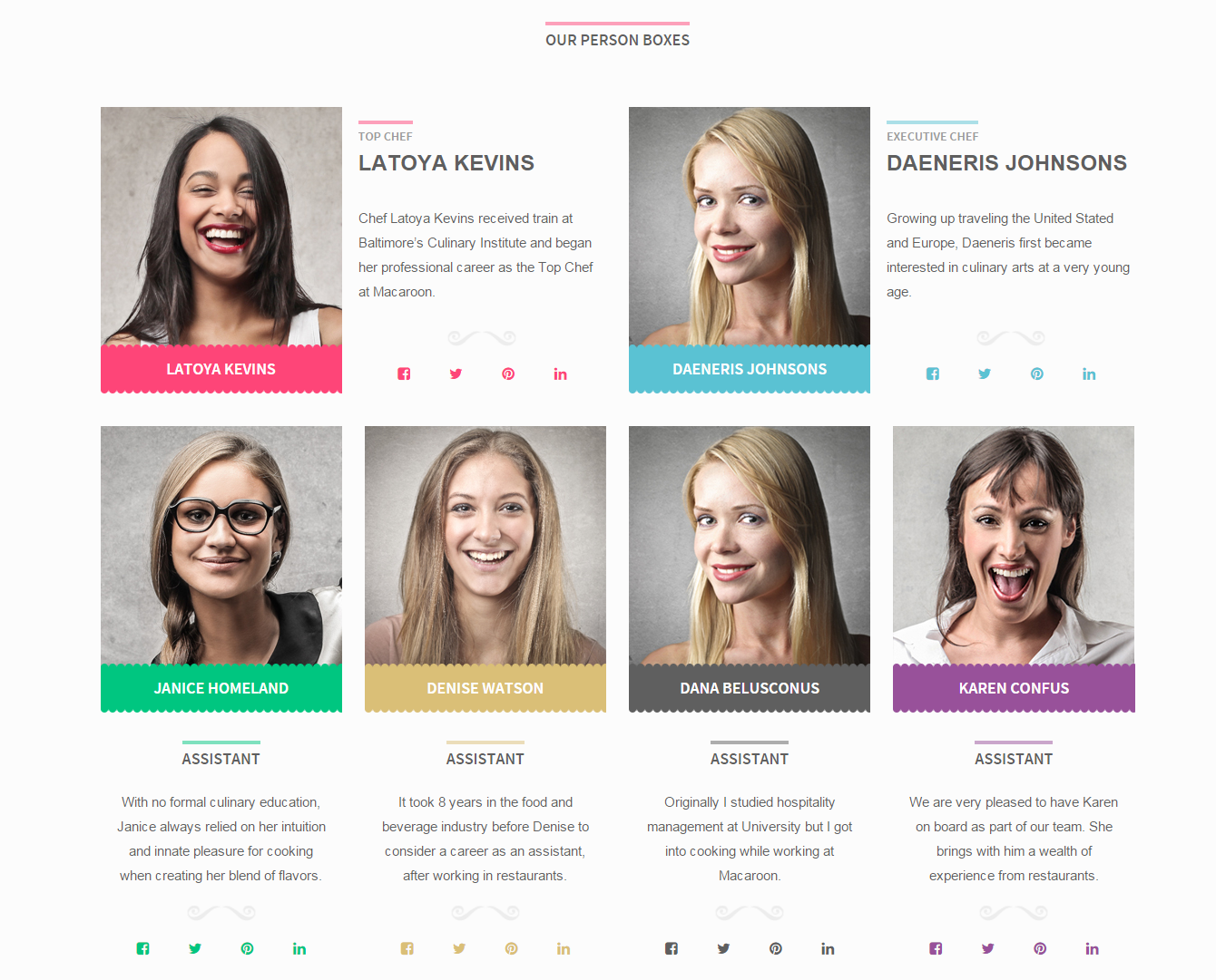
Person Boxes
Just use simple HTML markup with one available variations:
|
1 2 3 4 5 6 7 8 9 10 11 12 13 14 15 16 17 18 19 20 21 22 23 24 25 26 27 28 29 30 31 |
<div class="ct-personBox ct-personBox--thumb ct-personBox--primary"> <div class="ct-personBox-image"> <a href="#"><img src="assets/images/demo-content/person1.jpg" alt="Person"></a> </div> <a href="#" class="ct-personBox-name"> Latoya Kevins </a> <div class="ct-personBox-description text-center"> <h5 class="ct-u-sectionHeader ct-u-sectionHeader--primary text-uppercase"> Top Chef </h5> <p> Chef Latoya Kevins received train at Baltimore’s Culinary Institute and began her professional career as the Top Chef at Macaroon. </p> <div class="ct-u-moustache"></div> </div> <ul class="ct-socials ct-socials--primary list-inline list-unstyled"> <li> <a href="https://www.facebook.com/createITpl" data-toggle="tooltip" data-placement="top" title="" data-original-title="Facebook"><i class="fa fa-fw fa-facebook-square"></i></a> </li> <li> <a href="https://twitter.com/createitpl" data-toggle="tooltip" data-placement="top" title="" data-original-title="Twitter"><i class="fa fa-fw fa-twitter"></i></a> </li> <li> <a href="#" data-toggle="tooltip" data-placement="top" title="" data-original-title="Pinterest"><i class="fa fa-fw fa-pinterest"></i></a> </li> <li> <a href="#" data-toggle="tooltip" data-placement="top" title="" data-original-title="LinkedIn"><i class="fa fa-fw fa-linkedin"></i></a> </li> </ul> </div> |
You can also modify Person Boxes colors with the following CSS classes:
- ct-personBox–primary
- ct-personBox–blue
- ct-personBox–green
- ct-personBox–purple
- ct-personBox–blue
- ct-personBox–gray
- ct-personBox–gold
Was this article helpful ?
Buttons
In Test even buttons look awesome.

Buttons
Use simple markup:
|
1 |
<a href="#" class="btn btn-xs btn-primary">Hello!</a> |
Was this article helpful ?
Pricing Tables
Create standard pricing Boxes or use variation:
- ct-pricingBox–important
To highlight one of them.
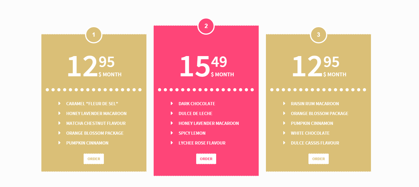
Pricing Boxes
Everything with simple HTML markup:
|
1 2 3 4 5 6 7 8 9 10 11 12 13 14 15 16 17 18 |
<div class="ct-pricingBox ct-pricingBox--gold"> <span class="ct-pricingbox-number">1</span> <div class="ct-pricingBox-pricing"> <span class="ct-pricingBox-price">12<sup>95</sup></span> <span class="ct-pricingBox-priceSub">$ Month</span> </div> <hr class="ct-dotted"> <div class="ct-pricingBox-list"> <ul class="list-unstyled ct-list-arrowWhite text-uppercase ct-fw-600"> <li>Caramel "Fleur de sel"</li> <li>Honey lavender macaroon</li> <li>Matcha Chestnut Flavour</li> <li>Orange blossom package</li> <li>Pumpkin Cinnamon</li> </ul> </div> <a href="#" class="btn btn-default">Order</a> </div> |
Use on of predefined colors with CSS class:
- ct-pricingBox–gold
- ct-pricingBox–primary
- ct-pricingBox–blue
- ct-pricingBox–green
- ct-pricingBox–orange
- ct-pricingBox–gray
- ct-pricingBox–purple
Was this article helpful ?
Portfolio
Create beautiful Portfolio with your works
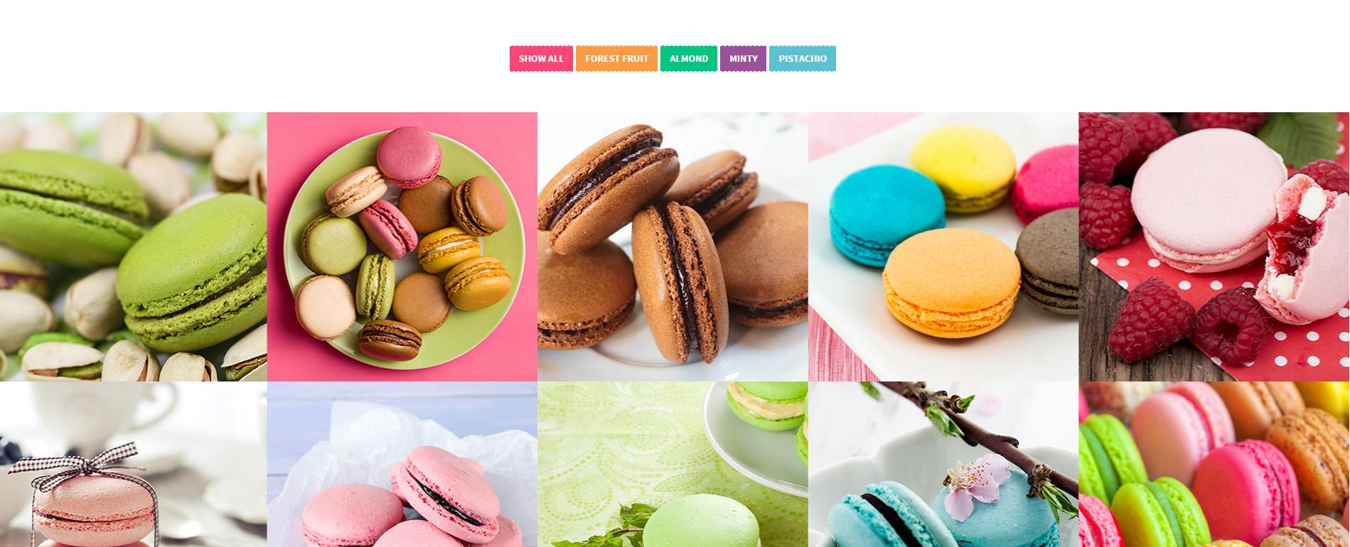
Portfolio
Use one of two variations:
- ct-gallery
- ct-gallery–withSpacing
And choose number of columns:
- ct-gallery–col4
- ct-gallery–col3
- ct-gallery–col2
- ct-gallery–col5
Use the following HTML markup:
|
1 2 3 4 5 6 7 8 9 10 11 12 13 14 15 16 17 18 19 20 21 22 23 24 25 26 27 28 29 30 31 32 33 34 35 36 37 38 39 40 41 42 |
<div id="ct-gallery" class="ct-gallery ct-gallery--col4 ct-gallery--withSpacing is-loaded" style="position: relative; height: 772px;"> <div class="ct-gallery-item ct-gallery-item--masonry ct-gallery-item--default ct-gallery-item--normal pistachio" style="position: absolute; left: 0px; top: 0px;"> <div class="ct-gallery-itemInner"> <div class="ct-galleryBox ct-galleryBox--type2 ct-galleryBox--green"> <div class="ct-galleryBox-image"> <a href="assets/images/demo-content/macaroon5.jpg" class="ct-js-magnificPopupImage"> <img src="assets/images/demo-content/thumbs/macaroon5.jpg" alt="Macaroon"> </a> </div> <div class="ct-galleryBox-overlay"> <div class="ct-u-displayTableVertical"> <div class="ct-u-displayTableCell"> <div class="ct-galleryBox-icons"> <a href="#"> <div class="ct-galleryBox-overlayIcon"> <i class="fa fa-share-alt"></i> </div> </a> <a href="assets/images/demo-content/macaroon5.jpg" class="ct-js-magnificPopupImage"> <div class="ct-galleryBox-overlayIcon"> <i class="fa fa-search"></i> </div> </a> <a href="#"> <div class="ct-galleryBox-overlayIcon"> <i class="fa fa-heart"></i> 0 </div> </a> </div> </div> </div> </div> </div> <a href="#" class="ct-galleryBox-content"> <h4 class="ct-galleryBox-title text-uppercase">Macaroon Name Title</h4> <span class="ct-galleryBox-description"> A very delicious macaroon. </span> </a> </div> </div> </div> |
Remember to include isotope javascript:
|
1 2 3 4 5 6 7 8 9 10 11 12 13 14 15 16 17 18 19 20 21 22 23 24 25 26 27 28 29 30 31 32 33 34 35 36 37 |
if ($().isotope && ($('.ct-gallery').length > 0)) { var $container = $('.ct-gallery'), // object that will keep track of options isotopeOptions = {}, // defaults, used if not explicitly set in hash defaultOptions = { filter: '*', itemSelector: '.ct-gallery-item', // set columnWidth to a percentage of container width masonry: { } }; // set up Isotope $container.isotope(defaultOptions); $container.imagesLoaded().progress(function (instance, image) { if (!image.isLoaded) { return; } var p = $(image.img).closest('.hidden'); p.removeClass('hidden'); $container.addClass('is-loaded') $container.isotope('layout'); }) $('.ct-gallery-filters a').click(function () { $('.ct-gallery-filters .active').removeClass('active'); $(this).addClass('active'); var selector = $(this).attr('data-filter'); $container.isotope({ filter: selector, animationOptions: { duration: 750, easing: 'linear', queue: false } }); return false; }); } |
Was this article helpful ?
Image Box
Create beautiful image box with the following HTML:
|
1 2 3 4 5 6 7 8 9 10 11 |
<div class="ct-imageBox ct-u-paddingBoth100" data-bg-image="assets/images/demo-content/groupedMacaroons.jpg" style="background-image: url(http://macaroon.html.themeforest.createit.pl/assets/images/demo-content/groupedMacaroons.jpg);"> <div class="ct-u-displayTableVertical"> <div class="ct-u-displayTableCell"> <div class="ct-imageBox-content"> <div class="ct-imageBox-innerContent"> </div> </div> </div> </div> </div> |
And javascript:
|
1 2 3 4 5 |
$('.ct-imageBox').each(function(){ var $this = $(this); var $bg_image = $this.attr("data-bg-image"); $this.css('background-image', 'url("' + $bg_image + '")'); }) |
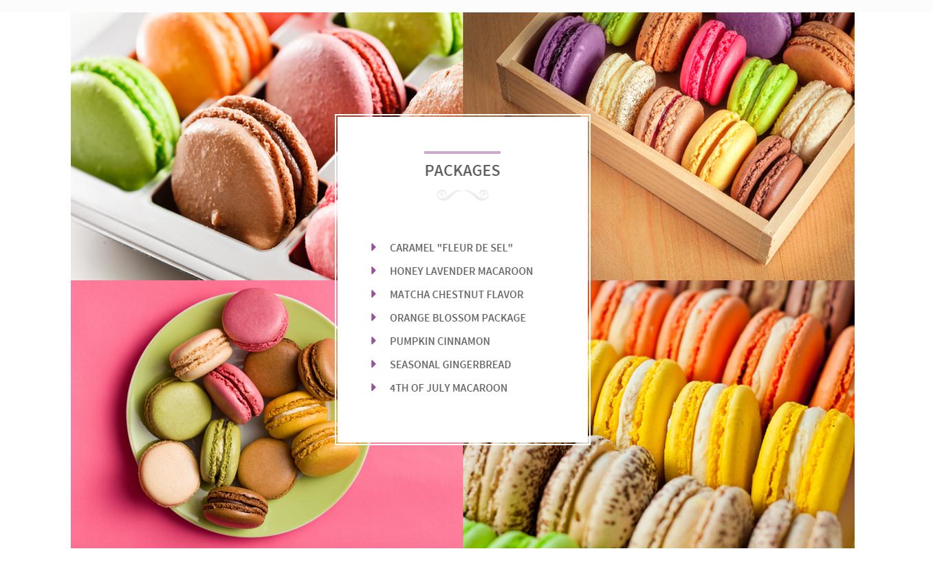
Image Box
Was this article helpful ?
Product Box
Use one of two types of product box:
- ct-productBox–type1
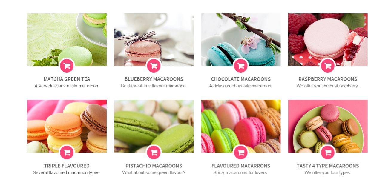
Product Box Type 1
1234567891011121314151617181920<div class="ct-productBox ct-productBox--type1 ct-productBox--green"><div class="ct-productBox-image"><a href="assets/images/demo-content/macaroon1.jpg" class="ct-js-magnificPopupImage"><img src="assets/images/demo-content/thumbs/macaroon1.jpg" alt="Macaroon"></a></div><div class="ct-productBox-overlay"><a href="#"><div class="ct-productBox-overlayIcon"><i class="fa fa-shopping-cart"></i></div></a></div><a href="#" class="ct-productBox-content"><h4 class="ct-productBox-title text-uppercase">Matcha Green Tea</h4><span class="ct-productBox-description">A very delicious minty macaroon.</span></a></div> - ct-productBox–type2
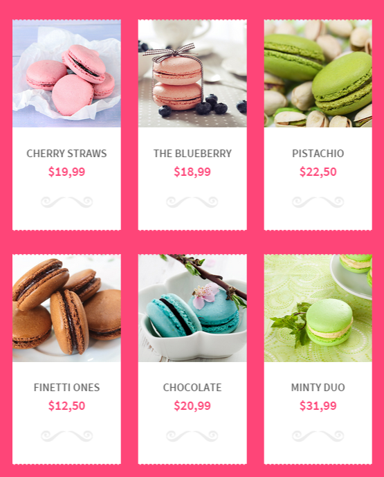
Product Box Type 2
12345678910111213141516171819<div class="ct-productBox ct-productBox--type2 ct-productBox--green"><div class="ct-productBox-image"><img src="assets/images/demo-content/thumbs/macaroon4.jpg" alt="Macaroon"><div class="ct-productBox-overlay"><a href="#"><div class="ct-productBox-overlayIcon"><i class="fa fa-shopping-cart"></i></div></a></div></div><div class="ct-productBox-content"><h4 class="ct-productBox-title text-uppercase"><a href="#">The blueberry</a></h4><span class="ct-productBox-price ct-u-colorPrimary">$18,99</span><div class="ct-u-moustache"></div></div></div>
Both types of boxes have several color variables:
- ct-productBox–green
- ct-productBox–primary
- ct-productBox–blue
- ct-productBox–gold
- ct-productBox–purple
- ct-productBox–orange
- ct-productBox–gray
Was this article helpful ?
Icon Box
There are 4 types of icon boxes:
- ct-iconBox–type1
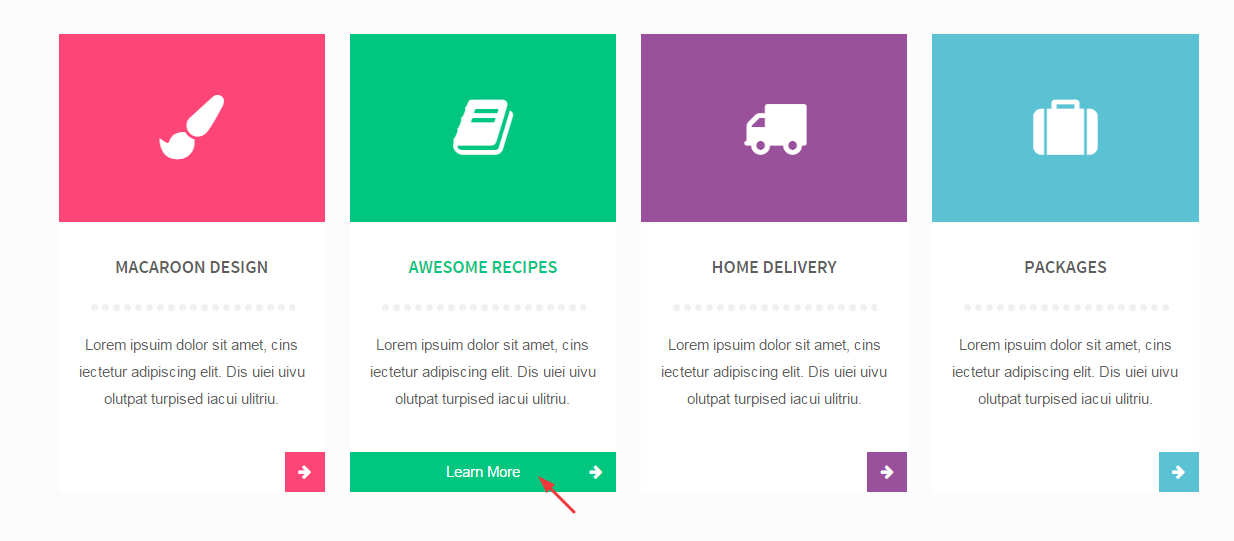
Icon Box Type 1
- ct-iconBox–type2
Icon Boxes Type 2
- ct-iconBox–type3
Icon Boxes Type 3
- ct-iconBox–type4
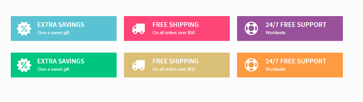
Icon Boxes Type 4
Every type with several color options:
- ct-iconBox–blue
- ct-iconBox–green
- ct-iconBox–orange
- ct-iconBox–gold
- ct-iconBox–primary
- ct-iconBox–gray
- ct-iconBox–purple
Just edit classes names!
Was this article helpful ?
Navbar and Top bar
There are several classes, which will help you to provide global changes for your template.
To edit top bar and navigation styles use on body tag:
- Fixed Navigation – .ct–navbarFixed
- Fixed Top Bar – .ct–TopBarFixed
You can also use the following Customization options:
- Topbar background – @ct-topBar-background
- Topbar color – @ct-topBar-color
- Topbar Font Family/Navbar Font Family – @ct-navbar-font
- Navbar background – @ct-navbar-background
- Navbar Color – @ct-navbar-color
Was this article helpful ?
Javascript – Macaroom
4.1. Javascrpt library and files
All javascripts are placed in folder /js. In main.js file we implement all functions calls.
This theme uses following Javascript files:
- Bootstrap v 3 framework (powerful front-end framework for faster and easier web development)
- jQuery v1.10.2 (A fast javascript library that Foodtruckifies how to traverse HTML documents, handle events, perform animations.)
- jQuery FlexSlider v2.2.0
- GMAP3 Plugin for JQuery v. 5.1.1
- jQuery.appear
- jQuery Stellar
- jQuery tweet
- Modernizr 2.0.6
- PageScroller
- final-countdown.js
- snap.js
- device.js 0.1.58
- chart.js
4.2. Google Map (GMAP3 Plugin)
This is google map with custom marker, you can define couple parameters:
- data-location – address to show
- data-height – map height (if undefined height will be 220px)
- data-offset – by how many map should be repositioned from marker center point (default -30)
It uses gmap3 plugin. Documentation: here
HTML Markup:
All javascript code can be found in js/main.js file.
Content / Images Slider.
Each parameter can be defined as data attribute :
- data-namespace
- data-selector
- data-animation
- data-easing
- data-direction
- data-reverse
- data-animationloop
- data-smoothheight
- data-startat
- data-slideshow
- data-slideshowspeed
- data-animationspeed
- data-initdelay
- data-randomize
- data-thumbcaptions
- data-pauseonaction
- data-pauseonhover
- data-pauseinvisible
- data-usecss
- data-touch
- data-video
- data-controlnav
- data-directionnav
- data-prevtext
- data-nexttext
- data-keyboard
- data-multiplekeyboard
- data-mousewheel
- data-pauseplay
- data-pausetext
- data-playtext
- data-itemwidth
- data-itemmargin
- data-minitems
- data-maxitems
- data-move
- data-allowoneslide
- data-controlscontainer
- data-manualcontrols
- data-sync
- data-asnavfor
Read the documentation here: Flexslider Documentation
|
1 2 3 |
<div class="flexslider" data-animation="slide" data-height="100" data-loop="true" data-smooth="true" data-slideshow="true" data-speed="15000" data-animspeed="550" data-controls="true" data-dircontrols="true" data-controlscontainer=".controls"> (...) </div> |
And js initialization (js/main.js file), there you can change slider parameters:
|
1 2 3 4 5 6 7 8 9 10 11 12 13 14 15 16 17 18 19 20 21 22 23 24 25 26 27 28 29 30 31 32 33 34 35 36 37 38 39 40 41 42 43 44 45 46 47 48 49 50 51 52 53 54 55 56 57 58 59 60 61 62 63 64 65 66 67 68 69 70 71 72 73 74 75 76 77 78 79 80 81 82 83 84 85 86 87 88 89 90 91 92 93 94 95 96 97 98 99 100 101 102 103 104 105 106 107 108 109 110 111 112 113 114 115 116 117 118 119 120 121 122 123 |
* ==================== */ /* ==== FLEXSLIDER ==== */ if(jQuery().flexslider){ if (jQuery(".flexslider").length > 0) { jQuery(".flexslider").each(function(){ $this=jQuery(this); var ctnamespace = validatedata($this.attr("data-namespace"),"flex-"); var ctselector = validatedata($this.attr("data-selector"),".slides > li"); var ctanimation = validatedata($this.attr("data-animation"),"slide"); var cteasing = validatedata($this.attr("data-easing"),"swing"); var ctdirection = validatedata($this.attr("data-direction"),"horizontal"); var ctreverse = parseBoolean($this.attr("data-reverse"), false); var ctanimationloop = parseBoolean($this.attr("data-animationloop"), false); var ctsmoothheight = parseBoolean($this.attr("data-smoothheight"), false); var ctstartat = parseInt(validatedata($this.attr("data-startat"), 0)); var ctslideshow = parseBoolean($this.attr("data-slideshow"), true); var ctslideshowspeed = parseInt(validatedata($this.attr("data-slideshowspeed"), 7000)); var ctanimationspeed = parseInt(validatedata($this.attr("data-animationspeed"), 600)); var ctinitdelay= parseInt(validatedata($this.attr("data-initdelay"), 0)); var ctrandomize = parseBoolean($this.attr("data-randomize"), false); var ctthumbcaptions = parseBoolean($this.attr("data-thumbcaptions"), false); var ctpauseonaction= parseBoolean($this.attr("data-pauseonaction"), true); var ctpauseonhover = parseBoolean($this.attr("data-pauseonhover"), false); var ctpauseinvisible= parseBoolean($this.attr("data-pauseinvisible"), true); var ctusecss= parseBoolean($this.attr("data-usecss"), true); var cttouch= parseBoolean($this.attr("data-touch"), true); if(device.mobile()){ cttouch = false; } var ctvideo = parseBoolean($this.attr("data-video"), false); var ctcontrolnav= parseBoolean($this.attr("data-controlnav"), true); if(ctcontrolnav == false){ $this.addClass("no-margin"); } var ctdirectionnav= parseBoolean($this.attr("data-directionnav"), false); var ctprevtext = validatedata($this.attr("data-prevtext"),"Previous"); var ctnexttext = validatedata($this.attr("data-nexttext"),"Next"); var ctkeyboard= validatedata(parseBoolean($this.attr("data-keyboard")), true); var ctmultiplekeyboard= parseBoolean($this.attr("data-multiplekeyboard"), false); var ctmousewheel= parseBoolean($this.attr("data-mousewheel"), false); var ctpauseplay= parseBoolean($this.attr("data-pauseplay"), false); var ctpausetext = validatedata($this.attr("data-pausetext"),"Pause"); var ctplaytext = validatedata($this.attr("data-playtext"),"Play"); var ctitemwidth= parseInt(validatedata($this.attr("data-itemwidth"), 0)); var ctitemmargin= parseInt(validatedata($this.attr("data-itemmargin"), 0)); var ctminitems= parseInt(validatedata($this.attr("data-minitems"), 0)); var ctmaxitems= parseInt(validatedata($this.attr("data-maxitems"), 0)); var ctmove= parseInt(validatedata($this.attr("data-move"), 0)); var ctallowoneslide= parseBoolean($this.attr("data-allowoneslide"), false); var ctcontrolscontainer= validatedata($this.attr("data-controlscontainer"), ""); var ctmanualcontrols= validatedata($this.attr("data-manualcontrols"), ""); var ctsync = validatedata($this.attr("data-sync"), ""); var ctasnavfor = validatedata($this.attr("data-asnavfor"), ""); $this.flexslider({ namespace: ctnamespace, //{NEW} String: Prefix string attached to the class of every element generated by the plugin selector: ctselector, //{NEW} Selector: Must match a simple pattern. "{container} > {slide}" -- Ignore pattern at your own peril animation: ctanimation, //String: Select your animation type, "fade" or "slide" easing: cteasing , //{NEW} String: Determines the easing method used in jQuery transitions. jQuery easing plugin is supported! direction: ctdirection, //String: Select the sliding direction, "horizontal" or "vertical" reverse: ctreverse, //{NEW} Boolean: Reverse the animation direction animationLoop: ctanimationloop, //Boolean: Should the animation loop? If false, directionNav will received "disable" classes at either end smoothHeight: ctsmoothheight, //{NEW} Boolean: Allow height of the slider to animate smoothly in horizontal mode startAt: ctstartat, //Integer: The slide that the slider should start on. Array notation (0 = first slide) slideshow: ctslideshow, //Boolean: Animate slider automatically slideshowSpeed: ctslideshowspeed, //Integer: Set the speed of the slideshow cycling, in milliseconds animationSpeed: ctanimationspeed, //Integer: Set the speed of animations, in milliseconds initDelay: ctinitdelay, //{NEW} Integer: Set an initialization delay, in milliseconds randomize: ctrandomize, //Boolean: Randomize slide order thumbCaptions: ctthumbcaptions, //Boolean: Whether or not to put captions on thumbnails when using the "thumbnails" controlNav. // Usability features pauseOnAction: ctpauseonaction, //Boolean: Pause the slideshow when interacting with control elements, highly recommended. pauseOnHover: ctpauseonhover, //Boolean: Pause the slideshow when hovering over slider, then resume when no longer hovering pauseInvisible: ctpauseinvisible, //{NEW} Boolean: Pause the slideshow when tab is invisible, resume when visible. Provides better UX, lower CPU usage. useCSS: ctusecss, //{NEW} Boolean: Slider will use CSS3 transitions if available touch: cttouch, //{NEW} Boolean: Allow touch swipe navigation of the slider on touch-enabled devices video: ctvideo, //{NEW} Boolean: If using video in the slider, will prevent CSS3 3D Transforms to avoid graphical glitches // Primary Controls controlNav: ctcontrolnav, //Boolean: Create navigation for paging control of each clide? Note: Leave true for manualControls usage directionNav: ctdirectionnav, //Boolean: Create navigation for previous/next navigation? (true/false) prevText: ctprevtext, //String: Set the text for the "previous" directionNav item nextText: ctnexttext, //String: Set the text for the "next" directionNav item // Secondary Navigation keyboard: ctkeyboard, //Boolean: Allow slider navigating via keyboard left/right keys multipleKeyboard: ctmultiplekeyboard, //{NEW} Boolean: Allow keyboard navigation to affect multiple sliders. Default behavior cuts out keyboard navigation with more than one slider present. mousewheel: ctmousewheel, //{UPDATED} Boolean: Requires jquery.mousewheel.js (https://github.com/brandonaaron/jquery-mousewheel) - Allows slider navigating via mousewheel pausePlay: ctpauseplay, //Boolean: Create pause/play dynamic element pauseText: ctpausetext, //String: Set the text for the "pause" pausePlay item playText: ctplaytext, //String: Set the text for the "play" pausePlay item // Special properties controlsContainer: ctcontrolscontainer, //{UPDATED} jQuery Object/Selector: Declare which container the navigation elements should be appended too. Default container is the FlexSlider element. Example use would be $(".flexslider-container"). Property is ignored if given element is not found. manualControls: ctmanualcontrols, //{UPDATED} jQuery Object/Selector: Declare custom control navigation. Examples would be $(".flex-control-nav li") or "#tabs-nav li img", etc. The number of elements in your controlNav should match the number of slides/tabs. sync: ctsync, //{NEW} Selector: Mirror the actions performed on this slider with another slider. Use with care. asNavFor: ctasnavfor, //{NEW} Selector: Internal property exposed for turning the slider into a thumbnail navigation for another slider // Carousel Options itemWidth: ctitemwidth, //{NEW} Integer: Box-model width of individual carousel items, including horizontal borders and padding. itemMargin: ctitemmargin, //{NEW} Integer: Margin between carousel items. minItems: ctminitems, //{NEW} Integer: Minimum number of carousel items that should be visible. Items will resize fluidly when below this. maxItems: ctmaxitems, //{NEW} Integer: Maxmimum number of carousel items that should be visible. Items will resize fluidly when above this limit. move: ctmove, //{NEW} Integer: Number of carousel items that should move on animation. If 0, slider will move all visible items. allowOneSlide: ctallowoneslide //{NEW} Boolean: Whether or not to allow a slider comprised of a single slide }) }) } |
4.4. Jquery.appear
This plugin call function when element appear in viewport. This is used in custom animation, progress bars, counter timer.
Documentation: https://github.com/bas2k/jquery.appear/
|
1 2 3 4 5 6 7 8 9 10 11 12 |
if (device.mobile()) { // disable animation on mobile jQuery("body").removeClass("withAnimation"); } else { jQuery('.withAnimation .animated').appear(function () { jQuery(this).each(function () { jQuery(this).addClass('activate'); jQuery(this).addClass($(this).data('fx')); }); }, {accY: -150}); } } |
4.5. Charts
This plugin is used to make graphics. Documentation: http://www.chartjs.org/
Was this article helpful ?
Flexslider
Main Slider with inset container (with Progress Bar):
HTML markup
|
1 2 3 4 5 6 7 8 9 10 11 12 13 14 |
<div class="flexslider ct-flexslider--mainSlider ct-js-flexslider"> <div class="ct-containerAbsolute"> <div class="ct-flexslider-progress"> <div class="ct-flexslider-progressBar"></div> </div> <div class="ct-containerAbsolute-inside"></div> </div> <ul class="slides"> <li></li> <li></li> <li></li> </ul> </div> |
Full Screen Slider (with Progress Bar):
HTML markup
|
1 2 3 4 5 6 7 8 9 10 |
<div class="flexslider ct-flexslider--mainSlider ct-js-flexslider"> <div class="ct-flexslider-progress"> <div class="ct-flexslider-progressBar"></div> </div> <ul class="slides"> <li></li> <li></li> <li></li> </ul> </div> |
Arrow Types:
HTML markup
ct-flexslider–arrowType1
ct-flexslider–arrowType2
Controls Type:
HTML markup
ct-flexslider–controls – default
ct-flexslider–whiteControls
Flexslider
Content / Images Slider.
Each parameter can be defined as data attribute :
- data-namespace
- data-selector
- data-animation
- data-easing
- data-direction
- data-reverse
- data-animationloop
- data-smoothheight
- data-startat
- data-slideshow
- data-slideshowspeed
- data-animationspeed
- data-initdelay
- data-randomize
- data-thumbcaptions
- data-pauseonaction
- data-pauseonhover
- data-pauseinvisible
- data-usecss
- data-touch
- data-video
- data-controlnav
- data-directionnav
- data-prevtext
- data-nexttext
- data-keyboard
- data-multiplekeyboard
- data-mousewheel
- data-pauseplay
- data-pausetext
- data-playtext
- data-itemwidth
- data-itemmargin
- data-minitems
- data-maxitems
- data-move
- data-allowoneslide
- data-controlscontainer
- data-manualcontrols
- data-sync
- data-asnavfor
Read the documentation here:
And js initialization (js/main.js file), there you can change slider parameters:
|
1 2 3 4 5 6 7 8 9 10 11 12 13 14 15 16 17 18 19 20 21 22 23 24 25 26 27 28 29 30 31 32 33 34 35 36 37 38 39 40 41 42 43 44 45 46 47 48 49 50 51 52 53 54 55 56 57 58 59 60 61 62 63 64 65 66 67 68 69 70 71 72 73 74 75 76 77 78 79 80 81 82 83 84 85 86 87 88 89 90 91 92 93 94 95 96 97 98 99 100 101 102 103 104 105 106 107 108 109 110 111 112 113 114 115 116 117 118 119 120 121 122 123 |
/* ==================== */ /* ==== FLEXSLIDER ==== */ if(jQuery().flexslider){ if (jQuery(".flexslider").length > 0) { jQuery(".flexslider").each(function(){ $this=jQuery(this); var ctnamespace = validatedata($this.attr("data-namespace"),"flex-"); var ctselector = validatedata($this.attr("data-selector"),".slides > li"); var ctanimation = validatedata($this.attr("data-animation"),"slide"); var cteasing = validatedata($this.attr("data-easing"),"swing"); var ctdirection = validatedata($this.attr("data-direction"),"horizontal"); var ctreverse = parseBoolean($this.attr("data-reverse"), false); var ctanimationloop = parseBoolean($this.attr("data-animationloop"), false); var ctsmoothheight = parseBoolean($this.attr("data-smoothheight"), false); var ctstartat = parseInt(validatedata($this.attr("data-startat"), 0)); var ctslideshow = parseBoolean($this.attr("data-slideshow"), true); var ctslideshowspeed = parseInt(validatedata($this.attr("data-slideshowspeed"), 7000)); var ctanimationspeed = parseInt(validatedata($this.attr("data-animationspeed"), 600)); var ctinitdelay= parseInt(validatedata($this.attr("data-initdelay"), 0)); var ctrandomize = parseBoolean($this.attr("data-randomize"), false); var ctthumbcaptions = parseBoolean($this.attr("data-thumbcaptions"), false); var ctpauseonaction= parseBoolean($this.attr("data-pauseonaction"), true); var ctpauseonhover = parseBoolean($this.attr("data-pauseonhover"), false); var ctpauseinvisible= parseBoolean($this.attr("data-pauseinvisible"), true); var ctusecss= parseBoolean($this.attr("data-usecss"), true); var cttouch= parseBoolean($this.attr("data-touch"), true); if(device.mobile()){ cttouch = false; } var ctvideo = parseBoolean($this.attr("data-video"), false); var ctcontrolnav= parseBoolean($this.attr("data-controlnav"), true); if(ctcontrolnav == false){ $this.addClass("no-margin"); } var ctdirectionnav= parseBoolean($this.attr("data-directionnav"), false); var ctprevtext = validatedata($this.attr("data-prevtext"),"Previous"); var ctnexttext = validatedata($this.attr("data-nexttext"),"Next"); var ctkeyboard= validatedata(parseBoolean($this.attr("data-keyboard")), true); var ctmultiplekeyboard= parseBoolean($this.attr("data-multiplekeyboard"), false); var ctmousewheel= parseBoolean($this.attr("data-mousewheel"), false); var ctpauseplay= parseBoolean($this.attr("data-pauseplay"), false); var ctpausetext = validatedata($this.attr("data-pausetext"),"Pause"); var ctplaytext = validatedata($this.attr("data-playtext"),"Play"); var ctitemwidth= parseInt(validatedata($this.attr("data-itemwidth"), 0)); var ctitemmargin= parseInt(validatedata($this.attr("data-itemmargin"), 0)); var ctminitems= parseInt(validatedata($this.attr("data-minitems"), 0)); var ctmaxitems= parseInt(validatedata($this.attr("data-maxitems"), 0)); var ctmove= parseInt(validatedata($this.attr("data-move"), 0)); var ctallowoneslide= parseBoolean($this.attr("data-allowoneslide"), false); var ctcontrolscontainer= validatedata($this.attr("data-controlscontainer"), ""); var ctmanualcontrols= validatedata($this.attr("data-manualcontrols"), ""); var ctsync = validatedata($this.attr("data-sync"), ""); var ctasnavfor = validatedata($this.attr("data-asnavfor"), ""); $this.flexslider({ namespace: ctnamespace, //{NEW} String: Prefix string attached to the class of every element generated by the plugin selector: ctselector, //{NEW} Selector: Must match a simple pattern. "{container} > {slide}" -- Ignore pattern at your own peril animation: ctanimation, //String: Select your animation type, "fade" or "slide" easing: cteasing , //{NEW} String: Determines the easing method used in jQuery transitions. jQuery easing plugin is supported! direction: ctdirection, //String: Select the sliding direction, "horizontal" or "vertical" reverse: ctreverse, //{NEW} Boolean: Reverse the animation direction animationLoop: ctanimationloop, //Boolean: Should the animation loop? If false, directionNav will received "disable" classes at either end smoothHeight: ctsmoothheight, //{NEW} Boolean: Allow height of the slider to animate smoothly in horizontal mode startAt: ctstartat, //Integer: The slide that the slider should start on. Array notation (0 = first slide) slideshow: ctslideshow, //Boolean: Animate slider automatically slideshowSpeed: ctslideshowspeed, //Integer: Set the speed of the slideshow cycling, in milliseconds animationSpeed: ctanimationspeed, //Integer: Set the speed of animations, in milliseconds initDelay: ctinitdelay, //{NEW} Integer: Set an initialization delay, in milliseconds randomize: ctrandomize, //Boolean: Randomize slide order thumbCaptions: ctthumbcaptions, //Boolean: Whether or not to put captions on thumbnails when using the "thumbnails" controlNav. // Usability features pauseOnAction: ctpauseonaction, //Boolean: Pause the slideshow when interacting with control elements, highly recommended. pauseOnHover: ctpauseonhover, //Boolean: Pause the slideshow when hovering over slider, then resume when no longer hovering pauseInvisible: ctpauseinvisible, //{NEW} Boolean: Pause the slideshow when tab is invisible, resume when visible. Provides better UX, lower CPU usage. useCSS: ctusecss, //{NEW} Boolean: Slider will use CSS3 transitions if available touch: cttouch, //{NEW} Boolean: Allow touch swipe navigation of the slider on touch-enabled devices video: ctvideo, //{NEW} Boolean: If using video in the slider, will prevent CSS3 3D Transforms to avoid graphical glitches // Primary Controls controlNav: ctcontrolnav, //Boolean: Create navigation for paging control of each clide? Note: Leave true for manualControls usage directionNav: ctdirectionnav, //Boolean: Create navigation for previous/next navigation? (true/false) prevText: ctprevtext, //String: Set the text for the "previous" directionNav item nextText: ctnexttext, //String: Set the text for the "next" directionNav item // Secondary Navigation keyboard: ctkeyboard, //Boolean: Allow slider navigating via keyboard left/right keys multipleKeyboard: ctmultiplekeyboard, //{NEW} Boolean: Allow keyboard navigation to affect multiple sliders. Default behavior cuts out keyboard navigation with more than one slider present. mousewheel: ctmousewheel, //{UPDATED} Boolean: Requires jquery.mousewheel.js (https://github.com/brandonaaron/jquery-mousewheel) - Allows slider navigating via mousewheel pausePlay: ctpauseplay, //Boolean: Create pause/play dynamic element pauseText: ctpausetext, //String: Set the text for the "pause" pausePlay item playText: ctplaytext, //String: Set the text for the "play" pausePlay item // Special properties controlsContainer: ctcontrolscontainer, //{UPDATED} jQuery Object/Selector: Declare which container the navigation elements should be appended too. Default container is the FlexSlider element. Example use would be $(".flexslider-container"). Property is ignored if given element is not found. manualControls: ctmanualcontrols, //{UPDATED} jQuery Object/Selector: Declare custom control navigation. Examples would be $(".flex-control-nav li") or "#tabs-nav li img", etc. The number of elements in your controlNav should match the number of slides/tabs. sync: ctsync, //{NEW} Selector: Mirror the actions performed on this slider with another slider. Use with care. asNavFor: ctasnavfor, //{NEW} Selector: Internal property exposed for turning the slider into a thumbnail navigation for another slider // Carousel Options itemWidth: ctitemwidth, //{NEW} Integer: Box-model width of individual carousel items, including horizontal borders and padding. itemMargin: ctitemmargin, //{NEW} Integer: Margin between carousel items. minItems: ctminitems, //{NEW} Integer: Minimum number of carousel items that should be visible. Items will resize fluidly when below this. maxItems: ctmaxitems, //{NEW} Integer: Maxmimum number of carousel items that should be visible. Items will resize fluidly when above this limit. move: ctmove, //{NEW} Integer: Number of carousel items that should move on animation. If 0, slider will move all visible items. allowOneSlide: ctallowoneslide //{NEW} Boolean: Whether or not to allow a slider comprised of a single slide }) }) } |
Was this article helpful ?
Header Theme Options
Test comes with extended options to configure headers appearance. You can choose options globally via Appearance > Theme Options. Those settings will be by default applied for every page.
In Theme Options > Main Navbar you can select option for navigation menu appearance.
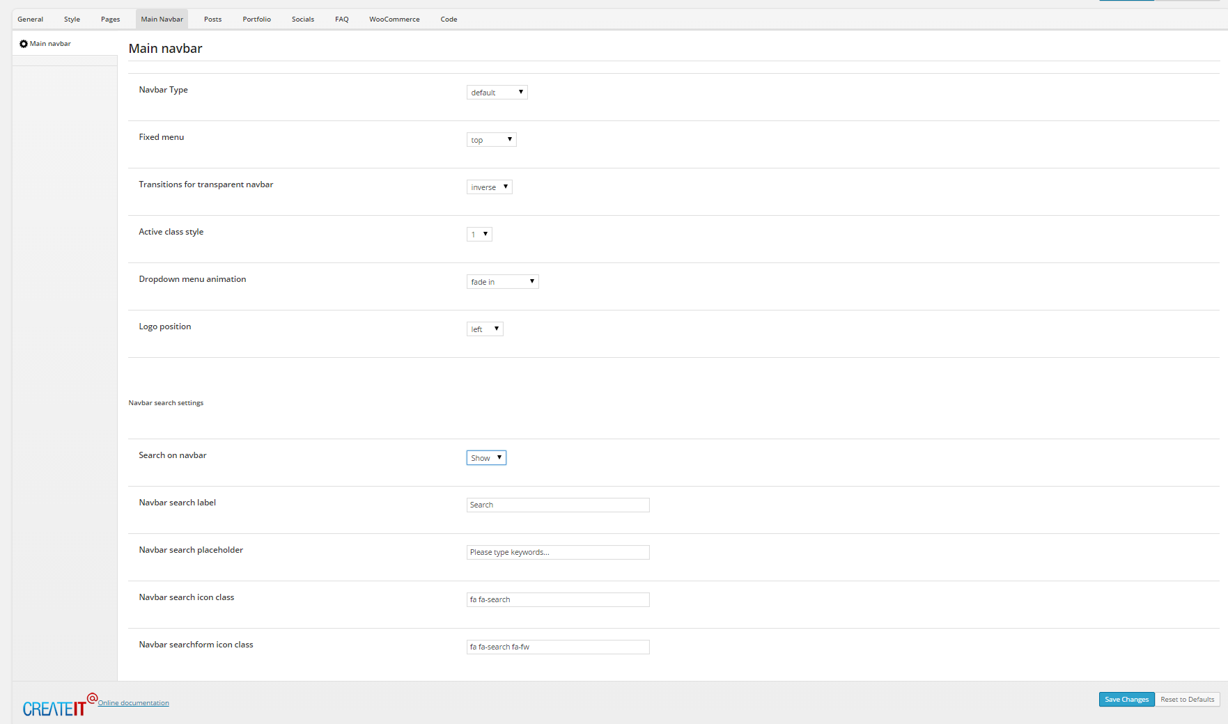
Theme Options Main Navigation settings
You can select here one of four Navigation Types:
- default

Default Navigation
- motive

Motive Navigation Type
- inverse

Inverse Navigation Type
- transparent

Transparent Navigation Type
Once you setup navigation bar background color with it’s type – you can adjust Style for active element in menu: You can choose one of five types:

Active element type 1

Active element type 2

Active element type 3

Active element type 4

Active element type 5
In Main Navbar settings you can also select:
- Fixed menu type
- Dropdown animation
- Logo position
- If search should be displayed
- Search label
- Search placeholde
- Search icon
In Theme Options > Pages – Header you can select option for page header appearance
You can define here:
- Diagonal [1]
- Triangle [2]
- Icon [3]
- Summary [4]
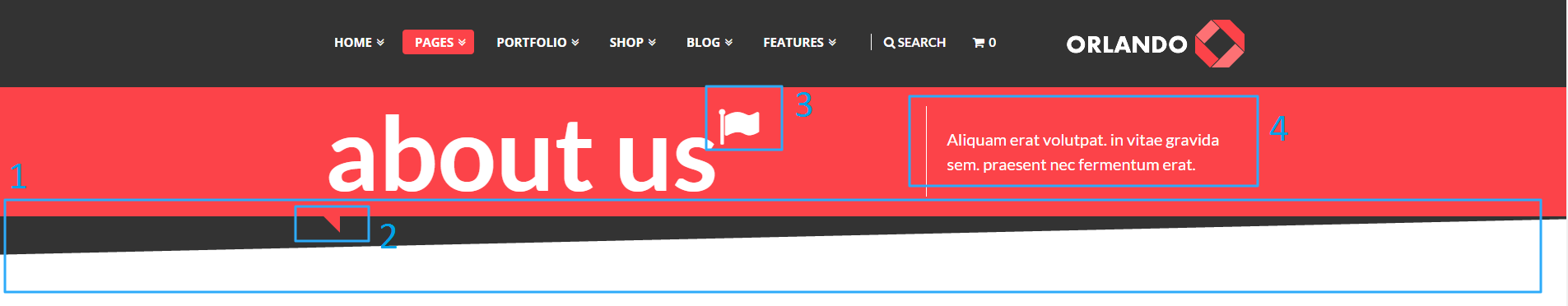
Header options
- Background Color
- Text Color
- Header Margins and Paddings
- Shadow
Header shadow
Or choose one of predefined simple header styles:
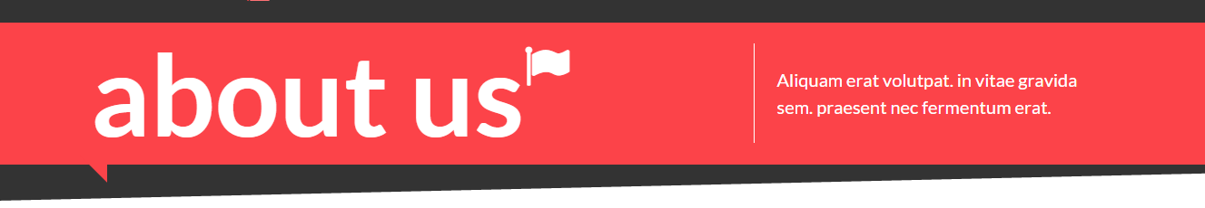
Simple header type 1

Simple Header type 2

Simple header type 3
You can also add media to header background:
- parallax
- kenburns
- video
You can setup header settings for every page separately in Header and Navbar settings [1], which you will find below page content edition window.
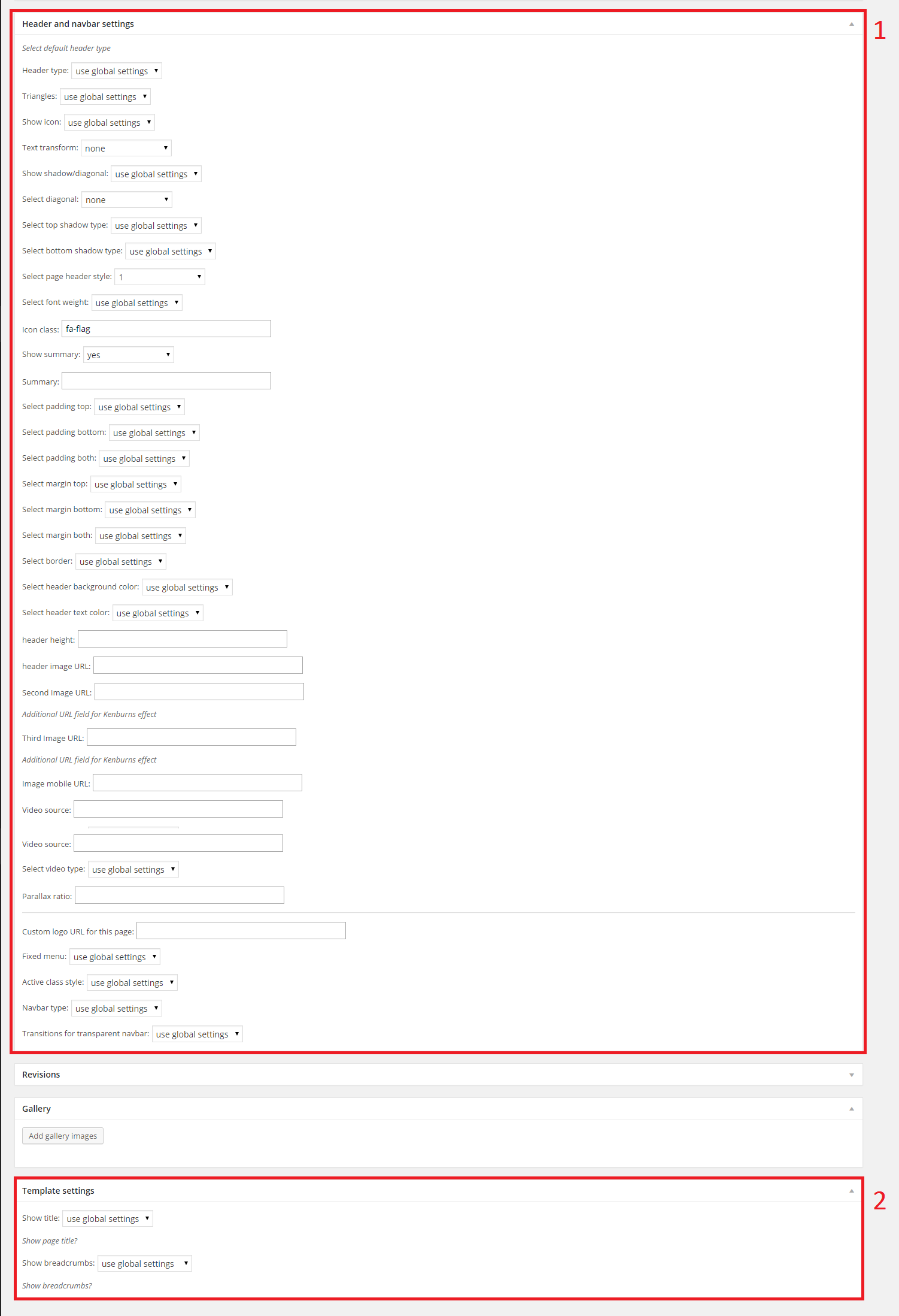
Header settings
Below header settings you can also choose if your page title should be displayed or not [2]
Was this article helpful ?
CSS files and structure
If you would like to edit the color, font, or style of any elements, you would do the following:
|
1 |
#primaryContent a {color: #someColor;} |
If you find that your new style is not overriding, it is most likely because of a specificity problem. Scroll down in your CSS file and make sure that there isn’t a similar style that has more weight.
I.E.
|
1 |
#wrap #primaryContent a {color: #someColor;} |
So, to ensure that your new styles are applied, make sure that they carry enough “weight” and that there isn’t a style lower in the CSS file that is being applied after yours.
Colors
The theme includes a css file wich you can use to edit the colors.
You just need to add the corresponding CSS file to the head of the page like this:
|
1 2 3 4 5 |
<head> (..) <link rel="stylesheet" type="text/css" href="css/motive.css"> (..) </head> |
Main Menu structure
Just change brand name, upload your logo to images/content/ folder and you’re ready to go!
|
1 2 3 4 5 6 7 8 9 10 11 12 13 14 15 16 17 18 19 20 21 22 23 24 25 26 27 28 29 30 31 32 33 |
<nav class="navbar ct-navbar navbar-default yamm ct-navbar--fadeIn" role="navigation"> <div class="container"> <div class="ct-navbarContainer"> <div class="navbar-header"> <a class="navbar-brand" href="index.html"><img id="ct-js-logo" src="assets/images/demo-content/logo.png" alt="FISHtank"></a> <!-- + --> </div> <ul class="nav navbar-nav"> <li role="presentation" class="dropdown"> <a class="dropdown-toggle" href="about.html" role="button" aria-expanded="true"> Home <span class="caret"></span> </a> <ul class="dropdown-menu"> <li> <div class="yamm-content"> </div> </li> </ul> </li> <li><a href="contact.html">Contact Us</a></li> </ul> <ul class="nav navbar-nav yamm ct-navbar--right"> <li><a href="login.html">My Account</a></li> </ul> </div> </div> </nav> |
In order to create mega menus read the documentation here:
Icons
We’ve included 360+ font icons.
Awesome Icons – http://fontawesome.io/icons/
HTML markup:
|
1 2 |
<!-- Awesome Icons --> <i class="fa fa-cog"></i> |
CSS Files & Structure
We’ve included 2 files.
bootstrap.css contains Bootstrap 3 Library.
style.css file contains general styles.
CSS Files & Structure
1. variables
2. mixins
3. datepicker
4. fonts
5. sections
6. animate
7. utilities
8. motive
9. typography
10. menu
11. buttons
12. lists
13. iconbox
14. icon
15. skills
16. blockquote
17. pricing
18. table
19. cta
10. tooltip
21. accordion
22. tabs
23. footer
24. copyright
25. form
26. breadcrumbs
27. flexslider
28. magnificpopup
29. slider
30. testimonial
31. courselist
32. coursesgallery
33. dropdown
34. sidebarcolumn
35. badge
36. choiceviev
37. graph
38. team
39. newsletter
40. singlecourse
41. headersection
42. pagination
43. mediasections
44. memberpage
45. mainparallax
46. tweet
47. videowachers
48. teacherbox
49. blogcontent
50. singlearticle
51. comments
52. program
53. contactpage
54. loginpage
55. socialicons
56. videoarchive
57. portfolio
58. maps
59. intro-effects
60. snap
Utilities
Utility classes are low-level structural and positional traits. Utilities can be applied directly to any element, multiple utilities can be used tohether and utilities can be used alongsie component classes.
Utilities are intended for frequently used CSS properties and patterns, like: floats, containing floats, vertical alignemnt, text tryncation. Relying on utilities can help to reduce repetition and provide consistend implementations.
- Test uses utilities for the following categories:
- Typography
- Display Types
- Paddings
- Margins
- Colors
- Font Colors
- Borders
- Backgrounds Colors
- Font Sizes
- Triangles
Was this article helpful ?
Buttons
Buttons
There are 6 types of section buttons – each for every template style, but feel free to use them wherever you want.
To add button, use the following HTML markup:
|
1 |
<a href="#" class="btn btn-primary btn-sm btn-center btn-block ct-btn-motive">Button</a> |
variable color types can be create with the following CSS classes:
- btn-link
- btn-primary
- btn-default
- btn-icon-right
- btn-block active
- btn-block btn-disabled

Buttons
Was this article helpful ?
Socials
You can choose from two types and seven colors of Socials:
- ct-socialIcons–circle
- ct-socialIcons–circlelg
- ct-socialIcons–bgMotive
- ct-socialIcons–fgrey
- ct-socialIcons–fwhite
- ct-socialIcons–fgreySm
- ct-socialIcons-bgDarkBlue
- ct-socialIcons-bgRed
- ct-socialIcons-bgBlue
Was this article helpful ?
Charts
In Test you can create a chart with the simple HTML markup:
|
1 2 |
<canvas width="130" height="130" class="ct-js-pieChart" data-ct-percentage="85" data-ct-middleSpace="95" data-ct-secondColor="#d9ddde" data-ct-firstColor="#3eaefa"></canvas> <span class="ct-graphBox-graphPercentage">85%</span> |
And the following javascript snippet:
|
1 2 3 4 5 6 7 8 9 10 11 12 13 14 15 16 17 18 19 20 21 22 23 24 25 26 27 28 29 30 31 32 |
(function ($) { "use strict"; $(window).load(function () { /* ==================== */ /* ==== PIE CHARTS ==== */ $('.ct-js-pieChart').each(function () { var $this = $(this); var $color = validatedata($(this).attr('data-ct-firstColor'), "#2b8be9"); var $color2 = validatedata($(this).attr('data-ct-secondColor'), "#eeeeee"); var $cutout = validatedata($(this).attr('data-ct-middleSpace'), 90); var $stroke = validatedata($(this).attr('data-ct-showStroke'), false); var options = { responsive: true, percentageInnerCutout: $cutout, segmentShowStroke: $stroke, showTooltips: false } var doughnutData = [{ value: parseInt($this.attr('data-ct-percentage')), color: $color, label: false }, { value: parseInt(100 - $this.attr('data-ct-percentage')), color: $color2 }]; if (($().appear) && ($("body").hasClass("cssAnimate"))) { $('.ct-js-pieChart').appear(function () { var ctx = $this[0].getContext("2d"); window.myDoughnut = new Chart(ctx).Doughnut(doughnutData, options); }); } else { var ctx = $this[0].getContext("2d"); window.myDoughnut = new Chart(ctx).Doughnut(doughnutData, options); } }) }) })(jQuery); |
Chart
Was this article helpful ?
Forms
Template comes with ready to use:
- Contact Form
- Newsletter Form
All needed files are in /form directory.
Remember to includeon page.
To configure form just edit form/form.php and change e-mails to your own :
|
1 2 |
$to = "mail@example.com"; $from = "mail@example.com"; |
That’s it!
Contact Form
HTML Markup:
Newsletter Form
HTML markup:
|
1 2 3 4 5 6 7 8 9 10 11 12 13 14 15 16 17 |
<div class="ct-newsletter ct-u-bgdark-lightfont text-center"> <h2 class="text-uppercase">Newsletter subscribe</h2> <div class="successMessage alert alert-success" style="display: none"> <button type="button" class="close" data-dismiss="alert" aria-hidden="true">×</button> Thank You! </div> <div class="errorMessage alert alert-danger" style="display: none"> <button type="button" class="close" data-dismiss="alert" aria-hidden="true">×</button> Ups! An error occured. Please try again later. </div> <form role="form" class="ct-form--newsletter validateIt" action="assets/form/send.php" method="post" data-email-subject="Newsletter Form" data-show-errors="true" data-hide-form="true"> <div class="form-group animated" data-fx="fadeInUp" data-time="0"> <input type="email" class="form-control" id="exampleInputEmail2" name="field[]" required placeholder="Your Email Address"> </div> <button type="submit" class="btn btn-primary btn-padding btn-center animated" data-fx="fadeInUp" data-time="0">Complete Course List</button> </form> </div> |
Was this article helpful ?
Flexslider
To create Flexslider use the following HTML markup:
|
1 2 3 4 5 6 7 8 9 10 11 12 13 14 15 16 17 18 19 20 21 22 23 24 25 26 27 28 29 30 |
<div class="flexslider ct-flexslider--fw ct-js-flexslider ct-flexslider" data-pauseonaction="false" data-directionnav="true" data-animations="true" data-height="100%" data-controlnav="true" data-animationloop="true" data-slideshow="true"> <ul class="slides"> <li data-bg="assets/images/demo-content/iconboxleft-bg.jpg"> <div class="inner"> <div class="inner-content animated" data-fx="pulse"> [content] </div> </div> </li> <li data-bg="assets/images/demo-content/iconboxleft-bg.jpg"> <div class="inner"> <div class="inner-content animated" data-fx="pulse"> [content] </div> </div> </li> <li data-bg="assets/images/demo-content/iconboxleft-bg.jpg"> <div class="inner-content animated" data-fx="pulse"> [content] </div> </li> </ul> </div> |

Flexslider
Was this article helpful ?
Google Map
With Test you can easily create Google Map:
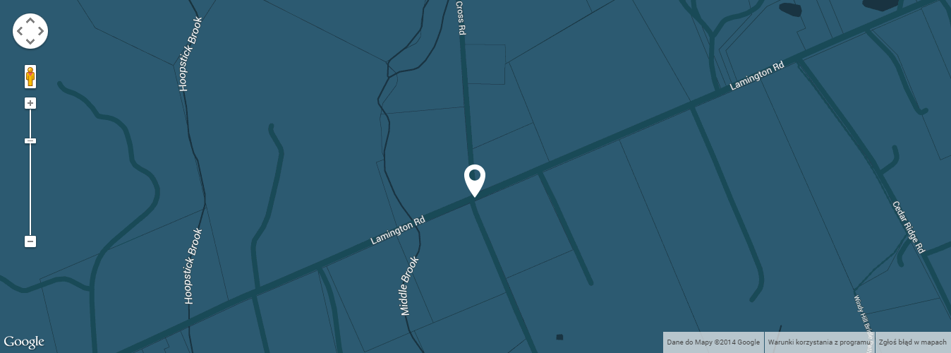
Google Map
Just use simple HTML markup:
|
1 2 3 4 5 6 7 |
<div class="ct-mediaSection"> <div class="ct-mediaSection-inner"> <div class="googlemapcontainer"> <div class="ct-googleMap" data-location="Bedminster" data-height="500" data-offset="0" data-zoom="16"></div> </div> </div><!-- /ct-mediaSection-inner --> </div> |
And don’t forget to include the following javascript in gmaps/init.js:
|
1 2 3 4 5 6 7 8 9 10 11 12 13 14 15 16 17 18 19 20 21 22 23 24 25 26 27 28 29 30 31 32 33 34 35 36 37 38 39 40 41 42 43 44 45 46 47 48 49 50 51 52 53 54 55 56 57 58 59 60 61 62 63 64 65 66 67 68 69 70 71 72 73 74 75 76 77 78 79 80 81 82 83 84 85 86 87 88 89 90 91 92 93 94 95 96 97 98 99 100 101 102 103 104 105 106 107 108 109 110 111 112 113 114 115 116 117 118 119 120 121 122 123 124 125 126 127 128 129 130 131 132 133 134 135 136 137 138 139 140 141 142 143 144 145 146 147 148 149 150 151 152 153 154 155 156 157 158 159 160 161 162 163 164 165 166 167 168 169 170 171 172 173 |
function initmap() { if (($(".ct-googleMap").length > 0) && (typeof google === 'object' && typeof google.maps === 'object')) { $('.ct-googleMap').each(function () { var atcenter = ""; var $this = $(this); var location = $this.data("location"); var zoom = $this.data("zoom"); var offset = -30; if (validatedata($this.data("offset"))) { offset = $this.data("offset"); } if (validatedata(location)) { $this.gmap3({ marker: { //latLng: [40.616439, -74.035540], address: location, options: { //visible: false icon: new google.maps.MarkerImage("assets/images/marker.png") }, callback: function (marker) { atcenter = marker.getPosition(); } }, map: { options: { //maxZoom:11, zoom: zoom, mapTypeId: google.maps.MapTypeId.ROADMAP, // ('ROADMAP', 'SATELLITE', 'HYBRID','TERRAIN'); scrollwheel: false, disableDoubleClickZoom: false, draggable: false, //disableDefaultUI: true, mapTypeControlOptions: { //mapTypeIds: [google.maps.MapTypeId.ROADMAP, google.maps.MapTypeId.HYBRID], //style: google.maps.MapTypeControlStyle.HORIZONTAL_BAR, //position: google.maps.ControlPosition.RIGHT_CENTER mapTypeIds: [] }, styles: [ { "featureType": "water", "elementType": "geometry", "stylers": [ { "color": "#193341" } ] }, { "featureType": "landscape", "elementType": "geometry", "stylers": [ { "color": "#2c5a71" } ] }, { "featureType": "road", "elementType": "geometry", "stylers": [ { "color": "#29768a" }, { "lightness": -37 } ] }, { "featureType": "poi", "elementType": "geometry", "stylers": [ { "color": "#406d80" } ] }, { "featureType": "transit", "elementType": "geometry", "stylers": [ { "color": "#406d80" } ] }, { "elementType": "labels.text.stroke", "stylers": [ { "visibility": "on" }, { "color": "#3e606f" }, { "weight": 2 }, { "gamma": 0.84 } ] }, { "elementType": "labels.text.fill", "stylers": [ { "color": "#ffffff" } ] }, { "featureType": "administrative", "elementType": "geometry", "stylers": [ { "weight": 0.6 }, { "color": "#1a3541" } ] }, { "elementType": "labels.icon", "stylers": [ { "visibility": "off" } ] }, { "featureType": "poi.park", "elementType": "geometry", "stylers": [ { "color": "#2c5a71" } ] } ] }, events: { idle: function () { if (!$this.data('idle')) { $this.gmap3('get').panBy(0, offset); $this.data('idle', true); } } } }, overlay: { address: location, options: { offset: { y: -100, x: -25 } } } //},"autofit" }); // center on resize google.maps.event.addDomListener(window, "resize", function () { //var userLocation = new google.maps.LatLng(53.8018,-1.553); setTimeout(function () { $this.gmap3('get').setCenter(atcenter); $this.gmap3('get').panBy(0, offset); }, 400); }); // set height $this.css("min-height", $this.data("height") + "px"); } if ($this.parent().parent().hasClass('hidemap')) { $this.parent().animate({height: '0px'}, 500); } }) } } |
Was this article helpful ?
Modern Form
Test comes with extended Modern Form
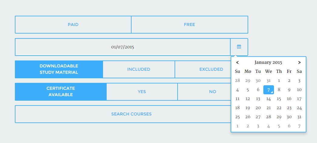
Modern Form
You can use it with the following HTML markup:
|
1 2 3 4 5 6 7 |
<form> <div class="input-group date ct-js-datetimePicker" id="datetimepicker"> <input type="text" id="inpcal" class="form-control ct-u-fontDarkgrey" /> label for="inpcal" class="input-group-addon"><i class="fa fa-calendar"></i> </label> </div> </form> |
Notice to include also the following javascript:
|
1 2 3 4 5 6 7 8 |
(function ($) { "use strict"; $(document).ready(function(){ $('.ct-js-datetimePicker').datetimepicker({ pickTime: false }); }) }(jQuery)); |
Was this article helpful ?
Progress Bars
To create progress bar use the following HTML markup:
|
1 2 3 4 5 |
<div class="progress"> <div class="progress-bar animating" role="progressbar" data-percentage="90" aria-valuenow="90" aria-valuemin="0" aria-valuemax="100"> <span>Web Design <strong>90%</strong></span> </div> </div> |
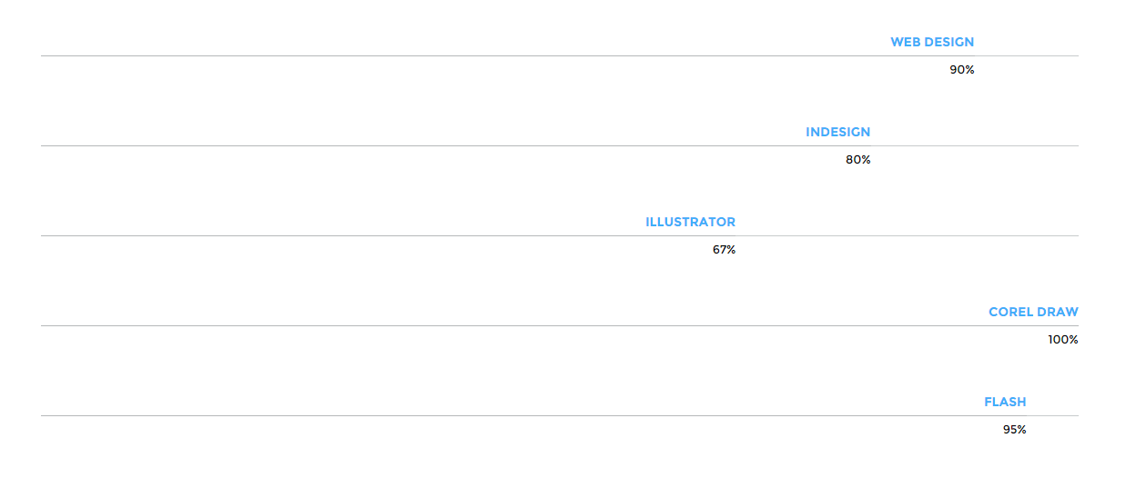
Progress Bars
Also don’t forget to include the javascript code:
|
1 2 3 4 5 6 7 8 9 10 11 12 13 14 15 16 17 18 19 20 21 22 23 24 25 26 27 28 29 30 31 32 33 34 35 36 37 38 |
(function ($) { "use strict"; $(document).ready(function(){ // Progress Bar // ------------------------------------------------------------------------------------------------------------------------------------------------------------------------------------------- //$('.progress-bar').progressbar(); if (jQuery().appear && jQuery("body").hasClass("cssAnimate")) { jQuery('.progress').appear(function () { var $this = jQuery(this); $this.each(function () { var $innerbar = $this.find(".progress-bar"); var percentage = $innerbar.attr("data-percentage"); $innerbar.addClass("animating").css("width", percentage + "%"); $innerbar.on('transitionend webkitTransitionEnd oTransitionEnd otransitionend MSTransitionEnd', function () { $innerbar.find(".pull-right").fadeIn(900); }); }); }, {accY: -100}); } else { jQuery('.progress').each(function () { var $this = jQuery(this); var $innerbar = $this.find(".progress-bar"); var percentage = $innerbar.attr("data-percentage"); $innerbar.addClass("animating").css("width", percentage + "%"); $innerbar.on('transitionend webkitTransitionEnd oTransitionEnd otransitionend MSTransitionEnd', function () { $innerbar.find(".pull-right").fadeIn(900); }); }); } }); // /document.ready })(jQuery); |
Was this article helpful ?
Progress Icons
You can present progress made also with Progress Icons
Progress Icons
You can use them with the following HTML markup:
|
1 2 3 4 5 6 7 8 |
<div class="ct-u-paddingBottom80"> <div class="progress-icons" data-font-size="90" data-icon-color="#3eaefa" data-active="12" data-total="15" data-icon="fa-male" data-delay="200"></div> </div> <div class="ct-u-paddingBottom80"> <div class="progress-icons" data-font-size="77" data-icon-color="#fc4349" data-active="12" data-total="15" data-icon="fa-female" data-delay="250"></div> </div> |
Also remember to include required javascript:
|
1 2 3 4 5 6 7 8 9 10 11 12 13 14 15 16 17 18 19 20 21 22 23 24 25 26 27 28 29 30 31 32 33 34 35 36 37 38 39 40 41 42 43 44 45 46 47 48 49 |
(function ($) { "use strict"; $(document).ready(function () { // Progress Icons // ------------------------------------------------------------------------------------------------------------------------------------------------------------------------------------------- $('.progress-icons').each(function () { var $this = $(this); var $total = $this.attr("data-total"); var $icon = $this.attr("data-icon"); var htmldata = ""; $this.css("font-size", ($this.attr("data-font-size") + "px")); var i; for (i = 0; i < $total; i++) { htmldata += '<i class="fa ' + $icon + '"></i> '; } $this.html(htmldata); if (($().appear) && ($("body").hasClass("cssAnimate"))) { $('.progress-icons').appear(function () { var $this = $(this); var $active = $this.attr("data-active"); var $icons = $this.find('i:lt(' + $active + ')'); var $delay = parseInt(validatedata($this.attr("data-delay"), 20)) var delay = $delay; for (i = 0; i < $icons.length; i++) { setTimeout((function (i) { return function () { i.style.color = $this.attr("data-icon-color"); } })($icons[i]), delay); delay += $delay; } }, {accY: -100}); } else { $this.each(function () { var $active = $this.attr("data-active"); var $icons = $this.find('i:lt(' + $active + ')'); $icons.css('color', $this.attr("data-icon-color")) }); } }) }) }(jQuery)); |
Was this article helpful ?
Select
Create nice selects with the following HTML markup:
|
1 2 3 4 5 6 7 8 9 |
<div class="form-group"> <select id="s1" class="form-control text-uppercase "> <option>Choose courses</option> <option>History</option> <option>Web Design</option> <option>Photography</option> <option>Building</option> </select> </div> |
And javascript code:
|
1 |
$('#s1').select2(); |
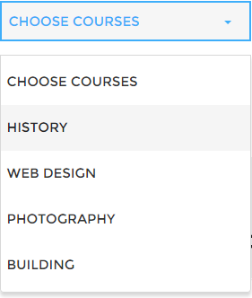
Select
Was this article helpful ?
Javascript Actly
All javascripts are placed in folder /js. In main.js file we implement all functions calls.
This theme uses following Javascript scripts:
- Bootstrap v 3 framework (powerful front-end framework for faster and easier web development)
- jQuery v1.10.2 (A fast javascript library that Foodtruckifies how to traverse HTML documents, handle events, perform animations.)
- jQuery FlexSlider v2.2.0
- GMAP3 Plugin for JQuery v. 5.1.1
- jQuery.appear
- isotope (http://isotope.metafizzy.co/)
- ct-mediaSections(with stellar.js)
- snap.js
- jquery.easing.1.3
- device
- jquery.pagescroller.lite
- chart.min
- jquery.countTo
- jquery.magnificpopup.min
- animate.css
- gmaps
- infinitescroll.min
- select2
jquery.appear
This plugin call function when element appear in viewport. This is used in custom animation, progress bars, counter timer.
Documentation: https://github.com/bas2k/jquery.appear/
|
1 2 3 4 5 6 7 8 9 10 11 12 13 |
if (jQuery().appear) { if (device.mobile()) { // disable animation on mobile jQuery("body").removeClass("withAnimation"); } else { jQuery('.withAnimation .animated').appear(function () { jQuery(this).each(function () { jQuery(this).addClass('activate'); jQuery(this).addClass($(this).data('fx')); }); }, {accY: -150}); } } |
Was this article helpful ?
Installation and activation
Installation via Administration Panel
When {Plugin} files are downloaded from your CodeCanyon account. You can start installation using WordPress administration panel.
Once you logged into your administration panel go to Plugins > Add New
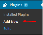
Add New plugin
Then choose Upload plugin:
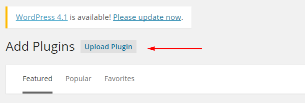
Upload plugin
Click Select a file and select ct-location.zip:
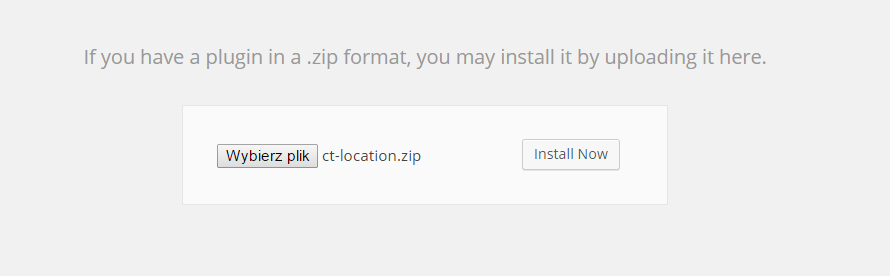
Select a file
And initialize installation via Install Now.
Installation via FTP
- Step 1 – Unarchive {plugin} file
- Step 2 – Access your host web server using FTP client
- Step 3 – Find directory wp-content > plugins
- Step 4 – Put folder ct-size-guide in directory wp-content > plugins
Was this article helpful ?
Creating a new map
You can display your map anywhere on the page by using a shortcode [ctlocation]. If you don’t define any map parammeters it will come with the defaults:
- ROADMAP style,
- width 100%,
- height 400px
- 3rd level of zoom,
- StreetView active
- centered on the city
Feel free to change any of the map parameters via shortcode attributes:
- MAPWIDTH
Example:You can use value in pixels or percents.1[ctlocation mapwidth="70%"] - MAPHEIGHT
Example:You can use value in pixels or percents.1[ctlocation mapheight="800px"] - CENTER
Example:Specify the point on which your map will centered after reloading the page.1[ctlocation center="lat_value, lng_value"] - ZOOM
Example:You can select values from 1 to 12.1[ctlocation zoom="10"] - CAT
Example:Define which markers should be displayed with assigned categories.1[ctlocation cat="europe"] - TAGS
Example:Define which markers should be displayed with assigned tag.1[ctlocation tags="creative"] - STREETVIEW
Example:1[ctlocation streetview="true"] - STREETVIEWNOW
Example:Enable or disbale StreetView option on your map with True and False attribute values.1[ctlocation streetview="true"] - TRAFFICLAYER
Example:Select True or False value. You can add next layer to your map to mark the most important roads.1[ctlocation trafficlayer="true"] - MAPTYPE
Example:Avalible map types: Hybrid, Roadmap, Satellite, Terrain. If you set different type than Roadmap, second button will be created at the top-right corner. If you set Terrain, there will be checkbox inside of default button.1[ctlocation maptype="Hybrid"] - GROUNDOVERLAY
Example:You can create new layer on your map to display an image. It is useful if you want to show how the displayed area had looked before or… how it looks now (for ex. if you set Satellite map type). Image_URL is a path to image, it could be web address. “NE” means top-right corner of image, “SW” is bottom-left corner.1[ctlocation groundoverlay="Image_URL, NE_Lat, NE_Lng, SW_Lat, SW_Lng]
All of these values are required. - POLYLINE
Example:You can draw a line on your map, which is based on declarated points. You can choose its color, visibility, and largeness. IMPORTANT! Remember about inserting Lat and Lng values for 2 points minimum.1[ctlocation polyline="Line_Color, Line_Visibility, Line_Largeness, 1_Lat, 1_Lng, 2_Lat, 2_Lng, ...."] - POLYGON
Example:You can draw a polygon on your map, which is based on declarated points. You can choose color, visibility, and largeness of its elements. IMPORTANT! Remember about inserting Lat and Lng values for minimum 3 points.1[ctlocation polylgon="Border_Color, Border_Visibility, Border_Largeness, Fill_Color, Fill_Visibility, 1_Lat, 1_Lng, 2_Lat, 2_Lng, 3_Lat, 3_Lng...."] - ROUTE
Example:Thanks to this attribute you can display a route from point A to point B.1[ctlocation route="Start_location; Final_location"]
IMPORTANT! Note that locations are separated with semicolon (” ; “), not with comma!
Notice:
Locations are separated with semicolon (” ; “), not with comma!
Was this article helpful ?
Adding markers
You finally have a map, but how to point something?
It is very simple. What you have to do is clicking on Location > Add new Location.
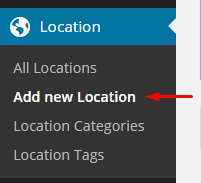
New Location
Was this article helpful ?
Address, Latitutde & Longitude
Obviously, you should write an address (1) or Latitude (2.1) & Longitude (2.2) values. You could set your location by clicking Get My Location button (3).
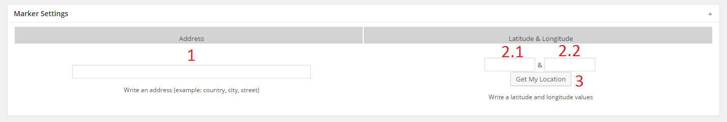
Markers settings
Was this article helpful ?
Categories & Tags
To display your marker it is required to attribute it to categories and tags.
You can choose Category (1) from All Location Categories (1.1) or add New Location Category (1.2 & 1.3). Tags (2) are similar to categories. Add new Location Tag (2.1) or choose one of most used tags (2.3). Attributted tags are under most used ones.
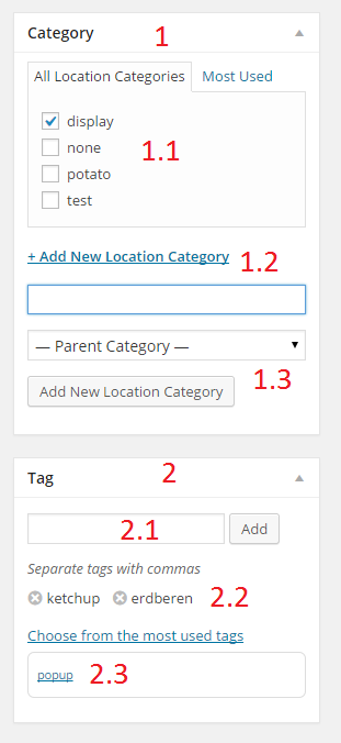
Categories and Tags
You can manage categories and tags in Location submenu.
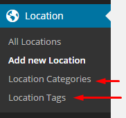
Manage tags and categories
Was this article helpful ?
Marker icons
If you want to change default icon (1), which is automaticly added, to custom icon, go to Marker Icon at the bottom and click on Add New Marker Icon button (2).
Icon settings
If you have some images in Media Library and you want to use one of them go to Media Library (1), then select your image (2). You can resize your image by clicking Edit Image (3). After that click Add to gallery (4). Notice: You can select more than one image at once.
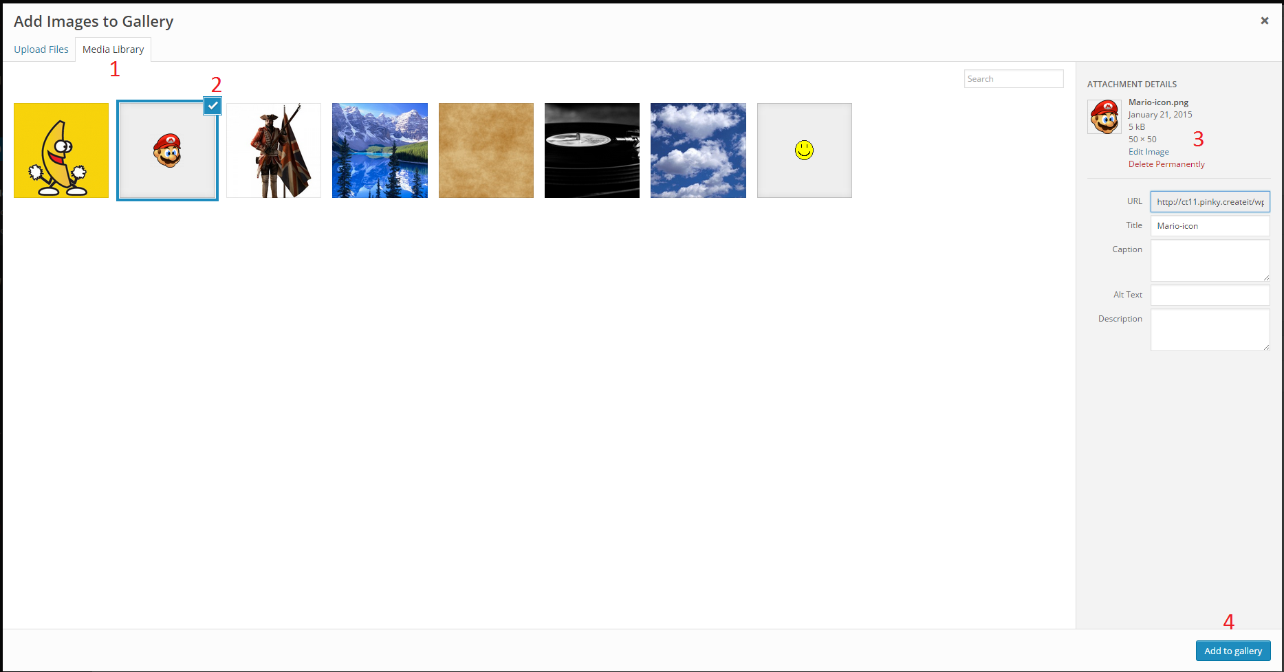
Select images from Media Library
You can also upload icon image directly from your computer via Upload Files tab.
We recommend to use maximum 60x60px images for icons, without background.
Was this article helpful ?
Pop Ups
You can add default or custom pop up to your Marker. How?
If you want the default pop up made by google just write your text (1) and mark Simple Pop Up option (default).
Shortcode example:
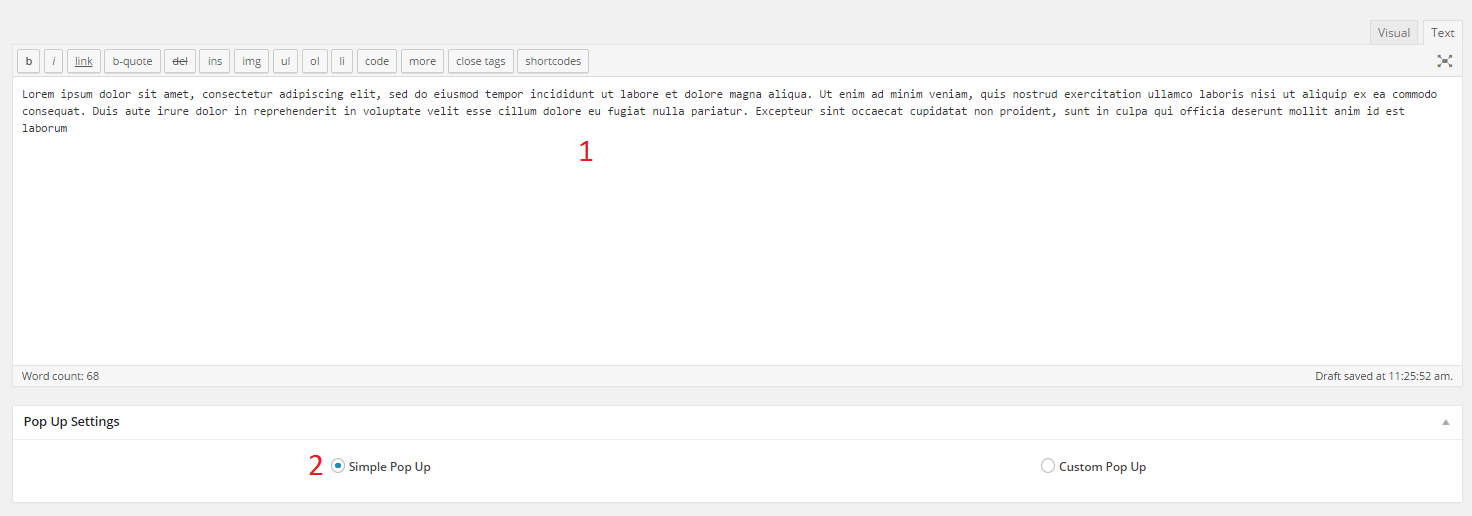
Simple pop up code
Result:
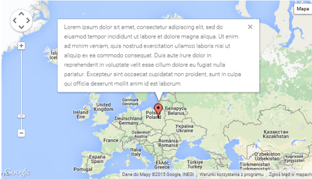
Simple pop up result
You can put HTML instead of text. It will be rendered inside of your Pop Up
Shortcode example:

Simple pop up with HTML shortcode
Result:
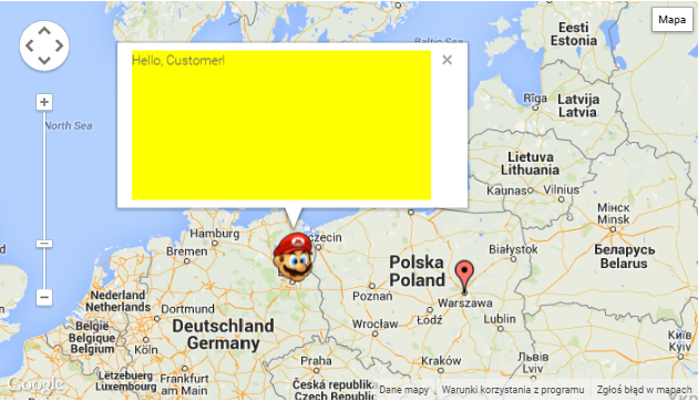
Simple popup with HTML result
When you mark Custom Pop Up (1) option you will have whole panel to customize your Pop Up.
Here you have an example with default values:
– Pop Up width (2) (in pixels or “auto”)
– Pop Up height (3) (in pixels or “auto”)
– Pop Up Border Type (4) (None, Solid, Double, Ridge, Inset, Outset)
– Pop Up Border Radius (5) (up to 30px)
– Pop Up Visibility (6) (between 0 and 1)
– As a Pop Up Background you can choose a color (7) or an image (8)
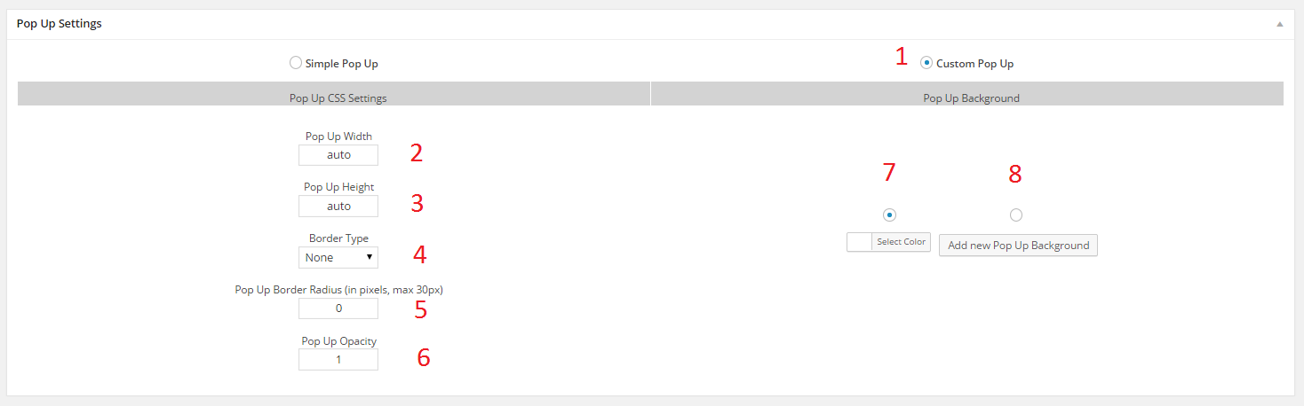
Pop Up Settings
To set background color (it’t a default option), click on Select Color:
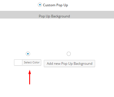
Background color
Then select a color (1) and press Current Color button (2):
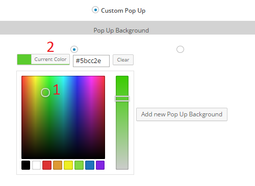
Select your color
If you want to use image as a background select Pop Up Background
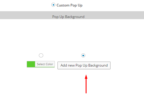
Background image
Select image in the same way you choose Marker Icon. The only difference is you can select only one image. After Adding to gallery you will have miniature of original image.
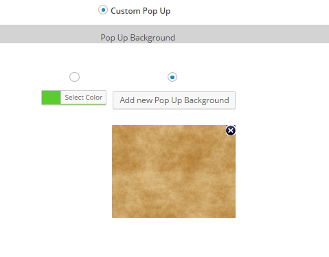
Select Pop Up background
Examples of usage:
Custom Pop Up with text
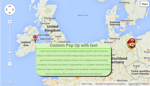
Custom Pop Up with text
Custom Pop Up with image
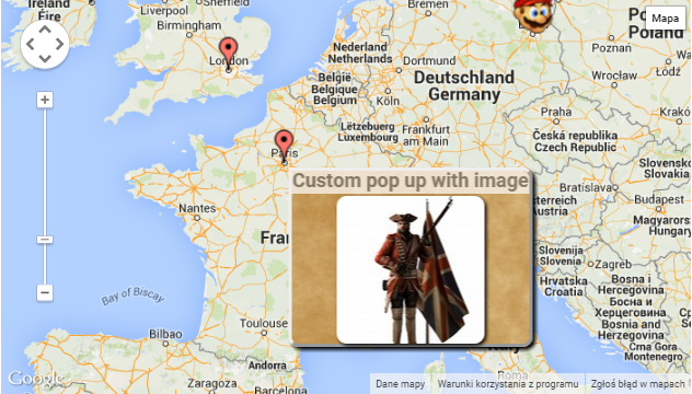
Custom pop up with image
Custom Pop Up with text and image
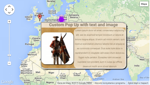
Custom pop up with text and image
Notice:
If you don’t want to use Pop up option – don’t modify Post Editor fields and don’t select Simple Pop Up options.
Was this article helpful ?
Text options
In Test you can use Excerpt text option, which can be displayed on Blog Index page as every post introduction.
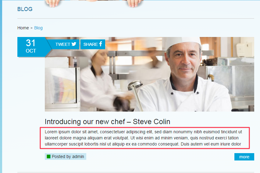
Post with excerpt
To display your blog post like above please navigate to Appearance > Theme Options – Posts and in Index tab select the following options:
- Post excerpt – Show
- Full text – Hide
Additionally you need to mark which part of your post should be an excerpt. You can did it with more divider. Just put the following code after your excerpt:
|
1 |
<!--more--> |
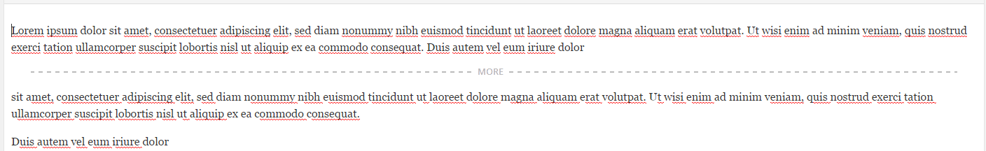
Excerpt divider
Was this article helpful ?
Theme Installation
1. Open index.html in {Theme Path} folder with your text editor (Example: Notepad++, Sublime Text, Php Storm or Etc)
2. Copy all HTML content from index.html file
Installation
3. Open your browser and go to the http://tumblr.com page. If you are registered please login into your Tumblr Dashboard
4. Please click on the Gear Icon at right top of the site
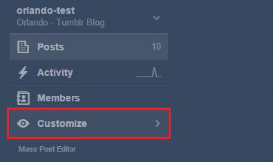
5. Click on the Edit HTML button, like this:
6. Next, paste the HTML code into Tumblr theme editor like below:
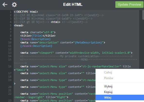
7. Finally, please click to the Update Preview button and save
Was this article helpful ?
Mobile View
Theme has default mobile layout. In our project we have own mobile design, so now you need to disable standard mobile layout. To do this, please click Advanced Options in the bottom of the side like below:
2. Click or disable use optimized mobile layout like below:
 3. Finally, please click Save button. Now you have ou own mobile layout.
Was this article helpful ?
Theme Options
1. After installing the theme you are able to add a text description to the options. Now the text fields are empty. To change it, please scroll down on the tumblr theme page and fill the Header Title to your own header name. This text will be displayed on the page like below:
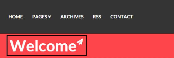
2. Next, please add the text to the Header description. This text will be displayed on the right side of the main header like in the picture below:

3. Next, please add the text to the Blog Username. This text is needed for the name of the author. This text field will be displayed on the post single page. When it’s done add some text to the Author Description text field. The both fields are described below:
4. Next things what you have to do is to add a name of the disqus component. OrlandoThumblrThemeworks with Disqus. So if you would like to have a comments like this on your page please fill the Disqus Shortname on the theme options menu. When it’s done you should see disqus panel in your single post page like below:
5. In the top of the administrative panel in tumblr you have an option like Avatar. Click on the option and choose the author image that you want to see on the page. It should be small picture with the image of author’s blog. Then please choose good name for the blog in component like below:

This text will be displayed on the sidebar at the top of the page.
6. The most important things is to set the options how many post should be displayed on the page. For do this, please go to Advanced Options on the bottom of the page and set Posts per page for 6. For now you have 6 posts on the every page. You can change it. How many posts should be displayed is depend from you. The options Open links in new window should be dsplayed.
7. In Theme options on the edit theme panel you have options like Logo. If you don’t want to have logo like in our theme please chosse the another logo.
8. OrlandoThumblrThemehas a list of components / options that you can use. The list of available options is on the picture :
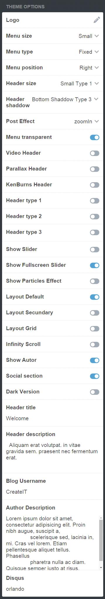
9. As you can see above, our theme let to the user to modyfy the theme. Our theme has 3 types of blog. So to enable the one of them, please go to the panel and choose for example Header type 1. You should see the header like below:

If you would like to have Header type 2, just click it. The image of the header on the picture:

If you would like to have Hedaer type 3, click it. The image below:

In components you can choose different options of the header. You can set the size of the header, header shaddow.
10. The list of components has options like : Video Header, Parallax Header, KenBurns Header. So instead of the normal header you can use it of them. The effect of the header are displayed on the bottom:
– Video Header

– Parallax Header

– KenBurns Header

11. If it’s works you can go to the menu options. In our theme we have a lot of menu options. You can choose a size of the menu, type of the menu, position and set menu as transparent menu. Just choose for example:
Menu size -> Small
Menu type -> Fixed
Menu position -> Right
Menu transparent -> disabled
The picture will be helpful, if you don’t know how to do it:


12. In our theme we have a 3 types of effects like below:
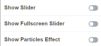
To activate one of them please click to enable. For example to show how it works use Show Slider effect. The effects are only displayed on the main page with post. Then make sure that you have acticate the options like here :
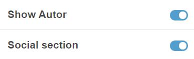
Thanks to thhis options in post single page you will see information about author and social section where you are be able to share on facebook or twitter.
If you are here,be happy , you already did everything to install our theme on you tumblr blog. Below i will describe the one of the most importang things needed to work with our theme.
13. If you are seeing the options:
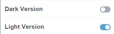
Please make sure that you have the same view on your computer. Like you can see, light version is already enabled. Thanks to do this, you will have a light version of theme. So everything will be done in light colors on the main page. If you decide to use dark version please make sure that you have the view like below:
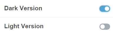
The user can not use the both version in the same time. So decide which version you want to use right now.
14. Next, you need to choose a type of blog. Our theme has 4 types of blog like below:
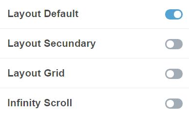
Please click to the version that you want to use. In the exaple above Layout Default is choosen. If you want to change it, just disable Layout Default and choose another. Now you can open a browser and enter address of you theme. The posts will be displayed if you added before. The main page is ready. So, enjoy with your nice Tumblr theme !
Was this article helpful ?
Custom Pages
If you want to make a custom pages, please follow this tutorial:
1. Please stay to your custom theme menu, and scroll down until very bottom of the menu. You should see the Add a page menu.
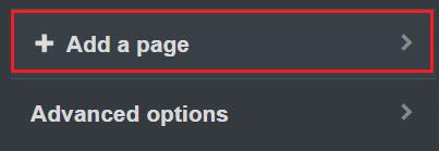
2. Enter the details you need for your new page. In our theme we have a following list of custom pages:
– page-blank
– maintenance-page
– our-office
– contact-us
– about-us
– services
– media-sections
3. If you want to have a following list of custom pages like above, just follow instructions. Here is an example how to add a page-blank to the our theme:
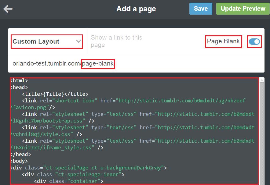
4. The content of the custom page is from page blank file. You will find this file in /OrlandoThumblrTheme/lightfolder or in /OrlandoThumblrTheme/dark folder. It’s depend of the user. If ther user want to have light version so please choose light, if not please choose different.
5. After that, click Update Preview and Click Save buton
6. Finally, the Custom Page will be displayed when you go to the menu and select Pages -> Page Blank. To add next custom pages you have to do the same like with Page Blank.
Was this article helpful ?
Icons and Animate CSS
1. Icons
We’ve included 360+ font icons. Awesome Icons – http://fontawesome.io/icons/
HTML markup:
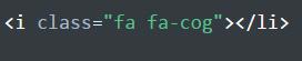
The example of icons below:

2. Animations with Posts
In our theme we have a lot of options displaying the posts. You can select one options from the list below:
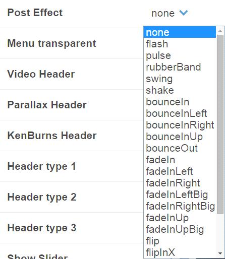
This effect works with Default and Secundary types of blog. Below is the list of effect that you can add to the tumblr theme:
Was this article helpful ?
Javascript
1. Javascript library and files
In main.js file we implement all functions calls.
This theme uses following Javascript files:
– Bootstrap v 3 framework (powerful front-end framework for faster and easier web development)
– jQuery v1.10.2 (A fast javascript library that Foodtruckifies how to traverse HTML documents, handle events, perform animations.)
– jQuery FlexSlider v2.2.0
– GMAP3 Plugin for JQuery v. 5.1.1
– jQuery.appear
– jQuery Stellar
– Modernizr 2.0.6
– PageScroller
– Snap.js
– Device.js 0.1.58
– Chart.js
2. Google Map (GMAP3 Plugin)
This is google map with custom marker, you can define couple parameters:
1. data-location – address to show
2. data-height – map height (if undefined height will be 220px)
3. data-offset – by how many map should be repositioned from marker center point (default -30)
HTML Markup:

3. Jquery.appear
This plugin call function when element appear in viewport. This is used in custom animation, progress bars, counter timer.

4. Charts
This plugin is used to make graphics. Documentation: http://www.chartjs.org/
Was this article helpful ?
Contact Form
The contact form was made using on-line contact form builder. The documentation is here :
http://www.jotform.com/myforms
The project has two different version of contact form. One of them is for light version, the second is for dark.
Was this article helpful ?
Sources & Credits
The following sources and files have been used to build up this theme
Twitter Bootstrap – http://twitter.github.com/bootstrap/
jQuery – http://www.jquery.com
Was this article helpful ?
Navbar

navbar
HTML markup:
|
1 2 3 4 5 6 7 8 9 10 11 12 13 14 15 16 17 18 19 20 21 22 23 24 25 26 27 28 29 30 31 32 33 34 35 36 37 38 39 40 41 42 43 44 45 46 47 48 49 50 51 52 53 54 55 56 57 58 59 |
<nav class="navbar navbar-default ct-navbar--type1"> <div class="navbar-header"> <a href="index.html"> <img id="ct-navbar--logoDark" src="../assets/images/demo-content/fancylogo.png" alt="JuGas"> <img id="ct-navbar--logoWhite" src="../assets/images/demo-content/fancylogo2.png" alt="JuGas"> </a> </div> <div class="container-fluid"> <ul class="nav navbar-nav yamm ct-navbar--fadeIn"> <!-- =========================== --> <li class="active"><a href="index.html">Home</a></li> <!-- =========================== --> <li><a href="about.html">About</a></li> <!-- =========================== --> <li class="dropdown"><a class="dropdown-toggle" href="single-work-floading.html">Works</a> <ul class="dropdown-menu"> <li> <div class="yamm-content"> <div class="row"> <div class="col-sm-12"> <h5 class="ct-dropdownHeader">Works</h5> <ul class="list-unstyled"> <li><a href="single-work-floading.html">Single Work - Floading</a></li> <li><a href="single-work-standard.html">Single-work - Standard</a></li> <li><a href="single-work-video.html">Single Work - Video</a></li> </ul> </div> </div> </div> </li> </ul> </li> <!-- =========================== --> <li><a href="boxed.html">Boxed</a></li> <li><a href="contact.html">Contact</a></li> <li> <a class="ct-js-navSearch ct-navbar-navSearch" href="#"> <i class="fa fa-search"></i> </a> </li> </ul> <div class="ct-navbar-search"> <form role="form"> <div class="form-group ct-input--type2"> <input id="search" required="" type="text" name="field[]" class="form-control"> <label for="search"><span>Search</span></label> <button class="ct-navbar-search-button" type="submit"> <i class="fa fa-search fa-fw"></i> </button> </div> </form> </div> </div> </nav> |
Was this article helpful ?
Section header

section-header
HTML markup:
|
1 2 3 4 5 6 |
<div class="ct-sectionHeader ct-sectionHeader--left"> <div class="container"> <h5 class="ct-u-hr ct-u-hr--left ct-sectionHeader-title ct-u-marginBottom10">Who we are ?</h5> <h3 class="ct-sectionHeader-subtitle ct-u-marginBoth0">About Us</h3> </div> </div> |
Was this article helpful ?
Media sections

media section
Parallax Section
HTML markup:
|
1 2 3 4 5 6 7 |
<div class="ct-mediaSection" data-height="575" data-type="parallax" data-stellar-background-ratio="0.3" data-bg-image="../../assets/images/demo-content/Intro-04.jpg" data-bg-image-mobile="../../assets/images/demo-content/Intro-04.jpg"> <div class="ct-mediaSection-inner text-center ct-u-colorWhite"> <h3 class="ct-u-colorWhite">Media Section with Parallax Effect</h3> <p>Lorem ipsum dolor sit amet, consectetur adipisicing elit. Proin nibh augue, suscipit a, scelerisque sed, lacinia in, mi. Cras vel lorem.</p> </div> </div> |
Pattern Section:
HTML markup:
|
1 2 3 4 5 6 7 |
<div class="ct-mediaSection" data-height="575" data-type="pattern" data-bg-image="../../assets/images/demo-content/slide-lg-02.jpg" data-bg-image-mobile="../../assets/images/demo-content/slide-lg-02.jpg"> <div class="ct-mediaSection-inner text-center ct-u-colorWhite"> <h3 class="ct-u-colorWhite">Media Section with Static Image</h3> <p>Lorem ipsum dolor sit amet, consectetur adipisicing elit. Proin nibh augue, suscipit a, scelerisque sed, lacinia in, mi. Cras vel lorem.</p> </div> </div> |
Ken Burns Section:
HTML markup:
|
1 2 3 4 5 6 7 8 9 10 |
<div class="ct-mediaSection" data-height="575" data-type="kenburns" data-bg-image="../../assets/images/demo-content/Intro-02.jpg" data-bg-image-mobile="../../assets/images/demo-content/Intro-02.jpg"> <div class="ct-mediaSection-kenburnsImageContainer"> <img src="../../assets/images/demo-content/Intro-02.jpg"> </div> <div class="ct-mediaSection-inner text-center ct-u-colorWhite"> <h3 class="ct-u-colorWhite">Media Section with Ken Burns Effect</h3> <p>Lorem ipsum dolor sit amet, consectetur adipisicing elit. Proin nibh augue, suscipit a, scelerisque sed, lacinia in, mi. Cras vel lorem.</p> </div> </div> |
Video Section
:
Html markup:
|
1 2 3 4 5 6 7 8 9 10 11 12 13 14 |
<div class="ct-mediaSection" data-height="575" data-type="video" data-bg-image-mobile="../assets/images/demo-content/section-01.jpg"> <div class="ct-mediaSection-video embed-responsive embed-responsive-16by9"> <video muted loop autoplay="autoplay" preload="auto"> <source src='../../assets/videos/state_fair.mp4' type='video/mp4'/> </video> </div> <div class="ct-u-displayTable"> <div class="ct-mediaSection-inner text-center ct-u-colorWhite"> <h3 class="ct-u-colorWhite">Media Section with Video Background</h3> <p>Lorem ipsum dolor sit amet, consectetur adipisicing elit. Proin nibh augue, suscipit a, scelerisque sed, lacinia in, mi. Cras vel lorem.</p> </div> </div> </div> |
Was this article helpful ?
Text box
text-box
HTML markup:
|
1 2 3 4 5 |
<div class="ct-textBox"> <h5 class="ct-u-hr ct-u-hr--left"><small>First</small></h5> <h3 class="ct-iconBox-header"><small>Ideas</small></h3> <p>A small river named Duden flows by their place and supplies it with the necessary regelia.</p> </div> |
Was this article helpful ?
Icon Box
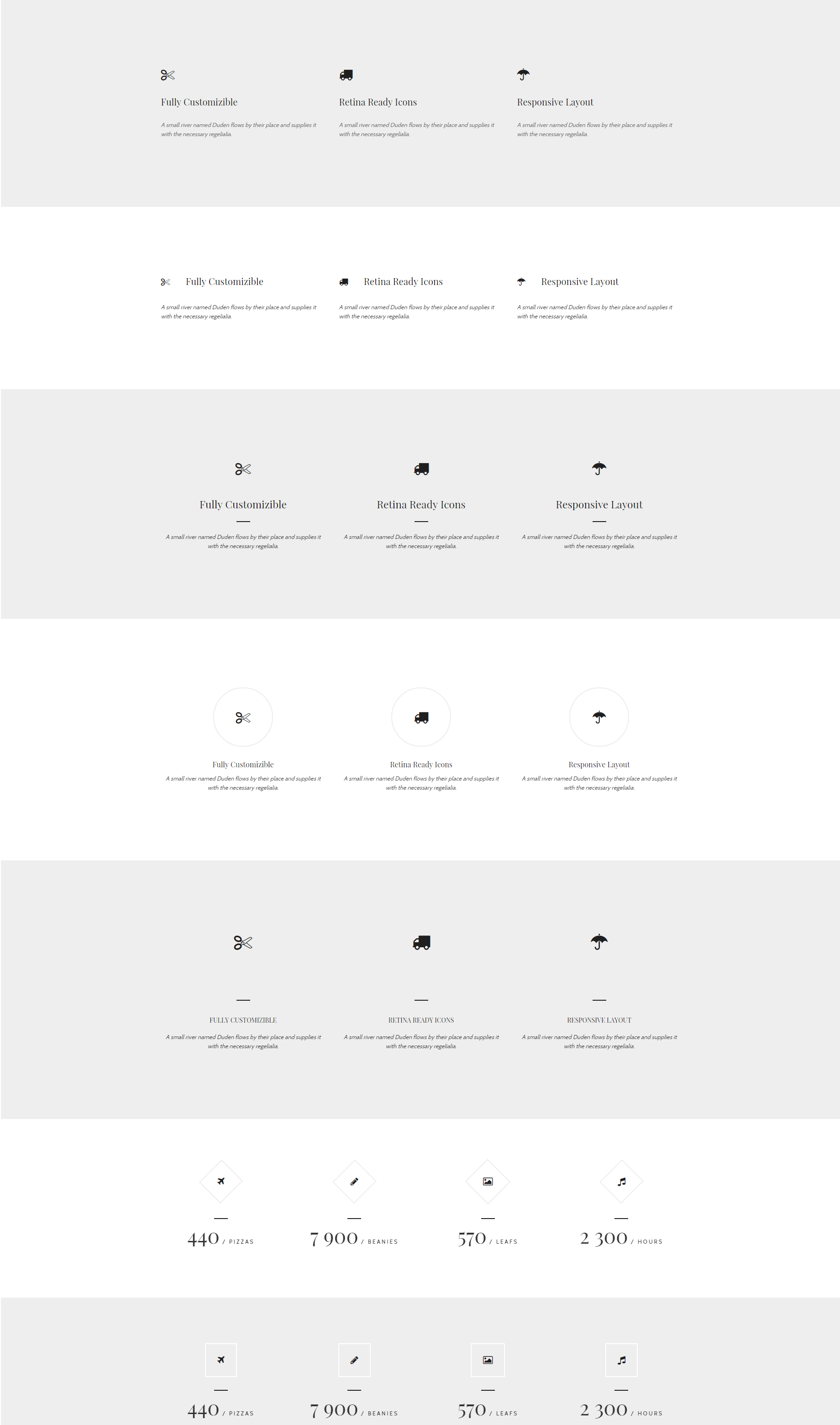
icon-boxes
Use one of our icon boxes with the following HTML markup – you can change box type with type class:
|
1 2 3 4 5 |
<div class="ct-iconBox--type1"> <div class="ct-iconBox-icon ct-u-hr ct-u-hr--mid"><i class="fa fa-truck"></i></div> <h4 class="ct-iconBox-header">Retina Ready Icons</h4> <p>A small river named Duden flows by their place and supplies it with the necessary regelialia.</p> </div> |
Was this article helpful ?
Person box
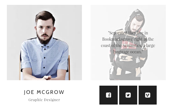
person-boxes
HTML markup:
|
1 2 3 4 5 6 7 8 9 10 11 12 13 14 15 16 17 18 |
<div class="ct-personBox"> <div class="ct-personBox-img"> <img src="../assets/images/demo-content/personBox-01.jpg" alt=""> <div class="ct-personBox-hover"> <div class="ct-personBox-quote"><p>"Separated they live in Bookmarksgrove right at the coast of the Semantics, a large language ocean."</p></div> </div> </div> <div class="ct-personBox-title"> <h5>Joe McGrow<small>Graphic Designer</small></h5> <div class="ct-personBox-hover"> <div class="ct-socials--type4"> <a href="https://www.facebook.com/createITpl"><i class="fa fa-facebook-square"></i></a> <a href="https://twitter.com/createitpl"><i class="fa fa-twitter-square"></i></a> <a href="#"><i class="fa fa-vimeo-square"></i></a> </div> </div> </div> </div> |
Was this article helpful ?
Slider
Remember to include the following scripts if you want to use Owlcarousel:
|
1 2 |
<script src="../assets/js/owl/owl.carousel.min.js"></script> <script src="../assets/js/owl/init.js"></script> |
Please check carousel documentation here
Was this article helpful ?
Socials

socials1
HTML markup:
|
1 2 3 4 5 6 |
<ul class="ct-socials ct-socials--type1 ct-u-paddingBoth20"> <li><a href="https://twitter.com/createitpl"><i class="fa fa-twitter-square"></i></a></li> <li><a href="https://www.facebook.com/createITpl"><i class="fa fa-facebook-square"></i></a></li> <li><a href="#"><i class="fa fa-vimeo-square"></i></a></li> <li><a href="#"><i class="fa fa-youtube"></i></a></li> </ul> |

socials2
|
1 2 3 4 5 6 |
<ul class="ct-socials ct-socials--type2 ct-u-paddingBoth20"> <li><a href="https://twitter.com/createitpl"><i class="fa fa-twitter-square"></i></a></li> <li><a href="https://www.facebook.com/createITpl"><i class="fa fa-facebook-square"></i></a></li> <li><a href="#"><i class="fa fa-vimeo-square"></i></a></li> <li><a href="#"><i class="fa fa-youtube"></i></a></li> </ul> |

socials3
|
1 2 3 4 5 6 |
<ul class="ct-socials ct-socials--type3 ct-u-paddingBoth20"> <li><a href="https://twitter.com/createitpl"><i class="fa fa-twitter-square"></i></a></li> <li><a href="https://www.facebook.com/createITpl"><i class="fa fa-facebook-square"></i></a></li> <li><a href="#"><i class="fa fa-vimeo-square"></i></a></li> <li><a href="#"><i class="fa fa-youtube"></i></a></li> </ul> |
Was this article helpful ?
Footer
You can easily use one of two predefined footer’s types.
Footer

footer
HTML markup:
|
1 2 3 4 5 6 7 8 9 |
<footer class="ct-footer ct-u-paddingTop30"> <ul class="ct-socials ct-socials--type3 ct-u-paddingBoth20"> <li><a href="https://twitter.com/createitpl"><i class="fa fa-twitter-square"></i></a></li> <li><a href="https://www.facebook.com/createITpl"><i class="fa fa-facebook-square"></i></a></li> <li><a href="#"><i class="fa fa-vimeo-square"></i></a></li> <li><a href="#"><i class="fa fa-youtube"></i></a></li> </ul> <p class="ct-u-colorDarkerGray text-center ct-u-paddingBottom30">COPYRIGHT © <a class="ct-u-colorDarkerGray" href="http://outsourcing.createit.pl/">createIT</a> 2014</p> </footer> |
Large Footer
large-footer
HTML markup:
|
1 2 3 4 5 6 7 8 9 10 11 12 13 14 15 16 17 18 19 20 21 22 23 24 25 26 27 28 29 30 31 32 33 34 35 36 37 38 39 40 41 42 43 44 45 46 47 48 49 50 51 52 53 54 55 56 57 58 59 60 61 62 63 64 65 |
<footer class="ct-footer"> <div class="container"> <div class="row"> <div class="col-md-4 col-sm-12"> <div class="ct-footer-about"> <img src="../assets/images/demo-content/logo2.png" alt=""> <p class="ct-u-hr ct-u-hr--left">A small river named Duden flows by their place and supplies it with the necessary regelialia. Their place and supplies it with the. Duden flows by their place and supplies it with the necessary regelialia. Their place and supplies it.</p> <ul class="list-unstyled ct-list ct-list--big"> <li><i class="fa fa-map-marker"></i><span>No.200 Joseph Road, Canada</span></li> <li><i class="fa fa-mobile"></i><span>+44 (0) 800 765 4321</span></li> <li><a href="#"><i class="fa fa-envelope-o"></i><span>info@Rainbow Dash.com</span></a></li> </ul> </div> </div> <div class="col-md-4 col-sm-6"> <div class="ct-footer-lists"> <h4><small>About this theme</small></h4> <ul class="list-unstyled ct-list ct-u-hr ct-u-hr--left"> <li><a href="#">Company Analysis</a></li> <li><a href="#">Strategy Planning</a></li> <li><a href="#">Brand Creation</a></li> <li><a href="#">Video Production</a></li> </ul> <h4><small>Shortcode Options</small></h4> <ul class="list-unstyled ct-list"> <li><a href="#">Company Analysis</a></li> <li><a href="#">Strategy Planning</a></li> <li><a href="#">Brand Creation</a></li> <li><a href="#">Video Production</a></li> </ul> </div> </div> <div class="col-md-4 col-sm-6"> <div class="ct-footer-contact"> <h4><small>Contact Us</small></h4> <p>A small river named Duden flows by their place and supplies it with the necessary regelialia.</p> <div class="form-group ct-input--type2"> <input id="contact_name" required="" type="email" class="form-control"> <label for="contact_name"><span>Name</span></label> </div> <div class="form-group ct-input--type2"> <input id="contact_email" required="" type="email" class="form-control"> <label for="contact_email"><span>Email</span></label> </div> <div class="form-group ct-input--type2"> <textarea id="contact_message" required="" rows="4" class="form-control"></textarea> <label for="contact_message"><span>Message</span></label> </div> <div class="clearfix visible"></div> <a href="#" class="btn btn-default"><span>Send</span></a> <div class="clearfix"></div> </div> </div> </div> </div> <div class="ct-footer-copyright"> COPYRIGHT © <a href="http://outsourcing.createit.pl/">createIT</a> 2014 </div> </footer> |
Was this article helpful ?
Testimonial

testimonial
Add your clients’ testimonials with simple HTML markup:
|
1 2 3 4 5 6 7 |
<div class="ct-testimonials"> <h6>Love Works</h6> <a href="#" class="ct-testimonials-image"><img src="../assets/images/demo-content/person-01.png" alt=""></a> <p class="ct-u-hr ct-u-hr--wide">"Founded in 2013, sisters Liz, Megan and Jess set out to produce a functional, beautiful diaper bag. As Leader, we designed backpack to reprezent us both as mothers and as leaders: thoughtful, confident and inspired. "</p> <h3>Mr. Frankie<small>(New York, USA)</small></h3> </div> |
Was this article helpful ?
Portfolio

portfolio
HTML markup:
|
1 2 3 4 5 |
<div class="container-fluid"> <div id="ct-gallery" class="ct-gallery ct-gallery--col4 ct-js-magnificPortfolioPopupGroup"> ... </div> </div> |
HTML markup for Single Item:
|
1 2 3 4 5 6 7 8 9 10 11 12 13 14 15 16 17 18 |
<div class="ct-gallery-item ct-gallery-item--masonry ct-gallery-item--default hidden ct-gallery-item--normal webdesign"> <div class="ct-gallery-itemInner"> <a class="ct-js-magnificPopupImage" href="../assets/images/demo-content/portfolio-03.jpg" title="Berlin Songs Festival"> <figure class="ct-hover ct-js-hover ct-hover--type10"> <img src="../assets/images/demo-content/portfolio-03.jpg" alt=""> <figcaption> <div class="ct-hover-inner"> <div class="ct-hover-text"> <h4 class="ct-hover-header">Berlin Songs Festival</h4> <div class="ct-u-hr ct-u-hr--mid"></div> <p>Design / Photography</p> </div> </div> </figcaption> </figure> </a> </div> </div> |
Required scripts:
|
1 2 3 4 5 6 7 |
<script src="../assets/js/magnific-popup/jquery.magnific-popup.min.js"></script> <script src="../assets/js/magnific-popup/init.js"></script> <script src="../assets/js/portfolio/jquery.isotope.min.js"></script> <script src="../assets/js/portfolio/imagesloaded.js"></script> <script src="../assets/js/portfolio/infinitescroll.min.js"></script> <script src="../assets/js/portfolio/init.js"></script> |
Was this article helpful ?
Progress Bar
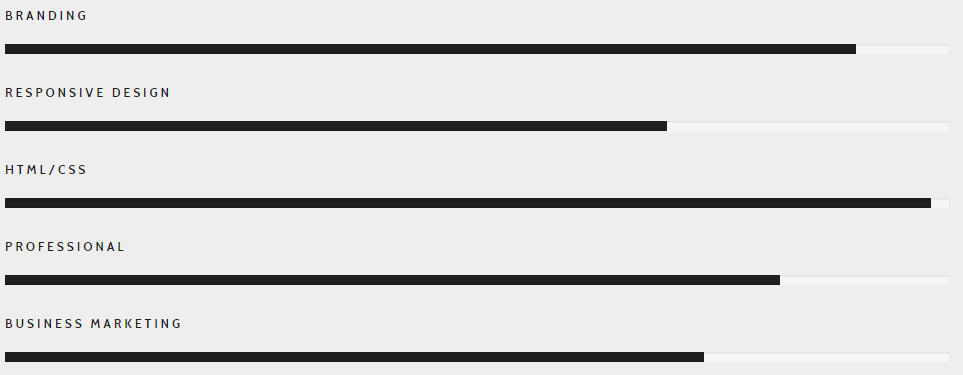
progress-bar
HTML markup:
|
1 2 3 4 5 6 7 8 |
<div class="ct-progressBar"> <div class="ct-progressBar-name">HTML/CSS</div> <div class="progress progress-motive"> <div class="progress-bar" role="progressbar" aria-valuenow="98" aria-valuemin="0" aria-valuemax="100"> <div class="ct-progressBar-tr"></div> </div> </div> </div> |
Remember to include also the following script:
|
1 |
<script src="../../assets/js/progressbars/init.js"></script> |
Was this article helpful ?
Overflow Container

overflow-container
HTML markup:
|
1 2 3 4 5 6 7 8 9 10 11 12 13 14 15 16 |
<div class="ct-sectionOverflow"> <div class="ct-sectionOverflow-content"> <div class="container"> <div class="row"> <div class="col-md-3 col-sm-5"> <div class="ct-sectionOverflow-image ct-sectionOverflow-image--left"> <img src="../assets/images/demo-content/Image-01.jpg"> </div> </div> <div class="col-md-9 col-sm-7"> ... </div> </div> </div> </div> </div> |
Was this article helpful ?
Buttons
There are two available button types. Use appropriate HTML markup to add buttons to your page:

Button 1
|
1 |
<a href="#" class="btn btn-default"><i class="fa fa-envelope-o"></i><span>Send</span></a> |

button2
|
1 |
<a href="#" class="btn btn-inverse ct-hover--icon-replace-left"><i class="fa fa-long-arrow-right"></i><span>View More</span></a> |
Was this article helpful ?
Forms
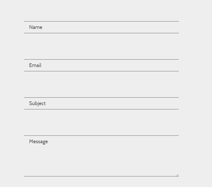
forms
Add the following HTML to create awesome animated forms:
|
1 2 3 4 |
<div class="form-group ct-input--type1"> <input id="contact_name" required="" type="email" class="form-control"> <label for="contact_name"><span>Name</span></label> </div> |
Notice, that you must also include the following script on page, where you are using forms:
|
1 |
<script src="../../assets/plugins/input-effects/input-effects.js"></script> |
Was this article helpful ?
Blog
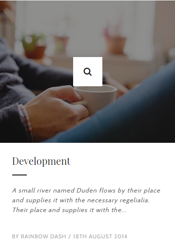
blog-post
Display your blog posts anywhere you want to with simple HTML markup:
|
1 2 3 4 5 6 7 8 9 10 |
<div class="ct-articleBox"> <a class="ct-js-magnificPopupImage" href="../assets/images/demo-content/article-02.jpg"> <div class="ct-articleBox-media ct-articleBox-media--image"><img src="../assets/images/demo-content/article-02.jpg" alt=""></div> </a> <div class="ct-articleBox-content"> <a href="#"><h4 class="ct-articleBox-header ct-u-hr ct-u-hr--left"><small>Ideas</small></h4></a> <p class="ct-articleBox-text">A small river named Duden flows by their place and supplies it with the necessary regelialia. Their place and supplies it with the...</p> <p class="ct-articleBox-autor">by Big Macintosh / 11th January 2015</p> </div> </div> |
Was this article helpful ?
Graphs
Line chart
line-chart
HTML markup:
|
1 |
<canvas id="linechart" height="450" width="600"></canvas> |
Javascript code:
|
1 2 3 4 5 6 7 8 9 10 11 12 13 14 15 16 17 18 19 20 21 22 23 24 25 26 27 28 29 30 31 32 33 34 35 36 37 38 39 40 41 |
<script> var randomScalingFactor = function () { return Math.round(Math.random() * 100) }; var lineChartData = { labels: ["January", "February", "March", "April", "May", "June", "July"], datasets: [ { label: "My First dataset", fillColor: "#555", strokeColor: "#333", highlightFill: "#222", highlightStroke: "#111", pointColor: "rgba(220,220,220,1)", pointStrokeColor: "#fff", pointHighlightFill: "#fff", pointHighlightStroke: "rgba(220,220,220,1)", data: [randomScalingFactor(), randomScalingFactor(), randomScalingFactor(), randomScalingFactor(), randomScalingFactor(), randomScalingFactor(), randomScalingFactor()] }, { label: "My Second dataset", fillColor: "rgba(240,173,78,0.2)", strokeColor: "rgba(222,157,63,1)", pointColor: "rgba(151,187,205,1)", pointStrokeColor: "#fff", pointHighlightFill: "#fff", pointHighlightStroke: "rgba(151,187,205,1)", data: [randomScalingFactor(), randomScalingFactor(), randomScalingFactor(), randomScalingFactor(), randomScalingFactor(), randomScalingFactor(), randomScalingFactor()] } ] } window.onload = function () { var ctx2 = document.getElementById("linechart").getContext("2d"); window.myLine = new Chart(ctx2).Line(lineChartData, { responsive: true }); } </script> |
Pie chart
pie-chart
HTML markup:
|
1 2 3 4 5 6 7 8 9 10 11 12 13 14 15 16 17 18 |
<div class="ct-graphBox ct-graphBox--default"> <div class="ct-graphBox-graph"> <canvas width="150" height="150" class="ct-js-pieChart" data-ct-percentage="80" data-ct-middleSpace="85" data-ct-secondColor="#222222" data-ct-firstColor="yellowgreen"></canvas> <span class="ct-graphBox-graphPercentage">80%</span> </div> <div class="ct-graphBox-content"> <h4 class="ct-graphBox-title text-lowercase ct-fw-600"> Frontend development </h4> <p> Lorem ipsum dolor sit amet, consecte adipiscing elit. Suspendisse condimentum porttitor cursumus. Duis nec nulla turpis. Nulla lacinia laoreet odio </p> </div> </div> |
Bar chart
bar-chart
HTML markup:
|
1 |
<canvas id="barchart" height="450" width="600"></canvas> |
Javascript code:
|
1 2 3 4 5 6 7 8 9 10 11 12 13 14 15 16 17 18 19 20 21 22 23 24 25 26 27 28 29 30 31 32 33 |
<script> var randomScalingFactor = function () { return Math.round(Math.random() * 100) }; var barChartData = { labels: ["January", "February", "March", "April", "May", "June", "July"], datasets: [ { fillColor: "#e6ae48", strokeColor: "#e6ae48", highlightFill: "#f5af2f", highlightStroke: "#f5af2f", data: [randomScalingFactor(), randomScalingFactor(), randomScalingFactor(), randomScalingFactor(), randomScalingFactor(), randomScalingFactor(), randomScalingFactor()] }, { fillColor: "#555", strokeColor: "#555", highlightFill: "#333", highlightStroke: "#333", data: [randomScalingFactor(), randomScalingFactor(), randomScalingFactor(), randomScalingFactor(), randomScalingFactor(), randomScalingFactor(), randomScalingFactor()] } ] }; window.onload = function () { var ctx1 = document.getElementById("barchart").getContext("2d"); window.myBar = new Chart(ctx1).Bar(barChartData, { responsive: true }); } </script> |
Notice:
To use any type of the chart you must also include the following scripts:
|
1 2 |
<script src="../../assets/js/charts/Chart.min.js"></script> <script src="../../assets/js/charts/init.js"></script> |
Was this article helpful ?
Table
table
Standard Table HTML markup:
|
1 2 3 4 5 6 7 8 9 10 11 12 13 14 15 16 17 18 19 20 21 22 23 24 25 26 27 28 29 30 |
<table class="table"> <thead> <tr> <th>#</th> <th>First Name</th> <th>Last Name</th> <th>Username</th> </tr> </thead> <tbody> <tr> <td>1</td> <td>Mark</td> <td>Otto</td> <td>@mdo</td> </tr> <tr> <td>2</td> <td>Jacob</td> <td>Thornton</td> <td>@fat</td> </tr> <tr> <td>3</td> <td>Larry</td> <td>the Bird</td> <td>@twitter</td> </tr> </tbody> </table> |
Was this article helpful ?
Counter
counter
Add awesome counters with simple HTML markup:
|
1 2 3 4 |
<div class="ct-iconBox--type7"> <div class="ct-iconBox-icon ct-u-hr ct-u-hr--mid"><i class="fa fa-plane"></i></div> <p class="ct-iconBox-counter"><span class="ct-js-counter" data-ct-to="440" data-ct-speed="5000">0></span><small> / Pizzas</small></p> </div> |
Was this article helpful ?
Accordion
accordion
Add accordion anywhere you want with simple HTML code:
|
1 2 3 4 5 6 7 8 9 10 11 12 13 14 15 16 17 18 19 20 21 22 23 24 25 26 27 28 29 30 31 32 33 34 35 36 37 38 39 40 41 42 43 44 |
<div class="panel-group" id="accordion"> <div class="panel panel-gray"> <div class="panel-heading"> <div class="panel-title"> <a data-toggle="collapse" data-parent="#accordion" href="#collapseOne" class=""> Quality </a> </div> </div> <div id="collapseOne" class="panel-collapse collapse in"> <div class="panel-body"> ... </div> </div> </div> <div class="panel panel-gray"> <div class="panel-heading"> <div class="panel-title"> <a data-toggle="collapse" data-parent="#accordion" href="#collapseTwo" class="collapsed"> Promises </a> </div> </div> <div id="collapseTwo" class="panel-collapse collapse"> <div class="panel-body"> ... </div> </div> </div> <div class="panel panel-gray"> <div class="panel-heading"> <div class="panel-title"> <a data-toggle="collapse" data-parent="#accordion" href="#collapseThree" class="collapsed"> Goals </a> </div> </div> <div id="collapseThree" class="panel-collapse collapse"> <div class="panel-body"> ... </div> </div> </div> </div> |
Was this article helpful ?
Progress icons
progress-icons
Add animated progress icons with simple HTML markup:
|
1 2 |
<div class="progress-icons" data-font-size="25" data-icon-color="#f0ad4e" data-active="11" data-total="22" data-icon="fa-plug" data-delay="250"></div> |
and the following script:
|
1 |
<script src="../../assets/js/progressicons/init.js"></script> |
Was this article helpful ?
Call to action

calll-to-action
HTML markup:
|
1 2 3 4 5 6 7 8 9 10 11 12 13 |
<div class="ct-callToActionSection"> <div class="container"> <div class="row"> <div class="col-sm-9"> <h4 class="ct-iconBox-header ct-u-hr ct-u-hr--left">Want a quick start ?</h4> <p>Our company is specialized in consulting, developing and expanding businesses and large enterprises.</p> </div> <div class="col-sm-3 ct-u-paddingBoth50"> <a href="#" class="btn btn-inverse ct-hover--icon-replace-left"><i class="fa fa-long-arrow-right"></i><span>View More</span></a> </div> </div> </div> </div> |
Was this article helpful ?
Pricing box
pricing-box
HTML markup:
|
1 2 3 4 5 6 7 8 9 10 11 12 13 14 15 16 |
<div class="ct-pricingBox"> <h6 class="ct-pricingBox-header ct-u-hr ct-u-hr--mid">Basic</h6> <span class="ct-pricingBox-number">10</span> <ul class="list-unstyled ct-list--italic"> <li>Full Access</li> <li>Unlimited Pizza</li> <li>Free Beers</li> <li>2 Fre Froks Every Month</li> </ul> <ul class="ct-pricingBox-rating ct-pricingBox-rating--hidden"> <li><i class="fa fa-star"></i></li> <li><i class="fa fa-star"></i></li> <li><i class="fa fa-star"></i></li> </ul> <a class="btn btn-motive"><span>Buy Now</span></a> </div> |
Was this article helpful ?
Waitlist for WooCommerce – Back In Stock Notifier
Waitlist for WooCommerce – Back In Stock Notifier is a plugin, which allows your customers to get notification about items, which are back available in stock.
Was this article helpful ?
Plugin Settings
Plugin comes with number of options, which you can modify under Waitlist section in your admin menu.
Under Plugin Settings, you will find the following:
Public facilities
- Subscribe button text – text to be displayed on plugins button on the front page under plugin’s subscribe message.
- Subscribe message – text to be displayed under woocommerce availability message.
- Product already subsribed – text to be displayed instead to subscribe button if user is logged in and already subscribed specific item.
- Variation already subscribed – same option but for product variation
- Simple product out of stock – overwrites woocommerce product out of stock message
- Variable product out of stock – overwrites woocommerce variable product out of stock message
- Waitlist simple product subscription success – text displayed when user successfuly fullfills email input(if logged in input won’t be displayed) and click subscribe button.
- Waitlist variation subscription success – text displayed when user successfuly fullfills email input(if logged in input won’t be displayed) and click subscribe button.
- User email box text – text to be displayed in email input as placeholder
- Waitlist style
- Show subscribers count (New!)
- Show count even if no one subscribed (New!)
- Sunscriber info singular ( use $count$ placeholder ) (New!)
- Subscribers info plural ( use $count$ placeholder ) (New!)
- Use custom CSS style
- Custom CSS

Plugin Settings
Subscription removing options
- Select waitlist un-subscribe page – select for choosing on which page should or not be displayed form for removing user from Waitlist Database. (Disabled, MyAccount, Product Page, both)
- Unsubscribe button text – text to be displayed on button displayed on page choosen by “Select waitlist un-subscribe page” option.
- Removed from waitlist – text to be displayed after successfull user’s remove from waitlist.
- Minimum stock amount to send “item is back” message – waitlist email is not sent if on stock returns less than this value
- Enable plugin data to shop manager – decidesif shop manager can view and manage plugin data
- Remove data on plugin deletion – removes all options from WP database on plugin deletion
- Display waitlist data on WooCommerce product page edit – determines if option for disabling subcription for specific item and overall amount of subscriptions for specific item should be displayed when editing WooCommerce product inventory
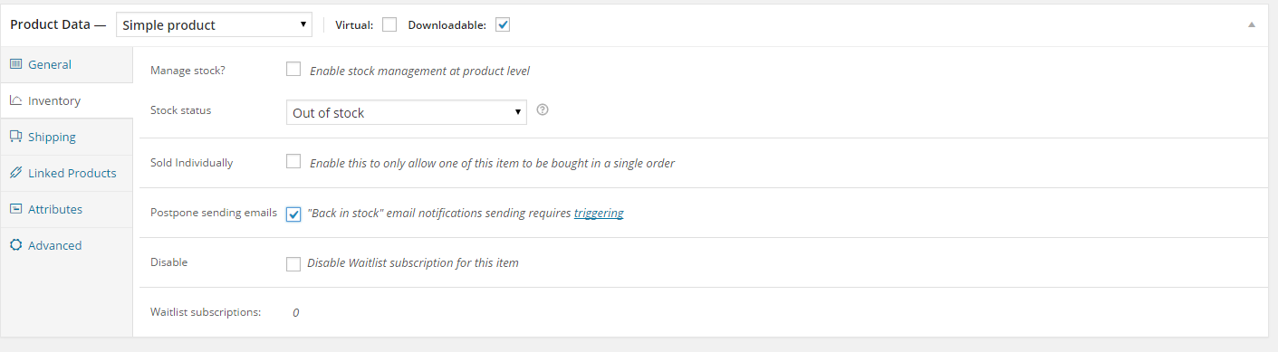
Single product settings
- Enable postponing emails option in product edit page – adding new option to product inventory page – this option will let you delay send Back In Stock message. You can view or edit queue to adjust and decide who to send email or when to do it.
Was this article helpful ?
Email Settings
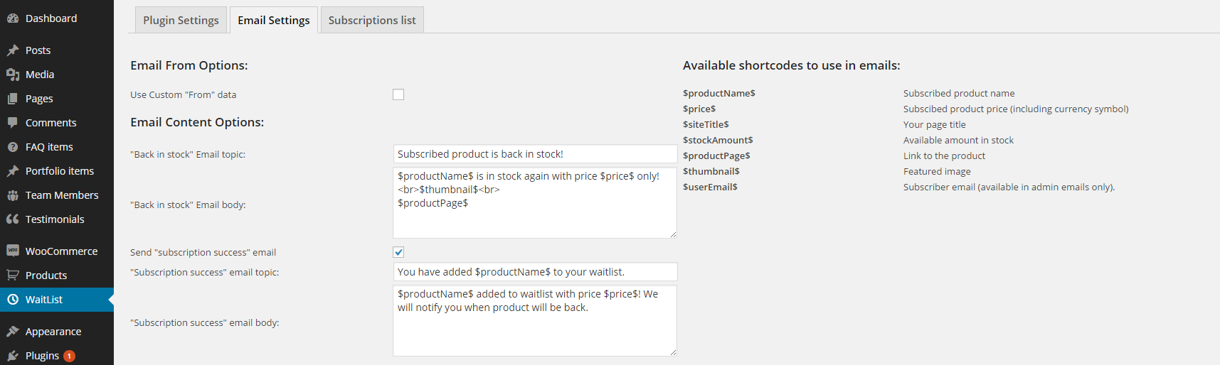
Email Settings
- Use custom from data – determines if plugin should use WooCommerce “from” data or custom data provided by user. This is used for emails displayed in email “from” cell. By default its sender’s email + name.
- Back in stock email topic and body – content of email sent when item returns on stock.
- Send subscription success – enabling/disabling sending email right after subscriber made subscription
- Subscription success email topic and body – content of email sent right after subscriber made subscription
Advanced Email Options
You can use following placeholders to full cusomize your email sent by Waitlist. Plugin will replace it with correct data.
Full list of available placeholders:
- $productName$
- $price$
- $siteTitle$
- $stockAmount$
- $productPage$
- $thumbnail$
- $variation$
- $userEmail$
Admin Email Options
- Send admin notification email on new subscription: enable/disable email to admin when new subscription has been made
- New subscription email topic and body.
- Send admin notification if subscribed item has been bought – enable/disable mail to admin when user bought subscribed item.
- Subscribed item bought email topic and body.
- Send admin notification when user is getting notified – enable/disable email to admin when user is getting notification about product back in stock.
- User notified email topic and body.
- Use woocommerce template – enable/disable use of woocommerce email template which can be previewed in link after.
- Shortcodes – replacing values between $ to proper data in emails sent to user/admin.
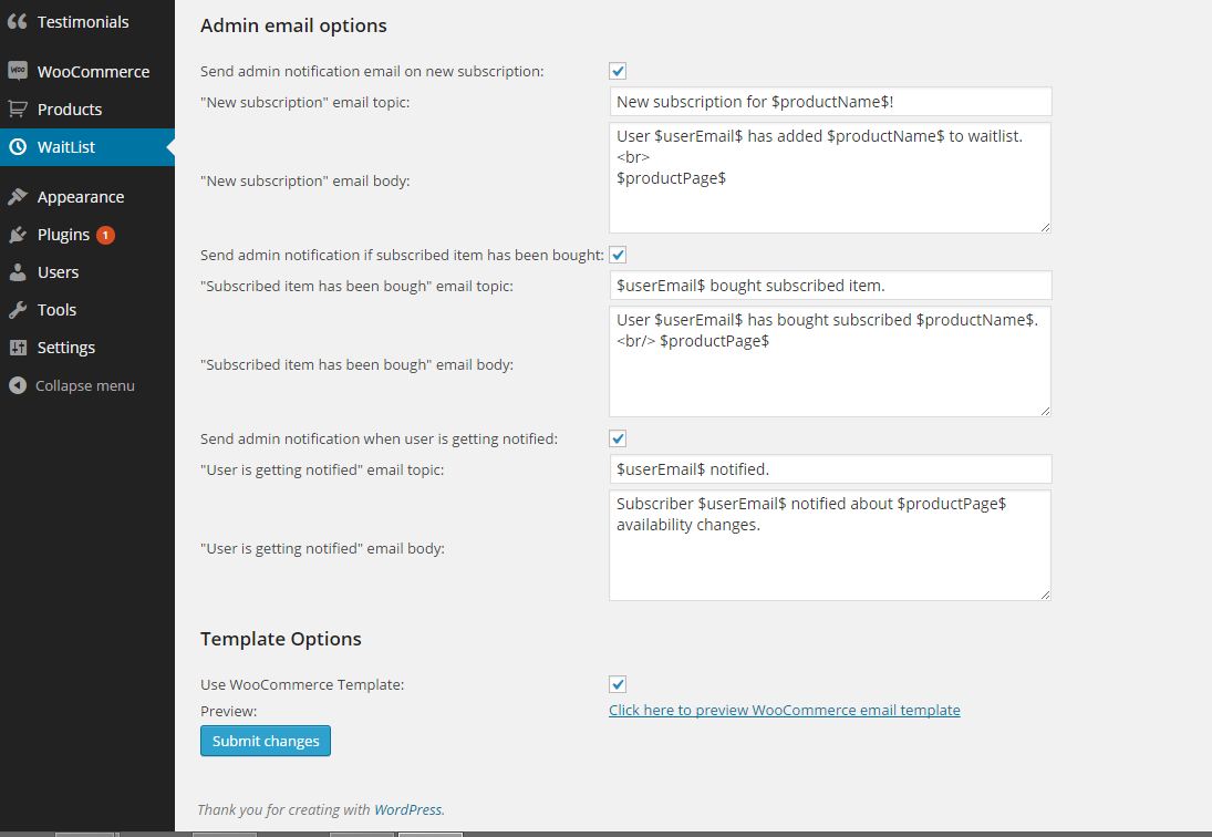
Admin email settings
Was this article helpful ?
Subscription list
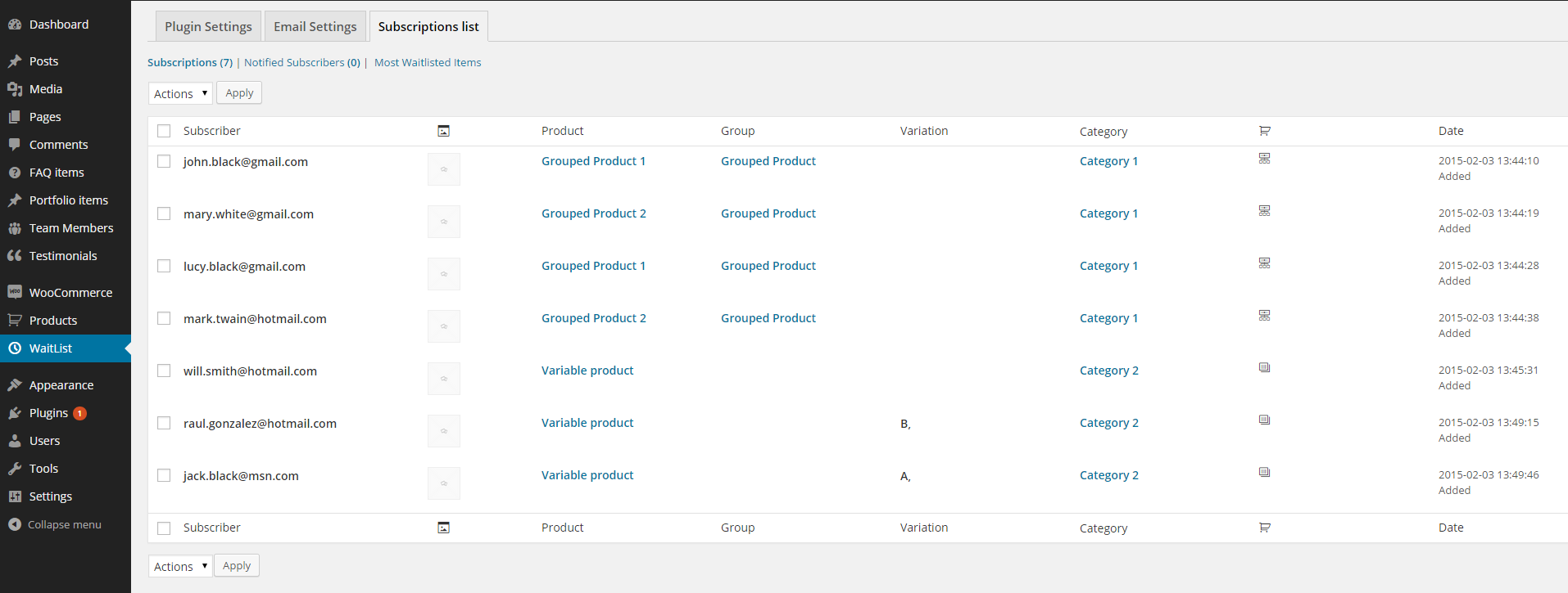
Subscription list
Subscription List is a database divided on subscribers notified and not notified about products out of stock and items mostly added to Waitlist. Displays:
- subscriber mail,
- product featured image,
- product name,
- group name,
- variation name,
- category name,
- product type (variable, simple or grouped)
- date, when it was added to waitlist.
Notified subscribers list shows also notify date (then user is notified about product back in stock) and item bought date (if user has bought subscribed item).
Most Waitlisted displays 20 items mostly added to waitlist with subsctiptions count for specific item.
You can sort data by:
- subscriber,
- product,
- group,
- variation,
- date.
Available actions:
- delete or export checked elements,
- export to .csv file.
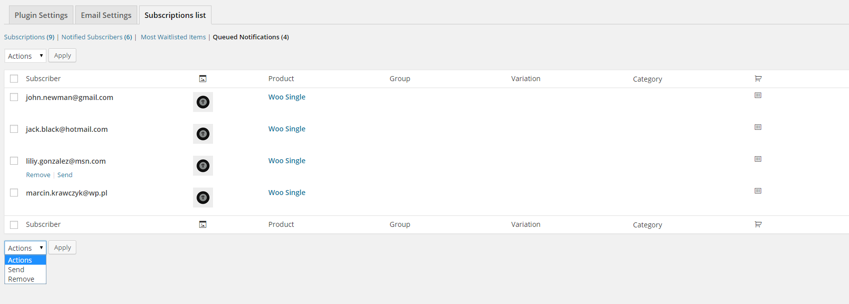
Was this article helpful ?
Extension points
Options filter – to change specific option via wordpress add_filter hook simply use:
|
1 2 3 4 |
add_filter('ctWaitlist_options_ . $optionName', 'change_option'); function change_option($value){ return $value = 'New option value'; } |
Was this article helpful ?
CSS Files and Structure
If you would like to edit the color, font, or style of any elements, you would do the following:
|
1 |
#primaryContent a {color: #someColor;} |
If you find that your new style is not overriding, it is most likely because of a specificity problem. Scroll down in your CSS file and make sure that there isn’t a similar style that has more weight.
I.E.
|
1 |
#wrap #primaryContent a {color: #someColor;} |
So, to ensure that your new styles are applied, make sure that they carry enough “weight” and that there isn’t a style lower in the CSS file that is being applied after yours.
Colors
The theme includes a css file wich you can use to edit the colors.
You just need to add the corresponding CSS file to the head of the page like this:
|
1 2 3 4 5 |
<head> (..) <link rel="stylesheet" type="text/css" href="css/motive.css"> (..) </head> |
Icons
We’ve included 360+ font icons.
Awesome Icons – http://fontawesome.io/icons/
HTML markup:
|
1 2 |
<!-- Awesome Icons --> <i class="fa fa-cog"></i> |
CSS Files & Structure
We’ve included 2 files.
bootstrap.css contains Bootstrap 3 Library.
style.css file contains general styles.
1. Index v2, collections, collections list
2. Login page
3. Contact Us
4. My account
5. Wishlist Products
6. My cart
7. Checkout
8. About Us
9. Our team
10. Team Member
11. Our Services
12 Testimonials
13. FAQ
14. Pricing
15. Blog
16. Portfolio
17. Coming soon
18. Single Product
Was this article helpful ?
Javascript
All javascripts are placed in folder /js. In main.js file we implement all functions calls.
This theme uses following Javascript files:
- Bootstrap v 3 framework (powerful front-end framework for faster and easier web development),
- jQuery v1.10.2 (A fast javascript library that Foodtruckifies how to traverse HTML documents, handle events, perform animations.),
- colorselector.js – (color ring picker),
- jquery.frogaloop.min.js, jquery.stellar.min.js – ct-mediaSection – (paralax, videos),
- jquery.elevatezoom.js – elevate-zoom (zoom effects on images),
- gmap3.min.js – (google maps, contact page),
- jquery.magnific-popup.min – (images popup),
- jquery.nouislider.all.js – nouislider/ (range slider in single product),
- imagesloaded.js, jquery.isotope.min.jsportoflio/init.js – (isotope),
- select2/init.js, select2.min.js – (styling select boxes with jquery),
- spinner/init.js (styled input quantity element where we can put any value, my cart page),
- stacktable/init.js, stacktable.js – (table which change the whole content to responsive table on the mobile),
- device.min.js,
- jquery.appear.js,
- jquery.browser.min.js,
- jquery.easing.1.3.js,
- jquery.placeholder.min.js,
- modernizr.custom.js,
- snap.min.js (mobile swaping),
- plugins/headroom/init.js, headroom.js, jQuery.headroom.js (menu and topbar effects),
- owl.carousel.min.js (owl slider),
- init.js
Google Map (GMAP3 Plugin)
This is google map with custom marker, you can define couple parameters:
- data-location – address to show
- data-height – map height (if undefined height will be 220px)
- data-offset – by how many map should be repositioned from marker center point (default -30)
It uses gmap3 plugin.
Documentation: here
HTML Markup:
|
1 |
<div class="ct-googleMap" data-location="Narbutta 24, Warsaw" data-zoom="15" data-height="500"></div> |
All javascript code can be found in js/main.js file.
jquery.appear
This plugin call function when element appear in viewport. This is used in custom animation, progress bars, counter timer.
Documentation: https://github.com/bas2k/jquery.appear/
|
1 2 3 4 5 6 7 8 9 10 11 12 13 |
if (jQuery().appear) { if (device.mobile()) { // disable animation on mobile jQuery("body").removeClass("withAnimation"); } else { jQuery('.withAnimation .animated').appear(function () { jQuery(this).each(function () { jQuery(this).addClass('activate'); jQuery(this).addClass($(this).data('fx')); }); }, {accY: -150}); } } |
Was this article helpful ?
Sliders
There are three available types of sliders:
Main slider
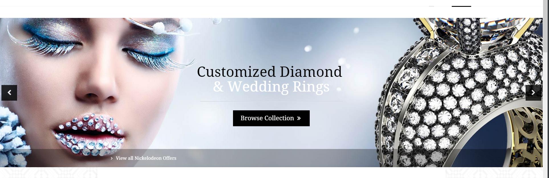
Main Slider
You can use it with the following HTML markup:
|
1 2 3 4 5 6 7 8 9 10 11 12 13 14 15 16 17 18 19 20 21 22 23 24 25 26 |
<div class="ct-js-owl owl-carousel ct-mainCarousel ct-mainCarousel--arrowsMiddle" data-pagination="false" data-items="1" data-autoPlay="false" data-bg="true" data-animations="true" data-height="525" data-navigation="true"> <div class="item" data-bg="./assets/images/demo-content/slider-image.jpg"> <div class="inner"> <div class="container"> <div class="row"> <div class="col-sm-12 text-center"> <h1 class="ct-u-colorBlack"> <span class="animated" data-fx="fadeIn">Customized Diamond</span> <br> <span class="ct-u-colorWhite animated" data-fx="fadeIn" data-time="200">& Wedding Rings</span></h1> <div class="text-center ct-u-paddingTop15 ct-u-paddingBottom30"> <hr class="hr-slider animated" data-fx="fadeIn"> </div> <div class="text-center"> <a class="btn btn-blackTransparent animated" data-fx="fadeInUp" href="#" role="button">Browse Collection <i class="fa fa-angle-double-right"></i></a> </div> </div> </div> </div> <a href="#" class="ct-btn-shadowBar text-left animated" data-fx="fadeInUp"> <div class="container"> <i class="fa fa-angle-right fa-fw"></i> View all Nickelodeon Offers </div> </a> </div> </div> |
We have few variations of the arrows:
- ct-mainCarousel–arrowsTop
- ct-mainCarousel–arrowsMiddle
- ct-mainCarousel–arrowsTopRight
- ct-mainCarousel–arrowsTopLeft
- ct-mainCarousel–arrowsTopCenter
Product Slider
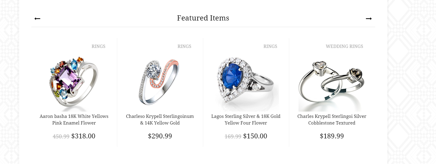
Product Slider
HTML markup:
|
1 2 3 4 5 6 7 8 9 10 11 12 13 14 15 16 17 18 19 20 21 22 |
<div class="ct-js-owl owl-carousel ct-productCarousel ct-productCarousel--arrowsTop" data-single="false" data-pagination="false" data-navigation="true" data-items="4"> <div class="owl-item"> <div class="ct-productShop ct-productShop--zoom"> <div class="ct-productShop-category"> <span class="ct-productShop-h5">Rings</span> <div class="clearfix"></div> <img class="ct-js-zoomImage" src="./assets/images/demo-content/featured-item1.jpg" data-zoom-image="assets/images/demo-content/featured-item1-large.jpg" alt=""> </div> <div class="ct-productShop-content"> <div class="ct-productShop-content-description"> <a href="single-product.html"> <h3>Aaron basha 18K White Yellows Pink Enamel Flower</h3> <span><del>450.99</del> $318.00</span> </a> <span class="ct-productShop-shopCart"> <a class="btn btn-default" href="#" role="button"><i class="fa fa-shopping-cart fa-fw"></i></a> <a class="btn btn-default btn-hidden" href="#" role="button"><i class="fa fa-chain fa-fw"></i></a> </span> </div> </div> </div> </div> |
With the following variations of arrows:
- ct-productCarousel–arrowsTop
- ct-productCarousel–arrowsTopRight
PersonBox Slider
PersonBox Slider
HTML markup:
|
1 2 3 4 5 6 7 8 9 10 11 12 13 14 15 16 17 18 19 20 21 22 |
<div class="ct-js-owl owl-carousel text-center" data-single="false" data-pagination="false" data-autoPlay="true"> <div class="owl-item"> <div class="ct-personBox"> <a href="team-member.html"> <div class="ct-personBox-image"> <img src="assets/images/demo-content/team-member1.jpg" alt="Team Member 1"> <div class="ct-personBox-image-link"> <i class="fa fa-long-arrow-right ct-u-colorWhite"></i> </div> <div class="ct-personBox-bottomBar"></div> </div> </a> <div class="ct-u-paddingTop15 ct-u-paddingBottom10 text-left"> <ul class="ct-socials ct-socials--medium ct-socials--black ct-socials--blackBorder list-inline list-unstyled"> <li><a href="https://www.facebook.com/createITpl"><i class="fa fa-facebook"></i></a></li> <li><a href="https://twitter.com/createitpl"><i class="fa fa-twitter"></i></a> </ul> </div> <div class="ct-u-size18 ct-u-paddingBottom5 ct-personBox-name text-left"><a href="team-member.html">Margarite Jencons</a></div> <div class="ct-fs-i ct-u-size15 ct-u-colorLighterGrey text-left">Jewelry Professional</div> </div> </div> |
Remember to attach the following, required javascript files for owl slider:
Was this article helpful ?
Shop Product
There are two variations of shop products.
Default Product
Variaton class:
- ct-productShop–default
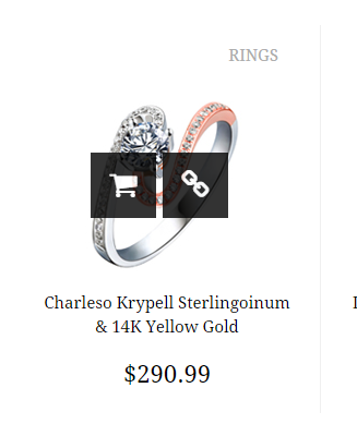
Default shop product
HTML markup:
|
1 2 3 4 5 6 7 8 9 10 11 12 13 14 15 16 17 18 19 |
<div class="ct-productShop ct-productShop--default"> <div class="ct-productShop-category"> <span class="ct-productShop-h5">Earrings</span> <div class="clearfix"></div> <img class="" src="./assets/images/demo-content/latest-item1.jpg" data-zoom-image="assets/images/demo-content/latest-item1-large.jpg" alt=""> </div> <div class="ct-productShop-content"> <div class="ct-productShop-content-description"> <a href="single-product.html"> <h3>Leslie Greene 18K Whiting Gold Square Aria Drop Earrings</h3> <span>$255.00</span> </a> <span class="ct-productShop-shopCart"> <a class="btn btn-default" href="#" role="button"><i class="fa fa-shopping-cart fa-fw"></i></a> <a class="btn btn-default btn-hidden" href="#" role="button"><i class="fa fa-chain fa-fw"></i></a> </span> </div> </div> </div> |
Shop product with zoom effect
Variation class:
- ct-productShop–zoom
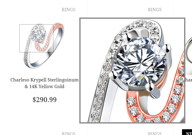
Shop product with zoom
HTML markup:
|
1 2 3 4 5 6 7 8 9 10 11 12 13 14 15 16 17 18 19 |
<div class="ct-productShop ct-productShop--zoom"> <div class="ct-productShop-category"> <span class="ct-productShop-h5">Rings</span> <div class="clearfix"></div> <img class="ct-js-zoomImage" src="./assets/images/demo-content/featured-item1.jpg" data-zoom-image="assets/images/demo-content/featured-item1-large.jpg" alt=""> </div> <div class="ct-productShop-content"> <div class="ct-productShop-content-description"> <a href="single-product.html"> <h3>Aaron basha 18K White Yellows Pink Enamel Flower</h3> <span><del>450.99</del> $318.00</span> </a> <span class="ct-productShop-shopCart"> <a class="btn btn-default" href="#" role="button"><i class="fa fa-shopping-cart fa-fw"></i></a> <a class="btn btn-default btn-hidden" href="#" role="button"><i class="fa fa-chain fa-fw"></i></a> </span> </div> </div> </div> |
These effects are used in sliders as well.
Javasript needed for Zoom Effect on images:
Learn more:
Zoom effect docs:
www.elevateweb.co.uk/image-zoom
Was this article helpful ?
Highlights
Add awesome highlights boxes with simple HTML markup!

Highlights
HTML markup:
|
1 2 3 4 5 6 7 8 9 |
<div class="ct-highlightsItem"> <div class="ct-highlightsItem-content"> <span class="ct-highlightsItem-content-firstTitle ct-u-size30 text-uppercase">Free</span> <br> <span class="ct-highlightsItem-content-secondTitle ct-u-size34 text-uppercase ct-fw-600">Shipping</span> <br> <span class="ct-highlightsItem-content-thirdTitle ct-u-size16">Orders over $200</span> </div> </div> |
Was this article helpful ?
Divided Section
These sections are by default above the footer, in prefooter section, because they are fixed all the time on the bottom of the main content.
Left Section HTML markup:

Divided section
|
1 2 3 4 5 6 7 8 9 10 11 |
<div class="ct-dividedSection-left"> <h3>Sign up for our newsletter</h3> <form role="form" action="#"> <div class="input-group"> <input type="email" class="form-control" placeholder="Your Email Address"> <span class="input-group-btn"> <button class="btn btn-default btn-sm" type="button"><i class="fa fa-fw fa-long-arrow-right"></i></button> </span> </div> </form> </div> |
|
1 2 3 4 5 6 |
<div class="ct-dividedSection-right"> <img src="assets/images/demo-content/prefooter-diamond.png" class="text-right pull-left" alt="Diamond Ring"> <h3 class="text-uppercase text-right">Have a jewelry inquiry?</h3> If you have any questions regarding our jeweleries please <a href="#">contact us directly</a> or use our contact form to get in touch. <div class="ct-dividedSection-right-triangle hidden-sm hidden-xs"></div> </div> |
Was this article helpful ?
Tooltips
Add tooltips anywhere you want!

Tooltips
HTML markup:
|
1 2 3 4 5 6 7 8 9 10 11 12 13 14 |
<div class="ct-tooltips text-center ct-u-paddingTop50 ct-u-paddingBottom40"> <ul class="list-unstyled list-inline"> <li data-toggle="tooltip" title="75,000+ customers trusted us to create their rings."><i class="fa fa-heart fa-fw fa-6x"></i></li> <li data-toggle="tooltip" title="Pay by cash, credit card, bank transfer or store."><i class="fa fa-dollar fa-fw fa-6x"></i></li> <li data-toggle="tooltip" title="Fully protected, all payments secured."><i class="fa fa-lock fa-fw fa-6x"></i></li> <li data-toggle="tooltip" title="Double guarantee for gold and diamonds."><i class="fa fa-certificate fa-fw fa-6x"></i></li> <li data-toggle="tooltip" title="24/7 support at your service."><i class="fa fa-headphones fa-fw fa-6x"></i></li> <li data-toggle="tooltip" title="Latest news collections directly on your email."><i class="fa fa-envelope fa-fw fa-6x"></i></li> <li data-toggle="tooltip" title="Free & easy returns in 48h."><i class="fa fa-circle-o-notch fa-fw fa-6x"></i></li> <li data-toggle="tooltip" title="Free Delivery and Assurance."><i class="fa fa-truck fa-fw fa-6x"></i></li> <li data-toggle="tooltip" title="Your data is fully protected."><i class="fa fa-folder fa-fw fa-6x"></i></li> <li data-toggle="tooltip" title="Find your measurements for your ring."><i class="fa fa-pencil-square-o fa-fw fa-6x"></i></li> </ul> </div> |
Was this article helpful ?
Socials
Test comes with two types and four colours of socials:
Types:
- ct-socials–small
- ct-socials–medium
- ct-socials–large
Colours:
- ct-socials–blackBorder
- ct-socials–whiteBorder
- ct-socials–white
- – ct-socials–black
HTML markup:
|
1 2 3 4 5 |
<ul class="ct-socials ct-socials--large ct-socials--white list-inline list-unstyled"> <li><a href="https://www.facebook.com/createITpl"><i class="fa fa-facebook fa-fw"></i></a></li> <li><a href="https://twitter.com/createitpl"><i class="fa fa-twitter fa-fw"></i></a></li> <li><a href="#"><i class="fa fa-rss fa-fw"></i></a></li> </ul> |

Socials
Was this article helpful ?
Widget
Footer widgets

Footer widget
|
1 2 3 4 5 6 7 8 9 10 11 |
<h5 class="ct-widgetHeader text-uppercase ct-u-size18">Customer Service</h5> <div class="ct-widgetLinks"> <ul class="ct-widgetLinks-list"> <li><a href="my-cart.html">My Orders</a></li> <li><a href="my-account.html">My Addresses</a></li> <li><a href="my-account.html">My Account</a></li> <li><a href="wishlist.html">My WishList</a></li> <li><a href="login.html">Login</a></li> <li><a href="create-account.html">Register</a></li> </ul> </div> |
Sidebar Widget
Sidebar widget
|
1 2 3 4 5 6 7 8 9 10 11 12 13 14 |
<div class="widget"> <div class="widget-inner"> <h4 class="ct-headerBox ct-u-borderBottom3 ct-u-paddingBottom10 text-left">Specials</h4> <div class="ct-specials ct-u-marginBoth20"> <img class="ct-js-zoomImage" src="./assets/images/demo-content/specials-item.jpg" data-zoom-image="assets/images/demo-content/specials-item-large.jpg" alt=""> <div class="ct-specialsDescription"> <span>14K White Gold Rings, 0.33 Carat Diamond Stud</span> <span class="ct-u-size22"><del>150.00</del> $129.00</span> <a class="btn btn-default" href="#" role="button"><i class="fa fa-shopping-cart"></i></a> </div> <div class="clearfix"></div> </div> </div> </div> |
Was this article helpful ?
Products Listing
There are two types of displaying products listing:
- ct-showProducts–default
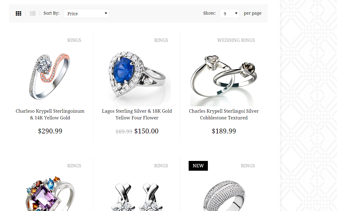
Product listing
- ct-showProducts–list
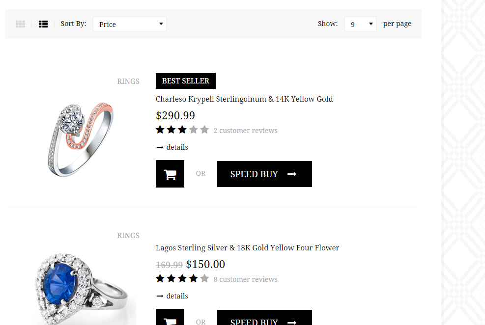
Products list
HTML markup:
|
1 2 3 4 5 6 7 8 9 10 11 12 13 14 15 16 17 18 19 20 21 22 23 24 25 26 27 28 29 30 31 32 33 34 35 36 37 38 39 40 41 42 43 44 45 46 47 48 |
<ul class="ct-productsList list-unstyled list-inline"> <li> <div class="ct-productShop ct-productShop--zoom ct-productShop--smaller"> <div class="ct-productShop-category"> <span class="ct-productShop-h5">Rings</span> <div class="clearfix"></div> <div class="text-center"> <img class="ct-js-zoomImage" src="./assets/images/demo-content/featured-item2.jpg" data-zoom-image="assets/images/demo-content/featured-item2-large.jpg" alt=""> </div> </div> <div class="ct-productShop-content"> <div class="ct-productShop-content-description"> <div class="ct-productShop-content-description-h5 text-uppercase">Best Seller</div> <a href="single-product.html"> <h3>Charleso Krypell Sterlingoinum & 14K Yellow Gold</h3> <span>$290.99</span> </a> <div class="ct-listElementDescription"> <div class="ct-stars"> <i class="fa fa-star"></i> <i class="fa fa-star"></i> <i class="fa fa-star"></i> <i class="fa fa-star ct-u-colorGrey"></i> <i class="fa fa-star ct-u-colorGrey"></i> <div class="ct-reviews"> <a href="single-product.html">2 customer reviews</a> </div> </div> <div class="ct-u-paddingTop10 ct-u-paddingBottom15"> <a class="ct-detailsLink" href="#"><i class="fa fa-long-arrow-right fa-fw"></i> details</a> </div> <div> <a class="btn btn-default" href="#" role="button"><i class="fa fa-shopping-cart"></i></a> <div class="ct-or text-uppercase ct-u-paddingBottom20"> OR </div> <a class="btn btn-default" href="#" role="button">Speed Buy <i class="fa fa-long-arrow-right ct-u-paddingLeft10"></i></a> </div> </div> <span class="ct-productShop-shopCart"> <a class="btn btn-default" href="#" role="button"><i class="fa fa-shopping-cart fa-fw"></i></a> <a class="btn btn-default btn-hidden" href="#" role="button"><i class="fa fa-chain fa-fw"></i></a> </span> </div> </div> <div class="clearfix"></div> </div> </li> |
Javascript code:
|
1 2 3 4 5 6 7 8 9 10 11 12 13 14 15 16 17 18 19 20 21 22 23 24 25 26 27 28 29 30 31 32 33 34 35 36 37 38 39 40 |
$(document).ready(function () { var $tilesItems = $("#ct-js-showTiles"); var $listItems = $("#ct-js-showList"); var $showProducts = $(".ct-showProducts"); if($tilesItems && $listItems){ $tilesItems.click(function(e){ e.preventDefault(); var $existListClass = $(".ct-showProducts--list"); if($existListClass){ $showProducts.removeClass("ct-showProducts--list"); $showProducts.addClass("ct-showProducts--default"); $showProducts.css("display", "none"); $showProducts.fadeIn(); $(this).addClass("is-active"); $listItems.removeClass("is-active"); } }); $listItems.click(function(e){ e.preventDefault(); var $existDefaultClass = $(".ct-showProducts--list"); if($existDefaultClass){ $showProducts.removeClass("ct-showProducts--default"); $showProducts.addClass("ct-showProducts--list"); $showProducts.css("display", "none"); $showProducts.fadeIn(); $(this).addClass("is-active"); $tilesItems.removeClass("is-active"); } }); } }); |
Was this article helpful ?
Buttons
There are three sizes of buttons:
- btn
- btn-sm
- btn-md
Each can have one of the following variations:
- btn-default
- btn-white
- btn-blackTransparent
- btn-blackTransparent–white
- btn-transparentWhite
HTML markup:
|
1 2 3 |
<button type="submit" class="btn btn-default"> <i class="fa fa-long-arrow-right"></i> Submit </button> |
Was this article helpful ?
Pagination
There are two available variations:
- default

Pagination
- ct-u-bgcolor-transparent
Transparent pagination
HTML markup:
|
1 2 3 4 5 6 7 8 9 10 11 12 13 14 |
<div class="ct-pagination ct-u-paddingBoth15"> <div class="ct-totalItems pull-left">Items 1 to 50 of 149 total</div> <div class="ct-pages pull-right"> <span>Page:</span> <ul class="ct-numerPages list-unstyled list-inline"> <li><a class="active" href="#">1</a></li> <li><a href="#">2</a></li> <li><a href="#">3</a></li> </ul> <a class="ct-rightArrow" href="#"><i class="fa fa-long-arrow-right fa-fw"></i></a> </div> <div class="clearfix"></div> </div> |
Was this article helpful ?
Tabs
Standard Tabs
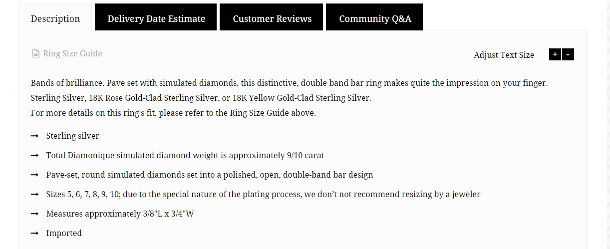
Tabs
|
1 2 3 4 5 6 7 8 9 10 11 12 13 14 15 16 17 18 19 20 21 22 23 24 25 26 27 28 29 30 31 |
<div role="tabpanel" class="ct-u-paddingTop20 ct-u-paddingBottom30"> <!-- Nav tabs --> <ul class="nav nav-tabs" role="tablist"> <li role="presentation" class="active"><a href="#description" aria-controls="description" role="tab" data-toggle="tab">Description</a></li> <li role="presentation"><a href="#delivery" aria-controls="delivery" role="tab" data-toggle="tab">Delivery Date Estimate</a></li> <li role="presentation"><a href="#reviews" aria-controls="reviews" role="tab" data-toggle="tab">Customer Reviews</a></li> <li role="presentation"><a href="#questions" aria-controls="questions" role="tab" data-toggle="tab">Community Q&A</a></li> </ul> <!-- Tab panes --> <div class="tab-content"> <div role="tabpanel" class="tab-pane active" id="description"> <div class="adjust-text"> <div class="ct-u-paddingBottom30 ct-u-paddingTop10 ct-panelWidget"> <a href="#" class="pull-left"><i class="fa fa-fw fa-file-text-o"></i> Ring Size Guide</a> <span class="pull-right">Adjust Text Size <a href="#" class="plus">+</a><a href="#" class="minus">-</a></span> <div class="clearfix"></div> </div> <p>Bands of brilliance. Pave set with simulated diamonds, this distinctive, double band bar ring makes quite the impression on your finger.<br> Sterling Silver, 18K Rose Gold-Clad Sterling Silver, or 18K Yellow Gold-Clad Sterling Silver.<br> For more details on this ring's fit, please refer to the Ring Size Guide above. </p> <ul class="list-unstyled ct-advantageList"> <li>Sterling silver</li> <li>Total Diamonique simulated diamond weight is approximately 9/10 carat</li> <li>Pave-set, round simulated diamonds set into a polished, open, double-band bar design</li> <li>Sizes 5, 6, 7, 8, 9, 10; due to the special nature of the plating process, we don’t not recommend resizing by a jeweler</li> <li>Measures approximately 3/8"L x 3/4"W</li> <li>Imported</li> </ul> </div> </div> |
Nested Tabs
Nested tabs
|
1 2 3 4 5 6 7 8 9 10 11 12 13 14 15 16 17 18 19 20 21 22 23 24 25 26 27 28 29 30 31 32 33 34 35 |
div role="tabpanel" class="tab-pane tab-pane-inner" id="questions"> <div role="tabpanel"> <!-- Nav tabs --> <ul class="nav nav-tabs pull-left ct-u-marginBottom20" role="tablist"> <li role="presentation" class="active"><a href="#featured" aria-controls="featured" role="tab" data-toggle="tab">Featured Q&A</a></li> <li role="presentation"><a href="#all" aria-controls="all" role="tab" data-toggle="tab">View All Q&A</a></li> </ul> <div class="ct-dividedTabSearch pull-right"> <form role="form" action="#"> <div class="input-group"> <input type="email" class="form-control" placeholder="Search All Questions For This Product"> <button class="btn btn-default btn-sm" type="button"><i class="fa fa-fw fa-long-arrow-right"></i></button> </div> </form> </div> <div class="clearfix"></div> <!-- Tab panes --> <div class="tab-content"> <div role="tabpanel" class="tab-pane active" id="featured"> <h5>Questions With Most Answers</h5> <div class="panel-group ct-u-marginBottom40" id="accordion2" role="tablist" aria-multiselectable="true"> <div class="panel panel-default"> <div class="panel-heading" role="tab" id="headingOne"> <h4 class="panel-title"> <a data-toggle="collapse" data-parent="#accordion" href="#collapseOne" aria-expanded="false" aria-controls="collapseOne"> <span class="pull-left"><i class="fa fa-fw fa-long-arrow-right"></i> What country was it made in?</span> <span class="pull-right"><i class="fa fa-fw fa-comment"></i> 1 answer</span> <span class="clearfix"></span> </a> </h4> </div> <div id="collapseOne" class="panel-collapse collapse" role="tabpanel" aria-labelledby="headingOne"> <div class="panel-body"> |
Was this article helpful ?
Accordion
HTML markup:
|
1 2 3 4 5 6 7 8 9 10 11 12 13 14 15 |
<div class="panel-group ct-u-marginBottom40" id="accordion" role="tablist" aria-multiselectable="true"> <div class="panel panel-default"> <div class="panel-heading" role="tab" id="headingOne"> <h4 class="panel-title"> <a data-toggle="collapse" data-parent="#accordion" href="#collapseOne" aria-expanded="false" aria-controls="collapseOne"> <i class="fa fa-circle ct-u-size4 ct-u-verticalMiddle ct-u-paddingRight5"></i> Is it safe to buy a diamond and other pieces of jewelry over the internet? </a> </h4> </div> <div id="collapseOne" class="panel-collapse collapse in" role="tabpanel" aria-labelledby="headingOne"> <div class="panel-body"> What? You lost the appraisal certificate?! Truth is we'd like you to return all bridal and engagement rings that come with an IGI® Appraisal Certify with the certificate. But, if you can't find it – call us and we'll give you a quote for the exact price of the replacement. However, your refund -- if you return the ring without the certificate -- will be reduced by $149 or more, depending on the certificate replacement cost. </div> </div> </div> |
Was this article helpful ?
Wishlist
Test comes with a wishlist. It changes to different table on mobile with special stacktable script. To use it you will need ct-js-wishList class.
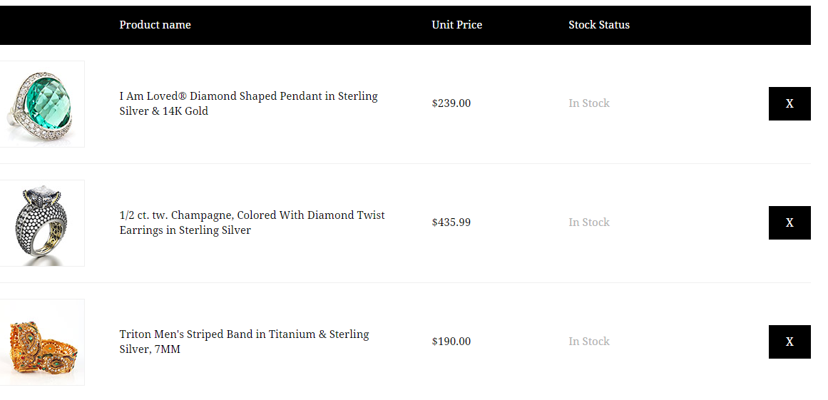
Wishlist
|
1 2 3 4 5 6 7 8 9 10 11 12 13 14 15 16 17 18 |
<table class="ct-wishList ct-js-wishList ct-u-marginTop30"> <thead> <tr> <th class="ct-wishList-image"></th> <th class="ct-wishList-description">Product name</th> <th class="ct-wishList-price">Unit Price</th> <th class="ct-wishList-stock">Stock Status</th> <th class="ct-wishList-button"></th> </tr> </thead> <tbody> <tr> <td class="ct-wishList-image"><img src="assets/images/demo-content/wishlist-item2.jpg" alt="Wishlist Product 1"></td> <td class="ct-wishList-description"><a class="ct-wishList-itemLink" href="single-product.html">I Am Loved® Diamond Shaped Pendant in Sterling Silver & 14K Gold</a></td> <td class="ct-wishList-price">$239.00</td> <td class="ct-wishList-stock ct-u-colorLightGrey">In Stock</td> <td class="ct-wishList-button ct-wishList-buttonX"><a class="btn btn-default btn-md ct-js-buttonX" href="#">X</a></td> </tr> |
Javascript code:
|
1 2 |
<script src="assets/js/stacktable/stacktable.js"></script> <script src="assets/js/stacktable/init.js"></script> |
Learn more:
Was this article helpful ?
Testimonial
We have two variations of testimonial:
- ct-testimonials–left
- ct-testimonials–right
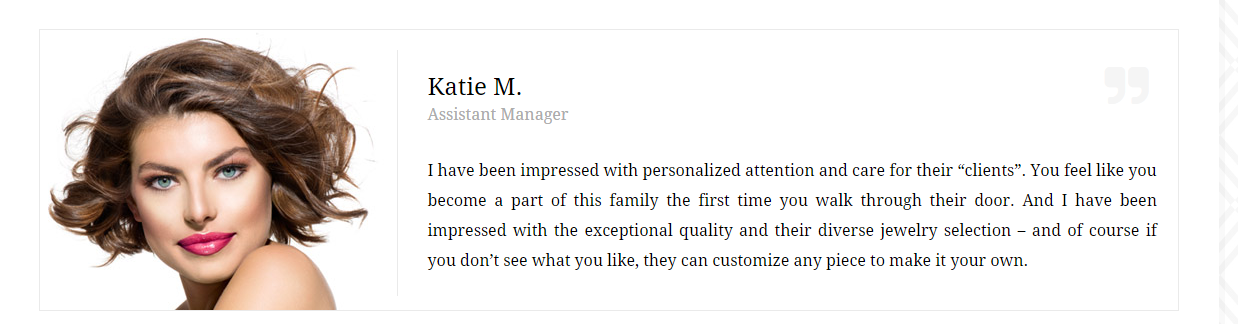
Testimonial
HTML markup:
|
1 2 3 4 5 6 7 8 9 10 11 12 13 14 15 |
<div class="ct-testimonials ct-testimonials--left ct-u-marginTop40"> <div class="ct-testimonials-image"> <img src="assets/images/demo-content/testimonials-image1.jpg" alt="Testimonial 1"> </div> <div class="ct-testimonials-content"> <div class="ct-testimonials-content-name ct-u-paddingBottom30"> <div class="ct-u-size24">Katie M.</div> <div class="ct-u-size16 ct-u-colorGrey">Assistant Manager</div> </div> <div class="ct-testimonials-content-description ct-u-size16 text-justify"> I have been impressed with personalized attention and care for their “clients”. You feel like you become a part of this family the first time you walk through their door. And I have been impressed with the exceptional quality and their diverse jewelry selection – and of course if you don’t see what you like, they can customize any piece to make it your own. </div> </div> <div class="clearfix"></div> </div> |
Was this article helpful ?
Pricing
Create pricing box with simple HTML markup:
|
1 2 3 4 5 6 7 8 9 10 11 12 13 14 15 16 17 18 19 |
<div class="ct-pricing ct-u-marginBoth40"> <div class="ct-pricing-iconBox ct-u-paddingTop20"> <div class="ct-pricing-iconBox-icon"> <img src="assets/images/demo-content/pricing-chains.png" alt="Chains"> <span class="ct-u-size24">$120</span> </div> </div> <ul class="ct-pricing-list list-unstyled ct-u-marginTop30"> <li>Solder chain</li> <li>Figure</li> <li>Supply and Solder</li> <li>Tighten clasp</li> </ul> <div class="ct-u-paddingTop30 ct-u-paddingBottom20"> <a class="btn btn-default ct-pricing-button"> <i class="fa fa-long-arrow-right"></i> </a> </div> </div> |
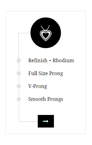
Pricing
Was this article helpful ?
Boxes
There are two types of boxes:
Image Box
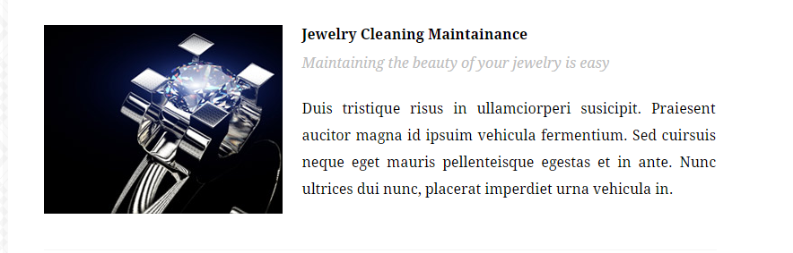
Image Box
HTML markup:
|
1 2 3 4 5 6 7 8 9 10 11 12 13 |
<div class="imageBox ct-u-paddingBoth40"> <img src="assets/images/demo-content/services-item1.jpg" alt="Services Item 1"> <div class="imageBox-content"> <div class="imageBox-content-title ct-u-size16 ct-fw-600 ct-u-paddingBottom10">Jewelry Cleaning Maintainance</div> <div class="imageBox-content-tip ct-u-size16 ct-u-colorLighterGrey ct-fs-i ct-u-paddingBottom25"> Maintaining the beauty of your jewelry is easy </div> <p class="imageBox-content-description text-justify ct-u-size16"> Duis tristique risus in ullamciorperi susicipit. Praiesent aucitor magna id ipsuim vehicula fermentium. Sed cuirsuis neque eget mauris pellenteisque egestas et in ante. Nunc ultrices dui nunc, placerat imperdiet urna vehicula in. </p> </div> <div class="clearfix"></div> </div> |
Number Box
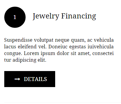
Number box
|
1 2 3 4 5 6 7 8 9 10 11 12 |
<div class="numberBox"> <div class="ct-u-paddingTop30 ct-u-paddingBottom30"> <div class="numberBox-iconBox"><span class="numberBox-icon ct-u-size18">1</span></div> <div class="numberBox-title ct-u-size24">Jewelry Financing</div> </div> <div class="numberBox-description ct-u-size16 text-justify ct-u-paddingBottom25"> Suspendisse volutpat neque quam, ac vehicula lacus eleifend vel. Doneiuc egestas iuivehicula congue. Lorem ipsum dolor sit amet, consectei tur adipiscing elit. </div> <div class="ct-u-paddingBottom50"> <a class="btn btn-default" href="#"><i class="fa fa-long-arrow-right fa-fw"></i> details</a> </div> </div> |
Was this article helpful ?
Short Info
There are two available color variations of Short Info:
- ct-shortInfoReason–grey
- ct-shortInfoReason–black
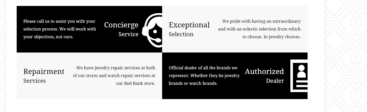
Short Info
HTML markup:
|
1 2 3 4 5 6 7 8 9 10 11 12 |
<div class="ct-shortInfoReason ct-shortInfoReason--black ct-u-displayTableVertical pull-left"> <div class="ct-shortInfoReason-description ct-u-displayTableCell"> Please call us to assist you with your selection process. We will work with your objectives, not ours. </div> <div class="ct-shortInfoReason-title ct-u-displayTableCell"> <div class="ct-u-size28 text-right ct-shortInfoReason-center">Concierge</div> <div class="ct-u-size22 text-right ct-shortInfoReason-center">Service</div> </div> <div class="ct-shortInfoReason-image ct-u-displayTableCell"> <img src="assets/images/demo-content/speaker.png" alt="Speaker"> </div> </div> |
Was this article helpful ?
Single Product
Product Cusotmization, description, details can be added with the following HTML markup:
|
1 2 3 4 5 6 7 8 9 10 11 12 13 14 15 16 17 18 19 20 21 22 23 24 25 26 27 28 29 30 31 32 33 34 35 36 37 38 39 40 41 42 43 44 45 46 47 48 49 50 51 52 53 54 55 56 57 58 59 60 61 62 63 64 65 66 67 68 69 70 71 72 73 74 75 76 77 78 79 80 81 82 83 84 85 86 |
<div class="ct-productCustomization"> <h3>Certified Radiant-Cut Diamond Doubled Engagement Ring in 14K White Gold</h3> <h5 class="ct-u-paddingTop15">Earrings</h5> <div class="ct-price"> <span class="ct-u-size24"><del>$310.00</del></span> <span class="ct-u-colorBlack ct-u-size40">$289.00</span> <span class="ct-u-size15">(Free Delivery)</span> </div> <div class="ct-code ct-u-paddingBoth20"> <div class="pull-left ct-u-paddingRight15"> <span class="ct-code-black">Code</span><span class="ct-code-grey">DR2633-750-W</span> </div> <iframe src="http://www.facebook.com/plugins/like.php?href=http%3A%2F%2Fwww.createit.pl&layout=standard&show_faces=true&action=like&colorscheme=light&" style="overflow:hidden;max-width:100%;height:30px" scrolling="no" frameborder="0" allowTransparency="true"></iframe> <div class="clearfix"></div> </div> <div class="ct-stars"> <i class="fa fa-star"></i> <i class="fa fa-star"></i> <i class="fa fa-star"></i> <i class="fa fa-star ct-u-colorGrey"></i> <i class="fa fa-star ct-u-colorGrey"></i> <div class="ct-reviews"> <a href="#">2 customer reviews</a> </div> </div> <form action="#"> <div class="ct-pincode ct-u-paddingBoth20"> <div class="ct-pincodeBox"> <span>Check Availability At:</span><input type="text" class="form-control" placeholder="enter your pincode"> </div> <button class="btn btn-default btn-sm" type="submit">Check</button> <div class="clearfix"></div> </div> </form> <form action="#"> <div class="ct-productSize"> <div class="ct-u-size16 ct-u-paddingBottom10">Select Size:</div> <div class=""> <label class="radio-inline"> <input type="radio" name="inlineRadioOptions" id="inlineRadio1" value="option1"> <span>5</span> </label> <label class="radio-inline"> <input type="radio" name="inlineRadioOptions" id="inlineRadio2" value="option2"> <span>6</span> </label> <label class="radio-inline"> <input type="radio" name="inlineRadioOptions" id="inlineRadio3" value="option3"> <span>7</span> </label> <label class="radio-inline"> <input type="radio" name="inlineRadioOptions" id="inlineRadio4" value="option4"> <span>8</span> </label> <label class="radio-inline"> <input type="radio" name="inlineRadioOptions" id="inlineRadio5" value="option5"> <span>9</span> </label> <label class="radio-inline"> <input type="radio" name="inlineRadioOptions" id="inlineRadio6" value="option6"> <span>10</span> </label> </div> </div> <div class="ct-u-size16 ct-u-paddingTop10">Select Color:</div> <select class="ct-js-colorSelector"> <option value="0" data-color="#d2a48a" selected="selected">salmon</option> <option value="1" data-color="#e1c99b">yellow</option> <option value="2" data-color="#deddd9">grey</option> </select> <div class="ct-productQuantity"> <div class="ct-u-size16 ct-u-paddingBottom10">Select Quantity:</div> <div class=""> <select class="ct-select ct-select--small"> <option value="1">1</option> <option value="2">2</option> <option value="3">3</option> <option value="4">4</option> <option value="5">5</option> </select> </div> </div> <div class="ct-speedbuy ct-u-paddingBoth20"> <a class="btn btn-default" href="#" role="button"><i class="fa fa-shopping-cart"></i></a> <div class="ct-or text-uppercase ct-u-paddingBottom20"> OR </div> <a class="btn btn-default ct-u-size18 text-uppercase" href="#" role="button">Speed Buy <i class="fa fa-long-arrow-right ct-u-paddingLeft10"></i></a> </div> </form> </div> |
Was this article helpful ?
Video
There are two available Video elements:
VideoBox

Video Box
HTML markup:
|
1 2 3 4 |
<div class="ct-videoBox"> <iframe src="//player.vimeo.com/video/9211288" width="100%" height="372" frameborder="0" allowfullscreen></iframe> <p class="ct-videoBox-description ct-u-paddingTop20">...</p> </div> |
Video Product
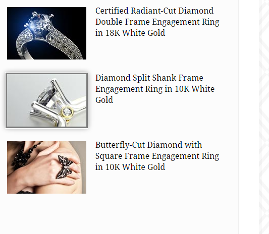
Video Product
HTML markup:
|
1 2 3 4 5 6 7 |
<div class="ct-videoProduct is-active"> <img src="assets/images/demo-content/video-image-1-small.jpg" alt="Video 1"> <div class="ct-videoProduct-description"> ... </div> <div class="clearfix"></div> </div> |
Javascript code:
|
1 2 3 4 5 6 7 8 9 10 11 12 13 14 15 16 17 18 19 |
$(document).ready(function(){ $('.ct-videoBox:first').css('display','block'); $('.ct-videoProduct').click(function(){ if($('.ct-videoProduct.is-active')){ $('.ct-videoProduct.is-active').each(function(){ $(this).removeClass('is-active'); }); } if(!($(this).hasClass('is-active'))) $(this).addClass('is-active'); var elnum = $(this).index(); $('.ct-videoBox').each(function(){ $(this).css("display", "none"); }); $('.ct-videoBox').eq(elnum).css("display", "block"); }); }); |
Was this article helpful ?
Portfolio
Create beautiful portfolio items with the following HTML markup:
|
1 2 3 4 5 6 7 8 9 10 11 12 13 14 15 16 17 18 19 20 |
<div class="ct-portfolio ct-u-paddingTop30"> <div class="ct-portfolio-image ct-u-paddingBottom25"> <img src="assets/images/demo-content/blog-item1.jpg" alt="Picture 1"> </div> <h5 class="ct-u-size16 ct-fw-600 ct-portfolio-title">Jewellery Storage Is Just As Important!</h5> <div class="ct-portfolioDescription ct-u-size15 ct-u-paddingTop15"> <p class="text-justify ct-u-paddingTop20 ct-u-size16"> ... </p> <p class="text-justify ct-u-paddingTop30 ct-u-size16"> ... </p> <p class="text-justify ct-u-paddingTop30 ct-u-size16"> ... </p> <p class="text-justify ct-u-paddingTop30 ct-u-paddingBottom40 ct-u-size16"> ... </p> </div> </div> |
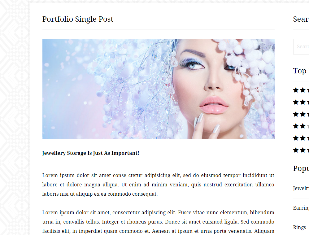
Portfolio Single page
Was this article helpful ?
Blog
Add your blog posts with the following HTML markup:
|
1 2 3 4 5 6 7 8 9 10 11 12 13 14 15 16 17 18 19 20 21 22 23 24 25 26 27 28 29 30 31 32 33 34 35 36 37 38 39 40 |
<div class="ct-blogBox ct-u-paddingTop30"> <div class="ct-blogBox-image ct-u-paddingBottom25"> <img src="assets/images/demo-content/blog-item1.jpg" alt="Picture 1"> </div> <h5 class="ct-u-size16 ct-fw-600 ct-blogBox-title">Jewellery Storage Is Just As Important!</h5> <div class="ct-blogDescription ct-u-size15 ct-u-paddingTop15"> <div class="pull-left ct-blogDescription-posted"> <span><i class="fa fa-pencil fa-fw"></i> Posted by: <a href="#">Karen1234</a></span> <span class="ct-u-paddingLeft15"><i class="fa fa-calendar fa-fw"></i> 9 Nov, 2014</span> </div> <div class="pull-right ct-blogDescription-comments"> <span><i class="fa fa-comments fa-fw"></i> <a href="#">3 comments</a></span> </div> <div class="clearfix"></div> <p class="text-justify ct-u-paddingTop20 ct-u-size16"> ... </p> <p class="text-justify ct-u-paddingTop30 ct-u-size16"> .... </p> <p class="text-justify ct-u-paddingTop30 ct-u-size16"> ... </p> <p class="text-justify ct-u-paddingTop30 ct-u-paddingBottom40 ct-u-size16"> ... </p> <hr> <div class="ct-blogDescription-tags ct-u-paddingBoth15"> <i class="fa fa-fw fa-tag ct-u-colorBlack"></i> Tagged: <a href="#">designer jewelry</a>, <a href="#">ring</a>, <a href="#">engagement</a>, <a href="#">wedding</a>, <a href="#">necklace</a>, <a href="#">pendant</a>, <a href="#">bracelet</a> </div> </div> </div> |
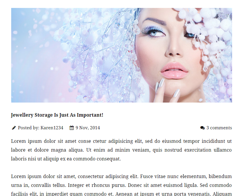
Blog Post
Blog Comments
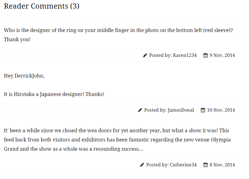
Blog comments
HTML markup:
|
1 2 3 4 5 6 7 8 9 10 |
<div class="ct-blogComment"> <p class="ct-u-size16 ct-u-paddingBottom15 ct-u-paddingTop30">Who is the designer of the ring on your middle finger in the photo on the bottom left (red sleeve)? Thank you!</p> <hr> <div class="pull-right ct-u-paddingBoth10 ct-u-size15"> <span><i class="fa fa-pencil fa-fw"></i> Posted by: <a href="#">Karen1234</a></span> <span class="ct-u-paddingLeft15"><i class="fa fa-calendar fa-fw"></i> 9 Nov, 2014</span> </div> <div class="clearfix"></div> <hr> </div> |
Was this article helpful ?
Ratings
There are several types of ratings:
Ratings in single product content
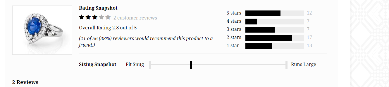
Ratings in single product content
HTML markup:
|
1 2 3 4 5 6 7 8 9 10 11 12 13 14 15 16 17 18 19 20 21 22 23 24 25 26 27 28 29 30 31 32 33 34 35 36 |
<div class="ct-ratings"> <div class="ct-ratingsLeft"> <h4>Rating Snapshot</h4> <div class="ct-stars"> <i class="fa fa-star"></i> <i class="fa fa-star"></i> <i class="fa fa-star"></i> <i class="fa fa-star ct-u-colorGrey"></i> <i class="fa fa-star ct-u-colorGrey"></i> <div class="ct-reviews"> <a href="#">2 customer reviews</a> </div> </div> <div class="ct-u-paddingTop10">Overall Rating 2.8 out of 5</div> <div class="ct-u-paddingTop15 ct-fs-i">(21 of 56 (38%) reviewers would recommend this product to a friend.)</div> </div> <div class="ct-ratingsRight"> <ul class="list-unstyled ct-u-paddingTop15"> <li><span>5 stars</span><span><span data-width="60"></span></span><span>12</span></li> <li><span>4 stars</span><span><span data-width="20"></span></span><span>7</span></li> <li><span>3 stars</span><span><span data-width="50"></span></span><span>7</span></li> <li><span>2 stars</span><span><span data-width="80"></span></span><span>17</span></li> <li><span>1 star</span><span><span data-width="45"></span></span><span>13</span></li> </ul> </div> <div class="clearfix"></div> <hr> <div class="ct-range ct-u-paddingTop25"> <div>Sizing Snapshot</div> <div>Fit Snug</div> <div class="ct-rangeSlider"> <div class="ct-js-noUiSliderDisabled ct-noUiSlider"></div> </div> <div>Runs Large</div> </div> </div> |
Star ratings
Star ratings
HTML markup:
|
1 2 3 4 5 6 7 8 9 10 |
<div class="ct-stars"> <i class="fa fa-star"></i> <i class="fa fa-star"></i> <i class="fa fa-star"></i> <i class="fa fa-star ct-u-colorGrey"></i> <i class="fa fa-star ct-u-colorGrey"></i> <div class="ct-reviews"> <a href="#">2 customer reviews</a> </div> </div> |
Javascript ratings
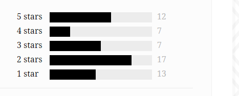
Bar ratings
HTML markup:
|
1 2 3 4 5 6 7 8 9 |
div class="ct-ratingsRight"> <ul class="list-unstyled ct-u-paddingTop15"> <li><span>5 stars</span><span><span data-width="60"></span></span><span>12</span></li> <li><span>4 stars</span><span><span data-width="20"></span></span><span>7</span></li> <li><span>3 stars</span><span><span data-width="50"></span></span><span>7</span></li> <li><span>2 stars</span><span><span data-width="80"></span></span><span>17</span></li> <li><span>1 star</span><span><span data-width="45"></span></span><span>13</span></li> </ul> </div> |
Javascript code:
|
1 2 3 4 5 6 7 8 |
$(document).ready(function(){ $(".ct-ratingsRight ul li span:nth-child(2) span").each(function(){ if($(this).attr("data-width")){ var $barWidth = $(this).attr("data-width"); $(this).css("width", $barWidth+'%'); } }); }); |
Was this article helpful ?
Reviews
Add reviews to your product with simple HTML markup:
|
1 2 3 4 5 6 7 8 9 10 11 12 13 14 15 16 17 18 19 20 21 22 23 24 25 26 27 28 29 30 |
<div class="ct-feedback ct-u-paddingTop30"> <span class="pull-left">Very Beautiful Ring!!</span><span></span> <span class="pull-right"><i class="fa fa-pencil fa-fw"></i> Posted by: <a href="#" class="author">Karen1234</a></span> <div class="clearfix"></div> <div class="ct-stars ct-u-paddingBoth10"> <i class="fa fa-star"></i> <i class="fa fa-star"></i> <i class="fa fa-star"></i> <i class="fa fa-star"></i> <i class="fa fa-star"></i> </div> <div class="ct-feedbackDescription ct-u-paddingBottom20"> This ring looks really elegant and dainty!! Love it!! This is really a pretty ring. get all kinds of compliments, I normally wear an 8 on my ring finger, so I orderd the size 10 for my pointer finger. perfect fit. I bought the clad & it is awesome. </div> <div class="ct-recommendation ct-u-paddingBoth20"> <span class="ct-fw-600">Would you recommend this product as a gift?</span><br> <span>Yes</span><br> <span class="ct-fw-600">Who would this be a perfect gift for?</span><br> <span>Families</span><br> <div class="ct-recommendationReport ct-u-paddingBoth25">Was this review helpful to you? <a href="#">Yes</a><a href="#">No</a><span><i class="fa fa-fw fa-long-arrow-right"></i> <a href="#"> Report Inappropriate Review</a></span></div> <div> <span>Share this review:</span> <ul class="ct-socials ct-socials--small ct-socials--black list-inline list-unstyled"> <li><a href="https://www.facebook.com/createITpl"><i class="fa fa-facebook fa-fw"></i></a></li> <li><a href="https://twitter.com/createitpl"><i class="fa fa-twitter fa-fw"></i></a></li> <li><a href="#"><i class="fa fa-rss fa-fw"></i></a></li> </ul> </div> </div> </div> |
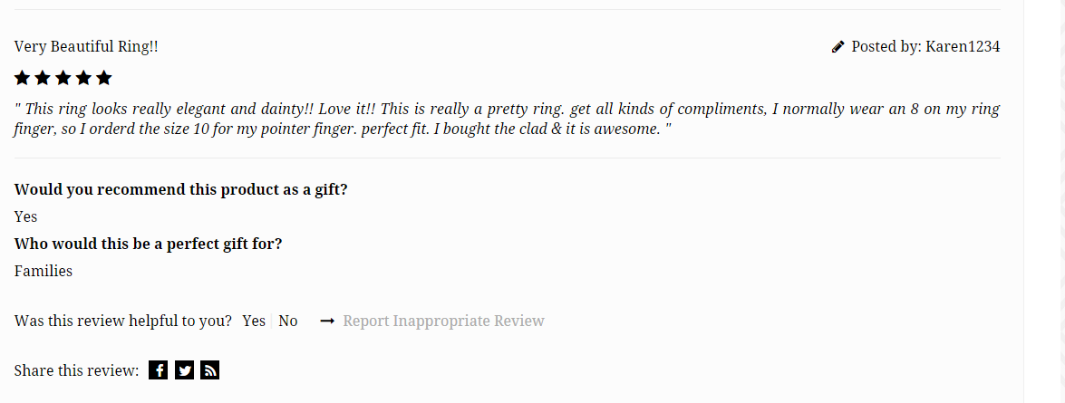
Reviews
Was this article helpful ?
Mutlitple SearchBox
Use our Multiple search box, where you can set advanced search options for products!
Multiple Search Box
Use the following HTML markup to include it to your page:
|
1 2 3 4 5 6 7 8 9 10 11 12 13 14 15 16 17 18 19 20 21 22 23 24 25 26 27 28 29 30 31 32 33 34 35 36 37 38 39 40 41 42 43 44 45 46 47 48 49 50 51 52 53 54 55 56 57 58 59 60 61 62 63 |
<div class="ct-searchBox ct-u-marginBottom60"> <form action="#"> <div class="ct-searchBookmark"> <a href="#" class="ct-js-filter"> <div class="ct-searchBookmark-header">Filter by: Price, Silver</div> </a> <div class="ct-searchContent"> <div class="ct-searchContent-category ct-searchContent-category--transparent">Price</div> <div class="ct-searchContent-description"> <div class="ct-searchContent-slider"> <div class="ct-js-noUiSliderPrice ct-u-marginBottom40"></div> <input type="text" class="form-control" id="lower-value"> <input type="text" class="form-control" id="upper-value"> </div> </div> <div class="ct-searchContent-category">Metal</div> <div class="ct-searchContent-description"> <!-- labels have to be next to each other --> <label for="checkbox1"> <input type="checkbox" id="checkbox1"><span>18k Yellow Gold</span> </label><label for="checkbox2"> <input type="checkbox" id="checkbox2"><span>18k White Gold</span> </label><label for="checkbox3"> <input type="checkbox" id="checkbox3"><span>14k White Gold</span> </label><label for="checkbox4"> <input type="checkbox" id="checkbox4"><span>14k White Gold</span> </label><label for="checkbox5"> <input type="checkbox" id="checkbox5"><span>Platinum</span> </label><label for="checkbox6"> <input type="checkbox" id="checkbox6"><span>Silver</span> </label><label for="checkbox7"> <input type="checkbox" id="checkbox7"><span>Stainless steel</span> </label> </div> <div class="ct-searchContent-category">Size</div> <div class="ct-searchContent-description"> <label for="checkbox8"> <input type="checkbox" id="checkbox8"><span>Less than 4mm</span> </label><label for="checkbox9"> <input type="checkbox" id="checkbox9"><span>4-6mm</span> </label><label for="checkbox10"> <input type="checkbox" id="checkbox10"><span>7-8mm</span> </label> </div> <div class="ct-searchContent-category">Color</div> <div class="ct-searchContent-color"> <select class="ct-js-colorSelector"> <option value="0" data-color="#d2a48a" selected="selected">salmon</option> <option value="1" data-color="#e1c99b">yellow</option> <option value="2" data-color="#deddd9">grey</option> <option value="3" data-color="#cd5c5c">indianred</option> <option value="4" data-color="#6495ed">cornflowerblue</option> <option value="5" data-color="#8fbc8f">darkseagreen</option> <option value="6" data-color="#ffd700">gold</option> <option value="7" data-color="#ffa500">orange</option> <option value="8" data-color="#db7093">palevioletred</option> <option value="9" data-color="#696969">dimgrey</option> </select> </div> <div class="clearfix"></div> </div> </div> </form> |
Notice, that Multiple Search box requires the following Javascripts if you want to use Color Picker and Range Slider for it:
|
1 2 3 4 5 |
<script src="assets/js/color-selector/colorselector.js"></script> <script src="assets/js/color-selector/init.js"></script> <script src="assets/js/nouislider/jquery.nouislider.all.js"></script> <script src="assets/js/nouislider/init.js"></script> |
Was this article helpful ?
Top Bar
There are two variations of top bar:
- deafult
- ct-topBar–grey
Gray top bar
To change bar color to gray just add the class above to the bar markup, like the following:
|
1 2 3 4 5 6 7 8 9 |
<div class="ct-topBar ct-topBar--grey"> <div class="container"> <div class="ct-topBar-navigation pull-left"> <ul class="list-unstyled"> <li><i class="fa fa-fw fa-phone"></i> Call us: (012) 345-6789</li> <li><a href="login.html"><i class="fa fa-fw fa-user"></i> Login</a></li> <li><a href="create-account.html"><i class="fa fa-fw fa-pencil"></i> Create an account</a></li> </ul> </div> |
Was this article helpful ?
Customizer
Test comes with advanced customizer, which allows to edit most of theme elements in one place. To use it navigate to Appearance > Customizer
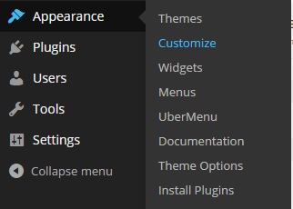
Customizer
And click on arrow to toggle all available options:
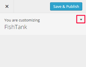
Start customization
It will display a panel with tabs corresponding to all theme sections, like:
- Pages
- Main Navbar
- Posts
- Portfolio
- Socials
- Faq
- WooCommerce
- Footer Widgets
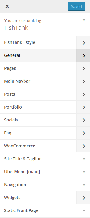
Customizer Options
You will find there also main style settings under:
- Test style
- General
In Test style section you can edit theme colors and fonts
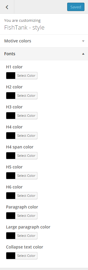
Fonts
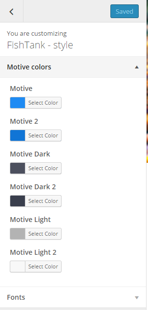
Colors settings
In General you can setup logos, copyright text and main theme settings
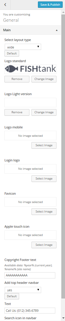
General Settings
Notice:
All changes done with customizer will be applied only once you click on
Was this article helpful ?
Pages Options
In Pages panel you are able to edit the following options:
- Home page settings:
- Show/Hide comments,
- Show/Hide comment form
- Header settings:
- Show/hide bar with title and breadcrumbs,
- Color of the bar,
- Size of the bar,
- Show/Hide title,
- Show/Hide breadcrumbs
- Maintenance Page:
- Define page title
- Define page description
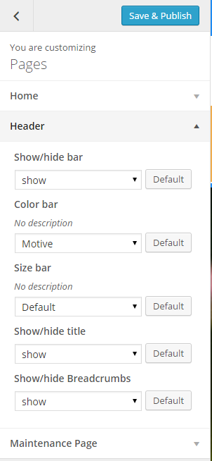
Pages general options
Was this article helpful ?
Main Navbar
There are several navbar color types to choose. You can setup navbar type and scroll effect globally via Appearance > Customize > Main Navbar
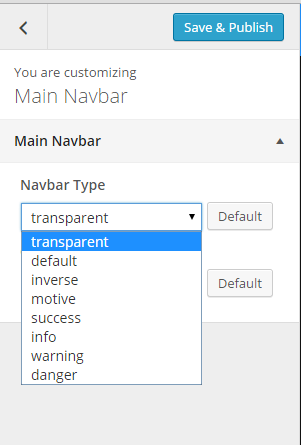
Global Settings for Navbar
Notice, that sometimes you can check changes in Customizer preview only after clicking on a Save & Publish button.
Those settings will be automatically applied for every page, although you can change options for each page with Template Settings:
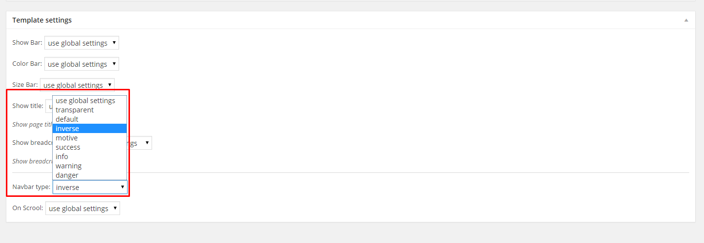
Page settings for Navbar
Here you can also define:
- if title bar should be displayed,
- bar color,
- bar size,
- if title should be displayed,
- if breadcrumbs should be displayed
Was this article helpful ?
Posts Options
When using the assigned blog page as described in Blog Index page, all the options are located in Appearance > Customize on the Posts tab. There are dozens of options to choose from such as layout, categories, dates, etc. There are general blog options and single post page options. Each one has title and descriptions to help you understand what they do. Any type of blog options you need to set will be set here in theme options when using the assigned blog page.
INDEX PAGE OPTIONS:
- Blog title – it will be displayed as title of your index page,
- Show index as – select the way of displaying posts on index,
- Show posts index page title – hide/show blog title,
- Post detail button label – define custom label for button Read More,
- Date – show/hide posts date
- Image / video / gallery – show/hide image, video or gallery assigned to post (if you select Hide – we will display only text on blog index page),
- Title / quote author – show/hide posts author,
- Text Option – display full posts text, post excerpt or no intro text in posts list,
- Show read more button – show/hide button Read More
- Sidebar – show/hide sidebar on blog index page,
- Tags – show/hide posts tags,
- Categories – show/hide posts categories,
- Pagination notice – it will display pagination in the following format: Page 1 OF 7 – you can adjust labels with the following code instead: Custom-text %current% custom-text %total% – it’s useful if you want to translate your content
SINGLE POST OPTIONS – select how should look like single post page:
- Post page title – it will be displayed as title of your single post page,
- Show posts index page title – hide/show blog title,
- Date – show/hide posts date
- Image / video / gallery – show/hide image, video or gallery assigned to post (if you select Hide – it will display only text on post page),
- Title / quote author – show/hide post author,
- Content – show/hide post content (text),
- Author link – show/hide link to post author,
- Comments – show/hide comments,
- Comment form – show/hide comment form (select Hide if you don’t want comments below you post),
- Comments tag – show/hide comments tag,
- Sidebar – show/hide – show/hide sidebar,
- Tag cloud – show/hide tags,
- Categories – show/hide categories,
- Show socials box – show/hide socials,
- Share button label – define custom label for Share Button,
- Show author box – show/hide box with author information.
- Pagination – show/hide pagination,
- Previous post label – define custom label for Previous post button,
- Next post label – define custom label for Next post button,
- By label – define custom label for BY tag,
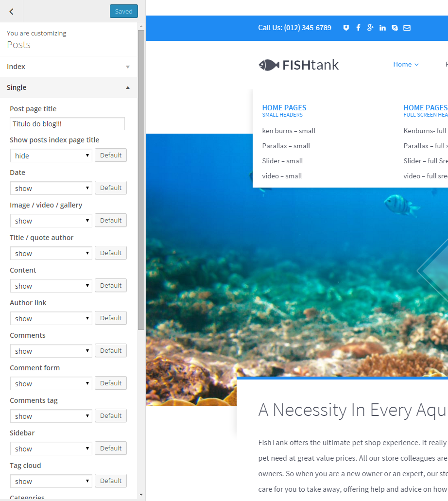
Posts options
Common issue: How to change post intro text?
Intro text, which can be displayed on Blog index page is an Excerpt. You can edit it manually for every post with the following field:
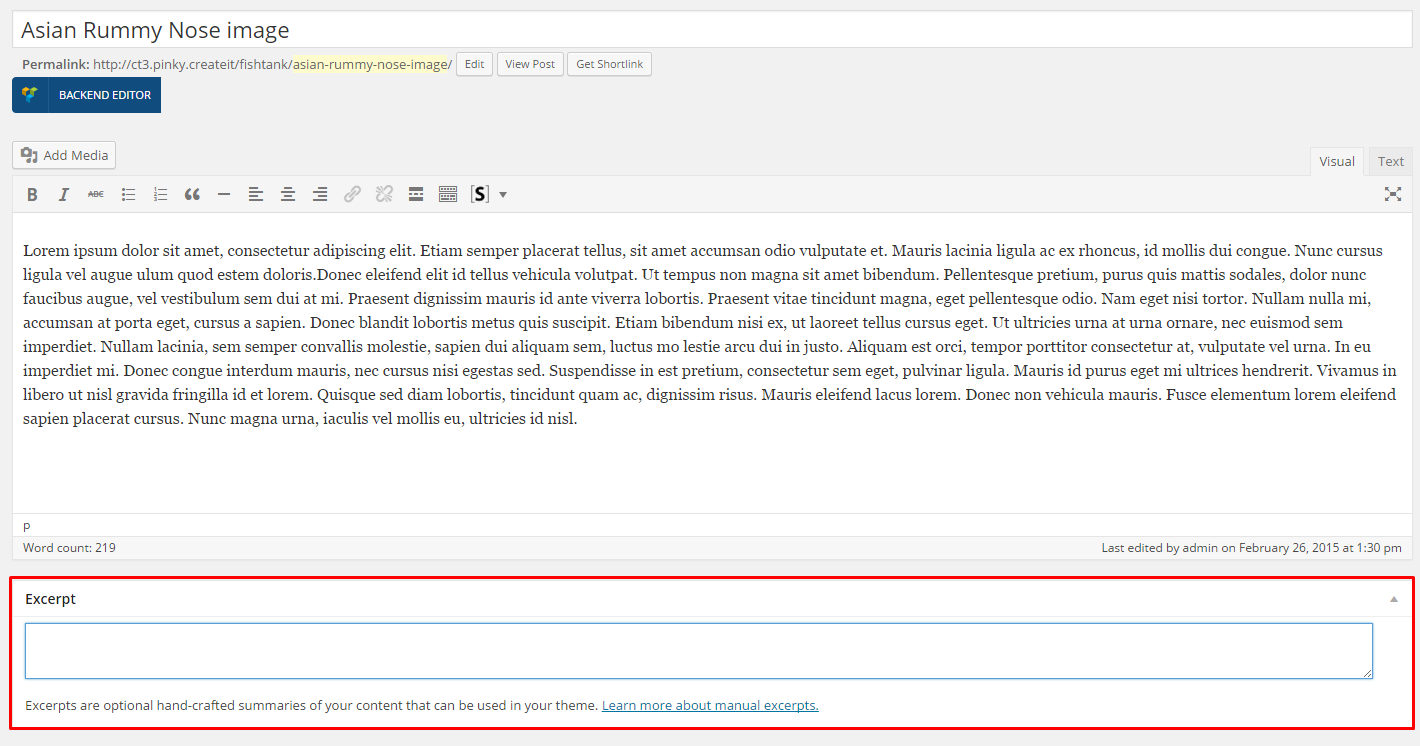
Excerpt
Notice: if you don’t see Excerpt field when you are editing your post, go to Screen Options at the top of the post edition window (on the right hand side) and enable Excerpt with checkbox.
Was this article helpful ?
Portfolio Options
PORTFOLIO INDEX OPTIONS:
- Enter portfolio index page title – it will be displayed as title of your index page,
- Show portfolio index page title – hide/show portfolio index page title,
- Portfolio type – select the way of displaying portfolio items on index page,
- Portfolio masonry columns – number of columns for Masonry portfolio type,
- Portfolio items show at most – maximum number of displayed Portfolio items,
- Show pagination – show/hide pagination,
- Masonry category filters – show/hide categories filters,
- Masonry filter All label – define custom label for “All Projects” button,
- Pagination notice – we will display pagination in the following format: Page 1 OF 7 – you can adjust labels with the following code instead: Custom-text %current% custom-text %total% – it’s useful if you want to translate your content
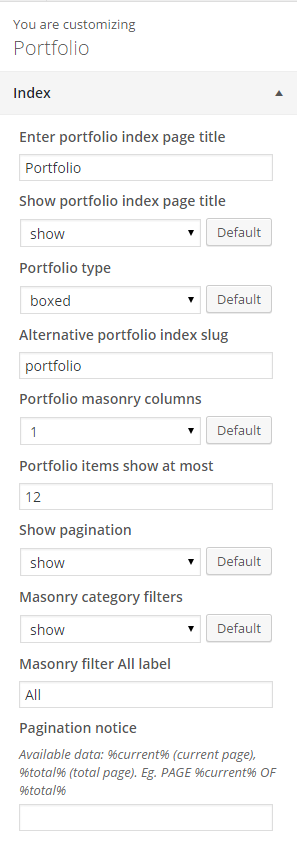
Portfolio options
SINGLE PORTFOLIO OPTIONS:
- Portfolio single page title – define custom portfolio title,
- Portfolio single show page title – show/hide page title,
- Project details – label – define custom label for View More button
- Project type – define custom label,
- Project type – define custom label,
- Project website – define custom label,
- Project prev – define custom label,
- Project next – define custom label,
- back to portfolio – define custom label,
- Show breadcrumbs – show/hide breadcrumbs,
- Single work Title – show/hide single work title,
- Image – show/hide,
- Client – show/hide,
- Date – show/hide,
- Categories – show/hide,
- Other projects – show/hide,
- External URL label – define custom label,
- Categories label – define custom label,
- Date label – define custom label,
- Client label – define custom label,
- Comments – show/hide,
- Comment form – show/hide,
- Related projects label – define custom label,
- Related projects description – define custom description,
- Related projects limit
Was this article helpful ?
Socials
Social icons, from the top of the page can be removed or changed via Appearance > Customize > Socials
Social Icons
We will display here only icons for social media profiles, which you define in settings:
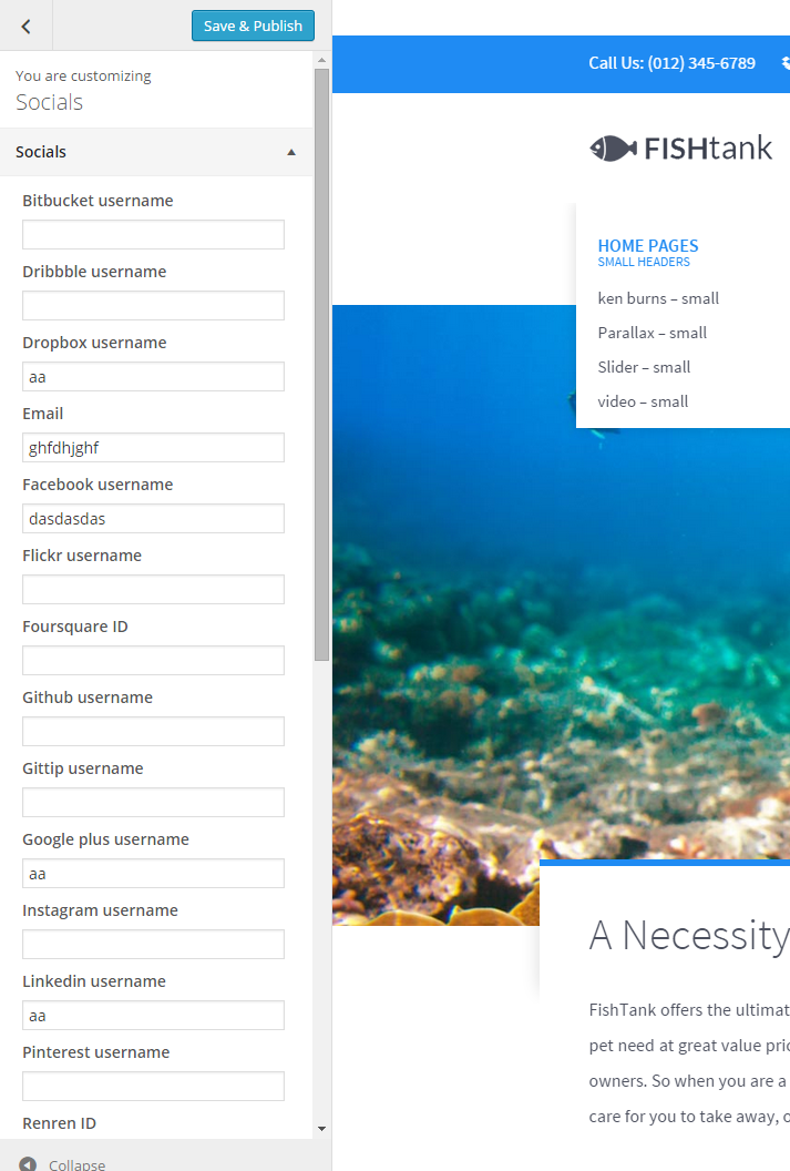
Social Icons settings
So if you don’t want to display, for example Facebook icon – just leave Facebook field empty.
Was this article helpful ?
Social Buttons
There are two available types of social buttons:
- rounded buttons – it’s a default type, which will be displayed when you use in markup class ct-socials

Rounded socials buttons
- squared buttons – can be used with class ct-socials–square

Squared socials buttons
Both types use the following basic HTML markup:
|
1 2 3 4 5 6 7 8 9 10 11 12 13 14 |
<ul class="list-unstyled list-inline ct-socials animated" data-fx="fadeInUp" data-time="400"> <li> <a href="https://www.facebook.com/createITpl" data-toggle="tooltip" data-placement="top" title="Facebook"><i class="fa fa-fw fa-facebook"></i></a> </li> <li> <a href="https://twitter.com/createitpl" data-toggle="tooltip" data-placement="top" title="Twitter"><i class="fa fa-fw fa-twitter"></i></a> </li> <li> <a href="#" data-toggle="tooltip" data-placement="top" title="Google +"><i class="fa fa-fw fa-google-plus"></i></a> </li> </ul> |
Was this article helpful ?
Slider
We use several types of sliders in Test.
Main Slider

Main slider
HTML markup:
|
1 2 3 4 5 6 7 8 9 10 11 12 13 14 15 16 17 18 19 20 21 22 23 |
<div class="ct-js-owl " data-animations="true" data-height="100%" data-snap-ignore="true"> <div class="item"> <hr class="hr-custom ct-js-background animated" data-fx="fadeInDown" data-bg="assets/images/hr2.png" data-bgrepeat="no-repeat"> <h2 class="ct-u-font2 text-uppercase animated" data-fx="flipInY">We love<br>coffee</h2> <p class="animated" data-fx="fadeIn">Vivamus iaculis placerat diam, laoreet posuere<br>dui aliquet ut.Praesent lacinia eleifend<br>eros, ac venenatis orci.</p> <a href="about.html" class="btn btn-lg btn-default animated" data-fx="fadeIn" data-hover="It's Delicious"><span>More about us</span></a> <hr class="hr-custom ct-js-background animated ct-u-paddingTop60" data-fx="fadeInDown" data-bg="assets/images/hr2.png" data-bgrepeat="no-repeat"> </div> <div class="item"> <hr class="hr-custom ct-js-background animated" data-fx="fadeInDown" data-bg="assets/images/hr2.png" data-bgrepeat="no-repeat"> <h2 class="ct-u-font2 text-uppercase animated" data-fx="flipInY">Coffee<br>& Breakfast</h2> <p class="animated" data-fx="fadeIn"> Donec fermentum eros at mauris mollis tincidunt.<br>Sed sit amet bibendum tellus, non commodo lacus.</p> <a href="menu.html" class="btn btn-lg btn-default animated" data-fx="fadeIn" data-hover="It's Delicious"><span>See our menu</span></a> <hr class="hr-custom ct-js-background animated ct-u-paddingTop60" data-fx="fadeInDown" data-bg="assets/images/hr2.png" data-bgrepeat="no-repeat"> </div> <div class="item"> <hr class="hr-custom ct-js-background animated" data-fx="fadeInDown" data-bg="assets/images/hr2.png" data-bgrepeat="no-repeat"> <h2 class="ct-u-font2 text-uppercase animated" data-fx="flipInY">Catering service</h2> <p class="animated" data-fx="fadeIn">Aliquam erat volutpat. Morbi nisl nibh, interdum<br> vitae ultricies vitae, lobortis sit amet tellus<br> mauris dolor velit.</p> <a href="menu.html" class="btn btn-lg btn-default animated" data-fx="fadeIn" data-hover="It's Delicious"><span>Get an estimate</span></a> <hr class="hr-custom ct-js-background animated ct-u-paddingTop60" data-fx="fadeInDown" data-bg="assets/images/hr2.png" data-bgrepeat="no-repeat"> </div> </div> |
Gallery
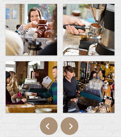
gallery slider
HTML markup:
|
1 2 3 4 5 6 7 8 9 10 11 12 13 14 |
<div class="ct-js-owl ct-js-popupGallery" data-items="2" data-single="false" data-navigation="true" data-pagination="false" data-lgItems="2" data-mdItems="2" data-smItems="1"> <div class="item ct-u-padding10"> <a href="assets/images/demo-content/gallery-full-1.jpg" class="ct-js-popup ct-gallerySlider-image" title="The Croissants"><img src="assets/images/demo-content/gallery-thumb-1.jpg" alt="thumbnail"></a> <a href="assets/images/demo-content/gallery-full-2.jpg" class="ct-js-popup ct-gallerySlider-image" title="The Space"><img src="assets/images/demo-content/gallery-thumb-2.jpg" alt="thumbnail"></a> </div> <div class="item ct-u-padding10"> <a href="assets/images/demo-content/gallery-full-3.jpg" class="ct-js-popup ct-gallerySlider-image" title="The Lamps"><img src="assets/images/demo-content/gallery-thumb-3.jpg" alt="thumbnail"></a> <a href="assets/images/demo-content/gallery-full-4.jpg" class="ct-js-popup ct-gallerySlider-image" title="The Coffee"><img src="assets/images/demo-content/gallery-thumb-4.jpg" alt="thumbnail"></a> </div> <div class="item ct-u-padding10"> <a href="assets/images/demo-content/gallery-full-5.jpg" class="ct-js-popup ct-gallerySlider-image" title="The balcon"><img src="assets/images/demo-content/gallery-thumb-5.jpg" alt="thumbnail"></a> <a href="assets/images/demo-content/gallery-full-6.jpg" class="ct-js-popup ct-gallerySlider-image" title="The bread"><img src="assets/images/demo-content/gallery-thumb-6.jpg" alt="thumbnail"></a> </div> </div> |
Gallery Simple
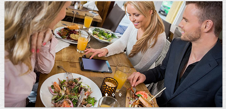
Simple gallery
HTML markup:
|
1 2 3 4 5 |
<div class="ct-js-owl ct-gallery--shaddow" data-animations="true" data-height="100%"> <div class="item"><img src="assets/images/demo-content/blog-gallery-1.jpg" alt="Gallery Blog Image" /></div> <div class="item"><img src="assets/images/demo-content/blog-gallery-2.jpg" alt="Gallery Blog Image" /></div> <div class="item"><img src="assets/images/demo-content/blog-gallery-3.jpg" alt="Gallery Blog Image" /></div> </div> |
Notice:
To use any of the following sliders you need to include javascript, which can be found here.
Was this article helpful ?
Blog
Test comes with the following template for blog posts
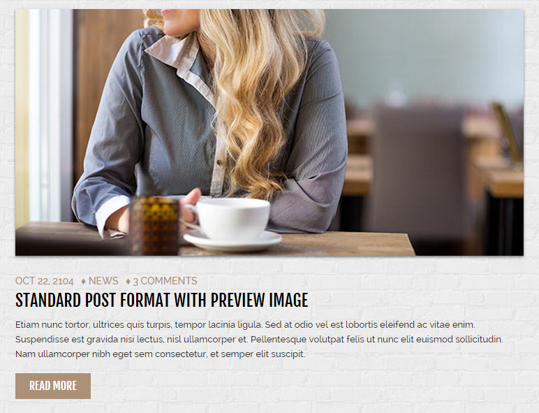
Blog post
You can use it with the following HTML markup:
|
1 2 3 4 5 6 7 8 9 10 11 12 13 14 15 16 17 18 19 20 |
<section class="ct-frame ct-frame--white"> <article class="ct-blogItem"> <div class="ct-blogItem ct-blogThumbnail"> <img src="assets/images/demo-content/blog-image.jpg" alt="Post Image" /> </div> <div class="ct-blogItem ct-innerMargin"> <div class="ct-blogItem ct-entryMeta"> <span class="ct-blogItem ct-entryDate">oct 22, 2104</span> <span class="ct-blogItem ct-catLinks">♦ <a href="#"> news</a></span> <span class="ct-blogItem ct-entryComments">♦ <a href="#"> 3 comments</a></span> </div> <h3 class="ct-blogItem ct-entryTitle ct-u-font2"><a href="blog-single.html">standard post format with preview image</a></h3> <p class="ct-blogItem ct-entryDescription">Etiam nunc tortor, ultrices quis turpis, tempor lacinia ligula. Sed at odio vel est lobortis eleifend ac vitae enim. Suspendisse est gravida nisi lectus, nisl ullamcorper et. Pellentesque volutpat felis ut nunc elit euismod sollicitudin. Nam ullamcorper nibh eget sem consectetur, et semper elit suscipit. </p> <div class="ct-u-paddingBottom10"><a href="blog-single.html" class="btn btn-lg btn-button--brown">read more</a></div> </div> </article> </section> |
Check also how our blog comments look like
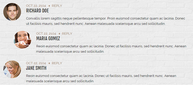
Blog comments
Use it with the following HTML markup:
|
1 2 3 4 5 6 7 8 9 10 11 12 13 14 15 16 17 18 19 20 21 22 23 24 25 26 27 28 29 30 31 32 33 34 35 36 37 38 39 40 41 42 43 44 45 46 47 48 49 50 |
<ul class="ct-comments"> <li> <div class="media"> <a href="#"><img src="assets/images/demo-content/blog-avatar-1.jpg" class="ct-authorImage pull-left" alt="Author"/></a> <div class="media-body ct-u-paddingLeft20"> <label class="ct-entryDateSecond">oct 22, 2104</label> <span class="ct-diamondSymbol">♦</span><a href="#" class="ct-commentReply"> reply</a> <h4 class="ct-media-heading ct-u-font2">richard doe</h4> <p> Convallis lorem sagittis neque pellentesque tempor. Proin euismod consectetur quam ac lacinia. Donec ut facilisis mauris, sed hendrerit nunc. Aenean malesuada scelerisque arcu sed sollicitudin. </p> </div> </div> </li> <li> <ol> <li> <div class="media"> <a href="#"><img src="assets/images/demo-content/blog-avatar-2.jpg" class="ct-authorImage pull-left" alt="Author"/></a> <div class="media-body ct-u-paddingLeft20"> <label class="ct-entryDateSecond">oct 22, 2104</label> <span class="ct-diamondSymbol">♦</span><a href="#" class="ct-commentReply"> reply</a> <h4 class="ct-media-heading ct-u-font2">maria gomez</h4> <p> Reoin euismod consectetur quam ac lacinia. Donec ut facilisis mauris, sed hendrerit nunc. Aenean malesuada scelerisque arcu sed sollicitudin. </p> </div> </div> </li> </ol> </li> <li> <div class="media"> <a href="#"><img src="assets/images/demo-content/blog-avatar-3.jpg" class="ct-authorImage pull-left" alt="Author"/></a> <div class="media-body ct-u-paddingLeft20"> <label class="ct-entryDateSecond">oct 22, 2104</label> <span class="ct-diamondSymbol">♦</span><a href="#" class="ct-commentReply"> reply</a> <h4 class="ct-media-heading ct-u-font2">jane smith</h4> <p> Reoin euismod consectetur quam ac lacinia. Donec ut facilisis mauris, sed hendrerit nunc. Aenean malesuada scelerisque arcu sed sollicitudin. </p> </div> </div> </li> </ul> |
Was this article helpful ?
Accordion
Check our beautiful accordion!

Accordion
You can use it with simple HTML markup:
|
1 2 3 4 5 6 7 8 9 10 11 12 13 14 15 16 17 18 19 20 21 22 23 24 25 26 27 28 29 30 31 32 33 34 35 36 37 38 39 40 41 42 43 44 45 46 47 48 49 50 51 |
<div class="panel-group" id="accordion" role="tablist" aria-multiselectable="true"> <div class="panel panel-default"> <div class="panel-heading" role="tab" id="headingOne"> <h4 class="panel-title"> <a data-toggle="collapse" data-parent="#accordion" href="#collapseOne" aria-expanded="true" aria-controls="collapseOne"> we love coffee so much </a> </h4> </div> <div id="collapseOne" class="panel-collapse collapse in" role="tabpanel" aria-labelledby="headingOne"> <div class="panel-body"> Etiam nunc tortor, ultrices quis turpis, tempor lacinia ligula. Sed at odio vel est lobortis eleifend ac vitae enim. Suspendisse est gravida nisi lectus, nisl ullamcorper et. Pellentesque volutpat felis ut nunc elit euismod sollicitudin. Nam ullamcorper nibh eget sem consectetur, et semper elit suscipit. </div> </div> </div> <div class="panel panel-default"> <div class="panel-heading" role="tab" id="headingTwo"> <h4 class="panel-title"> <a class="collapsed" data-toggle="collapse" data-parent="#accordion" href="#collapseTwo" aria-expanded="false" aria-controls="collapseTwo"> and also we love sweets </a> </h4> </div> <div id="collapseTwo" class="panel-collapse collapse" role="tabpanel" aria-labelledby="headingTwo"> <div class="panel-body"> Etiam nunc tortor, ultrices quis turpis, tempor lacinia ligula. Sed at odio vel est lobortis eleifend ac vitae enim. Suspendisse est gravida nisi lectus, nisl ullamcorper et. Pellentesque volutpat felis ut nunc elit euismod sollicitudin. Nam ullamcorper nibh eget sem consectetur, et semper elit suscipit. </div> </div> </div> <div class="panel panel-default"> <div class="panel-heading" role="tab" id="headingThree"> <h4 class="panel-title"> <a class="collapsed" data-toggle="collapse" data-parent="#accordion" href="#collapseThree" aria-expanded="false" aria-controls="collapseThree"> what are savories actually </a> </h4> </div> <div id="collapseThree" class="panel-collapse collapse" role="tabpanel" aria-labelledby="headingThree"> <div class="panel-body"> Etiam nunc tortor, ultrices quis turpis, tempor lacinia ligula. Sed at odio vel est lobortis eleifend ac vitae enim. Suspendisse est gravida nisi lectus, nisl ullamcorper et. Pellentesque volutpat felis ut nunc elit euismod sollicitudin. Nam ullamcorper nibh eget sem consectetur, et semper elit suscipit. </div> </div> </div> </div> |
Was this article helpful ?
Tabs
You can easily display your content in Tabs.
Tabs
|
1 2 3 4 5 6 7 8 9 10 11 12 13 14 15 16 17 18 19 20 21 22 23 24 25 26 27 28 29 30 31 32 33 34 |
<ul class="nav nav-tabs ct-u-paddingTop10" role="tablist" id="myTab"> <li role="presentation" class="ct-navbarTabs--default active"><a href="#coffee" aria-controls="coffee" role="tab" data-toggle="tab">Coffee</a></li> <li role="presentation" class="ct-navbarTabs--default"><a href="#sweets" aria-controls="sweets" role="tab" data-toggle="tab">Sweets</a></li> <li role="presentation" class="ct-navbarTabs--default"><a href="#savories" aria-controls="savories" role="tab" data-toggle="tab">Savories</a></li> </ul> <div class="tab-content"> <div role="tabpanel" class="tab-pane fade in active" id="coffee"> <p>Etiam nunc tortor, ultrices quis turpis, tempor lacinia ligula. Sed at odio vel est lobortis eleifend ac vitae enim. Suspendisse est gravida nisi lectus, nisl ullamcorper et. Pellentesque volutpat felis ut nunc elit euismod sollicitudin. Nam ullamcorper nibh eget sem consectetur, et semper elit suscipit.</p> <p class="ct-u-paddingBottom20"> Cras interdum ante a efficitur dictum. Duis tincidunt non elit pellentesque. Curabitur set accumsan accumsan consectetur. Quisque et velit vestibulum quam condimentum consectetur. Praesent ac elit molestie, commodo quam vel, laoreet amet elit lacinia lobortis pellentesque metus. </p> </div> <div role="tabpanel" class="tab-pane fade" id="sweets"> <p>Sed ut perspiciatis unde omnis iste natus error sit voluptatem accusantium doloremque laudantium, totam rem aperiam, eaque ipsa quae ab illo inventore veritatis et quasi architecto beatae vitae dicta sunt explicabo. Nemo enim ipsam voluptatem quia voluptas sit aspernatur</p> <p class="ct-u-paddingBottom20"> Sed ut perspiciatis unde omnis iste natus error sit voluptatem accusantium doloremque laudantium, totam rem aperiam, eaque ipsa quae ab illo inventore veritatis et quasi architecto beatae vitae dicta sunt explicabo. </p> </div> <div role="tabpanel" class="tab-pane fade" id="savories"> <p>At vero eos et accusamus et iusto odio dignissimos ducimus qui blanditiis praesentium voluptatum deleniti atque corrupti quos dolores et quas molestias excepturi sint occaecati cupiditate non provident, similique sunt in culpa qui officia deserunt mollitia animi.</p> <p class="ct-u-paddingBottom20"> Neque porro quisquam est, qui dolorem ipsum quia dolor sit amet, consectetur, adipisci velit, sed quia non numquam eius modi tempora incidunt ut labore et dolore magnam aliquam quaerat voluptatem numquam eius modi tempora incidunt. </p> </div> </div> |
Was this article helpful ?
Pagination
Display your posts on several pages and navigate between them with simple pagination.

Pagination
Use for it simple HTML markup:
|
1 2 3 4 5 6 7 8 9 10 11 12 |
<div class="row ct-navigation-blog-outer"> <div class="col-md-6 col-xs-12 text-left"> <div class="ct-navigation-blog"> <a href="#" class="btn btn-lg btn-button--dark"><i class="fa fa-long-arrow-left"></i> older posts</a> </div> </div> <div class="col-md-6 col-xs-12 text-right"> <div class="ct-navigation-blog"> <a href="#" class="btn btn-lg btn-button--dark">newer posts <i class="fa fa-long-arrow-right"></i></a> </div> </div> </div> |
Was this article helpful ?
Categories widget
Use simple HTML markup to display a widget.

Categories widget
HTML markup:
|
1 2 3 4 5 6 7 8 9 10 11 12 13 14 15 16 17 18 19 20 21 22 23 24 25 26 27 28 29 30 31 32 33 34 35 36 37 38 39 40 41 42 43 44 45 46 47 48 49 |
<section class="widget"> <div class="widget-inner"> <h4 class="widget-title ct-u-font1 ct-u-paddingBottom10">categories</h4> <ul class="ct-u-font2 text-center"> <li><a href="blog-single.html">announcing</a></li> <li><a href="blog-single.html">news</a></li> <li><a href="blog-single.html">photography</a></li> <li><a href="blog-single.html">press</a></li> <li><a href="blog-single.html">uncategorized</a></li> </ul> </div> </section> *Popular posts* ( http://prntscr.com/68un6l ) <pre> <section class="widget text-left"> <h4 class="widget-title ct-u-font1 ct-u-paddingBottom5">popular posts</h4> <article class="ct-blogItem"> <div class="ct-blogItem ct-innerMargin"> <div class="ct-blogItem ct-entryMetaPost"> <span class="ct-blogItem ct-entryDate">oct 22, 2104</span> </div> </div> <h4 class="ct-entryPost ct-u-font2"> <a href="blog-single.html">jim and nick's and the fatback coll...</a> </h4> </article> <article class="ct-blogItem"> <div class="ct-blogItem ct-innerMargin"> <div class="ct-blogItem ct-entryMetaPost"> <span class="ct-blogItem ct-entryDate">oct 22, 2104</span> </div> </div> <h4 class="ct-blogItem ct-entryPost ct-u-font2"> <a href="blog-single.html">drinking pappy under the live oaks</a> </h4> </article> <article class="ct-blogItem"> <div class="ct-blogItem ct-innerMargin"> <div class="ct-blogItem ct-entryMetaPost"> <span class="ct-blogItem ct-entryDate">oct 22, 2104</span> </div> </div> <h4 class="ct-blogItem ct-entryPost ct-u-font2"> <a href="blog-single.html">hanging out with david cross and t...</a> </h4> </article> </section> |
Was this article helpful ?
Buttons
Check all buttons, that you can create with Test!
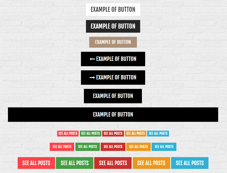
Buttons
Use the following basic HTML markup:
|
1 2 3 4 5 |
<li> <a href="#" class="btn btn-lg btn-button--brown "> Example of button </a> </li> |
And of the following variations:
Types of buttons:
– btn
– btn-sm
– btn-md
Different looks:
-btn-default
-btn-inverse
-btn-button–brown
-btn-button–dark

Button
Was this article helpful ?
CSS Files and Structure
If you would like to edit the color, font, or style of any elements, you would do the following:
|
1 |
#primaryContent a {color: #someColor;} |
If you find that your new style is not overriding, it is most likely because of a specificity problem. Scroll down in your CSS file and make sure that there isn’t a similar style that has more weight.
I.E.
|
1 |
#wrap #primaryContent a {color: #someColor;} |
So, to ensure that your new styles are applied, make sure that they carry enough “weight” and that there isn’t a style lower in the CSS file that is being applied after yours.
Colors
The theme includes a css file wich you can use to edit the colors.
You just need to add the corresponding CSS file to the head of the page like this:
|
1 2 3 4 5 |
<head> (..) <link rel="stylesheet" type="text/css" href="css/motive.css"> (..) </head> |
Main Menu structure
Just change brand name, upload your logo to images/content/ folder and you’re ready to go!
|
1 2 3 4 5 6 7 8 9 10 11 12 13 14 15 16 17 18 19 20 21 22 23 24 25 26 27 28 29 30 31 32 33 |
<nav class="navbar ct-navbar navbar-default yamm ct-navbar--fadeIn" role="navigation"> <div class="container"> <div class="ct-navbarContainer"> <div class="navbar-header"> <a class="navbar-brand" href="index.html"><img id="ct-js-logo" src="assets/images/demo-content/logo.png" alt="FISHtank"></a> <!-- + --> </div> <ul class="nav navbar-nav"> <li role="presentation" class="dropdown"> <a class="dropdown-toggle" href="about.html" role="button" aria-expanded="true"> Home <span class="caret"></span> </a> <ul class="dropdown-menu"> <li> <div class="yamm-content"> </div> </li> </ul> </li> <li><a href="contact.html">Contact Us</a></li> </ul> <ul class="nav navbar-nav yamm ct-navbar--right"> <li><a href="login.html">My Account</a></li> </ul> </div> </div> </nav> |
In order to create mega menus read the documentation here:
Icons
We’ve included 360+ font icons.
Awesome Icons – http://fontawesome.io/icons/
HTML markup:
|
1 2 |
<!-- Awesome Icons --> <i class="fa fa-cog"></i> |
CSS Files & Structure
We’ve included 2 files.
bootstrap.css contains Bootstrap 3 Library.
style.css file contains general styles.
1. Snap mobile
2. Sidebar
3. Content
4. Frame box
5. Image box
6. Contact
7. Popup
8. Sliders
9. Animations
10. Food box
11. To Top button
12. Navigations blog
13. Blog section
14. Comments
15. Google Map
16. Loader
Utilities
Utility classes are low-level structural and positional traits. Utilities can be applied directly to any element, multiple utilities can be used tohether and utilities can be used alongsie component classes.
Utilities are intended for frequently used CSS properties and patterns, like: floats, containing floats, vertical alignemnt, text tryncation. Relying on utilities can help to reduce repetition and provide consistend implementations.
- Test uses utilities for the following categories:
- Typography
- Display Types
- Paddings
- Margins
- Line height
- Borders
- Colors
- Transform
- Section elements
Was this article helpful ?
Javascript
All javascripts are placed in folder /js. In main.js file we implement all functions calls.
This theme uses following Javascript files:
- HTML/assets/js/jquery.min.js – Jquery Plugin
- HTML/assets/js/bootstrap.min.js – Bootstrap Plugin
- HTML/assets/js/placeholder.min.js
- HTML/assets/js/easing.1.3.js
- HTML/assets/js/device.min.js
- HTML/assets/js/jquery.browser.min.js
- HTML/assets/js/snap.min.js – Snap Plugin is for responsive menu
- HTML/assets/js/jquery.appear.js
- HTML/assets/js/masonry.min.js – This is using in home page and in gallery
- HTML/assets/plugins/owl/owl.carousel.min.js – slider plugin
- HTML/assets/plugins/owl/init.js
- HTML/assets/js/portfolio/imagesloaded.js – Needed for gallery
- HTML/assets/plugins/magnific-popup/jquery.magnific.min.js – Needed for gallery, using when you want to see a big image after click on thumbnail
- HTML/assets/plugins/magnific-popup/init.js
- HTML/assets/js/main.js – Main scripts
- HTML/assets/js/less.min.js
Google Map (GMAP3 Plugin)
This is google map with custom marker, you can define couple parameters:
- data-location – address to show
- data-height – map height (if undefined height will be 220px)
- data-offset – by how many map should be repositioned from marker center point (default -30)
It uses gmap3 plugin.
Documentation: here
HTML Markup:
|
1 |
<div class="ct-googleMap" data-location="Narbutta 24, Warsaw" data-zoom="15" data-height="500"></div> |
All javascript code can be found in js/main.js file.
jquery.appear
This plugin call function when element appear in viewport. This is used in custom animation, progress bars, counter timer.
Documentation: https://github.com/bas2k/jquery.appear/
|
1 2 3 4 5 6 7 8 9 10 11 12 13 |
if (jQuery().appear) { if (device.mobile()) { // disable animation on mobile jQuery("body").removeClass("withAnimation"); } else { jQuery('.withAnimation .animated').appear(function () { jQuery(this).each(function () { jQuery(this).addClass('activate'); jQuery(this).addClass($(this).data('fx')); }); }, {accY: -150}); } } |
Charts.js
This plugin is used to make graphics.
Documentation: http://www.chartjs.org/
Was this article helpful ?
Slider
There are three available types of slider. You can use it with the following variations:
- ct-owl–type1
- ct-owl–type2
- ct-owl–type3
Use the simple HTML markup:
|
1 2 3 4 5 6 7 8 9 10 11 12 13 |
div class="ct-js-owl ct-owl--type1" data-items="1" data-autoPlay="true" data-pagination="false" data-navigation="true" data-autoHeight="true"> <div class="item"> [content] </div> <div class="item"> [content] </div> </div> |
Don’t forget to include on the page the following javascripts:
|
1 2 |
<script src="assets/js/owl.carousel/owl.carousel.min.js"></script> <script src="assets/js/owl.carousel/init.js"></script> |
Was this article helpful ?
Progress icons
Progress icons
HTML markup:
|
1 2 3 |
<div class="progress-icons" data-font-size="90" data-icon-color="#F00A0A" data-active="11" data-total="15" data-icon="fa-male" data-delay="200"> </div> |
Don’t forget to include the following javascript file:
|
1 |
<script src="assets/js/progressicons/init.js"></script> |
Was this article helpful ?
Google Map
HTML markup:
|
1 2 3 |
<div class="ct-googleMap-contsainer"> <div class="ct-googleMap" data-height="280" data-location="Narbutta 24, Warsaw" data-zoom="15"></div> </div> |
Required javascript files:
|
1 2 3 |
<script src="http://maps.google.com/maps/api/js?sensor=false"></script> <script src="assets/js/gmap/gmap3.min.js"></script> <script src="assets/js/gmap/init.js"></script> |
Was this article helpful ?
Toggleable
TABS
Tabs
|
1 2 3 4 5 6 7 8 9 10 11 12 13 14 15 16 17 18 19 20 21 22 23 24 25 26 27 28 |
<div class="ct-tab"> <div class="tabs-container ct-tab-container"> <ul class="nav nav-tabs nav-justified ct-tab-navbar" role="tablist" id="myTab"> <li class="active"><a href="#related" role="tab" data-toggle="tab">Related</a></li> <li><a href="#recent" role="tab" data-toggle="tab">Recent</a></li> <li><a href="#popular" role="tab" data-toggle="tab">Popular</a></li> </ul> <div class="tab-content ct-tab-content"> <div class="tab-pane active" id="related"> [content] </div> <div class="tab-pane" id="recent"> [content] </div> <div class="tab-pane" id="popular"> [content] </div> </div> </div> </div> |
ACCORDION
Accordion
|
1 2 3 4 5 6 7 8 9 10 11 12 13 14 15 16 17 18 19 20 21 22 23 24 25 26 27 28 29 30 31 32 33 34 35 36 37 38 39 40 41 42 43 44 45 46 47 48 49 50 51 52 53 54 55 56 |
<div class="panel-group ct-accordion" id="accordion"> <div class="panel panel-default ct-accordion-panel"> <div class="panel-heading ct-accordion-heading"> <h4 class="panel-title ct-accordion-title"> <a data-toggle="collapse" data-parent="#accordion" href="#collapseOne"> [heading] </a> </h4> </div> <div id="collapseOne" class="panel-collapse collapse in"> <div class="panel-body ct-accordion-body"> [content] </div> </div> </div> <div class="panel panel-default ct-accordion-panel"> <div class="panel-heading ct-accordion-heading"> <h4 class="panel-title ct-accordion-title"> <a data-toggle="collapse" data-parent="#accordion" href="#collapseTwo" class="collapsed"> [heading] </a> </h4> </div> <div id="collapseTwo" class="panel-collapse collapse "> <div class="panel-body ct-accordion-body"> [content] </div> </div> </div> <div class="panel panel-default ct-accordion-panel"> <div class="panel-heading ct-accordion-heading"> <h4 class="panel-title ct-accordion-title"> <a data-toggle="collapse" data-parent="#accordion" href="#collapseThree" class="collapsed"> [heading] </a> </h4> </div> <div id="collapseThree" class="panel-collapse collapse"> <div class="panel-body ct-accordion-body"> [content] </div> </div> </div> </div> |
Was this article helpful ?
Pricing Table
Pricing Table
HTML markup:
|
1 2 3 4 5 6 7 8 9 10 11 12 13 14 15 16 17 18 19 20 21 22 23 24 25 26 27 28 29 30 31 32 33 34 |
<article class="ct-pricingTable"> <div class="ct-pricingTable-header"> <div> <h5><small>Personal</small></h5> <p> <sup>$</sup>19/month </p> </div> </div> <div class="ct-pricingTable-container"> <ul class="list-unstyled"> <li class="active"> <p><i class="fa fa-check"></i>Vestibulum ultrices orci</p> </li> <li class="active"> <p><i class="fa fa-check"></i>Quisque a lorem</p> </li> <li class="active"> <p><i class="fa fa-check"></i>Aliquam luctus eros</p> </li> <li> <p><i class="fa fa-check"></i>Mauris sed nunc a nunc</p> </li> <li> <p><i class="fa fa-check"></i>Nam eu purus tincidunt</p> </li> </ul> </div> <div class="ct-pricingTable-footer"> <a class="btn btn-motive ct-btn-block" href=""><span>Subscribe Now</span></a> </div> </article> |
Was this article helpful ?
Tables
Tables
HTML markup:
|
1 2 3 4 5 6 7 8 9 10 11 12 13 14 15 16 |
<div class="ct-table"> <div class="table-responsive"> <table class="table"> <thead> [head content] </thead> <tbody> [body content] </tbody> </table> </div> </div> |
You can adjust table look, with Bootstrap variations:
- table-responsive,
- table-striped,
- table-bordered,
- table-hover
Was this article helpful ?
Progress bar
SIMPLE
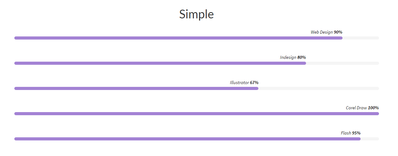
Progress bar simple
|
1 2 3 4 5 6 7 8 9 10 11 12 13 14 15 |
<div class="ct-progressBar"> <header class="ct-u-hideText"> <h4>Progress Bar</h4> </header> <div class="ct-progressBar-content"> <div class="progress"> <div class="progress-bar animating" role="progressbar" data-percentage="90" aria-valuenow="90" aria-valuemin="0" aria-valuemax="100"> <span>Web Design <strong>90%</strong></span> </div> </div> </div> </div> |
EXTENDED
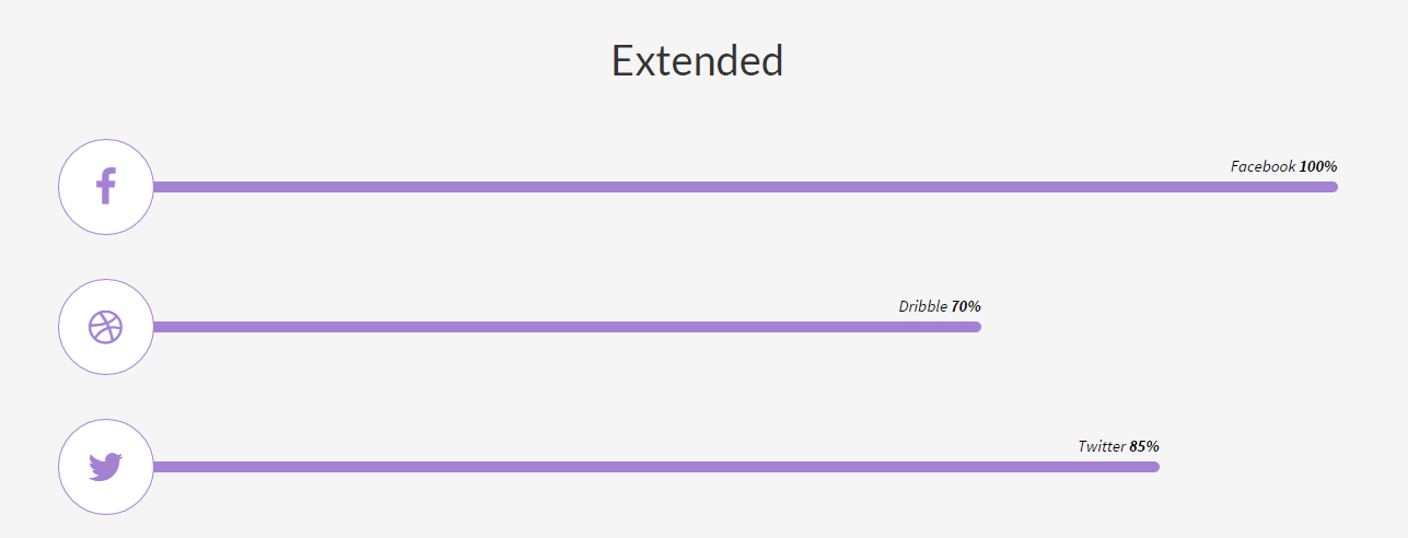
Progress bar – extended
|
1 2 3 4 5 6 7 8 9 10 11 12 13 14 15 16 |
<div class="ct-progressBar"> <div class="ct-progressBar-content ct-u-paddingBottom40"> <div class="media"> <div class="media-left"> <a href="#" class="ct-progressBar-icon ct-hover--outlineOut"><i class="fa fa-facebook"></i></a> </div> <div class="media-body media-middle ct-u-width100per"> <div class="progress"> <div class="progress-bar animating" role="progressbar" data-percentage="100" aria-valuenow="100" aria-valuemin="0" aria-valuemax="100"> <span>Facebook <strong>100%</strong></span> </div> </div> </div> </div> </div> </div> |
Don’t forget about javascript:
|
1 |
<script src="assets/js/progresBar/init.js"></script> |
Was this article helpful ?
Navbar
|
1 2 3 4 5 6 7 8 9 10 11 12 13 14 15 16 17 18 19 20 21 22 23 24 25 26 27 28 29 30 31 32 33 34 35 36 37 38 39 40 41 42 43 44 45 46 47 48 49 50 51 52 53 |
<nav class="navbar ct-u-backgroundWhite " role="navigation"> <div class="ct-u-hideText"> <h2 class="ct-u-hideText">Main Menu</h2> </div> <div class="container-fluid navbar-menu"> <!-- Brand and toggle get grouped for better mobile display --> <div class="navbar-header"> [logo] </div> <!-- Collect the nav links, forms, and other content for toggling --> <div class="header-search pull-right"> <form class="form-inline" role="search"> <div class="input-group"> <input type="text" class="form-control search-input" placeholder="Search"> <span class="input-group-btn"> <button type="submit" class="btn btn-primary btn-search">Submit</button> </span> </div> </form> </div> <div class="collapse navbar-collapse"> <ul class="nav navbar-nav yamm list-unstyled ct-navbar--fadeIn"> <li class="dropdown"> [content] </li> <li class="dropdown yamm-fw"> <a href="features-grid.html">Features </a> <ul class="dropdown-menu"> <li class="yamm-inner"> <div class="yamm-content"> [content] </div> </li> </ul> </li> </ul> </div> <!-- /.navbar-collapse --> </div> <!-- /.container --> </nav> |
- ct-headroom–scrollUpMenu
- ct-headroom–scrollUpTopBar
- ct-headroom–scrollUpBoth
- ct-headroom–fixedTopBar
- ct-headroom–fixedMenu
- ct-headroom–fixedBoth
- ct-headroom–hideMenu
- ct-navbar–transparent
You can also use smaller navbar type by adding the following class to .navbar:
- navbar-makeSmaller
Was this article helpful ?
Portfolio item
Use the following HTML markup to display single portfolio item:
|
1 2 3 4 5 6 7 8 9 10 11 12 13 14 15 16 17 18 19 20 21 22 23 24 25 26 27 28 29 30 31 32 33 34 35 36 37 38 39 |
<article class="ct-gallery-item ct-portfolio-item webdesign"> <header class="ct-u-hideText"> <h2 class="ct-u-hideText">Gallery item</h2> </header> <div class="ct-portfolio-item-outer"> <div class="ct-portfolio-item-media"> <a href="#"> <figure class="ct-imageBox effect-apollo"> <div class="ct-imageBox-image"> [image] </div> <figcaption> [content or empty] </figcaption> </figure> </a> </div> <div class="ct-portfolio-item-inner"> <header class="ct-portfolio-header"> <div class="ct-portfolio-title"> [title or none] <p> [text or none] </p> </div> </header> </div> </div> </article> |
Portfolio item
Was this article helpful ?
Count To

Counter
|
1 2 3 4 5 6 7 8 9 10 |
<div class="col-sm-3 ct-u-paddingTop30"> <div class="ct-counterBox"> <span class="ct-counterBox-number ct-js-counter" data-ct-to="48" data-ct-speed="5000"> 0 </span> <h5>Pizza's eaten</h5> </div> </div> |
Don’t forget to include the following javascript:
|
1 2 |
<script src="assets/js/counter/jquery.countTo.js"></script> <script src="assets/js/counter/init.js"></script> |
Was this article helpful ?
Coming Soon Counter
Your page is still under construction? Don’t worry! You can always keep visitors informed with Coming Soon Counter.
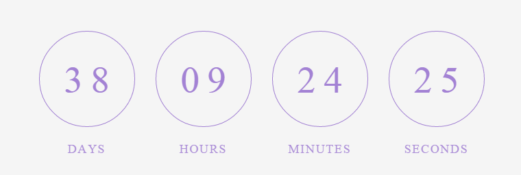
Coming soon
Use the following HTML markup:
|
1 |
<div class="row centered text-center ct-u-paddingBoth30" id="counter"></div> |
And define counter values in javascript:
|
1 2 3 4 5 6 7 8 |
<script src="assets/js/counter/jquery.countTo.js"></script> <script src="assets/js/counter/init.js"></script> <script src="assets/js/counter/jquery.mb-comingsoon.min.js"></script> <script type="text/javascript"> $('#counter').mbComingsoon({expiryDate: new Date(2015, 2, 24, 0, 0), speed: 950}); </script> |
Was this article helpful ?
Charts
Circle
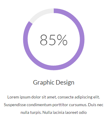
Chart – Circle
HTML markup:
|
1 2 3 4 5 6 7 8 9 10 11 12 13 14 15 16 17 18 |
<div class="ct-graphBox ct-graphBox--default"> <div class="ct-graphBox-graph"> <canvas width="150" height="150" class="ct-js-pieChart" data-ct-percentage="85" data-ct-middleSpace="85" data-ct-secondColor="#eeeeee" data-ct-firstColor="#a382d4"></canvas> <span class="ct-graphBox-graphPercentage">85%</span> </div> <div class="ct-graphBox-content"> <h4 class="ct-graphBox-title"> Graphic Design </h4> <p> Lorem ipsum dolor sit amet, consecte adipiscing elit. Suspendisse condimentum porttitor cursumus. Duis nec nulla turpis. Nulla lacinia laoreet odio </p> </div> </div> |
Script:
|
1 2 |
<script src="assets/js/charts/Chart.min.js"></script> <script src="assets/js/charts/init.js"></script> |
Bar

Chart – Bar
HTML markup:
|
1 |
<canvas id="barchart" height="450" width="600"></canvas> |
Script:
|
1 2 3 4 5 6 7 8 9 10 11 12 13 14 15 16 17 18 19 20 21 22 23 24 25 26 27 28 29 30 31 32 33 34 35 |
<script src="assets/js/charts/Chart.min.js"></script> <script src="assets/js/charts/init.js"></script> <script> var randomScalingFactor = function () { return Math.round(Math.random() * 100) }; var barChartData = { labels: ["January", "February", "March", "April", "May", "June", "July"], datasets: [ { fillColor: "rgba(252,67,73,0.5)", strokeColor: "#fc4349", highlightFill: "#fc4349", highlightStroke: "#fc4349", data: [randomScalingFactor(), randomScalingFactor(), randomScalingFactor(), randomScalingFactor(), randomScalingFactor(), randomScalingFactor(), randomScalingFactor()] }, { fillColor: "rgba(173,210,96,0.5)", strokeColor: "#add260", highlightFill: "#add260", highlightStroke: "#add260", data: [randomScalingFactor(), randomScalingFactor(), randomScalingFactor(), randomScalingFactor(), randomScalingFactor(), randomScalingFactor(), randomScalingFactor()] } ] } window.onload = function () { var ctx1 = document.getElementById("barchart").getContext("2d"); window.myBar = new Chart(ctx1).Bar(barChartData, { responsive: true } </script> |
Line
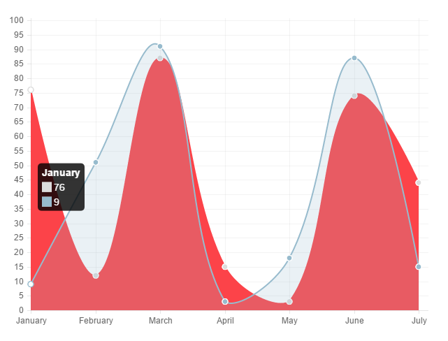
Chart – Line
HTML markup:
|
1 |
<canvas id="polararea" height="450" width="600"></canvas> |
Edit all values with Javascript:
|
1 2 3 4 5 6 7 8 9 10 11 12 13 14 15 16 17 18 19 20 21 22 23 24 25 26 27 28 29 30 31 32 33 34 35 36 37 38 39 40 41 42 43 44 |
<script src="assets/js/charts/Chart.min.js"></script> <script src="assets/js/charts/init.js"></script> <script> var randomScalingFactor = function () { return Math.round(Math.random() * 100) }; var lineChartData = { labels: ["January", "February", "March", "April", "May", "June", "July"], datasets: [ { label: "My First dataset", fillColor: "#fc4349", strokeColor: "#fc4349", highlightFill: "#fc4349", highlightStroke: "#fc4349", pointColor: "rgba(220,220,220,1)", pointStrokeColor: "#fff", pointHighlightFill: "#fff", pointHighlightStroke: "rgba(220,220,220,1)", data: [randomScalingFactor(), randomScalingFactor(), randomScalingFactor(), randomScalingFactor(), randomScalingFactor(), randomScalingFactor(), randomScalingFactor()] }, { label: "My Second dataset", fillColor: "rgba(151,187,205,0.2)", strokeColor: "rgba(151,187,205,1)", pointColor: "rgba(151,187,205,1)", pointStrokeColor: "#fff", pointHighlightFill: "#fff", pointHighlightStroke: "rgba(151,187,205,1)", data: [randomScalingFactor(), randomScalingFactor(), randomScalingFactor(), randomScalingFactor(), randomScalingFactor(), randomScalingFactor(), randomScalingFactor()] } ] } window.onload = function () { var ctx2 = document.getElementById("linechart").getContext("2d"); window.myLine = new Chart(ctx2).Line(lineChartData, { responsive: true }); } </script> |
Polar
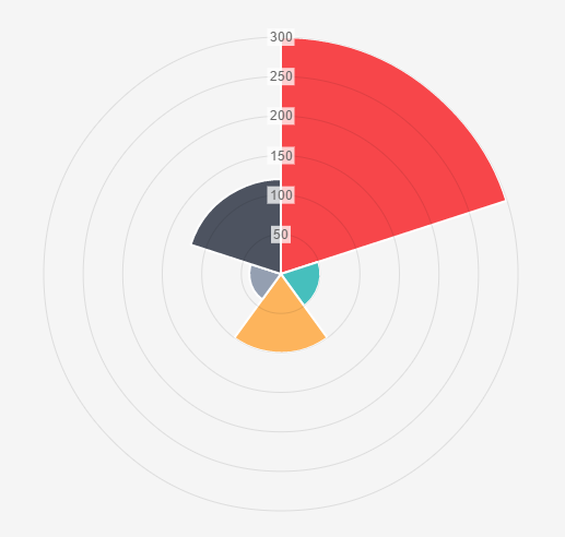
Chart – Polar
HTML markup:
|
1 |
<canvas id="polararea" height="450" width="600"></canvas> |
Script:
|
1 2 3 4 5 6 7 8 9 10 11 12 13 14 15 16 17 18 19 20 21 22 23 24 25 26 27 28 29 30 31 32 33 34 35 36 37 38 39 40 41 42 43 44 45 46 47 48 49 50 |
<script src="assets/js/charts/Chart.min.js"></script> <script src="assets/js/charts/init.js"></script> <script> var randomScalingFactor = function () { return Math.round(Math.random() * 100) }; var polarData = [ { value: 300, color: "#F7464A", highlight: "#FF5A5E", label: "Red" }, { value: 50, color: "#46BFBD", highlight: "#5AD3D1", label: "Green" }, { value: 100, color: "#FDB45C", highlight: "#FFC870", label: "Yellow" }, { value: 40, color: "#949FB1", highlight: "#A8B3C5", label: "Grey" }, { value: 120, color: "#4D5360", highlight: "#616774", label: "Dark Grey" } ]; window.onload = function () { var ctx3 = document.getElementById("polararea").getContext("2d"); window.myPolarArea = new Chart(ctx3).PolarArea(polarData, { responsive: true } </script> |
Was this article helpful ?
Buttons
Test comes with number of buttons types
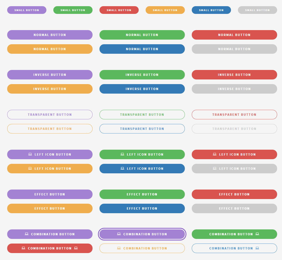
Buttons
You can use any of them with the simple HTML markup:
|
1 |
<a href="#" class="btn btn-lg btn-motive ct-btn-inverse ct-btn-rounded ct-hover--outlineOut"><i class="fa fa-file-text-o"></i><span>Learn More About Us</span></a> |
Just change types with the following options:
- ct-btn-inverse
- ct-btn-rounded
- ct-btn-transparent
- ct-btn-block
- ct-btn-link
- ct-hover–outlineOut
You can also use one of default Bootstrap parameters for buttons, like size and colors – find out more here.
Was this article helpful ?
Owl Slider
Check slider documentation here
You can call it with the following script:
|
1 2 |
<script src="assets/js/owl.carousel/owl.carousel.min.js"></script> <script src="assets/js/owl.carousel/init.js"></script |
And HTML markup:
|
1 2 3 4 5 6 7 8 9 10 11 12 13 14 15 16 17 |
<section class="ct-js-owl ct-owl--type3" data-height="765" data-items="1" data-autoPlay="true" data-pagination="false" data-navigation="true" data-autoHeight="true" data-animation="true" data-snap-ignore="true"> <div class="item" data-bg="assets/images/demo-content/photodune-735770-joy-and-freedom-m.jpg"> <div class="item-inner"> [content] </div> </div> <div class="item" data-bg="assets/images/demo-content/photodune-735770-joy-and-freedom-m.jpg"> <div class="item-inner"> [content] </div> </div> </section> |
Was this article helpful ?
Display your twitter feed with simple HTML markup:
|
1 2 3 4 5 6 7 8 9 10 |
<div class="twitterContainer ct-u-paddingBoth10"> <header class="text-center ct-u-marginBottom40 ct-u-ff--1"> <h6><small class="ct-fw-300 text-uppercase ct-u-Creme ct-u-ls-2">Latest Tweet</small></h6> </header> <div class="ct-js-twitter ct-twitter"></div> <div class="text-center ct-u-marginTop10"> <a href="#" class="btn btn-motive ct-btn-inverse btn-lg ct-btn-rounded ct-hover--outlineOut"><span>CreateIT</span></a> </div> </div> |
Don’t forget to include also script for this:
|
1 |
<script src="assets/twitter/js/jquery.tweet.js"></script> |
And here is the result:

Was this article helpful ?
Morph button
Use Morph button for Login/Register options or Email in Person Box. After click on it will display form window and move to another place on the page.
Morph button
|
1 2 3 4 5 6 7 8 9 10 11 12 13 14 15 16 |
<div class="ct-mbMorphButtonContainer ct-js-mbMorphButton ct-personBox-morph"> <button class="btn btn-motive ct-btn-rounded ct-hover--outlineOut"> <i class="fa fa-envelope cw-mail"></i> </button> <div class="ct-mbMorphButton-wrapper-outer"> <div class="ct-mbMorphButton-wrapper-inner"> <span class="ct-mbMorphIconClose"><i class="fa fa-times"></i></span> [content] </div> </div> <div class="ct-mbMorphButton-overlay"></div> </div> |
And script:
|
1 |
<script src="assets/less/ButtonComponentMorph/js/mbMorphButton.js"></script> |
See it in the action here
Was this article helpful ?
Social Icons
Test comes with number of Social Icons, created with FontAwesome icons set.

Social Icons
You can use it with simple HTML markup:
|
1 2 3 4 5 6 7 8 9 10 11 12 13 14 15 16 17 18 |
<ul class="socialicons socialicons-lg socialicons--white"> <li> <a href="#" data-toggle="tooltip" data-placement="bottom" title="" data-original-title="Vimeo"> <i class="fa fa-vimeo-square"></i> </a> </li> <li> <a href="https://twitter.com/createitpl" data-toggle="tooltip" data-placement="bottom" title="" data-original-title="Twitter"> <i class="fa fa-twitter"></i> </a> </li> <li> <a href="https://www.facebook.com/createITpl" data-toggle="tooltip" data-placement="bottom" title data-original-title="Facebook"> <i class="fa fa-facebook"></i> </a> </li> </ul> |
There are several size and color options:
- socialicons-sm
- socialicons-md
- socialicons-lg
- socialicons–white
- socialicons–gray
- socialicons–darkGray
- socialicons–darkGray2
Was this article helpful ?
Forms
Contact Form
Contact Form
HTML markup:
|
1 2 3 4 5 6 7 8 9 10 11 12 13 14 15 16 17 18 19 20 21 22 23 24 25 26 27 28 29 30 31 32 33 34 35 36 37 38 39 40 41 42 43 44 45 46 47 48 49 50 51 52 53 54 55 56 57 58 59 60 61 62 63 64 65 66 67 68 69 70 71 |
<div class="ct-comment"> <div class="successMessage ct-alert ct-alert--success"> <div class="ct-alert-header"> <div class="ct-alert-title"> <h4><small>Success</small></h4> </div> <div class="ct-alert-closeIcon"> <i class="fa fa-times"></i> </div> </div> <div class="ct-alert-content"> <p> Success </p> </div> </div> <div class="errorMessage ct-alert ct-alert--danger"> <div class="ct-alert-header"> <div class="ct-alert-title"> <h4><small>Danger</small></h4> </div> <div class="ct-alert-closeIcon"> <i class="fa fa-times"></i> </div> </div> <div class="ct-alert-content"> <p> Error </p> </div> </div> <form class="form-horizontal validateIt" role="form" action="assets/form/send.php" method="POST"> <div class="row"> <div class="col-md-4"> <div class="form-group"> <label for="name" class="col-md-3 control-label">Name:*</label> <div class="col-md-9"> <input type="text" class="form-control" required="" name="field[]" id="name" placeholder="Name"> </div> </div> <div class="form-group"> <label for="email" class="col-md-3 control-label">E-mail:*</label> <div class="col-md-9"> <input type="email" class="form-control" required="" name="field[]" id="email" placeholder="e-mail"> </div> </div> <div class="form-group"> <div class="ct-contact-btn col-md-9 col-md-offset-3"> <button type="submit" class="btn btn-motive ct-btn-rounded ct-hover--outlineOut ct-contact-btn"><span>Submit</span><i class="fa fa-send"></i></button> </div> </div> </div> <div class="col-md-8"> <div class="form-group"> <label for="email" class="col-md-2 control-label">Your comment:*</label> <div class="col-md-10"> <textarea class="form-control" rows="8" required="" name="field[]" placeholder="Type any text"></textarea> </div> </div> </div> </div> </form> </div> |
Script:
|
1 |
<script src="assets/form/js/contact-form.js"></script> |
Newsletter

Newsletter
HTML markup:
|
1 2 3 4 5 6 7 8 9 10 |
<div class="ct-newsletter"> <form class="form-inline" role="form" action="assets/form/send.php" method="POST"> <div class="input-group"> <input type="text" class="form-control" required="" name="field[]" placeholder="E-mail adress"> <span class="input-group-btn"> <button class="btn btn-motive" type="submit"><i class="fa fa-send"></i></button> </span> </div> </form> </div> |
Script:
|
1 |
<script src="assets/form/js/contact-form.js"></script> |
Common Problems
Where I can edit my contact form/newsletter email addres?
You can define where we should send messages from your contact form and newsletter in file HTML/assets/form/config.php
Form config
Add your email address instead of recipient@mail.com and it’s ready to use!
Was this article helpful ?
Icon box
You can use three types of Icon Boxes with the following CSS varaitions:
- ct-iconBox–type1
- ct-iconBox–type2
- ct-iconBox–type3
Icon Box
HTML markup:
|
1 2 3 4 5 6 7 8 9 10 11 12 13 14 15 16 17 |
<article class="ct-iconBox ct-iconBox--type1"> <div class="ct-iconBox-header"> <div class="ct-iconBox-logo"> <span class="ct-iconBox-logo ct-hover--outlineOut"><i class="fa fa-eye"></i></span> </div> <div class="ct-iconBox-title"> <div> <h6>Who Were Playing In The</h6> </div> </div> </div> <div class="ct-iconBox-text"> <p>Priests were passing in processions, beating their dreary tambourines; police and custom-house officers with pointed hats</p> </div> <a class="btn btn-motive btn-sm ct-btn-rounded ct-btn-transparent ct-hover--outlineOut" href=""><i class="fa fa-file-text-o"></i><span>Read More</span></a> </article> |
Was this article helpful ?
Portfolio
You can display your portfolio item in several different ways with the following CSS variations:
- default
- ct-portfolio-masonry
- ct-portfolio-masonry–col2
- ct-portfolio-masonry–col3
- ct-portfolio-masonry–col4
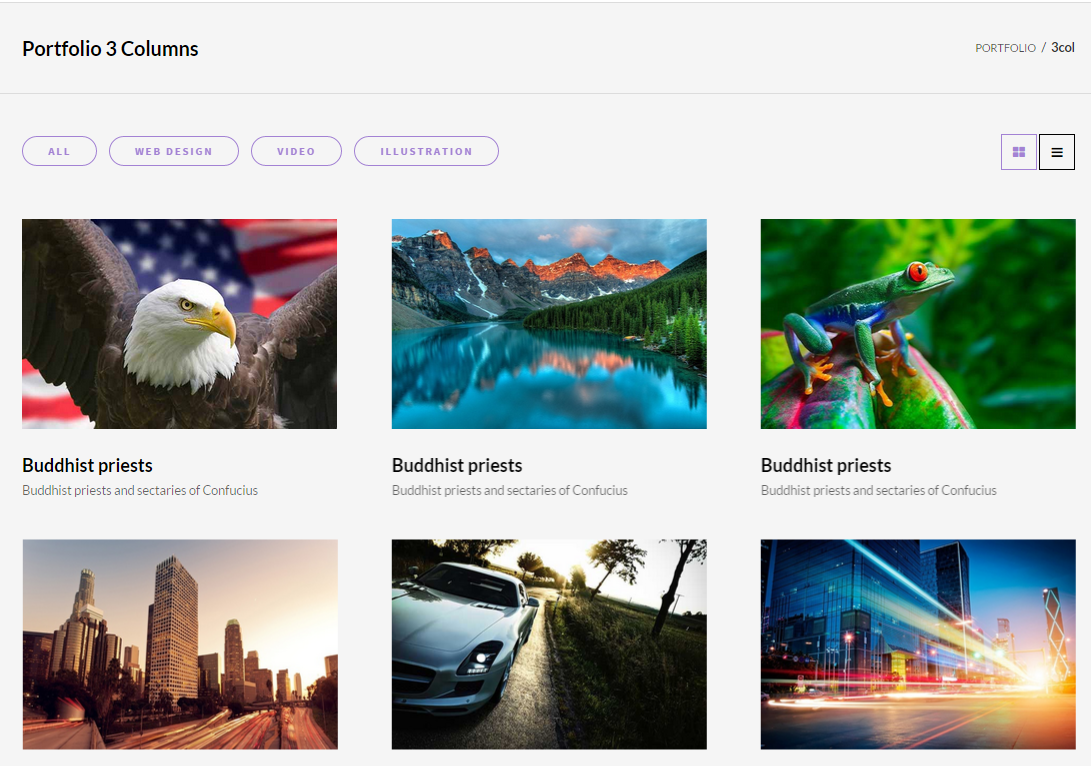
Portfolio
HTML markup:
|
1 2 3 4 5 6 7 8 9 10 11 12 13 14 15 16 17 18 19 20 21 22 23 |
<section class="ct-gallery ct-portfolio-container ct-portfolio-masonry ct-portfolio-masonry--col2"> <header class="ct-u-hideText"> <h2 class="ct-u-hideText">Gallery</h2> </header> <article class="ct-gallery-item ct-portfolio-item webdesign"> [content] </article> <article class="ct-gallery-item ct-portfolio-item webdesign"> [content] </article> <article class="ct-gallery-item ct-portfolio-item webdesign"> [content] </article> </section> |
Scripts:
|
1 2 3 4 |
<script src="assets/js/portfolio/infinitescroll.min.js"></script> <script src="assets/js/portfolio/jquery.isotope.min.js"></script> <script src="assets/js/portfolio/imagesloaded.js"></script> <script src="assets/js/portfolio/init.js"></script> |
Was this article helpful ?
Blockquote
There are three types of blockquotes:
- ct-quote–type1
- ct-quote–type2
- ct-quote–type3
To create any of them use the simple HTML markup:
|
1 2 3 4 5 6 |
<div class="ct-quote--type1"> <blockquote class="text-center"> <p class="ct-u-colorDark">Various versions have evolved over the years, sometimes by accident, sometimes on purpose</p> <a href="#"><cite>VINCENT THOMPSON <span>CREATIVE MIND</span></cite></a> </blockquote> </div> |
Was this article helpful ?
Person Box
Introduce your team members with pretty person boxes.
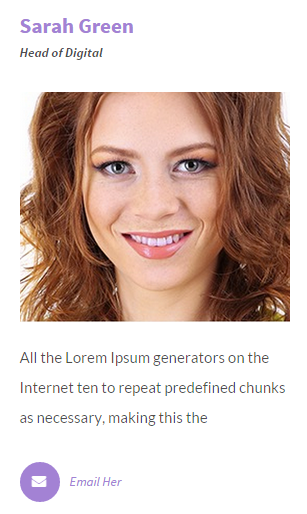
Person Box
Use for this simple HTML markup:
|
1 2 3 4 5 6 7 8 9 10 11 12 13 14 15 16 17 18 19 20 21 22 23 24 25 26 27 28 29 30 31 32 33 34 35 36 37 38 |
<article class="ct-personBox"> <header class="ct-personBox-title"> <h4><a href="#">Sarah Green</a></h4> <p>Head of Digital</p> </header> <figure class="ct-personBox-images ct-hover ct-js-hover ct-hover-type14"> <a href="#"><img src="assets/images/demo-content/peoplecomp_03.png" alt="peoplecomp_03" /></a> </figure> <div class="ct-personBox-text"> <p>All the Lorem Ipsum generators on the Internet ten to repeat predefined chunks as necessary, making this the</p> <div class="ct-personBox-email ct-morph-button ct-morph-button-modal ct-morph-button-modal-2 ct-morph-button-fixed"> <button type="button" class="btn btn-motive ct-btn-rounded ct-btn-NavbarMenu ct-hover--outlineOut"><i class="fa fa-envelope cw-mail"></i></button> <div class="ct-morph-content"> <div> <div class="content"> <span class="icon icon-close"><i class="fa fa-times"></i></span> <h4 class="ct-fw-900 text-uppercase">Ask Me</h4> <form> <div class="form-group"> <label for="ct-personBox-text3">Message</label> <textarea class="form-control" id="ct-personBox-text3" rows="3" placeholder="Message"></textarea> </div> <div class="form-group"> <label for="ct-personBox-email3">Email address</label> <input type="email" class="form-control" id="ct-personBox-email3" placeholder="Enter email"> </div> <button type="submit" class="btn btn-motive ct-btn-rounded ct-hover--outlineOut ct-u-marginTop15 pull-right">Send</button> </form> </div> </div> </div> </div><!-- morph-button --> <span class="ct-js-emailPerson">Email Her</span> </div> </article> |
Was this article helpful ?
Breadcrumbs
Make your website navigation more efficient with our breadcrumbs.

Breadcrumbs
Create breadcrumbs with simple HTML markup:
|
1 2 3 4 5 6 7 8 9 10 11 12 13 14 15 |
<section class="ct-breadcrumbs"> <div class="container"> <div> <div class="ct-breadcrumbs-pageTitle"> <h3><small>Progress Bar</small></h3> </div> <div class="ct-breadcrumbs-list"> <ul class="list-unstyled list-inline"> <li><a href="index.html">Features</a></li> <li>Progress Bar</li> </ul> </div> </div> </div> </section> |
Was this article helpful ?
Call To action
Present your content in new way with Call To Action box.

Call To Action
It can be done with simple HTML markup:
|
1 2 3 4 5 6 7 8 9 10 11 12 13 |
<div class="ct-callToAction"> <div class="ct-callToAction-inner"> <div class="ct-callToAction-title"> <p> Passepartout wandered for several hours in the midst of this motley crowd, looking in </p> </div> <div class="ct-callToAction-btn"> <a href="#" class="btn btn-lg btn-motive ct-btn-inverse ct-btn-rounded ct-hover--outlineOut"><i class="fa fa-comments"></i><span>Let'a Talk</span></a> </div> </div> </div> |
Was this article helpful ?
Color Box
Check out our beautiful color boxes here
Create a simple container with background color and content. Additionally you can add here up or down arrow in several positions.
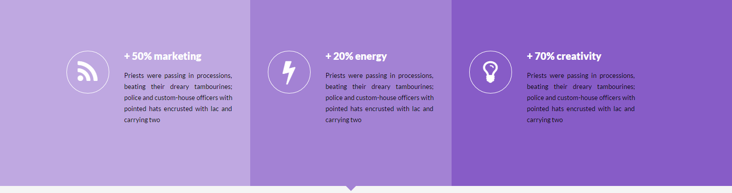
Color Box
Use the simple HTML markup:
|
1 2 3 4 5 6 7 8 9 |
<div class="ct-colorBox ct-colorBox--lighten10 ct-colorBox--before"> <div class="ct-colorBox-wrapper"> <div class="ct-colorBox-wrapperInner"> [content] </div> </div> </div> |
And extend options with the several variations:
- ct-colorBox–lighten10
- ct-colorBox–lighten20
- ct-colorBox–darken10
- ct-colorBox–darken20
- ct-colorBox–after
- ct-colorBox–before
- ct-colorBox-arrow
- ct-colorBox-arrow–top
- ct-colorBox-arrow–bottom
- ct-colorBox-arrow–left
- ct-colorBox-arrow–right
- ct-colorBox-arrow–center
- ct-colorBox-arrow–btPrev
- ct-colorBox-arrow–btNext
Was this article helpful ?
Javascript
All javascripts are placed in folder /js. In main.js file we implement all functions calls.
This theme uses following Javascript files:
- jquery-1.11.2
- jquery.easing.1.3
- jquery.browser
- jquery.appear
- bootstrap
- device
- classie
- contact-form
- jquery.tweet
- jquery.stellar/ct-mediaSection
- uiMorphingButton_fixed (http://tympanus.net/codrops/2014/05/12/morphing-buttons-concept/)
- snap (https://github.com/jakiestfu/Snap.js/)
- progresBar
- headroom (http://wicky.nillia.ms/headroom.js/)
- owl.carousel (http://owlgraphic.com/owlcarousel/#how-to)
- jquery.isotope
- jquery.magnific-popup
- gmap3
- Chart
- jquery.countTo
- jquery.mb-comingsoon
- progressicons
Google Map (GMAP3 Plugin)
This is google map with custom marker, you can define couple parameters:
- data-location – address to show
- data-height – map height (if undefined height will be 220px)
- data-offset – by how many map should be repositioned from marker center point (default -30)
It uses gmap3 plugin.
Documentation: here
HTML Markup:
|
1 |
<div class="ct-googleMap" data-location="Narbutta 24, Warsaw" data-zoom="15" data-height="500"></div> |
All javascript code can be found in js/main.js file.
jquery.appear
This plugin call function when element appear in viewport. This is used in custom animation, progress bars, counter timer.
Documentation: https://github.com/bas2k/jquery.appear/
|
1 2 3 4 5 6 7 8 9 10 11 12 13 |
if (jQuery().appear) { if (device.mobile()) { // disable animation on mobile jQuery("body").removeClass("withAnimation"); } else { jQuery('.withAnimation .animated').appear(function () { jQuery(this).each(function () { jQuery(this).addClass('activate'); jQuery(this).addClass($(this).data('fx')); }); }, {accY: -150}); } } |
Was this article helpful ?
CSS Files and Structure
If you would like to edit the color, font, or style of any elements, you would do the following:
|
1 |
#primaryContent a {color: #someColor;} |
If you find that your new style is not overriding, it is most likely because of a specificity problem. Scroll down in your CSS file and make sure that there isn’t a similar style that has more weight.
I.E.
|
1 |
#wrap #primaryContent a {color: #someColor;} |
So, to ensure that your new styles are applied, make sure that they carry enough “weight” and that there isn’t a style lower in the CSS file that is being applied after yours.
Colors
The theme includes a css file wich you can use to edit the colors.
You just need to add the corresponding CSS file to the head of the page like this:
|
1 2 3 4 5 |
<head> (..) <link rel="stylesheet" type="text/css" href="css/motive.css"> (..) </head> |
Main Menu structure
Just change brand name, upload your logo to images/content/ folder and you’re ready to go!
|
1 2 3 4 5 6 7 8 9 10 11 12 13 14 15 16 17 18 19 20 21 22 23 24 25 26 27 28 29 30 31 32 33 |
<nav class="navbar ct-navbar navbar-default yamm ct-navbar--fadeIn" role="navigation"> <div class="container"> <div class="ct-navbarContainer"> <div class="navbar-header"> <a class="navbar-brand" href="index.html"><img id="ct-js-logo" src="assets/images/demo-content/logo.png" alt="FISHtank"></a> <!-- + --> </div> <ul class="nav navbar-nav"> <li role="presentation" class="dropdown"> <a class="dropdown-toggle" href="about.html" role="button" aria-expanded="true"> Home <span class="caret"></span> </a> <ul class="dropdown-menu"> <li> <div class="yamm-content"> </div> </li> </ul> </li> <li><a href="contact.html">Contact Us</a></li> </ul> <ul class="nav navbar-nav yamm ct-navbar--right"> <li><a href="login.html">My Account</a></li> </ul> </div> </div> </nav> |
In order to create mega menus read the documentation here:
Icons
We’ve included 360+ font icons.
Awesome Icons – http://fontawesome.io/icons/
HTML markup:
|
1 2 |
<!-- Awesome Icons --> <i class="fa fa-cog"></i> |
CSS Files & Structure
We’ve included 2 files.
bootstrap.css contains Bootstrap 3 Library.
style.css file contains general styles.
1. Variables
2. Bootstrap
3. Mixins
4. Typography
5. Button hover effects
6. animate.css
7. Yamm
8. Image hover effects
9. Counter
10. Owl
11. Media section
12. Buttons
13. Morph buttons
14. Divided
15. Menu
16. Social icons
17. Forms
18. Widget
19. Icon box
20. Portfolio
21. Blockquote
22. Person Box
23. Progress Bar
24. Breadcrumbs
25. Call to action
26. Color Box
27. Media object
28. Blog
29. Blog sidebar
30. Blog Post
31. Pagination
32. List switcher
33. Comment
34. Contact
35. Error Page
36. Testimonals
37. Tables
38. Pricing tables
39. Toggables
40. Twitter
41. Footer
42. Maps
43. Utilities
44. Base Style
45. To Top arrow
46. Intro Effect
47. Magnific
Utilities
Utility classes are low-level structural and positional traits. Utilities can be applied directly to any element, multiple utilities can be used tohether and utilities can be used alongsie component classes.
Utilities are intended for frequently used CSS properties and patterns, like: floats, containing floats, vertical alignemnt, text tryncation. Relying on utilities can help to reduce repetition and provide consistend implementations.
- Test uses utilities for the following categories:
- Typography
- Display Types
- Paddings
- Margins
- Line height
- Borders
- Colors
- Transform
- Section elements
Was this article helpful ?
Main Navbar
There are several navbar color types to choose. You can setup navbar type and scroll effect globally via Appearance > Customize > Main Navbar
Global Settings for Navbar
Notice, that sometimes you can check changes in Customizer preview only after click on Save & Publish button.
Those settings will be automatically applied for every page, though you can change options for each page with Template Settings:
Page settings for Navbar
You can also define here:
- if title bar should be displayed,
- bar color,
- bar size,
- if title should be displayed,
- if breadcrumbs should be displayed
Was this article helpful ?
Pages Options
In Pages panel you are able to edit the following options:
- Logo Settings
- Home page settings:Show/Hide comments,
- Show/Hide comment form
- Header settings:
- 404 Page:
- Button Link
- facebook Link
- twiter Link
- dragable Link
- sound Link
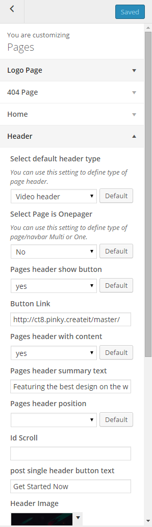
Pages Header Options
Was this article helpful ?
Portfolio Options
PORTFOLIO INDEX OPTIONS:
- Enter portfolio index page title – it will be displayed as title of your index page,
- Show portfolio index page title – hide/show portfolio index page title,
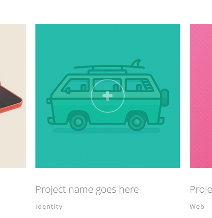
Portfolio item on mouse over
SINGLE PORTFOLIO OPTIONS:
- Portfolio single page title – define custom portfolio title,
- Portfolio single show page title – show/hide page title,
- Project prev – define custom label,
- Project next – define custom label,
- back to portfolio – define custom label,
- Show breadcrumbs – show/hide breadcrumbs,
- Single work Title – show/hide single work title,
- Image – show/hide,
- Client – show/hide,
- Date – show/hide,
- Categories – show/hide,
- Other projects – show/hide,
- External URL label – define custom label,
- Categories label – define custom label,
- Date label – define custom label,
- Client label – define custom label,
- Comments – show/hide,
- Comment form – show/hide,
- Related projects label – define custom label,
- Related projects description – define custom description,
- Related projects limit
Was this article helpful ?
Posts Options
When using the assigned blog page as described in Blog Index page, all the options you can select for it are located in Appearance > Customize on the Posts tab. There are dozens of options to choose from like layout, categories, dates, etc. There are general blog options and single post page options. Each one has title and descriptions to help you better understand what they do. Any type of blog options you need to set will be set here in theme options when using the assigned blog page.
INDEX PAGE OPTIONS:
- Blog title – it will be displayed as title of your index page,
- Show index as – select the way of displaying posts on index,
- Show posts index page title – hide/show blog title,
- Post detail button label – define custom label for button Read More,
- Date – show/hide posts date
- Image / video / gallery – show/hide image, video or gallery assigned to post (if you select Hide – we will display only text on blog index page),
- Title / quote author – show/hide posts author,
- Text Option – display full posts text, post excerpt or no intro text in posts list,
- Show read more button – show/hide button Read More
- Sidebar – show/hide sidebar on blog index page,
- Tags – show/hide posts tags,
- Categories – show/hide posts categories,
- Pagination notice – we will display pagination in the following format: Page 1 OF 7 – you can adjust labels with the following code instead: Custom-text %current% custom-text %total% – it’s useful if you want to translate your content
SINGLE POST OPTIONS – select how should look like single post page:
- Post page title – it will be displayed as title of your single post page,
- Show posts index page title – hide/show blog title,
- Date – show/hide posts date
- Image / video / gallery – show/hide image, video or gallery assigned to post (if you select Hide – we will display only text on post page),
- Title / quote author – show/hide post author,
- Content – show/hide post content (text),
- Author link – show/hide link to post author,
- Comments – show/hide comments,
- Comment form – show/hide comment form (select Hide if you don’t want comments below you post),
- Comments tag – show/hide comments tag,
- Sidebar – show/hide – show/hide sidebar,
- Tag cloud – show/hide tags,
- Categories – show/hide categories,
- Show socials box – show/hide socials,
- Share button label – define custom label for Share Button,
- Show author box – show/hide box with author information.
- Pagination – show/hide pagination,
- Previous post label – define custom label for Previous post button,
- Next post label – define custom label for Next post button,
- By label – define custom label for BY tag,
Common issue: How to change post intro text?
Intro text, which can be displayed on Blog index page is an Excerpt. You can edit it manually for every post with the following field:
Excerpt
Notice: if you don’t see Excerpt field when you are editing your post, go to Screen Options at the top of the post edition window (on the right hand side) and enable Excerpt with checkbox.
Was this article helpful ?
Socials
Social icons, from the top of the page can be removed or changed via Appearance > Customize > Socials
Social Icons
We will display here only icons for social media profiles, which you define in settings:
Social Icons settings
So if you don’t want to display, for example Facebook icon – just leave Facebook field empty.
Was this article helpful ?
Customizer
Test comes with advanced customizer, which allows to edit most of theme elements in one place. To use it navigate to Appearance > Customizer
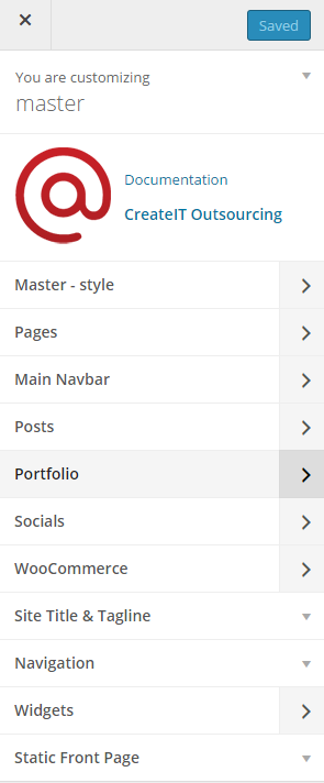
Customizer
It will display a panel with tabs corresponding to all theme sections, like:
- Pages
- Main Navbar
- Posts
- Portfolio
- Faq
- WooCommerce
- Footer Widgets
You will find there also main style settings under:
- Test style
In Test style section you can edit theme colors and fonts
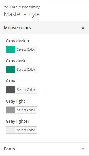
Colors
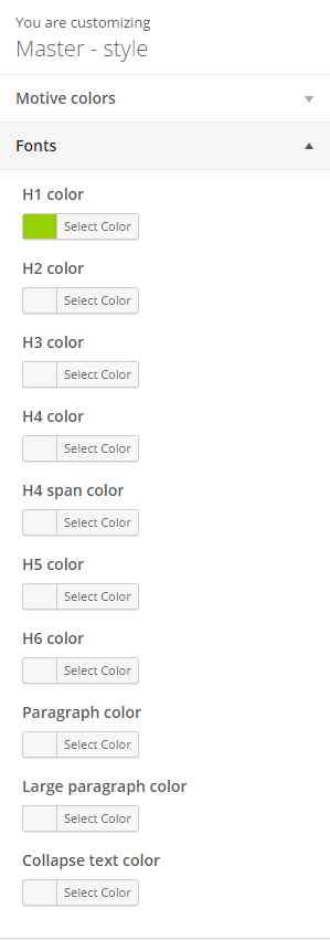
Fonts colors
All changes done with customizer will be applied only once you click on
Was this article helpful ?
Galleries
Test comes extended Galleries options, which allow you to manage all galleries and image in one place. Galleries are custom post types, where you can add multiple images, which then can be used almost everywhere on your page.
Creating Gallery
To create new Gallery, navigate to Galleries > Add New
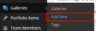
Add new Gallery
For new gallery you can define:
- Title (required),
- Tags (optional),
- Images (recommended),
The most important are of course images. You can Upload here new images from you computer or select images from Media library – one or multiple (hold CTRL or SHIFT to select more that one image).
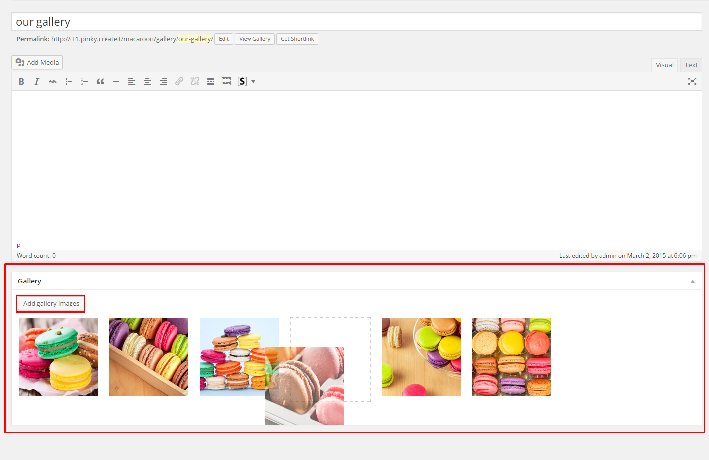
Gallery with images
For every gallery you can:
- reorder images with drag and drop tool,
- remove images from gallery with x sign
- add new images from media library or computer.
After every modification click on Update to keep your changes saved.
Header gallery
Each page has number of options to change header appearance. For the right half of header you can select images with Parallax or Kenburns effect, background Video or Slider.
If you would like to display images as Kenburns or Slider, you can do it with one of Galleries. Just select, which Gallery should be display here.
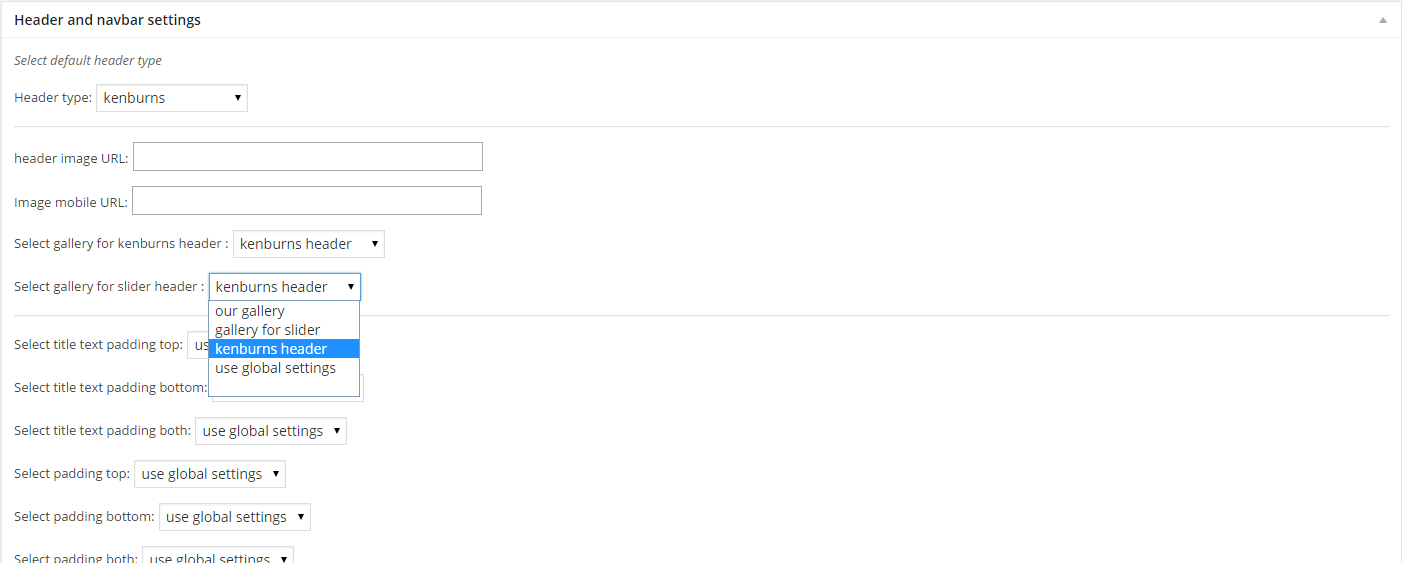
Header gallery
Slider Gallery
You can present your images as simple slider. From available components list select Slider. In tab Custom Gallery in slider settings you will see option to select gallery, which should be displayed as slider.
Notice: you have three Select options for images:
- none – image won’t be displayed,
- select all – all images from the gallery will be displayed (all changes which you will do for gallery, like adding/removing image will be applied in slider gallery),
- custom select – only selected images will be displayed.
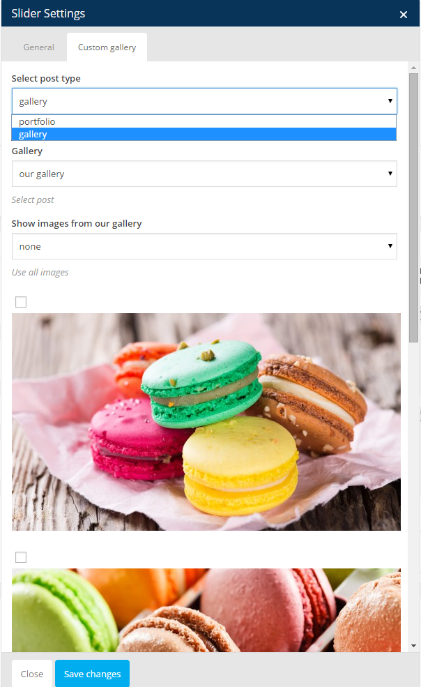
Slider Gallery
Image Grid
Another shortcode to display images uploaded to galleries in Image Grid – it works analogously to Slider element, but instead of slides, images are displayed in 2, 3 or 4 columns and can be opened in Lightbox.
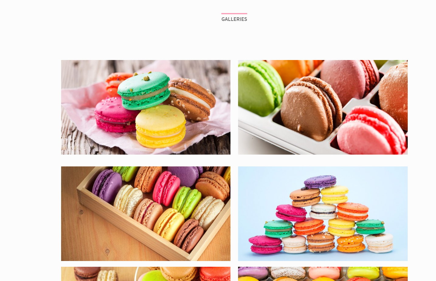
Image Grid
Portfolio Gallery
We didn’t forget also about standard gallery – which displays featured images of all created Portfolio Items (Portfolio Items > Add New). You can display it with Gallery element.
You will find here number of settings to change:
- Show/Hide categories filters
- Filters alignment
- “all” filter label
- Number of columns
- Gallery box style
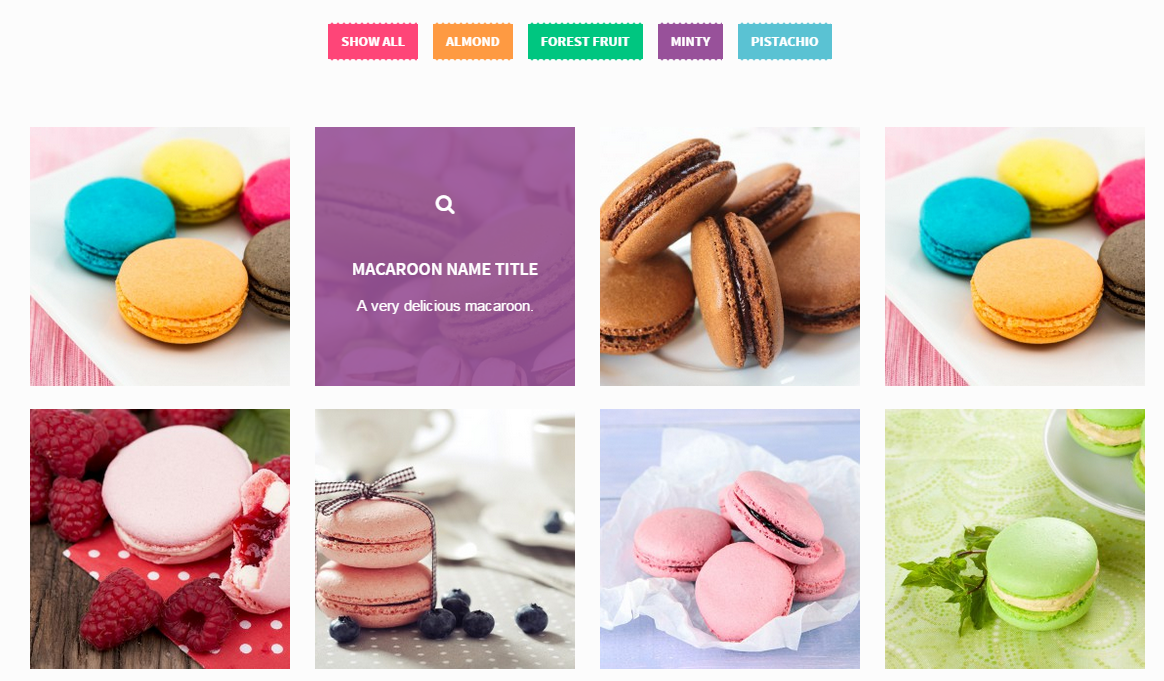
Portfolio Gallery
Was this article helpful ?
Sections
Section is essential element of page structure – it comes with number of structural and styles option. Below you will find main sections functionalities, which allow you to manage pages content easier.
To add new section – select Row from list of available components.
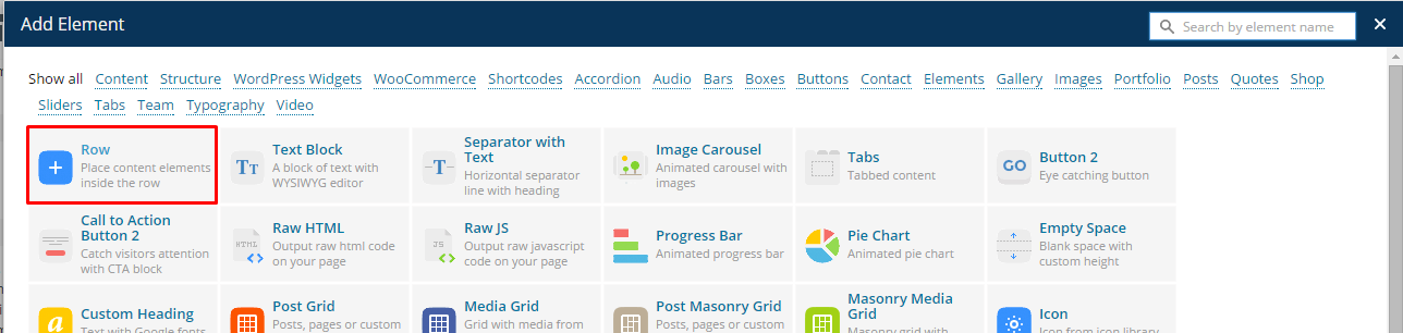
Add new section row
Once Row is selected you will see the list of the following options
- Type – you can choose between the following types: Divider, Parallax, Kenburns, Video, Default
- ID – section ID can be used if you want to create Onepager page – define custom ID for each section and corresponding /#section-id-name link in navigation menu
- Height – define custom section height,
- Divider color – this parameter will be displayed only if you selected Divider section type. Select background color for right (divided) column of the section
- Background mobile – this parameter will be displayed only if you selected Parallax or Kenburns section types – it allows you to select section background image, will be displayed on mobile devices,
- Background – this parameter will be displayed only if you selected Parallax or Kenburns section types – it allows you to select section background image,
- With container – select this option, if you want to keep your content in Bootstrap container, otherwise content will be full width (adjusted to browser window),
- Content centered – center align container content,
- Next section scroll button – creates button with arrow and link to different section (you can define, which sections it should be by its ID)
- Onepager element – select only if you want to create Onepager page and only for sections, which will be linked in your navigation menu
Section Types
Divider

Divided section
Creates section, which is divided to two columns with different background. Left column has always default backgroud. For right you can select your color with Divider color parameter.
Notice: you will get the best effect if you will enable With Container option for divided section.
Default

Default section
Basic version of section. You can divide it for any number of columns. It’s by default has no background and text inside has Primary (motive) color.
Parallax

Parallax section
Define background image with Parallax effect. You can modify parallax ratio and section height with additional section parameters. You can use any content you want in Parallax section.
Kenburns
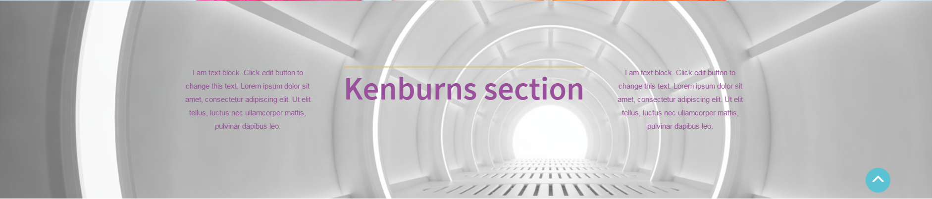
Kenburns section
Creates animated background with images, which are transits one to another.
Notice: to keep your pages structure responsive – every page page element should be inside Row (section) element.
Was this article helpful ?
Customizer
Test comes with advanced customizer, which allows to edit most of theme elements in one place. To use it navigate to Appearance > Customizer
Customizer options
It will display a panel with tabs corresponding to all theme sections, like:
- Style
- General
- Pages
- Main Navbar
- Posts
- Team
- Socials
- Faq
- WooCommerce
- Footer Widgets
You will find there also main style settings under:
- Test style
- General
In Test style section you can edit theme colors and layout setup
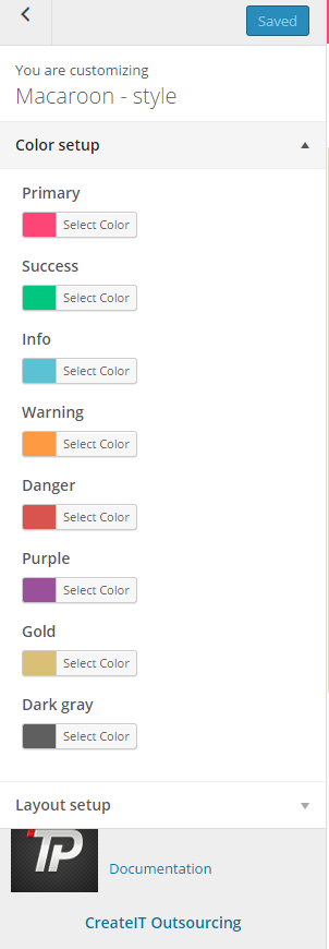
Color setup
Layout setup
In General you can setup logos, copyright text and main theme settings
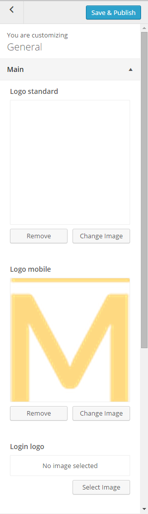
General settings
Notice:
All changes done with customizer will be applied only once you click on
Was this article helpful ?
Main Navbar
Select your navigation bar and top bar style.
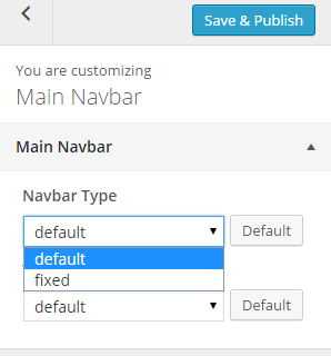
Main Navbar
Select default to keep you Navigation bar hidden after scroll down. If you want to display navbar or both bar always – select fixed option.
Was this article helpful ?
Pages Options
In Pages panel you are able to edit the following options:
- General pages options:
- Show/Hide Title row on pages
- Show/Hide Title text on pages
- Show/Hide comments,
- Show/Hide comment form
- Header settings:
- Select default header type – you can choose between: Parallax header, Video, Kenburs or Slider
- Header Image – define background image if you selected Parallax header above
- Gallery for Kenburns Header – select gallery of images if you want to use header with kenburns effect
- Gallery for Slider Header – select gallery of images if you want to display images sliders in header
- Video source – If video header is enabled, then you can display video as background
- Video type – select video source type
- Parallax ratio
- Header background color
- Title text paddings
- Header paddings
- Header margins
- Header height – you can set custom height of header (in px or %)
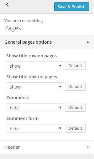
Pages options

Pages header options
Notice: – settings above are by default applied for all your pages. Though you can also customize them for each page separately with Header and Navbar settings – you will see this option during page content edition.
Header and navbar settings
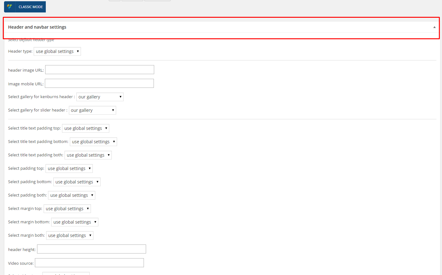
Was this article helpful ?
Team Options
In Team panel you can setup options for team member page header and title.
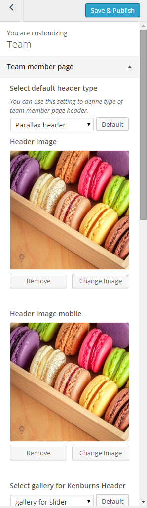
Team member page settings
- Select default header type – you can choose between: Parallax header, Video, Kenburs or Slider
- Header Image – define background image if you selected Parallax header above
- Gallery for Kenburns Header – select gallery of images if you want to use header with kenburns effect
- Gallery for Slider Header – select gallery of images if you want to display images sliders in header
- Video source – If video header is enabled, then you can display video as background
- Video type – select video source type
- Parallax ratio
- Header background color
- Title text paddings
- Header paddings
- Header margins
- Header height – you can set custom height of header (in px or %)
- Select header background color
- Show team member page title row
- Show title text
- Team member page title
Was this article helpful ?
Posts Options
When using the assigned blog page, as described in Blog Index page, all the options are located in Appearance > Customize on the Posts tab. There are dozens of options to choose from such as layout, categories, dates, etc. There are general blog options and single post page options. Each one has title and descriptions to help you understand what they do. Any type of blog options you need to set will be in the theme options when using the assigned blog page.
INDEX PAGE OPTIONS:
- Header settings – analogous to Page header settings
- Blog title – it will be displayed as title of your index page,
- Show index as – select the way of displaying posts on index,
- Show posts index page title – hide/show blog title,
- Post detail button label – define custom label for button Read More,
- Date – show/hide posts date
- Image / video / gallery – show/hide image, video or gallery assigned to post (if you select Hide – it will display only text on blog index page),
- Title / quote author – show/hide posts author,
- Text Option – display full posts text, post excerpt or no intro text in posts list,
- Show read more button – show/hide button Read More
- Sidebar – show/hide sidebar on blog index page,
- Labels – define custom labels, for “by”, “in” and “Tags” fields,
- Pagination notice – it will display pagination in the following format: Page 1 OF 7 – you can adjust labels with the following code instead: Custom-text %current% custom-text %total% – it’s useful when you want to translate your content
SINGLE POST OPTIONS – select how should look like single post page:
- Header settings – analogous to Page header settings
- Show posts index page title – hide/show blog title,
- Date – show/hide posts date
- Image / video / gallery – show/hide image, video or gallery assigned to post (if you select Hide – it will display only text on post page),
- Title / quote author – show/hide post author,
- Content – show/hide post content (text),
- Author link – show/hide link to post author,
- Comments – show/hide comments,
- Comment form – show/hide comment form (select Hide if you don’t want comments below you post),
- Show socials box – show/hide socials,
- Share button label – define custom label for Share Button,
- Show author box – show/hide box with author information.
- Pagination – show/hide pagination,
- Previous post label – define custom label for Previous post button,
- Next post label – define custom label for Next post button,
- By label – define custom label for BY tag,
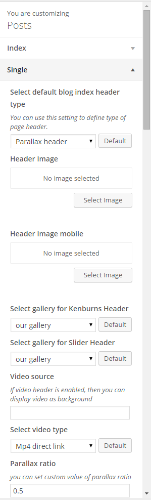
Post options
Common issue: How to change post intro text?
Intro text, which can be displayed on Blog index page is an Excerpt. You can edit it manually for every post with the following field:
Excerpt
Notice: if you don’t see Excerpt field when you are editing your post, go to Screen Options at the top of the post edition window (on the right hand side) and enable Excerpt with checkbox.
Was this article helpful ?
Socials
Social icons, from the top of the page can be removed or changed via Appearance > Customize > Socials
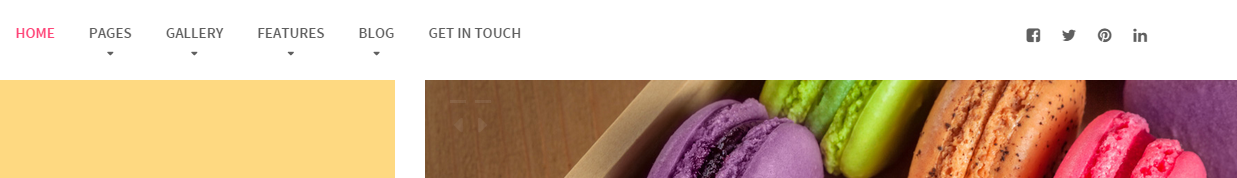
Social icons
Here we will display only icons for social media profiles, which you define in settings:
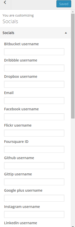
Socials settings
So if you don’t want to display, for example Facebook icon – just leave Facebook field empty.
Was this article helpful ?
FAQ options
Manage your FAQ index page with a few useful parameters:
- Page Header
- Page Subheader
- Color style
- Background color
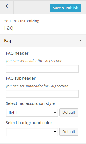
Faq options
Notice, that Faq categories will be displayed automatically as headings for each group of questions.
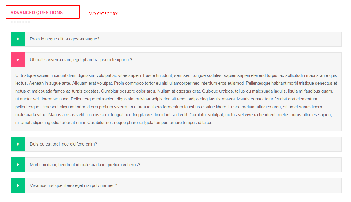
FAQ page
Was this article helpful ?
CSS Files and structure
If you would like to edit the color, font, or style of any elements, you would do the following:
|
1 |
#primaryContent a {color: #someColor;} |
If you find that your new style is not overriding, it is most likely because of a specificity problem. Scroll down in your CSS file and make sure that there isn’t a similar style that has more weight.
I.E.
|
1 |
#wrap #primaryContent a {color: #someColor;} |
So, to ensure that your new styles are applied, make sure that they carry enough “weight” and that there isn’t a style lower in the CSS file that is being applied after yours.
Colors
The theme includes a css file wich you can use to edit the colors.
You just need to add the corresponding CSS file to the head of the page like this:
|
1 2 3 4 5 |
<head> (..) <link rel="stylesheet" type="text/css" href="css/motive.css"> (..) </head> |
Icons
We’ve included 360+ font icons.
Awesome Icons – http://fontawesome.io/icons/
HTML markup:
|
1 2 |
<!-- Awesome Icons --> <i class="fa fa-cog"></i> |
CSS Files & Structure
We’ve included 2 files.
bootstrap.css contains Bootstrap 3 Library.
style.css file contains general styles.
Table of contents:
1. Mixins
2. Animate.css
3. Select2
4. Slider
5. Datepicker
6. Yamm
7. Menu
8. Typography
9. Forms
10. Buttons
11. Utilities
12. Owl Corusel
13. Media Sections
14. Portfolio
15. Magnific Popup
16. Font Awesome
17. Wrapper
18. Headroom
19. Socials
20. Slider
21. Header
22. Sections
23. Submission Steps
24. Icon Box
25. Synchronized slider(Single Product Page)
26. Person Box
27. Pricing Box
28. Product Single
29. Testimonials Tabs
30. Footer
31. Product Items
32. Sorting Bars
33. Google Map (Infobox and Navigation)
34. Custom Animation (Maintenance Page)
35. Blog (Sidebar)
36. Media Queries
Utilities
Utility classes are low-level structural and positional traits. Utilities can be applied directly to any element, multiple utilities can be used tohether and utilities can be used alongsie component classes.
Utilities are intended for frequently used CSS properties and patterns, like: floats, containing floats, vertical alignemnt, text tryncation. Relying on utilities can help to reduce repetition and provide consistend implementations.
Test uses utilities for the following categories:
Typography
|
1 2 3 4 5 6 7 8 9 10 11 12 13 14 15 16 17 18 19 20 21 22 23 24 25 26 27 28 29 30 31 32 33 34 35 36 37 |
.ct-fw-300{ font-weight: 300; } .ct-fw-400{ font-weight: 400; } .ct-fw-500{ font-weight: 500; } .ct-fw-600{ font-weight: 600; } .ct-fw-700{ font-weight: 700; } .ct-fw-800{ font-weight: 800; } .ct-fw-900{ font-weight: 900; } .ct-fs-i{ font-style: italic; } .ct-fs-n{ font-style: normal; } .ct-u-size20{ font-size: 20px; } .ct-u-underline:hover{ padding-bottom: 5px; } |
|
1 2 3 4 5 6 7 8 9 10 11 12 13 14 15 16 17 18 19 |
.ct-u-displayTable, .ct-u-displayTableVertical{ display: table; width: 100%; } .ct-u-displayTableVertical{ height: 100%; .ct-u-displayTableCell{ vertical-align: middle; } } .ct-u-displayTableRow{ display: table-row; } .ct-u-displayTableCell{ display: table-cell; } |
|
1 2 3 4 5 6 7 8 9 10 11 12 13 14 15 16 17 18 19 20 21 22 23 24 25 26 27 28 29 30 31 32 33 34 35 36 37 38 39 40 41 42 43 44 45 46 47 48 49 50 51 52 53 54 55 56 57 58 59 60 61 62 63 64 65 66 67 68 69 70 71 72 73 74 75 76 77 78 79 80 81 82 83 84 85 86 87 88 89 90 91 92 93 94 95 96 97 98 99 100 101 102 103 104 105 106 107 108 109 110 111 112 113 114 115 116 117 118 |
.ct-u-padding0{ padding: 0!important; } .ct-u-paddingBoth10{ padding-top: 10px; padding-bottom: 10px; } .ct-u-paddingTop10{ padding-top: 10px; } .ct-u-paddingBottom10{ padding-bottom: 10px; } .ct-u-paddingBoth20{ padding-top: 20px; padding-bottom: 20px; } .ct-u-paddingTop20{ padding-top: 20px; } .ct-u-paddingBottom20{ padding-bottom: 20px; } .ct-u-paddingBoth30{ padding-top: 30px; padding-bottom: 30px; } .ct-u-paddingTop30{ padding-top: 30px; } .ct-u-paddingBottom30{ padding-bottom: 30px; } .ct-u-paddingBoth40{ padding-top: 40px; padding-bottom: 40px; } .ct-u-paddingTop40{ padding-top: 40px; } .ct-u-paddingBottom40{ padding-bottom: 40px; } .ct-u-paddingBoth50{ padding-top: 50px; padding-bottom: 50px; } .ct-u-paddingTop50{ padding-top: 50px; } .ct-u-paddingBottom50{ padding-bottom: 50px; } .ct-u-paddingBoth60{ padding-top: 60px; padding-bottom: 60px; } .ct-u-paddingTop60{ padding-top: 60px; } .ct-u-paddingBottom60{ padding-bottom: 60px; } .ct-u-paddingBoth70{ padding-top: 70px; padding-bottom: 70px; } .ct-u-paddingTop70{ padding-top: 70px; } .ct-u-paddingBottom70{ padding-bottom: 70px; } .ct-u-paddingBoth80{ padding-top: 80px; padding-bottom: 80px; } .ct-u-paddingTop80{ padding-top: 80px; } .ct-u-paddingBottom80{ padding-bottom: 80px; } .ct-u-paddingBoth90{ padding-top: 90px; padding-bottom: 90px; } .ct-u-paddingTop90{ padding-top: 90px; } .ct-u-paddingBottom90{ padding-bottom: 90px; } .ct-u-paddingBoth100{ padding-top: 100px; padding-bottom: 100px; } .ct-u-paddingTop100{ padding-top: 100px; } .ct-u-paddingBottom100{ padding-bottom: 100px; } .ct-u-paddingBoth150{ padding-top: 150px; padding-bottom: 150px; } .ct-u-paddingTop150{ padding-top: 150px; } .ct-u-paddingBottom150{ padding-bottom: 150px; } .ct-u-paddingRight30{ padding-right: 30px; } |
|
1 2 3 4 5 6 7 8 9 10 11 12 13 14 15 16 17 18 19 20 21 22 23 24 25 26 27 28 29 30 31 32 33 34 35 36 37 38 39 40 41 42 43 44 45 46 47 48 49 50 51 52 53 54 55 56 57 58 59 60 61 62 63 64 65 66 67 68 69 70 71 72 73 74 75 76 77 78 79 80 81 82 83 84 85 86 87 88 89 90 91 92 93 94 95 96 97 98 99 100 101 102 103 104 105 106 107 108 109 110 111 112 113 114 115 |
.ct-u-margin0{ margin: 0!important; } .ct-u-marginBoth10{ margin-top: 10px; margin-bottom: 10px; } .ct-u-marginTop10{ margin-top: 10px; } .ct-u-marginBottom10{ margin-bottom: 10px; } .ct-u-marginBoth20{ margin-top: 20px; margin-bottom: 20px; } .ct-u-marginTop20{ margin-top: 20px; } .ct-u-marginBottom20{ margin-bottom: 20px; } .ct-u-marginBoth30{ margin-top: 30px; margin-bottom: 30px; } .ct-u-marginTop30{ margin-top: 30px; } .ct-u-marginBottom30{ margin-bottom: 30px; } .ct-u-marginBoth40{ margin-top: 40px; margin-bottom: 40px; } .ct-u-marginTop40{ margin-top: 40px; } .ct-u-marginBottom40{ margin-bottom: 40px; } .ct-u-marginBoth50{ margin-top: 50px; margin-bottom: 50px; } .ct-u-marginTop50{ margin-top: 50px; } .ct-u-marginBottom50{ margin-bottom: 50px; } .ct-u-marginBoth60{ margin-top: 60px; margin-bottom: 60px; } .ct-u-marginTop60{ margin-top: 60px; } .ct-u-marginBottom60{ margin-bottom: 60px; } .ct-u-marginBoth70{ margin-top: 70px; margin-bottom: 70px; } .ct-u-marginTop70{ margin-top: 70px; } .ct-u-marginBottom70{ margin-bottom: 70px; } .ct-u-marginBoth80{ margin-top: 80px; margin-bottom: 80px; } .ct-u-marginTop80{ margin-top: 80px; } .ct-u-marginBottom80{ margin-bottom: 80px; } .ct-u-marginBoth90{ margin-top: 90px; margin-bottom: 90px; } .ct-u-marginTop90{ margin-top: 90px; } .ct-u-marginBottom90{ margin-bottom: 90px; } .ct-u-marginBoth100{ margin-top: 100px; margin-bottom: 100px; } .ct-u-marginTop100{ margin-top: 100px; } .ct-u-marginBottom100{ margin-bottom: 100px; } .ct-u-marginBoth150{ margin-top: 150px; margin-bottom: 150px; } .ct-u-marginTop150{ margin-top: 150px; } .ct-u-marginBottom150{ margin-bottom: 150px; } |
|
1 2 3 4 5 6 7 8 9 10 11 12 13 14 15 16 17 18 19 20 21 22 23 24 25 26 27 28 29 30 |
.ct-u-letterSpacing1{ letter-spacing: 1px; } .ct-u-letterSpacing2{ letter-spacing: 2px; } .ct-u-letterSpacing3{ letter-spacing: 3px; } .ct-u-letterSpacing4{ letter-spacing: 4px; } .ct-u-letterSpacing5{ letter-spacing: 5px; } .ct-u-letterSpacing6{ letter-spacing: 6px; } .ct-u-letterSpacing7{ letter-spacing: 7px; } .ct-u-letterSpacing8{ letter-spacing: 8px; } .ct-u-letterSpacing9{ letter-spacing: 9px; } .ct-u-letterSpacing10{ letter-spacing: 10px; } |
|
1 2 3 4 5 6 7 8 9 10 11 |
.ct-u-line-height24{ line-height: 24px; } .ct-u-line-height26{ line-height: 26px; } .ct-u-line-height30{ line-height: 30px; } |
|
1 2 3 4 5 6 7 8 9 10 11 12 13 14 15 16 17 18 19 |
.ct-u-text--white{ color: #fff; } .ct-u-text--motive{ color: @ct-motive; } .ct-u-text--green{ color: #a2bf52; } .ct-u-text--orange{ color: #eb8a21; } .ct-u-text--dark{ color: #333; } |
|
1 2 3 4 5 6 7 8 |
.ct-u-borderTop--white{ border-top: 1px solid #fff; padding: 30px 0; } .ct-u-borderBottom--grey{ border-bottom: 1px solid #e6e6e6; } |
|
1 2 3 |
.ct-u-positionRelative{ position: relative; } |
Was this article helpful ?
Topbar
There are two available types of topbar:
- .ct-topBar
- .ct-topBar–darkStyle
To use any of them, first use the following HTML markup:
|
1 2 3 4 5 6 7 8 9 10 11 12 13 14 15 16 17 18 19 20 21 22 23 24 25 26 27 28 29 30 31 32 33 34 35 36 37 38 39 40 41 42 43 44 45 46 47 48 49 50 51 52 53 54 55 56 57 58 59 60 |
<div class="ct-topBar ct-topBar--darkStyle"> <div class="container"> <div class="row"> <div class="col-sm-7 col-md-7"> <div class="ct-panel--contact ct-panel--left"> <div class="ct-panel--item ct-email"> <a href="#"><i class="fa fa-envelope-o"></i> example@example.com</a> </div> <ul class="nav navbar-nav ct-switcher--language"> <li class="dropdown"> <a href="#"> <i class="fa fa-globe"></i> English <i class="fa fa-angle-down"></i> </a> <ul class="dropdown-menu"> <li> <a href="#"> English </a> </li> <li> <a href="#"> Spanish </a> </li> <li> <a href="#"> German </a> </li> </ul> </li> </ul> <div id="ct-js-navSearch"> <i class="fa fa-search"></i> <input placeholder="Search ..." required type="text" name="field[]" class="form-control input-lg ct-input--search"> </div> <div class="ct-navbar-search"> <form role="form"> <button class="ct-navbar-search-button" type="submit"> <i class="fa fa-search fa-fw"></i> </button> <div class="form-group"> <input id="search" placeholder="Search ..." required type="text" class="form-control input-lg"> </div> </form> </div> </div> </div> <div class="col-sm-5 col-md-5"> <div class="ct-panel--right text-right"> <div class="ct-panel--item"> <h6 class="ct-fw-600">Welcome to Estato Agency, we are at your disposal</h6> </div> </div> </div> </div> </div> </div> |
Was this article helpful ?
Navigation menu
You can change navigation menu bar by adding the following classes to body tag:
- .ct-headroom–scrollUpMenu – navigation menu is hidden with delay,
- .ct-headroom–scrollUpTopBar – top bar is hidden with delay,
- .ct-headroom–scrollUpBoth – both top bar and navigation menu is hidden with delay
- .ct-headroom–fixedTopBar – top bar is always visible at the top of the screen.
- .ct-headroom–fixedMenu – menu is always visible at the top of the screen

Fixed Menu
- .ct-headroom–fixedBoth – both top bar and navigation menu are always visible,
- .ct-headroom–hideMenu – top bar is always visible on the top of the screen, navigation menu is hidden after scroll

Hide Menu
HTML markup:
|
1 2 3 4 5 6 7 8 9 10 11 12 13 14 15 16 17 18 19 20 21 22 23 24 25 26 27 28 29 30 31 32 33 34 35 36 37 38 39 40 41 42 43 44 45 46 47 48 49 50 51 52 53 54 55 56 57 58 59 60 61 62 63 64 65 66 67 68 69 70 71 72 73 74 75 76 77 78 79 80 81 82 83 84 85 86 87 88 89 90 91 92 93 94 95 96 97 98 99 100 101 102 103 104 105 106 107 108 109 110 111 112 113 114 115 116 117 118 119 120 121 122 123 124 125 126 127 128 129 130 131 132 133 134 135 136 137 138 139 140 141 142 143 144 145 146 147 148 149 150 151 |
<body class="ct-headroom--scrollUpBoth cssAnimate"> <nav class="navbar yamm" role="navigation" data-heighttopbar="40px" data-startnavbar="0"> <div class="container"> <div class="navbar-header ct-panel--navbar"> <a href="index.html"> <img src="assets/images/demo-content/logo.png" alt="logo"> </a> </div> <div class="ct-panelBox"> <div class="ct-panel--text ct-panel--navbar ct-fw-600"><a href="#">8 534 Listings</a></div> <ul class="ct-panel--socials ct-panel--navbar list-inline list-unstyled"> <li><a href="https://www.facebook.com/createITpl"><div class="ct-socials ct-socials--circle"><i class="fa fa-facebook"></i></div></a></li> <li><a href="https://twitter.com/createitpl"><div class="ct-socials ct-socials--circle"><i class="fa fa-twitter"></i></div></a></li> <li><a href="#"><div class="ct-socials ct-socials--circle"><i class="fa fa-instagram"></i></div></a></li> </ul> </div> <div class="collapse navbar-collapse"> <ul class="nav navbar-nav ct-navbar--fadeInUp"> <li class="dropdown active"><a href="index.html">Home<span class="caret"></span></a> <ul class="dropdown-menu"> <li> <div class="yamm-content"> <div class="ct-u-displayTableVertical"> <div class="ct-u-displayTableCell"> <ul class="list-unstyled pull-left"> <li><a href="index.html">Home V1 - Portal Slider</a></li> <li><a href="index2.html">Home V2 - Portal Map</a></li> <li><a href="index3.html">Home V3 - Portal Map (Light)</a></li> <li><a href="index4.html">Home V4 - Real Estate Agency</a></li> <li><a href="index5.html">Home V5 - Property Slider</a></li> <li><a href="index6.html">Home V6 - Simple Onepager</a></li> </ul> </div> <div class="ct-u-displayTableCell"> <img class="pull-right" src="assets/images/demo-content/megamenu-image.jpg" alt=""> </div> </div> <div class="ct-menuBrand ct-u-displayTableVertical"> <div class="ct-u-displayTableCell"> <a href="index.html"> <img src="assets/images/demo-content/logo.png" alt="logo"> </a> </div> <div class="ct-u-displayTableCell"> <div class="ct-panel--text ct-panel--navbar ct-fw-600"><a href="#">Real Estate Theme</a></div> </div> </div> </div> </li> </ul> </li> <li class="dropdown"><a href="properties.html">Properties<span class="caret"></span></a> <ul class="dropdown-menu"> <li> <div class="yamm-content"> <div class="ct-u-displayTableVertical"> <div class="ct-u-displayTableCell"> <ul class="list-unstyled pull-left"> <li><a href="product-single.html">Property Page V1</a></li> <li><a href="product-single2.html">Property Page V2</a></li> <li><a href="search-grid.html">Properties Page - Grid</a></li> <li><a href="search-list.html">Properties Page - Listing</a></li> <li><a href="properties.html">My Properties Page</a></li> </ul> </div> <div class="ct-u-displayTableCell"> <ul class="list-unstyled pull-left"> <li><a href="product-singleEdit.html">Front Editing - Property Page V1</a></li> <li><a href="product-single2Edit.html">Front Editing - Property Page V2</a></li> </ul> </div> <div class="ct-u-displayTableCell"> <img class="pull-right" src="assets/images/demo-content/megamenu-image-2.jpg" alt=""> </div> </div> <div class="ct-menuBrand ct-u-displayTableVertical"> <div class="ct-u-displayTableCell"> <a href="index.html"> <img src="assets/images/demo-content/logo.png" alt="logo"> </a> </div> <div class="ct-u-displayTableCell"> <div class="ct-panel--text ct-panel--navbar ct-fw-600"><a href="#">Real Estate Theme</a></div> </div> </div> </div> </li> </ul> </li> <li class="dropdown ct-yamm--dropdownRight"><a href="agent.html">Agents<span class="caret"></span></a> <ul class="dropdown-menu"> <li> <div class="yamm-content"> <div class="ct-u-displayTableVertical"> <div class="ct-u-displayTableCell"> <img class="pull-right" src="assets/images/demo-content/megamenu-image-3.jpg" alt=""> </div> <div class="ct-u-displayTableCell middle-element"> <ul class="list-unstyled pull-left"> <li><a href="agency.html">Agency Page</a></li> <li><a href="agent.html">Agent's Profile</a></li> <li><a href="about.html">About Us</a></li> </ul> </div> <div class="ct-u-displayTableCell"> <ul class="list-unstyled pull-left"> <li><a href="agency-edit.html">Front Editing - Agency Page</a></li> <li><a href="agent-edit.html">Front Editing - Agent's Profile</a></li> </ul> </div> </div> <div class="ct-menuBrand ct-u-displayTableVertical"> <div class="ct-u-displayTableCell"> <a href="index.html"> <img src="assets/images/demo-content/logo.png" alt="logo"> </a> </div> <div class="ct-u-displayTableCell"> <div class="ct-panel--text ct-panel--navbar ct-fw-600"><a href="#">Real Estate Theme</a></div> </div> </div> </div> </li> </ul> </li> <li class="dropdown"><a href="pricing.html">Features<span class="caret"></span></a> <ul class="dropdown-menu"> <li><a href="pricing.html">Pricing Tables</a></li> </ul> </li> <li class="dropdown"><a href="about.html">Pages<span class="caret"></span></a> <ul class="dropdown-menu"> <li><a href="faq.html">FAQ</a></li> <li><a href="terms.html">Terms</a></li> <li><a href="policy.html">Privacy Policy</a></li> <li><a href="blog.html">Blog</a></li> <li><a href="blog-single.html">Blog Single</a></li> <li><a href="registration.html">Registration</a></li> <li><a href="404.html">404</a></li> <li><a href="maintenance.html">Maintenance</a></li> </ul> </li> <li><a href="contact.html">Contact Us</a></li> </ul> <a class="btn btn-primary btn-transparent--border ct-u-text--motive" href="properties.html">List Property</a> </div> <div class="clearfix"></div> <div class="ct-shapeBottom"></div> </div> </nav> |
Was this article helpful ?
Footer
Footer
You can use the following variations of footer:
- .ct-footer–light (add it for change style to to change styles to light version)
- .ct-footer–extended
- .ct-postFooter
HTML markup:
|
1 2 3 4 5 6 7 8 9 10 11 12 13 14 15 16 17 18 19 20 21 22 23 24 25 26 27 28 29 30 31 32 33 34 35 36 37 38 39 40 41 42 43 44 45 46 47 48 49 50 51 52 53 54 55 56 57 58 59 60 61 62 63 64 65 66 67 68 69 70 71 72 73 74 75 76 77 78 79 80 81 82 83 84 85 86 87 88 89 90 91 92 93 94 95 96 97 98 99 100 101 102 103 104 105 106 107 108 109 110 111 112 113 114 115 116 117 118 119 120 121 122 123 124 125 126 127 128 129 130 131 132 133 134 135 136 137 138 139 140 141 142 143 144 145 146 147 148 149 150 151 152 153 154 155 156 157 158 159 160 161 162 163 164 165 166 167 168 169 170 171 172 173 |
<footer class="ct-mediaSection ct-footer--light" data-stellar-background-ratio="0.3" data-height="375" data-type="parallax" data-bg-image="assets/images/demo-content/footer-parallax.jpg" data-bg-image-mobile="assets/images/demo-content/footer-parallax.jpg"> <div class="ct-footer--extended ct-u-paddingBoth60"> <div class="container"> <div class="row"> <div class="col-sm-6 col-md-6 col-lg-3"> <h4 class="text-uppercase ct-u-marginBottom30">About estato</h4> <div class="ct-u-marginBottom30"> <span>Estato is new and powerfull real estate theme. Lorem ipsum dolor sit amet, consectetur adipiscing elit. Fusce elementum nulla vel.</span> </div> <ul class="list-unstyled"> <li class="ct-u-marginBottom10"> <i class="fa fa-home"></i> <span class="ct-fw-600">Address:</span><span> 1234 Street Name, San Fransico, United States</span> </li> <li class="ct-u-marginBottom10"> <i class="fa fa-envelope"></i> <span class="ct-fw-600">E-mail:</span><span> example@example.com</span> </li> <li> <i class="fa fa-fax"></i> <span class="ct-fw-600">Fax:</span><span> 0 123 456 7890</span> </li> </ul> </div> <div class="col-sm-6 col-md-6 col-lg-3"> <h4 class="text-uppercase ct-u-marginBottom30">Contact us</h4> <ul class="list-unstyled ct-phoneNumbers ct-u-marginBottom30"> <li> <i class="fa fa-phone"></i> <span class="ct-fw-600">0 800 123 4567</span> </li> <li> <i class="fa fa-fax"></i> <span class="ct-fw-600">0 800 123 4562</span> </li> <li> <i class="fa fa-mobile"></i> <span class="ct-fw-600">+1 500 700 800</span> </li> </ul> <ul class="ct-panel--socials ct-panel--navbar list-inline list-unstyled ct-u-marginBottom30"> <li><a href="https://www.facebook.com/createITpl"><div class="ct-socials ct-socials--circle"><i class="fa fa-facebook"></i></div></a></li> <li><a href="https://twitter.com/createitpl"><div class="ct-socials ct-socials--circle"><i class="fa fa-twitter"></i></div></a></li> <li><a href="#" data-toggle="tooltip"><div class="ct-socials ct-socials--circle"><i class="fa fa-instagram"></i></div></a></li> </ul> <div class="ct-contactList "> <a href="#"><i class="fa fa-envelope-o"></i>questions@estato.com</a> <a href="#"><i class="fa fa-envelope-o"></i>sales@estato.com</a> </div> </div> <div class="col-sm-6 col-md-6 col-lg-3 "> <h4 class="text-uppercase ct-u-marginBottom30">Quick links</h4> <div class="row"> <div class="ct-links"> <div class="col-md-6"> <a class="text-capitalize" href="#">List Property</a> <a class="text-capitalize" href="#">Home</a> <a class="text-capitalize" href="#">Properties</a> <a class="text-capitalize" href="#">Agents</a> <a class="text-capitalize" href="#">Fratures</a> <a class="text-capitalize" href="#">About Us</a> <a class="text-capitalize" href="#">Contact Us</a> </div> <div class="col-md-6"> <a class="text-capitalize" href="#">Login</a> <a class="text-capitalize" href="#">Register</a> <a class="text-capitalize" href="#">Pricing</a> <a class="text-capitalize" href="#">Terms & Conditions</a> <a class="text-capitalize" href="#">Privacy Policy</a> <a class="text-capitalize" href="#">Purchase Estato</a> </div> </div> </div> </div> <div class="col-sm-6 col-md-6 col-lg-3"> <h4 class="text-uppercase ct-u-marginBottom30">Latest Listings</h4> <div class="ct-itemProducts--small ct-itemProducts--small-type1"> <a href="product-single.html"> <div class="ct-main-content"> <div class="ct-imageBox"> <img src="assets/images/demo-content/recently-reduced-thumbnail-4.jpg" alt=""> </div> <div class="ct-main-text"> <div class="ct-product--tilte"> 15421 Southwest 39th Terrace </div> <div class="ct-product--price"> <span>$ 650/month</span> </div> </div> </div> </a> </div> <div class="ct-itemProducts--small ct-itemProducts--small-type1"> <a href="product-single.html"> <div class="ct-main-content"> <div class="ct-imageBox"> <img src="assets/images/demo-content/recently-reduced-thumbnail-5.jpg" alt=""> </div> <div class="ct-main-text"> <div class="ct-product--tilte"> 15421 Southwest 39th Terrace </div> <div class="ct-product--price"> <span>$ 650/month</span> </div> </div> </div> </a> </div> <div class="ct-itemProducts--small ct-itemProducts--small-type1"> <a href="product-single.html"> <div class="ct-main-content"> <div class="ct-imageBox"> <img src="assets/images/demo-content/recently-reduced-thumbnail-6.jpg" alt=""> </div> <div class="ct-main-text"> <div class="ct-product--tilte"> 15421 Southwest 39th Terrace </div> <div class="ct-product--price"> <span>$ 650/month</span> </div> </div> </div> </a> </div> </div> </div> </div> </div> <div class="ct-postFooter ct-u-paddingBoth20"> <a href="#" class="ct-scrollUpButton ct-js-btnScrollUp"> <span class="ct-sectioButton--square"> <i class="fa fa-angle-double-up"></i> </span> </a> <div class="container"> <div class="row"> <div class="col-sm-6 col-md-6 col-sm-push-6"> <div class="ct-newsletter text-right"> <span class="text-uppercase ct-u-text--white ct-fw-600">Join our newsletter</span> <input id="newsletter" placeholder="Your E-mail Address" required type="text" name="field[]" class="form-control input-lg"> <button type="submit" class="btn btn-primary btn-transparent--border ct-u-text--motive text-capitalize">Subscribe</button> </div> </div> <div class="col-sm-6 col-md-6 col-sm-pull-6"> <span class="ct-copyright">© 2015 Estato. All rights reserved. We accept: </span> <ul class="icons list-unstyled list-inline"> <li> <i class="fa fa-cc-stripe" data-toggle="tooltip" data-placement="top" title="Stripe"></i> </li> <li> <i class="fa fa-cc-paypal" data-toggle="tooltip" data-placement="top" title="PayPal"></i> </li> <li> <i class="fa fa-cc-mastercard" data-toggle="tooltip" data-placement="top" title="Mastercard"></i> </li> <li> <i class="fa fa-cc-visa" data-toggle="tooltip" data-placement="top" title="Visa"></i> </li> <li> <i class="fa fa-cc-discover" data-toggle="tooltip" data-placement="top" title="Discover"></i> </li> <li> <i class="fa fa-cc-amex" data-toggle="tooltip" data-placement="top" title="Amex"></i> </li> </ul> </div> </div> </div> </div> </footer> |
Was this article helpful ?
Slider
- .ct-js-owl
- .ct-owl-controls–type2
- .ct-owl-controls–type3
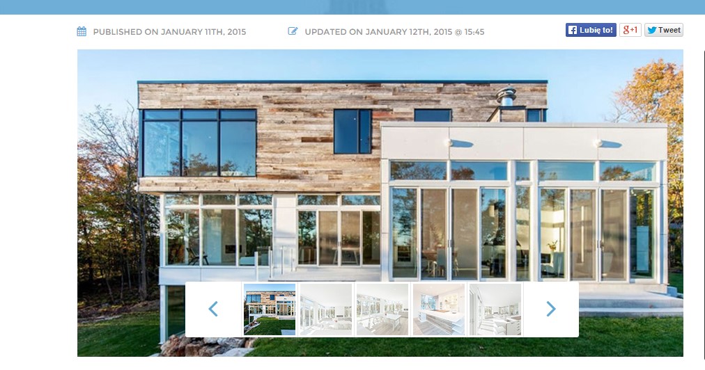
Slider
To use slider you need to use simple HTML markup:
|
1 2 3 4 5 6 7 8 9 10 |
<div class="ct-js-owl" data-items="6" data-navigation="false" data-autoPlay="true" data-single="false" data-pagination="false"> <div class="item"><img src="assets/images/demo-content/content-partners-1.png" alt=""></div> <div class="item"><img src="assets/images/demo-content/content-partners-2.png" alt=""></div> <div class="item"><img src="assets/images/demo-content/content-partners-3.png" alt=""></div> <div class="item"><img src="assets/images/demo-content/content-partners-4.png" alt=""></div> <div class="item"><img src="assets/images/demo-content/content-partners-5.png" alt=""></div> <div class="item"><img src="assets/images/demo-content/content-partners-6.png" alt=""></div> <div class="item"><img src="assets/images/demo-content/content-partners-1.png" alt=""></div> <div class="item"><img src="assets/images/demo-content/content-partners-2.png" alt=""></div> </div> |
|
1 2 3 4 5 6 7 8 9 10 11 12 13 14 15 16 17 18 19 20 21 22 23 24 25 26 27 28 29 30 31 32 33 34 35 36 37 38 39 40 41 42 43 44 45 46 47 48 49 50 51 52 53 54 55 56 57 58 59 60 61 62 63 64 65 66 67 68 69 70 71 72 73 74 75 76 77 78 79 80 81 82 83 84 85 86 87 88 89 90 91 92 93 94 95 96 97 98 99 100 101 102 103 104 105 106 107 108 109 110 111 112 113 114 115 116 117 118 119 120 121 122 123 124 125 126 127 128 129 130 131 132 133 134 135 136 137 138 139 140 141 142 143 144 145 146 147 148 149 150 151 152 153 154 155 156 157 158 159 160 161 162 163 164 165 166 167 168 169 170 171 172 173 174 175 176 177 178 179 180 181 182 183 184 185 186 187 188 189 190 191 192 193 194 195 196 197 198 199 200 201 202 203 204 205 206 207 208 209 210 211 212 213 214 215 216 217 218 219 220 221 222 223 224 225 226 227 228 229 230 231 232 233 234 235 236 237 238 239 240 241 242 243 244 245 246 247 248 249 250 251 252 253 254 255 256 257 258 259 260 261 262 263 264 265 266 267 268 269 270 271 272 273 274 275 276 277 278 279 280 281 282 283 284 285 286 287 |
(function ($) { "use strict"; $(document).ready(function () { /* ====================== */ /* ==== OWL CAROUSEL ==== */ if($().owlCarousel){ if ($(".ct-js-owl").length > 0) { $(".ct-js-owl").each(function (){ var $this = $(this); var ctanimations = validatedata($this.attr("data-animations"), false); if($devicewidth < 768 || device.mobile() || device.ipad() || device.androidTablet()){ ctanimations = false; } var ctitems = parseInt(validatedata($this.attr("data-items"), 5)); var $lgItems = parseInt(validatedata($this.attr("data-lgItems"), 4)); var $mdItems = parseInt(validatedata($this.attr("data-mdItems"), 3)); var $smItems = parseInt(validatedata($this.attr("data-smItems"), 2)); var $xsItems = parseInt(validatedata($this.attr("data-xsItems"), 1)); var ctsingleitem = parseBoolean($this.attr("data-single"), true); var ctscaleitems = parseBoolean($this.attr("data-scaleUp"), false); var ctslidespeed = parseInt(validatedata($this.attr("data-slideSpeed"), 200)); var ctpagspeed = parseInt(validatedata($this.attr("data-paginationSpeed"), 800)); var ctrewindspeed = parseInt(validatedata($this.attr("data-rewindSpeed"), 1000)); var ctautoplay = parseBoolean($this.attr("data-autoPlay"), false); if($this.attr("data-autoPlaySpeed") != null){ ctautoplay = parseInt(validatedata($this.attr("data-autoPlaySpeed"), 5000)); } var ctstophover = parseBoolean($this.attr("data-stopOnHover"), false); var ctnavigation = parseBoolean($this.attr("data-navigation"), true); var ctrewindnav = parseBoolean($this.attr("data-rewindNav"), true); var ctscrollperpage = parseBoolean($this.attr("data-scrollPerPage"), false) var ctpagination = parseBoolean($this.attr("data-pagination"), true); var ctpaginationnumbers = parseBoolean($this.attr("data-paginationNumbers"), false); var ctresponsive = parseBoolean($this.attr("data-responsive"), true); var ctlazyload = parseBoolean($this.attr("data-lazyLoad"), false); var ctautoheight = parseBoolean($this.attr("data-autoHeight"), false); var ctmouse = parseBoolean($this.attr("data-mouse"), true); var cttouch = parseBoolean($this.attr("data-touch"), true); var cttransition = validatedata($this.attr("data-cttransition"), "fade"); $this.owlCarousel({ // Most important owl features items : ctitems, //This variable allows you to set the maximum amount of items displayed at a time with the widest browser width itemsDesktop : [$lgWidth,$lgItems], //This allows you to preset the number of slides visible with a particular browser width. The format is [x,y] whereby x=browser width and y=number of slides displayed. For example [1199,4] means that if(window<=1199){ show 4 slides per page} Alternatively use itemsDesktop: false to override these settings. itemsDesktopSmall : [$mdWidth,$mdItems], //As above. itemsTablet: [$smWidth,$smItems], // As above. itemsMobile : [$xsWidth,$xsItems], // As above. singleItem : ctsingleitem, // Display only one item. itemsScaleUp : ctscaleitems, // Option to not stretch items when it is less than the supplied items. //Basic Speeds slideSpeed : ctslidespeed, // Slide speed in milliseconds paginationSpeed : ctpagspeed, // Pagination speed in milliseconds rewindSpeed : ctrewindspeed, // Rewind speed in milliseconds //Autoplay autoPlay : ctautoplay, // Change to any integrer for example autoPlay : 5000 to play every 5 seconds. If you set autoPlay: true default speed will be 5 seconds. stopOnHover : ctstophover, // Stop autoplay on mouse hover // Navigation navigation : ctnavigation, // Display "next" and "prev" buttons. navigationText : ['<i class="fa fa-angle-left"></i>','<i class="fa fa-angle-right"></i>'], // You can customize your own text for navigation. To get empty buttons use navigationText : false. Also HTML can be used here rewindNav : ctrewindnav, // Slide to first item. Use rewindSpeed to change animation speed. scrollPerPage : ctscrollperpage, // Scroll per page not per item. This affect next/prev buttons and mouse/touch dragging. //Pagination pagination : ctpagination, // Show pagination. paginationNumbers: ctpaginationnumbers, // Show numbers inside pagination buttons // Responsive responsive: ctresponsive, // You can use Owl Carousel on desktop-only websites too! Just change that to "false" to disable resposive capabilities responsiveRefreshRate : 200, // Check window width changes every 200ms for responsive actions responsiveBaseWidth: window, // Owl Carousel check window for browser width changes. You can use any other jQuery element to check width changes for example ".owl-demo". Owl will change only if ".owl-demo" get new width. // CSS Styles baseClass : "owl-carousel", // Automaticly added class for base CSS styles. Best not to change it if you don't need to. theme : "owl-theme", // Default Owl CSS styles for navigation and buttons. Change it to match your own theme //Lazy load lazyLoad : ctlazyload, // Delays loading of images. Images outside of viewport won't be loaded before user scrolls to them. Great for mobile devices to speed up page loadings. IMG need special markup class="lazyOwl" and data-src="your img path". See example. lazyFollow : true, // When pagination used, it skips loading the images from pages that got skipped. It only loads the images that get displayed in viewport. If set to false, all images get loaded when pagination used. It is a sub setting of the lazy load function. lazyEffect : "fade", // Default is fadeIn on 400ms speed. Use false to remove that effect. //Auto height autoHeight : ctautoheight, //JSON jsonPath : false, jsonSuccess : false, //Mouse Events dragBeforeAnimFinish : true, mouseDrag : ctmouse, touchDrag : cttouch, //Transitions transitionStyle : cttransition, // Add CSS3 transition style. Works only with one item on screen. // Other addClassActive : true, // Add "active" classes on visible items. Works with any numbers of items on screen. //Callbacks beforeUpdate : false, afterUpdate : false, beforeInit: function () { }, afterInit: function(){ if(ctanimations) { $this.css('min-height', $this.attr('data-height')); $this.css('height', $this.attr('data-height')); $this.find('.owl-wrapper-outer').css('min-height', $this.attr('data-height')); $this.find('.owl-wrapper-outer').css('height', $this.attr('data-height')); $this.find('.owl-wrapper').css('min-height', $this.attr('data-height')); $this.find('.owl-wrapper').css('height', $this.attr('data-height')); $this.find(".item").each(function () { var $slide_item = $(this); var bg = validatedata($slide_item.attr('data-bg'), false); if (bg) { $slide_item.css('background-image', 'url("' + bg + '")'); } }) setTimeout(function () { $this.find(".owl-item.active > .item [data-fx]").each(function () { var $content = $(this); if ($content.data('time') != undefined) { setTimeout(function () { $content.addClass($content.data('fx')).addClass("activate"); }, $content.data('time')); } else{ $content.addClass($content.data('fx')).addClass("activate"); } }) }, 650); } }, beforeMove: false, afterMove: false, afterAction: function(){ if(ctanimations){ $this.find(".owl-item > .item [data-fx]").each(function () { var $content = $(this); $content.removeClass($content.data('fx')).removeClass("activate"); }) setTimeout(function () { $this.find(".owl-item.active > .item [data-fx]").each(function () { var $content = $(this); if ($content.data('time') != undefined) { setTimeout(function () { $content.addClass($content.data('fx')).addClass("activate"); }, $content.data('time')); } else{ $content.addClass($content.data('fx')).addClass("activate"); } }) }, 150); } }, startDragging : false, afterLazyLoad : false }) }) } } }) $(document).ready(function() { var sync1 = $("#sync1"); var sync2 = $("#sync2"); if($(".ct-owl--background").hasClass("ct-mediaSection")){ //Fix for autoplay video in owl $(this).find('video').get(0).play(); } function syncPosition(el){ var current = this.currentItem; sync2 .find(".owl-item") .removeClass("synced") .eq(current) .addClass("synced") if(sync2.data("owlCarousel") !== undefined){ center(current) } } function center(number){ var sync2visible = sync2.data("owlCarousel").owl.visibleItems; var num = number; var found = false; for(var i in sync2visible){ if(num === sync2visible[i]){ found = true; } } if(found===false){ if(num>sync2visible[sync2visible.length-1]){ sync2.trigger("owl.goTo", num - sync2visible.length+2) }else{ if(num - 1 === -1){ num = 0; } sync2.trigger("owl.goTo", num); } } else if(num === sync2visible[sync2visible.length-1]){ sync2.trigger("owl.goTo", sync2visible[1]) } else if(num === sync2visible[0]){ sync2.trigger("owl.goTo", num-1) } } if(sync1 && sync2){ if(sync1.hasClass("ct-js-owl--propertySlider1")){ sync1.owlCarousel({ singleItem : true, slideSpeed : 1000, pagination: true, navigation: true, navigationText : ['<i class="fa fa-angle-left"></i>','<i class="fa fa-angle-right"></i>'], afterAction : syncPosition, responsiveRefreshRate : 200 }); } else{ sync1.owlCarousel({ singleItem : true, slideSpeed : 1000, pagination:false, afterAction : syncPosition, responsiveRefreshRate : 200 }); } if(sync2.hasClass("ct-js-owl--propertySlider2")){ sync2.owlCarousel({ singleItem : true, slideSpeed : 1000, navigation: true, navigationText : ['<i class="fa fa-angle-left"></i>','<i class="fa fa-angle-right"></i>'], pagination:false, responsiveRefreshRate : 100, afterInit : function(el){ el.find(".owl-item").eq(0).addClass("synced"); } }); } else{ sync2.owlCarousel({ items : 5, itemsDesktop : [1199,4], itemsDesktopSmall : [979,3], itemsTablet : [768,5], itemsMobile : [479,3], navigation: true, navigationText : ['<i class="fa fa-angle-left"></i>','<i class="fa fa-angle-right"></i>'], pagination:false, responsiveRefreshRate : 100, afterInit : function(el){ el.find(".owl-item").eq(0).addClass("synced"); } }); sync2.on("click", ".owl-item", function(e){ e.preventDefault(); var number = $(this).data("owlItem"); sync1.trigger("owl.goTo",number); }); } } }); } |
Was this article helpful ?
Forms
Test comes several variations of form, available with the following CSS classes:
Classes:
- .ct-formSearch–extended
- .ct-searchFormMobile
- .ct-formRegister
- .ct-formContact–map
- .ct-contactForm–small
- .ct-form–label–type1
- .ct-form–label–type2
- .ct-popupForm
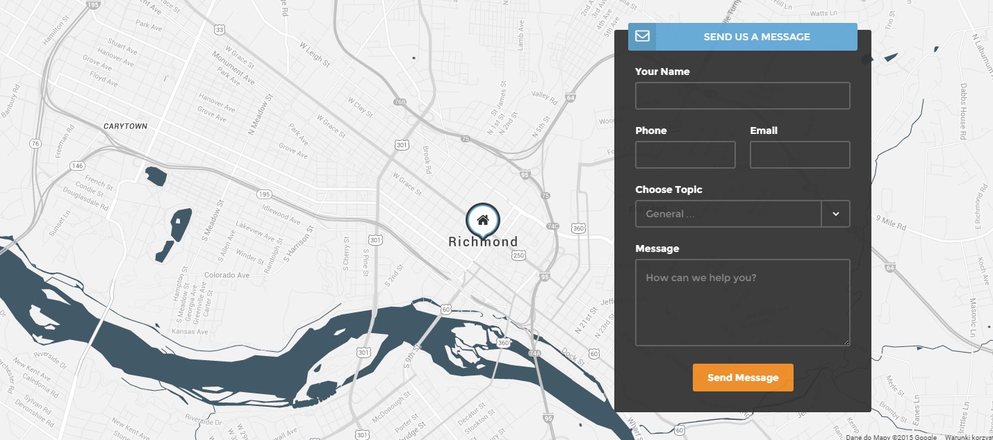
Contact Form
Search Form
Login form
Register form
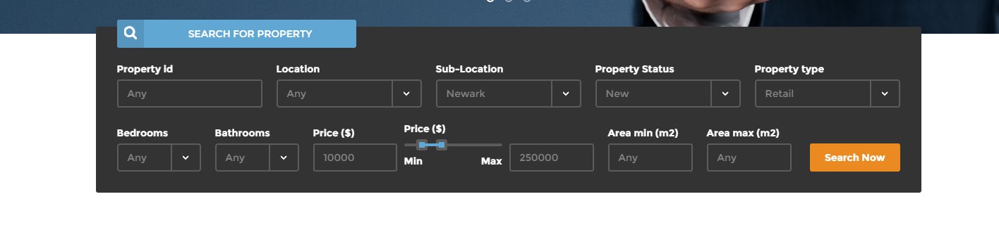
Wide search form
To use form you need to configure your mail data in form/config.php file and use the following HTML markup:
|
1 2 3 4 5 6 7 8 9 10 11 12 13 14 15 16 17 18 19 20 21 22 23 24 25 26 27 28 29 |
<form class="ct-formRegister pull-right"> <div class="form-group"> <div class="ct-form--label--type2"> <div class="ct-u-displayTableVertical"> <div class="ct-u-displayTableCell"> <div class="ct-input-group-btn"><button class="btn btn-primary"> <i class="fa fa-user"></i> </button></div> </div> <div class="ct-u-displayTableCell text-center"><span class="text-uppercase">Become a member</span></div> </div> </div> <div class="ct-form--item ct-u-marginBottom20"><label>Your Email</label> <input class="form-control input-lg" required="" type="text" placeholder="" /></div> <div class="ct-form--item ct-u-marginBottom20"><label>Password</label> <input class="form-control input-lg" required="" type="text" placeholder="" /></div> <div class="ct-form--item ct-u-marginBottom20"><label>Repeat Password</label> <input class="form-control input-lg" required="" type="text" placeholder="" /></div> <div class="ct-form--item ct-u-marginBottom20"><label>Account Type</label> <select class="ct-js-select ct-select-lg"><option value="standard">Standard User</option><option value="premium">Premium User</option></select></div> <div class="ct-form--item ct-u-marginBottom20"> <div class="checkbox"><label> <input type="checkbox" value="" /> I read and agree to<a href="terms.html"> terms & conditions</a> </label></div> </div> <div class="ct-form--item"><button class="btn btn-warning center-block" type="submit">Register Now</button></div> </div> </form> |
|
1 2 3 4 5 6 7 8 9 10 11 12 13 14 15 16 17 18 19 20 21 22 23 24 25 26 27 28 29 30 31 32 33 34 35 36 37 38 39 40 41 42 43 44 45 46 47 |
<div class="ct-popupForm ct-js-productForm--main infinite-left"><form> <div class="form-group"> <div class="ct-form-content"> <div class="ct-content--left pull-left"> <h3 class="text-uppercase">Edit Address</h3> <label>First Line</label> <input class="form-control input-lg" required="" type="text" value="15421 Southwest 39th Terrace" placeholder="" /> <label>Second Line</label> <input class="form-control input-lg" required="" type="text" value="San Francisco, CA 55689" placeholder="" /> <label>Property ID</label> <input class="form-control input-lg" required="" type="text" value="828219" placeholder="" /> </div> <div class="ct-content--right pull-right"> <h3 class="text-uppercase">Edit Description</h3> <label>Text</label> <textarea class="form-control" name="field[]" required="" placeholder="">Lorem ipsum dolor sit amet, consectetur adipisicing elit. Proin nibh augue, suscipit a, scelerisque sed, lacinia in, mi. Cras vel lorem. Etiam pellentesque aliquet tellus. Phasellus pharetra nulla ac diam. Quisque semper justo at risus. Donec venenatis, turpis vel hendrerit interdum, dui ligula ultricies purus, sed posuere.</textarea> </div> <div class="clearfix"></div> <h3 class="text-uppercase">Edit Summary</h3> <div class="ct-content--left pull-left"><label>Price</label> <input class="form-control input-lg" required="" type="text" value="$ 1 450 000" placeholder="" /> <label>Area</label> <input class="form-control input-lg" required="" type="text" value="185 m2" placeholder="" /> <label>Status</label> <input class="form-control input-lg" required="" type="text" value="Sale" placeholder="" /> <label>Type</label> <input class="form-control input-lg" required="" type="text" value="House" placeholder="" /> <label>Location</label> <input class="form-control input-lg" required="" type="text" value="San Francisco, CA 55689" placeholder="" /></div> <div class="ct-content--right pull-right"><label>Beds</label> <input class="form-control input-lg" required="" type="text" value="4" placeholder="" /> <label>Baths</label> <input class="form-control input-lg" required="" type="text" value="2" placeholder="" /> <label>Garage</label> <input class="form-control input-lg" required="" type="text" value="1" placeholder="" /> <label>Pool</label> <input class="form-control input-lg" required="" type="text" value="yes" placeholder="" /> <button class="btn btn-primary" type="button"><i class="fa fa-plus"></i></button></div> <div class="clearfix"></div> <button class="btn btn-success" type="submit">Save changes</button> </div> <div class="ct-form-close"></div> </div> </form></div> |
|
1 2 3 4 5 6 7 8 9 10 11 12 13 14 15 16 17 18 19 20 21 22 23 24 25 26 27 28 29 30 31 32 33 34 35 36 37 38 39 40 41 42 43 44 45 46 47 48 49 |
var $popupForm = $(".ct-popupForm"); var $popupMain = $(".ct-js-productForm--main"); var $popupMap = $(".ct-js-productForm--map"); var $popupDetails = $(".ct-js-productForm--details"); var $popupAgents = $(".ct-js-productForm--agents"); var $popupProperties = $(".ct-js-productForm--properties"); var $popupmask = $(".mask"); var $popupclose = $(".ct-form-close"); var $btnEditMain = $(".ct-js-btnEdit--Main"); var $btnEditMap = $(".ct-js-btnEdit--Map"); var $btnEditDetails = $(".ct-js-btnEdit--Details"); var $btnEditAgents = $(".ct-js-btnEdit--Agents"); var $btnEditProperties = $(".ct-js-btnEdit--Properties"); $btnEditMain.on("click", function(){ $popupMain.removeClass("infinite-left"); $popupmask.removeClass("infinite-left"); centerForm($popupMain); }); $btnEditMap.on("click", function(){ $popupMap.removeClass("infinite-left"); $popupmask.removeClass("infinite-left"); centerForm($popupMap); }); $btnEditDetails.on("click", function(){ $popupDetails.removeClass("infinite-left"); $popupmask.removeClass("infinite-left"); centerForm($popupDetails); }); $btnEditAgents.on("click", function(){ $popupAgents.removeClass("infinite-left"); $popupmask.removeClass("infinite-left"); centerForm($popupAgents); }); $btnEditProperties.on("click", function(){ $popupProperties.removeClass("infinite-left"); $popupmask.removeClass("infinite-left"); centerForm($popupProperties); }); $popupmask.on("click", function(){ $popupForm.addClass("infinite-left"); $popupmask.addClass("infinite-left"); }); $popupclose.on("click", function(){ $popupForm.addClass("infinite-left"); $popupmask.addClass("infinite-left"); }); |
Was this article helpful ?
Sidebar
You can use the following Sidebar widgets:
- .ct-widget-latestPosts
- .ct-text-widget
- .ct-search-widget
- .ct-widget–calculator
- .ct-widget–recentlyReduced
- .ct-widget–featuredItems
- .datepicker (learn more here: https://bootstrap-datepicker.readthedocs.org/en/release/markup.html)
Blog widgets
Blog widgets
Calculator
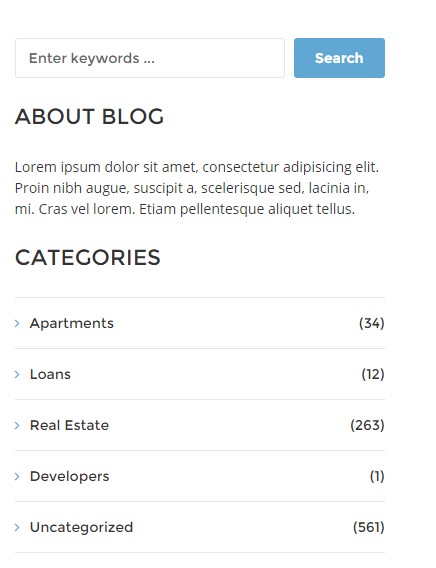
Categories widget
Recently reduced widget
Contact form in sidebar
|
1 2 3 4 5 6 7 8 9 10 11 12 13 14 15 16 17 18 19 20 21 22 23 24 25 26 27 28 29 30 31 32 33 34 35 36 37 38 39 40 41 42 43 44 45 46 47 48 49 50 51 52 53 54 55 56 57 58 59 60 61 62 63 64 65 66 67 68 69 70 71 72 73 74 75 76 77 78 79 80 81 82 83 84 85 86 87 88 89 90 91 92 93 94 95 96 97 98 99 100 101 102 103 104 105 106 107 108 109 110 111 112 113 114 115 116 117 118 119 120 121 122 123 124 125 126 127 128 129 130 131 132 133 134 135 136 137 138 139 140 141 142 143 144 145 146 147 148 149 150 151 152 153 154 155 156 157 158 159 160 161 162 163 164 165 166 167 168 169 170 171 172 173 174 175 176 177 178 179 180 181 182 183 184 185 186 187 188 189 190 191 192 193 194 195 196 197 198 199 200 201 202 203 204 205 206 207 208 209 210 211 212 213 214 215 216 217 218 219 220 221 222 223 224 225 226 227 228 229 230 231 232 233 234 235 236 237 238 239 240 241 242 243 244 245 246 247 248 249 250 251 252 253 254 255 256 257 258 259 260 261 262 263 264 265 266 267 268 269 270 271 272 273 274 275 276 277 278 279 280 281 282 283 284 285 286 287 288 289 290 291 292 293 294 295 296 297 298 |
//Latest Posts <div class="col-sm-6 col-md-12"> <section class="widget ct-widget-latestPosts"> <div class="widget-inner"> <h4 class="text-uppercase">Latest Posts</h4> <ul class="list-unstyled"> <li> <div class="widget-latest-posts-left"> <a href="blog-single.html"> <img src="assets/images/demo-content/latest-post-widget.jpg" alt=""> </a> </div> <div class="widget-latest-posts-content"> <a href="blog-single.html"> Expectations for 2015 </a> <span class="text-uppercase">Posted on january 9th, 2015</span> </div> </li> <li> <div class="widget-latest-posts-content"> <a href="blog-single.html"> Real Estate market most probably going to bloom in early 2016 </a> <span class="text-uppercase">Posted on january 5th, 2015</span> </div> </li> <li> <div class="widget-latest-posts-left"> <a href="blog-single.html"> <img src="assets/images/demo-content/latest-post-widget-1.jpg" alt=""> </a> </div> <div class="widget-latest-posts-content"> <a href="blog-single.html"> Trending in architecture leads us towards better standards </a> <span class="text-uppercase">Posted on january 9th, 2015</span> </div> </li> </ul> </div> </section> </div> //text widget <div class="col-sm-6 col-md-12"> <section class="widget"> <div class="widget-inner"> <div class="ct-text-widget"> <h4 class="text-uppercase">About Blog</h4> <p> Lorem ipsum dolor sit amet, consectetur adipisicing elit. Proin nibh augue, suscipit a, scelerisque sed, lacinia in, mi. Cras vel lorem. Etiam pellentesque aliquet tellus. </p> </div> </div> </section> </div> //search widget <div class="col-sm-6 col-md-12"> <section class="widget"> <div class="widget-inner"> <div class="ct-search-widget"> <div class="form-group"> <input id="search2" placeholder="Enter keywords ..." required type="text" name="field[]" class="form-control input-lg ct-input--border"> <button class="btn btn-primary pull-right"> Search </button> </div> </div> </div> </section> </div> //Calculator widget <div class="col-sm-6 col-md-12"> <div class="widget ct-widget--calculator ct-calculator--whiteStyle"> <div class="widget-inner"> <h4 class="text-uppercase">Calculator</h4> <form role="form"> <div class="form-group"> <div class="ct-form--label--type2"> <div class="ct-u-displayTableVertical"> <div class="ct-u-displayTableCell"> <div class="ct-input-group-btn"> <button class="btn btn-primary"> <i class="fa fa-calculator"></i> </button> </div> </div> <div class="ct-u-displayTableCell text-center"> <span class="text-uppercase">Calculate Loan</span> </div> </div> </div> <div class="ct-form--item"> <label>Property Price ($)</label> <input type="text" required class="form-control input-lg" placeholder=""> </div> <div class="ct-form--item"> <label>Procent Down</label> <input type="text" required class="form-control input-lg" placeholder=""> </div> <div class="ct-form--item"> <label>Term (Years)</label> <input type="text" required class="form-control input-lg" placeholder=""> </div> <div class="ct-form--item"> <label>Interest Rate in %</label> <input type="text" required class="form-control input-lg" placeholder=""> </div> <div class="ct-form--item last"> <button type="submit" class="btn btn-warning">Calculate My Mortgage</button> </div> </div> </form> </div> </div> </div> //Recently Reduced <div class="col-sm-6 col-md-12"> <div class="widget ct-widget--recentlyReduced"> <div class="widget-inner"> <h4 class="text-uppercase">Recently Reduced</h4> <div class="ct-itemProducts--small ct-itemProducts--small-type7"> <a href="product-single.html"> <div class="ct-main-content"> <div class="ct-imageBox"> <img src="assets/images/demo-content/recently-reduced-thumbnail-1.jpg" alt=""> </div> <div class="ct-main-text"> <div class="ct-product--tilte"> 15421 Southwest 39th Terrace </div> <div class="ct-product--price"> <span class="ct-price--Old">$ 450,000</span> <span>$ 390,000</span> </div> </div> </div> </a> </div> <div class="ct-itemProducts--small ct-itemProducts--small-type1"> <a href="product-single.html"> <div class="ct-main-content"> <div class="ct-imageBox"> <img src="assets/images/demo-content/recently-reduced-thumbnail-8.jpg" alt=""> </div> <div class="ct-main-text"> <div class="ct-product--tilte"> 15421 Southwest 39th Terrace </div> <div class="ct-product--price"> <span class="ct-price--Old">$ 450,000</span> <span>$ 390,000</span> </div> </div> </div> </a> </div> <div class="ct-itemProducts--small ct-itemProducts--small-type1"> <a href="product-single.html"> <div class="ct-main-content"> <div class="ct-imageBox"> <img src="assets/images/demo-content/recently-reduced-thumbnail-9.jpg" alt=""> </div> <div class="ct-main-text"> <div class="ct-product--tilte"> 15421 Southwest 39th Terrace </div> <div class="ct-product--price"> <span class="ct-price--Old">$ 450,000</span> <span>$ 390,000</span> </div> </div> </div> </a> </div> <a class="btn btn-primary btn-transparent--border ct-u-text--motive" href="properties.html">View More Reduced Properties</a> </div> </div> </div> //Featured Items <div class="col-sm-6 col-md-12"> <div class="widget ct-widget--featuredItems"> <div class="widget-inner"> <h4 class="text-uppercase">Featured</h4> <div class="ct-itemProducts--small ct-itemProducts--small-type1"> <a href="product-single.html"> <div class="ct-main-content"> <div class="ct-imageBox"> <img src="assets/images/demo-content/recently-reduced-thumbnail-1.jpg" alt=""> </div> <div class="ct-main-text"> <div class="ct-product--tilte"> 15421 Southwest 39th Terrace </div> <div class="ct-product--price"> <span>$ 450,000</span> </div> </div> </div> </a> </div> <div class="ct-itemProducts--small ct-itemProducts--small-type1"> <a href="product-single.html"> <div class="ct-main-content"> <div class="ct-imageBox"> <img src="assets/images/demo-content/recently-reduced-thumbnail-2.jpg" alt=""> </div> <div class="ct-main-text"> <div class="ct-product--tilte"> 15421 Southwest 39th Terrace </div> <div class="ct-product--price"> <span>$ 450,000</span> </div> </div> </div> </a> </div> <div class="ct-itemProducts--small ct-itemProducts--small-type1"> <a href="product-single.html"> <div class="ct-main-content"> <div class="ct-imageBox"> <img src="assets/images/demo-content/recently-reduced-thumbnail-3.jpg" alt=""> </div> <div class="ct-main-text"> <div class="ct-product--tilte"> 15421 Southwest 39th Terrace </div> <div class="ct-product--price"> <span>$ 450,000</span> </div> </div> </div> </a> </div> <div class="ct-itemProducts--small ct-itemProducts--small-type1"> <a href="product-single.html"> <div class="ct-main-content"> <div class="ct-imageBox"> <img src="assets/images/demo-content/recently-reduced-thumbnail-4.jpg" alt=""> </div> <div class="ct-main-text"> <div class="ct-product--tilte"> 15421 Southwest 39th Terrace </div> <div class="ct-product--price"> <span>$ 450,000</span> </div> </div> </div> </a> </div> <div class="ct-itemProducts--small ct-itemProducts--small-type1"> <a href="product-single.html"> <div class="ct-main-content"> <div class="ct-imageBox"> <img src="assets/images/demo-content/recently-reduced-thumbnail-5.jpg" alt=""> </div> <div class="ct-main-text"> <div class="ct-product--tilte"> 15421 Southwest 39th Terrace </div> <div class="ct-product--price"> <span>$ 450,000</span> </div> </div> </div> </a> </div> </div> </div> </div> //Calendar(datapicker) <div class="col-sm-6 col-md-12"> <section class="widget"> <div class="widget-inner"> <div class="ct-widget-categories ct-js-datetimePicker"> <h4 class="text-uppercase">Calendar</h4> <div></div> </div> </div> </section> </div> |
and javascript:
|
1 2 3 4 5 6 7 8 |
(function ($) { "use strict"; $(document).ready(function(){ $('.ct-js-datetimePicker div').datepicker({ todayHighlight: true }); }) }(jQuery)); |
Was this article helpful ?
Portfolio
We are using Isotope and Magnific Popup for portfolio. You can change number of portfolio columns and/or add portfolio filters with following classes:
- .ct-gallery-filters (isotope navigation)
- .ct-gallery
- .ct-gallery–col1
- .ct-gallery–col2
- .ct-gallery–col3
- .ct-gallery–col4
- .ct-gallery–col5
Portfolio
|
1 2 3 4 5 6 7 8 9 10 11 12 13 14 15 16 17 18 19 20 21 22 23 24 25 26 27 |
<section id="portfolio" class="section"> <div class="ct-mediaSection ct-u-paddingBoth100 ct-u-text--white text-center" data-stellar-background-ratio="0.3" data-height="295" data-type="parallax" data-bg-image="assets/images/demo-content/portfolio-parallax.jpg" data-bg-image-mobile="assets/images/demo-content/portfolio-parallax.jpg"> <div class="container"> <div class="ct-heading text-uppercase ct-u-marginBottom30"> <h2>Our work</h2> </div> <ul class="ct-gallery-filters list-unstyled list-inline"> <li><a data-filter="*" class="btn btn-default btn-transparent--border ct-u-text--white active">All</a></li> <li><a data-filter=".creative" class="btn btn-default btn-transparent--border ct-u-text--white">Creative</a></li> <li><a data-filter=".development" class="btn btn-default btn-transparent--border ct-u-text--white">Development</a></li> <li><a data-filter=".print" class="btn btn-default btn-transparent--border ct-u-text--white">Print</a></li> </ul> </div> </div> <div id="ct-gallery" class="ct-gallery ct-gallery--col4"> <div class="ct-gallery-item ct-gallery-item--masonry hidden development"> <div class="ct-gallery-itemInner"> <a href="assets/images/demo-content/portfolio-image-1.jpg" class="ct-js-magnificPopupImage"> <img src="assets/images/demo-content/portfolio-thumbnail-1.jpg" alt="Portfolio"> <div class="ct-galleryBox-overlay"></div> <div class="ct-hover--text text-uppercase"> <h4 class="ct-fw-600">Project name goes here</h4> <span class="ct-fw-600">Creative</span> </div> </a> </div> </div> |
Javascript:
|
1 2 3 4 5 6 7 8 9 10 11 12 13 14 15 16 17 18 19 20 21 22 23 24 25 26 27 28 29 30 31 32 33 34 35 36 37 38 39 |
jQuery(window).load(function () { if ($().isotope && ($('.ct-gallery').length > 0)) { var $container = $('.ct-gallery'), // object that will keep track of options isotopeOptions = {}, // defaults, used if not explicitly set in hash defaultOptions = { filter: '*', itemSelector: '.ct-gallery-item', // set columnWidth to a percentage of container width masonry: { } }; // set up Isotope $container.isotope(defaultOptions); $container.imagesLoaded().progress(function (instance, image) { if (!image.isLoaded) { return; } var p = $(image.img).closest('.hidden'); p.removeClass('hidden'); $container.addClass('is-loaded') $container.isotope('layout'); }) $('.ct-gallery-filters a').click(function () { $('.ct-gallery-filters .active').removeClass('active'); $(this).addClass('active'); var selector = $(this).attr('data-filter'); $container.isotope({ filter: selector, animationOptions: { duration: 750, easing: 'linear', queue: false } }); return false; }); } }); |
Was this article helpful ?
Person Box
There are two types of person boxes:
- .ct-personBox
- .ct-personBox–extended
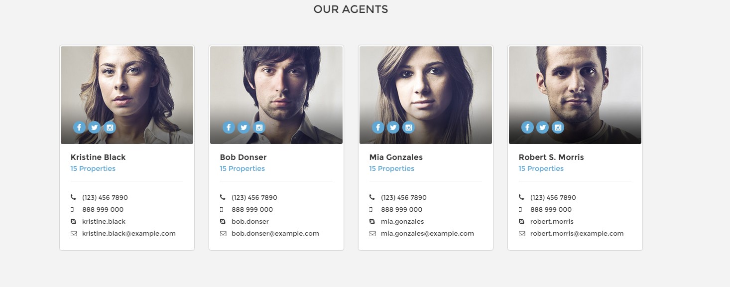
Person box default
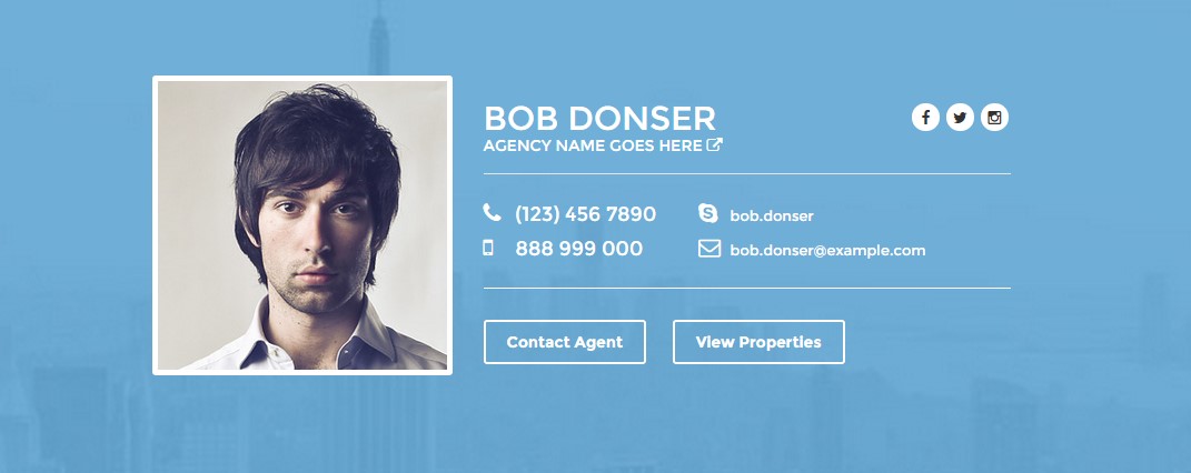
Person box extended
HTML markup:
|
1 2 3 4 5 6 7 8 9 10 11 12 13 14 15 16 17 18 19 20 21 22 23 24 25 26 27 28 29 30 31 32 33 34 35 36 37 38 39 40 41 42 43 44 45 46 47 48 49 50 51 52 53 54 55 56 57 58 59 60 61 62 63 64 65 66 67 68 69 70 71 72 73 |
<div class="ct-personBox text-left"> <div class="ct-imagePerson"> <img src="assets/images/demo-content/agents-1.jpg" alt=""> <ul class="ct-panel--socials list-inline list-unstyled"> <li><a href="https://www.facebook.com/createITpl"><div class="ct-socials ct-socials--circle"><i class="fa fa-facebook"></i></div></a></li> <li><a href="https://twitter.com/createitpl"><div class="ct-socials ct-socials--circle"><i class="fa fa-twitter"></i></div></a></li> <li><a href="#"><div class="ct-socials ct-socials--circle"><i class="fa fa-instagram"></i></div></a></li> </ul> </div> <div class="ct-personContent"> <div class="ct-personName ct-u-paddingBottom10 ct-u-marginBottom20"> <h5 class="ct-fw-600">Kristine Black</h5> <a href="">15 Properties</a> </div> <div class="ct-personDescription"> <ul class="list-unstyled ct-contactPerson"> <li> <i class="fa fa-phone"></i> <span>(123) 456 7890</span> </li> <li> <i class="fa fa-mobile"></i> <span>888 999 000</span> </li> <li> <a href=""><i class="fa fa-skype"></i> kristine.black</a> </li> <li> <a href=""><i class="fa fa-envelope-o"></i> kristine.black@example.com</a> </li> </ul> </div> </div> </div> <div class="ct-personBox ct-personBox--extended text-left"> <div class="ct-imagePerson"> <img src="assets/images/demo-content/logo--agency.png" alt=""> <ul class="ct-panel--socials list-inline list-unstyled"> <li><a href="https://www.facebook.com/createITpl"><div class="ct-socials ct-socials--circle"><i class="fa fa-facebook"></i></div></a></li> <li><a href="https://twitter.com/createitpl"><div class="ct-socials ct-socials--circle"><i class="fa fa-twitter"></i></div></a></li> <li><a href="#"><div class="ct-socials ct-socials--circle"><i class="fa fa-instagram"></i></div></a></li> </ul> </div> <div class="ct-personContent"> <div class="ct-personName ct-u-paddingBoth10 text-uppercase"> <h2>Agency Name</h2> <a href="">154 properties on estato <i class="fa fa-external-link"></i></a> </div> <div class="ct-personDescription pull-right ct-u-paddingBoth20"> <ul class="list-unstyled ct-contactPerson pull-right"> <li> <i class="fa fa-phone"></i> <span>(123) 456 7890</span> </li> <li> <a href=""><i class="fa fa-skype"></i> kristine.black</a> </li> <li> <i class="fa fa-mobile"></i> <span>888 999 000</span> </li> <li> <a href=""><i class="fa fa-envelope-o"></i> kristine.black@example.com</a> </li> </ul> </div> <div class="ct-buttonPanel text-capitalize ct-u-paddingBoth20 pull-right"> <a href="index.html" class="btn btn-default btn-transparent--border ct-u-text--white">Visit Our Website</a> <a href="properties.html" class="btn btn-default btn-transparent--border ct-u-text--white">View Properties</a> </div> </div> </div> |
Was this article helpful ?
Google Map
Available parameters:
- .ct-js-googleMap
- .ct-js-googleMap–single
data:
- data-location
- data-zoom
- data-icon
- data-offset
- .ct-js-googleMap–group
data:
- data-display-desc (yes/no infowindow)
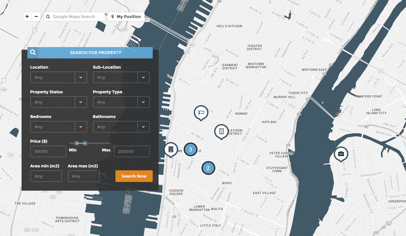
Google map with search form
|
1 2 3 4 5 6 7 8 9 10 11 |
var data = JSON.parse('[' + '{"address":"301 w 4th Street, New York","image":"assets/images/demo-content/property-1.jpg","icon":"assets/images/marker-apartment.png", "price":"450,000", "status":"House for sale", "bedrooms":"3", "bathrooms":"2", "area":"140"},' + '{"address":"128 7th Ave S, New York","image":"assets/images/demo-content/property-2.jpg","icon":"assets/images/marker-commercial.png", "price":"650,000", "status":"House for sale", "bedrooms":"4", "bathrooms":"3", "area":"100"},' + '{"address":"Eve 55 W 8th St, New York","image":"assets/images/demo-content/property-3.jpg","icon":"assets/images/marker-flat.png", "price":"400,000", "status":"House for sale", "bedrooms":"3", "bathrooms":"2", "area":"140"},' + '{"address":"21 W 16th St New York","image":"assets/images/demo-content/property-4.jpg","icon":"assets/images/marker-apartment.png", "price":"700,000", "status":"House for sale", "bedrooms":"3", "bathrooms":"2", "area":"140"},' + '{"address":"Washington Square Fountain, New York","image":"assets/images/demo-content/property-5.jpg","icon":"assets/images/marker-house.png", "price":"350,000", "status":"House for sale", "bedrooms":"3", "bathrooms":"2", "area":"140"},' + '{"address":"Pinkberry - Chelsea 170 8th Ave, New York","image":"assets/images/demo-content/property-6.jpg","icon":"assets/images/marker-land.png", "price":"750,000", "status":"House for sale", "bedrooms":"3", "bathrooms":"2", "area":"140"},' + '{"address":"8 Charles Ln New York","image":"assets/images/demo-content/property-7.jpg","icon":"assets/images/marker-villa.png", "price":"300,000", "status":"House for sale", "bedrooms":"3", "bathrooms":"2", "area":"140"},' + '{"address":"74 Green St Brooklyn","image":"assets/images/demo-content/property-8.jpg","icon":"assets/images/marker-apartment.png", "price":"800,000", "status":"House for sale", "bedrooms":"3", "bathrooms":"2", "area":"140"},' + '{"address":"321 w 4th Street, New York","image":"assets/images/demo-content/property-9.jpg","icon":"assets/images/marker-commercial.png", "price":"1,000,000", "status":"House for sale", "bedrooms":"3", "bathrooms":"2", "area":"140"}' + ']'); |
HTML markup:
|
1 |
<div class="ct-js-googleMap ct-googleMap ct-js-googleMap--group" data-display-desc="true" data-height="860" id="map"></div> |
Javascript:
|
1 2 3 4 5 6 7 8 9 10 11 12 13 14 15 16 17 18 19 20 21 22 23 24 25 26 27 28 29 30 31 32 33 34 35 36 37 38 39 40 41 42 43 44 45 46 47 48 49 50 51 52 53 54 55 56 57 58 59 60 61 62 63 64 65 66 67 68 69 70 71 72 73 74 75 76 77 78 79 80 81 82 83 84 85 86 87 88 89 90 91 92 93 94 95 96 97 98 99 100 101 102 103 104 105 106 107 108 109 110 111 112 113 114 115 116 117 118 119 120 121 122 123 124 125 126 127 128 129 130 131 132 133 134 135 136 137 138 139 140 141 142 143 144 145 146 147 148 149 150 151 152 153 154 155 156 157 158 159 160 161 162 163 164 165 166 167 168 169 170 171 172 173 174 175 176 177 178 179 180 181 182 183 184 185 186 187 188 189 190 191 192 193 194 195 196 197 198 199 200 201 202 203 204 205 206 207 208 209 210 211 212 213 214 215 216 217 218 219 220 221 222 223 224 225 226 227 228 229 230 231 232 233 234 235 236 237 238 239 240 241 242 243 244 245 246 247 248 249 250 251 252 253 254 255 256 257 258 259 260 261 262 263 264 265 266 267 268 269 270 271 272 273 274 275 276 277 278 279 280 281 282 283 284 285 286 287 288 289 290 291 292 293 294 295 296 297 298 299 300 301 302 303 304 305 306 307 308 309 310 311 312 313 314 315 316 317 318 319 320 321 322 323 324 325 326 327 328 329 330 331 332 333 334 335 336 337 338 339 340 341 342 343 344 345 346 347 348 349 350 351 352 353 354 355 356 357 358 359 360 361 362 363 364 365 366 367 368 369 370 371 372 373 374 375 376 377 378 379 380 381 382 383 384 385 386 387 388 389 390 391 392 393 394 395 396 397 398 399 400 401 402 403 404 405 406 407 408 409 410 411 412 413 414 415 416 417 418 419 420 421 422 423 424 425 426 427 428 429 430 431 432 433 434 435 436 437 |
(function ($) { "use strict"; /* ============================================= */ /* ==== GOOGLE MAP ==== */ var mapStyles = [{"featureType":"administrative","elementType":"labels.text.fill","stylers":[{"color":"#444444"}]},{"featureType":"landscape","elementType":"all","stylers":[{"color":"#f2f2f2"}]},{"featureType":"poi","elementType":"all","stylers":[{"visibility":"off"}]},{"featureType":"road","elementType":"all","stylers":[{"saturation":-100},{"lightness":45}]},{"featureType":"road.highway","elementType":"all","stylers":[{"visibility":"simplified"}]},{"featureType":"road.arterial","elementType":"labels.icon","stylers":[{"visibility":"off"}]},{"featureType":"transit","elementType":"all","stylers":[{"visibility":"off"}]},{"featureType":"water","elementType":"all","stylers":[{"color":"#425a68"},{"visibility":"on"}]}]; function initmap() { if (($(".ct-js-googleMap").length > 0) && (typeof google === 'object' && typeof google.maps === 'object')) { var draggable = true; if (device.mobile() || device.tablet()) { draggable = false; } $('.ct-js-googleMap--single').each(function () { var atcenter = ""; var $this = $(this); var location = $this.data("location"); var zoom = $this.data("zoom"); var icongmap = $this.attr('data-icon'); var offset = -30; if (validatedata($this.data("offset"))) { offset = $this.data("offset"); } if (validatedata(location)) { $this.gmap3({ marker: { //latLng: [40.616439, -74.035540], address: location, options: { //visible: false icon: new google.maps.MarkerImage(icongmap) }, callback: function (marker) { atcenter = marker.getPosition(); } }, map: { options: { //maxZoom:11, zoom: zoom, styles:mapStyles, mapTypeId: google.maps.MapTypeId.ROADMAP, // ('ROADMAP', 'SATELLITE', 'HYBRID','TERRAIN'); scrollwheel: false, disableDoubleClickZoom: false, draggable: false, //disableDefaultUI: true, disableDefaultUI: true, mapTypeControlOptions: { //mapTypeIds: [google.maps.MapTypeId.ROADMAP, google.maps.MapTypeId.HYBRID], //style: google.maps.MapTypeControlStyle.HORIZONTAL_BAR, //position: google.maps.ControlPosition.RIGHT_CENTER mapTypeIds: [] } }, events: { idle: function () { if (!$this.data('idle')) { $this.gmap3('get').panBy(offset, 0); $this.data('idle', true); } } } }, overlay: { address: location, options: { offset: { y: -100, x: -25 } } } //},"autofit" }); // center on resize google.maps.event.addDomListener(window, "resize", function () { //var userLocation = new google.maps.LatLng(53.8018,-1.553); setTimeout(function () { $this.gmap3('get').setCenter(atcenter); $this.gmap3('get').panBy(0, offset); }, 400); }); // set height $this.css("min-height", $this.data("height") + "px"); } if ($this.parent().parent().hasClass('hidemap')) { $this.parent().animate({height: '0px'}, 500); } }), jQuery('.ct-js-googleMap--group').each(function () { var $this = jQuery(this); var $display_desc = validatedata(parseBoolean($this.attr("data-display-desc")), false); // JSON var data = JSON.parse('[' + '{"address":"301 w 4th Street, New York","image":"assets/images/demo-content/property-1.jpg","icon":"assets/images/marker-apartment.png", "price":"450,000", "status":"House for sale", "bedrooms":"3", "bathrooms":"2", "area":"140"},' + '{"address":"128 7th Ave S, New York","image":"assets/images/demo-content/property-2.jpg","icon":"assets/images/marker-commercial.png", "price":"650,000", "status":"House for sale", "bedrooms":"4", "bathrooms":"3", "area":"100"},' + '{"address":"Eve 55 W 8th St, New York","image":"assets/images/demo-content/property-3.jpg","icon":"assets/images/marker-flat.png", "price":"400,000", "status":"House for sale", "bedrooms":"3", "bathrooms":"2", "area":"140"},' + '{"address":"21 W 16th St New York","image":"assets/images/demo-content/property-4.jpg","icon":"assets/images/marker-apartment.png", "price":"700,000", "status":"House for sale", "bedrooms":"3", "bathrooms":"2", "area":"140"},' + '{"address":"Washington Square Fountain, New York","image":"assets/images/demo-content/property-5.jpg","icon":"assets/images/marker-house.png", "price":"350,000", "status":"House for sale", "bedrooms":"3", "bathrooms":"2", "area":"140"},' + '{"address":"Pinkberry - Chelsea 170 8th Ave, New York","image":"assets/images/demo-content/property-6.jpg","icon":"assets/images/marker-land.png", "price":"750,000", "status":"House for sale", "bedrooms":"3", "bathrooms":"2", "area":"140"},' + '{"address":"8 Charles Ln New York","image":"assets/images/demo-content/property-7.jpg","icon":"assets/images/marker-villa.png", "price":"300,000", "status":"House for sale", "bedrooms":"3", "bathrooms":"2", "area":"140"},' + '{"address":"74 Green St Brooklyn","image":"assets/images/demo-content/property-8.jpg","icon":"assets/images/marker-apartment.png", "price":"800,000", "status":"House for sale", "bedrooms":"3", "bathrooms":"2", "area":"140"},' + '{"address":"321 w 4th Street, New York","image":"assets/images/demo-content/property-9.jpg","icon":"assets/images/marker-commercial.png", "price":"1,000,000", "status":"House for sale", "bedrooms":"3", "bathrooms":"2", "area":"140"}' + ']'); console.log($display_desc); if($display_desc == false){ $this.gmap3({ map:{ options:{ center:[40.742803, -74.002424], zoom: 14, scrollwheel: false, disableDoubleClickZoom: false, draggable: draggable, //disableDefaultUI: true, disableDefaultUI: true, mapTypeId: google.maps.MapTypeId.ROADMAP, // ('ROADMAP', 'SATELLITE', 'HYBRID','TERRAIN'); styles:mapStyles } }, marker:{ values: [ { address:"301 w 4th Street, New York", options:{ icon: "assets/images/marker-villa.png" } }, { address:"128 7th Ave S, New York", options:{ icon: "assets/images/marker-apartment.png" } }, { address:"Eve 55 W 8th St, New York", options:{ icon: "assets/images/marker-commercial.png" } }, { address:"21 W 16th St New York", options:{ icon: "assets/images/marker-flat.png" } }, { address:"Washington Square Fountain, New York", options:{ icon: "assets/images/marker-house.png" } }, { address:"Pinkberry - Chelsea 170 8th Ave, New York", options:{ icon: "assets/images/marker-land.png" } }, { address:"8 Charles Ln New York", options:{ icon: "assets/images/marker-apartment.png" } }, { address:"74 Green St Brooklyn", options:{ icon: "assets/images/marker-commercial.png" } }, { address:"321 w 4th Street, New York", options:{ icon: "assets/images/marker-house.png" } } ], cluster:{ radius: 50, 0: { content: "<div class='ct-markerCluster'>CLUSTER_COUNT</div>", width: 53, height: 52 }, 2: { content: "<div class='ct-markerCluster'>CLUSTER_COUNT</div>", width: 56, height: 55 }, 50: { content: "<div class='ct-markerCluster'>CLUSTER_COUNT</div>", width: 66, height: 65 } } } }) } else{ $this.gmap3({ map:{ options:{ center:[40.742803, -74.002424], zoom: 14, scrollwheel: false, disableDoubleClickZoom: false, draggable: draggable, //disableDefaultUI: true, mapTypeId: google.maps.MapTypeId.ROADMAP, disableDefaultUI: true, styles:mapStyles // ('ROADMAP', 'SATELLITE', 'HYBRID','TERRAIN'); }, events:{ click: function(map, event, context){ gmap_clear_markers(); } } } }) $.each(data, function(key, val) { $this.gmap3({ marker:{ values:[{ address:val.address, options:{ icon: val.icon }, events: { click: function() { gmap_clear_markers(); $this.gmap3({ overlay:{ address:val.address, options:{ content: "<div class='ct-itemProducts ct-hover ct-itemProducts--boxed ct-gmapProduct'>"+ "<a href='product-single.html'>"+ "<div class='ct-main-content'>" + "<div class='ct-imageBox'>"+ "<img src='"+val.image+"' alt=''>"+ "<i class='fa fa-eye'></i>"+ "</div>"+ "<div class='ct-main-text'>"+ "<div class='ct-product--tilte'>"+ val.address+ "</div>"+ "<div class='ct-product--price'>"+ "<span>$ "+val.price+"</span>"+ //"<span class='ct-price--Old'>$ 450,000</span>"+ "</div>"+ "</div>"+ "<div class='ct-product--meta'>"+ "<div class='ct-status'><span class='ct-fw-600'>Status</span> "+val.status+"</div>"+ "<div class='ct-icons'>"+ "<span>"+ "<i class='fa fa-bed'></i> "+ val.bedrooms+ "</span>"+ "<span>"+ "<i class='fa fa-cutlery'></i> "+ val.bathrooms+ "</span>"+ "</div>"+ "<div class='ct-text'>"+ "<span> Area: <span>"+val.area+" m2</span></span>"+ "</div>"+ "</div>"+ "</div>"+ "<div class='ct-bottomArrow'></div>"+ "</a>"+ "</div>", offset:{ y:-340, x:-140 } } } }); } } }], cluster:{ radius: 20, 0: { content: "<div class='ct-markerCluster'>CLUSTER_COUNT</div>", width: 53, height: 52 }, 2: { content: "<div class='ct-markerCluster'>CLUSTER_COUNT</div>", width: 56, height: 55 }, 50: { content: "<div class='ct-markerCluster'>CLUSTER_COUNT</div>", width: 66, height: 65 } } } }); }); }; // Function Clear Markers function gmap_clear_markers() { $('.ct-gmapProduct').each(function() { $(this).remove(); }); } var map = $(".ct-js-googleMap").gmap3({ get: { name:"map" } }); //Navigation $('#zoomin').on("click", function(){ var newCenter = map.getZoom(); map.setZoom(newCenter+1); }) $('#zoomout').on("click", function(){ var newCenter = map.getZoom(); map.setZoom(newCenter-1); }) $('#geolocation').on("click", function(){ // Try HTML5 geolocation if(navigator.geolocation) { navigator.geolocation.getCurrentPosition(function(position) { var pos = new google.maps.LatLng(position.coords.latitude, position.coords.longitude); $(".ct-js-googleMap").gmap3({ circle:{ options:{ center: pos, radius : 800, fillColor : "#60a7d4", strokeColor : "#333333" }, callback: function(){ $(this).gmap3('get').setZoom(15); } } }); map.setCenter(pos); }, function() { handleNoGeolocation(true); }); } else { // Browser doesn't support Geolocation handleNoGeolocation(false); } }) function handleNoGeolocation(errorFlag) { if (errorFlag) { var content = 'Error: The Geolocation service failed.'; } else { var content = 'Error: Your browser doesn\'t support geolocation.'; } } function searchauto() { var locations = []; // Create the search box and link it to the UI element. var input = (document.getElementById('searchGmaps')); var searchBox = new google.maps.places.SearchBox( /** @type {HTMLInputElement} */(input)); // Listen for the event fired when the user selects an item from the // pick list. Retrieve the matching places for that item. google.maps.event.addListener(searchBox, 'places_changed', function() { var places = searchBox.getPlaces(); if (places.length == 0) { return; } for (var i = 0, location; location = locations[i]; i++) { location.setMap(null); } // For each place, get the icon, place name, and location. locations = []; var bounds = new google.maps.LatLngBounds(); for (var i = 0, place; place = places[i]; i++) { var image = { url: "assets/images/marker-land.png", //size: new google.maps.Size(71, 71), origin: new google.maps.Point(0, 0), anchor: new google.maps.Point(17, 34) //scaledSize: new google.maps.Size(25, 25) }; bounds.extend(place.geometry.location); } map.fitBounds(bounds); }); google.maps.event.addListener(map, 'bounds_changed', function() { var bounds = map.getBounds(); searchBox.setBounds(bounds); }); } searchauto(); // set height $this.css("min-height", $this.data("height") + "px"); }) } } initmap(); }) |
Was this article helpful ?
Testimonials
There are two types of testimonials:
- .ct-testimonials
- .ct-testimonials–light
.ct-testimonials is a standard class for default styling, if you add .ct-testimonials–light it will change decoration to motive color.
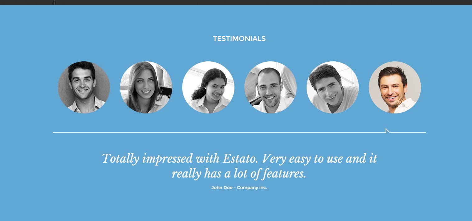
Testimonials
HTML markup:
|
1 2 3 4 5 6 7 8 9 10 11 12 13 14 15 16 17 18 19 20 21 22 23 24 25 26 27 28 29 30 31 32 33 34 35 36 37 38 39 40 41 42 43 44 45 46 47 48 49 50 |
<div class="ct-testimonials"> <div class="row ct-u-marginBottom60"> <ul class="list-unstyled" role="tablist"> <li role="presentation" class="col-xs-2 active ct-u-paddingBottom60"><a href="#testimonials-01" role="tab" data-toggle="tab"><img class="img-responsive" draggable="false" src="assets/images/demo-content/content-testimonials-1.png" alt="Team Member"></a></li> <li role="presentation" class="col-xs-2 ct-u-paddingBottom60"><a href="#testimonials-02" role="tab" data-toggle="tab"><img class="img-responsive" src="assets/images/demo-content/content-testimonials-2.png" alt="Team Member"></a></li> <li role="presentation" class="col-xs-2 ct-u-paddingBottom60"><a href="#testimonials-03" role="tab" data-toggle="tab"><img class="img-responsive" draggable="false" src="assets/images/demo-content/content-testimonials-3.png" alt="Team Member"></a></li> <li role="presentation" class="col-xs-2 ct-u-paddingBottom60"><a href="#testimonials-04" role="tab" data-toggle="tab"><img class="img-responsive" src="assets/images/demo-content/content-testimonials-4.png" alt="Team Member"></a></li> <li role="presentation" class="col-xs-2 ct-u-paddingBottom60"><a href="#testimonials-05" role="tab" data-toggle="tab"><img class="img-responsive" draggable="false" src="assets/images/demo-content/content-testimonials-5.png" alt="Team Member"></a></li> <li role="presentation" class="col-xs-2 ct-u-paddingBottom60"><a href="#testimonials-06" role="tab" data-toggle="tab"><img class="img-responsive" src="assets/images/demo-content/content-testimonials-6.png" alt="Team Member"></a></li> </ul> </div> <div class="tab-content center-block"> <div role="tabpanel" class="tab-pane row" id="testimonials-01"> <div class="animated fadeIn"> <p class="">Totally impressed with Estato. Very easy to use and it really has a lot of features.</p> <span class="">John Doe - Company inc.</span> </div> </div> <div role="tabpanel" class="tab-pane active row" id="testimonials-02"> <div class="animated fadeIn"> <p class="">Totally impressed with Estato. Very easy to use and it really has a lot of features.</p> <span class="">Anna Ferguson - Company inc.</span> </div> </div> <div role="tabpanel" class="tab-pane row" id="testimonials-03"> <div class="animated fadeIn"> <p class="">Totally impressed with Estato. Very easy to use and it really has a lot of features.</p> <span class="">Jane Foster - Company inc.</span> </div> </div> <div role="tabpanel" class="tab-pane row" id="testimonials-04"> <div class="animated fadeIn"> <p class=" ct-u-marginBottom0">Totally impressed with Estato. Very easy to use and it really has a lot of features.</p> <span class="">John Doe - Company inc.</span> </div> </div> <div role="tabpanel" class="tab-pane row" id="testimonials-05"> <div class="animated fadeIn"> <p class="">Totally impressed with Estato. Very easy to use and it really has a lot of features.</p> <span class="">John Doe - Company inc.</span> </div> </div> <div role="tabpanel" class="tab-pane row" id="testimonials-06"> <div class=" animated fadeIn"> <p class="">Totally impressed with Estato. Very easy to use and it really has a lot of features.</p> <span class="">John Doe - Company inc.</span> </div> </div> </div> </div> |
Remember to attach to HTML also the following script:
|
1 2 3 4 5 6 7 8 9 10 11 12 13 14 15 16 17 18 |
var tabChange = function(){ var tabs = $('.ct-testimonials > .row > ul > li'); var active = tabs.filter('.active'); var next = active.next('li').length ? active.next('li').find('a') : tabs.filter(':first-child').find('a'); next.tab('show'); }; var tabCycle = setInterval(tabChange, 5000); //-------------------------------------------------------------------------------------- $('.ct-testimonials > .row > ul > li > a').on('click', function (e) { e.preventDefault(); // Stop the cycle clearInterval(tabCycle); // Show the clicked tabs associated tab-pane $(this).tab('show'); // Start the cycle again in a predefined amount of time tabCycle = setInterval(tabChange, 5000); return false; }); |
Was this article helpful ?
Price Box
Create a price box with the simple HTML markup:
|
1 2 3 4 5 6 7 8 9 10 11 12 13 14 15 |
<div class="ct-priceBox text-center"> <div class="ct-priceSection ct-fw-600 ct-u-text--white"> <h4 class="text-uppercase">Free</h4> <div class="ct-pricebox ct-u-border--solid"> <span class="ct-price">$ 0.00</span> <span>monthly</span> </div> </div> <div class="ct-contentSection"> <span>No Agents</span> <span>0 Listings Monthly</span> <span>Whishlist Access</span> <a href="register.html" class="btn btn-warning text-capitalize">Register Now</a> </div> </div> |
Price Box
Was this article helpful ?
Icon Box
Test comes with the following variations for icon boxes:
- .ct-iconBox
- .ct-iconBox–2col
- .ct-iconBoxContainer
Icon boxes

Icon boxes 2 columns
|
1 2 3 4 5 6 7 8 9 10 11 12 13 14 15 16 17 18 19 20 21 22 23 24 25 26 27 28 29 30 31 32 33 34 35 36 37 38 39 40 41 42 43 44 45 46 47 48 49 50 51 52 53 54 55 56 57 58 59 60 |
<div class="ct-iconBox"> <div class="ct-icon ct-iconContainer--circle center-block ct-u-marginBottom30"> <i class="fa fa-bolt"></i> </div> <div class="ct-iconBox--description"> <span class="ct-title ct-u-marginBottom20 ct-fw-600">Powerfull</span> <span class="ct-text ct-u-marginBottom20">Estato is designed a way that it was flexible for different types of business.</span> </div> </div> ---------------------------- <div class="ct-iconBox ct-u-marginBottom40 ct-iconBox--2col pull-left"> <div class="ct-icon text-center ct-iconContainer--circle pull-left"> <i class="fa fa-users"></i> </div> <div class="ct-iconBox--description pull-right"> <span class="ct-title text-uppercase ct-fw-600">Get more users</span> <span class="ct-text">Thanks to our content optimization you will get more visits to your property page.</span> </div> </div> --------------------------------- <div class="ct-iconBoxContainer center-block"> <div class="col-md-4"> <div class="ct-iconBox"> <div class="ct-icon ct-iconContainer--circle center-block ct-u-marginBottom30"> <i class="fa fa-mobile"></i> </div> <div class="ct-iconBox--description"> <span class="ct-title ct-u-marginBottom20 ct-fw-600 text-uppercase">Responsive</span> <span class="ct-text ct-u-marginBottom20">Estato is designed a way that it was flexible for different types of business.</span> </div> </div> </div> <div class="col-md-4"> <div class="ct-iconBox"> <div class="ct-icon ct-iconContainer--circle center-block ct-u-marginBottom30"> <i class="fa fa-rocket"></i> </div> <div class="ct-iconBox--description"> <span class="ct-title ct-u-marginBottom20 ct-fw-600 text-uppercase">Innovative</span> <span class="ct-text ct-u-marginBottom20">Estato is designed a way that it was flexible for different types of business.</span> </div> </div> </div> <div class="col-md-4"> <div class="ct-iconBox"> <div class="ct-icon ct-iconContainer--circle center-block ct-u-marginBottom30"> <i class="fa fa-clock-o"></i> </div> <div class="ct-iconBox--description"> <span class="ct-title ct-u-marginBottom20 ct-fw-600 text-uppercase">Optimised</span> <span class="ct-text ct-u-marginBottom20">Estato is designed a way that it was flexible for different types of business.</span> </div> </div> </div> <div class="clearfix"></div> </div> |
Was this article helpful ?
Product page
There are two types of product details pages:
- .ct-productDetails
- .ct-productDetails–type2
Product details
Product details type 2
You can use the with the following HTML markup:
|
1 2 3 4 5 6 7 8 9 10 11 12 13 14 15 16 17 18 19 20 21 22 23 24 25 26 27 28 29 30 31 32 33 34 35 36 37 38 39 40 41 42 43 44 45 46 47 48 49 50 51 52 53 54 55 56 57 58 59 60 61 62 63 64 65 66 67 68 69 70 71 72 73 74 75 76 77 78 79 80 81 82 83 84 85 86 87 88 89 90 91 92 93 94 95 96 97 98 99 100 101 102 103 104 105 106 107 108 109 110 111 112 113 114 115 116 117 118 119 120 121 122 123 124 125 126 127 128 129 130 131 132 133 134 135 136 137 138 139 140 141 142 143 144 145 146 147 148 149 150 151 152 |
<div class="col-md-8 col-lg-9"> <div class="row"> <div class="col-md-4"> <div class="ct-heading ct-u-marginBottom20"> <h3 class="text-uppercase">Summary</h3> </div> <div class="ct-u-displayTableVertical ct-productDetails"> <div class="ct-u-displayTableRow"> <div class="ct-u-displayTableCell"> <span class="ct-fw-600">Price</span> </div> <div class="ct-u-displayTableCell text-right"> <span class="ct-price">$ 1 450 000</span> </div> </div> <div class="ct-u-displayTableRow"> <div class="ct-u-displayTableCell"> <span class="ct-fw-600">Area</span> </div> <div class="ct-u-displayTableCell text-right"> <span>185 m2</span> </div> </div> <div class="ct-u-displayTableRow"> <div class="ct-u-displayTableCell"> <span class="ct-fw-600">Status</span> </div> <div class="ct-u-displayTableCell text-right"> <span>Sale</span> </div> </div> <div class="ct-u-displayTableRow"> <div class="ct-u-displayTableCell"> <span class="ct-fw-600">Type</span> </div> <div class="ct-u-displayTableCell text-right"> <span>House</span> </div> </div> <div class="ct-u-displayTableRow"> <div class="ct-u-displayTableCell"> <span class="ct-fw-600">Location</span> </div> <div class="ct-u-displayTableCell text-right"> <span>San Francisco, CA 55689</span> </div> </div> <div class="ct-u-displayTableRow"> <div class="ct-u-displayTableCell"> <span class="ct-fw-600">Beds</span> </div> <div class="ct-u-displayTableCell text-right"> <span>4</span> </div> </div> <div class="ct-u-displayTableRow"> <div class="ct-u-displayTableCell"> <span class="ct-fw-600">Baths</span> </div> <div class="ct-u-displayTableCell text-right"> <span>2</span> </div> </div> <div class="ct-u-displayTableRow"> <div class="ct-u-displayTableCell"> <span class="ct-fw-600">Garage</span> </div> <div class="ct-u-displayTableCell text-right"> <span>1</span> </div> </div> <div class="ct-u-displayTableRow"> <div class="ct-u-displayTableCell"> <span class="ct-fw-600">Pool</span> </div> <div class="ct-u-displayTableCell text-right"> <span>yes</span> </div> </div> </div> </div> <div class="col-md-8"> <div class="ct-heading ct-u-marginBottom20"> <h3 class="text-uppercase">Description</h3> </div> <p class="ct-u-marginBottom20"> Lorem ipsum dolor sit amet, consectetur adipisicing elit. Proin nibh augue, suscipit a, scelerisque sed, lacinia in, mi. Cras vel lorem. Etiam pellentesque aliquet tellus. Phasellus pharetra nulla ac diam. Quisque semper justo at risus. Donec venenatis, turpis vel hendrerit interdum, dui ligula ultricies purus, sed posuere. </p> <div class="ct-heading ct-u-marginBottom20"> <h3 class="text-uppercase">Property Details</h3> </div> <div class="ct-u-displayTableVertical ct-productDetails--type2 ct-u-marginBottom20"> <div class="ct-u-displayTableCell"> <ul class="list-unstyled"> <li> <i class="fa fa-check-circle"></i> <span class="text-capitalize">air conditioning</span> </li> <li> <i class="fa fa-check-circle"></i> <span class="text-capitalize">ADSL cable</span> </li> <li> <i class="fa fa-check-circle"></i> <span class="text-capitalize">WiFi</span> </li> <li> <i class="fa fa-times-circle negative"></i> <span class="text-capitalize">HiFi audio</span> </li> <li> <i class="fa fa-check-circle"></i> <span class="text-capitalize">fridge</span> </li> <li> <i class="fa fa-check-circle"></i> <span class="text-capitalize">grill</span> </li> </ul> </div> <div class="ct-u-displayTableCell"> <ul class="list-unstyled"> <li> <i class="fa fa-check-circle"></i> <span class="text-capitalize">Full HD TV</span> </li> <li> <i class="fa fa-times-circle negative"></i> <span class="text-capitalize">Digital antenna</span> </li> <li> <i class="fa fa-check-circle"></i> <span>Kitchen with Island</span> </li> <li> <i class="fa fa-times-circle negative"></i> <span class="text-capitalize">exotic garden</span> </li> <li> <i class="fa fa-times-circle negative"></i> <span class="text-capitalize">guest house</span> </li> </ul> </div> </div> <div class="ct-heading ct-u-marginBottom20"> <h3 class="text-uppercase">Map</h3> </div> <div class="ct-js-googleMap ct-googleMap ct-js-googleMap--single" data-offset="1" data-location="Richmond" data-icon="assets/images/marker-house.png" data-zoom="14" data-height="260" id="map"></div> </div> </div> </div> |
Was this article helpful ?
Search results
You can select between the following Search results types:
- .ct-sortingBar
- .ct-showProducts–list
- .ct-showProducts–default
Use the following HTML markup:
|
1 2 3 4 5 6 7 8 9 10 11 12 13 14 15 16 17 18 19 20 21 22 23 24 25 26 27 28 29 30 31 32 33 34 35 36 37 38 39 40 41 42 43 44 45 46 47 48 49 50 51 52 53 54 55 56 57 58 59 60 61 62 63 64 65 66 67 68 69 70 71 72 73 74 75 76 77 78 79 80 81 82 83 84 85 86 87 88 |
//sorting bar <div class="ct-sortingBar ct-u-paddingRight10 ct-u-paddingLeft10 ct-u-marginBottom30"> <div class="ct-sortingTitle pull-left"> <h4 class="text-uppercase">Search Results<span> (231)</span></h4> </div> <ul class="list-inline list-unstyled pull-right ct-u-paddingBoth15"> <li> <form> <select class="ct-js-select"> <option value="price">Sort by</option> <option value="price">Price</option> <option value="newness">Newness</option> <option value="rating">Rating</option> <option value="popularity">Popularity</option> </select> </form> </li> <li> <form> <select class="ct-js-select"> <option value="nine">12 items</option> <option value="eighteen">15 items</option> <option value="eighteen">21 items</option> <option value="twentyseven">36 items</option> <option value="fourtyfive">45 items</option> <option value="ninety">90 items</option> </select> </form> </li> </ul> <ul class="ct-showPages list-inline list-unstyled pull-right ct-u-paddingBoth15"> <li class="ct-showElements is-active" id="ct-js-showTiles"> <a href="#"> <i class="fa fa-th fa-fw"></i> </a> </li> <li class="ct-showElements" id="ct-js-showList"> <a href="#"> <i class="fa fa-th-list fa-fw"></i> </a> </li> </ul> <div class="clearfix"></div> </div> //products diff display <div class="row ct-js-search-results ct-showProducts--default"> <div class="col-sm-6 col-md-6 col-lg-4"> <div class="ct-itemProducts ct-u-marginBottom30 ct-hover"> <label class="control-label sale"> Sale </label> <a href="product-single.html"> <div class="ct-main-content"> <div class="ct-imageBox"> <img src="assets/images/demo-content/property-10.jpg" alt=""><i class="fa fa-eye"></i> </div> <div class="ct-main-text"> <div class="ct-product--tilte"> 15421 Southwest 39th Terrace </div> <div class="ct-product--price"> <span class="ct-price--Old">$ 450,000</span> <span>$ 350,000</span> </div> <div class="ct-product--description"> Beautiful apartment in a great, very calm and safe place. </div> </div> </div> <div class="ct-product--meta"> <div class="ct-icons"> <span> <i class="fa fa-bed"></i> 3 </span> <span> <i class="fa fa-cutlery"></i> 2 </span> </div> <div class="ct-text"> <span> Area: <span>105 m2</span></span> </div> </div> </a> </div> </div> |
After click on sorting panel we switch class “ct-showProducts–default” and “.ct-showProducts–list”.
This classes change styles of boxes.
We are using the following javascript for search:
|
1 2 3 4 5 6 7 8 9 10 11 12 13 14 15 16 17 18 19 20 21 22 23 24 25 26 27 28 29 30 31 32 33 34 35 36 37 |
var $tilesItems = $("#ct-js-showTiles"); var $listItems = $("#ct-js-showList"); var $showProducts = $(".ct-js-search-results"); if($tilesItems && $listItems){ $tilesItems.click(function(e){ e.preventDefault(); var $existListClass = $(".ct-showProducts--list"); if($existListClass){ $showProducts.removeClass("ct-showProducts--list"); $showProducts.addClass("ct-showProducts--default"); $showProducts.css("display", "none"); $showProducts.fadeIn(); $(this).addClass("is-active"); $listItems.removeClass("is-active"); } }); $listItems.click(function(e){ e.preventDefault(); var $existDefaultClass = $(".ct-showProducts--list"); if($existDefaultClass){ $showProducts.removeClass("ct-showProducts--default"); $showProducts.addClass("ct-showProducts--list"); $showProducts.css("display", "none"); $showProducts.fadeIn(); $(this).addClass("is-active"); $tilesItems.removeClass("is-active"); } }); } |
Was this article helpful ?
Buttons
There are the following colors variations of buttons:
- .btn-default
- .btn-primary
- .btn-success
- .btn-info
- .btn-warning
- .btn-danger
- .btn-dark
- .btn-edit
- .btn-transparent–border
- .ct-sectioButton–square (footer)
You can also use different buttons sizes:
- btn-xs,
- btn-sm,
- btn-lg
Just add a class to simple HTML markup:
|
1 |
<a class="btn btn-primary btn-transparent--border ct-u-text--motive" href="properties.html">List Property</a> |
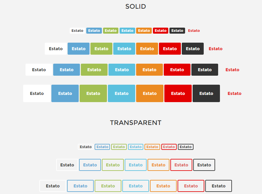
Buttons
Was this article helpful ?
Product Box
You can use one of the following types of product box:
- .ct-itemProducts
- .ct-itemProducts–small
- .ct-itemProducts–small-type1 (light style)
- .ct-itemProducts–small-type2 (dark style)
- .ct-itemProducts–boxed
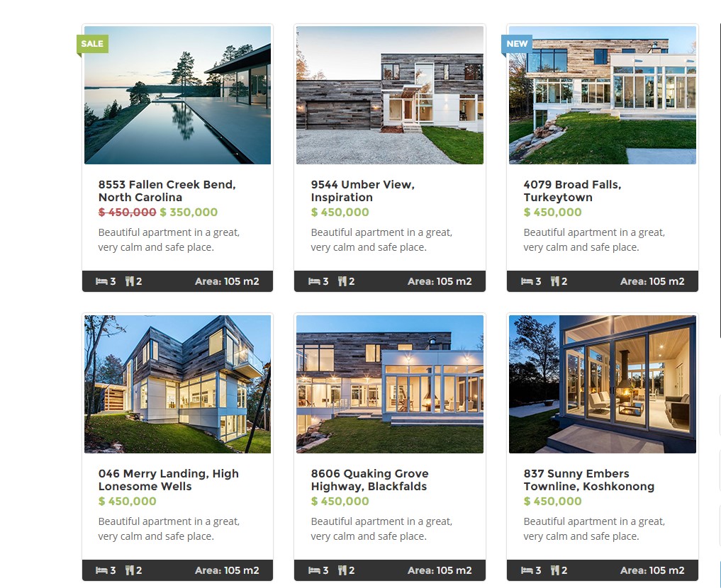
Product boxes
Use the following HTML markup to create a boxes:
|
1 2 3 4 5 6 7 8 9 10 11 12 13 14 15 16 17 18 19 20 21 22 23 24 25 26 27 28 29 30 31 32 33 34 35 36 37 38 39 40 41 42 43 44 45 46 47 48 49 50 51 52 53 54 55 56 57 58 59 60 61 62 63 64 65 66 67 68 69 70 71 72 73 74 75 76 77 78 79 80 81 82 83 84 85 86 87 88 89 90 91 92 93 94 95 |
<div class="ct-itemProducts ct-u-marginBottom30 ct-hover"> <label class="control-label sale"> Sale </label> <a href="product-single.html"> <div class="ct-main-content"> <div class="ct-imageBox"> <img src="assets/images/demo-content/property-1.jpg" alt=""><i class="fa fa-eye"></i> </div> <div class="ct-main-text"> <div class="ct-product--tilte"> 15421 Southwest 39th Terrace </div> <div class="ct-product--price"> <span class="ct-price--Old">$ 450,000</span> <span>$ 350,000</span> </div> <div class="ct-product--description"> Beautiful apartment in a great, very calm and safe place. </div> </div> </div> <div class="ct-product--meta"> <div class="ct-icons"> <span> <i class="fa fa-bed"></i> 3 </span> <span> <i class="fa fa-cutlery"></i> 2 </span> </div> <div class="ct-text"> <span> Area: <span>105 m2</span></span> </div> </div> </a> </div> ------------------------------ <div class="ct-itemProducts--small ct-itemProducts--small-type1"> <a href="product-single.html"> <div class="ct-main-content"> <div class="ct-imageBox"> <img src="assets/images/demo-content/recently-reduced-thumbnail-1.jpg" alt=""> </div> <div class="ct-main-text"> <div class="ct-product--tilte"> 15421 Southwest 39th Terrace </div> <div class="ct-product--price"> <span class="ct-price--Old">$ 450,000</span> <span>$ 390,000</span> </div> </div> </div> </a> </div> ------------------------------------ <div class="ct-itemProducts ct-u-marginBottom30 ct-hover ct-itemProducts--boxed"> <label class="control-label sale"> Sale </label> <a href="product-single.html"> <div class="ct-main-content"> <div class="ct-imageBox"> <img src="assets/images/demo-content/property-11.jpg" alt=""><i class="fa fa-eye"></i> </div> <div class="ct-main-text"> <div class="ct-product--tilte"> 15421 Southwest 39th Terrace </div> <div class="ct-product--price"> <span>$ 450,000</span> <span class="ct-price--Old">$ 500,000</span> </div> </div> </div> <div class="ct-product--meta"> <div class="ct-icons"> <span> <i class="fa fa-bed"></i> 3 </span> <span> <i class="fa fa-cutlery"></i> 2 </span> </div> <div class="ct-text"> <span> Area: <span>105 m2</span></span> </div> </div> </a> </div> |
Was this article helpful ?
Javascript
All javascripts are placed in folder /js. In main.js file we implement all functions calls.
This theme uses following Javascript scripts:
- 1. Media Sections
2. Datepicker – I use this for calendar widget in blog sidebar.
3. Gmaps
4. Headroom – Plugin for navbar options, same is in Diana.
5. Magnific Popup.
6. Pagescroller – Onepager navigation.
7. Owl Corusel – slider
8. Isotope – gallery categories sorting.
9. Select2 – overwrite a standard select.
10. Slider Bootstrap – amount slider.
11. Device.js – check what device we use.
12. Appear.js – check a status of element(is in viewport or not)
13. browser.js – check what browser we use
14. snap.js – snap event on mobile device
jquery.appear
This plugin call function when element appear in viewport. This is used in custom animation, progress bars, counter timer.
Documentation: https://github.com/bas2k/jquery.appear/
|
1 2 3 4 5 6 7 8 9 10 11 12 13 |
if (jQuery().appear) { if (device.mobile()) { // disable animation on mobile jQuery("body").removeClass("withAnimation"); } else { jQuery('.withAnimation .animated').appear(function () { jQuery(this).each(function () { jQuery(this).addClass('activate'); jQuery(this).addClass($(this).data('fx')); }); }, {accY: -150}); } } |
Was this article helpful ?
Custom Stylesheet (custom.css)
If you want to add a significant amount of custom CSS, the best method is to use a custom stylesheet.
1. Activate the custom stylesheet
In the UberMenu Control Panel, go to General Settings > Assets and activate the Load Custom Stylesheet settings.

This will load the custom/custom.css file after the UberMenu core and skin files, but before the Custom Tweaks from the settings.
2. Use Test custom stylesheet
In theme/assets/less/ubermenu/ you will find custom.css and custom.less files with UberMenu styles dedicated to use with the Test. We recommend you to copy custom.css file into plugins/ubermenu/custom directory.
3. Adding supplementary styles
If you would like to add additional styles to customize an existing skin, just start adding your custom CSS to the file.
4. Creating a complete custom skin
If you want to create a completely customized skin, you will likely want to disable the existing skin in the UberMenu Control PanelMain UberMenu Configuration > Basic Configuration by setting the Skin to None (Disable)

If you would like a sample skin to begin working with, copy the custom-sample-skin.css file into your custom.css.
Was this article helpful ?
Chess slider

Chess slider
Create beautiful chess slider with the simple HTML markup:
|
1 2 3 4 5 6 7 8 9 10 11 12 13 14 15 16 17 18 19 20 21 22 23 24 25 26 27 28 29 30 31 32 33 34 35 36 37 |
<div class="ct-js-owl ct-chess-slider ct-sliderbuttons-bottom" data-animations="true" data-items="3" data-lgItems="2" data-mdItems="2" data-smItems="1" data-navigation="true" data-pagination="false" data-single="false"> <div class="item"> <div class="ct-u-displayTable"> <div class="ct-u-displayTableRow"> <div class="ct-u-displayTableCell"> <i class="fa fa-cog"></i> <p>Cleaning Green</p> </div> <div class="ct-u-displayTableCell"> Lorem ipsum tiouidoi lor siti amet, cosecim tetr aidip iscing etiui elita ei. </div> </div> <div class="ct-u-displayTableRow"> <div class="ct-u-displayTableCell"> <i class="fa fa-coffee"></i> <p>Carpet Cleaning</p> </div> <div class="ct-u-displayTableCell"> Lorem ipsum tiouidoi lor siti amet, cosecim tetr aidip iscing etiui elita ei. </div> </div> </div> </div> ... </div> |
You can easily change slider settings with the following CSS variations:
.ct-chess-slider – Type for chess slider. It indicates general display properties for the whole type of slider.
.ct-u-displayTableCell – Element displayed as ‘table-cell’.
.ct-u-displayTableRow – Element displayed as ‘table-row’.
.ct-sliderbuttons-top – Indicates position of buttons in the top of a slider. Buttons are placed on the far left and right side.
.ct-sliderbuttons-middle – Indicates position of buttons in the middle of a slider. Buttons are placed on the far left and right side.
.ct-sliderbuttons-bottom – Indicates position of buttons in the bottom of a slider. Buttons are placed on the far left and right side.
.ct-sliderbuttons-top2 – Parent class. Indicates position of buttons in the top of a slider.Buttons are attached to each other.
.ct-sliderbuttons-bottom2 – Parent class. Indicates position of buttons in the bottom of a slider.Buttons are attached to each other.
.ct-sliderbuttons-top2–left – Descendant class.Buttons are placed on the top-left of a slider.
.ct-sliderbuttons-top2–middle – Descendant class. Buttons are place on the top-middle of a slider.
.ct-sliderbuttons-top2–right – Descendant class. Buttons are place on the top-right of a slider.
Was this article helpful ?
Gallery Slider
Gallery slider
Use the following HTML markup to insert slider:
|
1 2 3 4 5 6 7 8 9 10 11 12 13 14 15 16 17 18 19 20 21 22 23 24 25 26 27 28 29 30 31 32 |
<div class="ct-gallery-slider"> <div class="ct-gallery"> <div class="ct-js-owl ct-sliderbuttons-middle" data-animations="true" data-items="5" data-navigation="true" data-pagination="false" data-single="false"> <div> <div class="ct-galleryBox ct-galleryBox--type2 ct-galleryBox--primary"> <a href="../assets/images/cleaning/slider-gallery/row1/1.png" class="ct-js-magnificPopupImage"> <img src="../assets/images/cleaning/slider-gallery/row1/1.png" alt="Zappy"> </a> <div class="ct-galleryBox-overlay"> <div class="ct-u-displayTableVertical"> <div class="ct-u-displayTableCell"> <div class="ct-galleryBox-icons"> <a href="../assets/images/cleaning/TwoWomenCleaningCarpetGV1.png" class="ct-js-magnificPopupImage"> <div class="ct-galleryBox-overlayIcon"> <span>Quick View</span> </div> </a> </div> </div> </div> </div> </div> </div> </div> </div> |
You can modify slider settings using the following CSS classes for variations:
.ct-gallery-slider – Type for gallery slider. It indicates general display properties for the whole type of slider.
.ct-gallery,
.ct-galleryBox-icons,
.ct-js-magnificPopupImage.ct-galleryBox-overlay,
.ct-galleryBox–primary,
.ct-galleryBox-overlayIcon,
.ct-js-owl – Idicates owl-slider.
.ct-u-displayTableCell – Element displayed as ‘table-cell’.
.ct-galleryBox–type2 – Indicates gallery item properties.
.ct-galleryBox–primary – Indicates color for ‘.ct-galleryBox’ content.
.ct-u-displayTableVertical – Indicates element that acquires height 100% and every nested element in ‘display-cell’ mode is vertically aligned to ‘middle’.
.ct-sliderbuttons-top – Indicates position of buttons in the top of a slider. Buttons are placed on the far left and right side.
.ct-sliderbuttons-middle – Indicates position of buttons in the middle of a slider. Buttons are placed on the far left and right side.
.ct-sliderbuttons-bottom – Indicates position of buttons in the bottom of a slider. Buttons are placed on the far left and right side.
.ct-sliderbuttons-top2 – Parent class. Indicates position of buttons in the top of a slider.Buttons are attached to each other.
.ct-sliderbuttons-bottom2 – Parent class. Indicates position of buttons in the bottom of a slider.Buttons are attached to each other.
.ct-sliderbuttons-top2–left – Descendant class.Buttons are placed on the top-left of a slider.
.ct-sliderbuttons-top2–middle – Descendant class. Buttons are place on the top-middle of a slider.
.ct-sliderbuttons-top2–right – Descendant class. Buttons are place on the top-right of a slider.
Was this article helpful ?
Welcome visitor

Welcome Visitor
Create Welcome! section with the simple HTML markup:
|
1 2 3 4 5 6 7 8 9 10 11 12 13 14 15 16 17 18 19 20 21 22 23 24 25 26 27 28 29 30 |
<section class="ct-js-section ct-advert ct-u-marginTop70" data-bg-color="f5f6f9"> <div class="container"> <div class="row"> <div class="col-sm-7"> <div class="ct-u-paddingTop130"> <a class="h1 ct-u-colorPrimary">Welcome Visitor!</a> </div> <p class="h4 ct-u-paddingTop30">Professional Cleaning Services for You</p> <p class="ct-u-paddingBoth40"> Proin rhoncus rhoncus dictum. Curabitur eget mauris sit amet justo euismod hendrerit sed etuiu etami orci. Suspendisse ac risus turpis. Integer convallis sed erat consectetur. </p> <a class="btn btn-lg btn-default ct-u-marginBottom110 animated" data-fx="fadeInUp" href="#"><span>Learn more</span> <i class="fa fa-location-arrow"></i> </a> </div> <div class="ct-u-imgWrapper"> <img src="../assets/images/demo-content/cleaning/welcomevisitor-img.png" alt=""> </div> </div> </div> </section> |
Was this article helpful ?
Worksample slider

Worksample slider
Create a slider with the simple HTML markup:
|
1 2 3 4 5 6 7 8 9 10 11 12 13 14 15 16 17 18 19 20 21 22 23 24 25 26 27 28 29 30 31 32 33 34 35 36 37 38 39 40 |
<div class="ct-worksample"> <div class="col-lg-3"> <div class="ct-worksample-sidebar"> <h3 class="ct-u-hrLeft">Sampels of my work</h3> <p> Our values are knowledge, professionalism, safety, and efficiency. Our goal is to not only help you build and/or repair your home, but to make the process very easy and affordable for you. We are a company with a wide range of experience. </p> <a class="btn btn-lg btn-transparent" href="#">View Project <i class="fa fa-location-arrow"></i> </a> </div> </div> <div class="col-lg-9"> <div class="ct-js-owl ct-worksample-slider" data-animations="true" data-items="3" data-navigation="true" data-pagination="false" data-single="false" data-lgItems="3"> <!------------------------------------------------------------------------------------------------------------------------> <div class="item"> <img src="../assets/images/cleaning/worksample-slider/OwlTwoWomenCleaningCarpet.png"> <div class="ct-u-displayTable"> <h5 class=" ct-u-marginBottom50">Water, drain and gas systems (repipes)</h5> <a class="btn btn-lg btn-transparent" href="#">View Project <i class="fa fa-location-arrow"></i> </a> </div> </div> ... </div> </div> </div> |
You can select between two variations:
.ct-worksample-sidebar,
.ct-worksample-slider.
Was this article helpful ?
Table
We prepared custom tables with simple HTML markup:
|
1 2 3 4 5 6 7 8 9 10 11 12 13 14 |
<div class="ct-schedule"> <div class=">Opening Hours</div> <div class="ct-u-displayTable"> <div class="ct-u-displayTableRow--equal"> <div class="ct-u-displayTableCell">Mon</div> <div class="ct-u-displayTableCell text-right">8.00am - 6.30pm</div> </div> ... </div> </div> |
Opening Hours table
Was this article helpful ?
Icon Box
There are two main types of icon boxes:
Default
– can be created with class .ct-iconBox, used in the following markup:
|
1 2 3 4 5 6 7 8 9 10 11 12 13 14 15 16 17 18 19 |
<div class="ct-iconBox ct-iconBox--mid"> <a class="ct-iconBox-icon ct-iconBox-icon--verylarge ct-iconBox-icon--circle ct-iconBox-icon--dark ct-u-marginBottom30"> <i class="fa fa-truck"></i> </a> <div class="ct-iconBox-content"> <h6 class="ct-iconBox-title ct-fw-600 ct-u-paddingBottom20"> Plumbing & Installation </h6> <p class="ct-u-paddingBottom30"> Praesent at porttitor mi. Inteu ger convallis gravida arcu auc hendrerit vivamus. </p> <a class="btn btn-lg btn-primary" href="#">Learn More <i class="fa fa-location-arrow"></i> </a> </div> </div> |
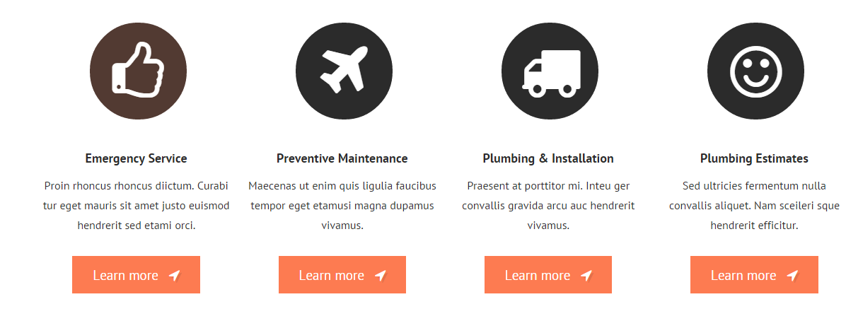
Default icon boxes
Secondary
– can be created with the class .ct-iconBox–secondary, used in the following HTML markup:
|
1 2 3 4 5 6 7 8 9 |
<div class="ct-iconBox ct-iconBox--secondary ct-iconBox-icon--dark"> <i class="fa fa-headphones"></i> <div class="pull-right ct-u-paddingTop50"> <span class="">Plumbing Emergency</span> <h2 class="ct-u-hrLeft ct-u-paddingTop10">We’re available 24/7.</h2> <h6 class="text-uppercase ct-u-paddingBoth20">Call service zappy today</h6> There <span>-(12) 345-6789</span> </div> </div> |
Secondary icon boxes
Both types can be also adjusted with the following CSS variations:
.ct-iconBox-icon,
.ct-iconBox–default,
.ct-iconBox-title,
.ct-iconBox–mid,
.ct-iconBox-icon–verylarge,
.ct-iconBox–left,
.ct-iconBox-content,
.ct-iconBox-icon–dark,
Was this article helpful ?
Navigation bar
Navigation bar can be created with the simple HTML markup:
|
1 2 3 4 5 6 7 8 9 10 11 12 13 14 15 16 17 |
<section class="header ct-topBar"> ... <nav class="navbar" role="navigation"> <li role="presentation" class="dropdown"> <a class="dropdown-toggle" role="button" aria-expanded="true" href="index.html">Home</a> <ul class="dropdown-menu ct-dropdown-menu"> <li> <ul class="list-unstyled"> <li><a href="#">Lorem ipsum</a></li> ... </ul> </li> </ul> </li> </nav> ... </section> |
Was this article helpful ?
Buttons
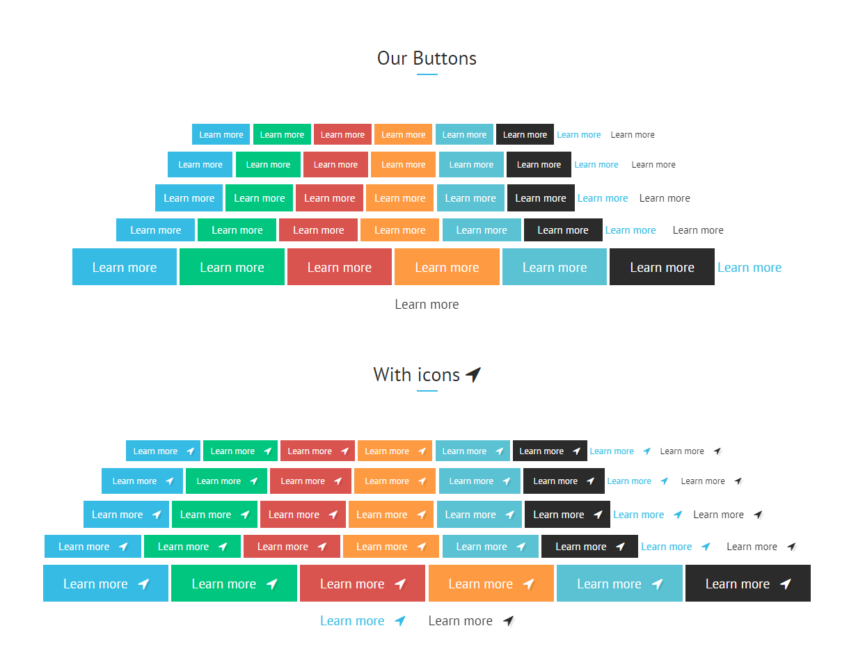
Buttons
Dozens of variations to select any button you want! Use the simple HTML markup:
|
1 2 3 4 5 6 |
<a class="btn btn-lg btn-primary pull-left" href="#"> <span> Learn More </span> <i class="fa fa-location-arrow"></i> </a> |
And adjust button appearance with the following variations:
- .btn-primary,
- .btn-success,
- .btn-danger,
- .btn-warning,
- .btn-white,
- .btn-info,
- .btn-transparent,
- .btn-default,
- .btn-lg,
- .btn-sm,
- .btn-xs,
Was this article helpful ?
Gallery

Gallery
Create beautiful gallery of your works. Filter your pictures by Categories with Isotope.
If you want to use isotope filters – please add the following markup above your gallery container:
|
1 2 3 4 5 6 7 8 9 |
<div class="ct-gallery-filters-container"> <ul class="ct-gallery-filters list-unstyled"> <li><a data-filter="*" class="">All</a></li> <li><a data-filter=".furnaces" class="">Furnaces</a></li> <li><a data-filter=".boilers" class="">Boilers</a></li> <li><a data-filter=".fireplaces" class="">Fireplaces</a></li> <li><a data-filter=".controls" class="">Controls</a></li> </ul> </div> |
Than create your gallery:
|
1 2 3 4 5 6 7 8 9 10 11 12 13 14 15 16 17 18 19 20 21 22 23 24 25 26 27 28 29 30 31 |
<div id="ct-gallery" class="ct-gallery ct-gallery--col4 ct-gallery--withSpacing"> <!-- gallery item starts here --> <div class="ct-gallery-item ct-gallery-item--masonry ct-gallery-item--default hidden ct-gallery-item--normal controls"> <div class="ct-gallery-itemInner"> <div class="ct-galleryBox ct-galleryBox--type2 ct-galleryBox--primary"> <div class="ct-galleryBox-image"> <a href="./assets/images/demo-content/construction/gallery-v1-1row1-large.jpg" class="ct-js-magnificPopupImage"> <img src="./assets/images/demo-content/construction/gallery-v1-1row1.jpg" alt="Zappy"> </a> </div> <div class="ct-galleryBox-overlay"> <div class="ct-u-displayTableVertical"> <div class="ct-u-displayTableCell"> <div class="ct-galleryBox-icons"> <a href="./assets/images/demo-content/construction/gallery-v1-1row1-large.jpg" class="ct-js-magnificPopupImage"> <div class="ct-galleryBox-overlayIcon"> <span>Quick View</span> </div> </a> </div> </div> </div> </div> </div> </div> <!-- gallery item ends here --> </div> |
If you want to assign portfolio item to a particular filter add the corresponding class to portfolio item.

Isotope filter class
You can use several variations for main gallery container:
- .ct-gallery,
- .ct-gallery–col4,
- .ct-gallery–withSpacing,
- .ct-gallery–col7 – enable to display 7 gallery items in a row.
Remember to attach the following JS files to your gallery page:
|
1 2 3 |
<script src="../assets/js/portfolio/jquery.isotope.min.js"></script> <script src="../assets/js/portfolio/imagesloaded.js"></script> <script src="../assets/js/portfolio/init.js"></script> |
Was this article helpful ?
Call To Action

Call to action
Create Call To Action box with simple HTML markup:
|
1 2 3 4 5 6 7 8 9 10 11 12 |
<section class="ct-js-section" data-bg-color="2b2b2b"> <div class="row"> <div class="col-md-12 text-center"> <a class="h3 ct-u-hrLeft ct-u-colorWhite" href="#"> <div class="ct-u-paddingBoth40"> Ways to save money, courtesy of Zappy Cleaning Service Company! <i class="fa fa-location-arrow"></i> </div> </a> </div> </div> </section> |
You can choose between the following text variations classes:
- .ct-u-hrLeft,
- .ct-u-hrMid,
- .ct-u-hrRight
Was this article helpful ?
Gallery Item
Inside your Isotope Gallery you can put as many gallery items as you want. Just use the following HTML markup for every item:
|
1 2 3 4 5 6 7 8 9 10 11 12 13 14 15 16 17 18 19 20 21 22 23 24 25 26 27 28 29 30 |
<!--GALLERY ITEM--> <div class="ct-gallery-item ct-gallery-item--masonry ct-gallery-item--default hidden ct-gallery-item--normal controls"> <div class="ct-gallery-itemInner"> <div class="ct-galleryBox ct-galleryBox--type2 ct-galleryBox--primary"> <div class="ct-galleryBox-image"> <a href="../assets/images/cleaning/TwoWomenCleaningCarpetGV1.png" class="ct-js-magnificPopupImage"> <img src="../assets/images/cleaning/TwoWomenCleaningCarpetGV1.png" alt="Zappy"> </a> </div> <div class="ct-galleryBox-overlay"> <div class="ct-u-displayTableVertical"> <div class="ct-u-displayTableCell"> <div class="ct-galleryBox-icons"> <a href="../assets/images/cleaning/TwoWomenCleaningCarpetGV1.png" class="ct-js-magnificPopupImage"> <div class="ct-galleryBox-overlayIcon"> <span>Quick View</span> </div> </a> </div> </div> </div> </div> </div> </div> </div> |
Gallery Item
You can select between several different options to change your gallery items appearance, just use combination of the following variations:
- .ct-gallery-item,
- .ct-gallery-item–masonry,
- .ct-gallery-item–default hidden,
- .ct-gallery-item–normal,
- .controls,
- .ct-gallery-itemInner,
- .ct-galleryBox,
- .ct-galleryBox–type2,
- .ct-galleryBox–primary,
- .ct-galleryBox-image,
- .ct-galleryBox-overlay,
- .ct-galleryBox-icons,
- .ct-galleryBox-overlayIcon
Remember to attach the following JS files:
|
1 2 |
<script src="../assets/js/magnific-popup/jquery.magnific-popup.min.js"></script> <script src="../assets/js/magnific-popup/init.js"></script> |
Was this article helpful ?
Tabs
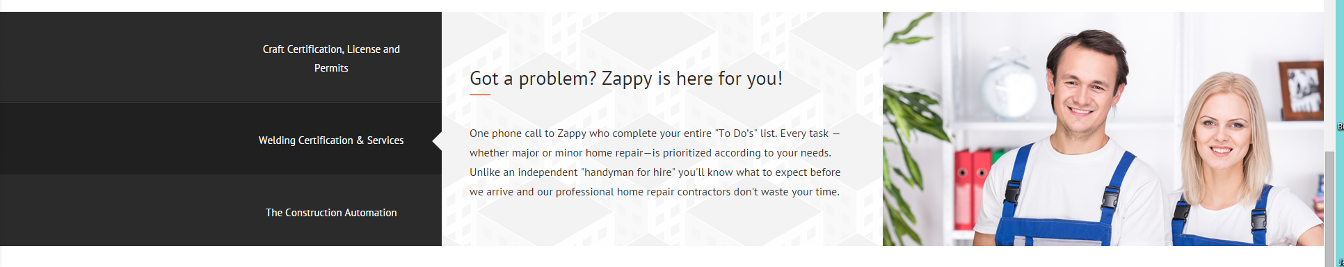
Tabs
Our tabs are created on Bootstrap tabs basis. You can use them with the following HTML markup:
|
1 2 3 4 5 6 7 8 9 10 11 12 13 14 15 16 17 18 19 20 21 22 23 24 25 26 27 28 29 30 31 32 33 34 35 36 37 38 39 40 41 42 43 44 45 46 47 48 49 50 51 52 53 54 55 56 57 58 59 60 61 62 63 64 65 66 67 |
<div class="ct-tab-wrapper" data-bg-color="ffffff" data-bg-image="../assets/images/cleaning/pattern.png"> <div class="row"> <div class="col-xs-12 col-sm-4 col-md-3"> <ul class="nav nav-tabs"> <li class="active"> <a href="#a" data-toggle="tab"> Woodwork washing (doors, windowsills, cabinets) <div class="ct-u-extender"></div> </a> </li> <li> <a href="#b" data-toggle="tab"> Interior appliance cleaning <div class="ct-u-extender"></div> </a> </li> <li> <a href="#c" data-toggle="tab"> Carpet & upholstery cleaning <div class="ct-u-extender"></div> </a> </li> </ul> </div> <div class="col-xs-12 col-sm-8 col-md-9"> <div class="tab-content"> <div class="tab-pane fade active in" id="a"> <h3 class="tab-pane-title ct-u-hrLeft ct-u-autoAlignment--center"> Zappy is ready to fix all your problems! </h3> <p class="tab-pane-text"> One phone call to Zappy who complete your entire "To Do’s" list. Every task —whether major or minor home repair—is prioritized according to your needs. Unlike an independent "handyman for hire" you'll know what to expect before we arrive and our professional home repair contractors don't waste your time. </p> </div> <div class="tab-pane fade" id="b"> <p class="tab-pane-text"> Secondo sed ac orci quis tortor imperdiet venenatis. Duis elementum auctor accumsan. Aliquam in felis sit amet augue. </p> </div> <div class="tab-pane fade" id="c"> <p class="tab-pane-text"> Thirdamuno, ipsum dolor sit amet, consectetur adipiscing elit. Duis pharetra varius quam sit amet vulputate. Quisque mauris augue, molestie tincidunt condimentum vitae. </p> </div> </div> </div> </div> <!-- /row --> </div> |
Was this article helpful ?
Testimonials
There are several types of available Testimonials.
Sidebar Widget
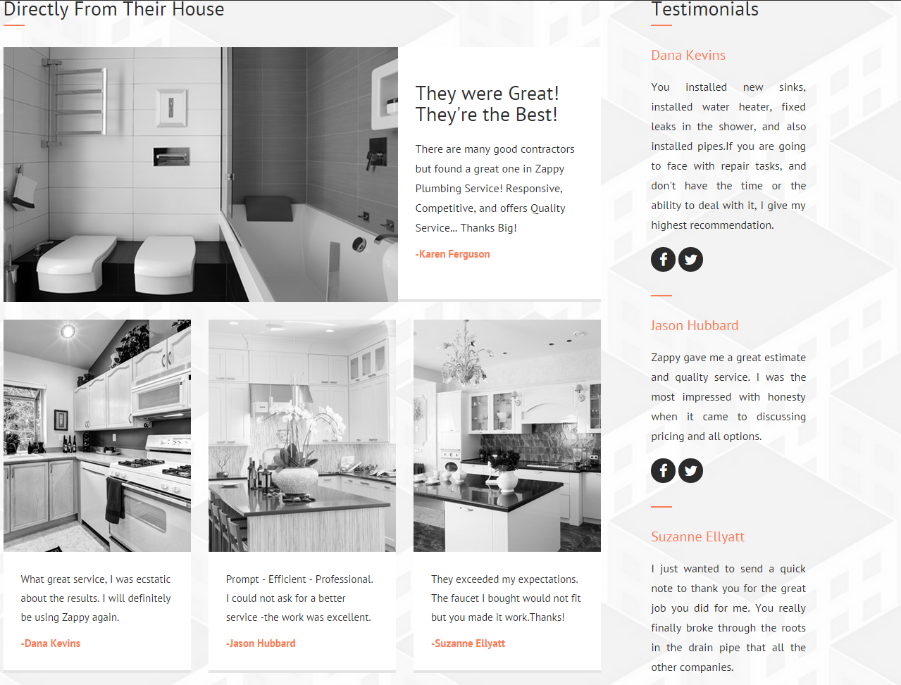
Testimonial widget
HTML markup:
|
1 2 3 4 5 6 7 8 9 10 11 12 13 14 15 16 17 18 19 20 21 22 23 |
<div class="ct-testimonial-sidebar ct-u-autoAlignment--center"> <h3 class="ct-u-hrLeft ct-u-autoAlignment--center">Testimonials</h3> <div class="ct-testimonial-sidebar-item ct-u-hrLeft"> <h5>Dana Kevins</h5> <p>You installed new sinks, installed water heater, fixed leaks in the shower, and also installed pipes.If you are going to face with repair tasks, and don't have the time or the ability to deal with it, I give my highest recommendation. </p> <div class="ct-socialIcon-wrapper ct-u-autoAlignment--center"> <a href="https://www.facebook.com/createITpl" class="ct-socialIcon ct-socialIcon-circle"><i class="fa fa-facebook"></i></a> <a href="https://twitter.com/createitpl" class="ct-socialIcon ct-socialIcon-circle"><i class="fa fa-twitter"></i></a> </div> </div> ... </div> |
IMAGE TESTIMONIAL
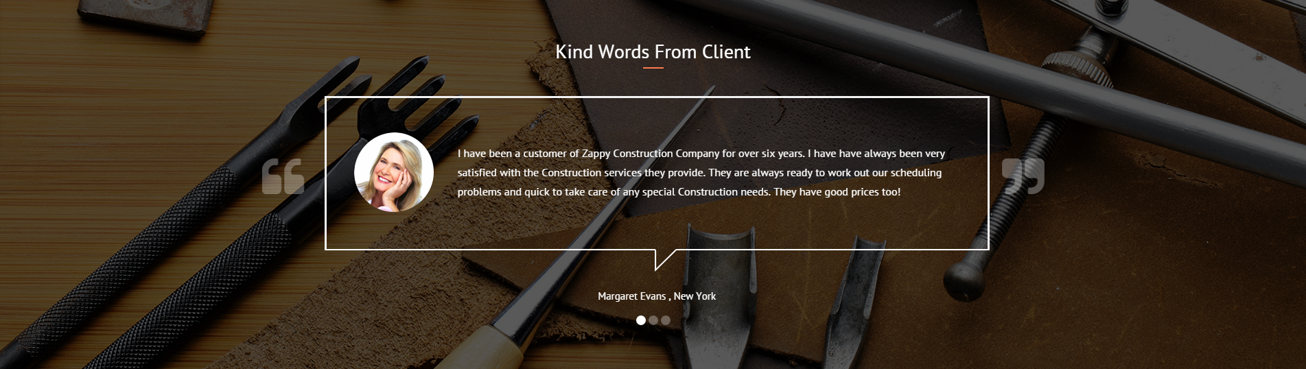
Image testimonial
HTML markup:
|
1 2 3 4 5 6 7 8 9 10 11 12 13 14 15 16 17 18 19 20 21 22 23 24 25 |
<div class="ct-testimonial"> <h3 class="ct-u-hrLeft ct-u-autoAlignment--center">Directly From Their House</h3> <div class="ct-testimonial-item"> <div class="ct-u-displayTable"> <div class="ct-u-displayTableCell"> <a href="#"><img src="../assets/images/cleaning/BathRoomTestimonialsBig.png"></a> </div> <div class="ct-u-displayTableCell ct-testimonial-item--inner"> <h3>They were Great!</h3> <h3>They're the Best!</h3> <p class="ct-u-paddingTop20"> There are many good contractors but found a great one in Zappy Plumbing Service! Responsive, Competitive, and offers Quality Service... Thanks Big! </p> <span>Karen Ferguson</span> </div> </div> </div> ... </div> |
PERSON BOXES TESTIMONIAL
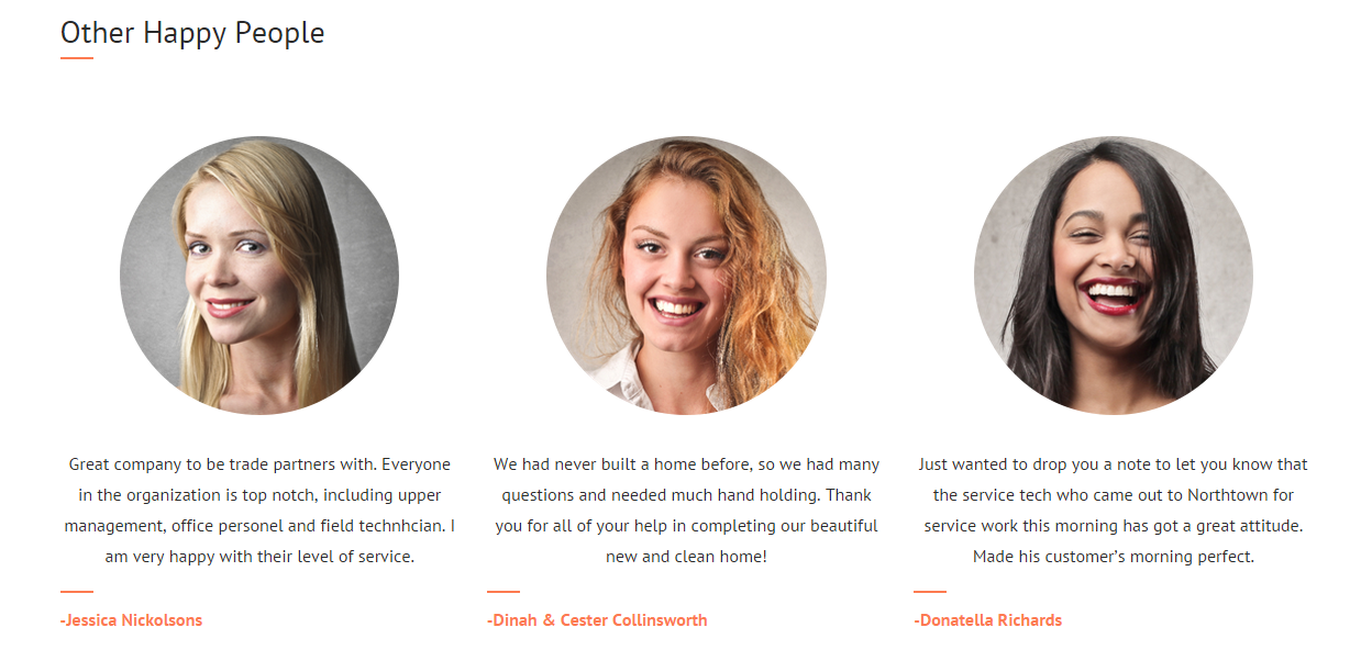
Testimonial with person boxes
HTML markup:
|
1 2 3 4 5 6 7 8 9 10 11 12 13 14 |
<div class="ct-personBox ct-personBox--testimonial"> <img class="ct-u-paddingBottom30" src="../assets/images/cleaning/PersonBox01Blonde.png" alt="Team Member 1"> <p class="ct-u-hrLeft text-justify"> Great company to be trade partners with. Everyone in the organization is top notch, including upper management, office personel and field technhcian. I am very happy with their level of service. </p> <p>Jessica Nickolsons</p> </div> |
Available CSS classes:
.ct-testimonial: Indicates testimonial’s display properties.
.ct-testimonial-item: Testimonial’s element;
.ct-testimonial-item–inner: Inner content of Testimonial’s element.
.ct-testimonial-sidebar: Indicates testimonial’s display properties for sidebar.
.ct-testimonial-sidebar-item: Testimonial’s sidebar item.
.ct-personBox–testimonial: person box for testimonials.
Was this article helpful ?
Event article

Event article
Use the following HTML markup to insert event article:
|
1 2 3 4 5 6 7 8 9 10 11 12 13 14 |
<article> <h6 class="ct-u-paddingBottom10">Recent Event</h6> <h1 class="ct-u-paddingBottom40"><a href="#">01/01/2015</a></h1> <p>Found a new fixture at Home Depot or Lowes but are not able to transport it home? We are here to help you. Just let us know which toilet, water heater, faucet you want and we will purchase it. </p> <a class="btn btn-lg btn-default" href="#"><span>Learn more</span> <i class="fa fa-location-arrow"></i> </a> </article> |
Available CSS classes:
- .ct-articleBox : Indicates display properties for an article element.
- .ct-articleBox–default : Default display properties.
- .ct-articleBox-media : An article media like images or video.
- .ct-articleBox-description : Article’s description.
Was this article helpful ?
Custom post types
Test comes with number of custom post type, for example:
- portfolio items,
- faq items,
- galleries,
For the correct operation of Test you have to install and activate dedicated for custom post types plugin:
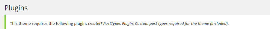
custom post types
With these plugins your custom post types will be saved in your admin panel, even if you change your WordPress theme.
Notice: Plugin must be installed and activated right after you install and activate the Test – otherwise you might be encountered problems with correct theme functioning.
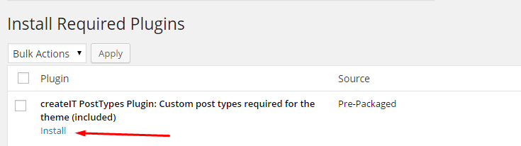
Install the plugin
Was this article helpful ?
CSS Files and Structure
If you would like to edit the color, font, or style of any elements, just do the following:
|
1 |
#primaryContent a {color: #someColor;} |
If you find that your new style is not overriding, it is most likely because of a specificity problem. Scroll down in your CSS file and make sure that there isn’t a similar style that has more weight.
I.E.
|
1 |
#wrap #primaryContent a {color: #someColor;} |
So, to ensure that your new styles are applied, make sure that they carry enough “weight” and that there isn’t a style lower in the CSS file that is being applied after yours.
Colors
The theme includes a css file wich you can use to edit the colors.
You just need to add the corresponding CSS file to the head of the page like this:
|
1 2 3 4 5 |
<head> (..) <link rel="stylesheet" type="text/css" href="css/motive.css"> (..) </head> |
Main Menu structure
|
1 2 3 4 5 6 7 8 9 10 11 12 13 |
<nav class="navbar"role="navigation"> <li role="presentation"class="dropdown"> <a class="dropdown-toggle"role="button"aria-expanded="true"href="index.html">Home</a> <ul class="dropdown-menu ct-dropdown-menu"> <li> <ul class="list-unstyled"> <li><a href="#">Lorem ipsum</a></li> ... </ul> </li> </ul> </li> </nav> |
Just change brand name, upload your logo to images/content/ folder and you’re ready to go!
In order to create mega menus read the documentation here:
Icons
We’ve included 360+ font icons.
Awesome Icons – http://fontawesome.io/icons/
HTML markup:
|
1 2 |
<!-- Awesome Icons --> <i class="fa fa-cog"></i> |
Appearing with Animation when element in viewport
Animation can be turn off just be remove “withAnimation” class from body.
Usage:
– add “animated” class to element and data-fx=”animation-type”. That’s it.
Available animation : http://daneden.github.io/animate.css/
- data-fx=”hinge”
- data-fx=”bounce”
- data-fx=”flash”
- data-fx=”pulse”
- data-fx=”shake”
- data-fx=”swing”
- data-fx=”tada”
- data-fx=”wobble”
- data-fx=”bounceIn”
- data-fx=”bounceInDown”
- data-fx=”bounceInLeft”
- data-fx=”bounceInRight”
- data-fx=”bounceInUp”
- data-fx=”bounceOut”
- data-fx=”bounceOutDown”
- data-fx=”bounceOutLeft”
- data-fx=”bounceOutRight”
- data-fx=”bounceOutUp”
- data-fx=”fadeIn”
- data-fx=”fadeInDown”
- data-fx=”fadeInDownBig”
- data-fx=”fadeInLeft”
- data-fx=”fadeInLeftBig”
- data-fx=”fadeInRight”
- data-fx=”fadeInRightBig”
- data-fx=”fadeInUp”
- data-fx=”fadeInUpBig”
- data-fx=”fadeOut”
- data-fx=”fadeOutDown”
- data-fx=”fadeOutDownBig”
- data-fx=”fadeOutLeft”
- data-fx=”fadeOutLeftBig”
- data-fx=”fadeOutRight”
- data-fx=”fadeOutRightBig”
- data-fx=”fadeOutUp”
- data-fx=”fadeOutUpBig”
- data-fx=”flip”
- data-fx=”flipInX”
- data-fx=”flipInY”
- data-fx=”flipOutX”
- data-fx=”flipOutY”
- data-fx=”lightSpeedIn”
- data-fx=”lightSpeedOut”
- data-fx=”rotateIn”
- data-fx=”rotateInDownLeft”
- data-fx=”rotateInDownRight”
- data-fx=”rotateInUpLeft”
- data-fx=”rotateInUpRight”
- data-fx=”rotateOut”
- data-fx=”rotateOutDownLeft”
- data-fx=”rotateOutDownRight”
- data-fx=”rotateOutUpLeft”
- data-fx=”rotateOutUpRight”
- data-fx=”slideInDown”
- data-fx=”slideInLeft”
- data-fx=”slideInRight”
- data-fx=”slideOutLeft”
- data-fx=”slideOutRight”
- data-fx=”slideOutUp”
- data-fx=”rollIn”
- data-fx=”rollOut”
CSS Files & Structure
We’ve included 2 files.
bootstrap.css contains Bootstrap 3 Library.
style.css file contains general styles.
1.IMPORTS
2.VARIABLES
3.SWITCHER
4.HEADER AND GENERAL SETTINGS
5.TESTIMONIALS
6.SERVICES
7.PRICING PLAN
8.404 AND PAGE TITLE
9.MAINTENANCE
10.ACCORDION
11.ARTICLES
12.BLOG
13.BLOG WIDE & MASONRY
14.BLOG WIDE
15.BLOG MASONRY
16.PAGINATION
17.PERSON BOX
18.SPECIAL OFFERS
19.FOOTER
20.SOCIAL ICONS
21.ICON BOX
22.SECONDARY ICONBOX
23.GALLERY
24.ADVERT
25.GOOGLE MAP
26.CONTACT DETAILS
27.SERVICE ICON
28.EXCEPTIONAL QUALITY
29.OUR HISTORY
30.POPULAR TIPS
31.CALL TO ACTION
32.SCHEDULE TABLE
33.ANIMATION
34.VIDEO
35.FEATURES
36.CHARTS
Utilities
Utility classes are low-level structural and positional traits. Utilities can be applied directly to any element, multiple utilities can be used together and utilities can be used alongside component classes.
Utilities are intended for frequently used CSS properties and patterns, like: floats, containing floats, vertical alignment, text truncation. Relying on utilities can help to reduce repetition and provide consistend implementations.
Was this article helpful ?
Javascript Components
All javascripts are placed in folder /js. In main.js file we implement all functions calls.
This theme uses following Javascript files:
- js/charts/init.js – chart display.
- js/countdown/jquery.mb-comingsoon.min.js – Date counter (e.g. ‘Under Maintenance’ page)
- js/counter/init.js,
- js/counter/jquery.countTo.js – Counter display.
- js/ct-mediaSection/init.js,
- js/ct-mediaSection/jquery.frogaloop.min.js,
- js/ct-mediaSection/jquery.stellar.min.js – Media section preformance.
- js/gmaps/init.js,
- js/gmaps/gmap3.min.js – Google maps display.
- js/magnific-popup/init.js,
- js/magnific-popup/jquery.magnific-popup.min.js – portfolio item display.
- js/owl/init.js,
- js/owl/owl.carousel.js – Owl carousel.
- js/portfolio/init.js,
- js/portfolio/imagesloaded.js,
- js/portfolio/jquery.isotope.min.js – Portfolio performance.
- js/progressbars/init.js – Progress bars display.
- js/progressicons/init.js – Progress icons performance.
- js/jquery.stellar.min.js,
- js/init.js – Parallax effect.
- js/device.min.js,
- js/snap.min.js,
- js/jquery.appear.js – Menu in mobile devices.
- bootstrap/js/bootstrap.min.js – compiled bootstrap plugin.
- js/less.min.js – less compilation.
- js/placeholder.min.js – old browsers support for placeholders.
- js/easing.1.3.js – easing animations.
- js/browser.min.js – browser identification.
Google Map (GMAP3 Plugin)
This is google map with custom marker, you can define couple parameters:
- data-location – address to show
- data-height – map height (if undefined height will be 220px)
- data-offset – by how many map should be repositioned from marker center point (default -30)
It uses gmap3 plugin.
Documentation: here
HTML Markup:
|
1 |
<div class="ct-googleMap" data-location="Narbutta 24, Warsaw" data-zoom="15" data-height="500"></div> |
All javascript code can be found in js/main.js file.
jquery.appear
This plugin call function when element appear in viewport. This is used in custom animation, progress bars, counter timer.
Documentation: https://github.com/bas2k/jquery.appear/
|
1 2 3 4 5 6 7 8 9 10 11 12 13 |
if (jQuery().appear) { if (device.mobile()) { // disable animation on mobile jQuery("body").removeClass("withAnimation"); } else { jQuery('.withAnimation .animated').appear(function () { jQuery(this).each(function () { jQuery(this).addClass('activate'); jQuery(this).addClass($(this).data('fx')); }); }, {accY: -150}); } } |
Charts.js
This plugin is used to make graphics.
Documentation: http://www.chartjs.org/
Was this article helpful ?
Icon Boxes
We prepared for you three types of icon boxes.
Type 1
Icon Box – type 1
HTML markup:
|
1 2 3 4 5 6 7 8 |
<div class="ct-iconBox media ct-u-marginBottom50"> <div class="h3 ct-iconBox-icon media-left"><small><i class="fa fa-wrench"></i></small></div> <div class="ct-iconBox-content media-body"> <h6 class="ct-iconBox-header ct-u-hr ct-u-hr--left">Our cars work great</h6> <p>Lorem ipsum dolor sit amet, consectetur adipiscing elit. Duis tincidunt quis tortor non lobortis. Suspendisse a lacus luctus, luctus libero sed, vulputate est. Donec elementum.</p> </div> </div> |
Type 2
Icon Box type 2
HTML markup:
|
1 2 3 4 5 6 7 8 |
<div class="ct-iconBox ct-iconBox--type2 ct-u-marginBottom80"> <div class="h2 ct-iconBox-icon"><small><i class="fa fa-map-marker"></i></small></div> <div class="ct-iconBox-content"> <h6 class="ct-iconBox-header ct-u-hr ct-u-hr--center">Choose your destination</h6> <p>Lorem ipsum dolor sit amet, consecte adipis suspendisse ma condimentum mau porttitor met mauris, facerit phasellique certimus caesen.</p> <a href="#" class="btn btn-motive"><span>Read More</span></a> </div> </div> |
Type 3
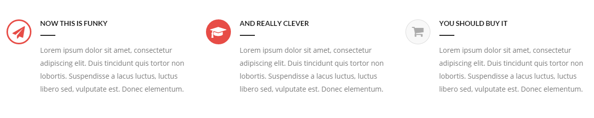
Icon Box – type 3
HTML markup:
|
1 2 3 4 5 6 7 8 |
<div class="ct-iconBox ct-iconBox--type3 media ct-u-marginBottom50"> <div class="h3 ct-iconBox-icon media-left"><small><i class="fa fa-send"></i></small></div> <div class="ct-iconBox-content media-body"> <h6 class="ct-iconBox-header ct-u-hr ct-u-hr--left">Now this is funky</h6> <p>Lorem ipsum dolor sit amet, consectetur adipiscing elit. Duis tincidunt quis tortor non lobortis. Suspendisse a lacus luctus, luctus libero sed, vulputate est. Donec elementum.</p> </div> </div> |
Was this article helpful ?
Person Box
Introduce the team with nice and simple person boxes!

Person Boxes
Use simple html markup, with Team Member picture, name, position and links to social media. Each element can be easily modified:
|
1 2 3 4 5 6 7 8 9 10 11 |
<div class="ct-personBox"> <div class="ct-personBox-image"><img src="../assets/images/demo-content/boats/person-02.jpg" alt=""/></div> <div class="ct-personBox-content"> <h6 class="ct-personBox-header">Jessica Dawson <small>sales manager</small></h6> <ul class="ct-socials"> <li><a data-toggle="tooltip" data-placement="top" title="pinterest" href="#"><i class="fa fa-pinterest"></i></a></li> <li><a data-toggle="tooltip" data-placement="top" title="facebook" href="#"><i class="fa fa-facebook-square"></i></a></li> <li><a data-toggle="tooltip" data-placement="top" title="twitter" href="#"><i class="fa fa-twitter"></i></a></li> </ul> </div> </div> |
Was this article helpful ?
Pricing Tables
Create multiple Pricing Tables with different color variations with the simple HTML markup:
|
1 2 3 4 5 6 7 8 9 10 11 12 13 14 15 16 17 18 19 20 |
<div class="ct-pricingBox ct-pricingBox--graydarker ct-u-marginBoth50"> <div class="ct-pricingBox-header"> <h2 class="ct-pricingBox-title ct-u-hr ct-u-hr--wide"><small>Funky Package</small></h2> <h2 class="ct-pricingBox-price"><b>$750</b></h2> <h6 class="ct-pricingBox-subtitle">Monthly</h6> </div> <svg viewBox="0 0 100 100" preserveAspectRatio="none"> <path d="M0,0 L 50,50 100,0 Z"/> </svg> <div class="ct-pricingBox-content"> <ul class="ct-pricingBox-list"> <li>T-shirt and toaster</li> <li>Rihanna's phone number</li> <li>Telepathic support</li> <li>Foldable time machine</li> <li>Real life undo button</li> </ul> </div> <a href="login.html" class="btn btn-lg btn-graydarker"><span>Sign Up Now</span></a> </div> |
If you would like to use table with different color replace ct-pricingBox--graydarker with one of the following CSS classes:
- ct-pricingBox–motive
- ct-pricingBox–gray
- ct-pricingBox–graylighter
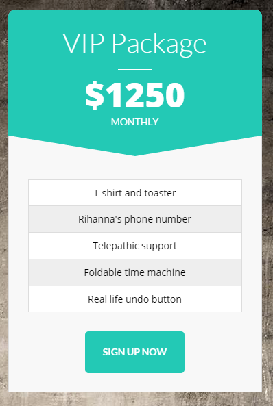
Was this article helpful ?
Accordions
With the Test you can use two types of accordions.
Accordions
Just use the followoing HTML markup:
|
1 2 3 4 5 6 7 8 9 10 11 12 13 14 15 16 |
<div class="panel-group ct-u-marginTop50" id="accordion"> <div class="panel panel-motive"> <div class="panel-heading"> <div class="panel-title"> <a class="h5 collapsed" data-toggle="collapse" data-parent="#accordion" href="#collapseOne"> <small>How easy is to launch this rocket ?</small> </a> </div> </div> <div id="collapseOne" class="panel-collapse collapse"> <div class="panel-body"> ... </div> </div> </div> </div> |
If you would like to change accordion style to the Second one
Accordion
Replace class .panel-motive from the markup above with panel-motive-o
Was this article helpful ?
Inputs
There are two types of inputs in Test:
Type 1
First type of inputs
HTML markup:
|
1 2 3 4 |
<div class="form-group"> <label for="first_name">First Name</label> <input id="first_name" class="form-control form-control--type2"> </div |
Type 2
Second type of inputs
HTML markup:
|
1 2 3 |
<div class="form-group ct-input--type2 ct-u-marginBottom20"> <input id="contact_name" placeholder="Name" type="text" required="" name="field[]" class="form-control" title="Name"> </div> |
Was this article helpful ?
Section Header
Use headers with separator to highlight your sections content.

Section header
HTML markup:
|
1 2 3 4 5 6 7 8 9 10 |
<div class="ct-sectionHeader"> <h2 class="ct-sectionHeader-title"><small>Awesome <span>header</span></small></h2> <div class="ct-sectionHeader-separator"> <span class="minus"></span> <span class="slash">/</span> <span class="slash">/</span> <span class="minus"></span> </div> <p>Aliquam lectus sem, semper in hendrerit eget, iaculis eu neque suspendisse pharetra</p> </div> |
Was this article helpful ?
Progress icons
Indicate progress a little bit different.
Progress icons
All parameters can be easily edited in simple HTML markup:
|
1 2 |
<div class="progress-icons" data-font-size="25" data-icon-color="#ffa500" data-active="17" data-total="18" data-icon="fa fa-tint" data-delay="200"></div> |
You can use the following data-attributes to change settings:
- data-font-size=”icon size in pixels”
- data-icon-color=”color of your active icons”
- data-active=”how many icons should be activated?”
- data-total=”number of all displayed icons”
- data-icon=”CSS class of Font Awesome icon, you want to use”
- data-delay=”how fast icon should be activated?”
Was this article helpful ?
Progress bars
Show the progress with clean and simple progress bars.
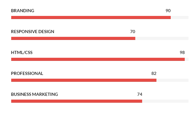
Progress bars
Use the simple HTML markup:
|
1 2 3 4 5 6 7 8 |
<div class="ct-progressBar"> <div class="ct-progressBar-name">Responsive Design</div> <div class="progress progress-motive"> <div class="progress-bar" role="progressbar" aria-valuenow="70" aria-valuemin="0" aria-valuemax="100"> <div class="ct-progressBar-tr">70</div> </div> </div> </div> |
Was this article helpful ?
Bar Charts
Present the statistics with HTML and Javascript bar charts.
Bar chart
Use the following HTML markup to initialize bar charts:
|
1 |
<div class="col-sm-3"><canvas id="barchart" height="250" width="300"></canvas></div> |
Bar Charts require the following scripts – don’t forget to attach them to HTML page:
|
1 2 3 4 5 6 7 8 9 10 11 12 13 14 15 16 17 18 19 20 21 22 23 24 25 26 27 28 29 30 31 32 33 34 35 36 |
<script src="../assets/js/charts/Chart.min.js"></script> <script src="../assets/js/charts/init.js"></script> <script> var randomScalingFactor = function () { return Math.round(Math.random() * 100) }; var barChartData = { labels: ["Samsung", "Nokia", "Motorola", "Sony", "Apple"], datasets: [ { fillColor: "#D0E0EB", strokeColor: "#D0E0EB", highlightFill: "#BBC9D3", highlightStroke: "#BBC9D3", data: [randomScalingFactor(), randomScalingFactor(), randomScalingFactor(), randomScalingFactor(), randomScalingFactor()] }, { fillColor: "#555", strokeColor: "#555", highlightFill: "#333", highlightStroke: "#333", data: [randomScalingFactor(), randomScalingFactor(), randomScalingFactor(), randomScalingFactor(), randomScalingFactor()] } ] }; window.onload = function () { var ctx1 = document.getElementById("barchart").getContext("2d"); window.myBar = new Chart(ctx1).Bar(barChartData, { responsive: true }); } </script> |
Here you will find more about Charts structure and options.
Was this article helpful ?
Pie Charts
Test comes with two types of pie charts.
Type 1
Pie Chart – type 1
HTML markup:
|
1 2 3 4 5 6 7 8 9 10 11 12 13 14 |
<div class="ct-graphBox ct-graphBox--default"> <div class="ct-graphBox-graph"> <canvas width="150" height="150" class="ct-js-pieChart" data-ct-percentage="100" data-ct-middleSpace="95" data-ct-secondColor="#ddd" data-ct-firstColor="#ff9673"></canvas> <span class="h2 ct-graphBox-number"><b>+2K</b></span> </div> <div class="ct-graphBox-content ct-u-paddingTop10"> <h6 class="ct-u-hr ct-u-hr--center text-uppercase text-center ct-fw-bold">happy customers</h6> <p class="text-center"> Aenean tristique, turpis id bla commodo, libero neque rhoncuse turpis, vel malesuada arcu tu. </p> </div> </div> |
Type 2 – Graph Box
Graph Box
HTML markup:
|
1 2 3 4 5 6 7 8 9 10 11 12 13 14 15 |
<div class="ct-graphBox ct-graphBox--type2"> <div class="ct-graphBox-graph"> <canvas width="150" height="150" class="ct-js-pieChart" data-ct-percentage="65" data-ct-middleSpace="95" data-ct-secondColor="#fff" data-ct-firstColor="#c25d7b"></canvas> <div class="ct-graphBox-graph-content"> <div class="ct-u-displayTableVertical"> <div class="ct-u-displayTableCell"> <div class="ct-graphBox-number">95<span>%</span></div> <h6 class="ct-graphBox-title">JAVASCRIPT</h6> </div> </div> </div> </div> </div> |
Remember to include the following scripts to your HTML page, otherwise pie charts won’t work correctly.
|
1 2 |
<script src="../assets/js/charts/Chart.min.js"></script> <script src="../assets/js/charts/init.js"></script> |
Was this article helpful ?
Counters
Test comes with two element with counting functions.
Counter
Counter
HTML markup:
|
1 2 3 4 5 |
<div class="ct-counterBox" data-color="#00c5f9"> <span class="ct-counterBox-number ct-js-counter" data-ct-to="279" data-ct-speed="50">0</span> <h6 class="ct-counterBox-title">Happy Clients</h6> <span class="ct-counterBox-icon"><i class="fa fa-heart-o"></i></span> </div> |
JS scripts:
|
1 2 |
<script src="../assets/js/counter/jquery.countTo.js"></script> <script src="../assets/js/counter/init.js"></script> |
Count Down
Count down
HTML markup:
|
1 |
<div id="ct-counter"></div> |
JS scripts:
|
1 2 3 4 |
<script src="../assets/plugins/mb-comingsoon/jquery.mb-comingsoon.min.js"></script> <script type="text/javascript"> $('#ct-counter').mbComingsoon({expiryDate: new Date(2015, 3, 24, 12, 40), speed: 950}); </script> |
Was this article helpful ?
Navbar
There are three color variations of navigation menu:
- navbar-default
- navbar-motive
- navbar-inverse
To use each of them you need to add proper class to: <nav class="">...</nav>

Navigation bar
|
1 2 3 4 5 6 7 8 9 10 11 12 13 14 15 16 17 18 19 20 21 22 23 24 25 26 27 28 29 30 31 32 33 34 35 36 37 38 39 40 41 42 43 44 45 46 47 48 49 50 51 52 53 54 55 56 |
<nav class="navbar navbar-default ct-navbar ct-shadow ct-shadow--type1"> <div class="navbar-header"> <a class="ct-logoDark" href="#"><img src="../assets/images/demo-content/logo.png" alt=""/></a> <a class="ct-logoWhite" href="#"><img src="../assets/images/demo-content/logo2.png" alt=""/></a> </div> <div class="container"> <div class="ct-navbarBox"> <a href="../cars/login.html" class="ct-login"><span>Login</span><i class="fa fa-lock"></i></a> <div class="ct-navbarBox-meta"> <div class="ct-navSearch-box"> <a class="ct-js-navSearch ct-navSearch" href="#"><i class="fa fa-search"></i></a> <div class="ct-navbar-search"> <form role="form"> <div class="form-group ct-input--type2"> <input id="searchM" required="" type="text" name="field[]" placeholder="Search website..." class="form-control"> <label for="searchM"><span>Search</span></label> <button class="ct-navbar-search-button" type="submit"> <i class="fa fa-search fa-fw"></i> </button> </div> </form> </div> </div> <div class="ct-langPicker"> <div class="ct-langPicker-content"> <a href="#"><img src="../assets/images/demo-content/flag-01.jpg" alt=""/></a> <ul class="ct-langPicker-list"> <li><a href="#">English <img src="../assets/images/demo-content/flag-01.jpg" alt=""/></a></li> <li><a href="#">Español <img src="../assets/images/demo-content/flag-03.jpg" alt=""/></a></li> <li><a href="#">Italiano <img src="../assets/images/demo-content/flag-02.jpg" alt=""/></a></li> </ul> </div> </div> </div> <button type="button" class="navbar-toggle"> <span class="sr-only">Toggle navigation</span> <span class="icon-bar"></span> <span class="icon-bar"></span> <span class="icon-bar"></span> </button> </div> <ul class="nav navbar-nav ct-navbar--fadeIn"> <li class="dropdown"><a href="box-icons.html"><div class="ct-textEffect"><span data-content="Boxes">Boxes</span></div></a> <ul class="dropdown-menu"> <li><a href="box-icons.html"><span>Icon Boxes</span></a></li> ... </ul> </li> </ul> </div> </nav> |
Was this article helpful ?
Buttons
Test comes with number of variations for buttons.
Buttons
Use simple HTML markup:
|
1 |
<a href="#" class="btn btn-motive"><span>Button</span></a> |
To change button color add one of the following classes after btn class:
- btn-motive
- btn-primary
- btn-warning
- btn-danger
- btn-info
- btn-success
- btn-graygraydarker
- btn-graylighter
- btn-inverse
- btn-default
If you would like to use button with transparent background and color only in border and text, add to the class, which defines color suffix -o, for example:
btn-motive-o
You can also change button size with the following classes:
- btn-xs
- btn-lg
Add btn-wide to create full width button.
Was this article helpful ?
Page Header

Page header
HTML markup:
|
1 2 3 |
<section class="ct-mediaSection ct-mediaSection--desktop ct-u-paddingTop60 ct-u-paddingBottom40" data-height="340" data-type="parallax" data-stellar-background-ratio="0.3" data-bg-image="../assets/images/demo-content/boats/mediaHeader-01.jpg" data-bg-image-mobile="../assets/images/demo-content/boats/mediaHeader-01.jpg"> <div class="ct-mediaSection-inner ct-mediaSection-inner--bottom" data-stellar-ratio="0.7"><h2 class="ct-fw-lighter ct-u-hr ct-u-hr--wide text-center">Header Parallax</h2></div> </section> |
Was this article helpful ?
Figure box
Figure box
Create image with caption with simple HTML markup:
|
1 2 3 4 5 6 |
<figure class="ct-figureBox"> <img src="../assets/images/demo-content/boats/rent-01.jpg" alt=""> <figcaption> <h2 class="ct-figureBox-header"><small>Rent a <span>luxury yacht</span><i class="ct-figureBox-icon fa fa-chevron-right"></i></small></h2> </figcaption> </figure> |
Was this article helpful ?
Rent item
Rent item page is created with several elements, which can be used together or separately:
Date Picker
Date picker
HTML markup:
|
1 2 3 4 |
<form class="ct-form-group ct-u-marginBottom30 input-daterange input-group" id="datepicker"> <input type="text" class="form-control" placeholder="Check In Date" name="start" title="from"/> <!-- LABEL TODO --> <input type="text" class="form-control" placeholder="Check Out Date" name="end" title="to"/> </form> |
Scripts:
|
1 2 |
<script src="../assets/plugins/datepicker/js/bootstrap-datepicker.min.js"></script> <script>jQuery('.input-daterange').datepicker({});</script> |
Radioboxes
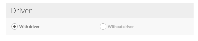
Radioboxes
HTML markup:
|
1 2 3 4 5 6 7 8 9 10 11 12 13 14 15 16 |
<form id="ct-js-driverCheckbox" class="ct-js-radio-group ct-widget-content"> <div class="ct-u-displayTableVertical"> <div class="ct-u-displayTableCell"> <div class="ct-checkbox ct-checkbox--rounded"> <input data-price="2100" name="Driver" id="checkbox5" type="radio" checked> <label for="checkbox5" class="checkbox-inline">With driver</label> </div> </div> <div class="ct-u-displayTableCell"> <div class="ct-checkbox ct-checkbox--rounded"> <input data-price="0" name="Driver" id="checkbox6" type="radio"> <label for="checkbox6" class="checkbox-inline">Without driver</label> </div> </div> </div> </form> |
Checkboxes
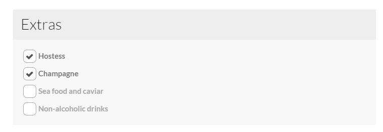
Checkboxes
HTML markup:
|
1 2 3 4 5 6 7 8 9 10 11 12 13 14 15 16 17 18 |
<form class="ct-widget-content ct-js-checkbox-group"> <div class="ct-checkbox ct-u-marginBottom10"> <input data-price="450" name="Hostess" id="checkbox1" type="checkbox" checked="checked"> <label for="checkbox1" class="checkbox-inline">Hostess</label> </div> <div class="ct-checkbox ct-u-marginBottom10"> <input data-price="200" name="Champagne" id="checkbox2" type="checkbox" checked="checked"> <label for="checkbox2" class="checkbox-inline">Champagne</label> </div> <div class="ct-checkbox ct-u-marginBottom10"> <input data-price="725" name="Sea-food-and-caviar" id="checkbox3" type="checkbox"> <label for="checkbox3" class="checkbox-inline">Sea food and caviar</label> </div> <div class="ct-checkbox"> <input data-price="50" name="Non-alcoholic-drinks" id="checkbox4" type="checkbox"> <label for="checkbox4" class="checkbox-inline">Non-alcoholic drinks</label> </div> </form> |
Checkout Box
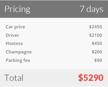
Checkout box
HTML markup:
|
1 2 3 4 5 6 7 8 9 10 11 12 13 14 15 16 |
<div id="ct-js-checkoutBox" class="ct-widget ct-widget-pricing ct-u-marginBottom30"> <h3 class="ct-widget-header ct-widget-header--dark">Pricing <span id="datepickerOutput" class="pull-right">0 days</span></h3> <div class="ct-widget-content"> <ul id="ct-js-checkout-list" class="ct-widget-list"> <li data-name="Car-Price" data-itemPrice="350">Car price<span class="pull-right data-currency">$0</span></li> <li data-name="ct-js-driverCheckbox">Driver<span class="pull-right">0</span></li> <li data-name="Hostess">Hostess<span class="pull-right">0</span></li> <li data-name="Sea-food-and-caviar">Sea food and caviar<span class="pull-right">0</span></li> <li data-name="Non-alcoholic-drinks">Non-alcoholic drinks<span class="pull-right">0</span></li> <li data-name="Champagne">Champagne<span class="pull-right">0</span></li> <li data-name="Parking-fee">Parking fee<span class="pull-right">$90</span></li> </ul> <h4 class="ct-checkout-error"><small>Please select a date</small></h4> </div> <h3 class="ct-widget-footer">Total <span id="ct-js-checkout-price" class="ct-widget-price pull-right">$0</span></h3> </div> |
- dataItemPrice – product price per day;
Notice:
data-price – Every checkbox and radiobox should have specified this attribute, otherwise script responsible for total price calculating won’t work correctly;
data-name – For radioboxes this attribute should have the same value as form’s ID containing a group of radio inputs.
For checkboxes this attribute should have the same value as input’s [name] attribute.
Required javascript:
|
1 |
<script src="../assets/js/shop.js"></script> |
Was this article helpful ?
Slider
We are using Slick carousel script in our slider.
Just use the simple HTML markup:
|
1 2 3 4 5 6 7 8 9 10 11 |
<div class="ct-slick ct-js-slick"> <div class="item"> ... </div> <div class="item"> ... </div> <div class="item"> ... </div> </div> |
And add as many items as you want. In plugin documentation you will find available settings and examples of usage.
Don’t forget to include the following scripts in your html page:
|
1 2 |
<script src="../assets/plugins/slick/slick.min.js"></script> <script src="../assets/plugins/slick/init.js"></script> |
Was this article helpful ?
Gallery
Main HTML markup:
|
1 2 3 4 |
<div id="ct-gallery" class="ct-gallery ct-gallery--col5 ct-js-magnificPortfolioPopupGroup"> ... ... </div> |
Required scripts:
|
1 2 3 4 |
<script src="../assets/plugins/isotope/jquery.isotope.min.js"></script> <script src="../assets/plugins/isotope/imagesloaded.js"></script> <script src="../assets/plugins/isotope/infinitescroll.min.js"></script> <script src="../assets/plugins/isotope/init.js"></script> |
Single gallery item HTML markup:
|
1 2 3 4 5 6 7 8 9 10 11 12 13 14 |
<a class="ct-js-magnificPopupImage" href="../assets/images/demo-content/boats/gallery-17-big.jpg" title="Ahoy There Matey"> <figure class="ct-gallery-item events"> <img src="../assets/images/demo-content/boats/gallery-17.jpg" alt=""> <figcaption> <div class="ct-u-displayTableVertical"> <div class="ct-u-displayTableCell"> <span class="ct-iconButton ct-iconButton--larger ct-u-marginBottom20"><i class="fa fa-search"></i></span> <h6 class="ct-u-hr ct-u-hr--center text-uppercase ct-fw-bold ct-u-marginBottom15">Ahoy There Matey</h6> <p>speed boat</p> </div> </div> </figcaption> </figure> </a> |
Gallery product filtering
|
1 2 3 4 5 |
<select class="ct-select ct-js-selectize ct-js-selectDriver" title="Driver"> <option value="*">with or without crew</option> <option value=".withDriver">with crew</option> <option value=".withoutDriver">without crew</option> </select> |
|
1 2 3 4 5 |
<div id="data-price" class="ct-u-paddingBottom10 ct-sliderAmount"> <input type="text" value="$100" required class="form-control slider_min" placeholder=""> <input type="text" value="$990" required class="form-control slider_max" placeholder=""> <input type="text" data-currency="$" class="slider sliderAmount" value="" data-slider-tooltip="hide" data-slider-handle="round" data-slider-min="100" data-slider-max="990" data-slider-step="10" data-slider-value="[100,990]" title="Slider Amount"> </div> |
data-currency – value of this attribute will be displayed next to the value of slider’s min and max inputs;
ID of an element containing a slider should have the same ID as the product’s attribute, in this example it would be data-price.
Was this article helpful ?
Slider
Test comes with two main types of sliders. Each type can be additionally customized by data-attributes.
Simple slider
Slick slider
HTML markup for slider:
|
1 2 3 4 5 6 7 8 9 10 11 12 13 14 15 16 17 18 19 |
<section class="ct-js-slick ct-slick ct-slick-arrow--type3 ct-u-marginBottom30" data-animations="true" data-autoplay="false" data-arrows="true" data-items="1" data-XSitems="1" data-SMitems="1" data-MDitems="1"> <div class="item"> [content] </div> <div class="item"> [content] </div> <div class="item"> [content] </div> </section> |
You can edit arrows types by adding one of the following classes to <section>:
- ct-slick-arrow–type1
- ct-slick-arrow–type2
- ct-slick-arrow–type3
- ct-slick-arrow–type4
- ct-slick-arrow–type5
- ct-slick-arrow–type6
There are also two types of image hover effect, which can be edited analogously, with the following classes:
- ct-slick-thumbnailHover–type1
- ct-slick-thumbnailHover–type2
Synch Slider
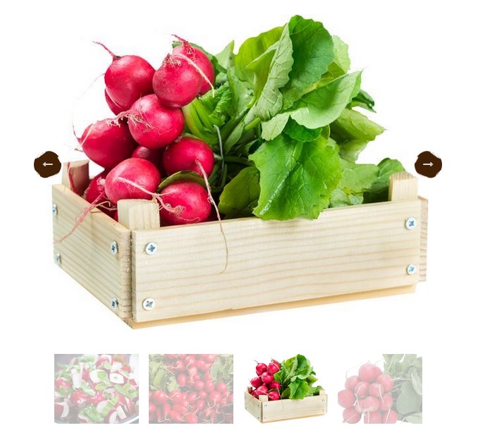
Synch slider
HTML markup:
|
1 2 3 4 5 6 7 8 9 10 11 12 13 14 15 16 |
<div id="synced-1" class="ct-slick--synced ct-slick--synced--type2"> <div class="ct-slick ct-js-slick ct-js-slick-for" data-items="1" data-arrows="false" data-draggable="false" data-touchMove="false"> <div class="item"><img src="assets/images/demo-content/radish01.jpg" alt=""/></div> <div class="item"><img src="assets/images/demo-content/radish02.jpg" alt=""/></div> <div class="item"><img src="assets/images/demo-content/radish03.jpg" alt=""/></div> <div class="item"><img src="assets/images/demo-content/radish04.jpg" alt=""/></div> <div class="item"><img src="assets/images/demo-content/radish05.jpg" alt=""/></div> </div> <div class="ct-slick ct-js-slick ct-js-slick-nav ct-slick-arrow--type4 ct-slick-thumbnailHover--type2" data-items="1" data-centerMode="true" data-centerPadding="0" data-asNavFor="#synced-1 .ct-js-slick-for" data-XSitems="2" data-SMitems="4" data-focusOnSelect="true"> <div class="item"><img src="assets/images/demo-content/radish01.jpg" alt=""/></div> <div class="item"><img src="assets/images/demo-content/radish02.jpg" alt=""/></div> <div class="item"><img src="assets/images/demo-content/radish03.jpg" alt=""/></div> <div class="item"><img src="assets/images/demo-content/radish04.jpg" alt=""/></div> <div class="item"><img src="assets/images/demo-content/radish05.jpg" alt=""/></div> </div> </div> |
You can edit synch slider arrow positions with the following classes:
- ct-slick–synced–type1
- ct-slick–synced–type2
Both sliders require using the following scripts:
|
1 2 |
<script src="assets/plugins/slick/slick.min.js"></script> <script src="assets/plugins/slick/init.js"></script> |
Was this article helpful ?
Charts
There are several types of charts, which you can use to display your statistics data.
Circle
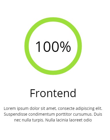
Circle chart
Values and colors of Circle Chart can be edited with data-attributes in HTML code:
|
1 2 3 4 5 6 7 8 9 10 11 12 13 14 15 16 17 18 |
<div class="ct-graphBox ct-graphBox--default"> <div class="ct-graphBox-graph"> <canvas width="150" height="150" class="ct-js-pieChart" data-ct-percentage="95" data-ct-middleSpace="85" data-ct-secondColor="#eeeeee" data-ct-firstColor="#9cdf3a"></canvas> <span class="ct-graphBox-graphPercentage">95%</span> </div> <div class="ct-graphBox-content"> <h4 class="ct-graphBox-title"> Graphic Design </h4> <p> Lorem ipsum dolor sit amet, consecte adipiscing elit. Suspendisse condimentum porttitor cursumus. Duis nec nulla turpis. Nulla lacinia laoreet odio </p> </div> </div> |
Don’t forget to use also the following script for this:
|
1 2 3 4 5 6 7 8 9 10 11 12 13 14 15 16 17 18 19 20 21 22 23 24 25 26 27 28 29 30 31 32 |
<script src="assets/js/charts/Chart.min.js"></script> <script> $('.ct-js-pieChart').each(function () { var $this = $(this); var $color = validatedata($(this).attr('data-ct-firstColor'), "#2b8be9"); var $color2 = validatedata($(this).attr('data-ct-secondColor'), "#eeeeee"); var $cutout = validatedata($(this).attr('data-ct-middleSpace'), 90); var $stroke = validatedata($(this).attr('data-ct-showStroke'), false); var $margin = validatedata($(this).attr('data-ct-margin'), false); $(this).parent().css('margin-left',$margin + 'px'); $(this).parent().css('margin-right',$margin + 'px'); var options = { responsive: true, percentageInnerCutout: $cutout, segmentShowStroke: $stroke, showTooltips: false } var doughnutData = [{ value: parseInt($this.attr('data-ct-percentage'), 10), color: $color, label: false }, { value: parseInt(100 - $this.attr('data-ct-percentage'), 10), color: $color2 }]; if (($().appear) && ($("body").hasClass("cssAnimate"))) { $('.ct-js-pieChart').appear(function () { var ctx = $this[0].getContext("2d"); window.myDoughnut = new Chart(ctx).Doughnut(doughnutData, options); }); } else { var ctx = $this[0].getContext("2d"); window.myDoughnut = new Chart(ctx).Doughnut(doughnutData, options); } }) </script> |
Bar chart
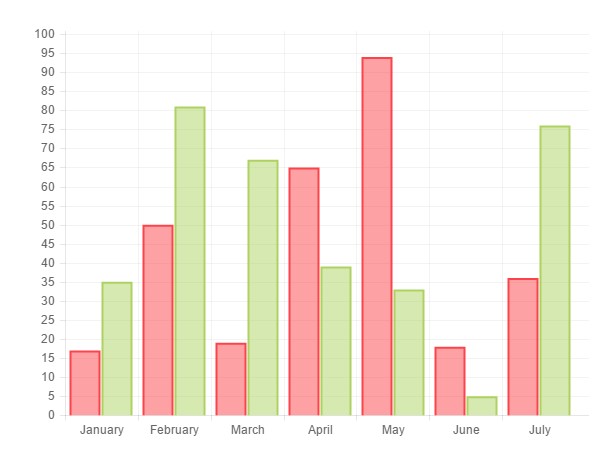
Bar chart
Please use simple HTML markup for bar chart:
|
1 2 3 |
<div> <canvas id="barchart" height="450" width="600"></canvas> </div> |
You can modify all settings via the following Javascript:
|
1 2 3 4 5 6 7 8 9 10 11 12 13 14 15 16 17 18 19 20 21 22 23 24 25 26 27 28 29 30 31 32 33 34 35 |
<script src="assets/js/charts/Chart.min.js"></script> <script> var randomScalingFactor = function () { return Math.round(Math.random() * 100) }; var barChartData = { labels: ["January", "February", "March", "April", "May", "June", "July"], datasets: [ { fillColor: "rgba(252,67,73,0.5)", strokeColor: "#fc4349", highlightFill: "#fc4349", highlightStroke: "#fc4349", data: [randomScalingFactor(), randomScalingFactor(), randomScalingFactor(), randomScalingFactor(), randomScalingFactor(), randomScalingFactor(), randomScalingFactor()] }, { fillColor: "rgba(173,210,96,0.5)", strokeColor: "#add260", highlightFill: "#add260", highlightStroke: "#add260", data: [randomScalingFactor(), randomScalingFactor(), randomScalingFactor(), randomScalingFactor(), randomScalingFactor(), randomScalingFactor(), randomScalingFactor()] } ] } window.onload = function () { var ctx1 = document.getElementById("barchart").getContext("2d"); window.myBar = new Chart(ctx1).Bar(barChartData, { responsive: true }); } </script> |
Line Chart
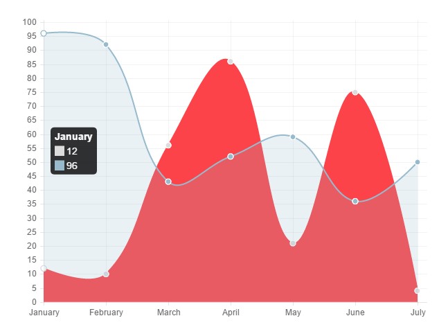
Line chart
Analogously to Bart charts, you can use Line chart with simple HTML markup:
|
1 |
<canvas id="linechart" height="450" width="600"></canvas> |
And edit all parameters with the following Javascript:
|
1 2 3 4 5 6 7 8 9 10 11 12 13 14 15 16 17 18 19 20 21 22 23 24 25 26 27 28 29 30 31 32 33 34 35 36 37 38 39 40 41 42 43 |
<script src="assets/js/charts/Chart.min.js"></script> <script> var randomScalingFactor = function () { return Math.round(Math.random() * 100) }; var lineChartData = { labels: ["January", "February", "March", "April", "May", "June", "July"], datasets: [ { label: "My First dataset", fillColor: "#fc4349", strokeColor: "#fc4349", highlightFill: "#fc4349", highlightStroke: "#fc4349", pointColor: "rgba(220,220,220,1)", pointStrokeColor: "#fff", pointHighlightFill: "#fff", pointHighlightStroke: "rgba(220,220,220,1)", data: [randomScalingFactor(), randomScalingFactor(), randomScalingFactor(), randomScalingFactor(), randomScalingFactor(), randomScalingFactor(), randomScalingFactor()] }, { label: "My Second dataset", fillColor: "rgba(151,187,205,0.2)", strokeColor: "rgba(151,187,205,1)", pointColor: "rgba(151,187,205,1)", pointStrokeColor: "#fff", pointHighlightFill: "#fff", pointHighlightStroke: "rgba(151,187,205,1)", data: [randomScalingFactor(), randomScalingFactor(), randomScalingFactor(), randomScalingFactor(), randomScalingFactor(), randomScalingFactor(), randomScalingFactor()] } ] } window.onload = function () { var ctx1 = document.getElementById("linechart").getContext("2d"); window.myLine = new Chart(ctx1).Line(lineChartData, { responsive: true }); } </script> |
Polar Chart
Polar chart
Insert the polar chart with the following HTML markup:
|
1 |
<canvas id="polararea" height="450" width="600"></canvas> |
Polar chart can be customized with the following Javascript:
|
1 2 3 4 5 6 7 8 9 10 11 12 13 14 15 16 17 18 19 20 21 22 23 24 25 26 27 28 29 30 31 32 33 34 35 36 37 38 39 40 41 42 43 44 45 46 47 48 |
<script src="assets/js/charts/Chart.min.js"></script> <script> var randomScalingFactor = function () { return Math.round(Math.random() * 100) }; var polarData = [ { value: 300, color: "#F7464A", highlight: "#FF5A5E", label: "Red" }, { value: 50, color: "#46BFBD", highlight: "#5AD3D1", label: "Green" }, { value: 100, color: "#FDB45C", highlight: "#FFC870", label: "Yellow" }, { value: 40, color: "#949FB1", highlight: "#A8B3C5", label: "Grey" }, { value: 120, color: "#4D5360", highlight: "#616774", label: "Dark Grey" } ]; window.onload = function () { var ctx1 = document.getElementById("polararea").getContext("2d"); window.myPolarArea = new Chart(ctx1).PolarArea(polarData, { responsive: true }); } </script> |
Was this article helpful ?
Image Data
With Test you can add custom text information on your image. For example you can add there date information.

Image data
Use for this the following HTML markup:
|
1 2 3 4 |
<div class="ct-imagedata ct-imagedata--left"> <span class="ct-imagedata-day">2</span> <span class="ct-imagedata-month">Mar</span> </div> |
Element background can be edited with the following CSS:
|
1 2 3 |
.ct-imagedata { background-image: url("../images/GreendataBG.png"); } |
Additionally you can change element alignment and float by editing classes names in HTML with the following variables:
|
1 2 3 4 5 |
ct-imagedata ct-imagedata--left ct-imagedata--right ct-imagedata--floatRight ct-imagedata--floatLeft |
Was this article helpful ?
Modal
Create popup boxes with the following HTML markup:
|
1 2 3 4 5 6 7 8 9 10 11 12 13 14 15 16 17 18 19 20 21 22 23 24 25 26 27 28 29 30 31 32 33 34 |
<div id="popup" data-toggle="modal" data-target="#modal1"></div> <!-- Modal --> <div class="modal fade ct-modal" id="modal1" tabindex="-1" role="dialog" data-bg-image="assets/images/demo-content/image2a.png"> <div class="modal-dialog ct-modalDialog"> <div class="modal-content ct-modalContent"> <div class="modal-header ct-modalHeader"> <button type="button" class="close" data-dismiss="modal" aria-label="Close"><span aria-hidden="true">x</span></button> [title] </div> <div class="modal-body ct-modalBody"> <div class="ct-modalBody-header"> [content] </div> <div class="ct-modalBody-content"> [content] </div> </div> <div class="modal-footer ct-modalFooter" data-discount-image="assets/images/demo-content/discount.png"> [content] </div> </div> </div> </div> |
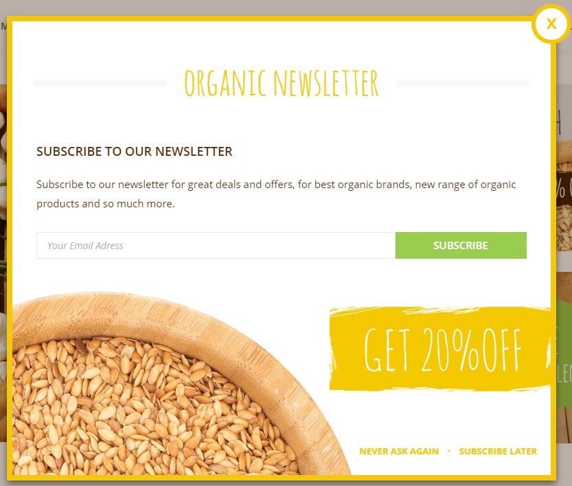
Modal
Was this article helpful ?
Progress bar
Indicate progress with Progress Bars!
Progress bars
You can edit bars values and colors with data-attributes used with the following HTML markup:
|
1 2 3 4 5 6 7 8 9 10 11 12 13 14 |
<div class="ct-progressBar"> <div class="ct-progressBar-content"> <div class="progress"> <div class="progress-bar animating" role="progressbar" data-percentage="51" aria-valuenow="90" aria-valuemin="0" aria-valuemax="100"> <span>WebDesign</span> <div class="ct-progressBar-percent"> <span>51%</span> </div> </div> </div> </div> </div> |
The following script is responsible for proper work of Progress Bars:
|
1 2 3 4 5 6 7 8 9 10 11 12 13 14 15 16 17 18 19 20 21 22 23 24 25 26 27 |
if (jQuery().appear && jQuery("body").hasClass("cssAnimate")) { jQuery('.progress').appear(function () { var $this = jQuery(this); $this.each(function () { var $innerbar = $this.find(".progress-bar"); var percentage = $innerbar.attr("data-percentage"); $innerbar.addClass("animating").css("width", percentage + "%"); $innerbar.on('transitionend webkitTransitionEnd oTransitionEnd otransitionend MSTransitionEnd', function () { $innerbar.find(".pull-right").fadeIn(900); }); }); }, {accY: -100}); } else { jQuery('.progress').each(function () { var $this = jQuery(this); var $innerbar = $this.find(".progress-bar"); var percentage = $innerbar.attr("data-percentage"); $innerbar.addClass("animating").css("width", percentage + "%"); $innerbar.on('transitionend webkitTransitionEnd oTransitionEnd otransitionend MSTransitionEnd', function () { $innerbar.find(".pull-right").fadeIn(900); }); }); } |
Was this article helpful ?
Pricing Tables
Present your prices with easy and clean tables.
Pricing table
It can be added with simple HTML markup:
|
1 2 3 4 5 6 7 8 9 10 11 12 13 14 15 16 17 18 19 20 |
<div class="ct-pricingTable"> <div class="ct-pricingTable-header"> [title] <div class="ct-pricingTable-price"> <span> [price] </span> </div> </div> <div class="ct-pricingTable-container"> [list] </div> </div> |
Was this article helpful ?
Portfolio
Create simple portfolio with filters.
To use filters add the following HTML markup before your portfolio code:
|
1 2 3 4 5 6 7 8 9 10 11 12 13 14 15 16 17 18 19 20 21 22 23 24 |
<div class="ct-gallery-filters"> <div class="ct-gallery-filters-decoration"></div> <ul class="ct-gallery-filters-list list-unstyled list-inline"> <li> <a href="#" class="btn btn-motive btn-sm ct-btn-rounded ct-btn-transparent ct-hover--outlineOut" data-filter="*"><span>new ones</span></a> </li> <li> <a href="#" class="btn btn-motive btn-sm ct-btn-rounded ct-btn-transparent ct-hover--outlineOut" data-filter=".saladsGreens"><span>salads + greens</span></a> </li> <li> <a href="#" class="btn btn-motive btn-sm ct-btn-rounded ct-btn-transparent ct-hover--outlineOut" data-filter=".fresh"><span>fresh</span></a> </li> <li> <a href="#" class="btn btn-motive btn-sm ct-btn-rounded ct-btn-transparent ct-hover--outlineOut" data-filter=".frozen"><span>frozen</span></a> </li> <li> <a href="#" class="btn btn-motive btn-sm ct-btn-rounded ct-btn-transparent ct-hover--outlineOut active" data-filter=".dried"><span>dried</span></a> </li> </ul> </div> |
Notice: data-filter in each filter link will be used for filtering. For example: if you want portfolio item to be displayed after clicking on FRESH filter you need to add fresh class to portfolio item, like the following:
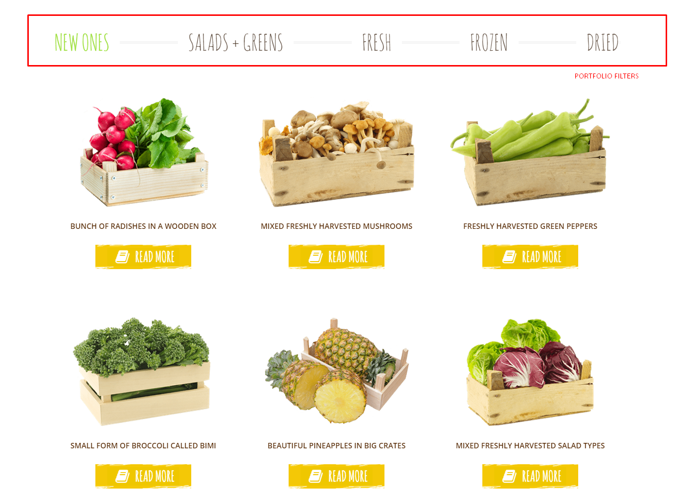
Portfolio
|
1 2 3 4 5 6 7 |
<div class="ct-portfolio-container ct-portfolio-masonry ct-portfolio-masonry--col3 ct-gallery"> <article class="ct-portfolio-item ct-gallery-item ct-gallery-item--type1"> [content] </article> </div> |
You can change Portfolio layout with the following classes:
– ct-portfolio-container
——– ct-portfolio-masonry
————— none – you don’t have to add “masonry” class at all
————— ct-portfolio-masonry–col2
————— ct-portfolio-masonry–col3
————— ct-portfolio-masonry–col4
Remember to include the following script on your portfolio page:
|
1 2 3 |
<script src="assets/js/portfolio/jquery.isotope.min.js"></script> <script src="assets/js/portfolio/imagesloaded.js"></script> <script src="assets/js/portfolio/init.js"></script> |
Was this article helpful ?
Info box
Info Box by default contains image with title and text content.
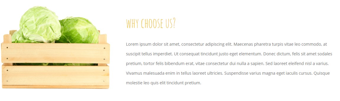
Info Box
There are several layout variation for InfoBox:
– ct-infoBox
— ct-infoBox–type1
— ct-infoBox–type2
— ct-infoBox–type3
– ct-infoBox-media
— ct-infoBox-media–left
— ct-infoBox-media–right
Which can be added to the following HTML markup:
|
1 2 3 4 5 6 7 8 9 10 11 12 13 14 15 16 17 18 19 20 21 |
<div class="ct-infoBox ct-infoBox--type1"> <div class="ct-infoBox-media ct-infoBox-media--left"> <figure> <img class="ct-infoBox-image--square" src="assets/images/demo-content/aboutimage1.png" alt=""> </figure> </div> <div class="ct-infoBox-content"> <div class="ct-infoBox-title"> <h3>why choose us?</h3> </div> <div class="ct-infoBox-text"> <p> [content] </p> </div> </div> </div> |
Was this article helpful ?
Icon Box
Icon Box
You can easily change what icon will be displayed in box by changing icon class. Here you will find full set of icons.
Full Icon box HTML markup looks like the following:
|
1 2 3 4 5 6 7 8 9 10 11 12 13 14 15 16 17 |
<article class="ct-iconBox"> <div class="ct-iconBox-icon"> <span><i class="fa fa-headphones"></i></span> </div> <div class="ct-iconBox-text text-center"> <p class="ct-u-colorGray3"> [text] </p> </div> <div class="text-center"> <a href="about-us.html" class="btn btn-lg ct-btn-image btn-warning"><span>Read About Us</span></a> </div> </article> |
Was this article helpful ?
Forms
We preapred for you several types of forms – all available options can be found here.
Email address, where we should send messages from Newsletter can be edited via HTML/assets/form/config.php file. Just use your email address instead of recipient@mail.com
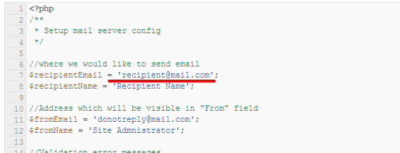
Form configuration
Newsletter HTML markup:
|
1 2 3 4 5 6 7 8 9 10 11 12 13 14 15 16 17 18 19 20 21 22 23 24 25 26 27 28 29 30 31 32 |
<div class="ct-newsletter"> <div class="text-center"> <header> <h2><span class="ct-u-colorBrownDark ct-u-ff--2 text-lowercase"><span class="ct-u-colorMotive text-capitalize">Why We Love Us?</span> Subscribe To Us!</span></h2> <h6><span class="ct-u-colorGray ct-u-ff--1">We are developing the most innovative, nutritious, free-form and organic foods ever. The futre of health food is right here.</span></h6> </header> </div> <div class="successMessage alert alert-success alert-dismissible" role="alert"> <button type="button" class="close" data-dismiss="alert" aria-label="Close"><span aria-hidden="true">×</span></button> <strong>Success!</strong> Congratulation, mission success </div> <div class="errorMessage alert alert-danger alert-dismissible" role="alert"> <button type="button" class="close" data-dismiss="alert" aria-label="Close"><span aria-hidden="true">×</span></button> <strong>Danger!</strong> You did something wrong </div> <form class="validateIt" role="form" action="assets/form/send.php" method="POST"> <div class="row"> <div class="col-md-9"> <div class="form-group"> <label class="sr-only" for="newsletter-email">Your Email Address</label> <input type="email" class="form-control ct-input--type1" id="newsletter-email" placeholder="Your Email Address" required="" name="field[]"> </div> </div> <div class="col-md-3"> <button type="submit" class="btn btn-block ct-btn-default btn-default"><span>Subscribe Today</span></button> </div> </div> </form> </div> |
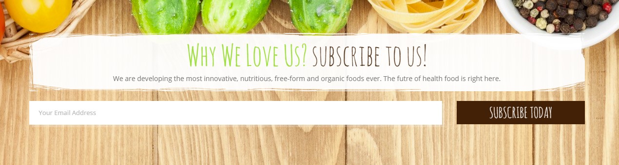
Newsletter form
Was this article helpful ?
Event
Create event on your website with the following HTML markup:
|
1 2 3 4 5 6 7 8 9 10 11 12 13 14 15 16 17 18 19 20 21 22 23 24 25 26 27 28 29 30 31 32 33 34 35 36 37 38 39 40 41 42 43 44 45 46 47 |
<article class="ct-event-item ct-event-item--type1"> <header> <h2 class="ct-u-hideText">Event 1</h2> </header> <div class="ct-event-item-outer"> <div class="ct-event-item-media"> <figure> [media] </figure> </div> <div class="ct-event-item-wrapper"> <div class="ct-imagedata ct-imagedata--left"> <span class="ct-imagedata-day">2</span> <span class="ct-imagedata-month">Mar</span> </div> <div class="ct-event-item-inner"> <section> <div class="ct-event-title"> <a href="single-event.html"> <h6><span>mixed freshly harvested mushrooms</span></h6> </a> </div> <div class="ct-event-text"> <p> [text] </p> </div> <div class="text-left"> <a href="single-event.html" class="btn ct-btn-image btn-warning"><span>learn more</span></a> <a href="#" class="btn ct-btn-image btn-default"><span>buy tickets</span></a> </div> </section> </div> </div> </div> <div class="clearfix"></div> </article> |
You can select one of two type of events by changing type number in class name:
- ct-event-item–type1
- ct-event-item–type2
Was this article helpful ?
Divider
Organize your page content with the simple divider:
|
1 |
<div class="ct-divider ct-divider--big"></div> |
You can select if you want to use big or small divider by editing class name in HTML markup:
- ct-divider–small
- ct-divider–big
Was this article helpful ?
Counters
Count to
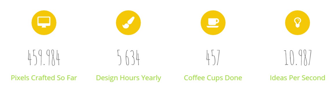
Count to
Add your custom values with the data-attributes in the following HTML markup:
|
1 2 3 4 5 6 7 8 9 10 11 12 13 |
<div class="ct-counter"> <div class="ct-counter-icon"> <i class="fa fa-desktop"></i> </div> <span class="ct-counter-number ct-js-counter" data-ct-to="459.984" data-ct-speed="1500" data-ct-decimals="3"> 0 </span> <div class="ct-counter-text"> <h5><span>Pixels Crafted So Far</span></h5> </div> </div> |
Available data-attributes to edit are:
- data-ct-to,
- data-ct-from,
- data-ct-speed,
- data-ct-decimals
For proper counter work you need to include the following script:
|
1 |
<script src="assets/js/counter/jquery.countTo.js"></script> |
Comming Soon
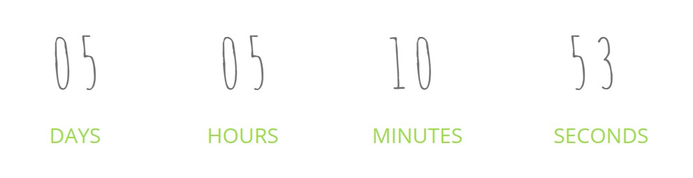
Comming Soon
The date and speed can be edited in the following Javascript:
|
1 2 3 4 |
<script src="assets/js/counter/jquery.mb-comingsoon.min.js"></script> <script type="text/javascript"> $('#counter').mbComingsoon({expiryDate: new Date(2015, 3, 14, 0, 0), speed: 950}); </script> |
Full HTML markup:
|
1 |
<div class="row centered text-center ct-u-paddingBoth30" id="counter"></div> |
Was this article helpful ?
Buttons
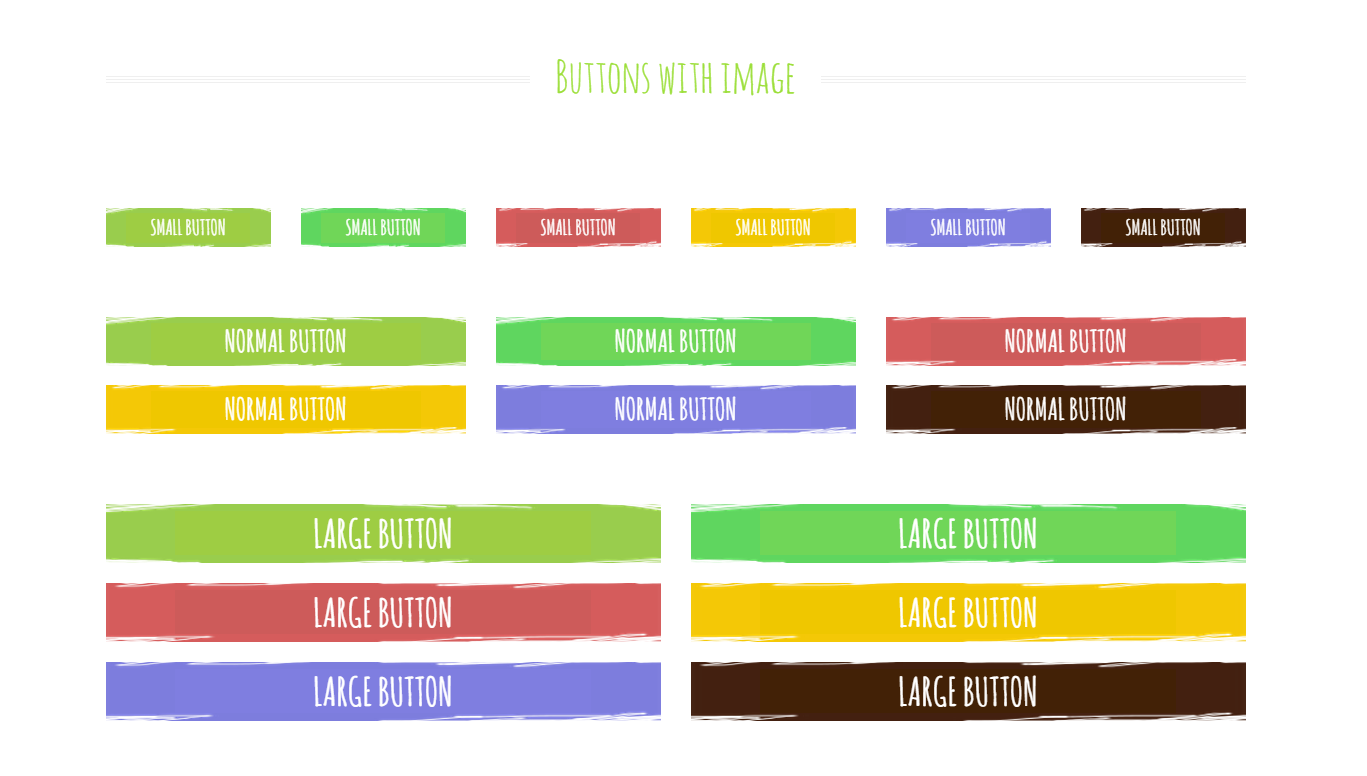
Buttons with image
Check all of available buttons on our demo page
Below you will find button HTML markup:
|
1 |
<a href="#" class="btn btn-success btn-block ct-btn-default"><span>Normal Button</span></a> |
You can edit button size with default bootstrap sizing – here you will find more information.
There are also three button types, which come with the Test. They can be also selected with CSS classes:
- ct-btn-link
- ct-btn-default
- ct-btn-image
Was this article helpful ?
Map
You can embed google map to your website with simple HTML markup:
|
1 2 3 |
<div class="ct-googleMap-contsainer"> <div class="ct-googleMap" data-height="172" data-location="Narbutta 24, Warsaw" data-zoom="14"></div> </div> |
Parameters like: map height, location address and map zoom, can be edited with the following data-attributes:
- data-height,
- data-location,
- data-zoom
Don’t forget to include the following scripts to page with map:
|
1 2 |
<script src="http://maps.google.com/maps/api/js?sensor=false"></script> <script src="assets/js/gmap/gmap3.min.js"></script> |
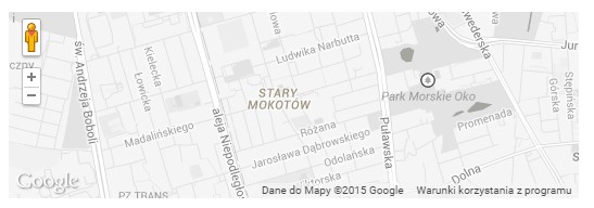
Map
Was this article helpful ?
Image Box
Test comes with several types of image boxes. All of them creates Images with caption.
Below you will find example of HTML markup to use:
|
1 2 3 4 5 6 7 8 9 10 11 12 13 14 15 16 17 18 19 20 21 22 23 24 25 26 |
<article class="ct-imageBox"> <figure class="ct-imageBox-wrapperOuter"> <a href="single-product.html"> <div class="ct-imageBox-container *ct-imageBox-container-shadow*"> <div class="ct-imageBox-hover *ct-imageBox-hover--type1*"></div> [image] <div class="ct-decoration <strong>ct-decoration--type5</strong> <strong>ct-decoration-decorationBorder</strong>"> <div> <div class="ct-decoration-textContainer"> <div class="ct-decoration-text"> <h5><span>New</span></h5> </div> </div> </div> </div> </div> </a> <figcaption class="ct-imageBox-wrapperInner ct-imageBox-wrapperInner--type1"> [content] </figcaption> </figure> </article> |
The only required class to use is ct-imageBox-container. Other classes can be replaces with the following variations:
- ct-imageDecoration
- none
- ct-decoration-decorationBorder
- ct-imageDecoration–type1
- ct-imageDecoration–type2
- ct-imageDecoration–type3
- ct-imageDecoration–type4
- ct-imageDecoration–type5
- ct-imageBox-container
- ct-imageBox-container-shadow
- ct-imageBox-wrapperInner
- ct-imageBox-wrapperInner-type1
- ct-imageBox-wrapperInner-type2
- ct-imageBox-wrapperInner-type3
- ct-imageBox-wrapperInner-type4
- ct-imageBox-wrapperInner-type5
- ct-imageBox-hover
- none
- ct-imageBox-hover–type1
- ct-imageBox-hover–type2

Image Box – type 1
Image Box – type 2
Image Box – type 3

Image Box – type 4
Was this article helpful ?
Pagination
To add pagination, use the simple HTML markup:
|
1 2 3 4 5 6 7 8 9 10 11 12 13 14 15 16 |
<div class="ct-pagination text-center ct-u-marginBottom80"> <ul class="list-unstyled list-inline"> <li> <a href="#" class="active">1</a> </li> <li> <a href="#">2</a> </li> <li> <a href="#">3</a> </li> <li> <a href="#">4</a> </li> </ul> </div> |
Pagination
Was this article helpful ?
Configure your twiiter credentials in assets/twitter/config.php. Here you will find information how to generate required Keys and Tokens.
Once your config.php is setup you can embed your tweets with the following HTML markup:
|
1 |
<div class="ct-js-twitter ct-twitter" data-snap-ignore="true"></div> |
You need to embed also twitter script on page with Twitter:
|
1 |
<script src="assets/twitter/js/jquery.tweet.js"></script> |
Notice: live Twitter feed requires enabled PHP, so it won’t be displayed correctly on your localhost nor on servers, which are not supporting PHP.
Was this article helpful ?
Blog
Create a blog page with simple HTML markup:
|
1 2 3 4 5 6 7 |
<div class="ct-blog-container ct-blog-masonry ct-blog-masonry--col3 ct-gallery"> <article class="ct-blog-item ct-gallery-item ct-gallery-item--type1"> [content] </article> </div> |
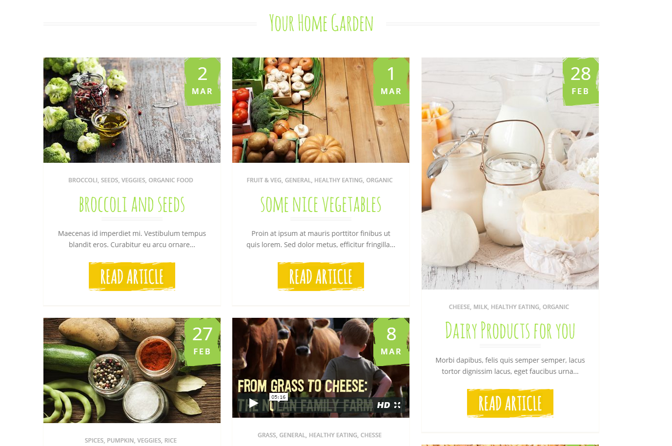
Blog Masonry
If you would like to use Masonry layout for the blog, don’t forget to use the following scripts on blog page:
|
1 2 3 |
<script src="assets/js/portfolio/jquery.isotope.min.js"></script> <script src="assets/js/portfolio/imagesloaded.js"></script> <script src="assets/js/portfolio/init.js"></script> |
You can modify blog columns settings with following CSS variations:
– ct-blog-container
- ct-blog-masonry
- none – it’s not required to use ‘masonry’ option
- ct-blog-masonry–col2
- ct-blog-masonry–col3
- ct-blog-masonry–col4
You can also select single post appearance with the following classes:
- ct-gallery-item–type1
- ct-gallery-item–type2
- ct-gallery-item–type3
Was this article helpful ?
Accordion
There are two types of accordions in Test
Accordion – type 1
Accordion – type 2
You can select each type by using proper CSS class in HTML markup.
Classes to select:
– ct-accordion
- ct-accordion–type1
- ct-accordion–type2
HTML markup:
|
1 2 3 4 5 6 7 8 9 10 11 12 13 14 15 16 17 18 19 20 |
<div class="panel-group ct-accordion ct-accordion--type1" id="accordion"> <div class="panel panel-default ct-accordion-panel"> <div class="panel-heading ct-accordion-heading"> <h4 class="panel-title ct-accordion-title"> <a data-toggle="collapse" data-parent="#accordion" href="#collapseOne"> [content] </a> </h4> </div> <div id="collapseOne" class="panel-collapse collapse in ct-accordion-collapse"> <div class="panel-body ct-accordion-body"> [contentTarget] </div> </div> </div> </div> |
Was this article helpful ?
Magnific Popup
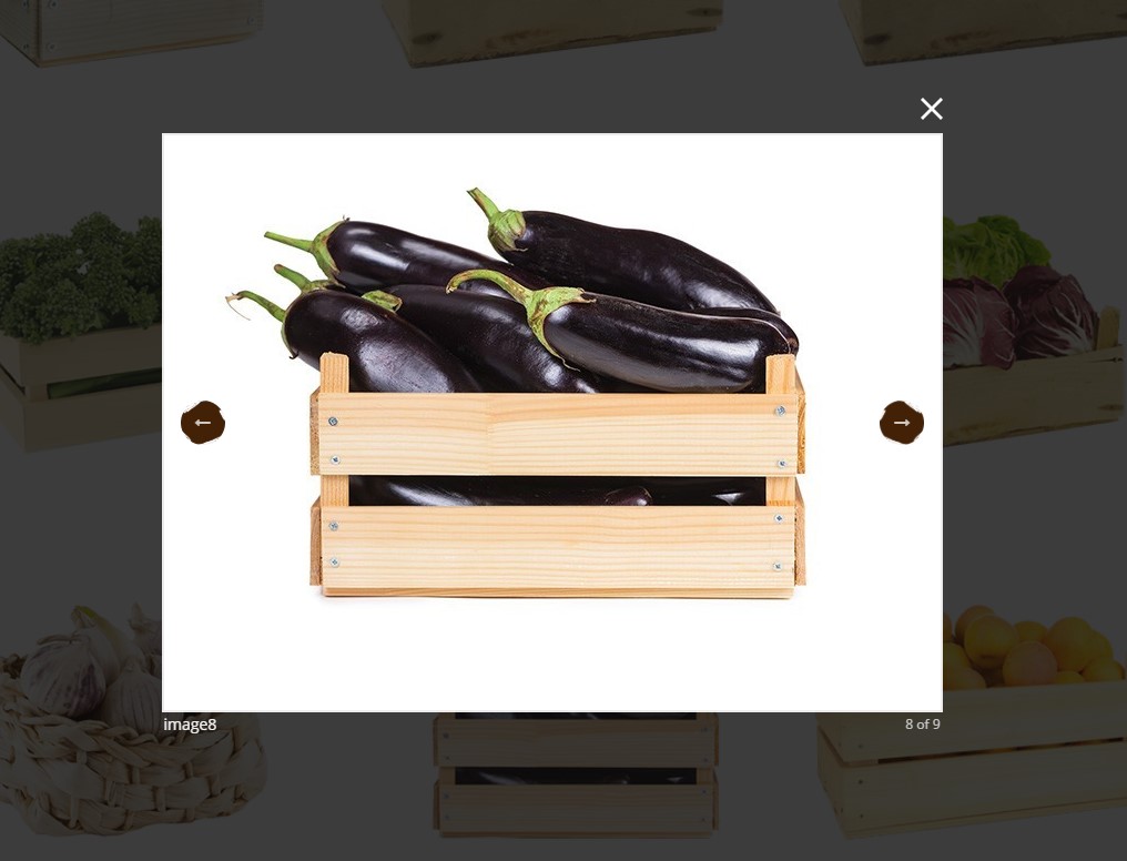
Magnific Popup
If you want to add Magnific Popup effect to your image, you need to wrap image element in link with proper classes, like the following:
|
1 2 3 |
<a class="ct-js-magnificPopupGroup" href="assets/images/demo-content/galleryitem1a.jpg" title="image1"> <img src="assets/images/demo-content/galleryitem1.png" alt=""/> </a> |
And include with HTML page the following script:
|
1 |
<script src="assets/js/magnific-popup/jquery.magnific-popup.min.js"></script> |
Was this article helpful ?
Tabs
There are two available types of tabs.
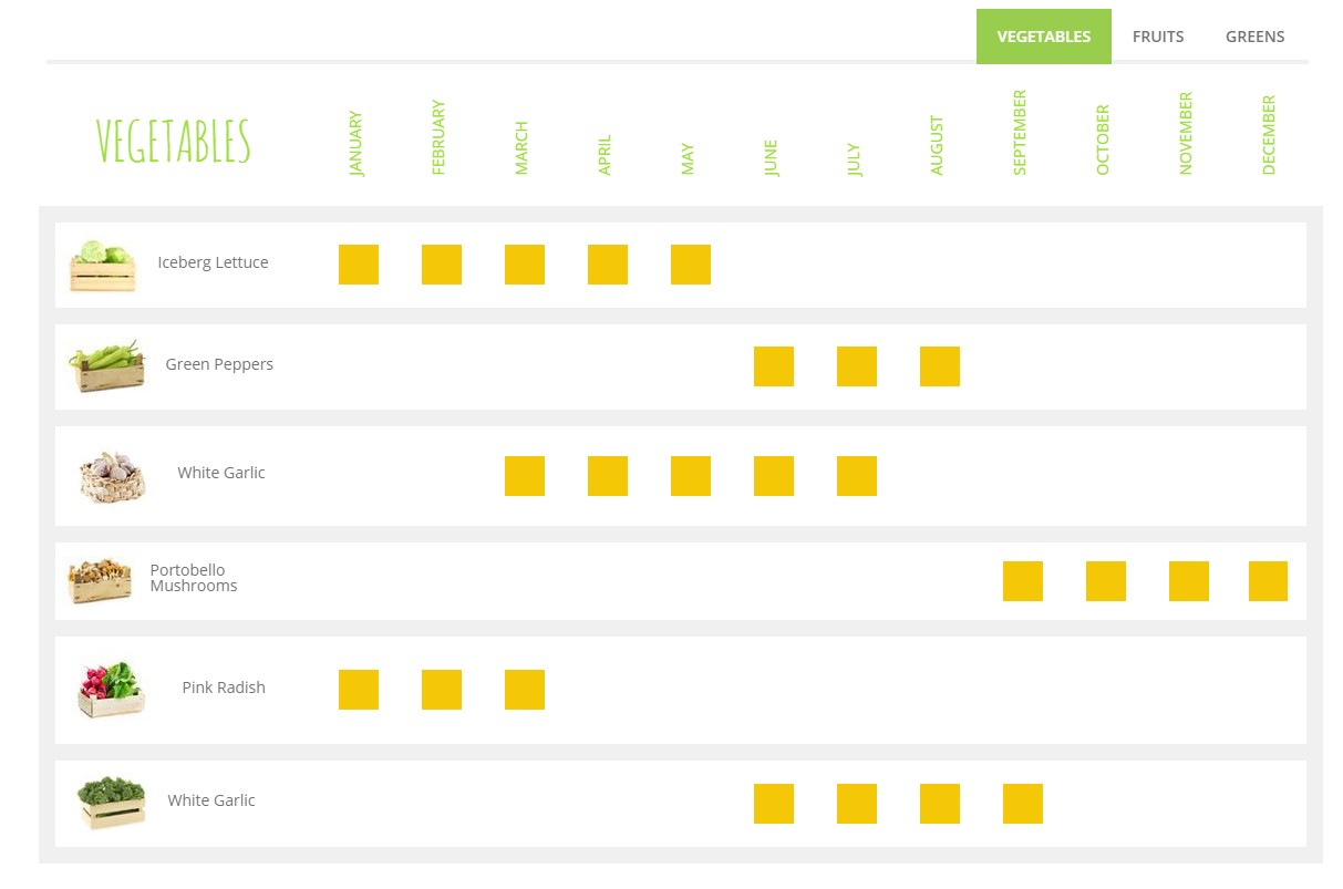
Tabs – type 1
Tabs – type 2
Tab type can be switched by changing the type class name to the following:
- ct-tabs–type1
- ct-tabs–type2
For both types the rest of HTML markup is the same:
|
1 2 3 4 5 6 7 8 9 10 11 12 13 14 15 16 17 18 19 20 21 22 23 24 25 26 27 28 |
<div role="tabpanel" class="ct-tabs ct-tabs--type1"> <!-- Nav tabs --> <ul class="nav nav-tabs ct-tabs-nav" role="tablist" id="productGuide"> <li role="presentation" class="active"><a href="#vegetables" aria-controls="vegetables" role="tab" data-toggle="tab">Vegetables</a></li> <li role="presentation"><a href="#fruits" aria-controls="fruits" role="tab" data-toggle="tab">Fruits</a></li> <li role="presentation"><a href="#greens" aria-controls="greens" role="tab" data-toggle="tab">Greens</a></li> </ul> <!-- Tab panes --> <div class="tab-content ct-tabs-content"> <div role="tabpanel" class="tab-pane active ct-tabs-panel" id="vegetables"> [content] </div> <div role="tabpanel" class="tab-pane ct-tabs-panel" id="fruits"> [content] </div> <div role="tabpanel" class="tab-pane ct-tabs-panel" id="greens"> [content] </div> </div> </div> |
Was this article helpful ?
Comments
Comments
Every blog page or blog single post looks better if you add there users comments. You can do it with the following HTML markup:
|
1 2 3 4 5 6 7 8 9 10 11 12 13 14 15 16 17 18 19 20 21 22 23 24 25 26 27 28 29 30 31 32 33 34 35 36 37 38 39 40 41 42 43 44 45 46 47 48 49 50 51 52 53 54 55 56 57 58 59 60 61 |
<div class="ct-comments"> <div class="ct-comment"> <div class="media ct-media"> <div class="media-left"> <a href="#"> <img class="media-object ct-media-object" src="assets/images/demo-content/commentPerson.png" alt=""> </a> </div> <div class="media-body ct-media-body"> <div class="ct-media-bodyHeader"> <div class="ct-media-body-title"> <span><a href="#"><h6 class="media-heading ct-media-heading">Catherine Zeta</h6></a> says:</span> </div> <div class="ct-media-body-meta"> <ul class="list-unstyled list-inline"> <li><time datetime="2015-02-23">February 23, 2015</time></li> <li><a href="#">Reply</a></li> </ul> </div> </div> <div class="ct-media-body-content"> <p> [text] </p> </div> </div> </div> </div> <div class="ct-subcomment"> <div class="media ct-media"> <div class="media-left"> <a href="#"> <img class="media-object ct-media-object" src="assets/images/demo-content/commentPerson.png" alt=""> </a> </div> <div class="media-body ct-media-body"> <div class="ct-media-bodyHeader"> <div class="ct-media-body-title"> <span><a href="#"><h6 class="media-heading ct-media-heading">Caroline Zoe</h6></a> says:</span> </div> <div class="ct-media-body-meta"> <ul class="list-unstyled list-inline"> <li><time datetime="2015-02-23">February 23, 2015</time></li> <li><a href="#">Reply</a></li> </ul> </div> </div> <div class="ct-media-body-content"> <p> [text] </p> </div> </div> </div> </div> </div> |
Was this article helpful ?
Heading

Heading
Every section can start with heading, created with the following HTML:
|
1 2 3 4 5 6 7 |
<h3 class="ct-headline text-center"> <span class="ct-headline-container ct-u-colorMotive"> <span class="ct-headline-line ct-headline-line--left"></span> [text] <span class="ct-headline-line ct-headline-line--right"></span> </span> </h3> |
You can change heading alignment without using CSS styles, just add one of the following classes to HTML markup:
– ct-headline
— text-center
— text-left
— text-right
Was this article helpful ?
Blockquote
Do you want to your motto or favourite quote?
It’s simple just use the following HTML with your custom text:
|
1 2 3 4 5 6 7 |
<div class="ct-blockquote"> <blockquote> [content] </blockquote> </div> |

Blockquote
Was this article helpful ?
Breadcrumbs
Test allows you to easily create Breadcrumbs with page navigation and background image. Image source and element height can be edited via data-attributes:
- data-bg-image
- data-height
Of course you need to use first basic HTML markup:
|
1 2 3 4 5 |
<div class="ct-breadcrumbs ct-js-breadcrumbs ct-u-marginTop50 ct-u-marginBottom70" data-bg-image="assets/images/demo-content/breadcrumbs1.png" data-height="260"> <div class="ct-breadcrumbs-title"> [title] </div> </div> |
The following script is responsible for Breadcrumbs:
|
1 2 3 4 5 6 7 8 9 10 11 12 |
var $breadcrumbs = $('.ct-js-breadcrumbs'); $breadcrumbs.each(function(){ var $this = $(this); var $breadcrumbsHeight = $this.attr("data-height"); var $breadcrumbsImage = $this.attr("data-bg-image"); $this.css({ "background-image": "url(\"" + $breadcrumbsImage + "\")", "height": $breadcrumbsHeight + "px" }); }); |

Breadcrumbs
Was this article helpful ?
CSS Files and Structure
If you would like to edit the color, font, or style of any elements, you would do the following:
|
1 |
#primaryContent a {color: #someColor;} |
If you find that your new style is not overriding, it is most likely because of a specificity problem. Scroll down in your CSS file and make sure that there isn’t a similar style that has more weight.
I.E.
|
1 |
#wrap #primaryContent a {color: #someColor;} |
So, to ensure that your new styles are applied, make sure that they carry enough “weight” and that there isn’t a style lower in the CSS file that is being applied after yours.
Colors
The theme includes a css file wich you can use to edit the colors.
You just need to add the corresponding CSS file to the head of the page like this:
|
1 2 3 4 5 |
<head> (..) <link rel="stylesheet" type="text/css" href="css/motive.css"> (..) </head> |
Main Menu structure
Just change brand name, upload your logo to images/content/ folder and you’re ready to go!
|
1 2 3 4 5 6 7 8 9 10 11 12 13 14 15 16 17 18 19 20 21 22 23 24 25 26 27 28 29 30 31 32 33 |
<nav class="navbar ct-navbar navbar-default yamm ct-navbar--fadeIn" role="navigation"> <div class="container"> <div class="ct-navbarContainer"> <div class="navbar-header"> <a class="navbar-brand" href="index.html"><img id="ct-js-logo" src="assets/images/demo-content/logo.png" alt="FISHtank"></a> <!-- + --> </div> <ul class="nav navbar-nav"> <li role="presentation" class="dropdown"> <a class="dropdown-toggle" href="about.html" role="button" aria-expanded="true"> Home <span class="caret"></span> </a> <ul class="dropdown-menu"> <li> <div class="yamm-content"> </div> </li> </ul> </li> <li><a href="contact.html">Contact Us</a></li> </ul> <ul class="nav navbar-nav yamm ct-navbar--right"> <li><a href="login.html">My Account</a></li> </ul> </div> </div> </nav> |
In order to create mega menus read the documentation here:
Icons
We’ve included 360+ font icons.
Awesome Icons – http://fontawesome.io/icons/
HTML markup:
|
1 2 |
<!-- Awesome Icons --> <i class="fa fa-cog"></i> |
CSS Files & Structure
We’ve included 2 files.
bootstrap.css contains Bootstrap 3 Library.
style.css file contains general styles.
1. Variables
2. Bootstrap
3. Mixins
4. Animate
5. Magnific
6. Animate
7. Typography
8. Maps
9. Menu
10. Social Icon
11. Image Box
12. Headline
13. Slick
14. Newsletter
15. Footer
16. Form
17. Modal
18. Buttons
19. Breadcrumbs
20. Blog
21. Divider
22. Pagination
23. Media Object
24. Widget
25. Blockquote
26. Comment
27. Portfolio
28. Info Box
29. Accordion
30. Tabs
31. Table
32. Event
33. Tweet
34. Icon Box
35. Pricing Tables
36. Progress Bar
37. Counters
Utilities
Utility classes are low-level structural and positional traits. Utilities can be applied directly to any element, multiple utilities can be used tohether and utilities can be used alongsie component classes.
Utilities are intended for frequently used CSS properties and patterns, like: floats, containing floats, vertical alignemnt, text tryncation. Relying on utilities can help to reduce repetition and provide consistend implementations.
- Test uses utilities for the following categories:
- Typography
- Display Types
- Paddings
- Margins
- Line height
- Borders
- Colors
- Transform
- Section elements
Was this article helpful ?
Javascript
All javascripts are placed in folder /js. In main.js file we implement all functions calls.
This theme uses following Javascript scripts:
- chart.min
- jquery.mb-comingsoon.min
- jquery.countTo
- jquery.stellar.min
- gmap3.min
- headroom http://wicky.nillia.ms/headroom.js/
- jQuery.headroom
- jquery.magnific-popup.min
- jquery.pagescroller.lite
- imagesloaded
- jquery.isotope.min
- slick.min http://kenwheeler.github.io/slick/
jquery.appear
This plugin call function when element appear in viewport. This is used in custom animation, progress bars, counter timer.
Documentation: https://github.com/bas2k/jquery.appear/
|
1 2 3 4 5 6 7 8 9 10 11 12 13 |
if (jQuery().appear) { if (device.mobile()) { // disable animation on mobile jQuery("body").removeClass("withAnimation"); } else { jQuery('.withAnimation .animated').appear(function () { jQuery(this).each(function () { jQuery(this).addClass('activate'); jQuery(this).addClass($(this).data('fx')); }); }, {accY: -150}); } } |
Was this article helpful ?
Social Buttons
We used two types of social buttons in Test

Socials
|
1 2 3 4 5 6 |
<ul class="ct-socials"> <li></li> <li></li> ... <li></li> </ul> |

Rounded socials
|
1 2 3 4 5 6 |
<ul class="ct-socials--roundedBox"> <li></li> <li></li> ... <li></li> </ul> |
Was this article helpful ?
Widgets
Sidebar widgets
Sidebar widget
Each widget should have basic widgets classes, like the following:
|
1 2 3 4 5 6 7 8 9 10 11 12 13 14 15 16 17 |
<div class="widget"> <div class="widget-inner"> <h6 class="ct-headerBox ct-u-paddingBottom20 ct-u-borderBottom">popular articles</h6> <ul class="list-unstyled ct-articlesBox"> <li><a href="#">Coming Soon - Bamboo Massage</a></li> <li><a href="#">New Beginnings</a></li> <li><a href="#">Neom Organics</a></li> <li><a href="#">Mother's Day</a></li> <li><a href="#">Spring Trends 2015</a></li <li><a href="#">Lily Lolo Make Up</a></li> <li><a href="#">Anti Ageing Skincare</a></li> <li><a href="#">Wash those March blues away</a></li> <li><a href="#">Nail designs</a></li> <li><a href="#">Looking after your skin this summer</a></li> </ul> </div> </div> |
Was this article helpful ?
Pagination

Pagination
Use the following HTML markup to create blog posts pagination:
|
1 2 3 4 |
<div class="ct-navigationBlog ct-u-paddingTop30"> <a href="#" class="text-uppercase ct-u-motiveColor pull-left"><i class="fa fa-angle-left fa-lg"></i> older posts</a> <a href="#" class="text-uppercase ct-u-motiveColor pull-right">newer posts <i class="fa fa-angle-right fa-lg"></i></a> </div> |
Was this article helpful ?
Accordion
Accordion
Accordion can be created with the following HTML markup:
|
1 2 3 4 5 6 7 8 9 10 11 12 13 14 15 16 17 18 |
<div class="panel-group" id="accordion" role="tablist" aria-multiselectable="true"> <div class="panel panel-default"> <div class="panel-heading" role="tab" id="headingOne"> <a data-toggle="collapse" data-parent="#accordion" href="#collapseOne" aria-expanded="true" aria-controls="collapseOne"> <h4 class="panel-title"> should i tell anyone about any physical, medical, or allergy concerns? </h4> </a> </div> <div id="collapseOne" class="panel-collapse collapse in" role="tabpanel" aria-labelledby="headingOne"> <div class="panel-body"> Upon arrival, you will complete a brief health history questionnaire to assist the spa technicians in providing with maximum safety and comfort during your visit. We encourage you to disclose any pertinent health conditions that may affect your spa experience. Please also consider printing and completing the health questionnaire prior to your visit to expedite your check-in process. </div> </div> </div> </div> |
Was this article helpful ?
Testimonials
Testimonials
There are three variations of testiomonials. Each can be enable with one of the following CSS classes added to HTML markup:
- ct-testimonials–left – align testimonials to the left hand side,
- ct-testimonials–right – align testimonials to the right hand side,
- ct-testimonials – without frame
- ct-testimonials–frame – with frame
General HTML markup to edit:
|
1 2 3 4 5 6 7 8 9 10 11 12 |
<div class="ct-testimonials ct-testimonials--frame ct-testimonials--left"> <header class="ct-u-motiveColor ct-fw-600 ct-u-fontSize16 ct-u-paddingBottom20">Plock Mazovia Reviews</header> <div class="ct-testimonials-image"> <img src="assets/images/demo-content/testimonials-person1.jpg" alt="" /> </div> <div class="ct-testimonials-content ct-fw-600"> <q>Good Looks is a wonderfully relaxing, unpretentious haven in the heart of the city. The staff is friendly, attentive and knowledgeable, offering a complete list of services and expertise. Facials are a special treat. I've been going to here regularly for five years, and have never wanted to go anywhere else.</q> <div class="clearfix"></div> <span class="ct-u-motiveColor ct-u-fontSize15 ct-fw-600">- Maureen Holloway</span> </div> </div> |
Was this article helpful ?
Sliders
All sliders in Test are created with OWL Slider plugin – here you will find plugins documentation.
Also each page, where you are including the slider should have attached the following script:
owl.carousel.min.js
Below you will find general HTML markup for slider:
|
1 2 3 4 5 6 7 8 9 10 11 12 13 14 15 16 17 18 19 20 |
<div class="ct-js-owl" data-items="5" data-navigation="false" data-autoPlay="true" data-single="false" data-pagination="false" data-snap-ignore="true"> <div class="item"> <img src="assets/images/demo-content/partners_buisness5.png" class="grayscale grayscale-fade" alt=""> </div> <div class="item"> <img src="assets/images/demo-content/partners_buisness4.png" class="grayscale grayscale-fade" alt=""> </div> <div class="item"> <img src="assets/images/demo-content/partners_buisness3.png" class="grayscale grayscale-fade" alt=""> </div> <div class="item"> <img src="assets/images/demo-content/partners_buisness2.png" class="grayscale grayscale-fade" alt=""> </div> <div class="item"><img src="assets/images/demo-content/partners_buisness5.png" class="grayscale grayscale-fade" alt=""> </div> <div class="item"><img src="assets/images/demo-content/partners_buisness3.png" class="grayscale grayscale-fade" alt=""> </div> <div class="item"><img src="assets/images/demo-content/partners_buisness1.png" class="grayscale grayscale-fade" alt=""> </div> </div> |
There are 4 types of sliders:

Main slider
Example of usage can be found here.

Slider with bottom left pagination
ct-pagination–BottomLeft – to create navigation at the bottom left side.
Slider with middle navigation
Add to the HTML markup class:
ct-navigation–variation1 – to create navigation in the middle of the slide.
Was this article helpful ?
Service List
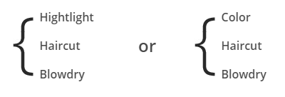
Service List
HTML markup:
|
1 2 3 4 5 6 7 8 9 10 11 12 13 14 15 16 17 18 19 |
<div class="ct-u-displayTableVertical"> <div class="ct-u-displayTableCell"> <ul class="ct-serviceLists list-unstyled"> <li class="ct-fw-600">Hightlight</li> <li class="ct-fw-600">Haircut</li> <li class="ct-fw-600">Blowdry</li> </ul> </div> <div class="ct-u-displayTableCell text-center"> <span class="ct-u-fontSize24 ct-fw-600 ct-u-lineHeight0">or</span> </div> <div class="ct-u-displayTableCell"> <ul class="ct-serviceLists list-unstyled"> <li class="ct-fw-600">Color</li> <li class="ct-fw-600">Haircut</li> <li class="ct-fw-600">Blowdry</li> </ul> </div> </div> |
Was this article helpful ?
Media Sections
Test allows you to create three types of Media Sections. To each type you can add any content you want.
Parallax

Kenburns media section
HTML markup:
|
1 2 3 4 5 6 7 8 9 10 11 12 13 14 15 16 17 |
<section class="ct-mediaSection ct-u-paddingBoth70 ct-u-colorWhite" data-stellar-background-ratio="0.3" data-height="500" data-type="parallax" data-bg-image="assets/images/demo-content/gallery_bigimage9.jpg" data-bg-image-mobile="assets/images/demo-content/gallery_bigimage9.jpg"> <div class="ct-mediaSection-inner"> <div class="container"> <div class="row"> <div class="col-sm-4"> <h5 class="ct-sectionTitle text-uppercase ct-u-text--white"> Parallax Section </h5> <br> data-type="parallax"<br> data-height="650" </div> </div> </div> </div> |
Kemburns
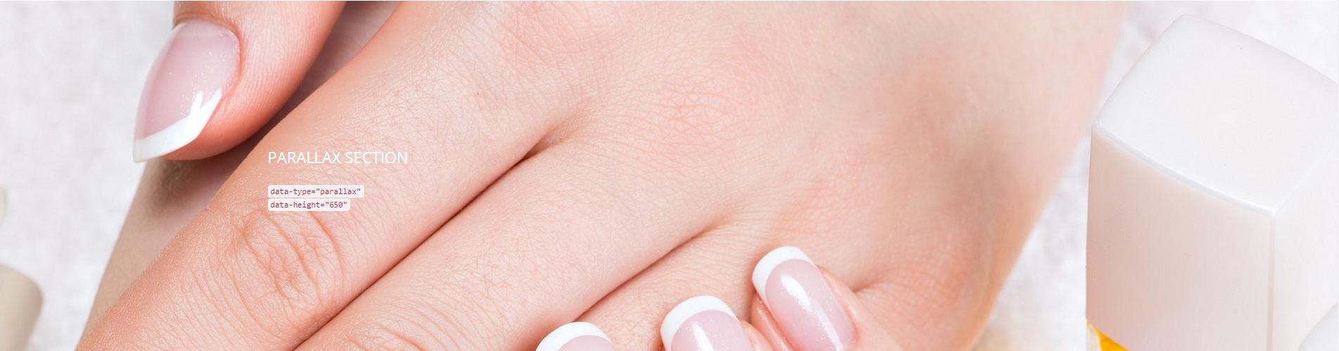
Parallax media section
HTML markup:
|
1 2 3 4 5 6 7 8 9 10 11 12 13 14 15 16 17 18 19 20 21 22 |
<section class="ct-mediaSection ct-u-paddingBoth70 ct-u-colorWhite" data-height="500" data-type="kenburns" data-bg-image-mobile="assets/images/demo-content/gallery_bigimage10.jpg"> <div class="ct-mediaSection-kenburnsImageContainer"> <img src="assets/images/demo-content/gallery_bigimage10.jpg" alt="demo image"> <img src="assets/images/demo-content/gallery_bigimage10.jpg" alt="demo image"> <img src="assets/images/demo-content/gallery_bigimage10.jpg" alt="demo image"> </div> <div class="ct-mediaSection-inner"> <div class="container"> <div class="row"> <div class="col-sm-4"> <h5 class="ct-sectionTitle text-uppercase ct-u-text--white"> Kenburns Section </h5> <br> data-type="kenburns"<br> data-height="650" </div> </div> </div> </div> </section> |
Video
HTML markup:
|
1 2 3 4 5 6 7 8 9 10 11 12 13 14 15 16 17 18 19 20 21 22 |
<section class="ct-mediaSection ct-u-paddingBoth70 ct-u-colorWhite" data-height="700" data-type="video" data-bg-image-mobile="assets/images/demo-content/macaroon3.jpg"> <div class="ct-mediaSection-video embed-responsive embed-responsive-16by9"> <iframe src="https://player.vimeo.com/video/47707314?autoplay=1&title=0&byline=0&portrait=0" width="500" height="281" frameborder="0" webkitallowfullscreen mozallowfullscreen allowfullscreen></iframe> <p><a href="https://vimeo.com/47707314">COSMETIC</a> from <a href="https://vimeo.com/user12756525">vambee</a> on <a href="https://vimeo.com">Vimeo</a>.</p> </div> <div class="ct-u-displayTable"> <div class="ct-mediaSection-inner"> <div class="container"> <div class="row"> <div class="col-sm-4"> <h5 class="ct-sectionTitle text-uppercase ct-u-text--white"> Video Section </h5> <br> data-type="video"<br> data-height="650" </div> </div> </div> </div> </div> </section> |
Remember to include plugin jquery.stellar.min.js to page where you are using media sections for proper element working.
Was this article helpful ?
Gallery
Test comes with three types of Gallery:
Standard gallery (OWL gallery)

Standard Gallery
Example of HTML markup:
|
1 2 3 4 5 6 7 8 9 10 11 12 13 14 15 16 17 |
<div class="ct-js-owl ct-owl-item--smallPadding ct-js-popupGallery" data-items="6" data-animations="false" data-navigation="true" data-autoPlay="false" data-single="false" data-pagination="false"> <a href="assets/images/demo-content/gallery_bigimage3.jpg" class="ct-js-popup"> <div class="item ct-gallery-itemInner ct-u-displayBlock"> <img src="assets/images/demo-content/gallery-sec-image1.jpg"> </div> </a> <a href="assets/images/demo-content/gallery_bigimage9.jpg" class="ct-js-popup"> <div class="item ct-gallery-itemInner ct-u-displayBlock"> <img src="assets/images/demo-content/gallery-sec-image2.jpg"> </div> </a> <a href="assets/images/demo-content/gallery_bigimage11.jpg" class="ct-js-popup"> <div class="item ct-gallery-itemInner ct-u-displayBlock"> <img src="assets/images/demo-content/gallery-sec-image3.jpg"> </div> </a> </div> |
Masonry Gallery

Masonry gallery
HTML markup:
|
1 2 3 4 5 6 7 8 9 10 11 12 13 14 15 16 17 18 19 20 21 22 23 24 |
<div id="ct-gallery" class="ct-gallery ct-gallery--col4 ct-js-popupGallery ct-gallery--smallPadding"> <div class="ct-gallery-item ct-gallery-item--masonry ct-gallery-item--default hidden ct-gallery-item--normal facials"> <a href="assets/images/demo-content/gallery_bigimage25.jpg" class="ct-js-popup"> <div class="ct-gallery-itemInner"> <img src="assets/images/demo-content/masonry-image1.jpg" alt="Image"/> </div> </a> </div> <div class="ct-gallery-item ct-gallery-item--masonry ct-gallery-item--default hidden ct-gallery-item--normal facials"> <a href="assets/images/demo-content/gallery_bigimage17.jpg" class="ct-js-popup"> <div class="ct-gallery-itemInner"> <img src="assets/images/demo-content/masonry-image4.jpg" alt="Image"/> </div> </a> </div> <div class="ct-gallery-item ct-gallery-item--masonry ct-gallery-item--default hidden ct-gallery-item--normal facials"> <a href="assets/images/demo-content/gallery_bigimage20.jpg" class="ct-js-popup"> <div class="ct-gallery-itemInner"> <img src="assets/images/demo-content/masonry-image7.jpg" alt="Image"/> </div> </a> </div> </div> |
Gallery with filters

Gallery with filters
HTML markup:
|
1 2 3 4 5 6 7 8 9 10 11 12 13 14 15 16 17 18 19 20 21 22 23 24 25 26 |
<div class="text-center"> <ul class="ct-gallery-filters list-unstyled list-inline"> <li><a data-filter="*" class="active">All</a></li> <li><a data-filter=".massages">Massages</a></li> <li><a data-filter=".facials">Facials</a></li> <li><a data-filter=".manicure">Manicure & Pedicure</a></li> </ul> <div class="clearfix"></div> </div> </div> <div id="ct-gallery" class="ct-gallery ct-gallery--col5 ct-js-popupGallery"> <div class="ct-gallery-item ct-gallery-item--masonry hidden facials"> <a href="assets/images/demo-content/gallery_bigimage1.jpg" class="ct-js-popup"> <div class="ct-gallery-itemInner"> <img src="assets/images/demo-content/gallery-image1.jpg" alt="Image"/> </div> </a> </div> <div class="ct-gallery-item ct-gallery-item--masonry hidden facials"> <a href="assets/images/demo-content/gallery_bigimage2.jpg" class="ct-js-popup"> <div class="ct-gallery-itemInner"> <img src="assets/images/demo-content/gallery-image2.jpg" alt="Image"/> </div> </a> </div> </div> |
Notice:
The following plugins are used in gallery:owl-carousel.js
imagesloaded.js
jquery.isotope.min.js
Was this article helpful ?
Blog
There are several types of blog posts, which can be used for you blog:
Featured post
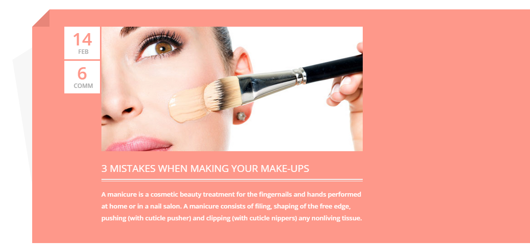
Featured post
|
1 2 3 4 5 6 7 8 9 10 11 12 13 14 15 16 17 18 19 20 21 22 23 24 25 26 27 28 29 30 |
<div class="ct-featuredBox"> <span></span> <article class="ct-articleBox"> <div class="ct-articleBox-date"> <div class="ct-articleBox-dateDay"> 14 </div> <div class="ct-articleBox-dateMonth"> feb </div> <div class="ct-articleBox-dateDay"> 6 </div> <div class="ct-articleBox-dateMonth"> comm </div> </div> <div class="ct-articleBox-media"> <img src="assets/images/demo-content/featured_post-image.jpg" alt="Post Image" /> </div> <div class="ct-articleBox-titleBox"> <a href="#"><h5>3 mistakes when making your make-ups</h5></a> </div> <div class="ct-articleBox-description ct-u-paddingTop20"> <p class="ct-header ct-header--doubleBorderTop"> A manicure is a cosmetic beauty treatment for the fingernails and hands performed at home or in a nail salon. A manicure consists of filing, shaping of the free edge, pushing (with cuticle pusher) and clipping (with cuticle nippers) any nonliving tissue. </p> </div> </article> </div> |
Blog post:
1) Simple post with picture
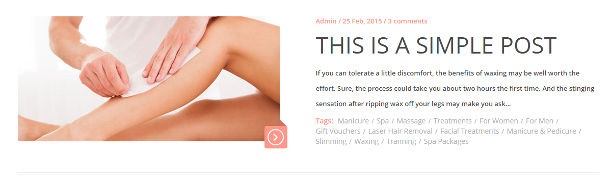
Simple post
2.) Video post

Video post
3.) Gallery post with pagination

Gallery post with pagination
4.) Text post
Text post
5.) Different gallery post with navigation

Gallery post type 2
6.) Post with quote
Post with blockquote
7.) Audio post
Audio post
Basic HTML markup:
|
1 2 3 4 5 6 7 8 9 10 11 12 13 14 15 16 17 18 19 20 21 22 23 24 25 26 27 28 29 30 31 32 33 34 35 36 37 38 39 40 41 42 43 |
<article class="ct-articleBox"> <div class="row"> <div class="col-lg-6 col-md-6"> <div class="ct-articleBox-media"> <img src="assets/images/demo-content/blog-image1.jpg" alt="" /> <div class="btn-arrow"> <a class="" href="blog-single.html"><span></span></a> </div> </div> </div> <div class="col-lg-6 col-md-6"> <div class="ct-articleBox-meta"> Admin / 25 Feb, 2015 / 3 comments </div> <h2 class="ct-articleBox-header "> <a href="blog-single.html">this is a simple post</a> </h2> <p class="ct-articleBox-description"> If you can tolerate a little discomfort, the benefits of waxing may be well worth the effort. Sure, the process could take you about two hours the first time. And the stinging sensation after ripping wax off your legs may make you ask... </p> <span class="ct-u-motiveColor ct-u-fontSize14 ct-fw-600">Tags: </span> <ul class="ct-blogTags list-inline list-unstyled"> <li><a href="#">Manicure</a></li> <li><a href="#">Spa</a></li> <li><a href="#">Massage</a></li> <li><a href="#">Treatments</a></li> <li><a href="#">For Women</a></li> <li><a href="#">For Men</a></li> <li><a href="#">Gift Vouchers</a></li> <li><a href="#">Laser Hair Removal</a></li> <li><a href="#">Facial Treatments</a></li> <li><a href="#">Manicure & Pedicure</a></li> <li><a href="#">Slimming</a></li> <li><a href="#">Waxing</a></li> <li><a href="#">Tranning</a></li> <li><a href="#">Spa Packages</a></li> </ul> <div class="clearfix"></div> </div> </div> </article> |
Was this article helpful ?
Single post page
There are several elements you will find on blog single page:

Single post – general view
HTML markup:
|
1 2 3 4 5 6 7 8 9 10 11 12 13 14 15 16 17 18 19 20 21 22 23 24 25 26 27 28 29 30 31 32 33 34 35 36 37 38 39 40 41 42 43 44 45 46 47 48 49 |
<article class="ct-articleBox ct-articleBox--singlePage"> <div class="ct-articleBox-media"> <img src="assets/images/demo-content/blog-single-image.jpg" alt="Image Blog" /> </div> <h2 class="ct-articleBox-header"> Benefits of peeling Your face </h2> <div class="ct-articleBox-meta"> Admin / 25 Feb, 2015 / 3 comments </div> <p class="ct-articleBox-description"> Lorem ipsum dolor sit amet conse ctetur adipisicing elit, sed do eiusmod tempor incididunt ut labore et dolore magna aliqua. Ut enim ad minim veniam, quis nostrud exercitation ullamco laboris nisi ut aliquip ex ea commodo consequat.</p> <p class="ct-articleBox-description">Lorem ipsum dolor sit amet, consectetur adipiscing elit. Fusce vitae nunc elementum, bibendum urna in, convallis tellus. Inte ger et rhoncus purus. Donec sit amet euismod ligula. Sed commodo facilisis elit, in imperdiet quam commodo et. Aenean at ipsum et urna porta venenatis. Aliquam erat volutpat. Fusce consectetur condimentum justo, vitae feugiat odio pulvinar vel. Maecenas eu hendrerit urna. Curabitur pharetra cursus sem, eu varius ex posuere eu. Maecenas in gravida nunc.</p> <p class="ct-articleBox-description">Sed aliquet rutrum augue, in facilisis mauris varius eu. Morbi est libero, tempus eu efficitur nec, comui mmodo id ex. Ut tris tique sagittis arcu ut venenatis. Donec id nulla mi. Nullam nisi est, rutrum ac velit eu, pharetra tristique lacus. Pellentesque tristique ex nibh, et euismod dolor suscipit dignissim. Susum pendisse sed enim nec est dictum laoreet.</p> <p class="ct-articleBox-description">Phasellus facilisis, augue non tincidunt venenatis, tortor urna fringilla urna, id facilisis urna sem iacu lis erat. Etiam nec justo ut dolor laoreet cursus. Pellentesque nec tristique enim. Duis accumsan sem purus, non consectetur arcu maximus ac. Sus pendisse urna risus, congue non pellentesque eu, cursus eget dolor. Suspendisse mollis leo sit amet accumsan aliquet. Cum sociis natoque penatibus et magnis dis parturient montes, nascetur ridiculus mus. Proin ante enim, viverra vel libero nec, faucibus aliui quam lacus. Donec sit amet congue tellus, vitae ornare lacus. Nam eget pellentesque libero.</p> <div class="ct-shareBox ct-u-borderBottom"> <span class="ct-shareBox-title">Share:</span> <ul class="ct-socials ct-socials--roundedBox list-unstyled list-inline ct-u-paddingBottom15"> <li><a href="https://www.facebook.com/createITpl" data-toggle="tooltip" data-placement="top" title="Facebook"><i class="fa fa-facebook fa-lg"></i></a></li> <li><a href="https://twitter.com/createitpl" data-toggle="tooltip" data-placement="top" title="Twitter"><i class="fa fa-twitter fa-lg"></i></a></li> <li><a href="#" data-toggle="tooltip" data-placement="top" title="Rss"><i class="fa fa-rss fa-lg"></i></a></li> <li><a href="#" data-toggle="tooltip" data-placement="top" title="Linkedin"><i class="fa fa-linkedin fa-lg"></i></a></li> </ul> </div> <i class="fa fa-tag fa-lg ct-u-paddingRight5 ct-u-paddingTop20 ct-u-motiveColor"></i> <span class="ct-u-greyColor ct-fw-600">Tagged: </span> <ul class="ct-blogTags ct-blogTags-secondType list-inline list-unstyled"> <li><a href="#">face</a></li> <li><a href="#">peeling</a></li> <li><a href="#">treatments</a></li> <li><a href="#">skin</a></li> <li><a href="#">cream</a></li> <li><a href="#">massage</a></li> <li><a href="#">manicure</a></li> <li><a href="#">pedicure</a></li> </ul> </article> |

Comment form
Comments
Was this article helpful ?
Image Box
Image box is simply image with cool hover effect.

Image Box
HTML markup:
|
1 2 3 |
<div class="ct-imageBox ct-u-displayBlock"> <img src="assets/images/demo-content/welcome-image.jpg" alt="Image" /> </div> |
Available variations – just add selected class to HTML markup:
- ct-imageBox–transparent
- ct-imageBox–doubleLine
Was this article helpful ?
Slider boxes
Test comes with predefined boxes, which can be added in main slider:
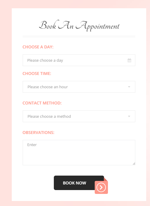
Book form
HTML markup:
|
1 2 3 4 5 6 7 8 9 10 11 12 13 14 15 16 17 18 19 20 21 22 23 24 25 26 27 28 29 30 31 32 33 34 35 36 37 38 39 40 41 42 43 44 45 46 47 48 49 50 |
<div class="ct-box"> <div class="text-center"> <h3 class="ct-header--stretch ct-header--doubleBorderBottom ct-u-fontType2 ct-fw-700 ct-u-fontSize40 ct-u-marginBoth0"> Book An Appointment </h3> </div> <form role="form" action="" method="post" class="contactForm validateIt ct-u-paddingTop40" data-email-subject="Contact Form" data-show-errors="true"> <div class="form-group date ct-js-datetimePicker"> <label for="dayTime1" class="control-label text-uppercase ct-u-fontSize14 ct-fw-600 ct-u-motiveColor ct-u-paddingBottom10">choose a day:</label> <input type="text" class="form-control" placeholder="Please choose a day" id="dayTime1"> <input type="submit" value=""> </div> <div class="form-group"> <label for="hourTime" class="control-label text-uppercase ct-u-fontSize14 ct-fw-600 ct-u-motiveColor ct-u-paddingBottom10">choose time:</label> <select class="ct-selectTime" id="hourTime"> <option></option> <option value="8">08:00 am</option> <option value="9">09:00 am</option> <option value="10">10:00 am</option> <option value="11">11:00 am</option> <option value="12">12:00 am</option> <option value="13">13:00 pm</option> <option value="14">14:00 pm</option> <option value="15">15:00 pm</option> <option value="16">16:00 pm</option> <option value="17">17:00 pm</option> <option value="18">18:00 pm</option> <option value="17">19:00 pm</option> <option value="18">20:00 pm</option> </select> </div> <div class="form-group"> <label for="contact-method" class="control-label text-uppercase ct-u-fontSize14 ct-fw-600 ct-u-motiveColor ct-u-paddingBottom10 ct-u-paddingTop10">contact method:</label> <select class="ct-selectContact"> <option></option> <option value="8">Email</option> <option value="9">Self-Serve</option> <option value="10">Phone</option> <option value="11">In Person</option> </select> </div> <div class="form-group"> <label for="obs" class="control-label text-uppercase ct-u-fontSize14 ct-fw-600 ct-u-motiveColor ct-u-paddingBottom10 ct-u-paddingTop10">Observations:</label> <textarea type="text" class="form-control ct-inputCode" rows="4" placeholder="Enter" id="obs"></textarea> </div> <div class="text-center ct-u-paddingTop20"> <a href="#" class="btn btn-sm btn-arrow"><span>book now</span></a> </div> </form> </div> |
Notice: to define email address, where contact should send emails – edit /form/config.php file with your email.

Offer box
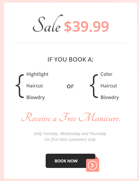
Promo Box
Was this article helpful ?
Dotted menu
Create a price-list or table of content with simple HTML markup:
|
1 2 3 4 5 6 7 8 9 |
<ul class="ct-dottedBox"> <li class="ct-dottedMenu ct-u-motiveColor"> <div class="ct-dottedBg"></div> <span>Face Mapping Consultation</span> <span>$50</span> <div class="clearfix"></div> <p class="ct-dottedMenuDetails">Consultation is complimentary with purchase of dermatological products or facial treatment.</p> </li> </ul> |
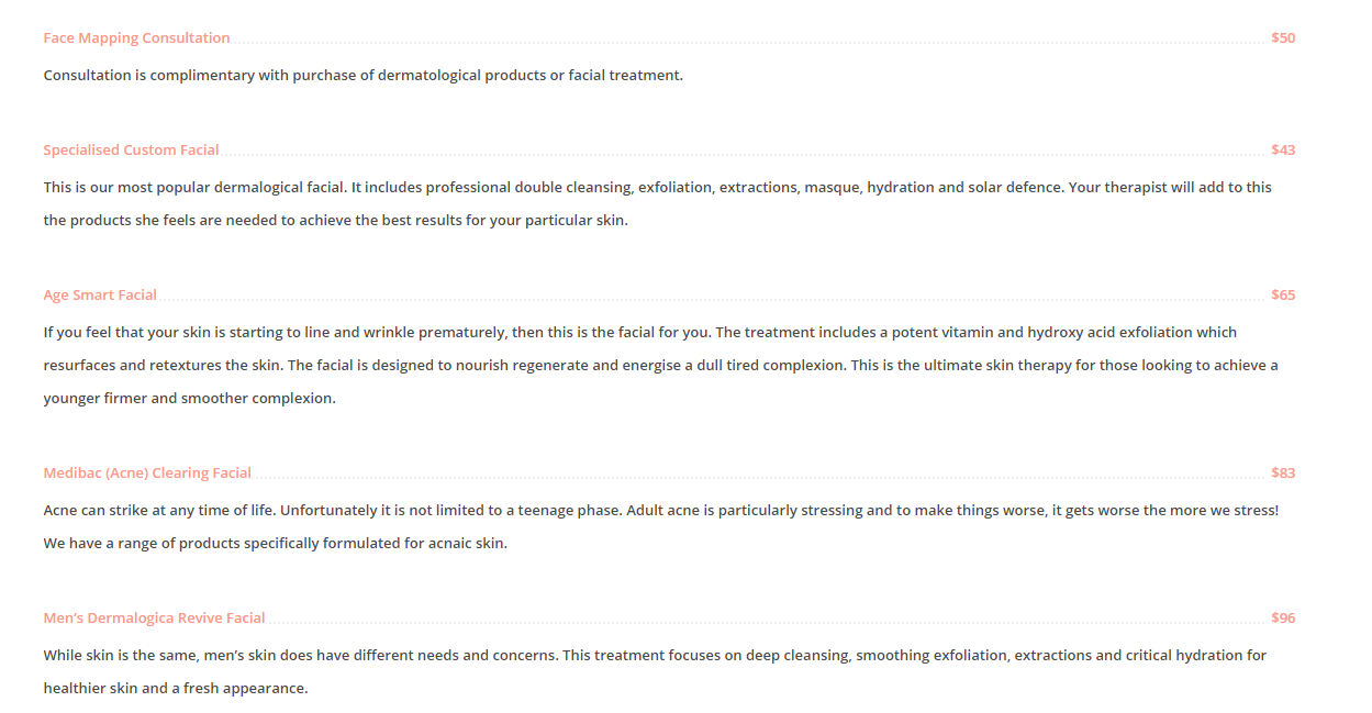
Dotted menu
Was this article helpful ?
Header line
Header line
HTML markup:
|
1 2 3 |
<h2 class="ct-header ct-header--doubleBorderTop text-uppercase ct-u-motiveColor"> latest offers </h2> |
You can use several header variations – just add one of the following classes to your HTML markup:
- ct-header
- ct-header–stretch
- ct-header–doubleBorderTop
- ct-header–doubleBorderBottom
Was this article helpful ?
CSS files and structure
If you would like to edit the color, font, or style of any elements, you would do the following:
|
1 |
#primaryContent a {color: #someColor;} |
If you find that your new style is not overriding, it is most likely because of a specificity problem. Scroll down in your CSS file and make sure that there isn’t a similar style that has more weight.
I.E.
|
1 |
#wrap #primaryContent a {color: #someColor;} |
So, to ensure that your new styles are applied, make sure that they carry enough “weight” and that there isn’t a style lower in the CSS file that is being applied after yours.
Colors
The theme includes a css file wich you can use to edit the colors.
You just need to add the corresponding CSS file to the head of the page like this:
|
1 2 3 4 5 |
<head> (..) <link rel="stylesheet" type="text/css" href="css/motive.css"> (..) </head> |
Icons
We’ve included 360+ font icons.
Awesome Icons – http://fontawesome.io/icons/
HTML markup:
|
1 2 |
<!-- Awesome Icons --> <i class="fa fa-cog"></i> |
CSS Files & Structure
We’ve included 2 files.
bootstrap.css contains Bootstrap 3 Library.
style.css file contains general styles.
- Snap mobile
- Frame box
- Image pointers
- Pricing lists
- Contact
- Popup
- Sliders
- Animations
- To Top button
- Navigations blog
- Services list
- Blog post
- Blos single post
- Gallery
- Person box
- Comments
- Google Map
- Loader
- Forms
- Buttons
- Media sections
Was this article helpful ?
Javascript
All javascripts are placed in folder /js. In main.js file we implement all functions calls.
This theme uses following Javascript files:
- HTML/assets/js/jquery.min.js – Jquery Plugin
- HTML/assets/js/bootstrap.min.js – Bootstrap Plugin
- HTML/assets/js/placeholder.min.js
- HTML/assets/js/easing.1.3.js
- HTML/assets/js/device.min.js
- HTML/assets/js/jquery.browser.min.js
- HTML/assets/js/snap.min.js – Snap Plugin is for responsive menu
- HTML/assets/js/jquery.appear.js
- HTML/assets/js/masonry.min.js – This is using in home page and in gallery
- HTML/assets/plugins/owl/owl.carousel.min.js – slider plugin
- HTML/assets/plugins/owl/init.js
- HTML/assets/js/portfolio/imagesloaded.js – Needed for gallery
- HTML/assets/plugins/magnific-popup/jquery.magnific.min.js – Needed for gallery, using when you want to see a big image after click on thumbnail
- HTML/assets/plugins/magnific-popup/init.js
- HTML/assets/plugins/ct-mediaSection/js/jquery.stellar.min.js
- HTML/assets/plugins/ct-mediaSection/js/init.js
- HTML/assets/js/jquery.gray.js this plugin is for image
- http://maps.google.com/maps/api/js?sensor=false
- HTML/assets/js/gmaps/gmap3.min.js
- HTML/assets/js/gmaps/init.js
- HTML/assets/js/datepicker/moment.js
- HTML/assets/js/datepicker/bootstrap-datetimepicker.min.js – needed to have a small calendar on the page
- HTML/assets/js/headroom/headroom.js – creates effect for menu and topbar
- HTML/assets/js/headroom/jQuery.headroom.js
- HTML/assets/js/headroom/init.js
- HTML/assets/js/select2/select2.js – select input on the page
- HTML/assets/js/main.js – Main scripts
- HTML/assets/js/less.min.js
Google Map (GMAP3 Plugin)
This is google map with custom marker, you can define couple parameters:
- data-location – address to show
- data-height – map height (if undefined height will be 220px)
- data-offset – by how many map should be repositioned from marker center point (default -30)
It uses gmap3 plugin.
Documentation: here
HTML Markup:
|
1 |
<div class="ct-googleMap" data-location="Narbutta 24, Warsaw" data-zoom="15" data-height="500"></div> |
All javascript code can be found in js/main.js file.
jquery.appear
This plugin call function when element appear in viewport. This is used in custom animation, progress bars, counter timer.
Documentation: https://github.com/bas2k/jquery.appear/
|
1 2 3 4 5 6 7 8 9 10 11 12 13 |
if (jQuery().appear) { if (device.mobile()) { // disable animation on mobile jQuery("body").removeClass("withAnimation"); } else { jQuery('.withAnimation .animated').appear(function () { jQuery(this).each(function () { jQuery(this).addClass('activate'); jQuery(this).addClass($(this).data('fx')); }); }, {accY: -150}); } } |
Charts.js
This plugin is used to make graphics.
Documentation: http://www.chartjs.org/
Was this article helpful ?
CSS Files and Structure
If you would like to edit the color, font, or style of any elements, you would do the following:
|
1 |
#primaryContent a {color: #someColor;} |
If you find that your new style is not overriding, it is most likely because of a specificity problem. Scroll down in your CSS file and make sure that there isn’t a similar style that has more weight.
I.E.
|
1 |
#wrap #primaryContent a {color: #someColor;} |
So, to ensure that your new styles are applied, make sure that they carry enough “weight” and that there isn’t a style lower in the CSS file that is being applied after yours.
Colors
The theme includes a css file wich you can use to edit the colors.
You just need to add the corresponding CSS file to the head of the page like this:
|
1 2 3 4 5 |
<head> (..) <link rel="stylesheet" type="text/css" href="css/motive.css"> (..) </head> |
Icons
We’ve included 360+ font icons.
Awesome Icons – http://fontawesome.io/icons/
HTML markup:
|
1 2 |
<!-- Awesome Icons --> <i class="fa fa-cog"></i> |
CSS Files & Structure
We’ve included 2 files.
bootstrap.css contains Bootstrap 3 Library.
style.css file contains general styles.
- Animations
- Divided Section
- List Box
- Promo
- Divided Widget
- Counter Box
- Ratings
- Weather
- Board
- Google Map
- Headroom
- Blog Box
- Pagination
- Lists
- Bootsrap Media
- Categories
- Dividers
- Media section, owl thumbnails
- Divided Media Sections
- Info Boxes
- Calendar
- Divider slider
- Testimonial
- Date picker
- Contact
- Gallery Container
Was this article helpful ?
Javascript
All javascripts are placed in folder /js.
Javascript library structure
In main.js file we implement all functions calls.
This theme uses following Javascript scripts:
/counter/
Files needed for initialising the animation number after loading pages.
/data-picker/
Scripts for choosing the date from small calendar and attaching it to the input form.
/full-calendar/
This calendar is devoted to planning the events in the calendar. User can put some events there and review them between e.g. months, years etc.
/gmaps/
Plugin needed for displaying google map on the page.
/magnific-popup/
Needed for galleries and their popups images where we can review them with slides via arrows.
/select2/
Plugin which creates select box for select tag in the page. It generates html code via javascript so that each browser can have the same select box.
/zweatherfeed/
Weather plugin where we can see weathe on live.
externals.min.js
One big file where are minifixed javascript files:_ 1.jquery 2.boostrap 3.placeholder 4. easing 5. device.min.js 6. jquery browser 7.Snap min JS 8. jquery appear_
main.js
The main javascript initializaions and other major snippets.
/plugins/ct-mediaSections/
Media sections where we can add parralax, kenburns or video to the section. Dynamical content of medias.
/headroom/
Animated/fixed navbars. Plugin needed for detecting scrollbar and attaching animations for menu.
/owl/
Files which initialize sliders in the page.
jquery.appear
This plugin call function when element appear in viewport. This is used in custom animation, progress bars, counter timer.
Documentation: https://github.com/bas2k/jquery.appear/
|
1 2 3 4 5 6 7 8 9 10 11 12 13 |
if (jQuery().appear) { if (device.mobile()) { // disable animation on mobile jQuery("body").removeClass("withAnimation"); } else { jQuery('.withAnimation .animated').appear(function () { jQuery(this).each(function () { jQuery(this).addClass('activate'); jQuery(this).addClass($(this).data('fx')); }); }, {accY: -150}); } } |
Was this article helpful ?
Buttons

Button
Use the simple HTML markup to create a button:
|
1 |
<a href="book.html" class="btn btn-link">Book Now</a> |
Define button size by adding one of the following classes to HTML:
- btn
- btn-xs
- btn-sm
- btn-lg
And select one of the following color variations:
- btn-default
- btn-primary
- btn-secondary
- btn-link
- btn-transparent
Was this article helpful ?
Socials
Test comes with two types of socials. Each type has it’s CSS variation:
ct-socials

Socials
ct-socials–small

Small socials
Both types have the same basic HTML markup:
|
1 2 3 4 |
<ul class="ct-socials list-inline list-unstyled"> <li><a href="https://www.facebook.com/createITpl" data-toggle="tooltip" data-placement="top" title="Facebook"><i class="fa fa-facebook"></i></a></li> <li><a href="https://twitter.com/createitpl" data-toggle="tooltip" data-placement="top" title="Twitter"><i class="fa fa-twitter"></i></a></li> </ul><div class="ct-contact-right"> |
Was this article helpful ?
Sliders
All sliders included in Test have the following common HTML markup:
|
1 2 3 4 |
<div class="ct-js-owl owl-carousel owl-carousel--arrowsType2 ct-js-popupGallery" data-single="true" data-autoPlay="false" data-pagination="false" data-navigation="true" data-items="1" data-snap-ignore="true"> <div class="item"> <a href="../assets/images/demo-content/country-latest-offer-item1.jpg" class="ct-js-magnificPopupImage" title="Beautifull House"><img src="../assets/images/demo-content/country-latest-offer-item1.jpg" alt="Latest Offer 1"></a> </div> |
There are three types of slider basis on this markup. To select each type you need to add one of the following CSS classes to <div class="item"> tag:
owl-carousel–arrowsType1
Slider -type 1
owl-carousel–arrowsType2
Slider – type 2
owl-carousel–arrowsOutside – navigation arrows will be displayed outside the slider content
Remember to include the following script in page with slider:
|
1 2 |
<script src="../assets/plugins/owl/owl.carousel.min.js"></script> <script src="../assets/plugins/owl/init.js"></script> |
Learn more:
Check slider advanced option in plugin documentation.
Was this article helpful ?
Tooltip
We’re using tooltips for each social button.

Tooltip
Tooltip can be added with the following HTML markup:
|
1 |
<a href="https://www.facebook.com/createITpl" data-toggle="tooltip" data-placement="top" title="Facebook"><i class="fa fa-facebook"></i></a> |
You can change tooltip placement also to:
- bottom,
- left,
- right,
Was this article helpful ?
Gallery Box
Gallery Box
Put any image in columns in Gallery Box and you’ll get equal elements as images.
HTML markup:
|
1 2 3 4 5 6 7 8 9 |
<div class="ct-galleryBox ct-galleryBox--image"> <a href="gallery-outdoor.html"> <div class="ct-u-displayTableVertical"> <div class="ct-u-displayTableCell"> <img src="../assets/images/demo-content/country-index-gallery-outdoor-item1.jpg" alt="Outdoor Image 1"> </div> </div> </a> </div> |
Was this article helpful ?
Media Sections
There are three types if media sections:
- Parallax,
- Video,
- Kenburns
Inside each of them you can add your custom content.
Parralax
We recommend you to use at least 1900px widht image as background
HTML markup:
|
1 2 3 4 5 |
<div class="ct-mediaSection" data-stellar-background-ratio="0.3" data-type="parallax" data-bg-image="path/to/the/picture" data-bg-image-mobile="path/to/the/picture"> <div class="ct-mediaSection-inner"> //content </div> </div> |
Video
Consider having to 2 extended files: mp4 and webm.
HTML markup:
|
1 2 3 4 5 6 7 8 |
<div class="ct-mediaSection" id="header" data-type="video" data-height="650" data-bg-image-mobile="path/to/the/image"> <div class="ct-mediaSection-video embed-responsive embed-responsive-16by9"> <video id="video1" muted="" loop="loop" autoplay="autoplay" preload="auto"> <source src="path/to/the/video.mp4" type="video/mp4"> <source src="path/to/the/video.webm" type="video/webm"> </video> </div> </div> |
Kenburns
In kenburs we can add 3 images.
HTML markup:
|
1 2 3 4 5 6 7 8 9 |
<div class="ct-mediaSection" data-height="460" data-type="kenburns" data-bg-image-mobile="path/to/the/picture.jpg"> <div class="ct-mediaSection-kenburnsImageContainer"> <img src="path/to/the/picture.jpg" alt="Picture"> <img src="path/to/the/picture.jpg" alt="Picture"> <img src="path/to/the/picture.jpg" alt="Picture"> </div> //content </div |
Require scripts for Media sections:
|
1 2 |
<script src="../assets/plugins/ct-mediaSection/js/jquery.stellar.min.js"></script> <script src="../assets/plugins/ct-mediaSection/js/init.js"></script> |
Was this article helpful ?
Divided Section
We have two divided sections on media sections:
– ct-dividedSection–primary
|
1 2 3 4 5 6 7 8 9 10 11 12 13 14 15 16 17 |
<div class="ct-dividedSection ct-dividedSection--primary"> <div class="ct-scaleImage"> <img src="../assets/images/demo-content/country-divided-section-middle.jpg" alt="Chairs"> </div> <div class="container"> <div class="row"> <div class="col-sm-4 col-sm-offset-8"> <div class="ct-dividedSection-content ct-u-paddingBoth55"> <h3 class="ct-u-paddingBottom10">Property you won’t find anywhere else.</h3> <p>We have direct access to the lake Guzowy furnace and a unique view of both of our homes for a wide panorama of the lake.</p> <a href="book.html" class="btn btn-link">Book Now</a> </div> </div> </div> </div> <div class="ct-dividedSection-mask"></div> </div> |

– ct-dividedSection–secondary
|
1 2 3 4 5 6 7 8 9 10 11 12 13 14 15 16 17 |
<div class="ct-dividedSection ct-dividedSection--secondary"> <div class="ct-scaleImage"> <img class="ct-dividedSection-image" src="../assets/images/demo-content/country-divided-section-middle2.jpg" alt="Chairs"> </div> <div class="container"> <div class="row"> <div class="col-sm-6"> <div class="ct-dividedSection-content ct-u-paddingBoth130"> <h3 class="ct-u-paddingBottom10">Nature is a haunted house, but art is a house that tries to be haunted.</h3> <p>Lorem ipsum dolor sit amet, consectetuer adipiiscing elit. Praesent vestibuluim este molestie lacus. Aenean nonummy hendrierit mauris. Phasellus portia. Fusce sustam varius mi. Cum sociis natoque penatibus et magnis dis parturient montes.</p> <a href="book.html" class="btn btn-link">Book Now</a> </div> </div> </div> </div> <div class="ct-dividedSection-mask"></div> </div> |
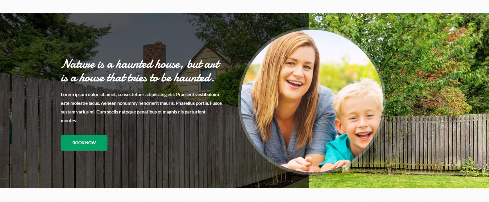
Was this article helpful ?
Divided Media Section
We have divided media section where on the left side there is a video frame.
|
1 2 3 4 5 6 7 8 9 10 11 12 13 14 15 16 17 18 19 20 21 22 23 24 25 26 27 28 29 30 31 32 33 34 35 36 |
<div class="ct-dividedMediaSection ct-u-marginBottom80"> <div class="ct-dividedMediaSection-left"> <iframe src="https://player.vimeo.com/video/63226515"></iframe> </div> <div class="ct-dividedMediaSection-right"> <h3>Our list of Amenities</h3> <ul class="ct-listBox ct-listBox--divided list-unstyled"> <li> <span><i class="fa fa-tree"></i> Nature</span> <span><i class="fa fa-bomb"></i> Grill</span> <div class="clearfix"></div> </li> <li> <span><i class="fa fa-cloud"></i> Close to a lake</span> <span><i class="fa fa-dollar"></i> Equipment rental</span> <div class="clearfix"></div> </li> <li> <span><i class="fa fa-fire"></i> Fireplace</span> <span><i class="fa fa-soccer-ball-o"></i> Pitch</span> <div class="clearfix"></div> </li> <li> <span><i class="fa fa-users"></i> No crowds</span> <span><i class="fa fa-play-circle-o"></i> TV room</span> <div class="clearfix"></div> </li> <li> <span><i class="fa fa-heart"></i> Friendly places</span> <span><i class="fa fa-gamepad"></i> Game room</span> <div class="clearfix"></div> </li> </ul> </div> <div class="clearfix"></div> </div> |

Was this article helpful ?
Divided Section Widget (simpleWeather)
There is divided section widget where we have plugin weather on the right side.

To add weather to any element we inject this code snippet:
|
1 2 3 |
<div class="ct-dividedWidget-right-title">Weather Now</div> <div id="ct-js-weather" class="ct-weather"></div> </div> |
Javascript markup (in main.js file)
|
1 2 3 4 5 6 7 8 9 10 11 12 13 14 15 16 17 |
if(typeof $.simpleWeather === "function"){ $.simpleWeather({ location: 'New York', woeid: '', unit: 'c', success: function(weather) { var html = '<h2><i class="icon-'+weather.code+'"></i> '+weather.temp+'°'+weather.units.temp+'</h2>'; html += '<ul><li>'+weather.city+', '+weather.region+'</li>'; html += '<li class="currently">'+weather.currently+'</li>'; $("#ct-js-weather").html(html); }, error: function(error) { $("#ct-js-weather").html('<p>'+error+'</p>'); } }); } |
To set your location insert the name of the location or the latitude/longitude param.
Script Source
|
1 |
<script src="../assets/js/jquery.simpleWeather.min.js"></script> |
Was this article helpful ?
Board and wallBox
Test comes with board content on the top of the footer and wallBox elements:

|
1 2 3 4 5 6 7 8 9 10 11 12 13 14 |
<div class="ct-board"> <div class="container ct-board-content"> <div class="ct-wallBox text-center"> <a href="blog-single.html"><img src="../assets/images/demo-content/country-board-item1.jpg" alt="Board Image 1"></a> <div class="ct-wallBox-date">Posted by <a href="#">Admin</a> / 19 March, 2015</div> <a href="#"><h4>The Living Room</h4></a> <p>Lorem ipsum dolor sit amet, consectetur es adipiscing elit. Donec fermentum nullamus vitae sapien pellentesque porta. Duis quisu laoreet nulla. Pellentesque felis nisl, cresiti maximus vitae dolor sit amet.</p> <a class="btn btn-transparent" href="blog-single.html">Read Article</a> </div> <div class="ct-wallBox text-center">...</div> <div class="ct-wallBox text-center">...</div> <div class="ct-wallBox text-center">...</div> </div> </div> |
Was this article helpful ?
Widgets
Widgets can be used in footer and sidebar.
Widgets:
|
1 2 3 4 5 6 7 8 |
<div class="widget"> <div class="widget-title"><i class="fa fa-map-marker fa-fw"></i> Poland</div> <address> ul. Uziembły Henryka 119<br> 31-998 Kraków<br> 79 181 63 18<br> </address> </div> |

Sidebar widgets:
|
1 2 3 4 5 6 7 8 9 10 11 12 13 14 15 16 17 18 19 20 21 22 |
<div class="widgetSidebar"> <div class="widgetSidebar-title">Top Posts</div> <div class="widgetSidebar-inner"> <ul class="ct-list list-unstyled"> <li> <a href="blog-single.html"><i class="fa fa-long-arrow-right fa-fw"></i> Beautiful Garden With Flower</a> </li> <li> <a href="blog-single.html"><i class="fa fa-long-arrow-right fa-fw"></i> Let’s Stay In The Sun</a> </li> <li> <a href="blog-single.html"><i class="fa fa-long-arrow-right fa-fw"></i> Inside Our Lovely Home</a> </li> <li> <a href="blog-single.html"><i class="fa fa-long-arrow-right fa-fw"></i> Big Wooden Bathroom</a> </li> <li> <a href="blog-single.html"><i class="fa fa-long-arrow-right fa-fw"></i> Sunny Day For A Barbeque</a> </li> </ul> </div> </div> |
Was this article helpful ?
Info Box
Info box.

|
1 2 3 4 5 6 7 8 9 10 |
<div class="ct-infoBox"> <div class="ct-infoBox-media"> <a href="blog-single.html"><img src="../assets/images/demo-content/country-infoslider-item1.jpg" alt="Info Slider Picture 1"></a> </div> <div class="ct-infoBox-content"> <a href="blog-single.html"><h3>At Ride</h3></a> <p>In addition to the foyer, the entrance area of the villa, you will find the Dining.</p> <a href="blog-single.html" class="btn btn-primary">Read More</a> </div> </div> |
Was this article helpful ?
Lists
There are several available variations of List Elements :
- ct-list
- ct-list–extended
- ct-list–tagged
- ct-list–colour
- ct-list–taggedNoBorder
Common HTML markup:
|
1 2 3 4 5 6 7 8 9 10 11 12 13 14 15 16 17 18 19 20 |
<ul class="ct-list ct-list--colour list-unstyled"> <li> <i class="fa fa-long-arrow-right fa-fw"></i> Mary56 on <a href="blog-single.html">Rent Me House</a> </li> <li> <i class="fa fa-long-arrow-right fa-fw"></i> Doloris888 on <a href="blog-single.html">Renting</a> </li> <li> <i class="fa fa-long-arrow-right fa-fw"></i> Gerry Mad on <a href="blog-single.html">Lovely Home</a> </li> <li> <i class="fa fa-long-arrow-right fa-fw"></i> MeredithG on <a href="blog-single.html">Wooden Bath</a> </li> <li> <i class="fa fa-long-arrow-right fa-fw"></i> FergusonY on <a href="blog-single.html">Barbeque</a> </li> <li> <i class="fa fa-long-arrow-right fa-fw"></i> KevinGT on <a href="blog-single.html">Sunny Day</a> </li> </ul> |
ct-list

ct-list ct-list–extended

ct-list ct-list–tagged

ct-list ct-list–colour

ct-list ct-list–taggedNoBorder

Was this article helpful ?
Gallery and Magnific Popup Image
Use gallery with Magnific Popup Images with simple HTML markup:
|
1 2 3 4 5 6 7 8 9 10 11 |
<div class="ct-galleryContainer ct-js-popupGallery ct-u-paddingBoth50"> <div class="ct-galleryContainer-image"> <a href="../assets/images/demo-content/country-gallery-backyard.jpg" class="ct-js-magnificPopupImage" title="Backyard"><img src="../assets/images/demo-content/country-gallery-category1.jpg" alt="Category"></a> <a href="../assets/images/demo-content/country-gallery-backyard2.jpg" class="ct-js-magnificPopupImage" title="Backyard"></a> <a href="../assets/images/demo-content/country-gallery-backyard3.jpg" class="ct-js-magnificPopupImage" title="Backyard"></a> <a href="../assets/images/demo-content/country-gallery-backyard4.jpg" class="ct-js-magnificPopupImage" title="Backyard"></a> <a href="../assets/images/demo-content/country-gallery-backyard5.jpg" class="ct-js-magnificPopupImage" title="Backyard"></a> <a href="../assets/images/demo-content/country-gallery-backyard6.jpg" class="ct-js-magnificPopupImage" title="Backyard"></a> </div> <h4>Backyard</h4> </div> |

Inside the gallery:

We put ct-js-popupGallery to the container which is going to be parent of certain gallery. And then we add one image and other images with empty links so that is why we can achieve effect of many galliers in one pages after one click.
Javascript
|
1 |
<script src="../assets/js/magnific-popup/jquery.magnific-popup.min.js"></script> |
Was this article helpful ?
Testimonials
Each testimonial containes user’s feedback and his/her picture.
|
1 2 3 4 5 6 7 8 9 10 11 12 13 14 |
<div class="col-md-4 text-center"> <div class="ct-testimonial ct-u-paddingBoth10"> <p>As a tenant, I am impressed and grateful that I am treated with both warmth and respect at Warshaw. I have just received friendly prompt and efficient service thus far and would highly recommend them to anyone. It's good to know that they consider their tenants just as important as their landlords.</p> </div> <div class="media media-slider ct-u-paddingBoth10"> <div class="media-left"> <img class="media-object" src="../assets/images/demo-content/blog-single-comment-author1.jpg" alt="Reference"> </div> <div class="media-body"> <span class="media-heading">Margareta Gonzalez</span> <span>Spain</span> </div> </div> </div> |

Was this article helpful ?
Bootstrap media
Test comes with several variations for Bootstrap media – read more about Bootstrap media object:
- media
- media-slider
- media-sidebar
- media-author
- media-comment
Code snippet:
|
1 2 3 4 5 6 7 8 9 |
<div class="media media-slider ct-u-paddingBoth10"> <div class="media-left"> <img class="media-object" src="../assets/images/demo-content/blog-single-comment-author3.jpg" alt="Reference"> </div> <div class="media-body"> <span class="media-heading">Dana Pourquois</span> <span>France</span> </div> </div> |
media-slider

media-sidebar

media-author

media-comment

All media can be nested inside its parent media-body.
Was this article helpful ?
Blog
We have few kinds of blogs in {Theme):
- normal index blog
- blog sidebar left
- blog full width
- blog single post.
Common blog post looks like:
|
1 2 3 4 5 6 7 8 9 10 11 12 13 |
<div class="ct-blogBox"> <div class="ct-blogBox-media"> <a href="blog-single.html"><img src="../assets/images/demo-content/country-blog-item1.jpg" alt="Blog Picture 1"></a> </div> <div class="ct-blogBox-description"> <a href="blog-single.html"><h5>This is a standard post format with preview picture</h5></a> <div class="ct-blogBox-description-posted"> By <a href="#">Karen Mei</a> in <a href="#">Early 2015</a> on March 14, 2015 - <a href="#">23 Comments</a> </div> <p>Lorem ipsum dolor sit ametum, consectetur adipiscing elit. Sed ves tibulum mattis ex, eget ullamcorper purus sempeui vel. Maecenas non dictum mauris. Class aptent taciti sociosqu ad litora torquent per conubia nostr.</p> <a href="blog-single.html" class="btn btn-primary">Read More</a> </div> </div> |
We can put there any images, video, audio or slider medias. An example:

After entering any blog to blog single post we’ll get full blog post.
Was this article helpful ?
Calendar
Test comes extenden calendar where you can attach any info events into it in javascript. If you want to invoke calendar, the only one thing is to put the code snippet in HTML:
Javascript Example of events, how to add:
|
1 2 3 4 5 6 7 8 9 10 11 12 13 14 15 16 17 18 19 |
$(document).ready(function() { // page is now ready, initialize the calendar... $('#calendar').fullCalendar({ events: [ { title: 'All Day Event', start: '2015-04-01' }, { title: 'Long Event', start: '2015-04-07', end: '2015-04-10' }, ] }); }); |

Javascript
|
1 2 3 |
<script src="../assets/js/fullcalendar/moment.min.js"></script> <script src="../assets/js/fullcalendar/fullcalendar.min.js"></script> <script src="../assets/js/fullcalendar/init.js"></script> |
Full calendar documentation: http://fullcalendar.io/docs/
Was this article helpful ?
Booking
There are 3 pages for houses listing:
- book slider
- book 2 columns
- book 3 columns
EXAMPLE (book slider):

And there is common book page.

Was this article helpful ?
Pagination
Navigate between blog posts with simple pagination:
|
1 2 3 4 5 6 7 8 9 10 11 12 |
<div class="ct-pagination"> <a href="#"> <span class="ct-pagination-older pull-left"> <i class="fa fa-long-arrow-left"></i> Older Posts </span> </a> <a href="#"> <span class="ct-pagination-next pull-right"> Next Posts <i class="fa fa-long-arrow-right"></i></span> </a> <div class="clearfix"></div> </div> |
How it looks?

Was this article helpful ?
Navigation Menu
Scroll page down to see animated fixed menu.

What you need to do is put the proper class to the body for example (ct-headroom–scrollUpMenu):
|
1 |
<body class="cssAnimate ct-headroom--scrollUpMenu"> |
We han have fixed menu, animated, hided etc. We can add the moment when navbar should disappear, show itself etc.
Javascript
|
1 2 3 |
<script src="../assets/plugins/headroom/headroom.js"></script> <script src="../assets/plugins/headroom/jQuery.headroom.js"></script> <script src="../assets/plugins/headroom/init.js"></script> |
The whole docs how to use ir properly, is in the_../assets/plugins/headroom/init.js
Was this article helpful ?
Ratings
Use one of two elements dedicated for ratings:
- ratingBox
- rating stars:
|
1 2 3 4 5 6 7 8 9 10 11 12 |
<ul class="ct-ratingBox list-unstyled ct-u-paddingBottom10"> <li> <span class="ct-fw-700">Overal Rating:</span> <ul class="ct-stars ct-stars--overall list-unstyled list-inline"> <li><i class="fa fa-star"></i></li> <li><i class="fa fa-star"></i></li> <li><i class="fa fa-star"></i></li> <li><i class="fa fa-star"></i></li> <li class="empty"><i class="fa fa-star"></i></li> </ul> </li> </ul> |
Was this article helpful ?
WooCommerce Videos
Enhance your online shop with product videos
Videos Plugin for WooCommerce by createIT allows you to add multiple videos to your products. Add Youtube, Vimeo and HTML5 Videos anywhere you wish on your product page!
No coding knowledge required.
Was this article helpful ?
New Video
To add a new video to your WooCommerce product, please follow the steps below:
Adding a video:
- Open ‘Edit Product’ page
- Open ‘Videos’ tab in ‘Product Data’ metabox
- Click ‘Add Video’ button
- The form with following fields will appear:
- Video Title – you may add a title for your video to keep order in your videos. By default the id is set as a title.
- Enter external video URL – paste a link from one of these sites: https://codex.wordpress.org/Embeds#Okay.2C_So_What_Sites_Can_I_Embed_From.3F but only Youtube and Vimeo will be responsive and will have autoplay option.
- Or upload a video – instead of using external links, upload your own video via media library (it will not work if the previous field is not empty). MP4 is the safest format, but it’s reccomended to upload .webm or .ogg (or both) as well to make sure it will play in every browser. To convert the video files you can use one of the free online converters like this one: http://www.online-convert.com/ . If wrong format will be chosen, it will not be saved. If you want to choose already uploaded video, you can change ‘All media items’ to ‘Video’ in upper left corner of media library box, to choose only from videos. Uploaded videos will be responsive.
- Video Location:
– Tab – create a new tab, next to the Product description – video will be displayed inside the tab,
Video embed in tab
- – Image Gallery – video will be added to product images gallery (you must set a thumbnail in a further field)
Gallery video
– Popup Button – a button will appear on the site, after clicking it will display full width video in popup window. A new section with button settings will appear below.
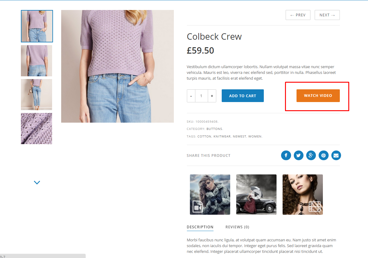
Video added with Popup Button
– Shortcode – information with shortcode to paste will appear below. [ct_woovideo id=’3′] – the only attribute is videos id that points to the proper video. All other settings should be set in this panel. You can paste the shortcode in the product description or in some other text field if it’s available.
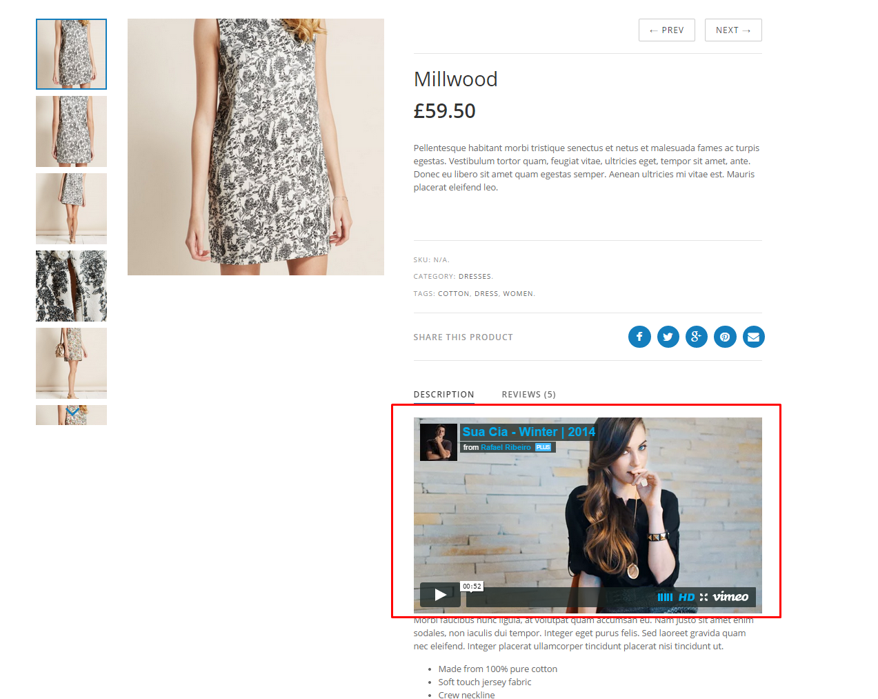
Add a video whenever you want with Shortcode
- Location priority – changes the action or filter priority so it will change the position in relation to other elements that are connected with the same hook. For example setting it to 1 and setting location to ‘tab’ will create a tab on the first place.
- Add a custom video class – add your class to video container.
- Video max height and width – will add css max-height and width in px. Use to reduce videos size. May be also useful if video does not display correctly (may happen when link embedded from external – not youtube and vimeo – site).
- Autoplay – videos will play automaticly when page is loaded or popup button/tab/gallery thumbnail clicked. Will work only with uploaded videos, Youtube and Vimeo.
- Video align – will add css float. It’s best to set it to ‘none’ to avoid display problems especially when video location is set to ‘Popup Button’. May be useful to adjust video position in various themes.
- Video clearing – will add clearfix div under the video. May be useful when video location is set to ‘tab’ and tabs are broken after adding the video (which may occur in some themes) or when other display problems occur.
- Margins – will add css margin-left, margin-top etc. in px. May be useful to adjust videos position.
- Upload a thumbnail – upload an image that will be used as a thumbnail if video location is ‘Image Gallery’ or a ‘Popup Button’ with label set to ‘Thumbnail’. Otherwise may be left empty.
- Select thumbnail icon – if thumbnail is uploaded, you may choose an icon to appear on the thumbnail to distinguish the video thumbnail from others.
- Icon size – will set the icon size in % in relation to thumbnails size (will be responsive).
- Icon position in thumbnail – may be set to center, or one of the corners (if corners it’s better to reduce the icon size)
- Icon opacity – set the icon opacity
Popup button settings:
- Button location – set the location
- Location priority – set priority
- Button color – button background color
- Button text color – button text color
- Button label:
– Title – use the video title which has been set in the field above
– Thumbnail – use the image as a background, thumbnail has to be set in the field above
– Custom – input it in the text field below - Button align, button clearing, margins, paddings, border radius – will adjust buttons display properties through css.
- Height, Width – may be set instead of padding when button label is set to ‘thumbnail’
- After setting up videos press ‘Save Videos’ button or otherwise you’ll loose all the changes.
- Press ‘Remove’ to delete the video. After confirming it can’t be undone (you do not need to press ‘Save Videos’ to save removing).
- On top in bulk options you can remove all videos, or restore settings to default.
- Also each video has a button: ‘Restore default video settings’ and ‘Restore default button settings’. You can set defaults in WooCommerce -> Settings -> Woovideo -> Video Settings/Popup Button Settings.
- In Popup Button Settings you can set in addition the ‘popup overlay color’ which will be the color of the background for popup videos.
- In ‘Add video to product list’ you can add a video that will appear on top of the product list in your shop.
Was this article helpful ?
Hooks
Woocommerce hooks used in the plugin:
for video locations:
– tab: woocommerce_product_tabs
– image gallery: woocommerce_before_single_product
– popup button: woocommerce_before_single_product
for button locations:
– After ‘Add to cart’ button: woocommerce_after_add_to_cart_button
– After product info: woocommerce_short_description
– Under the product gallery: woocommerce_product_thumbnails
– Above the product summary tabs: woocommerce_single_product_summary
Notice: All hooks above have priority set to 100 by default, but you can change them adjusting the ‘Location priority‘ setting)
for the video on top of the product list:
– woocommerce_before_shop_loop – with priority set to 1
Available display filters:
ct_woovideo_video_styles – handles video css styles
ct_woovideo_display_video – handles the whole video container display
ct_woovideo_button_styles – handles button css styles
ct_woovideo_display_button – handles the whole button display
ct_woovideo_icon_styles – handles icon css styles
ct_woovideo_gallery_videos – adds some custom classes to container that holds videos added to the image gallery
Settings page filters:
wc_ct_woovideo_video_settings – video default settings page
wc_ct_woovideo_button_settings – button default settings page
wc_ct_woovideo_list_video_settings – ‘Add video to product list’ settings page
‘Edit Product‘ page actions and filters:
ct_woovideo_attributes – filter to handle list of video metadata
ct_woovideo_admin_panel_metabox – action on top of each video section
ct_woovideo_after_video_attributes – action at the end of each video section, enables adding some options to the form
ct_woovideo_video_save_atts – filter to handle list of vide metadata before saving
ct_woovideo_video_save – action to add some code before saving every video
ct_woovideo_before_save – action to add some code before saving all videos
ct_woovideo_bulk_edit_actions – action to add some bulk options
Was this article helpful ?
Custom Thumbnail icon
You can add custom video icon, which will be displayed on video thumbnails, like the below:
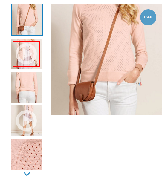
Custom thumbnail icon
If you want to add your custom thumbnail icon add a png image file to the wp-content/plugins/ct-woovideo/assets/images folder and add the following code to your functions.php file:
|
1 2 3 4 5 6 7 8 9 10 11 12 13 14 15 |
//add a new icon to your 'video settings' page add_filter('wc_ct_woovideo_icons' , 'add_woovideo_icon_setting', 1, 2); function add_woovideo_icon_setting($icons, $path){ $icons['new_icon'] = '<img src="' . $path . '/images/new_icon.png"/>'; return $icons; } //add a new icon to your 'edit product' page add_action('ct_woovideo_thumbnail_icons' , 'add_woovideo_icon_admin', 1, 3); function add_woovideo_icon_admin($loop, $video, $path){ ?> <label class="ct-woovideo-thumbnail-icon" for="ct-woovideo-select-icon7[<?php echo esc_attr($loop); ?>]"> <input type="radio" autocomplete="off" name="ct_woovideo_select_icon[<?php echo esc_attr($loop); ?>]" id="ct-woovideo-select-icon7[<?php echo esc_attr($loop); ?>]" class="ct-woovideo-select-icon" value="new_icon" <?php checked( $video['_thumbnail_icon'], 'new_icon' ); ?>/><img src="<?php echo $path ?>images/new_icon.png"/></label> <?php } |
Was this article helpful ?
General information
Thank you for purchasing Test! We’re very pleased that you have chosen our plugin to extend your website. We’re doing our best not to disappoint you! Before you get started, please check out these documentation pages. Test can only be used with WordPress and we assume that you already have it installed and ready to go. If you don’t, please see WordPress Codex to get started.
Was this article helpful ?
How to edit existing header block
Header block is a custom post type, where you can create whatever content you want with Visual Composer. Below you will find clues, which I believe help you to edit it:
1. Make sure, that Visual Composer in enabled for header blocks via Settings > Visual Composer
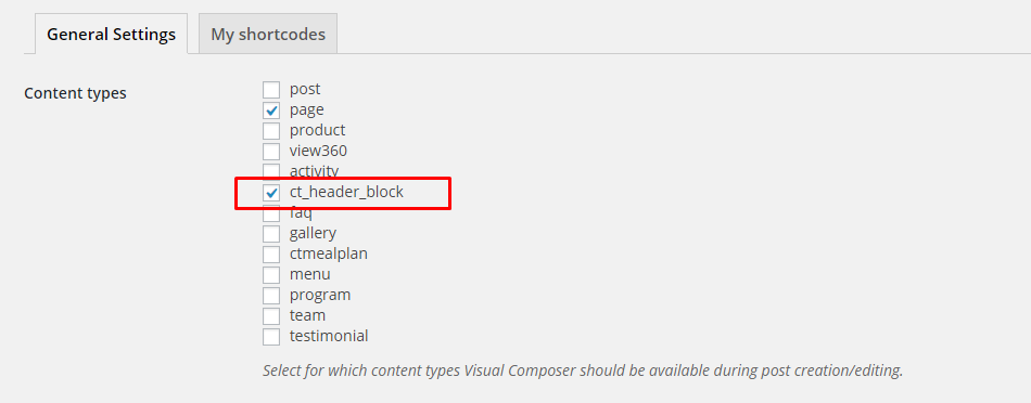
Visual Composer settings
2. To edit block, please go to Header Blocks
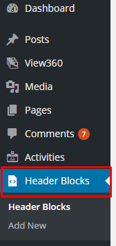
Header blocks list
and click on Edit).
3. Header block from our demo is created out of two elements: slider

Slider
and tabs

Tabs
4. If you would like to edit Slider – please check the slider settings below:
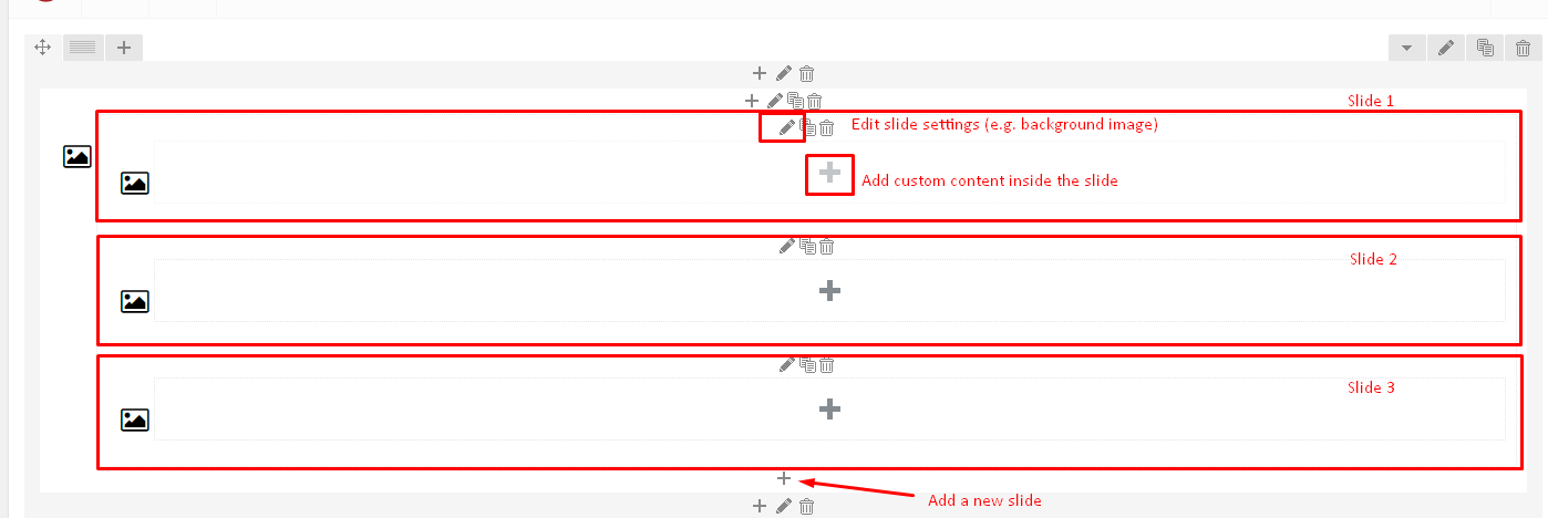
Slider settings
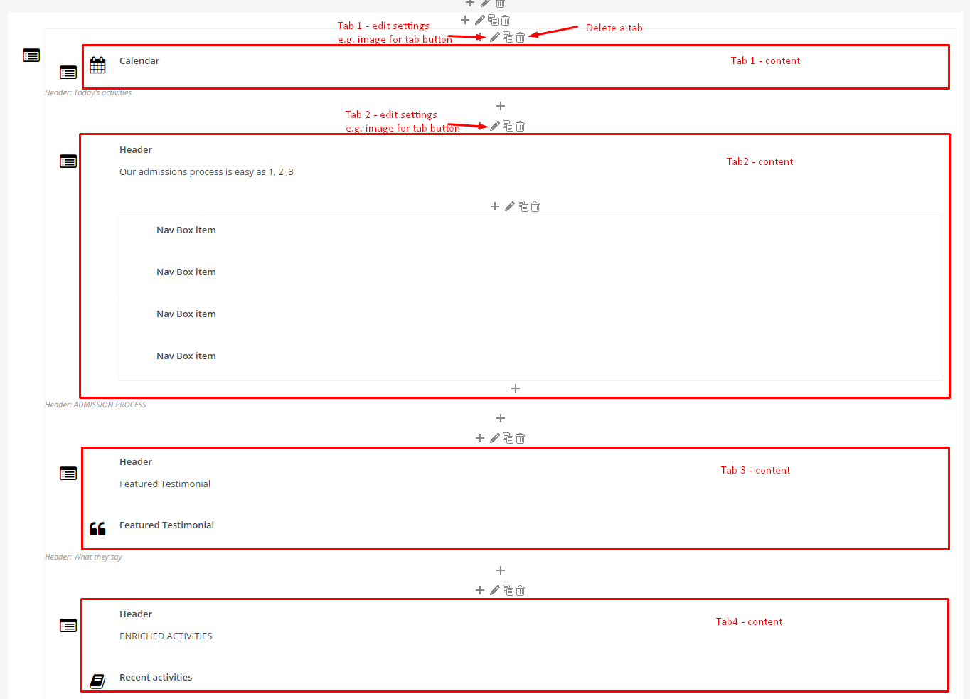
Tabs settings
6. Don’t forget to save changes with Update button.
Was this article helpful ?
CSS Files and structure
If you would like to edit the color, font, or style of any elements, you would do the following:
|
1 |
#primaryContent a {color: #someColor;} |
If you find that your new style is not overriding, it is most likely because of a specificity problem. Scroll down in your CSS file and make sure that there isn’t a similar style that has more weight.
I.E.
|
1 |
#wrap #primaryContent a {color: #someColor;} |
So, to ensure that your new styles are applied, make sure that they carry enough “weight” and that there isn’t a style lower in the CSS file that is being applied after yours.
Colors
The theme includes a css file wich you can use to edit the colors.
You just need to add the corresponding CSS file to the head of the page like this:
|
1 2 3 4 5 |
<head> (..) <link rel="stylesheet" type="text/css" href="css/motive.css"> (..) </head> |
Main Menu structure
Just change brand name, upload your logo to images/content/ folder and you’re ready to go!
|
1 2 3 4 5 6 7 8 9 10 11 12 13 14 15 16 17 18 19 20 21 22 23 24 25 26 27 28 29 30 31 32 33 34 35 36 37 38 39 40 41 42 43 44 45 46 47 48 49 50 51 52 53 54 55 56 57 58 59 60 61 62 63 64 65 66 67 68 69 70 71 72 73 74 75 76 77 78 79 80 81 82 83 84 85 86 87 88 89 90 91 92 93 94 95 |
<nav class="navbar navbar-white" role="navigation"> <!--</div>--> <div class="container"> <ul class="nav navbar-nav yamm ct-navbar--fadeIn"> <li class="dropdown"> <a class="dropdown-toggle"><i class="fa fa-bars"></i><span>Navigation</span></a> <ul class="dropdown-menu"> <li class="dropdown-submenu"><a class="active">Home</a> <ul class="dropdown-menu"> <li><a class="active" href="index.html">Home Parallax</a></li> <li><a href="index-2.html">Home KenBurns</a></li> <li><a href="index-3.html">Home Video</a></li> <li><a href="index-4.html">Home Slider</a></li> </ul> </li> <li class="dropdown"><a href="about-us.html">About us</a></li> <li class="dropdown"><a href="services.html">Service</a></li> <li class="dropdown-submenu"><a>Portfolio</a> <ul class="dropdown-menu"> <li><a href="portfolio-1.html">Portfolio 1</a></li> <li><a href="portfolio-2.html">Portfolio 2</a></li> <li><a href="portfolio-details.html">Portfolio Details</a></li> </ul> </li> <li class="dropdown-submenu"><a>Shop</a> <ul class="dropdown-menu"> <li><a href="shop.html">Shop</a></li> <li><a href="product-details.html">Products</a></li> </ul> </li> <li class="dropdown-submenu"><a>Blog</a> <ul class="dropdown-menu"> <li><a href="blog-1.html">Blog 1</a></li> <li><a href="blog-2.html">Blog 2</a></li> <li><a href="blog-post-single-1.html">Single 1</a></li> <li><a href="blog-post-single-2.html">Single 2</a></li> </ul> </li> <li class="dropdown-submenu"><a>FAQ</a> <ul class="dropdown-menu"> <li><a href="faq-1.html">FAQ 1</a></li> <li><a href="faq-2.html">FAQ 2</a></li> </ul> </li> <li class="dropdown"><a href="contact-us.html">Contact</a></li> </ul> </li> </ul> <ul class="nav navbar-nav ct-navbar--options"> <li> <a class="ct-js-navSearch ct-navbar-navSearch" href="#"> <i class="fa fa-search"></i> </a> </li> </ul> <div class="navbar-header"> <a class="navbar-brand" href="index.html"> <img src="assets/images/demo-content/exico.png" alt="exico"> </a> </div> <div class="pull-right"> <ul class="ct-socials list-inline list-unstyled"> <li> <a href="https://www.facebook.com/createITpl" data-toggle="tooltip" data-placement="left" title="facebook"> <i class="fa fa-facebook"></i> </a> </li> <li> <a href="https://twitter.com/createitpl" data-toggle="tooltip" data-placement="left" title="twitter"> <i class="fa fa-twitter"></i> </a> </li> </ul> </div> <div class="ct-navbar-search"> <form role="form"> <div class="form-group"> <input id="search" required="" type="text" name="field[]" class="form-control" placeholder="Search..."> <button class="ct-navbar-search-button" type="submit"> <i class="fa fa-search fa-fw"></i> </button> </div> </form> </div> </div> </nav> |
In order to create mega menus read the documentation here:
Icons
We’ve included 360+ font icons.
Awesome Icons – http://fontawesome.io/icons/
HTML markup:
|
1 2 |
<!-- Awesome Icons --> <i class="fa fa-cog"></i> |
Appearing with Animation when element in viewport
Animation can be turn off just be remove “withAnimation” class from body.
Usage:
– add “animated” class to element and data-fx=”animation-type”. That’s it.
Available animation : http://daneden.github.io/animate.css/
- data-fx=”hinge”
- data-fx=”bounce”
- data-fx=”flash”
- data-fx=”pulse”
- data-fx=”shake”
- data-fx=”swing”
- data-fx=”tada”
- data-fx=”wobble”
- data-fx=”bounceIn”
- data-fx=”bounceInDown”
- data-fx=”bounceInLeft”
- data-fx=”bounceInRight”
- data-fx=”bounceInUp”
- data-fx=”bounceOut”
- data-fx=”bounceOutDown”
- data-fx=”bounceOutLeft”
- data-fx=”bounceOutRight”
- data-fx=”bounceOutUp”
- data-fx=”fadeIn”
- data-fx=”fadeInDown”
- data-fx=”fadeInDownBig”
- data-fx=”fadeInLeft”
- data-fx=”fadeInLeftBig”
- data-fx=”fadeInRight”
- data-fx=”fadeInRightBig”
- data-fx=”fadeInUp”
- data-fx=”fadeInUpBig”
- data-fx=”fadeOut”
- data-fx=”fadeOutDown”
- data-fx=”fadeOutDownBig”
- data-fx=”fadeOutLeft”
- data-fx=”fadeOutLeftBig”
- data-fx=”fadeOutRight”
- data-fx=”fadeOutRightBig”
- data-fx=”fadeOutUp”
- data-fx=”fadeOutUpBig”
- data-fx=”flip”
- data-fx=”flipInX”
- data-fx=”flipInY”
- data-fx=”flipOutX”
- data-fx=”flipOutY”
- data-fx=”lightSpeedIn”
- data-fx=”lightSpeedOut”
- data-fx=”rotateIn”
- data-fx=”rotateInDownLeft”
- data-fx=”rotateInDownRight”
- data-fx=”rotateInUpLeft”
- data-fx=”rotateInUpRight”
- data-fx=”rotateOut”
- data-fx=”rotateOutDownLeft”
- data-fx=”rotateOutDownRight”
- data-fx=”rotateOutUpLeft”
- data-fx=”rotateOutUpRight”
- data-fx=”slideInDown”
- data-fx=”slideInLeft”
- data-fx=”slideInRight”
- data-fx=”slideOutLeft”
- data-fx=”slideOutRight”
- data-fx=”slideOutUp”
- data-fx=”rollIn”
- data-fx=”rollOut”
CSS Files & Structure
We’ve included 2 files.
bootstrap.css contains Bootstrap 3 Library.
style.css file contains general styles.
01. Imports
a) Variables
b) font awesome
c) Typography
d) Mediasection
e) Portfolio
f) Buttons
g) Hover
h) Mixins
i) Animate
j) Utilities
k) Menu
l) Gallery
m) Accordion
n) Widget
o) Toggables
p) Form
q) Datepicker
r) Magnific popup
s) Slick slider
02 .Wrapper and Snap.js
03. Media section
04. Checkout
05. Thumbnails
06. ImageBoxes
07. PersonBoxes
08. Pricing Box
09. Icon box
10. Socials
11. Google map
12. Header
13. footer
14. Last Works
15. Article Boxes
16. Image wrappers
17. Shop
18. Raiting
19. Text box
20. Comment Box
21. Lists
22. Video
23. Preloader
24. Scrollbar
25. Animation
Utilities
Utility classes are low-level structural and positional traits. Utilities can be applied directly to any element, multiple utilities can be used tohether and utilities can be used alongsie component classes.
Utilities are intended for frequently used CSS properties and patterns, like: floats, containing floats, vertical alignemnt, text tryncation. Relying on utilities can help to reduce repetition and provide consistend implementations.
Test uses utilities for the following categories:
- Font size:
- .ct-u-size13{
font-size: 13px;
} - .ct-u-size13{
font-size: 13px;
}
- .ct-u-size13{
- Paddings – the following values of padding can be added to any element you want: 10px, 20px, 30px. 40px, 50px, 60px, 70px, 80px, 90px, 100px, 110px, 120px, 130px, 140px, 150px – each value can be added to bottom, top or both top and bottom paddings, according to the following CSS class naming scheme:
- .ct-u-paddingBoth10
- .ct-u-paddingTop10
- .ct-u-paddingBottom10
- .ct-u-paddingBoth20
- .ct-u-paddingTop20
- .ct-u-paddingBottom20
- .ct-u-paddingBoth30
- .ct-u-paddingBoth30
- .ct-u-paddingBottom30
Just add class with padding value to any HTML element.
- Margins – the following values of margins can be added to any element you want: 10px, 20px, 30px. 40px, 50px, 60px, 70px, 80px, 90px, 100px, 110px, 120px, 130px, 140px, 150px – each value can be added as bottom, top or both top and bottom margin, according to the following CSS class naming scheme:
- .ct-u-marginBoth10
- .ct-u-marginTop10
- .ct-u-marginBottom10
- .ct-u-marginBoth20
- .ct-u-marginTop20
- .ct-u-marginBottom20
- .ct-u-marginBoth150
- .ct-u-marginBoth150
- .ct-u-marginBottom150
- Colors
- .ct-u-colorWhite
- .ct-u-colorFaint{
.ct-m-opacity(0.4);
} - .ct-u-colorBlack{
color: #000000;
} - .ct-u-colorInfo{ color: @alert-info-text;
} - .ct-u-colorSuccess{ color: @alert-success-text;
} - .ct-u-colorWarning{ color: @alert-warning-text;
} - .ct-u-colorDanger{ color: @alert-danger-text;
} - .ct-u-colorBody{ color: @body-color;
}
- Fonts
- .ct-u-fontType-1{
font-family: “PT Sans”,sans-serif;
} - .ct-u-fontType-2{
font-family: “Roboto Slab”, sans-serif;
} - .ct-u-fontType-3{
font-family: “Montserrat”, sans-serif;
}
- .ct-u-fontType-1{
- Background Colors
- .ct-u-backgroundWhite{
background-color: #ffffff;
} - .ct-u-backgroundGray{
background-color: #cacaca;
} - .ct-u-backgroundBody{
background-color: @body-color;
} - .ct-u-backgroundSuccess{
background-color: @alert-success-bg;
h1,.h1,h2,.h2,h3,.h3,h4,.h4,h5,.h5,h6,.h6{
color: @alert-success-bg;
}
} - .ct-u-backgroundWarning{
background-color: @alert-warning-bg;
h1,.h1,h2,.h2,h3,.h3,h4,.h4,h5,.h5,h6,.h6{
color: @alert-warning-bg;
}
} - .ct-u-backgroundDanger{
background-color: @alert-danger-bg;
h1,.h1,h2,.h2,h3,.h3,h4,.h4,h5,.h5,h6,.h6{
color: @alert-danger-bg;
}
} - .ct-u-backgroundInfo{
background-color: @alert-info-bg;
h1,.h1,h2,.h2,h3,.h3,h4,.h4,h5,.h5,h6,.h6{
color: @alert-info-bg;
}
} - .ct-u-backgroundBlack{
background-color: #000000;
h1,.h1,h2,.h2,h3,.h3,h4,.h4,h5,.h5,h6,.h6{
color: #ffffff;
}
.ct-raiting{
color: #ffffff;
}.lead{
.fa-star.ct-u-colorBlack{
color: #ffffff;
}
}
}
- .ct-u-backgroundWhite{
- Overflow
- .ct-u-overflow-show{
overflow: visible;
} - .ct-u-overflow-hide{
overflow: hidden;
}
- .ct-u-overflow-show{
- Display types
- .ct-u-displayTable, .ct-u-displayTableVertical, .ct-u-displayTableBottom , .ct-u-displayTableTop{
display: table;
width: 100%;
} - .ct-u-displayTableVertical, .ct-u-displayTableBottom, .ct-u-displayTableTop{
height: 100%;
} - .ct-u-displayTableTop{
.ct-u-displayTableCell{
vertical-align: top;
}
} - .ct-u-displayTableVertical{
.ct-u-displayTableCell{
vertical-align: middle;
}
} - .ct-u-displayTableBottom{
.ct-u-displayTableCell{
vertical-align: bottom;
}
} - .ct-u-displayTableRow{
display: table-row;
} - .ct-u-displayTableCell{
display: table-cell;
}
- .ct-u-displayTable, .ct-u-displayTableVertical, .ct-u-displayTableBottom , .ct-u-displayTableTop{
- Borders
- .ct-u-colorWhite{
.ct-u-borderAll{
border-color: #ffffff
}
} - .ct-u-borderAll{
border: 1px solid;
.ct-u-colorWhite{
border-color: #ffffff;
}
}
- .ct-u-colorWhite{
Was this article helpful ?
Article
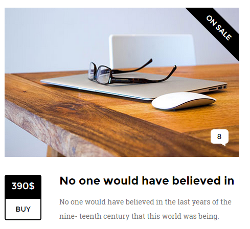
Article – type 1
HTML markup:
|
1 2 3 4 5 6 7 8 9 10 11 12 13 14 15 16 17 18 19 20 21 22 23 24 25 26 27 28 29 30 31 32 33 34 35 36 |
<div class="ct-articleBox"> <div class="ct-articleBox-media"> <div class="ct-galleryBox"> <div class="ct-galleryBox-image "> <a class="ct-js-magnificPopupImage"> <img src="assets/images/portfolio1.jpg" alt=""> </a> </div> <div class="ct-galleryBox-overlay"> <div class="ct-u-displayTableVertical"> <div class="ct-u-displayTableCell"> <div class="ct-galleryBox-icons"> <div class="btn-group ct-btn-group--rounded ct-u-colorWhite" role="group" aria-label="..."> <a class="btn ct-btn--transparent" data-toggle="tooltip" data-placement="left" title="09/04/2015"><i class="fa fa-calendar"></i></a> <a class="btn ct-btn--transparent">Details</a> <a href="assets/images/portfolio1-lg.jpg" class="btn ct-btn--transparent ct-js-magnificPopupImage"><i class="fa fa-search"></i></a> </div> </div> </div> </div> </div> </div> </div> <h3 class=" ct-u-paddingTop30"> <a class="btn btn-link">No one would have believed in the last years</a> </h3> <div class="ct-articleBox-description"> <p class="ct-u-paddingTop20"> No one would have believed in the last years of the nine- teenth century that this world was being watched keenly and closely by intelligences greater than man’s and yet as mor- tal as his own; that as men busied themselves about their vari- ous concerns they were scrutinised and </p> </div> </div> |
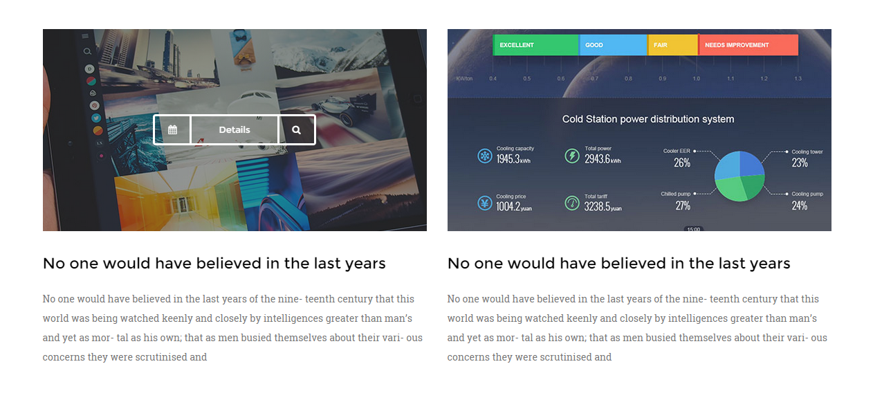
Article – type 2
|
1 2 3 4 5 6 7 8 9 10 11 12 13 14 15 16 17 18 19 20 21 22 23 |
<div class="ct-articleBox"> <div class="ct-articleBox-media"> <img src="assets/images/article-10.jpg" alt=""/> <div class="ct-tag">on sale</div> <span class="ct-link"> <a href="#">8</a> </span> </div> <div class="media ct-u-paddingTop20"> <div class="media-left"> <div class="media-object ct-articleBox-info"> <div class="info-1">390$</div> <div class="info-2"><a href="#">BUY</a></div> </div> </div> <div class="media-body"> <h3 class="media-heading ct-u-paddingBottom10 ct-fw-600">No one would have believed in</h3> <p> No one would have believed in the last years of the nine- teenth century that this world was being. </p> </div> </div> </div> |
CSS classes:
ct-articleBox: Base class for article.
ct-articleBox-media: Images,videos or other media that can be used in article.
ct-articleBox-description: Description of an article.
ct-link: number of comments displayed in bubble speech.
ct-tag: Tag for announcments, like “brand new”.
ct-u-paddingTop20: adds 20px padding on top.
ct-u-paddingTop30: adds 30px padding on top.
media, media-left, media-heading, media-object ,media-body – Bootstrap classes for creating media.
ct-articleBox-info: article info box wrapper that contain such information like date,price or is simply a button.
info-1: ‘ct-articleBox-info‘ subclass.
info-2: ‘ct-articleBox-info‘ subclass.
An article may be a part of a gallery:
ct-galleryBox: wrapper for gallery media.
ct-galleryBox-image: wrapper for gallery image.
ct-js-magnificPopupImage: Indicates that light box is in use. (Magnific pop-up)
btn: button class.
btn-link: button link style.
ct-btn–transparent: adds transparency to button.
Was this article helpful ?
Blockquote
Blockquotes
HTML Markup:
Standard bootstrap markup
|
1 2 3 4 5 6 7 8 |
<blockquote> <p> Yokohama is called Benten, after the goddess of the sea, who is worshipped on the islands round about. There Passepartout beheld beautiful fir and cedar groves, sacred gates of a singular architecture, bridges half hid in the midst of bamboos and reeds, temples shaded by immense cedar-trees, holy retreats where were sheltered </p> </blockquote> |
Style 1 for class “ct-blockquote-1”
|
1 2 3 4 5 6 7 8 |
<blockquote class="ct-blockquote-1"> <p> The planet Mars, I scarcely need remind the reader, revolves about the sun at a mean distance of 140,000,000 miles, and the light and heat it receives from the sun is barely half of that received by this world. It must be, if the nebular hypothesis has any truth, older than our world; and long before this earth ceased to be molten. </p> </blockquote> |
Style 2 for class “ct-blockquote-2”
|
1 2 3 4 5 6 |
<blockquote class="ct-blockquote-2"> <p> Yokohama is called Benten, after the goddess of the sea, who is worshipped on the islands round about. There Passepartout beheld beautiful fir and cedar groves. </p> </blockquote> |
Was this article helpful ?
Buttons
Button groups

Button wrapper
Buttons
HTML Markup:
Single buttons:
|
1 2 3 |
<a href="#" class="btn btn-xs btn-default ct-btn-rounded"> Small Button </a> |
|
1 2 3 |
<a href="#" class="btn btn-sm btn-primary ct-btn-rounded"> Medium Button </a> |
|
1 2 3 |
<a href="#" class="btn ct-btn--transparent ct-btn-rounded"> Normal Button </a> |
Description:
btn – this is a base class that is obligatory for every button.
ct-btn–transparent – adds transparency to button leaving only borders.
btn-xs,.btn-sm… etc. these classes gives size to a button.
ct-btn-rounded – this class makes button rounded.
‘btn-primary‘ and ‘btn-default‘ – types of buttons, which change color to: black and white .
Notice:
if class ‘ct-u-colorWhite‘ is a wrapping class e.g.
|
1 2 3 4 5 |
<div class="ct-u-colorWhite"> <a class="btn btn-lg btn-primary"> Click me ! </a> </div> |
It changes properties of this button to white.
Some buttons may keep the properties of a link. It’s strongly adviced to create them by using
‘
<a> ‘ attribute.
|
1 |
<a class="btn btn-link btn-link--white">Link</a> |
Button groups
|
1 2 3 4 5 |
<div class="btn-group ct-btn-group--rounded btn-group--equal ct-u-colorWhite" role="group" aria-label="..."> <a class="btn ct-btn--transparent">Left</a> <a class="btn ct-btn--transparent">Center</a> <a class="btn ct-btn--transparent">Right</a> </div> |
Button wrapper
|
1 2 3 4 |
<div class="ct-btn-wrapper"> <a class="btn ct-btn--transparent ct-btn-rounded ct-js-magnificPopupImage" href="assets/images/top-product-1-lg.jpg"><i class="fa fa-search"></i></a> <a class="btn ct-btn--transparent ct-btn-rounded" href="#"><i class="fa fa-shopping-cart"></i></a> </div> |
CSS Classes:
ct-btn-rounded: Gives border radius to button.
ct-u-colorWhite: changes button’s color properties to white.
ct-btn–transparent, btn-primary, btn-default, btn-link: button types.
btn-link–white: Gives white color properties to a link.
ct-btn-wrapper: Wraps buttons if they are dsplayed on image.
Group buttons :
ct-btn-group–rounded: Gives border radius to a button group.
btn-group–equal: Buttons in button group are equal.
Button sizes:
btn-xs,.btn-sm,.btn-lg,.btn-lg-2: button size.
ct-btn–full: full width button.
Button types:
btn-default, btn-primary, btn-link: Button types.
btn-link–white: variation to change ‘btn-link’ properties to white.
Was this article helpful ?
Call to action box

Call to action
|
1 2 3 4 5 6 7 8 9 10 11 12 13 14 15 16 17 18 19 20 21 22 23 24 25 26 27 28 29 30 |
<section class="ct-mediaSection ct-u-paddingBoth120" data-stellar-background-ratio="0.3" data-type="parallax" data-bg-image="assets/images/background-4.jpg" data-bg-image-mobile="assets/images/background-4.jpg"> <div class="ct-mediaSection-inner"> <div class="container"> <div class="row"> <div class="col-md-6"> <h5 class="ct-u-colorWhite">No one would have believed in the last years of the nineteenth century that this world was being watched </h5> </div> </div> <div class="row"> <div class="col-md-7 ct-u-colorWhite"> <p class="ct-u-colorFaint ct-u-paddingBoth20"> No one would have believed in the last years of the nine- teenth century that this world was being watched keenly and closely by intelligences greater than man’s and yet as mortal as his </p> <a class="btn btn-lg ct-btn-rounded ct-btn--transparent" href="contact-us.html"> Get in touch! </a> </div> <div class="col-md-5"></div> </div> </div> </div> </section> |
CSS Classes:
ct-u-paddingBoth120: adds 120px padding both to top and buttom.
ct-u-paddingBoth20: adds 20px padding both to top and bottom.
ct-u-colorFaint: changes the opacity.
ct-u-colorWhite: gives white color to component.
ct-mediaSection, ct-mediaSection-inner: are common throughout all our templates.
You can edit section parameters with the following data-attributes:
data-type: indicates the parralax effect for section.
data-stellar-background-ratio: how fast will background image change its position with parallax effect.
data-bg-image-mobile: define image, which should be displayed on mobile devices.
Was this article helpful ?
Cart menu
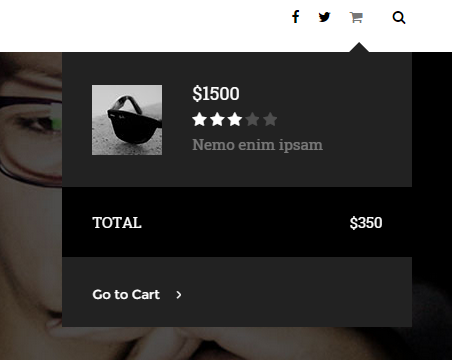
Cart menu
|
1 2 3 4 5 6 7 8 9 10 11 12 13 14 15 16 17 18 19 20 21 22 23 24 25 26 27 28 |
<div class="ct-cart-tag" data-placement="left"> <i class="fa fa-shopping-cart"></i> <div class="ct-cart-window"> <div class="ct-cart-product"><img src="assets/images/cart-sm.jpg" alt=""/></div> <div class="ct-cart-details"> <span class="h6 ct-u-fontType-2 ct-u-colorWhite">$1500</span> <div class="ct-raiting ct-u-colorWhite"> <i class="fa fa-star"></i> <i class="fa fa-star"></i> <i class="fa fa-star"></i> <i class="fa fa-star ct-u-colorFaint"></i> <i class="fa fa-star ct-u-colorFaint"></i> </div> <span class="ct-u-colorWhite ct-u-colorFaint">Nemo enim ipsam</span> </div> <div class="ct-cart-total ct-u-marginTop30"> <div class="ct-u-displayTable ct-u-colorWhite"> <div class="ct-u-displayTableCell text-uppercase">Total</div> <div class="ct-u-displayTableCell ct-cart-total--price">$350</div> </div> </div> <div> <button class="btn btn-link btn-link--white ct-u-colorWhite"> <span>Go to Cart</span><i class="fa fa-angle-right"></i> </button> </div> </div> </div> |
CSS Classes:
ct-cart-tag: Base class for cart window.
ct-cart-window: It displays cart window.
ct-cart-product: Wrapper for product image.
ct-cart-details: Wrapper for Cart’s product content.
ct-cart-total: Total price for all products.
ct-cart-total–price: style for price.
ct-u-colorWhite: gives white color to component.
ct-u-colorFaint: Lowers component opacity.
|
1 2 3 4 5 6 |
.ct-u-displayTable{ display: table; } .ct-u-displayTableCell{ display: table-cell } |
fa, fa-star: font awesome classes used to display stars in ratings.
Was this article helpful ?
Checkout
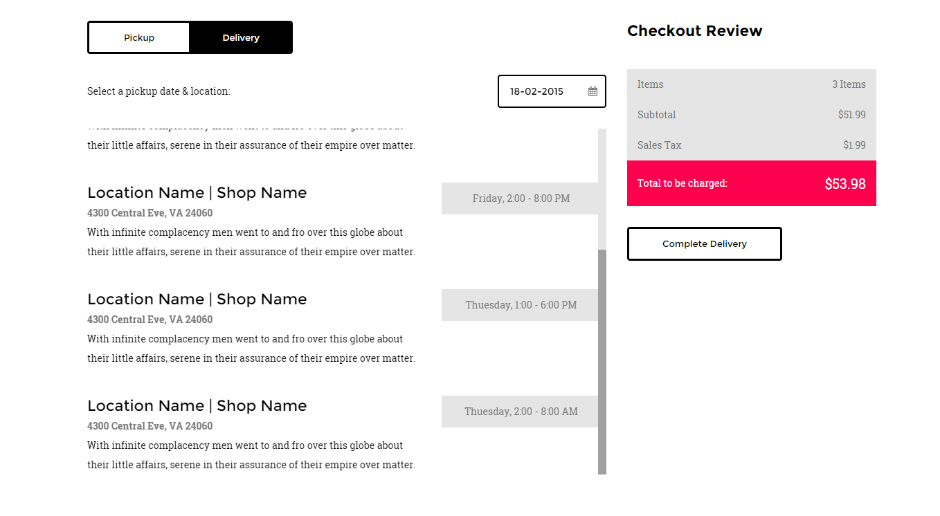
Checkout
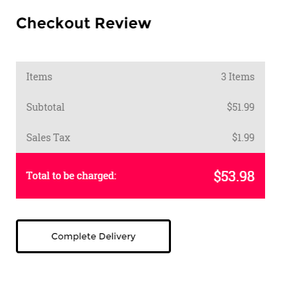
Checkout table
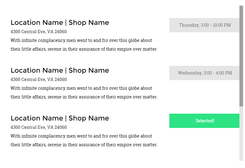
Checkout item

Datepicker

Form row
Form row 2
|
1 2 3 4 5 6 7 8 9 10 11 12 13 14 15 16 17 18 19 20 21 22 23 24 25 26 27 28 29 30 31 32 33 34 35 36 37 38 39 40 41 42 43 44 45 46 47 48 49 50 51 52 53 54 55 56 57 58 59 60 61 62 63 64 65 66 67 68 69 70 71 72 73 74 75 76 77 78 79 80 81 82 83 84 85 86 87 88 89 90 91 92 93 94 95 96 97 98 99 100 101 102 103 104 105 106 107 108 109 110 111 112 113 114 115 116 117 118 119 120 121 122 123 124 125 126 127 128 129 130 131 132 133 134 135 136 137 138 139 140 141 142 143 144 145 146 147 148 149 150 151 152 153 |
<div class="tab-content ct-checkout"> <div id="a2" class="tab-pane fade in active"> <div class="row"> <div class="col-md-12"> <div class="ct-u-displayTableVertical ct-u-marginBottom30"> <div class="ct-u-displayTableCell"><span class="ct-u-colorBlack">Select a pickup date & location:</span></div> <div class="ct-u-displayTableCell"> <div class="input-append date pull-right" data-date="12-02-2012" data-date-format="dd-mm-yyyy"> <input class="form-control-3" size="16" type="text" value="12-02-2012"> <span class="add-on"><i class="fa fa-calendar"></i></span> </div> </div> </div> <div class="ct-checkout-item"> <div class="row ct-u-paddingTop40"> <div class="col-md-8"> <h5>Location Name | Shop Name</h5> <p class="ct-fw-600">4300 Central Eve, VA 24060</p> <p class="ct-u-colorBlack">With infinite complacency men went to and fro over this globe about their little affairs, serene in their assurance of their empire over matter. </p> </div> <div class="col-md-4"> <div class="ct-btn-checkbox"> <label> <input type="checkbox" value="18-02-2015" data-value="Thursday, 3:00 - 10:00 PM" name="checkout"> <span>Thursday, 3:00 - 10:00 PM</span> </label> </div> </div> </div> <div class="col-md-8"> <h5>Location Name | Shop Name</h5> <p class="ct-fw-600">4300 Central Eve, VA 24060</p> <p class="ct-u-colorBlack">With infinite complacency men went to and fro over this globe about their little affairs, serene in their assurance of their empire over matter. </p> </div> <div class="col-md-4"> <div class="ct-btn-checkbox"> <label> <input type="checkbox" value="9-02-2015" data-value="Thuesday, 2:00 - 8:00 AM" name="checkout"> <span>Thuesday, 2:00 - 8:00 AM</span> </label> </div> </div> </div> </div> </div> </div> </div> <div class="row"> <div class="col-md-12"> <div class="ct-u-displayTableVertical ct-u-marginBottom30"> <div class="ct-u-displayTableCell"><span class="ct-u-colorBlack">Select a delivery date & location:</span></div> <div class="ct-u-displayTableCell"> <div class="input-append date pull-right" data-date="12-02-2012" data-date-format="dd-mm-yyyy"> <input class="form-control-3" size="16" type="text" value="12-02-2012"> <span class="add-on"><i class="fa fa-calendar"></i></span> </div> </div> </div> <div class="ct-checkout-item"> <div class="row ct-u-paddingTop40"> <div class="col-md-8"> <h5>Location Name | Shop Name</h5> <p class="ct-fw-600">4300 Central Eve, VA 24060</p> <p class="ct-u-colorBlack">With infinite complacency men went to and fro over this globe about their little affairs, serene in their assurance of their empire over matter. </p> </div> <div class="col-md-4"> <div class="ct-btn-checkbox"> <label> <input type="checkbox" value="18-02-2015" data-value="Thursday, 3:00 - 10:00 PM" name="checkout"> <span>Thursday, 3:00 - 10:00 PM</span> </label> </div> </div> </div> <div class="row ct-u-paddingTop40"> <div class="col-md-8"> <h5>Location Name | Shop Name</h5> <p class="ct-fw-600">4300 Central Eve, VA 24060</p> <p class="ct-u-colorBlack">With infinite complacency men went to and fro over this globe about their little affairs, serene in their assurance of their empire over matter. </p> </div> <div class="col-md-4"> <div class="ct-btn-checkbox"> <label> <input type="checkbox" value="11-02-2015" data-value="Wednesday, 3:00 - 4:00 PM" name="checkout"> <span>Wednesday, 3:00 - 4:00 PM</span> </label> </div> </div> </div> <div class="row ct-u-paddingTop40"> <div class="col-md-8"> <h5>Location Name | Shop Name</h5> <p class="ct-fw-600">4300 Central Eve, VA 24060</p> <p class="ct-u-colorBlack">With infinite complacency men went to and fro over this globe about their little affairs, serene in their assurance of their empire over matter. </p> </div> <div class="col-md-4"> <div class="ct-btn-checkbox"> <label> <input type="checkbox" value="11-02-2015" data-value="Friday, 2:00 - 8:00 PM" name="checkout"> <span>Friday, 2:00 - 8:00 PM</span> </label> </div> </div> </div> <div class="row ct-u-paddingTop40"> <div class="col-md-8"> <h5>Location Name | Shop Name</h5> <p class="ct-fw-600">4300 Central Eve, VA 24060</p> <p class="ct-u-colorBlack">With infinite complacency men went to and fro over this globe about their little affairs, serene in their assurance of their empire over matter. </p> </div> <div class="col-md-4"> <div class="ct-btn-checkbox"> <label> <input type="checkbox" value="8-02-2015" data-value="Thuesday, 1:00 - 6:00 PM" name="checkout"> <span>Thuesday, 1:00 - 6:00 PM</span> </label> </div> </div> </div> <div class="row ct-u-paddingTop40"> <div class="col-md-8"> <h5>Location Name | Shop Name</h5> <p class="ct-fw-600">4300 Central Eve, VA 24060</p> <p class="ct-u-colorBlack">With infinite complacency men went to and fro over this globe about their little affairs, serene in their assurance of their empire over matter. </p> </div> <div class="col-md-4"> <div class="ct-btn-checkbox"> <label> <input type="checkbox" value="9-02-2015" data-value="Thuesday, 2:00 - 8:00 AM" name="checkout"> <span>Thuesday, 2:00 - 8:00 AM</span> </label> </div> </div> </div> </div> </div> </div> </div> </div> |
ct-checkout: Base class for checkout.
tab-content: Hide tab panels at start, show them when .active.
The ‘.datepicker’ component consist of fallowing HTML markup:
|
1 2 3 4 |
<div class="input-append date pull-right" data-date="12-02-2012" data-date-format="dd-mm-yyyy"> <input class="form-control-3" size="16" type="text" value="12-02-2012"> <span class="add-on"><i class="fa fa-calendar"></i></span> </div> |
CSS Classes :
‘.input-append‘, ‘.date‘ are the classes necessary to get datepicker plugin to work and be displayed.
I also requires the following js files:
<script> $('.input-append').datepicker();</script>
The ‘ct-checkout’ component consist of ‘datepicker‘ and ‘ct-checkout-item‘ items.
The ‘ct-checkout-item’ selects a prticular date in ‘.datepicker’ component by clicking CHECKBOX BUTTON.
CHECKBOX BUTTON :
It always comes with the following markup :
|
1 2 3 4 5 6 |
<div class="ct-btn-checkbox"> <label> <input type="checkbox" value="18-02-2015" data-value="Thursday, 3:00 - 10:00 PM" name="checkout"> <span>Thursday, 3:00 - 10:00 PM</span> </label> </div> |
ct-btn-checkbox: It’s a type of a button, reserved just for checkout section.
Input field receive two attributes, which is ‘value’ and ‘data-value’. The ‘value’ attribute
sets the ‘datepicker’ component to particular date. The ‘data-value’ is text of a button that
will be displayed after clicking twice on the button. First click will inform user that button was clicked
by displaying thext ‘Selected!’. Second click will take value from ‘data-value’ attribute.
USED UTILITIES CLASSES:
|
1 2 3 4 5 6 7 8 9 10 11 12 13 |
.ct-u-displayTableVertical{ display: table; .ct-u-displayTableCell{ vertical-align: middle. } } .ct-u-displayTable{ display: table; } .ct-u-displayTableCell{ display: table-cell } |
Was this article helpful ?
Google Map
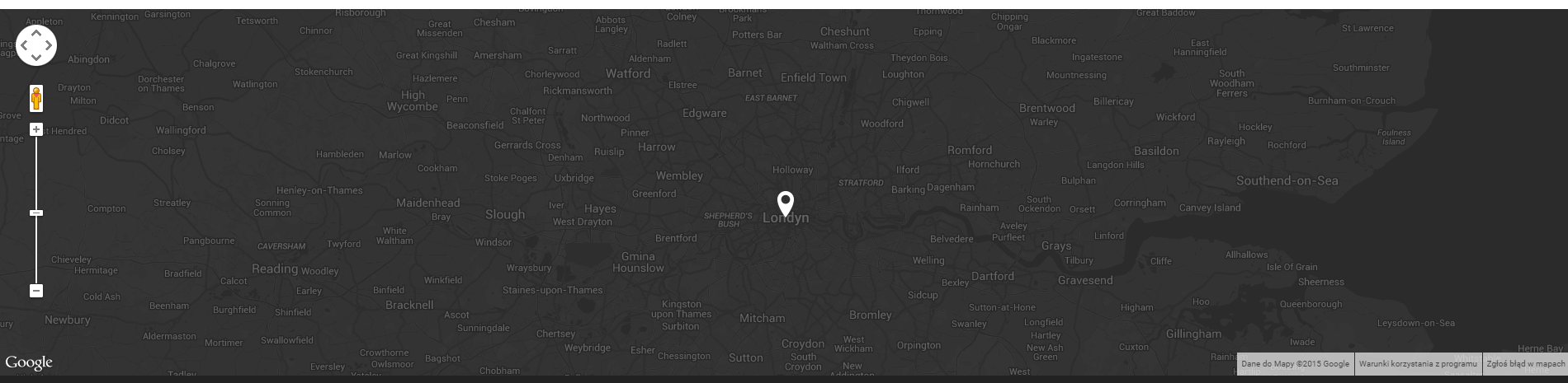
Google Map
HTML Markup:
|
1 |
<div class="ct-js-googleMap ct-googleMap" data-location="London" data-zoom="10" data-height="445"></div> |
You can change map location with:
data-location=" " attribute – just add here your current location.
Make sure to include the following scripts in map page:
|
1 2 3 |
<script src="http://maps.google.com/maps/api/js?sensor=false"></script> <script src="assets/js/gmaps/gmap3.min.js"></script> <script src="assets/js/gmaps/init.js"></script> |
Was this article helpful ?
Icon Box
HTML Markup :
Icon box 1
Icon Box
|
1 2 3 4 5 6 7 8 9 10 11 12 13 14 |
<div class="ct-iconBox-1"> <div class="ct-icon"> <img src="assets/images/Speach.png" alt=""/> </div> <p class="ct-u-paddingBoth20"> No one would have believed in the last years of the nine- teenth century that this world was being watched keenly. </p> <h6> <a class="btn btn-link"> At most terrestrial men fancied </a> </h6> </div> |
Icon box 2 – animated counter
|
1 2 3 4 5 6 7 8 |
<div class="ct-iconBox-2"> <div class="ct-icon animated activate pulse infinite"> <img src="assets/images/notebook-icon.png" alt=""/> </div> <span class="ct-fw-700 ct-u-colorWhite ct-js-counter" data-ct-to="512" data-ct-speed="5000">0</span> <p>Praesentium</p> </div> |
Icon box 3
|
1 2 3 4 5 6 7 8 9 10 11 12 13 14 15 |
<div class="ct-u-displayTableVertical"> <div class="ct-u-displayTableCell"> <div class="ct-iconBox-3"> <div class="ct-img-wrapper-2"> <img src="assets/images/progress-1.jpg" alt=""/> <i class="fa fa-angle-right animated activate pulse infinite"></i> </div> <h5 class="ct-fw-600 ct-u-paddingTop30 ct-u-paddingBottom20">Perspiciatis unde</h5> <p class="ct-content"> No one would have believed in the last years of the nine- teenth century that this world was being watched keenly </p> </div> </div> </div> |
CSS Classes
ct-iconBox-1, .ct-iconBox-2, .ct-iconBox-3: Icon boxes type.
ct-icon: Sets size for image or icon.
ct-img-wrapper-2: Sets position relative.
ct-img-wrapper-2: returns position relative.
ct-fw-700: font weight 700.
|
1 2 3 4 5 6 7 8 9 10 11 12 13 14 |
ct-u-displayTableVertical{ display: table; .ct-u-displayTableCell{ vertical-align: middle; } } .ct-u-displayTableRow{ display: table-row; } .ct-u-displayTableCell{ display: table-cell; } |
animated, activate, pulse, infinite: Add animation to the icon, requires using ‘cssAnimate‘ class in body HTML attribute.
Class ‘pulse‘ can be replaced with other class like ‘wobble‘ or ‘shake‘ to receive different animation
ct-content: some description, text, etc.
ct-u-colorWhite: gives white color to a component.
Icon boxes may be used as counters, therefore js classes are required.
To create a counter, remember to attach “ct-js-counter” class to counter component like below:
|
1 2 |
<span class="ct-js-counter" data-ct-to="512" data-ct-speed="5000">0</span> |
You can edit counter settings with the following data attributes:
data-ct-to: Max value for counter to count.
data-ct-speed: Counter speed.
Remember to attach the following script to your HTML page, when you want to use a counter:
|
1 2 |
<script src="assets/js/counter/jquery.countTo.js"></script>, <script src="assets/js/counter/init.js"></script> |
Was this article helpful ?
Person box
Person box:
Person Box
|
1 2 3 4 5 6 7 8 9 10 11 12 13 14 15 16 17 18 19 20 21 22 |
<div class="ct-personBox"> <div class="ct-img-wrapper-2"> <div class="ct-img-wrapper-3"> <div class="ct-u-displayTableVertical"> <div class="ct-u-displayTableCell ct-u-colorWhite text-center"> <a class="btn btn-lg ct-btn--transparent ct-btn-rounded" href="#">See Profile</a> </div> </div> </div> <img src="assets/images/demo-content/team-1.jpg" alt=""> </div> <div> <h5 class="ct-fw-600 ct-u-paddingTop30">Emil Costello</h5> <p>Founder</p> <p>No one would have believed in the last years of the nine- teenth century that this world was being watched keenly</p> <ul class="list-inline ct-socials ct-u-size20 ct-u-paddingTop10"> <li><a href="#"><i class="fa fa-envelope" data-toggle="tooltip" data-placement="top" title="" data-original-title="linkedin"></i></a></li> <li><a href="https://twitter.com/createitpl" data-toggle="tooltip" data-placement="top" title="" data-original-title="twitter"><i class="fa fa-twitter"></i></a></li> <li><a href="#"><i class="fa fa-linkedin" data-toggle="tooltip" data-placement="top" title="" data-original-title="linkedin"></i></a></li> </ul> </div> </div> |
Widget person box:
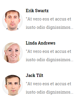
Person box – widget
|
1 2 3 4 5 6 7 8 9 10 11 12 13 14 15 16 |
<div class="widget"> <div class="widget-inner"> <div class="media"> <div class="media-left media-middle"> <a href="#"> <img class="media-object" src="assets/images/demo-content/person-1.png" alt=""> </a> </div> <div class="media-body"> <span class="media-heading">Erik Swartz</span> <p>"At vero eos et accus et iusto odio dignissimos...</p> </div> </div> </div> </div> |
ct-personBox: Person box style.
ct-img-wrapper-2: Gives position relative.
ct-img-wrapper-3: Gives position absolute and sets top: 0, bottom: 0, right: 0,left:0.
btn, btn-link, btn-lg, ct-btn–transparent, ct-btn-rounded: button classes.
Was this article helpful ?
Photo stream
Photostream
|
1 2 3 4 5 6 7 8 9 10 11 12 13 14 15 16 17 18 19 |
<div class="widget"> <div class="widget-inner"> <h6 class="ct-fw-600 ct-u-paddingBoth40">My Photostream</h6> <ul class="list-unstyled ct-photostream"> <li class="ct-u-paddingBottom30"> <div class="ct-u-displayTableCell"><a class="ct-img-wrapper-2" href="portfolio-2.html"><img src="assets/images/photostream-small-1.jpg" alt=""/></a></div> <div class="ct-u-displayTableCell"><a class="ct-img-wrapper-2" href="portfolio-2.html"><img src="assets/images/photostream-small-2.jpg" alt=""/></a></div> </li> <li class="ct-u-paddingBottom30"> <div class="ct-u-displayTableCell"><a class="ct-img-wrapper-2" href="portfolio-2.html"><img src="assets/images/photostream-small-3.jpg" alt=""/></a></div> <div class="ct-u-displayTableCell"><a class="ct-img-wrapper-2" href="portfolio-2.html"><img src="assets/images/photostream-small-4.jpg" alt=""/></a></div> </li> <li class="ct-u-paddingBottom30"> <div class="ct-u-displayTableCell"><a class="ct-img-wrapper-2" href="portfolio-2.html"><img src="assets/images/photostream-small-5.jpg" alt=""/></a></div> <div class="ct-u-displayTableCell"><a class="ct-img-wrapper-2" href="portfolio-2.html"><img src="assets/images/photostream-small-6.jpg" alt=""/></a></div> </li> </ul> </div> </div> |
Was this article helpful ?
Portfolio slider

Portfolio
|
1 2 3 4 5 6 7 8 9 10 11 12 13 14 15 16 17 18 19 20 21 22 23 24 25 26 27 28 29 30 31 32 33 34 35 36 37 38 39 40 41 42 43 44 45 46 47 48 49 |
HTML Markup : <section class="ct-mediaSection" data-bg-image="assets/images/background-2.jpg" data-stellar-background-ratio="0.3" data-type="parallax"> <div class="ct-mediaSection-inner"> <div class="container"> <div class="ct-js-slick ct-slick-1 ct-slick-arrow-1" data-animations="true" data-autoplay="false" data-arrows="true" data-items="1" data-XSitems="1" data-SMitems="1" data-MDitems="1"> <div class="item"> <img class="ct-u-marginTop70" src="assets/images/portfolio-details-slider-person-1.jpg" alt=""/> <p class="ct-u-marginTop30"> “No one would have believed in the last years of the nine- teenth century that this world was being watched keenly and closely by intelligences greater than man’s and yet as mortal as his own limet norma ipsum delient century looper that as men busied” </p> <p class="ct-name ct-u-marginTop20 ct-u-marginBottom100">Maria Barnett - CEO</p> </div> <div class="item"> <img class="ct-u-marginTop70" src="assets/images/portfolio-details-slider-person-1.jpg" alt=""/> <p class="ct-u-marginTop30"> “No one would have believed in the last years of the nine- teenth century that this world was being watched keenly and closely by intelligences greater than man’s and yet as mortal as his own limet norma ipsum delient century looper that as men busied” </p> <p class="ct-name ct-u-marginTop20 ct-u-marginBottom100">Maria Barnett - CEO</p> </div> <div class="item"> <img class="ct-u-marginTop70" src="assets/images/portfolio-details-slider-person-1.jpg" alt=""/> <p class="ct-u-marginTop30"> “No one would have believed in the last years of the nine- teenth century that this world was being watched keenly and closely by intelligences greater than man’s and yet as mortal as his own limet norma ipsum delient century looper that as men busied” </p> <p class="ct-name ct-u-marginTop20 ct-u-marginBottom100" >Maria Barnett - CEO</p> </div> </div> </div> </div> </section> |
Change sliders navigation position by adding one of the following CSS classes to HTML markup:
- ct-slick-arrow-1,
- ct-slick-arrow-1–above,
- ct-slick-arrow-2,
- ct-slick-arrow-3,
- ct-slick-arrow-3–leftTop
- ct-slick-arrow-3–leftBottom,
- ct-slick-arrow-3–rightTop
- ct-slick-arrow-3–rightBottom,
- ct-slick-arrow-3–under
Was this article helpful ?
PSD Files
We understand that you might have ideas for improving our project design. Feel free to change the design to better suit your needs. Layered PSD files are available here
Was this article helpful ?
Pricing Tables
Pricing table 1

|
1 2 3 4 5 6 7 8 9 10 11 12 13 14 15 16 17 18 19 20 21 22 23 24 25 26 |
<div class="ct-pricing-1"> <div class="ct-u-displayTableVertical"> <div class="ct-u-displayTableRow"> <div class="ct-u-displayTableCell"> <span class="ct-fw-300">Free</span> <h3 class="ct-fw-600">$0/mo</h3> </div> </div> <div class="ct-u-displayTableRow"> <div class="ct-u-displayTableCell"> <ul class="list-unstyled"> <li class="ct-u-colorBlack">Yokohama</li> <li>Worshipped</li> <li>Passepartout</li> <li>Buddhist</li> <li>Confucius</li> </ul> </div> </div> <div class="ct-u-displayTableRow"> <div class="ct-u-displayTableCell"> <a class="btn btn-link" href="#"><span>Try this</span><i class="fa fa-angle-right"></i></a> </div> </div> </div> </div> |
Pricing table 2
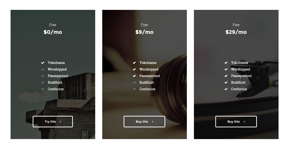
|
1 2 3 4 5 6 7 8 9 10 11 12 13 14 15 16 17 18 19 20 21 22 23 24 25 26 |
<div class="ct-pricing-2" data-bg-image="assets/images/pricing-1.jpg"> <div class="ct-u-displayTableVertical"> <div class="ct-u-displayTableRow"> <div class="ct-u-displayTableCell"> <span class="ct-fw-300">Free</span> <h3 class="ct-fw-600">$0/mo</h3> </div> </div> <div class="ct-u-displayTableRow"> <div class="ct-u-displayTableCell"> <ul class="list-unstyled"> <li class="ct-u-colorWhite">Yokohama</li> <li>Worshipped</li> <li>Passepartout</li> <li>Buddhist</li> <li>Confucius</li> </ul> </div> </div> <div class="ct-u-displayTableRow"> <div class="ct-u-displayTableCell ct-u-colorWhite"> <a class="btn btn-lg ct-btn--transparent ct-btn-rounded" href="#"><span>Try this</span><i class="fa fa-angle-right"></i></a> </div> </div> </div> </div> |
Background image can be change with data attribute:
data-bg-image – just define url to your image,
Pricing table 3 – inverse
|
1 2 3 4 5 |
<div class="ct-u-backgroundBlack> //Pricing table </div> |
Pricing table 4 – Counter

|
1 2 3 4 5 6 7 8 9 10 11 12 13 14 15 16 17 18 19 20 21 22 23 24 25 26 27 28 29 30 31 32 33 34 35 |
<div class="ct-pricing-2" data-bg-image="assets/images/pricing-1.jpg"> <div class="ct-u-displayTableVertical"> <div class="ct-u-displayTableRow"> <div class="ct-u-displayTableCell"> <span class="ct-fw-300">Free</span> //Counter --> <h3>$</h3> <h3 class="ct-u-colorWhite ct-js-counter" data-ct-to="2134" data-ct-speed="5000">$0</h3> <h3>/mo</h3> //Counter <-- </div> </div> <div class="ct-u-displayTableRow"> <div class="ct-u-displayTableCell"> <ul class="list-unstyled"> <li class="ct-u-colorWhite">Yokohama</li> <li>Worshipped</li> <li>Passepartout</li> <li>Buddhist</li> <li>Confucius</li> </ul> </div> </div> <div class="ct-u-displayTableRow"> <div class="ct-u-displayTableCell ct-u-colorWhite"> <a class="btn btn-lg ct-btn--transparent ct-btn-rounded" href="#"><span>Try this</span><i class="fa fa-angle-right"></i></a> </div> </div> </div> </div> |
Script required for Pricing table 4 – Counter:
|
1 2 |
<script src="assets/js/counter/jquery.countTo.js"></script> , <script src="assets/js/counter/init.js"></script> |
Was this article helpful ?
Ratings
HTML Markup:
Rating box 1
|
1 2 3 4 5 6 7 |
<div class="ct-raiting ct-u-colorWhite"> <i class="fa fa-star"></i> <i class="fa fa-star"></i> <i class="fa fa-star"></i> <i class="fa fa-star ct-u-colorFaint"></i> <i class="fa fa-star ct-u-colorFaint"></i> </div> |
Rating box 2
|
1 2 3 4 5 6 7 |
<div class="ct-lead--wrapper"> <span class="ct-title">Rank</span> <div class="lead ct-u-paddingBoth10"> <div id="stars" class="starrr"></div> </div> </div> |
CSS Classes:
.fa .fa-star: Bootstrap classes. They display ‘star’ tag.
.ct-u-colorFaint: lowers opacity of a font.
.ct-rating: Rating box style.
.ct-u-colorWhite: changes rating box color to white.
ct-lead–wrapper: Wrapper for a rating box.
Javascript:
.lead, .starrr, .stars: classes are required for rating plugin.
Raiting init file is required to make ‘rating’ plugin working.
|
1 |
<script src="assets/js/raiting/init.js"></script> |
Was this article helpful ?
Shop product
HTML markup:
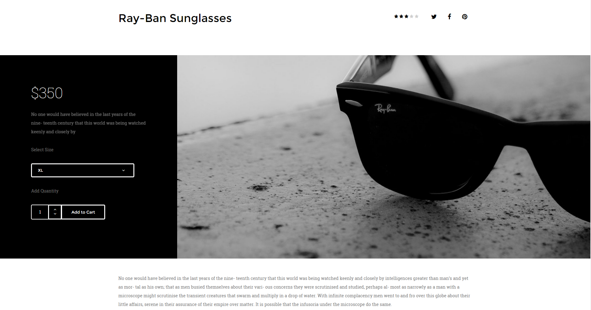
Shop product
|
1 2 3 4 5 6 7 8 9 10 11 12 13 14 15 16 17 18 19 20 21 22 23 24 25 26 27 28 29 30 31 32 33 34 35 36 37 38 39 40 41 42 43 44 45 46 47 48 49 |
<div class="ct-productBox"> <div class="ct-u-displayTableVertical"> <div class="ct-u-displayTableCell ct-productBox-cart ct-u-colorWhite"> <div class="row"> <div class="col-md-12 col-lg-8 col-md-offset-2"> <h3 class="ct-fw-100 ct-u-fontType-2 ct-u-paddingBottom30">$350</h3> <p class="ct-u-colorFaint"> No one would have believed in the last years of the nine- teenth century that this world was being watched keenly and closely by </p> <p class="ct-u-colorFaint ct-u-paddingBoth20">Select Size</p> <div class="btn-group ct-btn--full ct-btn-group--rounded ct-dropdown ct-dropdown--borderOff ct-u-colorWhite"> <a class="btn ct-btn--transparent uppercase dropdown-toggle-target"> XL </a> <a class="btn ct-btn--transparent uppercase dropdown-toggle" data-toggle="dropdown"><i class="fa fa-angle-down"></i></a> <ul class="dropdown-menu" role="menu"> <li><a class="btn">XL</a></li> <li><a class="btn">L</a></li> <li><a class="btn">M</a></li> <li><a class="btn">S</a></li> </ul> </div> <p class="ct-u-colorFaint ct-u-paddingBottom20 ct-u-paddingTop30">Add Quantity</p> <div class="input-group spinner spinner-lg spinner-rounded ct-u-marginBottom30"> <input type="text" class="form-control-4" value="1"> <div class="input-group-btn-vertical"> <button class="btn ct-btn--transparent"><i class="fa fa-angle-up"></i></button> <button class="btn ct-btn--transparent"><i class="fa fa-angle-down"></i></button> </div> <a class="btn ct-btn--transparent" href="#">Add to Cart</a> </div> </div> </div> </div> <div class="ct-u-displayTableCell ct-productBox-product"> <div class="row"> <div class="col-md-12 col-lg-12"> <img src="assets/images/product-1-lg.jpg" alt=""/> </div> </div> </div> </div> </div> |
Was this article helpful ?
Shop slider
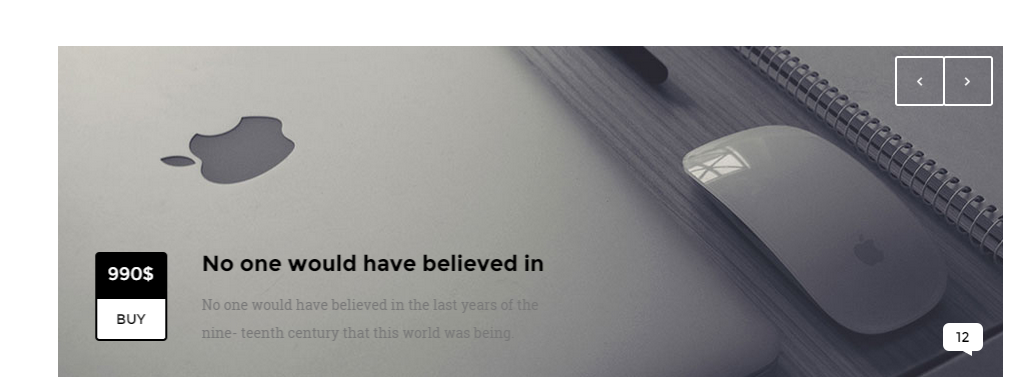
Shop slider
HTML markup:
|
1 2 3 4 5 6 7 8 9 10 11 12 13 14 15 16 17 18 19 20 21 22 23 24 25 26 27 28 29 30 31 32 33 34 35 36 37 38 39 40 41 42 43 44 45 46 47 48 49 50 51 52 53 54 55 56 57 |
<div class="ct-articleBox ct-js-slick ct-slick-arrow-3 ct-slick-arrow-3--rightTop ct-u-marginBottom60" data-animations="true" data-autoplay="true" data-autoplaySpeed="9000" data-arrows="true" data-items="1"> <div class="item"> <div class="ct-articleBox-media"> <img src="assets/images/shop-slider.jpg" alt=""/> <span class="ct-link"><a href="#">12</a></span> <div class="media animated" data-fx="slideInLeft"> <div class="media-left"> //Article info box --> <div class="media-object ct-articleBox-info"> <div class="info-1">990$</div> <div class="info-2"><a href="#">BUY</a></div> </div> //Article info box <-- </div> <div class="media-body"> <h3 class="media-heading ct-u-paddingBottom10 ct-fw-600">No one would have believed in</h3> <p> No one would have believed in the last years of the nine- teenth century that this world was being. </p> </div> </div> </div> </div> <div class="item"> <div class="ct-articleBox-media"> <img src="assets/images/shop-slider-2.jpg" alt=""/> <span class="ct-link"><a href="#">23</a></span> <div class="media animated" data-fx="slideInLeft"> <div class="media-left"> //Article info box --> <div class="media-object ct-articleBox-info"> <div class="info-1">1000$</div> <div class="info-2"><a href="#">BUY</a></div> </div> //Article info box <-- </div> <div class="media-body"> <h3 class="media-heading ct-u-paddingBottom10 ct-fw-600">No one would have believed in</h3> <p> No one would have believed in the last years of the nine- teenth century that this world was being. </p> </div> </div> </div> </div> </div> |
.ct-articleBox: Base class for article.
.ct-articleBox-media: Images,Videos for article.
.ct-js-slick: class for slick slider.
.ct-articleBox-info : article info box wrapper.
.info-1 : ‘.ct-articleBox-info’ subclass.
.info-2 : ‘.ct-articleBox-info’ subclass.
NAVIGATION PLACEMENT – change where sliders navigation should be displayed by adding one of the following CSS classes to HTML markup:
- .ct-slick-arrow-1,
- .ct-slick-arrow-1–above,
- .ct-slick-arrow-2,
- .ct-slick-arrow-3,
- .ct-slick-arrow-3–leftTop,
- .ct-slick-arrow-3–leftBottom,
- .ct-slick-arrow-3–rightTop,
- .ct-slick-arrow-3–rightBottom,
- .ct-slick-arrow-3–under
Was this article helpful ?
Shop Locator
Thank you for purchasing this theme. If you have any questions that are beyond the scope of this help file, please feel free to start new ticket on this page. Thanks so much!
Scope of free support
We can help you with:
- Responding to questions or problems regarding the item and its features
- Fixing any discovered item’s bugs
- Providing updates to ensure compatibility with new software versions
Shop Locator plugin allows you to create a map with simple HTML markup and customize it with number of various parameters. Change map marker, pagination type, add infoBubbles and much more.
Please read this documentation to discover all available options.
Was this article helpful ?
Plugin Installation
{Plugin} requires the following scripts to be attached in HTML page:
|
1 |
<script type="text/javascript" src="https://maps.googleapis.com/maps/api/js?key=[YOUR_API_KEY]&libraries=places,geometry"></script> |
After you attached script you have to change substitute [YOUR_API_KEY] in the code with the API key you have. More about API Key
Once scripts are attached – induce your google map with the simple HTML markup:
|
1 |
<div class="firstStyle"></div> |
We prepared for you 9 predefined map styles, though there are also number of parameters editable via javascript attributes.
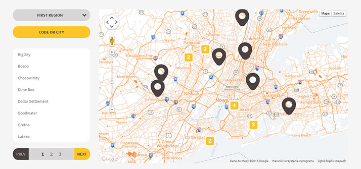
Bee
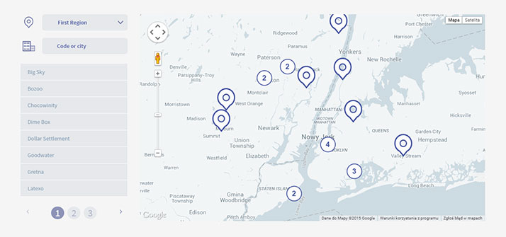
Cosmic
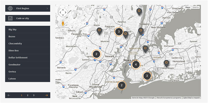
Dark
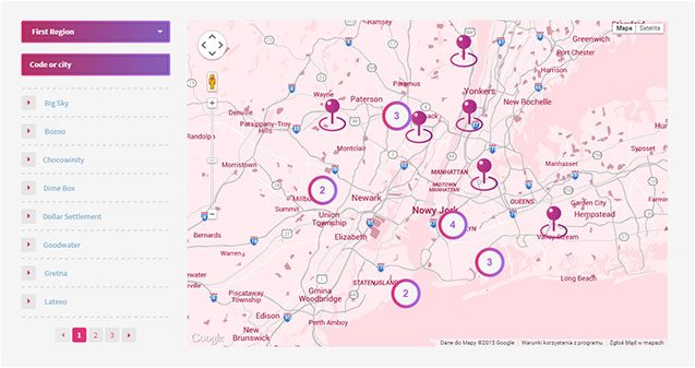
Lollipop
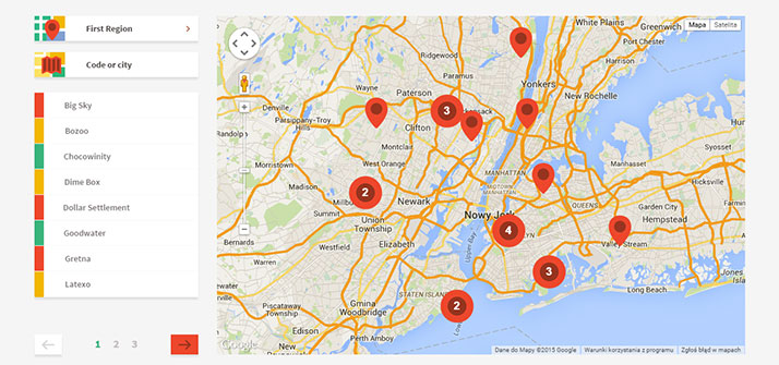
Material
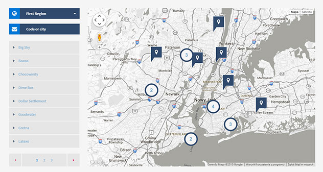
Metro
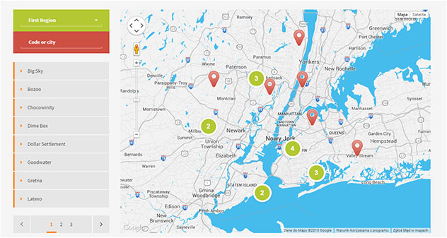
Modern
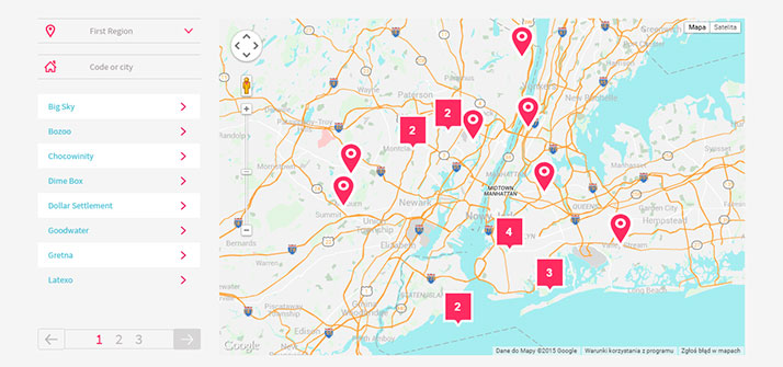
Pop
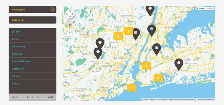
Retro
Was this article helpful ?
Example of usage.
Below you will find examples of map styles, which you can create with our plugin:
Examples of usage
Was this article helpful ?
Available parameters
| Nested Options | Name | Type | Description |
| pluginStyle | string | Add class to element we call the script | |
| paginationStyle | integer | Change pagination style, value 1 or 2 | |
| preloader | boolean | Enable/Disable preloader to plugin body. | |
| json | string | Add json file |
EXAMPLE:
|
1 2 3 4 |
$(".firstStyle").ShopLocator({ paginationStyle: 1 json: "../src/json/markers.json" ); |
How it looks?
Pagination – type 1
Pagination – type 2
| MAP | |||
| center | array, integer | Center map on longitude and latitude. | |
| MapType | google map method | Type of the map, MapTypeId.ROADMAP, MapTypeId.SATELLITE, MapTypeId.HYBRID, MapTypeId.TERRAIN | |
| disableDefaultUI | boolean | Disable default google maps UI. | |
| mapStyle | array | Add custom map style. | |
| draggable | boolean | Drag event to the map. | |
| disableDoubleClickZoom | boolean | Disable DB click zoom on the map. | |
| maxZoom | integer | Set max zoom to map. | |
| minZoom | integer | Set min zoom to map. | |
| scrollwheel | boolean | Zoom with mouse scrollwheel. | |
| Zoom | integer | Set zoom to map. | |
| allMarkersInViewport | boolean | Set viewport to fit all markers. | |
EXAMPLE:
|
1 2 3 4 5 6 7 8 9 10 11 12 13 14 15 |
$(".firstStyle").ShopLocator({ map:{ center: [52.2296760, 21.0122290], MapType: google.maps.MapTypeId.ROADMAP, disableDefaultUI: false, mapStyle: [], draggable: true, disableDoubleClickZoom: false, maxZoom: 15, minZoom: 2, scrollwheel: true, zoom: 10, allMarkersInViewport: true } ); |
| infoBubble | |||
| visible | boolean | Enable/disable infoBubble(infoWindow). | |
| padding | integer | Add padding to infoBubble main container. | |
| borderRadius | integer | Add border radius to infoBubble main container. | |
| borderWidth | integer | Add border width radius to infoBubble main container. | |
| borderColor | string | Add border color to infoBubble main container. | |
| backgroundColor | string | Add color to infoBubble main container. | |
| shadowStyle | integer | Pick shadow style, value 0, 1 or 2. | |
| minHeight | integer | Add min height to infoBubble main container. | |
| maxHeight | integer | Add max height to infoBubble main container. | |
| minWidth | integer | Add min width to infoBubble main container. | |
| maxWidth | integer | Add max height to infoBubble main container. | |
| arrowStyle | integer | Change arrow style, value 0, 1, 2. | |
| arrowSize | integer | Size of arrow. | |
| arrowPosition | integer | Position of arrow. | |
| hideCloseButton | boolean | Show/hide close button. | |
| closeSrc | string | Path to closeButton icon. | |
| disableAutoPan | boolean | Enable/Disable auto pan to element. | |
| markersIcon | string | Add path to marker image. | |
| getDirectionsButton | boolean | Enable/Disable directions to location | |
| getDirectionsButtonName | string | Name of directions button. | |
| directionsUseGeolocation | boolean | Directions by geolocation, if false directions are calculated by adding some location in searchbox. | |
EXAMPLE:
|
1 2 3 4 5 6 7 8 9 10 11 12 13 14 15 16 17 18 19 20 21 22 23 24 25 |
$(".firstStyle").ShopLocator({ infoBubble:{ visible: false, padding: 0, borderRadius: 4, borderWidth: 0, borderColor: "#fff", backgroundColor: "#fff", shadowStyle: 0, minHeight: null, maxHeight: 100, minWidth: 200, maxWidth: null, arrowStyle: 0, arrowSize: 10, arrowPosition: 50, hideCloseButton: false, closeSrc: "src/style/closeButton.svg", disableAutoPan: false, getDirectionsButton: true, getFirectionsButtonName: "Get Directions", directionsUseGeolocation: true }, markersIcon:"src/style/lollipop/images/markers.png", ); |
Info bubble content
| MARKER | |||
| latlng | array, integer | Add lat and lng where will be the marker on map. | |
| title | string | Data for infowindow. | |
| street | string | Data for infowindow. | |
| zip | string | Data for infowindow. | |
| city | string | Data for infowindow. | |
EXAMPLE:
|
1 2 3 4 5 6 7 8 |
$(".firstStyle").ShopLocator({ marker: { latlng: [52.2296760, 21.0122290], title: "CreateIT", street: "ul. Narbutta 22/15", city: "Warszawa" } }) |
| CLUSTER | |||
| enable | boolean | Enable/disable marker clustering. | |
| gridSize | integer | The grid size of a cluster in pixels. The grid is a square. | |
| maxZoom | integer | Max zoom where cluster is active. | |
| style{ | |||
| fontFamily | string | Cluster font. | |
| fontStyle | string | Style of the font(inherit, italic, normal, oblique) | |
| textColor | string | Color of the text. | |
| fontWeight | string | Same as css. | |
| textSize | integer | Size of the text. | |
| heightSM, heightMD, heightBIG | integer | Height of small, medium and big cluster. | |
| widthSM, widthMD, widthBIG | integer | Width of small, medium and big cluster | |
| iconSmall, iconMedium, iconBig | string | Path to icon for all cluster size. | |
EXAMPLE:
|
1 2 3 4 5 6 7 8 9 10 11 12 13 14 15 16 17 18 19 20 21 22 23 |
$(".firstStyle").ShopLocator({ cluster{ enable: false, gridSize: 50, maxZoom: 14, style:{ fontFamily: 'Arial,sans-serif', fontStyle: 'normal', textColor: 'white', fontWeight: 'bold', textSize: 18, heightSM: 60, widthSM: 54, heightMD: 60, widthMD: 54, heightBIG: 60, widthBIG: 54, iconSmall: "../src/style/lollipop/images/clusterSmall.png", iconMedium: "../src/style/lollipop/images/clusterMedium.png", iconBig: "../src/style/lollipop/images/clusterBig.png" } } }) |
| SIDEBAR | |||
| visible | boolean | Enable/disable sidebar. | |
| selectSection | |||
| visible | boolean | Enable/disable json multiple files. | |
| pathToJSONDirectory | boolean | Path to JSON directory | |
| difFiles | array, string | [[“selectText1”, “selectValue1”], [“selectText2”, “selectValue2”]]. It’s for multiple json file. In “selectText” you input what you want to display in select option, “selectValue” is for name of the json file that will be loaded when user pick it. | |
| fileTypes | string | File types, json or php. | |
| searchBox: | |||
| findPlaceBy | string | Search locations by cities or regions. | |
| searchByCountry | array | Filter by country. To enable you need to change value for true. Country use ISO 3166-1 Alpha-2 country code. More information you can find here. | |
| visible | boolean | Enable/disable search box. | |
| search | boolean | Enable/disable search on displayed markers. | |
| searchRadius | integer | Radius of the search in km. | |
| results | |||
| visibleInFirstPage | boolean | Enable/disable marker buttons on first page. | |
| pageSize | integer | Results items per page. | |
| currenPage | integer | Active results page. | |
| paginationItems | integer | Pagination items per page. | |
| (NEW) | sort | ascending, descending or false. | Set order of the results |
|
1 2 3 4 5 6 7 8 9 10 11 12 13 14 15 16 17 18 19 |
sidebar:{ visible: false, selectSection:{ visible: false, difFiles: [["First Region", "markers"], ["Second Region", "diffmarkers"]] } searchBox: { visible: false, search: false, searchRadius: 20 }, results:{ visibleInFirstPage: true, pageSize: 10, currentPage: 1, paginationItems: 5, sort: 'ascending' } } |
Was this article helpful ?
Custom JSON file
You can define your custom JSON file with data for all map markers. Example of json files is attached in plugin package in src/json directory.
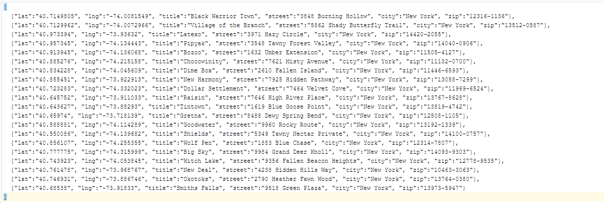
Example of JSON file
By default the following values from JSON are supported by plugin:
- latitude (lat),
- longitude (lng),
- title,
- street,
- city,
- zip code (zip)
If you would like to add more parameters to your JSON file – remember to update the plugin settings in file shop-locator.js:
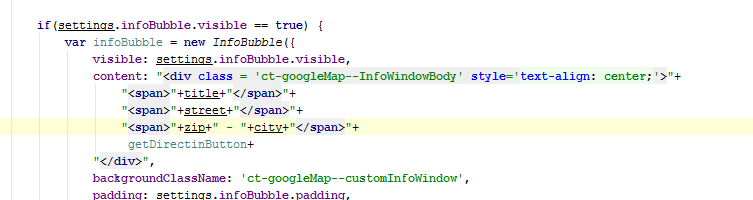
Add new JSON nodes here
To induce your JSON file in plugin, please update its path via json: parameter:
|
1 2 3 |
$(".firstStyle").ShopLocator({ json: "../src/json/markers.json" ); |
To attach multiple custom JSON files to plugin you need to update also the following javascript attributes:
- pathToJSONDirectory,
- difFiles,
- fileTypes,
With new values adjusted to new JSON structure.
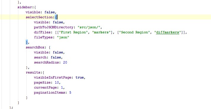
Custom JSON attachment
Was this article helpful ?
Theme Options
1. After installing the theme you are able to add a text description to the options. Now the text fields are empty. To change it, please scroll down on the tumblr theme page and fill the:
-
Title
-
Description
-
Blog Username
-
Blog Username Website
-
Username Description
-
First Paragraph
-
Second Paragraph
-
Third Paragraph
-
Footer Description
-
Disqus
2. The text will be displaying on the different parts of your theme. Here is the example lists how it should looks like:
For example: Blog Username – thix text is needed for the name of the author. Thix text will be displayed on the sidebar type of blog.
3. Next things what you have to do is to add a name of the Disqus component. So if you would like to have components like a comments like on your page please fill the Disqus Shortname on the theme options menu. When it’s done you should to see the disqus panel in your single post page like below:
Was this article helpful ?
jQuery Social Media Timeline
Thank you for purchasing this plugin. If you have any questions that are beyond the scope of this help file, please feel free to start new ticket on this page. Thanks so much!
Scope of free support
We can help you with:
- Responding to questions or problems regarding the item and its features
- Fixing any discovered item’s bugs
- Providing updates to ensure compatibility with new software versions
jQuery Social Media Timeline plugin allows you to add Social Media to your website with simple HTML markup and customize it with number of various parameters.
Please read this documentation to discover all available options.
Was this article helpful ?
Plugin Installation
jQuery Social Media Timeline requires the following scripts to be attached in HTML page:
CSS:
|
1 |
<link rel="stylesheet" type="text/css" href="css/pluginstyle.css"> |
|
1 2 3 4 5 |
<script src="js/jquery-1.11.2.min.js"></script> <script src="js/moment.min.js"></script> <script src="js/codebird.js"></script> <script src="js/social-widgets/social-widgets.js"></script> <script src="js/social-widgets/init.js"></script> |
|
1 |
<div class="socialFirst socialMedia-switcher"></div> |
|
1 2 3 |
<div class="socialSecond socialMedia-switcher socialMedia-switcher--right"></div> or <div class="socialThird socialMedia-switcher socialMedia-switcher--left"></div> |
Was this article helpful ?
Available parameters
Main options
| Option | Default | Type | Description |
|---|---|---|---|
| width | 330 | integer | Define width of the element. |
| height | 600 | integer | Define height of the element. |
| enabled | “twitter” | string | Show enabled social at the beginning |
| available | no default value | array | Order and display socials media you need. [‘facebook’, ‘twitter’, ‘instagram’, ‘pinterest’] This option is required. |
| Option | Default | Type | Description |
|---|---|---|---|
| account | no default value | string | Social page to display. It’s simple name. This option is required. |
| token | no default value | string | Access token. More info in documentation. This option is required. |
| limit | 10 | integer | Number of feeds displayed in social. |
| media | true | boolean | Display media (photos and videos). Allowed values are: true or false. |
| showOnly | null | string | Display specified type of posts throughout the limit. Available options are: “photo”, “link”, “status”, “video”, “event”. |
| descriptionLength | 200 | integer | Set the length of the message (characters). |
| linkLength | 35 | integer | Set the length of the link (characters). This links shows up when post is the ‘link’ type. |
| linkText | <i class=”icon-angle-double-right”> | string | Text or icon displayed as a link in the end of the message. It can be text or html. |
| disable | null | array | Disable parts of the plugin. Allowed values: ‘header, ‘information’, ‘stats’, ‘thumbnail’, ‘shares’, ‘likes’, comments’, ‘date’, ‘name’. If you want to disable one part of the plugin then put one string. However, if you want to disable more things, then put it into array e.g.: [‘likes’, ‘date’]. |
| afterLoad | null | function | Callback after loading content. |
| Option | Default | Type | Description |
|---|---|---|---|
| account | no default value | string | Social page to display. It’s simple name. This option is required. |
| consumer_key | no default value | string | Consumer key. More info in documentation. This option is required. |
| consumer_secret | no default value | string | Consumer secret. More info in documentation. This option is required. |
| limit | 10 | integer | Number of tweets displayed in social. |
| media | true | boolean | Display media (photos and videos). Allowed values are: true or false. |
| linkText | <i class=”icon-angle-double-right”> | string | Text or icon displayed as a link in the end of the message. It can be text or html. |
| disable | null | string | Disable parts of the plugin. Allowed values: ‘header, ‘information’, ‘stats’, ‘thumbnail’, ‘retweets’, ‘tweets’, ‘date’, ‘name’. If you want to disable one part of the plugin then put one string. However, if you want to disable more things, then put it into array e.g.: [‘tweets’, ‘date’]. |
| afterLoad | null | function | Callback after loading content. |
Notice:
Common question: How to generate all those tokens and keys?
| Option | Default | Type | Description |
|---|---|---|---|
| access_token | no default value | string | Your access token which you have to provide. More info in documentation.This option is required. |
| limit | 10 | integer | Number of tweets displayed in social. |
| media | true | boolean | Display media (photos and videos). Allowed values are: true or false. |
| linkText | <i class=”icon-angle-double-right”> | string | Text or icon displayed as a link in the end of the message. It can be text or html. |
| disable | null | string | Disable parts of the plugin. Allowed values: ‘header, ‘information’, ‘stats’, ‘thumbnail’, ‘likes’, ‘comments’, ‘date’, ‘name’. If you want to disable one part of the plugin then put one string. However, if you want to disable more things, then put it into array e.g.: [‘likes’, ‘date’]. |
| afterLoad | null | function | Callback after loading content. |
| Option | Default | Type | Description |
|---|---|---|---|
| account | no default value | string | Social page to display. It’s simple name. This option is required. |
| media | true | boolean | Display media (photos and videos). Allowed values are: true or false. |
| linkText | <i class=”icon-angle-double-right”> | string | Text or icon displayed as a link in the end of the message. It can be text or html. |
| disable | null | string | Disable parts of the plugin. Allowed values: ‘header, ‘information’, ‘stats’, ‘thumbnail’, ‘likes’, ‘repins’, ‘name’. If you want to disable one part of the plugin then put one string. However, if you want to disable more things, then put it into array e.g.: [‘likes’, ‘date’]. |
| descriptionLength | 200 | integer | Set the length of the message (characters). |
| afterLoad | null | function | Callback after loading content. |
VKontakte
| Option | Default | Type | Description |
|---|---|---|---|
| account | no default value | integer | Social page to display. VKontakte requires the id number. This option is required. |
| limit | 10 | integer | Number of posts displayed in social. |
| media | true | boolean | Display media (photos and videos). Allowed values are: true or false. |
| linkText | <i class=”icon-angle-double-right”> | string | Text or icon displayed as a link in the end of the message. It can be text or html. |
| disable | null | string | Disable parts of the plugin. Allowed values: ‘header, ‘information’, ‘stats’, ‘thumbnail’, ‘retweets’, ‘tweets’, ‘date’, ‘name’. If you want to disable one part of the plugin then put one string. However, if you want to disable more things, then put it into array e.g.: [‘tweets’, ‘date’]. |
| descriptionLength | 200 | integer | Set the length of the message (characters). |
| afterLoad | null | function | Callback after loading content. |
Was this article helpful ?
Examples of usage
Below you will find examples of usage for each social media type. You can just copy and paste code snippets from the examples below to your website and update the settings.
One social, facebook
|
1 |
<div class="socialFourth socialMedia-switcher"></div> |
|
1 2 3 4 5 6 7 8 9 10 11 12 |
$('.socialFourth').socialTimeLine({ width: 303, available: ['facebook'], enabled: 'facebook', facebook: { account: 'LeoMessi', token: 'your application facebook token', limit: 10, disable: ['thumbnail', 'date', 'name'] } }); |
How it looks?

One social, twitter
|
1 |
<div class="socialFifth socialMedia-switcher"></div> |
|
1 2 3 4 5 6 7 8 9 10 11 12 13 14 |
$('.socialFifth').socialTimeLine({ //enabled needs to have the same value which occurs in available width: 303, available: ['twitter'], enabled: 'twitter', twitter: { account: 'rihanna', consumer_key: 'your consumer key', consumer_secret: 'your consumer secret key', limit: 10, disable: ['thumbnail', 'date', 'name'] } }); |
How it looks?

One social, instagram
|
1 |
<div class="socialSixth socialMedia-switcher"></div> |
|
1 2 3 4 5 6 7 8 9 10 11 12 |
$('.socialSixth').socialTimeLine({ //enabled needs to have the same value which occurs in available width: 303, available: ['instagram'], enabled: 'instagram', instagram: { access_token: 'add here your Instagram access token', disable: ['thumbnail', 'date', 'name'], limit: 10 } }); |

One social, pinterest
|
1 |
<div class="socialSeventh socialMedia-switcher"></div> |
|
1 2 3 4 5 6 7 8 9 10 11 |
$('.socialSeventh').socialTimeLine({ //enabled needs to have the same value which occurs in available width: 303, available: ['pinterest'], enabled: 'pinterest', pinterest: { account: 'KlavesMarina', disable: ['thumbnail', 'name'] } }); |

One social, vkontakte
|
1 |
<div class="socialTwelfth socialMedia-switcher"></div> |
|
1 2 3 4 5 6 7 8 9 10 11 |
$('.socialTwelfth').socialTimeLine({ //enabled needs to have the same value which occurs in available width: 303, available: ['vkontakte'], enabled: 'vkontakte', vkontakte: { account: 112985556, disable: ['thumbnail', 'date', 'name'] } }); |

Multiple socials with some order
To order socials you have to pu them in order in available option. If you want to make enabled social on the start you need add into that property the social value.
|
1 |
<div class="socialEighth socialMedia-switcher"></div> |
|
1 2 3 4 5 6 7 8 9 10 11 12 13 14 15 16 17 18 19 20 21 22 23 24 25 26 27 28 |
$('.socialEighth').socialTimeLine({ width: 303, available: ['pinterest', 'instagram', 'facebook', 'twitter'], enabled: 'pinterest', facebook: { account: 'skrillex', token: 'acccess token, limit: 10, disable: ['thumbnail', 'date', 'name'] }, twitter: { account: 'taylorswift13', consumer_key: 'consumer key', consumer_secret: 'consumer secret', limit: 10, disable: ['thumbnail', 'date', 'name'] }, instagram: { access_token: 'add here your Instagram access token', disable: ['thumbnail', 'date', 'name'], limit: 10 }, pinterest: { account: 'KING__K', disable: ['thumbnail', 'name'] } }); |

Activate whichever social you want on the start.
The only what you need to do is specify in enabled the correct social you wan t to display.
|
1 |
<div class="socialSecond socialMedia-switcher socialMedia-switcher--right"></div> |
|
1 2 3 4 5 6 7 8 9 10 11 12 13 14 15 16 17 18 19 20 21 22 23 24 25 26 27 28 |
$('.socialNinth').socialTimeLine({ width: 303, available: ['pinterest', 'instagram', 'facebook', 'twitter'], enabled: 'facebook', facebook: { account: 'skrillex', token: 'access token', limit: 10, disable: ['thumbnail', 'date', 'name'] }, twitter: { account: 'taylorswift13', consumer_key: 'consumer_key', consumer_secret: 'consumer_secret', limit: 10, disable: ['thumbnail', 'date', 'name'] }, instagram: { access_token: 'add here your Instagram access token', disable: ['thumbnail', 'date', 'name'], limit: 10 }, pinterest: { account: 'KING__K', disable: ['thumbnail', 'name'] } }); |

Sticked socials
If you want to have sticked social on the right or on the left side on your site you simply have to add corresponding class to the thml.
Social right looks like:
|
1 |
<div class="socialSecond socialMedia-switcher socialMedia-switcher--right"></div> |

After hover:

Social left looks like:
|
1 |
<div class="socialSecond socialMedia-switcher socialMedia-switcher--left"></div> |

After hover:
Was this article helpful ?
How to get tokens, ids and page name
API tokens are unique identifiers of an application requesting access to your service. Each API has got different specs for tokens or ids. Note that you should be careful and create test application fot that purpose. Do not do this with your main account. In this plugin pinterest is public so it doesnt need any authorization or application. Twitter should be set for read-only app like it is presented below. However Facebook and Instagram should have their own test accounts due to security.
Facebook
How to get a Facebook Access Token (token)
Here is the whole proccess of retrieving access token: https://smashballoon.com/custom-facebook-feed/access-token/
Example Page
A sample how to get the name of the page.

Twitter
How to get a Customer Key and customer secret
Here is the whole proccess of retrieving access token. You should care about first step where you obtain these keys. http://www.webdevdoor.com/php/authenticating-twitter-feed-timeline-oauth/
What is very important is that you should set your application to Read-only. If you dont have it set yet go to your application and change it. This is for your security.

Example Page
A sample how to get the name of the page.

Instagram
How to generate an Instagram Access Token (client_id)
http://jelled.com/instagram/access-token
Pinterest
There is no need to get tokens or other secure keys.
Example page
A sample how to get the name of the page.

VKontakte
There is no need to get tokens or other secure keys.
Example page
A sample how to get the id of the page (in this case it’s number no string). Simply, click on any photo of your favourite social and go to the link and retrieve id as it is below in the picture. If social doesnt display, that means it’s not full public.

Was this article helpful ?
YOU Customizer
Test comes with advanced customizer, which allows to edit most of theme elements in one place. To use it navigate to Appearance > Customizer
Main Customizer Menu
It will display a panel with tabs corresponding to all theme sections, like:
- Pages
- Top Bars
- Posts
- Portfolio
- Socials
- Widgets
You will find there also main style settings under:
- General
In General style section you can edit theme colors and layout setup
General styles
In General you can setup logos, copyright text and main theme settings
Main settings
Notice:
All changes done with customizer will be applied only once you click on
Was this article helpful ?
Top Bars
There are several navbar color types to choose. You can setup navbar type and scroll effect globally via Appearance > Customize > Top bars
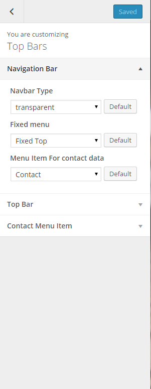
Navigation Bar
via Top Bar tab you can define top bar styles and content:
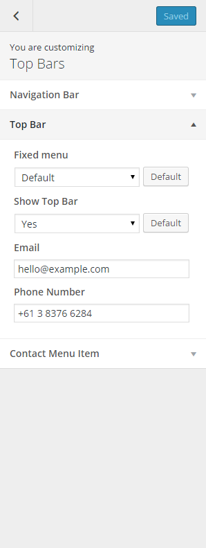
Top Bar settings
And in Contact menu Item you can set the content of contact menu widget:
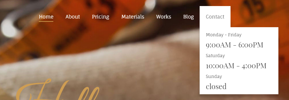
Contact widget
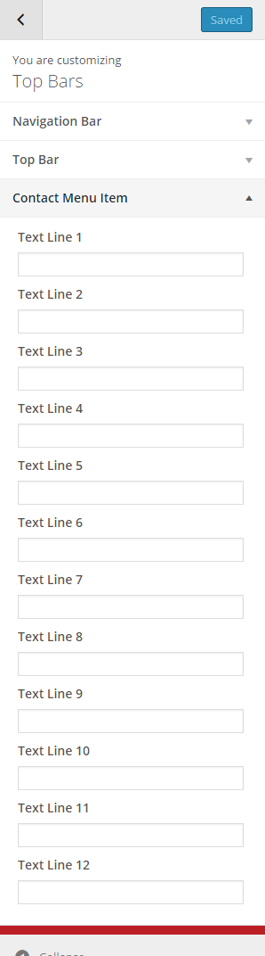
Contact widget settings
Was this article helpful ?
Portfolio options
PAGE HEADER:
- IndexPress return or enter to expand
- SinglePress return or enter to expand
- SocialsPress return or enter to open this panel
- Site Title & TaglinePress return or enter to expand
- NavigationPress return or enter to expand
- WidgetsPress return or enter to open this panel
- Static Front PagePress return or enter to expand
PORTFOLIO OPTIONS:
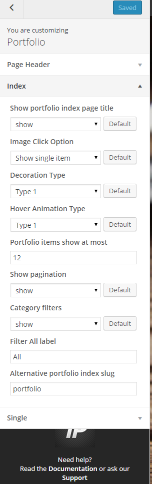
Portfolio Index settings
SINGLE PORTFOLIO OPTIONS:
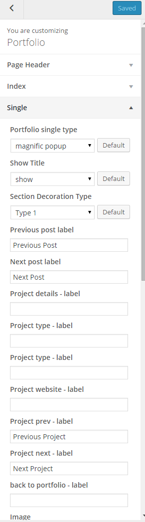
Portfolio single item settings
Was this article helpful ?
Customizer
Test comes with an advanced customizer, which allows to edit most of the theme elements in one place. If you want to use it, navigate to Appearance > Customize
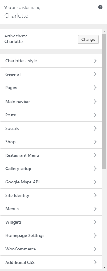
Charlotte Customizer
Charlotte – style
You can pick the color scheme of the site here.
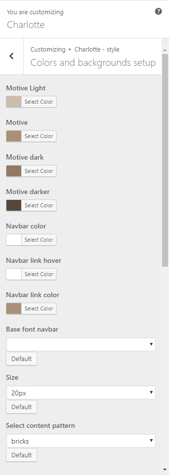
Charlotte – style
- Motive Light – A light motive color of the site.
- Motive – The main color scheme of the site.
- Motive dark – A dark motive color of the site.
- Motive darker – A darker motive color of the site.
- Navbar color – The font color of the words in the Navigation bar.
- Navbar link hover – The font color of the words with links when hovered.
- Navbar link color – The font color of words with links in the Navigation bar.
- Base font navbar – The font style of the words with links in the Navigation bar.
- Size – The font size of the words with links in the Navigation bar.
- Select content pattern – The background pattern of the site.
General
Here you will have the option to customize your site’s identity or how it can be viewed by people.
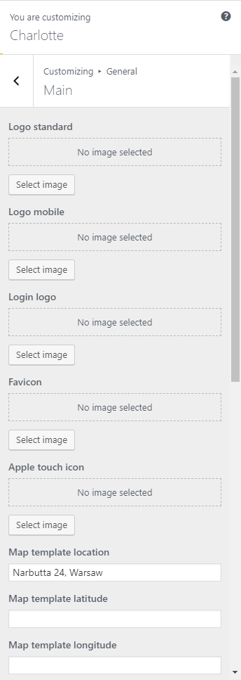
General
- Logo standard – Logo in the Navigation bar.
- Logo mobile – Logo shown in mobile version.
- Login logo – logo shown in the login section.
- Favicon – Icon used as the image in the tab of the site.
- Apple touch icon
- Map template location – Address for the map template.
- Map template latitude – Latitude coordinate for the location in the map.
- Map template longitude – Longitude coordinate for the location in the map.
- Search icon in navbar – Option to shoe or hide the search icon in the navigation bar.
- Page 404 sidebar background image – Image used as the background for the 404 page’s sidebar.
- Page 404 sidebar background style – Style of the 404 page’s sidebar background.
- Page 404 sidebar animated background – Option to add animation on the 404 page’s sidebar background.
Pages
Pages is divided into 2:

Pages
Page sidebar options
Page sidebar options
- Select sidebar block – What the side bar will show.
- Page sidebar background image – Set an image as the background for the sidebar.
- Page sidebar background style – The background style of the sidebar.
- Page sidebar animated background – Option to add animation on the sidebar background.
Header
Header
- Header Image – Image set as the Header background.
- Header Image mobile – Image set as the Header background in the mobile version.
Main navbar
You can customize the navigation bar’s look.

Style
- Navbar background image – Set a background image for the sidebar.
- Top divider background – Add a top divider image.
- Bottom divider background – Add a bottom divider image.
- Top divider background style – Top divider background style.
- Bottom divider background style – Bottom divider background style.
- Bottom sidebar – Option to show bottom widgets area.
Posts
Posts is divided into 3:
Posts
Blog Sidebar options
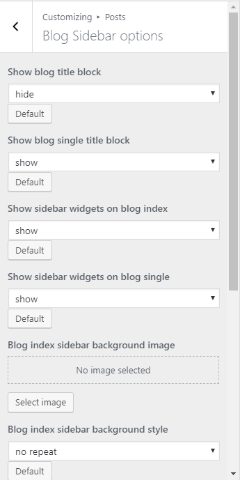
Blog Sidebar options
- Show blog title block – Option to show the blog title block.
- Show blog single title block – Option to show the blog single title block.
- Show sidebar widgets on blog index – Option to show sidebar widgets on blog index.
- Show sidebar widgets on blog single – Option to show sidebar widgets on blog single.
- Blog index sidebar background image – Set the background image of the blog index sidebar.
- Blog index sidebar background style – The style of the background image of the blog index sidebar.
- Blog single sidebar background image – Set the background image of the blog single sidebar.
- Blog single sidebar background style – The style of the background image of the blog single sidebar.
- Blog index sidebar animated background – Option to add animation on the background of the blog index sidebar.
- Blog single sidebar animated background – Option to add animation on the background of the blog single sidebar.
Index
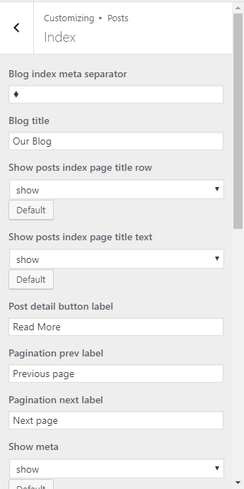
Index
- Blog index meta separator – Icon/sign that separates the information about the blog.
- Blog title – Title of the blog page.
- Show posts index page title row – Option to show posts index page title row.
- Show posts index page title text – Option to show posts index page title text.
- Post detail button label – What is written in the post detail button.
- Pagination prev label – Label for the pagination of previous page.
- Pagination next label – Label for the pagination of next page.
- Show meta – Show the meta details of the blog posts.
- Tags label – Label for tags.
- Date – Option to show the date when the blog is posted.
- Show featured media on blog index – Option to show media (images, videos, etc.,) that is in the blog post in the blog index.
- Title / quote author – Option to show the author of the post.
- Comments count – Option to show comment count.
- Post text – Set what the post text will show.
- Author link – Option to show author link.
- Show read more button? – Option to show read more button.
Single
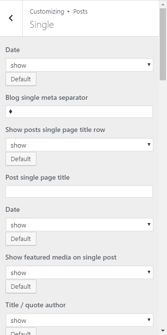
Single
- Date – Option to show the date of the blog.
- Blog single meta separator – Icon/sign that separates the information about the blog.
- Show posts single page title row – Option to show posts single page title row.
- Post single page title – Option to show posts single page title text.
- Date – Option to show the date of the blog.
- Show featured media on single post – Option to show media (images, videos, etc.,) that is in the blog post in the blog index.
- Title / quote author – Option to show the author of the post.
- Content – Option to show the content of the blog.
- Author link – Option to show author link.
- Comments – Option to allow comment in blog post.
- Comment form – Option to show the comment form for the blog.
- Tag cloud – Option to show tags of the blog.
- Categories – Option to show blog category.
- Show author box
- Pagination – Option to show pagination.
- Tags label – Label for tags.
- Previous post label – Label for the pagination of previous post.
- Next post label – Label for the pagination of next post.
- By label – Label of by.
- Comment reply label – Label of reply.
- Leave a comment label – Label for Leave a comment.
- Comment Form submit label – Label Comment Form Submit.
- Comment Form name placeholder – Label Comment Form name.
- Comment Form email placeholder – Label Comment Form email.
- Comment Form message placeholder – Label Comment Form message.
- Bottom divider – Add a bottom divider image.
- Bottom divider background style – Bottom divider background style.
- Comments top divider – Top divider for the comments.
- Comments top divider background style – Top divider background style for the comments.
- Comments bottom divider – Bottom divider for the comments.
- Comments bottom divider background style – Bottom divider background style for the comments.
- Comment Form divider background style – Comment form divider background style for the comments.
Socials
This is where you can set your socials account.
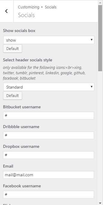
Socials
- Show socials box – Option to show social box in the header.
- Select header socials style – What the style of the header socials will look.
- Bitbucket username – Account for the site.
- Dribbble username – Account for the site.
- Dropbox username – Account for the site.
- Email – Email address for the site.
- Facebook – Account for the site.
- Twitter – Account for the site.
- Pinterest – Account for the site.
- Instagram – Account for the site.
- RSS – Account for the site.
- LinkedIn – Account for the site.
- Google Plus – Account for the site.
- Tumblr – Account for the site.
- Skype – Account for the site.
- Dribble – Account for the site.
- Dropbox – Account for the site.
- Flickr – Account for the site.
- Github – Account for the site.
Shop
Shop is divided to 3:

Shop
Shop Sidebar options
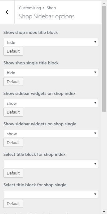
Shop Sidebar options
- Shop index sidebar background style –
- Shop single sidebar background style
Shop index options
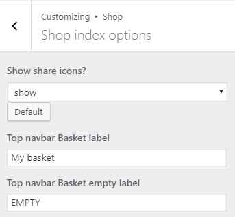
Shop index options
- Show share icons? – Option to show share icons.
- Top navbar Basket label – Label for the navigation bar basket.
- Top navbar Basket empty label – Label when the navigation bar is empty.
Shop index options
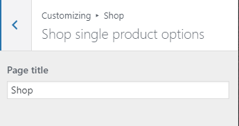
Shop single product option
- Page title – Title for the single product page.
Restaurant Menu
Restaurant Menu is divided into 3:
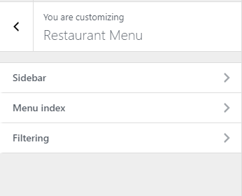
Restaurant Menu
Sidebar
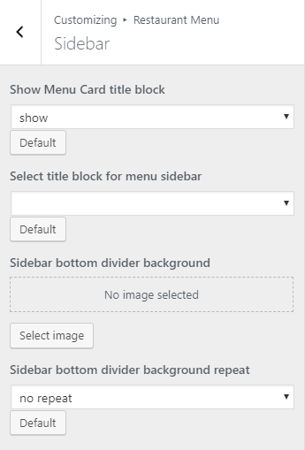
Sidebar
Menu index
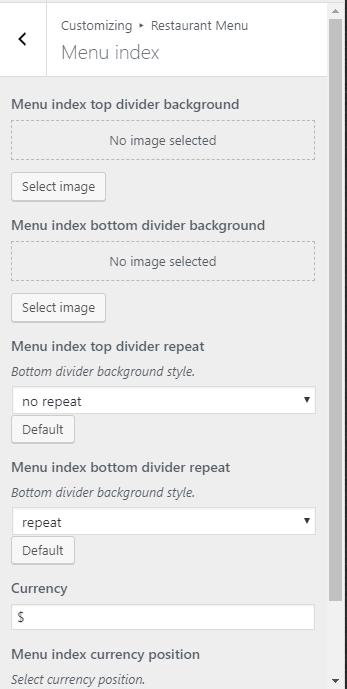
Menu index
Filtering
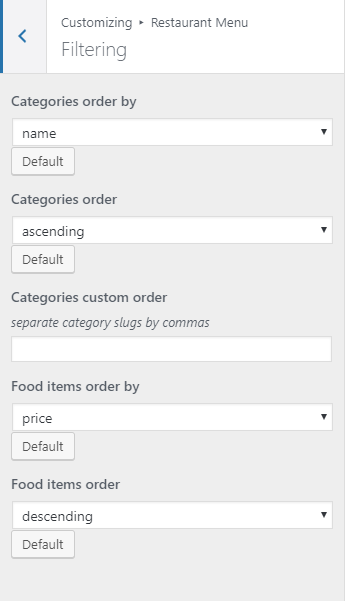
Filtering
Gallery Setup
Gallery Setup is divided into 4:
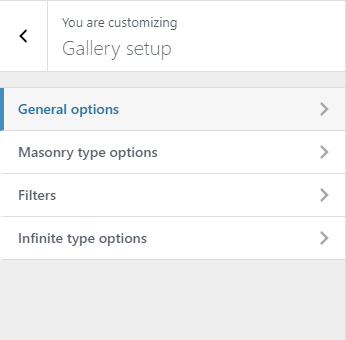
Gallery Setup
General options
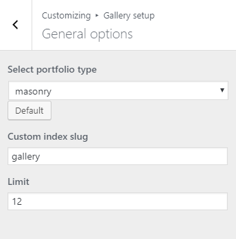
General options
- Select portfolio type – How the gallery/portfolio is going to look.
- Custom index slug – Slug for the page.
- Limit – Number of items in the gallery/portfolio that will show.
Masonry type options

Masonry type options
- Columns – Number of post per column.
- Pagination prev label – Label for the pagination previous page.
- Pagination next label – Label for the pagination next page.
Filters
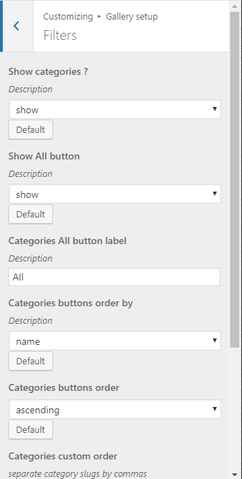
Filters
- Separate category slugs by commas.
Infinite type options

Infinite type options
- Columns – Number of column post per row.
- Random sizes – Option to show the images with random sizes.
Google Maps API

Google Maps API Config
- Google maps API key – API key set for the google maps.
Site Identity

Site Identity
- Site Title – The title of the site you created.
- Tagline – The slogan/catchphrase for you site. What people will remember if they see your site.
- Site Icon – The icon used as a browser icon. Icons must be square, and at least 512 pixels wide and tall.
Menus
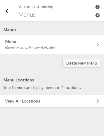
Menus
- Menus – These are the menus made by you. You can make/add a new menu or delete it here.
- Menu Location – Test supports 2 menus: Primary Menu and Sidebar Menu
- Top primary menu – Choose which menu in the Menus you would like to use as the primary menu.
- Secondary menu in left sidebar – Choose which menu in the Menus would like to use as the sidebar menu.
Widgets
You can customize what is inside the widgets on the page. If a widget is placed on the page you see on the preview, it will be listed on the left side under widgets.
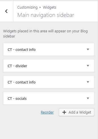
Widgets
Notice:
You can also do the same thing by going to Appearance > Widgets.
Homepage Settings
Option for the front page is shown here.
-
Front page displays – Options on how the front page/home page looks like.
-
Your latest posts – Show the latest post on your blogs.
-
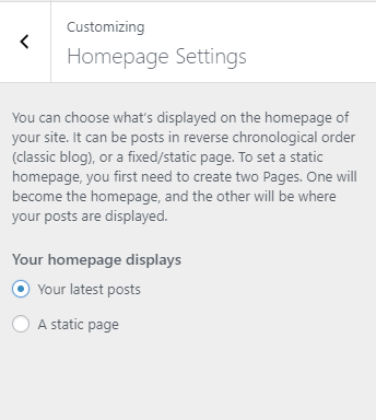
Homepage Setting 1
-
- A static page – Set a page that would stay the same until the page is replaced manually.

Homepage Settings 2
Notice:
You can also do this by going to Settings > Reading.
WooCommerce
WooCommerce is divided into 3:
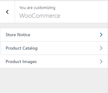
WooCommerce
Store Notice
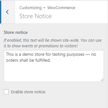
Store Notice
- Store notice – If enabled, this text will be shown site-wide. You can use it to show events or promotions to visitors.
- Enable store notice – Option to enable Store notice on the site.
Product Catalog
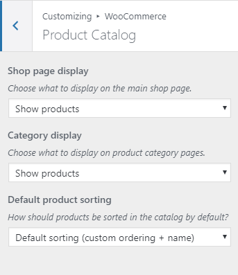
Product Catalog
- Choose what to display on the main shop page.
- Choose what to display on product category pages.
- How should products be sorted in the catalog by default?
Product Images

Product Images
- Image size used for the main image on single product pages. These images will remain uncropped.
- Image size used for products in the catalog and product gallery thumbnails.
- Thumbnail cropping
Additional CSS
You can add your own CSS code for your site.
Additional CSS
Notice:
All changes made with customizer will only be applied when you click on
Was this article helpful ?
Gallery Setup
Gallery is built out of Portfolio Items – a custom post types, which can be created via Portfolio section.
Creating Portfolio items
To create new Gallery elements, navigate to Portfolio items > Add New
Add a new portfolio item
For new portfolio item you can define:
- Title (required),
- Tags (optional),
- Categories (optional),
- Order attribute (optional),
- Images (recommended),
After every modification click on Update to keep your changes saved.
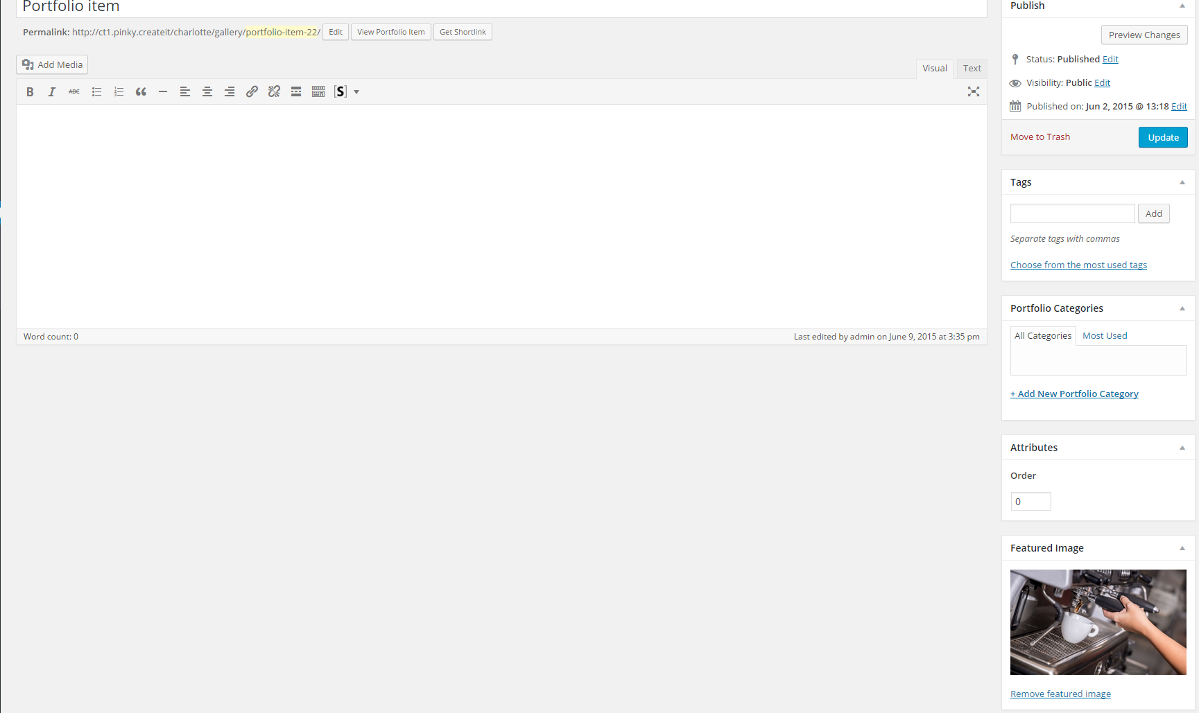
Portfolio items
Gallery setup
Once your portfolio items are created you can build a Gallery. Please navigate to Appearance > Customize – Gallery Setup
In main tab – General Options you can:
- select gallery type,
- define gallery page slug
- define maximum number of displayed items
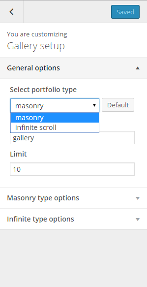
Gallery general options
Depending on which gallery style you have selected in the General tab – define more advanced options, such as Number of columns, pagination settings, or gallery thumbnail sizes for the infinite scroll.
Was this article helpful ?
Main Navbar
In Main Navbar tab you can define the following settings:
- Navbar background image
- Top divider background
- Bottom divider background
- Top divider background style
- Bottom divider background style
- Bottom widgets area
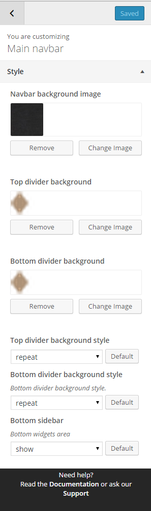
Main navbar style settings
Was this article helpful ?
Pages Options
In Pages panel you are able to edit the following options:
- Page sidebar options:
- Select sidebar block
- Background style
- Animation background – yes/no
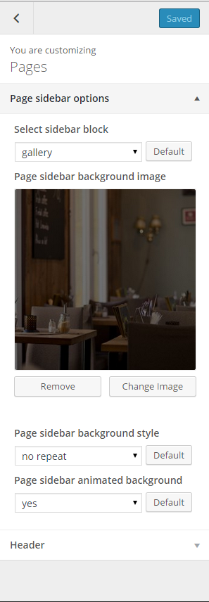
Pages sidebar options
- Header settings:
- Header image
- Header background image
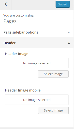
Pages header options
Notice: – settings above are by default applied for all your pages. Although you can customize them for each page separately using Page side content settings – you will see this option during page content editing.
Single page – sidebar block setting
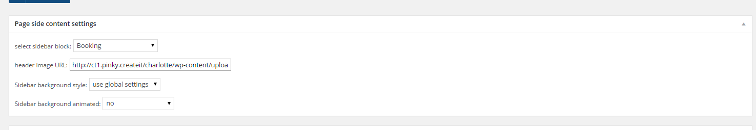
Was this article helpful ?
Posts options
When using the assigned blog page, as described in Blog Index page, all options are located in Appearance > Customize on the Posts tab. There are dozens of options to choose from, such as layout, categories, dates, etc. There are general blog options and single post page options. Each one has a title and a description which explains you what it does. Any type of blog options that you need to set, will be in theme options of assigned blog page.
INDEX PAGE OPTIONS:
- Blog index meta separator – image, which should be displayed between post meta information: date, category, comments

- Blog title – it will be displayed as title of your index page,
- Show index as – select the way of displaying posts on index,
- Show posts index page title row – hide/show blog title container,
- Show posts index page title text – hide/show blog title,
- Post detail button label – define custom label for button Read More,
- Pagination prev label – define custom label for button Previous Page,
- Pagination next label – define custom label for button Next Page,
- Show meta – display post meta information: date, category, comments,
- Date – show/hide posts date
- Show featured media on blog index – show/hide image, video or gallery assigned to post (if you select Hide – it will display only text on blog index page),
- Title / quote author – show/hide posts author,
- Post text – display full posts text, post excerpt or no intro text in posts list,
- Show read more button – show/hide button Read More
- Sidebar – show/hide sidebar on blog index page,
- Tags labels – define custom labels, for “Tags” ,
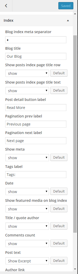
Blog index page settings
SINGLE POST OPTIONS – select how single post page should look like:
- Blog single meta separator – image, which should be displayed between post meta information: date, category, comments
- Post single page title – it will be displayed as title of your index page,
- Show index as – select the way of displaying posts on index,
- Show posts index page title row – hide/show blog title,
- Date – show/hide posts date
- Show featured media on blog index – show/hide image, video or gallery assigned to post (if you select Hide – it will display only text on blog index page),
- Title / quote author – show/hide posts author,
- Content – show/hide,
- Author link – show/hide,
- Comments – show/hide,
- Comment form – show/hide,
- Comments count – show/hide,
- Tag cloud – show/hide,
- Categories – show/hide,
- Show author box – show/hide,
- Pagination – show/hide,
- Tags label
- Previous post label
- Next post label
- By label
- Comment reply label
- Leave a comment label
- Comment Form submit label
- Comment Form name placeholder
- Comment Form email placeholder
- Comment Form message placeholder
- Bottom divider
- RemoveChange Image
- Bottom divider background style
- Comments top divider
- RemoveChange Image
- Comments top divider background style
- Comments bottom divider
- RemoveChange Image
- Comments bottom divider background style
- Comment Form divider
- RemoveChange Image
- Comment Form divider background style
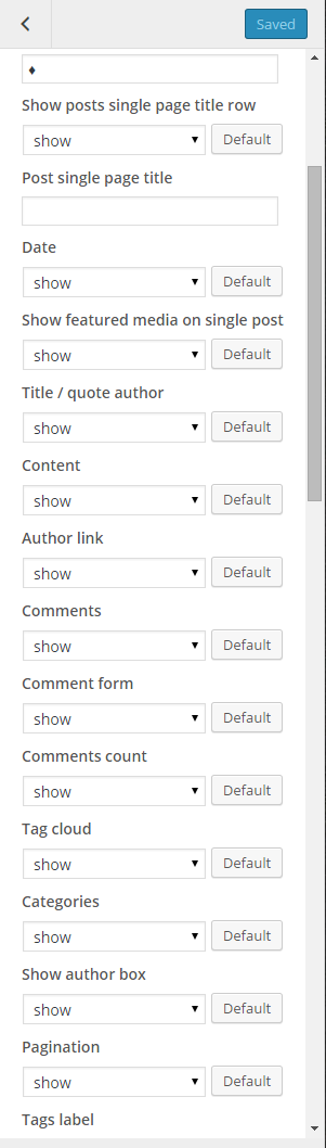
Single post settings
BLOG SIDEBAR OPTIONS:
- Show blog title block,
- Show blog single title block
- Show sidebar widgets on blog index
- Show sidebar widgets on blog single
- Blog index sidebar background image
- Blog index sidebar background style
- Blog single sidebar background image
- Blog single sidebar background style
- Blog index sidebar animated background
- Blog single sidebar animated background
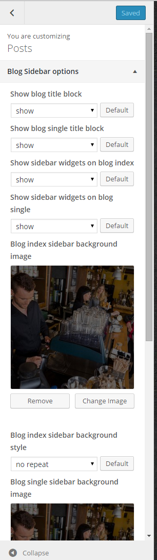
Blog sidebar options
Common issue: How to change post intro text?
Intro text, which can be displayed on Blog index page is an Excerpt. You can edit it manually for every post with the following field:
Excerpt
Notice: if you don’t see Excerpt field when you are editing your post, go to Screen Options at the top of the post edition window (on the right hand side) and enable Excerpt with checkbox.
Was this article helpful ?
Restaurant Menu
Test comes with an option to create a restaurant menu. Below you will find available settings for Restaurant Menu page template, where all restaurant products are displayed. All products are grouped by categories. You can define order of displayed categories together with order of displaying single products.
SIDEBAR OPTIONS:
- Show Menu Card title block
- Select title block for menu sidebar
- Menu sidebar background image
- Menu sidebar background style
- Menu sidebar animated background
- Sidebar bottom divider background
- Sidebar bottom divider background repeat
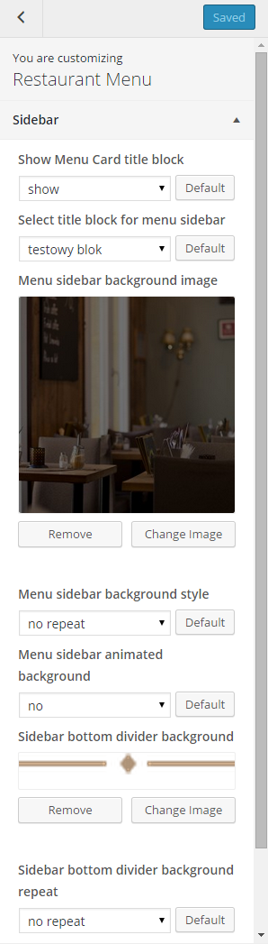
Menu sidebar options
MENU INDEX OPTIONS – select how your menu page should look like:
- Menu index top divider background
- Menu index bottom divider background
- Menu index top divider repeat
- Bottom divider background style.
- Menu index bottom divider repeat
- Bottom divider background style.
- Currency
- Menu index currency position
- Select currency position – select if we should display on the left or right side of a price.
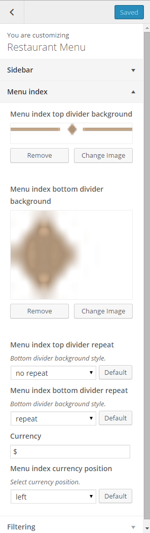
Menu index page options
FILTERING – define product categories order in menu card:
- Categories order by – select attribute by which products categories will be filtered,
- Categories order – select order type: descending, ascending,
- Categories custom order – if you want to setup custom order of categories, define it here – just type categories names (slugs), after commas by order you want to have,
- Food items order by – select attribute by which products will be filtered,
- Food items order – select order type: descending, ascending,
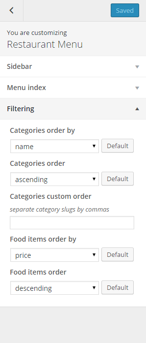
Menu filtering options
Was this article helpful ?
Social Unlocker
Thank you for purchasing this {Plugin}. If you have any questions that are beyond the scope of this help file, please feel free to start new ticket on this page. Thanks so much!
Scope of free support
We can help you with:
- Responding to questions or problems regarding the item and its features
- Fixing any discovered item’s bugs
- Providing updates to ensure compatibility with new software versions
{Plugin} allows you to create uniquely designed social networks buttons to your website. It comes with predefined skins, but you can setup your custom styles as well.
Please read this documentation to discover all available options.
Was this article helpful ?
Plugin installation
{Plugin} requires the following scripts to be attached in HTML page:
Javascript:
|
1 2 |
<script src="js/jquery-1.11.3.min.js"></script> <script src="js/socialUnlocker.js"></script> |
|
1 2 3 4 5 6 7 8 9 10 11 12 13 14 15 16 17 18 19 20 21 22 23 24 25 26 27 28 29 30 31 32 33 34 35 36 37 38 |
<script> $('.secretContainer').socialUnlocker({ texts:{ maskHeader: "Like Us", maskText: "We show you hidden content" }, buttons : ["facebook_like", "twitter_tweet", "google_plus1"], closeButton: true, fullPage: true, facebook:{ appId: "659569734174330", likeButton:{ url: "https://www.facebook.com/createITpl" } }, twitter:{ tweetButton: { url: "http://www.createit.pl/en/", message: "Nicola Tesla inventor", hashtags: "tesla, inventor, ac" } }, googlePlus:{ plusOneButton:{ url: "http://www.createit.pl/en/" } } }); </script> |
|
1 2 3 4 5 6 7 8 9 |
<div class="secretContainer"> <h4>Secret Header</h4> <div class="video"> <iframe width="560" height="315" src="https://www.youtube.com/embed/_luhn7TLfWU" frameborder="0" allowfullscreen></iframe> </div> </div> |
Was this article helpful ?
Available parameters
Define custom options with the following script:
|
1 2 3 4 5 6 7 8 9 |
<script> $('.secretContainer').socialUnlocker({ [options] }); </script> |
Below you will find all available parameters.
| Variable | Default | Type | Description |
|---|---|---|---|
| timer | 0 | integer | Set time to auto unlock content. “0” don’t add this options. |
| closeButton | false | boolean | Enable/Disable button to close mask. |
| buttons | [] | array, string | An array of buttons to create. The order indicates the order of created buttons. Available value: “facebook_like”, “facebook_share”, “twitter_tweet”, “twitter_follow”, “google_plus1”, “google_share” |
| theme | ” “ | string | Plugin style. Available value: ” ” – (empty string), “blueSky”, “material”, “hipster”, “lollipop”, “slick”, “image” |
| customClass | “” | string | Add custom class name to main container. |
| fullPage | false | boolean | Enable/Disable full page type popup. |
| beforeInit | false | function | Function invoke before plugin init. |
| beforeCreateMask | false | function | Function invoke before create mask. |
| afterCreateMask | false | function | Function invoke after create mask. |
| afterRemoveMask | false | function | Function invoke after remove mask. |
| afterAddContent | false | function | Function invoke after add content. |
| afterFBLikeClick | false | function | Function invoke after click facebook like button. |
| afterFBShareClick | false | function | Function invoke after click facebook share button. |
| afterTwitterTweetClick | false | function | Function invoke after click twitter tweet button. |
| afterTwitterFollowClick | false | function | Function invoke after click twitter follow button. |
| afterGooglePlusOneClick | false | function | Function invoke after click google +1 button. |
| afterGooglePlusShareClick | false | function | Function invoke after click google share button. |
texts:
| Variable | Default | Type | Description |
|---|---|---|---|
| maskHeader | “Simple test heading” | string | Mask header text. |
| maskText | “Simple paragraph text” | string | Mask paragraph text. |
| timerWaitText | “or wait” | string | Text before timer if timer exist. |
| timerSecText | “sec” | string | “Second” text after timer if timer exist. |
| closeCharacter | “×” | string | “Close button” value. |
Facebook:
| Variable | Default | Type | Description |
|---|---|---|---|
| appId | “0” | string | Facebook application ID important for facebook share button, but optional for like button. You can create your own app here |
| lang | “en_US” | string | Language of the button labels. More info here |
likeButton
| Variable | Default | Type | Description |
|---|---|---|---|
| url | “” | string | Link to like. |
| colorscheme | “light” | string | Button scheme color. Available value: “light”, “dark”. |
| width | “auto” | string | Width button container. |
| action | “like” | string | Verb to display. Available value: “like”, “recommend”. |
| ref | “” | string | Label for tracking referrals. |
| layout | “button_count” | string | Button layout. Available value: “standard”, “box_count”, “button_count”, “button”. |
shareButton:
| Variable | Default | Type | Description |
|---|---|---|---|
| url | “” | string | Link to share. |
| width | “auto” | string | Width button container. |
| layout | “button_count” | string | Button layout. Available value: “box_count”, “button_count”, “button”, “icon_link”, “icon”, “link”. |
| name | “” | string | Name of the product or content you want to share. |
| picture | “” | string | Path to an image you would like to share with this content. |
| caption | “” | string | Caption. |
| description | “” | string | Description of your product or content. |
twitter:
| Variable | Default | Type | Description |
|---|---|---|---|
| lang | “en” | string | Language of the button labels. More info here. |
tweetButton:
| Variable | Default | Type | Description |
|---|---|---|---|
| url | “” | string | Tweet url. |
| message | “” | string | Default message in tweet. |
| hashtags | “” | string | Hash tags separated by comma. Example: “hash1, hash2, hash3”. |
| related | “” | string | Related accounts. |
| count | “horizontal” | string | Count position. Available value: “none”, “horizontal”, “vertical”. |
| size | “default” | string | Button size. Available value: “default”, “large”. |
followButton:
| Variable | Default | Type | Description |
|---|---|---|---|
| username | “” | string | Twitter username. |
| showScreenName | “false” | string | Enable/disable username inside button. |
| size | “default” | string | Button size. Available value: “default”, “large”. |
googlePlus:
| Variable | Default | Type | Description |
|---|---|---|---|
| lang | “en-US” | string | Language of the button labels. More info here |
plusOneButton:
| Variable | Default | Type | Description |
|---|---|---|---|
| url | “” | string | Link to like |
| size | “medium” | string | Button size. Available value: “small”, “medium”, “standard”, “tall”. |
| annotation | “bubble” | string | Annotation to display. Available value: “none”, “bubble”, “inline”. |
| width | “auto” | string | Button container width. Not available with “bubble” annotation |
| align | “left” | string | Button horizontal align. Available value: “left”, “right”. |
| expandTo | “” | string | Hover and confirmation bubbles display position; separated by comma list of: top, right, bottom, left. |
shareButton:
| Variable | Default | Type | Description |
|---|---|---|---|
| url | “” | string | Link to share |
| annotation | “bubble” | string | Annotation to display. Available value: “none”, “bubble”, “inline”, “vertical-bubble”. |
| width | “auto” | string | Button container width. |
| height | “20” | string | Button height. |
| align | “left” | string | Button horizontal align. Available value: “left”, “right”. |
| expandTo | “” | string | Hover and confirmation bubbles display position; separated by comma list of: top, right, bottom, left. |
Was this article helpful ?
How to get the Facebook APP ID
Please follow the steps below you get your Facebook App ID:
- Go to: https://developers.facebook.com/
- Click My Apps tab

- Click Create a New App button

- Fill in the form and click Create App ID button
- Go to Settings tab, add your page domain and contact email
- Click + Add Platform and select Website
- Then add your Site URL and click Save Changes
- Go to Status & Review tab
- Change button on the right to YES
- Back to Dashboard tab and copy your App ID
Was this article helpful ?
Examples of usage
LIKE BUTTONS
HTMLmarkup:
|
1 2 3 4 5 6 7 8 9 |
<div class="secretContainer"> <h4>Secret Header</h4> <div class="video"> <iframe width="560" height="315" src="https://www.youtube.com/embed/_luhn7TLfWU" frameborder="0" allowfullscreen></iframe> </div> </div> |
Javascript:
|
1 2 |
<script src="js/jquery-1.11.3.min.js"></script> <script src="js/socialUnlocker.js"></script> |
|
1 2 3 4 5 6 7 8 9 10 11 12 13 14 15 16 17 18 19 20 21 22 23 24 25 26 27 28 29 30 31 32 33 34 35 36 |
<script> $('.secretContainer').socialUnlocker({ texts:{ maskHeader: "Like Us", maskText: "We show you hidden content" }, buttons : ["facebook_like", "twitter_tweet", "google_plus1"], timer: 10000000, facebook:{ appId: "659569734174330", likeButton:{ url: "https://www.facebook.com/createITpl" } }, twitter:{ tweetButton: { url: "http://www.createit.pl/en/", message: "Nicola Tesla inventor", hashtags: "tesla, inventor, ac" } }, googlePlus:{ plusOneButton:{ url: "http://www.createit.pl/en/" } } }); </script> |
SHARE BUTTONS
HTML markup:
|
1 2 3 4 5 6 7 8 9 |
<div class="secretContainer"> <h4>Secret Header</h4> <div class="video"> <iframe width="560" height="315" src="https://www.youtube.com/embed/_luhn7TLfWU" frameborder="0" allowfullscreen></iframe> </div> </div> |
Javascript:
|
1 2 |
<script src="js/jquery-1.11.3.min.js"></script> <script src="js/socialUnlocker.js"></script> |
|
1 2 3 4 5 6 7 8 9 10 11 12 13 14 15 16 17 18 19 20 21 22 23 24 25 26 27 28 29 30 31 32 33 34 35 36 37 |
<script> $('.secretContainer').socialUnlocker({ texts:{ maskHeader: "Share", maskText: "We show you hidden content" }, buttons : ["facebook_share", "twitter_follow", "google_share"], closeButton: true, facebook:{ appId: "659569734174330", shareButton:{ url:"https://www.facebook.com/createITpl/posts/898868683469333", name : "CreateIT", picture : "http://www.createit.pl//wp-content/uploads/sites/2/2015/02/createit-landing-logo-upd.png", caption : "CreateIT", description : "We are createIT. We create IT. And we are really good at it." } }, twitter:{ followButton:{ username: "createitpl" } }, googlePlus:{ shareButton: { url: "http://www.createit.pl/en/" } } }); </script> |
FULL PAGE
HTML markup:
|
1 2 3 4 5 6 7 8 9 10 11 |
<body class="secretContainer"> <section> <h4>Header</h4> <div class="video"> <iframe width="560" height="315" src="https://www.youtube.com/embed/_luhn7TLfWU" frameborder="0" allowfullscreen></iframe> </div> </section> </body> |
|
1 2 |
<script src="js/jquery-1.11.3.min.js"></script> <script src="js/socialUnlocker.js"></script> |
|
1 2 3 4 5 6 7 8 9 10 11 12 13 14 15 16 17 18 19 20 21 22 23 24 25 26 27 28 29 30 31 32 33 34 35 36 37 38 |
<script> $('.secretContainer').socialUnlocker({ texts:{ maskHeader: "Like Us", maskText: "We show you hidden content" }, buttons : ["facebook_like", "twitter_tweet", "google_plus1"], closeButton: true, fullPage: true, facebook:{ appId: "659569734174330", likeButton:{ url: "https://www.facebook.com/createITpl" } }, twitter:{ tweetButton: { url: "http://www.createit.pl/en/", message: "Nicola Tesla inventor", hashtags: "tesla, inventor, ac" } }, googlePlus:{ plusOneButton:{ url: "http://www.createit.pl/en/" } } }); </script> |
Was this article helpful ?
Available skins
BlueSky
|
1 2 3 |
$('.secretContainer').socialUnlocker({ theme: "blueSkye" }); |
Image
|
1 2 3 |
$('.secretContainer').socialUnlocker({ theme: "image" }); |

Hipster
|
1 2 3 |
$('.secretContainer').socialUnlocker({ theme: "hipster" }); |
Lollipop
|
1 2 3 |
$('.secretContainer').socialUnlocker({ theme: "lollipop" }); |
Material
|
1 2 3 |
$('.secretContainer').socialUnlocker({ theme: "material" }); |

Slick
|
1 2 3 |
$('.secretContainer').socialUnlocker({ theme: "slick" }); |
Was this article helpful ?
Creating Restaurant Menu
With Test you can define menu for the restaurants or cafeteria.
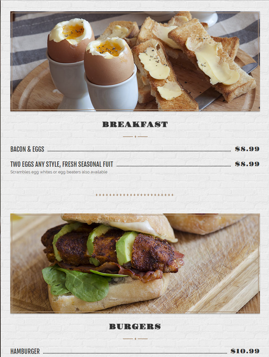
Products menu
You can create each product for your menu through Restaurant Menu section
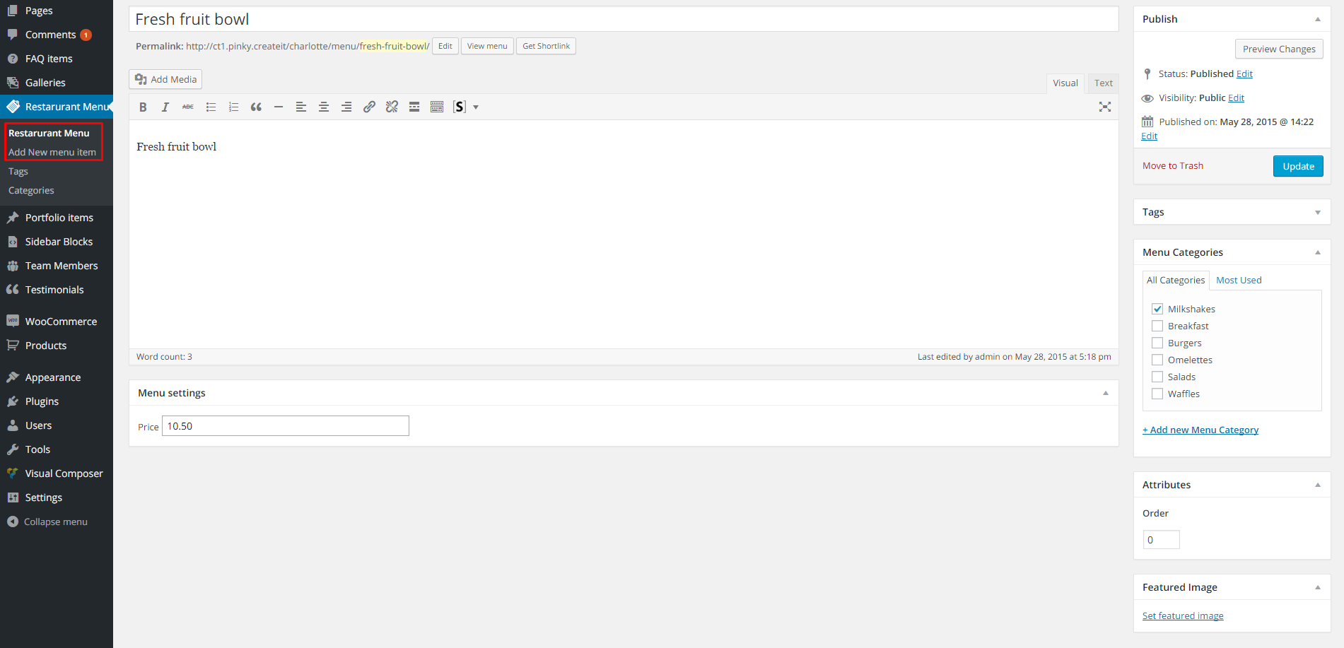
For each product you can define:
- Menu product name (required),
- Menu product description (optional),
- Price (recommended),
- Tags (optional)
- Categories (recommended),
- Order attribute (optional),
- Featured image (recommended),
All Menu products will be displayed on page with Restaurant Menu template, which can be defined in pages options.
You can setup the way of displaying menu via Appearance > Customize section.
Was this article helpful ?
What is sidebar block?
As you can see most of Test content is arranged in two main content columns and navigation menu on the left side.

Main Theme structure
Navigation Menu can be setup via Appearance > Menus by Primary Navigation option. Main page content (right part of the content) is created in standard way with Visual Composer or shortcode through Pages section.
To create a central part of the content you need to use Sidebar Blocks. These are the custom post types – which can be built with shortcodes or Visual Composer widgets such as other posts or pages.
To create a new Sidebar Block – please navigate to Sidebar Blocks section and click on Add New:
Add a new sidebar block
You can also edit block imported with our demo content. To do this – just click on Sidebar Block to display list of all blocks. You can go to edition page with Edit button.
For Example to edit content of the main theme slider – go to edition page of Big Slider block.

Main Slider
You can edit each slide content with Visual Composer elements:
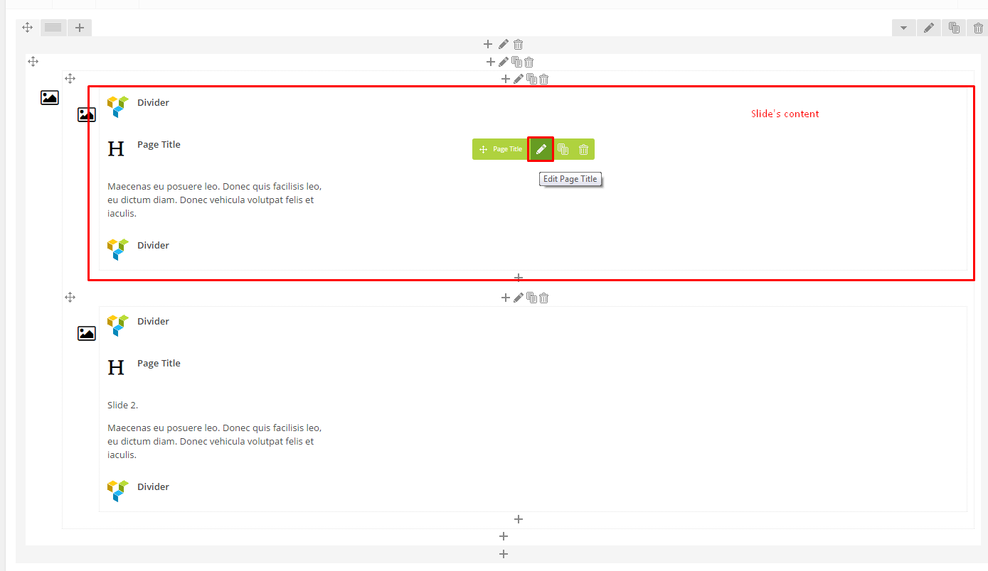
Edit slider elements
<
Was this article helpful ?
Assign sidebar block to page
Sidebar blocks can be assigned individually for each page with Page side content options:
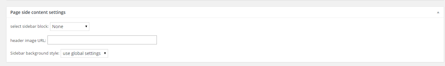
Page side content options
But for Pages in general, Blog and Restaurant Menu you can define Sidebar blocks via Appearance > Customize menu.
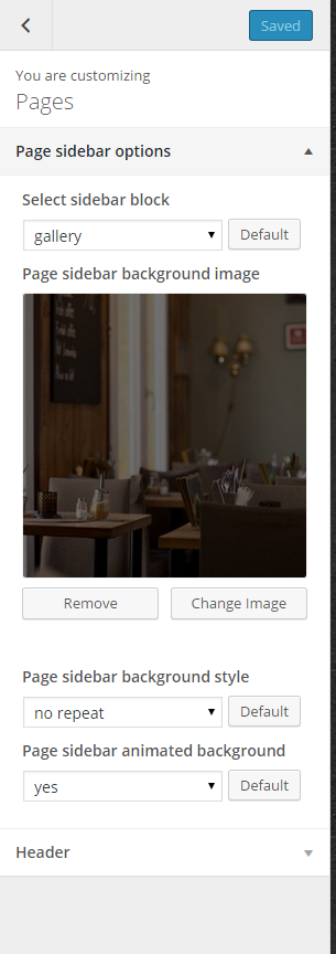
Setup global options for sidebar block
Was this article helpful ?
Courses box
HTML MARKUP
|
1 2 3 4 5 6 7 8 9 10 11 12 13 |
<article class="ct-coursesBox"> <a href="#"> <div class="ct-coursesBox-image"> <img src="../assets/images/demo-content/coursesBox-1.jpg" class="grayscale grayscale-fade" alt="Team Member 1"> <div class="ct-coursesIcon"> <div class="text-uppercase ct-fw-600 ct-u-paddingTop5">BEG</div> <div class="text-capitalize">Lvl1</div> </div> </div> </a> <h4 class="ct-coursesBox-title"><a href="#" class="ct-u-colorInherit">Shuffle Toe Heel Wiggles</a></h4> <span class="ct-coursesBox-subtitle">Teacher: <a href="#">Marta Davis</a></span> </article> |
How it looks?

Was this article helpful ?
Slider

HTML MARKUP
|
1 2 3 4 5 6 7 8 9 10 |
<div id="sync1" class="ct-js-owl owl-carousel" data-single="true" data-height="" data-snap-ignore="false"> <div class="item"> <img src="../assets/images/demo-content/gallery-sync-1.jpg" alt=""> </div> </div> <div id="sync2" class="ct-js-owl owl-carousel ct-u-paddingBoth20 ct-syncedCarousel ct-syncedCarousel--navigationBottom ct-backgroundContent" data-type="color" data-bg-color="#f6f6f6" data-snap-ignore="false"> <div class="item"> <img src="../assets/images/demo-content/gallery-sync-thumb-1.jpg" alt=""> </div> </div> |
|
1 2 |
<script src="../assets/plugins/owl/owl.carousel.js"></script><script src="../assets/plugins/owl/sync.js"></script> <script src="../assets/plugins/owl/init.js"></script> |
Was this article helpful ?
Schedule
HTML MARKUP
|
1 2 3 4 5 6 7 8 9 10 |
<table class="ct-schedule ct-backgroundContent" data-type="color" data-bg-color="#f6f6f6"> <caption class="ct-u-size15 ct-fw-500">Ballet at Lunchtime</caption> <tbody> <tr> <td>Monday</td> <td>12:30pm</td> <td>1:30pm</td> </tr> </tbody> </table> |

Was this article helpful ?
Testimonials
HTML MARKUP
There are two available variations of testimonial box. With picture on the left or right side, each type has a corresponding CSS class, which needs to be added in compoenent markup:
— ct-testimonials–left
— ct-testimonials–right
|
1 2 3 4 5 6 7 8 9 10 11 12 13 14 15 16 17 18 |
<div class="ct-testimonials ct-testimonials--left ct-u-marginTop70"> <div class="ct-testimonials-image"> <img src="../assets/images/demo-content/testimonials1.jpg" alt="Testimonial 1"> </div> <div class="ct-testimonials-content"> <div class="ct-testimonials-content-name ct-u-paddingBottom20"> <span class="ct-u-size18">Karen Donalds</span> </div> <p class="ct-testimonials-content-description text-justify"> I am extremely pleased with my decision to have my daughter take dance classes from you guys. The environment, the teachers and overall experience has been wonderful! I would highly recommend others to look into having their children take classes here! Lorem ipsum dolor sit amet, consectetur adipiscing elit. Aliquam dictum tempus magna eu gravida. Cum sociis natoque penatibus et magnis dis parturient montes. </p> </div> <div class="clearfix"></div> </div> |
Screenshot’s

Was this article helpful ?
Tickets & Showtimes
HTML MARKUP
|
1 2 3 4 5 6 7 8 9 10 11 12 13 14 15 16 17 18 19 20 21 22 23 24 25 |
<div class="col-md-3"> <div class="row"> <div class="col-md-12"> <div class="ct-widget"> <div class="ct-widgetInner"> <h6 class="ct-u-colorMotive text-uppercase ct-u-size20">Tickets & Showtimes</h6> <div class="form-group ct-u-paddingTop10"> <div class="input-group date" id="sandbox-container"></div> </div> </div> </div> </div> </div> <div class="row"> <div class="col-md-12"> <div class="ct-widget"> <div class="ct-widgetInner"> <div class="ct-widget-tickets"> <div class="ct-js-datePicker"></div> </div> </div> </div> </div> </div> </div> |
JavaScript
|
1 |
<script src="../assets/plugins/ct-datepicker/bootstrap-date-picker.js"></script><script src="../assets/plugins/ct-datepicker/init.js"></script> |

Was this article helpful ?
Isotope gallery with popup
HTML MARKUP
|
1 2 3 4 5 6 7 8 9 10 11 12 13 14 15 16 17 18 19 20 21 22 23 24 25 26 27 |
<ul class="list-unstyled ct-gallery-filters"><!-- Isotope nav --> <li><a data-filter="*" class="active">ALL</a></li> <li><a data-filter=".classical">CLASSICAL</a></li> <li><a data-filter=".neo-classical">NEO-CLASSICAL</a></li> <li><a data-filter=".contemporary">CONTEMPORARY</a></li> </ul> <div class="ct-gallery ct-gallery--col3 ct-gallery--withSpacing is-loaded"> <div class="ct-gallery-item ct-gallery-item--masonry classical"><!-- Gallery's 1 item--> <div class="ct-gallery-itemInner"> <div class="ct-galleryBox ct-galleryBox--type1 ct-galleryBox--motive"> <a class="ct-js-magnificPopupImage ct-galleryBox ct-galleryBox--type1 ct-galleryBox--motive" href="../assets/images/demo-content/gallery1.jpg"> <figure> <img src="../assets/images/demo-content/gallery1.jpg" class="ct-portfolio-image" alt="Gallery picture 1"> <figcaption class="ct-galleryBox-overlay"> <div class="ct-galleryBox-overlay-imageTitle"> Orange Ballerina Dancing </div> <div class="ct-galleryBox-overlay-imageView"> <span>See</span> </div> </figcaption> </figure> </a> </div> </div> </div> </div> |
JavaScript
|
1 2 3 4 5 |
<script src="../assets/plugins/ct-portfolio/jquery.isotope.min.js"></script> <script src="../assets/plugins/ct-portfolio/imagesloaded.js"></script> <script src="../assets/plugins/ct-portfolio/init.js"></script> <script src="../assets/plugins/magnificPopup/jquery.magnific-popup.js"></script> <script src="../assets/plugins/magnificPopup/init.js"></script> |
Screenshot’s

Was this article helpful ?
Main carousel slider
There are several available options for the slider navigation placement. Each variation can be enabled with one of the following CSS classes added to HTML markup of the slider:
— ct-mainCarousel.ct-mainCarousel–arrowsMiddle,
— ct-mainCarousel.ct-mainCarousel–arrowsTop,
— ct-mainCarousel.ct-mainCarousel–arrowsTopRight,
— ct-mainCarousel.ct-mainCarousel–arrowsTopLeft,
— ct-mainCarousel.ct-mainCarousel–arrowsBottom,
— ct-mainCarousel.ct-mainCarousel–arrowsBottomLeft,
— ct-mainCarousel.ct-mainCarousel–arrowsBottomRight,
— ct-mainCarousel.ct-mainCarousel–arrowsCenterTop,
— ct-mainCarousel.ct-mainCarousel–arrowsCenterBottom
HTML MARKUP
|
1 2 3 4 5 6 7 8 9 10 11 12 13 14 15 16 17 18 19 20 21 22 23 24 25 26 27 28 29 30 31 32 33 34 35 36 |
<!-- Main Carousel --> <div class="ct-js-owl ct-u-owl ct-mainCarousel ct-mainCarousel--arrowsMiddle" data-single="true" data-height="844" data-animations="true" data-navigation="true" data-pagination="false" data-bg="true" data-snap-ignore="true"> <div class="item" data-bg="../assets/images/demo-content/slide-number-first.jpg" data-position="center center"> <!-- 1' OwlSlider item --> <div class="inner"> <div class="ct-dividedButtons ct-dividedButtons--bottomMiddle"> <div class="btn-group btn-block" role="group" aria-label="..."> <button type="button" class="btn btn-primary">Student Division (8+)</button> <button type="button" class="btn btn-gray">Attend class <i class="fa fa-angle-double-right"></i></button> </div> </div> </div> </div> <div class="item" data-bg="../assets/images/demo-content/main-slider-3.jpg" data-position="right center"> <!-- 2' OwlSlider item --> <div class="inner"> <div class="ct-dividedButtons ct-dividedButtons--bottomMiddle"> <div class="btn-group btn-block" role="group" aria-label="..."> <button type="button" class="btn btn-primary">Student Division (8+)</button> <button type="button" class="btn btn-gray">Attend class <i class="fa fa-angle-double-right"></i></button> </div> </div> </div> </div> <div class="item" data-bg="../assets/images/demo-content/main-slider4.jpg" data-position="right"> <!-- 3' OwlSlider item --> <div class="inner"> <div class="ct-dividedButtons ct-dividedButtons--bottomMiddle"> <div class="btn-group btn-block" role="group" aria-label="..."> <button type="button" class="btn btn-primary">Student Division (8+)</button> <button type="button" class="btn btn-gray">Attend class <i class="fa fa-angle-double-right"></i></button> </div> </div> </div> </div> </div> |
JavaScript
|
1 2 |
<script src="../assets/plugins/owl/owl.carousel.js"></script> <script src="../assets/plugins/owl/init.js"></script> |
Screenshot’s

Was this article helpful ?
Product single

JavaScript
|
1 2 3 |
<script src="../assets/plugins/owl/owl.carousel.js"></script> <script src="../assets/plugins/owl/init.js"></script> <script src="../assets/plugins/ct-select2/select2.js"></script> |
Was this article helpful ?
Products list
HTML MARKUP
|
1 2 3 4 5 6 7 8 9 10 11 12 13 14 15 16 17 18 19 20 21 22 23 24 25 |
<div class="ct-productItem"> <div class="row"> <div class="col-md-2"> <div class="ct-productItem-image"> <a href="shop-single-product.html"> <img src="../path/to/shopProduct" alt="Shop product"> </a> </div> </div> <div class="col-md-10"> <div class="ct-productItem-content"> <h6 class="ct-productItem-name"> <a href="shop-single-product">I'm Bob T-Shirt</a> </h6> <div class="ct-productItem-description"> This classic silhouette is an affordable alternative heavyweight t-shirt for the value-conscious consumer. </div> <div class="ct-u-paddingTop10 ct-u-paddingBottom15"> <span class="ct-productItem-price ct-u-colorPrimary">$25.00</span> </div> <a href="shop-single-product.html" class="btn btn-primary btn-xs text-uppercase">Buy now</a> </div> </div> </div> </div> |

Was this article helpful ?
Person Box
HTML MARKUP
|
1 2 3 4 5 6 7 8 9 |
<a href="single-member" class="ct-personBox ct-personBox--primary"> <figure class="ct-personBox-image"> <img src="../path/image.*" alt="Person 2"> <figcaption> <div class="ct-personBox-name">Lisa Donalds</div> <span class="ct-personBox-linkHelper">See</span> </figcaption> </figure> </a> |

Was this article helpful ?
Video Box
HTML MARKUP
|
1 2 3 4 5 |
<div class="ct-video-poster"> <a href="#" class="ct-videoPopup"> <img src="../assets/images/demo-content/pattern3.jpg" alt="Video poster"> </a> </div> |
JavaScript
|
1 2 |
<script src="../assets/plugins/magnificPopup/jquery.magnific-popup.js"></script> <script src="../assets/plugins/magnificPopup/init.js"></script> |

Was this article helpful ?
Image Box
HTML MARKUP
There are two types of image boxes. Define which one you would like to use with the proper CSS class added to HTML markup:
-ct-imageBox–type1
-ct-imageBox–type2
|
1 2 3 4 5 6 7 8 9 10 11 12 13 14 15 16 |
<div class="ct-imageBox ct-imageBox--type2"> <a href="#" class="ct-imageBox-image"> <img src="path/to/image" class="img-responsive" alt="Demo image"> </a> <article class="ct-imageBox-content"> <h5 class="ct-imageBox-content-header ct-fw-400 text-uppercase text-left"> <a href="#">Title</a> </h5> <p class="ct-imageBox-content-description"> Lorem ipsum dolor sit amet, consectetur adipiscing elit. Mauris leo nibh, suscipit et nibh sed, posuere veneuis massa. Aliquam nunc nulla, imperdiet sed mattis id, conseu quat aliquet diam. Fusce dictum feugiat aliquam. Get tincidunt ipsum accumsan sit amet. In faucibus lacinia est. Praesent dapibus, dolor id vehicula sodales, justo. </p> </article> </div> |
Screenshot’s

Was this article helpful ?
Header
The header can be:
- static,
- parallax,
- kenburns
- video
The header title can be placed:
- – ct-pageHeader–bottomRight
- – ct-pageHeader–bottomLeft
- – ct-pageHeader–topRight
- – ct-pageHeader–topLeft
HTML MARKUP
|
1 2 3 4 5 6 7 8 9 10 11 12 13 14 15 |
<header class="ct-pageHeader"> <section class="ct-backgroundContent ct-u-displayTableVertical" data-type="pattern" data-height="283" data-bg-image="../assets/images/demo-content/header1.jpg" data-bg-image-mobile="../assets/images/demo-content/header1.jpg"> <div class="inner ct-u-displayTableCell ct-pageHeader--bottomRight"> <div class="container"> <div class="row"> <div class="col-md-12"> <h5 class="ct-pageHeader-title"> This is a STATIC header. </h5> </div> </div> </div> </div> </section> </header> |

You can use also extra header title animation “like typing”. You just need to adjust HTML markup for this – please see the example below. You can set also data-animation-speed. It’s usefull with short or long header’s title.
|
1 2 3 |
<h5 class="ct-pageHeader-title"> <span class="ct-js-typingAnimation" data-type="typingAnimation" data-animation-speed="3">Respect your body. Eat well. Dance forever.</span> </h5> |
Was this article helpful ?
Artistic Boxes
HTML MARKUP
|
1 2 3 4 5 6 7 8 9 10 11 12 13 14 15 16 17 18 19 20 21 22 23 24 25 26 27 28 29 30 31 32 33 34 35 36 37 38 39 40 41 42 43 44 45 46 47 48 49 50 51 52 53 54 55 |
<div class="ct-artisticBox"> <div class="ct-artisticBox-content"> <div class="ct-backgroundContent" data-bg-color="#f7f7f7" data-type="color"> <div class="ct-artisticBox-description"> <h3 class="ct-artisticBox-date">2014 - 2015</h3> <h4 class="ct-artisticBox-title text-uppercase">Artistic Staff</h4> <ul class="list-unstyled ct-artistBox-members"> <li>Karen Jenkins - <a href="#">Ballet Master</a></li> <li>Lisa Donalds - <a href="">Ballet Mistress</a></li> <li>Dana Johnsons - <a href="#">Rehearsal Director</a></li> <li>Melissa Kens - <a href="#">Artistic Director</a></li> </ul> </div> </div> </div> <div class="ct-artisticBox-personImage"> <a href="staff-single-member.html" class="ct-personBox ct-personBox--primary"> <figure class="ct-personBox-image"> <img src="../assets/images/demo-content/personBox0.jpg" alt="Person 1"> <figcaption> <div class="ct-personBox-name">Karen Jenkins</div> <span class="ct-personBox-linkHelper">See</span> </figcaption> </figure> </a> <a href="staff-single-member.html" class="ct-personBox ct-personBox--primary"> <figure class="ct-personBox-image"> <img src="../assets/images/demo-content/personBox2.jpg" alt="Person 2"> <figcaption> <div class="ct-personBox-name">Lisa Donalds</div> <span class="ct-personBox-linkHelper">See</span> </figcaption> </figure> </a> <a href="staff-single-member.html" class="ct-personBox ct-personBox--primary"> <figure class="ct-personBox-image"> <img src="../assets/images/demo-content/personBox3.jpg" alt="Person 3"> <figcaption> <div class="ct-personBox-name">Dana Johnsons</div> <span class="ct-personBox-linkHelper">See</span> </figcaption> </figure> </a> <a href="staff-single-member.html" class="ct-personBox ct-personBox--primary"> <figure class="ct-personBox-image"> <img src="../assets/images/demo-content/personBox4.jpg" alt="Person 4"> <figcaption> <div class="ct-personBox-name">Monika Belluci</div> <span class="ct-personBox-linkHelper">See</span> </figcaption> </figure> </a> </div> <div class="clearfix"></div> </div> |
Screenshot’s

Was this article helpful ?
Media Sections
You can arrange your content with the following Media sections types:
HTML MARKUP for parallax
|
1 2 3 4 5 |
<div class="ct-mediaSection" data-stellar-background-ratio="0.3" data-type="parallax" data-bg-image="path/to/the/picture" data-bg-image-mobile="path/to/the/picture"> <div class="inner"> //content </div> </div> |
HTML MARKUP for kenburns
|
1 2 3 4 5 6 7 8 |
<div class="ct-mediaSection" data-height="460" data-type="kenburns" data-bg-image-mobile="path/to/the/picture.jpg"> <div class="ct-mediaSection-kenburnsImageContainer"> <img src="path/to/the/picture.jpg" alt="Picture"> <img src="path/to/the/picture.jpg" alt="Picture"> <img src="path/to/the/picture.jpg" alt="Picture"> </div> //content </div> |
HTML MARKUP for video
|
1 2 3 4 5 6 7 8 |
<div class="ct-mediaSection" id="header" data-type="video" data-height="650" data-bg-image-mobile="path/to/the/image"> <div class="ct-mediaSection-video embed-responsive embed-responsive-16by9"> <video id="video1" muted="" loop="loop" autoplay="autoplay" preload="auto"> <source src="path/to/the/video.mp4" type="video/mp4"> <source src="path/to/the/video.webm" type="video/webm"> </video> </div> </div> |
JavaScript
|
1 2 |
<script src="../assets/plugins/ct-mediaSection/js/jquery.stellar.min.js"></script> <script src="../assets/plugins/ct-mediaSection/js/init.js"></script> |
Was this article helpful ?
Blockquote
HTML MARKUP
|
1 2 3 4 5 6 7 8 9 10 |
<blockquote class="ct-blockquote ct-blockquote-quotation ct-blockquote--quotationLeft text-center"> <div class="ct-blockquote-content"> <p class="ct-blockquote-citation ct-u-colorWhite"> The videos quality is great and the explanations are very clear so even beginners can learn quickly. </p> <span class="ct-blockquote-author ct-u-colorMotive"> - Jessica Dawn </span> </div> </blockquote> |
Screenshot’s


Was this article helpful ?
Google Maps
HTML MARKUP
|
1 |
<div class="ct-googleMap ct-googlemapStyle ct-u-marginBoth50" data-location="Manhattan, NY 56789" data-height="445" data-zoom="2" data-snap-ignore="true"></div> |
JavaScript
|
1 2 3 |
<script src="http://maps.google.com/maps/api/js?sensor=false"></script> <script src="../assets/plugins/gmaps/gmap3.min.js"></script> <script src="../assets/plugins/gmaps/init.js"></script> |
Screenshot’s

Common question: How to define my location on the map?
To display your location on the Google map just edit data-attribute data-location in HTML markup with your address.
Was this article helpful ?
Single blog post
HTML MARKUP
|
1 2 3 4 5 6 7 8 9 10 11 12 13 14 15 16 17 18 19 20 21 22 23 24 25 26 27 28 29 30 31 32 33 34 35 36 37 38 39 40 41 42 43 44 45 46 47 48 49 50 51 52 53 54 55 56 57 58 59 60 61 62 63 64 65 66 67 68 69 70 71 72 73 74 75 |
<article class="ct-blogPost ct-blogPost--primary text-justify-xs"> <img src="../assets/images/demo-content/blog-single-1.jpg" alt="Ballet Image"> <h5 class="ct-blogPost-title text-center-xs">Home for the holidays</h5> <div class="ct-blogPost-metaContainer text-center-xs"> <span class="ct-blogPost-meta">By <a href="#">DanaK</a></span> <span class="ct-blogPost-meta">in: <a href="#">Just Ballet</a></span> <span class="ct-blogPost-meta"> on January 3, 2015</span> <span class="ct-blogPost-meta"><a href="#">6 Comments</a></span> </div> <div class="ct-blogPost-text"> <p class="ct-u-size16"> Show off your culinary skills with a batch of pretty pastel macaroons. They're a small light biscuit, crunchy outside and soft inside, made with ground almonds, sugar and egg whites. Macaroons are sometimes flavoured with additional ingredients such as coffee, chocolate, nuts or fruit. They’re particularly good made with freshly ground. </p> <p class="ct-u-size16"> I hate sifting. I learned the importance of sifting from my mother-in-law Gail. We made macarons together after she had returned from Paris where she had taken a macaron class. She had me sift the almond flour over and over. When I thought I was done, she told me to sift it again. Then again. Sifting feels like a chore. It can be time consuming, but it eliminates chunks from your almond flour and ground pistachios. It is an important step that leads to smoother macaron shells. The more you sift, the smoother your shells will be. </p> <p class="ct-u-size16"> This next picture shows the chunks that I removed from the almond and pistachio mixture through sifting. If I had not sifted, these chunks of nuts would be incorporated into my shell batter. Like I said, sifting feels like a tedious chore, but it is so worth it to have a smooth shell in the end. </p> </div> <div class="ct-blogTags"> <span class="ct-u-size16"><i class="fa fa-tag"></i> Tags:</span> <a href="#" class="ct-blogTag">ballerina</a> <a href="#" class="ct-blogTag">joyful</a> <a href="#" class="ct-blogTag">hiliday</a> <a href="#" class="ct-blogTag">ballet</a> </div> <ul class="ct-socials ct-socials--darkGrey list-inline list-unstyled ct-u-marginTop20 ct-u-marginBottom50"> <li> <span class="ct-fw-600 ct-u-size16 text-uppercase ct-fw-700">Share:</span> </li> <li> <a href="#" data-toggle="tooltip" data-placement="top" title="" data-original-title="Facebook"> <i class="fa fa-facebook ct-fw-600"></i> </a> </li> <li> <a href="#" data-toggle="tooltip" data-placement="top" title="" data-original-title="Twitter"> <i class="fa fa-twitter ct-fw-600"></i> </a> </li> <li> <a href="#" data-toggle="tooltip" data-placement="top" title="" data-original-title="RSS"> <i class="fa fa-rss ct-fw-600"></i> </a> </li> <li> <a href="#" data-toggle="tooltip" data-placement="top" title="" data-original-title="Linkedin"> <i class="fa fa-linkedin ct-fw-600"></i> </a> </li> </ul> <div class="ct-authorPost"> <img class="img-responsive" src="../assets/images/demo-content/blog-single-3.jpg" alt="Author Photo"> <div class="ct-authorPost-content"> <div class="ct-authorPost-author ct-u-paddingBottom20"><span class="ct-authorPost-name">Janice Dohnson</span> - January 4, 2015</div> <p class="ct-authorPost-quote text-justify-xs"> But not fine enough that you don’t have to sift it again. It’s a chore, but sifting the powdered sugar and nut mixture one last time will be worth the effort and ensure a smooth macaron shell. </p> </div> <div class="clearfix"></div> </div> </article> |
Screenshot

Was this article helpful ?
Blog list
1) Widget – search
Screenshot:

2) Widget – topPosts
Screenshot:

3) Widget – recent Posts
Screenshot:

4) Widget – tag list
Screenshot:

5) Widget – latestComments
Screenshot:

6) Blog item
Screenshot:

Was this article helpful ?
Leadership box
There are two available variation of the box:
ct-leadershipBox–left
ct-leadershipBox–right
|
1 2 3 4 5 6 7 8 9 10 11 12 13 14 15 16 17 18 19 20 |
<div class="ct-leadershipBox ct-leadershipBox--left"> <div class="ct-leadershipBox-description"> <div class="ct-leadershipBox-title"> <h1 class="ct-leadershipBox-firstName">Megan</h1> <h2 class="ct-leadershipBox-surName">Trainers</h2> <span class="ct-leadershipBox-positionName ct-fw-300">Founder of 1STEP</span> </div> <p class="ct-leadershipBox-basicInformation text-justify-xs"> Lorem ipsum dolor sit amet, consectetur adipiscing elit. Mauris leo nibh, suscipit et nibh sed, posuere veneuis massa. Aliquam nunc nulla, imperdiet sed mattis id, consequat aliquet diam. Fusce dictum feugiat aliquam. Phasellus diam libero, mollis vel velit quis, bibendum volutpat turpis. Proin id gravida diam. Donec tempor, enim ac vulputate vehicula, odio arcu vulputate dui, at tristique dui nibh ut nisl. Aliquam lacinia pretium urna, eget tincidunt ipsum accumsan sit amet. In faucibus lacinia est. Praesent dapibus, dolor id vehicula sodales, justo diam eleifend ipsum, vel laoree. </p> </div> <div class="ct-leadershipBox-image animated" data-fx="" data-time=""> <img src="../assets/images/demo-content/leadership-1.jpg" alt="Leadership 1" class="img-responsive"> </div> <div class="clearfix"></div> </div> |
JavaScript:
Screenshot’s:

Was this article helpful ?
Shadow box
HTML MARKUP
|
1 2 3 4 5 6 7 8 9 10 11 12 13 14 15 16 17 18 19 20 21 22 23 24 25 26 27 28 29 30 31 |
<div class="ct-shadowBox ct-backgroundContent" data-type="color" data-bg-color="rgba(255, 255, 255, .4)" data-snap-ignore="true"> <div class="form"> <div class="text-right ct-u-colorLighterGray ct-u-size16"> <span class="ct-u-colorLighterGrey ct-u-cursorPointer" data-toggle="modal" data-target="#myModal">Login</span> </div> <div class="text-left"> <h3 class="ct-u-marginBoth0 ct-u-marginTopMinus10 ct-u-size24 ct-fw-400">Join Us</h3> </div> <form class="ct-u-paddingTop25 ct-u-form-control--Default ct-loginForm"> <div class="form-group"> <input type="text" class="form-control input-sm" placeholder="First Name" required="required"> </div> <div class="form-group"> <input type="text" class="form-control input-sm" placeholder="Last Name" required="required"> </div> <div class="form-group"> <input type="email" class="form-control input-sm" placeholder="Email Address" required="required"> </div> <div class="form-group"> <input type="email" class="form-control input-sm" placeholder="Confirm Email Address" required="required"> </div> <button type="submit" class="btn btn-xs btn-primary btn-block text-uppercase ct-u-size14">Sign up</button> <div class="help-block ct-u-size12 ct-u-colorLighterGray ct-u-paddingTop20"> By signing up with 1step, you agree to our <a href="">Terms of OurService</a> and <a href="">Privacy Policy.</a> </div> </form> </div> </div> |
Screenshot:

Was this article helpful ?
Social Bar
HTML MARKUP
|
1 2 3 4 5 6 7 8 9 10 11 12 13 14 15 16 17 18 |
<div class="ct-socialBar text-center"> <h4 class="ct-socialTitle"><i class="fa fa-share-alt"></i> Connect with us</h4> <hr class="divider"> <div class="container"> <div class="row"> <div class="col-md-12"> <div class="ct-socialList"> <ul class="list-inline list-unstyled text-uppercase"> <li><a href="#" class="ct-socialLink">Facebook<span rel="Facebook"></span></a></li> <li><a href="#" class="ct-socialLink">Twitter<span rel="Twitter"></span></a></li> <li><a href="#" class="ct-socialLink">YouTube<span rel="YouTube"></span></a></li> <li><a href="#" class="ct-socialLink">Pinterest<span rel="Pinterest"></span></a></li> </ul> </div> </div> </div> </div> </div> |
Screenshot:

Was this article helpful ?
Photo Gallery
There are three variation of the gallery:
ct-photoGallery–alignLeft – this is the standard one
ct-photoGallery–alignRight
ct-photoGallery–alignCenter
HTML MARKUP for 2 elements (markup it’s repeatable, if you need more item just duplicate the code below)
|
1 2 3 4 5 6 7 8 9 10 11 12 13 14 15 16 17 18 19 20 21 22 23 24 25 26 27 28 29 30 31 32 33 34 35 36 37 38 39 40 41 42 43 44 45 46 47 48 49 |
<div class="ct-photoGallery ct-photoGallery--alignLeft"> <div class="row"> <div class="col-md-12"> <div class="nav-tabs-justified"> <div class="tabpanel"> <ul class="nav nav-tabs" role="tablist"> <li role="presentation"><a href="#person1" aria-controls="person1" role="tab" data-toggle="tab"><img src="../assets/images/demo-content/person1.jpg" alt="Person1"></a></li> <li role="presentation"><a href="#person2" aria-controls="person2" role="tab" data-toggle="tab"><img src="../assets/images/demo-content/person2.jpg" alt="Person2"></a></li> (...) (...) (...) </ul> <div class="tab-content ct-photoBox"> <!-- person 1 --> <div role="tabpanel" class="tab-pane animated fadeIn" id="person1"> <div class="ct-personImage"> <img src="../assets/images/demo-content/person1-medium.jpg" alt="Person image"> </div> <div class="ct-personDescription"> <h3 class="ct-personName animated" data-fx="fadeInDown">Caty Jenson #1</h3> <p class="ct-personAbout"> Mauris eleifend elit faucibus, aliquet magna utamus, bibendum lacus. Nam a vulputate justo. Etiam mitum ipsum, aliquam sed tincidunt vitae, blandit vel oduio. Mauris malesuada tincidunt aliquet. Maecenas auctor at ipsum s. </p> <a href="" class="btn btn-lg btn-primary text-uppercase">subscribe today</a> </div> </div> <!-- person 2 --> <div role="tabpanel" class="tab-pane animated fadeIn" id="person2"> <div class="ct-personImage"> <img src="../assets/images/demo-content/person2-medium.jpg" alt="Person image"> </div> <div class="ct-personDescription"> <h3 class="ct-personName animated" data-fx="fadeInDown">Caty Jenson #2</h3> <p class="ct-personAbout"> Mauris eleifend elit faucibus, aliquet magna utamus, bibendum lacus. Nam a vulputate justo. Etiam mitum ipsum, aliquam sed tincidunt vitae, blandit vel oduio. Mauris malesuada tincidunt aliquet. Maecenas auctor at ipsum s. </p> <a href="" class="btn btn-lg btn-primary text-uppercase">subscribe today</a> </div> </div> </div> </div> </div> </div> </div> </div> |
Screenshot:

Was this article helpful ?
Rounded Gallery
Rounded Gallery with magnific-popup
HTML markup:
|
1 2 3 4 5 6 7 8 9 10 11 12 13 14 15 16 17 18 19 20 21 22 23 24 25 26 27 28 29 30 31 32 33 34 35 36 37 38 39 40 41 42 43 44 45 46 47 48 49 50 51 52 53 54 55 56 57 58 59 60 61 62 63 64 65 66 67 68 69 70 71 72 73 74 75 76 77 78 79 80 81 82 83 84 85 86 87 88 89 90 91 92 93 94 95 96 97 98 99 100 101 102 103 104 105 106 107 108 109 110 111 112 |
<div class="ct-galleryRounded ct-galleryRounded--8people ct-u-paddingBoth50 ct-gallery-popup"> <div class="container"> <!-- Rounded Gallery: 1 line --> <div class="row"> <div class="col-md-12"> <div class="ct-galleryFirstLine"> <div class="row"> <div class="col-lg-3 col-lg-offset-3 col-md-4 col-sm-4 col-sm-offset-2 col-xs-12"> <div class="ct-personImage"> <div class="ct-imageHovered"> <a href="../assets/images/demo-content/wallhaven-113665.jpg" data-effect="mfp-move-from-top" title="Space on appropriate title #1."> <img class="img-responsive img-circle img1" src="../assets/images/demo-content/roundedGallery-person1.png" alt="Person 1"> </a> </div> </div> </div> <div class="col-lg-3 col-md-4 col-sm-4 col-xs-12"> <div class="ct-personImage ct-personImage--MarginLeft25"> <div class="ct-imageHovered"> <a href="../assets/images/demo-content/46e7a3321e16c34e8d4b44f248df4a32.jpeg" data-effect="mfp-move-from-top" title="Space on appropriate title #2."> <img class="img-responsive img-circle img2" src="../assets/images/demo-content/roundedGallery-person2.png" alt="Person 2"> </a> </div> </div> </div> </div> </div> </div> </div> <!-- Rounded Gallery: 2 line --> <div class="row"> <div class="col-md-12"> <div class="ct-gallerySecondLine"> <div class="row"> <div class="col-lg-3 col-lg-offset-2 col-md-4 col-sm-4 col-xs-12"> <div class="ct-personImage ct-personImage--MarginLeft25"> <div class="ct-imageHovered"> <a href="../assets/images/demo-content/32e54468767ce97dfbc99ddf03d3a983.jpg" data-effect="mfp-move-from-top" title="Space on appropriate title #3."> <img class="img-responsive img-circle img3" src="../assets/images/demo-content/roundedGallery-person3.png" alt="Person 3"> </a> </div> </div> </div> <div class="col-lg-3 col-md-4 col-sm-4 col-xs-12"> <div class="ct-personImage ct-personImage--MarginLeft50"> <div class="ct-imageHovered"> <a href="../assets/images/demo-content/wallhaven-86108.jpg" data-effect="mfp-move-from-top" title="Space on appropriate title #4."> <img class="img-responsive img-circle img4" src="../assets/images/demo-content/roundedGallery-person4.png" alt="Person 4"> </a> </div> </div> </div> <div class="col-lg-3 col-md-4 col-sm-4 col-xs-12"> <div class="ct-personImage ct-personImage--MarginLeft75"> <div class="ct-imageHovered"> <a href="../assets/images/demo-content/wallhaven-93028.jpg" data-effect="mfp-move-from-top" title="Space on appropriate title #5."> <img class="img-responsive img-circle img5" src="../assets/images/demo-content/roundedGallery-person5.png" alt="Person 5"> </a> </div> </div> </div> </div> </div> </div> </div> <!-- Rounded Gallery: 3 line --> <div class="row"> <div class="col-md-12"> <div class="ct-galleryThirdLine"> <div class="row"> <div class="col-lg-3 col-lg-offset-3 col-md-4 col-sm-4 col-sm-offset-2 col-xs-12"> <div class="ct-personImage"> <div class="ct-imageHovered"> <a href="../assets/images/demo-content/wallhaven-119023.jpg" data-effect="mfp-move-from-top" title="Space on appropriate title #6."> <img class="img-responsive img-circle img6" src="../assets/images/demo-content/roundedGallery-person6.png" alt="Person 6"> </a> </div> </div> </div> <div class="col-lg-3 col-sm-4 col-md-4 col-xs-12"> <div class="ct-personImage ct-personImage--MarginLeft25"> <div class="ct-imageHovered"> <a href="../assets/images/demo-content/3ac547676d5d3dbb8b2be73e2d214acc.jpg" data-effect="mfp-move-from-top" title="Space on appropriate title #7."> <img class="img-responsive img-circle img7" src="../assets/images/demo-content/roundedGallery-person7.png" alt="Person 7"> </a> </div> </div> </div> </div> </div> </div> </div> <!-- Rounded Gallery: 4 line --> <div class="row"> <div class="col-md-12"> <div class="ct-galleryFourLine"> <div class="row"> <div class="col-lg-3 col-lg-offset-5 col-md-4 col-sm-4 col-sm-offset-4 col-xs-12"> <div class="ct-personImage ct-personImage--MarginLeft50"> <div class="ct-imageHovered"> <a href="../assets/images/demo-content/roundedGallery-person8-huge.png" data-effect="mfp-move-from-top" title="Space on appropriate title #8."> <img class="img-responsive img-rounded img8" src="../assets/images/demo-content/roundedGallery-person8.png" alt="Person 8"> </a> </div> </div> </div> </div> </div> </div> </div> </div> </div> |
JavaScript files:
|
1 2 |
<script src="../assets/plugins/magnificPopup/jquery.magnific-popup.js"></script> <script src="../assets/plugins/magnificPopup/init.js"></script> |
Screenshot

Was this article helpful ?
Decoration Carousel
HTML MARKUP
|
1 2 3 4 5 6 7 8 9 10 11 12 13 14 15 16 17 18 |
<div class="ct-owlCarousel-frame center-block"> <div class="ct-owlCarousel-slideSpacer"> <div class="ct-js-owl owl-carousel ct-decorationCarousel ct-decorationCarousel--navBottomCenter" data-single="true" data-pagination="true" data-autoplay="true" data-navigation="false" data-height="" data-stopOnHover="true" data-snap-ignore="true"> <div class="item"> <img src="../assets/images/demo-content/ipad-img1.png" alt="Team Member 1"> </div> <div class="item"> <img src="../assets/images/demo-content/ipad-img2.jpg" alt="Team Member 2"> </div> <div class="item"> <img src="../assets/images/demo-content/ipad-img3.jpg" alt="Team Member 3"> </div> <div class="item"> <img src="../assets/images/demo-content/ipad-img4.jpg" alt="Team Member 4"> </div> </div> </div> </div> |
Screenshot

Was this article helpful ?
Icon Boxes
Option 1
HTML MARKUP
|
1 2 3 4 5 6 7 8 9 10 11 12 13 14 |
<div class="ct-iconBox ct-iconBox--type1"> <a href="#" class="ct-iconBox-Icon ct-iconBox-IconEffect ct-iconBox-effectHelper"> <i class="fa fa-pie-chart"></i> </a> <div class="ct-iconBox-content"> <h5 class="ct-iconBox-title text-capitalize"> <a href="">Online Classes</a> </h5> <p class="ct-iconBox-description ct-u-colorWhite text-justify-xs"> Paid membership includes video classes, when you want, from your computer, tablet, or mobile device. Be inspired, learn new moves and keep fit with well-known dance instructors. </p> </div> </div> |
Option 2
HTML MARKUP
|
1 2 3 4 5 6 7 8 9 10 11 12 |
<div class="ct-iconBox ct-iconBox--square"> <a href="#" class="ct-iconBox-icon ct-iconBox-IconEffect ct-iconBox-effectHelper"> <i class="fa fa-user-secret"></i> </a> <div class="ct-iconBox-content ct-u-colorWhite"> <h5 class="ct-iconBox-title"><a href="">Online Classes</a></h5> <p class="ct-iconBox-description text-justify-xs"> Paid membership includes video classes, when you want, from your computer, tablet, or mobile device. Be inspired, learn new moves and keep fit with well-known dance instructors. </p> </div> </div> |
Option 3
HTML MARKUP
|
1 2 3 4 5 6 7 8 9 10 11 12 13 14 15 |
<div class="ct-iconBox ct-iconBox--pentagon"> <a href="#" class="ct-iconBox-icon ct-iconBox-IconEffect ct-iconBox-effectHelper"> <svg width="50" height="50" viewBox="-1 0 101 100"> <path d="M20,0 L80,0 L100,60 L50,100 L0,60z"></path> </svg> <i class="fa fa-user-secret"></i> </a> <div class="ct-iconBox-content ct-u-colorWhite"> <h5 class="ct-iconBox-title"><a href="">Online Classes</a></h5> <p class="ct-iconBox-description text-justify-xs"> Paid membership includes video classes, when you want, from your computer, tablet, or mobile device. Be inspired, learn new moves and keep fit with well-known dance instructors. </p> </div> </div> |
Option 4
HTML MARKUP
|
1 2 3 4 5 6 7 8 9 10 11 12 |
<div class="ct-iconBox ct-iconBox--rectangle"> <a href="#" class="ct-iconBox-icon ct-iconBox-IconEffect ct-iconBox-effectHelper"> <i class="fa fa-users"></i> </a> <div class="ct-iconBox-content"> <h5 class="ct-iconBox-title"><a href="">Online Classes</a></h5> <p class="ct-iconBox-description"> Paid membership includes video classes, when you want, from your computer, tablet, or mobile device. Be inspired, learn new moves and keep fit with well-known dance instructors. </p> </div> </div> |
Screenshot:


Was this article helpful ?
Tooltips
You can add tooltips only to social icons. Define tooltip placement with one of the following CSS classes added in HTML markup:
top – data-placement=”top”
bottom – data-placement=”bottom”
left – data-placement=”left”
right – data-placement=”right”
HTML MARKUP
|
1 2 3 |
<a href="#" data-toggle="tooltip" data-placement="top" title="" data-original-title="Facebook"> <i class="fa fa-facebook ct-fw-600"></i> </a> |
Screenshot

Was this article helpful ?
Pagination
There are four available variations of pagination:
ct-pagination–separatelyCorners
ct-pagination–middle
ct-pagination–right
ct-pagination–left
HTML MARKUP
|
1 2 3 4 5 6 7 8 9 10 11 |
<div class="ct-pagination ct-pagination--separatelyCorners ct-u-paddingBottom60"> <div class="ct-pages"> <div class="ct-pages-prev"> <a href="#" class="ct-first-page"><i class="fa fa-long-arrow-left fa-fw"></i>Previous</a> </div> <div class="ct-pages-next"> <a href="#">Next<i class="fa fa-long-arrow-right fa-fw"></i></a> </div> <div class="clearfix"></div> </div> </div> |
Screenshot:

Was this article helpful ?
Progress bars
HTML MARKUP
|
1 2 3 4 5 6 7 8 9 10 11 12 |
<div class="ct-progressBar"> <div class="ct-progressBar-title"> Space for title </div> <div class="progress"> <div class="progress-bar progress-bar--motive animating" role="progressbar" aria-valuenow="47" aria-valuemin="0" aria-valuemax="100"> <div class="ct-progressBar-content"> <span class="ct-progressBar-text">47</span> </div> </div> </div> </div> |
JavaScript
|
1 |
<script src="../assets/plugins/ct-progressbars/init.js"></script> |
Screenshot’s

Was this article helpful ?
Counters
There are two types of counters:
HTML MARKUP
|
1 2 3 4 5 6 7 8 9 10 11 |
<div class="text-center ct-counterBox-icon"><strong><!-- Counter 'option 1 --></strong> <div class="ct-counter-icon"> <i class="fa fa-desktop fa-2x"></i> </div> <div class="ct-counter-content"> <span class="ct-counter-base ct-fw-300 ct-js-counter" data-ct-to="459984" data-ct-speed="400">459 984</span> <p class="ct-counter-description text-capitalize"> Pixels Crafted so far </p> </div> </div> |
|
1 2 3 4 5 6 7 8 |
<div class="text-center ct-counterBox"><strong><!-- Counter 'option 2 --></strong> <div class="ct-counter-content"> <span class="ct-counter-base ct-fw-300 ct-js-counter" data-ct-to="34" data-ct-speed="10">34</span> <p class="ct-counter-description text-uppercase"> Days </p> </div> </div> |
JavaScript
|
1 2 |
<script src="../assets/plugins/ct-counters/jquery.countTo.js"></script> <script src="../assets/plugins/ct-counters/init.js"></script> |
Screenshot’s


Was this article helpful ?
Pricing Tables
There are two types of Pricing Tables:
HTML MARKUP
|
1 2 3 4 5 6 7 8 9 10 11 12 13 14 15 16 |
<div class="text-center ct-pricingBox ct-pricingBox--standard"> <div class="ct-pricingBox-title"> <h5 class="text-uppercase">Basic</h5> </div> <div class="ct-pricingBox-pricing"> <span class="ct-pricingBox-price">$34</span> <span class="ct-pricingBox-priceSub"> / <strong>month</strong></span> </div> <ul class="list-unstyled ct-pricingBox-list"> <li><i class="fa fa-check-square-o"></i> lorem ipsum</li> <li><i class="fa fa-check-square-o"></i> dolor sumit</li> <li><i class="fa fa-check-square-o"></i> lorem ipsum primus</li> <li><i class="fa fa-check-square-o"></i> dolor sumit simus</li> </ul> <a href="#" class="btn btn-xs btn-primary">Buy now</a> </div> |
|
1 2 3 4 5 6 7 8 9 10 11 12 13 14 15 |
<div class="text-center ct-pricingBox ct-pricingBox--professional"> <div class="ct-pricingBox-title"> <h5 class="text-uppercase ct-fw-300 ct-u-size30">Basic</h5> <div class="ct-pricingBox-pricing"> <span class="ct-pricingBox-price">$34</span> </div> </div> <ul class="list-unstyled ct-pricingBox-list"> <li><i class="fa fa-check-square-o"></i> lorem ipsum</li> <li><i class="fa fa-check-square-o"></i> dolor sumit</li> <li><i class="fa fa-check-square-o"></i> lorem ipsum primus</li> <li><i class="fa fa-check-square-o"></i> dolor sumit simus</li> </ul> <a href="#" class="btn btn-xs btn-primary">Buy now</a> </div> |
Screenshot’s:


Was this article helpful ?
CSS Files and structure
If you would like to edit the color, font, or style of any elements, you would do the following:
|
1 |
#primaryContent a {color: #someColor;} |
If you find that your new style is not overriding, it is most likely because of a specificity problem. Scroll down in your CSS file and make sure that there isn’t a similar style that has more weight.
I.E.
|
1 |
#wrap #primaryContent a {color: #someColor;} |
So, to ensure that your new styles are applied, make sure that they carry enough “weight” and that there isn’t a style lower in the CSS file that is being applied after yours.
Colors
The theme includes a css file wich you can use to edit the colors.
You just need to add the corresponding CSS file to the head of the page like this:
|
1 2 3 4 5 |
<head> (..) <link rel="stylesheet" type="text/css" href="css/motive.css"> (..) </head> |
Icons
We’ve included 360+ font icons.
Awesome Icons – http://fontawesome.io/icons/
HTML markup:
|
1 2 |
<!-- Awesome Icons --> <i class="fa fa-cog"></i> |
CSS Files & Structure
We’ve included 2 files.
bootstrap.css contains Bootstrap 3 Library.
style.css file contains general styles.
style.less
1. Font Awesome
2. Owl Slider
3. Animate.css
4. Typography
5. Paginations
6. Menu
7. Forms
8. Tables
9. Utilities
10. Divided Buttons
11. Courses Box
12. Google map
13. Photo Gallery
14. Blog list
15. Testimonials
16. Gallery isotope
17. Image box
18. Person box
19. Counters
20. Progress bars
21. icon box
22. Pricing box
23. Shop
24. Modal popup
25. Dividers
26. Social bar
27. Section title
28. Video
29. Leadership box
30. Artistic box
31. Typing animation
32. Date picker
33. Accordions/Tabs
For more advanced user – we included also folder with less files – under assets/less you will find the following files:
plugins.less – file for plugins styling
motive.less – file for motive styling
buttons.less – file for buttons styling (colors, sizes etc.)
pageheader.less – file for page header styling
Was this article helpful ?
Javascript scripts and structure
JavaScript files:
- /plugins/ct-charts/ – Files needed for initialising the charts animation on pages
- /plugins/ct-counters/ – Files needed for initialising the animation number after pages loaded.
- /plugins/ct-datepicker/ – The script allows you to generate your calendar. In addition, the event can be created.
- /plugins/ct-mainMenu/ – Animated/fixed navbars. Plugin needed for detecting scrollbar and attaching animations for menu.
- /plugins/ct-mediaSection/ – Media sections where we can add parralax, kenburns or video to the section. Dynamical content of medias.
- /plugins/ct-onepager/ – Plugin for onepager only. It helps with navigation. Manages sections.
- /plugins/ct-portfolio/ – Plugin which manages the isotope-based gallery.
- /plugins/ct-progressbars/ – It’s file which helps us for setting elements on progressbars (times, speed, delay, text)
- /plugins/ct-progressicons/ – It’s file which helps us for setting elements on progressicons
- /plugins/ct-select2/ – Plugin which creates select box for select tag in the page. It generates html code via javascript so that each browser can have the same select box.
- /plugins/gmaps/ – Plugin needed for displaying google map on the page.
- /plugins/grayScale-jQuery/ – This plugin allows you to obtain color “black & white” on any elements even under internet explorer. IE8 Support.
- /plugins/magnificPopup/ – Needed for galleries and their popups images where we can review them with slides via arrows.
- /plugins/owl/ – Files which initialize sliders in the page.
- /main.js/ – The main javascript initializaions and other major snippets.
- /externals.js/ – One big file where are minifixed javascript files: 1.jquery 2.boostrap 3.placeholder 4. easing 5. device.min.js 6. jquery browser 7.Snap min JS 8. jquery appear
ScreenShots


Google Map (GMAP3 Plugin)
This is google map with custom marker, you can define couple parameters:
- data-location – address to show
- data-height – map height (if undefined height will be 220px)
- data-offset – by how many map should be repositioned from marker center point (default -30)
It uses gmap3 plugin.
Documentation: here
HTML Markup:
|
1 |
<div class="ct-googleMap" data-location="Narbutta 24, Warsaw" data-zoom="15" data-height="500"></div> |
All javascript code can be found in js/main.js file.
jquery.appear
This plugin call function when element appear in viewport. This is used in custom animation, progress bars, counter timer.
Documentation: https://github.com/bas2k/jquery.appear/
|
1 2 3 4 5 6 7 8 9 10 11 12 13 |
if (jQuery().appear) { if (device.mobile()) { // disable animation on mobile jQuery("body").removeClass("withAnimation"); } else { jQuery('.withAnimation .animated').appear(function () { jQuery(this).each(function () { jQuery(this).addClass('activate'); jQuery(this).addClass($(this).data('fx')); }); }, {accY: -150}); } } |
Charts.js
This plugin is used to make graphics.
Documentation: http://www.chartjs.org/
Was this article helpful ?
Mobile View
1. Our theme has default mobile layout. We have own mobile design, so you have to disable standard mobile layout. To do this, please click Advanced Options in the bottom of the side.
2. Click or disable use optimized mobile layout. To do this you have to disable option Use default mobile theme
Mobile view settings
3. Finally, please click Save button. Now you have your own mobile layout.
Was this article helpful ?
Theme Options
1. After installing the theme you are able to add a text description to the options. Now the text fields are empty. To change it, please scroll down on the tumblr theme page and fill the following fields:
-Background Description
-Number of Columns
-Theme Description
-Disqus
-Blog username
-Blog username Website
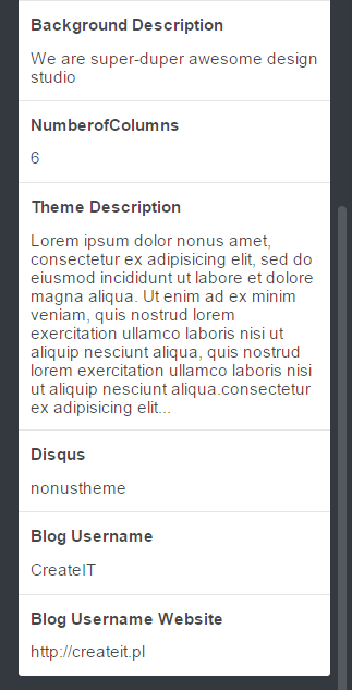
Theme options
2. The text in the fields will be displaying on the different parts of the theme. Above is the example how should looks like the fields.
*For example Background Description – is the text that you want to see on the Slider.
*Number of Columns is the variable reponsible for the columns in Masonry Blog.
*Disqus – this is a comments system. If you registered before into this system, you should have your own disqus short name. This information you can put it here if you want to work it.
Comments
*Theme Description – this description will be in the footer on the bottom part of the page.
*Blog Username and *Blog Username Website are the additional fields.
3. In the top of the administrative panel in tumblr you have an option like Avatar. Click on the option and choose the author image that you want to see on the page. It should be small picture with the image of author’s blog.
4. The most important thing is to set the how many posts should be displayed on the page. For do this, please go the the Advanced Options on the bottom of the page and set the Posts per page for 6. For now you have 6 posts on every page. You can change it. How many posts should be displayed is depending from You.
Number of posts per page
5. The options Open links in new window should be disabled.
6. In Theme options in the edit theme panel you have options like Logo. If you do not want to have logo like in our theme please choose the another logo.
7. Nonus Tumblr Theme has a following lists of components / options that you can use. The lists of available options is on the picture:

Available options
8. We have options to change the type of the blog: Masonry and Default. Also we have options to blog header, to show the slider on the main page and to show the background on the main page. You can modify all of the options if you want. If you want to change something please do it and then clik Update nad Save button.
9. If you did everything you can do the last thing. You have to enable options in your tumblr theme to allow the customers to send you a messages. Like you see on the top of the page is the options:
‘Ask me’ section
To activate this options, please go to the your main Tumblr Dashboard, Edit appearance and choose Let people ask questions and then Allow anonymous questions.

Allow questions
Was this article helpful ?
Icons and animate CSS
1. Icons
We’ve included 360+ font icons. Awesome Icons – http://fontawesome.io/icons/
HTML markup:
2. Animations.css
we use this library to make an effect on the posts. Animate css has a lof of the effect made using css. Please check the plugin documentation for more information.
Was this article helpful ?
Javascript scripts
1. Javascript library and files
In main.js we implement all functions calls. This theme uses the following Javascript files:
-
Bootstrap v3 framwork – powerfull front-end framework for faster and easier web development
-
jQuery – a fast javascript library
-
jQuery Appear – this plugin call funtion when elements is in viewport
-
jQuery easing
-
jQuery browser
-
Modernizr
-
Device.js
-
Isotope and Masonry plugin
-
OWL slider carousel
2. Sources & Credits – the following sourced and files have been used to build up this theme:
-
Twitter Bootstrap – http://twitter.github.com/bootstrap/
-
jQuery Plugin – http://www.jquery.com
Was this article helpful ?
Theme Setup
Major Test content structure can be divided in three sections:
- Navigation Menu
- Sidebar Block
- Page Content
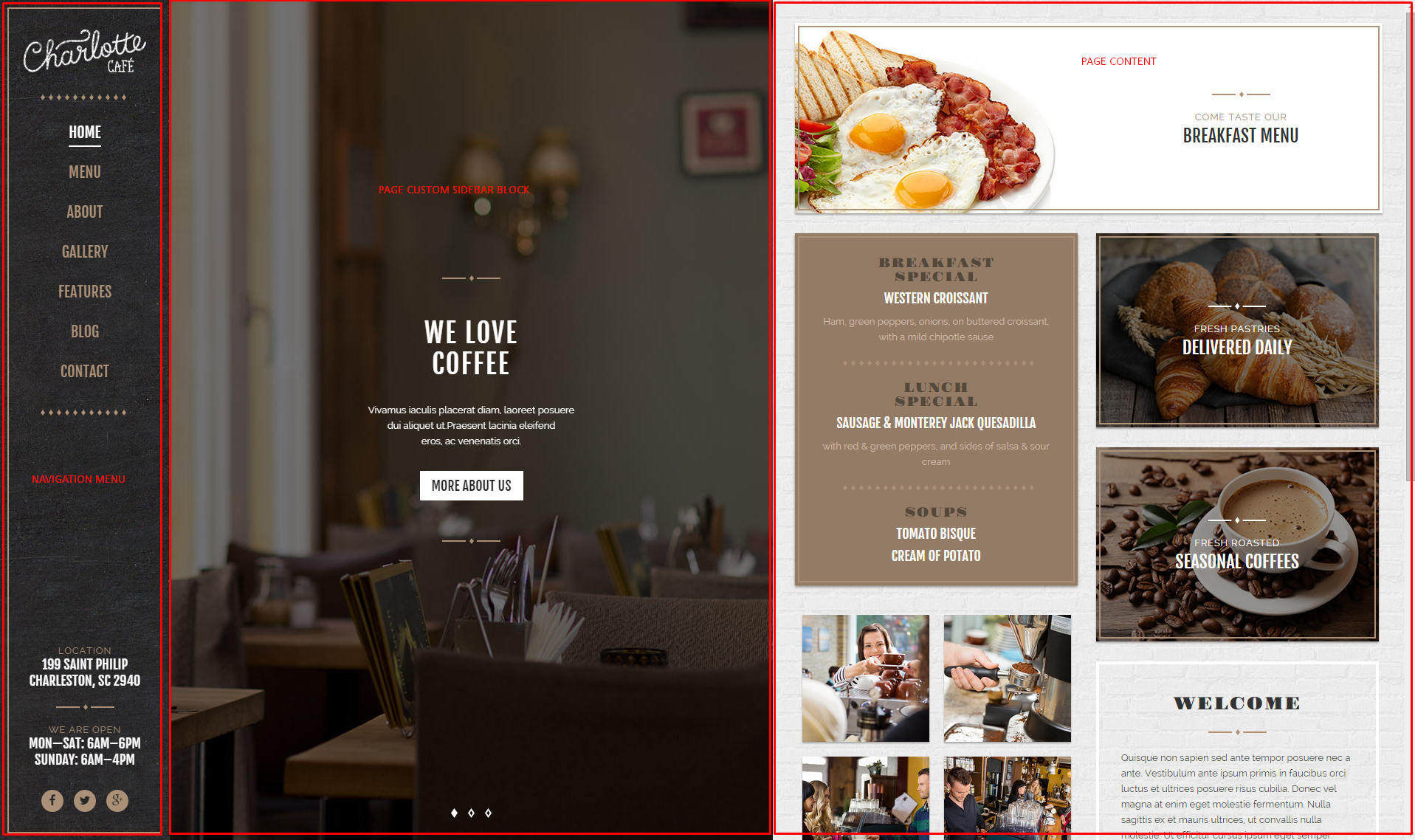
Content structure
Navigation Menu
Menu bar contains two main components:
- menu
- widgets
Menu can be setup via Appearance > Menus section – just select pages you would like to display in navigation – for more information check Menu setup section.
Menu appearance can be edited via Appearance > Customizer – Main Navbar (for more information please check the customizer documentation.)
Decorative diamonds above and below the menu links are Top and Bottom dividers. On demo page we used assets/images.hr1.png patterns with dividers background style parameters setup to repeat.
You can display widgets below the menu. To enable sidebar with widgets – please set the bottom sidebar to show.
Main navigation sidebar
Content of the sidebar can be setup via Widgets section
Main navigation Widgets
On demo page in Main Navigation Sidebar you’ll find the following widgets:
- CT – contact info
- CT – divider (with setup Built-in style to type 2)
- CT – contact info
- CT – socials
Sidebar Block
Sidebar Blocks can be created separately for each page. Please check Sidebar Blocks documentation.
In sidebar block you can add any content you want, using Visual Composer or shortcodes. In our demo page we’re mostly using sidebar blocks:
- Divider
- Header
- Text
Sidebar block content
Sidebar block background and animation can be edited via Appearance > Customize.
Please read more about pages sidebar options here.
Page content
There are several types of pages included in Test. Content such as:
is generated from custom post types created in sections: Restaurant Menu, Portfolio items, Posts
Pages with standard content for example:
- About
- Booking
- Catering
- Contact
are created with Visual Composer elements.
About Us
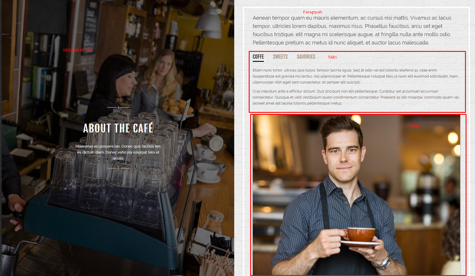
About us page
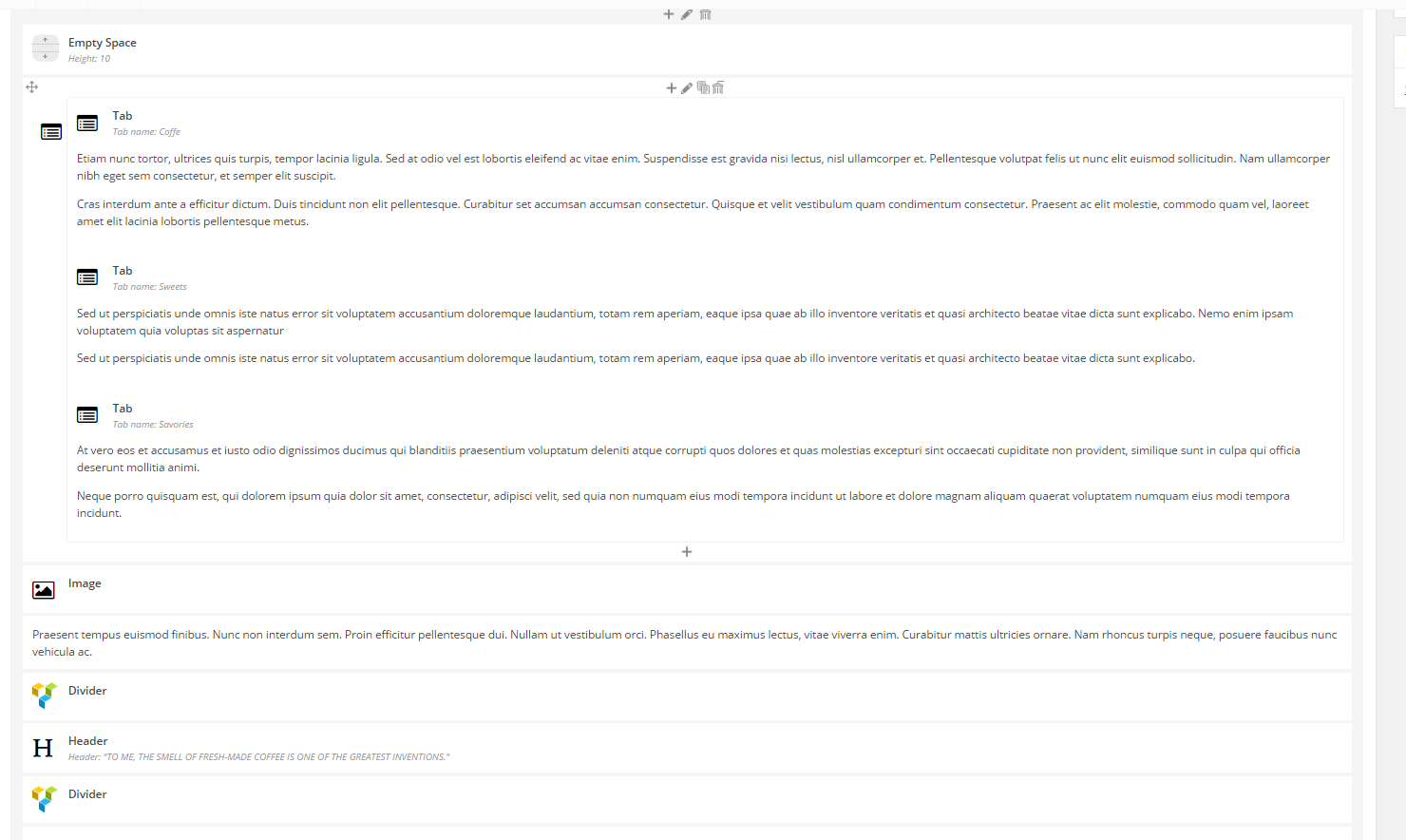
About us – shortcodes content
Booking
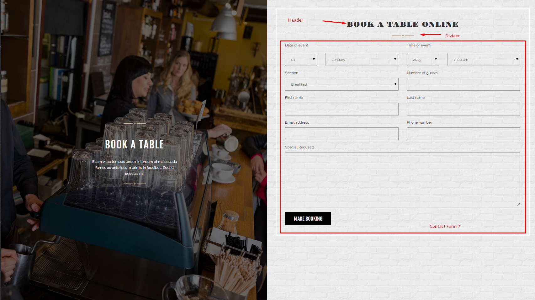
Booking page
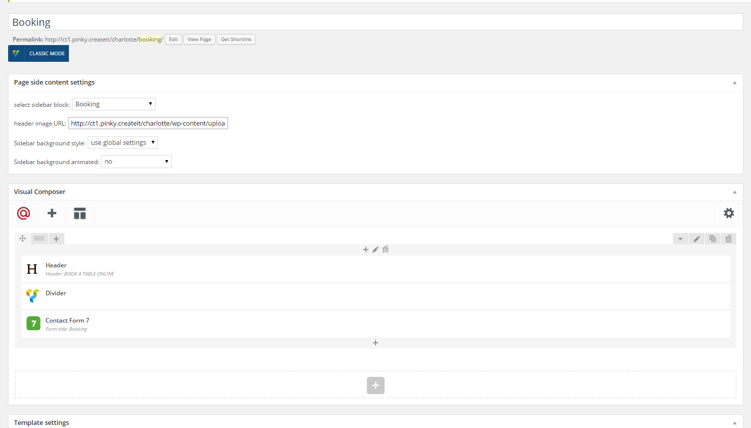
Booking – shortcodes
Contact form 7
Contact form can be created via Contact section and added in page content with Contact Form 7 widget.
Please check the plugin documentation for advanced form configuration.
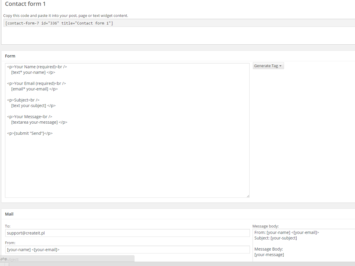
Contact form 7
Catering
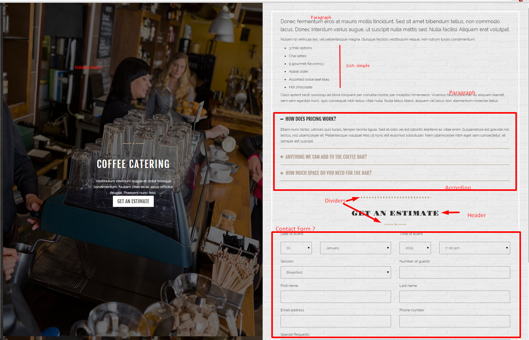
Catering
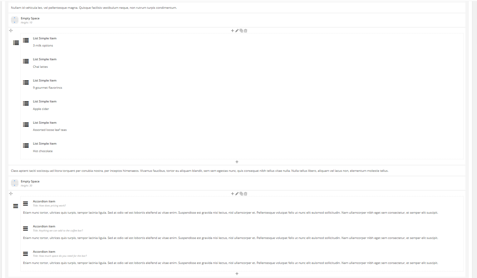
Catering – shortcodes
Contact
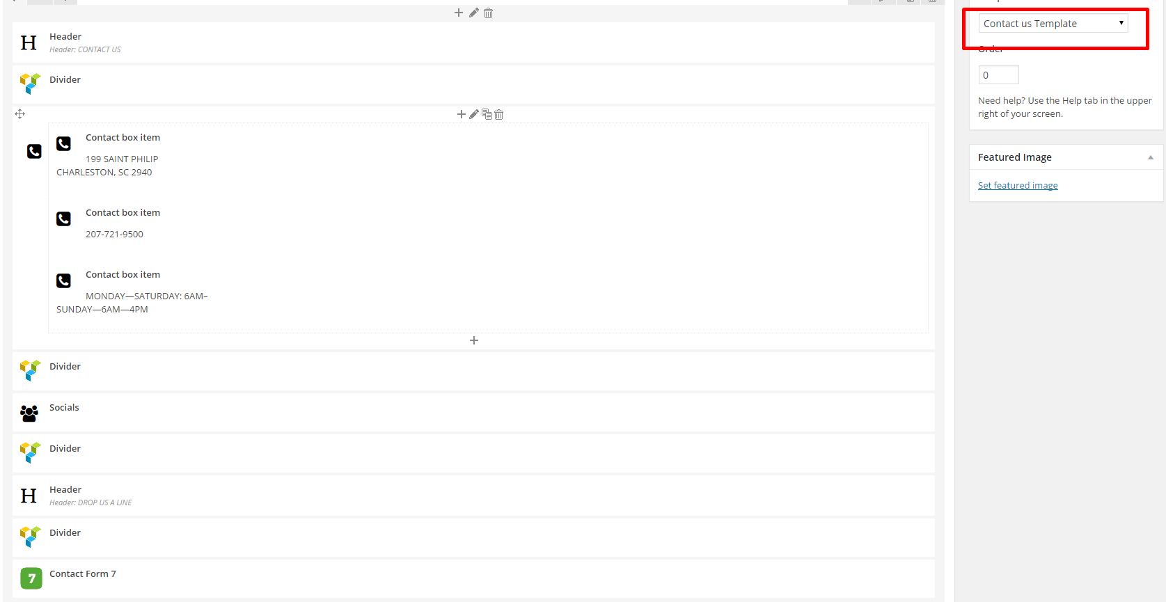
Contac page – shortcodes
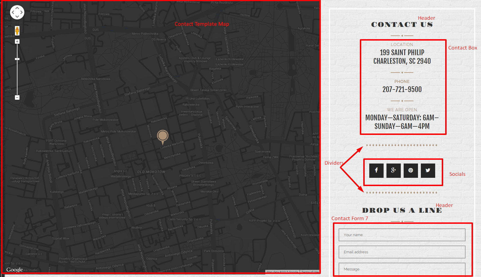
Contact page
Please notice to set page template to Contact us Template – only this template comes with embed big google map. Map location can be defined via Appearance > Customizer – General.
Contact us Template isn’t compatible with Sidebar Blocks.
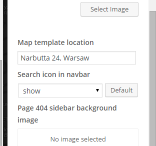
Map Location
Was this article helpful ?
Exico – Theme Options
1. After installing the theme you will be able to define and change number of settings. At the beginning you can setup general theme options, like:
- Header image – you can setup here custom image displayed in header background.
- Logo image – setup your logo image here.
- Logo – show or hide the logo from the header
- Copyright – Copyright text for prefooter section, can be displayed on hidden.
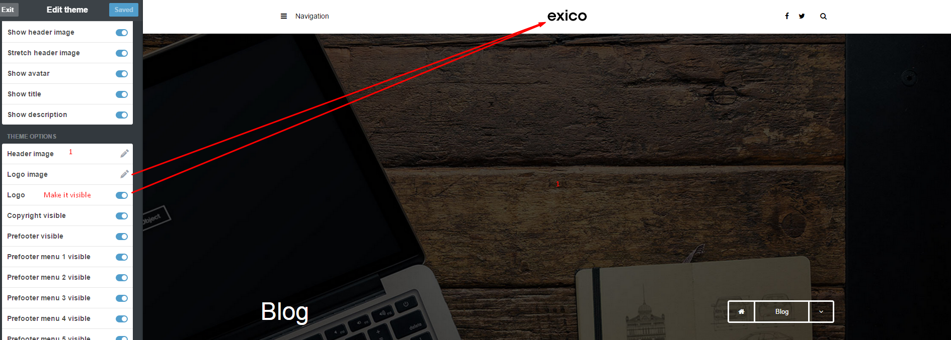
2. Appearance Options
- Title – define your website Title, by default it’s setup to Blog
- Description – define custom website description.
- Avatar – add an image with your avatar.
- Show avatar – hide/show your avatar,
- Show title – show/hide blog title in page header
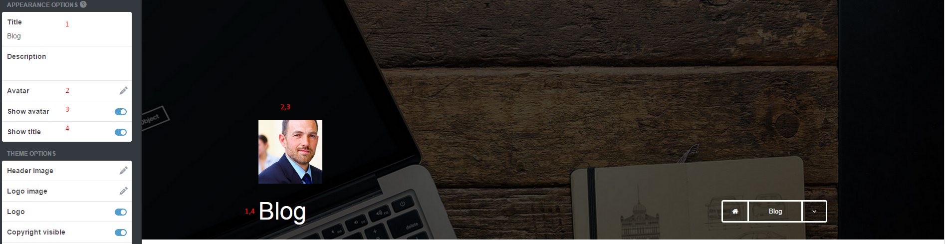
3. Theme Options – you can define also more detailed settings, like the following:
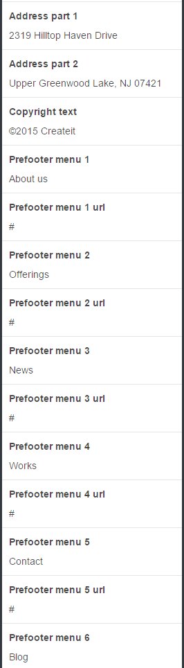
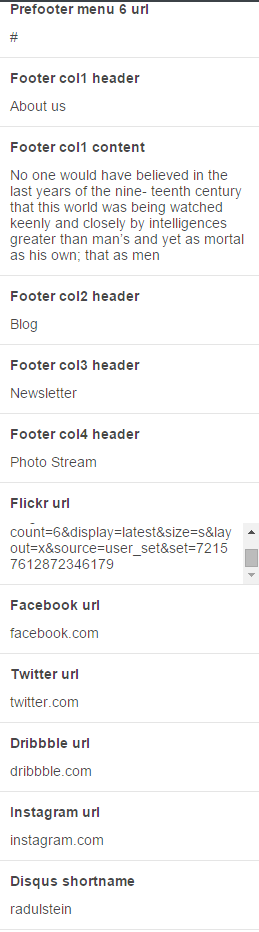
Change blog displaying options to Masonry type:

4. Socials
You can define your social media services address by adding proper URLs. If you would like to display Flickr images – just define here link to your gallery of images.
5. Footer
- 1. – enable/disable footer,
- 2. , 3. , 4. , 5. – enable/disable columns titles,
- 6. – enable/disable Flicker images,
- 7. , 8. , 9. , 10. – enable/disable social media icons.
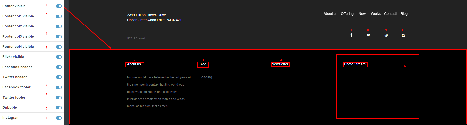
Footer settings
- 1. , 3. , 4. , 5. – define custom header names,
- 2. – add your custom text content,
- 6. – define url to your Flickr gallery,
- 7. , 8. , 9. , 10. – define urls to social media services,
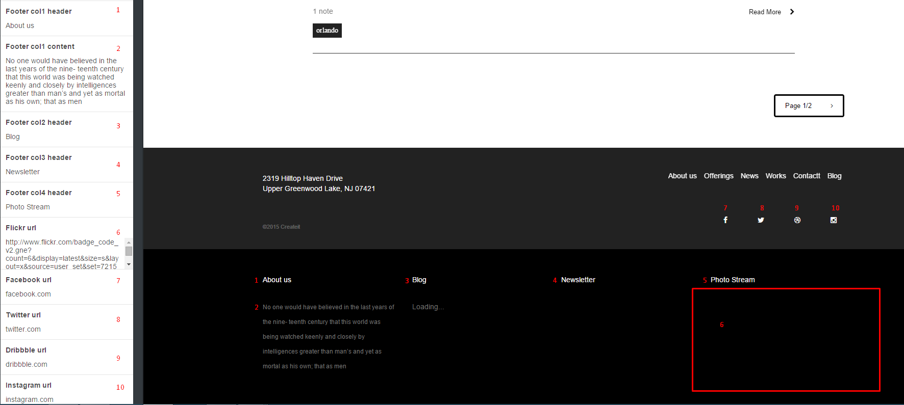
Footer settings -part 2
6. Prefooter
- 1. – enable/disable Copyright text.
- 2. – enable/disable prefooter.
- 3. , 4. , 5. , 6. , 7. , 8. – enable/disable menu options
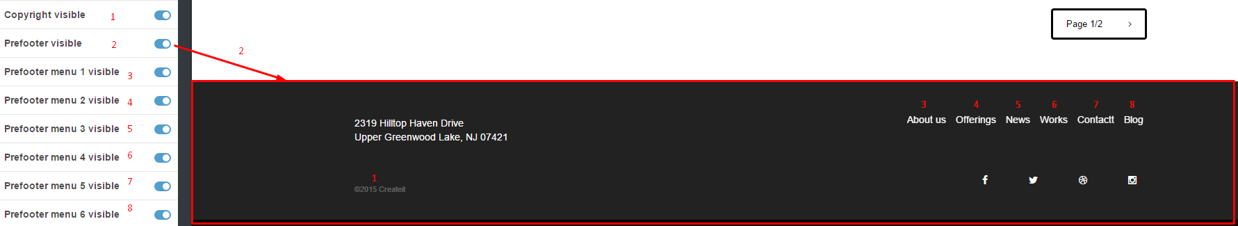
PreFooter
- 1. Edit Copyright text.
- 2. ,4. ,6. ,8. ,10. ,12. – edit menu options names
- 1. , 3. , 5. , 7. , 9. , 11., 13. – add url to each menu options
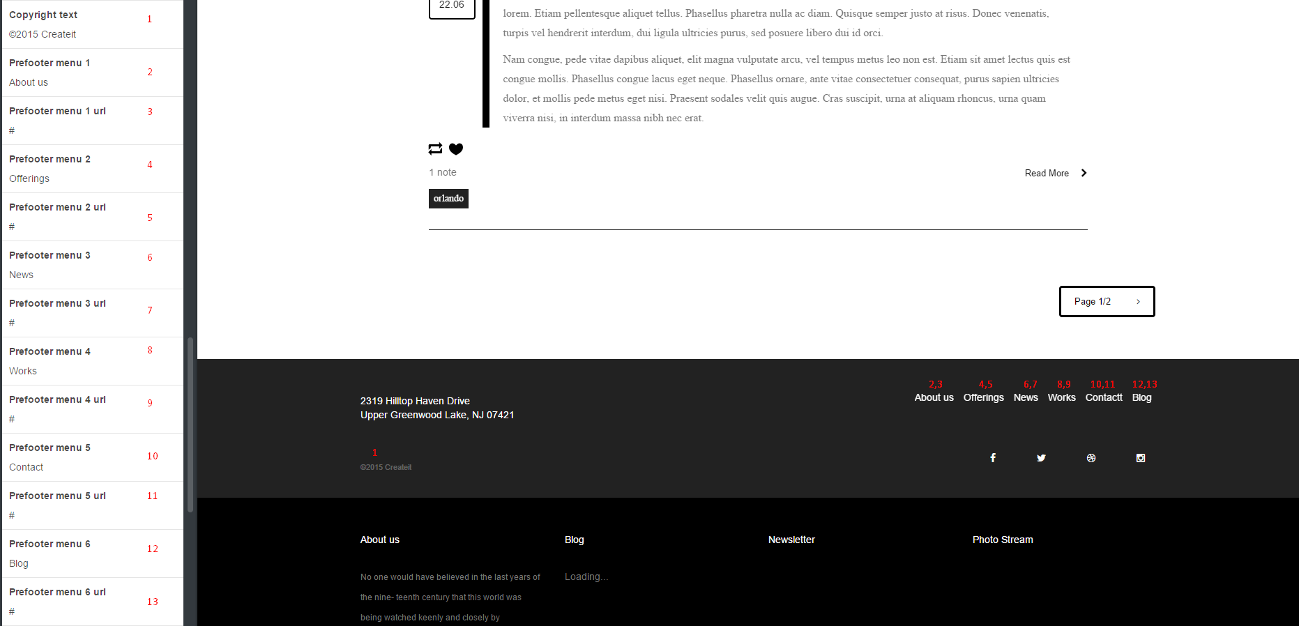
PreFooter
Define your address:
PreFooter
Was this article helpful ?
Custom Pages
If you want to make a custom pages, please follow this tutorial:
1. Please stay to your custom theme menu, and scroll down until very bottom of the menu. You should see the Add a page menu.
2. Enter the details you need for your new page. In our theme we have a following list of custom pages:
– contact-us
– about-us
– services
3. If you want to have a following list of custom pages like above, just follow instructions. Here is an example how to add a page-blank to the our theme:
4. The content of the custom page is from page blank file. You will find this file in {Theme Path}folder or in {Theme Path} folder. It’s depend of the user. If ther user want to have light version so please choose light, if not please choose different.
5. After that, click Update Preview and Click Save buton
6. Finally, the Custom Page will be displayed when you go to the menu and select Pages -> Page Blank. To add next custom pages you have to do the same like with Page Blank.
Was this article helpful ?
Javascript and CSS
USED CSS stylesheets:
- style.css – main Exico theme stylesheet,
- bootstrap.min.css – bootstrap styles.
If you would like to use FontAwesome for icons – you need to attach it separately with the following code:
|
1 2 |
<link rel="stylesheet" href="//maxcdn.bootstrapcdn.com/font-awesome/4.3.0/ css/font-awesome.min.css"> |
Main style – make sure it’s included in head section when you clicking on Edit HTML
|
1 2 3 4 5 6 7 8 9 10 11 12 13 14 15 16 17 18 19 20 21 22 23 24 25 26 27 28 29 30 31 32 33 34 35 36 37 38 39 40 41 42 43 44 45 46 47 48 49 50 51 52 53 54 55 56 57 58 59 60 61 62 63 64 65 66 67 68 69 70 71 72 73 74 75 76 77 78 79 80 81 82 83 84 85 86 87 88 89 90 91 92 93 94 95 96 97 98 99 100 101 102 103 104 105 106 107 108 109 110 111 112 113 114 115 116 117 118 119 120 121 122 123 124 125 126 127 128 129 130 131 132 133 134 135 |
<style> /*Group button*/ .btn-group span{ cursor: context-menu; } span.btn.ct-btn--transparent:hover{ background-color: transparent; color: #000000; } /*Article box*/ .ct-articleBox-media img{ height: auto; } .video-wrapper iframe, iframe.soundcloud_audio_player{ width: 100%; } /*Reblog link*/ a.reblog-link{ display: none; } a.tumblr_blog{ position:relative; background-color: #000000; color:#ffffff; padding: 5px; margin-left: 14px; } a.tumblr_blog:before{ content:""; border-top: 0px solid transparent; border-bottom: 29px solid transparent; border-left: 14px solid #000000; position: absolute; left: 100%; top: 0; } a.tumblr_blog:after{ content: ""; border-top: 29px solid transparent; border-bottom: 0px solid transparent; border-right: 14px solid #000000; position: absolute; right: 100%; top: 0; } div.link-host{ padding: 5px; border: 1px solid #000000; display:inline; color:#000000; } /*Chat post*/ ul.conversation{ padding-left: 0px; list-style: none; text-align: left; } ul.conversation > li.chat-odd,ul.conversation > li.chat-even{ margin-left: 0px !important; } ul.conversation .label{ background-color: #000000; } /* tumblr video --> */ .tumblr_video_container{ width: auto !important; height: auto !important; } /*Masonry --> */ .ct-gallery-item.ct-gallery-item--masonry img{ height: 50%; } /* <-- masonry */ .widget{ border-bottom: 1px solid #333333; } .tags.tagcloud{ padding-left: 0px; } .tags.tagcloud li{ display: inline-block; } .btn-link{ color: #000000; } #posts .post-wrapper .post .panel{ box-shadow: none; border: none; border-radius: 0px; margin-bottom: 0px; } .post-controls .controls-wrapper .control{ display: inline-block; padding-right: 15px; margin-left: -10px; } /* Custom CSS */ {CustomCSS} </style> |
Used Javascripts:
- main.js – main javascript file,
- bootstrap.min.js – responsible for website responsiveness,
- device.min.js – required for mobile menu,
- jquery.browser.min.js – support for old IE browsers,
- snap.min.js – required for mobile menu
- jquery.appear.js – required for animations,
- init_mediasection.js – responsible for parallax effect,
- jquery.stellar.min.js – responsible for parallax effect,
- jquery.magnific-popup.min.js – used for magnific lightbox,
- init_magnific.js – used for magnific lightbox,
- jquery.isotope.min.js – required for masonry effect,
- imagesloaded.js – required for masonry effect,
- infinitescroll.min.js – required for masonry effect,
- init.js – required for masonry effect,
Required script – make sure that this code is always included after last attached script:
|
1 2 3 4 5 6 7 8 9 10 11 12 13 14 15 16 17 18 19 20 21 22 23 24 25 26 27 28 29 30 31 32 33 34 35 36 37 38 39 40 41 42 43 44 45 46 47 48 49 50 51 52 53 54 55 56 57 58 59 60 61 62 |
<script type='text/javascript'> var flickr = $('.flickr_badge_image a'); flickr.addClass('ct-galleryBox-overlay'); var Tumblr = Tumblr || {}; Tumblr.RecentPosts = function(el, postsCount) { var apiUrl = "http://" + document.domain + "/api/read/json?callback=?&filter=text&num=" + (postsCount || 10); var titleTypes = { regular: "regular-title", link: "link-text", quote: "quote-source", photo: "photo-caption", conversation: "conversation-title", video: "video-caption", audio: "audio-caption", answer: "question" }; var renderPosts = function(posts) { return $.map($.map(posts, postInfo), renderPost); }; var renderPost = function(post) { return "<li><a class='post_footer' href='" + post.url + "'><i class='fa fa-link'></i> " + post.title.substr(0,40) + "...</a></li> <small class='ct-u-fontType-2'>"+ post.date+"</small>"; }; var postInfo = function(post) { var titleType = titleTypes[post.type]; if (titleType in post) { return { title: post[titleType], url: post["url-with-slug"], date: post["date"], type: post["type"] }; } }; return { render: function() { var loadingEl = $("<div>").text("Loading...").appendTo($(el)); $.getJSON(apiUrl, function(data) { loadingEl.remove(); $("<ul class='recent-posts'>").appendTo($(el)) .hide().append(renderPosts(data.posts) .join("")).slideDown('slow'); }); return this; } } }; $(function() { new Tumblr.RecentPosts($("#recent-posts"),2).render() }) </script> |
OHTER:
Contact form
The contact form was made using on-line contact form builder. The documentation is here:
http://www.jotform.com/myforms
Disqus for tumblr – comments for each posts are displayed with:
Was this article helpful ?
Google Calendar
In Test you can embed your Google Calendar events in Todays Activities section.
Google Calendar activities
You can add here your own acclivities by simply updating Calendar URL in Google Calendar shortcode.
Before you start…
You must first have a Google Calendar API Key:
- Go to the Google Developer Console and create a new project (it might take a second).
- Once in the project, go to APIs & auth > APIs on the sidebar.
- Find “Calendar API” in the list and turn it ON.
- On the sidebar, click APIs & auth > Credentials.
- In the “Public API access” section, click “Create new Key”.
- Choose “Browser key”.
- If you know what domains will host your calendar, enter them into the box. Otherwise, leave it blank. You can always change it later.
- Your new API key will appear. It might take second or two before it starts working.
Make your Google Calendar public:
- In the Google Calendar interface, locate the “My calendars” area on the left.
- Hover over the calendar you need and click the downward arrow.
- A menu will appear. Click “Share this Calendar”.
- Check “Make this calendar public”.
- Make sure “Share only my free/busy information” is unchecked.
- Click “Save”.
Obtain your Google Calendar’s ID:
- In the Google Calendar interface, locate the “My calendars” area on the left.
- Hover over the calendar you need and click the downward arrow.
- A menu will appear. Click “Calendar settings”.
- In the “Calendar Address” section of the screen, you will see your Calendar ID. It will look something like “abcd1234@group.calendar.google.com”.
Notice:
Full documentation for Google Calendar can be found here: http://fullcalendar.io/docs/google_calendar/
Was this article helpful ?
PayPal HTML Shop
Thank you for purchasing this plugin. If you have any questions that are beyond the scope of this help file, please feel free to start new ticket on this page. Thanks so much!
Scope of free support
We can help you with:
- Responding to questions or problems regarding the item and its features
- Fixing any discovered item’s bugs
- Providing updates to ensure compatibility with new software versions
PayPal HTML Shop plugin allows you to add shop functionality with PayPal payments to your HTML website. You can customize it with number of various parameters. Change the skin, Paypal settings and much more.
Please read this documentation to discover all available options.
Was this article helpful ?
Available parameters
Once scripts are attached – plugin is installed, so you can attach your HTML code with your own classes or use defaults.
The default product markup looks like the following:
|
1 2 3 4 5 |
<div class="ct-product"> - Product Wrapper <h1 class="ct-product-title">Example Title</h1> - Product Title <span class="ct-product-price">$599</span> - Product Price <button class="ct-product-button">Add to Cart</button> - Product Button </div> |
You will need to add a <div/> which will be used by the plugin as a cart. The default is:
|
1 |
<div class="ct-cart"></div> |
Settings
Remember to change default PayPal settings to the one matching your own. Below you will find a list of all available settings. You can defined them with the following markup:
|
1 2 3 4 5 6 7 |
<script> $('body').ctshop({ paypal: { business: "exampleCompany@email.com" } }); </script> |
Main:
| VARIABLE | DEFAULT | TYPE | DESCRIPTION |
| cart | “ct-cart” | string | Cart Class Name |
| product | “ct-product” | string | Product Class Name |
| product_title | “ct-product-title” | string | Product Title Class Name |
| product_price | “ct-product-price” | string | Product Price Class Name |
| product_button | “ct-btn” | string | Add to Cart Button Class Name |
| currency | “$” | string | Currency |
| currency_after_number | “false” | boolean | Enable/Disable showing currency after price value |
| permanent_cart_buttons | “false” | boolean | Enable/Disable Permanent Checkout/Clear buttons in Cart |
| permanent_total_value | “false” | boolean | Enable/Disable Permanent Total Value in Cart |
| animation | ” “ | string | Add Cart Item Animation |
| empty_disable | false | boolean | Enable/Disable “Cart is empty” text |
| empty_text | “The Cart is Empty” | string | Change text visible when cart is empty |
| product_image | “ct-product-image” | string | Product Image Class Name |
| product_wishlist | “ct-wishlist” | string | Wishlist Class Name |
| promo_codes | “true” | boolean | Enable/Disable Promo Code Field |
| shipping_options | “true” | boolean | Enable/Disable Shipping Rates Dropdown Menu (paypal shipping need to be disabled to use this option) |
| small_cart | “ct-small-cart” | string | Adding custom class for small cart |
| display_small_cart | “false” | boolean | Enable/Disable small cart on the site |
| display_name (small_cart_option) | “Cart:” | string | Visible as the name of small cart on the site |
| items_name (small_cart_option) | “item(s)” | string | Visible as the name identifies items |
| wishlist (small_cart_option) | “false” | boolean | Enable/Disable wishlist in cart |
| scroll (small_cart_option) | “false” | boolean | Enable/Disable scroll in small cart (requires jquery.mCustomScrollbar.min.css and jquery.mCustomScrollbar.min.js) |
| scroll_style (small_cart_option) | “dark” | string | Set scroll style depending on the selected name from HERE |
| scroll_height (small_cart_option) | “400” | string | Set height of the cart (avaliable when scroll is set to “true”) |
| (new) promo_amount | “0” | string | The discount will be added only if the value of the cart will be greater than the one set for this variable |
| (new) promo_tooltips | “true” | boolean | Enable/Disable tooltip for the promo code |
| (new) promo_tooltips_time | “2000” | numbers | Time in which the tooltip will be display |
| (new) promo_tooltips_animation | “false” | boolean | Enable/Disable animation for the tooltip |
| (new) promo_tooltips_text | “Your savings” | string | Text that will be visible for the tooltip |
| (new) promo_tooltips_date | “12-30-2018” | mm/dd/yy | Set expiration date for the discount code |
| (new) promo_tooltips_position | “top” | string | Avaliable tooltip position: – “top” – Tooltip on top – “bottom” – Tooltip on botto – “left” – Tooltip on left – “right” – Tooltip on right – “auto” – The browser will decide the position of the tooltip |
Paypal:
| VARIABLE | DEFAULT | TYPE | DESCRIPTION |
| business | ” “ | string | Your PayPal ID or an email address associated with your PayPal account. Email addresses must be confirmed. |
| currency_code | “USD” | string | The currency of the payment. |
| lc | “EN” | string | The locale of the login or sign-up page, which may have the specific country”s language available, depending on localization. |
| cpp_cart_border_color | ” “ | 6 single-byte hexadecimal characters | The HTML hex code for your principal identifying color. PayPal blends your color to white in a gradient fill that borders the cart review area of the PayPal checkout user interface. |
| cpp_payflow_color | ” “ | 6 single-byte hexadecimal characters | The background color for the checkout page below the header. |
| no_note | “0” | 0/1 | Do not prompt buyers to include a note with their payments. (1 – hide the text box and the prompt) |
| no_shipping | “0” | 0/1/2 | Do not prompt buyers for a shipping address. Allowable values are: (0 – prompt for an address, but do not require one; 1 – do not prompt for an address; 2 – prompt for an address, and require one) |
| return | ” “ | url | The URL to which PayPal redirects buyers” browser after they complete their payments. |
| cancel_return | ” “ | url | A URL to which PayPal redirects the buyers” browsers if they cancel checkout before completing their payments. |
Callbacks:
| VARIABLE | TYPE | DESCRIPTION |
| init | function | fires after first initialization |
| before_add_to_cart | function | fires before append to cart happen |
| after_add_to_cart | function | fires after append to cart happen |
| remove_item_from_cart | function | fires after click a remove button in cart |
| before_checkout | function | fires before redirecting to paypal |
| after_clear_cart | function | fires after clearing the cart |
| after_value_changes | function | fires when total value changes |
| before_add_to_wishlist | function | fires before append to wishlist happen |
| after_add_to_wishlist | function | fires after append to wishlist happen |
| remove_item_from_wishlist | function | fires after remove button in wishlist |
Was this article helpful ?
Installation
Remember:
Please DO NOT test the plugin code directly from the package as the scripts may not load correctly.
The suggested way to test the plugin is via using LocalHost or (if possible) directly on a server.
{Plugin} requires the following scripts to be attached in HTML page:
|
1 2 3 4 5 6 |
<script src="//code.jquery.com/jquery-1.11.3.min.js"></script> <script src="shop.min.js"></script> <script> $('.example-container').ctshop(); </script> |
You can also just use it for a body:
|
1 2 3 |
<script> $('body').ctshop(); </script> |
Once scripts are attached you can attach your HTML code and your own classes or use defaults. The default class names for product item are as follows:
|
1 2 3 4 5 |
<div class="ct-product"> - Product Wrapper <h1 class="ct-product-title">Example Title</h1> - Product Title <span class="ct-product-price">$599</span> - Product Price <button class="ct-product-button">Add to Cart</button> - Product Button </div> |
You will need to add a <div/> which the plugin will use as a cart. The default is:
|
1 |
<div class="ct-cart"></div> |
For the wishlist the default is:
|
1 |
<div class="ct-wishlist"></div> |
We prepared for you 6 predefined skins of the shop. To enable any of them just attach proper CSS stylesheet in your HTML.
EXAMPLES:
Below you will find example: skin preview along with the stylesheet, which needs to be attached to use the skin.
DIANA
Skin: Diana
|
1 |
<link rel="stylesheet" type="text/css" href="HTML/diana/assets/css/style.css"> |
ESTATO
Skin: Estato
|
1 |
<link rel="stylesheet" type="text/css" href="HTML/estato/assets/css/style.css"> |
FARMFRESH
Skin: FarmFresh
|
1 |
<link rel="stylesheet" type="text/css" href="HTML/farmfresh/assets/css/style.css"> |
MACAROON
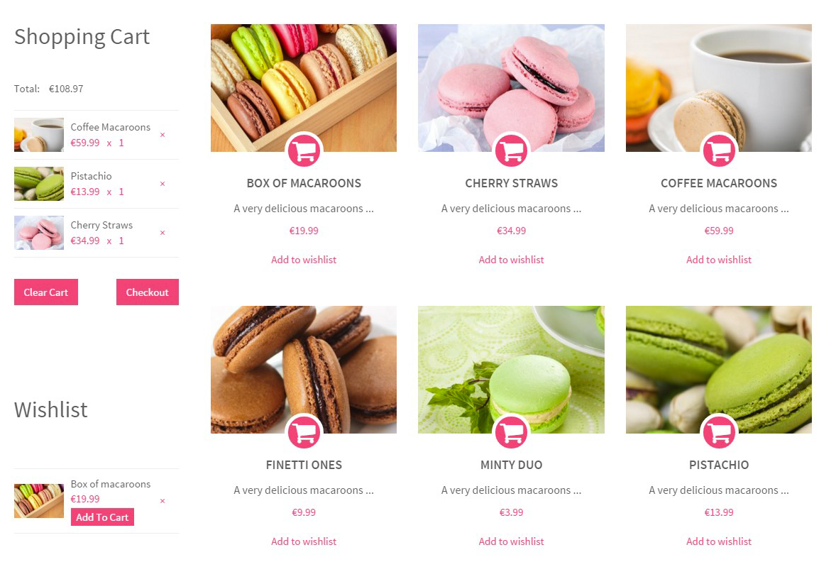
Skin: Macaroon
|
1 |
<link rel="stylesheet" type="text/css" href="HTML/macaroon/assets/css/style.css"> |
RENTICA
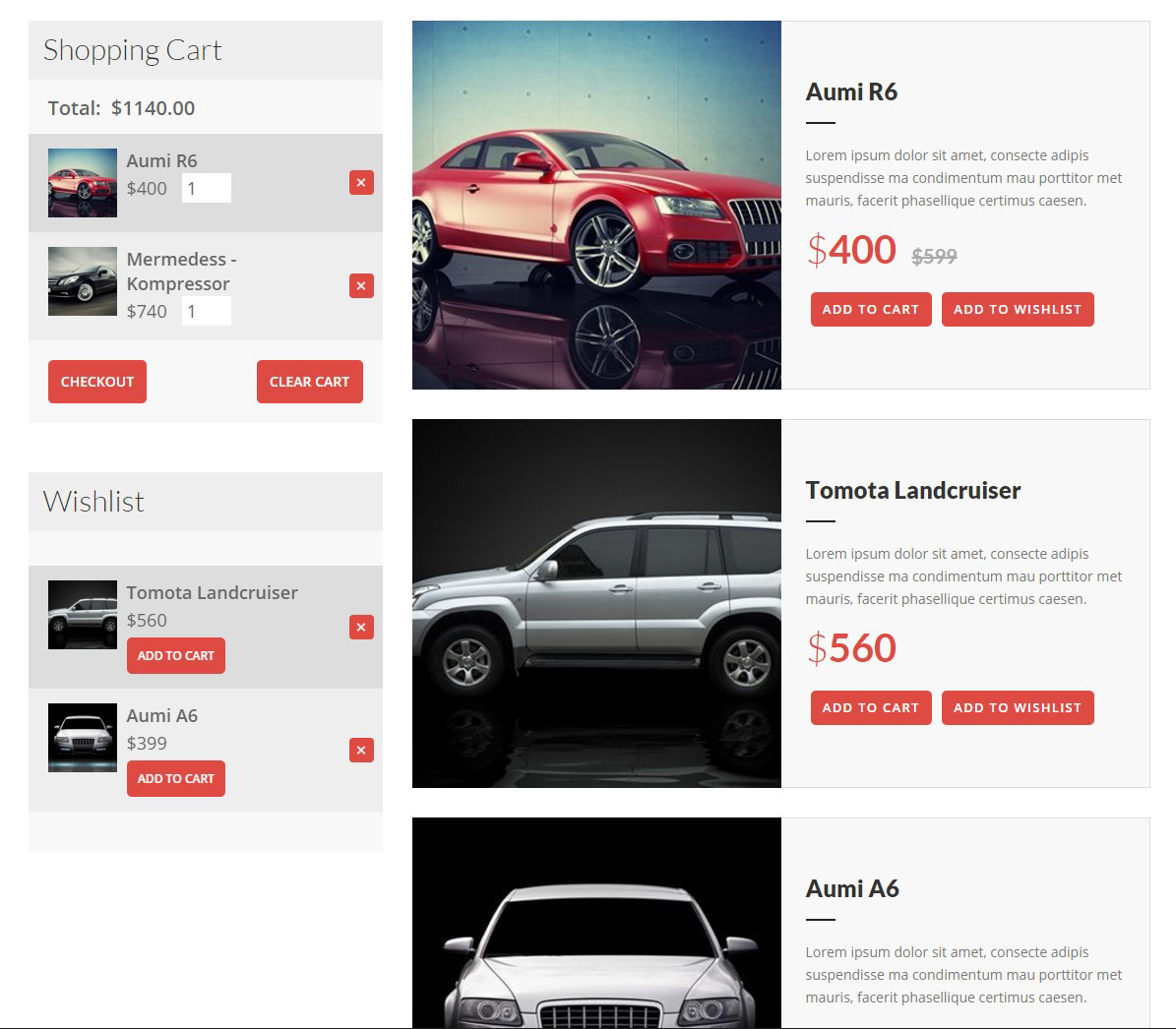
Skin: Rentica
|
1 |
<link rel="stylesheet" type="text/css" href="HTML/rentica/assets/css/style.css"> |
CORPRESS
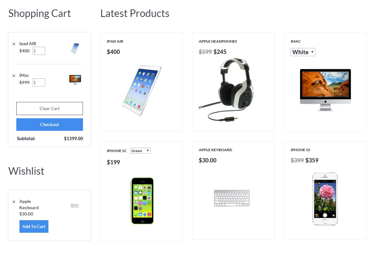
Skin: Corpress
|
1 |
<link rel="stylesheet" type="text/css" href="HTML/corpress/assets/css/style.css"> |
Was this article helpful ?
Examples of usage
Please check the live examples of shop pages: here
In purchased package you will find separate folders:
- corpress
- diana
- estato
- farmfresh
- macaroon
- rentica
With demo examples ready to use, including HTML code and CSS stylesheets. Feel free to just copy HTML markup to your website.
Was this article helpful ?
Google Map Plugin
Maps in Test are created with our premium Map plugin. Here: link you will fin full plugins documentation.
Was this article helpful ?
Advanced WooCommerce Filters
Finding a product was never that easy!
Advanced Filters by createIT enhances your shop by adding advanced filters to your list. Tired of having a super long sidebar? This plugin will fix that for you!
Perfect if your products have a lot of attributes.
Was this article helpful ?
Filters settings
All plugin settings are located in Woocommerce->Settings->Filters
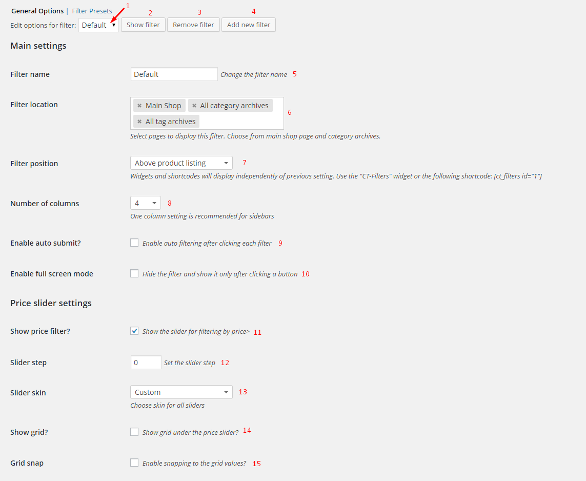
GENERAL OPTIONS
Main Settings:
- Choose the filter you want to edit (1) and then click ‘Edit filter’ (2). First filter is set by default.
- Add a new filter (4) or remove one (3).
- Set the name for the filter (5) – this name will appear in (1)
- Choose filter location (6) – by default it’s Main Shop, All category archives and All tag archives – so every Woocommerce archive page. You can remove f.ex. ‘All category archives’ and add choose just one category from the list, so this filter will appear only on the chosen category archive page.
You can also use the ‘CT – Filters’ widget or a shortcode – these will appear on pages or sidebars where you place them. - Filter position (7) – choose from ‘Above product listing’, ‘Below product listing’ – if you’re using only widget or shortcode
- Number of columns (8) – set the number of columns for the filter, choose from 1 to 6. One will be best for sidebars.
- Auto submit (9) – if selected, page will reload after every change (not by clicking ‘filter’ button)
- Full screen mode (10)– filter will be hidden and after clicking a button it will appear on the whole page.
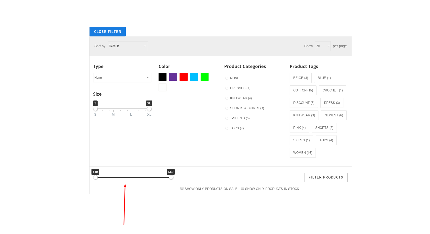
Price slider settings:
- Show price filter (11) – show or hide the price filter.
- Slider step (12) – interval by which the price will change when the slider is used. Set to zero to make it smooth.
- Slider skin (13) – choose from several skin styles. This will occur also other sliders in the filter.
- Show grid (14) – display a grid with values underneath the price slider (other sliders will always have the grid)
- Grid snap (15) – slider handles will snap to grid points which can be regulated by option ‘slider step’
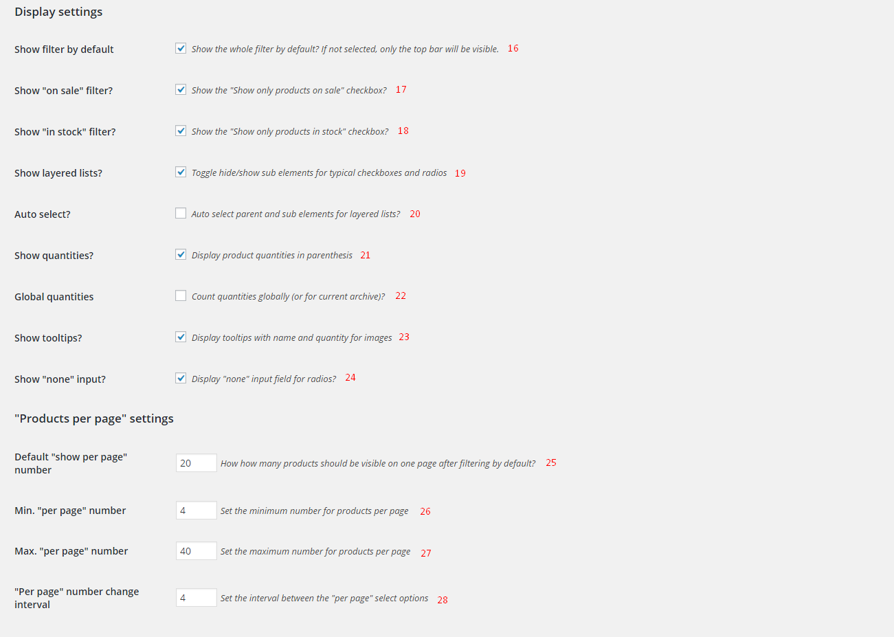
Display settings:
- Show filter by default (16) will hide the filter which can be viewed by clicking a button.
- on sale (17) – ‘show only products on sale’ checkbox close to the ‘Filter button’
- in stock (18) – ‘show only products in stock’ checkbox close to the ‘Filter button’
- Layered lists (19) – use layered lists like this:
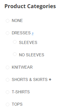
- Auto select (20) – only for the layered list. Will select parent if all children are selected etc.
- Show quantities (21) – will show available products in given category/in given color etc.
- Global quantities (22) – on category page it will show quantities from the whole store, not just from the category.
- Show tooltips (23) – will show tooltips with name and quantity when the image is hovered. Only for image checkboxes and radios.
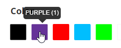
- Show ‘none’ input (24) – will show ‘None’ radio button on radio button lists.
Products per page settings:
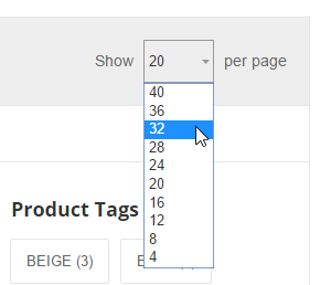
- Default number (25) – default number that will appear in this select
- min (26) and max (27) number
- interval (28) – set the step
On the picture default is set to 20, min is set to 4, max is set to 40 and interval is set to 4.
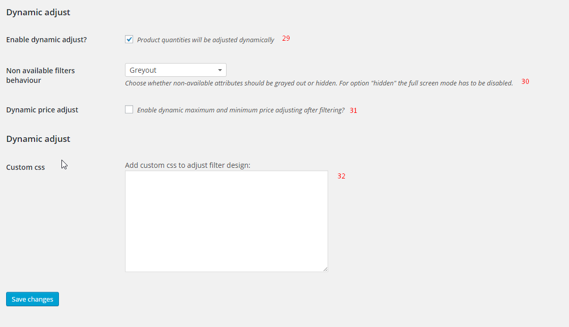
Dynamic adjust:
- Enable dynamic adjust (29) – this will calculate product quantities that are available after filtering
- Non available filters behaviour (30) – choose from greyout or hide. Greyout on the picture.
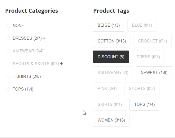
On the picture we’re searching for products with tag ‘discount’. There are five products with this tag. 3 out of 15 products with tag ‘cotton’ also have tag ‘discount’. 2 out of 7 products from category ‘dresses’ also have tag ‘discount’. None of products from category ‘knitwear’ have tag ‘discount’.
- Dynamic price adjust (31) will apply dynamic adjust to the price filter
Custom css: (32) add custom css for small design changes.
REMEMBER TO HIT ‘SAVE CHANGES’ BUTTON AFTER CHANGES
FILTER PRESETS
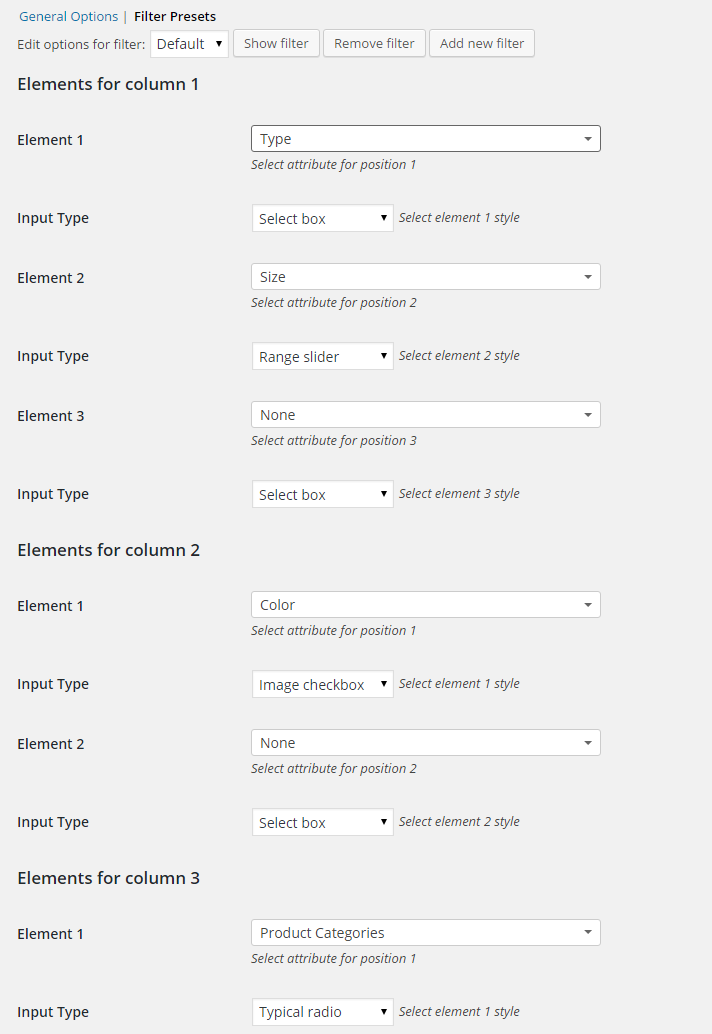
Make sure that ‘Edit options for filter:’ is set to the right filter.
The number of columns set in general options (8) will generate here a section for every column: Elements for column X.
If the last element for the column will be set to something, a new empty element will appear. You can set up to 6 elements for one column.
Element X: choose what the filter will represent. Choose from: product type, product categories, product tags, shipping classes and any attribute that you have set for your products in Products → Attributes.
Input type: choose the input type for this filter: select box (A), typical radio (B), text radio (C), image radio (D), typical checkbox (E), text checkbox (F), image checkbox (G), range slider (H)
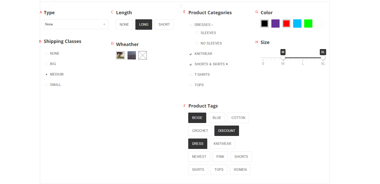
Selects and radios are single select fields. Checkboxes and ranges are multi select fields.
Images for image fields can be set in Products->Categories/Tags/Shipping Classes/Attributes(configure terms). They can not be used for product types.
Range sliders are suitable for terms with short names f.ex:
Attribute: Size
Terms: S, M, L, XL
After editing the presets, hit the ‘Save Changes’ button
Was this article helpful ?
INFORMATION FOR DEVELOPERS
The filter is rendered on ‘woocommerce_archive_description’ hook or ‘woocommerce_after_shop_loop’ which depends on the settings.
All plugins options may be adjusted with ‘ct_sorting_settings’ filter.
Adding images to product tags and shipping classes uses following wordpress hooks: ‘product_tag_add_form_fields’, ‘product_tag_edit_form_fields’, ‘product_shipping_class_add_form_fields’, ‘product_shipping_class_edit_form_fields’. Analogic hooks may be used for other taxonomies.
Thumbnail file size may be adjusted by following filters:
‘ct_sorting_radio_thumbnail_size’ – for radio images,
‘ct_sorting_checkbox_thumbnail_size’ – for checkbox images.
These filters can be used to change from ‘ct_sorting_size’ (50×50) to other predefined size.
To change the ‘ct_sorting_size’ dimentions, use the ‘ct_sorting_thumbnail_size’ filter.
For example the following code should change the ‘ct_sorting_size’ size to 100×100 px:
|
1 2 3 4 5 6 7 8 |
function changeThumbnailSize(){ $size['width'] = 100; $size['height'] = 100; return $size; } add_filter('ct_sorting_thumbnail_size', 'changeThumbnailSize'); |
Was this article helpful ?
CSS files and structures
If you would like to edit the color, font, or style of any elements, you would do the following:
|
1 |
#primaryContent a {color: #someColor;} |
If you find that your new style is not overriding, it is most likely because of a specificity problem. Scroll down in your CSS file and make sure that there isn’t a similar style that has more weight.
I.E.
|
1 |
#wrap #primaryContent a {color: #someColor;} |
So, to ensure that your new styles are applied, make sure that they carry enough “weight” and that there isn’t a style lower in the CSS file that is being applied after yours.
Colors
The theme includes a css file wich you can use to edit the colors.
You just need to add the corresponding CSS file to the head of the page like this:
|
1 2 3 4 5 |
<head> (..) <link rel="stylesheet" type="text/css" href="css/red.css"> (..) </head> |
Main Menu structure
Just change brand name, upload your logo to images/content/ folder and you’re ready to go!
|
1 2 3 4 5 6 7 8 9 10 11 12 13 14 15 16 17 18 19 20 21 22 23 24 25 26 27 28 29 30 |
<nav class="navbar ct-navbar--transparent ct-navbar--logoright" role="navigation"> <div class="container"> <!-- Brand and toggle get grouped for better mobile display --> <div class="navbar-header"> <a class="navbar-brand" href="index.html"><img src="./assets/images/logo.png" alt="Orlando Logo"> </a> </div> <!-- Collect the nav links, forms, and other content for toggling --> <div class="collapse navbar-collapse"> <ul class="nav navbar-nav ct-navbarNav--defaultActive ct-navbar--fadeIn yamm"> <li class="dropdown yamm-fw active"> <a href="index.html">Home <i class="fa fa-angle-double-down"></i></a> <ul class="dropdown-menu"> </ul> </div> <!-- /.navbar-collapse --> <div class="ct-navbar-search"> <form role="form"> <div class="form-group"> <input type="text" class="form-control" placeholder="Please type keywords..." required> </div> <button class="ct-navbar-search-button" type="submit"> <i class="fa fa-search fa-fw"></i> </button> </form> </div> </div> <!-- /.container --> </nav> |
In order to create mega menus read the documentation here:
Icons
We’ve included 360+ font icons.
Awesome Icons – http://fontawesome.io/icons/
HTML markup:
|
1 2 |
<!-- Awesome Icons --> <i class="fa fa-cog"></i> |
CSS Files & Structure
We’ve included 2 files.
bootstrap.css contains Bootstrap 3 Library.
style.css file contains general styles.
1. Fonts/Imports
2. Body
3. Preloader
4. Icon Box
5. Dividers
6. CTA
7. Accordion
8. Product Box
9. Slick Corusel
10. Gallery
11. Modal
12. Footer
13. Hovers
14. Lists
15. Person Box
16. Blog
17. Twitter
18. Custom Checkbox
19. Contact
20. Comments
21. Counter
22. Progress Bars
23. Media Query
Utilities
Utility classes are low-level structural and positional traits. Utilities can be applied directly to any element, multiple utilities can be used tohether and utilities can be used alongsie component classes.
Utilities are intended for frequently used CSS properties and patterns, like: floats, containing floats, vertical alignemnt, text tryncation. Relying on utilities can help to reduce repetition and provide consistend implementations.
- Test uses utilities for the following categories:
- Typography
- Display Types
- Paddings
- Margins
- Text Decorations
- Font Style
- Colors
- Border
- Position
- Background Colors
- Images
- Text Size
Was this article helpful ?
Topbar
There are four variations of top bar:
Default (no extra class needed)
Screenshot
Topbar – Default color version
Classes:
— ct-topBar
HTML markup
|
1 2 3 4 5 6 7 8 9 10 11 12 13 14 15 16 17 18 19 20 21 22 23 24 25 26 |
<div class="ct-topBar text-center"> <div class="container"> <ul class="ct-panel--user list-inline text-uppercase pull-left"> <li><a href="#">login<i class="fa fa-lock"></i></a></li> <li><a href="#">sign up<i class="fa fa-user"></i></a></li> </ul> <div class="ct-widget--group pull-right"> <ul class="ct-widget--socials list-inline text-uppercase"> <li><a href="https://www.facebook.com/createITpl"><i class="fa fa-facebook"></i></a></li> <li><a href="https://twitter.com/createitpl"><i class="fa fa-twitter"></i></a></li> <li><a href="http://www.createit.pl/"><i class="fa fa-wordpress"></i></a></li> </ul> <div class="btn-group"> <button type="button" class="btn btn-md dropdown-toggle" data-toggle="dropdown" aria-expanded="false"> <img src="assets/images/flags/png/england.png" alt="UK">English <i class="fa fa-angle-down"></i> </button> <ul class="dropdown-menu" role="menu"> <li><a href="#"><img src="assets/images/flags/png/england.png" alt="UK">English</a></li> <li><a href="#"><img src="assets/images/flags/png/de.png" alt="GER">German</a></li> <li><a href="#"><img src="assets/images/flags/png/pl.png" alt="PL">Polish</a></li> </ul> </div> </div> <div class="clearfix"></div> </div> </div> |
Dark (ct-topBar–dark)
Screenshot
Topbar – Dark color version
Classes:
— ct-topBar
— ct-topBar–dark
HTML markup
|
1 2 3 4 5 6 7 8 9 10 11 12 13 14 15 16 17 18 19 20 21 22 23 24 25 26 |
<div class="ct-topBar ct-topBar--dark text-center"> <div class="container"> <ul class="ct-panel--user list-inline text-uppercase pull-left"> <li><a href="#">login<i class="fa fa-lock"></i></a></li> <li><a href="#">sign up<i class="fa fa-user"></i></a></li> </ul> <div class="ct-widget--group pull-right"> <ul class="ct-widget--socials list-inline text-uppercase"> <li><a href="https://www.facebook.com/createITpl"><i class="fa fa-facebook"></i></a></li> <li><a href="https://twitter.com/createitpl"><i class="fa fa-twitter"></i></a></li> <li><a href="http://www.createit.pl/"><i class="fa fa-wordpress"></i></a></li> </ul> <div class="btn-group"> <button type="button" class="btn btn-md dropdown-toggle" data-toggle="dropdown" aria-expanded="false"> <img src="assets/images/flags/png/england.png" alt="UK">English <i class="fa fa-angle-down"></i> </button> <ul class="dropdown-menu" role="menu"> <li><a href="#"><img src="assets/images/flags/png/england.png" alt="UK">English</a></li> <li><a href="#"><img src="assets/images/flags/png/de.png" alt="GER">German</a></li> <li><a href="#"><img src="assets/images/flags/png/pl.png" alt="PL">Polish</a></li> </ul> </div> </div> <div class="clearfix"></div> </div> </div> |
Motive (ct-topBar–motive)
Screenshot

Topbar – Motive color version
Classes:
— ct-topBar
— ct-topBar–motive
HTML markup
|
1 2 3 4 5 6 7 8 9 10 11 12 13 14 15 16 17 18 19 20 21 22 23 24 25 26 |
<div class="ct-topBar ct-topBar--motive text-center"> <div class="container"> <ul class="ct-panel--user list-inline text-uppercase pull-left"> <li><a href="#">login<i class="fa fa-lock"></i></a></li> <li><a href="#">sign up<i class="fa fa-user"></i></a></li> </ul> <div class="ct-widget--group pull-right"> <ul class="ct-widget--socials list-inline text-uppercase"> <li><a href="https://www.facebook.com/createITpl"><i class="fa fa-facebook"></i></a></li> <li><a href="https://twitter.com/createitpl"><i class="fa fa-twitter"></i></a></li> <li><a href="http://www.createit.pl/"><i class="fa fa-wordpress"></i></a></li> </ul> <div class="btn-group"> <button type="button" class="btn btn-md dropdown-toggle" data-toggle="dropdown" aria-expanded="false"> <img src="assets/images/flags/png/england.png" alt="UK">English <i class="fa fa-angle-down"></i> </button> <ul class="dropdown-menu" role="menu"> <li><a href="#"><img src="assets/images/flags/png/england.png" alt="UK">English</a></li> <li><a href="#"><img src="assets/images/flags/png/de.png" alt="GER">German</a></li> <li><a href="#"><img src="assets/images/flags/png/pl.png" alt="PL">Polish</a></li> </ul> </div> </div> <div class="clearfix"></div> </div> </div> |
Transparent (ct-topBar–transparent)
Screenshot

Topbar – Transparent color version
Classes:
— ct-topBar
— ct-topBar–transparent
HTML markup
|
1 2 3 4 5 6 7 8 9 10 11 12 13 14 15 16 17 18 19 20 21 22 23 24 25 26 |
<div class="ct-topBar ct-topBar--transparent text-center"> <div class="container"> <ul class="ct-panel--user list-inline text-uppercase pull-left"> <li><a href="#">login<i class="fa fa-lock"></i></a></li> <li><a href="#">sign up<i class="fa fa-user"></i></a></li> </ul> <div class="ct-widget--group pull-right"> <ul class="ct-widget--socials list-inline text-uppercase"> <li><a href="https://www.facebook.com/createITpl"><i class="fa fa-facebook"></i></a></li> <li><a href="https://twitter.com/createitpl"><i class="fa fa-twitter"></i></a></li> <li><a href="http://www.createit.pl/"><i class="fa fa-wordpress"></i></a></li> </ul> <div class="btn-group"> <button type="button" class="btn btn-md dropdown-toggle" data-toggle="dropdown" aria-expanded="false"> <img src="assets/images/flags/png/england.png" alt="UK">English <i class="fa fa-angle-down"></i> </button> <ul class="dropdown-menu" role="menu"> <li><a href="#"><img src="assets/images/flags/png/england.png" alt="UK">English</a></li> <li><a href="#"><img src="assets/images/flags/png/de.png" alt="GER">German</a></li> <li><a href="#"><img src="assets/images/flags/png/pl.png" alt="PL">Polish</a></li> </ul> </div> </div> <div class="clearfix"></div> </div> </div> |
Was this article helpful ?
Buttons

Button
There are four sizes of buttons:
- btn
- btn-xs
- btn-sm
- btn-lg
Each can have one of the following variations:
- .btn-default
- .btn-primary
- .btn-primaryDark
- .btn-success
- .btn-info
- .btn-warning
- .btn-danger
- .btn-dark
- .btn-link
- .btn-loadMore
- .btn-transparent
- .btn-bordered–dark
- .btn-bordered–Light
HTML markup:
|
1 |
<a href="#" class="btn btn-primary btn-sm ct-u-marginBottom30">Uacademy</a> |
Was this article helpful ?
Footer
Screenshot
Footer
One type with different sections
— ct-prefooter
— ct-footer
HTML markup
|
1 2 3 4 5 6 7 8 9 10 11 12 13 14 15 16 17 18 19 20 21 22 23 24 25 26 27 28 29 30 31 32 33 34 35 36 37 38 39 40 41 42 43 44 45 46 47 48 49 50 51 52 53 54 55 56 57 58 59 60 61 62 63 64 65 66 67 68 69 70 71 72 73 74 75 76 77 78 79 80 81 82 83 84 85 86 87 88 89 90 91 92 93 94 95 96 97 98 99 100 101 102 103 104 105 106 107 108 109 110 111 112 113 114 115 116 117 118 119 120 121 122 123 124 125 126 127 128 129 130 131 132 133 134 135 136 137 138 139 140 141 142 143 144 145 146 147 148 149 150 151 152 153 154 155 156 157 158 159 160 161 162 163 164 165 166 167 168 169 170 171 172 173 174 175 176 177 178 179 180 181 182 183 184 185 186 187 188 189 190 191 192 193 194 195 196 197 198 199 200 201 202 203 204 205 206 207 208 209 210 211 212 213 214 215 216 217 218 219 220 221 222 223 224 225 226 227 228 229 230 231 232 233 234 235 236 237 238 239 |
<footer> <div class="ct-prefooter"> <div class="ct-u-paddingTop100 ct-u-paddingBottom80"> <div class="container"> <div class="row"> <div class="col-sm-6 col-md-3"> <div class="widget"> <div class="widget-inner"> <img class="ct-u-marginBottom30" src="assets/images/demo-content/logo-footer.png" alt="logo"> <p class="ct-u-marginBottom40"> Far far away, behind the word mount ains, far from the countries Vokalia <span class="ct-fw-300 center-block ct-u-marginTop30"> texts. Separated they live in Bookm arksgrove right at the coast of the control about the blind texts it is an . </span> </p> <a class="ct-u-textUnderline" href="">LEARN MORE</a> </div> </div> </div> <div class="col-sm-6 col-md-3"> <div class="widget"> <div class="widget-inner"> <h3 class="text-uppercase ct-fw-400 ct-u-marginBottom50">popular posts</h3> <ul class="list-unstyled"> <li><a class="ct-u-lineHeight33" href="blog.html">My daily blog entry (259)</a></li> <li><a class="ct-u-lineHeight33" href="blog.html">Unrevealed Shortcodes (223)</a></li> <li><a class="ct-u-lineHeight33" href="blog.html">Developing with pleasure (204)</a></li> <li><a class="ct-u-lineHeight33" href="blog.html">Communication information (199)</a></li> <li><a class="ct-u-lineHeight33" href="blog.html">Beautiful Image Post (167)</a></li> <li><a class="ct-u-lineHeight33" href="blog.html">Unrevealed Shortcodes (223)</a></li> </ul> </div> </div> </div> <div class="clearfix visible-sm"></div> <div class="col-sm-6 col-md-3"> <div class="widget widget-latestPosts"> <div class="widget-inner"> <h4 class="text-uppercase ct-fw-400 ct-u-marginBottom50">recent post</h4> <div class="media ct-u-displayTable ct-hoverImage--rectangle"> <a href="blog-single.html"> <div class="media-left"> <img class="media-object" src="assets/images/demo-content/recentPost-1.jpg" alt="recent post"> </div> <div class="media-body"> <p class="ct-fw-300 ct-u-lineHeight25 ct-textInHover"> Far far away, behind the word mountains, far. </p> <span class="center-block ct-u-colorWhiteLight">October 1,2014</span> </div> </a> </div> <div class="media ct-u-displayTable ct-hoverImage--rectangle"> <a href="blog-single.html"> <div class="media-left"> <img class="media-object" src="assets/images/demo-content/recentPost-2.jpg" alt="recent post"> </div> <div class="media-body"> <p class="ct-fw-300 ct-u-lineHeight25 ct-textInHover"> Far far away, behind the word mountains, far. </p> <span class="center-block ct-u-colorWhiteLight">October 1,2014</span> </div> </a> </div> <div class="media ct-u-displayTable ct-hoverImage--rectangle"> <a href="blog-single.html"> <div class="media-left"> <img class="media-object" src="assets/images/demo-content/recentPost-3.jpg" alt="recent post"> </div> <div class="media-body"> <p class="ct-fw-300 ct-u-lineHeight25 ct-textInHover"> Far far away, behind the word mountains, far. </p> <span class="center-block ct-u-colorWhiteLight">October 1,2014</span> </div> </a> </div> </div> </div> </div> <div class="col-sm-6 col-md-3"> <div class="widget widget-flickr "> <div class="widget-inner"> <h4 class="text-uppercase ct-fw-400 ct-u-marginBottom50">Flickr</h4> <div class="flickr_badge"> <script type="text/javascript" src="http://www.flickr.com/badge_code_v2.gne?count=6&display=latest&size=s&layout=x&source=user_set&set=72157612872346179"></script> </div> </div> </div> </div> <div class="clearfix visible-sm"></div> </div> </div> </div> <div class="widget widget-socialsFullWidth"> <div class="widget-inner"> <div class="container"> <div class="ct-slick ct-js-slick text-center" data-adaptiveHeight="true" data-animations="true" data-autoplay="true" data-infinite="false" data-autoplaySpeed="6000" data-draggable="true" data-touchMove="false" data-arrows="false" data-XSitems="4" data-SMitems="8" data-MDitems="12" data-LGitems="12" data-items="1"> <div class="item"> <a href="#"><i class="fa fa-apple"></i></a> </div> <div class="item"> <a href="#"><i class="fa fa-yelp"></i></a> </div> <div class="item"> <a href="#"><i class="fa fa-behance"></i></a> </div> <div class="item"> <a href="#"><i class="fa fa-digg"></i></a> </div> <div class="item"> <a href="#"><i class="fa fa-delicious"></i></a> </div> <div class="item"> <a href="#"><i class="fa fa-drupal"></i></a> </div> <div class="item"> <a href="#"><i class="fa fa-dropbox"></i></a> </div> <div class="item"> <a href="#"><i class="fa fa-dribbble"></i></a> </div> <div class="item"> <a href="#"><i class="fa fa-foursquare"></i></a> </div> <div class="item"> <a href="#"><i class="fa fa-github"></i></a> </div> <div class="item"> <a href="#"><i class="fa fa-google-plus"></i></a> </div> <div class="item"> <a href="#"><i class="fa fa-linkedin-square"></i></a> </div> </div> </div> </div> </div> <div class="ct-u-paddingBoth100"> <div class="container"> <div class="row"> <div class="col-sm-6 col-md-3"> <h4 class="text-uppercase ct-fw-400 ct-u-marginBottom50">Other links</h4> <div class="widget widget-links"> <div class="widget-inner"> <ul class="ct-list-hyperlink list-unstyled"> <li><a href="#">Courses</a></li> <li><a href="#">Events</a></li> <li><a href="#">Showcase</a></li> <li><a href="#">Thoughts</a></li> <li><a href="#">Uncategorized</a></li> <li><a href="#">Full Width Template</a></li> <li><a href="#">Contact</a></li> </ul> </div> </div> </div> <div class="col-sm-6 col-md-3"> <h4 class="text-uppercase ct-fw-400 ct-u-marginBottom50">Education</h4> <div class="widget widget-links"> <div class="widget-inner"> <ul class="ct-list-default list-unstyled"> <li><a href="#">Membership Levels</a></li> <li><a href="#">Reasons to join</a></li> <li><a href="#">Shop</a></li> <li><a href="#">Cart</a></li> <li><a href="#">Members</a></li> <li><a href="#">Shortcodes</a></li> <li><a href="#">Full Width Template</a></li> </ul> </div> </div> </div> <div class="clearfix visible-sm"></div> <div class="col-sm-6 col-md-3"> <h4 class="text-uppercase ct-fw-400 ct-u-marginBottom50">Engineering</h4> <div class="widget widget-links"> <div class="widget-inner"> <ul class="ct-list-default list-unstyled"> <li><a href="#">Specials</a></li> <li><a href="#">New Products</a></li> <li><a href="#">Best Sellers</a></li> <li><a href="#">Our Stores</a></li> <li><a href="#">Contact us</a></li> <li><a href="#">Shop</a></li> <li><a href="#">Cart</a></li> </ul> </div> </div> </div> <div class="col-sm-6 col-md-3"> <h4 class="text-uppercase ct-fw-400 ct-u-marginBottom50">Law & Business</h4> <div class="widget widget-links"> <div class="widget-inner"> <ul class="ct-list-default list-unstyled"> <li><a href="#">My Orders</a></li> <li><a href="#">My Credit Slips</a></li> <li><a href="#">My Addresses</a></li> <li><a href="#">My Personal Info</a></li> <li><a href="#">My Specials</a></li> <li><a href="#">My New Products</a></li> </ul> </div> </div> </div> <div class="clearfix visible-sm"></div> </div> </div> </div> </div> <div class="ct-footer"> <div class="container"> <div class="row"> <div class="col-md-6 col-md-push-6"> <ul class="list-unstyled list-inline text-right ct-fw-300 ct-navbar--footer"> <li><a href="index.html">Home</a></li> <li><a href="index.html">Page</a></li> <li><a href="index.html">Portfolio</a></li> <li><a href="blog.html">Blog</a></li> <li><a href="index.html">Shop</a></li> </ul> </div> <div class="col-md-6 col-md-pull-6"> <ul class="list-unstyled list-inline ct-copyright"> <li>Copyright 2015</li> <li>Created by <a href="http://www.createit.pl/">createIT</a></li> </ul> </div> </div> </div> </div> </footer> |
Was this article helpful ?
Icon Box
Test comes with several types of Icon Boxes:
Screenshots for button variations
iconBox – Transparent version
iconBox – Solid border version
iconBox – Solid big version
iconBox – Small transparent inline round version
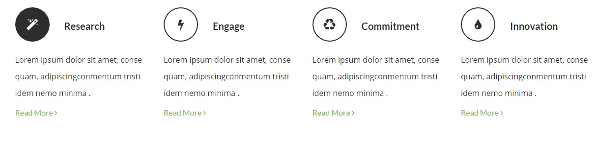
iconBox – Small transparent dark inline version
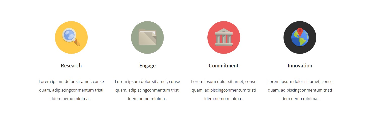
iconBox – Image version
Classes
— ct-iconBox (core class)
— ct-iconBox–small (define size of iconbox)
— ct-iconBox–Big (define size of iconbox)
— ct-iconBox–solidBorder (on hover border changed to dark green)
— ct-iconBox–solid (on hover background to black)
— ct-iconBox–solidBlue (different background, hover to black)
— ct-iconBox–solidYellow (different background, hover to black)
— ct-iconBox–solidRed (different background, hover to black)
— ct-iconBox–solidDark (different background, hover to black)
— ct-iconBox–withImageGreyScale (grayscale on hover)
— ct-iconBox–transparent (transparent background)
— ct-iconBox–inline (icon to the left, title to right)
Example of markup
|
1 2 3 4 5 6 7 8 9 10 11 12 |
<div class="ct-iconBox ct-iconBox--small ct-iconBox--transparent ct-iconBox--inline"> <div class="ct-icon"> <i class="fa fa-magic"></i> </div> <div class="ct-icon--description"> <h4 class="ct-fw-600 ct-u-colorMotive">Research</h4> <p class="ct-fw-400">Lorem ipsum dolor sit amet, conse quam, adipiscingconmentum tristi idem nemo minima .</p> <a href="course-single.html">Read More <i class="fa fa-angle-right"></i></a> </div> </div> |
Was this article helpful ?
CSS files and structure
If you would like to edit the color, font, or style of any elements, you would do the following:
|
1 |
#primaryContent a {color: #someColor;} |
If you find that your new style is not overriding, it is most likely because of a specificity problem. Scroll down in your CSS file and make sure that there isn’t a similar style that has more weight.
I.E.
|
1 |
#wrap #primaryContent a {color: #someColor;} |
So, to ensure that your new styles are applied, make sure that they carry enough “weight” and that there isn’t a style lower in the CSS file that is being applied after yours.
Colors
The theme includes a css file wich you can use to edit the colors.
You just need to add the corresponding CSS file to the head of the page like this:
|
1 2 3 4 5 |
<head> (..) <link rel="stylesheet" type="text/css" href="css/motive.css"> (..) </head> |
Icons
We’ve included 360+ font icons.
Awesome Icons – http://fontawesome.io/icons/
HTML markup:
|
1 2 |
<!-- Awesome Icons --> <i class="fa fa-cog"></i> |
CSS Files & Structure
We’ve included 2 files.
bootstrap.css contains Bootstrap 3 Library.
style.css file contains general styles.
style.less
1. Animations
2. Utilities
3. Font awesome
4. Fontello
5. Menu
6. Slick slider
7. Media Sections
8. Selectize
9. Bootstrap datepicker
10. Headroom
11. Magnificpopup
12. Typography
13. Section header
14. Portfolio
15. Icon box
16. Article box
17. Blockquote
18. Lists
19. Buttons
20. Line break
21. Slick navigation
22. Socials
23. Footer
24. Flag box
25. Main slider
26. Booking box
27. Forms
28. Date picker
29. Image box
30. Divided icon wall
31. Page header
32. Accordions
33. Pricing box
34. Testimonials
35. Product box
36. Gallery container
37. Blog
38. Pagination
39. Puzzle box
40. Google maps
41. Info box
42. Video poster
43. Pre loader
44. Progress bar
45. Tabs
46. Counters
47. Tables
48. Onepager
49. Person box
50. Icons
For more advanced user – we included also folder with less files – under assets/less you will find the following files:
plugins.less – file for plugins styling
motive.less – file for motive styling
buttons.less – file for buttons styling (colors, sizes etc.)
pageheader.less – file for page header styling
Was this article helpful ?
Javascript Components
JavaScript files:
- /charts/ – script for canvas charts animating
- /counters/ – Files needed for initialising the animation number after loading pages.
- /ct-mediaSection/ – Media sections where we can add parralax, kenburns or video to the section. Dynamical content of medias.
- /datetime-picker/ -Scripts for choosing the date from small calendar and attaching it to the input form.
- /gmaps/ – Plugin needed for displaying google map on the page.
- /headroom/ – Animated/fixed navbars. Plugin needed for detecting scrollbar and attaching animations for menu.
- /magnificpopup/ – Needed for galleries and their popups images where we can review them with slides via arrows.
- /onepager/ – scripts for onepager.html only
- /portfolio/ – scripts for gallery isotope
- /progressbars/ – files needed for initialising the animation bars after loading pages
- /progressicons/ – files needed for initialising the animation icons after loading pages
- /selectize/ – Plugin which creates select box for select tag in the page. It generates html code via javascript so that each browser can have the same select box.
- /slick/ – Files which initialize sliders in the page.
- /external.js/ – One big file where are minifixed javascript files:_ 1.jquery 2.boostrap 3.placeholder 4. easing 5. device.min.js 6. jquery browser 7.Snap min JS 8. jquery appear_
- /main.js/ – The main javascript initializaions and other major snippets.
Screenshot
Google Map (GMAP3 Plugin)
This is google map with custom marker, you can define couple parameters:
- data-location – address to show
- data-height – map height (if undefined height will be 220px)
- data-offset – by how many map should be repositioned from marker center point (default -30)
It uses gmap3 plugin.
Documentation: here
HTML Markup:
|
1 |
<span class="html-tag"><div <span class="html-attribute-name">class</span>="<span class="html-attribute-value">ct-googleMap</span>" <span class="html-attribute-name">data-location</span>="<span class="html-attribute-value">54.3178115,16.5529038</span>" <span class="html-attribute-name">data-height</span>="<span class="html-attribute-value">415</span>" <span class="html-attribute-name">data-zoom</span>="<span class="html-attribute-value">10</span>" <span class="html-attribute-name">data-marker</span>="<span class="html-attribute-value">false</span>" <span class="html-attribute-name">data-mapImage</span>="<span class="html-attribute-value">./assets/images/demo-content/map-image.png</span>"></span><span class="html-tag"></div></span> |
All javascript code can be found in js/main.js file.
jquery.appear
This plugin call function when element appear in viewport. This is used in custom animation, progress bars, counter timer.
Documentation: https://github.com/bas2k/jquery.appear/
|
1 2 3 4 5 6 7 8 9 10 11 12 13 |
if (jQuery().appear) { if (device.mobile()) { // disable animation on mobile jQuery("body").removeClass("withAnimation"); } else { jQuery('.withAnimation .animated').appear(function () { jQuery(this).each(function () { jQuery(this).addClass('activate'); jQuery(this).addClass($(this).data('fx')); }); }, {accY: -150}); } } |
Charts.js
This plugin is used to make graphics.
Documentation: http://www.chartjs.org/
Was this article helpful ?
Contact Form
Template comes with ready to use:
- Contact Form
All needed files are in /form directory.
Remember to includeon page.
To configure form just edit form/config.php and change e-mails to your own :
|
1 2 |
$to = "mail@example.com"; $from = "mail@example.com"; |
That’s it!
Contact Form
HTML Markup
|
1 2 3 4 5 6 7 8 9 10 11 12 13 14 15 16 17 18 19 20 21 22 23 24 25 26 27 28 29 30 31 32 33 34 35 36 37 38 39 40 41 42 43 44 45 46 47 48 49 50 51 52 53 54 55 56 57 58 59 60 61 62 63 64 65 66 67 68 69 70 71 72 73 74 75 76 77 78 79 80 81 82 83 84 85 86 87 88 89 90 91 92 93 94 95 96 97 98 99 100 101 102 103 |
<form action="./assets/form/send.php" method="post" class="ct-u-paddingBottom30 contactForm validateIt contactForm--type3" data-hide-form="false" data-email-subject="Contact Form" data-show-errors="true"> <div class="row"> <div class="col-sm-12"> <div class="successMessage alert alert-success ct-u-marginTop30" style="display: none"> <button type="button" class="close" data-dismiss="alert" aria-hidden="true">×</button> Thank You! </div> <div class="errorMessage alert alert-danger ct-u-marginTop30" style="display: none"> <button type="button" class="close" data-dismiss="alert" aria-hidden="true">×</button> Ups! An error occured. Please try again later. </div> </div> </div> <div class="row"> <div class="col-sm-12"> <div class="form-group"> <select class="ct-js-selectize"> <option value="">Enquiry</option> <option value="1">The Sydney Harbour</option> <option value="2">Casa Caracol</option> <option value="3">The Clayzy House</option> <option value="4">RE B&B</option> <option value="5">CamelBackpackers</option> <option value="6">Fauzi Azar Inn</option> </select> </div> </div> </div> <div class="row"> <div class="col-sm-12"> <div class="form-group"> <select class="ct-js-selectize"> <option value="">Enquiry</option> <option value="1">The Sydney Harbour</option> <option value="2">Casa Caracol</option> <option value="3">The Clayzy House</option> <option value="4">RE B&B</option> <option value="5">CamelBackpackers</option> <option value="6">Fauzi Azar Inn</option> </select> </div> </div> </div> <div class="row"> <div class="col-sm-12"> <div class="form-group"> <label for="email" class="sr-only">Your email</label> <input type="email" id="email" class="form-control input-lg" name="field[email]" placeholder="Your email" required/> </div> </div> </div> <div class="row"> <div class="col-sm-12"> <div class="form-group"> <label for="name" class="sr-only">Your name</label> <input type="text" id="name" class="form-control input-lg" name="field[name]" placeholder="Your name" required/> </div> </div> </div> <div class="row"> <div class="col-sm-12"> <div class="form-group"> <label for="subject" class="sr-only">Subject</label> <input type="text" id="subject" class="form-control input-lg" name="field[subject]" placeholder="Subject" required/> </div> </div> </div> <div class="row"> <div class="col-sm-12"> <div class="form-group"> <textarea class="form-control" rows="3" name="field[message]" placeholder="Your message" required></textarea> </div> </div> </div> <div class="row"> <div class="col-sm-12"> <div class="form-group"> <select required="" class="ct-js-selectize"> <option value="">How did you hear about us?</option> <option value="1">The Sydney Harbour</option> <option value="2">Casa Caracol</option> <option value="3">The Clayzy House</option> <option value="4">RE B&B</option> <option value="5">CamelBackpackers</option> <option value="6">Fauzi Azar Inn</option> </select> </div> </div> </div> <div class="row"> <div class="col-sm-12"> <div class="checkbox ct-u-marginTop10"> <input type="checkbox" id="checkbox1" name="field[subscribe]"> <label for="checkbox1">subscribe to our newsletter</label> </div> </div> </div> <div class="row"> <div class="col-sm-12"> <button type="submit" class="btn btn-primary ct-u-marginTop20">Send now<span><i class="icon-right-small"></i></span></button> </div> </div> </form> |
Options (can be changed in HTML) :
Mail Subject – just change value in :
Success Message – change successMessage div content
Error Message – change errorMessage div content
Was this article helpful ?
Buttons
Test have three sizes of buttons:
- btn
- btn-xs
- btn-sm
Each can have one of the following variations:
Standard button
Screenshot

Standard button
HTML markup
|
1 |
<a href="#" class="btn btn-xs btn-primary">Button</a> |
Button with beating arrow
Screenshot

Button with beating arrow
HTML markup
|
1 |
<a href="#" class="btn btn-xs btn-primary">Button<span><i class="icon-right-small"></i></span></a> |
Button with arrow and icon
Screenshot

Button with arrow and icon
HTML markup
|
1 |
<a href="#" class="btn btn-xs btn-primary btn--icon"><i class="fa fa-twitter"></i>Button<span><i class="icon-right-small"></i></span></a> |
Was this article helpful ?
Progress Bars
Indicate progress with three versions of Progress Bars!
Screenshots
— ct-progressBar–type1

Progress bar type1
— ct-progressBar–type2

Progress bar type2
— ct-progressBar–type3

Progress bar type3
You can edit bars values and colors with data-attributes used with the following HTML markup
|
1 2 3 4 5 6 7 8 9 10 |
<div class="ct-progressBar ct-progressBar--type1"><!-- Progress Bar type 1 --> <div class="ct-progressBar-title">WebDesign</div> <div class="progress"> <div class="progress-bar animating" role="progressbar" aria-valuenow="51" aria-valuemin="0" aria-valuemax="100"> <div class="ct-progressBar-content"> <span class="ct-progressBar-text">51%</span> </div> </div> </div> </div> |
Java Script
|
1 |
<script src="../assets/js/progressbars/init.js"></script> |
Was this article helpful ?
Slick Slider Navigation
Slick Slider in Test have two types navigation with three (dots) and four (arrows) variations
Dots
ct-slick-dots–type1
This type has the following positions:
— ct-slick-dots–rightTop
— ct-slick-dots–rightBottom
— ct-slick-dots–centerBottom
— ct-slick-dots–leftTop
— ct-slick-dots–rightTop
— ct-slick-dots–centerTop
HTML markup
|
1 2 3 |
<div class="ct-js-slick ct-slick ct-slick-dots--type1 ct-slick-dots--centerTop slick-initialized slick-slider"> [ -- ] </div> |
Screenshot

Example of dots slider nav
ct-slick-dots–type2
HTML markup
|
1 2 3 |
<div class="ct-js-slick ct-slick ct-slick-dots--type2 slick-initialized slick-slider"> [ -- ] </div> |
Screenshot

Example of dots slider nav 2
ct-slick-dots–type3
This type has the following positions:
1. ct-slick-dots–rightTop
2. ct-slick-dots–rightBottom
3. ct-slick-dots–centerBottom
4. ct-slick-dots–leftTop
5. ct-slick-dots–rightTop
6. ct-slick-dots–centerTop
HTML markup
|
1 2 3 |
<div class="ct-js-slick ct-slick ct-slick-dots--type3 ct-slick-dots--rightBottom"> [ -- ] </div> |
Screenshot

Arrows
ct-slick-arrows–type1
This type has the following positions
1. ct-slick-arrows–position1
HTML markup
|
1 2 3 |
<div class="ct-js-slick ct-slick ct-slick-arrows--type1 ct-slick-arrow--position1r"> [ -- ] </div> |
Screenshot

Example of arrow slider nav
ct-slick-arrows–type2
This type has the following positions (vertical align middle, arrow on the left side (content), arrow on the right side (content))
1. ct-slickarrow–middleCorners (vertical align middle, arrow on the left side (body), arrow on the right side (body))
HTML markup
|
1 2 3 |
<div class="ct-js-slick ct-slick ct-slick-arrows--type2 ct-slickarrow--middleCorners slick-initialized slick-slider"> [ -- ] </div> |
Image:

Example of arrow slider nav 2
ct-slick-arrows–type3
This type has the following positions:
This type has a extra another class “ct-slick-arrows–motive”, which one changing our arrow color on hover into motive color
1. ct-slick-arrows–position1 (vertical align middle, arrow on the left side, arrow on the right side)
2. ct-slick-arrows–position2 (vertical align bottom, and arrows on the middle)
3. ct-slick-arrows–position4 (vertical align bottom, and arrows on the right side)
4. ct-slick-arrows–position5 (vertical align bottom, and arrows on the left side)
5. ct-slick-arrows–position8 (vertical align top, and arrows on the middle)
HTML markup
|
1 2 3 |
<div class="ct-js-slick ct-slick ct-slick-arrows--type2 ct-slickarrow--middleCorners"> [ -- ] </div> |
Screenshot

Example of arrow slider nav 3
ct-slick-arrows–type4
This type has the following positions
1. ct-slick-arrows–position1
2. ct-slick-arrows–position2
3. ct-slick-arrows–position3
4. ct-slick-arrows–position4
5. ct-slick-arrows–position5
6. ct-slick-arrows–position7
HTML markup
|
1 2 3 |
<div class="ct-js-slick ct-slick ct-slick-arrows--type4 ct-slick-arrows--position7 slick-initialized slick-slider"> [ -- ] </div> |
Screenshot

Example of dots slider nav 4
Was this article helpful ?
Main Slider
HTML markup
|
1 2 3 4 5 6 7 8 9 10 11 12 13 14 15 16 17 18 19 20 21 22 23 24 25 26 27 28 29 30 31 32 33 34 35 36 37 38 39 40 41 42 43 44 45 46 47 48 49 50 51 52 53 54 55 56 57 58 59 60 61 62 63 64 65 66 67 68 69 |
<div class="ct-mainSlider ct-u-backgroundMotive"> <div class="ct-mainSlider--rightSide ct--col-md-push-7"> <div class="ct-js-slick ct-slick ct-slick-dots--type3 ct-slick-dots--rightBottom" data-adaptiveHeight="true" data-dots="true" data-arrows="false" data-infinite="true"> <div class="item"><!-- item [1] --> <img src="../assets/images/demo-content/hostel-1.jpg" alt="Hostel"/> </div> <div class="item"><!-- item [2] --> <img src="../assets/images/demo-content/hostel-1.jpg" alt="Hostel"/> </div> <div class="item"><!-- item [3] --> <img src="../assets/images/demo-content/hostel-1.jpg" alt="Hostel"/> </div> </div> </div> <div class="ct-mainSlider--leftSide ct--col-md-pull-5"> <div class="ct-mainSlider-miniImage hidden-xs"> <img src="../assets/images/demo-content/mini-hostel.jpg" alt=""/> </div> <div class="ct-bookingBox-fix ct-u-paddingTop30"> <div class="ct-bookingBox"> <div class="ct-bookingBox-inner"> <h2 class="ct-bookingBox-title ct-u-marginBottom30">Book a bed</h2> <div class="clearfix"></div> <form action="../assets/form/send.php" method="post" class="contactForm validateIt contactForm--type3" data-email-subject="Book a bed" data-show-errors="true"> <div class="form-group"> <select class="demo-default ct-js-selectize" name="hostel"> <option value="">Select a Hostel</option> <option value="1">The Sydney Harbour</option> <option value="2">Casa Caracol</option> <option value="3">The Clayzy House</option> <option value="4">RE B&B</option> <option value="5">CamelBackpackers</option> <option value="6">Fauzi Azar Inn</option> </select> </div> <div class="form-group"> <div class="ct-datePicker"> <input type="text" class="form-control ct-js-datePicker" placeholder="Select Date"> </div> </div> <div class="form-group"> <select class="demo-default ct-js-selectize"> <option value="">Number of Nights</option> <option value="1">1</option> <option value="2">2</option> <option value="3">3</option> <option value="4">4</option> <option value="5">5</option> <option value="6">6</option> </select> </div> <div class="form-group"> <select class="demo-default ct-js-selectize"> <option value="">Currency</option> <option value="1">Dollar</option> <option value="2">Euro</option> <option value="3">Franc</option> <option value="6">Zloty</option> </select> </div> <div class="ct-u-paddingTop20"> <button type="submit" class="btn btn-link text-uppercase">Book now <span><i class="icon-right-small"></i></span></button> </div> </form> </div> </div> </div> </div> <div class="clearfix"></div> |
JavaScript
<script src=”../assets/js/slick/js/slick.js”></script>
<script src=”../assets/js/slick/js/init.js”></script>
<script src=”../assets/js/selectize/selectize.min.js”></script>
Screenshot

Main slider
Was this article helpful ?
Video poster
HTML markup
|
1 2 3 4 5 6 7 8 9 10 11 12 13 14 15 |
<div class="ct-videoPoster text-right animated" data-fx="fadeInRight"> <div class="ct-videoPoster-content"> <img src="../assets/images/demo-content/video-frame.png" alt="Image"/> <div class="ct-videoPoster-frame"> <img src="../assets/images/demo-content/video-poster.jpg" alt="Image"/> <a href="https://www.youtube.com/watch?v=rYbtBXhMFAQ" class="ct-js-videoPlay"><img src="../assets/images/demo-content/video-play.png" alt="Image"/></a> </div> </div> <div class="ct-videoPoster--mobile ct-u-paddingBottom70 ct-u-paddingTop20"> <div class="ct-videoPoster-frame"> <img src="../assets/images/demo-content/video-poster.jpg" alt="Image"/> <a href="https://www.youtube.com/watch?v=rYbtBXhMFAQ" class="ct-js-videoPlay"><img src="../assets/images/demo-content/video-play.png" alt="Image"/></a> </div> </div> </div> |
JavaScript
<script src=”../assets/js/magnificpopup/magnificpopup.min.js”></script><script src=”../assets/js/magnificpopup/init.js”></script>
Screenshot

Video poster
Was this article helpful ?
Divided icon wall
HTML markup
|
1 2 3 4 5 6 7 8 9 10 11 12 13 14 15 16 17 18 19 20 21 22 23 24 25 26 27 28 29 30 31 32 33 34 35 36 37 38 39 40 41 42 43 44 45 46 47 48 49 50 51 52 53 54 55 56 57 |
<section class="ct-mediaSection" data-type="parallax" data-height="863" data-background="../assets/images/demo-content/media-section-2.jpg" data-stellar-background-ratio="0.2" data-background-mobile="../assets/images/demo-content/media-section-2.jpg"> <div class="ct-mediaSection-inner"> <div class="container"> <div class="col-sm-8 ct-u-backgroundDark"> <div class="ct-sectionHeader ct-sectionHeader--type2 ct-u-marginBottom50 text-center"> <h3 class="ct-sectionHeader-title text-uppercase text-center ct-u-colorWhite"> Our room types</h3> </div> <div class="media ct-iconBox ct-iconBox--type3"> <div class="media-left"> <span class="media-object ct-iconBox-icon ct-icon-bedSingle" role="presentation"></span> </div> <div class="media-body"> <h5 class="media-heading ct-u-colorWhite">Single private ensuite</h5> <p class="ct-u-colorWhite ct-iconBox-description">Contains 1 single bed, bathroom, desk, flat screen tv, wifi access, hair dryer, wardrobe & towels.</p> </div> </div> <div class="media ct-iconBox ct-iconBox--type3"> <div class="media-left"> <span class="media-object ct-iconBox-icon ct-icon-bedDouble" role="presentation"></span> </div> <div class="media-body"> <h5 class="media-heading ct-u-colorWhite">Double room ensuite</h5> <p class="ct-u-colorWhite ct-iconBox-description">Contains 1 single bed, bathroom, desk, flat screen tv, wifi access, hair dryer, wardrobe & towels.</p> </div> </div> <div class="media ct-iconBox ct-iconBox--type3"> <div class="media-left"> <span class="media-object ct-iconBox-icon ct-icon-bedTwin" role="presentation"></span> </div> <div class="media-body"> <h5 class="media-heading ct-u-colorWhite">Twin private ensuite</h5> <p class="ct-u-colorWhite ct-iconBox-description">Contains 1 single bed, bathroom, desk, flat screen tv, wifi access, hair dryer, wardrobe & towels.</p> </div> </div> <div class="media ct-iconBox ct-iconBox--type3"> <div class="media-left"> <span class="media-object ct-iconBox-icon ct-icon-bedTriple" role="presentation"></span> </div> <div class="media-body"> <h5 class="media-heading ct-u-colorWhite">Triple private ensuite</h5> <p class="ct-u-colorWhite ct-iconBox-description">Contains 1 single bed, bathroom, desk, flat screen tv, wifi access, hair dryer, wardrobe & towels.</p> </div> </div> <div class="media ct-iconBox ct-iconBox--type3"> <div class="media-left"> <span class="media-object ct-iconBox-icon ct-icon-bedTwin" role="presentation"></span> </div> <div class="media-body"> <h5 class="media-heading ct-u-colorWhite">4, 6 or 8 bed dorm / bunk bed</h5> <p class="ct-u-colorWhite ct-iconBox-description">All beds come with private reading lamp, fleece blankets and pillows. Each bed has its own storage locker that can be locked. Bed linen is provided.</p> </div> </div> </div> <img src="../assets/images/demo-content/chambermaid.png" class="ct-mediaSection-Subimage animated hidden-sm" data-fx="fadeInUp" data-time="1000" alt="Chambermaid"/> </div> </div> </section> |
JavaScript
<script src=”../assets/js/ct-mediaSection/js/smoothScroll.js”></script><script src=”../assets/js/ct-mediaSection/js/jquery.stellar.min.js”></script>
<script src=”../assets/js/ct-mediaSection/js/media-section.js”></script>
Screenshot

Divided icon wall
Was this article helpful ?
Blockquote
HTML markup
|
1 2 3 |
<blockquote class="ct-blockquote ct-blockquote--motive"> Keep your dreams alive. Understand to achieve anything requires faith and belief in yourself, vision, hard work, determination, and dedication. Remember all things are possible for those who believe. </blockquote> |
Screenshot

Blockquote
Was this article helpful ?
Article box
Test have 3 types of Article boxes
Article box – type 1
HTML markup
|
1 2 3 4 5 6 7 8 9 10 11 12 |
<div class="ct-articleBox text-center"> <a href="single-blog-post.html"> <figure> <img src="../assets/images/demo-content/article-thumbnail-1.jpg" alt="Image"/> <figcaption> <span class="ct-articleBox-date">Thursday, July 02, 2015</span> <h4 class="ct-articleBox-title">Our Impecable Cleaning Services & Staff</h4> </figcaption> </figure> <span class="btn btn-primary text-uppercase ct-articleBox-link"><strong>Read</strong> article</span> </a> </div> |
Screenshot

Article box 1
Article box – type 2
HTML markup
|
1 2 3 4 5 6 7 8 9 10 |
<div class="ct-articleBox ct-articleBox--type2 ct-u-marginBottom40"> <a href="single-blog-post.html" class="ct-articleBox-image"> <img src="../assets/images/demo-content/image-9.jpg" alt="Image"/> <span class="btn btn-primary text-uppercase ct-articleBox-link">Read article</span> </a> <span class="h6"><small class="ct-articleBox-meta">Wednesday, July 10, 2015</small></span> <span class="ct-hr ct-hr--type1 ct-u-marginTop20 ct-u-marginBottom10" data-background="#f7f7f7">Line break</span> <h4 class="ct-articleBox-title"><a href="single-blog-post.html">The dream dorm: best bunkmates</a></h4> <p>A few of the HI team give their two cents on the destinations they wanderlust...</p> </div> |
Screenshot

Artickle box 2
Article box – type 3
HTML markup
|
1 2 3 4 5 6 7 8 9 10 11 12 |
<div class="media ct-articleBox ct-articleBox--type3"> <a href="single-blog-post.html" class="media-left ct-articleBox-image"> <img class="media-object" src="../assets/images/demo-content/image-10.jpg" alt="Image"> <span class="btn btn-primary text-uppercase ct-articleBox-link">Read article</span> </a> <div class="media-body"> <span class="h6"><small class="ct-articleBox-meta">Wednesday, July 09, 2015</small></span> <span class="ct-hr ct-hr--type1 ct-u-marginTop20 ct-u-marginBottom20" data-background="#f7f7f7">Line break</span> <h4 class="ct-articleBox-title"><a href="single-blog-post.html">Hostel of the Week: The Hat, Madrid</a></h4> <p>Looking for a bit of hostel luxury in Europe?</p> </div> </div> |
Screenshot

Artickle box 3
Was this article helpful ?
Puzzle box
Test have two types of puzzle boxes
Puzzle box – type1
HTML markup
|
1 2 3 4 5 |
<div class="ct-puzzleBox" data-height="566"> <img src="../assets/images/demo-content/puzzleBox-1.jpg" alt="Image" class="ct-puzzleBox--image1 animated" data-fx="zoomIn" data-time="1000"/> <img src="../assets/images/demo-content/puzzleBox-2.jpg" alt="Image" class="ct-puzzleBox--image2 animated" data-fx="fadeInRight"/> <img src="../assets/images/demo-content/puzzleBox-3.jpg" alt="Image" class="ct-puzzleBox--image3 animated" data-fx="fadeInLeft"/> </div> |
Screenshot
Puzzle box 1
Puzzle box – type2
HTML markup
|
1 2 3 4 5 6 |
<div class="ct-puzzleBox ct-puzzleBox--type2"> <img src="../assets/images/demo-content/image-4.jpg" alt="Image"/> <img src="../assets/images/demo-content/image-5.jpg" alt="Image"/> <img src="../assets/images/demo-content/image-6.jpg" alt="Image"/> <img src="../assets/images/demo-content/image-7.jpg" alt="Image"/> </div> |
Screenshot

Puzzle box 2
Was this article helpful ?
Icon Box
Test have four types of icon boxes.
Icon box version 1
HTML markup
|
1 2 3 4 5 6 7 8 |
<div class="ct-iconBox ct-iconBox--type2 ct-u-marginBottom50"> <span class="ct-iconBox-icon"> <i class="fa fa-map-marker"></i> </span> <h3 class="ct-iconBox-title text-uppercase">Map &<br> DIRECTIONS</h3> <p class="ct-iconBox-description">Located in the middle of the historical centre of Poland only 2 minutes away. Very easy to find.</p> <a href="#" class="btn btn-primary ct-u-marginTop10">Learn more <span><i class="icon-right-small"></i></span></a> </div> |
Screenshot

Icon box 1
Icon box version 2
HTML markup
|
1 2 3 4 5 6 |
<a href="#" class="ct-iconBox ct-iconBox--circle text-center ct-u-marginBottom50"> <span class="ct-iconBox-icon">1</span> <h5 class="ct-iconBox-title">Free Outdoor Swimming Pool</h5> <p class="ct-iconBox-description">Our outdoor swimming pool with waterfall is perfect to laze by on those 35 degree days when lining up at a museum.</p> <span class="btn btn-primary ct-iconBox-linkHelper">Book now</span> </a> |
Screenshot

Icon box 2
Icon box version 3
HTML markup
|
1 2 3 4 5 6 7 8 9 |
<div class="media ct-iconBox ct-iconBox--type3"> <div class="media-left"> <span class="media-object ct-iconBox-icon ct-icon-bedSingle" role="presentation"></span> </div> <div class="media-body"> <h5 class="media-heading">Single private ensuite</h5> <p class="ct-iconBox-description">Contains 1 single bed, bathroom, desk, flat screen tv, wifi access, hair dryer, wardrobe & towels.</p> </div> </div> |
Screenshot

Icon box 3
Icon box version 4
HTML markup
|
1 2 3 4 |
<div class="ct-iconBox ct-iconBox--type4"> <span class="ct-iconBox-icon"><i class="fa fa-wifi"></i></span> <p class="ct-iconBox-title">Free Wi-Fi</p> </div> |
Screenshot

Icon box 4
Was this article helpful ?
CSS Files and Structure
If you would like to edit the color, font, or style of any elements, you would do the following:
|
1 |
#primaryContent a {color: #someColor;} |
If you find that your new style is not overriding, it is most likely because of a specificity problem. Scroll down in your CSS file and make sure that there isn’t a similar style that has more weight.
I.E.
|
1 |
#wrap #primaryContent a {color: #someColor;} |
So, to ensure that your new styles are applied, make sure that they carry enough “weight” and that there isn’t a style lower in the CSS file that is being applied after yours.
Colors
The theme includes a css file wich you can use to edit the colors.
You just need to add the corresponding CSS file to the head of the page like this:
|
1 2 3 4 5 |
<head> (..) <link rel="stylesheet" type="text/css" href="css/red.css"> (..) </head> |
Main Menu structure
Just change brand name, upload your logo to images/content/ folder and you’re ready to go!
|
1 2 3 4 5 6 7 8 9 10 11 12 13 14 15 16 17 18 19 20 21 22 23 24 25 26 27 28 29 30 |
<nav class="navbar ct-navbar--transparent ct-navbar--logoright" role="navigation"> <div class="container"> <!-- Brand and toggle get grouped for better mobile display --> <div class="navbar-header"> <a class="navbar-brand" href="index.html"><img src="./assets/images/logo.png" alt="Orlando Logo"> </a> </div> <!-- Collect the nav links, forms, and other content for toggling --> <div class="collapse navbar-collapse"> <ul class="nav navbar-nav ct-navbarNav--defaultActive ct-navbar--fadeIn yamm"> <li class="dropdown yamm-fw active"> <a href="index.html">Home <i class="fa fa-angle-double-down"></i></a> <ul class="dropdown-menu"> </ul> </div> <!-- /.navbar-collapse --> <div class="ct-navbar-search"> <form role="form"> <div class="form-group"> <input type="text" class="form-control" placeholder="Please type keywords..." required> </div> <button class="ct-navbar-search-button" type="submit"> <i class="fa fa-search fa-fw"></i> </button> </form> </div> </div> <!-- /.container --> </nav> |
In order to create mega menus read the documentation here:
Icons
We’ve included 360+ font icons.
Awesome Icons – http://fontawesome.io/icons/
HTML markup:
|
1 2 |
<!-- Awesome Icons --> <i class="fa fa-cog"></i> |
CSS Files & Structure
We’ve included 2 files.
bootstrap.css contains Bootstrap 3 Library.
style.css file contains general styles.
1. Font Awesome
2. Animate.css
3. Typography
4. Buttons
5. Menu
6. Forms
7. Hovers
8. Tables
9. Utilities
10. Media Sections – video/parallax/kenburns
11. Accordions
12. Progress Bar
13. Tabs
14. Mixins
15. Select2
16. Wrapper
17. Page Header
18. Footer
19. Socials Types
20. Counter
21. Blog
22. Blog Panel
23. Blog Comments
24. Pricing Boxes
25. Blockquote
26. Sliders
27. Google Maps
28. Widgets
29. Magnific Popup
30. After & before slider(twentytwenty)
31. Templates
Utilities
Utility classes are low-level structural and positional traits. Utilities can be applied directly to any element, multiple utilities can be used tohether and utilities can be used alongsie component classes.
Utilities are intended for frequently used CSS properties and patterns, like: floats, containing floats, vertical alignemnt, text tryncation. Relying on utilities can help to reduce repetition and provide consistend implementations.
- Test uses utilities for the following categories:
- Typography
- Display Types
- Paddings
- Margins
- Line height
- Borders
- Colors
- Transform
- Section elements
Was this article helpful ?
Navigation
There are several options for menu and topbar scrolling effects:
- ct-headroom–scrollUpMenu
- ct-headroom–scrollUpTopBar
- ct-headroom–scrollUpBoth
- ct-headroom–fixedTopBar
- ct-headroom–fixedMenu
- ct-headroom–fixedBoth
- ct-headroom–hideMenu
For example:
|
1 |
<body class="ct-headroom--scrollUpBoth cssAnimate"> |
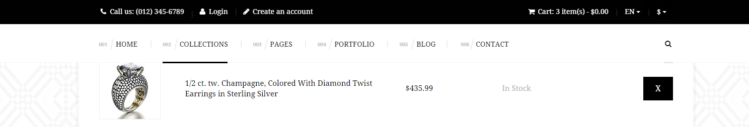
Top Bar
Notice:
The following javascripts are required for the effects above:
You can also change menu color to black. You only need to add the following class to markup:
- navbar–black
Black Menu Bar
Here you will find example of HTML markup for black menu bar:
|
1 2 3 4 5 6 7 8 |
<nav class="navbar navbar--black yamm"> <div class="container"> <ul class="nav navbar-nav ct-navbar--fadeIn"> <li class="dropdown active"> <a href="index.html">Home</a> <ul class="dropdown-menu"> <li> ..... |
Learn More:
You fill find whole documentation of plugin in <
script src="assets/plugins/headroom/init.js"></script>
Was this article helpful ?
Top bar
HTML markup (example for one item)
|
1 2 3 4 5 6 7 8 9 10 11 12 13 14 15 16 17 18 |
<div class="ct-topBar ct-u-paddingBoth10 ct-u-positionRelative" data-background="#f6f6f6"> <div class="container"> <div class="row"> <div class="col-sm-12 ct-u-positionStatic"> <div class="ct-js-slick ct-slick ct-slick-arrows--type2 ct-slickarrow--middleCorners" data-LGitems="7" data-MDitems="5" data-SMitems="3" data-XSitems="2" data-adaptiveHeight="true" data-dots="false" data-arrows="true"> <div class="item"><!-- item [1] --> <a href="#" class="ct-flagBox ct-u-centered"> <figure> <img src="../assets/images/demo-content/flag-italy.jpg" alt="Flag"/> <figcaption class="text-uppercase">Italy</figcaption> </figure> </a> </div> </div> </div> </div> </div> </div> |
JavaScript
<script src=”../assets/js/slick/js/slick.js”></script>
<script src=”../assets/js/slick/js/init.js”></script>
Screenshot
Top bar
Was this article helpful ?
Media sections
You can arrange your content with the following Media sections types:
HTML markup – for parallax
|
1 2 3 4 5 |
<section class="ct-mediaSection" data-type="parallax" data-height="600" data-background="../path/to/image/image-name" data-background-mobile="../path/to/image/image-name"> <div class="ct-mediaSection-inner"> [ -- ] </div> </section> |
HTML markup – for kenburns
|
1 2 3 4 5 6 7 8 9 10 |
<section class="ct-mediaSection" data-type="kenburns" data-height="600" data-background-mobile="../path/to/image/image-name"> <div class="ct-mediaSection-kenburns"> <img src="../path/to/image/image-name" alt="Image" class="singlefx"> <img src="../path/to/image/image-name" alt="Image" class="singlefx"> <img src="../path/to/image/image-name" alt="Image" class="singlefx"> </div> <div class="ct-mediaSection-inner"> [ -- ] </div> </section> |
HTML markup – for video
|
1 2 3 4 5 6 7 8 |
<section class="ct-mediaSection" data-type="video" data-height="600" data-background-mobile="../path/to/image/image-name"> <div class="ct-mediaSection-video embed-responsive embed-responsive-16by9"> <iframe src="../path/to/video"></iframe> </div> <div class="ct-mediaSection-inner"> [ -- ] </div> </section> |
Description
data-type – determines the type of media section
data-height – determines the height of media section
data-background – this attribute allows you to insert image for desktop devices
data-background-mobile – this attribute allows you to insert image for mobile devices
JavaScript
<script src=”../assets/js/ct-mediaSection/js/smoothScroll.js”></script>
<script src=”../assets/js/ct-mediaSection/js/jquery.stellar.min.js”></script>
<script src=”../assets/js/ct-mediaSection/js/media-section.js”></script>
Was this article helpful ?
Product box
Product box – type 1
HTML markup
|
1 2 3 4 5 6 7 8 9 10 |
<div class="media ct-productBox ct-productBox--type1"> <div class="media-left"> <img class="media-object" src="../assets/images/demo-content/product-1.jpg" alt="Image"> </div> <div class="media-body"> <h5 class="media-heading">French</h5> <p class="ct-productBox-description">1 Croissant, Butter, Jam or <br>Honey</p> <span class="ct-productBox-price">4, 50 €</span> </div> </div> |
Screenshot

Product box 1
Product box – type 2
HTML markup
|
1 2 3 4 5 6 7 8 9 10 11 12 13 14 15 16 17 18 19 20 21 22 23 24 25 26 27 |
<div class="ct-productBox ct-productBox--type2 ct-u-paddingBottom40"> <div class="row"> <div class="col-md-8"> <img src="../assets/images/demo-content/product-7.jpg" class="center-block ct-u-left--sm ct-u-marginBottom30" alt="Image"/> </div> <div class="col-md-4"> <div class="ct-productBox-content"> <div class="ct-productBox-header"> <h4 class="text-capitalize ct-productBox-title">Single Room</h4> <p>A comfortable and quiet room facing the inner courtyard.</p> <span class="ct-hr ct-hr--type1 ct-u-marginTop20 ct-u-marginBottom20" data-background="#f7f7f7">Line break</span> </div> <div class="ct-productBox-price"> <span>from</span> <p>25.00€ / night</p> </div> <ul class="list-unstyled ct-list--type2 ct-list--striped ct-icon--motive ct-u-paddingTop25"> <li><i class="fa fa-check-circle-o"></i>Shower / WC</li> <li><i class="fa fa-check-circle-o"></i>TV</li> <li><i class="fa fa-check-circle-o"></i>Breakfast buffet incl.</li> <li><i class="fa fa-check-circle-o"></i>Parking sticker incl.</li> </ul> <a href="#section8" class="btn btn-primary ct-u-marginTop20 ct-js-btnScroll">Book now</a> </div> </div> </div> </div> |
Screenshot

Product box 2
Was this article helpful ?
Google maps
Google maps without any marker
HTML markup
|
1 |
<div class="ct-googleMap ct-mapBox--disabled" data-location="Des Allemands" data-height="350" data-zoom="8" data-marker="false"></div> |
Description
Class “ct-mapBox–disabled” – responsible for not displaying google marker in the form box.
Attribute data-marker=”false” – makes marker invisible (if you want make it visible use value “true”)
Screenshot

Google map without any marker
Google maps with mapBox
HTML markup
|
1 |
<div class="ct-googleMap" data-location="54.3178115,16.5529038" data-height="415" data-zoom="10" data-marker="false" data-mapImage="../assets/images/demo-content/map-image.png"></div> |
description
Attribute data-mapImage=”../assets/images/demo-content/map-image.png” – allows you to set any photo into mapBox
Screenshot

Google map with mapBox
Google maps – data attributes explanation
— data-location – use it for display your location on the Google map (e.g. can be a string: “New York”, or cords: 40.7198584,-74.0021416)
— data-height – use it for height adjustment
— data-zoom – use it to set the zoom
JavaScript – for both version
<script src=”http://maps.google.com/maps/api/js?sensor=false”></script>
<script src=”../assets/js/gmaps/gmap3.min.js”></script>
<script src=”../assets/js/gmaps/init.js”></script>
Was this article helpful ?
Headers
The header in Test can be:
– static
– paralax
– kenburns
– video
The header title can be placed:
– ct-pageHeader-center (center)
– ct-pageHeader-right (right-side)
– ct-pageHeader-left (left-side)
HTML markup – example for static header with header title at center
|
1 2 3 4 5 6 7 8 9 10 11 12 13 |
<header class="ct-pageHeader ct-pageHeader-center ct-mediaSection" data-height="151" data-background="../assets/images/demo-content/header.jpg" data-background-mobile="../assets/images/demo-content/header.jpg" > <div class="ct-mediaSection-inner"> <div class="container"> <div class="row"> <div class="col-sm-12"> <div class="ct-sectionHeader ct-sectionHeader--type1"> <h3 class="ct-sectionHeader-title text-capitalize ct-u-colorWhite">Comfortable & Quiet Rooms</h3> </div> </div> </div> </div> </div> </header> |
JavaScript
– for static header:
<script src=”../assets/js/ct-mediaSection/js/media-section.js”></script>
– for parallax, kenburns, video headers:
<script src=”../assets/js/ct-mediaSection/js/smoothScroll.js”></script>
<script src=”../assets/js/ct-mediaSection/js/jquery.stellar.min.js”></script>
<script src=”../assets/js/ct-mediaSection/js/media-section.js”></script>
Screenshot

Header
Was this article helpful ?
Person Box
Test have 2 types of Person box
Person box – type1
HTML markup
|
1 2 3 4 5 6 7 8 9 10 11 12 13 14 |
<div class="ct-personBox ct-personBox--type1"> <figure class="ct-personBox-image"> <img src="../assets/images/demo-content/person-1.jpg" alt="Image"/> <ul class="list-unstyled list-inline ct-socials ct-socials--type2"> <li><a href="#"><i class="fa fa-twitter"></i></a></li> <li><a href="#"><i class="fa fa-facebook"></i></a></li> <li><a href="#"><i class="fa fa-dribbble"></i></a></li> <li><a href="#"><i class="fa fa-linkedin"></i></a></li> </ul> </figure> <h5 class="ct-personBox-name">Aleksandra Weis</h5> <p class="ct-personBox-job">Hotel guest</p> <p class="ct-personBox-description">Seded ut perspiciatis unde omnis iste natus error sit voluptatem accusantium</p> </div> |
Screenshot

Person box 1
Person box – type2
HTML markup
|
1 2 3 4 5 6 7 8 9 10 11 12 13 14 15 16 |
<div class="ct-personBox ct-personBox--type2"> <header class="ct-personBox-header"> <h5 class="ct-personBox-name">Lisa Donalds</h5> <p class="ct-personBox-job">Hotel manager</p> </header> <figure class="ct-personBox-image"> <img src="../assets/images/demo-content/person-1.jpg" alt="Image"/> <ul class="list-unstyled list-inline ct-socials ct-socials--type2"> <li><a href="#"><i class="fa fa-twitter"></i></a></li> <li><a href="#"><i class="fa fa-facebook"></i></a></li> <li><a href="#"><i class="fa fa-dribbble"></i></a></li> <li><a href="#"><i class="fa fa-linkedin"></i></a></li> </ul> </figure> <p class="ct-personBox-description">Seded ut perspiciatis unde omnis iste natus error sit voluptatem accusantium</p> </div> |
Screenshot

Person box 2
Was this article helpful ?
Counters
Counters Icons
HTML markup
|
1 2 3 4 5 6 7 8 9 |
<div class="text-center ct-counterBox-icon"><!-- Counter '1 --> <div class="ct-counter-icon"> <i class="fa fa-desktop fa-2x"></i> </div> <div class="ct-counter-content"> <span class="ct-counter-base ct-fw-300 ct-js-counter" data-ct-to="459984" data-ct-speed="400">459 984</span> <p class="ct-counter-description text-capitalize">Pixels Crafted so far</p> </div> </div> |
JavaScript
<script src=”../assets/js/counters/jQuery.countTo.js”></script>
<script src=”../assets/js/counters/init.js”></script>
Screenshot

Counter Icons
Counters down
HTML markup
|
1 2 3 4 5 6 |
<div class="text-center ct-counterBox"><!-- Counter '1a --> <div class="ct-counter-content"> <span class="ct-counter-base ct-fw-300 ct-js-counter" data-ct-to="34" data-ct-speed="10">34</span> <p class="ct-counter-description text-uppercase">Days</p> </div> </div> |
JavaScript
<script src=”../assets/js/counters/jQuery.countTo.js”></script>
<script src=”../assets/js/counters/init.js”></script>
Screenshot

Counters Down
Was this article helpful ?
Accordions
HTML markup – for one item
|
1 2 3 4 5 6 7 8 9 10 11 12 13 14 15 16 17 18 19 |
<div class="ct-accordion"> <div class="panel-group" id="accordion" role="tablist" aria-multiselectable="true"> <div class="panel panel-default"><!-- [1] --> <div class="panel-heading" role="tab" id="headingOne"> <h4 class="panel-title"> <a role="button" data-toggle="collapse" data-parent="#accordion" href="#collapseOne" aria-expanded="true" aria-controls="collapseOne"> When can I check in? When is check out? </a> </h4> </div> <div id="collapseOne" class="panel-collapse collapse in" role="tabpanel" aria-labelledby="headingOne"> <div class="panel-body"> We serve a continental buffet breakfast from 07:00-12:00 which is included in the room tariff. You can pay with cash or one of these cards: Girocard, Maestro, Visa, Mastercard, Amex or JCB. All taxes are included in the price. </div> </div> </div> </div> </div> |
Available variations
For Test there is available two variations:
— ct-accordion
|
1 2 3 |
<div class="ct-accordion"> [ -- ] </div> |
— ct-accordion–type2
|
1 2 3 |
<div class="ct-accordion ct-accordion--type2"> [ -- ] </div> |
Screenshots
— ct-accordion

Accordion variation 1
— ct-accordion–type2

- Accardin variation 2
Was this article helpful ?
Tabs
HTML markup – for one item (tabs type1)
|
1 2 3 4 5 6 7 8 9 10 11 12 13 14 15 16 17 18 19 20 |
<div class="ct-tabs ct-tabs--type1"> <ul class="nav nav-tabs" role="tablist"><!-- Tabs nav --> <li role="presentation" class="active"> <a href="#elegant-interiors" aria-controls="elegant-interiors" role="tab" data-toggle="tab"> <div class="nav-tabs-icon"><span><i class="fa fa-home"></i></span></div> <h6 class="nav-tabs-title">Elegant Interiors</h6> </a> </li> </ul> <div class="tab-content"><!-- Tabs content --> <div role="tabpanel" class="tab-pane active animated" data-fx="fadeInRight" id="elegant-interiors"> <!-- place for rest content [example below] --> <div class="ct-js-slick ct-slick ct-slick-arrows--type4 ct-slick-arrows--position7" data-LGitems="1" data-XSitems="1" data-adaptiveHeight="true" data-dots="false" data-arrows="true"> <div class="item"> <img src="../assets/images/demo-content/hostel-1.jpg" alt="Image"> </div> </div> </div> </div> </div> |
Available variations
There is in Test available two variations:
— ct-tabs–type1
|
1 2 3 |
<div class="ct-tabs ct-tabs--type1"> [ -- ] </div> |
— ct-tabs–type2
|
1 2 3 |
<div class="ct-tabs ct-tabs--type2"> [ -- ] </div> |
Screenshots
— ct-tabs–type1

Tabs type 1
— ct-tabs–type2

Tabs type 2
Was this article helpful ?
Socials
HTML markup – example for one social
|
1 2 3 4 5 6 7 |
<ul class="list-inline ct-js-socials ct-socials ct-socials--type1 ct-socials-tooltip text-center"> <li> <a href="#" class="ct-social-link" data-social-hover-color="#3B5998"><i class="fa fa-facebook"></i> <span class="ct-tooltipContent">Facebook</span> </a> </li> </ul> |
Description
Attribute data-social-hover-color=”” responsible for social item color which one is already hovering. This allows you to set a different color to each social item.
example:
data-social-hover-color=”#000000″ – corresponds to the black color
JavaScript
Code responsible for this component is in the file: <script src=”../assets/js/main.js”></script>
Screenshots

Social Section

Social section – hover
Was this article helpful ?
Gallery
HTML markup
|
1 2 3 4 5 6 7 8 9 10 11 12 13 14 15 16 17 |
<div class="ct-galleryContainer ct-js-popupGallery"> <a href="../assets/images/demo-content/gallery-1-sm.jpg" class="ct-js-magnificPopupImage" data-effect="mfp-zoom-in"> <figure> <img src="../assets/images/demo-content/gallery-1-sm.jpg" alt="Image"/> <figcaption> <span class="ct-galleryContainer-inStock">(14 pictures)</span> <h4 class="text-capitalize ct-galleryContainer-title">Grand New Opening Of Our Hostel</h4> <span class="btn btn-link ct-u-marginTop20"><strong>See</strong> gallery<span><i class="icon-right-small"></i></span></span> </figcaption> </figure> </a> <a href="../assets/images/demo-content/gallery-1-sm.jpg" class="ct-js-magnificPopupImage"></a> <a href="../assets/images/demo-content/gallery-2-sm.jpg" class="ct-js-magnificPopupImage"></a> <a href="../assets/images/demo-content/gallery-3-sm.jpg" class="ct-js-magnificPopupImage"></a> <a href="../assets/images/demo-content/gallery-4-sm.jpg" class="ct-js-magnificPopupImage"></a> <a href="../assets/images/demo-content/gallery-5-sm.jpg" class="ct-js-magnificPopupImage"></a> </div> |
JavaScript
<script src=”../assets/js/magnificpopup/magnificpopup.min.js”></script>
<script src=”../assets/js/magnificpopup/init.js”></script>
Screenshot

Gallery
Was this article helpful ?
Testimonials
HTML markup – example for one item
|
1 2 3 4 5 6 7 8 9 10 11 12 13 14 15 16 17 18 19 20 21 22 23 24 25 26 27 28 29 30 31 32 33 34 35 36 37 |
<div class="ct-testimonials"> <div class="container"> <div class="row"> <div class="col-sm-12"> <div class="ct-testimonials-nav"> <div class="ct-slick slider-nav" data-snap-ignore="true"> <div class="item"> <img src="../assets/images/demo-content/testimonial-thumb-1.jpg" class="center-block" alt="Image"> </div> </div> </div> </div> </div> </div> <div class="ct-testimonials-content"> <div class="ct-slick slider-for" data-snap-ignore="true"> <div class="item"> <div class="ct-testimonials-description"> <div class="ct-testimonials-textContent"> <header class="ct-testimonials-header"> <h2 class="ct-testimonial-author text-capitalize">Serena Jhonsons</h2> <p class="ct-testimonial-citation ct-fs-i">“It was more than we expected or hoped for.”</p> </header> <p class="ct-u-marginBoth30 ct-u-colorWhite">After three nights at Youth Hostel we had a great time, I was very impressed with the way the hostel is managed, all the personnel at the front desk were very nice and helpful, some of them were very excited that they were able to practice their Spanish.</p> <p class="ct-u-marginBottom30 ct-u-colorWhite">The rooms and bathrooms were clean. I was very happy and I will use your facilities again in the future.</p> <a href="#" class="btn btn-link ct-js-seeNext"><strong>See</strong> next<span><i class="icon-right-small"></i></span></a> </div> </div> <div class="ct-testimonials-image"> <div class="ct-mediaSection" data-height="650" data-background="../assets/images/demo-content/testimonial-bg-1.jpg"> <img src="../assets/images/demo-content/testimonials-person-1.png" class="animated" data-fx="fadeInRight" alt="Image"/> </div> </div> </div> </div> </div> </div> |
Description
Attribute data-background=”” – it allows you to set background as a picture or color (if you want to set the background color use data-background=”#color”)
example:
data-background=”../path/to/image/image-name” – for background image
data-background=”#000000″ – for background color (#000000 – hexadecimal equivalent of black color)
The main person image can be animated. If you want to do this, add to img class “animated” and in attribute data-fx=”” add the name of the animation – the list of available animation can be found here: https://daneden.github.io/animate.css/
JavaScript
<script src=”../assets/js/slick/js/slick.js”></script>
Screenshot

Testimonials
Was this article helpful ?
Pricing box
HTML markup
|
1 2 3 4 5 6 7 8 9 10 11 12 13 14 15 16 17 18 19 |
<div class="ct-pricingBox"> <div class="ct-pricingBox-header"> <h4 class="ct-pricingBox-title">Single room</h4> <span class="ct-pricingBox-price"><sup>€</sup>25<sub>/ night</sub></span> <svg viewBox="0 0 100 100" preserveAspectRatio="none"> <path d="M0,50 L 100,50 100,0 Z"></path> </svg> </div> <ul class="ct-pricingBox-content list-unstyled"> <li class="ct-pricinBox-item ct-u-paddingTop40"><i class="fa fa-check-square-o"></i>Peak Season (3/1 - 10/31) <span><sup>€</sup>27</span></li> <li class="ct-pricinBox-item"><i class="fa fa-check-square-o"></i>Off-Season (11/1 - 2/28) <span><sup>€</sup>25</span></li> </ul> <div class="ct-pricingBox-footer text-center"> <svg viewBox="0 0 100 100" preserveAspectRatio="none"> <path d="M0,50 L 100,50 0,0 Z"></path> </svg> <a href="#" class="btn btn-link"><strong>Book</strong> now <span><i class="icon-right-small"></i></span></a> </div> </div> |
HTML markup (for pricing box with tooltip)
|
1 2 3 4 5 6 7 |
<div class="ct-pricingBox ct-pricingBox--special"> <div class="ct-pricingBox-header"> <div class="ct-pricingBox-tooltip"> <span><i class="fa fa-cc-visa"></i> No credit cards</span> </div> [ -- ] [ -- ] |
Available variations
There is available special pricing box with static tooltip on the top.
– new class required: ct-pricingBox–special
– new html markup required (example above)
We have here also a variation with a change of color for pricingBox.
– new class required: ct-pricingBox–switchColors
example
|
1 2 3 |
<div class="ct-pricingBox ct-pricingBox--switchColors"> [ -- ] </div> |
Screenshot

Pricing Box
Was this article helpful ?
HTML Structure
This theme is built upon bootstrap framework and is fully responsive. It adapts to window resolution and looks good on all devices including iPad and iPhone.
See for yourself (resize your browser).
If you would like to read more
about bootstrap framework click here :
Grid System and Single row structure
The default Bootstrap grid system utilizes 12 columns. It’s responsive grid and adapts to viewport. Below 767px viewports, the columns become fluid and stack vertically. The fluid grid system uses percents instead of pixels for column widths. Each row always include 12 columns (for example col-md-8 + col-md-4 = col-md-12).
Bootstrap documentation: here
Basic grid HTML:
|
1 2 3 4 5 6 7 8 9 10 11 12 13 14 15 16 17 18 19 20 21 22 23 24 25 26 27 |
<div class="row"> <div class="col-md-1">.col-md-1</div> <div class="col-md-1">.col-md-1</div> <div class="col-md-1">.col-md-1</div> <div class="col-md-1">.col-md-1</div> <div class="col-md-1">.col-md-1</div> <div class="col-md-1">.col-md-1</div> <div class="col-md-1">.col-md-1</div> <div class="col-md-1">.col-md-1</div> <div class="col-md-1">.col-md-1</div> <div class="col-md-1">.col-md-1</div> <div class="col-md-1">.col-md-1</div> <div class="col-md-1">.col-md-1</div> </div> <div class="row"> <div class="col-md-8">.col-md-8</div> <div class="col-md-4">.col-md-4</div> </div> <div class="row"> <div class="col-md-4">.col-md-4</div> <div class="col-md-4">.col-md-4</div> <div class="col-md-4">.col-md-4</div> </div> <div class="row"> <div class="col-md-6">.col-md-6</div> <div class="col-md-6">.col-md-6</div> </div> |
Page structure
Below you will find default page structure :
|
1 2 3 4 5 6 7 8 9 10 11 12 13 14 15 16 17 18 19 20 21 22 23 24 25 26 27 28 29 30 31 32 33 34 35 36 |
<!DOCTYPE html> <html> <head> [css] </head> <body> [header] [main menu] <!-- main container --> <div id="wrapper"> [component 1] <!-- fullwidth element --> </div> [fullwidth parallax] <div class="container"> <!-- / fullwidth element --> [component 6] </div> <!-- / main container --> [footer] [javascripts] </body> </html> |
Was this article helpful ?
CSS Files and Structure
If you would like to edit the color, font, or style of any elements, you would do the following:
|
1 |
#primaryContent a {color: #someColor;} |
If you find that your new style is not overriding, it is most likely because of a specificity problem. Scroll down in your CSS file and make sure that there isn’t a similar style that has more weight.
I.E.
|
1 |
#wrap #primaryContent a {color: #someColor;} |
So, to ensure that your new styles are applied, make sure that they carry enough “weight” and that there isn’t a style lower in the CSS file that is being applied after yours.
Colors
The theme includes a css file wich you can use to edit the colors.
You just need to add the corresponding CSS file to the head of the page like this:
|
1 2 3 4 5 |
<head> (..) <link rel="stylesheet" type="text/css" href="css/motive.css"> (..) </head> |
Icons
We’ve included 360+ font icons.
Awesome Icons – http://fontawesome.io/icons/
HTML markup:
|
1 2 |
<!-- Awesome Icons --> <i class="fa fa-cog"></i> |
CSS Files & Structure
We’ve included 2 files.
bootstrap.css contains Bootstrap 3 Library.
style.css file contains general styles.
style.less
1. Animations
2. Utilities
3. Font awesome
4. Menu
5. Slick slider
6. Media Sections
7. Selectize
8. Magnificpopup
9. Typography
10. Section header
11. Portfolio
12. Icon box
13. Article box
14. Blockquote
15. Lists
16. Buttons
17. Slick navigation
18. Socials
19. Footer
20. Main slider
21. Booking box
22. Forms
23. Image box
24. Page header
25. Accordions
26. Pricing box
27. Testimonials
28. Gallery container
29. Blog
30. Pagination
31. Google maps
32. Info box
33. Pre loader
34. Progress bar
35. Tabs
36. Counters
37. Tables
38. Person box
39. Icons
For more advanced user – we included also folder with less files – under assets/less you will find the following files:
motive.less – file for motive styling
buttons.less – file for buttons styling (colors, sizes etc.)
Was this article helpful ?
Javascript Components
JavaScript files:
- /charts/ – script for canvas charts animating
- /counters/ – Files needed for initialising the animation number after loading pages.
- /ct-mediaSection/ – Media sections where we can add parralax, kenburns or video to the section. Dynamical content of medias.
- /gmaps/ – Plugin needed for displaying google map on the page.
- /magnificpopup/ – Needed for galleries and their popups images where we can review them with slides via arrows.
- /portfolio/ – scripts for gallery isotope
- /progressbars/ – files needed for initialising the animation bars after loading pages
- /progressicons/ – files needed for initialising the animation icons after loading pages
- /selectize/ – Plugin which creates select box for select tag in the page. It generates html code via javascript so that each browser can have the same select box.
- /slick/ – Files which initialize sliders in the page.
- /external.js/ – One big file where are minifixed javascript files:_ 1.jquery 2.boostrap 3.placeholder 4. easing 5. device.min.js 6. jquery browser 7.Snap min JS 8. jquery appear_
- /main.js/ – The main javascript initializaions and other major snippets.
Screenshot
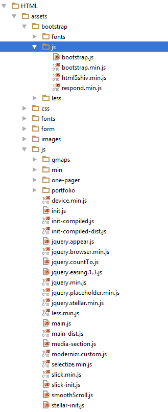
Google Map (GMAP3 Plugin)
This is google map with custom marker, you can define couple parameters:
- data-location – address to show
- data-height – map height (if undefined height will be 220px)
- data-offset – by how many map should be repositioned from marker center point (default -30)
It uses gmap3 plugin.
Documentation: here
HTML Markup:
|
1 |
<span class="html-tag"><div <span class="html-attribute-name">class</span>="<span class="html-attribute-value">ct-googleMap</span>" <span class="html-attribute-name">data-location</span>="<span class="html-attribute-value">54.3178115,16.5529038</span>" <span class="html-attribute-name">data-height</span>="<span class="html-attribute-value">415</span>" <span class="html-attribute-name">data-zoom</span>="<span class="html-attribute-value">10</span>" <span class="html-attribute-name">data-marker</span>="<span class="html-attribute-value">false</span>" <span class="html-attribute-name">data-mapImage</span>="<span class="html-attribute-value">./assets/images/demo-content/map-image.png</span>"></span><span class="html-tag"></div></span> |
All javascript code can be found in js/main.js file.
jquery.appear
This plugin call function when element appear in viewport. This is used in custom animation, progress bars, counter timer.
Documentation: https://github.com/bas2k/jquery.appear/
|
1 2 3 4 5 6 7 8 9 10 11 12 13 |
if (jQuery().appear) { if (device.mobile()) { // disable animation on mobile jQuery("body").removeClass("withAnimation"); } else { jQuery('.withAnimation .animated').appear(function () { jQuery(this).each(function () { jQuery(this).addClass('activate'); jQuery(this).addClass($(this).data('fx')); }); }, {accY: -150}); } } |
Charts.js
This plugin is used to make graphics.
Documentation: http://www.chartjs.org/
Was this article helpful ?
Contact Form
Template comes with ready to use:
- Contact Form
All needed files are in /form directory.
Remember to includeon page.
To configure form just edit form/config.php and change e-mails to your own :
|
1 2 |
$to = "mail@example.com"; $from = "mail@example.com"; |
That’s it!
Contact Form
Test has three kinds of design for contact form:
Type 1
HTML markup
–> input-typeFirst
|
1 2 3 4 5 6 7 8 9 10 11 12 13 14 15 16 17 18 19 20 21 22 23 24 25 26 27 28 29 30 31 32 33 34 35 36 37 38 39 40 41 42 43 44 45 46 47 48 49 50 51 52 53 54 55 |
<form action="assets/form/send.php" method="post" data-email-subject="Contact Form" data-show-errors="true" class="contactForm validateIt"> <div class="row ct-u-paddingTop25"> <div class="col-lg-4 col-md-4 col-sm-4"> <div class="form-group"> <label for="name" class="control-label ct-u-fontSize14 ct-u-fontTypeRegular">Name</label> <input type="text" id="name" placeholder="" required="" class="form-control input-sm input-typeFirst"> </div> </div> <div class="col-lg-4 col-md-4 col-sm-4"> <div class="form-group"> <label for="email" class="control-label ct-u-fontSize14 ct-u-fontTypeRegular ">E-Mail</label> <input type="email" id="email" placeholder="" required="" class="form-control input-sm input-typeFirst"> </div> </div> <div class="col-lg-4 col-md-4 col-sm-4"> <div class="form-group"> <label for="phone" class="control-label ct-u-fontSize14 ct-u-fontTypeRegular ">Phone</label> <input type="text" id="phone" placeholder="" required="" class="form-control input-sm input-typeFirst"> </div> </div> </div> <div class="row ct-u-mobileTextCenter"> <div class="col-lg-4 col-md-4 col-sm-6 ct-u-marginTopMinus5"> <div class="form-group"> <label for="guests" class="control-label ct-u-fontSize14 ct-u-fontTypeRegular">Guests (Amount)</label> <input type="text" id="guests" placeholder="" required="" class="form-control input-sm input-typeFirst"> </div> </div> <div class="col-lg-4 col-md-4 col-sm-6 ct-u-marginTopMinus5"> <div class="form-group"> <label for="date" class="control-label ct-u-fontSize14 ct-u-fontTypeRegular ">Date</label> <input type="email" id="date" placeholder="" required="" class="form-control input-sm input-typeFirst"> </div> </div> <div class="col-lg-4 col-md-4 col-sm-12 ct-u-marginTopMinus5"> <div class="form-group"> <label for="time" class="control-label ct-u-fontSize14 ct-u-fontTypeRegular ">Time</label> <select id="time" tabindex="-1" class="selectized" style="display: none;"><option value="9" selected="selected">09:00 AM</option></select><div class="selectize-control single"><div class="selectize-input items full has-options has-items"><div data-value="9" class="item">09:00 AM</div><input type="text" autocomplete="off" tabindex="" style="width: 4px;"></div><div class="selectize-dropdown single" style="display: none;"><div class="selectize-dropdown-content"></div></div></div> </div> </div> </div> <div class="row ct-u-paddingBottom20"> <div class="col-lg-12 col-md-12 col-sm-12 ct-u-marginTopMinus5"> <div class="form-group"> <label for="message" class="control-label ct-u-fontSize14 ct-u-fontTypeRegular ">Special Requests</label> <textarea rows="2" placeholder="" id="message" class="form-control input-typeFirst"></textarea> </div> </div> </div> <div class="row"> <div class="col-lg-12 col-md-12 col-sm-12 ct-u-marginTopMinus5 text-center"> <button type="submit" class="btn btn-primary btn-iconType btn-xs">book a table<span data-bg="../assets/images/demo-content/delimondo/icon_book_small.png" class="ct-js-background" style="background-image: url(http://localhost:63342/delimondo/HTML/assets/images/demo-content/delimondo/icon_book_small.png); background-repeat: repeat;"></span></button> </div> </div> </form> |
Screen shot
Contact Form 1
Type 2
HTML markup
–> input-typeSecond
|
1 2 3 4 5 6 7 8 9 10 11 12 13 14 15 16 17 18 19 20 21 22 23 24 25 26 27 28 29 30 31 32 33 34 35 36 37 38 39 40 41 42 43 44 45 46 47 48 49 50 51 52 53 |
<form action="assets/form/send.php" method="post" data-email-subject="Contact Form" data-show-errors="true" class="contactForm validateIt"> <div class="row ct-u-paddingBottom15"> <div class="col-md-12"> <div class="col-lg-6 col-md-6 col-sm-6"> <div class="form-group"> <label class="control-label ct-u-fontSize16 ct-u-fontTypeBold ct-u-colorWhite text-uppercase ct-u-paddingBottom10">first name</label> <input type="text" placeholder="put in your first name" required="" class="form-control input-lg input-typeSecond"> </div> </div> <div class="col-lg-6 col-md-6 col-sm-6"> <div class="form-group"> <label class="control-label ct-u-fontSize16 ct-u-fontTypeBold ct-u-colorWhite text-uppercase ct-u-paddingBottom10">last name</label> <input type="text" placeholder="put in your last name" required="" class="form-control input-lg input-typeSecond"> </div> </div> </div> </div> <div class="row ct-u-paddingBottom15"> <div class="col-md-12"> <div class="col-lg-6 col-md-6 col-sm-6"> <div class="form-group"> <label class="control-label ct-u-fontSize16 ct-u-fontTypeBold ct-u-colorWhite text-uppercase ct-u-paddingBottom10">email</label> <input type="email" placeholder="put in your email address" required="" class="form-control input-lg input-typeSecond"> </div> </div> <div class="col-lg-6 col-md-6 col-sm-6"> <div class="form-group"> <label class="control-label ct-u-fontSize16 ct-u-fontTypeBold ct-u-colorWhite text-uppercase ct-u-paddingBottom10">phone</label> <input type="text" placeholder="put in your phone number" required="" class="form-control input-lg input-typeSecond"> </div> </div> </div> </div> <div class="row"> <div class="col-md-12"> <div class="col-lg-4 col-md-4 col-sm-6"> <div class="form-group ct-u-paddingBottom20"> <label class="control-label ct-u-fontSize16 ct-u-fontTypeBold ct-u-colorWhite text-uppercase ct-u-paddingBottom10">how many guests</label> <input type="email" placeholder="put in your email address" required="" class="form-control input-lg input-typeSecond"> </div> <div class="form-group"> <button type="submit" class="btn btn-link btn-xs btn-block">place a booking</button> </div> </div> <div class="col-lg-8 col-md-8 col-sm-6"> <div class="form-group"> <label class="control-label ct-u-fontSize16 ct-u-fontTypeBold ct-u-colorWhite text-uppercase ct-u-paddingBottom10">special requests</label> <textarea rows="5" placeholder="put in your requests" class="form-control input-typeSecond"></textarea> </div> </div> </div> </div> </form> |
Screen shot
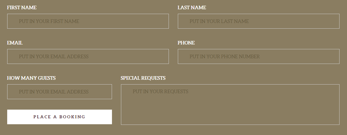
Contact Form 2
Type 3
HTML markup
–> input-typeThird
|
1 2 3 4 5 6 7 8 9 10 11 12 13 14 15 16 17 18 19 20 21 |
<form action="assets/form/send.php" method="post" data-email-subject="Contact Form" data-show-errors="true" class="contactForm validateIt"> <div class="row"> <div class="col-md-6 col-sm-6"> <div class="form-group ct-u-paddingBottom15"> <input type="text" placeholder="FIRST NAME" required="" class="form-control input-md input-typeThird"> </div> </div> <div class="col-md-6 col-sm-6"> <div class="form-group ct-u-paddingBottom15"> <input type="text" placeholder="LAST NAME" required="" class="form-control input-md input-typeThird"> </div> </div> </div> <div class="row"> <div class="col-md-12 col-sm-12"> <div class="form-group ct-u-paddingBottom15"> <textarea rows="6" placeholder="COMMENT" class="form-control input-typeThird"></textarea> </div> </div> </div> </form> |
Screen shot
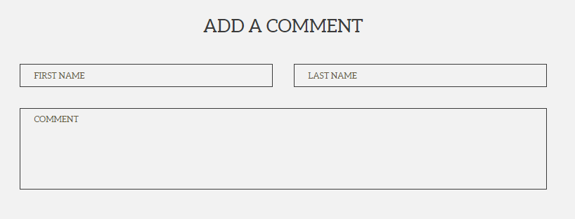
Contact Form 3
Options (can be changed in HTML) :
Options (can be changed in HTML) :
- Mail Subject – just change value in :
- Success Message – change successMessage div content
- Error Message – change errorMessage div content
Was this article helpful ?
Sources and Credits
The following sources and files have been used to build up this theme
Twitter Bootstrap – http://twitter.github.com/bootstrap/
jQuery – http://www.jquery.com
Was this article helpful ?
Sources & Credits
The following sources and files have been used to build up this theme
Twitter Bootstrap – http://twitter.github.com/bootstrap/
jQuery – http://www.jquery.com
Was this article helpful ?
Buttons
Button Sizes
Test has three type of button sizes:
Button extra small

Button xs size
–> btn-xs
HTML markup
|
1 |
<a href="#" class="btn btn-default btn-xs">button</a> |
Button small

Button small size
–> btn-sm
HTML markup
|
1 |
<a href="#" class="btn btn-default btn-sm">button</a> |
Button default

Button default size
–> btn-default
HTML markup
|
1 |
<a href="#" class="btn btn-default">button</a> |
Button large

Button large size
–> btn-lg
HTML markup
|
1 |
<a href="#" class="btn btn-default btn-lg">button</a> |
Button Types
Each of this sizes can have one of the following variations:
Button solid
Button solid type
–> btn-lg
HTML markup
|
1 |
<a href="#" class="btn btn-default btn-lg">button</a> |
Button transparent

Button transaprent type
–> btn–transparent
HTML markup
|
1 |
<a href="#" class="btn btn-default btn--transparent btn--border btn-lg">button</a> |
Button icon type
Button icon type
–> btn-iconType
HTML markup
|
1 2 3 |
<a href="#" class="btn btn-default btn-lg btn-iconType">button <span data-bg="./assets/images/demo-content/delimondo/icon_book_sm.png" class="ct-js-background" style="background-image: url(http://delimondo2.html.themeforest.createit.pl/features/assets/images/demo-content/delimondo/icon_book_sm.png); background-repeat: repeat;"></span> </a> |
Was this article helpful ?
Map With Image Component
Test has option to switch to the image instead of map. If you want to swap it, click on the button SHOW IMAGE/ SHOW MAP on the map section.
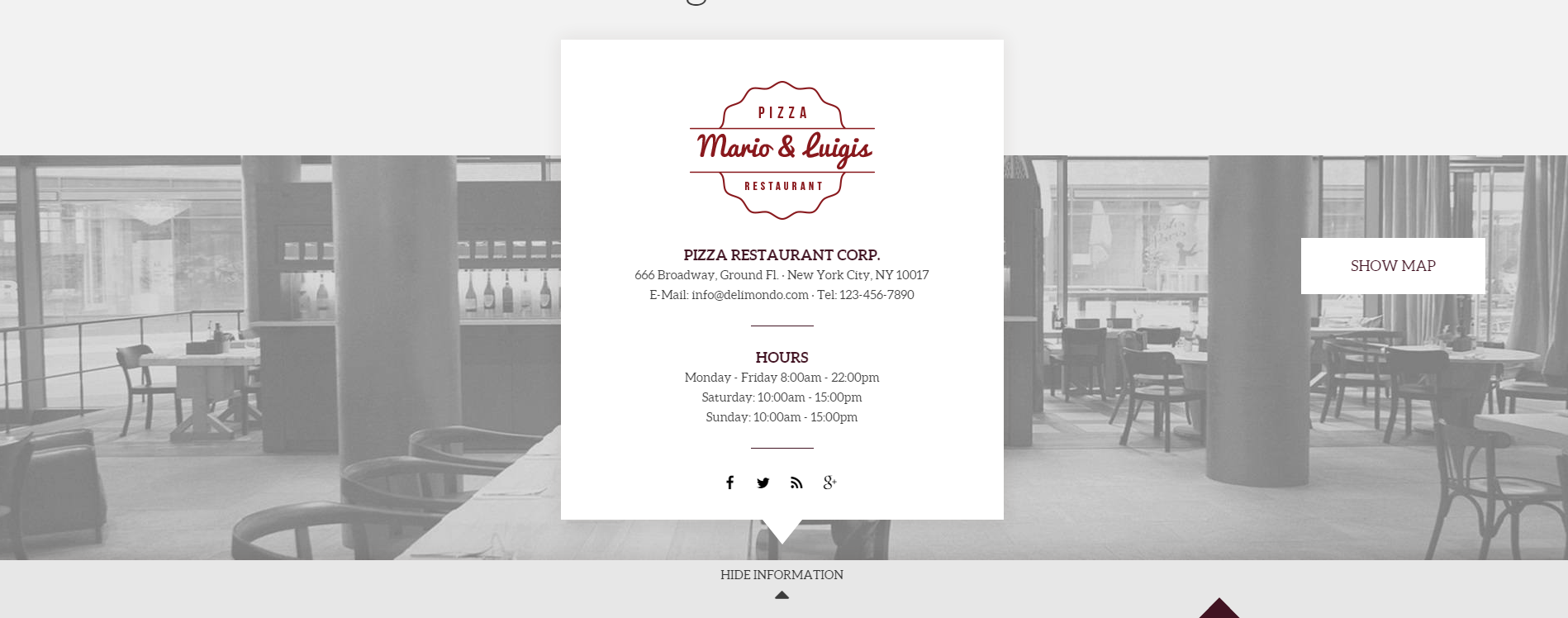
Map With Image Component
HTML markup
|
1 |
<div class="ct-innerMap"><img src="../assets/images/demo-content/delimondo/photo-map.jpg" alt="Image"> |
JavaScript – can be find in main.js file
|
1 2 3 4 5 6 7 8 9 10 11 12 13 14 15 16 17 18 |
//Button on the map showing and hiding map and picture //------------------------------------------------------------------------------------ var element2 = $('body').find(".ct-mapSection"); $(".ct-js-mapButton").on("click",function(){ if ((element2).hasClass('ct-active')) { $(element2).removeClass('ct-active'); $(this).find("span").text('show image').attr("data-hover",'show image'); $(element2).find(".ct-googleMap").fadeIn(1000).css('display','block'); $(element2).find(".ct-innerMap > img").css('display','none'); } else { $(element2).find(".ct-googleMap").css('display','none'); $(element2).find(".ct-innerMap > img").fadeIn(1000).css('display','block'); $(element2).addClass('ct-active'); $(this).find("span").text('show map').attr("data-hover",'show map'); } return false; }) |
Google maps – data attributes explanation
— data-location – use it for display your location on the Google map (e.g. can be a string: “New York”, or cords: 40.7198584,-74.0021416)
— data-height – use it for height adjustment
— data-zoom – use it to set the zoom
JavaScript – for both version
<script src=”http://maps.google.com/maps/api/js?sensor=false”></script>
<script src=”../assets/js/gmaps/gmap3.min.js”></script>
<script src=”../assets/js/gmaps/init.js”></script>
Was this article helpful ?
Media Sections
You can arrange your content with the following Media sections types
Parallax
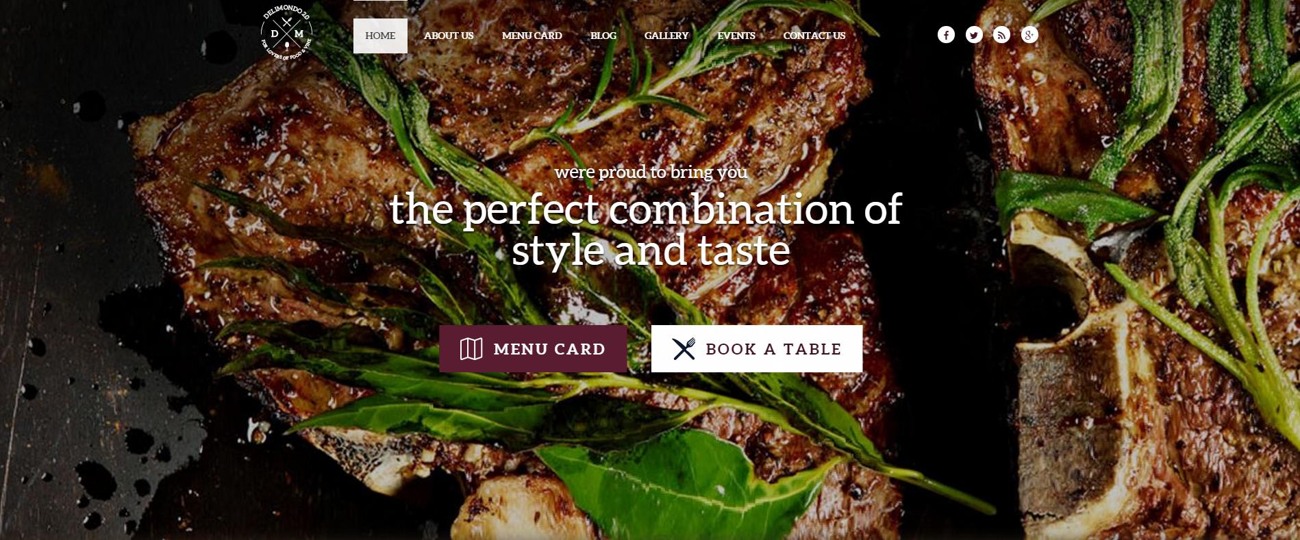
Parallax
HTML markup
|
1 |
<section data-height="795" data-type="parallax" data-background="../assets/images/demo-content/pizza/slide1.jpg" data-background-mobile="../assets/images/demo-content/pizza/slide1.jpg" class="ct-mediaTable ct-mediaSection" data-stellar-background-ratio="0.3" style="min-height: 795px; background-image: url(http://localhost:63342/delimondo/HTML/assets/images/demo-content/pizza/slide1.jpg); background-position: 0% 0px;"></section> |
Ken Burn

Kenburns
HTML markup
|
1 2 3 |
<div data-type="kenburns" data-height="750" data-background-mobile="../assets/images/demo-content/delimondo/slide1.jpg" class="ct-mediaSection" style="min-height: 750px; background-image: url(http://localhost:63342/delimondo/HTML/pizza/index-kenburn.html);"> <div class="ct-mediaSection-kenburns"><img src="../assets/images/demo-content/pizza/slide1.jpg" alt="Image" class="singlefx"></div> </div> |
Video
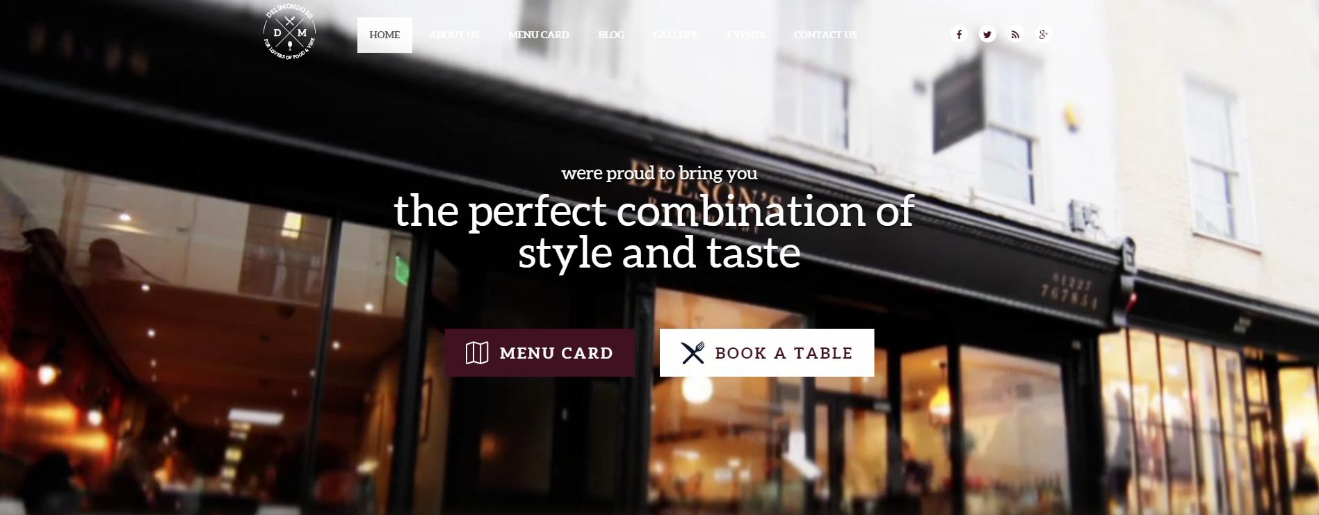
Video
HTML markup
|
1 2 3 4 5 6 7 8 |
<div data-type="video" data-height="750" data-background-mobile="../assets/images/demo-content/delimondo/slide1.jpg" class="ct-mediaSection" style="min-height: 750px; background-image: url(http://localhost:63342/delimondo/HTML/pizza/index-video.html);"> <div class="ct-mediaSection-video"> <video muted="" loop="" autoplay="autoplay" preload="auto"> <source src="../assets/video/video-restaurant.mp4" type="video/mp4"> <source src="../assets/video/video-restaurant.webm" type="video/webm"> </video> </div> </div> |
Description
data-type – determines the type of media section
data-height – determines the height of media section
data-background – this attribute allows you to insert image for desktop devices
data-background-mobile – this attribute allows you to insert image for mobile devices
JavaScript
<script src=”../assets/js/smoothScroll.js”></script>
<script src=”../assets/js/jquery.stellar.min.js”></script>
<script src=”../assets/js/media-section.js”></script>
Was this article helpful ?
Counters
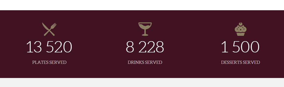
Counters
HTML markup
|
1 2 3 |
<div class="col-md-4 col-sm-4"> <div class="ct-counterBox"><span class="ct-counterBox-icon"><img src="../assets/images/demo-content/delimondo/fork-icon-small.png" alt="Image"></span><span data-ct-to="13520" data-ct-speed="9000" class="ct-counterBox-number ct-js-counter">13 520</span><span class="ct-counterBox-title">plates served</span></div> </div> |
JavaScript
This code can be find in the Test main.js file
|
1 2 3 4 5 6 7 8 9 10 11 12 13 14 15 16 17 18 19 20 21 22 23 24 25 26 27 28 29 30 31 32 33 34 35 |
// Counters // ------------------------------------------------------------------------------------------------------------------------------------------ /* ================== */ /* ==== COUNT TO ==== */ if (($().countTo) && ($().appear) && ($("body").hasClass("cssAnimate"))) { $('.ct-js-counter').data('countToOptions', { formatter: function (value, options) { return value.toFixed(options.decimals).replace(/\B(?=(?:\d{3})+(?!\d))/g, ' '); } }).appear(function () { $(this).each(function (options) { var $this = $(this); var $speed = validatedata($this.attr('data-speed'), 1400); options = $.extend({}, options || { speed: $speed }, $this.data('countToOptions') || {}); $this.countTo(options); }); }); } else if(($().countTo)){ $('.ct-js-counter').data('countToOptions', { formatter: function (value, options) { return value.toFixed(options.decimals).replace(/\B(?=(?:\d{3})+(?!\d))/g, ' '); } }); $('.ct-js-counter').each(function (options) { var $this = $(this); var $speed = validatedata($this.attr('speed'), 1200); options = $.extend({}, options || { speed: $speed }, $this.data('countToOptions') || {}); $this.countTo(options); }); } |
Was this article helpful ?
Menucard – isotope component
Menucard used in Test is done using isotope plugin and masonry plugin.
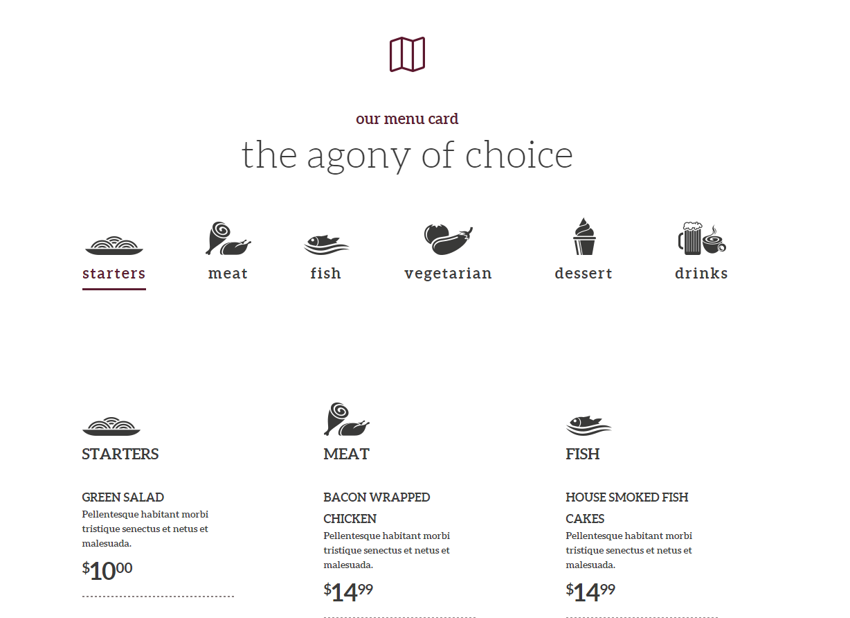
Menu Card
HTML markup
|
1 2 3 4 5 6 7 8 9 10 11 12 13 14 15 16 17 18 19 20 21 22 23 24 25 26 27 28 29 30 31 32 33 34 35 36 37 38 39 40 41 42 43 44 45 46 47 48 49 50 51 52 53 54 55 56 57 58 59 60 61 62 63 64 65 66 67 68 69 70 71 72 73 74 75 76 77 78 79 80 81 82 83 84 85 86 87 88 89 90 91 92 93 94 95 96 97 98 99 100 101 102 103 104 105 106 107 108 109 110 111 112 113 114 115 116 117 118 119 120 121 122 123 124 125 126 127 128 129 130 131 132 133 134 135 136 137 138 139 140 141 142 143 144 145 146 147 148 149 150 151 152 153 154 155 156 157 158 159 160 161 162 163 164 165 166 167 |
<section class="ct-u-backgroundWhite ct-u-paddingTop130 ct-u-paddingBottom150 ct-removeTopPadding130 ct-removeBottomPadding150"> <div class="container"> <div class="row"> <div class="col-md-12 text-center"><img src="../assets/images/demo-content/delimondo/icon-2.png" alt="Image"> <h6 class="ct-u-fontTypeBold ct-u-colorMotiveLight ct-u-paddingBottom10 ct-u-fontSize22 ct-u-paddingTop55">our menu card</h6> <h2 class="ct-u-fontTypeLight ct-u-lineHeight60 ct-u-paddingBottom140">the agony of choice</h2> <ul class="ct-gallery-filters list-unstyled list-inline"> <li><a data-filter="*" class="active">starters<img src="../assets/images/demo-content/delimondo/starters.png" alt="Image"><img src="../assets/images/demo-content/delimondo/starters-motive.png" alt="Image" class="ct-hide"></a></li> <li><a data-filter=".meat">meat<img src="../assets/images/demo-content/delimondo/meat.png" alt="Image"><img src="../assets/images/demo-content/delimondo/meat-motive.png" alt="Image" class="ct-hide"></a></li> <li><a data-filter=".fish">fish<img src="../assets/images/demo-content/delimondo/fish.png" alt="Image"><img src="../assets/images/demo-content/delimondo/fish-motive.png" alt="Image" class="ct-hide"></a></li> <li><a data-filter=".vegetarian">vegetarian<img src="../assets/images/demo-content/delimondo/vegetable.png" alt="Image"><img src="../assets/images/demo-content/delimondo/vegetable-motive.png" alt="Image" class="ct-hide"></a></li> <li><a data-filter=".dessert">dessert<img src="../assets/images/demo-content/delimondo/dessert.png" alt="Image"><img src="../assets/images/demo-content/delimondo/dessert-motive.png" alt="Image" class="ct-hide"></a></li> <li><a data-filter=".drinks">drinks<img src="../assets/images/demo-content/delimondo/drinks.png" alt="Image"><img src="../assets/images/demo-content/delimondo/drinks-motive.png" alt="Image" class="ct-hide"></a></li> </ul> <div class="clearfix"></div> </div> </div> <div class="row"> <div class="col-md-12 ct-u-paddingTop170 ct-removeTopPadding170"> <div class="ct-gallery ct-gallery--col3 ct-gallery--withSpacing is-loaded" style="position: relative; height: 1747px;"> <div class="ct-gallery-item ct-gallery-item--masonry starters" style="position: absolute; left: 0px; top: 0px;"> <div class="ct-gallery-itemInner"> <div class="ct-menuBox"><span class="ct-leftPosition">starters<img src="../assets/images/demo-content/delimondo/starters.png" alt="Image"></span> <ul> <li><span>green salad</span> <p>Pellentesque habitant morbi tristique senectus et netus et malesuada.</p> <p class="price"><sup>$</sup>10<sup>00</sup></p> <div class="ct-dottedDivider"></div> </li> <li><span>baked spinach</span> <p>Pellentesque habitant morbi tristique senectus et netus et malesuada.</p> <p class="price"><sup>$</sup>5<sup>99</sup></p> <div class="ct-dottedDivider"></div> </li> <li><span>green salad</span> <p>Pellentesque habitant morbi tristique senectus et netus et malesuada.</p> <p class="price"><sup>$</sup>6<sup>99</sup></p> </li> </ul> </div> </div> </div> <div class="ct-gallery-item ct-gallery-item--masonry meat" style="position: absolute; left: 349px; top: 0px;"> <div class="ct-gallery-itemInner"> <div class="ct-menuBox"><span class="ct-leftPosition">meat<img src="../assets/images/demo-content/delimondo/meat.png" alt="Image"></span> <ul> <li><span>bacon wrapped chicken</span> <p>Pellentesque habitant morbi tristique senectus et netus et malesuada.</p> <p class="price"><sup>$</sup>14<sup>99</sup></p> <div class="ct-dottedDivider"></div> </li> <li><span>lemon chicken</span> <p>Pellentesque habitant morbi tristique senectus et netus et malesuada.</p> <p class="price"><sup>$</sup>15<sup>99</sup></p> <div class="ct-dottedDivider"></div> </li> <li><span>beef tenderloin</span> <p>Pellentesque habitant morbi tristique senectus et netus et malesuada.</p> <p class="price"><sup>$</sup>23<sup>00</sup></p> <div class="ct-dottedDivider"></div> </li> <li><span>shrimp</span> <p>Pellentesque habitant morbi tristique senectus et netus et malesuada.</p> <p class="price"><sup>$</sup>16<sup>00</sup></p> <div class="ct-dottedDivider"></div> </li> <li><span>twin lobster tails</span> <p>Pellentesque habitant morbi tristique senectus et netus et malesuada.</p> <p class="price"><sup>$</sup>12<sup>00</sup></p> </li> </ul> </div> </div> </div> <div class="ct-gallery-item ct-gallery-item--masonry fish" style="position: absolute; left: 699px; top: 0px;"> <div class="ct-gallery-itemInner"> <div class="ct-menuBox"><span class="ct-leftPosition">fish<img src="../assets/images/demo-content/delimondo/fish.png" alt="Image"></span> <ul> <li><span>House smoked fish cakes</span> <p>Pellentesque habitant morbi tristique senectus et netus et malesuada.</p> <p class="price"><sup>$</sup>14<sup>99</sup></p> <div class="ct-dottedDivider"></div> </li> <li><span>Bruschetta</span> <p>Pellentesque habitant morbi tristique senectus et netus et malesuada.</p> <p class="price"><sup>$</sup>13<sup>00</sup></p> <div class="ct-dottedDivider"></div> </li> <li><span>fish and chips</span> <p>Pellentesque habitant morbi tristique senectus et netus et malesuada.</p> <p class="price"><sup>$</sup>16<sup>99</sup></p> <div class="ct-dottedDivider"></div> </li> <li><span>ciabatta</span> <p>Pellentesque habitant morbi tristique senectus et netus et malesuada.</p> <p class="price"><sup>$</sup>6<sup>99</sup></p> </li> </ul> </div> </div> </div> <div class="ct-gallery-item ct-gallery-item--masonry vegetarian" style="position: absolute; left: 0px; top: 747px;"> <div class="ct-gallery-itemInner"> <div class="ct-menuBox"><span class="ct-leftPosition">vegetarian<img src="../assets/images/demo-content/delimondo/vegetable.png" alt="Image"></span> <ul> <li><span>House smoked fish cakes</span> <p>Pellentesque habitant morbi tristique senectus et netus et malesuada.</p> <p class="price"><sup>$</sup>14<sup>99</sup></p> <div class="ct-dottedDivider"></div> </li> <li><span>Bruschetta</span> <p>Pellentesque habitant morbi tristique senectus et netus et malesuada.</p> <p class="price"><sup>$</sup>13<sup>00</sup></p> <div class="ct-dottedDivider"></div> </li> <li><span>fish and chips</span> <p>Pellentesque habitant morbi tristique senectus et netus et malesuada.</p> <p class="price"><sup>$</sup>16<sup>99</sup></p> <div class="ct-dottedDivider"></div> </li> <li><span>ciabatta</span> <p>Pellentesque habitant morbi tristique senectus et netus et malesuada.</p> <p class="price"><sup>$</sup>6<sup>99</sup></p> </li> </ul> </div> </div> </div> <div class="ct-gallery-item ct-gallery-item--masonry dessert" style="position: absolute; left: 699px; top: 969px;"> <div class="ct-gallery-itemInner"> <div class="ct-menuBox"><span class="ct-leftPosition">dessert<img src="../assets/images/demo-content/delimondo/dessert.png" alt="Image"></span> <ul> <li><span>House smoked fish cakes</span> <p>Pellentesque habitant morbi tristique senectus et netus et malesuada.</p> <p class="price"><sup>$</sup>14<sup>99</sup></p> <div class="ct-dottedDivider"></div> </li> <li><span>Bruschetta</span> <p>Pellentesque habitant morbi tristique senectus et netus et malesuada.</p> <p class="price"><sup>$</sup>13<sup>00</sup></p> </li> </ul> </div> </div> </div> <div class="ct-gallery-item ct-gallery-item--masonry drinks" style="position: absolute; left: 349px; top: 1160px;"> <div class="ct-gallery-itemInner"> <div class="ct-menuBox"><span class="ct-leftPosition">drinks<img src="../assets/images/demo-content/delimondo/drinks.png" alt="Image"></span> <ul> <li><span>House smoked fish cakes</span> <p>Pellentesque habitant morbi tristique senectus et netus et malesuada.</p> <p class="price"><sup>$</sup>14<sup>99</sup></p> <div class="ct-dottedDivider"></div> </li> <li><span>Bruschetta</span> <p>Pellentesque habitant morbi tristique senectus et netus et malesuada.</p> <p class="price"><sup>$</sup>13<sup>00</sup></p> </li> </ul> </div> </div> </div> </div> </div> </div> </div> </section> |
Plugins used in this component
– Jquery.isotope
– Masonry Plugin
Was this article helpful ?
Comments Box
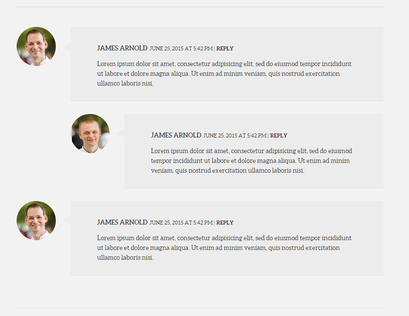
Comments Box
HTML markup
|
1 2 3 4 5 6 7 8 9 10 11 12 13 14 15 16 17 18 19 20 21 22 23 24 25 26 27 28 29 30 31 32 33 34 35 36 |
<div class="col-md-8 col-md-offset-2 text-center"> <div class="ct-number-of-comments ct-u-paddingBottom40"><span>3 </span><span>comments</span></div> <div class="ct-u-borderAnother"></div> <ul class="ct-comments list-unstyled ct-u-paddingTop40"> <li> <div class="mediaBox text-left"><a href="#" class="pull-left"><img src="../assets/images/demo-content/delimondo/author1-big.png" alt="Image"></a> <div class="mediaBox-body"> <div class="mediaBox-inner-body"><span class="media-heading"><a href="#">james arnold </a></span><span class="ct-comment-meta">JUNE 25, 2015 at 5:42 pm | </span><span class="ct-replyButton"><a href="#">reply</a></span> <p>Lorem ipsum dolor sit amet, consectetur adipisicing elit, sed do eiusmod tempor incididunt ut labore et dolore magna aliqua. Ut enim ad minim veniam, quis nostrud exercitation ullamco laboris nisi.</p> </div> </div> </div> <ol class="list-unstyled children"> <li> <div class="mediaBox text-left"><a href="#" class="pull-left"><img src="../assets/images/demo-content/delimondo/author2-big.png" alt="Image"></a> <div class="mediaBox-body"> <div class="mediaBox-inner-body"><span class="media-heading"><a href="#">james arnold </a></span><span class="ct-comment-meta">JUNE 25, 2015 at 5:42 pm | </span><span class="ct-replyButton"><a href="#">reply</a></span> <p>Lorem ipsum dolor sit amet, consectetur adipisicing elit, sed do eiusmod tempor incididunt ut labore et dolore magna aliqua. Ut enim ad minim veniam, quis nostrud exercitation ullamco laboris nisi.</p> </div> </div> </div> </li> </ol> </li> <li class="ct-u-paddingBottom40"> <div class="mediaBox text-left"><a href="#" class="pull-left"><img src="../assets/images/demo-content/delimondo/author1-big.png" alt="Image"></a> <div class="mediaBox-body"> <div class="mediaBox-inner-body"><span class="media-heading"><a href="#">james arnold </a></span><span class="ct-comment-meta">JUNE 25, 2015 at 5:42 pm | </span><span class="ct-replyButton"><a href="#">reply</a></span> <p>Lorem ipsum dolor sit amet, consectetur adipisicing elit, sed do eiusmod tempor incididunt ut labore et dolore magna aliqua. Ut enim ad minim veniam, quis nostrud exercitation ullamco laboris nisi.</p> </div> </div> </div> </li> </ul> <div class="ct-u-borderAnother"></div> <div class="clearfix"></div> |
Was this article helpful ?
Blog Page Navigation
This Test feature is used for navigation between previous and next blog post on Single blog post paget.

Navigation
HTML markup
|
1 2 3 4 5 6 7 8 9 10 |
<section class="ct-navigation ct-u-displayTable"> <div class="ct-u-displayTableCell ct-u-paddingTop55 ct-u-paddingBottom70 ct-u-backgroundLemon"> <div class="ct-previous"><a href="#">previous</a></div> <div class="ct-previousPost">finally scallops are back!</div> </div> <div class="ct-u-displayTableCell ct-u-paddingTop50 ct-u-paddingBottom70 ct-u-backgroudMotive"> <div class="ct-next"><a href="#">next</a></div> <div class="ct-nextPost">full house again!</div> </div> </section> |
Was this article helpful ?
Magnific Pop Up Box
In Test theme we use Magnific Popup – v0.9.9
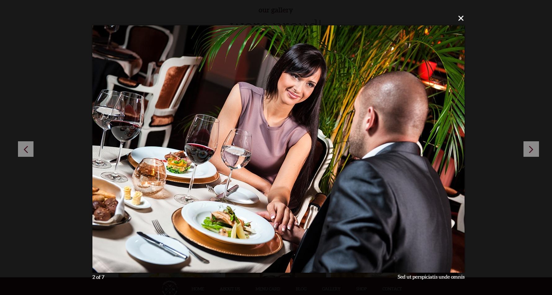
Magnific Pop Up Box
HTML markup
|
1 2 3 4 5 6 7 8 9 10 11 12 13 14 15 16 17 18 19 20 21 22 23 24 25 |
<div class="ct-photoGallery ct-js-popupGallery"> <div class="ct-photoGallery-item ct-item--small"><a href="../assets/images/demo-content/delimondo/big-image6.jpg" title="Neque porro quisquam est" class="ct-js-magnificPopupImage"> <div class="ct-galleryTitle ct-u-fontSize24 ct-u-fontTypeBold text-uppercase">a romantic dinner<br> for two</div> <div class="ct-galleryDescription ct-u-fontSize16 ct-u-fontTypeRegularPellentesque">habitant morbi tristique senectus et netus et <br>malesuada fames ac turpis egestas. Vestibulum tortor quam, feugiat<br> vitae, ultricies eget, tempor sit amet, ante.</div><img src="../assets/images/demo-content/delimondo/image1.jpg" alt="Image"></a></div> <div class="ct-photoGallery-item ct-item--big"><a href="../assets/images/demo-content/delimondo/big-image7.jpg" title="Sed ut perspiciatis unde omnis" class="ct-js-magnificPopupImage"> <div class="ct-galleryTitle ct-u-fontSize24 ct-u-fontTypeBold text-uppercase">a romantic dinner<br> for two</div> <div class="ct-galleryDescription ct-u-fontSize16 ct-u-fontTypeRegularPellentesque">habitant morbi tristique senectus et netus et malesuada <br>fames ac turpis egestas. Vestibulum tortor quam, feugiat<br> vitae, ultricies eget, tempor sit amet, ante.</div><img src="../assets/images/demo-content/delimondo/image2.jpg" alt="Image"></a></div> <div class="clearfix"></div> <div class="ct-photoGallery-item ct-item--big"><a href="../assets/images/demo-content/delimondo/big-image5.jpg" title="Ut enim ad" class="ct-js-magnificPopupImage"> <div class="ct-galleryTitle ct-u-fontSize24 ct-u-fontTypeBold text-uppercase">a romantic dinner<br> for two</div> <div class="ct-galleryDescription ct-u-fontSize16 ct-u-fontTypeRegularPellentesque">habitant morbi tristique senectus et netus et malesuada <br>fames ac turpis egestas. Vestibulum tortor quam, feugiat<br> vitae, ultricies eget, tempor sit amet, ante.</div><img src="../assets/images/demo-content/delimondo/image3.jpg" alt="Image"></a></div> <div class="ct-photoGallery-item ct-item--small"><a href="../assets/images/demo-content/delimondo/big-image4.jpg" title="Neque porro quisquam est" class="ct-js-magnificPopupImage"> <div class="ct-galleryTitle ct-u-fontSize24 ct-u-fontTypeBold text-uppercase">a romantic dinner<br> for two</div> <div class="ct-galleryDescription ct-u-fontSize16 ct-u-fontTypeRegularPellentesque">habitant morbi tristique senectus et netus et <br>malesuada fames ac turpis egestas. Vestibulum tortor quam, feugiat<br> vitae, ultricies eget, tempor sit amet, ante.</div><img src="../assets/images/demo-content/delimondo/image4.jpg" alt="Image"></a></div> <div class="clearfix"></div> <div class="ct-photoGallery-item ct-item--small"><a href="../assets/images/demo-content/delimondo/big-image3.jpg" title="Quis autem vel eum" class="ct-js-magnificPopupImage"> <div class="ct-galleryTitle ct-u-fontSize24 ct-u-fontTypeBold text-uppercase">a romantic dinner<br> for two</div> <div class="ct-galleryDescription ct-u-fontSize16 ct-u-fontTypeRegularPellentesque">habitant morbi tristique senectus et netus et <br>malesuada fames ac turpis egestas. Vestibulum tortor quam, feugiat<br> vitae, ultricies eget, tempor sit amet, ante.</div><img src="../assets/images/demo-content/delimondo/image5.jpg" alt="Image"></a></div> <div class="ct-photoGallery-item ct-item--small"><a href="../assets/images/demo-content/delimondo/big-image2.jpg" title="Nemo enim ipsam voluptatem quia" class="ct-js-magnificPopupImage"> <div class="ct-galleryTitle ct-u-fontSize24 ct-u-fontTypeBold text-uppercase">a romantic dinner<br> for two</div> <div class="ct-galleryDescription ct-u-fontSize16 ct-u-fontTypeRegularPellentesque">habitant morbi tristique senectus et netus et <br>malesuada fames ac turpis egestas. Vestibulum tortor quam, feugiat<br> vitae, ultricies eget, tempor sit amet, ante.</div><img src="../assets/images/demo-content/delimondo/image6.jpg" alt="Image"></a></div> <div class="ct-photoGallery-item ct-item--small"><a href="../assets/images/demo-content/delimondo/big-image1.jpg" title="Quis autem vel eum" class="ct-js-magnificPopupImage"> <div class="ct-galleryTitle ct-u-fontSize24 ct-u-fontTypeBold text-uppercase">a romantic dinner<br> for two</div> <div class="ct-galleryDescription ct-u-fontSize16 ct-u-fontTypeRegularPellentesque">habitant morbi tristique senectus et netus et <br>malesuada fames ac turpis egestas. Vestibulum tortor quam, feugiat<br> vitae, ultricies eget, tempor sit amet, ante.</div><img src="../assets/images/demo-content/delimondo/image7.jpg" alt="Image"></a></div> </div> |
JavaScript
This code can be find in the Test main.js file
|
1 2 3 4 5 6 7 8 9 10 11 12 13 14 15 16 17 18 19 20 21 22 23 24 25 26 27 28 29 30 31 32 33 34 35 36 37 38 39 40 41 42 43 44 45 46 47 48 49 50 51 52 53 54 55 56 57 58 59 60 61 62 63 |
(function ($) { "use strict"; $(document).on('ready', function () { if(!device.mobile()) { if (jQuery().magnificPopup) { jQuery('.ct-js-popupGallery').each(function () { // the containers for all your galleries jQuery(this).magnificPopup({ type: 'image', mainClass: 'ct-magnificPopup--image', removalDelay: 160, preloader: true, delegate: '.ct-js-magnificPopupImage', closeBtnInside: true, closeOnContentClick: false, closeOnBgClick: true, midClick: true, gallery: { enabled: true }, callbacks: { buildControls: function () { // re-appends controls inside the main container this.contentContainer.append(this.arrowLeft.add(this.arrowRight)); }, beforeOpen: function () { // just a hack that adds mfp-anim class to markup this.st.image.markup = this.st.image.markup.replace('mfp-figure', 'mfp-figure mfp-with-anim'); this.st.mainClass = this.st.el.attr('data-effect'); } } }); }); jQuery('.ct-js-videoPlay').each(function () { jQuery(this).magnificPopup({ type: 'iframe', iframe: { markup: '<div class="iframe-popup">' + '<iframe class="mfp-iframe" frameborder="0" scrolling="no" allowtransparency="true" allowfullscreen></iframe>' + '<div class="mfp-close"></div>' + '</div>' } }); }); jQuery('.ct-js-popupImage').each(function () { jQuery(this).magnificPopup({ type: 'image', callbacks: { beforeOpen: function () { // just a hack that adds mfp-anim class to markup this.st.image.markup = this.st.image.markup.replace('mfp-figure', 'mfp-figure mfp-with-anim'); this.st.mainClass = this.st.el.attr('data-effect'); } } }); }); } } }); })(jQuery); |
JavaScript
<script src=”./assets/plugins/magnific-popup/magnificpopup.min.js”></script>
<script src=”./assets/plugins/magnific-popup/init.js”></script>
Was this article helpful ?
Book Table
Test theme has book table component. If you would like to see it, click on the menu About us -> Book Table or just click on the button Book a Table on the main slider in home page.

Book Table
HTML markup
|
1 2 3 4 5 6 7 8 9 10 11 12 13 14 15 16 17 18 19 20 21 22 23 24 25 26 27 28 29 30 31 32 33 34 35 36 37 38 39 40 41 42 43 44 45 46 47 48 49 50 51 52 53 54 55 56 57 58 59 60 61 62 63 64 65 66 67 68 69 70 71 72 73 74 75 76 77 78 79 80 81 82 83 84 85 86 87 88 89 90 91 92 93 94 95 96 97 98 99 100 101 102 103 104 105 106 107 108 109 110 111 112 113 114 115 116 117 118 119 120 121 122 123 124 125 126 127 128 129 130 131 132 133 134 135 136 137 138 139 140 141 142 143 144 145 146 147 148 149 150 151 152 |
<div class="ct-bookTable ct-u-paddingBoth80 is-open" style="display: block;"><a href="#"></a> <div class="ct-bookTable-border"> <header class="text-uppercase ct-u-fontTypeBold ct-u-colorWhite text-center">GIVE US SOME INFORMATIONS ABOUT YOUR BOOKING</header> <div class="container ct-u-paddingTop60"> <div class="row"> <div class="col-md-12 text-center"> <p class="text-uppercase ct-u-fontSize16 ct-u-colorWhite ct-u-fontTypeBold">when you wanna book a table?</p> <ul class="ct-dropdown-button list-unstyled list-inline ct-u-paddingBottom50 ct-u-paddingTop15"> <li> <div class="dropdown"> <button type="button" data-toggle="dropdown" aria-haspopup="true" aria-expanded="true" class="btn-dropdown dropdown-toggle">sep</button> <ul class="dropdown-menu ct-dropdown-menu"> <li><a href="#">Jan</a></li> <li><a href="#">feb</a></li> <li><a href="#">mar</a></li> <li><a href="#">apr</a></li> <li><a href="#">may</a></li> <li><a href="#">jun</a></li> <li><a href="#">jul</a></li> <li><a href="#">aug</a></li> <li><a href="#">sep</a></li> <li><a href="#">oct</a></li> <li><a href="#">nov</a></li> <li><a href="#">dec</a></li> </ul> </div> </li> <li> <div class="dropdown"> <button type="button" data-toggle="dropdown" aria-haspopup="true" aria-expanded="true" class="btn-dropdown dropdown-toggle">21</button> <ul class="dropdown-menu ct-dropdown-menu"> <li><a href="#">01</a></li> <li><a href="#">02</a></li> <li><a href="#">03</a></li> <li><a href="#">04</a></li> <li><a href="#">05</a></li> <li><a href="#">06</a></li> <li><a href="#">07</a></li> <li><a href="#">08</a></li> <li><a href="#">09</a></li> <li><a href="#">10</a></li> <li><a href="#">11</a></li> <li><a href="#">12</a></li> <li><a href="#">13</a></li> <li><a href="#">14</a></li> <li><a href="#">15</a></li> <li><a href="#">16</a></li> <li><a href="#">17</a></li> <li><a href="#">18</a></li> <li><a href="#">19</a></li> <li><a href="#">20</a></li> <li><a href="#">21</a></li> <li><a href="#">22</a></li> <li><a href="#">23</a></li> <li><a href="#">24</a></li> <li><a href="#">25</a></li> <li><a href="#">26</a></li> <li><a href="#">27</a></li> <li><a href="#">28</a></li> <li><a href="#">29</a></li> <li><a href="#">30</a></li> <li><a href="#">31</a></li> </ul> </div> </li> <li> <div class="dropdown"> <button type="button" data-toggle="dropdown" aria-haspopup="true" aria-expanded="true" class="btn-dropdowns dropdown-toggle">9pm</button> <ul class="dropdown-menu ct-dropdown-menu"> <li><a href="#">9am</a></li> <li><a href="#">10am</a></li> <li><a href="#">11am</a></li> <li><a href="#">12am</a></li> <li><a href="#">1pm</a></li> <li><a href="#">2pm</a></li> <li><a href="#">3pm</a></li> <li><a href="#">4pm</a></li> <li><a href="#">5pm</a></li> <li><a href="#">6pm</a></li> <li><a href="#">7pm</a></li> <li><a href="#">8pm</a></li> <li><a href="#">9pm</a></li> </ul> </div> </li> </ul> </div> </div> <form action="assets/form/send.php" method="post" data-email-subject="Contact Form" data-show-errors="true" class="contactForm validateIt"> <div class="row ct-u-paddingBottom15"> <div class="col-md-12"> <div class="col-lg-6 col-md-6 col-sm-6"> <div class="form-group"> <label class="control-label ct-u-fontSize16 ct-u-fontTypeBold ct-u-colorWhite text-uppercase ct-u-paddingBottom10">first name</label> <input type="text" placeholder="put in your first name" required="" class="form-control input-lg input-typeSecond"> </div> </div> <div class="col-lg-6 col-md-6 col-sm-6"> <div class="form-group"> <label class="control-label ct-u-fontSize16 ct-u-fontTypeBold ct-u-colorWhite text-uppercase ct-u-paddingBottom10">last name</label> <input type="text" placeholder="put in your last name" required="" class="form-control input-lg input-typeSecond"> </div> </div> </div> </div> <div class="row ct-u-paddingBottom15"> <div class="col-md-12"> <div class="col-lg-6 col-md-6 col-sm-6"> <div class="form-group"> <label class="control-label ct-u-fontSize16 ct-u-fontTypeBold ct-u-colorWhite text-uppercase ct-u-paddingBottom10">email</label> <input type="email" placeholder="put in your email address" required="" class="form-control input-lg input-typeSecond"> </div> </div> <div class="col-lg-6 col-md-6 col-sm-6"> <div class="form-group"> <label class="control-label ct-u-fontSize16 ct-u-fontTypeBold ct-u-colorWhite text-uppercase ct-u-paddingBottom10">phone</label> <input type="text" placeholder="put in your phone number" required="" class="form-control input-lg input-typeSecond"> </div> </div> </div> </div> <div class="row"> <div class="col-md-12"> <div class="col-lg-4 col-md-4 col-sm-6"> <div class="form-group ct-u-paddingBottom20"> <label class="control-label ct-u-fontSize16 ct-u-fontTypeBold ct-u-colorWhite text-uppercase ct-u-paddingBottom10">how many guests</label> <input type="email" placeholder="put in your email address" required="" class="form-control input-lg input-typeSecond"> </div> <div class="form-group"> <button type="submit" class="btn btn-link btn-xs btn-block">place a booking</button> </div> </div> <div class="col-lg-8 col-md-8 col-sm-6"> <div class="form-group"> <label class="control-label ct-u-fontSize16 ct-u-fontTypeBold ct-u-colorWhite text-uppercase ct-u-paddingBottom10">special requests</label> <textarea rows="5" placeholder="put in your requests" class="form-control input-typeSecond"></textarea> </div> </div> </div> </div> </form> <div style="display:none" class="successMessage alert alert-success ct-u-marginTop15"> <button type="button" data-dismiss="alert" aria-hidden="true" class="close">×</button> <p>Thank You!</p> </div> <div style="display:none" class="errorMessage alert alert-danger ct-u-marginTop15"> <button type="button" data-dismiss="alert" aria-hidden="true" class="close">×</button> <p>Ups! An error occured. Please try again later.</p> </div> </div> </div> </div> |
JavaScript
This code can be find in the Test main.js file
|
1 2 3 4 5 6 7 8 9 10 11 12 13 14 15 16 17 18 19 20 21 22 23 24 25 26 27 28 29 30 31 32 33 34 |
// Book table //------------------------------------------------------------------------------------- if ($(".ct-bookTable").length > 0) { $(".ct-js-bookTable, .ct-bookTable a").on("click",function (e) { var y = $(".ct-bookTable").innerHeight(); $(".ct-bookTable").slideToggle(400); setTimeout(function () { $('html, body').animate({ scrollTop: $("body").offset().top }, 1000); }, 500); if ($(".ct-bookTable").hasClass('is-open')) { $(".ct-bookTable").removeClass('is-open'); $("body").find("nav.navbar").animate({ top: 0 }, 400); if ($("body").find("nav.navbar").hasClass('navbar-fixed-top')) { $("body").find("nav.navbar").removeClass('navbar-absolute'); } } else { $(".ct-bookTable").addClass('is-open'); $("body").find("nav.navbar").animate({ top: y }, 400) if ($("body").find("nav.navbar").hasClass('navbar-fixed-top')) { $("body").find("nav.navbar").addClass('navbar-absolute'); } } e.preventDefault(); }); } |
Was this article helpful ?

HTML markup
|
1 2 3 4 5 6 7 8 9 |
<div class="ct-u-displayTable ct-dividerContent"> <div class="ct-u-displayTableCell ct-Column50 ct-u-backgroundLemon ct-u-paddingBoth60 text-right ct-u-paddingRight200"> <header class="ct-title">WERE TWEETING</header> <header class="ct-description">ON A DAILY BASIS</header><a href="https://twitter.com/createitpl" class="btn btn-link btn-iconType btn--transparent btn--noHover btn-xs">follow us<span data-bg="../assets/images/demo-content/delimondo/twittericon.png" class="ct-js-background" style="background-image: url(http://localhost:63342/delimondo/HTML/assets/images/demo-content/delimondo/twittericon.png); background-repeat: repeat;"></span></a> </div> <div class="ct-u-displayTableCell ct-Column50 ct-u-paddingBoth60 text-left ct-u-paddingLeft100"> <div class="ct-js-twitter ct-tweet"></div> </div> </div> |
JavaScript files
— jquery.tweet.js
Was this article helpful ?
Map
Map
HTML markup
|
1 2 3 4 5 6 7 8 9 10 11 12 13 14 15 16 17 18 19 20 21 22 23 24 25 26 27 28 29 30 31 32 33 34 35 36 37 38 39 40 41 42 43 44 45 |
<section class="ct-u-backgroundLight ct-js-mapSection"> <div class="container"> <div class="row"> <div class="col-md-12 text-center ct-u-paddingBottom100"><img src="../assets/images/demo-content/delimondo/icon-contact.png" alt="Image"> <h6 class="ct-u-fontTypeBold ct-u-colorMotiveLight ct-u-paddingBottom10 ct-u-fontSize22 ct-u-paddingTop55">lets get in contact</h6> <h2 class="ct-u-fontTypeLight ct-u-lineHeight60 ct-u-paddingBottom80">lets get in contact</h2> </div> </div> </div> <div class="ct-mapSection"> <div class="ct-innerMap"><img src="../assets/images/demo-content/delimondo/photo-map.jpg" alt="Image"> <div data-location="666 Broadway, New York City" data-height="490" data-zoom="14" class="ct-googleMap ct-googlemapStyle"></div> <div class="ct-itemProducts"> <div class="ct-u-displayTableVertical"> <div class="ct-u-displayTableCell"><img src="../assets/images/demo-content/delimondo/ornamant.png" alt="Image"></div> <div class="ct-u-displayTableCell"><img src="../assets/images/demo-content/delimondo/delimond-map.png" alt="Image"></div> <div class="ct-u-displayTableCell"><img src="../assets/images/demo-content/delimondo/ornamant.png" alt="Image"></div> </div> <div class="ct-content text-center"> <div class="ct-header">DELIMONDO RESTAURANT CORP.</div> <p>666 Broadway, Ground Fl. · New York City, NY 10017</p> <p>E-Mail: info@delimondo.com · Tel: 123-456-7890</p> <div class="ct-divideLine ct-divideLine--another"></div> <div class="ct-header">HOURS</div> <p>Monday - Friday 8:00am - 22:00pm</p> <p>Saturday: 10:00am - 15:00pm</p> <p>Sunday: 10:00am - 15:00pm</p> <div class="ct-divideLine ct-divideLine--another"></div> <ul class="ct-socials ct-socials--second list-inline list-unstyled"> <li data-toggle="tooltip" data-placement="top" title="Facebook"><a href="https://www.facebook.com/createITpl"><i data-icon-size="18" class="fa fa-facebook ct-js-iconSize"></i></a></li> <li data-toggle="tooltip" data-placement="top" title="Twitter"><a href="https://twitter.com/createitpl"><i data-icon-size="18" class="fa fa-twitter ct-js-iconSize"></i></a></li> <li data-toggle="tooltip" data-placement="top" title="Rss"><a href="#"><i data-icon-size="18" class="fa fa-rss ct-js-iconSize"></i></a></li> <li data-toggle="tooltip" data-placement="top" title="Google Plus"><a href="#"><i data-icon-size="18" class="fa fa-google-plus ct-js-iconSize"></i></a></li> </ul> </div> </div> <div data-top="100" data-right="100" class="ct-mapButtonOuther ct-js-position"><a href="#" class="ct-mapButton ct-js-mapButton"><span data-hover="show image">show image</span></a></div> </div> </div> </section> <div class="section ct-u-backgroundLightDark ct-info"> <div class="container"> <div class="row text-center"><a href="#" class="ct-js-btn">hide information</a><i class="fa fa-caret-up"></i></div> </div> </div> |
If the user click on the HIDE INFORMATION button, the map will slide up and the button changed the text. The component works like a accordion.
— Here we have a map from Google Map Plugin
HTML markup
|
1 2 |
<div data-location="666 Broadway, New York City" data-height="490" data-zoom="14" class="ct-googleMap ct-googlemapStyle"></div> <pre> |
Google maps – data attributes explanation
— data-location – use it for display your location on the Google map (e.g. can be a string: “New York”, or cords: 40.7198584,-74.0021416)
— data-height – use it for height adjustment
— data-zoom – use it to set the zoom
JavaScript – for both version
<script src=”http://maps.google.com/maps/api/js?sensor=false”></script>
<script src=”../assets/js/gmaps/gmap3.min.js”></script>
<script src=”../assets/js/gmaps/init.js”></script>
Was this article helpful ?
Footer
Footer in Test has two variations :
Default footer
No extra class needed.
Fixed position footer
Needed ct-postFooter–fixedPosition class

Footer
HTML markup for fixed position footer
|
1 2 3 4 5 6 7 8 9 10 11 12 13 14 15 16 17 18 19 20 21 22 23 24 25 26 27 28 29 30 31 32 33 34 35 36 37 38 39 40 41 |
<section class="ct-postFooter ct-postFooter--fixedPosition"> <div class="container"> <div class="row ct-u-borderBottom ct-u-paddingBottom15"> <div class="col-lg-10 col-lg-offset-2 col-md-10 col-md-offset-1"> <div class="ct-u-displayTableVertical"> <div class="ct-u-displayTableCell ct-col1"><a href="index.html"><img src="../assets/images/demo-content/delimondo/delimondo-transparent.png" alt="Image"></a></div> <div class="ct-u-displayTableCell ct-col2"> <ul class="ct-map-links list-inline list-unstyled"> <li><a href="index.html"><span data-hover="home">home</span></a></li> <li><a href="about-us.html"><span data-hover="about us">about us</span></a></li> <li><a href="menucard.html"><span data-hover="menu card">menu card</span></a></li> <li><a href="blog.html"><span data-hover="blog">blog</span></a></li> <li><a href="gallery.html"><span data-hover="gallery">gallery</span></a></li> <li><a href="shop.html"><span data-hover="shop">shop</span></a></li> <li><a href="contact.html"><span data-hover="contact">contact</span></a></li> </ul> </div> </div> </div> </div> <div class="ct-u-displayTable text-center ct-u-paddingLeft180 ct-u-paddingRight180 ct-u-removePadding"> <div class="ct-u-displayTableCell ct-postFooter-col1"> <ul class="ct-copyrights list-inline list-unstyled"> <li>© 2015 delimondo</li> <li>all rights reserved</li> </ul> </div> <div class="ct-u-displayTableCell ct-postFooter-col2"> <ul class="ct-copyrights list-inline list-unstyled"> <li>|</li> </ul> </div> <div class="ct-u-displayTableCell ct-postFooter-col3"> <ul class="ct-copyrights ct-copyrights--noDivider list-inline list-unstyled"> <li>TEL: +49 123 456 789-0</li> <li><a href="mailto:hello@delimondo.com">HELLO @DELIMONDO.COM</a></li> </ul> </div> </div> </div><a href="#" class="ct-js-btnScrollUp is-active"><span><i class="fa fa-angle-up"></i></span></a> </section> |
|
1 2 3 4 5 6 7 8 9 10 11 12 13 14 15 16 17 18 19 20 21 22 23 |
//Fixed Footer //------------------------------------------------------------------------------------------------------------------------------------------------------------------ var prev_footer = $('.ct-postFooter--fixedPosition').prev(); if(!device.mobile() && !device.tablet()) { if ($(".ct-postFooter").hasClass("ct-postFooter--fixedPosition")) { prev_footer.css('margin-bottom','124px'); } else { prev_footer.css('margin-bottom','0'); } } else { $(".ct-postFooter").removeClass("ct-postFooter--fixedPosition"); } $(window).scroll(function () { if ($(this).scrollTop() != 0) { $(".ct-postFooter").fadeIn(400); } else { $(".ct-postFooter").fadeOut(400); } }); |
Was this article helpful ?
Gallery
In Test theme to create a gallery we used masonry Magnific Pop-up Plugin to show the big images

Gallery
HTML markup
|
1 2 3 4 5 6 7 8 9 10 11 12 13 14 15 16 17 18 19 20 21 22 23 24 25 |
<div class="ct-photoGallery ct-js-popupGallery"> <div class="ct-photoGallery-item ct-item--small"><a href="../assets/images/demo-content/delimondo/big-image6.jpg" title="Neque porro quisquam est" class="ct-js-magnificPopupImage"> <div class="ct-galleryTitle ct-u-fontSize24 ct-u-fontTypeBold text-uppercase">a romantic dinner<br> for two</div> <div class="ct-galleryDescription ct-u-fontSize16 ct-u-fontTypeRegularPellentesque">habitant morbi tristique senectus et netus et <br>malesuada fames ac turpis egestas. Vestibulum tortor quam, feugiat<br> vitae, ultricies eget, tempor sit amet, ante.</div><img src="../assets/images/demo-content/delimondo/image1.jpg" alt="Image"></a></div> <div class="ct-photoGallery-item ct-item--big"><a href="../assets/images/demo-content/delimondo/big-image7.jpg" title="Sed ut perspiciatis unde omnis" class="ct-js-magnificPopupImage"> <div class="ct-galleryTitle ct-u-fontSize24 ct-u-fontTypeBold text-uppercase">a romantic dinner<br> for two</div> <div class="ct-galleryDescription ct-u-fontSize16 ct-u-fontTypeRegularPellentesque">habitant morbi tristique senectus et netus et malesuada <br>fames ac turpis egestas. Vestibulum tortor quam, feugiat<br> vitae, ultricies eget, tempor sit amet, ante.</div><img src="../assets/images/demo-content/delimondo/image2.jpg" alt="Image"></a></div> <div class="clearfix"></div> <div class="ct-photoGallery-item ct-item--big"><a href="../assets/images/demo-content/delimondo/big-image5.jpg" title="Ut enim ad" class="ct-js-magnificPopupImage"> <div class="ct-galleryTitle ct-u-fontSize24 ct-u-fontTypeBold text-uppercase">a romantic dinner<br> for two</div> <div class="ct-galleryDescription ct-u-fontSize16 ct-u-fontTypeRegularPellentesque">habitant morbi tristique senectus et netus et malesuada <br>fames ac turpis egestas. Vestibulum tortor quam, feugiat<br> vitae, ultricies eget, tempor sit amet, ante.</div><img src="../assets/images/demo-content/delimondo/image3.jpg" alt="Image"></a></div> <div class="ct-photoGallery-item ct-item--small"><a href="../assets/images/demo-content/delimondo/big-image4.jpg" title="Neque porro quisquam est" class="ct-js-magnificPopupImage"> <div class="ct-galleryTitle ct-u-fontSize24 ct-u-fontTypeBold text-uppercase">a romantic dinner<br> for two</div> <div class="ct-galleryDescription ct-u-fontSize16 ct-u-fontTypeRegularPellentesque">habitant morbi tristique senectus et netus et <br>malesuada fames ac turpis egestas. Vestibulum tortor quam, feugiat<br> vitae, ultricies eget, tempor sit amet, ante.</div><img src="../assets/images/demo-content/delimondo/image4.jpg" alt="Image"></a></div> <div class="clearfix"></div> <div class="ct-photoGallery-item ct-item--small"><a href="../assets/images/demo-content/delimondo/big-image3.jpg" title="Quis autem vel eum" class="ct-js-magnificPopupImage"> <div class="ct-galleryTitle ct-u-fontSize24 ct-u-fontTypeBold text-uppercase">a romantic dinner<br> for two</div> <div class="ct-galleryDescription ct-u-fontSize16 ct-u-fontTypeRegularPellentesque">habitant morbi tristique senectus et netus et <br>malesuada fames ac turpis egestas. Vestibulum tortor quam, feugiat<br> vitae, ultricies eget, tempor sit amet, ante.</div><img src="../assets/images/demo-content/delimondo/image5.jpg" alt="Image"></a></div> <div class="ct-photoGallery-item ct-item--small"><a href="../assets/images/demo-content/delimondo/big-image2.jpg" title="Nemo enim ipsam voluptatem quia" class="ct-js-magnificPopupImage"> <div class="ct-galleryTitle ct-u-fontSize24 ct-u-fontTypeBold text-uppercase">a romantic dinner<br> for two</div> <div class="ct-galleryDescription ct-u-fontSize16 ct-u-fontTypeRegularPellentesque">habitant morbi tristique senectus et netus et <br>malesuada fames ac turpis egestas. Vestibulum tortor quam, feugiat<br> vitae, ultricies eget, tempor sit amet, ante.</div><img src="../assets/images/demo-content/delimondo/image6.jpg" alt="Image"></a></div> <div class="ct-photoGallery-item ct-item--small"><a href="../assets/images/demo-content/delimondo/big-image1.jpg" title="Quis autem vel eum" class="ct-js-magnificPopupImage"> <div class="ct-galleryTitle ct-u-fontSize24 ct-u-fontTypeBold text-uppercase">a romantic dinner<br> for two</div> <div class="ct-galleryDescription ct-u-fontSize16 ct-u-fontTypeRegularPellentesque">habitant morbi tristique senectus et netus et <br>malesuada fames ac turpis egestas. Vestibulum tortor quam, feugiat<br> vitae, ultricies eget, tempor sit amet, ante.</div><img src="../assets/images/demo-content/delimondo/image7.jpg" alt="Image"></a></div> </div> |
JavaScript
<script src=”../assets/plugins/magnific-popup/magnificpopup.min.js”></script>
<script src=”../assets/plugins/magnific-popup/init.js”></script>
Was this article helpful ?
Blog – single page
Blog – Single Page
HTML markup
|
1 2 3 4 5 6 7 8 9 10 11 12 13 14 15 16 17 18 19 20 21 22 23 24 25 26 27 28 29 30 31 32 33 34 35 36 37 38 39 40 41 42 43 44 45 46 47 48 49 50 |
<section itemscope="" itemtype="http://schema.org/Blog" class="ct-u-backgroundLight ct-u-paddingTop80 ct-u-paddingBottom70"> <div class="container"> <div class="row"> <div class="col-md-10 col-md-offset-1 text-center"> <article itemprop="blogPost" itemscope="" itemtype="http://schema.org/BlogPosting" class="ct-article ct-article--single"> <div class="ct-article-content--single"> <div class="ct-article-title ct-u-paddingBottom60">A NEW SOUS CHEF HAS JOINED</div> <div class="ct-article-author ct-u-paddingBottom20">by<span itemprop="author">lauryn hill</span></div> <ul class="list-inline list-unstyled"> <li> <div itemprop="dateCreated" class="ct-article-date"><i class="fa fa-calendar"> </i><span class="ct-article-date-dateDay">12 </span><span class="ct-article-date-dateMonth">november </span><span class="ct-article-date-dateMonth">2014</span></div> </li> <li> <div class="ct-article-comments"><i class="fa fa-comments-o"> </i><span itemprop="commentCounts">3 Comments</span></div> </li> <li><i class="fa fa-tags"> </i> <ul class="list-inline list-unstyled ct-article-tags"> <li><a href="#">all</a></li> <li><a href="#">business</a></li> <li><a href="#">restaurant</a></li> </ul> </li> </ul> <div class="ct-article-description ct-u-paddingTop50 ct-u-paddingBottom60"> <p>Pellentesque habitant morbi tristique senectus et netus et malesuada fames ac turpis egestas. Vestibulum tortor quam, feugiat vitae, ultricies eget, tempor sit amet, ante. Donec eu libero sit amet quam egestas semper. Aenean ultricies mi vitae est. Mauris placerat eleifend leo. Quisque sit amet est et sapien ullamcorper pharetra. Vestibulum erat wisi, condimentum sed, commodo vitae, ornare sit amet, wisi.</p> <p>Aenean fermentum, elit eget tincidunt condimentum, eros ipsum rutrum orci, sagittis tempus lacus enim ac dui. Donec non enim in turpis pulvinar facilisis. Ut felis. Praesent dapibus, neque id cursus faucibus, tortor neque egestas augue, eu vulputate magna eros eu erat. Aliquam erat volutpat. Nam dui mi, tincidunt quis, accumsan porttitor, facilisis luctus, metusAenean fermentum, elit eget tincidunt condimentum, eros ipsum rutrum orci, sagittis tempus lacus enim ac dui. Donec non enim in turpis pulvinar facilisis.</p> <p>Ut felis. Praesent dapibus, neque id cursus faucibus, tortor neque egestas augue, eu vulputate magna eros eu erat. Aliquam erat volutpat. Nam dui mi, tincidunt quis, accumsan porttitor, facilisis luctus, metus</p> </div> <ul class="list-inline list-unstyled"> <li><i class="fa fa-tags ct-tag"> </i> <ul class="list-inline list-unstyled ct-article-tags"> <li><a href="#">cook</a></li> <li><a href="#">chef</a></li> <li><a href="#">fishing</a></li> <li><a href="#">restaurant</a></li> </ul> </li> </ul> <div class="media ct-u-paddingTop50 ct-u-centerBlock"> <div class="media-left"><img src="../assets/images/demo-content/delimondo/media-picture.jpg" alt="Image" class="media-object"></div> <div class="media-body text-left"><span class="media-heading text-uppercase ct-u-fontSize14 ct-u-fontTypeRegular">gordon grant</span> <p class="media-description ct-u-fontTypeRegular">Lorem ipsum dolor sit amet, consectetur adipisicing elit, sed do eiusmod tempor incididunt ut labore et dolore magna aliqua. Ut enim ad minim veniam, quis nostrud exercitation ullamco laboris nisi.</p> </div> </div> </div> </article> </div> </div> </div> </section> |
Was this article helpful ?
Blog – main page
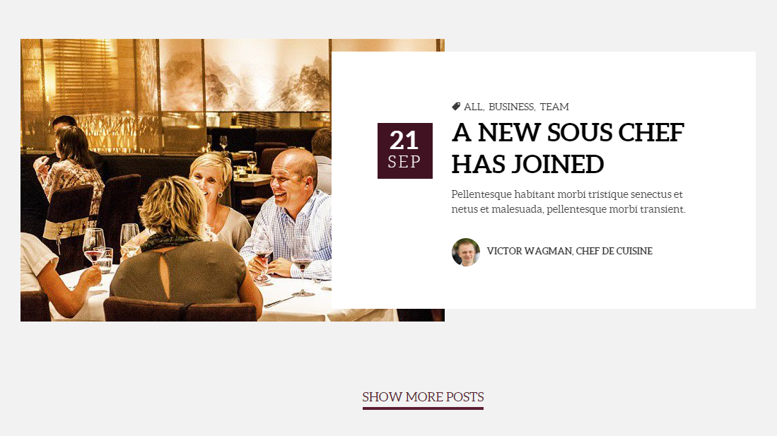
Blog – Main Page
HTML markup
|
1 2 3 4 5 6 7 8 9 10 11 12 13 14 15 16 17 18 19 20 21 22 23 24 25 |
<div class="col-md-12 ct-u-paddingTop120 ct-u-mobileCenter"> <article itemprop="blogPost" itemscope="" itemtype="http://schema.org/BlogPosting" data-fx="fadeInLeft" class="ct-article animated activate fadeInLeft"> <div class="ct-article-media"><img src="../assets/images/demo-content/delimondo/blog-picture3.jpg" alt="blog-post"></div> <div class="ct-article-content text-left"> <div itemprop="dateCreated" class="ct-article-date"> <div class="ct-article-date-dateDay">21</div> <div class="ct-article-date-dateMonth">sep</div> </div> <ul class="list-inline list-unstyled ct-article-tags"> <li><i class="fa fa-tag"></i></li> <li class="ct-article-tags"><a itemprop="url" href="blog-single.html">all</a></li> <li class="ct-article-tags"><a itemprop="url" href="blog-single.html">business</a></li> <li class="ct-article-tags"><a itemprop="url" href="blog-single.html">team</a></li> </ul> <div class="ct-article-title"><a itemprop="url" href="blog-single.html">a new sous chef has joined</a></div> <div class="ct-article-description"> <p>Pellentesque habitant morbi tristique senectus et netus et malesuada, pellentesque morbi transient.</p> </div> <div class="ct-article-author"><img src="../assets/images/demo-content/delimondo/author1.png" alt="blog-post"><a href="blog-single.html" itemprop="url"><span itemprop="author">victor wagman, chef de cuisine</span></a> <div class="clearfix"></div> </div> </div> </article> <div class="clearfix"></div> </div> |
Blog page in Test has an option that user can see the other hidden posts. If the customer will click on the button the rest post will appear on the page. If the customer want to hide more posts – it is possible by adding .hidden class to the blog like here :

Adding .hidden Class
Was this article helpful ?
Slider
Delimondo 2.0 theme use two types of slider :
Owl Slider

OWL Slider
HTML markup
|
1 2 3 4 5 6 7 8 9 10 11 12 13 14 15 16 17 18 19 20 |
<section> <div class="ct-u-owlWrapper"> <div class="ct-sliderContent"> <h6 class="ct-u-fontTypeRegular ct-u-colorWhite ct-u-paddingBottom10 ct-u-textShaddow">were proud to bring you</h6> <h1 data-fx="zoomIn" data-time="400" class="ct-u-fontTypeRegular ct-u-colorWhite ct-u-lineHeight60 ct-u-textShaddow animated activate zoomIn">the perfect combination of <br>style and taste</h1> <ul class="ct-buttonList list-inline list-unstyled ct-u-paddingTop80"> <li data-fx="fadeInLeft" data-time="00" class="ct-u-paddingBottom10 animated activate fadeInLeft"><a href="menucard.html" class="btn btn-default btn-lg btn-iconType ct-u-paddingBottom20">menu card<span data-bg="../assets/images/demo-content/delimondo/btn-icon2.png" class="ct-js-background" style="background-image: url(http://localhost:63342/delimondo/HTML/assets/images/demo-content/delimondo/btn-icon2.png); background-repeat: repeat;"></span></a></li> <li data-fx="fadeInRight" data-time="500" class="animated activate fadeInRight"><a href="#" class="btn btn-link btn-lg btn-iconType ct-js-bookTable">book a table<span data-bg="../assets/images/demo-content/delimondo/btn-icon1.png" class="ct-js-background" style="background-image: url(http://localhost:63342/delimondo/HTML/assets/images/demo-content/delimondo/btn-icon1.png); background-repeat: repeat;"></span></a></li> </ul> </div> </div> <div data-items="3" data-animations="true" data-height="750" data-navigation="true" data-single="true" data-pagination="true" class="ct-mainSlider ct-js-owl owl-carousel owl-theme" style="height: 750px; opacity: 1; display: block;"> <div class="owl-wrapper-outer"><div class="owl-wrapper" style="width: 11418px; left: 0px; display: block;"><div class="owl-item active" style="width: 1903px;"><div data-bg="../assets/images/demo-content/delimondo/slide1.jpg" class="item" style="height: 750px; background-image: url(http://localhost:63342/delimondo/HTML/assets/images/demo-content/delimondo/slide1.jpg);"> </div></div><div class="owl-item" style="width: 1903px;"><div data-bg="../assets/images/demo-content/delimondo/slide2.jpg" class="item" style="height: 750px; background-image: url(http://localhost:63342/delimondo/HTML/assets/images/demo-content/delimondo/slide2.jpg);"> </div></div><div class="owl-item" style="width: 1903px;"><div data-bg="../assets/images/demo-content/delimondo/slide3.jpg" class="item" style="height: 750px; background-image: url(http://localhost:63342/delimondo/HTML/assets/images/demo-content/delimondo/slide3.jpg);"> </div></div></div></div> <div class="owl-controls clickable"><div class="owl-pagination"><div class="owl-page active"><span class=""></span></div><div class="owl-page"><span class=""></span></div><div class="owl-page"><span class=""></span></div></div><div class="owl-buttons"><div class="owl-prev"></div><div class="owl-next"></div></div></div></div> </section> |
JavaScript
<script src=”./assets/plugins/owl/owl.carousel.min.js”></script>
<script src=”./assets/plugins/owl/init.js”></script>
Slick Slider
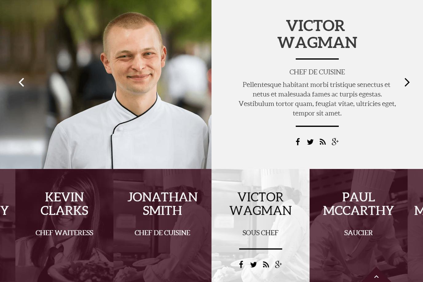
Slick synchronized Slider
HTML markup
|
1 2 3 4 5 6 7 8 9 10 11 12 13 14 15 16 17 18 19 20 21 22 23 24 25 26 27 28 29 30 31 32 33 34 35 36 37 38 39 40 41 42 43 44 45 46 47 48 49 50 51 52 53 54 55 56 57 58 59 60 61 62 63 64 65 66 67 68 69 70 71 72 73 74 75 76 77 78 79 80 81 82 83 84 85 86 87 88 89 90 91 92 93 94 95 96 97 98 99 100 101 102 103 104 105 106 107 108 109 110 111 112 113 114 115 116 117 118 119 120 121 122 123 124 125 126 127 128 129 130 131 132 133 134 135 136 137 138 139 140 141 142 143 144 145 146 147 148 149 150 151 152 153 154 155 156 157 158 159 160 161 162 163 164 165 166 167 168 169 170 171 172 173 174 175 176 177 178 179 180 181 182 183 184 185 186 187 188 189 190 191 192 193 194 195 196 197 198 199 200 201 202 203 204 205 206 207 208 209 210 211 212 213 |
<div class="ct-slick slider-for slick-initialized slick-slider"> <div aria-live="polite" class="slick-list draggable" style="padding: 0px 50px;"><div class="slick-track" role="listbox" style="opacity: 1; width: 4785px; transform: translate3d(-957px, 0px, 0px);"><div class="item slick-slide slick-cloned" tabindex="-1" role="option" aria-describedby="slick-slide10" style="width: 319px;" data-slick-index="-5" aria-hidden="true"><img src="../assets/images/demo-content/delimondo/slick-image1.jpg" alt="Image"> <div class="ct-itemBox"> <h4 class="text-uppercase ct-u-fontTypeRegular">victor wagman</h4> <div class="ct-u-fontSize22 text-uppercase ct-u-paddingBottom10 ct-u-fontTypeRegular">sous chef</div> <div class="ct-infoBox"> <div class="ct-divideLine ct-divideLine--black ct-divideLine--longer"></div> <ul class="ct-socials ct-socials--second ct-socials--second--anotherHover list-inline list-unstyled ct-u-paddingTop10"> <li data-toggle="tooltip" data-placement="top" title="" data-original-title="Facebook"><a href="https://www.facebook.com/createITpl" tabindex="-1"><i data-icon-size="25" class="fa fa-facebook ct-js-iconSize" style="font-size: 25px;"></i></a></li> <li data-toggle="tooltip" data-placement="top" title="" data-original-title="Twitter"><a href="https://twitter.com/createitpl" tabindex="-1"><i data-icon-size="25" class="fa fa-twitter ct-js-iconSize" style="font-size: 25px;"></i></a></li> <li data-toggle="tooltip" data-placement="top" title="" data-original-title="Rss"><a href="#" tabindex="-1"><i data-icon-size="25" class="fa fa-rss ct-js-iconSize" style="font-size: 25px;"></i></a></li> <li data-toggle="tooltip" data-placement="top" title="" data-original-title="Google Plus"><a href="#" tabindex="-1"><i data-icon-size="25" class="fa fa-google-plus ct-js-iconSize" style="font-size: 25px;"></i></a></li> </ul> </div> </div> </div><div class="item slick-slide slick-cloned" tabindex="-1" role="option" aria-describedby="slick-slide11" style="width: 319px;" data-slick-index="-4" aria-hidden="true"><img src="../assets/images/demo-content/delimondo/slick-image2.jpg" alt="Image"> <div class="ct-itemBox"> <h4 class="text-uppercase ct-u-fontTypeRegular">paul mccarthy</h4> <div class="ct-u-fontSize22 text-uppercase ct-u-paddingBottom10 ct-u-fontTypeRegular">saucier</div> <div class="ct-infoBox"> <div class="ct-divideLine ct-divideLine--black ct-divideLine--longer"></div> <ul class="ct-socials ct-socials--second ct-socials--second--anotherHover list-inline list-unstyled ct-u-paddingTop10"> <li data-toggle="tooltip" data-placement="top" title="" data-original-title="Facebook"><a href="https://www.facebook.com/createITpl" tabindex="-1"><i data-icon-size="25" class="fa fa-facebook ct-js-iconSize" style="font-size: 25px;"></i></a></li> <li data-toggle="tooltip" data-placement="top" title="" data-original-title="Twitter"><a href="https://twitter.com/createitpl" tabindex="-1"><i data-icon-size="25" class="fa fa-twitter ct-js-iconSize" style="font-size: 25px;"></i></a></li> <li data-toggle="tooltip" data-placement="top" title="" data-original-title="Rss"><a href="#" tabindex="-1"><i data-icon-size="25" class="fa fa-rss ct-js-iconSize" style="font-size: 25px;"></i></a></li> <li data-toggle="tooltip" data-placement="top" title="" data-original-title="Google Plus"><a href="#" tabindex="-1"><i data-icon-size="25" class="fa fa-google-plus ct-js-iconSize" style="font-size: 25px;"></i></a></li> </ul> </div> </div> </div><div class="item slick-slide slick-cloned" tabindex="-1" role="option" aria-describedby="slick-slide12" style="width: 319px;" data-slick-index="-3" aria-hidden="true"><img src="../assets/images/demo-content/delimondo/slick-image3.jpg" alt="Image"> <div class="ct-itemBox"> <h4 class="text-uppercase ct-u-fontTypeRegular">paul mccdonewy</h4> <div class="ct-u-fontSize22 text-uppercase ct-u-paddingBottom10 ct-u-fontTypeRegular">pattisier</div> <div class="ct-infoBox"> <div class="ct-divideLine ct-divideLine--black ct-divideLine--longer"></div> <ul class="ct-socials ct-socials--second ct-socials--second--anotherHover list-inline list-unstyled ct-u-paddingTop10"> <li data-toggle="tooltip" data-placement="top" title="" data-original-title="Facebook"><a href="https://www.facebook.com/createITpl" tabindex="-1"><i data-icon-size="25" class="fa fa-facebook ct-js-iconSize" style="font-size: 25px;"></i></a></li> <li data-toggle="tooltip" data-placement="top" title="" data-original-title="Twitter"><a href="https://twitter.com/createitpl" tabindex="-1"><i data-icon-size="25" class="fa fa-twitter ct-js-iconSize" style="font-size: 25px;"></i></a></li> <li data-toggle="tooltip" data-placement="top" title="" data-original-title="Rss"><a href="#" tabindex="-1"><i data-icon-size="25" class="fa fa-rss ct-js-iconSize" style="font-size: 25px;"></i></a></li> <li data-toggle="tooltip" data-placement="top" title="" data-original-title="Google Plus"><a href="#" tabindex="-1"><i data-icon-size="25" class="fa fa-google-plus ct-js-iconSize" style="font-size: 25px;"></i></a></li> </ul> </div> </div> </div><div class="item slick-slide slick-cloned slick-active" tabindex="0" role="option" aria-describedby="slick-slide13" style="width: 319px;" data-slick-index="-2" aria-hidden="false"><img src="../assets/images/demo-content/delimondo/slick-image4.jpg" alt="Image"> <div class="ct-itemBox"> <h4 class="text-uppercase ct-u-fontTypeRegular">kevin clarks</h4> <div class="ct-u-fontSize22 text-uppercase ct-u-paddingBottom10 ct-u-fontTypeRegular">chef waiteress</div> <div class="ct-infoBox"> <div class="ct-divideLine ct-divideLine--black ct-divideLine--longer"></div> <ul class="ct-socials ct-socials--second ct-socials--second--anotherHover list-inline list-unstyled ct-u-paddingTop10"> <li data-toggle="tooltip" data-placement="top" title="" data-original-title="Facebook"><a href="https://www.facebook.com/createITpl" tabindex="0"><i data-icon-size="25" class="fa fa-facebook ct-js-iconSize" style="font-size: 25px;"></i></a></li> <li data-toggle="tooltip" data-placement="top" title="" data-original-title="Twitter"><a href="https://twitter.com/createitpl" tabindex="0"><i data-icon-size="25" class="fa fa-twitter ct-js-iconSize" style="font-size: 25px;"></i></a></li> <li data-toggle="tooltip" data-placement="top" title="" data-original-title="Rss"><a href="#" tabindex="0"><i data-icon-size="25" class="fa fa-rss ct-js-iconSize" style="font-size: 25px;"></i></a></li> <li data-toggle="tooltip" data-placement="top" title="" data-original-title="Google Plus"><a href="#" tabindex="0"><i data-icon-size="25" class="fa fa-google-plus ct-js-iconSize" style="font-size: 25px;"></i></a></li> </ul> </div> </div> </div><div class="item slick-slide slick-cloned slick-active" tabindex="0" role="option" aria-describedby="slick-slide14" style="width: 319px;" data-slick-index="-1" aria-hidden="false"><img src="../assets/images/demo-content/delimondo/slick-image1.jpg" alt="Image"> <div class="ct-itemBox"> <h4 class="text-uppercase ct-u-fontTypeRegular">jonathan smith</h4> <div class="ct-u-fontSize22 text-uppercase ct-u-paddingBottom10 ct-u-fontTypeRegular">chef de cuisine</div> <div class="ct-infoBox"> <div class="ct-divideLine ct-divideLine--black ct-divideLine--longer"></div> <ul class="ct-socials ct-socials--second ct-socials--second--anotherHover list-inline list-unstyled ct-u-paddingTop10"> <li data-toggle="tooltip" data-placement="top" title="" data-original-title="Facebook"><a href="https://www.facebook.com/createITpl" tabindex="0"><i data-icon-size="25" class="fa fa-facebook ct-js-iconSize" style="font-size: 25px;"></i></a></li> <li data-toggle="tooltip" data-placement="top" title="" data-original-title="Twitter"><a href="https://twitter.com/createitpl" tabindex="0"><i data-icon-size="25" class="fa fa-twitter ct-js-iconSize" style="font-size: 25px;"></i></a></li> <li data-toggle="tooltip" data-placement="top" title="" data-original-title="Rss"><a href="#" tabindex="0"><i data-icon-size="25" class="fa fa-rss ct-js-iconSize" style="font-size: 25px;"></i></a></li> <li data-toggle="tooltip" data-placement="top" title="" data-original-title="Google Plus"><a href="#" tabindex="0"><i data-icon-size="25" class="fa fa-google-plus ct-js-iconSize" style="font-size: 25px;"></i></a></li> </ul> </div> </div> </div><div class="item slick-slide slick-current slick-active slick-center" tabindex="0" role="option" aria-describedby="slick-slide10" style="width: 319px;" data-slick-index="0" aria-hidden="false"><img src="../assets/images/demo-content/delimondo/slick-image1.jpg" alt="Image"> <div class="ct-itemBox"> <h4 class="text-uppercase ct-u-fontTypeRegular">victor wagman</h4> <div class="ct-u-fontSize22 text-uppercase ct-u-paddingBottom10 ct-u-fontTypeRegular">sous chef</div> <div class="ct-infoBox"> <div class="ct-divideLine ct-divideLine--black ct-divideLine--longer"></div> <ul class="ct-socials ct-socials--second ct-socials--second--anotherHover list-inline list-unstyled ct-u-paddingTop10"> <li data-toggle="tooltip" data-placement="top" title="" data-original-title="Facebook"><a href="https://www.facebook.com/createITpl" tabindex="0"><i data-icon-size="25" class="fa fa-facebook ct-js-iconSize" style="font-size: 25px;"></i></a></li> <li data-toggle="tooltip" data-placement="top" title="" data-original-title="Twitter"><a href="https://twitter.com/createitpl" tabindex="0"><i data-icon-size="25" class="fa fa-twitter ct-js-iconSize" style="font-size: 25px;"></i></a></li> <li data-toggle="tooltip" data-placement="top" title="" data-original-title="Rss"><a href="#" tabindex="0"><i data-icon-size="25" class="fa fa-rss ct-js-iconSize" style="font-size: 25px;"></i></a></li> <li data-toggle="tooltip" data-placement="top" title="" data-original-title="Google Plus"><a href="#" tabindex="0"><i data-icon-size="25" class="fa fa-google-plus ct-js-iconSize" style="font-size: 25px;"></i></a></li> </ul> </div> </div> </div><div class="item slick-slide slick-active" tabindex="0" role="option" aria-describedby="slick-slide11" style="width: 319px;" data-slick-index="1" aria-hidden="false"><img src="../assets/images/demo-content/delimondo/slick-image2.jpg" alt="Image"> <div class="ct-itemBox"> <h4 class="text-uppercase ct-u-fontTypeRegular">paul mccarthy</h4> <div class="ct-u-fontSize22 text-uppercase ct-u-paddingBottom10 ct-u-fontTypeRegular">saucier</div> <div class="ct-infoBox"> <div class="ct-divideLine ct-divideLine--black ct-divideLine--longer"></div> <ul class="ct-socials ct-socials--second ct-socials--second--anotherHover list-inline list-unstyled ct-u-paddingTop10"> <li data-toggle="tooltip" data-placement="top" title="" data-original-title="Facebook"><a href="https://www.facebook.com/createITpl" tabindex="0"><i data-icon-size="25" class="fa fa-facebook ct-js-iconSize" style="font-size: 25px;"></i></a></li> <li data-toggle="tooltip" data-placement="top" title="" data-original-title="Twitter"><a href="https://twitter.com/createitpl" tabindex="0"><i data-icon-size="25" class="fa fa-twitter ct-js-iconSize" style="font-size: 25px;"></i></a></li> <li data-toggle="tooltip" data-placement="top" title="" data-original-title="Rss"><a href="#" tabindex="0"><i data-icon-size="25" class="fa fa-rss ct-js-iconSize" style="font-size: 25px;"></i></a></li> <li data-toggle="tooltip" data-placement="top" title="" data-original-title="Google Plus"><a href="#" tabindex="0"><i data-icon-size="25" class="fa fa-google-plus ct-js-iconSize" style="font-size: 25px;"></i></a></li> </ul> </div> </div> </div><div class="item slick-slide slick-active" tabindex="0" role="option" aria-describedby="slick-slide12" style="width: 319px;" data-slick-index="2" aria-hidden="false"><img src="../assets/images/demo-content/delimondo/slick-image3.jpg" alt="Image"> <div class="ct-itemBox"> <h4 class="text-uppercase ct-u-fontTypeRegular">paul mccdonewy</h4> <div class="ct-u-fontSize22 text-uppercase ct-u-paddingBottom10 ct-u-fontTypeRegular">pattisier</div> <div class="ct-infoBox"> <div class="ct-divideLine ct-divideLine--black ct-divideLine--longer"></div> <ul class="ct-socials ct-socials--second ct-socials--second--anotherHover list-inline list-unstyled ct-u-paddingTop10"> <li data-toggle="tooltip" data-placement="top" title="" data-original-title="Facebook"><a href="https://www.facebook.com/createITpl" tabindex="0"><i data-icon-size="25" class="fa fa-facebook ct-js-iconSize" style="font-size: 25px;"></i></a></li> <li data-toggle="tooltip" data-placement="top" title="" data-original-title="Twitter"><a href="https://twitter.com/createitpl" tabindex="0"><i data-icon-size="25" class="fa fa-twitter ct-js-iconSize" style="font-size: 25px;"></i></a></li> <li data-toggle="tooltip" data-placement="top" title="" data-original-title="Rss"><a href="#" tabindex="0"><i data-icon-size="25" class="fa fa-rss ct-js-iconSize" style="font-size: 25px;"></i></a></li> <li data-toggle="tooltip" data-placement="top" title="" data-original-title="Google Plus"><a href="#" tabindex="0"><i data-icon-size="25" class="fa fa-google-plus ct-js-iconSize" style="font-size: 25px;"></i></a></li> </ul> </div> </div> </div><div class="item slick-slide" tabindex="-1" role="option" aria-describedby="slick-slide13" style="width: 319px;" data-slick-index="3" aria-hidden="true"><img src="../assets/images/demo-content/delimondo/slick-image4.jpg" alt="Image"> <div class="ct-itemBox"> <h4 class="text-uppercase ct-u-fontTypeRegular">kevin clarks</h4> <div class="ct-u-fontSize22 text-uppercase ct-u-paddingBottom10 ct-u-fontTypeRegular">chef waiteress</div> <div class="ct-infoBox"> <div class="ct-divideLine ct-divideLine--black ct-divideLine--longer"></div> <ul class="ct-socials ct-socials--second ct-socials--second--anotherHover list-inline list-unstyled ct-u-paddingTop10"> <li data-toggle="tooltip" data-placement="top" title="" data-original-title="Facebook"><a href="https://www.facebook.com/createITpl" tabindex="-1"><i data-icon-size="25" class="fa fa-facebook ct-js-iconSize" style="font-size: 25px;"></i></a></li> <li data-toggle="tooltip" data-placement="top" title="" data-original-title="Twitter"><a href="https://twitter.com/createitpl" tabindex="-1"><i data-icon-size="25" class="fa fa-twitter ct-js-iconSize" style="font-size: 25px;"></i></a></li> <li data-toggle="tooltip" data-placement="top" title="" data-original-title="Rss"><a href="#" tabindex="-1"><i data-icon-size="25" class="fa fa-rss ct-js-iconSize" style="font-size: 25px;"></i></a></li> <li data-toggle="tooltip" data-placement="top" title="" data-original-title="Google Plus"><a href="#" tabindex="-1"><i data-icon-size="25" class="fa fa-google-plus ct-js-iconSize" style="font-size: 25px;"></i></a></li> </ul> </div> </div> </div><div class="item slick-slide" tabindex="-1" role="option" aria-describedby="slick-slide14" style="width: 319px;" data-slick-index="4" aria-hidden="true"><img src="../assets/images/demo-content/delimondo/slick-image1.jpg" alt="Image"> <div class="ct-itemBox"> <h4 class="text-uppercase ct-u-fontTypeRegular">jonathan smith</h4> <div class="ct-u-fontSize22 text-uppercase ct-u-paddingBottom10 ct-u-fontTypeRegular">chef de cuisine</div> <div class="ct-infoBox"> <div class="ct-divideLine ct-divideLine--black ct-divideLine--longer"></div> <ul class="ct-socials ct-socials--second ct-socials--second--anotherHover list-inline list-unstyled ct-u-paddingTop10"> <li data-toggle="tooltip" data-placement="top" title="" data-original-title="Facebook"><a href="https://www.facebook.com/createITpl" tabindex="-1"><i data-icon-size="25" class="fa fa-facebook ct-js-iconSize" style="font-size: 25px;"></i></a></li> <li data-toggle="tooltip" data-placement="top" title="" data-original-title="Twitter"><a href="https://twitter.com/createitpl" tabindex="-1"><i data-icon-size="25" class="fa fa-twitter ct-js-iconSize" style="font-size: 25px;"></i></a></li> <li data-toggle="tooltip" data-placement="top" title="" data-original-title="Rss"><a href="#" tabindex="-1"><i data-icon-size="25" class="fa fa-rss ct-js-iconSize" style="font-size: 25px;"></i></a></li> <li data-toggle="tooltip" data-placement="top" title="" data-original-title="Google Plus"><a href="#" tabindex="-1"><i data-icon-size="25" class="fa fa-google-plus ct-js-iconSize" style="font-size: 25px;"></i></a></li> </ul> </div> </div> </div><div class="item slick-slide slick-cloned slick-center" tabindex="-1" role="option" aria-describedby="slick-slide10" style="width: 319px;" data-slick-index="5" aria-hidden="true"><img src="../assets/images/demo-content/delimondo/slick-image1.jpg" alt="Image"> <div class="ct-itemBox"> <h4 class="text-uppercase ct-u-fontTypeRegular">victor wagman</h4> <div class="ct-u-fontSize22 text-uppercase ct-u-paddingBottom10 ct-u-fontTypeRegular">sous chef</div> <div class="ct-infoBox"> <div class="ct-divideLine ct-divideLine--black ct-divideLine--longer"></div> <ul class="ct-socials ct-socials--second ct-socials--second--anotherHover list-inline list-unstyled ct-u-paddingTop10"> <li data-toggle="tooltip" data-placement="top" title="" data-original-title="Facebook"><a href="https://www.facebook.com/createITpl" tabindex="-1"><i data-icon-size="25" class="fa fa-facebook ct-js-iconSize" style="font-size: 25px;"></i></a></li> <li data-toggle="tooltip" data-placement="top" title="" data-original-title="Twitter"><a href="https://twitter.com/createitpl" tabindex="-1"><i data-icon-size="25" class="fa fa-twitter ct-js-iconSize" style="font-size: 25px;"></i></a></li> <li data-toggle="tooltip" data-placement="top" title="" data-original-title="Rss"><a href="#" tabindex="-1"><i data-icon-size="25" class="fa fa-rss ct-js-iconSize" style="font-size: 25px;"></i></a></li> <li data-toggle="tooltip" data-placement="top" title="" data-original-title="Google Plus"><a href="#" tabindex="-1"><i data-icon-size="25" class="fa fa-google-plus ct-js-iconSize" style="font-size: 25px;"></i></a></li> </ul> </div> </div> </div><div class="item slick-slide slick-cloned" tabindex="-1" role="option" aria-describedby="slick-slide11" style="width: 319px;" data-slick-index="6" aria-hidden="true"><img src="../assets/images/demo-content/delimondo/slick-image2.jpg" alt="Image"> <div class="ct-itemBox"> <h4 class="text-uppercase ct-u-fontTypeRegular">paul mccarthy</h4> <div class="ct-u-fontSize22 text-uppercase ct-u-paddingBottom10 ct-u-fontTypeRegular">saucier</div> <div class="ct-infoBox"> <div class="ct-divideLine ct-divideLine--black ct-divideLine--longer"></div> <ul class="ct-socials ct-socials--second ct-socials--second--anotherHover list-inline list-unstyled ct-u-paddingTop10"> <li data-toggle="tooltip" data-placement="top" title="" data-original-title="Facebook"><a href="https://www.facebook.com/createITpl" tabindex="-1"><i data-icon-size="25" class="fa fa-facebook ct-js-iconSize" style="font-size: 25px;"></i></a></li> <li data-toggle="tooltip" data-placement="top" title="" data-original-title="Twitter"><a href="https://twitter.com/createitpl" tabindex="-1"><i data-icon-size="25" class="fa fa-twitter ct-js-iconSize" style="font-size: 25px;"></i></a></li> <li data-toggle="tooltip" data-placement="top" title="" data-original-title="Rss"><a href="#" tabindex="-1"><i data-icon-size="25" class="fa fa-rss ct-js-iconSize" style="font-size: 25px;"></i></a></li> <li data-toggle="tooltip" data-placement="top" title="" data-original-title="Google Plus"><a href="#" tabindex="-1"><i data-icon-size="25" class="fa fa-google-plus ct-js-iconSize" style="font-size: 25px;"></i></a></li> </ul> </div> </div> </div><div class="item slick-slide slick-cloned" tabindex="-1" role="option" aria-describedby="slick-slide12" style="width: 319px;" data-slick-index="7" aria-hidden="true"><img src="../assets/images/demo-content/delimondo/slick-image3.jpg" alt="Image"> <div class="ct-itemBox"> <h4 class="text-uppercase ct-u-fontTypeRegular">paul mccdonewy</h4> <div class="ct-u-fontSize22 text-uppercase ct-u-paddingBottom10 ct-u-fontTypeRegular">pattisier</div> <div class="ct-infoBox"> <div class="ct-divideLine ct-divideLine--black ct-divideLine--longer"></div> <ul class="ct-socials ct-socials--second ct-socials--second--anotherHover list-inline list-unstyled ct-u-paddingTop10"> <li data-toggle="tooltip" data-placement="top" title="" data-original-title="Facebook"><a href="https://www.facebook.com/createITpl" tabindex="-1"><i data-icon-size="25" class="fa fa-facebook ct-js-iconSize" style="font-size: 25px;"></i></a></li> <li data-toggle="tooltip" data-placement="top" title="" data-original-title="Twitter"><a href="https://twitter.com/createitpl" tabindex="-1"><i data-icon-size="25" class="fa fa-twitter ct-js-iconSize" style="font-size: 25px;"></i></a></li> <li data-toggle="tooltip" data-placement="top" title="" data-original-title="Rss"><a href="#" tabindex="-1"><i data-icon-size="25" class="fa fa-rss ct-js-iconSize" style="font-size: 25px;"></i></a></li> <li data-toggle="tooltip" data-placement="top" title="" data-original-title="Google Plus"><a href="#" tabindex="-1"><i data-icon-size="25" class="fa fa-google-plus ct-js-iconSize" style="font-size: 25px;"></i></a></li> </ul> </div> </div> </div><div class="item slick-slide slick-cloned" tabindex="-1" role="option" aria-describedby="slick-slide13" style="width: 319px;" data-slick-index="8" aria-hidden="true"><img src="../assets/images/demo-content/delimondo/slick-image4.jpg" alt="Image"> <div class="ct-itemBox"> <h4 class="text-uppercase ct-u-fontTypeRegular">kevin clarks</h4> <div class="ct-u-fontSize22 text-uppercase ct-u-paddingBottom10 ct-u-fontTypeRegular">chef waiteress</div> <div class="ct-infoBox"> <div class="ct-divideLine ct-divideLine--black ct-divideLine--longer"></div> <ul class="ct-socials ct-socials--second ct-socials--second--anotherHover list-inline list-unstyled ct-u-paddingTop10"> <li data-toggle="tooltip" data-placement="top" title="" data-original-title="Facebook"><a href="https://www.facebook.com/createITpl" tabindex="-1"><i data-icon-size="25" class="fa fa-facebook ct-js-iconSize" style="font-size: 25px;"></i></a></li> <li data-toggle="tooltip" data-placement="top" title="" data-original-title="Twitter"><a href="https://twitter.com/createitpl" tabindex="-1"><i data-icon-size="25" class="fa fa-twitter ct-js-iconSize" style="font-size: 25px;"></i></a></li> <li data-toggle="tooltip" data-placement="top" title="" data-original-title="Rss"><a href="#" tabindex="-1"><i data-icon-size="25" class="fa fa-rss ct-js-iconSize" style="font-size: 25px;"></i></a></li> <li data-toggle="tooltip" data-placement="top" title="" data-original-title="Google Plus"><a href="#" tabindex="-1"><i data-icon-size="25" class="fa fa-google-plus ct-js-iconSize" style="font-size: 25px;"></i></a></li> </ul> </div> </div> </div><div class="item slick-slide slick-cloned" tabindex="-1" role="option" aria-describedby="slick-slide14" style="width: 319px;" data-slick-index="9" aria-hidden="true"><img src="../assets/images/demo-content/delimondo/slick-image1.jpg" alt="Image"> <div class="ct-itemBox"> <h4 class="text-uppercase ct-u-fontTypeRegular">jonathan smith</h4> <div class="ct-u-fontSize22 text-uppercase ct-u-paddingBottom10 ct-u-fontTypeRegular">chef de cuisine</div> <div class="ct-infoBox"> <div class="ct-divideLine ct-divideLine--black ct-divideLine--longer"></div> <ul class="ct-socials ct-socials--second ct-socials--second--anotherHover list-inline list-unstyled ct-u-paddingTop10"> <li data-toggle="tooltip" data-placement="top" title="" data-original-title="Facebook"><a href="https://www.facebook.com/createITpl" tabindex="-1"><i data-icon-size="25" class="fa fa-facebook ct-js-iconSize" style="font-size: 25px;"></i></a></li> <li data-toggle="tooltip" data-placement="top" title="" data-original-title="Twitter"><a href="https://twitter.com/createitpl" tabindex="-1"><i data-icon-size="25" class="fa fa-twitter ct-js-iconSize" style="font-size: 25px;"></i></a></li> <li data-toggle="tooltip" data-placement="top" title="" data-original-title="Rss"><a href="#" tabindex="-1"><i data-icon-size="25" class="fa fa-rss ct-js-iconSize" style="font-size: 25px;"></i></a></li> <li data-toggle="tooltip" data-placement="top" title="" data-original-title="Google Plus"><a href="#" tabindex="-1"><i data-icon-size="25" class="fa fa-google-plus ct-js-iconSize" style="font-size: 25px;"></i></a></li> </ul> </div> </div> </div></div></div></div> |
JavaScript
<script src=”./assets/js/slick.min.js”></script>
Was this article helpful ?
Menu
Test has a following list of menus variations
Default Menu

Default Menu
HTML markup
–> ct-mainMenu
|
1 2 3 4 5 6 7 8 9 10 11 12 13 14 15 16 17 18 19 20 21 22 23 24 25 26 27 28 29 30 31 32 33 34 35 36 37 38 39 40 41 42 43 44 45 46 47 48 49 50 51 52 |
<nav class="navbar navbar-default ct-mainMenu"> <div class="container"> <div class="navbar-header"><a href="index.html" class="navbar-brand"><img src="../assets/images/logo.png" alt="Image"></a></div> <div class="collapse navbar-collapse"> <ul class="nav navbar-nav ct-navbar--fadeIn"> <li class="dropdown"><a href="index.html">home</a> <ul class="dropdown-menu"> <li class="dropdown"><a href="index.html">home</a> <ul class="dropdown-menu"> <li><a href="index.html">homepage slider</a></li> <li><a href="index-parallax.html">homepage parallax</a></li> <li><a href="index-kenburn.html">homepage kenburn</a></li> <li><a href="index-video.html">homepage video</a></li> </ul> </li> <li class="dropdown"><a href="index.html">headers</a> <ul class="dropdown-menu"> <li><a href="index.html">left</a></li> <li><a href="index-centeredHeader.html">center</a></li> <li><a href="index-HeaderTransparent.html">left transparent fixed</a></li> <li><a href="index-centerHeaderTransparent.html">center transparent fixed</a></li> </ul> </li> </ul> </li> <li class="dropdown"><a href="about-us.html">about us</a> <ul class="dropdown-menu"> <li><a href="about-us.html">About us</a></li> <li><a href="book.html">book a table</a></li> </ul> </li> <li><a href="menucard.html">menu card</a></li> <li class="dropdown"><a href="blog.html">blog</a> <ul class="dropdown-menu"> <li><a href="blog.html">blog</a></li> <li><a href="blog-single.html">blog single</a></li> </ul> </li> <li><a href="gallery.html">gallery</a></li> <li><a href="events.html">events</a></li> <li><a href="contact.html">contact us</a></li> </ul> </div> <ul class="ct-socials list-inline list-unstyled"> <li data-toggle="tooltip" data-placement="top" title="Facebook"><a href="https://www.facebook.com/createITpl"><i data-icon-size="14" class="fa fa-facebook ct-js-iconSize"></i></a></li> <li data-toggle="tooltip" data-placement="top" title="Twitter"><a href="https://twitter.com/createitpl"><i data-icon-size="14" class="fa fa-twitter ct-js-iconSize"></i></a></li> <li data-toggle="tooltip" data-placement="top" title="Rss"><a href="#"><i data-icon-size="14" class="fa fa-rss ct-js-iconSize"></i></a></li> <li data-toggle="tooltip" data-placement="top" title="Google Plus"><a href="#"><i data-icon-size="14" class="fa fa-google-plus ct-js-iconSize"></i></a></li> </ul> <div class="clearfix"></div> </div> </nav> |
Centered Menu

Centered Menu.png
HTML markup
–> ct-centeredMenu
|
1 2 3 4 5 6 7 8 9 10 11 12 13 14 15 16 17 18 19 20 21 22 23 24 25 26 27 28 29 30 31 32 33 34 35 36 37 38 39 40 41 42 43 44 45 46 47 48 49 50 51 52 53 54 |
<nav class="navbar navbar-default ct-centeredMenu"> <div class="container"> <div class="collapse navbar-collapse"> <ul class="nav navbar-nav ct-navbar--fadeIn"> <li class="dropdown"><a href="index.html">home</a> <ul class="dropdown-menu"> <li class="dropdown"><a href="index.html">home</a> <ul class="dropdown-menu"> <li><a href="index.html">homepage slider</a></li> <li><a href="index-parallax.html">homepage parallax</a></li> <li><a href="index-kenburn.html">homepage kenburn</a></li> <li><a href="index-video.html">homepage video</a></li> </ul> </li> <li class="dropdown"><a href="index.html">headers</a> <ul class="dropdown-menu"> <li><a href="index.html">left</a></li> <li><a href="index-centeredHeader.html">center</a></li> <li><a href="index-HeaderTransparent.html">left transparent fixed</a></li> <li><a href="index-centerHeaderTransparent.html">center transparent fixed</a></li> </ul> </li> </ul> </li> <li class="dropdown"><a href="about-us.html">about us</a> <ul class="dropdown-menu"> <li><a href="about-us.html">About us</a></li> <li><a href="book.html">book a table</a></li> </ul> </li> <li><a href="menucard.html">menu card</a></li> <li class="dropdown"><a href="blog.html">blog</a> <ul class="dropdown-menu"> <li><a href="blog.html">blog</a></li> <li><a href="blog-single.html">blog single</a></li> </ul> </li> </ul> </div> <div class="navbar-header"><a href="index.html" class="navbar-brand"><img src="../assets/images/logo.png" alt="Image"></a></div> <ul class="nav navbar-nav ct-innerMargin"> <li><a href="gallery.html">gallery</a></li> <li><a href="events.html">events</a></li> <li><a href="contact.html">contact us</a></li> </ul> <ul class="ct-socials list-inline list-unstyled"> <li data-toggle="tooltip" data-placement="top" title="Facebook"><a href="https://www.facebook.com/createITpl"><i data-icon-size="14" class="fa fa-facebook ct-js-iconSize"></i></a></li> <li data-toggle="tooltip" data-placement="top" title="Twitter"><a href="https://twitter.com/createitpl"><i data-icon-size="14" class="fa fa-twitter ct-js-iconSize"></i></a></li> <li data-toggle="tooltip" data-placement="top" title="Rss"><a href="#"><i data-icon-size="14" class="fa fa-rss ct-js-iconSize"></i></a></li> <li data-toggle="tooltip" data-placement="top" title="Google Plus"><a href="#"><i data-icon-size="14" class="fa fa-google-plus ct-js-iconSize"></i></a></li> </ul> <div class="clearfix"></div> </div> </nav> |
Transparent Fixed Default Menu

Transparent Default Fixed Menu
HTML markup
–> ct-mainMenu ct-mainMenu–color navbar-fixed-top
|
1 2 3 4 5 6 7 8 9 10 11 12 13 14 15 16 17 18 19 20 21 22 23 24 25 26 27 28 29 30 31 32 33 34 35 36 37 38 39 40 41 42 43 44 45 46 47 48 49 50 51 52 |
<nav class="navbar navbar-default ct-mainMenu ct-mainMenu--color navbar-fixed-top"> <div class="container"> <div class="navbar-header"><a href="index.html" class="navbar-brand"><img src="../assets/images/logo.png" alt="Image"></a></div> <div class="collapse navbar-collapse"> <ul class="nav navbar-nav ct-navbar--fadeIn"> <li class="dropdown"><a href="index.html">home</a> <ul class="dropdown-menu"> <li class="dropdown"><a href="index.html">home</a> <ul class="dropdown-menu"> <li><a href="index.html">homepage slider</a></li> <li><a href="index-parallax.html">homepage parallax</a></li> <li><a href="index-kenburn.html">homepage kenburn</a></li> <li><a href="index-video.html">homepage video</a></li> </ul> </li> <li class="dropdown"><a href="index.html">headers</a> <ul class="dropdown-menu"> <li><a href="index.html">left</a></li> <li><a href="index-centeredHeader.html">center</a></li> <li><a href="index-HeaderTransparent.html">left transparent fixed</a></li> <li><a href="index-centerHeaderTransparent.html">center transparent fixed</a></li> </ul> </li> </ul> </li> <li class="dropdown"><a href="about-us.html">about us</a> <ul class="dropdown-menu"> <li><a href="about-us.html">About us</a></li> <li><a href="book.html">book a table</a></li> </ul> </li> <li><a href="menucard.html">menu card</a></li> <li class="dropdown"><a href="blog.html">blog</a> <ul class="dropdown-menu"> <li><a href="blog.html">blog</a></li> <li><a href="blog-single.html">blog single</a></li> </ul> </li> <li><a href="gallery.html">gallery</a></li> <li><a href="events.html">events</a></li> <li><a href="contact.html">contact us</a></li> </ul> </div> <ul class="ct-socials list-inline list-unstyled"> <li data-toggle="tooltip" data-placement="top" title="Facebook"><a href="https://www.facebook.com/createITpl"><i data-icon-size="14" class="fa fa-facebook ct-js-iconSize"></i></a></li> <li data-toggle="tooltip" data-placement="top" title="Twitter"><a href="https://twitter.com/createitpl"><i data-icon-size="14" class="fa fa-twitter ct-js-iconSize"></i></a></li> <li data-toggle="tooltip" data-placement="top" title="Rss"><a href="#"><i data-icon-size="14" class="fa fa-rss ct-js-iconSize"></i></a></li> <li data-toggle="tooltip" data-placement="top" title="Google Plus"><a href="#"><i data-icon-size="14" class="fa fa-google-plus ct-js-iconSize"></i></a></li> </ul> <div class="clearfix"></div> </div> </nav> |
Transparent Fixed Centered Menu

Transparent Centered Fixed Menu
HTML markup
–> ct-centeredMenu ct-centeredMenu–color navbar-fixed-top
|
1 2 3 4 5 6 7 8 9 10 11 12 13 14 15 16 17 18 19 20 21 22 23 24 25 26 27 28 29 30 31 32 33 34 35 36 37 38 39 40 41 42 43 44 45 46 47 48 49 50 51 52 53 54 |
<nav class="navbar navbar-default ct-centeredMenu ct-centeredMenu--color navbar-fixed-top"> <div class="container"> <div class="collapse navbar-collapse"> <ul class="nav navbar-nav"> <li class="dropdown"><a href="index.html">home</a> <ul class="dropdown-menu ct-navbar--fadeIn"> <li class="dropdown"><a href="index.html">home</a> <ul class="dropdown-menu"> <li><a href="index.html">homepage slider</a></li> <li><a href="index-parallax.html">homepage parallax</a></li> <li><a href="index-kenburn.html">homepage kenburn</a></li> <li><a href="index-video.html">homepage video</a></li> </ul> </li> <li class="dropdown"><a href="index.html">headers</a> <ul class="dropdown-menu"> <li><a href="index.html">left</a></li> <li><a href="index-centeredHeader.html">center</a></li> <li><a href="index-HeaderTransparent.html">left transparent fixed</a></li> <li><a href="index-centerHeaderTransparent.html">center transparent fixed</a></li> </ul> </li> </ul> </li> <li class="dropdown"><a href="about-us.html">about us</a> <ul class="dropdown-menu"> <li><a href="about-us.html">About us</a></li> <li><a href="book.html">book a table</a></li> </ul> </li> <li><a href="menucard.html">menu card</a></li> <li class="dropdown"><a href="blog.html">blog</a> <ul class="dropdown-menu"> <li><a href="blog.html">blog</a></li> <li><a href="blog-single.html">blog single</a></li> </ul> </li> </ul> </div> <div class="navbar-header"><a href="index.html" class="navbar-brand"><img src="../assets/images/logo.png" alt="Image"></a></div> <ul class="nav navbar-nav ct-innerMargin"> <li><a href="gallery.html">gallery</a></li> <li><a href="events.html">events</a></li> <li><a href="contact.html">contact us</a></li> </ul> <ul class="ct-socials list-inline list-unstyled"> <li data-toggle="tooltip" data-placement="top" title="Facebook"><a href="https://www.facebook.com/createITpl"><i data-icon-size="14" class="fa fa-facebook ct-js-iconSize"></i></a></li> <li data-toggle="tooltip" data-placement="top" title="Twitter"><a href="https://twitter.com/createitpl"><i data-icon-size="14" class="fa fa-twitter ct-js-iconSize"></i></a></li> <li data-toggle="tooltip" data-placement="top" title="Rss"><a href="#"><i data-icon-size="14" class="fa fa-rss ct-js-iconSize"></i></a></li> <li data-toggle="tooltip" data-placement="top" title="Google Plus"><a href="#"><i data-icon-size="14" class="fa fa-google-plus ct-js-iconSize"></i></a></li> </ul> <div class="clearfix"></div> </div> </nav> |
Was this article helpful ?
Social icon
In Test we have following different types of social icons
–> ct-socials
Social Icon 1
HTML markup
|
1 2 3 4 5 6 |
<ul class="ct-socials list-inline list-unstyled"> <li data-toggle="tooltip" data-placement="top" title="" data-original-title="Facebook"><a href="https://www.facebook.com/createITpl"><i data-icon-size="14" class="fa fa-facebook ct-js-iconSize" style="font-size: 14px;"></i></a></li> <li data-toggle="tooltip" data-placement="top" title="" data-original-title="Twitter"><a href="https://twitter.com/createitpl"><i data-icon-size="14" class="fa fa-twitter ct-js-iconSize" style="font-size: 14px;"></i></a></li> <li data-toggle="tooltip" data-placement="top" title="" data-original-title="Rss"><a href="#"><i data-icon-size="14" class="fa fa-rss ct-js-iconSize" style="font-size: 14px;"></i></a></li> <li data-toggle="tooltip" data-placement="top" title="" data-original-title="Google Plus"><a href="#"><i data-icon-size="14" class="fa fa-google-plus ct-js-iconSize" style="font-size: 14px;"></i></a></li> </ul> |
–> ct-socials–second
Social Icon 2
HTML markup
|
1 2 3 4 5 6 |
<ul class="ct-socials ct-socials--second list-inline list-unstyled"> <li data-toggle="tooltip" data-placement="top" title="" data-original-title="Facebook"><a href="https://www.facebook.com/createITpl"><i data-icon-size="18" class="fa fa-facebook ct-js-iconSize" style="font-size: 18px;"></i></a></li> <li data-toggle="tooltip" data-placement="top" title="" data-original-title="Twitter"><a href="https://twitter.com/createitpl"><i data-icon-size="18" class="fa fa-twitter ct-js-iconSize" style="font-size: 18px;"></i></a></li> <li data-toggle="tooltip" data-placement="top" title="" data-original-title="Rss"><a href="#"><i data-icon-size="18" class="fa fa-rss ct-js-iconSize" style="font-size: 18px;"></i></a></li> <li data-toggle="tooltip" data-placement="top" title="" data-original-title="Google Plus"><a href="#"><i data-icon-size="18" class="fa fa-google-plus ct-js-iconSize" style="font-size: 18px;"></i></a></li> </ul> |
–> ct-socials–second–anotherHover
Social Icon 3
HTML markup
|
1 2 3 4 5 6 |
<ul class="ct-socials ct-socials--second ct-socials--second--anotherHover list-inline list-unstyled ct-u-paddingTop10"> <li data-toggle="tooltip" data-placement="top" title="" data-original-title="Facebook"><a href="https://www.facebook.com/createITpl" tabindex="0"><i data-icon-size="25" class="fa fa-facebook ct-js-iconSize" style="font-size: 25px;"></i></a></li> <li data-toggle="tooltip" data-placement="top" title="" data-original-title="Twitter"><a href="https://twitter.com/createitpl" tabindex="0"><i data-icon-size="25" class="fa fa-twitter ct-js-iconSize" style="font-size: 25px;"></i></a></li> <li data-toggle="tooltip" data-placement="top" title="" data-original-title="Rss"><a href="#" tabindex="0"><i data-icon-size="25" class="fa fa-rss ct-js-iconSize" style="font-size: 25px;"></i></a></li> <li data-toggle="tooltip" data-placement="top" title="" data-original-title="Google Plus"><a href="#" tabindex="0"><i data-icon-size="25" class="fa fa-google-plus ct-js-iconSize" style="font-size: 25px;"></i></a></li> </ul> |
Was this article helpful ?
Progress Icons
HTML markup
|
1 |
<div class="ct-js-progressIcons" data-font-size="115" data-icon-color="#DD673E" data-active="4" data-total="7" data-icon="fa-globe" data-delay="400"></div> |
Desription – list of attributes
data-font-size=”115″ – it allows you to adjust the size of icon
data-icon-color=”#DD673E” – it allows you to adjust the color of icon
data-active=”4″ – it allows you to adjust the number of active icons
data-total=”7″ – it allows you to adjust the number of total icons which will be displayed
data-icon=”fa-globe” – you can select here appropriate icon
data-delay=”400″ – you can set here delay between each icons which will be displayed
JavaScript
<script src=”../assets/js/progressicons/init.js”></script>
Screenshot

Progress icons
Was this article helpful ?
Slick Slider
There are three version of this slider in the Test
Default (no extra class needed)
Screenshoot

Slick Slider – Default version
HTML markup
|
1 2 3 4 5 6 7 8 9 10 11 12 13 14 15 16 17 18 19 20 21 22 23 24 25 26 27 28 29 30 31 32 33 34 35 36 37 38 |
<div class="ct-slick ct-js-slick text-center" data-adaptiveHeight="true" data-animations="true" data-autoplay="true" data-infinite="false" data-autoplaySpeed="6000" data-draggable="true" data-touchMove="false" data-arrows="false" data-XSitems="4" data-SMitems="8" data-MDitems="12" data-LGitems="12" data-items="1"> <div class="item"> <a href="#"><i class="fa fa-apple"></i></a> </div> <div class="item"> <a href="#"><i class="fa fa-yelp"></i></a> </div> <div class="item"> <a href="#"><i class="fa fa-behance"></i></a> </div> <div class="item"> <a href="#"><i class="fa fa-digg"></i></a> </div> <div class="item"> <a href="#"><i class="fa fa-delicious"></i></a> </div> <div class="item"> <a href="#"><i class="fa fa-drupal"></i></a> </div> <div class="item"> <a href="#"><i class="fa fa-dropbox"></i></a> </div> <div class="item"> <a href="#"><i class="fa fa-dribbble"></i></a> </div> <div class="item"> <a href="#"><i class="fa fa-foursquare"></i></a> </div> <div class="item"> <a href="#"><i class="fa fa-github"></i></a> </div> <div class="item"> <a href="#"><i class="fa fa-google-plus"></i></a> </div> <div class="item"> <a href="#"><i class="fa fa-linkedin-square"></i></a> </div> </div> |
Title bigger font size (ct-slick–titleAboveBig)
Screenshoot

Slick Slider – Title bigger font size version
HTML markup
|
1 2 3 4 5 6 7 8 9 10 11 12 13 14 15 16 17 18 19 20 21 22 23 24 25 26 27 28 29 30 31 32 33 34 35 36 37 38 |
<div class="ct-slick ct-js-slick text-center ct-slick--titleAboveBig" data-adaptiveHeight="true" data-animations="true" data-autoplay="true" data-infinite="false" data-autoplaySpeed="6000" data-draggable="true" data-touchMove="false" data-arrows="false" data-XSitems="4" data-SMitems="8" data-MDitems="12" data-LGitems="12" data-items="1"> <div class="item"> <a href="#"><i class="fa fa-apple"></i></a> </div> <div class="item"> <a href="#"><i class="fa fa-yelp"></i></a> </div> <div class="item"> <a href="#"><i class="fa fa-behance"></i></a> </div> <div class="item"> <a href="#"><i class="fa fa-digg"></i></a> </div> <div class="item"> <a href="#"><i class="fa fa-delicious"></i></a> </div> <div class="item"> <a href="#"><i class="fa fa-drupal"></i></a> </div> <div class="item"> <a href="#"><i class="fa fa-dropbox"></i></a> </div> <div class="item"> <a href="#"><i class="fa fa-dribbble"></i></a> </div> <div class="item"> <a href="#"><i class="fa fa-foursquare"></i></a> </div> <div class="item"> <a href="#"><i class="fa fa-github"></i></a> </div> <div class="item"> <a href="#"><i class="fa fa-google-plus"></i></a> </div> <div class="item"> <a href="#"><i class="fa fa-linkedin-square"></i></a> </div> </div> |
Title smaller font size (ct-slick–titleAboveSmall)
Screenshoot

Slick Slider – Title smaller font size version
HTML markup
|
1 2 3 4 5 6 7 8 9 10 11 12 13 14 15 16 17 18 19 20 21 22 23 24 25 26 27 28 29 30 31 32 33 34 35 36 37 38 |
<div class="ct-slick ct-js-slick text-center ct-slick--titleAboveSmall" data-adaptiveHeight="true" data-animations="true" data-autoplay="true" data-infinite="false" data-autoplaySpeed="6000" data-draggable="true" data-touchMove="false" data-arrows="false" data-XSitems="4" data-SMitems="8" data-MDitems="12" data-LGitems="12" data-items="1"> <div class="item"> <a href="#"><i class="fa fa-apple"></i></a> </div> <div class="item"> <a href="#"><i class="fa fa-yelp"></i></a> </div> <div class="item"> <a href="#"><i class="fa fa-behance"></i></a> </div> <div class="item"> <a href="#"><i class="fa fa-digg"></i></a> </div> <div class="item"> <a href="#"><i class="fa fa-delicious"></i></a> </div> <div class="item"> <a href="#"><i class="fa fa-drupal"></i></a> </div> <div class="item"> <a href="#"><i class="fa fa-dropbox"></i></a> </div> <div class="item"> <a href="#"><i class="fa fa-dribbble"></i></a> </div> <div class="item"> <a href="#"><i class="fa fa-foursquare"></i></a> </div> <div class="item"> <a href="#"><i class="fa fa-github"></i></a> </div> <div class="item"> <a href="#"><i class="fa fa-google-plus"></i></a> </div> <div class="item"> <a href="#"><i class="fa fa-linkedin-square"></i></a> </div> </div> |
Standard navigation for slider (ct-slick-defaultNavigation)
Screenshoot

Slick Slider – Default navigation
HTML markup
|
1 2 3 4 5 6 7 8 9 10 11 12 13 14 15 16 17 18 19 20 21 22 23 24 25 26 27 28 29 30 31 32 33 34 35 36 37 38 |
<div class="ct-slick ct-js-slick text-center ct-slick-defaultNavigation" data-adaptiveHeight="true" data-animations="true" data-autoplay="true" data-infinite="false" data-autoplaySpeed="6000" data-draggable="true" data-touchMove="false" data-arrows="false" data-XSitems="4" data-SMitems="8" data-MDitems="12" data-LGitems="12" data-items="1"> <div class="item"> <a href="#"><i class="fa fa-apple"></i></a> </div> <div class="item"> <a href="#"><i class="fa fa-yelp"></i></a> </div> <div class="item"> <a href="#"><i class="fa fa-behance"></i></a> </div> <div class="item"> <a href="#"><i class="fa fa-digg"></i></a> </div> <div class="item"> <a href="#"><i class="fa fa-delicious"></i></a> </div> <div class="item"> <a href="#"><i class="fa fa-drupal"></i></a> </div> <div class="item"> <a href="#"><i class="fa fa-dropbox"></i></a> </div> <div class="item"> <a href="#"><i class="fa fa-dribbble"></i></a> </div> <div class="item"> <a href="#"><i class="fa fa-foursquare"></i></a> </div> <div class="item"> <a href="#"><i class="fa fa-github"></i></a> </div> <div class="item"> <a href="#"><i class="fa fa-google-plus"></i></a> </div> <div class="item"> <a href="#"><i class="fa fa-linkedin-square"></i></a> </div> </div> |
JavaScript markup for all of the sliders
|
1 2 3 4 5 6 7 8 9 10 11 12 13 14 15 16 17 18 19 20 21 22 23 24 25 26 27 28 29 30 31 32 33 34 35 36 37 38 39 40 41 42 43 44 45 46 47 48 49 50 51 52 53 54 55 56 57 58 59 60 61 62 63 64 65 66 67 68 69 70 71 72 73 74 75 76 77 78 79 80 81 82 83 84 |
(function ($) { "use strict"; var $slick = $(".ct-js-slick"); var $devicewidth = (window.innerWidth > 0) ? window.innerWidth : screen.width; function validatedata($attr, $defaultValue) { "use strict"; if ($attr !== undefined) { return $attr } return $defaultValue; } function parseBoolean(str, $defaultValue) { "use strict"; if (str == 'true') { return true; } else if (str == "false") { return false; } return $defaultValue; } $(document).ready(function () { if ($().slick) { // Responsive Breakpoins var $widthLG = 1200, $widthMD = 900, $widthSM = 600, $widthXS = 0; if ($slick.length > 0) { $slick.each(function () { var $this = $(this), ctanimations = validatedata($this.attr("data-animations"), true), // variable from main.js $slickheight = $this.attr('data-height'); if (ctanimations === false || $devicewidth < 768 || device.mobile() || device.ipad() || device.androidTablet()) { // Disable scroll animation on mobile $slick.find('.animated').each(function () { $(this).removeClass('animated'); }); } else { // Slider init animations $('.cssAnimate .animated').appear(function () { var $this = $(this); $this.each(function () { if ($this.data('time') !== undefined) { setTimeout(function () { $this.addClass('activate'); $this.addClass($this.data('fx')); }, $this.data('time')); } else { $this.addClass('activate'); $this.addClass($this.data('fx')); } }); }, {accX: 50, accY: -200}); } // slider height if ($this.attr('data-height')) { $this.css({height: $slickheight}); $this.find('.slick-list').css({height: $slickheight}); $this.find('.slick-track').css({height: $slickheight}); $this.find('.item').each(function () { $(this).css({height: $slickheight}) }); } // item height $this.find('.item').each(function () { var $item = $(this), $height = $item.attr('data-height'); $item.css({ height: $height }) }); |
|
1 2 3 4 5 6 7 8 9 10 11 12 13 14 15 16 17 18 19 20 21 22 23 24 25 26 27 28 29 30 31 32 33 34 35 36 37 38 39 40 41 42 43 44 45 46 47 48 49 50 51 52 53 54 55 56 57 58 59 60 61 62 63 64 65 66 67 68 69 70 71 72 73 74 75 76 77 78 79 80 81 82 83 84 85 86 87 88 89 90 91 92 93 94 95 96 97 98 99 100 101 102 103 104 105 106 107 108 109 110 111 112 113 114 115 116 117 118 119 120 121 122 123 124 125 126 127 128 129 130 131 132 133 134 135 136 137 138 139 |
var ctslidesToShow = parseInt(validatedata($this.attr("data-items"), 1), 10), // Non Responsive slidesXS = parseInt(validatedata($this.attr("data-XSitems"), ctslidesToShow), 10), slidesSM = parseInt(validatedata($this.attr("data-SMitems"), slidesXS), 10), // Default Item from data-items; slidesMD = parseInt(validatedata($this.attr("data-MDitems"), slidesSM), 10), // Default Item from smaller Device; slidesLG = parseInt(validatedata($this.attr("data-LGitems"), slidesMD), 10), // Default Item from smaller Device; ctaccessibility = parseBoolean($this.attr("data-accessibility"), true), ctadaptiveHeight = parseBoolean($this.attr("data-adaptiveHeight"), false), ctautoplay = parseBoolean($this.attr("data-autoplay"), false), ctautoplaySpeed = parseInt(validatedata($this.attr("data-autoplaySpeed"), 5000), 10), ctarrows = parseBoolean($this.attr("data-arrows"), true), ctasNavFor = validatedata($this.attr("data-asNavFor")), ctappendArrows = validatedata($this.attr("data-appendArrows")), ctprevArrow = validatedata($this.attr("data-prevArrow"), '<button type="button" class="slick-prev">Previous</button>'), ctnextArrow = validatedata($this.attr("data-nextArrow"), '<button type="button" class="slick-next">Next</button>'), ctcenterMode = parseBoolean($this.attr("data-centerMode"), false), ctcenterPadding = validatedata($this.attr("data-centerPadding"), '50px'), ctcssEase = validatedata($this.attr("data-cssEase"), 'ease'), ctdots = parseBoolean($this.attr("data-dots"), false), ctdraggable = parseBoolean($this.attr("data-draggable"), true), ctfade = parseBoolean($this.attr("data-fade"), false), ctfocusOnSelect = parseBoolean($this.attr("data-focusOnSelect"), false), cteasing = validatedata($this.attr("data-easing"), 'linear'), ctedgeFriction = parseInt(validatedata($this.attr("data-edgeFriction"), 0.15), 10), ctinfinite = parseBoolean($this.attr("data-infinite"), true), ctinitialSlide = parseInt(validatedata($this.attr("data-initialSlide"), 0), 10), ctlazyLoad = validatedata($this.attr("data-lazyLoad"), 'ondemand'), ctmobileFirst = parseBoolean($this.attr("data-mobileFirst"), true), ctpauseOnHover = parseBoolean($this.attr("data-pauseOnHover"), true), ctpauseOnDotsHover = parseBoolean($this.attr("data-pauseOnDotsHover"), false), ctrespondTo = validatedata($this.attr("data-respondTo"), 'window'), ctslide = validatedata($this.attr("data-slide")), ctslidesToScroll = parseInt(validatedata($this.attr("data-slidesToScroll"), 1), 10), ctspeed = parseInt(validatedata($this.attr("data-speed"), 300), 10), ctswipe = parseBoolean($this.attr("data-swipe"), true), ctswipeToSlide = parseBoolean($this.attr("data-swipeToSlide"), false), cttouchMove = parseBoolean($this.attr("data-touchMove"), true), cttouchThreshold = parseInt(validatedata($this.attr("data-touchThreshold"), 5), 10), ctuseCSS = parseBoolean($this.attr("data-useCSS"), true), ctvariableWidth = parseBoolean($this.attr("data-variableWidth"), false), ctvertical = parseBoolean($this.attr("data-vertical"), false), ctrtl = parseBoolean($this.attr("data-rtl"), false); // Slick Init $this.slick({ slidesToShow: ctslidesToShow, accessibility: ctaccessibility, // Enables tabbing and arrow key navigation adaptiveHeight: ctadaptiveHeight, // Enables adaptive height for single slide horizontal carousels. autoplay: ctautoplay, // Enables Autoplay autoplaySpeed: ctautoplaySpeed, // Autoplay Speed in milliseconds arrows: ctarrows, // Prev/Next Arrows asNavFor: ctasNavFor, // Set the slider to be the navigation of other slider (Class or ID Name) appendArrows: ctappendArrows, // Change where the navigation arrows are attached (Selector, htmlString, Array, Element, jQuery object) prevArrow: ctprevArrow, // Allows you to select a node or customize the HTML for the "Previous" arrow. nextArrow: ctnextArrow, // Allows you to select a node or customize the HTML for the "Next" arrow. centerMode: ctcenterMode, // Enables centered view with partial prev/next slides. Use with odd numbered slidesToShow counts. centerPadding: ctcenterPadding, // Side padding when in center mode (px or %) cssEase: ctcssEase, // CSS3 Animation Easing dots: ctdots, // Show dot indicators draggable: ctdraggable, // Enable mouse dragging fade: ctfade, // Enable fade focusOnSelect: ctfocusOnSelect, // Enable focus on selected element (click) easing: cteasing, // Add easing for jQuery animate. Use with easing libraries or default easing methods edgeFriction: ctedgeFriction, // Resistance when swiping edges of non-infinite carousels infinite: ctinfinite, // Infinite loop sliding initialSlide: ctinitialSlide, // Slide to start on lazyLoad: ctlazyLoad, // Set lazy loading technique. Accepts 'ondemand' or 'progressive' mobileFirst: ctmobileFirst, // Responsive settings use mobile first calculation pauseOnHover: ctpauseOnHover, // Pause Autoplay On Hover pauseOnDotsHover: ctpauseOnDotsHover,// Pause Autoplay when a dot is hovered respondTo: ctrespondTo, // Width that responsive object responds to. Can be 'window', 'slider' or 'min' (the smaller of the two) slide: ctslide, // Element query to use as slide slidesToScroll: ctslidesToScroll, // Number of slides to scroll speed: ctspeed, // Slide/Fade animation speed swipe: ctswipe, // Enable swiping swipeToSlide: ctswipeToSlide, // Allow users to drag or swipe directly to a slide irrespective of slidesToScroll touchMove: cttouchMove, // Enable slide motion with touch touchThreshold: cttouchThreshold, // To advance slides, the user must swipe a length of (1/touchThreshold) * the width of the slide useCSS: ctuseCSS, // Enable/Disable CSS Transitions variableWidth: ctvariableWidth, // Variable width slides vertical: ctvertical, // Vertical slide mode rtl: ctrtl, // Change the slider's direction to become right-to-left responsive: [ // Responsive Breakpoints { breakpoint: $widthLG, // Desktop settings: { slidesToShow: slidesLG } }, { breakpoint: $widthMD, // Laptop settings: { slidesToShow: slidesMD } }, { breakpoint: $widthSM, // Tablet settings: { slidesToShow: slidesSM } }, { breakpoint: $widthXS, // Mobile settings: { slidesToShow: slidesXS } } ] // end Responsive Breakpoints }); //end $this.slick $this.on('beforeChange', function () { if (ctanimations) { $this.find(".slick-slide [data-fx]").each(function () { var $content = $(this); $content.removeClass($content.data('fx')).removeClass("activate"); }); setTimeout(function () { $this.find(".slick-active [data-fx]").each(function () { var $content = $(this); if ($content.data('time') !== undefined) { setTimeout(function () { $content.addClass($content.data('fx')).addClass("activate"); }, $content.data('time')); } else { $content.addClass($content.data('fx')).addClass("activate"); } }); }, 150); } }); }); // end each functions } // end length if } // end Slick }); // end Doc Ready }(jQuery)); |
Was this article helpful ?
Sidebar
This sidebar is used in the Test blog page
Screenshoot
Blog Sidebar
Classes (widgets):
— ct-search-widget (class used for search bar)
— ct-widget-categories (class used for categories in blog)
— ct-widget-latestPosts (class used to show latests posts)
— widget-flickr (class used to show flickr)
— tagcloud (class used to show tags)
HTML markup
|
1 2 3 4 5 6 7 8 9 10 11 12 13 14 15 16 17 18 19 20 21 22 23 24 25 26 27 28 29 30 31 32 33 34 35 36 37 38 39 40 41 42 43 44 45 46 47 48 49 50 51 52 53 54 55 56 57 58 59 60 61 62 63 64 65 66 67 68 69 70 71 72 73 74 75 76 77 78 79 80 81 82 83 84 85 86 87 88 89 90 91 92 93 94 95 96 97 98 99 100 101 102 103 104 105 106 107 108 109 110 111 112 113 114 115 116 117 118 119 120 121 122 123 124 125 126 127 128 129 130 131 132 133 134 135 136 137 138 139 140 141 142 143 144 145 146 147 148 149 150 |
<div class="ct-sidebar"> <div class="row"> <div class="col-sm-6 col-md-12"> <section class="widget ct-search-widget ct-u-marginBottom100"> <div class="widget-inner"> <h4 class="text-uppercase ct-u-textNormal ct-fw-900">Search</h4> <div class="ct-divider ct-u-marginBoth30"></div> <div class="form-group"> <input id="search2" placeholder="Start searching ..." required type="text" name="field[]" class="form-control input-lg"> <button class="btn btn-primary"> <i class="fa fa-search"></i> </button> </div> </div> </section> </div> <div class="col-sm-6 col-md-12"> <section class="widget ct-widget-categories ct-u-marginBottom100"> <div class="widget-inner"> <h4 class="text-uppercase ct-u-textNormal ct-fw-900">Categories</h4> <div class="ct-divider--dark ct-u-marginBoth30"></div> <ul class="list-unstyled ct-fw-400"> <li><a href="#"><i class="fa fa-angle-right"></i>Creative (2)</a></li> <li><a href="#"><i class="fa fa-angle-right"></i>Design 19</a></li> <li><a href="#"><i class="fa fa-angle-right"></i>Photography (25)</a></li> <li><a href="#"><i class="fa fa-angle-right"></i>Image (37)</a></li> <li><a href="#"><i class="fa fa-angle-right"></i>Wordpress (82)</a></li> </ul> </div> </section> </div> <div class="col-sm-6 col-md-12"> <section class="widget ct-widget-latestPosts ct-u-marginBottom100"> <div class="widget-inner"> <h4 class="text-uppercase ct-u-textNormal ct-fw-900">Popular posts</h4> <div class="ct-divider--dark ct-u-marginBoth30"></div> <ul class="list-unstyled"> <li> <div class="widget-latest-posts-left"> <a href="blog-single.html"> <img src="assets/images/demo-content/popular-post1.jpg" alt=""> </a> </div> <div class="widget-latest-posts-content"> <a href="blog-single.html"> <h5 class="ct-fw-900">But I must explain.</h5> </a> <p class="ct-fw-400 ct-u-marginBottom10"> Lorem ipsum dolor sit amet, consectetuer dolor. Aenean massa . </p> <span class="ct-fw-300">Jul 29 2013</span> </div> </li> <li> <div class="widget-latest-posts-left"> <a href="blog-single.html"> <img src="assets/images/demo-content/popular-post2.jpg" alt=""> </a> </div> <div class="widget-latest-posts-content"> <a href="blog-single.html"> <h5 class="ct-fw-900">Lorem ipsum dolor sit amet .</h5> </a> <p class="ct-fw-400 ct-u-marginBottom10"> Lorem ipsum dolor sit amet, consectetuer dolor. Aenean massa . </p> <span class="ct-fw-300">Jul 29 2013</span> </div> </li> <li> <div class="widget-latest-posts-left"> <a href="blog-single.html"> <img src="assets/images/demo-content/popular-post3.jpg" alt=""> </a> </div> <div class="widget-latest-posts-content"> <a href="blog-single.html"> <h5 class="ct-fw-900">Donec quam felis, ultricies .</h5> </a> <p class="ct-fw-400 ct-u-marginBottom10"> Lorem ipsum dolor sit amet, consectetuer dolor. Aenean massa . </p> <span class="ct-fw-300">Jul 29 2013</span> </div> </li> <li> <div class="widget-latest-posts-left"> <a href="blog-single.html"> <img src="assets/images/demo-content/popular-post4.jpg" alt=""> </a> </div> <div class="widget-latest-posts-content"> <a href="blog-single.html"> <h5 class="ct-fw-900">These sweet mornings.</h5> </a> <p class="ct-fw-400 ct-u-marginBottom10"> Lorem ipsum dolor sit amet, consectetuer dolor. Aenean massa . </p> <span class="ct-fw-300">Jul 29 2013</span> </div> </li> </ul> </div> </section> </div> <div class="col-sm-6 col-md-12"> <section class="widget widget-flickr"> <div class="widget-inner"> <h4 class="text-uppercase ct-u-textNormal ct-fw-900">Photos Flickr</h4> <div class="ct-divider--dark ct-u-marginBoth30"></div> <div class="flickr_badge"> <script type="text/javascript" src="http://www.flickr.com/badge_code_v2.gne?count=6&display=latest&size=s&layout=x&source=user_set&set=72157612872346179"></script> </div> </div> </section> </div> <div class="col-sm-6 col-md-12"> <section class="widget widget-flickr ct-u-marginBoth100"> <div class="widget-inner"> <h4 class="text-uppercase ct-u-textNormal ct-fw-900">Latest Tweets</h4> <div class="ct-divider--dark ct-u-marginBoth30"></div> <div class="ct-twitter ct-js-twitter"></div> </div> </section> </div> <div class="col-sm-6 col-md-12"> <section class="widget"> <div class="widget-inner"> <h4 class="text-uppercase ct-u-textNormal ct-fw-900">Tags</h4> <div class="ct-divider--dark ct-u-marginBoth30"></div> <div class="tagcloud"> <a href="">Portfolio</a> <a href="">Theme</a> <a href="">HTML</a> <a href="">Course</a> <a href="">jQuery</a> <a href="">PHP</a> <a href="">Wordpress</a> <a href="">GIT</a> <a href="">Angular</a> </div> </div> </section> </div> </div> </div> |
Was this article helpful ?
Product box
This Test has 2 versions of Product box
Default (no extra class needed)
Screenshoot

Product Box – Default version

HTML markup
|
1 2 3 4 5 6 7 8 9 10 11 12 13 14 15 16 17 18 19 20 21 22 23 24 25 26 27 |
<div class="ct-productBox"> <a href="#"> <div class="ct-productImage"> <img src="assets/images/demo-content/productBox-5.jpg" alt="Product"> </div> <div class="ct-productDescription"> <h5 class="ct-fw-600 ct-u-marginBottom10">Developing Mobile Apps</h5> <span>Lorem ipsum dolor sit amet, consectetuer adipiscing elit. Aenean .</span> </div> </a> <div class="ct-productMeta"> <div class="ct-u-displayTableVertical"> <div class="ct-u-displayTableCell"> <div class="starrr" data-rating="4"><i class="fa fa-star"></i><i class="fa fa-star"></i><i class="fa fa-star"></i><i class="fa fa-star"></i><i class="fa-star-o fa"></i></div> </div> <div class="ct-u-displayTableCell"> <span class="ct-u-colorMotive">190$</span> <span class="ct-u-textLineThrough">290$</span> </div> <a href="#"> <div class="ct-u-displayTableCell"> 15 <i class="fa fa-user"></i> </div> </a> </div> </div> </div> |
Inline (ct-productBox–inline)
This style will set the image to the left and content on the right side.
Screenshoot
Product Box – Inline version
HTML markup
|
1 2 3 4 5 6 7 8 9 10 11 12 13 14 15 16 17 18 19 20 21 22 23 24 25 26 27 28 29 30 31 32 33 34 35 36 |
<div class="ct-productBox ct-productBox--inline ct-u-displayTable ct-u-marginBottom30"> <div class="ct-u-displayTableCell"> <div class="ct-productImage"> <a href="course-single.html"> <img src="assets/images/demo-content/product-inline1.jpg" alt="Product"> </a> </div> </div> <div class="ct-u-displayTableCell"> <div class="ct-productDescription"> <h5 class="ct-fw-600 ct-u-marginBottom10">Developing Mobile Apps</h5> <span> Lorem ipsum dolor sit amet, consectetuer adipiscing But I mu explain to you how all this mistaken idea of denouncing pleas ure and praising pain was born and I will give you a complete elit. Aenean . </span> </div> <div class="ct-productMeta"> <div class="ct-u-displayTableVertical"> <div class="ct-u-displayTableCell"> <div class="starrr" data-rating="4"><i class="fa fa-star"></i><i class="fa fa-star"></i><i class="fa fa-star"></i><i class="fa fa-star"></i><i class="fa-star-o fa"></i></div> </div> <div class="ct-u-displayTableCell"> <span class="ct-u-colorMotive">190$</span> <span class="ct-u-textLineThrough">290$</span> </div> <div class="ct-u-displayTableCell"> <a href="#"> 15 <i class="fa fa-user"></i> </a> </div> </div> </div> </div> </div> |
Was this article helpful ?
Price Box
Screenshoot
Pricing Box
HTML markup
|
1 2 3 4 5 6 7 8 9 10 11 12 13 14 15 16 17 18 19 20 21 |
<div class="ct-priceBox text-center"> <div class="ct-priceSection ct-priceBox-section"> <h5 class="ct-fw-300">Start Up</h5> <div class="ct-priceBox-fullPrice"> <span class="ct-main-price ct-fw-700">Free!</span> <span class="ct-month">/ 1 month</span> </div> </div> <div class="ct-contentSection ct-priceBox-section"> <span class="ct-fw-300"><span class="ct-fw-600">50 GB</span> Storage</span> <span class="ct-fw-300"><span class="ct-fw-600">1 FREE</span> Domain Name</span> <span class="ct-fw-300"><span class="ct-fw-600">100</span> Mailboxes</span> <span class="ct-fw-300"><span class="ct-fw-600">5</span> One-Click Apps</span> <span class="ct-fw-300"><span class="ct-fw-600">25</span> Databases</span> <span class="ct-fw-300"><span class="ct-fw-600">24/7</span> Support</span> <span class="ct-fw-300"><span class="ct-fw-600">Money back</span> Guarantee</span> </div> <div class="ct-priceBox-section"> <a href="#" class="btn btn-default text-capitalize">Choose Plan</a> </div> </div> |
Was this article helpful ?
Portfolio
Portfolio in Test is using Isotope + Magnigic Popup
Screenshoot
Classes
.ct-gallery-filters (isotope navigation)
.ct-gallery
.ct-gallery–col1
.ct-gallery–col2
.ct-gallery–col3
.ct-gallery–col4
.ct-gallery–col5
HTML markup
|
1 2 3 4 5 6 7 8 9 10 11 12 13 14 15 16 17 18 19 20 21 22 23 24 25 26 27 28 29 30 31 32 33 34 35 36 37 38 39 40 41 42 43 44 45 46 47 48 49 50 51 52 53 54 55 56 57 58 59 60 61 62 63 64 65 66 67 68 69 70 71 72 73 74 75 76 77 78 79 80 81 82 83 84 85 86 87 88 89 90 91 92 93 94 95 96 97 98 99 100 101 102 103 104 105 106 107 108 109 110 111 112 113 114 115 116 117 118 119 120 121 122 123 124 125 126 127 128 129 130 131 132 133 134 135 136 137 138 139 140 141 142 143 144 145 146 147 148 149 150 151 152 153 154 155 156 157 158 159 160 161 162 163 164 165 166 167 168 169 170 171 172 173 174 175 176 177 178 179 180 181 182 183 184 185 186 187 188 189 190 191 192 193 194 195 196 197 198 |
<div id="ct-gallery" class="ct-gallery ct-gallery--rounded ct-gallery--arrowBottom row ct-js-magnificPortfolioPopupGroup"> <a class="ct-js-magnificPopupImage" href="assets/images/demo-content/header2.jpg" title="Our Gallery"> <div class="ct-gallery-item ct-u-marginBottom30 col-sm-4 wordpress"> <figure class="ct-u-relative "> <img src="assets/images/demo-content/gallery1.jpg" alt=""> <figcaption class="ct-u-colorWhite"> <div class="ct-u-displayTable ct-gallery-meta"> <div class="ct-u-displayTableCell text-left"> <h4>Project name</h4> <div class="text-left"> <span>Logo, </span> <span>Design</span> </div> </div> <div class="ct-u-displayTableCell text-right"> <i class="fa fa-heart"></i> </div> </div> </figcaption> </figure> </div> </a> <a class="ct-js-magnificPopupImage" href="assets/images/demo-content/header.jpg" title="Our Gallery"> <div class="ct-gallery-item ct-u-marginBottom30 col-sm-4 marketing"> <figure class="ct-u-relative "> <img src="assets/images/demo-content/gallery2.jpg" alt=""> <figcaption class="ct-u-colorWhite"> <div class="ct-u-displayTable ct-gallery-meta"> <div class="ct-u-displayTableCell text-left"> <h4>Project name</h4> <div class="text-left"> <span>Logo, </span> <span>Design</span> </div> </div> <div class="ct-u-displayTableCell text-right"> <i class="fa fa-heart"></i> </div> </div> </figcaption> </figure> </div> </a> <a class="ct-js-magnificPopupImage" href="assets/images/demo-content/header4.jpg" title="Our Gallery"> <div class="ct-gallery-item ct-u-marginBottom30 col-sm-4 graphic"> <figure class="ct-u-relative "> <img src="assets/images/demo-content/gallery3.jpg" alt=""> <figcaption class="ct-u-colorWhite"> <div class="ct-u-displayTable ct-gallery-meta"> <div class="ct-u-displayTableCell text-left"> <h4>Project name</h4> <div class="text-left"> <span>Logo, </span> <span>Design</span> </div> </div> <div class="ct-u-displayTableCell text-right"> <i class="fa fa-heart"></i> </div> </div> </figcaption> </figure> </div> </a> <a class="ct-js-magnificPopupImage" href="assets/images/demo-content/header5.jpg" title="Our Gallery"> <div class="ct-gallery-item ct-u-marginBottom30 col-sm-4 graphic"> <figure class="ct-u-relative "> <img src="assets/images/demo-content/gallery4.jpg" alt=""> <figcaption class="ct-u-colorWhite"> <div class="ct-u-displayTable ct-gallery-meta"> <div class="ct-u-displayTableCell text-left"> <h4>Project name</h4> <div class="text-left"> <span>Logo, </span> <span>Design</span> </div> </div> <div class="ct-u-displayTableCell text-right"> <i class="fa fa-heart"></i> </div> </div> </figcaption> </figure> </div> </a> <a class="ct-js-magnificPopupImage" href="assets/images/demo-content/header6.jpg" title="Our Gallery"> <div class="ct-gallery-item ct-u-marginBottom30 col-sm-4 web"> <figure class="ct-u-relative "> <img src="assets/images/demo-content/gallery5.jpg" alt=""> <figcaption class="ct-u-colorWhite"> <div class="ct-u-displayTable ct-gallery-meta"> <div class="ct-u-displayTableCell text-left"> <h4>Project name</h4> <div class="text-left"> <span>Logo, </span> <span>Design</span> </div> </div> <div class="ct-u-displayTableCell text-right"> <i class="fa fa-heart"></i> </div> </div> </figcaption> </figure> </div> </a> <a class="ct-js-magnificPopupImage" href="assets/images/demo-content/gallery1.jpg" title="Our Gallery"> <div class="ct-gallery-item ct-u-marginBottom30 col-sm-4 wordpress"> <figure class="ct-u-relative "> <img src="assets/images/demo-content/gallery6.jpg" alt=""> <figcaption class="ct-u-colorWhite"> <div class="ct-u-displayTable ct-gallery-meta"> <div class="ct-u-displayTableCell text-left"> <h4>Project name</h4> <div class="text-left"> <span>Logo, </span> <span>Design</span> </div> </div> <div class="ct-u-displayTableCell text-right"> <i class="fa fa-heart"></i> </div> </div> </figcaption> </figure> </div> </a> <a class="ct-js-magnificPopupImage" href="assets/images/demo-content/header7.jpg" title="Our Gallery"> <div class="ct-gallery-item ct-u-marginBottom30 col-sm-4 marketing"> <figure class="ct-u-relative "> <img src="assets/images/demo-content/gallery7.jpg" alt=""> <figcaption class="ct-u-colorWhite"> <div class="ct-u-displayTable ct-gallery-meta"> <div class="ct-u-displayTableCell text-left"> <h4>Project name</h4> <div class="text-left"> <span>Logo, </span> <span>Design</span> </div> </div> <div class="ct-u-displayTableCell text-right"> <i class="fa fa-heart"></i> </div> </div> </figcaption> </figure> </div> </a> <a class="ct-js-magnificPopupImage" href="assets/images/demo-content/gallery8.jpg" title="Our Gallery"> <div class="ct-gallery-item ct-u-marginBottom30 col-sm-4 web"> <figure class="ct-u-relative "> <img src="assets/images/demo-content/gallery8.jpg" alt=""> <figcaption class="ct-u-colorWhite"> <div class="ct-u-displayTable ct-gallery-meta"> <div class="ct-u-displayTableCell text-left"> <h4>Project name</h4> <div class="text-left"> <span>Logo, </span> <span>Design</span> </div> </div> <div class="ct-u-displayTableCell text-right"> <i class="fa fa-heart"></i> </div> </div> </figcaption> </figure> </div> </a> <a class="ct-js-magnificPopupImage" href="assets/images/demo-content/gallery9.jpg" title="Our Gallery"> <div class="ct-gallery-item ct-u-marginBottom30 col-sm-4 marketing"> <figure class="ct-u-relative "> <img src="assets/images/demo-content/gallery9.jpg" alt=""> <figcaption class="ct-u-colorWhite"> <div class="ct-u-displayTable ct-gallery-meta"> <div class="ct-u-displayTableCell text-left"> <h4>Project name</h4> <div class="text-left"> <span>Logo, </span> <span>Design</span> </div> </div> <div class="ct-u-displayTableCell text-right"> <i class="fa fa-heart"></i> </div> </div> </figcaption> </figure> </div> </a> </div> |
Was this article helpful ?
Person Box
This Test has three versions of Person Box
Default
Screenshoot

Person Box – Default version
HTML markup
|
1 2 3 4 5 6 7 8 9 10 11 12 13 14 15 16 17 18 19 20 21 22 23 24 |
<div class="ct-personBox ct-u-marginBottom30"> <div class="ct-personMedia"> <div class="ct-personImage"> <a href="member-single.html"> <img src="assets/images/demo-content/member1.jpg" alt="person"> </a> </div> <div class="ct-personName"> <h4 class="ct-personName--title ct-fw-600"> Mohamed Said </h4> <span class="ct-personName--meta ct-u-colorMotive"> Web Designer </span> </div> </div> <div class="ct-personDescription"> <p> Ut enim ad minima veniam, quis nostrum exercitationem ullamcorpor suscipit laboriosam </p> </div> </div> |
Inline
Screenshoot

Person Box – Inline version
HTML markup
|
1 2 3 4 5 6 7 8 9 10 11 12 13 14 15 16 17 18 19 20 21 22 23 24 25 26 27 28 |
<div class="ct-personBox ct-personBox--inline"> <div class="ct-personMedia ct-u-displayTableVertical"> <div class="ct-u-displayTableCell"> <div class="ct-personImage"> <img src="assets/images/demo-content/personBoxImage1-circle.jpg" alt="person"> </div> </div> <div class="ct-u-displayTableCell"> <div class="ct-personName"> <span class="ct-personName--title ct-fw-700"> Mohamed Said </span> <span class="ct-personName--meta text-lowercase"> senior ui ux designer </span> </div> </div> </div> <div class="ct-personDescription"> <p> In just 2 years Victor has become one of the most successful instructors on the web. Victor's incred ble rising story has been covered on the Wall Stre et Journal, MIT Journal, Slate and the Sydney Mo rning Herald <a href="#">Moree..</a> </p> </div> </div> |
Inline Description
Screenshoot
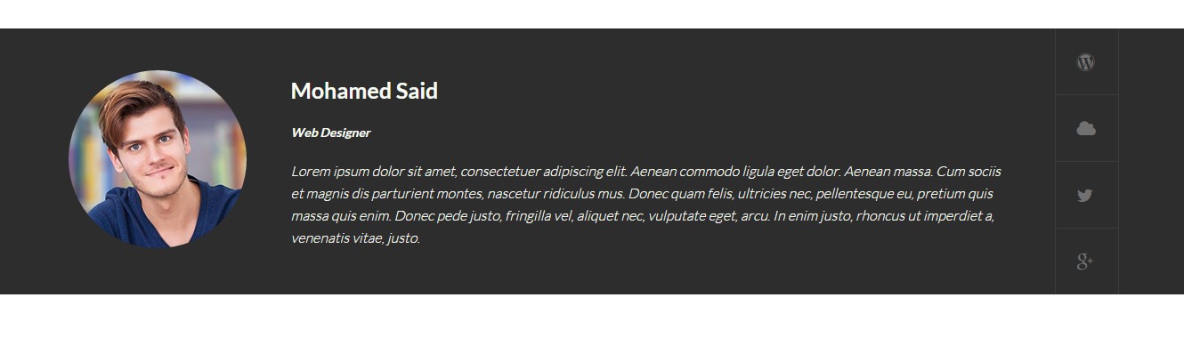
Person Box – Inline Description version
HTML markup
|
1 2 3 4 5 6 7 8 9 10 11 12 13 14 15 16 17 18 19 20 21 22 23 24 25 26 27 28 29 30 31 32 33 34 35 36 37 |
<div class="ct-personBox ct-personBox--inline ct-personBox--inlineDescription"> <div class="container"> <div class="ct-personMedia ct-u-displayTableVertical"> <div class="ct-u-displayTableCell"> <div class="ct-personImage"> <img src="assets/images/demo-content/single-member.jpg" alt="person"> </div> </div> <div class="ct-u-displayTableCell"> <div class="ct-personName ct-u-marginBottom20"> <span class="ct-personName--title ct-fw-700 ct-u-marginBottom20"> Mohamed Said </span> <span class="ct-personName--meta ct-fw-600"> Web Designer </span> </div> <div class="ct-personDescription"> <p class="ct-fw-300"> Lorem ipsum dolor sit amet, consectetuer adipiscing elit. Aenean commodo ligula eget dolor. Aenean massa. Cum sociis et magnis dis parturient montes, nascetur ridiculus mus. Donec quam felis, ultricies nec, pellentesque eu, pretium quis massa quis enim. Donec pede justo, fringilla vel, aliquet nec, vulputate eget, arcu. In enim justo, rhoncus ut imperdiet a, venenatis vitae, justo. </p> </div> </div> <div class="ct-u-displayTableCell"> <ul class="ct-socials--singleMember list-unstyled"> <li><a href="http://www.createit.pl/"><i class="fa fa-wordpress"></i></a></li> <li><a href="#"><i class="fa fa-cloud"></i></a></li> <li><a href="https://twitter.com/createitpl"><i class="fa fa-twitter"></i></a></li> <li><a href="#"><i class="fa fa-google-plus"></i></a></li> </ul> </div> </div> </div> </div> |
Was this article helpful ?
Nawigation
Screenshoot

Nawigation example
Classes
There are several options for menu and topbar scrolling effects
.yamm
.ct-headroom–scrollUpMenu
.ct-headroom–scrollUpTopBar
.ct-headroom–scrollUpBoth
.ct-headroom–fixedTopBar
.ct-headroom–fixedMenu
.ct-headroom–fixedBoth
.ct-headroom–hideMenu
HTML markup
|
1 2 3 4 5 6 7 8 9 10 11 12 13 14 15 16 17 18 19 20 21 22 23 24 25 26 27 28 29 30 31 32 33 34 35 36 37 38 39 40 41 42 43 44 45 46 47 48 49 50 51 52 53 54 55 56 57 58 59 60 61 62 63 64 65 66 67 68 69 70 71 72 73 74 75 76 77 78 79 80 81 82 83 84 85 86 87 88 89 90 91 92 93 94 95 96 97 98 99 100 101 102 103 104 105 106 107 108 109 110 111 112 113 114 115 116 117 118 119 120 121 122 123 124 125 126 127 128 129 130 131 132 133 134 135 136 137 138 139 140 141 142 143 144 145 146 147 148 149 150 151 152 153 154 155 156 157 158 159 160 161 162 163 164 165 166 167 168 169 170 171 172 173 174 175 176 177 178 179 180 181 182 183 184 185 186 187 188 189 190 191 192 193 194 195 196 197 198 199 200 201 202 203 204 205 206 207 208 209 210 211 212 |
<nav class="navbar navbar-default yamm " data-heighttopbar="60px" data-startnavbar="0"> <div class="container"> <div class="navbar-header"> <a href="index.html"><img src="assets/images/demo-content/logo.png" alt="logo"/></a> </div> <div class="ct-navbar--fluid pull-right"> <ul class="nav navbar-nav ct-navbar--fadeInUp"> <li class="active dropdown yamm-fw "><a href="index.html">Home</a> <ul class="dropdown-menu"> <li> <div class="yamm-content"> <div class="row"> <div class="col-sm-3"> <a class="active" href="index.html">Home Page V1</a> <a href="index2.html">Home Page V2</a> <a href="index3.html">Home Page V3</a> <a href="index4.html">Home Page V4</a> <a href="index5.html">Home Page V5</a> </div> <div class="col-sm-3"> <a href="index6.html">Home Page V6</a> <a href="index7.html">Home Page V7</a> <a href="index8.html">Home Page V8</a> <a href="index9.html">Home Page V9</a> <a href="index10.html">Home Page V10</a> </div> <div class="col-sm-3"> <a href="index11.html">Home Page V11</a> <a href="index12.html">Home Page V12</a> <a href="index13.html">Home Page V13</a> <a href="index14.html">Home Page V14</a> </div> <div class="col-sm-3"> <a href="index15.html">Home Page V15</a> <a href="index16.html">Home Page V16</a> <a href="index17.html">Home Page V17</a> <a href="index18.html">Home Page V18</a> </div> </div> </div> </li> </ul> </li> <li class="dropdown yamm-fw"><a href="index.html">Courses</a> <ul class="dropdown-menu"> <li> <div class="yamm-content"> <div class="row"> <div class="col-sm-4"> <a href="course-single.html">Single Course V1</a> <a href="course-single2.html">Single Course V2</a> <a href="course-single3.html">Single Course V3</a> </div> <div class="col-sm-4"> <a href="course-single4.html">Single Course V4</a> <a href="course-single5.html">Single Course V5</a> <a href="course-single6.html">Single Course V6</a> </div> <div class="col-sm-4"> <a href="course-single7.html">Single Course V7</a> <a href="course-single8.html">Single Course V8</a> <a href="course-single9.html">Single Course V9</a> </div> </div> </div> </li> </ul> </li> <li class="dropdown yamm-fw"><a href="index.html">Pages</a> <ul class="dropdown-menu"> <li> <div class="yamm-content"> <div class="row"> <div class="col-sm-3"> <a href="members.html">List of Members</a> <a href="member-single.html">Single Member V1</a> <a href="member-single2.html">Single Member V2</a> </div> <div class="col-sm-3"> <a href="blog.html">Blog V1</a> <a href="blog2.html">Blog V2</a> <a href="blog-single.html">Blog Single V1</a> </div> <div class="col-sm-3"> <a href="blog-single2.html">Blog Single V2</a> <a href="contact.html">Contact V1</a> <a href="contact2.html">Contact V2</a> </div> <div class="col-sm-3"> <a href="404-v1.html">404 V1</a> <a href="404-v2.html">404 V2</a> <a href="404-v3.html">404 V3</a> </div> </div> </div> </li> </ul> </li> <li class="dropdown yamm-fw"> <a href="features-typography.html">Features</a> <ul class="dropdown-menu"> <li> <div class="yamm-content"> <div class="row"> <div class="col-sm-4"> <ul class="list-unstyled"> <li><a href="features-grid.html"><i class="fa fa-fw fa-th"></i> Grid System</a></li> <li><a href="features-typography.html"><i class="fa fa-fw fa-font"></i> Typography</a></li> <li><a href="features-buttons.html"><i class="fa fa-fw fa-link"></i> Buttons</a></li> <li><a href="features-forms.html"><i class="fa fa-fw fa-align-justify"></i> Forms</a></li> <li><a href="features-tables.html"><i class="fa fa-fw fa-table"></i> Tables</a></li> <li><a href="features-sliders.html"><i class="fa fa-fw fa-navicon"></i> Sliders</a></li> </ul> </div> <div class="col-sm-4"> <ul class="list-unstyled"> <li><a href="features-pricetables.html"><i class="fa fa-fw fa-money"></i> Pricing Tables</a> </li> <li><a href="features-iconboxes.html"><i class="fa fa-fw fa-th-large"></i> Icon Boxes</a> </li> <li><a href="features-personboxes.html"><i class="fa fa-fw fa-users"></i> Person Boxes</a> </li> <li><a href="features-counters.html"><i class="fa fa-fw fa-plus"></i> Counters</a></li> <li><a href="features-toggable.html"><i class="fa fa-fw fa-toggle-on"></i> Toggables</a> </li> <li><a href="features-m-sections.html"><i class="fa fa-fw fa-play"></i> Media Sections</a> </li> </ul> </div> <div class="col-sm-4"> <ul class="list-unstyled"> <li><a href="features-charts.html"><i class="fa fa-fw fa-area-chart"></i> Charts</a></li> <li><a href="features-p-bars.html"><i class="fa fa-fw fa-bars"></i> Progress Bars</a></li> <li><a href="features-p-icons.html"><i class="fa fa-fw fa-star-half-full"></i> Progress Icons</a></li> <li><a href="features-lists.html"><i class="fa fa-fw fa-list"></i> Lists Simple</a></li> <li><a href="features-lists2.html"><i class="fa fa-fw fa-list"></i> Lists Icons</a></li> <li><a href="features-developers.html"><i class="fa fa-fw fa-code"></i> For developers</a> </li> </ul> </div> </div> </div> </li> </ul> </li> <li class="dropdown"><a href="contact.html">Contact</a></li> </ul> <div class="ct-navbarCart"> <i class="fa fa-shopping-cart"></i> <div class="ct-navbarCart--Info"> <div class="media ct-navbarCart--Item ct-u-displayTable ct-hoverImage--rectangle"> <a href="course-single.html"> <div class="media-left"> <img class="media-object" src="assets/images/demo-content/itemCart1.jpg" alt="Item Cart"> </div> <div class="media-body"> <h5 class="ct-navbarCart--itemName ct-fw-400">Your Product Name</h5> <span class="ct-navbarCart--itemPrice ct-u-colorMotive">90x3</span> </div> </a> </div> <div class="media ct-navbarCart--Item ct-u-displayTable ct-hoverImage--rectangle"> <a href="course-single.html"> <div class="media-left"> <img class="media-object" src="assets/images/demo-content/itemCart2.jpg" alt="Item Cart"> </div> <div class="media-body"> <h5 class="ct-navbarCart--itemName ct-fw-400">Your Product Name</h5> <span class="ct-navbarCart--itemPrice ct-u-colorMotive">90x3</span> </div> </a> </div> <div class="media ct-navbarCart--Item ct-u-displayTable ct-hoverImage--rectangle"> <a href="course-single.html"> <div class="media-left"> <img class="media-object" src="assets/images/demo-content/itemCart3.jpg" alt="Item Cart"> </div> <div class="media-body"> <h5 class="ct-navbarCart--itemName ct-fw-400">Your Product Name</h5> <span class="ct-navbarCart--itemPrice ct-u-colorMotive">90x3</span> </div> </a> </div> <div class="ct-navbarCart--summary"> <div class="pull-left"> <a class="ct-fw-400" href=""><i class="fa fa-trash-o"></i> Clear The Cart</a> </div> <div class="pull-right"> Total: $54.30 </div> <div class="clearfix"></div> </div> <a href="" class="btn btn-primaryDark ct-fw-600 text-uppercase ct-u-marginTop30">Checkout</a> </div> </div> <div id="ct-js-navSearch" class="ct-navbarSearch--icon"> <i class="fa fa-search"></i> </div> <div class="ct-navbar-search"> <form role="form"> <button class="ct-navbar-search-button" type="submit"> <i class="fa fa-search fa-fw"></i> </button> <div class="form-group"> <input id="search" placeholder="Search ..." required type="text" class="form-control input-lg"> </div> </form> </div> </div> </div> </nav> |
The following javascripts are required for the effects above:
|
1 2 3 |
<script src="assets/plugins/headroom/headroom.js"></script> <script src="assets/plugins/headroom/jQuery.headroom.js"></script> <script src="assets/plugins/headroom/init.js"></script> |
You fill find whole documentation of plugin in < script src="assets/plugins/headroom/init.js"></script>
Was this article helpful ?
Forms
Template comes with ready to use:
- Contact Form
All needed files are in /form directory.
Remember to includeon page.
To configure form just edit form/config.php and change e-mails to your own :
|
1 2 |
$to = "mail@example.com"; $from = "mail@example.com"; |
That’s it!
Screenshot
Markup
|
1 2 3 4 5 6 7 8 9 10 11 12 13 14 15 16 17 18 19 20 21 22 23 24 25 26 27 |
<form role="form" action="assets/form/send.php" method="POST" class="validateIt"> <div class="row"> <div class="col-sm-6"> <div class="form-group ct-u-marginBottom30"> <input id="contact_name" data-error-message="Name" placeholder="Name" type="text" required="" name="field[]" class="form-control ct-input--type1 input-hg" title="Name"> <label for="contact_name" class="sr-only"></label> </div> </div> <div class="col-sm-6"> <div class="form-group ct-u-marginBottom30"> <input id="contact_email" data-error-message="Email" placeholder="Email" required="" name="field[]" type="email" class="form-control ct-input--type1 input-hg h5-email" title="Email"> <label for="contact_email" class="sr-only"></label> </div> </div> </div> <div class="form-group ct-u-marginBottom30"> <input id="contact_phone" placeholder="Website" name="field[]" type="tel" class="form-control h5-phone ct-input--type1 input-hg" title="Phone"> <label for="contact_phone" class="sr-only"></label> </div> <div class="form-group ct-u-marginBottom30"> <textarea id="contact_message" data-error-message="Message is required" placeholder="Your Message" class="form-control ct-input--type1" rows="6" name="field[]" required="" title="Message"></textarea> <label for="contact_message" class="sr-only"></label> </div> <button type="submit" class="btn btn-primary btn-lg pull-right"><span>Send Message</span></button> <div class="clearfix"></div> </form> |
Options (can be changed in HTML) :
Mail Subject – just change value in :
Success Message – change successMessage div content
Error Message – change errorMessage div content
Common Problems
Where I can edit my contact form/newsletter email addres?
You can define where we should send messages from your contact form and newsletter in file HTML/assets/form/config.php
Form config
Add your email address instead of recipient@mail.com and it’s ready to use!
Was this article helpful ?
Buttons
Test has several types of buttons you can use
Screenshots
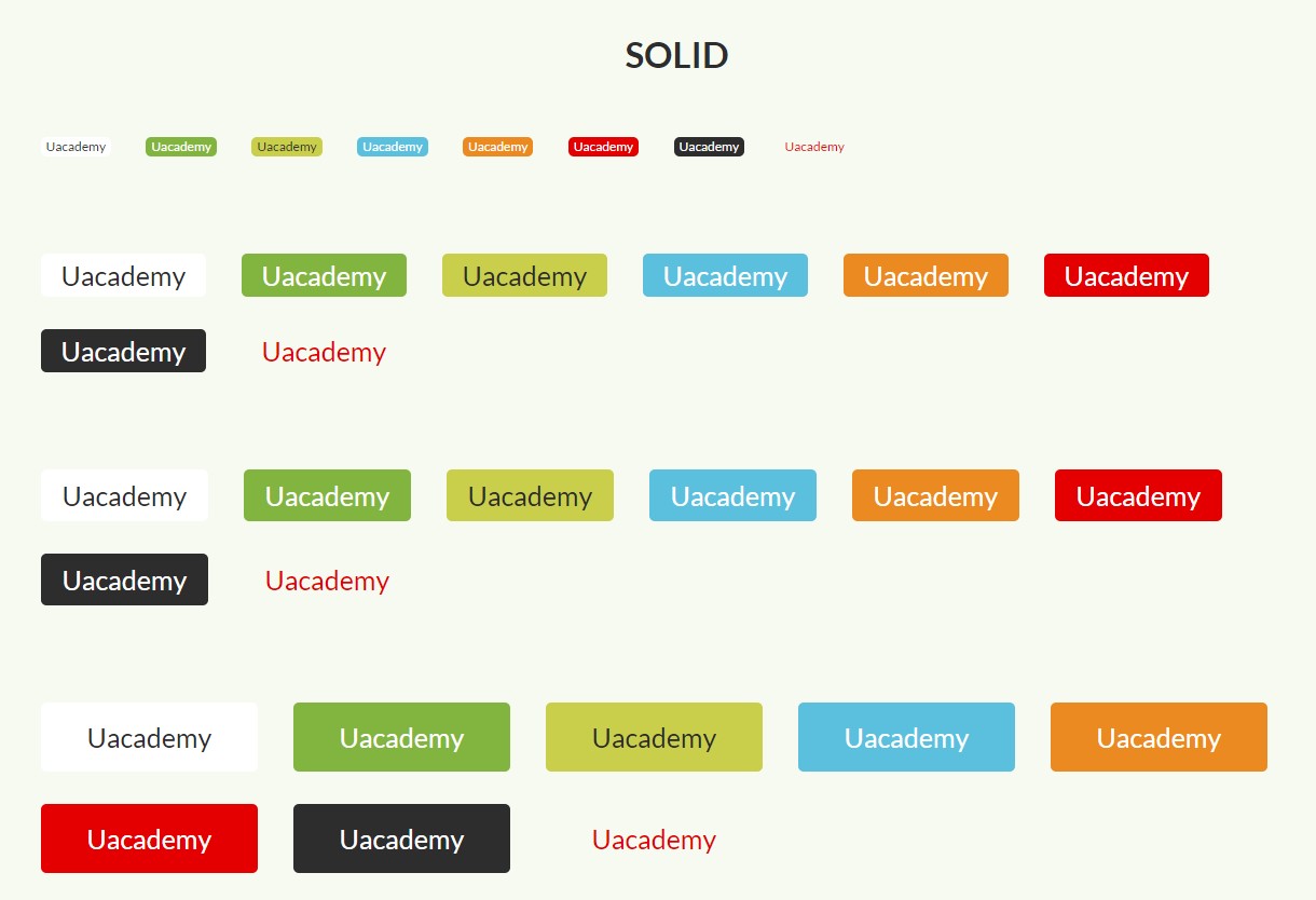
Buttons Solid
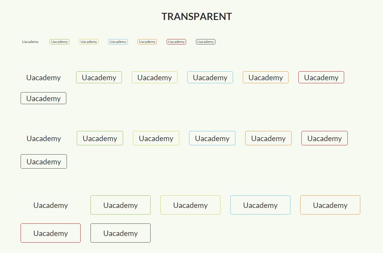
Buttons Transparent
There are four sizes of buttons:
— btn
— btn-xs
— btn-sm
— btn-lg
Classes used for the different button type
— btn
— btn-default
— btn-primary
— btn-primaryDark
— btn-success
— btn-info
— btn-warning
— btn-danger
— btn-dark
— btn-link
— btn-loadMore
— btn-transparent
— btn-bordered–dark
— btn-bordered–Light
HTML markup example
|
1 |
<a href="#" class="btn btn-primary btn-sm ct-u-marginBottom30">Uacademy</a> |
Was this article helpful ?
HTML Structure
This theme is built upon bootstrap framework and is fully responsive. It adapts to window resolution and looks good on all devices including iPad and iPhone.
See for yourself (resize your browser).
If you would like to read more
about bootstrap framework click here :
Grid System and Single row structure
The default Bootstrap grid system utilizes 12 columns. It’s responsive grid and adapts to viewport. Below 767px viewports, the columns become fluid and stack vertically. The fluid grid system uses percents instead of pixels for column widths. Each row always include 12 columns (for example col-md-8 + col-md-4 = col-md-12).
Bootstrap documentation: here
Basic grid HTML:
|
1 2 3 4 5 6 7 8 9 10 11 12 13 14 15 16 17 18 19 20 21 22 23 24 25 26 27 |
<div class="row"> <div class="col-md-1">.col-md-1</div> <div class="col-md-1">.col-md-1</div> <div class="col-md-1">.col-md-1</div> <div class="col-md-1">.col-md-1</div> <div class="col-md-1">.col-md-1</div> <div class="col-md-1">.col-md-1</div> <div class="col-md-1">.col-md-1</div> <div class="col-md-1">.col-md-1</div> <div class="col-md-1">.col-md-1</div> <div class="col-md-1">.col-md-1</div> <div class="col-md-1">.col-md-1</div> <div class="col-md-1">.col-md-1</div> </div> <div class="row"> <div class="col-md-8">.col-md-8</div> <div class="col-md-4">.col-md-4</div> </div> <div class="row"> <div class="col-md-4">.col-md-4</div> <div class="col-md-4">.col-md-4</div> <div class="col-md-4">.col-md-4</div> </div> <div class="row"> <div class="col-md-6">.col-md-6</div> <div class="col-md-6">.col-md-6</div> </div> |
Page structure
Below you will find default page structure :
|
1 2 3 4 5 6 7 8 9 10 11 12 13 14 15 16 17 18 19 20 21 22 23 24 25 26 27 28 29 30 31 32 33 34 35 36 |
<!DOCTYPE html> <html> <head> [css] </head> <body> [header] [main menu] <!-- main container --> <div id="wrapper"> [component 1] <!-- fullwidth element --> </div> [fullwidth parallax] <div class="container"> <!-- / fullwidth element --> [component 6] </div> <!-- / main container --> [footer] [javascripts] </body> </html> |
Was this article helpful ?
CSS files and structure
If you would like to edit the color, font, or style of any elements, you would do the following:
|
1 |
#primaryContent a {color: #someColor;} |
If you find that your new style is not overriding, it is most likely because of a specificity problem. Scroll down in your CSS file and make sure that there isn’t a similar style that has more weight.
I.E.
|
1 |
#wrap #primaryContent a {color: #someColor;} |
So, to ensure that your new styles are applied, make sure that they carry enough “weight” and that there isn’t a style lower in the CSS file that is being applied after yours.
Colors
The theme includes a css file wich you can use to edit the colors.
You just need to add the corresponding CSS file to the head of the page like this:
|
1 2 3 4 5 |
<head> (..) <link rel="stylesheet" type="text/css" href="css/motive.css"> (..) </head> |
Icons
We’ve included 360+ font icons.
Awesome Icons – http://fontawesome.io/icons/
HTML markup:
|
1 2 |
<!-- Awesome Icons --> <i class="fa fa-cog"></i> |
CSS Files & Structure
We’ve included 2 files.
bootstrap.css contains Bootstrap 3 Library.
style.css file contains general styles.
style.less
1. Font Awesome
2. Et line Font
3. Variables
4. Slick
5. Selectize
6. Starrr
7. Magnific Popup
8. Isotope
9. Mixins
10. Portfolio
11. Animate css
12. Typography
13. Utilities
14. Media Sections
15. NstSlider
16. Beat Picker
17. Yamm
18. Menu
19. Forms
20. Buttons
21. Font Awesome
22. Boxed
23. Google Maps
24. Tickets Button
25. Section Shadow
26. Breadcumbs
27. Dividers
28. FAQ thumbnail
29. Testimonials
30. Image container
31. Headings
32. Media Box
33. InfoBox
34. PersonBox
35. ProductBox
36. IconBox
37. Tabs
38. Accordion
39. Gallery
40. Blog
41. Blocquote
42. Footer
43. Widgets
44. Media Queries
For more advanced user – we included also folder with less files – under assets/less you will find the following files:
— file for motive styling
motive-parties.less
motive-tourist.less
motive-wedding.less
motive-tours.less
— file for buttons styling (colors, sizes etc.)
buttons.less
Was this article helpful ?
Javascript Components
JavaScript files:
- /charts/ – script for canvas charts animating
- /counters/ – Files needed for initialising the animation number after loading pages.
- /ct-mediaSection/ – Media sections where we can add parralax, kenburns or video to the section. Dynamical content of medias..
- /headroom/ – Animated/fixed navbars. Plugin needed for detecting scrollbar and attaching animations for menu.
- /magnificpopup/ – Needed for galleries and their popups images where we can review them with slides via arrows.
- /selectize.js-master/ – Plugin which creates select box for select tag in the page. It generates html code via javascript so that each browser can have the same select box.
- /slick/ – Files which initialize sliders in the page.
- /main.js/ – The main javascript initializaions and other major snippets.
- /selectize/ – plugin for select https://brianreavis.github.io/selectize.js/
- /nstSlider/ – plugin for range slider http://lokku.github.io/jquery-nstslider/
- /starrr/ – plugin for stars in products https://github.com/dobtco/starrr
Screenshot
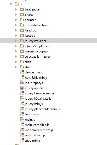
jquery.appear
This plugin call function when element appear in viewport. This is used in custom animation, progress bars, counter timer.
Documentation: https://github.com/bas2k/jquery.appear/
|
1 2 3 4 5 6 7 8 9 10 11 12 13 |
if (jQuery().appear) { if (device.mobile()) { // disable animation on mobile jQuery("body").removeClass("withAnimation"); } else { jQuery('.withAnimation .animated').appear(function () { jQuery(this).each(function () { jQuery(this).addClass('activate'); jQuery(this).addClass($(this).data('fx')); }); }, {accY: -150}); } } |
Charts.js
This plugin is used to make graphics.
Documentation: http://www.chartjs.org/
Was this article helpful ?
Google Map Plugin
Maps in Test are created with our premium Map plugin. Here: link you will fin full plugins documentation.
Was this article helpful ?
Testimonials
Css styles:
.ct-testimonials–withBigImage
.ct-testimonials–inline
Testimonials with big image
Screenshot

Tetsimonial with big image
Markup (ct-testimonials–withBigImage) – example for one item:
|
1 2 3 4 5 6 7 8 9 10 11 12 13 14 15 16 |
<div class="ct-testimonials--withBigImage"><img src="assets/images/demo-content/testimonials-background.jpg" alt="testimonials"> <div class="ct-testimonials-slider"> <div data-adaptiveHeight="false" data-animations="true" data-autoplay="true" data-infinite="true" data-autoplaySpeed="3000" data-draggable="true" data-touchMove="false" data-arrows="false" data-XSitems="1" data-SMitems="2" data-MDitems="2" data-LGitems="3" data-items="1" class="ct-slick ct-js-slick ct-slick--arrowsTopBlue text-center"> <div class="item"> <div class="ct-slick-inner ct-u-marginBoth50"> <div class="ct-slick-content"> <div class="ct-personBox ct-personBox--titleTop"> <div class="ct-personBox-image"><img src="assets/images/demo-content/personBox-testimonials.jpg" alt="person"></div> <div class="ct-personBox-description"> <h5 class="ct-personBox-title">gabrielle memphis</h5> <p>My friends couldn't believe the price. The hotels were top of the line, and our guide was great. </p> </div> </div> </div> </div> </div> |
Testimonials – inline
Screenshot
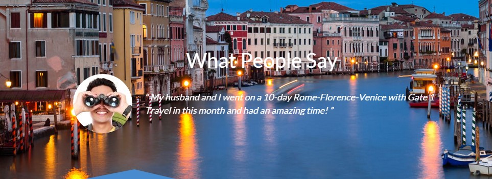
Testimonials inline
Markup (ct-testimonials–inline) – example for one item:
|
1 2 3 4 5 6 7 8 9 10 11 12 13 14 |
<div data-adaptiveHeight="true" data-animations="true" data-autoplay="true" data-infinite="true" data-autoplaySpeed="6000" data-draggable="true" data-touchMove="false" data-arrows="false" data-items="1" class="ct-slick ct-js-slick ct-u-marginBottom10"> <div class="item"> <div class="ct-slick-inner"> <div class="ct-slick-content"> <div class="ct-testimonials--inline"> <div class="ct-testimonials-image"><img src="assets/images/demo-content/testimonials2.jpg" alt="testimonials"></div> <div class="ct-testimonials-description"> “ My husband and I went on a 10-day Rome-Florence-Venice with Gate 1 Travel in this month and had an amazing time! ” </div> </div> </div> </div> </div> |
JavaScript
<script src=”../assets/js/slick/js/slick.js”></script>
Was this article helpful ?
Slick Slider
There are three version of this slider in the Test depending on the navigation class that will be used.
Css styles:
— Core classes for slick plugin
.ct-slick
.ct-js-slick
— Different navigations:
.ct-slick–arrowsTop
.ct-slick–arrowsTopBlue
.ct-slick–arrowsTopBlue-style2
.ct-slick–arrowsNoBorder
.ct-slick–arrowsCircle
.ct-slick–arrowsCustom
.ct-slick–arrowsSquare
.ct-slick–lightBlue
This classes you add to div with class .ct-slick, it adds different look for navigations.
Screenshot:
Slick
Example of HTML markup:
|
1 2 3 |
<div data-adaptiveHeight="true" data-animations="true" data-autoplay="true" data-infinite="true" data-autoplaySpeed="6000" data-draggable="true" data-touchMove="false" data-arrows="true" data-items="1" class="ct-slick ct-js-slick"> <div data-bg="assets/images/demo-content/sliderImage.jpg" class="item"> .. some content .. |
JavaScript markup:
— Script path: assets/js/slick/init.js, assets/js/slick/slick.js
|
1 2 3 4 5 6 7 8 9 10 11 12 13 14 15 16 17 18 19 20 21 22 23 24 25 26 27 28 29 30 31 32 33 34 35 36 37 38 39 40 41 42 43 44 45 46 47 48 49 50 51 52 53 54 55 56 57 58 59 60 61 62 63 64 65 66 67 68 69 70 71 72 73 74 75 76 77 78 79 80 81 82 83 84 85 86 87 88 89 90 91 92 93 94 95 96 |
(function ($) { "use strict"; var $slick = $(".ct-js-slick"); var $devicewidth = (window.innerWidth > 0) ? window.innerWidth : screen.width; function validatedata($attr, $defaultValue) { "use strict"; if ($attr !== undefined) { return $attr } return $defaultValue; } function parseBoolean(str, $defaultValue) { "use strict"; if (str == 'true') { return true; } else if (str == "false") { return false; } return $defaultValue; } $(document).ready(function () { if ($().slick) { // Responsive Breakpoins var $widthLG = 1200, $widthMD = 900, $widthSM = 600, $widthXS = 0; if ($slick.length > 0) { $slick.each(function () { var $this = $(this), ctanimations = validatedata($this.attr("data-animations"), true), // variable from main.js $slickheight = $this.attr('data-height'); if (ctanimations === false || $devicewidth < 768 || device.mobile() || device.ipad() || device.androidTablet()) { // Disable scroll animation on mobile $slick.find('.animated').each(function () { $(this).removeClass('animated'); }); } else { // Slider init animations $('.cssAnimate .animated').appear(function () { var $this = $(this); $this.each(function () { if ($this.data('time') !== undefined) { setTimeout(function () { $this.addClass('activate'); $this.addClass($this.data('fx')); }, $this.data('time')); } else { $this.addClass('activate'); $this.addClass($this.data('fx')); } }); }, {accX: 50, accY: -200}); } // slider height if ($this.attr('data-height')) { $this.css({height: $slickheight}); $this.find('.slick-list').css({height: $slickheight}); $this.find('.slick-track').css({height: $slickheight}); $this.find('.item').each(function () { $(this).css({height: $slickheight}) }); } // item height $this.find('.item').each(function () { var $item = $(this), $height = $item.attr('data-height'); $item.css({ height: $height }) }); // Background Image // ------------------------------- $this.find(".item").each(function () { var $slide_item = $(this); var bg = validatedata($slide_item.attr('data-bg'), false); if (bg) { $slide_item.css('background-image', 'url("' + bg + '")'); } }); |
|
1 2 3 4 5 6 7 8 9 10 11 12 13 14 15 16 17 18 19 20 21 22 23 24 25 26 27 28 29 30 31 32 33 34 35 36 37 38 39 40 41 42 43 44 45 46 47 48 49 50 51 52 53 54 55 56 57 58 59 60 61 62 63 64 65 66 67 68 69 70 71 72 73 74 75 76 77 78 79 80 81 82 83 84 85 86 87 88 89 90 91 92 93 94 95 96 97 98 99 100 101 102 103 104 105 106 107 108 109 110 111 112 113 114 115 116 117 118 119 120 121 122 123 124 125 126 127 128 129 130 131 132 133 134 135 136 137 138 139 140 141 142 143 144 145 146 |
var ctslidesToShow = parseInt(validatedata($this.attr("data-items"), 1), 10), // Non Responsive slidesXS = parseInt(validatedata($this.attr("data-XSitems"), ctslidesToShow), 10), slidesSM = parseInt(validatedata($this.attr("data-SMitems"), slidesXS), 10), // Default Item from data-items; slidesMD = parseInt(validatedata($this.attr("data-MDitems"), slidesSM), 10), // Default Item from smaller Device; slidesLG = parseInt(validatedata($this.attr("data-LGitems"), slidesMD), 10), // Default Item from smaller Device; ctaccessibility = parseBoolean($this.attr("data-accessibility"), true), ctadaptiveHeight = parseBoolean($this.attr("data-adaptiveHeight"), false), ctautoplay = parseBoolean($this.attr("data-autoplay"), false), ctautoplaySpeed = parseInt(validatedata($this.attr("data-autoplaySpeed"), 5000), 10), ctarrows = parseBoolean($this.attr("data-arrows"), true), ctasNavFor = validatedata($this.attr("data-asNavFor")), ctappendArrows = validatedata($this.attr("data-appendArrows")), ctprevArrow = validatedata($this.attr("data-prevArrow"), '<button type="button" class="slick-prev">Previous</button>'), ctnextArrow = validatedata($this.attr("data-nextArrow"), '<button type="button" class="slick-next">Next</button>'), ctcenterMode = parseBoolean($this.attr("data-centerMode"), false), ctcenterPadding = validatedata($this.attr("data-centerPadding"), '50px'), ctcssEase = validatedata($this.attr("data-cssEase"), 'ease'), ctdots = parseBoolean($this.attr("data-dots"), false), ctdraggable = parseBoolean($this.attr("data-draggable"), true), ctfade = parseBoolean($this.attr("data-fade"), false), ctfocusOnSelect = parseBoolean($this.attr("data-focusOnSelect"), false), cteasing = validatedata($this.attr("data-easing"), 'linear'), ctedgeFriction = parseInt(validatedata($this.attr("data-edgeFriction"), 0.15), 10), ctinfinite = parseBoolean($this.attr("data-infinite"), true), ctinitialSlide = parseInt(validatedata($this.attr("data-initialSlide"), 0), 10), ctlazyLoad = validatedata($this.attr("data-lazyLoad"), 'ondemand'), ctmobileFirst = parseBoolean($this.attr("data-mobileFirst"), true), ctpauseOnHover = parseBoolean($this.attr("data-pauseOnHover"), true), ctpauseOnDotsHover = parseBoolean($this.attr("data-pauseOnDotsHover"), false), ctrespondTo = validatedata($this.attr("data-respondTo"), 'window'), ctslide = validatedata($this.attr("data-slide")), ctslidesToScroll = parseInt(validatedata($this.attr("data-slidesToScroll"), 1), 10), ctspeed = parseInt(validatedata($this.attr("data-speed"), 300), 10), ctswipe = parseBoolean($this.attr("data-swipe"), true), ctswipeToSlide = parseBoolean($this.attr("data-swipeToSlide"), false), cttouchMove = parseBoolean($this.attr("data-touchMove"), true), cttouchThreshold = parseInt(validatedata($this.attr("data-touchThreshold"), 5), 10), ctuseCSS = parseBoolean($this.attr("data-useCSS"), true), ctvariableWidth = parseBoolean($this.attr("data-variableWidth"), false), ctvertical = parseBoolean($this.attr("data-vertical"), false), ctrtl = parseBoolean($this.attr("data-rtl"), false); //$this.on('init', function (event, slick) { // console.log(slick) // if (!($('html').is('.ie8'))){ // // Selectize.js // ---------------------------------------------------------------- // var $selectize = $(slick).find('.ct-js-selectize-slick'); // $selectize.each(function(){$(this).selectize();}) // } //}); // Slick Init $this.slick({ slidesToShow: ctslidesToShow, accessibility: ctaccessibility, // Enables tabbing and arrow key navigation adaptiveHeight: ctadaptiveHeight, // Enables adaptive height for single slide horizontal carousels. autoplay: ctautoplay, // Enables Autoplay autoplaySpeed: ctautoplaySpeed, // Autoplay Speed in milliseconds arrows: ctarrows, // Prev/Next Arrows asNavFor: ctasNavFor, // Set the slider to be the navigation of other slider (Class or ID Name) appendArrows: ctappendArrows, // Change where the navigation arrows are attached (Selector, htmlString, Array, Element, jQuery object) prevArrow: ctprevArrow, // Allows you to select a node or customize the HTML for the "Previous" arrow. nextArrow: ctnextArrow, // Allows you to select a node or customize the HTML for the "Next" arrow. centerMode: ctcenterMode, // Enables centered view with partial prev/next slides. Use with odd numbered slidesToShow counts. centerPadding: ctcenterPadding, // Side padding when in center mode (px or %) cssEase: ctcssEase, // CSS3 Animation Easing dots: ctdots, // Show dot indicators draggable: ctdraggable, // Enable mouse dragging fade: ctfade, // Enable fade focusOnSelect: ctfocusOnSelect, // Enable focus on selected element (click) easing: cteasing, // Add easing for jQuery animate. Use with easing libraries or default easing methods edgeFriction: ctedgeFriction, // Resistance when swiping edges of non-infinite carousels infinite: ctinfinite, // Infinite loop sliding initialSlide: ctinitialSlide, // Slide to start on lazyLoad: ctlazyLoad, // Set lazy loading technique. Accepts 'ondemand' or 'progressive' mobileFirst: ctmobileFirst, // Responsive settings use mobile first calculation pauseOnHover: ctpauseOnHover, // Pause Autoplay On Hover pauseOnDotsHover: ctpauseOnDotsHover,// Pause Autoplay when a dot is hovered respondTo: ctrespondTo, // Width that responsive object responds to. Can be 'window', 'slider' or 'min' (the smaller of the two) slide: ctslide, // Element query to use as slide slidesToScroll: ctslidesToScroll, // Number of slides to scroll speed: ctspeed, // Slide/Fade animation speed swipe: ctswipe, // Enable swiping swipeToSlide: ctswipeToSlide, // Allow users to drag or swipe directly to a slide irrespective of slidesToScroll touchMove: cttouchMove, // Enable slide motion with touch touchThreshold: cttouchThreshold, // To advance slides, the user must swipe a length of (1/touchThreshold) * the width of the slide useCSS: ctuseCSS, // Enable/Disable CSS Transitions variableWidth: ctvariableWidth, // Variable width slides vertical: ctvertical, // Vertical slide mode rtl: ctrtl, // Change the slider's direction to become right-to-left responsive: [ // Responsive Breakpoints { breakpoint: $widthLG, // Desktop settings: { slidesToShow: slidesLG } }, { breakpoint: $widthMD, // Laptop settings: { slidesToShow: slidesMD } }, { breakpoint: $widthSM, // Tablet settings: { slidesToShow: slidesSM } }, { breakpoint: $widthXS, // Mobile settings: { slidesToShow: slidesXS } } ] // end Responsive Breakpoints }); //end $this.slick $this.on('beforeChange', function () { if (ctanimations) { $this.find(".slick-slide [data-fx]").each(function () { var $content = $(this); $content.removeClass($content.data('fx')).removeClass("activate"); }); setTimeout(function () { $this.find(".slick-active [data-fx]").each(function () { var $content = $(this); if ($content.data('time') !== undefined) { setTimeout(function () { $content.addClass($content.data('fx')).addClass("activate"); }, $content.data('time')); } else { $content.addClass($content.data('fx')).addClass("activate"); } }); }, 150); } }); }); // end each functions } // end length if } // end Slick }); // end Doc Ready }(jQuery)); |
Was this article helpful ?
Section decoration
In Test you can add decoration for the element.
Css styless:
.ct-u-decoration–triangleBefore
Screenshot:

Decoration T&T
Markup:
|
1 |
<section class="ct-u-decoration--triangleBefore"></section> |
Was this article helpful ?
Product Box
Test have several types of product box
CSS styless:
.ct-productBox
.ct-productBox–style2
.ct-productBox–grey
.ct-productBox–moreInfo
.ct-productBox–moreInfo-inline
.ct-productBox–vertical
.ct-productBox–inline
.ct-productBox–verticalSmall
.ct-productBox–mini
Product box – default
Screenshot:
Markup:
|
1 2 3 4 5 6 7 8 9 10 11 12 13 14 |
<div class="ct-productBox ct-u-marginBottom50"> <div class="ct-productBox-image"> <div class="ct-productBox-imageContainer"><a href="#"><img src="assets/images/demo-content/product-image.jpg" alt="Product"></a></div> </div> <div class="ct-productBox-Description"> <div class="ct-productBox-DescriptionInner"><a href="#"> <h5 class="text-uppercase ct-u-marginBottom20 ct-fw-700">adventure day</h5></a> <p>Vestibulum congue elit vitae nisi vestiub ulum, ut porttitor velit miaximus etaiu ci.</p> </div> <div class="ct-productBox-Meta"><a href="#" class="btn btn-primary btn-xs text-uppercase ct-u-marginBoth10">more details</a><span class="ct-price">$49</span> <div class="clearfix"></div> </div> </div> </div> |
Product box – style 2
Screenshot:
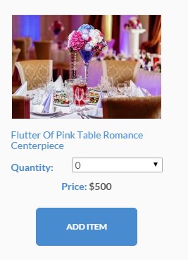
Product box – style 2
Markup:
|
1 2 3 4 5 6 7 8 9 10 11 12 13 14 15 16 17 18 |
<div class="ct-productBox ct-productBox--inline ct-productBox--style2 ct-u-marginBottom50"> <div class="ct-productBox-image"> <div class="ct-productBox-imageContainer"><a href="#"><img src="assets/images/demo-content/product-image14.jpg" alt="Product"></a></div> </div> <div class="ct-productBox-Description text-center"> <div class="ct-productBox-DescriptionInner"><a href="#"> <h6 class="text-capitalize ct-u-marginBottom10 ct-fw-400 text-left">Flutter of Pink Table Romance Centerpiece</h6></a><span class="ct-fw-600 ct-u-colorMotive ct-select-label">Quantity:</span> <select class="ct-select ct-js-selectize-slick ct-select--type2 ct-u-marginBottom10"> <option value="0">0</option> <option value="1">1</option> <option value="2">2</option> </select> <div class="clearfix"></div> <div class="ct-u-marginBottom20"><span class="ct-u-colorMotive ct-fw-700">Price: </span><span class="ct-fw-700 ct-js-price">$500</span></div> <button type="submit" class="btn btn-primary btn-lg">ADD ITEM</button> </div> </div> </div> |
Product box – more info
Screenshot:

Product box – more info
Markup:
|
1 2 3 4 5 6 7 8 9 10 11 12 13 14 15 16 17 18 19 20 21 22 23 24 25 26 27 |
<div class="ct-productBox ct-productBox--moreInfo ct-productBox--moreInfo-inline"> <h4 class="h4 ct-u-marginBottom30">Skip the Line: Ancient Rome and Colosseum Half-Day Walking Tour</h4> <div class="ct-productBox-Description"> <div class="ct-productBox-image"> <div class="ct-productBox-imageContainer"><a href="#"><img src="assets/images/demo-content/trip.jpg" alt="Product"></a></div> </div> <div class="ct-productBox-Meta text-center"> <div class="ct-productBox-deliveryInformation"> <div class="ct-u-displayTableRow"> <div class="ct-productBox-MetaItem"><span class="ct-u-colorMotive ct-fw-700 text-uppercase">Days</span><span class="h5 text-uppercase ct-days">8</span></div> <div class="ct-productBox-MetaItem"><span class="ct-u-colorMotive ct-fw-700 text-uppercase">package</span><span class="h5 text-uppercase">BASIC</span></div> <div class="ct-productBox-MetaItem"> <div class="ct-productBox-price"><span class="ct-discount">$346</span><span class="ct-currency">$300</span></div> </div> </div> <div class="ct-u-displayTableRow"> <div class="ct-productBox-date ct-productBox-MetaItem"><span class="ct-u-colorMotive"><i class="fa fa-calendar"></i>Date</span><span class="ct-date">7/05/2015</span></div> <div class="ct-productBox-departure ct-productBox-MetaItem"><span class="ct-u-colorMotive"><i class="fa fa-plane"></i>Departure</span><span>AZ</span></div> <div class="ct-productBox-MetaItem"> <div data-rating="3" class="starrr"></div> </div> </div> </div><a href="#" class="btn btn-primary btn-sm text-uppercase ct-u-marginTop20">view trip</a> </div> </div> <p class="ct-u-marginTop20">Leave the crowds behind and head straight inside the Colosseum with your skip-the-line entrance ticket! In a group of no more than 25 people, explore the first...</p> </div> |
Product box – vertical product box
Screenshot:
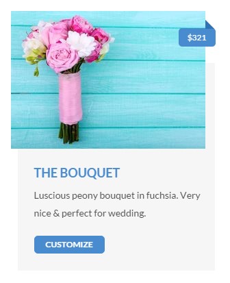
Product box – vertical
Markup:
|
1 2 3 4 5 6 7 8 9 10 11 12 13 14 |
<div class="ct-productBox ct-productBox--vertical ct-productBox--verticalSmall ct-productBox--grey"> <div class="ct-productBox-image"> <div class="ct-productBox-imageContainer"><a href="#"><img src="assets/images/demo-content/product-small.jpg" alt="Product"></a> <div class="ct-ribbon text-uppercase"><span>$321</span></div> </div> </div> <div class="ct-productBox-Description"> <div class="ct-productBox-DescriptionInner"><a href="#"> <h5 class="text-uppercase ct-u-marginBottom10 ct-fw-700">the bouquet</h5></a> <p class="ct-u-marginBottom10">Luscious peony bouquet in fuchsia. Very nice & perfect for wedding.</p> </div> <div class="ct-productBox-Meta"><a href="#" class="btn btn-primary btn-xs text-uppercase">customize</a></div> </div> </div> |
Product box – mini product box
Screenshot:

Product box – mini
Markup:
|
1 2 3 4 5 6 7 8 9 10 11 12 13 |
<div class="ct-productBox ct-productBox--mini"> <div class="ct-productBox-image"><img src="assets/images/demo-content/product-mini.jpg" alt="" class="ct-u-marginBottom20"> <div class="ct-productBox-price"> <div class="ct-productBox-iconBackground"><span class="ct-price"><span class="ct-currency">$</span>45</span></div> </div> </div> <div class="ct-productBox-Description"> <div class="ct-productBox-DescriptionInner"><a href="#"> <h5 class="text-uppercase ct-fw-700">The Grand Package</h5></a> <p class="ct-u-marginBottom10 ct-fw-700">Starting from $8 per person</p><a href="#" class="btn btn-primary btn-xs text-uppercase">book now</a> </div> </div> </div> |
Was this article helpful ?
Person Box
Test has three versions of person box.
CSS classes:
.ct-personBox
.ct-personBox–withHover
.ct-personBox–titleTop
Default person box
Screenshot:

Person box default
Markup:
|
1 2 3 4 5 6 |
<div class="ct-personBox"> <div class="ct-personBox-image"><img src="assets/images/demo-content/personBox.jpg" alt="person"></div> <div class="ct-personBox-description"> <h5 class="ct-personBox-title">Kareb Dhonson</h5><span class="ct-personBox-meta">The ceo</span> </div> </div> |
Tite top person box
Screenshot:

Person box title top
Markup:
|
1 2 3 4 5 6 7 |
<div class="ct-personBox ct-personBox--titleTop"> <div class="ct-personBox-image"><img src="assets/images/demo-content/personBox-testimonials.jpg" alt="person"></div> <div class="ct-personBox-description"> <h5 class="ct-personBox-title">gabrielle memphis</h5> <p>My friends couldn't believe the price. The hotels were top of the line, and our guide was great. </p> </div> </div> |
Person box with hover
Screenshot:
Person box with hover
Markup:
|
1 2 3 4 5 6 |
<div class="ct-personBox ct-personBox--withHover"> <div class="ct-personBox-image"><img src="assets/images/demo-content/todo1.jpg" alt="person"></div> <div class="ct-personBox-description"> <h5 class="ct-personBox-title">Colosseum</h5><span class="ct-personBox-meta">3 tours</span><a href="#" class="btn btn-primary btn-xs text-uppercase">read more</a> </div> </div> |
Was this article helpful ?
Navigation
Css styles:
.yamm
.ct-headroom–scrollUpMenu
.ct-headroom–scrollUpTopBar
.ct-headroom–scrollUpBoth
.ct-headroom–fixedTopBar
.ct-headroom–fixedMenu
.ct-headroom–fixedBoth
.ct-headroom–hideMenu
Screenshot:
Navigation
Markup:
|
1 2 3 4 5 6 7 8 9 10 11 12 13 14 15 16 17 18 19 20 21 22 23 24 25 26 27 28 29 30 31 32 33 34 35 36 37 38 39 40 41 42 43 44 45 46 47 48 49 50 51 52 53 54 55 56 57 58 59 |
<nav class="navbar yamm text-uppercase"> <div class="container"> <div class="navbar-header"><a href="index.html"><img src="assets/images/demo-content/logo.png" alt="logo"></a></div> <ul class="nav navbar-nav ct-navbar--fadeInUp pull-right"> <li class="dropdown"><a href="index.html">home</a> <ul class="dropdown-menu"> <li><a href="adventure.html">Adventure</a><a href="adventure2.html">Adventure - next</a><a href="travel.html">Travel</a><a href="travel-deals.html">Travel Deals</a></li> </ul> </li> <li class="dropdown yamm-fw"><a href="index.html">private tours</a> <ul class="dropdown-menu"> <li> <div class="yamm-content"> <div class="container"> <div class="row"> <div class="col-sm-4"><a href="basic-package.html">Basic Package</a></div> <div class="col-sm-4"><a href="basic-package-single.html">home</a></div> <div class="col-sm-4"><a href="index.html">home</a></div> </div> </div> </div> </li> </ul> </li> <li class="dropdown yamm-fw"><a href="itinerary.html">Itinerary</a></li> <li class="dropdown yamm-fw"><a href="index.html">Pages</a> <ul class="dropdown-menu"> <li> <div class="yamm-content"> <div class="container"> <div class="row"> <div class="col-sm-4"><a href="index.html">home</a></div> <div class="col-sm-4"><a href="index.html">home</a></div> <div class="col-sm-4"><a href="index.html">home</a></div> </div> </div> </div> </li> </ul> </li> <li class="dropdown yamm-fw"><a href="index.html">Features</a> <ul class="dropdown-menu"> <li> <div class="yamm-content"> <div class="container"> <div class="row"> <div class="col-sm-4"><a href="index.html">home</a></div> <div class="col-sm-4"><a href="index.html">home</a></div> <div class="col-sm-4"><a href="index.html">home</a></div> </div> </div> </div> </li> </ul> </li> <li class="dropdown"><a href="contact.html">Contact</a></li> </ul> </div> </nav> |
The following javascripts are required for the effects above:
|
1 2 3 |
<script src="assets/plugins/headroom/headroom.js"></script> <script src="assets/plugins/headroom/jQuery.headroom.js"></script> <script src="assets/plugins/headroom/init.js"></script> |
You fill find whole documentation of plugin in < script src="assets/plugins/headroom/init.js"></script>
Was this article helpful ?
Media box
Test has four types of media boxes that you can use by just adding one of .ct-mediaBox element to your markup.
CSS styles:
.ct-mediaBox
add this to .ct-mediaBox element for different look:
.ct-mediaBox–inline
.ct-mediaBox–grey
.ct-mediaBox–right
.ct-mediaBox–inlineType2
Markup:
|
1 2 3 4 5 6 7 |
<div class="ct-mediaBox text-center ct-u-marginBottom50"> <div class="ct-mediaBox-mediaContainer"><img src="assets/images/demo-content/mediaBox2.jpg" alt="media"></div> <div class="ct-mediaBox-description"> <h4 class="ct-u-marginBottom20 ct-u-colorMotive text-capitalize">Local Leader</h4> <p>All of our Basic-style adventures are led by a local leader whose specialty is getting you from A to B, showing you the sights and letting you in on the secrets that make their region tick.</p> </div> </div> |
Media box default
Screenshots:

Media box default
Media box inline type 2 right

Media box inline type 2 + right
Media box inline grey
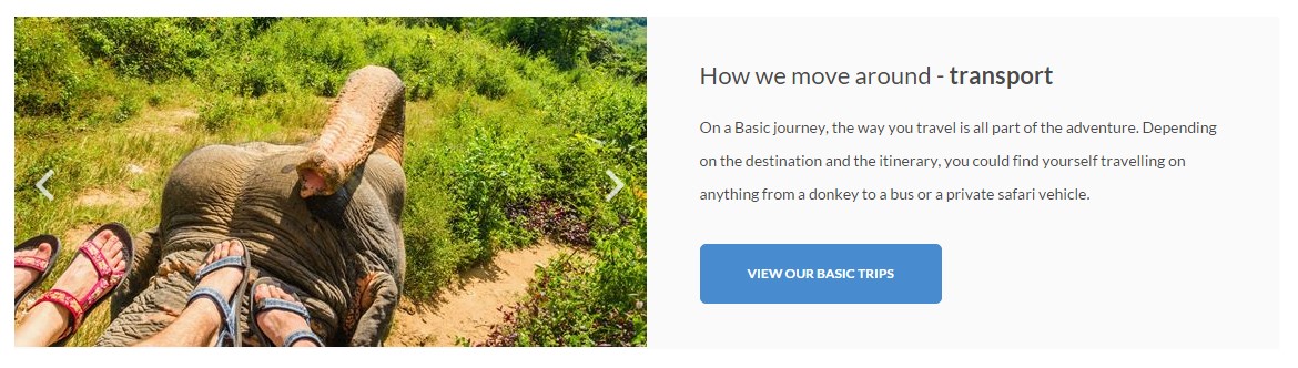
Media box inline + grey
Was this article helpful ?
Info Box
Css styles:
.ct-infoBox
.ct-infoBox–vertical
Info Box default
Screenshot:
Info box default
Markup:
|
1 2 3 4 5 6 7 |
<div class="ct-infoBox ct-u-marginBottom70"> <div class="ct-infoBox-image"><img src="assets/images/demo-content/infoBox.jpg" alt="image"></div> <div class="ct-infoBox-description"> <h3 class="ct-infoBox-title">Tour Tickets is very dedicated to providing extreme customer satisfaction & customer care!</h3> <p>Lorem ipsum dolor sit amet, consectetur adipiscing elit. Suspendisse in ligula justo. Nulla id aliquam sem. In laoreet interdum molestie. Fusce malesuada arcu non sem rhoncus, in scelerisque metus.<br><br>Suspendisse velit justo, maximus eu dolor sed, sodales imperdiet est. Lorem ipsum dolor sit amet.</p><a href="#" class="btn btn-default btn-xs text-uppercase">book now</a> </div> </div> |
Info Box vertical
Screenshot:
Info box vertical
Markup:
|
1 2 3 4 5 6 7 8 9 10 11 12 13 |
<div class="ct-infoBox ct-infoBox--vertical ct-u-marginBottom70"> <div class="ct-infoBox-description"> <h3 class="ct-infoBox-title">Packages Includes</h3> <div class="ct-divider--doubleBorder"></div> <ul class="list-unstyled ct-list--WithIcons ct-u-marginBottom30"> <li><img src="assets/images/icon-check2.png" alt="icon">Private Arrival Transfer</li> <li><img src="assets/images/icon-check2.png" alt="icon">1 Night at the Hotel Fontanella Borghese</li> <li><img src="assets/images/icon-check2.png" alt="icon">1 Night at the Hotel Relais Uffizi</li> <li><img src="assets/images/icon-check2.png" alt="icon">1 Night at the Hotel Violino d'Oro</li> </ul> </div> <div class="ct-infoBox-image"><img src="assets/images/demo-content/infoBox2.jpg" alt="image"></div> </div> |
Was this article helpful ?
Images Containers
Css styles:
.ct-image-container–GiftCard
.ct-image–border
.ct-image–hover
.ct-image–steps
.ct-featuredItem
Gift card image containert
Screenshot:
Image container – gift card
Markup:
|
1 2 3 |
<div class="ct-image-container--GiftCard"> <div class="ct-image-container--mainBody"><img src="assets/images/demo-content/gift-icon.png"></div> </div> |
Border image container
Screenshot:

Image container – border
Markup:
|
1 |
<div class="ct-image--border"><img src="assets/images/demo-content/random-image.jpg" alt="image"></div> |
Steps image containert
Screenshot:
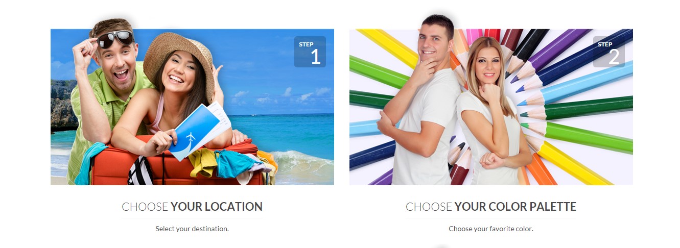
Image container – steps
Markup:
|
1 2 3 4 5 |
<div class="ct-image--steps text-center"> <div class="ct-image-container"><img src="assets/images/demo-content/wedding.png" alt=""> <div class="ct-stepsBox"><span class="text-left text-uppercase ct-fw-700">step</span><span class="text-right ct-number">1</span></div> </div><span class="h4 ct-fw-300 text-uppercase ct-image-title">choose <span class="ct-fw-600">your location</span></span><span>Select your destination.</span> </div> |
Featured items image containert with hover
Screenshot:
Image container – feature image
Markup:
|
1 2 3 4 5 6 7 8 9 10 11 12 |
<div class="ct-image--hover"><a href="#"><img src="assets/images/demo-content/package2.jpg" alt=""></a> <div class="ct-image-text"><span class="h3 ct-fw-300 text-uppercase">pre-designed <span class="ct-fw-600">themes</span></span> <div class="image-label">Inspiration that fits your style.</div> </div> <div class="ct-featuredItem"> <div class="ct-featuredItem-inner"><span class="ct-featuredItem-title ct-fw-700">Beautiful Beginnings</span><span class="ct-featuredItem-tag ct-fw-300">Wedding Themes</span> <div class="ct-strip"> <div class="ct-strip-inner">Free Now</div> </div> </div> </div> </div> |
Was this article helpful ?
Icon Box
Css styles:
.ct-iconBox
.ct-iconBox–withImage
.ct-iconBox–big
Icon Box with image
Screenshot:

Icon box with image
Markup:
|
1 2 3 4 5 6 7 |
<div class="ct-iconBox ct-u-marginBottom20 ct-iconBox--withImage"><a href="#"> <div class="ct-iconBox-icon"><img src="assets/images/demo-content/icon.png" alt="icon"> </div> <div class="ct-iconBox-description"> <h5 class="text-uppercase ct-fw-700 ct-u-colorMotive ct-u-marginBottom20">see & do</h5> <p>Explore the perfect combination of city buzz & peaceful nature</p> </div></a></div> |
Icon Box big
Screenshot:

Icon box – big
Markup:
|
1 2 3 4 5 6 7 |
<div class="ct-iconBox ct-u-marginBottom20 ct-iconBox--big"><a href="#"> <div class="ct-iconBox-icon"><i class="fa fa-plane"></i> </div> <div class="ct-iconBox-description"> <h6 class="text-uppercase ct-fw-700 ct-u-marginBottom10">see & do</h6> <p>Explore the perfect combination of city buzz & peaceful nature</p> </div></a></div> |
Was this article helpful ?
Headings
Test has three types of heading:
Css styles:
–With border:
.ct-heading–withBorder
.ct-heading–withBorderGrey
.ct-heading–withBorderGreyDark
–Striped:
.ct-heading–striped
–With arrow:
.ct-heading–withArrow
Heading with border
Screenshot:

Heading with border
Markup:
|
1 2 3 4 |
<div class="ct-heading--withBorder ct-heading--withBorderGrey ct-u-marginBottom40"> <h4 class="ct-u-colorMotive text-uppercase ct-u-marginBottom10">our staff</h4> <p>Lorem ipsum dolor sit amet, consectetur adipiscing elit. Integer sed arcu ac ligula volutpat tincidunt vel ut mauris. Fusce nec ultrices leo.</p> </div> |
Heading striped
Screenshot:

Heading striped
Markup:
|
1 2 3 4 5 |
<div class="ct-heading--striped text-uppercase text-capitalize ct-u-top-50 ct-u-marginBottom20"> <h4 class="pull-left">View Our Other Wedding Themes</h4><a href="#" class="btn btn-default btn-xs pull-right">start today</a> <div class="clearfix"></div> <div class="ct-right-extension"></div> </div> |
Heading with arrow
Screenshot:

Heading with arrow
Markup :
|
1 2 3 |
<div class="ct-heading--withArrow ct-u-colorWhite"> <h6 class="text-uppercase">This week's bestsellers</h6> </div> |
Was this article helpful ?
Contact Form
Template comes with ready to use:
- Contact Form
All needed files are in /form directory.
Remember to includeon page.
To configure form just edit form/config.php and change e-mails to your own :
|
1 2 |
$to = "mail@example.com"; $from = "mail@example.com"; |
That’s it!
Screenshot:
Contact form
Markup:
|
1 2 3 4 5 6 7 8 9 10 11 12 13 14 |
<form action="assets/form/send.php" method="POST" class="validateIt ct-u-marginBottom30 ct-form ct-form-grey"> <div class="row"> <div class="col-md-6"> <input id="contact_name" data-error-message="Name" placeholder="Name" type="text" required="" name="field[]" class="form-control input--withBorder ct-u-marginBottom10 input-focusMotive"> <label for="contact_name" class="sr-only"></label> </div> <div class="col-md-6"> <input id="contact_email" data-error-message="Email" placeholder="Email" type="email" required="" name="field[]" class="form-control input--withBorder ct-u-marginBottom10 input-focusMotive"> <label for="contact_email" class="sr-only"></label> </div> </div> <textarea id="contact_message" data-error-message="Message is required" placeholder="Message" rows="8" required="" name="field[]" title="Message" class="form-control input--withBorder ct-u-marginBottom20 input-focusMotive ct-u-marginBottom20"></textarea> <button class="btn btn-primary btn-lg text-uppercase">send message</button> </form> |
Was this article helpful ?
Faq thumbnails
Css styles:
.ct-squareThumbnail
.ct-squareThumbnail–withHover
Standard faq thumbnails
Screenshot:
Faq thumbnails default
Markup:
|
1 2 3 4 5 6 7 8 9 10 |
<div class="ct-squareThumbnail"> <div class="ct-squareThumbnail-body"> <div class="ct-squareThumbnail-title"><span class="ct-fw-700 text-uppercase">secured flight passenger data</span><i class="fa fa-lock"></i></div> <div class="ct-squareThumbnail-content"> . . . </div> </div> </div> |
Faq thumbnails with special hover
Screenshot:
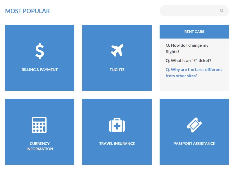
Faq thumbnails with hover
Markup:
|
1 2 3 4 5 6 7 8 9 10 11 12 13 14 15 16 |
<div class="ct-squareThumbnail ct-squareThumbnail--withHover ct-u-marginBottom30"> <div class="ct-squareThumbnail-body"> <div class="ct-squareThumbnail-title text-center"><span class="ct-fw-700">BILLING & PAYMENT</span></div> <div class="ct-squareThumbnail-content"> <ul class="list-unstyled"> <li><a href="#" class="ct-fw-700">Q. How do I change my flights?</a></li> <li><a href="#" class="ct-fw-700">Q. What is an "E" ticket?</a></li> <li><a href="#" class="ct-fw-700">Q. Why are the fares different from other sites?</a></li> </ul> </div> <div class="ct-squareThumbnail-button"><a href="#"></a></div> </div> <div class="ct-squareThumbnail-mask"><i class="fa ct-u-marginBottom30 fa-dollar"></i> <div class="ct-squareThumbnail-text"><span class="ct-fw-700">BILLING & PAYMENT</span></div> </div> </div> |
Was this article helpful ?
Dividers
Test have three type of dividers:
Css styles:
.ct-divider–grey
.ct-divider–greyLight
.ct-divider–greyBig
Dividers grey type
Screenshot:
Divider – grey
Markup:
|
1 |
<div class="ct-divider--grey"></div> |
Dividers grey light type
Screenshot:

Divider – grey light
Markup:
|
1 |
<div class="ct-divider--greyLight"></div> |
Dividers grey big type
Screenshot:
Divider – grey big
Markup:
|
1 |
<div class="ct-divider--greyBig"></div> |
Was this article helpful ?
Buttons
Test have several variations for button styles:
Css styles:
.btn-default
.btn-primary
.btn-primaryDark
.btn-grey
.btn-success
.btn-info
.btn-warning
.btn-danger
.btn-dark
.btn-link
.btn-transparent
.btn-bordered–dark
.btn-bordered–Light
Buttons screenshot:
Buttons
Exampl of markup:
|
1 |
<a class="btn btn-lg btn-default btn-transparent text-uppercase">more details</a> |
Was this article helpful ?
Sources & Credits
The following sources and files have been used to build up this theme
Twitter Bootstrap – http://twitter.github.com/bootstrap/
jQuery – http://www.jquery.com
Was this article helpful ?
Gallery
Test has four types of hover that you can use by just adding one of hover classes to your markup.
Css styles:
.ct-gallery-filters (isotope navigation)
.ct-gallery
.ct-gallery–col1
.ct-gallery–col2
.ct-gallery–col3
.ct-gallery–col4
.ct-gallery–col5
Different types of hover for .ct-gallery-item.
.ct-gallery-itemDefaultHover
.ct-gallery-itemShadowHover
.ct-gallery-itemShadowHoverLeft
.ct-gallery-itemHoverSquare
Markup (example):
|
1 2 3 4 5 6 7 8 9 10 |
<div id="ct-gallery" class="ct-gallery ct-js-gallery ct-js-magnificPortfolioPopupGroup ct-gallery--col3 ct-u-marginBottom80"><a href="assets/images/demo-content/galleryImage9.jpg" title="Our Gallery" class="ct-js-magnificPopupImage ct-gallery-itemShadowHover"> <figure class="ct-gallery-item"><img src="assets/images/demo-content/galleryImage9.jpg" alt="gallery"> <figcaption class="ct-u-colorWhite text-uppercase"> <div class="ct-u-displayTableVertical"> <div class="ct-u-displayTableCell text-left"> <h6 class="ct-gallery-itemTitle ct-fw-700">EXPEDITIONS</h6> </div> </div> </figcaption> </figure></a> |
Gallery with default hover
Screenshot:
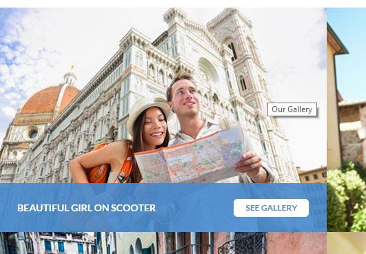
Gallery default hover
Gallery with hover square
Screenshot:
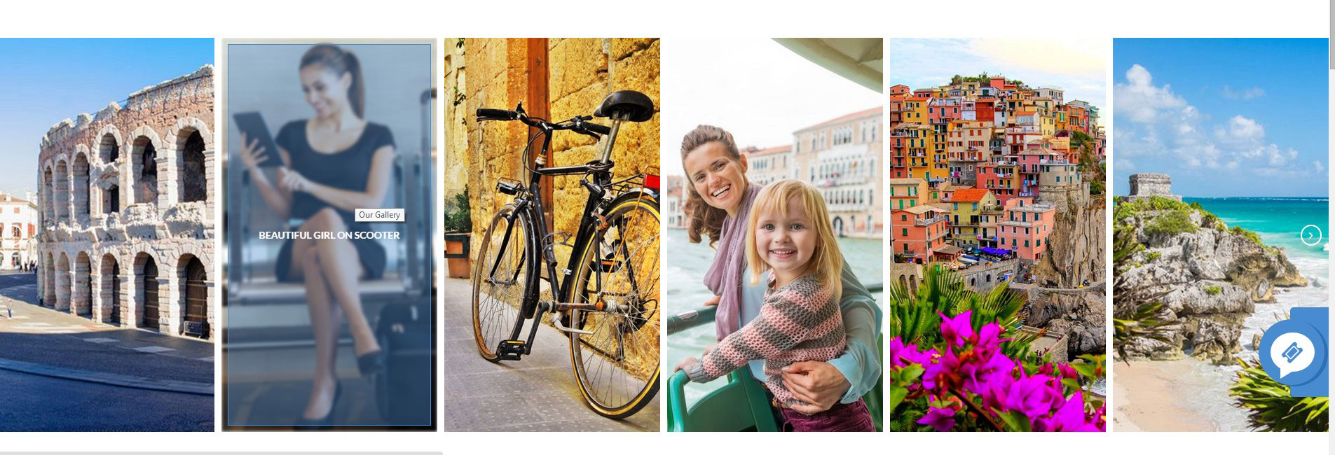
Gallery hover square
Gallery with shadow hover
Screenshot:
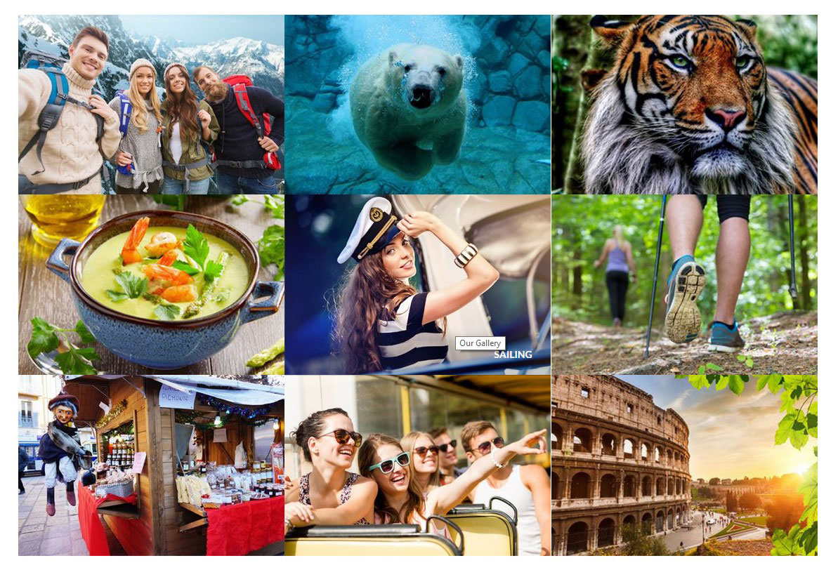
Gallery shadow hover
Gallery with shadow hover left
Screenshot:
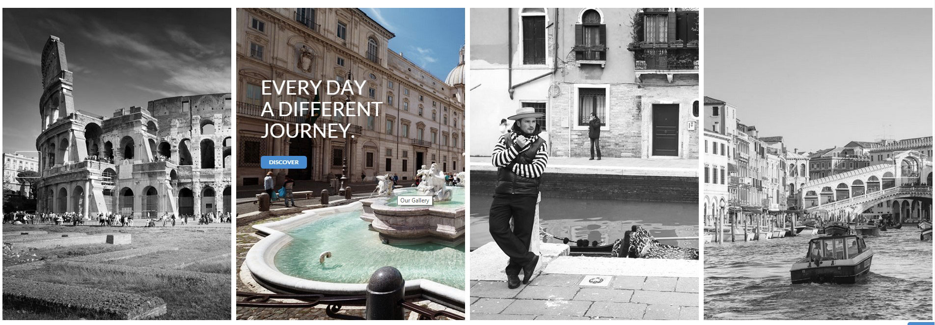
Gallery shadow hover left
Was this article helpful ?
HTML Structure
Test is built upon bootstrap framework and is fully responsive. It adapts to window resolution and looks good on all devices including ipad and iphone.
If you would like to read more about bootstrap framework click HERE
Was this article helpful ?
CSS Files and Structure
We’ve included style.css file, which contains default styles.
- Bootstrap CSS Framework v.3
- Font Face
- General Styles
- typography
- buttons
- main menu
- google map
- socials links
- section
- flexslider
- menuBox
- rounded image
- eventBox
- gallery
- forms
- footer
- media queries, adjustments
- @media (min-width: 990px) {}
- @media (max-width: 990px) {}
- @media (min-width: 767px) and (max-width: 990px) {}
- @media (max-width: 767px) {}
- @media (max-width: 480px) {}
If you want to modify or add new styles please find this lines in style.css :
|
1 2 3 4 |
/* *************** */ /* GENERAL STYLES */ /* *************** */ /* START EDIT HERE */ |
Main /css/style.css includes “Burger Love” styles
Each FLAVOUR style (for example flavours/cupcake/css/cupcake.css) overwrite “main styles” with his own.
Was this article helpful ?
JavaScript
All javascripts are placed in folder /js. In main.js file we implement all functions calls.
This theme uses following Javascript files:
- Bootstrap v 3 framework (powerful front-end framework for faster and easier web development)
- jQuery v1.10.2
- Flexslider 2
- Arctext.js (A jQuery plugin for curved text)
- GMAP3 5.1.1 – plugin to use google maps
Curved Text (arctext.js)
You can enable curved text for element by adding “curved” class to it.
Remember thatlibrary should be included. As example there is curved header on fullwidth map. Credits: http://tympanus.net/codrops/2012/01/24/arctext-js-curving-text-with-css3-and-jquery/
data-radius – it is radius of curve
data-direction – direction of effect
HTML MARKUP:
|
1 |
<h4 class="hdr6 curved" data-radius="600" data-direction="1">Wheres the truck?</h4> |
JAVASCRIPT MARKUP:
|
1 2 3 4 5 6 7 8 9 10 11 12 13 14 15 16 17 18 19 20 21 22 23 |
jQuery(document).ready(function () { /* rotate text */ if(jQuery().arctext) { jQuery(".curved").each(function () { $this = jQuery(this); var radius = $this.data("radius"); var direction = $this.data("direction"); if ((validateDataAttr(radius)) && (validateDataAttr(direction))) { jQuery($this).arctext({ radius: radius, dir: direction, // 1: curve is down, // -1: curve is up rotate: true // if true each letter should be rotated. }) } }) } }) |
Google Map (GMAP3 Plugin)
This is google map with custom marker, you can define couple parameters:
- data-location – address to show
- data-text – text in bubble overlay
- data-height – map height (if undefined height will be 220px)
- data-offset – by how many map should be repositioned from marker center point (default -30)
It uses gmap3 plugin.
Documentation: here
HTML MARKUP:
|
1 |
<div class="googleMap" data-location="Junipers Blvd. 380 Queens, NY 11379, USA" data-text="Junipers Blvd. 380 Queens, NY 11379, USA" data-height="480" data-offset="-80"></div> |
|
1 |
<div class="googleMap" data-latitude="52.13" data-longitude="21.135540" data-text="We are here!"></div> |
|
1 2 3 4 5 6 7 8 9 10 11 12 13 14 15 16 17 |
function initmap() { jQuery(".googleMap").each(function () { var atcenter = ""; var $this = jQuery(this); var location = $this.data("location"); var text = $this.data("text"); var offset = -30; if (validateDataAttr($this.data("offset"))) { offset = $this.data("offset"); } if (validateDataAttr(location)) { (..) } |
Was this article helpful ?
Typography
We use google font service to include fonts or font face sets.
- Burger Lover (default)
– geared slab regular
– geared slab bold
– aleo bold
– aleo regular - Cupcake Wagon
– Grand Hotel
– Patua One - Tacos Locos
– El Rio Lobo
– Kaushan Script
– Bree Serif - Seabreeze
– Kaushan Script
– Bree Serif - Ribs & Dogs
– Kaushan Script
– Bree Serif - Bad Ass BBQ
– Carnivalee Freakshow
– Kaushan Script
– Bree Serif - Coffee & Cream
– Grand Hotel
– Kaushan Script
– Bree Serif - Pizza Revelation
– Lobster
– Kaushan Script
– Bree Serif
Credits:
Geared Font
Aleo Font
Grand Hotel Font
Patua One Font
El Rio Lobo Font
Kaushan Script Font
Bree Serif Font
Carnivalee Freakshow Font
Lobster Font
Chunk Five Font
Was this article helpful ?
Contact/Newsletter Form
Template comes with ready to use:
- Contact Form
- Newsletter Form
All needed files are in /form directory.
Remember to includeon page.
To configure form just edit form/form.php and change e-mails to your own :
|
1 2 |
$to = "mail@example.com"; $from = "mail@example.com"; |
That’s it!
Contact Form
HTML MARKUP:
|
1 2 3 4 5 6 7 8 9 10 11 12 13 14 15 16 17 18 19 20 21 22 23 24 25 |
<form class="simpleForm" action="form/form.php" method="post"> <fieldset> <div class="form-group"> <label>Your name</label> <input type="text" class="form-control" name="field_[]" placeholder="enter your name"> </div> <div class="form-group"> <label>E-mail address</label> <input type="email" required class="form-control" name="email" placeholder="enter your e-mail address"> </div> <div class="form-group"> <label>Your message</label> <textarea class="form-control" rows="5" name="field_[]" placeholder="type your message"></textarea> </div> <input type="hidden" name="msg_subject" value="Contact Form"> <input type="hidden" name="field_[]" value=" "> <input class="btn btn-default" type="submit" value="Submit"> </fieldset> </form> <div class="successMsg" style="display:none;"> Message has been sent successfully! </div> <div class="errorMsg" style="display:none;"> An error occurred, please try again later. </div> |
— How to add more fields to form ?
Just add another form-group section, for example additional phone and fax :
HTML MARKUP:
|
1 2 3 4 5 6 7 8 |
<div class="form-group"> <label>Your Phone</label> <input type="text" class="form-control" name="field_[]" placeholder="enter your phone"> </div> <div class="form-group"> <label>Your Fax</label> <input type="text" class="form-control" name="field_[]" placeholder="enter your fax"> </div> |
Newsletter Form
HTML MARKUP:
|
1 2 3 4 5 6 7 8 9 10 11 12 13 14 15 16 |
<form class="newsletterForm simpleForm" action="form/form.php" method="post"> <fieldset> <div class="form-group"> <input class="form-control" type="email" name="email" required placeholder="enter your e-mail address"> </div> <input type="hidden" name="msg_subject" value="New Newsletter subscription"> <input type="hidden" name="field_[]" value=" "> <input class="btn btn-default" type="submit" value="Submit"> </fieldset> </form> <div class="successMsg" style="display:none;"> Your e-mail has been added to our list! </div> <div class="errorMsg" style="display:none;"> Error, please try again later. </div> |
Options (can be changed in HTML) :
- Mail Subject – just change value in : <input type=”hidden” name=”msg_subject” value=”Contact Form”>
- Success Message – change successMsg div content (below form)
- Error Message – change errorMsg div content (below form)
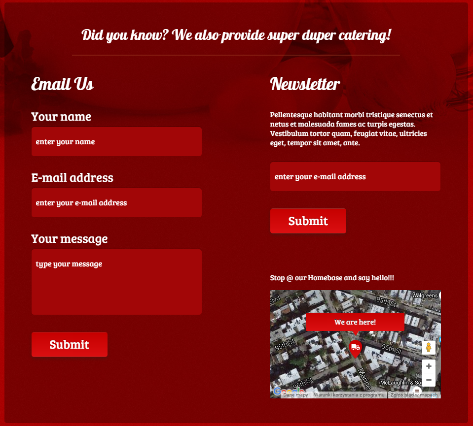
Contact Form and Newsletter (Pizza Revelation flavour)
Was this article helpful ?
Sources and Credits
The following sources and files have been used to build up this theme
- Twitter Bootstrap – http://twitter.github.com/bootstrap/
- jQuery – http://www.jquery.com
Was this article helpful ?
Intro
Thank you for purchasing this theme. If you have any questions that are beyond the scope of this help file, please feel free to start new ticket on this page. Thanks so much!
Was this article helpful ?
DISQUS
DISQUS is a networked community platform we are using in Test. It is a feature-rich comment system complete with social network integration, advanced administration and moderation options, and other extensive community functions.
All the comments are keept on DISQUS account because of that use the DISQUS plugin on your page you need register your website with Disqus
HTML MARKUP:
|
1 2 3 4 5 6 7 8 9 10 11 12 13 |
<div id="disqus_thread"></div> <script type="text/javascript"> /* * * CONFIGURATION VARIABLES * * */ var disqus_shortname = 'foodtruck'; /* * * DON'T EDIT BELOW THIS LINE * * */ (function() { var dsq = document.createElement('script'); dsq.type = 'text/javascript'; dsq.async = true; dsq.src = '//' + disqus_shortname + '.disqus.com/embed.js'; (document.getElementsByTagName('head')[0] || document.getElementsByTagName('body')[0]).appendChild(dsq); })(); </script> <noscript>Please enable JavaScript to view the <a href="https://disqus.com/?ref_noscript" rel="nofollow">comments powered by Disqus.</a></noscript> |
SCREENSHOT:
DISQUS (Burger Lover flavour)
For more information please check DISQUS home page.
Was this article helpful ?
MAIN MENU STRUCTURE
Just change address, fill in social page urls and upload your logo to images/content/logo.png file and you’re ready to go!
HTML MARKUP:
|
1 2 3 4 5 6 7 8 9 10 11 12 13 14 15 16 17 18 19 20 21 22 23 24 25 26 27 28 29 30 31 32 33 34 35 36 37 38 39 40 |
<nav class="navbar navbar-default"> <div class="inner"> <div class="container"><!-- Brand and toggle get grouped for better mobile display --> <div class="navbar-header"><button class="navbar-toggle btn btn-primary" type="button" data-toggle="collapse" data-target=".navbar-ex1-collapse"> <span class="sr-only">Toggle navigation</span> </button> <div class="text-center"> <p class="address">Seabreeze - Atlantic Avenue 1234, New York, +66 87 65 43 21</p> </div> <a class="small-brand" href="/" data-width="119" data-top="58"><img src="{{@blog.logo}}" alt="Logo" /></a> <a class="phoneIcon" style="display: none;" href="tel:66-87-65-43-21">+66 87 65 43 21</a> <a class="locationIcon" style="display: none;" href="http://goo.gl/maps/IUzKJ" target="_blank">http://goo.gl/maps/IUzKJ</a> <ul class="smallSocials"> <li class="fb"><a href="#"><img src="{{asset " alt="Facebook" /></a></li> <li class="tw"><a href="#"><img src="{{asset " alt="Twitter" /></a></li> <li class="gg"><a href="#"><img src="{{asset " alt="Google+" /></a></li> <li class="rss"><a href="#"><img src="{{asset " alt="RSS" /></a></li> </ul> </div> <!-- Collect the nav links, forms, and other content for toggling --> <div class="collapse navbar-collapse navbar-ex1-collapse"> <ul class="nav navbar-nav text-center" data-type="margin-top" data-pos="145"> <li><a href="/">Home</a></li> <li><a href="/menu-card/">Menu card</a></li> <li><a href="/events/">Events</a></li> <li><a href="/rss">Rss</a></li> <li><a href="/contact/">Contact</a></li> </ul> </div> <!-- /.navbar-collapse --> </div> <!-- / container --> <div class="btm"></div> </div> |
SCREENSHOT:
Main menu (Pizza Revelation flavour)
Was this article helpful ?
GRID SYSTEM AND SINGLE ROW STRUCTURE
The default Bootstrap grid system utilizes 12 columns. It’s responsive grid and adapts to viewport. Below 767px viewports, the columns become fluid and stack vertically. The fluid grid system uses percents instead of pixels for column widths. Each row always include 12 columns (for example col-md-8 + col-md-4 = col-md-12).
BASIC GRID HTML:
|
1 2 3 4 5 6 7 8 9 10 11 12 13 14 15 16 17 18 19 20 21 22 23 24 25 26 27 |
<div class="row"> <div class="col-md-1">.col-md-1</div> <div class="col-md-1">.col-md-1</div> <div class="col-md-1">.col-md-1</div> <div class="col-md-1">.col-md-1</div> <div class="col-md-1">.col-md-1</div> <div class="col-md-1">.col-md-1</div> <div class="col-md-1">.col-md-1</div> <div class="col-md-1">.col-md-1</div> <div class="col-md-1">.col-md-1</div> <div class="col-md-1">.col-md-1</div> <div class="col-md-1">.col-md-1</div> <div class="col-md-1">.col-md-1</div> </div> <div class="row"> <div class="col-md-8">.col-md-8</div> <div class="col-md-4">.col-md-4</div> </div> <div class="row"> <div class="col-md-4">.col-md-4</div> <div class="col-md-4">.col-md-4</div> <div class="col-md-4">.col-md-4</div> </div> <div class="row"> <div class="col-md-6">.col-md-6</div> <div class="col-md-6">.col-md-6</div> </div> |
Was this article helpful ?
BLOG SCTRUCTURE
BLOG PAGE
This sections in Test show method of displaying the posts as a BLOG LIST.
HTML MARKUP:
|
1 2 3 4 5 6 7 8 9 10 11 12 13 14 15 16 17 18 19 20 21 22 23 24 25 26 27 28 29 30 31 32 33 34 35 36 37 38 39 40 41 42 43 44 45 46 47 48 49 50 51 52 53 54 55 56 57 58 59 60 61 62 63 |
<div class="bg-1 section"> <div class="inner" data-topspace="75" style="padding-top: 75px; background-image: none;"> <div class="container"> <h3 class="hdr1">Blog Page</h3> <div class="blog-list"> <div class="row"> <div class="col-md-10 col-md-offset-1 col-sm-10 col-sm-offset-1 blog-main"> <div class="inner"> {{#foreach posts}} <article class="blog-post blog-default-page {{post_class}}"> <h3 class="blog_title"><a href="{{url}}">{{{title}}}</a></h3> <div class="blog-thumbnail mbslider responsiveVideo"> <span class="ribbon_details"> <span class="ribbon_details_date">{{date published_at format="MMM"}} <br>{{date published_at format="DD"}}</span> <a href="{{url}}#disqus_thread" class="ribbon_details_comments"></a> </span> {{#if image}} <a href="{{url}}"><img src="{{image}}" alt="{{title}}"></a> {{else}} <a href="{{url}}" title="{{title}}">{{content words="0"}}</a> {{/if}} </div> <div class="meta_box"> <span class="meta_date">{{date published_at format="MMMM DD, YYYY"}}</span> <span class="meta_author">by <a href="{{author.website}}">{{author}}</a></span> {{#if tags}} <span class="meta_categories"> <i class="fa fa-tags"></i> {{tags separator=", "}} </span> {{/if}} </div> <div class="mbslider-source" style="display:none"> {{content}} </div> <p class="ct-excerpt"> {{excerpt words="60"}} {{!okresla liczbe slow wyswietlanych postow bez czytania dalej}} </p> <a href="{{url}}" class="btn btn-primary btn-sm btn-blog">read more</a> </article> <hr class="dashed-separator"> {{/foreach}} {{#if pagination}} {{{pagination}}} {{/if}} </div> <!-- / inner --> </div> </div> </div> </div> </div> </div> |
SCREENSHOT:
Post on Blog page (Burger Lover flavour)
PAGINATION
To move between blog pages we are using pagination buttons:
HTML MARKUP:
|
1 2 3 4 5 6 7 8 9 10 11 12 13 14 15 16 17 18 19 |
<!--Pagination--> <!--this is essential for moving beetween the post--> <div class="text-center"> <ul class="pagination"> {{#if prev}} <li><a href="{{page_url prev}}#blog"><i class="fa fa-arrow-left"></i>Previous Page</a></li> {{else}} <li class="disabled"><a href="#blog"><i class="fa fa-arrow-left"></i>Previous Page</a></li> {{/if}} <li><a href="#">{{page}}</a></li> <li><a href="#">of </a></li> <li><a href="#">{{pages}}</a></li> {{#if next}} <li><a href="{{page_url next}}#blog">Next Page<i class="fa fa-arrow-right"></i></a></li> {{else}} <li class="disabled"><a href="#blog">Next Page<i class="fa fa-arrow-right"></i></a></li> {{/if}} </ul> </div> |
SCREENSHOT:

Pagination (Burger Lover flavour)
AUTOR PAGE
In Test you can check all the information about the autor of the post like some short info about him and ammount of post he created.
HTML MARKUP:
|
1 2 3 4 5 6 7 8 9 10 11 12 13 14 15 16 17 18 19 20 21 22 23 24 25 26 27 28 29 30 31 32 33 34 35 36 37 38 39 40 41 42 43 44 45 46 47 48 49 50 51 52 53 54 55 56 57 58 59 60 61 62 63 64 65 66 67 68 69 70 71 72 73 74 75 76 |
{{!< default}} <div class="bg-1 section"> <div class="inner" data-image="{{asset "images/bg-1.jpg"}}" data-scroll="scroll" data-topspace="75"> <div class="container"> <h3 class="hdr1">Autor Page</h3> <div class="blog-list"> <div class="row"> <div class="col-md-10 col-md-offset-1 col-sm-10 col-sm-offset-1 blog-main"> <div class="inner"> {{#author}} <section class="author-profile inner"> {{#if image}} <figure class="author-image"> <div class="img author-box" style="background-image: url({{image}})"><span class="hidden">{{name}}'s Picture</span></div> </figure> {{/if}} <h1 class="author-title">{{name}}</h1> {{#if bio}} <h2 class="author-bio">{{bio}}</h2> {{/if}} <div class="author-meta"> {{#if location}}<span class="author-location icon-location">{{location}}</span>{{/if}} {{#if website}}<span class="author-link icon-link"><a href="{{website}}">{{website}}</a></span>{{/if}} <span class="author-stats"><i class="icon-stats"></i> {{plural ../pagination.total empty='No posts' singular='% post' plural='% posts'}}</span> </div> </section> <hr class="dashed-separator"> {{/author}} {{#foreach posts}} <article class="blog-post blog-default-page {{post_class}}"> <h3 class="blog_title"><a href="{{url}}">{{{title}}}</a></h3> <div class="blog-thumbnail mbslider responsiveVideo"> <span class="ribbon_details"> <span class="ribbon_details_date">{{date published_at format="MMM"}} <br>{{date published_at format="DD"}}</span> <a href="{{url}}#disqus_thread" class="ribbon_details_comments"></a> </span> {{#if image}} <a href="{{url}}"><img src="{{image}}" alt="{{title}}"></a> {{else}} <a href="{{url}}" title="{{title}}">{{content words="0"}}</a> {{/if}} </div> <div class="meta_box"> <span class="meta_date">{{date published_at format="MMMM DD, YYYY"}}</span> <span class="meta_author">by <a href="{{author.website}}">{{author}}</a></span> {{#if tags}} <span class="meta_categories"> <i class="fa fa-tags"></i> {{tags separator=", "}} </span> {{/if}} </div> <div class="mbslider-source" style="display:none"> {{content}} </div> <p class="ct-excerpt"> {{excerpt words="60"}} {{!okresla liczbe slow wyswietlanych postow bez czytania dalej}} </p> <a href="{{url}}" class="btn btn-primary btn-sm btn-blog">read more</a> </article> <hr class="dashed-separator"> {{/foreach}} {{! Previous/next page links - displayed on every page }} {{pagination}} </div> </div> </div> </div> </div> </div> </div> |
SCREENSHOT:
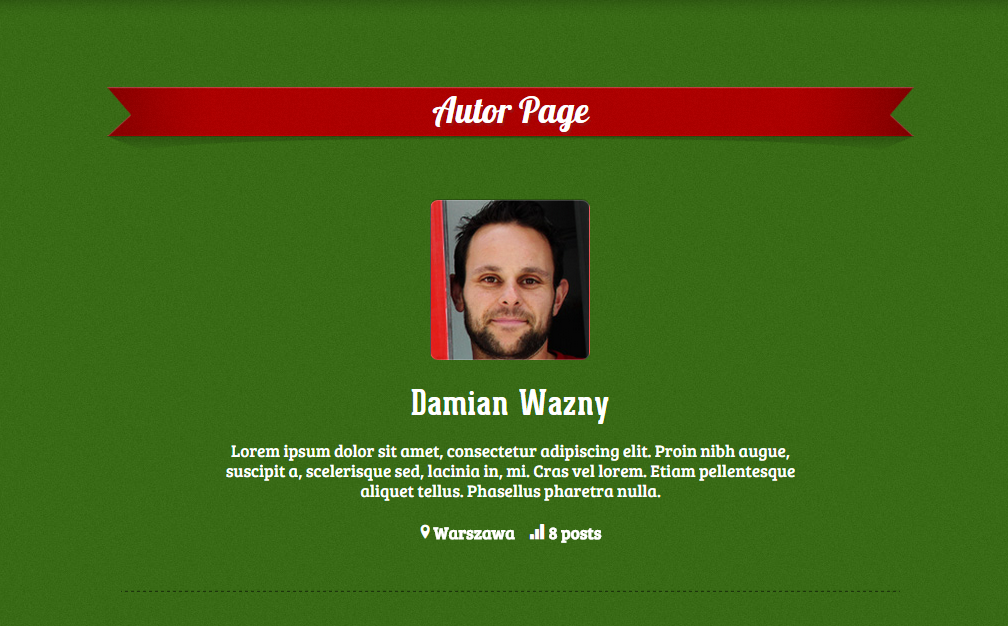
Author page (Pizza Revelation flavour)
Was this article helpful ?
MAIN SLIDER
It is fullwidth slider of any content. We use flexsldier plugin. Just paste your content into li tags.
HTML MARKUP:
|
1 2 3 4 5 6 7 8 9 10 11 12 13 14 15 16 17 18 19 |
<!-- ************************* --> <!-- ** FULL PRODUCT SLIDER ** --> <div class="flexFull flexslider loading-slider text-center"> <ul class="slides"> <li> <div class="container"> <img src="images/content/sliderphoto-1.png" alt=" "> [any content] </div> </li> <li> <div class="container"> <img src="images/content/sliderphoto-1.png" alt=" "> [any content] </div> </li> </ul> </div> <!-- / flexslider --> |
And js initialization (js/main.js file),
there you can change slider parameters :
JS:
|
1 2 3 4 5 6 7 8 9 10 11 12 13 14 15 16 17 18 19 20 21 22 23 24 25 26 27 28 29 30 31 32 33 34 35 36 37 38 39 40 41 42 43 44 45 46 47 48 49 50 51 52 53 54 55 56 57 58 59 60 61 |
jQuery(window).load(function () { // flexfull slider init jQuery('.flexslider.flexFull').flexslider({ animation: "slide", //String: Select your animation type, "fade" or "slide" easing: "easeInOutExpo", //{NEW} String: Determines the easing method used in jQuery transitions. jQuery easing plugin is supported! // easing types : // swing, easeInQuad, easeOutQuad, easeInOutQuad, easeInCubic, easeOutCubic, // easeInOutCubic, easeInQuart, easeOutQuart, easeInOutQuart, easeInQuint, // easeOutQuint, easeInOutQuint, easeInSine, easeOutSine, easeInOutSine, // easeInExpo, easeOutExpo, easeInOutExpo, easeInCirc, easeOutCirc, // easeInOutCirc, easeInElastic, easeOutElastic, easeInOutElastic, easeInBack, // easeOutBack, easeInOutBack, easeInBounce, easeOutBounce, easeInOutBounce direction: "horizontal", //String: Select the sliding direction, "horizontal" or "vertical" reverse: false, //{NEW} Boolean: Reverse the animation direction animationLoop: true, //Boolean: Should the animation loop? If false, directionNav will received "disable" classes at either end smoothHeight: false, //{NEW} Boolean: Allow height of the slider to animate smoothly in horizontal mode startAt: 0, //Integer: The slide that the slider should start on. Array notation (0 = first slide) slideshow: false, //Boolean: Animate slider automatically slideshowSpeed: 7000, //Integer: Set the speed of the slideshow cycling, in milliseconds animationSpeed: 1100, //Integer: Set the speed of animations, in milliseconds initDelay: 0, //{NEW} Integer: Set an initialization delay, in milliseconds randomize: false, //Boolean: Randomize slide order // Primary Controls controlNav: false, //Boolean: Create navigation for paging control of each clide? Note: Leave true for manualControls usage directionNav: true, //Boolean: Create navigation for previous/next navigation? (true/false) prevText: "Previous", //String: Set the text for the "previous" directionNav item nextText: "Next", //String: Set the text for the "next" directionNav item // Usability features pauseOnAction: true, //Boolean: Pause the slideshow when interacting with control elements, highly recommended. pauseOnHover: true, //Boolean: Pause the slideshow when hovering over slider, then resume when no longer hovering touch: true, //{NEW} Boolean: Allow touch swipe navigation of the slider on touch-enabled devices video: true, //{NEW} Boolean: If using video in the slider, will prevent CSS3 3D Transforms to avoid graphical glitches useCSS: true, //{NEW} Boolean: Slider will use CSS3 transitions if available // Secondary Navigation keyboard: true, //Boolean: Allow slider navigating via keyboard left/right keys multipleKeyboard: false, //{NEW} Boolean: Allow keyboard navigation to affect multiple sliders. Default behavior cuts out keyboard navigation with more than one slider present. mousewheel: false, //{UPDATED} Boolean: Requires jquery.mousewheel.js (https://github.com/brandonaaron/jquery-mousewheel) - Allows slider navigating via mousewheel pausePlay: false, //Boolean: Create pause/play dynamic element pauseText: 'Pause', //String: Set the text for the "pause" pausePlay item playText: 'Play', //String: Set the text for the "play" pausePlay item // Callback API start: function () { jQuery(".flexslider.flexFull").removeClass("loading-slider"); }, before: function () { }, //Callback: function(slider) - Fires asynchronously with each slider animation after: function () { }, //Callback: function(slider) - Fires after each slider animation completes end: function () { }, //Callback: function(slider) - Fires when the slider reaches the last slide (asynchronous) added: function () { }, //{NEW} Callback: function(slider) - Fires after a slide is added removed: function () { } //{NEW} Callback: function(slider) - Fires after a slide is removed }); }) |
SCREENSHOT:
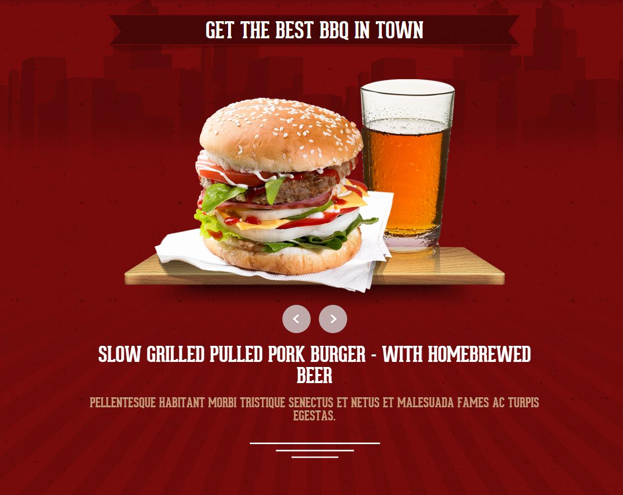
Main slider (Burger Lover flavour)
Was this article helpful ?
SECTION
Section is part of page with separate background, has several paramaters that can be changed:
- “bg-2” class – define background-color, you can also use “bg-1”
- “topOrnament” class – adds fancy strip at the top of section (just remove class to disable it)
- “repeated” class – it will repeat background image (like brick background in “story” section, it is optional)
- data-topspace – top padding for section
- data-bottomspace – bottom padding for section
- scroll=”scroll” – background will scroll instead be fixed (optional parameter)
- data-image – path to background image, best resolution is 1920px x 1200px
In Test we have 2 types of sections:
PARALLAX SECTION
HTML MARKUP:
|
1 2 3 4 5 6 7 8 9 |
<div class="bg-1 topOrnament section"> <div class="inner" data-image="./assets/images/demo-content/background-1.jpg"> <span class="html-tag"><div <span class="html-attribute-name">class</span>="<span class="html-attribute-value">container</span>"></span> [section content] </div> </div> </div> |
SECTION
HTML MARKUP:
|
1 2 3 4 5 6 7 8 9 |
<div class="bg-2 topOrnament section"> <div class="inner repeated" data-topspace="20" data-bottomspace="20" scroll="scroll" data-image="flavours/pizza/images/content/background-6.jpg"> <div class="container"> [section content] </div> </div> </div> |
Was this article helpful ?
Flavours
Theme includs 8 flavours. To activate certain flavour just add proper css file.
For example to activate “Coffee and Cream”:
|
1 2 3 4 5 6 |
<head> (..) <link rel="stylesheet" type="text/css" href="css/style.css"> <link rel="stylesheet" type="text/css" href="flavours/coffeecream/css/coffeecream.css"> (..) </head> |
|
1 2 3 4 5 6 |
<head> (..) <link rel="stylesheet" type="text/css" href="css/style.css"> <link rel="stylesheet" type="text/css" href="flavours/tacos/css/tacos.css"> (..) </head> |
Second added .css file will change page design.
Flavours files (images, fonts, etc) are placed in flavours/[flavour_name] directory, for example :
|
1 2 3 4 5 |
<!-- cupcake files --> /flavours/cupcake <!-- pizza files --> /flavours/pizza |
Avaiblable Flavours
- Burger Lover (default)
- Cupcake Wagon
- Tacos Locos
- Seabreeze
- Ribs & Dogs
- Bad Ass BBQ
- Coffee & Cream
- Pizza Revelation
Was this article helpful ?
Components
Special Headers
Predefined headers you can use by adding special class to header element (there is no difference which tag do you use : h1, h2 or h5),
for example :
|
1 2 3 4 5 6 7 |
<h1 class="hdr1">Example header 1</h1> <h2 class="hdr2">Example header 2</h2> <h3 class="hdr3">Example header 3</h3> <h5 class="hdr4">Example header 4</h5> <h1 class="hdr5">Example header 5</h1> <h2 class="hdr6">Example header 6</h2> <h3 class="hdr7">Example header 7</h3> |
Social Icons
You can use small, medium or big social icons.
We provided 24 icons
HTML MARKUP:
|
1 2 3 4 5 6 7 8 9 10 11 12 13 14 15 16 17 18 19 20 21 22 23 24 25 26 27 28 29 30 31 32 33 34 35 36 37 38 39 40 41 42 43 44 45 46 47 48 49 50 51 52 53 54 55 56 57 58 59 60 61 62 63 64 65 66 67 68 69 70 71 72 73 74 75 76 77 78 79 80 81 82 83 84 85 86 87 |
<!-- Small Icons --> <ul class="soc_list soc-small list-unstyled clearfix"> <li><a href="#" target="_blank" data-toggle="tooltip" data-placement="top" title="Bitbucket"><i class="fa fa-bitbucket"></i></a></li> <li><a href="#" target="_blank" data-toggle="tooltip" data-placement="top" title="Dribbble"><i class="fa fa-dribbble"></i></a></li> <li><a href="#" target="_blank" data-toggle="tooltip" data-placement="top" title="Dropbox"><i class="fa fa-dropbox"></i></a></li> <li><a href="#" target="_blank" data-toggle="tooltip" data-placement="top" title="Facebook"><i class="fa fa-facebook"></i></a></li> <li><a href="#" target="_blank" data-toggle="tooltip" data-placement="top" title="Flickr"><i class="fa fa-flickr"></i></a></li> <li><a href="#" target="_blank" data-toggle="tooltip" data-placement="top" title="Foursquare"><i class="fa fa-foursquare"></i></a></li> <li><a href="#" target="_blank" data-toggle="tooltip" data-placement="top" title="GitHub"><i class="fa fa-github-alt"></i></a></li> <li><a href="#" target="_blank" data-toggle="tooltip" data-placement="top" title="Gittip"><i class="fa fa-gittip"></i></a></li> <li><a href="#" target="_blank" data-toggle="tooltip" data-placement="top" title="Google+"><i class="fa fa-google-plus"></i></a></li> <li><a href="#" target="_blank" data-toggle="tooltip" data-placement="top" title="Instagram"><i class="fa fa-instagram"></i></a></li> <li><a href="#" target="_blank" data-toggle="tooltip" data-placement="top" title="LinkedIn"><i class="fa fa-linkedin"></i></a></li> <li><a href="#" target="_blank" data-toggle="tooltip" data-placement="top" title="Pinterest"><i class="fa fa-pinterest"></i></a></li> <li><a href="#" target="_blank" data-toggle="tooltip" data-placement="top" title="Renren"><i class="fa fa-renren"></i></a></li> <li><a href="#" target="_blank" data-toggle="tooltip" data-placement="top" title="RSS"><i class="fa fa-rss"></i></a></li> <li><a href="#" target="_blank" data-toggle="tooltip" data-placement="top" title="Skype"><i class="fa fa-skype"></i></a></li> <li><a href="#" target="_blank" data-toggle="tooltip" data-placement="top" title="Stack Exchange"><i class="fa fa-stack-exchange"></i></a></li> <li><a href="#" target="_blank" data-toggle="tooltip" data-placement="top" title="Stack Overflow"><i class="fa fa-stack-overflow"></i></a></li> <li><a href="#" target="_blank" data-toggle="tooltip" data-placement="top" title="Tumblr"><i class="fa fa-tumblr"></i></a></li> <li><a href="#" target="_blank" data-toggle="tooltip" data-placement="top" title="Twitter"><i class="fa fa-twitter"></i></a></li> <li><a href="#" target="_blank" data-toggle="tooltip" data-placement="top" title="Vimeo"><i class="fa fa-vimeo-square"></i></a></li> <li><a href="#" target="_blank" data-toggle="tooltip" data-placement="top" title="VKontakte"><i class="fa fa-vk"></i></a></li> <li><a href="#" target="_blank" data-toggle="tooltip" data-placement="top" title="Weibo"><i class="fa fa-weibo"></i></a></li> <li><a href="#" target="_blank" data-toggle="tooltip" data-placement="top" title="Xing"><i class="fa fa-xing"></i></a></li> <li><a href="#" target="_blank" data-toggle="tooltip" data-placement="top" title="YouTube"><i class="fa fa-youtube-play"></i></a></li> </ul> <!-- Medium Icons --> <ul class="soc_list soc-medium list-unstyled clearfix"> <li><a href="#" target="_blank" data-toggle="tooltip" data-placement="top" title="Bitbucket"><i class="fa fa-bitbucket"></i></a></li> <li><a href="#" target="_blank" data-toggle="tooltip" data-placement="top" title="Dribbble"><i class="fa fa-dribbble"></i></a></li> <li><a href="#" target="_blank" data-toggle="tooltip" data-placement="top" title="Dropbox"><i class="fa fa-dropbox"></i></a></li> <li><a href="#" target="_blank" data-toggle="tooltip" data-placement="top" title="Facebook"><i class="fa fa-facebook"></i></a></li> <li><a href="#" target="_blank" data-toggle="tooltip" data-placement="top" title="Flickr"><i class="fa fa-flickr"></i></a></li> <li><a href="#" target="_blank" data-toggle="tooltip" data-placement="top" title="Foursquare"><i class="fa fa-foursquare"></i></a></li> <li><a href="#" target="_blank" data-toggle="tooltip" data-placement="top" title="GitHub"><i class="fa fa-github-alt"></i></a></li> <li><a href="#" target="_blank" data-toggle="tooltip" data-placement="top" title="Gittip"><i class="fa fa-gittip"></i></a></li> <li><a href="#" target="_blank" data-toggle="tooltip" data-placement="top" title="Google+"><i class="fa fa-google-plus"></i></a></li> <li><a href="#" target="_blank" data-toggle="tooltip" data-placement="top" title="Instagram"><i class="fa fa-instagram"></i></a></li> <li><a href="#" target="_blank" data-toggle="tooltip" data-placement="top" title="LinkedIn"><i class="fa fa-linkedin"></i></a></li> <li><a href="#" target="_blank" data-toggle="tooltip" data-placement="top" title="Pinterest"><i class="fa fa-pinterest"></i></a></li> <li><a href="#" target="_blank" data-toggle="tooltip" data-placement="top" title="Renren"><i class="fa fa-renren"></i></a></li> <li><a href="#" target="_blank" data-toggle="tooltip" data-placement="top" title="RSS"><i class="fa fa-rss"></i></a></li> <li><a href="#" target="_blank" data-toggle="tooltip" data-placement="top" title="Skype"><i class="fa fa-skype"></i></a></li> <li><a href="#" target="_blank" data-toggle="tooltip" data-placement="top" title="Stack Exchange"><i class="fa fa-stack-exchange"></i></a></li> <li><a href="#" target="_blank" data-toggle="tooltip" data-placement="top" title="Stack Overflow"><i class="fa fa-stack-overflow"></i></a></li> <li><a href="#" target="_blank" data-toggle="tooltip" data-placement="top" title="Tumblr"><i class="fa fa-tumblr"></i></a></li> <li><a href="#" target="_blank" data-toggle="tooltip" data-placement="top" title="Twitter"><i class="fa fa-twitter"></i></a></li> <li><a href="#" target="_blank" data-toggle="tooltip" data-placement="top" title="Vimeo"><i class="fa fa-vimeo-square"></i></a></li> <li><a href="#" target="_blank" data-toggle="tooltip" data-placement="top" title="VKontakte"><i class="fa fa-vk"></i></a></li> <li><a href="#" target="_blank" data-toggle="tooltip" data-placement="top" title="Weibo"><i class="fa fa-weibo"></i></a></li> <li><a href="#" target="_blank" data-toggle="tooltip" data-placement="top" title="Xing"><i class="fa fa-xing"></i></a></li> <li><a href="#" target="_blank" data-toggle="tooltip" data-placement="top" title="YouTube"><i class="fa fa-youtube-play"></i></a></li> </ul> <!-- Big Icons --> <ul class="soc_list soc-big list-unstyled clearfix"> <li><a href="#" target="_blank" data-toggle="tooltip" data-placement="top" title="Bitbucket"><i class="fa fa-bitbucket"></i></a></li> <li><a href="#" target="_blank" data-toggle="tooltip" data-placement="top" title="Dribbble"><i class="fa fa-dribbble"></i></a></li> <li><a href="#" target="_blank" data-toggle="tooltip" data-placement="top" title="Dropbox"><i class="fa fa-dropbox"></i></a></li> <li><a href="#" target="_blank" data-toggle="tooltip" data-placement="top" title="Facebook"><i class="fa fa-facebook"></i></a></li> <li><a href="#" target="_blank" data-toggle="tooltip" data-placement="top" title="Flickr"><i class="fa fa-flickr"></i></a></li> <li><a href="#" target="_blank" data-toggle="tooltip" data-placement="top" title="Foursquare"><i class="fa fa-foursquare"></i></a></li> <li><a href="#" target="_blank" data-toggle="tooltip" data-placement="top" title="GitHub"><i class="fa fa-github-alt"></i></a></li> <li><a href="#" target="_blank" data-toggle="tooltip" data-placement="top" title="Gittip"><i class="fa fa-gittip"></i></a></li> <li><a href="#" target="_blank" data-toggle="tooltip" data-placement="top" title="Google+"><i class="fa fa-google-plus"></i></a></li> <li><a href="#" target="_blank" data-toggle="tooltip" data-placement="top" title="Instagram"><i class="fa fa-instagram"></i></a></li> <li><a href="#" target="_blank" data-toggle="tooltip" data-placement="top" title="LinkedIn"><i class="fa fa-linkedin"></i></a></li> <li><a href="#" target="_blank" data-toggle="tooltip" data-placement="top" title="Pinterest"><i class="fa fa-pinterest"></i></a></li> <li><a href="#" target="_blank" data-toggle="tooltip" data-placement="top" title="Renren"><i class="fa fa-renren"></i></a></li> <li><a href="#" target="_blank" data-toggle="tooltip" data-placement="top" title="RSS"><i class="fa fa-rss"></i></a></li> <li><a href="#" target="_blank" data-toggle="tooltip" data-placement="top" title="Skype"><i class="fa fa-skype"></i></a></li> <li><a href="#" target="_blank" data-toggle="tooltip" data-placement="top" title="Stack Exchange"><i class="fa fa-stack-exchange"></i></a></li> <li><a href="#" target="_blank" data-toggle="tooltip" data-placement="top" title="Stack Overflow"><i class="fa fa-stack-overflow"></i></a></li> <li><a href="#" target="_blank" data-toggle="tooltip" data-placement="top" title="Tumblr"><i class="fa fa-tumblr"></i></a></li> <li><a href="#" target="_blank" data-toggle="tooltip" data-placement="top" title="Twitter"><i class="fa fa-twitter"></i></a></li> <li><a href="#" target="_blank" data-toggle="tooltip" data-placement="top" title="Vimeo"><i class="fa fa-vimeo-square"></i></a></li> <li><a href="#" target="_blank" data-toggle="tooltip" data-placement="top" title="VKontakte"><i class="fa fa-vk"></i></a></li> <li><a href="#" target="_blank" data-toggle="tooltip" data-placement="top" title="Weibo"><i class="fa fa-weibo"></i></a></li> <li><a href="#" target="_blank" data-toggle="tooltip" data-placement="top" title="Xing"><i class="fa fa-xing"></i></a></li> <li><a href="#" target="_blank" data-toggle="tooltip" data-placement="top" title="YouTube"><i class="fa fa-youtube-play"></i></a></li> </ul> |
Rounded Image
Just paste img tag inside roundedImg div, and it will be circle shape.
- data-size – it is cicle radius
|
1 2 3 |
<div class="roundedImg" data-size="54"> <img class="media-object" src="images/content/product-small-1.jpg" alt=" "> </div> |
Buttons
We prepare 2 type of buttons. Example HTML markup:
|
1 2 3 |
<a href="#" class="btn btn-primary btn-sm">order now!</a> <input class="btn btn-default" type="submit" value="Submit"> |
menuBox
This is box to present menu from certain category. It is available in 4 types (different paper graphics). Just add type2, type3 or type4 class to change version.
|
1 2 3 4 5 6 7 8 9 10 11 12 13 14 15 16 17 18 19 20 21 22 23 24 25 26 27 28 29 30 31 32 33 34 35 |
<div class="menuBox type2"> <div class="top"> <img src="images/content/icon-1.png" alt=" "> <span>Starters</span> </div> <div class="inner"> <div class="media"> <a class="pull-left" href="images/content/product-small-1.jpg" data-rel="prettyPhoto[menu1]"> <div class="roundedImg" data-size="54"> <img class="media-object" src="images/content/product-small-1.jpg" alt=" "> </div> </a> <div class="media-body"> <span class="title">Fried Scallops</span> <p>Lorem ipsum dolor sit amet, consectetur adipisicing elit.</p> <span class="price"> <em>$</em>7 </span> </div> </div> <!-- / item --> <hr> <div class="media"> [second item] </div> <!-- / item --> <div class="media"> [third item] </div> <!-- / item --> </div> </div> <!-- / menuBox --> |
Was this article helpful ?
Customizer
Test comes with advanced customizer, which allows to edit most of theme elements in one place. To use it navigate to Appearance > Customize
Customizer Farm Fresh
It will display a panel with tabs corresponding to all theme sections, like:
- Style
- General
- Pages
- Main Navbar
- Posts
- Socials
- WooCommerce
- Team
- Testimonials
- After content templates
- Events
- Distributors
- Widgets
You will find there also main style settings under:
- Test – style
- General
In Test – style section you can edit theme colors and backgrounds

Custom main theme colors
With Motive colors you can define motive color of the theme and boxes motive shadow color , which will be displayed on all pages.
In General you will find two sections:
- Main, where you will be able to choose
- to show preloader,
- select one from two layout patterns (wide and boxed),
- select one of the content patter,
- set copyright footer text,
- add or remove search field on navbar
- copyright text and main theme settings

Main settings
- Logo and icons:

Logo and icons settings
Notice:
All changes done with customizer will be applied only once you click on Saved & Publish button
Was this article helpful ?
Pages Options
In Pages panel you are able to edit the following options:

Pages options avaliable in customizer
- Home:
- Comments – hide/show,
- Show breadcrumbs – hide show,
- Comment form – hide/show

Home page options
- FAQ
- Faq Items Per category – you can choose the largest number of faq questions in categories,
- First Faq Item in accordion – decide if you wish to have all of the faq question closed.

FAQ options
- Title row general options:
- Show title on pages,
- Select title row type,
- Title row subtitle,
- Button link,
- Button label,
- Title row image mobile
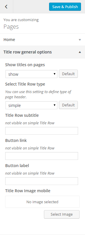
Pages title row general options
- Title row simple:
- Show background mask – show/hide
- Background mask
- Title row height
- Title row image
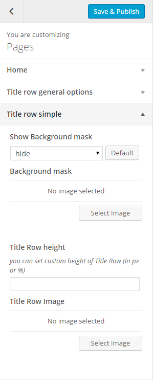
Pages title row simple
- Title row parallax:
- Parallax ratio
- Title row height
- Title row image

Pages title row parallax
- Title row kenburns:
- Select gallery for kenburns Header
- Title row height
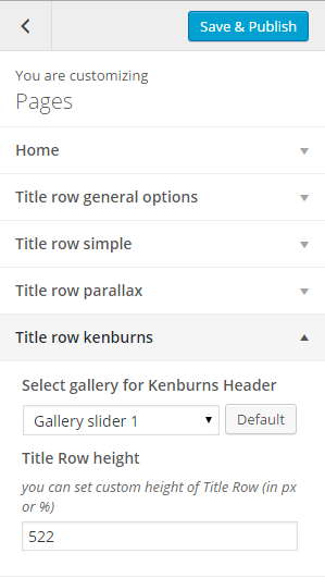
Pages title row kenburns
- Title row video:
- Videos source
- Select video type
- Title row height
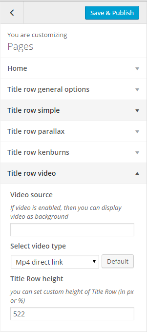
Pages title row video
Notice: – settings above are by default applied for all your pages. Though you can also customize them for each page separately with Page side content settings – you will see this option during page content edition.
Was this article helpful ?
Posts options
When using the assigned blog page as described in Blog Index page, all the options you can select for it are located in Appearance > Customize on the Posts tab. There are dozens of options to choose from like layout, categories, dates, etc. There are general blog options and single post page options. Each one has title and descriptions to help you better understand what they do. Any type of blog options you need to set will be set here in theme options when using the assigned blog page.
Blog Index Title row general Options:
- Show titles on blog index – show/hide ttile on blog index page,
- Select title row type – you can use this setting to define type of page header,
- Title Row subtitle – it will be displayed as sub title,
- Button link – add your own link,
- Button label – define custom label for button,
- Title row Image mobile – set an Image that will be display in title row on mobile
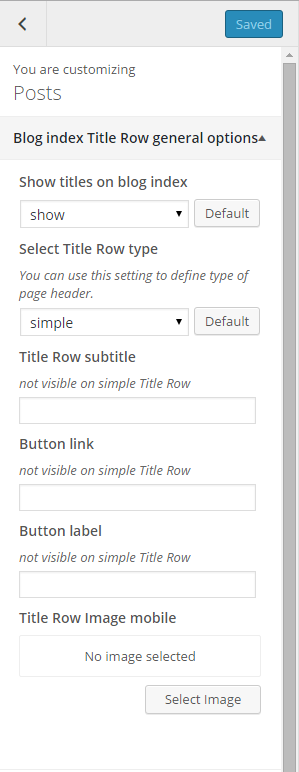
Pages blog index title row general options
Blog Index Title Row Simple:
- Show background mask – show/hide;
- Background mas – add your own background mask,
- Title row height – set custom height of ttile row,
- Title row image – set an Image that will be display in title
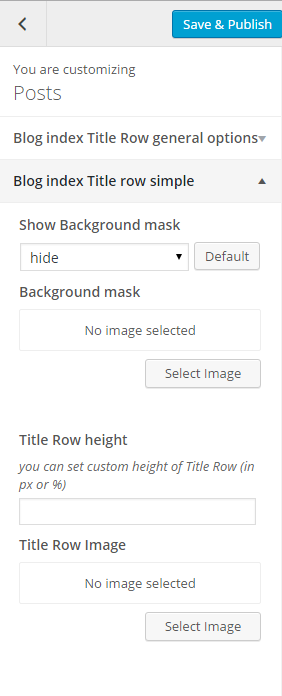
Pages blog index title row simple
Blog Index Title Row Parallax:
- Parallax ratio – set custom value of parallax ratio,
- Title row height – set custom height of title row,
- Title row image – set an Image that will be display in title
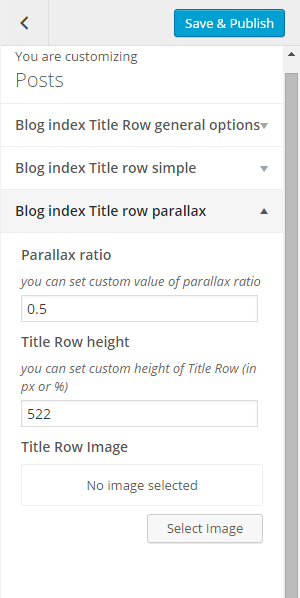
Pages blog index title row parallax options
Blog Index Title Row Kenburns:
- Select gallery for Kenburns header,
- Title row height – set custom height of title row
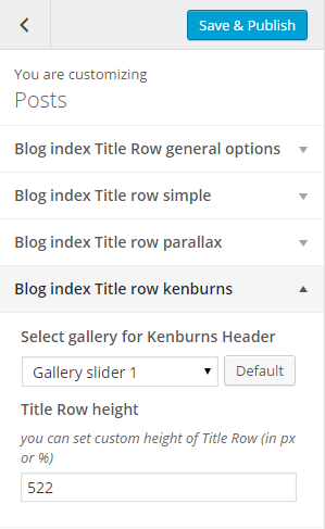
Pages blog index title row kenburns options
Blog Index Title Row Video:
- Video source,
- Select video type – Mp4 direct link/Webm direct link,
- Title row height – set custom height of title row
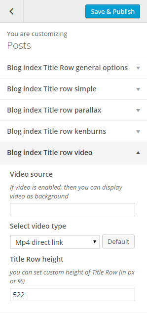
Pages blog index title row video options
Single Post Title Row General Options:
- Select title row type – you can use this setting to define type of page header,
- Title row subtitle – it will be displayed as sub title,
- Button link – add your own link,
- Button label – define custom label for button,
- Title row Image mobile – set an Image that will be display in title row on mobile
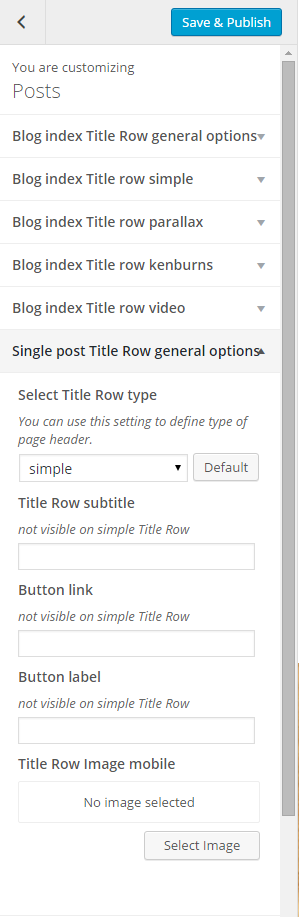
Single post title row general options
Single Post Title Simple:
- Show background mask – show/hide,
- Background mas – add your own background mask,
- Title row height – set custom height of ttile row,
- Title row image – set an Image that will be display in title
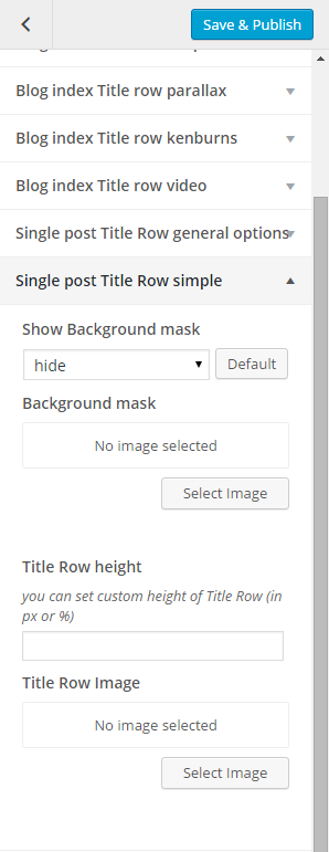
Simple post title row single options
Single Post Title Row Parallax:
- Parallax ratio – set custom value of parallax ratio,
- Title row height – set custom height of title row,
- Title row image – set an Image that will be display in title
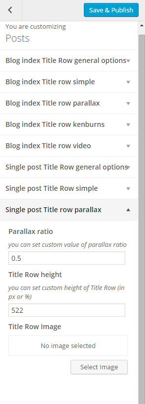
Single post title row parallax
Single Post Title Row Kenburns:
- Select gallery for Kenburns header,
- Title row height – set custom height of title row
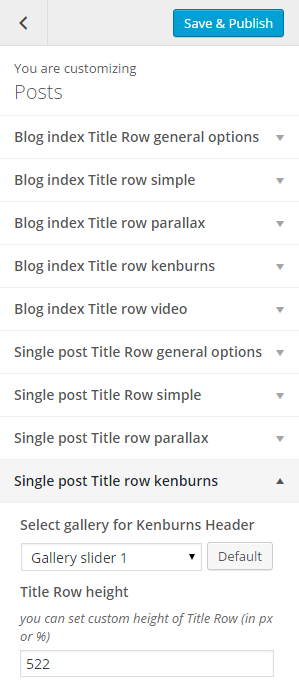
Single post title row kenburns
Single Post Title Row Video:
- Video source,
- Select video type – Mp4 direct link/Webm direct link,
- Title row height – set custom height of title row
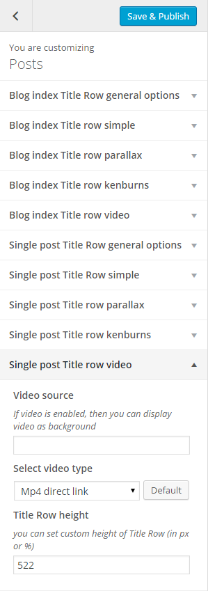
Single post title row video options
Index:
- Blog title – it will be displayed as title of your index page,
- Blog sub title – it will be displayed as sub title of your index page,
- Show index as – select the way of displaying posts on index,
- Post detail button label – define custom label for button Read More,
- Meta – show/hide posts meta
- By label – define custom label
- On label – define custom label
- In label – define custom label
- Tags label – define custom label
- Date – show/hide posts date
- Show featured media on blog index
- Title / quote author – show/hide posts author,
- Comments count – show/hide information about ammount of comments under the post
- Post text – show/hide Author link
- Author link – show/hide Author link
- Show read more button – show/hide button Read More
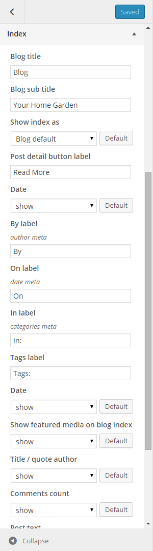
Blog index page settings
Single – select how should look single post page:
- Blog sub title – it will be displayed as sub title of your single post,
- Meta – show/hide single post meta,
- Tags – show/hide single post tags,
- Categories – show/hide post categories,
- Show posts index page title – hide/show blog title,
- Post single sidebar – choose the sidebar type that will be display on single post,
- Date – show/hide post date,
- Show featured media on single post – show/hide image, video or gallery assigned to post,
- Tag cloud – show/hide,
- Categories – show/hide,
- Show social box – show/hide,
- Show button label – define custom label for button Share this post,
- Pagination – show/hide,
- Tags label
- Previous post label
- Next post label
- By label
- On label
- In label (for categories)
- Comment reply label
- Leave a comment label
- Comment Form description
- Comment Form submit label
- Comment Form name placeholder
- Comment Form email placeholder
- Comment Form website placeholder
- Comment Form message placeholder
- Comment Form description
- Latest posts header
- Latest post slider link label
- Latest posts posts limit
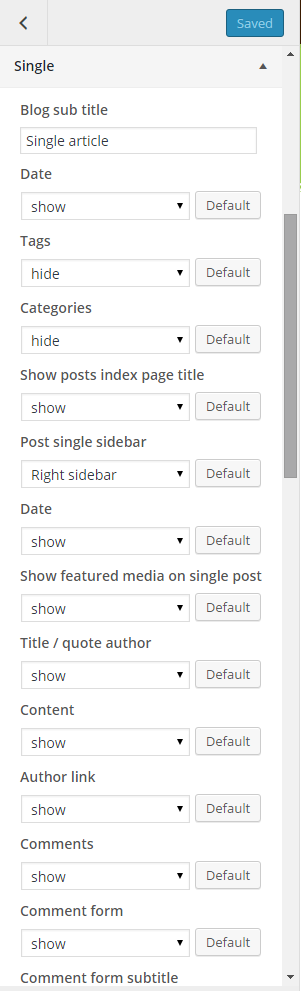
Single post settings
Common issue: How to change post intro text?
Intro text, which can be displayed on Blog index page is an Excerpt. You can edit it manually for every post with the following field:
Excerpt
Notice: if you don’t see Excerpt field when you are editing your post, go to Screen Options at the top of the post edition window (on the right hand side) and enable Excerpt with checkbox.
Was this article helpful ?
Topbar

Top Bar
Look of the topbar can be edited via Appearance > Customize > Main Navbar > Topbar
Topbar:
- Show support info – show/hide,
- Support icon – choose font awesome icon,
- Support text – add custom text,
- Text on right – add the text that will be showing up on the right side of the topbar
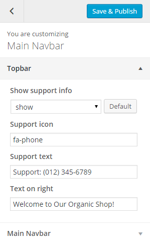
Topbar options
Was this article helpful ?
Main Navbar

Main navbar (normal)
There are several to options to choose. You can change navbar style and scroll effect globally via Appearance > Customize > Main Navbar > Main Navbar
Navigation:
- Navbar Style – choose between normal and narrow style,
- Navbar behavior – choose how the navigation bar will act after scrolling the page:
– Scroll Up Menu
– Scroll Up Top Bar
– Scroll Up Both
– Fixed Top Bar
– Fixed Menu
– Fixed Both - Navbar transparent,
- Search on navbar,
- Navbar search label – set custom text for search label,
- Navbar search icon class – choose FontAwesome icon for the search label

Main Navbar settings
Was this article helpful ?
Creating Team Member Page
Them item are custom post types, which can be created via Team section.

Team member page
This page is a team members item, team slider is generated in all team members pages. Team member item and team slider can be customize with the help of customizer options you can find in this section.
CREATING TEAM MEMBERS
To create new Team elements, navigate to team Team Members > Add New

Add new Team Member
For new Team Member item you can define:
- Title (required),
- Tags (optional),
- Categories (optional),
- Order attribute (optional),
- Featured Images (recommended),
- Gallery(optional),
- Team settings(optional),
- Date,
- Time,
- Location,
- Button URL,
- Button label,
- URL to map,
- Description
- Socials-meta
- Page title row options
- Title row simple
- Title row parallax
- Title row Kenburns
- Title row Video
Remember that the settings set in Team Item for Page Title and Title Row will be only visible on the page when the title row type will be set to diffrent than use global settings.
After every modification click on Update to keep your changes saved.

Team item
Was this article helpful ?
Team options
Team Customizer Options

Team Single Title Row
Customizer in Test is giving many customizer options that will let you customize
- Member Single Title Row general Options
- Show titles on single member – show/hide,
- Select title row type – you can use this setting to define type of page header,
- Title row subtitle – add your custom subtitle (not visible on simple title row),
- Button link – add custom link for button (not visible on simple title row),
- Button label – add custom link for button label (not visible on simple title row),
- Title row image mobile – add image for title row that will be visible on mobile
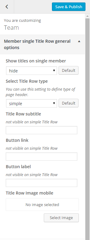
Team member single title row general options
- Team Single Title Row Simple
- Show background mask – show/hide,
- Background mask – you can add image for the background mask,
- Title row height – you can set custom height of Title Row (in px or %),
- Title row image – you can add image for the title row
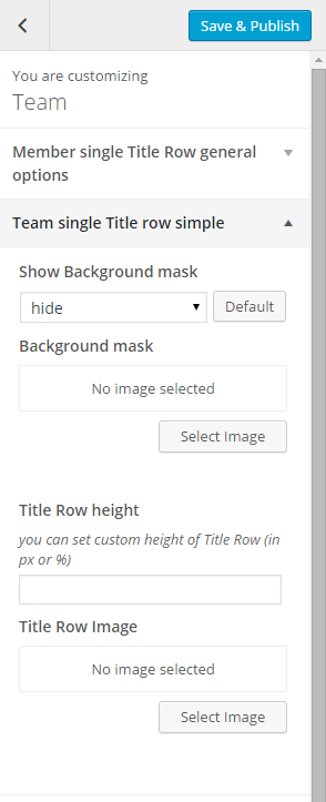
Team single title row simple
- Team Single Row Parallax
- Parallax ratio – you can set custom value for parallax ratio,
- Title row height – you can set custom height of Title Row (in px or %),
- Title row Image – add your own image for the title row

Team single title row parallax
- Team Single Row Kenburns
- Select gallery for Kenburns Header – choose one of created galleries to display,
- Title row height – you can set custom height of Title Row (in px or %),

Team single title row kenburns
- Team Single Row Video
- Video source – add source of the video,
- Select video typ – Mp4 direct link or Webm direct link,
- Title row height – you can set custom height of Title Row (in px or %)
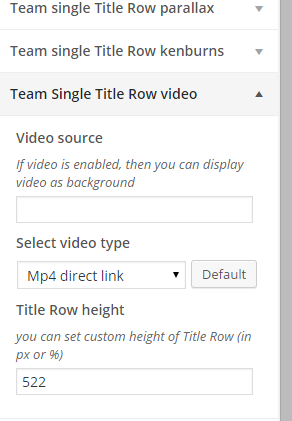
Team single row video

Team Single page
- Team Single Options
- Phone label – add custom text for Phone label,
- Email label – add custom text for Email label,
- Show email – show/hide,
- Show phone – show/hide,
- Show socials – show/hide,
- Show team slider – show/hide,
- Slider header – set custom text for the slider header
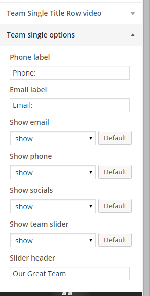
Team single options
Was this article helpful ?
Socials
Social icons, from the top of the page can be removed or changed via Appearance > Customize > Socials
Socials icons
We will display here only icons for social media profiles, which you define in settings:
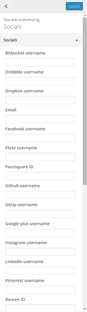
Socials
So if you don’t want to display, for example Facebook icon – just leave Facebook field empty.
Was this article helpful ?
Events
Test is loaded with options for the Event. It offers many different options for you to present your events posts and there are numerous theme options and shortcode options that allow you to customize how events are displayed.
There are several ways to display your event posts, we will cover each method as well as describe blog post types, post options and theme options. The following sections will cover each of these aspects of the blog.
To create this type of page you need to create a page and in Page Atributes choose Events Template
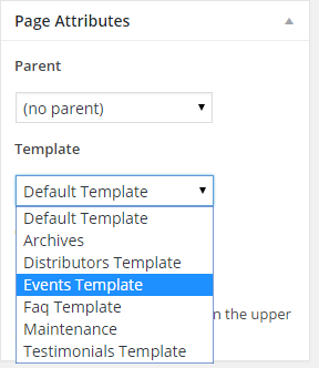
Choose Events template
Remember to update the page to keep all your changes.
Was this article helpful ?
Popup configurations
With Test you will be able to create your own Newsletter popup.

TEAM CUSTOMIZER OPTIONS
To customize the Newsletter you need to go to the Appearance > Customize > Popup configuration
- GENERAL OPTIONS
- Show newsletter – show/hide,
- Select newsletter Contact Form – select one from the created contact forms,
- Sub header – Add custom text for sub header,
- Message – add custom text for pop up,
- Header – add custom text for header,
- Link 1 URL – add URL link,
- Link 2 URL – add URL link,
- Link 1 Label – add custom text for link label 1,
- Link 2 Label – add custom text for link label 2,
- Background image,
- Promo image
Popup configuration
Was this article helpful ?
Event options
Event Customizer Options
Customizer in Test is giving many customizer options that will let you
- General Settings
- Custom post type slug – Set custom post type slug,
- Select featured event – Choose one of created events that will be shown as featured one
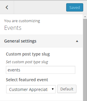
Events general settings
- Event list Settings
- Event list header – Set custom header, text
- Event list pagination – show/hide,
- Show featured event – show/hide,
- Show event list header – show/hide,
- Show date on images – show/hide,
- Show images – show/hide events images,
- Show titles – show/hide,
- Show content – show/hide event content text,
- Show divider after content – show/hide,
- Show dates – show/hide,
- Show time – show/hide,
- Show location – show/hide,
- Show facebook share – show/hide,
- Show map direct link – show/hide,
- Show button link to single – show/hide,
- Show custom button link – show/hide,
- Date label – add custom DATE label text,
- Time label – add custom TIME label text,
- Map location label – add custom Map location label text,
- Share label – add custom share label text,
- Map link label – add custom Map link label text,
- Show button link label – add custom single button link label text
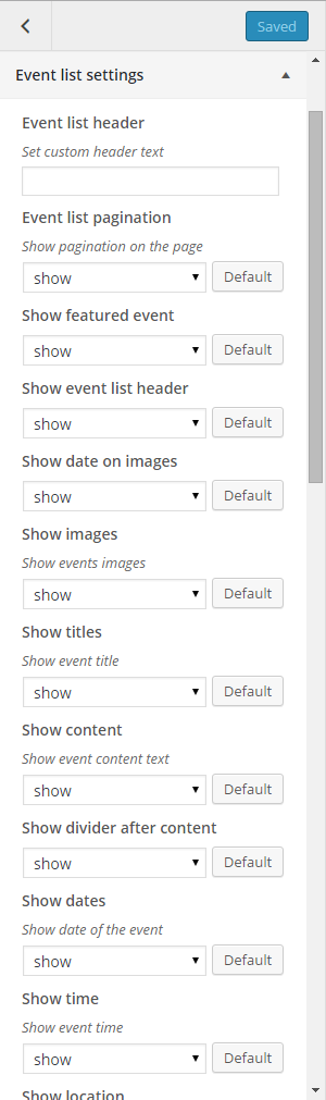
Events list settings
- Featured Event Settings
- Show gallery – show/hide,
- Show date – show/ hide,
- Show title – show/hide,
- Show description – show/hide,
- Show button link to single – show/hide,
- Show custom button link to single – show/hide
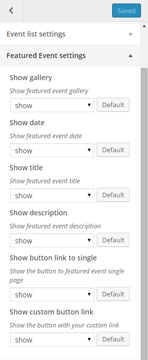
Featured event settings
- Event Single Settings
- Content header – you can set custom text for single conten header,
- Show gallery box – show/hide,
- Show gallery date – show/hide,
- Show gallery title – show/hide,
- Show gallery description – show/hide,
- Show custom button on gallery – show/hide,
- Show meta – show/hide,
- Show meta author – show/hide,
- Show meta date – show/hide,
- By autor label meta – add custom text for author label,
- Created on label meta – add custom text for Created on label,
- Tag label – add custom text for Tag label,
- Categories label – add custom text for Categories label,
- Show title – show/hide,
- Show content – show/hide,
- Show divider after content – show/hide,
- Show tags – show/hide,
- Show event tags – show/hide,
- Show socials – show/hide,
- Show navigation – show/hide
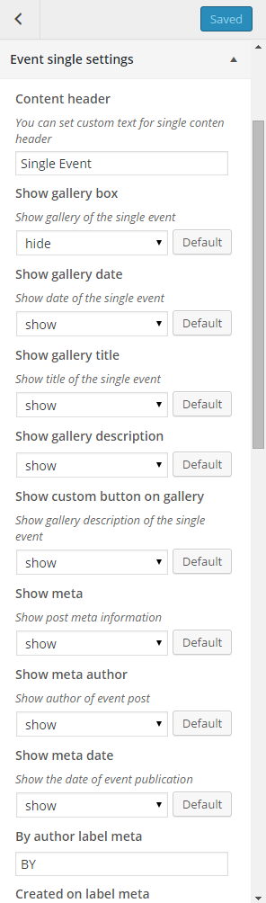
Event single settings
- Filters
- Categories custom order – set custom separate category slugs,
- Event order by – set Event order,
- Event order – ascending/descending,
- Event per page – choose number of events that will show on event page
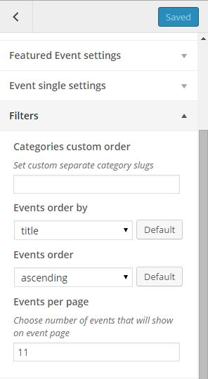
Event Filters
- Event Index Title Row General Options
- Show titles on Events index – show/hide,
- Select title row type – you can use this setting to define type of page header,
- Title row subtitle – set custom title row subtitle (not visible on simple Title Row),
- Button link – set link for the button (not visible on simple Title Row),
- Button label – set custom text for button label,
- Background mobile – set image for background mobile
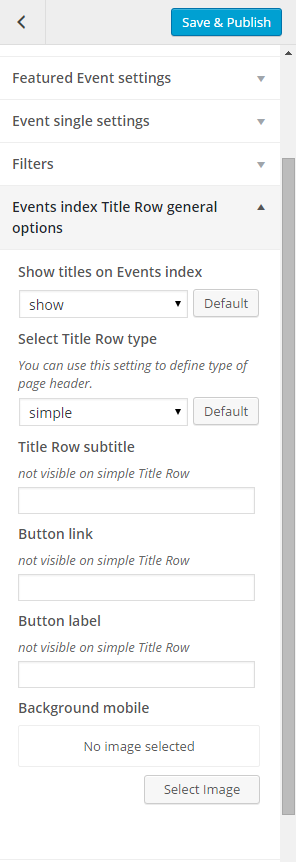
Event index ttile row general options
- Events Index Title Row Simple
- Show background mask – hide/show,
- Background mask – add image that will be used as background mask,
- Title row height – you can set custom height of Title Row (in px or %),
- Title row image – add image that will be used as title row image
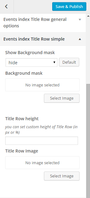
Events index title row simple
- Event Index Title Row Parallax
- Parallax ratio – you can set custom value of parallax ratio,
- Title row height – you can set custom height of Title Row (in px or %)
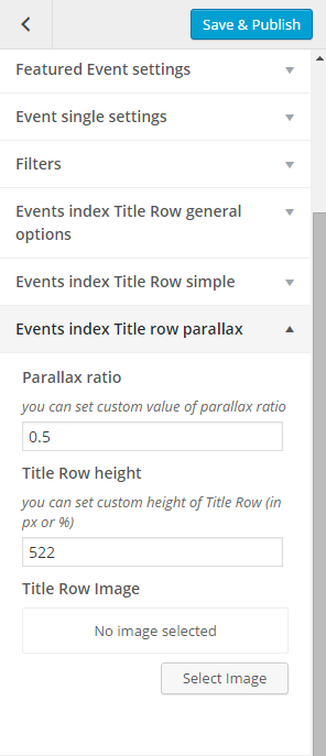
Events index title row parallax
- Event Index Title Row Kenburns
- Video source – add source of the video,
- Select video type – Mp4 direct link or Webm direct link
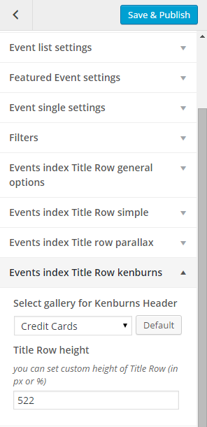
Events index title row kenburns
- Event Index Title Row Video
- Video source – add source of the video,
- Select video type – Mp4 direct link or Webm direct link
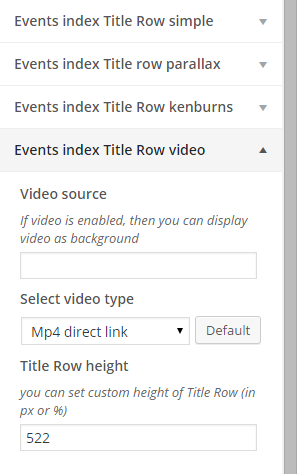
Events index title row video
- Event Singe Title Row General Option
- Show titles on Events index – show/hide,
- Select title row type – you can use this setting to define type of page header,
- Title row subtitle – set custom title row subtitle (not visible on simple Title Row),
- Button link – set link for the button (not visible on simple Title Row),
- Button label – set custom text for button label,
- Background mobile – set image for background mobile
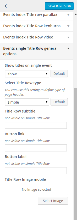
Events single title row general options
- Event Single Title Row Simple
- Show background mask – hide/show,
- Background mask – add image that will be used as background mask,
- Title row height – you can set custom height of Title Row (in px or %),
- Title row image – add image that will be used as title row image
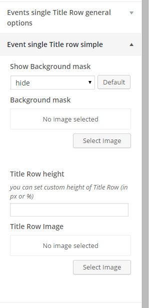
Event single title row simple
- Event Single Title Row Parallax
- Parallax ratio – you can set custom value of parallax ratio,
- Title row height – you can set custom height of Title Row (in px or %)
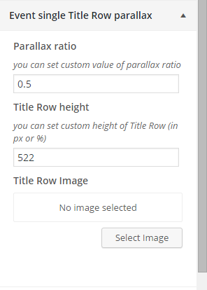
Event single title row parallax
- Events Single Title Row Kenburns
- Select gallery for Kenburns header – choose one of created galleries to display,
- Title Row height – set height of the title row
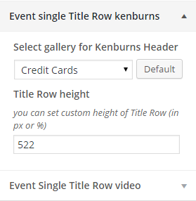
Events single title row Kenburns
- Events Single Title Row Video
- Video source – add source of the video,
- Select video type – Mp4 direct link or Webm direct link
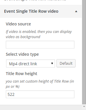
Event single title row video
Was this article helpful ?
Menu setup
Depending on which version of content arrangement you choose, you can create onepager or multipage navigation menu.
To create navigation menu dedicated to multipage websites, please follow the steps below:
- Step 1 – Navigate to Appearance > Menus
Manage your menus
- Step 2 – Click on create a new menu, enter menu Name and click on Create Menu button
Add new menu
- Step 3 – From the right hand side choose pages that you want to add to your menu and click on Add to Menu. Once menu items are added you can reorder or nest them via drag and drop tool. Remember to click Save Menu when you finish to keep your changes saved.
Add pages to menu
- Step 4 – You can easily rename every menu item in item details.
Rename your menu items
- Step 5 – Optionally you can add to menu other items, like Links or Categories
- Step 6 – Check you menu as Primary Navigation to set it up as main menu.
Primary navigation
- Step 7 – Always click Save Menu after providing any changes.
In Test you can also select which menu you would like to use by going to Appearance > Customizer > Navigation
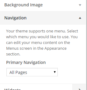
Navigation setings
To create navigation menu dedicated to onepager websites
on step Step 3 Instead of choosing the pages you want to use for you menu you should use Custom Links option where for the URL you will add a unique ID like on the example below. The same ID need to be add on the section of the page that you want the navigation items to link to.

Creating onepager
Remember that order of menu items and the order of the page sections must be the same
Was this article helpful ?
Testimonials Options

Testimonial Index page
Testimonial Customizer Options
Customizer in Test is giving many customizer options that will let you
- Testimonial General Settings
- Index header – set custom index header,
- Limit – show ammount of testimonials on page,
- Testimonials show pagination – show/hide
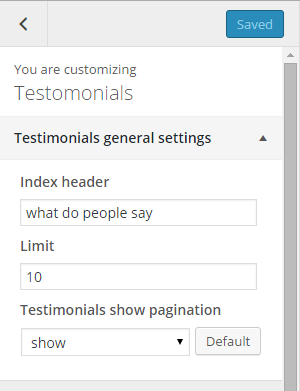
Testimonials general settings
Was this article helpful ?
Portfolio Options

Portfolio Single Title Row
Testimonial Portfolio Options
Customizer in Test is giving many customizer options that will let you customize Portfolio page.
- Single Portfolio – Title Row
- Show titles on single portfolio – show/hide,
- Select title row type – you can use this setting to define type of page header,
- title row subtitle – add custom text for title row subtitle (not visible on simple Title Row),
- Button label – add custom text for button link,
- Title row image mobile – add title row image for mobile
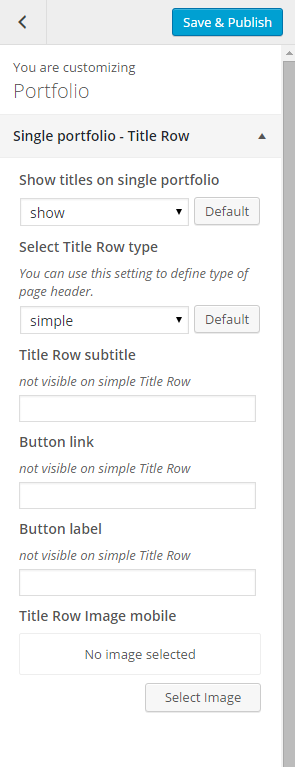
Single portfolio – single row
- Single Portfolio Title Row Simple
- Show Background mask – show/hide
- Background mask – add image for background mask
- Title row height – you can set custom height of Title Row (in px or %),
- Title row image – add image for title row

Single portfolio title row simple
- Single Portfolio Title Row Parallax
- Parallax ratio – you can set custom value of parallax video
- Title row height – you can set custom height of Title Row (in px or %)
- Title row image – add title row image
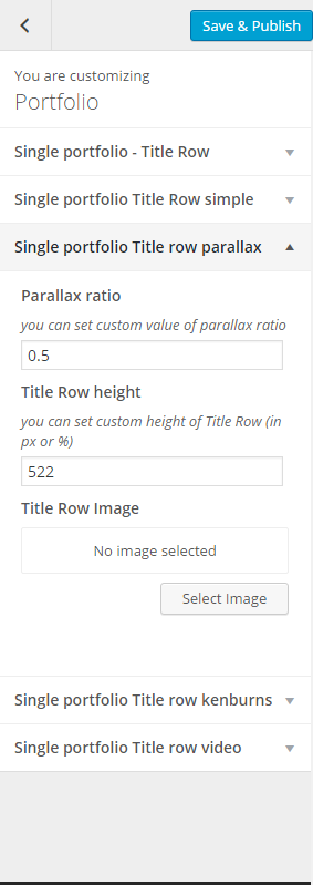
Single portfolio title row parallax
- Single Portfolio Title Row Kenburns
- Select gallery for Kenburns header – you can set custom value of parallax video
- Title row height – you can set custom height of Title Row (in px or %)

Single portfolio title row kenburns
- Single Portfolio Title Row Video
- Video source – add the source link of the video
- Select video type – MP4 direct link/Webm direct link
- Title row height – you can set custom height of Title Row (in px or %)
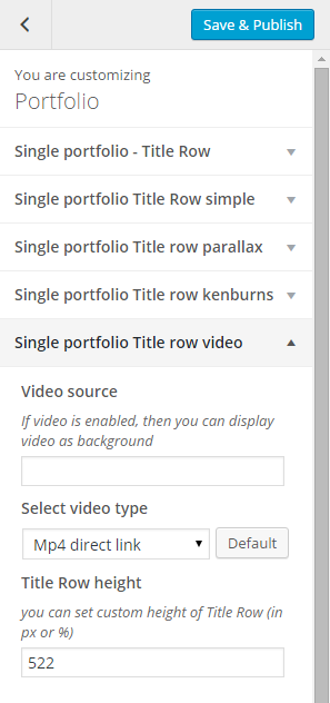
Single portfolio title row video
Was this article helpful ?
Creating Testimonial page
This page is generated using Testimonial Template. Testimonial Template display created Testimonials.

Testimonial page
Creating Testimonial Item
To create new Team elements, navigate to team Testimonials > Add New
Add new Testimonial
For new Testimonial item you can define:
- Title (required),
- Tags (optional),
- Categories (optional),
- Order attribute (optional),
- Featured Images (recommended),
- Gallery(optional)
After every modification click on Update to keep your changes saved.
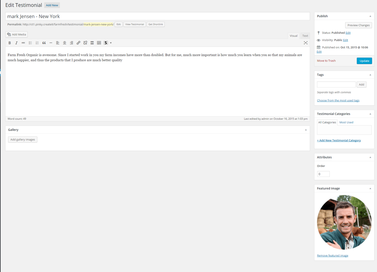
Testimonial item
Was this article helpful ?
Creating Portfolio item
CREATING PORTFOLIO ITEM
To create new Portfolio elements, navigate to team Portfolio > Add New

Add new portfolio item
For new Portfolio item you can define:
- Title (required),
- Tags (optional),
- Categories (optional),
- Order attribute (optional),
- Featured Images (recommended)
After every modification click on Update to keep your changes saved.
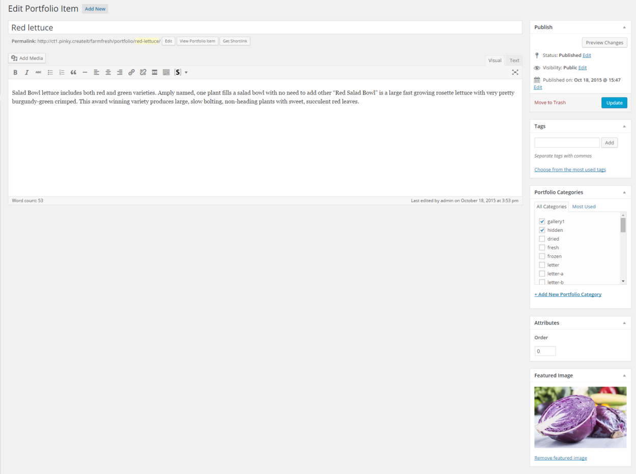
Portfolio item
Portfolio item isn’t compatible with Visual Composer plugin.
Was this article helpful ?
Woocommerce Options
Woocommerce Customizer Options
Customizer in Test is giving many customizer options that will let you change the look of your shop pages:

Shop Index title row
- Shop Index Title Row general Options
- Show titles on single member – show/hide,
- Select title row type – you can use this setting to define type of page header,
- Title row subtitle – add your custom subtitle (not visible on simple title row),
- Button link – add custom link for button (not visible on simple title row),
- Button label – add custom link for button label (not visible on simple title row),
- Title row image mobile – add image for title row that will be visible on mobile
Woocommerce shop index title row general options
- Shop Index Title Row Simple
- Show background mask – show/hide,
- Background mask – you can add image for the background mask,
- Title row height – you can set custom height of Title Row (in px or %),
- Title row image – you can add image for the title row
Woocommerce shop index title row simple
- Shop Index Title Row Parallax
- Parallax ratio – you can set custom value for parallax ratio,
- Title row height – you can set custom height of Title Row (in px or %),
- Title row Image – add your own image for the title row
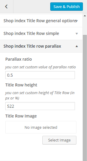
Woocommerce shop index title row parallax
- Shop Index Title Row Kenburns
- Select gallery for Kenburns Header – choose one of created galleries to display,
- Title row height – you can set custom height of Title Row (in px or %),
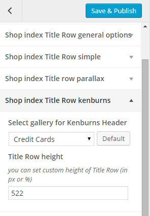
Woocommerce shop index title row kenburns
- Shop Index Title Row Video
- Video source – add source of the video,
- Select video typ – Mp4 direct link or Webm direct link,
- Title row height – you can set custom height of Title Row (in px or %)
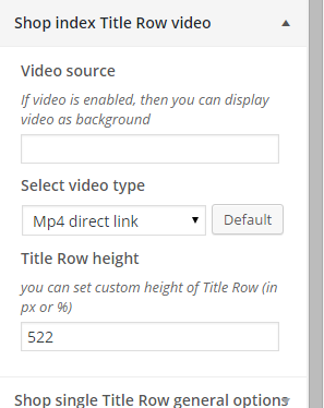
Woocommerce shop index title row video

Example of product title row
- Shop Single Title Row General Options
- Show titles on single product – show/hide,
- Select title row type – you can use this setting to define type of page header,
- Title row subtitle – add custom subtitle text for ttile row (not visible on simple Title Row),
- Button link – add link for the button (not visible on simple Title Row),
- Button label – add custom button label text (not visible on simple Title Row) – show/hide,
- Title row image mobile – add image for the title row on mobile
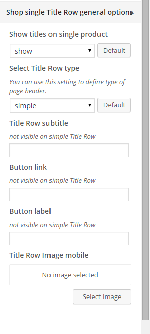
Woocommerce shop single title row general options
- Product Single Title Row Simple
- Show background mask – show/hide,
- Background mask – you can add image for the background mask,
- Title row height – you can set custom height of Title Row (in px or %),
- Title row image – you can add image for the title row
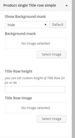
Woocommerce product single title row simple
- Product Single Title Row Parallax
- Parallax ratio – you can set custom value for parallax ratio,
- Title row height – you can set custom height of Title Row (in px or %),
- Title row Image – add your own image for the title row
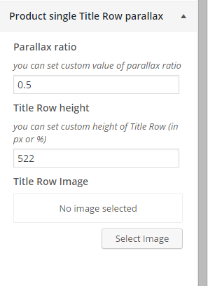
Woocommerce product single title row parallax
- Product Single Title Row Kenburns
- Select gallery for Kenburns Header – choose one of created galleries to display,
- Title row height – you can set custom height of Title Row (in px or %),
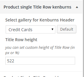
Woocommerce product single title row kenburns
- Product Single Title Row Video
- Video source – add source of the video,,
- Select video typ – Mp4 direct link or Webm direct link,
- Title row height – you can set custom height of Title Row (in px or %)
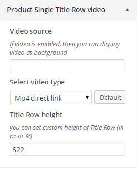
Woocommerce product single title row video
- Woocommerce General options
- Show share icons? – hide/show
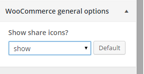
Woocommerce general options
Was this article helpful ?
Distributors Options
In Distrubutors panel you are able to edit the following options for Distribution page:

Distributors page
- Distributors General Options
- Content header – change the header of single distributor content (*This option work only for pages generated from Distributors Template)

Distributors general options
Was this article helpful ?
Creating Distributors page
With Test you can define map showing some info about places where your products are distributed.

Distributors page
Creating Distributors item
To create new Distributors elements, navigate to team Distributors > Add New
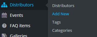
Add new Distributors item
For new Distributors item you can define:
- Title (required),
- Tags (optional),
- Categories (optional),
- Order attribute (optional),
- Featured Images (recommended),
- Distributors settings
- Gallery (recommended)
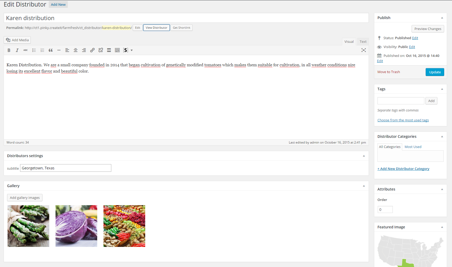
Add new distributors item
After every modification click on Update to keep your changes saved.
Was this article helpful ?
Distributors

Distributors 2 page
In Test you will be able to create page to show from where are you getting all your products, isn’t that great ?!
This page is generated from Distributors Template, so no extra shortcode is needed on the page.
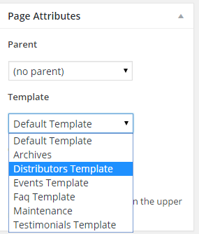
Choose Distributors template
For new Distributors page you can define:
- Title (required),
- Tags (optional),
- Categories (optional),
- Order attribute (optional),
- Featured Images (recommended),
- Page title row options,
- Title row simple,
- Title row parallax,
- Title row Kenburns,
- Title row Video,
- Navbar settings
Remember to update the page to keep all your changes.
Was this article helpful ?
Tesimonials
In Test you will be able to create page to show from where are you gettings all your products isn’t that great ?!
To create this type of page you need to create a page and in Page Atributes choose Distributors Template
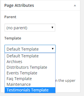
Choose Testimonial Template
Remember to update the page to keep all your changes.
Was this article helpful ?
Creating ‘What we grow?’ item
Creating Item
To create this type of item you need to create a new Product or used the one you created before. to create anew object go to theme Products > Add Products
Add new products
Please check this documentation for how to create a Woocommerce products. The features added in {theme} you will find in the Product Data > General
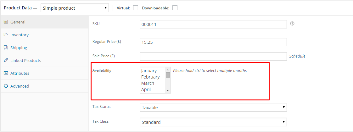
Product Availability
Via Availability option you will be able to set the months when your customers should expect your fresh products in the shop!
After every modification click on Update to keep your changes saved.
Was this article helpful ?
Creating the App
First thing you need to do to fully use the {plugin} you need to creating this ap on your own so you will be able to move it.
Getting ready to use the plugin
Go to the Simple Gallery > Global Settings
Global Settings
To be able to see the  button to facebook you need to fill the facebook App ID and App Secret labels and click Save Changes button.
Neat! But from where I will get this credentials?
This is a really good question. Just follow this steps and you will be able to get your own in no time!
Please go to the Facebook developer page and log in using your FB credentials.
*Creating new App
-After successful login into the developer you should be able to find in the My Apps dropdown menu with all the created arleady Apps.
-To create new app please click the Add a New App
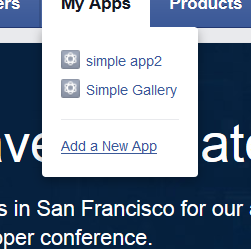
FB Developers
*The next step is to choose the Website as a platform for you App
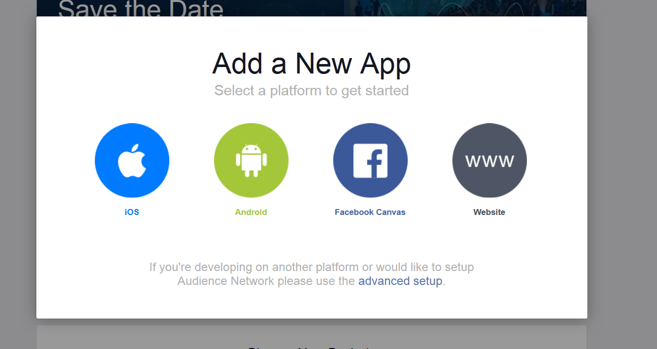
Add new App
*Next fill in the field for display name of your new App and click the Create New Facebook App ID button.
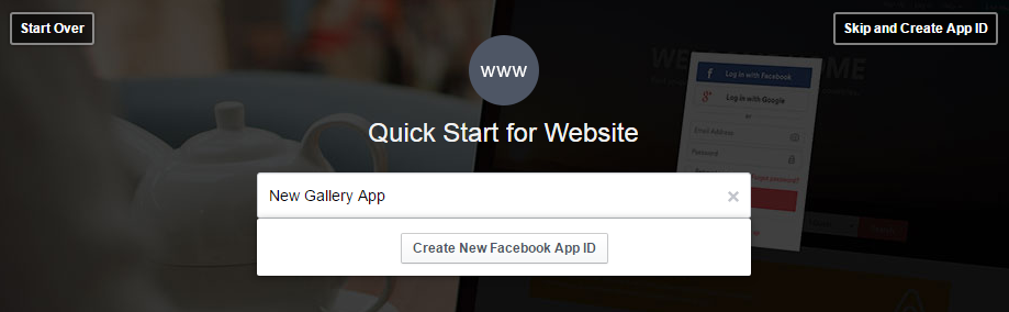
Choosing your app name
*For the category we are suggesting to choose: photo.

Choose the category for your app
-After clicking the  button the settings will be saved.
*As a next step go back to the My Apps and choose your new App.
-You will find the App ID and Secret Key like on the image below in the Dashboard section.

Creating new App
*You will be able to copy from here the App ID and App Secret that will be used in the {plugin}
*But first you need to Next step is going to the  that you will find in the New Gallery App menu
– In the Settings choose the Advanced tab and set your Valid OAuth redirect URIs link in the Client OAuth Settings section. This is the name of the domain on which you are using {plugin}

*Then you can go back to the Basick tab and Add Platform – Website
*Copy the App ID and App Secreed and past them in the General setting labels of the plugin.
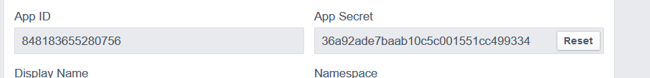
* The last step is to save all the changes you made and from no one you can use the {plugin} with no problems.
Was this article helpful ?
Creating simple gallery
To create a new Simple Gallery:
Go to Simple gallery > Add new Simple Gallery in your WordPress Admin Panel
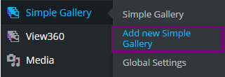
Create a new Simple Gallery
Choose all the settings you want to use.
Simple Gallery settings
- Choose gallery source – select one of the following sources for the simple gallery:
- Tumblr
- Flickr
- Media Gallery
- WooCommerce (Product)
- Social User/album – Type the name of valid user of chosen social media or album number of facebook:
- Facebooka – Album number
- Instagram, Tumblr, Flickr – User name.
- Media Gallery – Media Gallery Post. For more information go HERE.
- WooCommerce – ID produktu. For more information go HERE.
- Enable vertical – Will let you view the gallery verticaly
- Enable adaptive height – When this option is enabled the height and width of each slide will be depending it size. If this option is disabled the height and width of all of the sliders will be the same and it will be the size of the biggest slide.
- Slides to show – Type how many gallery images (as a slide) would you like to show on the page (max 25 images).
- Enable fade – Enable fade for each slide.
- Enable lazy load – Enable lazy loading slide images.
- Choose lazy load type – Choose lazy load type for the gallery.
- On Demand – Will load if necessary.
- Progressive – Work in the background.
- Columns to show – How many columns you would like to show (max 5).
- Enable dots – Turn on/off pagination with numbers of the slides.
- Enable Arrows – Enables pagination arrows for the gallery.
- Enable Infinite Sliding – Looping gallery. If this option is enable you will be able to go directly from the last slide to the firts one.
- Enable autoplay – The slides will be change automatically.
- autoplay speed – Set autoplay speed in ms.
- Enable center mode – Enable center mode for the gallery sliders.
- Center Padding – Adjust center padding (percentage) if center mode is on (max 30%)
- Enable fixed height of picture – By default the height is set to 200px.
- Fixed height – Type height of your fixed pictures (in px).
- Choose slider skin Ondemand – When the loading will be needed.
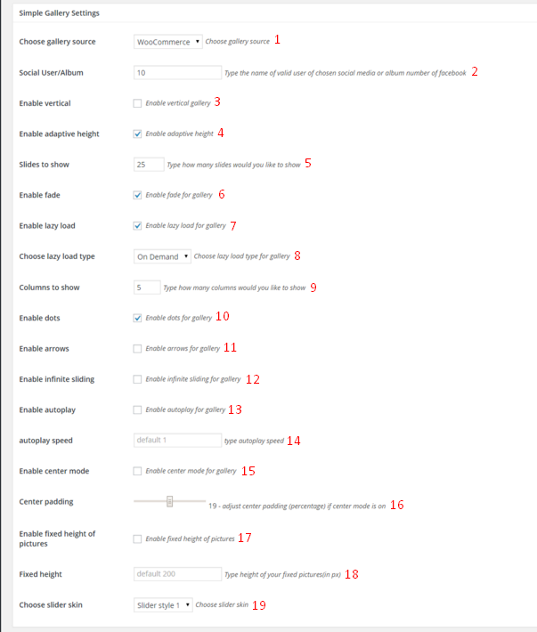
To add the simple gallery to the page you need to copy/paste the shortcode name.

Simple gallery shortcode
Please be aware that:
- If you enable the Verticla option you will limit the amount of the columns to 4 also we suggest to use same size images and do not choose adaptive height and fade.
- If the center mode isn’t selected the center padding will not affect the display of the gallery aslo if the lazy load isn’t selected the autoplay will not affect the display of the gallery.
- Center mode will show all other sllides on the sides (if on slide we will have 4 images to with center mode we will se 12 images of which 4 will be centered).
Was this article helpful ?
Simple Gallery widget options
You will find the widget section by going in the WordPress from Dashboard section to Appearance > Widgets
This are all the options for the Test in the Widgets section.
Simple Gallery widget settings:
- Title – Set custom title for the Simple Gallery
- Source – Select one of the following sources:
- Tumblr
- Flickr
- Media Gallery – Media Gallery ID. For more information go HERE.
- WooCommerce – Product’s ID. For more information go HERE.
- Social User/album – ID of the element from which we retrive:
- Facebooka – Album number.
- instagram,tumblr,flickr – User name.
- Media Gallery -> Media Gallery Post. For more information go HERE.
- WooCommerce -> ID produktu. For more information go HERE.
- Columns – how many columns you would like to show (max 2).
- Slides to Show – how many slides you would like to show (max 4).
- Autoplay -The slides will be change automatically.
- Enable Dots – Turn on/off pagination with numbers of the slides.
- Enable infinite sliding – Looping gallery. If this option is enable you will be able to go directly from the last slide to the firts one.
- Enable Arrows – Enables pagination arrows for the gallery.
- Enable adaptive height – When this option is enabled the height and width of each slide will be depending it size. If this option is disabled the height and width of all of the sliders will be the same and it will be the size of the biggest slide.
- Enable fixed height of picture – By default the height is set to 200px.
- Fixed items height – Type height of your fixed pictures (in px).
- Slider Style – choose the style of the slider.

Simple Gallery widget options
Was this article helpful ?
How to get correct source
In this section you will find the information how to get the correct surce for your Simple gallery.
You can create your own Simple Gallery by going into WordPress Dasboard and from there to Simple gallery > Add new Simple Gallery

- Go to Facebook page
- Click photos (1) and then click albums (2)

Facebook
- Choose one of the albums you want to use in your Simple Gallery

Choose FaceBook gallery
- Copy the page source like on the image below

Copy Facebook gallery source
- Paste the code in Social User/Album box and don’t forget to choose the Facebook as the gallery source and
 the gallery settings after you are done.

Paste the Facebook source
- Go to the Instagram page of the user you want images to be seen in your simple gallery.
- Copy the Instagram username.

Instagram username
- And then past it to the user/album box in Simple gallery Settings. Also be sure you choose the correct source for the gallery.

Instagram images
- The last thing you need to do is to update all this changes you made.
Tumblr
- Go to the Tumblr page of the user you want images to be seen in your simple gallery.
- Copy the username or the Tumblr website adress like on the example below:

Tumbrl images
- Next step is to past it to user/album box in Simple gallery Settings. Don’t forget also to choose correct gallery source!

Copy the tumbl username
Flickr
Go to the flickr page of the user you want images to be seen in your simple gallery.

Flickr user account
If you are not able to find the ‘pretty’ version of the account name you want to use just copy the username from the website link.

Second solution
Copy and paste the username to the user/album box in Simple gallery Settings. Choosing correct gallery source is also important.

Addinf Flickr to Simple Gallery
The last thing to do is to update the changes !
Media Gallery
In Simple Gallery Settings you will find Media gallery section where you will be able to add gallery Images. After clicking Add gallery images new window will pop up where you will be able to add new images to the gallery from Media Library

Add gallery images
After adding the images to the gallery you will be able to removed and sort added images. Also don’t forget to update the changes you made if you do not wan’t to loose them!
WooCommerce (Product Gallery)
Please go to WooCommerce products. If you don’t know how to create a new WooCommerce product please check this WooCommerce documentation.

Product gallery
You just need to hover over one of created product. This way you will be able to see its ID’s

WooCommerce product ID
Copy and paste the ID number to the user/album box in Simple gallery Settings and update the changes.
Please be aware that the Simple gallery plugin is using Product Gallery images. If you didn’t add any images there, the plugin will not work.
Was this article helpful ?
CSS files and structure
If you would like to edit the color, font, or style of any elements, you would do the following:
|
1 |
#primaryContent a {color: #someColor;} |
If you find that your new style is not overriding, it is most likely because of a specificity problem. Scroll down in your CSS file and make sure that there isn’t a similar style that has more weight.
I.E.
|
1 |
#wrap #primaryContent a {color: #someColor;} |
So, to ensure that your new styles are applied, make sure that they carry enough “weight” and that there isn’t a style lower in the CSS file that is being applied after yours.
Colors
The theme includes a css file wich you can use to edit the colors.
You just need to add the corresponding CSS file to the head of the page like this:
|
1 2 3 4 5 |
<head> (..) <link rel="stylesheet" type="text/css" href="css/motive.css"> (..) </head> |
Icons
We’ve included 360+ font icons.
Awesome Icons – http://fontawesome.io/icons/
HTML markup:
|
1 2 |
<!-- Awesome Icons --> <i class="fa fa-cog"></i> |
CSS Files & Structure
We’ve included 2 files.
bootstrap.css contains Bootstrap 3 Library.
style.css file contains general styles.
style.less
1. Variables
2. Mixins
3. Animate
4. Slick
5. Selectize
6. Magnific Popup
7. nstSlider
8. Scaffolding
9. Utilities
10. Buttons
11. Typography
12. Form
13. Address
14. Socials
15. Pagination
16. Boxes
17. Sidebar
18. Blog
19. Newsletter
20. Shop
21. Widgets
22. Sliders
23. Navbar
24. Dropdown
25. Footer
26. Page Headers
27. Mobile Menu
28. Coming Soon Page
29. Gallery
30. Accordion
31. 404 Page
32. Map
33. Twitter
34. Demo Styles
The template also includes:
Google Fonts
@import url(https://fonts.googleapis.com/css?family=Lato:400,300,400italic,700,900);
Mixins and Variables
@import ‘variables.scss’;
@import ‘_bootstrap/bootstrap/mixins’;
@import ‘mixins’;
— Plugins
Animate CSS
@import ‘_animate-css/animate’;
Slick
@import ‘../plugins/slick/slick’;
@import ‘../plugins/slick/slick-theme’;
Selectize
@import ‘../plugins/selectize/selectize.bootstrap3’;
Magnific Popup
@import “../plugins/magnific-popup/main”;
Bootstrap Slider
@import “../plugins/nstSlider/jquery.nstSlider”;
Global
@import ‘global’;
@import ‘utilities’;
— Components
Small Elements
@import ‘components/buttons’;
@import ‘components/typography’;
@import ‘components/form’;
@import ‘components/address’;
@import ‘components/socials’;
@import ‘components/pagination’;
Page Elements
@import ‘components/boxes’;
@import ‘components/sidebar’;
@import ‘components/blog’;
@import ‘components/newsletter’;
@import ‘components/shop’;
@import ‘components/widgets’;
@import ‘components/sliders’;
@import ‘components/navbar’;
@import ‘components/dropdown’;
@import ‘components/footer’;
@import ‘components/page-headers’;
@import ‘components/mobile-menu’;
@import ‘components/coming-soon’;
@import ‘components/gallery’;
@import “components/accordion”;
@import “components/404”;
@import “components/map”;
@import “components/demo”;
Was this article helpful ?
Javascript Components
JavaScript files:
- jquery.min.js – https://jquery.com/
- bootstrap.min.js – http://getbootstrap.com/getting-started/
- browser.min.js – https://github.com/gabceb/jquery-browser-plugin
- device.min.js – https://github.com/borismus/device.js/tree/master/build
- hammer.min.js – http://hammerjs.github.io/
- jquery.hammer.js
- jquery.placeholder.min.js – https://github.com/mathiasbynens/jquery-placeholder
- jquery.visible.js – https://github.com/customd/jquery-visible
- skrollr.min.js – http://prinzhorn.github.io/skrollr/
- slick.min.js – http://kenwheeler.github.io/slick/
- init.js – custom script for slick slider
- isotope.min.js – http://isotope.metafizzy.co/
- jquery.magnific-popup.min.js – http://dimsemenov.com/plugins/magnific-popup/
- jquery.nstSlider.js – http://lokku.github.io/jquery-nstslider/
- selectize.min.js – https://brianreavis.github.io/selectize.js/
- helpers.js – custom script
Screenshot

Was this article helpful ?
Accordion
You can find 7 types of variation in Test for Accordion
- .panel-motive
- .panel-default
- .panel-primary
- .panel-success
- .panel-info
- .panel-warning
- .panel-danger
HTML markup example
|
1 2 3 4 5 6 7 8 9 10 11 12 13 |
<div id="example" role="tablist" aria-multiselectable="true" class="panel-group"> <div class="panel panel-motive"> <div role="tab" id="header-example-1" class="panel-heading"> <h4 class="panel-title"><a aria-controls="collapse-example-1" aria-expanded="false" data-parent="#example" data-toggle="collapse" href="#collapse-example-1" role="button" class="collapsed">Example Title</a></h4> </div> <div id="collapse-example-1" role="tabpanel" aria-labelledby="header-example-1" class="panel-collapse collapse"> <div class="panel-body">Lorem ipsum dolor sit amet, consectetur adipisicing elit, sed do eiusmod tempor incididunt ut labore et dolore magna aliqua. Ut enim ad minim veniam, quis nostrud exercitation ullamco laboris nisi ut aliquip ex ea commodo consequat. </div> </div> </div> </div> |
Screenshot

Accordion example
Was this article helpful ?
Blog Posts
In Test we have 5 types of blog posts you can created using this markups:
Blog Image
HTML markup
|
1 2 3 4 5 6 7 8 9 10 11 |
<article itemprop="blogPost" itemscope="itemtype" itemtype="http://schema.org/BlogPosting" class="ct-blog-post ct-blog-post--image"> <div class="ct-blog-post__media"><img src="assets/images/demo-content/blog-05.png" alt="Beautiful Party With Fairies & Lillies"/></div> <div class="ct-blog-post__body"> <div itemprop="dateCreated" class="ct-blog-post__date"><span class="ct-blog-post__day">17</span><span class="ct-blog-post__month">august</span></div> <div class="ct-blog-post__description">By <a href="blog-post-5.html" class="ct-blog-post__author">Carmen Robin</a><a href="blog-post-5.html" class="ct-blog-post__category"><span>Food & Drinks</span></a><a href="blog-post-5.html" class="ct-blog-post__comments"><span>15 Comments</span></a></div> <h3 class="h4 ct-blog-post__title">Beautiful Party With Fairies & Lillies</h3> <div class="ct-blog-post__content"> <p>Spoon the marshmallows into the first color of Jell-O powder that you want to make. Close the bag tightly and shake to coat the marshmallow.</p> </div><a href="blog-post-5.html" class="btn btn-gray-o" itemprop="url">Read Article</a> </div> </article> |
Screenshot

Blog image
Blog Slider
HTML markup
|
1 2 3 4 5 6 7 8 9 10 11 12 13 14 15 16 17 18 |
<article itemprop="blogPost" itemscope="itemtype" itemtype="http://schema.org/BlogPosting" class="ct-blog-post ct-blog-post--slider"> <div class="ct-blog-post__media"> <div data-arrows="false" data-autoplay="true" data-fade="true" data-dots="true" class="ct-slick ct-js-slick"> <div class="item"><img src="assets/images/demo-content/blog-06.png" alt="The Cupcakes are coming"/></div> <div class="item"><img src="assets/images/demo-content/blog-05.png" alt="The Cupcakes are coming"/></div> <div class="item"><img src="assets/images/demo-content/blog-04.png" alt="The Cupcakes are coming"/></div> <div class="item"><img src="assets/images/demo-content/blog-03.png" alt="The Cupcakes are coming"/></div> </div> </div> <div class="ct-blog-post__body"> <div itemprop="dateCreated" class="ct-blog-post__date"><span class="ct-blog-post__day">13</span><span class="ct-blog-post__month">august</span></div> <div class="ct-blog-post__description">By <a href="blog-post-9.html" class="ct-blog-post__author">Arya Stark</a><a href="blog-post-9.html" class="ct-blog-post__category"><span>Food & Drinks</span></a><a href="blog-post-9.html" class="ct-blog-post__comments"><span>12 Comments</span></a></div> <h3 class="h4 ct-blog-post__title">The Cupcakes are coming</h3> <div class="ct-blog-post__content"> <p>Can you tell we are excited about graduation this year? This oh-so-simple party idea will have you looking like the smartest (and most clever) hostess in town!</p> </div><a href="blog-post-9.html" class="btn btn-gray-o" itemprop="url">Read Article</a> </div> </article> |
Screenshot

Blog slider
Blog Audio
HTML markup
|
1 2 3 4 5 6 7 8 9 10 11 12 13 14 15 |
<article itemprop="blogPost" itemscope="itemtype" itemtype="http://schema.org/BlogPosting" class="ct-blog-post ct-blog-post--audio"> <div class="ct-blog-post__media"> <div class="embed-responsive embed-responsive-square"> <iframe src="http://w.soundcloud.com/player/?url=https%3A//api.soundcloud.com/tracks/97869394&amp;auto_play=false&amp;hide_related=true&amp;show_comments=false&amp;show_user=false&amp;show_reposts=false&amp;visual=true" class="embed-responsive-item"></iframe> </div> </div> <div class="ct-blog-post__body"> <div itemprop="dateCreated" class="ct-blog-post__date"><span class="ct-blog-post__day">12</span><span class="ct-blog-post__month">august</span></div> <div class="ct-blog-post__description">By <a href="blog-post-10.html" class="ct-blog-post__author">Lindsey Stirling</a><a href="blog-post-10.html" class="ct-blog-post__category"><span>Food & Drinks</span></a><a href="blog-post-10.html" class="ct-blog-post__comments"><span>9 Comments</span></a></div> <h3 class="h4 ct-blog-post__title">Elements</h3> <div class="ct-blog-post__content"> <p>Skewers (easiest) or Cake Wire (to shape the cake wire like a rainbow, an adult will have to cut the wire and bend it like an arc to fit the bowl or cup that you use.)</p> </div><a href="blog-post-10.html" class="btn btn-gray-o" itemprop="url">Read Article</a> </div> </article> |
Screenshot

Blog Audio
Blog Quote
HTML markup
|
1 2 3 4 5 6 7 8 9 10 11 12 13 14 15 16 17 18 |
<article itemprop="blogPost" itemscope="itemtype" itemtype="http://schema.org/BlogPosting" class="ct-blog-post ct-blog-post--quote"> <div class="ct-blog-post__media"> <div class="ct-blog-post__quote"> <div class="ct-blog-post__quote-inner"> <div class="ct-blog-post__quote-content">"You Shall Not Pass"</div> <div class="ct-blog-post__quote-author">- Gandalf</div> </div> </div> </div> <div class="ct-blog-post__body"> <div itemprop="dateCreated" class="ct-blog-post__date"><span class="ct-blog-post__day">29</span><span class="ct-blog-post__month">July</span></div> <div class="ct-blog-post__description">By <a href="blog-post-12.html" class="ct-blog-post__author">J. R. R. Tolkien</a><a href="blog-post-12.html" class="ct-blog-post__category"><span>Food & Drinks</span></a><a href="blog-post-12.html" class="ct-blog-post__comments"><span>56 Comments</span></a></div> <h3 class="h4 ct-blog-post__title">The Fellowship of the Ring</h3> <div class="ct-blog-post__content"> <p>Can you tell we are excited about graduation this year? This oh-so-simple party idea will have you looking like the smartest (and most clever) hostess in town!</p> </div><a href="blog-post-12.html" class="btn btn-gray-o" itemprop="url">Read Article</a> </div> </article> |
Screenshot

Blog Quote
Blog Video
HTML markup
|
1 2 3 4 5 6 7 8 9 10 11 12 13 14 15 |
<article itemprop="blogPost" itemscope="itemtype" itemtype="http://schema.org/BlogPosting" class="ct-blog-post ct-blog-post--video"> <div class="ct-blog-post__media"> <div class="embed-responsive embed-responsive-16by9"> <iframe src="https://player.vimeo.com/video/44332989?title=0&byline=0&portrait=0" class="embed-responsive-item"></iframe> </div> </div> <div class="ct-blog-post__body"> <div itemprop="dateCreated" class="ct-blog-post__date"><span class="ct-blog-post__day">14</span><span class="ct-blog-post__month">august</span></div> <div class="ct-blog-post__description">By <a href="blog-post-8.html" class="ct-blog-post__author">Miles Nathan</a><a href="blog-post-8.html" class="ct-blog-post__category"><span>Food & Drinks</span></a><a href="blog-post-8.html" class="ct-blog-post__comments"><span>0 Comments</span></a></div> <h3 class="h4 ct-blog-post__title">Tesco Mobile Cupcake</h3> <div class="ct-blog-post__content"> <p>Spoon the marshmallows into the first color of Jell-O powder that you want to make. Close the bag tightly and shake to coat the marshmallow.</p> </div><a href="blog-post-8.html" class="btn btn-gray-o" itemprop="url">Read Article</a> </div> </article> |
Screenshot

Blog Video
Was this article helpful ?
Icon Box
You can easily change what icon will be displayed in box by changing the svg icone code you want to use.
Full set of the icons used in the Test you will find in {icon_file}. All you need to do is to copy the code the the Icon Box markup.
HTML markup
|
1 2 3 4 5 6 7 8 9 10 11 12 13 14 |
<a href="#" class="ct-icon-box"> <div class="ct-icon-box__inner"> <div class="ct-icon-box__icon"> <div class="inner"> <svg width="36px" height="43px" viewbox="0 0 36 43" class="ct-icon ct-icon--timer"> <path></path> </svg> </div> </div> <h3 class="ct-icon-box__header">Crazy Relay Races</h3> <p class="ct-icon-box__content">Phasellus cursus, nulla sit amet prei tium iegestaus, nisii diam ultiricies mauris cresciam nunc. </p> </div> </a> |
Screenshot
Icon Box
Was this article helpful ?
Event Box
You can easily change what icon will be displayed in box by changing the svg icone code you want to use.
Full set of the icons used in the Test you will find in {icon_file}. All you need to do is to copy the code the the Event Box markup.
HTML markup
|
1 2 3 4 5 6 7 8 9 10 11 12 13 14 15 16 17 18 |
<a href="#" class="ct-event-box"> <div class="ct-event-box__inner"> <div class="ct-event-box__icon"> <div class="inner"> <svg width="28px" height="31px" viewbox="0 0 28 31" class="ct-icon ct-icon--return"> <path d="M 16.6 3.82C 16.65 3 16.69 2.17 16.73 1.34 16.78 0.37 15.56-0.37 14.74 0.19 12.91 1.45 10.79 2.08 9.04 3.47 8.61 3.81 8.52 4.64 8.83 5.08 10.16 6.92 11.8 8.62 13.72 9.87 13.86 10.05 14.06 10.17 14.29 10.22 15.09 10.6 15.82 10.07 16.04 9.38 16.09 9.27 16.12 9.15 16.14 9.01 16.25 8.17 16.33 7.32 16.4 6.47 24.27 7.15 27.32 15.79 24.01 22.67 22.14 26.58 18.5 28.37 14.3 28.35 6.71 28.33 2.01 23.07 2.73 15.46 2.89 13.76 0.25 13.78 0.09 15.46-0.67 23.43 3.93 29.69 11.85 30.81 17.39 31.59 22.49 29.93 25.64 25.16 28.27 21.2 28.67 15.74 27.01 11.35 25.29 6.78 21.26 4.19 16.6 3.82ZM 13.75 6.6C 13.07 6.02 12.44 5.38 11.87 4.7 12.54 4.3 13.25 3.97 13.96 3.63 13.9 4.62 13.83 5.61 13.75 6.6Z"></path> </svg> </div> </div> <h3 class="ct-event-box__header">Everyday Parties</h3> <div class="ct-event-box__hover"> <div class="inner"> <h5 class="ct-event-box__header">Everyday Parties</h5> <p class="ct-event-box__content">Lorem ipsum dolor sitam consectetur brevis estia nunc aeneat brevis es. </p> </div> </div> </div></a> |
Screenshot

Event Box
Was this article helpful ?
Image Box
HTML markup
|
1 2 3 4 5 6 7 8 9 10 11 12 |
<a href="#" class="ct-image-box"> <div class="ct-image-box__media"> <div class="inner"><img src="assets/images/demo-content/image-01.jpg" alt="Indoor Parties"/></div> <div class="ct-image-box__hover"> <div class="ct-image-box__inner"> <button class="btn btn-default-o">See All </button> </div> </div> </div> <h3 class="ct-image-box__title"><span class="ct-image-box__colored">18 </span><span>Indoor Parties</span></h3> </a> |
Screenshot

Image Box
Was this article helpful ?
Pricing Box
Present your prices with sweet and fun tables by just adding this simple HTML markup:
HTML markup
|
1 2 3 4 5 6 7 8 9 10 11 12 13 14 15 16 17 18 19 20 21 |
<div class="ct-pricing-box"> <div class="ct-pricing-box__inner"> <div class="ct-pricing-box__header"> <div class="ct-pricing-box__skew-outer"></div> <div class="ct-pricing-box__skew-inner"></div> <div class="ct-pricing-box__price"><span>$250</span></div> <h4 class="ct-pricing-box__title">Fantastic</h4> </div> <div class="ct-pricing-box__content"> <ul class="ct-pricing-box__list"> <li>Personalized Games</li> <li>Crazy Relay Races</li> <li>Parachute Games</li> <li>Wacky Sports Games</li> <li>Airbounce Games</li> <li>Obstacle Course Inflatable</li> </ul> <div class="clearfix"></div><a href="book-party.html" class="btn btn-default-o--type2">Read More</a> </div> </div> </div> |
Screenshot

Pricing Box
Was this article helpful ?
Party Box
Present all the awsome parties you can made by using this party box markup.
HTML markup
|
1 2 3 4 5 6 7 8 9 10 11 12 |
<figure class="ct-party-box"> <div class="ct-party-box__inner"> <div class="ct-party-box__media"><a href="party-1.html" class="btn btn-accent mfp-ajax">Quick View</a><img src="assets/images/demo-content/party-01.jpg" alt="Balloons and Bubbles Party"/> </div> <div class="ct-party-box__content"> <h3 class="ct-party-box__header"><span>Balloons and Bubbles Party</span></h3> <div class="ct-party-box__price"> <span>$289</span> </div> <p>Hire a ballon artist to craft your guest's favorite animals.</p><a href="book-party.html" class="btn btn-motive">Choose This</a> </div> </div> </figure> |
Screenshot

Party Box
Was this article helpful ?
Isotope
— Filters
HTML markup
|
1 2 3 4 5 6 7 8 9 10 11 12 |
<div class="ct-isotope-filtering"> <button class="btn btn-gray-o is-active" data-filter="*">Show All </button> <button class="btn btn-gray-o" data-filter=".august">August, 2015 </button> <button class="btn btn-gray-o" data-filter=".july">July, 2015 </button> <button class="btn btn-gray-o" data-filter=".june">June, 2015 </button> <button class="btn btn-gray-o" data-filter=".may">May, 2015 </button> </div> |
Screenshot

Filters
— Item
HTML markup
|
1 2 3 4 5 6 7 8 |
<figure class="ct-isotope-item august"> <div class="ct-isotope-item__media"><img src="assets/images/demo-content/gallery-01.jpg" alt="Gallery Item"/> <div class="ct-isotope-item__hover"> <div class="ct-isotope-item__inner"><a href="assets/images/demo-content/gallery-01.jpg" class="btn btn-default-o--type2 btn-sm mfp-image">View Image</a><a href="#" class="btn btn-default-o--type2 btn-sm">Read More</a> </div> </div> </div> </figure> |
Screenshots

Isotope Item

Isotope Hover
JavaScript
|
1 2 3 4 5 6 7 8 9 10 11 12 13 14 15 16 17 18 19 20 21 22 23 24 25 26 27 28 29 30 31 32 33 34 35 36 37 38 39 40 41 42 43 44 45 46 47 48 49 50 51 52 53 54 |
/* Isotope */ (isotope_gallery = function() { var isotope_filter, isotope_load; if ($().isotope) { isotope_gallery = $('.ct-isotope-gallery'); isotope_filter = $('.ct-isotope-filtering button'); isotope_load = $('#load-more'); isotope_gallery.isotope({ itemSelector: '.ct-isotope-item', percentPosition: true, masonry: { columnWidth: '.isotope-grid-sizer' } }); isotope_filter.on('click', function() { var filter_value, that; that = $(this); isotope_filter.removeClass('is-active'); that.addClass('is-active'); filter_value = that.attr('data-filter'); return isotope_gallery.isotope({ filter: filter_value }); }); return isotope_load.on('click', function() { var load_name, load_page, response, that; that = $(this); load_name = that.attr('data-load-name'); load_page = parseInt(that.attr('data-load-page')); response = ''; $.ajax({ type: 'GET', url: load_name + load_page + '.html', async: false, success: function(value) { response = value; return isotope_gallery.isotope('insert', $(response)); }, complete: function() { magnific_popup(); return $.ajax({ type: 'GET', url: load_name + (load_page + 1) + '.html', async: false, error: function() { return that.remove(); } }); } }); return that.attr('data-load-page', load_page + 1); }); } })(); |
Isotope Documentation can be found here Files are bundled inside confetti.min.js & style.css
Was this article helpful ?
Packages
HTML markup
|
1 2 3 4 5 6 7 8 9 10 11 12 13 |
<div class="ct-party-detailed__container"> <div class="ct-party-detailed ct-party-detailed--default"> <div class="ct-party-detailed__media"><img src="assets/images/demo-content/package-01.jpg" alt="Coloring Party With Clowns Up To 3 Hours"/> </div> <div class="ct-party-detailed__body"> <h4 class="ct-party-detailed__title">Coloring Party With Clowns Up To 3 Hours</h4> <div class="ct-party-detailed__price"><span>$250</span> </div> <div class="ct-party-detailed__content">Etiam nec aliquet dolor, sed egestas est. Sed vestibulum consequat lorem, et tinci dunt ligula volutpat non. Nam id convallis mauris. </div><a href="package-detail-1.html" class="btn btn-motive">See Package</a> </div> </div> </div> |
Screenshots

Packages
Was this article helpful ?
Testimonials
The best way to adversize your company is to let your customers speak for you. In Test you can do this by using testimonials markup.
HTML markup
|
1 2 3 4 5 6 7 8 9 |
<div class="ct-testimonial"> <div class="ct-testimonial__inner"> <div class="ct-testimonial__image"><img src="assets/images/demo-content/team-01.jpg" alt="Jessica Johns"/></div> <h4 class="ct-testimonial__name">Jessica Johns</h4> <h5 class="ct-testimonial__job">Manager</h5> <p class="ct-testimonial__content">“My Confetti made putting my party together a breeze! Incredible success! I'd suggest it to anyone!” </p> </div> </div> |
Screenshots

Testimonials
Was this article helpful ?
Feature Box
if you want to tell something about your company or yourself you can use this feature box. It can’t be easier! The only thing you need to do is to use the markup you can see down below.
HTML markup
|
1 2 3 4 5 6 7 8 9 10 11 12 13 14 15 16 17 18 19 20 21 22 |
<div class="ct-feature-box"> <div class="ct-feature-box__header"> <h2 class="ct-feature-box__heading">How We<b>Behave</b></h2> </div> <div class="ct-feature-box__inner"><span class="ct-feature-box__number">/01</span> <div class="ct-feature-box__image"> <div class="inner"><img src="assets/images/demo-content/feature-01.png" alt="How We Behave"/></div> </div> <h4 class="ct-feature-box__title">Our commitment to excellence</h4> <div class="ct-feature-box__content"> <p>Is demonstrated most meaningfully in the examples we set for each other and our young guests. </p> <div class="ct-feature-box__hidden ct-js-hidden"> <div class="inner"> <p>Lorem ipsum dolor sit amet, consectetur adipisicing elit, sed do eiusmod tempor incididunt ut labore et dolore magna aliqua. Ut enim ad minim veniam, quis nostrud exercitation ullamco laboris nisi ut aliquip ex ea commodo consequat. Duis aute irure dolor in reprehenderit in voluptate velit esse cillum dolore eu fugiat nulla pariatur. Excepteur sint occaecat cupidatat non proident, sunt in culpa qui officia deserunt mollit anim id est laborum.</p> </div> </div> </div> <button class="btn btn-motive" data-alternate-text="Show Less">Read More </button> </div> </div> |
Screenshots

Feature Box
JavaScript
|
1 2 3 4 5 6 7 8 9 10 |
/* Party Read More */ (read_more_wrapper = function() { var box; box = $('.ct-party-box--simple, .ct-feature-box'); if (box.length) { return box.each(function() { return show_more($(this)); }); } })(); |
You can find this code on path:
<script src=”../assets/js/slick/js/main.js”></script>
Was this article helpful ?
Buttons
In Test you will find several variations of sizes and colors for buttons
- Size
- btn-lg
- btn-sm
- btn-xs
- Color Full
- motive
- default
- gray
- primary
- success
- info
- warning
- danger
- accent
- Color Open
- motive-o
- default-o
- gray-o
- primary-o
- success-o
- info-o
- warning-o
- danger-o
- accent-o
HTML markup example
|
1 2 |
<button class="btn btn-motive btn-lg">Read More</button> <a href="#" class="btn btn-motive btn-lg">Read More</a> |
Screenshot

Buttons variations
Was this article helpful ?
Input
HTML markup
|
1 2 3 4 |
<div class="form-group"> <input type="email" placeholder="Email" id="email" required="required" class="form-control"/> <label for="email" class="sr-only">Email</label> </div> |
Screenshots

Input
Was this article helpful ?
Textarea
HTML markup
|
1 2 3 4 |
<div class="form-group"> <textarea placeholder="Message" id="message" rows="7" required="required" class="form-control"></textarea> <label for="message" class="sr-only">Message</label> </div> |
Screenshots

Text area
Was this article helpful ?
Newsletter
HTML markup
|
1 2 3 4 5 6 |
<form class="ct-newsletter__form form-group from-inline"> <label for="newsletter-input" class="ct-newsletter__label">E-mail Address</label> <input type="email" id="newsletter-input" placeholder="Enter your E-mail" required class="ct-newsletter__input form-control"> <button type="submit" class="btn btn-default ct-newsletter__button"><span class="ct-newsletter__submit">Subscribe</span><span class="ct-newsletter__wait"><i class="fa fa-spinner"></i></span> </button><span class="ct-newsletter__subscribed">Thank you for subscribing</span> </form> |
Screenshots

Newsletter
Was this article helpful ?
Search
HTML markup
|
1 2 3 4 5 |
<form class="ct-search form-group"> <input id="mobile-search" placeholder="Search..." required="required" class="form-control"/> <label for="mobile-search" class="sr-only">Search...</label> <button type="submit"><i class="fa fa-search"></i></button> </form> |
Screenshots

Search form
Was this article helpful ?
Select
HTML markup
|
1 2 3 4 5 6 7 8 9 10 11 12 13 14 15 16 17 |
<div class="form-group"> <select id="month" required="required" class="ct-select"> <option disabled="disabled" selected="selected" hidden="hidden" value="">Month</option> <option value="January">January</option> <option value="February">February</option> <option value="March">March</option> <option value="April">April</option> <option value="May">May</option> <option value="June">June</option> <option value="July">July</option> <option value="August">August</option> <option value="September">September</option> <option value="October">October</option> <option value="Nobember">Nobember</option> <option value="December">December</option> </select> </div> |
Screenshot

Select
JavaScript
|
1 2 3 4 5 6 7 8 |
/* Selectize */ if ($().selectize) { $('.ct-select').each(function() { $(this).selectize({ create: true }); }); } |
Selectize Documentation can be found here Files are bundled inside confetti.min.js & style.css
Was this article helpful ?
Range Slider
HTML markup
|
1 2 3 4 5 6 7 8 9 |
<div data-range_min="1" data-range_max="9999" data-cur_min="850" data-cur_max="9999" class="ct-range-slider"> <div class="ct-range-slider__bar"></div> <div class="ct-range-slider__left-grip ct-range-slider__grip"> <div class="ct-range-slider__left-label ct-range-slider__label"></div> </div> <div class="ct-range-slider__right-grip ct-range-slider__grip"> <div class="ct-range-slider__right-label ct-range-slider__label"></div> </div> </div> |
Extra data attributes
- data-currency=”$” – set the currency
- data-postfix=”false” – set the currency position (after or before the price)
Screenshot

Range Slider
JavaScript
|
1 2 3 4 5 6 7 8 9 10 11 12 13 14 15 16 17 18 |
/* nst Slider */ (nst_slider = function() { var range_slider; range_slider = $('.ct-range-slider'); return range_slider.each(function() { var that; that = $(this); return that.nstSlider({ 'left_grip_selector': '.ct-range-slider__left-grip', 'right_grip_selector': '.ct-range-slider__right-grip', 'value_bar_selector': '.ct-range-slider__bar', 'value_changed_callback': function(cause, leftValue, rightValue) { that.find('.ct-range-slider__left-label').text(leftValue); return that.find('.ct-range-slider__right-label').text(rightValue); } }); }); })(); |
For Range Slider we are using a plugin called nstSlider, you can find documentation here Files are bundled inside confetti.min.js & style.css
Was this article helpful ?
Checkbox
HTML markup
|
1 2 3 4 |
<div class="checkbox-group"> <input type="checkbox" id="girlfriend-getaway" class="hidden"/> <label for="girlfriend-getaway">Girlfriend Getaway</label> </div> |
Screenshot

Checkbox
Was this article helpful ?
Page Headers
Test has two variations for page headers you can use in your website!
— Small
HTML markup
|
1 2 3 4 5 6 7 8 9 10 |
<header data-parallax="50" class="ct-page-header ct-page-header--small"> <svg viewBox="0 0 100 100" preserveAspectRatio="none" class="ct-page-header__svg"> <path d="M0,100 L 100,100 100,0 Z"></path> </svg> <div class="ct-page-header__inner"> <div class="container"> <h1 class="h1 ct-page-header__title">Our <b>Faq</b></h1> </div> </div> </header> |
Screenshot

Small Page Header
— Big
HTML markup
|
1 2 3 4 5 6 7 8 9 10 11 12 13 14 15 |
<header data-parallax="30" class="ct-page-header ct-page-header--big"> <svg viewBox="0 0 100 100" preserveAspectRatio="none" class="ct-page-header__svg"> <path d="M0,100 L 100,100 100,0 Z"></path> </svg> <div class="ct-page-header__inner"> <div class="container"> <div class="row"> <div class="col-md-8 col-md-offset-2"> <h1>Parties & Events With <b>Personalized Fun!</b></h1> <p>We set up, organize, and supervise all of the festivities with fun, engaging, and age appropriate games & activities. Mom & Dad never have to worry about boredom or safety!</p><a href="#" class="btn btn-default-o">See Parties</a> </div> </div> </div> </div> </header> |
Screenshot

Big Page Header
Was this article helpful ?
Navigation
Navigation is really important part of the theme. In Test we have 2 variations of it. The menu markup also contains search bar.
- Default Navigation
- Sticky Navigation (activate on scroll)
HTML markup
|
1 2 3 4 5 6 7 8 9 10 11 12 13 14 15 16 17 18 19 20 21 22 23 24 25 26 27 28 29 30 31 32 33 34 35 36 37 38 39 40 41 42 43 44 45 46 47 48 49 50 51 52 53 54 55 56 57 58 59 60 61 62 63 64 65 66 67 68 69 70 71 72 73 74 75 76 77 78 79 80 81 82 83 84 85 86 87 88 89 90 91 92 93 94 95 96 97 98 99 100 101 102 103 104 105 106 107 108 109 110 111 112 |
<nav class="ct-menu"> <div class="topbar"> <div class="topbar__inner"> <address class="ct-address ct-footer__address topbar__address"><a href="https://goo.gl/maps/obRcgtwGH5K2" class="media ct-address__box" target="_blank"> <div class="media-left"><i class="fa fa-map-marker"></i></div> <div class="media-body"><span class="media-heading">9870 St Vincent Place, Glasgow, DC 45 Fr 45.</span></div></a><a href="mailto:contact@myconfetti.com" class="media ct-address__box"> <div class="media-left"><i class="fa fa-envelope"></i></div> <div class="media-body"><span class="media-heading">contact@myconfetti.com</span></div></a><a href="tel:0123456789" class="media ct-address__box"> <div class="media-left"><i class="fa fa-phone"></i></div> <div class="media-body"><span class="media-heading">(012) 345-6789</span></div></a> </address> </div> <div class="topbar__inner"> <ul class="ct-socials list-inline list-unstyled"> <li class="ct-socials__item ct-socials__item--facebook"><a href="https://www.facebook.com/createITpl"><i class="fa fa-facebook"></i></a></li> <li class="ct-socials__item ct-socials__item--twitter"><a href="https://twitter.com/createitpl"><i class="fa fa-twitter"></i></a></li> <li class="ct-socials__item ct-socials__item--flickr"><a href="#"><i class="fa fa-flickr"></i></a></li> </ul> </div> </div> <div class="midbar"> <div class="midbar__inner"> <ul class="midbar-nav list-inline"> <li class="nav-item"><a href="event-picnics.html">Picnics</a> </li> <li class="nav-item"><a href="event-church.html">Church Events</a> </li> <li class="nav-item"><a href="event-neighborhood.html">Neighborhood Parties</a> </li> <li class="nav-item"><a href="event-sports-teams.html">Sports Teams</a> </li> <li class="nav-item"><a href="event-adult.html">Fundraisers</a> </li> <li class="nav-item"><a href="event-schools.html">Schools</a> </li> <li class="nav-item"><a href="event-special.html">Special Events</a> </li> <li class="nav-item"><a href="event-birthday.html">Birthday Parties</a> </li> </ul> </div> <div class="midbar__inner"><a href="#" class="midbar__search-toggle"><i class="fa fa-search"></i></a></div> <div class="midbar__search midbar__search--default"> <form class="ct-search form-group"> <input id="midbar-search" placeholder="Search..." required="required" class="form-control"/> <label for="midbar-search" class="sr-only">Search...</label> <button type="submit"><i class="fa fa-search"></i></button> </form> </div> </div> <div class="navbar navbar-default"> <div class="navbar-header"><a href="index.html" class="navbar-brand"><img src="assets/images/demo-content/logo.png" alt="logo"></a></div><a href="#" class="btn btn-motive pull-right">Book Now</a> <ul class="nav navbar-nav navbar-right"> <li class="nav-item"><a href="index.html">Home</a> </li> <li role="presentation" class="dropdown nav-item nav-item"><a href="about.html" class="dropdown-toggle">Pages<span class="caret"></span></a> <ul class="dropdown-menu"> <li><a href="about.html">About Us</a> </li> <li><a href="testimonials.html">Testimonials</a> </li> <li><a href="book-party.html">Book Party</a> </li> <li><a href="faq.html">Faq</a> </li> <li><a href="coming-soon.html">Coming Soon</a> </li> <li role="presentation" class="submenu"><a href="#" class="submenu-toggle">Submenu<i class="fa fa-caret-right"></i></a> <ul class="dropdown-menu"> <li><a href="#">Submenu-1</a> </li> <li><a href="#">Submenu-2</a> </li> <li><a href="#">Submenu-3</a> </li> <li><a href="#">Submenu-4 </a> </li> </ul> </li> </ul> </li> <li class="nav-item"><a href="gallery.html">Portfolio</a> </li> <li role="presentation" class="dropdown nav-item nav-item"><a href="packages.html" class="dropdown-toggle">Packages<span class="caret"></span></a> <ul class="dropdown-menu"> <li><a href="package-detail-1.html">Coloring Party With Clowns</a> </li> <li><a href="package-detail-2.html">Tutus & Twinkle Toes</a> </li> <li><a href="package-detail-3.html">Cooking In The Backyard</a> </li> <li><a href="package-detail-4.html">Barnyard Bash With Toddlers</a> </li> <li><a href="package-detail-5.html">Cooking In The Backyard</a> </li> <li><a href="package-detail-6.html">Getting Ready For Indian Party</a> </li> </ul> </li> <li role="presentation" class="dropdown nav-item nav-item"><a href="blog.html" class="dropdown-toggle">Blog<span class="caret"></span></a> <ul class="dropdown-menu"> <li><a href="blog.html">Page 1</a> </li> <li><a href="blog2.html">Page 2</a> </li> </ul> </li> <li class="nav-item"><a href="contact-us.html">Contact Us</a> </li> </ul> </div> </nav> |
Screenshots

Default Navigation

Fixed Navigation (activate on scroll)
Needed class:
.midbar__search–default

Navbar Search Default
Needed class:
.midbar__search–transparent

Navbar Search Transparent
JavaScript
You will find this code inside main.js file.
|
1 2 3 4 5 6 7 8 9 10 11 12 13 14 |
/* Midbar Search */ $('.midbar__search-toggle').on('click', function(e) { var input, midbar; e.preventDefault(); midbar = $('.midbar'); input = $('.midbar__search input'); if (midbar.hasClass('search-open')) { midbar.removeClass('search-open'); } else { midbar.addClass('search-open'); } input.focus(); return false; }); |
Was this article helpful ?
Pagination
To add pagination, use the simple HTML markup:
HTML markup
|
1 2 3 4 5 6 7 8 9 10 11 |
<div class="ct-pagination ct-blog__pagination"> <a href=blog2.html class="btn btn-arrow btn-arrow-left"> <svg></path> </svg><span class="btn-arrow__text">Previous Posts</span> </a href=blog2.html> <a href=blog2.html class="btn btn-arrow btn-arrow-right"><span class="btn-arrow__text">Next Posts</span> <svg width="31" height="24" viewbox="0 0 31 24" class="btn-arrow__svg"> <path></path> </svg> </a href=blog2.html> </div> |
Screenshot

Pagination
Was this article helpful ?
Magnific Popup
You can create 3 variations of Magnific Popups by adding one of this custom classes:
Magnific Popup custom classes:
1. mfp-ajax – ajax popup
2. mfp-image – image-popup
3. mfp-video – video popup
HTML markup
|
1 2 3 4 5 6 7 8 9 10 11 12 13 14 15 16 17 18 19 20 21 22 23 24 |
<div class="container ct-party-detailed__container"> <div class="ct-party-detailed ct-party-detailed--popup"> <div class="row"> <div class="col-md-6"> <div class="ct-party-detailed__media"> <div class="ct-party-detailed__time"> <div class="ct-party-detailed__number">90</div> <div class="ct-party-detailed__minutes">minutes</div> </div> <img src="assets/images/demo-content/party-01.jpg" alt="Outdoor Party With Costumes For Kids Between 7-12" /> </div> </div> <div class="col-md-6"> <div class="ct-party-detailed__body"> <h4 class="ct-party-detailed__title">Outdoor Party With Costumes For Kids Between 7-12</h4> <div class="ct-party-detailed__price">$190</div> <div class="ct-party-detailed__content">Lorem ipsum dolor sit amet, consectetur adipisicing elit, sed do eiusmod tempor incididunt ut labore et dolore magna aliqua. Ut enim ad minim veniam, quis nostrud exercitation ullamco laboris nisi ut aliquip ex ea commodo consequat. Duis aute irure dolor in reprehenderit in voluptate velit esse cillum dolore eu fugiat nulla pariatur. Excepteur sint occaecat cupidatat non proident, sunt in culpa qui officia deserunt mollit anim id est laborum. </div><a href="#" class="btn btn-motive">See Package</a> </div> </div> </div> </div> </div> |
Screenshot

Popup
Magnific Popup Documentation can be found here.
Files are bundled inside confetti.min.js & style.css
* This Block show only the way how to create the Popup element. To make it work you need also to create the sctructure that will activate it. The Popup above was created for the Party Box.
Was this article helpful ?
Shop Locator plugin
Was this article helpful ?
Data Attributes
- data-color – custom text color
- data-font-size – custom font size
- data-height – custom height
- data-background – custom background
- data-show – show hidden content
- data-parallax – set parallax value
Check the markup example with the use of data attributes:
HTML markup
|
1 2 3 4 5 6 7 8 9 10 11 12 13 14 15 |
<header data-parallax="30" class="ct-page-header ct-page-header--big"> <svg viewBox="0 0 100 100" preserveAspectRatio="none" class="ct-page-header__svg"> <path d="M0,100 L 100,100 100,0 Z"></path> </svg> <div class="ct-page-header__inner"> <div class="container"> <div class="row"> <div class="col-md-8 col-md-offset-2"> <h1>Parties & Events With <b>Personalized Fun!</b></h1> <p>We set up, organize, and supervise all of the festivities with fun, engaging, and age appropriate games & activities. Mom & Dad never have to worry about boredom or safety!</p><a href="packages.html" class="btn btn-default-o">See Parties</a> </div> </div> </div> </div> </header> |
Screenshot

Slider example with data attributes
Was this article helpful ?
Section Headers
HTML markup
|
1 2 3 |
<h2 class="ct-section-header"> Parties <b>Include</b> </h2> |
Screenshot

Section Headers
Was this article helpful ?
Sidebar
HTML markup
|
1 2 3 4 |
<aside class="ct-sidebar ct-blog__sidebar"> <div class="ct-sidebar__inner"> </div> </aside> |
Screenshot

Sidebar
To swap sidebar on mobile you need add is-sidebar class on body
HTML markup
|
1 |
<body class"is-sidebar">...</body> |
Screenshot

Sidebar Mobile
JavaScript
|
1 2 3 4 5 6 7 8 9 10 11 12 13 14 15 16 17 18 19 20 21 22 23 24 |
/* Sidebar */ if (el_body.hasClass('is-sidebar') && device_width < 992 && (device.mobile() || device.tablet())) { /* Sidebar Toggle */ sidebar_toggle = $('.ct-sidebar__mobile-toggle'); sidebar_toggle.on('click', function(e) { e.preventDefault(); if (el_html.hasClass('sidebar-open')) { el_html.removeClass('sidebar-open'); } else { el_html.addClass('sidebar-open'); } return false; }); /* Sidebar */ sidebar = $('.ct-sidebar'); sidebar.hammer().bind('swipeleft', function() { return el_html.addClass('sidebar-open'); }); el_body.hammer().bind('swiperight', function() { return el_html.removeClass('sidebar-open'); }); } |
Was this article helpful ?
Sliders
There are two types of sliders used in the Test
- Main Slider
- Slick Custom Tweaks
— Main Slider
HTML markup
|
1 2 3 4 5 |
<div class="ct-slick ct-js-slick"> <div class="item">...</div> ... <div class="item">...</div> </div> |
Screenshot

Main Slider
–Slick Custom Tweaks
HTML markup
|
1 2 3 4 5 6 7 8 9 10 11 12 13 14 15 |
<div class="ct-slick ct-js-slick"> <div data-background="assets/images/demo-content/slider-01.jpg" class="item"> <div class="ct-slick__footer"> <div class="inner"> <h3>Garden Tea Time In The Backyard</h3> <div role="separator" class="divider"></div><span>And to top it all of, your princess and her court will enjoy a tea party at a table fit for a queen!</span> </div> <div class="inner"><a href="#" class="btn btn-default-o">See Gallery</a> </div> </div> </div> ... </div> |
Screenshot

Slick Custom Tweaks
New Responsive data-atributes for ease of use:
- data-items-xl
- data-items-lg
- data-items-md
- data-items-sm
- data-items-xs
Slick Documentation can be found here. Files are bundled inside confetti.min.js & style.css
Was this article helpful ?
Contact Form
All needed files are in /form directory.
Remember to includeon page.
To configure form just edit form/config.php and change e-mails to your own :
|
1 2 |
$to = "mail@example.com"; $from = "mail@example.com"; |
That’s it!
HTML markup:
|
1 2 3 4 5 6 7 8 9 10 11 12 13 14 15 16 17 18 19 20 21 22 23 24 25 26 27 28 29 30 31 32 33 34 35 36 37 |
<div class="ct-form-section ct-form-section--type2"> <h2 class="h4 ct-form-section__title text-left">Get In Touch</h2> <form role="form" action="assets/form/send.php" method="POST" data-email-subject="My Confetti" class="ct-js-validate ct-form-section__form"><span class="ct-form-section__header">We promise to get back to you within 48h.</span> <div class="row"> <div class="col-sm-6"> <div class="form-group"> <input type="text" placeholder="Name" id="name" name="field[]" required="required" class="form-control"/> <label for="name" class="sr-only">Name</label> </div> <div class="form-group"> <input type="email" placeholder="Email" id="email" name="field[]" required="required" class="form-control"/> <label for="email" class="sr-only">Email</label> </div> <div class="form-group"> <input type="text" placeholder="Website" id="website" name="field[]" required="required" class="form-control"/> <label for="website" class="sr-only">Website</label> </div> </div> <div class="col-sm-6"> <div class="form-group"> <textarea placeholder="Message" id="message" rows="7" type="text" required="required" name="field[]" class="form-control"></textarea> <label for="message" class="sr-only">Message</label> </div> </div> <div class="col-xs-12"> <button type="submit" class="btn btn-motive">Send </button> </div> </div> <div role="alert" class="successMessage alert alert-success alert-dismissible"> <button type="button" data-dismiss="alert" aria-label="Close" class="close"><span aria-hidden="true">×</span></button>Your Email has been sent successfully. </div> <div role="alert" class="errorMessage alert alert-danger alert-dismissible"> <button type="button" data-dismiss="alert" aria-label="Close" class="close"><span aria-hidden="true">×</span></button>Ups, something went wrong. </div> </form> </div> |
Screenshot

Contact Form
Options (can be changed in HTML) :
- Mail Subject – just change value in :
- Success Message – change successMessage div content
- Error Message – change errorMessage div content
Was this article helpful ?
Booking Party Form
The configuration process is the same as in the Contact form. This form will let your customers send informations to you abouth the party they want to book.
HTML markup
|
1 2 3 4 5 6 7 8 9 10 11 12 13 14 15 16 17 18 19 20 21 22 23 24 25 26 27 28 29 30 31 32 33 34 35 36 37 38 39 40 41 42 43 44 45 46 47 48 49 50 51 52 53 54 55 56 57 58 59 60 61 62 63 64 65 66 67 68 69 70 71 72 73 74 75 76 77 78 79 80 81 82 83 84 85 86 87 88 89 90 91 92 93 94 95 96 97 98 99 100 101 102 103 104 105 106 107 108 109 110 111 112 113 114 115 116 117 118 119 120 121 122 123 124 125 126 127 128 129 130 131 132 133 134 135 136 137 138 139 140 141 142 143 144 145 146 147 148 149 150 151 152 153 154 155 156 157 158 159 160 161 162 163 164 165 166 167 168 169 170 171 172 173 174 175 176 177 178 179 180 181 182 183 184 185 186 187 188 189 190 191 192 193 194 195 196 197 198 199 200 201 202 203 204 205 206 207 208 209 210 211 212 213 214 215 |
<main> <section class="ct-form-section"> <h2 class="h4 ct-form-section__title">Feel free to phone us at <a href="tel:0123456789">(012) 345 6789</a> to get started right away! Or use the form below:</h2> <form role="form" action="assets/form/send.php" method="POST" data-email-subject="My Confetti" class="ct-form-section__form ct-js-validate"> <div class="row"> <div class="col-sm-6"> <div class="form-group"> <input type="text" placeholder="Name" id="name" name="field[]" required="required" class="form-control"/> <label for="name" class="sr-only">Name</label> </div> <div class="form-group"> <input type="email" placeholder="Email" id="email" name="field[]" required="required" class="form-control"/> <label for="email" class="sr-only">Email</label> </div> <div class="form-group"> <input type="tel" placeholder="Phone" id="phone" name="field[]" required="required" class="form-control"/> <label for="phone" class="sr-only">Phone</label> </div> <div class="form-group"> <input type="text" placeholder="Address" id="address" name="field[]" required="required" class="form-control"/> <label for="address" class="sr-only">Address</label> </div> <div class="form-group"> <input type="text" placeholder="City" id="city" name="field[]" required="required" class="form-control"/> <label for="city" class="sr-only">City</label> </div> <div class="form-group"> <input type="text" placeholder="State" id="state" name="field[]" required="required" class="form-control"/> <label for="state" class="sr-only">State</label> </div> <div class="form-group"> <input type="text" placeholder="Zipcode" id="zipcode" name="field[]" required="required" class="form-control"/> <label for="zipcode" class="sr-only">Zipcode</label> </div><span class="ct-form-section__header">Schedule Party For:</span> <div class="row"> <div class="col-md-4"> <div class="form-group"> <select id="month" placeholder="Month" required="required" name="field[]" class="ct-select"> <option disabled="disabled" selected="selected" hidden="hidden" value="">Month</option> <option value="January">January</option> <option value="February">February</option> <option value="March">March</option> <option value="April">April</option> <option value="May">May</option> <option value="June">June</option> <option value="July">July</option> <option value="August">August</option> <option value="September">September</option> <option value="October">October</option> <option value="Nobember">Nobember</option> <option value="December">December</option> </select> </div> </div> <div class="col-md-4"> <div class="form-group"> <select id="day" placeholder="Day" required="required" name="field[]" class="ct-select"> <option disabled="disabled" selected="selected" hidden="hidden" value="">Day</option> <option value="1">1</option> <option value="2">2</option> <option value="3">3</option> <option value="4">4</option> <option value="5">5</option> <option value="6">6</option> <option value="7">7</option> <option value="8">8</option> <option value="9">9</option> <option value="10">10</option> <option value="11">11</option> <option value="12">12</option> <option value="13">13</option> <option value="14">14</option> <option value="15">15</option> <option value="16">16</option> <option value="17">17</option> <option value="18">18</option> <option value="19">19</option> <option value="20">20</option> <option value="21">21</option> <option value="22">22</option> <option value="23">23</option> <option value="24">24</option> <option value="25">25</option> <option value="26">26</option> <option value="27">27</option> <option value="28">28</option> <option value="29">29</option> <option value="30">30</option> <option value="31">31</option> </select> </div> </div> <div class="col-md-4"> <div class="form-group"> <select id="time" placeholder="Time" required="required" name="field[]" class="ct-select"> <option disabled="disabled" selected="selected" hidden="hidden" value="">Time</option> <option value="6:00 AM">6:00 AM</option> <option value="7:00 AM">7:00 AM</option> <option value="8:00 AM">8:00 AM</option> <option value="9:00 AM">9:00 AM</option> <option value="10:00 AM">10:00 AM</option> <option value="11:00 AM">11:00 AM</option> <option value="12:00 PM">12:00 PM</option> <option value="1:00 PM">1:00 PM</option> <option value="2:00 PM">2:00 PM</option> <option value="3:00 PM">3:00 PM</option> <option value="4:00 PM">4:00 PM</option> <option value="5:00 PM">5:00 PM</option> <option value="6:00 PM">6:00 PM</option> <option value="7:00 PM">7:00 PM</option> <option value="8:00 PM">8:00 PM</option> <option value="9:00 PM">9:00 PM</option> </select> </div> </div> </div> <div class="form-group"> <input type="number" placeholder="Number of Children" id="number-of-children" name="field[]" required="required" class="form-control"/> <label for="number-of-children" class="sr-only">Number of Children</label> </div> </div> <div class="col-sm-6"> <div class="form-group"> <input type="text" placeholder="Event Location" id="event-location" name="field[]" required="required" class="form-control"/> <label for="event-location" class="sr-only">Event Location</label> </div> <div class="form-group"> <input type="text" placeholder="Event Theme" id="event-theme" name="field[]" required="required" class="form-control"/> <label for="event-theme" class="sr-only">Event Theme</label> </div> <div class="form-group"> <input type="number" placeholder="Number of Guests" id="number-of-guests" name="field[]" required="required" class="form-control"/> <label for="number-of-guests" class="sr-only">Number of Guests</label> </div> <div class="form-group"> <input type="text" placeholder="Guests Age Range" id="guests-age-range" name="field[]" required="required" class="form-control"/> <label for="guests-age-range" class="sr-only">Guests Age Range</label> </div><span class="ct-form-section__header">Event Budget</span> <div class="ct-range-slider__wrapper"> <div data-range_min="1" data-range_max="9999" data-cur_min="850" data-cur_max="9999" class="ct-range-slider"> <div class="ct-range-slider__bar"></div> <div class="ct-range-slider__left-grip ct-range-slider__grip"> <div class="ct-range-slider__left-label ct-range-slider__label"></div> </div> <div class="ct-range-slider__right-grip ct-range-slider__grip"> <div class="ct-range-slider__right-label ct-range-slider__label"></div> </div> </div> </div> <div class="form-group"> <select id="how-did-you-hear" placeholder="How did you hear about us?" required="required" name="field[]" class="ct-select"> <option disabled="disabled" selected="selected" hidden="hidden" value="">How did you hear about us?</option> <option value="Internet">Internet</option> <option value="Friends">Friends</option> <option value="Family">Family</option> <option value="Newspaper">Newspaper</option> </select> </div><span class="ct-form-section__header">Planning Options (Check all that apply)</span> <div class="row"> <div class="col-sm-6"> <div class="checkbox-group"> <input type="checkbox" placeholder="Girlfriend Getaway" id="girlfriend-getaway" name="field[]" class="hidden"/> <label for="girlfriend-getaway">Girlfriend Getaway</label> </div> <div class="checkbox-group"> <input type="checkbox" placeholder="Spa Party" id="spa-party" name="field[]" class="hidden"/> <label for="spa-party">Spa Party</label> </div> <div class="checkbox-group"> <input type="checkbox" placeholder="Children's Party" id="childrens-party" name="field[]" class="hidden"/> <label for="childrens-party">Children's Party</label> </div> <div class="checkbox-group"> <input type="checkbox" placeholder="Baby Shower" id="baby-shower" name="field[]" class="hidden"/> <label for="baby-shower">Baby Shower</label> </div> </div> <div class="col-sm-6"> <div class="checkbox-group"> <input type="checkbox" placeholder="School Event" id="school-event" name="field[]" class="hidden"/> <label for="school-event">School Event</label> </div> <div class="checkbox-group"> <input type="checkbox" placeholder="Corporate Event" id="corporate-event" name="field[]" class="hidden"/> <label for="corporate-event">Corporate Event</label> </div> <div class="checkbox-group"> <input type="checkbox" placeholder="Social Event" id="social-event" name="field[]" class="hidden"/> <label for="social-event">Social Event</label> </div> <div class="checkbox-group"> <input type="checkbox" placeholder="Adult Birthday Party" id="adult-birthday-party" name="field[]" class="hidden"/> <label for="adult-birthday-party">Adult Birthday Party</label> </div> </div> </div> </div> <div class="col-xs-12"> <div class="form-group"> <textarea placeholder="Questions or Comments" id="questions-or-comments" rows="8" type="text" required="required" name="field[]" class="form-control ct-u-margin-top-15"></textarea> <label for="questions-or-comments" class="sr-only">Questions or Comments</label> </div> <button type="submit" class="btn btn-motive">Book Now </button> <div role="alert" class="successMessage alert alert-success alert-dismissible"> <button type="button" data-dismiss="alert" aria-label="Close" class="close"><span aria-hidden="true">×</span></button>Your Email has been sent successfully. </div> <div role="alert" class="errorMessage alert alert-danger alert-dismissible"> <button type="button" data-dismiss="alert" aria-label="Close" class="close"><span aria-hidden="true">×</span></button>Ups, something went wrong. </div> </div> </div> </form> </section> </main> |
Screenshot

Booking Party Form
JavaScript
All needed scripts you will find in confetti.min.js file.
* More information about Booking form elements you will find in next Blocks
Was this article helpful ?
CSS files and structure
If you would like to edit the color, font, or style of any elements, you would do the following:
|
1 |
#primaryContent a {color: #someColor;} |
If you find that your new style is not overriding, it is most likely because of a specificity problem. Scroll down in your CSS file and make sure that there isn’t a similar style that has more weight.
I.E.
|
1 |
#wrap #primaryContent a {color: #someColor;} |
So, to ensure that your new styles are applied, make sure that they carry enough “weight” and that there isn’t a style lower in the CSS file that is being applied after yours.
Colors
The theme includes a css file wich you can use to edit the colors.
You just need to add the corresponding CSS file to the head of the page like this:
|
1 2 3 4 5 |
<head> (..) <link rel="stylesheet" type="text/css" href="css/motive.css"> (..) </head> |
Icons
We’ve included 360+ font icons.
Awesome Icons – http://fontawesome.io/icons/
HTML markup:
|
1 2 |
<!-- Awesome Icons --> <i class="fa fa-cog"></i> |
CSS Files & Structure
We’ve included 2 files.
bootstrap.css contains Bootstrap 3 Library.
style.css file contains general styles.
style.less
- variables
- mixins
- animate
- navbar
- background-effects
- buttons
- typography
- iconbox
- cta
- footer
- forms
- portfolio
- price-table
- contact-information
- event-box
- blog
- testimonials
- progress-bars
- toggables
- sidebar
- widgets
- personbox
- label
- charts
- sections
- map
- counter
The template also includes:
Google Fonts
@import url(https://fonts.googleapis.com/css?family=Montserrat:400,700);
@import url(https://fonts.googleapis.com/css?family=Open+Sans:700italic,400,300,300italic,400italic);
@import url(https://fonts.googleapis.com/css?family=Libre+Baskerville:400italic);
Mixins and Variables
- variables
- mixins
- animate
— Plugins
- slick
- selectize
- lightgallery
- chartist
- tablesaw
- pace preloader
- fullpage scroll
- countdown
— Components
- navbar
- background-effects
- buttons
- typography
- iconbox
- cta
- footer
- forms
- portfolio
- price-table
- contact-information
- event-box
- blog
- testimonials
- progress-bars
- toggables
- sidebar
- widgets
- personbox
- label
- charts
- sections
- map
- counter
Was this article helpful ?
Javascript Components
JavaScript files:
- jquery.min.js – https://jquery.com/
- bootstrap.min.js – http://getbootstrap.com/getting-started/
- browser.min.js – https://github.com/gabceb/jquery-browser-plugin
- device.min.js – https://github.com/borismus/device.js/tree/master/build
- jquery.placeholder.min.js – https://github.com/mathiasbynens/jquery-placeholder
- skrollr.min.js – http://prinzhorn.github.io/skrollr/
- slick.js – http://kenwheeler.github.io/slick/
- jquery.isotope.min.js – http://isotope.metafizzy.co/
- selectize.min.js – https://brianreavis.github.io/selectize.js/
- helpers.js – custom script
- chartist.js
- jquery.countdown.js
- jquery.countTo.js
- jquery.fullpage.min.js
- lightgallery.js
- pace.js
- tablesaw.js
- jquery.appear.js
- main.js
Screenshot

Was this article helpful ?
Sources & Credits
The following sources and files have been used to build up this theme
Twitter Bootstrap – http://twitter.github.com/bootstrap/
jQuery – http://www.jquery.com
Isotope – http://isotope.metafizzy.co/
Chartist – https://gionkunz.github.io/chartist-js/
Slick – http://kenwheeler.github.io/slick/
Was this article helpful ?
Accordion
You can find 2 types of variation in Test for Accordion. you can choose betwenn this two variations by adding or removing the class you can see down below.
- DEFAULT (no extra class)
- .ct-accordion-dark
HTML markup example
|
1 2 3 4 5 6 7 8 9 10 11 12 |
<div id="1" role="tablist" aria-multiselectable="true" class="panel-group ct-accordion-dark"> <div class="panel panel-default"> <div role="tab" id="header-1" class="panel-heading"> <h4 class="panel-title"><a aria-controls="collapse-1" aria-expanded="true" data-parent="#1" data-toggle="collapse" href="#collapse-1" role="button" class="collapsed">who is the best it company out there?</a></h4> </div> <div id="collapse-1" role="tabpanel" aria-labelledby="header-1" class="panel-collapse collapse"> <div class="panel-body"> <p>Sella, enough said. Nam a diam tincidunt, condimentum nisi et, fringilla lectus. Nullam nec lectus eu erat tempus pulvinar. Quisque mauris felis, porta et cursus vel, efficitur et velit.</p> </div> </div> </div> </div> |
Screenshot

Accordion types – default version and dark version
JavaScript
Bootstrap Documentation for Accorion can be found Here. Files are bundled inside sella.min.js & style.css
Was this article helpful ?
Blog Posts
In Test we have 4 types of blog posts you can created using this markups:
Blog Image
HTML markup
|
1 2 3 4 5 6 7 8 9 10 11 |
<article itemprop="blogPost" itemscope="itemscope" itemtype="http://schema.org/BlogPosting" class="ct-article"> <h4 class="ct-article-title"><a href="blog-single.html" itemprop="url">meetings in london</a></h4><span itemprop="dateCreated" class="h5 ct-article-meta">August 13, 2015 by <a href="#" itemprop="url">Admin</a> in <a href="#" itemprop="url">Trainings</a></span> <div class="ct-article-media"><a href="blog-single.html" itemprop="url"><img src="assets/images/demo-content/blog-post.jpg" alt=""/></a> </div> <div itemprop="text" class="ct-article-description"> <p>Nam a diam tincidunt, condimentum nisi et, fringilla lectus. Nullam nec lectus eu erat tempus pulvinar. Quisque mauris felis, porta et cursus vel. Nullam nec lectus eu erat tempus pulvinar. Quisque mauris felis, porta et cursus vel.</p> </div> <div class="ct-article-comments"><a href="blog-single.html" class="h6 text-uppercase pull-left">continue reading</a><span class="pull-right h6">2 Comments</span> <div class="clearfix"></div> </div> </article> |
Screenshot

Blog Image
Blog Slider
HTML markup
|
1 2 3 4 5 6 7 8 9 10 11 12 13 14 15 16 |
<article itemprop="blogPost" itemscope="itemscope" itemtype="http://schema.org/BlogPosting" class="ct-article"> <h4 class="ct-article-title"><a href="blog-single.html" itemprop="url">getting full-room</a></h4><span itemprop="dateCreated" class="h5 ct-article-meta">August 7, 2015 by <a href="#" itemprop="url">Admin</a> in <a href="#" itemprop="url">other</a></span> <div class="ct-article-media"> <div data-arrows="true" class="ct-slick ct-js-slick"> <div class="tablex item"><img src="assets/images/demo-content/blog-post2.jpg" alt=""/></div> <div class="tablex item"><img src="assets/images/demo-content/blog-post.jpg" alt=""/></div> <div class="tablex item"><img src="assets/images/demo-content/blog-post3.jpg" alt=""/></div> </div> </div> <div itemprop="text" class="ct-article-description"> <p>Nam a diam tincidunt, condimentum nisi et, fringilla lectus. Nullam nec lectus eu erat tempus pulvinar. Quisque mauris felis, porta et cursus vel. Nullam nec lectus eu erat tempus pulvinar. Quisque mauris felis, porta et cursus vel.</p> </div> <div class="ct-article-comments"><a href="blog-single.html" class="h6 text-uppercase pull-left">continue reading</a><span class="pull-right h6">2 Comments</span> <div class="clearfix"></div> </div> </article> |
Screenshot

Blog Slider
Blog Aside
HTML markup
|
1 2 3 4 5 6 |
<article itemprop="blogPost" itemscope="itemscope" itemtype="http://schema.org/BlogPosting" class="ct-article ct-article-aside"> <h4 class="ct-article-title"><a href="blog-single.html" itemprop="url">this is aside post</a></h4><span itemprop="dateCreated" class="h5 ct-article-meta">July 9, 2015 by <a href="#" itemprop="url">Admin</a> in <a href="#" itemprop="url">Announcements</a></span> <div itemprop="text" class="ct-article-description"> <p>Nam a diam tincidunt, condimentum nisi et, fringilla lectus. Nullam nec lectus eu erat tempus pulvinar. Quisque mauris felis, porta et cursus vel. Nullam nec lectus eu erat tempus pulvinar. Quisque mauris felis, porta et cursus vel.</p> </div> </article> |
Screenshot

Blog Aside
Blog Video
HTML markup
|
1 2 3 4 5 6 7 8 9 10 11 12 13 14 15 16 |
<article itemprop="blogPost" itemscope itemtype="http://schema.org/BlogPosting" class="ct-article"> <h4 class="ct-article-title">Check it out<a href="blog-single.html" itemprop="url"></a></h4><span itemprop="dateCreated" class="h5 ct-article-meta"> August 14, 2015 by <a href="#" itemprop="url">Admin</a> in <a href="#" itemprop="url">Video</a></span> <div class="ct-article-media"> <div class="embed-responsive embed-responsive-16by9"> <iframe src="https://www.youtube.com/embed/2Rxoz13Bthc" class="embed-responsive-item"></iframe> </div> </div> <div itemprop="text" class="ct-article-description"> <p>Nam a diam tincidunt, condimentum nisi et, fringilla lectus. Nullam nec lectus eu erat tempus pulvinar. Quisque mauris felis, porta et cursus vel. Nullam nec lectus eu erat tempus pulvinar. Quisque mauris felis, porta et cursus vel.</p> </div> <div class="ct-article-comments"><a href="blog-single.html" class="h6 text-uppercase pull-left">continue reading</a><span class="pull-right h6">2 Comments</span> <div class="clearfix"></div> </div> </article> |
Screenshot

Blog Video
Was this article helpful ?
Icon Box
You can easily change what icon will be displayed in box by changing icon class. Here you will find full set of icons.
Test have 3 varations of icon boxes that are using the classes you can see below.
- .ct-iconBox–style2
- .ct-iconBox–inline
- .ct-iconBox–small
HTML markup
|
1 2 3 4 5 6 7 8 |
<div class="ct-iconBox"> <div class="ct-iconBox-icon"><i class="fa fa-line-chart"></i> </div> <div class="ct-iconBox-description"> <h4 class="ct-iconBox-title">fb & aw campaigns</h4><span class="ct-iconBox-subtitle">integer a mattis diam, at sagittis dolor.</span> <p>Nam a diam tincidunt, condimentum nisi et, fringilla lectus. Nullam nec lectus eu erat tempus pulvinar. Quisque mauris felis, porta et cursus vel.</p> </div> </div> |
Screenshot
Icon Box ver.1
HTML markup
|
1 2 3 4 5 6 7 |
<div class="ct-iconBox ct-iconBox--inline ct-iconBox--small"> <div class="ct-iconBox-icon"><i class="fa fa-exclamation-triangle"></i> </div> <div class="ct-iconBox-description"> <h4 class="ct-iconBox-title">I’ll find your weakness</h4><span class="ct-iconBox-subtitle">Integer a mattis diam at sagittis</span> </div> </div> |
Screenshot
Icon Box ver.2
HTML markup
|
1 2 3 4 5 6 7 8 |
<div class="ct-iconBox ct-iconBox--style2"> <div class="ct-iconBox-icon"><i class="fa fa-line-chart"></i> </div> <div class="ct-iconBox-description"> <h4 class="ct-iconBox-title">fb & aw campaigns</h4><span class="ct-iconBox-subtitle">integer a mattis diam, at sagittis dolor.</span> <p>Nam a diam tincidunt, condimentum nisi et, fringilla lectus. Nullam nec lectus eu erat tempus pulvinar. Quisque mauris felis, porta et cursus vel.</p> </div> </div> |
Screenshot
Icon Box ver.3
Was this article helpful ?
Event Box
Test has 2 version of Event Box that you can use.
–Default version
HTML markup
|
1 2 3 4 5 6 7 8 9 10 11 12 13 14 15 16 17 18 19 |
<a href="#" class="ct-event-box"> <div class="ct-event-box__inner"> <div class="ct-event-box__icon"> <div class="inner"> <svg width="37px" height="32px" viewbox="0 0 37 32" class="ct-icon ct-icon--drawing"> <path></path> </svg> </div> </div> <h3 class="ct-event-box__header">Drawing Parties</h3> <div class="ct-event-box__hover"> <div class="inner"> <h5 class="ct-event-box__header">Drawing Parties</h5> <p class="ct-event-box__content">Lorem ipsum dolor sitam consectetur brevis estia nunc aeneat brevis es. </p> </div> </div> </div> </a> |
Screenshot

Event Box – Default
–Style 2 version
HTML markup
|
1 2 3 4 5 6 7 8 9 10 11 12 13 14 15 16 17 18 19 20 21 22 23 24 25 26 27 28 29 30 31 32 33 34 |
<div class="ct-eventBox ct-eventBox--col3-left"> <div class="ct-eventBox-item ct-u-background--motive text-left"><i class="fa fa-calendar-check-o"></i> <div class="ct-section-header ct-section-header--type2"><span class="h1 big">come and see me live!</span> </div> </div> </div> <div data-autoplay="true" data-autoplaySpeed="3000" data-arrows="false" data-items-sm="1" data-items-md="2" data-items-lg="2" data-items="1" class="ct-eventBox ct-eventBox--col3-right text-center ct-slick ct-js-slick"> <div class="tablex item"> <div class="ct-eventBox-item ct-u-background--motive-5"> <div class="ct-section-header ct-section-header--type2"><span class="h1">next event starts in</span> </div> <div class="ct-js-countdown ct-countdown"></div> <div class="ct-eventBox-info"> <div class="ct-eventBox-inner"> <div class="ct-left"> <div class="inner ct-icon"><i class="fa fa-calendar"></i></div> <div class="inner ct-desc"><span class="h4">December 5, 2015</span><span class="h5 ct-subtitle">10:00 - 18:00</span></div> </div> <div class="ct-right"> <div class="inner ct-icon"><i class="fa fa-map"></i></div> <div class="inner ct-desc"><span class="h4">Sella Plaza</span><span class="h5 ct-subtitle">928 Park Ave R. New York, NY 10001, United States</span></div> </div> </div> </div> </div> </div> <div class="tablex item"> <div class="ct-eventBox-item ct-u-background--motive-10"> <div class="ct-section-header ct-section-header--type2 ct-u-margin-top-20"><span class="h1">buy your ticket now</span> </div> <div class="text-center"><span class="ct-price">$ 149</span><img src="assets/images/demo-content/etickets-logo.png" alt=""></div><a href="#" class="btn btn-default btn-lg btn-square ct-u-margin-bottom-20">buy ticket now<i class="fa fa-ticket"></i></a> </div> </div> </div> |
Screenshot

Event Box – Style2
Was this article helpful ?
Person Box
Person Box in Test have one variation that is using the class you can see below.
- .ct-personBox–light
HTML markup
|
1 2 3 4 5 6 7 8 9 10 11 12 13 14 15 16 17 18 19 20 21 22 |
<div class="ct-personBox"> <div class="ct-personBox-image"><img src="assets/images/demo-content/personbox.jpg" alt="person"/></div> <div class="ct-personBox-description"> <div class="ct-personBox-meta"><span class="h5 ct-personBox-name">john warner</span><span class="ct-personBox-position">ceo & founder</span> <ul class="ct-socials list-inline list-unstyled"> <li class="ct-socials__itemfacebook"><a href="https://www.facebook.com/createITpl"><i class="fa fa-facebook"></i></a></li> <li class="ct-socials__itemtwitter"><a href="https://twitter.com/createitpl"><i class="fa fa-twitter"></i></a></li> <li class="ct-socials__iteminstagram"><a href="#"><i class="fa fa-instagram"></i></a></li> </ul> </div> <p>Nam a diam tincidunt, condimentum nisi et, fringilla lectus. Nullam nec lectus eu erat tempus pulvinar.</p><span class="progress-bar-label">Marketing<span>92%</span></span> <div class="progress"> <div role="progressbar" aria-valuenow="92" aria-valuemin="0" aria-valuemax="100" style="width:92%" class="progress-bar"></div> </div><span class="progress-bar-label">PR<span>85%</span></span> <div class="progress"> <div role="progressbar" aria-valuenow="85" aria-valuemin="0" aria-valuemax="100" style="width:85%" class="progress-bar"></div> </div><span class="progress-bar-label">Managing<span>98%</span></span> <div class="progress"> <div role="progressbar" aria-valuenow="98" aria-valuemin="0" aria-valuemax="100" style="width:98%" class="progress-bar"></div> </div> </div> </div> |
Screenshot

Person Box
Was this article helpful ?
Pricing Box
Present your prices by just adding this simple HTML markup:
HTML markup
|
1 2 3 4 5 6 7 8 9 10 11 12 13 |
<div class="ct-priceTable"> <div class="ct-priceTable-main"><span class="ct-priceTable-title h4">online campaign</span><span class="ct-priceTable-subtitle h5">Integer a mattis diam</span><span class="ct-priceTable-price"><span class="ct-priceTable-currency">$</span>495</span><span class="ct-priceTable-tag">per month</span><span class="ct-priceTable-short-dsc">Fully serviced tailormade campaign for your company</span> </div> <div class="ct-priceTable-features"> <ul class="ct-priceTable-list"> <li>Website traffic analytics</li> <li>New traffic strategies</li> <li>Campaign optimization</li> <li>Full progress reports</li> <li>Customer support</li> </ul><a href="#" class="btn btn-dark btn-lg">purchase now<i class="fa fa-shopping-cart"></i></a> </div> </div> |
Screenshot

Pricing Box
Was this article helpful ?
Call to action
In Test we have one variation for call to action
- .ct-call-to-action-dark
–Default (no extra class needed)
HTML markup
|
1 2 3 4 5 6 7 8 9 |
<div class="ct-call-to-action"> <div class="ct-call-to-action-inner"> <div class="ct-action-item"><a href="index.html"><img src="assets/images/demo-content/logo-light.png" alt="alt"/></a></div> <div class="ct-action-item"> <h5 class="h2 ct-u-font-weight--300 ct-action-title">Sella is your<span class="ct-u-font-weight--700"> next marketing theme</span></h5><span>Buy it now and start your marketing business</span> </div> <div class="ct-action-item"><a href="#" class="btn-dark btn btn-lg">purchase now<i class="fa fa-shopping-cart"></i></a></div> </div> </div> |
Screenshot

Call To Action – Default
–Dark
HTML structure
|
1 2 3 4 5 6 7 8 9 |
<div class="ct-call-to-action ct-call-to-action-dark"> <div class="ct-call-to-action-inner"> <div class="ct-action-item"><a href="index.html"><img src="assets/images/demo-content/logo-light.png" alt="alt"/></a></div> <div class="ct-action-item"> <h5 class="h2 ct-u-font-weight--300 ct-action-title">Sella is your<span class="ct-u-font-weight--700"> next marketing theme</span></h5><span>Buy it now and start your marketing business</span> </div> <div class="ct-action-item"><a href="#" class="btn-dark btn btn-lg">purchase now<i class="fa fa-shopping-cart"></i></a></div> </div> </div> |
Screenshot

Call To Action – Dark
Was this article helpful ?
Isotope
— Filters
HTML markup
|
1 2 3 4 5 6 |
<ul class="ct-js-gallery-filters ct-gallery-filters"> <li><a href="#" data-filter="*" class="btn btn-motive-o btn-sm active">all</a></li> <li><a href="#" data-filter=".marketing" class="btn btn-motive-o btn-sm">marketing</a></li> <li><a href="#" data-filter=".training" class="btn btn-motive-o btn-sm">training</a></li> <li><a href="#" data-filter=".other" class="btn btn-motive-o btn-sm">other</a></li> </ul> |
Screenshot

Filters
— Item
HTML markup
|
1 2 3 4 5 6 7 8 |
<article class="ct-gallery-item marketing"> <figure><img src="assets/images/demo-content/portfolio-thumbnail.jpg" alt=""/> <figcaption> <div class="ct-gallery-item-text"> <div class="inner"><span class="ct-gallery-item-title ct-section-header-decoration-center">motivational campaign</span><span class="ct-gallery-item-tags">marketing / other</span></div> </div> </figcaption> </figure> |
Screenshots

Isotope Item

Isotope Hover
JavaScript
|
1 2 3 4 5 6 7 8 9 10 11 12 13 14 15 16 17 18 19 20 21 22 23 24 25 26 27 28 29 30 31 32 33 34 35 36 37 38 39 40 41 42 43 44 45 46 47 48 49 50 51 52 53 54 55 56 57 58 59 60 61 62 63 64 65 66 67 68 69 70 71 72 73 74 |
/* Isotope */ (function ($) { "use strict"; jQuery(document).ready(function () { if ($().isotope && ($('.ct-js-gallery').length > 0)) { var $container = $('.ct-js-gallery'), // object that will keep track of options isotopeOptions = {}, // defaults, used if not explicitly set in hash defaultOptions = { filter: '*', itemSelector: '.ct-gallery-item', // set columnWidth to a percentage of container width masonry: { } }; $container.imagesLoaded().progress(function (instance, image) { if (!image.isLoaded) { return; } var p = $(image.img).closest('.hidden'); p.removeClass('hidden'); $container.addClass('is-loaded'); // set up Isotope $container.each(function () { $(this).isotope(defaultOptions); $container.isotope('layout'); }); $container.isotope('layout'); }).always(function (instance) { if($().infinitescroll){ $container.infinitescroll({ loading: { finished: undefined, //img: finishedMsg: "<div class='gallerymessage'>No more images</div>", msg: null, msgText: "<div class='gallerymessage'>Loading</div>", selector: null, speed: 'fast', start: undefined }, navSelector: ".wp-pagenavi", nextSelector: ".nextpostslink", itemSelector: ".ct-gallery-item", extraScrollPx: 0, prefill: true }, function( newElements ) { $container.imagesLoaded(function(){ $(newElements).removeClass('hidden'); $container.isotope('appended', $(newElements)); }); }); } }); $('.ct-js-gallery-filters a').click(function () { $('.ct-js-gallery-filters .active').removeClass('active'); $(this).addClass('active'); var selector = $(this).attr('data-filter'); $container.isotope({ filter: selector, animationOptions: { duration: 750, easing: 'linear', queue: false } }); return false; }); } }); }(jQuery)); |
Isotope Documentation can be found here Files are bundled inside sella.min.js & style.css
Was this article helpful ?
Chartist
HTML markup
|
1 2 |
<div class="ct-js-chart ct-chart ct-chart-animated"> </div> |
Screenshot

Chartsist
JavaScript
|
1 2 3 4 5 6 7 8 9 |
new Chartist.Pie('.ct-chart-1', { series: [75, 25] }, { donut: true, donutWidth: 4, startAngle: 0, showLabel: false, chartPadding: 1, }); |
Chartist Documentation can be found here Files are bundled inside sella.min.js & style.css
Was this article helpful ?
Testimonials
The best way to adversize your company is to let your customers speak for you. And we have two types of this element! In Test for Testimonials section we are using Slick slider. More information about this jQuery Slick plugin you will find in the documentation link down below.
— Slider
HTML markup
|
1 2 3 4 5 6 7 8 9 10 11 12 13 14 15 16 17 18 19 |
<div data-arrows="true" data-dots="true" class="ct-slick ct-js-slick ct-slick-dots-style2 ct-u-padding-bottom-40 ct-u-padding-top-40"> <div class="tablex item"> <div class="container"> <div class="row"> <div class="col-md-10 col-md-offset-1"> <div class="ct-testimonials ct-testimonials--dark"> <div class="ct-testimonials-inner"> <div class="ct-testimonials-image"><img src="assets/images/demo-content/testimonials.jpg" alt=""/></div> <div class="ct-testimonials-dsc"> <p>Nam a diam tincidunt, condimentum nisi et, fringilla lectus. Nullam nec lectus eu erat tempus pulvinar.</p> </div> <div class="ct-testimonials-client"><span class="ct-testimonials-name h4">jeffrey kendrick</span><span class="ct-testimonials-company h5">sales manager @ crisppi</span></div> </div> </div> </div> </div> </div> </div> </div> |
Screenshot

Testimonials – Slider
— Box
HTML markup
|
1 2 3 4 5 6 7 8 9 10 11 12 13 14 15 |
<div class="ct-testimonials ct-testimonials--block"> <div class="ct-testimonials-inner"> <div class="ct-item-label--circle"> <svg xmlns="http://www.w3.org/2000/svg" xmlns:xlink="http://www.w3.org/1999/xlink" width="23px" height="17px" viewBox="0 0 23 17"> <text transform="translate(-25.00,10.00)" class="icon-svg"> <tspan y="42.60" x="16.88">“</tspan> </text> </svg> </div> <div class="ct-testimonials-dsc"> <p>Lorem ipsum dolor sit amet, consectetur adipiscing elit. Proin nibh augue, suscipit a, scelerisque sed, lacinia in, mi.</p> </div> <div class="ct-testimonials-client"><span class="ct-testimonials-name h4">jefrey kendrick</span><span class="ct-testimonials-company h5">sales manager @crisppi</span></div> </div> </div> |
Screenshot

Testimonials – Boxes
Slick Custom Tweaks
New Responsive data-attributes for ease of use:
- data-items-xl
- data-items-lg
- data-items-md
- data-items-sm
- data-items-xs
Slick Documentation can be found here. Files are bundled inside sella.min.js & style.css
Was this article helpful ?
Contact Information
It is nice to let your visitors to know how to keep in touch with you. In Test for Contact Information section we are using Slick slider. More information about this jQuery Slick plugin you will find in the documentation link down below.
HTML markup
|
1 2 3 4 5 6 7 8 9 10 11 12 13 14 15 16 17 18 19 20 21 22 23 24 25 26 |
<div data-autoplay="true" data-autoplaySpeed="3000" data-arrows="false" data-items-xs="2" data-items-sm="2" data-items-md="3" data-items-lg="4" data-items="1" class="ct-slick ct-js-slick ct-contact-information"> <div class="tablex item"><a href="https://www.google.pl/maps?q=121+King+Street,+Melbourne&um=1&ie=UTF-8&sa=X&ved=0CAcQ_AUoAWoVChMI6NOf-4DHyAIVgvxyCh02aA8-"> <div class="ct-contact-information-item ct-u-background--motive-15"> <div class="inner"><i class="fa fa-home"></i></div> <div class="inner"><span class="ct-contact-information-title h4">my location</span><span class="ct-contact-information-subtitle h5">121 King Street, Melbourne</span></div> </div></a> </div> <div class="tablex item"><a href="tel:08001234567"> <div class="ct-contact-information-item ct-u-background--motive-10"> <div class="inner"><i class="fa fa-mobile"></i></div> <div class="inner"><span class="ct-contact-information-title h4">phone no.</span><span class="ct-contact-information-subtitle h5">0 800 123 4567</span></div> </div></a> </div> <div class="tablex item"><a href="mailto:example@example.com"> <div class="ct-contact-information-item ct-u-background--motive-5"> <div class="inner"><i class="fa fa-envelope-o"></i></div> <div class="inner"><span class="ct-contact-information-title h4">e-mail address</span><span class="ct-contact-information-subtitle h5">example@example.com</span></div> </div></a> </div> <div class="tablex item"> <div class="ct-contact-information-item ct-u-background--motive"> <div class="inner"><i class="fa fa-clock-o"></i></div> <div class="inner"><span class="ct-contact-information-title h4">working time</span><span class="ct-contact-information-subtitle h5">Mon-Fri, 9-5</span></div> </div> </div> </div> |
Screenshot

Contact Information
Slick Custom Tweaks
New Responsive data-attributes for ease of use:
- data-items-xl
- data-items-lg
- data-items-md
- data-items-sm
- data-items-xs
Slick Documentation can be found here. Files are bundled inside sella.min.js & style.css
Was this article helpful ?
Buttons
In Test you will find several variations of sizes and colors for buttons. Using the class you see down below you will be able to set the size of the button and its color.
- Size
- btn-lg
- btn-sm
- btn-xs
- Color Full
- motive
- default
- gray
- primary
- success
- info
- warning
- danger
- accent
- Color Open
- motive-o
- default-o
- gray-o
- primary-o
- success-o
- info-o
- warning-o
- danger-o
- accent-o
HTML markup
|
1 2 |
<button class="btn btn-motive btn-lg">Read More</button> <a href="#" class="btn btn-motive btn-lg">Read More</a> |
Screenshot

Buttons
Was this article helpful ?
Contact Form
All needed files are in /form directory.
To configure form just edit form/config.php and change e-mails to your own :
|
1 2 |
$to = "mail@example.com"; $from = "mail@example.com"; |
That’s it!
HTML markup
|
1 2 3 4 5 6 7 8 9 10 11 12 13 14 15 16 17 18 19 20 21 22 23 24 25 26 27 28 29 30 31 32 33 |
<form action="../assets/form/send.php" method="POST" class="validateIt ct-form ct-form--with-inner"> <div class="row ct-u-margin-bottom-20"> <div class="col-md-4"> <div class="inner-group"> <div class="form-group"> <input type="text" placeholder="Name *" id="contact_name" required="required" class="form-control form-control-light input-lg"/> <label for="contact_name" class="sr-only">Name *</label> </div> <div class="form-group"> <input type="text" placeholder="Email *" id="contact_email" required="required" class="form-control form-control-light input-lg"/> <label for="contact_email" class="sr-only">Email *</label> </div> </div> </div> <div class="col-md-8"> <div class="form-group"> <textarea placeholder="Your message *" id="contact_message" rows="5" required="required" class="form-control form-control-light ct-u-margin-both-0"></textarea> <label for="contact_message" class="sr-only">Your message *</label> </div> </div> </div> <div class="row"> <div class="col-sm-8 text-left"><span class="ct-u-color--gray ct-u-font-family-secondary ct-u-font-style--italic center-block ct-u-margin-top-15">Fields marked with * are mandatory</span></div> <div class="col-sm-4"> <div class="row"> <div class="col-xs-5"><a class="btn btn-link"><i class="fa fa-close"></i>clear</a></div> <div class="col-xs-7"> <button class="btn btn-motive btn-square">send message</button> </div> </div> </div> </div> </form> |
Screenshot
Contact Form
Options (can be changed in HTML) :
- Mail Subject – just change value in :
- Success Message – change successMessage div content
- Error Message – change errorMessage div content
Was this article helpful ?
Newsletter
All need files you will find in /form directory.
To configure form just edit form/config.php and change e-mails to your own :
|
1 2 |
$to = "mail@example.com"; $from = "mail@example.com"; |
That’s it!
HTML markup
|
1 2 3 4 5 6 7 |
<form action="../assets/form/send.php" method="POST" class="validateIt ct-form"> <div class="form-group"> <input type="text" placeholder="Email *" id="contact_email2" required="required" class="form-control form-control-light form-control-bordered-dark input-lg"/> <label for="contact_email2" class="sr-only">Email *</label> </div> <button class="btn btn-motive btn-lg btn-square">sign up now</button> </form> |
Screenshots

Newsletter
Was this article helpful ?
Input
Test have two variations of Input
- form-control-light
- form-control-bordered-dark
HTML markup
|
1 2 3 4 |
<div class="form-group"> <input type="email" placeholder="Email" id="email" required="required" class="form-control"/> <label for="email" class="sr-only">Email</label> </div> |
Screenshots

Inputs Variations
Was this article helpful ?
Textarea
HTML markup
|
1 2 3 4 |
<div class="form-group"> <textarea placeholder="Message" id="message" rows="7" required="required" class="form-control"></textarea> <label for="message" class="sr-only">Message</label> </div> |
Screenshot

Text Area Examples
Was this article helpful ?
Search
HTML markup
|
1 2 3 |
<form class='form-group'> <input type="text" class="form-control"> </form> |
Screenshot

Search
Was this article helpful ?
Navigation
Navigation is really important part of the theme. In Test we have 2 variations of it. The menu markup also contains search bar.
- Default Navigation (on scroll Fixed Navigation)
- With Topbar
— Default Navigation (on scroll Fixed Navigation)
HTML markup
|
1 2 3 4 5 6 7 8 9 10 11 12 13 14 15 16 17 18 19 20 21 22 23 24 25 26 27 28 29 30 31 32 33 34 35 36 37 38 39 40 41 42 43 44 45 46 47 48 49 50 51 52 53 54 55 56 57 58 59 60 61 62 63 64 65 66 67 68 69 70 71 |
<nav class="ct-nav"> <div class="navbar navbar-default navbar-fixed text-center"> <div class="navbar-header"><a href="index.html" class="navbar-brand navbar-panel"><img src="assets/images/demo-content/logo.png" alt="" class="ct-img"><img src="assets/images/demo-content/logo-dark.png" alt="" class="ct-img-show"></a><a href="tel:08001234567" class="navbar-panel"> <span class="ct-tel">0 800 123 4567</span><i class="fa fa-phone ct-tel-icon"></i></a> <ul class="ct-socials list-inline list-unstyled navbar-panel"> <li class="ct-socials__itemfacebook"><a href="https://www.facebook.com/createITpl"><i class="fa fa-facebook"></i></a></li> <li class="ct-socials__itemtwitter"><a href="https://twitter.com/createitpl"><i class="fa fa-twitter"></i></a></li> <li class="ct-socials__iteminstagram"><a href="#"><i class="fa fa-instagram"></i></a></li> </ul> </div> <div class="ct-search ct-js-search"> <div class="ct-search-icon"><i class="fa fa-search"></i></div> <form> <input type="text" class="form-control"> </form> </div> <ul class="nav navbar-nav navbar-right navbar-fw"> <li class="dropdown dropdown-fw"><a href="index.html">Home</a> <ul class="dropdown-menu"> <li><a href="coach.html">coach</a> </li> <li><a href="speaker.html">speaker</a> </li> <li><a href="training.html">training</a> </li> <li><a href="online-content.html">online content</a> </li> <li><a href="coming-soon.html">coming soon</a> </li> <li><a href="index.html">corporate</a> </li> </ul> </li> <li><a href="about.html">About me</a> </li> <li><a href="services.html">services</a> </li> <li><a>case study</a> </li> <li><a href="pricing.html">pricing</a> </li> <li><a href="testimonials.html">testimonials</a> </li> <li class="dropdown dropdown-fw"><a>pages</a> <ul class="dropdown-menu"> <li><a href="about-us.html">about us</a> </li> <li><a href="team.html">team</a> </li> <li><a href="blog-single.html">blog single</a> </li> <li><a href="contact-us.html">contact us</a> </li> <li><a href="faq.html">faq</a> </li> <li><a href="job.html">job</a> </li> <li><a href="portfolio.html">portfolio</a> </li> <li><a href="portfolio-single.html">portfolio single</a> </li> <li><a href="services-extended.html">services extended</a> </li> </ul> </li> <li><a href="blog.html">blog</a> </li> <li><a href="contact.html">contact me</a> </li> </ul> </div> </nav> |
Screenshots

Navigation – Default

Navigation – Fixed
— With Topbar
HTML markup
|
1 2 3 4 5 6 7 8 9 10 11 12 13 14 15 16 17 18 19 20 21 22 23 24 25 26 27 28 29 30 31 32 33 34 35 36 37 38 39 40 41 42 43 44 45 46 47 48 49 50 51 52 53 54 55 56 57 58 59 60 61 62 63 64 65 66 67 68 69 70 71 72 73 74 75 76 77 78 79 80 81 82 83 84 85 86 |
<nav class="ct-nav"> <div class="navbar navbar-default navbar-fixed text-center ct-navbar-style2"> <div class="ct-topbar"> <div class="container"> <ul class="list-unstyled list-inline ct-topbar-contact"> <li><a href="tel:08001234567"><i class="fa fa-phone"></i>0 800 123 4567</a></li> <li><a href="mailto:example@example.com"><i class="fa fa-envelope-o"></i>example@example.com</a></li> </ul> <ul class="list-unstyled list-inline ct-topbar-user-panel"> <li><a data-toggle="modal" data-target="#modal_login"><i class="fa fa-power-off"></i>login</a></li> <li><a data-toggle="modal" data-target="#modal_register"><i class="fa fa-plus"></i>register</a></li> </ul> <div class="clearfix"></div> </div> </div> <div class="container"> <div class="navbar-header"><a href="index.html" class="navbar-brand navbar-panel"><img src="assets/images/demo-content/logo-dark.png" alt=""></a></div> <div class="ct-search ct-search-simple ct-js-search"> <div class="ct-search-icon"><i class="fa fa-search"></i></div> <form class="form-group"> <input type="text" class="form-control"> </form> </div> <ul class="nav navbar-nav navbar-right navbar-fw"> <li class="dropdown"><a href="index.html">Home</a> <ul class="dropdown-menu"> <li><a href="coach.html">coach</a> </li> <li><a href="speaker.html">speaker</a> </li> <li><a href="training.html">training</a> </li> <li><a href="online-content.html">online content</a> </li> <li><a href="coming-soon.html">coming soon</a> </li> <li><a href="index.html">corporate</a> </li> </ul> </li> <li><a href="about.html">About me</a> </li> <li><a href="services.html">services</a> </li> <li><a href="portfolio.html">case study</a> </li> <li><a href="pricing.html">pricing</a> </li> <li><a href="testimonials.html">testimonials</a> </li> <li class="dropdown dropdown-fw"><a>pages</a> <ul class="dropdown-menu"> <li><a href="about-us.html">about us</a> </li> <li><a href="team.html">team</a> </li> <li><a href="contact-us.html">contact us</a> </li> <li><a href="faq.html">faq</a> </li> <li><a href="job.html">job</a> </li> <li><a href="portfolio.html">portfolio</a> </li> <li><a href="portfolio2.html">portfolio2</a> </li> <li><a href="portfolio-single.html">portfolio single</a> </li> <li><a href="services-extended.html">services extended</a> </li> </ul> </li> <li class="dropdown"><a href="blog.html">blog</a> <ul class="dropdown-menu"> <li><a href="blog.html">blog listing</a> </li> <li><a href="blog-single.html">blog single post</a> </li> </ul> </li> <li><a href="contact.html">contact me</a> </li> </ul> </div> </div> </nav> |
Screenshot

Navigation – With Topbar
Was this article helpful ?
Pagination
To add pagination, use the simple HTML markup:
|
1 2 3 4 5 6 7 8 9 10 11 |
<nav> <ul class="pagination"> <li><a href="#" aria-label="Previous"><i class="fa fa-long-arrow-left"></i>Prev</a></li> <li><a href="#">1</a></li> <li><a href="#">2</a></li> <li><a href="#">3</a></li> <li><a href="#">4</a></li> <li><a href="#">5</a></li> <li><a href="#" aria-label="Next">next<i class="fa fa-long-arrow-right"></i></a></li> </ul> </nav> |

Pagination
Was this article helpful ?
Slider
This is the default markup with classes you must use if you want to create a slick slider.
HTML markup
|
1 2 3 4 5 |
<div class="ct-slick ct-js-slick"> <div class="item">...</div> ... <div class="item">...</div> </div> |
— Main Slider
If you want to achieve slider looking like the one on our demo page use this markup example
HTML markup
|
1 2 3 4 5 6 7 8 9 10 11 12 13 14 |
<div class="ct-slick ct-js-slick"> <div data-background="assets/images/demo-content/slider-bg.jpg" class="ct-header tablex item"> <div data-height="91%" class="ct-u-display-tablex"> <div class="inner text-uppercase"> <div class="container ct-u-color--white text-center"><span class="h4">let me bring you</span> <h1 class="h1"><span class="ct-u-color--motive">new</span>customers</h1><span class="h4">creative marketing / b2b / b2c / startup acceleration</span> </div> </div> </div> </div> ... </div> |
Screenshot

Main Slider
Slick Custom Tweaks
New Responsive data-attributes for ease of use:
- data-items-xl
- data-items-lg
- data-items-md
- data-items-sm
- data-items-xs
Slick Documentation can be found here. Files are bundled inside sella.min.js & style.css
Was this article helpful ?
Section Header
In Test we have several variations of this element that can be created using classes you can see down below.
- .ct-section-header-decoration-left
- .ct-section-header-decoration-center
— .ct-section-header-decoration-left
HTML markup
|
1 2 3 |
<div class="ct-section-header ct-section-header-decoration-left ct-u-margin-bottom-30"><span class="h5 ct-u-color--gray">things i do</span> <h2 class="h1">services<br>for your business</h2> </div> |
Screenshot

Section Header Left
— .ct-section-header-decoration-center
HTML markup
|
1 2 3 |
<div class="ct-section-header ct-section-header-decoration-center ct-u-margin-bottom-30"><span class="h5 ct-u-color--gray">things i do</span> <h2 class="h1">services<br>for your business</h2> </div> |
Screenshot

Section Header Center
Was this article helpful ?
Data Attributes
This are the attributes you can use in the Test
- data-color – custom text color
- data-font-size – custom font size
- data-height – custom height
- data-background – custom background
- data-show – show hidden content
- data-parallax – set parallax value
Was this article helpful ?
Countdown
HTML markup
|
1 |
<div class="ct-js-countdown ct-countdown"></div> |
Screenshot

Countdown
JavaScript
|
1 2 3 4 5 6 7 8 9 10 11 12 |
if ($().countdown) { $('.ct-js-countdown').each(function() { $(this).countdown('2016/1/1', function(event) { var $this = $(this).html(event.strftime('' + '<span class="ct-countdown-days">%D</span> ' + '<span class="ct-countdown-hours">%H</span> ' + '<span class="ct-countdown-min">%M</span> ' + '<span class="ct-countdown-sec">%S</span> ' + '<div class="clearfix"></div>')); }); }); } |
Countdown Documentation can be found here. Files are bundled inside sella.min.js & style.css
Was this article helpful ?
Count to
HTML markup
|
1 2 3 |
<div class="ct-counter"><i class="fa fa-coffee"></i> <div data-from="0" data-to="32786" data-speed="5000" class="ct-js-counter"></div><span class="h4">Cofee Cups So Far</span><img src="assets/images/demo-content/logo-counter.png" alt=""> </div> |
Screenshot

Count to
JavaScript
|
1 2 3 4 5 |
if ($().countTo) { $('.ct-js-counter').each(function() { $(this).countTo(); }); } |
Count to Documentation can be found here. Files are bundled inside sella.min.js & style.css
Was this article helpful ?
Lightgallery
It is a really nice way to present images on your website
HTML marker (example)
|
1 2 3 4 5 6 7 8 9 10 11 |
<div id="ct-gallery" class="ct-gallery ct-js-gallery ct-gallery--col5 lightGallery"><a href="assets/images/demo-content/portfolio-big-image.jpg"> <article class="ct-gallery-item marketing"> <figure><img src="assets/images/demo-content/portfolio-thumbnail.jpg" alt=""/> <figcaption> <div class="ct-gallery-item-text"> <div class="inner"><span class="ct-gallery-item-title ct-section-header-decoration-center">motivational campaign</span><span class="ct-gallery-item-tags">marketing / other</span></div> </div> </figcaption> </figure> </article></a> </div> |
Screenshot

Lightgallery
JavaScript
|
1 2 3 4 5 |
$('.lightGallery').each(function() { $(this).lightGallery({ thumbnail:true }); }); |
Lightgallery Documentation can be found here. Files are bundled inside sella.min.js & style.css
Was this article helpful ?
Customizer
Test comes with advanced customizer, which allows to edit most of theme elements in one place. To use it navigate to Appearance > Customize

Customizer Blogly
It will display a panel with tabs corresponding to all theme sections, like:
- Blog
- Shop
- Site Identity
- Menu
- Widgets
- Static Front Page
You will find there also main style settings under:
- Test style
- General
In Test style section you can edit theme colors and backgrounds
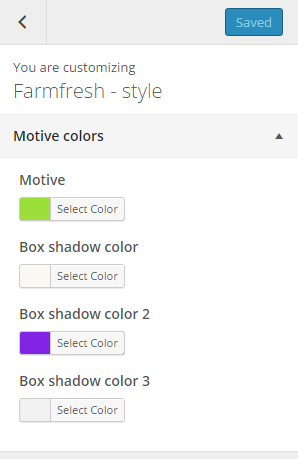
Customizer main theme colors
With Motive colors you can define motive color of the theme and boxes motive shadow color , which will be displayed on all pages.
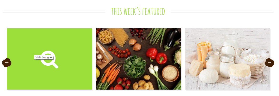
In General you can setup logos, copyright text and main theme settings

General Settings
In General you can setup logos, copyright text and main theme settings
Notice:
All changes done with customizer will be applied only once you click on
Was this article helpful ?
Blog
In Blog panel you are able to edit the following options:
- Top-bar settings:
- Comments – hide/show
- Comment form – hide/show
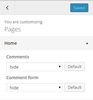
Pages home options
- Nav-bar settings:
- Show title on pages
- Select title row type
- Title row subtitle
- Button link
- Button label
- Title row image mobile
Pages title row general options
- Layout:
- Show background mask – show/hide
- Background mask
- Title row height
- Title row image
Pages title row simple
- Posts:
- Parallax ratio
- Title row height
- Title row image
Pages title row parallax
- Footer:
- Select gallery for kenburns Header
- Title row height
Pages title row kenburns
Notice: – settings above are by default applied for all your pages. Though you can also customize them for each page separately with Page side content settings – you will see this option during page content edition.
Was this article helpful ?
Blogly Customizer
Most of theme customization is made from three panels in Theme Customizer:
Blog panel gathers everything post-related
Page panel deals with pages
Shop panel customizes various woocommerce aspects
Lets look at the BLOG section:
Motive colors:
Theres only two options here:
– “motive” changes the general feel of the theme
– “Parallax background color” does what its name implies – changes background color in parralax layout
Top Bar Section:
Top bar is the area Over or Under the Navigation bar. You can also disable it. Additionally You can change its image background and logo.
Nav bar section:
Nav bar settings are meant to controll navigation bar style. The options that are available here are:
– Menu location – either top or side
– Menu style – 3 different styles to choose from
– Logo and Background – used in sidebar menu
Blog Layout Section:
This is the core panel of it all, the options here are:
– Layout – 4 different layouts – grid, big, wide, parallax
– Pull layout – pulls layout up for that extra style(parallax excluded)
– advert frequency – choose how often adverts will appear (between the posts)
– number of columns – special control for grid layout – choose 1, 2 or 3 columns
– first post – style first post differently (for wide and grid)
– sidebar location – left, right or without
– additional pagination – if needed enable pagination on top of posts index
– link to grid layout
– link to big layout
– link to wide layout
– link to parallax layout
– link to layout with first post as wide
– link to additional pagination layout
Posts section
This panel controls various post elements:
– layout – change the layout of single post view – cover photo(audio/video) or standard
– sidebar location – sidebar visibility on single post view left,right or none
– more button – show/hide
– tags – show/hide
– title – show/hide
– date – show/hide
– author – show/hide
– index view – control length of posts in index view
– link to standard layout
– link to cover layout
Footer section:
Theres two options here to control footer layout:
– style – 2 to choose from
– layout – either one-two or 2 left one right
– link to one-two
– link to two-one
Page Layout Section:
This panel controls sidebar visibility on pages – left, right, none or both.
– link to right sidebar page
– link to left sidebar page
– link to both sidebar page
– link to no sidebar page
Shop Section:
Shop layout section:
This panel lets You choose to display standard woocommerce layout or use Blogly one ( shop and product layouts can be turned on independently)
– link to custom shop
– link to standard shop
– link to custom product
– link to standard product
Call to action Section:
This panel controls special banner that appears on woocommerce shop (if layout is set to custom).
– link to CTA shop
Badges section:
This panel controls special banner that shows under Top Content Shop in woocommerce shop.
– link to badge page
Theme is packed with additional sidebars for special uses:
Top Content appears under the navbar in posts index pages
Top Content Shop appears under the navbar in woo shop page
Top additional content pages appear under top content sidebar in posts index pages
Additional Nav Bar Content adds widget area to navbar
Additional Top bar left and right content adds widgetizied areas to top bar on both sides of the logo
Socials in your content adds socials in various places
Ads 1, 2 and 3 creates widgetizied areas for adverts between your posts
Additional widgets featured in BLOGLY:
Additional Plugins for BLOGLY:
– multiple post thumbnails
– wp user avatars
– ct custom types blogly
Was this article helpful ?
Blogly Customizer
Test comes with an advanced customizer, which allows to edit most of theme elements in one place. To use it navigate to Appearance > Customize

Customizer Blogly
Most of Test customization is made from three panels in Theme Customizer:
- Blog
- Page
- Shop
In General you can setup logos, copyright text and main theme settings.
Notice:
All changes made with customizer will be applied only once you click on
Was this article helpful ?
Blog
Let’s look at the Blog section of the Test
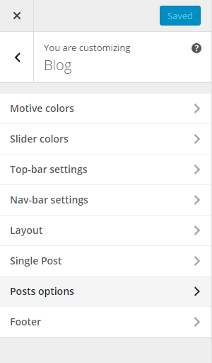
Blog Customizer
–Motive colors
In Blog you’ll find all the main options to customize your Theme
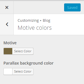
Motive Settings
There’s only two options for motive colors:
- Motive colors
- Motive – changes the general feel of the theme
- Parallax background color – changes background color in parralax layout
–Slider colors

Slider example
With this settings you are able to set the colors for the main page slider
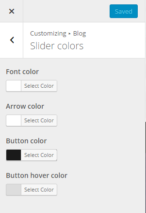
Slider colors settings
- Slider colors
- Font color
- Arrow color
- Button color
- Button hover color
–Top-bar settings
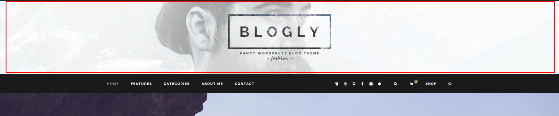
Top-bar example
Top bar is the area Over or Under the Navigation bar. You can also disable it. Additionally you can change its image background and logo.

Top-bar settings
- Top-bar settings
- Choose Image for background of Top bar
- Choose Image for logo in Top Bar
- Append NavBar – Over/None/Under
–Nav-bar settings
Nav bar settings are meant to controll navigation bar style.

Menu location – Top
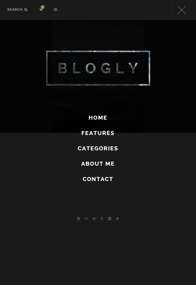
Menu location – Sidebar
The options that are available here are:

Nav-bar settings
- Nav-bar settings
- Choose your menu location – Top or Sidebar
- Choose your menu style – 3 different styles to choose from (type 1, type 2, type 3)
- Choose Logo for sidebar menu – Vsible only in the sidebar version of the menu
- Choose background image for sidebar menu – Visible only in the sidebar version of the menu
–Layout
This is the core panel of it all, the options here are:

Layout
- Layout
- Choose your layout – 4 different layouts (grid, big, wide, parallax)
- Show sticky posts? – Pulls layout up for that extra style(parallax excluded)
- Pull layout on top of top bar? – Yes/No
- Choose your advert frequency – Choose how often adverts will appear (between the posts)
- Number of columns for grid layout – Special control for grid layout (choose 1, 2 or 3 columns)
- Show first post as full width each page? – Style first post differently (for wide and grid)
- Sidebar location – Right/Left/None
- Main pagination style:
- Inner

Inner pagination
- Outer

Outer pagination
- Inner
- Infinite sliding (don’t use with additional pagination) – Active infinite scroll option for blog page.
- Auto Infinite sliding – will work only when Infinite sliding option is active. New posts will load automatically on the page.
- Show additional pagination on top of the posts? – If needed enable pagination on top of posts index
–Single Post
Here you will be able to customize the elements for the single post
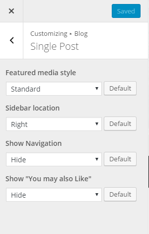
Single Post settings
- Single Post
- Featured media style – Change the layout of single post view – cover photo(audio/video) or standard
- Sidebar location – Sidebar visibility on single post view left, right or none
- Show Navigation – Hide the navigation to the next and preview post.
- Show “You may also Like” – Hide the suggested posts.
–Posts options
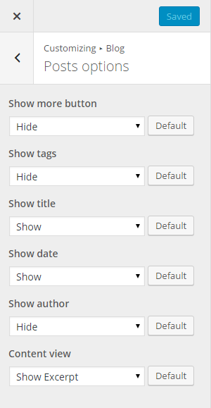
Posts options settings
- Posts options
- Show more buttons – show/hide
- Show tags – show/hide
- Show title – show/hide
- Show date – show/hide
- Show author – show/hide
- Content view -control length of posts in index view
–Footer

Footer settings
- Footer
- Choose footer style – White Background/Black text or White Background/Black text
- Pre footer layout – 1 above 2 below or 3 uneven columns
Was this article helpful ?
Page Customizer

Page customizer
–Layout
This panel controls sidebar visibility on pages – left, right, none or both.
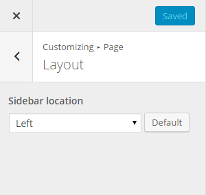
Layout customizer
Theres only one option for the Layout:
- Layout
- Sidebar Location – Left/Right/Both/None
Was this article helpful ?
Shop

Shop customizer
–Layout
Here you can choose to display standard woocommerce layout or use Blogly one.

Layout Shop customizer
There’s only one option for the Layout:
- Layout
- Shop layout – Custom/Standard
–Call to Action

Call to Action example
This panel controls special banner that appears on woocommerce shop (if layout is set to custom).
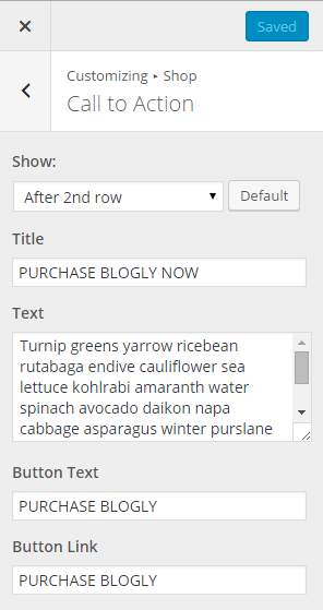
Call to Action settings
- Call to Action
- Show
- Title
- Text
- Button Text
- Button Link
–Badges

Badges example
This panel controls special banner that shows under Top Content Shop in woocommerce shop.
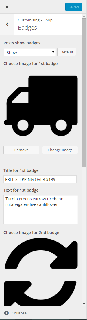
Badges settings
Theres only one option for the Layout:
- Badges
- Posts show badges – Show/hide
- Choose Image for 1st badge
- Title for 1st badge
- Text for 1st badge
- Choose Image for 2nd badge
- Title for 2nd badge
- Text for 2nd badge
- Choose Image for 3rd badge
- Title for 3rd badge
- Text for 3rd badge
Was this article helpful ?
Additional sidebars
In Test you’ll find this additional sidebars for special uses:
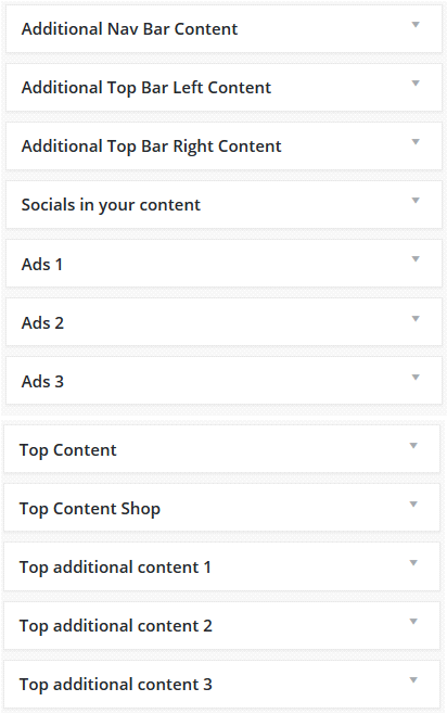
Custom widgets
- Additional sidebars
- Additional Nav Bar Content – adds widget area to navbar

Adding widgets to Nav bar
- Additional Top Bar Left Content – adds widgetizied areas to top bar on both sides of the logo
- Additional Top Bar Right Content – adds widgetizied areas to top bar on both sides of the logo
- Socials in your content – adds socials in various places
- Ads 1 – creates widgetizied areas for adverts between your posts
- Ads 2 – creates widgetizied areas for adverts between your posts
- Ads 3 – creates widgetizied areas for adverts between your posts
- Top Content – appears under the navbar in posts index pages

Added CT-Sticky widget to Top Content
- Top Content Shop – appears under the navbar in woo shop page

Example of using CT – ProductSlider in Top Content Shop
- Top additional content 1 – content pages appear under top content sidebar in posts index pages
- Top additional content 2 – content pages appear under top content sidebar in posts index pages
- Top additional content 3 – content pages appear under top content sidebar in posts index pages

Example of using CT – LinkBox widget in Top additional contents
- Additional Nav Bar Content – adds widget area to navbar
Was this article helpful ?
Additional widgets
Additional widgets featured in Test:
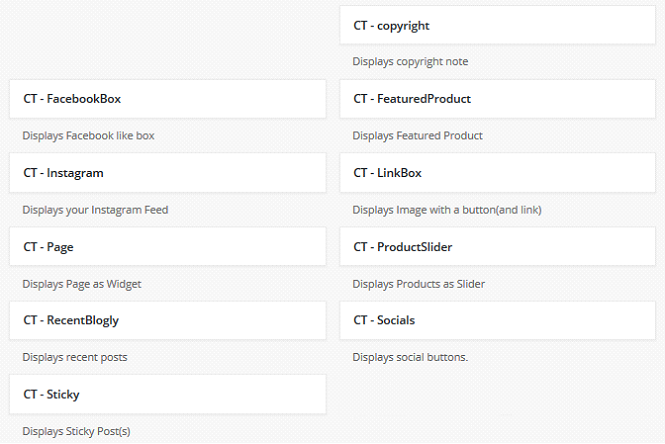
Additional widgets
- Additional widgets
- CT-FacebookBox – displays Facebook like box
- CT-Instagram – displays your Instagram Feed
- CT-Page – Displays Page as Widgets
- CT-RecentBlogly – Display recent posts
- CT-Sicky – Display Sticky Posts
- CT-copyright – Displays copyright note
- CT-FeaturedProducts – Displays Featured Product
- CT-LinkBox – Display image with a button and link
- CT-ProductSlider – Display Products as Slider
- CT-Socials – Displays social buttons
Was this article helpful ?
HTML Structure
This theme is built upon bootstrap framework and is fully responsive. It adapts to window resolution and looks good on all devices including iPad and iPhone.
See for yourself (resize your browser).
If you would like to read more
about bootstrap framework click here :
Grid System and Single row structure
The default Bootstrap grid system utilizes 12 columns. It’s responsive grid and adapts to viewport. Below 767px viewports, the columns become fluid and stack vertically. The fluid grid system uses percents instead of pixels for column widths. Each row always include 12 columns (for example col-md-8 + col-md-4 = col-md-12).
Bootstrap documentation: here
Basic grid HTML:
|
1 2 3 4 5 6 7 8 9 10 11 12 13 14 15 16 17 18 19 20 21 22 23 24 25 26 27 |
<div class="row"> <div class="col-md-1">.col-md-1</div> <div class="col-md-1">.col-md-1</div> <div class="col-md-1">.col-md-1</div> <div class="col-md-1">.col-md-1</div> <div class="col-md-1">.col-md-1</div> <div class="col-md-1">.col-md-1</div> <div class="col-md-1">.col-md-1</div> <div class="col-md-1">.col-md-1</div> <div class="col-md-1">.col-md-1</div> <div class="col-md-1">.col-md-1</div> <div class="col-md-1">.col-md-1</div> <div class="col-md-1">.col-md-1</div> </div> <div class="row"> <div class="col-md-8">.col-md-8</div> <div class="col-md-4">.col-md-4</div> </div> <div class="row"> <div class="col-md-4">.col-md-4</div> <div class="col-md-4">.col-md-4</div> <div class="col-md-4">.col-md-4</div> </div> <div class="row"> <div class="col-md-6">.col-md-6</div> <div class="col-md-6">.col-md-6</div> </div> |
Page structure
Below you will find default page structure :
|
1 2 3 4 5 6 7 8 9 10 11 12 13 14 15 16 17 18 19 20 21 22 23 24 25 26 27 28 29 30 31 32 33 34 35 36 |
<!DOCTYPE html> <html> <head> [css] </head> <body> [header] [main menu] <!-- main container --> <div id="wrapper"> [component 1] <!-- fullwidth element --> </div> [fullwidth parallax] <div class="container"> <!-- / fullwidth element --> [component 6] </div> <!-- / main container --> [footer] [javascripts] </body> </html> |
Was this article helpful ?
CSS files and structure
If you would like to edit the color, font, or style of any elements, you would do the following:
|
1 |
#primaryContent a {color: #someColor;} |
If you find that your new style is not overriding, it is most likely because of a specificity problem. Scroll down in your CSS file and make sure that there isn’t a similar style that has more weight.
I.E.
|
1 |
#wrap #primaryContent a {color: #someColor;} |
So, to ensure that your new styles are applied, make sure that they carry enough “weight” and that there isn’t a style lower in the CSS file that is being applied after yours.
Colors
The theme includes a css file wich you can use to edit the colors.
You just need to add the corresponding CSS file to the head of the page like this:
|
1 2 3 4 5 |
<head> (..) <link rel="stylesheet" type="text/css" href="css/motive.css"> (..) </head> |
Icons
We’ve included 360+ font icons.
Awesome Icons – http://fontawesome.io/icons/
HTML markup:
|
1 2 |
<!-- Awesome Icons --> <i class="fa fa-cog"></i> |
CSS Files & Structure
We’ve included 2 files.
bootstrap.css contains Bootstrap 3 Library.
style.css file contains general styles.
style.less
1. Animations
2. Utilities
3. Font Awesome
4. Menu
5. Slick Slider
6. Media Sections
7. Selectize
8. Light Gallery
9. Typography
10. Article Box
11. Buttons
12. Socials buttons
13. Footer
14. Main Slider
15. Booking Form
16. Forms
17. Accordions
18. Blog
19. Blog Single Page
20. Pagination
21. Testimonials
22. Google Maps
Was this article helpful ?
Javascript Components
JavaScript files:
- Gmaps – google map plugin
- Light Gallery – plugin for the gallery
- Portfolio – istotpe and masonry plugins
- Jquery Gray – Gray-scale plugin for the pictures
- Jquery Pagescroller – plugin for the onepager section
- DataTime Picker – this is plugin for the calendar
- Skrollr – plugin for the media sections
- Slick – this is the plugin for the slider
- Booze.min.js – One big file where are minifixed javascript files:
- jquery
- boostrap
- placeholder
- easing
- device.min.js
- jquery browser
- Snap min JS
- jquery appear
- Main.js – The main javascript initializaions and other major snippets.
Screenshot
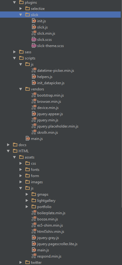
Google Map (GMAP3 Plugin)
This is google map with custom marker, you can define couple parameters:
- data-location – address to show
- data-height – map height (if undefined height will be 220px)
- data-offset – by how many map should be repositioned from marker center point (default -30)
It uses gmap3 plugin.
Documentation: here
Screenshot
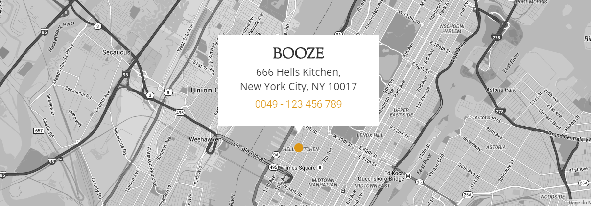
Booze map
HTML Markup
|
1 2 3 |
<section class="ct-mapSection"> <div data-location="666 Hells Kitchen, New York City" data-height="420" data-zoom="13" class="ct-googleMap ct-googlemapStyle"></div> </section> |
jquery.appear
This plugin call function when element appear in viewport. This is used in custom animation, progress bars, counter timer.
Documentation: https://github.com/bas2k/jquery.appear/
|
1 2 3 4 5 6 7 8 9 10 11 12 13 |
if (jQuery().appear) { if (device.mobile()) { // disable animation on mobile jQuery("body").removeClass("withAnimation"); } else { jQuery('.withAnimation .animated').appear(function () { jQuery(this).each(function () { jQuery(this).addClass('activate'); jQuery(this).addClass($(this).data('fx')); }); }, {accY: -150}); } } |
Was this article helpful ?
Menu
HTML markup
|
1 2 3 4 5 6 7 8 9 10 11 12 13 14 15 16 17 |
<nav class="navbar navbar-default ct-centeredMenu ct-menu--color navbar-fixed-top"> <div class="container"> <ul class="nav navbar-nav ct-leftSide ct-navbar--fadeIn"> <li class="onepage"><a href="#home" class="ct-js-btnScroll">home</a></li> <li class="onepage"><a href="#menus" class="ct-js-btnScroll">menus</a></li> <li class="onepage"><a href="#blog" class="ct-js-btnScroll">blog</a></li> <li class="onepage"><a href="#events" class="ct-js-btnScroll">events</a></li> </ul> <div class="navbar-header"><a href="index.html" class="navbar-brand"><img src="../assets/images/demo-content/booze/logo.png" alt="Image"></a></div> <ul class="nav navbar-nav ct-rightSide"> <li class="onepage"><a href="#master" class="ct-js-btnScroll">masterclass</a></li> <li class="onepage"><a href="#gallery" class="ct-js-btnScroll">gallery</a></li> <li class="onepage"><a href="#contact" class="ct-js-btnScroll">contact</a></li> </ul> <div class="clearfix"></div> </div> </nav> |
Screenshot

Menu Fixed Color
Was this article helpful ?
Blog – main page
HTML markup:
|
1 2 3 4 5 6 7 8 9 10 11 12 13 14 15 16 17 18 19 20 21 22 23 24 25 26 27 28 29 30 31 32 33 34 35 36 37 38 39 40 41 42 43 44 45 46 47 48 49 50 51 52 53 54 55 56 57 58 59 60 61 62 63 64 65 66 67 68 69 70 71 72 73 74 75 76 77 78 79 80 81 82 83 84 85 86 |
<section itemscope itemtype="http://schema.org/Blog" id="blog" class="ct-blogSection onepager"> <div class="container-fluid"> <div class="row text-center"> <div class="col-md-12"><span class="ct-iconHeader ct-iconHeader--large"><i class="fa fa-close"></i><i class="fa fa-close"></i><i class="fa fa-close"></i></span> <div class="ct-header ct-header--smaller ct-u-paddingTop10 ct-u-font-weight--600">Our Blog</div> <h1 class="ct-anotherHeader ct-u-paddingTop25 ct-u-marginTopMinus15 ct-u-paddingBottom40">Listen up!</h1> </div> </div> <div class="row text-center"> <div class="col-lg-4 col-md-4 col-sm-6 ct-u-margin-bottom-40"> <article itemprop="blogPost" itemscope="itemscope" itemtype="http://schema.org/BlogPosting" class="ct-article"> <div class="article-media"><a itemprop="url" href="blog-single.html"><img src="../assets/images/demo-content/booze/blog1.jpg" alt="blog-post" class="grayscale grayscale-fade"/></a></div> <div class="ct-article-content"> <ul class="list-inline list-unstyled ct-article-tags"> <li class="ct-article-tags"><a itemprop="url" href="blog-single.html">nightlife</a></li> <li class="ct-article-tags"><a itemprop="url" href="blog-single.html">booze</a></li> </ul> <div itemprop="url" class="ct-article-title"><a itemprop="url" href="blog-single.html">Say hello to Jim, our new bar dude</a></div> <div class="ct-article-author"><img src="../assets/images/demo-content/booze/author.png" alt="blog-post"/> <ul class="list-inline list-unstyled ct-article-date"> <li itemprop="author">Victor Wagman</li> <li itemprop="dateCreated">Tuesday</li> <li itemprop="dateCreated">July 2015</li> </ul> </div> <div class="ct-article-description"> <p>Pellentesque habitant morbi tristique senectus et netus et malesuada fames ac turpis egestas. Vestibulum tortor quam, feugiat vitae, ultricies eget, tempor sit amet, ante. Donec eu libero sit amet quam egestas semper. Aenean ultricies mi vitae est. Mauris placerat eleifend leo {...}</p> </div><a href="blog-single.html" itemprop="url" class="ct-article-readMore">read more</a> </div> </article> </div> <div class="col-lg-4 col-md-4 col-sm-6 ct-u-margin-bottom-40"> <article itemprop="blogPost" itemscope="itemscope" itemtype="http://schema.org/BlogPosting" class="ct-article"> <div class="article-media"><a itemprop="url" href="blog-single.html"><img src="../assets/images/demo-content/booze/blog2.jpg" alt="blog-post" class="grayscale grayscale-fade"/></a></div> <div class="ct-article-content"> <ul class="list-inline list-unstyled ct-article-tags"> <li class="ct-article-tags"><a itemprop="url" href="blog-single.html">champagne</a></li> <li class="ct-article-tags"><a itemprop="url" href="blog-single.html">booze</a></li> </ul> <div itemprop="url" class="ct-article-title"><a itemprop="url" href="blog-single.html">Thats how you made an old fashioned</a></div> <div class="ct-article-author"><img src="../assets/images/demo-content/booze/author.png" alt="blog-post"/> <ul class="list-inline list-unstyled ct-article-date"> <li itemprop="author">Kevin Watsey</li> <li itemprop="dateCreated">Monday</li> <li itemprop="dateCreated">July 2015</li> </ul> </div> <div class="ct-article-description"> <p>Pellentesque habitant morbi tristique senectus et netus et malesuada fames ac turpis egestas. Vestibulum tortor quam, feugiat vitae, ultricies eget, tempor sit amet, ante. Donec eu libero sit amet quam egestas semper. Aenean ultricies mi vitae est. Mauris placerat eleifend leo {...}</p> </div><a href="blog-single.html" itemprop="url" class="ct-article-readMore">read more</a> </div> </article> </div> <div class="col-lg-4 col-md-4 col-sm-6 ct-u-margin-bottom-40"> <article itemprop="blogPost" itemscope="itemscope" itemtype="http://schema.org/BlogPosting" class="ct-article"> <div class="article-media"><a itemprop="url" href="blog-single.html"><img src="../assets/images/demo-content/booze/blog3.jpg" alt="blog-post" class="grayscale grayscale-fade"/></a></div> <div class="ct-article-content"> <ul class="list-inline list-unstyled ct-article-tags"> <li class="ct-article-tags"><a itemprop="url" href="blog-single.html">masterclass</a></li> <li class="ct-article-tags"><a itemprop="url" href="blog-single.html">booze</a></li> </ul> <div itemprop="url" class="ct-article-title"><a itemprop="url" href="blog-single.html">Stir it, mix it! Join our masterclass</a></div> <div class="ct-article-author"><img src="../assets/images/demo-content/booze/author.png" alt="blog-post"/> <ul class="list-inline list-unstyled ct-article-date"> <li itemprop="author">Thomas Edinson</li> <li itemprop="dateCreated">Sunday</li> <li itemprop="dateCreated">July 2015</li> </ul> </div> <div class="ct-article-description"> <p>Pellentesque habitant morbi tristique senectus et netus et malesuada fames ac turpis egestas. Vestibulum tortor quam, feugiat vitae, ultricies eget, tempor sit amet, ante. Donec eu libero sit amet quam egestas semper. Aenean ultricies mi vitae est. Mauris placerat eleifend leo {...}</p> </div><a href="blog-single.html" itemprop="url" class="ct-article-readMore">read more</a> </div> </article> </div> </div> <div class="row text-center"> <div class="col-md-12"> <ul class="list-inline list-unstyled ct-buttonComponents"> <!--li: a(href="#" class="ct-js-loadMore") load more--> <li><a href="#" data-url="blog-posts.html" class="ct-js-loadAll">show all</a></li> </ul> </div> </div> </div> </section> |
Screenshot

Blog main page
Was this article helpful ?
Blog – single page
HTML markup
|
1 2 3 4 5 6 7 8 9 10 11 12 13 14 15 16 17 18 19 20 |
<article itemprop="blogPost" itemscope="itemscope" itemtype="http://schema.org/BlogPosting" class="ct-article"> <div class="article-media"><a itemprop="url" href="blog-single.html"><img src="../assets/images/demo-content/booze/blog1.jpg" alt="blog-post" class="grayscale grayscale-fade"/></a></div> <div class="ct-article-content"> <ul class="list-inline list-unstyled ct-article-tags"> <li class="ct-article-tags"><a itemprop="url" href="blog-single.html">nightlife</a></li> <li class="ct-article-tags"><a itemprop="url" href="blog-single.html">booze</a></li> </ul> <div itemprop="url" class="ct-article-title"><a itemprop="url" href="blog-single.html">Say hello to Jim, our new bar dude</a></div> <div class="ct-article-author"><img src="../assets/images/demo-content/booze/author.png" alt="blog-post"/> <ul class="list-inline list-unstyled ct-article-date"> <li itemprop="author">Victor Wagman</li> <li itemprop="dateCreated">Tuesday</li> <li itemprop="dateCreated">July 2015</li> </ul> </div> <div class="ct-article-description"> <p>Pellentesque habitant morbi tristique senectus et netus et malesuada fames ac turpis egestas. Vestibulum tortor quam, feugiat vitae, ultricies eget, tempor sit amet, ante. Donec eu libero sit amet quam egestas semper. Aenean ultricies mi vitae est. Mauris placerat eleifend leo {...}</p> </div><a href="blog-single.html" itemprop="url" class="ct-article-readMore">read more</a> </div> </article> |
Screenshot
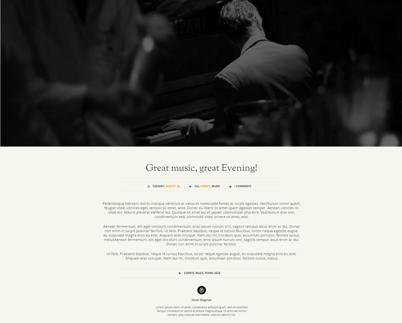
Blog Single page
Was this article helpful ?
Buttons
In Test we have several flavours from which you can choose:
Booze flavours
- Btn-primary.btn-borde
HTML markup
Screenshot1<a href="#menus" data-padding-left="30" data-padding-right="30" class="btn btn-primary btn-border btn-sm ct-js-btnSize ct-js-btnScroll" style="padding-left: 30px; padding-right: 30px;">lets have one!</a>

- Btn-default.btn-border
HTML markup
Screenshot1<a href="contact.html" class="btn btn-default btn-border btn-sm">book an event</a>

- Btn-link.btn-border
HTML markup
Screenshot1<a href="masterclass.html" class="btn btn-link btn-sm btn-border btn-border--white">learn more</a>

- Btn-primary.btn-stretched
HTML markup
Screenshot1<button type="submit" class="btn btn-primary btn-sm btn-border btn-stretched">submit the form</button>

Castro Flavour
- Btn-primary.btn-border
HTML markup
Screenshot1<a href="#menus" data-padding-left="30" data-padding-right="30" class="btn btn-primary btn-border btn-sm ct-js-btnSize ct-js-btnScroll" style="padding-left: 30px; padding-right: 30px;">lets have one!</a>

- Btn-default.btn-border
HTML markup
Screenshot1<a href="events.html" class="btn btn-default btn-border btn-sm">join a class</a>

- Btn-link.btn-border
HTML markup
Screenshot1<a href="masterclass.html" class="btn btn-link btn-sm btn-border btn-border--white">learn more</a>

- Btn-primary.btn-stretched
HTML markup
Screenshot1<button type="submit" class="btn btn-primary btn-sm btn-border btn-stretched">submit the form</button>

Rooftop Flavour
- Btn-primary.btn-border
HTML markup
Screenshot1<a href="#menus" data-padding-left="30" data-padding-right="30" class="btn btn-primary btn-border btn-sm ct-js-btnSize ct-js-btnScroll" style="padding-left: 30px; padding-right: 30px;">get one!</a>

- Btn-default.btn-border
HTML markup
Screenshot1<a href="contact.html" class="btn btn-default btn-border btn-sm">book an event</a>

- Btn-link.btn-border
HTML markup
Screenshot1<a href="masterclass.html" class="btn btn-link btn-sm btn-border btn-border--white">learn more</a>

- Btn-primary.btn-stretched
HTML markup
Screenshot1<button type="submit" class="btn btn-primary btn-sm btn-border btn-stretched">submit the form</button>

Was this article helpful ?
Parallax
HTML markup
|
1 2 3 4 5 6 7 8 9 10 11 12 13 14 15 16 17 18 19 |
<div data-background="../assets/images/demo-content/booze/parallax.png" data-height="58%" data-parallax="50" class="ct-parallax tablex ct-eventsSection ct-u-displayTableVertical"> <section data-height="58%" class="ct-u-displayTableCell"> <div class="container"> <div class="row"> <div class="col-md-12 text-center"> <header class="ct-u-color--white">Upcoming Events</header> <div class="ct-eventsSection-paragraphBox"> <p>Pellentesque habitant morbi tristique senectus et netus et malesuada fames ac turpis egestas.</p> <p class="ct-u-paddingTop10">Vestibulum tortor quam, feugiat vitae, ultricies eget, tempor sit amet, ante. Donec eu libero sit amet quam egestas semper. Aenean ultricies mi vitae est. Mauris placerat eleifend leo.</p><img src="../assets/images/demo-content/booze/symbol.png" alt="Image" class="ct-u-paddingTop25 ct-u-paddingBottom25"> <ul class="list-inline list-unstyled"> <li><a href="events.html" data-padding-left="64" data-padding-right="64" class="btn btn-primary btn-border btn-sm ct-js-btnSize">events</a></li> <li><a href="contact.html" class="btn btn-default btn-border btn-sm">book an event</a></li> </ul> </div> </div> </div> </div> </section> </div> |
Screenshot

Parallax Example
Was this article helpful ?
Blog Page Navigations
HTML markup
|
1 2 3 4 5 6 7 8 9 10 |
<section class="ct-navigation ct-u-displayTable"> <div class="ct-u-displayTableCell"> <div class="ct-previous"><a href="#">previous post</a></div> <div class="ct-previousPost">Scotch & Whisky know the difference!</div> </div> <div class="ct-u-displayTableCell"> <div class="ct-next"><a href="#">next post</a></div> <div class="ct-nextPost">James "The piano" Turner comes!</div> </div> </section> |
Screenshot

Blog Page Navigation example
Was this article helpful ?
Booking Form
HTML markup
|
1 2 3 4 5 6 7 8 9 10 11 12 13 14 15 16 17 18 19 20 21 22 23 |
<div class="ct-bookTable ct-bookTable--border"> <div class="ct-bookTable-form"> <form action="assets/form/send.php" method="post" data-email-subject="Contact Form" data-show-errors="true" class="contactForm validateIt"> <div class="form-group ct-u-paddingBottom15 ct-u-borderBottom"> <div class="ct-datePicker"> <label class="control-label label-typeFirst">when</label> <input type="text" placeholder="sep.01" required="" class="form-control input-lg input-typeThird ct-js-datePicker"> </div> </div> <div class="form-group ct-u-paddingBottom15 ct-u-paddingTop15 ct-u-borderBottom"> <label class="control-label label-typeFirst">when exactly</label> <input type="time" placeholder="7pm" required="" class="form-control input-lg input-typeThird"> </div> <div class="form-group ct-u-paddingBottom15 ct-u-paddingTop15"> <label class="control-label label-typeFirst">how many</label> <input type="text" placeholder="_ _" required="" class="form-control input-lg input-typeThird"> </div> <div class="form-group"> <button type="submit" data-padding-left="32" data-padding-right="32" class="btn btn-link btn-sm ct-js-btnSize btn-block">book a table</button> </div> </form> </div> </div> |
Screenshot

Booking Form example
Was this article helpful ?
HTML markup
|
1 2 3 4 |
<div class="col-lg-3 col-md-3 col-sm-6 col-xs-12 ct-twitterBox"> <h6 class="ct-headerBottom">Latest Tweets</h6> <div class="ct-js-twitter ct-tweet"></div> </div> |
Screenshot

Twitter example
Was this article helpful ?
Social icons
HTML markup
|
1 2 3 4 5 6 7 8 |
<div class="col-lg-2 col-md-2 col-sm-6 col-xs-12 ct-followBox"> <h6 class="ct-headerBottom">Follow us</h6> <ul class="list-unstyled"> <li><a href="https://www.facebook.com/createITpl">Facebook</a><i data-left="4" data-top="5" data-icon-size="23" class="fa fa-facebook ct-js-position ct-js-iconSize"></i></li> <li><a href="https://twitter.com/createitpl">Twitter</a><i data-left="0" data-top="5" data-icon-size="27" class="fa fa-twitter ct-js-position ct-js-iconSize"></i></li> <li><a href="#">Instagram</a><i data-left="0" data-top="5" data-icon-size="27" class="fa fa-instagram ct-js-position ct-js-iconSize"></i></li> </ul> </div> |
Screenshot

Social Icons example
Was this article helpful ?
Footer
HTML markup
|
1 2 3 4 5 6 7 8 9 10 11 12 13 14 15 16 17 18 19 20 21 22 23 24 25 26 27 28 29 30 31 32 33 34 35 36 37 38 39 40 41 42 43 44 45 46 47 48 49 50 51 52 53 54 |
<footer class="ct-footer"> <section class="ct-preFooter"> <div class="container"> <div class="row ct-row"> <div class="col-lg-4 col-md-4 col-sm-6 col-xs-12 text-left"><a href="index-multipager.html"><img src="../assets/images/demo-content/booze/logo-footer.png" alt="Image"></a></div> <div class="col-lg-3 col-md-3 col-sm-6 col-xs-12 ct-contactBox"> <h6 class="ct-headerBottom">Contact us</h6> <ul class="list-unstyled ct-contactList"> <li>Adress:<br/> 600 Gtrand St. New York, NY, 11211<i data-icon-size="22" data-left="0" class="fa fa-map-marker ct-js-iconSize ct-js-position"></i></li> <li>Phone:<br/>Tel:<a href="tel:070088087"> 0049 - 123 456 789 - 0</a><i data-icon-size="20" data-left="-2" class="fa fa-phone ct-js-iconSize ct-js-position"></i></li> <li>Web:<br/><a href="http://booze.html.themeforest.createit.pl/">www.booze.com<br/></a><a href="mailto:hello@booze.com">hello@booze.com</a><i data-icon-size="16" data-left="-2" class="fa fa-envelope ct-js-iconSize ct-js-position"></i></li> </ul> </div> <div class="col-lg-3 col-md-3 col-sm-6 col-xs-12 ct-twitterBox"> <h6 class="ct-headerBottom">Latest Tweets</h6> <div class="ct-js-twitter ct-tweet"></div> </div> <div class="col-lg-2 col-md-2 col-sm-6 col-xs-12 ct-followBox"> <h6 class="ct-headerBottom">Follow us</h6> <ul class="list-unstyled"> <li><a href="https://www.facebook.com/createITpl">Facebook</a><i data-left="4" data-top="5" data-icon-size="23" class="fa fa-facebook ct-js-position ct-js-iconSize"></i></li> <li><a href="https://twitter.com/createitpl">Twitter</a><i data-left="0" data-top="5" data-icon-size="27" class="fa fa-twitter ct-js-position ct-js-iconSize"></i></li> <li><a href="#">Instagram</a><i data-left="0" data-top="5" data-icon-size="27" class="fa fa-instagram ct-js-position ct-js-iconSize"></i></li> </ul> </div> </div> </div><a href="#" class="ct-js-btnScrollUp is-active"><span><i class="fa fa-angle-up"></i></span></a> </section> <section class="ct-postFooter"> <div class="container ct-containerFix"> <div class="row"> <div class="ct-u-displayTableVertical"> <div class="ct-u-displayTableCell ct-footerCol1"> <p class="ct-copyright">Copyright © 2016 BOOZE</p> </div> <div class="ct-u-displayTableCell ct-footerCol2 text-right"> <ul class="ct-map-links list-inline list-unstyled text-uppercase"> <li><a href="index-multipager.html" class="ct-js-btnScroll"><span data-hover="home">home</span></a></li> <li><a href="menus.html" class="ct-js-btnScroll"><span data-hover="menus">menus</span></a></li> <li><a href="blog.html" class="ct-js-btnScroll"><span data-hover="blog">blog</span></a></li> <li><a href="events.html" class="ct-js-btnScroll"><span data-hover="events">events</span></a></li> <li><a href="masterclass.html" class="ct-js-btnScroll"><span data-hover="masterclass">masterclass</span></a></li> <li><a href="gallery.html" class="ct-js-btnScroll"><span data-hover="gallery">gallery</span></a></li> <li><a href="contact.html" class="ct-js-btnScroll"><span data-hover="contact">contact</span></a></li> </ul> </div> <div class="ct-u-displayTableCell ct-footerCol3 text-right"> <p class="ct-authorPage"><span>Design by<a href="http://www.createit.pl/"> CreateIT</a></span></p> </div> </div> </div> </div> </section> </footer> |
Screenshot

Footer example
Was this article helpful ?
Gallery
HTML markup
|
1 2 3 4 5 6 7 8 9 10 11 12 13 14 15 16 17 18 19 20 21 22 23 24 25 26 27 28 29 30 31 32 33 34 35 36 37 38 39 40 41 42 43 44 45 46 47 48 49 50 51 52 53 54 55 56 57 58 59 60 61 62 63 64 65 66 67 68 69 70 71 72 73 74 75 76 77 78 79 80 81 82 83 84 85 86 87 88 89 90 91 92 93 94 95 96 97 98 99 100 101 |
<section id="gallery" class="ct-gallerySection onepager"> <div class="ct-topContent"> <div data-bg="../assets/images/demo-content/booze/main-picture.jpg" class="ct-imageComponent ct-js-background ct-u-displayTable ct-u-displayTableVertical"> <div class="ct-u-displayTableCell text-center"> <header>Booze Gallery</header> <p>Pellentesque habitant morbi tristique senectus et netus et malesuada <br/> fames ac turpis egestas.</p> <ul class="ct-gallery-filters list-unstyled list-inline"> <li><a data-filter="*" class="active">All<span class="rel">All</span></a></li> <li><a data-filter=".rooms">Rooms<span class="rel">Rooms</span></a></li> <li><a data-filter=".drinks">Drinks<span class="rel">Drinks</span></a></li> <li><a data-filter=".food">Foods<span class="rel">Foods</span></a></li> <li><a data-filter=".staff">Staff<span class="rel">Staff</span></a></li> <li><a data-filter=".events">Events<span class="rel">Events</span></a></li> </ul> <div class="clearfix"></div> </div> </div> </div> <div class="ct-bottomContent"> <div id="ct-gallery" class="ct-gallery ct-gallery--col5 ct-js-popupGallery ct-bottomBorder"> <div class="_js-lightGallery"><a href="../assets/images/demo-content/booze/gallery1.jpg" data-sub-html="Sed ut perspiciatis" class="ct-gallery-item ct-gallery-item--masonry hidden drinks grayscale grayscale-fade"><img src="../assets/images/demo-content/booze/gallery1.jpg" alt="Image"> <div class="ct-galleryHover text-center"> <div class="ct-title"><span>THE BEST BLEND</span></div> <ul class="ct-category list-unstyled list-inline"> <li class="text-uppercase">all,</li> <li class="text-uppercase">drinks</li> </ul> </div></a><a href="../assets/images/demo-content/booze/gallery2.jpg" data-sub-html="Unde omnis iste" class="ct-gallery-item ct-gallery-item--masonry hidden rooms grayscale grayscale-fade"><img src="../assets/images/demo-content/booze/gallery2.jpg" alt="Image"> <div class="ct-galleryHover text-center"> <div class="ct-title"><span>THE BEST BLEND</span></div> <ul class="ct-category list-unstyled list-inline"> <li class="text-uppercase">people,</li> <li class="text-uppercase">party</li> </ul> </div></a><a href="../assets/images/demo-content/booze/gallery3.jpg" data-sub-html="Unde omnis iste" class="ct-gallery-item ct-gallery-item--masonry hidden drinks events grayscale grayscale-fade"><img src="../assets/images/demo-content/booze/gallery3.jpg" alt="Image"> <div class="ct-galleryHover text-center"> <div class="ct-title"><span>THE BEST BLEND</span></div> <ul class="ct-category list-unstyled list-inline"> <li class="text-uppercase"> </li> <li class="text-uppercase"> </li> </ul> </div></a><a href="../assets/images/demo-content/booze/gallery4.jpg" data-sub-html="Unde omnis iste" class="ct-gallery-item ct-gallery-item--masonry hidden events grayscale grayscale-fade"><img src="../assets/images/demo-content/booze/gallery4.jpg" alt="Image"> <div class="ct-galleryHover text-center"> <div class="ct-title"><span>THE BEST BLEND</span></div> <ul class="ct-category list-unstyled list-inline"> <li class="text-uppercase"> </li> <li class="text-uppercase"> </li> </ul> </div></a><a href="../assets/images/demo-content/booze/gallery5.jpg" data-sub-html="Unde omnis iste" class="ct-gallery-item ct-gallery-item--masonry hidden rooms staff grayscale grayscale-fade"><img src="../assets/images/demo-content/booze/gallery5.jpg" alt="Image"> <div class="ct-galleryHover text-center"> <div class="ct-title"><span>THE BEST BLEND</span></div> <ul class="ct-category list-unstyled list-inline"> <li class="text-uppercase">all,</li> <li class="text-uppercase">people</li> </ul> </div></a><a href="../assets/images/demo-content/booze/gallery6.jpg" data-sub-html="Unde omnis iste" class="ct-gallery-item ct-gallery-item--masonry hidden food grayscale grayscale-fade"><img src="../assets/images/demo-content/booze/gallery6.jpg" alt="Image"> <div class="ct-galleryHover text-center"> <div class="ct-title"><span>THE BEST BLEND</span></div> <ul class="ct-category list-unstyled list-inline"> <li class="text-uppercase">mohito,</li> <li class="text-uppercase">orange juice</li> </ul> </div></a><a href="../assets/images/demo-content/booze/gallery7.jpg" data-sub-html="Unde omnis iste" class="ct-gallery-item ct-gallery-item--masonry hidden drinks grayscale grayscale-fade"><img src="../assets/images/demo-content/booze/gallery7.jpg" alt="Image"> <div class="ct-galleryHover text-center"> <div class="ct-title"><span>THE BEST BLEND</span></div> <ul class="ct-category list-unstyled list-inline"> <li class="text-uppercase">food,</li> <li class="text-uppercase">party</li> </ul> </div></a><a href="../assets/images/demo-content/booze/gallery8.jpg" data-sub-html="Unde omnis iste" class="ct-gallery-item ct-gallery-item--masonry hidden food grayscale grayscale-fade"><img src="../assets/images/demo-content/booze/gallery8.jpg" alt="Image"> <div class="ct-galleryHover text-center"> <div class="ct-title"><span>THE BEST BLEND</span></div> <ul class="ct-category list-unstyled list-inline"> <li class="text-uppercase">party,</li> <li class="text-uppercase">drinks</li> </ul> </div></a><a href="../assets/images/demo-content/booze/gallery9.jpg" data-sub-html="Unde omnis iste" class="ct-gallery-item ct-gallery-item--masonry hidden rooms staff grayscale grayscale-fade"><img src="../assets/images/demo-content/booze/gallery9.jpg" alt="Image"> <div class="ct-galleryHover text-center"> <div class="ct-title"><span>THE BEST BLEND</span></div> <ul class="ct-category list-unstyled list-inline"> <li class="text-uppercase">drinks,</li> <li class="text-uppercase">pizza</li> </ul> </div></a><a href="../assets/images/demo-content/booze/gallery10.jpg" data-sub-html="Unde omnis iste" class="ct-gallery-item ct-gallery-item--masonry hidden staff grayscale grayscale-fade"><img src="../assets/images/demo-content/booze/gallery10.jpg" alt="Image"> <div class="ct-galleryHover text-center"> <div class="ct-title"><span>THE BEST BLEND</span></div> <ul class="ct-category list-unstyled list-inline"> <li class="text-uppercase"> </li> <li class="text-uppercase"> </li> </ul> </div></a><a href="../assets/images/demo-content/booze/gallery11.jpg" data-sub-html="Unde omnis iste" class="ct-gallery-item ct-gallery-item--masonry hidden food grayscale grayscale-fade"><img src="../assets/images/demo-content/booze/gallery11.jpg" alt="Image"> <div class="ct-galleryHover text-center"> <div class="ct-title"><span>THE BEST BLEND</span></div> <ul class="ct-category list-unstyled list-inline"> <li class="text-uppercase"> </li> <li class="text-uppercase"> </li> </ul> </div></a></div> </div> </div> </section> |
Screenshot

Gallery example
Was this article helpful ?
Slick Slider
HTML markup
|
1 2 3 4 5 6 7 8 9 10 11 12 13 14 15 16 17 18 19 20 |
<section id="home" class="ct-sliderSection onepager"> <div data-items="1" data-height="100%" class="ct-mainSlider ct-js-slick ct-slick ct-js-slick ct-slick--table"> <div data-background="../assets/images/demo-content/booze/slide1.jpg" class="item _image-overlay"> <div class="item-inner text-center"> <div class="ct-u-displayTableVertical"> <div class="ct-u-displayTableCell"> <div class="container"> <div class="row"> <div class="col-md-12"><a href="index.html"><img src="../assets/images/demo-content/booze/big-intro.png" alt="Image"></a></div> </div> </div> </div> </div> </div> </div> </div> <div class="ct-scrollDown"> <div data-bg="../assets/images/demo-content/booze/scroller.png" class="ct-scrollDown-icon ct-js-background animated activate bounce infinite"></div><a href="#intro" class="ct-js-btnScroll">Cheers<span><i class="fa fa-angle-double-down fa-lg"></i></span></a> </div> </section> |
Screenshot

Slick Slider example
Was this article helpful ?
Contact Form
HTML markup
|
1 2 3 4 5 6 7 8 9 10 11 12 13 14 15 16 17 18 19 |
<form action="assets/form/send.php" method="post" data-email-subject="Contact Form" data-show-errors="true" class="contactForm validateIt"> <div class="form-group ct-u-paddingBottom15 ct-u-borderBottom"> <div class="ct-datePicker"> <label class="control-label label-typeFirst">when</label> <input type="text" placeholder="sep.01" required="" class="form-control input-lg input-typeThird ct-js-datePicker"> </div> </div> <div class="form-group ct-u-paddingBottom15 ct-u-paddingTop15 ct-u-borderBottom"> <label class="control-label label-typeFirst">when exactly</label> <input type="time" placeholder="7pm" required="" class="form-control input-lg input-typeThird"> </div> <div class="form-group ct-u-paddingBottom15 ct-u-paddingTop15"> <label class="control-label label-typeFirst">how many</label> <input type="text" placeholder="_ _" required="" class="form-control input-lg input-typeThird"> </div> <div class="form-group"> <button type="submit" data-padding-left="32" data-padding-right="32" class="btn btn-link btn-sm ct-js-btnSize btn-block">book a table</button> </div> </form> |
Screenshot
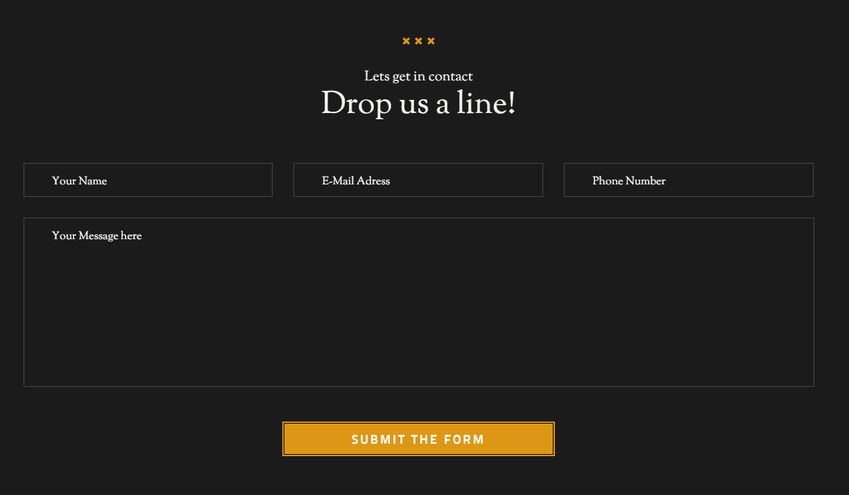
Contact Form example
Was this article helpful ?
Menu Restaurant
HTML markup
|
1 2 3 4 5 6 7 8 9 10 11 12 13 14 15 16 17 18 19 20 21 22 23 24 25 26 27 28 29 30 31 32 33 34 35 36 37 38 39 40 41 42 43 44 45 46 47 48 49 50 51 52 53 54 55 56 57 58 59 60 61 62 63 64 65 66 67 68 69 70 71 72 73 74 75 76 77 78 79 80 81 82 83 84 85 86 87 88 89 90 91 92 93 94 95 96 97 98 99 100 101 102 103 104 105 106 107 108 109 110 111 112 113 114 115 116 117 118 119 |
<section id="menus" class="ct-menuSection onepager"> <div data-bg="../assets/images/demo-content/booze/main-picture2.jpg" class="ct-topSection ct-js-background"> <ul id="myTab2" role="tablist" class="ct-menuList list-inline list-unstyledul nav nav-tabs"> <li><a href="#tab11" role="tab" data-toggle="tab"><img src="../assets/images/demo-content/booze/menu-icon1.png" alt="Image"><img src="../assets/images/demo-content/booze/menu-icon1-colored.png" alt="Image" class="ct-hide"><span>bar food</span></a></li> <li class="active"><a href="#tab22" role="tab" data-toggle="tab"><img src="../assets/images/demo-content/booze/menu-icon2.png" alt="Image"><img src="../assets/images/demo-content/booze/menu-icon2-colored.png" alt="Image" class="ct-hide"><span>drinks</span></a></li> <li><a href="#tab33" role="tab" data-toggle="tab"><img src="../assets/images/demo-content/booze/menu-icon3.png" alt="Image"><img src="../assets/images/demo-content/booze/menu-icon3-colored.png" alt="Image" class="ct-hide"><span>events</span></a></li> <li><a href="#tab44" role="tab" data-toggle="tab"><img src="../assets/images/demo-content/booze/menu-icon4.png" alt="Image"><img src="../assets/images/demo-content/booze/menu-icon4-colored.png" alt="Image" class="ct-hide"><span>masterclass</span></a></li> </ul> </div> <div class="ct-bottomSection tab-content"> <div id="tab11" class="tab-pane fade"> <div class="container"> <div class="row text-center"> <div class="col-md-12"><span class="ct-iconHeader ct-iconHeader--large"><i class="fa fa-close"></i><i class="fa fa-close"></i><i class="fa fa-close"></i></span> <div class="ct-header ct-header--smaller ct-u-paddingTop10 ct-u-font-weight--600 ct-u-color--white ct-u-paddingBottom10">The taste treat</div> <h1 class="ct-anotherHeader ct-u-paddingTop25 ct-u-marginTopMinus30 ct-u-paddingBottom25 ct-u-color--white">Bar Food</h1> </div> </div> </div> <div class="ct-tabsContent"> <div class="ct-leftSide"> <div class="ct-leftSide-inside"> <div class="ct-iconContainer text-center"><span class="ct-iconHeader ct-iconHeader--small"><i class="fa fa-close"></i><i class="fa fa-close"></i><i class="fa fa-close"></i></span> <header class="ct-bigHeader">Menucard</header> </div> <ul id="myTab06" role="tablist" class="ct-menuRestaurant list-unstyled"> <li class="active"><a href="#tab0100111" role="tab" data-toggle="tab">Tobacco</a></li> <li><a href="#tab0100222" role="tab" data-toggle="tab">Fresh Fish</a></li> <li><a href="#tab0100333" role="tab" data-toggle="tab">The Powerplant</a></li> <li><a href="#tab0100444" role="tab" data-toggle="tab">Potatoes with salad</a></li> <li><a href="#tab0100555" role="tab" data-toggle="tab">Chicken</a></li> <li><a href="#tab0100666" role="tab" data-toggle="tab">Fresh carry</a></li> <li><a href="#tab0100777" role="tab" data-toggle="tab">Salad with cheese</a></li> <li><a href="#tab0100888" role="tab" data-toggle="tab">Pizza</a></li> <li><a href="#tab0100999" role="tab" data-toggle="tab">Becon</a></li> </ul> </div> </div> <div class="ct-rightSide tab-content"> <div id="tab0100111" class="tab-pane fade active in"> <div class="ct-rightSideContent"> <div class="ct-menu"> <header class="ct-bigHeader text-center">Tobacco</header> <ul class="list-unstyled"> <li> <ul class="ct-dottedBox list-unstyled"> <li class="ct-dottedMenu"> <div class="ct-photo"><img src="../assets/images/demo-content/booze/camera.png" alt="Image"></div> <div class="ct-dottedBg"><span data-left-position="110" class="ct-specialOffer ct-js-specialOffer">*special</span></div><span class="ct-name">Dry Goods</span><span class="ct-price">$16.50</span> <div class="clearfix"></div> <p class="ct-dottedMenuDetails">Includes dry vermouth and olive brine shaken ice and served with an olive.</p> </li> </ul> </li> <li> <ul class="ct-dottedBox list-unstyled"> <li class="ct-dottedMenu"> <div class="ct-dottedBg"></div><span class="ct-name">Bad Days</span><span class="ct-price">$18.50</span> <div class="clearfix"></div> <p class="ct-dottedMenuDetails">Includes dry vermouth and olive brine shaken ice and served with an olive.</p> </li> </ul> </li> <li> <ul class="ct-dottedBox list-unstyled"> <li class="ct-dottedMenu"> <div class="ct-photo"><img src="../assets/images/demo-content/booze/camera.png" alt="Image"></div> <div class="ct-dottedBg"><span data-left-position="146" class="ct-specialOffer ct-js-specialOffer">*special</span></div><span class="ct-name">Private Rooms</span><span class="ct-price">$17.50</span> <div class="clearfix"></div> <p class="ct-dottedMenuDetails">Includes dry vermouth and olive brine shaken ice and served with an olive.</p> </li> </ul> </li> <li> <ul class="ct-dottedBox list-unstyled"> <li class="ct-dottedMenu"> <div class="ct-photo"><img src="../assets/images/demo-content/booze/camera.png" alt="Image"></div> <div class="ct-dottedBg"></div><span class="ct-name">Party</span><span class="ct-price">$12.50</span> <div class="clearfix"></div> <p class="ct-dottedMenuDetails">Includes dry vermouth and olive brine shaken ice and served with an olive.</p> </li> </ul> </li> <li> <ul class="ct-dottedBox list-unstyled"> <li class="ct-dottedMenu"> <div class="ct-photo"><img src="../assets/images/demo-content/booze/camera.png" alt="Image"></div> <div class="ct-dottedBg"></div><span class="ct-name">Night Party</span><span class="ct-price">$10.50</span> <div class="clearfix"></div> <p class="ct-dottedMenuDetails">Includes dry vermouth and olive brine shaken ice and served with an olive.</p> </li> </ul> </li> <li> <ul class="ct-dottedBox list-unstyled"> <li class="ct-dottedMenu"> <div class="ct-photo"><img src="../assets/images/demo-content/booze/camera.png" alt="Image"></div> <div class="ct-dottedBg"></div><span class="ct-name">Meeting with stars</span><span class="ct-price">$13.50</span> <div class="clearfix"></div> <p class="ct-dottedMenuDetails">Includes dry vermouth and olive brine shaken ice and served with an olive.</p> </li> </ul> </li> </ul> <ul class="pagination"> <li><a href="#">1</a></li> <li class="active"><a href="#">2</a></li> <li><a href="#">3</a></li> </ul> <div class="clearfix"></div> </div> <div class="ct-content"><img src="../assets/images/demo-content/booze/drinks.jpg" alt="Image"></div> <div class="clearfix"></div> <div class="ct-additionalBox"> <div class="ct-title">*The fine print</div> <p>All drinks marked with are of a special price.<br/>We only use clean glasses and biological ingredients.</p> </div> </div> </div> |
Screenshots

Menu Restaurant ver 1

Menu Restaurant Version 2
Was this article helpful ?
Accordions
HTML markup
|
1 2 3 4 5 6 7 8 9 10 11 12 13 14 15 16 17 18 19 20 21 22 23 24 25 26 27 28 29 30 31 32 33 34 35 36 37 38 39 40 41 42 43 44 |
<div class="ct-accordionList"> <div id="accordion" role="tablist" aria-multiselectable="true" class="panel-group"> <div class="panel panel-default"> <div id="headingOne" role="tab" class="panel-heading"> <h4 class="panel-title"><a role="button" data-toggle="collapse" data-parent="#accordion" href="#collapseOne" aria-expanded="true" aria-controls="collapseOne">21<span>/aug</span></a></h4> </div> <div id="collapseOne" role="tabpanel" aria-labelledby="headingOne" class="panel-collapse collapse in"> <div class="panel-body">An evening with Frank<strong> “THE PIANO GUY” </strong>Sed ut perspiciatis, unde omnis iste natus. <div class="panel-button"><a href="masterclass.html" class="btn btn-link btn-sm btn-border btn-border--white">learn more</a></div> </div> </div> </div> <div class="panel panel-default"> <div id="headingTwo" role="tab" class="panel-heading"> <h4 class="panel-title"><a role="button" data-toggle="collapse" data-parent="#accordion" href="#collapseTwo" aria-expanded="false" aria-controls="collapseTwo" class="collapsed">27<span>/aug</span></a></h4> </div> <div id="collapseTwo" role="tabpanel" aria-labelledby="headingTwo" class="panel-collapse collapse"> <div class="panel-body">An evening with Frank<strong> “THE PIANO GUY” </strong>Sed ut perspiciatis, unde omnis iste natus. <div class="panel-button"><a href="masterclass.html" class="btn btn-link btn-sm btn-border btn-border--white">learn more</a></div> </div> </div> </div> <div class="panel panel-default"> <div id="headingThree" role="tab" class="panel-heading"> <h4 class="panel-title"><a role="button" data-toggle="collapse" data-parent="#accordion" href="#collapseThree" aria-expanded="false" aria-controls="collapseThree" class="collapsed">03<span>/sep</span></a></h4> </div> <div id="collapseThree" role="tabpanel" aria-labelledby="headingThree" class="panel-collapse collapse"> <div class="panel-body">An evening with Frank<strong> “THE PIANO GUY” </strong>Sed ut perspiciatis, unde omnis iste natus. <div class="panel-button"><a href="masterclass.html" class="btn btn-link btn-sm btn-border btn-border--white">learn more</a></div> </div> </div> </div> <div class="panel panel-default"> <div id="headingFour" role="tab" class="panel-heading"> <h4 class="panel-title"><a role="button" data-toggle="collapse" data-parent="#accordion" href="#collapseFour" aria-expanded="false" aria-controls="collapseFour" class="collapsed">12<span>/sep</span></a></h4> </div> <div id="collapseFour" role="tabpanel" aria-labelledby="headingFour" class="panel-collapse collapse"> <div class="panel-body">An evening with Frank<strong> “THE PIANO GUY” </strong>Sed ut perspiciatis, unde omnis iste natus. <div class="panel-button"><a href="masterclass.html" class="btn btn-link btn-sm btn-border btn-border--white">learn more</a></div> </div> </div> </div> </div> </div> |
Screenshot

Was this article helpful ?
Comment Box
HTML markup
|
1 2 3 4 5 6 7 8 9 10 11 12 13 14 15 16 17 18 19 20 21 22 23 24 25 26 27 28 29 30 31 32 33 34 35 36 37 38 39 40 41 |
<section class="ct-u-backgroundLight ct-contactSection--blog"> <div class="container"> <div class="row"> <div class="col-md-8 col-md-offset-2 text-center"> <h6 class="ct-u-paddingTop65 ct-u-paddingBottom40 ct-addComment">Add a comment</h6> <form action="assets/form/send.php" method="post" data-email-subject="Contact Form" data-show-errors="true" class="contactForm validateIt"> <div class="row"> <div class="col-md-6 col-sm-6"> <div class="form-group ct-u-paddingBottom15"> <input type="text" name="field[]" placeholder="Your Name" required="" class="form-control input-typeSecond"> </div> </div> <div class="col-md-6 col-sm-6"> <div class="form-group ct-u-paddingBottom15"> <input type="text" name="field[]" placeholder="Last Name" required="" class="form-control input-typeSecond"> </div> </div> </div> <div class="row"> <div class="col-md-12 col-sm-12"> <div class="form-group ct-u-paddingBottom15"> <textarea rows="6" name="field[]" placeholder="Comment" class="form-control input-typeSecond"></textarea> </div> </div> </div> <div class="row ct-u-paddingTop25"> <button type="submit" class="btn btn-primary btn-sm btn-border btn-stretched">submit the form</button> </div> </form> <div style="display:none" class="successMessage alert alert-success ct-u-marginTop15"> <button type="button" data-dismiss="alert" aria-hidden="true" class="close">×</button> <p>Thank You!</p> </div> <div style="display:none" class="errorMessage alert alert-danger ct-u-marginTop15"> <button type="button" data-dismiss="alert" aria-hidden="true" class="close">×</button> <p>Ups! An error occured. Please try again later.</p> </div> </div> </div> </div> </section> |
Screenshot

Comment Box example
Was this article helpful ?
CSS Files and Structure
If you would like to edit the color, font, or style of any elements, you would do the following:
|
1 |
#primaryContent a {color: #someColor;} |
If you find that your new style is not overriding, it is most likely because of a specificity problem. Scroll down in your CSS file and make sure that there isn’t a similar style that has more weight.
I.E.
|
1 |
#wrap #primaryContent a {color: #someColor;} |
So, to ensure that your new styles are applied, make sure that they carry enough “weight” and that there isn’t a style lower in the CSS file that is being applied after yours.
Colors
The theme includes a css file wich you can use to edit the colors.
You just need to add the corresponding CSS file to the head of the page like this:
|
1 2 3 4 5 |
<head> (..) <link rel="stylesheet" type="text/css" href="css/motive.css"> (..) </head> |
Icons
We’ve included 360+ font icons.
Awesome Icons – http://fontawesome.io/icons/
HTML markup:
|
1 2 |
<!-- Awesome Icons --> <i class="fa fa-cog"></i> |
CSS Files & Structure
We’ve included 2 files.
bootstrap.css contains Bootstrap 3 Library.
style.css file contains general styles.
style.less
- animate-css
- slick
- slick-theme
- selectize.bootstrap3
- global
- utilities
- navbar
- background-effects
- buttons
- typography
- widget
- footer
- socials
- person-box
- counters
- jumbotron
- portfolio
- sliders
- post
- comments
- forms
- upload
- pricing-table
- map
Was this article helpful ?
JavaScript Components
JavaScript files
- jquery.min.js – https://jquery.com/
- bootstrap.min.js – http://getbootstrap.com/getting-started/
- browser.min.js – https://github.com/gabceb/jquery-browser-plugin
- device.min.js – https://github.com/borismus/device.js/tree/master/build
- jquery.placeholder.min.js – https://github.com/mathiasbynens/jqueryplaceholder
- jquery.visible.js – https://github.com/customd/jquery-visible
- skrollr.min.js – http://prinzhorn.github.io/skrollr/
- slick.min.js – http://kenwheeler.github.io/slick/
- init.js – custom script for slick slider
- isotope.min.js – http://isotope.metafizzy.co/
- selectize.min.js – https://brianreavis.github.io/selectize.js/
- helpers.js – custom script
- shopLocator – https://createit.support/html-documentation/shoplocator/
Screenshot

Was this article helpful ?
Blog Post Types
In Test you will be able to create several types of blog post on your blog.
Blog Post (text)
HTML markup
|
1 2 3 4 5 6 7 8 9 10 11 12 13 14 15 16 17 |
<article itemprop="blogPost" itemscope="itemtype" itemtype="http://schema.org/BlogPosting" class="ct-blog-post ct-blog-post--image"> <div class="ct-blog-post__media"><img src="assets/images/demo-content/post-image02.jpg" alt="Image Post"></div> <div class="ct-blog-post__body"> <div class="ct-blog-post__description"> <ul> <li><a href="single-post.html" class="ct-blog-post__author"><i class="fa fa-user"></i> My Admin</a></li> <li><a itemprop="dateCreated" href="single-post.html" class="ct-blog-post__date"><i class="fa fa-clock-o"></i> 7 Day ago </a></li> <li><a href="single-post.html" class="ct-blog-post__comments"><i class="fa fa-comment"></i> 70 Comments</a></li> </ul> </div> <h4 class="ct-blog-post__title">Image Post</h4> <div class="ct-blog-post__content"> <p>Neque porro quisquam est, qui dolorem ipsum quia dolor sit amet, consectetur, adipisci lit,sed quia nonquam eius modi mpora incidunt ut labore et dolore magnam aliquam quaerat pt tem. Ut enim ad minima veniam, qus nostrum exercitaion ullam corporis suscipit laboriosam qui dolorem ipsum quia dolor sit amet, consectetur, adipisci lit,sed quia nonquam eius modi mpora incidunt ut labore et dolore magnam aliquam quaerat pt tem. qui dolorem ipsum quia dolor sit amet, consectetur.</p> </div> <a href="#" class="btn btn-default btn-xs btn-rounded">Read More</a> </div> </article> |
Screenshot

Blog Post example
Blog Slider
HTML markup
|
1 2 3 4 5 6 7 8 9 10 11 12 13 14 15 16 17 18 19 20 21 22 23 24 25 26 27 28 29 |
<article itemprop="blogPost" itemscope="itemtype" itemtype="http://schema.org/BlogPosting" class="ct-blog-post ct-blog-post--slider"> <div class="ct-blog-post__media"> <div data-arrows="true" data-autoplay="true" data-fade="true" data-adaptiveHeigh="true" data-dots="false" class="ct-slick ct-js-slick"> <div class="item"> <div class="item-inner"><img src="assets/images/demo-content/post-image01.jpg" alt="Autoplay Image Slider Post"/></div> </div> <div class="item"> <div class="item-inner"><img src="assets/images/demo-content/post-image02.jpg" alt="Autoplay Image Slider Post"/></div> </div> <div class="item"> <div class="item-inner"><img src="assets/images/demo-content/post-image03.jpg" alt="Autoplay Image Slider Post"/></div> </div> </div> </div> <div class="ct-blog-post__body"> <div class="ct-blog-post__description"> <ul> <li><a href="single-post.html" class="ct-blog-post__author"><i class="fa fa-user"></i> My Admin</a></li> <li><a itemprop="dateCreated" href="single-post.html" class="ct-blog-post__date"><i class="fa fa-clock-o"></i> 6 Day ago </a></li> <li><a href="single-post.html" class="ct-blog-post__comments"><i class="fa fa-comment"></i> 10 Comments</a></li> </ul> </div> <h4 class="ct-blog-post__title">Autoplay Image Slider Post</h4> <div class="ct-blog-post__content"> <p>Neque porro quisquam est, qui dolorem ipsum quia dolor sit amet, consectetur, adipisci lit,sed quia nonquam eius modi mpora incidunt ut labore et dolore magnam aliquam quaerat pt tem. Ut enim ad minima veniam, qus nostrum exercitaion ullam corporis suscipit laboriosam qui dolorem ipsum quia dolor sit amet, consectetur, adipisci lit,sed quia nonquam eius modi mpora incidunt ut labore et dolore magnam aliquam quaerat pt tem. qui dolorem ipsum quia dolor sit amet, consectetur.</p> </div> <a href="#" class="btn btn-default btn-xs btn-rounded">Read More</a> </div> </article> |
Screenshot

Blog Slider example
Blog Audio
HTML markup
|
1 2 3 4 5 6 7 8 9 10 11 12 13 14 15 16 17 18 19 20 21 |
<article itemprop="blogPost" itemscope="itemtype" itemtype="http://schema.org/BlogPosting" class="ct-blog-post ct-blog-post--audio"> <div class="ct-blog-post__media"> <div class="embed"> <iframe src="https://w.soundcloud.com/player/?url=https%3A//api.soundcloud.com/tracks/96456869&amp;color=ff5500&amp;auto_play=false&amp;hide_related=false&amp;show_comments=true&amp;show_user=true&amp;show_reposts=false" class="embed-responsive-item"></iframe> </div> </div> <div class="ct-blog-post__body"> <div class="ct-blog-post__description"> <ul> <li><a href="single-post.html" class="ct-blog-post__author"><i class="fa fa-user"></i> My Admin</a></li> <li><a itemprop="dateCreated" href="single-post.html" class="ct-blog-post__date"><i class="fa fa-clock-o"></i> 1 Day ago </a></li> <li><a href="single-post.html" class="ct-blog-post__comments"><i class="fa fa-comment"></i> 0 Comments</a></li> </ul> </div> <h4 class="ct-blog-post__title">Audio Post</h4> <div class="ct-blog-post__content"> <p>Neque porro quisquam est, qui dolorem ipsum quia dolor sit amet, consectetur, adipisci lit,sed quia nonquam eius modi mpora incidunt ut labore et dolore magnam aliquam quaerat pt tem. Ut enim ad minima veniam, qus nostrum exercitaion ullam corporis suscipit laboriosam qui dolorem ipsum quia dolor sit amet, consectetur, adipisci lit,sed quia nonquam eius modi mpora incidunt ut labore et dolore magnam aliquam quaerat pt tem. qui dolorem ipsum quia dolor sit amet, consectetur.</p> </div> <a href="#" class="btn btn-default btn-xs btn-rounded">Read More</a> </div> </article> |
Screenshot

Blog Audio example
Blog Quote
HTML markup
|
1 2 3 4 5 6 7 8 9 10 11 12 13 14 15 16 17 18 19 20 |
<article itemprop="blogPost" itemscope="itemtype" itemtype="http://schema.org/BlogPosting" class="ct-blog-post ct-blog-post--quote"> <div class="ct-blog-post__media"> <i class="fa fa-quote-left"></i> <blockquote class="ct-blog-post__quote-content">Crafting visually stunning memorable experiences for web and interfaces.</blockquote><i class="fa fa-quote-right"></i> </div> <div class="ct-blog-post__body"> <div class="ct-blog-post__description"> <ul> <li><a href="single-post.html" class="ct-blog-post__author"><i class="fa fa-user"></i> My Admin</a></li> <li><a itemprop="dateCreated" href="single-post.html" class="ct-blog-post__date"><i class="fa fa-clock-o"></i> 14 Day ago </a></li> <li><a href="single-post.html" class="ct-blog-post__comments"><i class="fa fa-comment"></i> 4 Comments</a></li> </ul> </div> <h4 class="ct-blog-post__title">Quote Post</h4> <div class="ct-blog-post__content"> <p>Neque porro quisquam est, qui dolorem ipsum quia dolor sit amet, consectetur, adipisci lit,sed quia nonquam eius modi mpora incidunt ut labore et dolore magnam aliquam quaerat pt tem. Ut enim ad minima veniam, qus nostrum exercitaion ullam corporis suscipit laboriosam qui dolorem ipsum quia dolor sit amet, consectetur, adipisci lit,sed quia nonquam eius modi mpora incidunt ut labore et dolore magnam aliquam quaerat pt tem. qui dolorem ipsum quia dolor sit amet, consectetur.</p> </div> <a href="#" class="btn btn-default btn-xs btn-rounded">Read More</a> </div> </article> |
Screenshot

Blog Quote example
Blog Video
HTML markup
|
1 2 3 4 5 6 7 8 9 10 11 12 13 14 15 16 17 18 19 20 21 22 |
<article itemprop="blogPost" itemscope="itemtype" itemtype="http://schema.org/BlogPosting" class="ct-blog-post ct-blog-post--video"> <div class="ct-blog-post__media"> <div class="embed-responsive embed-responsive-16by9"> <iframe src="https://www.youtube.com/embed/RhFMIRuHAL4" class="embed-responsive-item"></iframe> </div> </div> <div class="ct-blog-post__body"> <div class="ct-blog-post__description"> <ul> <li><a href="single-post.html" class="ct-blog-post__author"> <i class="fa fa-user"></i> My Admin</a></li> <li><a itemprop="dateCreated" href="single-post.html" class="ct-blog-post__date"><i class="fa fa-clock-o"></i> 23 Day ago </a></li> <li><a href="single-post.html" class="ct-blog-post__comments"><i class="fa fa-comment"></i> 31 Comments</a></li> </ul> </div> <h4 class="ct-blog-post__title">Video Post</h4> <div class="ct-blog-post__content"> <p>Neque porro quisquam est, qui dolorem ipsum quia dolor sit amet, consectetur, adipisci lit,sed quia nonquam eius modi mpora incidunt ut labore et dolore magnam aliquam quaerat pt tem. Ut enim ad minima veniam, qus nostrum exercitaion ullam corporis suscipit laboriosam qui dolorem ipsum quia dolor sit amet, consectetur, adipisci lit,sed quia nonquam eius modi mpora incidunt ut labore et dolore magnam aliquam quaerat pt tem. qui dolorem ipsum quia dolor sit amet, consectetur.</p> </div> <a href="#" class="btn btn-default btn-xs btn-rounded">Read More</a> </div> </article> |
Screenshot

Blog Video example
Link Post
HTML markup
|
1 2 3 4 5 6 7 8 9 10 11 12 13 14 15 16 |
<article itemprop="blogPost" itemscope="itemtype" itemtype="http://schema.org/BlogPosting" class="ct-blog-post ct-blog-post--link"> <div class="ct-blog-post__media"> <i class="fa fa-link"></i><a href="http://www.google.com" target="_blank" class="ct-blog-post__link-content">your-google-link</a></div> <div class="ct-blog-post__body"> <div class="ct-blog-post__description"> <ul> <li><a href="single-post.html" class="ct-blog-post__author"><i class="fa fa-user"></i> My Admin</a></li> <li><a itemprop="dateCreated" href="single-post.html" class="ct-blog-post__date"><i class="fa fa-clock-o"></i> 6 Day ago </a></li> <li><a href="single-post.html" class="ct-blog-post__comments"><i class="fa fa-comment"></i> 10 Comments</a></li> </ul> </div> <h4 class="ct-blog-post__title">Link Post</h4> <div class="ct-blog-post__content"> <p>Neque porro quisquam est, qui dolorem ipsum quia dolor sit amet, consectetur, adipisci lit,sed quia nonquam eius modi mpora incidunt ut labore et dolore magnam aliquam quaerat pt tem. Ut enim ad minima veniam, qus nostrum exercitaion ullam corporis suscipit laboriosam qui dolorem ipsum quia dolor sit amet, consectetur, adipisci lit,sed quia nonquam eius modi mpora incidunt ut labore et dolore magnam aliquam quaerat pt tem. qui dolorem ipsum quia dolor sit amet, consectetur.</p> </div><a href="single-post.html" class="btn btn-default btn-xs btn-rounded">Read More</a> </div> </article> |
Screenshot

Link Post example
Was this article helpful ?
Info Box
Info Box is the best way to put some interesting information on your website.
HTML markup
|
1 2 3 4 5 6 |
<div class="ct-info-box"> <h5 class="ct-info-box__title"><i class="fa fa-check-circle"></i>High quality images</h5> <div class="ct-info-box__content"> <p>Suspendisse convallis ipsum nibh, at imperdiet eros pellentee id. Quisque neque neque, finibus sed mollis id, sollicitudin in neque. imperdiet eros pntesque id. Quisque neque neque.</p> </div> </div> |
Screenshot

Info Box example
Was this article helpful ?
Person Box
Using Person Box you can create short person profiles. Add social links and icons, name, company role and don’t forget about the photo!
HTML markup
|
1 2 3 4 5 6 7 8 9 10 11 12 13 14 15 16 |
<article class="ct-person-box"> <figure class="ct-js-gray-image-container"><img src="assets/images/demo-content/person-box-03.jpg" alt="Jhon Deo"/></figure> <div class="ct-person-box__content"> <h5 class="ct-person-box__name">Jhon Deo</h5> <div class="ct-person-box__profession">(<span>ceo</span><span>director</span>) </div> </div> <ul class="ct-socials list-inline list-unstyled ct-socials--light"> <li class="ct-socials__itemfacebook"><a href="https://www.facebook.com/createITpl" target="_blank"><i class="fa fa-facebook"></i></a></li> <li class="ct-socials__itemtwitter"><a href="https://twitter.com/createitpl" target="_blank"><i class="fa fa-twitter"></i></a></li> <li class="ct-socials__itempinterest"><a href="#" target="_blank"><i class="fa fa-pinterest"></i></a></li> <li class="ct-socials__iteminstagram"><a href="#" target="_blank"><i class="fa fa-instagram"></i></a></li> <li class="ct-socials__itembehance"><a href="#" target="_blank"><i class="fa fa-behance"></i></a></li> <li class="ct-socials__itemgoogle-plus"><a href="#" target="_blank"><i class="fa fa-google-plus"></i></a></li> </ul> </article> |
Screenshots

Info Box example

Person Box hover example
Was this article helpful ?
Jumbotron
This is the best way to call extra attention to important content of infomation. Check out Test clean and elegant Jumbotron example.
HTML markup
|
1 2 3 4 5 6 7 8 9 10 11 12 13 14 15 16 17 18 19 20 21 22 |
<div class="ct-jumbotron"> <div class="row"> <div class="col-md-6"> <figure><img src="assets/images/demo-content/mockup.png" alt="mockup"></figure> </div> <div class="col-md-6"> <div class="ct-jumbotron__body"> <h4 class="ct-jumbotron__header">We’re Egal Photography</h4> <div class="ct-jumbotron__content"> <p>Etiam placerat purus ac sollicitudin conue. Nullam lobortis neque eget odio suscipit um. Sed pretium a dolor vel porttitor. Pellentesque eu nibh viverra urna molestie pulvinar. In luctus consectetur odio, ut faucibus lorem commodo sit amet. Fusce nulla mi, pese sed metus in, convallis finibus turpis. </p> <p>Nulla at dictum magna. Donec rhoncus nisi id ante posuere pharetra. Suspendisse enti. Cras eu dapibus tortor.</p> </div> <ul class="ct-socials list-inline list-unstyled ct-socials--dark"> <li class="ct-socials__itemfacebook"><a href="https://www.facebook.com/createITpl" target="_blank"><i class="fa fa-facebook"></i></a></li> <li class="ct-socials__itemtwitter"><a href="https://twitter.com/createitpl" target="_blank"><i class="fa fa-twitter"></i></a></li> <li class="ct-socials__itempinterest"><a href="#" target="_blank"><i class="fa fa-pinterest"></i></a></li> <li class="ct-socials__iteminstagram"><a href="#" target="_blank"><i class="fa fa-instagram"></i></a></li> </ul> </div> </div> </div> </div> |
Screenshot

Jumbotron example
Was this article helpful ?
Counters
HTML markup
|
1 2 3 4 5 6 |
<section class="ct-counters"> <div class="ct-counter-to"> <h5 class="ct-counter-to__header"><i class="fa fa-trophy"></i>Awards Won</h5> <div class="ct-counter-to__number"><span data-from='0' data-to='365' data-speed='5000' class="ct-counter-to-number ct-js-counter">0</span></div> </div> </section> |
JavaScript
|
1 2 3 4 5 6 7 8 9 10 11 12 13 14 15 16 17 18 19 |
$('.ct-counters').each(function(){ var that = $(this), counter = that.find('.ct-js-counter'); if(that.visible(true)){ /*CountTo */ if ($().countTo) { counter.each(function() { $(this).countTo(); }); } }else{ if ($().countTo) { counter.each(function() { $(this).countTo("restart"); }); } } }); |
Screenshot

Counters example
Was this article helpful ?
Isotope
In Test you will have no problems finding the images you are looking for using the Isotope filters to find the perfect picture for you.
Filters
HTML markup
|
1 2 3 4 5 6 7 8 9 10 11 12 13 14 15 16 17 18 19 20 21 22 23 24 25 26 27 28 29 30 31 32 33 34 35 |
<ul class="dropdown-menu ct-isotope-filtering"> <li class="ct-wide-dropdown"> <div class="ct-wide-dropdown-container"> <div class="row"> <div class="col-md-8 ct-u-background--white"> <div class="ct-wide-dropdown__white-section"> <h4 class="ct-dropdown-header ct-dropdown-header--dark">Photography</h4> <div class="row"> <div class="col-md-4 col-sm-4"> <ul> <li><a href="portfolio.html" data-filter="*">All Categories</a> </li> <li><a href="portfolio.html" data-filter="animals">Animals</a> </li> <li><a href="portfolio.html" data-filter="cats">Animals - Cats</a> </li> <li><a href="portfolio.html" data-filter="dogs">Animals - Dogs</a> </li> <li><a href="portfolio.html" data-filter="artistic_objects">Artistic Objects</a> </li> <li><a href="portfolio.html" data-filter="babies_and_children">Babies & Children</a> </li> <li><a href="portfolio.html" data-filter="black_and_white">Black & White</a> </li> <li><a href="portfolio.html" data-filter="buildings">Buildings</a> </li> </ul> </div> </div> </div> </div> </div> </div> </li> </ul> |
Screenshot

Isotope Filte example
Item
HTML markup
|
1 2 3 4 5 6 |
<article class="ct-isotope-item isotope-grid-sizer people"> <div class="ct-isotope-item__inner"> <figure class="ct-isotope-item__media"><a href="image_single.html"><img src="assets/images/demo-content/isotope-item01.jpg" alt="Jakob_Night"/></a></figure> <div class="ct-isotope-item__content"><a href="image_single.html" class="ct-isotope-item__name">Jakob_Night</a><a href="#" class="ct-isotope-item__likes"><i class="fa fa-heart"></i>25</a></div> </div> </article> |
JavaScript
|
1 2 3 4 5 6 7 8 9 10 11 12 13 14 15 16 17 18 19 20 21 22 23 24 25 26 27 28 29 30 31 32 33 34 35 36 37 38 39 40 41 42 43 44 45 46 47 48 49 50 51 52 53 54 55 56 57 58 59 60 61 62 63 64 65 66 67 68 69 70 71 72 73 74 75 76 77 78 79 80 81 82 83 84 85 86 87 88 89 90 91 92 93 94 95 96 97 98 99 100 101 102 103 104 105 106 107 108 109 110 111 112 113 114 115 116 117 118 119 120 121 122 123 124 125 126 127 128 129 130 131 132 133 134 135 136 137 138 139 140 141 142 143 144 145 146 147 148 149 150 151 152 153 154 155 156 157 158 159 160 161 162 163 164 165 166 167 168 169 170 171 172 173 174 175 176 177 178 179 180 181 182 183 184 185 186 187 188 189 190 191 192 193 194 195 196 197 198 199 200 201 202 203 204 205 206 207 208 209 210 211 212 213 214 215 216 217 218 219 220 221 222 223 224 225 226 227 228 229 230 231 232 233 234 235 236 |
inside document ready // isotope filter manager var isotope_gallery = $('.ct-isotope-gallery'); var isotope_filter = $('.ct-isotope-filtering a'); var isotope_categories = $('.ct-isotope-gallery-categories'); var main_categories = isotope_categories.find(".ct-isotope__main-categories"); var sub_categories = isotope_categories.find(".ct-isotope__categories"); if(el_body.find(".ct-isotope-gallery").length){ isotope_filter.each(function(){ var filter_value = sessionStorage.getItem('filter') || "*", that = $(this); if (that.attr("data-filter") == filter_value) { that.parent().addClass("is-active"); return false; } }); } isotope_filter.on('click', function(e) { if(el_body.find('.ct-isotope-gallery').length) { e.preventDefault(); var filter_value, that; that = $(this); isotope_filter.parent().removeClass('is-active'); that.parent().addClass('is-active'); filter_value = that.attr('data-filter'); $('.is-sidebar-open').removeClass("is-sidebar-open"); $('.ct-menu-mobile').removeClass("is-open"); $('.ct-mobile-container').removeClass("is-open"); $('.morph-wrapper').removeClass('is-morph-open'); sessionStorage.setItem('filter', filter_value); if(filter_value != "*"){ filter_value = "." + filter_value; } isotope_gallery.isotope({ filter: filter_value }); var result = ""; isotope_filter.each(function(){ var filter_value = sessionStorage.getItem('filter') || "*", that = $(this); if (that.attr("data-filter") == filter_value) { result = that.text(); return false; } }); sub_categories.text(result); return false; } else { var filter_val, thiz; thiz = $(this); filter_val = thiz.attr('data-filter'); sessionStorage.setItem('filter', filter_val); var result = ""; isotope_filter.each(function(){ var filter_value = sessionStorage.getItem('filter') || "*", that = $(this); if (that.attr("data-filter") == filter_value) { result = that.text(); return false; } }); sub_categories.text(result); } }); inside window load // Isotope // if ($().isotope) { var isotope_gallery, isotope_filter, isotope_load, layout_buttons, masonry_layout_button, half_layout_button, grid_layout_button, isotope_categories, main_categories, sub_categories; isotope_gallery = $('.ct-isotope-gallery'); isotope_filter = $('.ct-isotope-filtering a'); isotope_load = $('#load-more'); isotope_categories = $('.ct-isotope-gallery-categories'); main_categories = isotope_categories.find(".ct-isotope__main-categories"); sub_categories = isotope_categories.find(".ct-isotope__categories"); var result = ""; isotope_filter.each(function(){ var filter_value = sessionStorage.getItem('filter') || "*", that = $(this); if (that.attr("data-filter") == filter_value) { result = that.text(); return false; } }); sub_categories.text(result); var filter_value = sessionStorage.getItem('filter') || "*"; if(filter_value != "*"){ filter_value = "." + filter_value; } // pagination menager layout_buttons = $('.ct-isotope-gallery-pagination button'); masonry_layout_button = $('.ct-js-isotope-gallery-massonry'); half_layout_button = $('.ct-js-isotope-gallery-half'); grid_layout_button = $('.ct-js-isotope-gallery-grid'); if (isotope_gallery.hasClass("ct-isotope-item--half")) { half_layout_button.addClass("is-active"); } else if ((isotope_gallery.hasClass("ct-isotope-item--grid"))) { grid_layout_button.addClass("is-active"); } else { masonry_layout_button.addClass("is-active"); } masonry_layout_button.on("click", function(){ filter_value = sessionStorage.getItem('filter') || "*"; if(filter_value != "*"){ filter_value = "." + filter_value; } layout_buttons.removeClass("is-active"); $(this).addClass("is-active"); isotope_gallery.removeClass("ct-isotope-item--half ct-isotope-item--grid"); isotope_gallery.isotope('layout'); }); half_layout_button.on("click", function(){ filter_value = sessionStorage.getItem('filter') || "*"; if(filter_value != "*"){ filter_value = "." + filter_value; } layout_buttons.removeClass("is-active"); $(this).addClass("is-active"); isotope_gallery.removeClass("ct-isotope-item--grid"); isotope_gallery.addClass("ct-isotope-item--half"); isotope_gallery.isotope('layout'); }); grid_layout_button.on("click", function(){ filter_value = sessionStorage.getItem('filter') || "*"; if(filter_value != "*"){ filter_value = "." + filter_value; } layout_buttons.removeClass("is-active"); $(this).addClass("is-active"); isotope_gallery.removeClass("ct-isotope-item--half"); isotope_gallery.addClass("ct-isotope-item--grid"); isotope_gallery.isotope('layout'); }); // mian isotope invoke isotope_gallery.isotope({ itemSelector: '.ct-isotope-item', percentPosition: true, masonry: { columnWidth: '.isotope-grid-sizer' }, filter: filter_value }); // infinity load isotope_load.on('click', function() { var load_name, load_page, response, that; that = $(this); load_name = that.attr('data-load-name'); load_page = parseInt(that.attr('data-load-page')); response = ''; $.ajax({ type: 'GET', url: load_name + load_page + '.html', async: false, success: function(value) { response = value; return isotope_gallery.isotope('insert', $(response)); }, complete: function() { // magnific_popup(); return $.ajax({ type: 'GET', url: load_name + (load_page + 1) + '.html', async: false, error: function() { return that.remove(); } }); } }); return that.attr('data-load-page', load_page + 1); }); } // end isotope inside window scroll if ($('.ct-js-infinite').length) { $('.ct-js-infinite').each(function() { var offset, that; that = $(this); offset = parseInt(that.offset().top); if (that.visible()) { return that.trigger('click'); } }); } |
Screenshots

isotope Item example

Isotope Item on hover example
Isotope Documentation can be found here Files are bundled inside shots.min.js & style.css
Was this article helpful ?
Buttons
In Test you will find several variations of buttons.
- Size
- btn-lg
- btn
- btn-sm
- btn-xs
- Colors
- btn-motive
- btn-primary
- btn-success
- btn-danger
- btn-info
- btn-warning
- Types
- btn-ractangle
- btn-rounded
- btn-circle
HTML markup
|
1 |
<button class="btn btn-motive btn-lg">Read More</button> |
Screenshot

Button examples
HTML markup
|
1 |
<a href="#" class="btn btn-motive btn-lg">+</a> |
Screenshot

Button example
Was this article helpful ?
Input
HTML markup
|
1 2 3 4 |
<div class="form-group"> <label for="contact_name" class="sr-only">Name</label> <input id="contact_name" type="text" reguired="reguired" placeholder="Name *" class="form-control"> </div> |
Screenshot

Input example
Was this article helpful ?
Textarea
HTML markup
|
1 2 3 4 |
<div class="form-group"> <label for="contact_message" class="sr-only">Message</label> <textarea id="contact_message" type="text" reguired="reguired" placeholder="Message" rows="7" class="form-control"></textarea> </div> |
Screenshot

Text Area example
Was this article helpful ?
Search
HTML markup
|
1 2 3 4 5 6 7 8 9 |
<form action="#" class="ct-searcher"> <div class="form-group ct-search__input-container"> <label for="searcher" class="sr-only">Searcher</label> <input id="searcher" type="text" placeholder="Search Images, Vectors and more ..." class="form-control" tabindex="0"> </div> <div class="form-group text-center"> <button type="submit" class="btn btn btn-lg btn-motive btn-rounded" tabindex="0">Search</button> </div> </form> |
Screenshot

Search example
Was this article helpful ?
Select
HTML markup
|
1 2 3 4 5 |
<select placeholder="Select Category"> <option value="Animals">Animals</option> <option value="Buldings">Buldings</option> <option value="Flowers">Flovers</option> </select> |
JavaScript
|
1 2 3 4 5 6 7 8 |
/* Selectize */ if ($().selectize) { $('.ct-select').each(function() { $(this).selectize({ create: true }); }); } |
Screenshot

Select example
Selectize Documentation can be found here Files are bundled inside confetti.min.js & style.css
Was this article helpful ?
Checkbox
HTML markup
|
1 2 3 4 5 6 |
<div class="form-group"> <div class="checkbox"> <input type="checkbox" id="u_images_mature_content"> <label for="u_images_mature_content">Mature Content </label> </div> </div> |
Screenshot

Checkbox example
Was this article helpful ?
Radio
HTML markup
|
1 2 3 4 5 6 |
<div class="form-group"> <div class="radio"> <input type="radio" name="payment_metod" id="u_checkout_creditcard"> <label for="u_checkout_creditcard">Creaditcard</label> </div><img src="assets/images/demo-content/creditcard.png" alt="creditcart"> </div> |
Screenshot

Radio example
Was this article helpful ?
TopBar
HTML markup
|
1 2 3 4 5 6 7 8 9 10 11 12 13 14 15 16 17 18 19 20 21 22 23 24 25 26 27 28 29 30 31 32 33 34 35 36 37 38 39 40 41 42 43 44 45 46 47 48 49 50 51 52 53 54 55 56 57 58 59 60 61 62 63 64 65 66 67 68 69 70 71 72 73 74 75 76 77 78 79 80 81 82 83 84 85 86 87 88 89 90 91 92 93 94 95 96 97 98 99 100 101 102 103 104 105 106 107 108 109 110 111 112 113 114 115 116 117 118 119 120 121 122 123 124 125 126 127 128 129 130 131 132 133 134 135 136 137 138 139 140 141 142 143 144 145 146 147 148 149 150 151 152 153 154 155 156 157 158 159 160 161 162 163 164 165 166 167 168 |
<nav class="navbar ct-navbar-main"> <div class="container-fluid"> <ul role="ct-navigation" class="nav navbar-nav"> <li class="dropdown is-active ct-image-content"><a href="#" role="button"> Top Images <i class="fa fa-caret-down"></i></a> <ul class="dropdown-menu"> <li><a href="image_single.html"><img src="assets/images/demo-content/cart_item01.jpg" alt="Lorem Pixel"> <h5 class="ct-image-title">Top Images #1</h5></a></li> <li><a href="image_single.html"><img src="assets/images/demo-content/cart_item02.jpg" alt="Lorem Pixel"> <h5 class="ct-image-title">Top Images #2</h5></a></li> <li><a href="image_single.html"><img src="http://lorempixel.com/280/200" alt="Lorem Pixel"> <h5 class="ct-image-title">Top Images #3</h5></a></li> </ul> </li> <li class="dropdown is-wide"><a href="#" role="button"> Categories <i class="fa fa-caret-down"></i></a> <ul class="dropdown-menu ct-isotope-filtering"> <li class="ct-wide-dropdown"> <div class="ct-wide-dropdown-container"> <div class="row"> <div class="col-md-8 ct-u-background--white"> <div class="ct-wide-dropdown__white-section"> <h4 class="ct-dropdown-header ct-dropdown-header--dark">Photography</h4> <div class="row"> <div class="col-md-4 col-sm-4"> <ul> <li><a href="portfolio.html" data-filter="*">All Categories</a> </li> <li><a href="portfolio.html" data-filter="animals">Animals</a> </li> <li><a href="portfolio.html" data-filter="cats">Animals - Cats</a> </li> <li><a href="portfolio.html" data-filter="dogs">Animals - Dogs</a> </li> <li><a href="portfolio.html" data-filter="artistic_objects">Artistic Objects</a> </li> <li><a href="portfolio.html" data-filter="babies_and_children">Babies & Children</a> </li> <li><a href="portfolio.html" data-filter="black_and_white">Black & White</a> </li> <li><a href="portfolio.html" data-filter="buildings">Buildings</a> </li> </ul> </div> <div class="col-md-4 col-sm-4"> <ul> <li><a href="portfolio.html" data-filter="city">City, Street & Park</a> </li> <li><a href="portfolio.html" data-filter="digital_art">Digital Art</a> </li> <li><a href="portfolio.html" data-filter="flowers">Flowers</a> </li> <li><a href="portfolio.html" data-filter="food_and_drink">Food & Drink</a> </li> <li><a href="portfolio.html" data-filter="instagram_and_mobile">Instagram & Mobile</a> </li> <li><a href="portfolio.html" data-filter="landscapes">Landscapes</a> </li> <li><a href="portfolio.html" data-filter="nature_up_close">Nature Up Close</a> </li> <li><a href="portfolio.html" data-filter="novices_only">Novices Only</a> </li> </ul> </div> <div class="col-md-4 col-sm-4"> <ul> <li><a href="portfolio.html" data-filter="nudes_and_boudoir">Nudes & Boudoir</a> </li> <li><a href="portfolio.html" data-filter="people">People</a> </li> <li><a href="portfolio.html" data-filter="public_holidays">Public Holidays</a> </li> <li><a href="portfolio.html" data-filter="sports_and_fitness">Sports & Fitness</a> </li> <li><a href="portfolio.html" data-filter="transportation">Transportation</a> </li> <li><a href="portfolio.html" data-filter="*">Uncategorized</a> </li> <li><a href="portfolio.html" data-filter="wedding">Wedding</a> </li> </ul> </div> </div> </div> </div> <div class="col-md-4 ct-u-background--dark"> <div class="ct-wide-dropdown__dark-section"> <div class="row"> <div class="col-lg-12 col-sm-6"> <h4 class="ct-dropdown-header ct-dropdown-header--white">Illustration & Design</h4> <ul> <li><a href="portfolio.html" data-filter="illustration">Illustration</a> </li> <li><a href="portfolio.html" data-filter="typography">Typography</a> </li> <li><a href="portfolio.html" data-filter="web_and_apps">Web & Apps</a> </li> </ul> </div> <div class="col-lg-12 col-sm-6"> <h4 class="ct-dropdown-header ct-dropdown-header--white">Traditional Art</h4> <ul> <li><a href="portfolio.html" data-filter="drawing">Drawing</a> </li> <li><a href="portfolio.html" data-filter="painting">Painting</a> </li> </ul> </div> </div> </div> </div> </div> </div> </li> </ul> </li> <li class="dropdown"><a href="#" role="button"> Photographer <i class="fa fa-caret-down"></i></a> <ul class="dropdown-menu"> <li class="dropdown"><a href="#"> Team Doe <i class="fa fa-caret-right"></i></a> <ul class="dropdown-menu"> <li><a href="about-us.html">John Doe</a></li> <li><a href="about-us.html">Eve Doe</a></li> <li><a href="about-us.html">Tom Doe</a></li> </ul> </li> <li><a href="about-us.html">Jessica Lon</a></li> <li><a href="about-us.html">George Bame</a></li> <li><a href="about-us.html">Michael Cake</a></li> <li><a href="about-us.html">Mark Chile</a></li> </ul> </li> <li class="dropdown ct-isotope-filtering"><a href="#" role="button"> Locations <i class="fa fa-caret-down"></i></a> <ul class="dropdown-menu"> <li><a href="portfolio.html" data-filter="city">City</a> </li> <li><a href="portfolio.html" data-filter="village">Village</a> </li> <li><a href="portfolio.html" data-filter="mountain">Mountain</a> </li> <li><a href="portfolio.html" data-filter="sea">Sea</a> </li> </ul> </li> <li class="ct-js-color-menu"><a href="#"> Color <i class="fa fa-tint"></i></a></li> <li class="ct-js-searcher-menu"><a href="#"> Sarch <i class="fa fa-search"></i></a></li> </ul> <ul class="nav navbar-nav navbar-right"> <li> <a href="#" data-toggle="modal" data-target="#modal-login-signup"> <i class="fa fa-lock"></i> Login/Sign Up</a></li> <li class="ct-js-cart"><a href="#"> Bag <i class="fa fa-shopping-cart"></i></a></li> </ul> </div> </nav> |
Screenshot

TopBar example
Was this article helpful ?
Searcher
HTML markup
|
1 2 3 4 5 6 7 8 9 10 11 12 13 14 15 16 17 18 |
<div class="ct-menu-searcher"> <div class="ct-menu-searcher__content"> <button type="button" class="ct-menu-searcher__button ct-js-close-button ct-js-menu-searcher__button morph-button-close"> close <i class="fa fa-times"></i> </button> <p> <i class="fa fa-search"></i> Search Anytime By Typing... <i class="fa fa-question-circle"></i> </p> <form id="main-searcher" method="#" action="#"> <label for="main-searcher-input" class="sr-only">Search</label> <input type="search" id="main-searcher-input" placeholder="Search"> <button type="submit" class="ct-menu-searcher__find-button"><i class="fa fa-search"></i></button> </form> </div> </div> |
Screenshot

Searcher example
Was this article helpful ?
Color Picker
HTML markup
|
1 2 3 4 5 6 7 8 9 10 11 12 13 14 15 16 17 18 19 20 21 22 23 24 25 26 27 28 29 30 31 32 33 34 35 36 37 38 39 40 41 42 43 44 45 46 47 48 49 50 51 52 53 54 55 56 57 58 59 60 61 62 63 64 65 66 67 68 69 70 71 72 73 74 75 76 77 78 79 80 81 82 83 84 85 86 87 88 89 90 91 92 93 94 95 96 97 98 99 100 101 102 103 104 105 106 107 108 109 110 111 112 113 114 115 116 117 118 119 120 121 122 123 124 125 126 127 128 129 130 131 132 133 134 135 136 137 138 139 140 141 142 143 144 145 146 147 148 149 150 151 152 153 154 155 156 157 158 159 |
<div class="ct-color-picker> <div class="ct-color-picker__navbar"> <p> <i class="fa fa-tint"></i> Secect Up To 5 Colors </p> <ul class="ct-color-picker__colors"></ul><a href="#" class="btn btn-motive btn-xs btn-rounded">Search</a> <button type="button" class="ct-color-picker__button ct-js-close-button ct-js-color-picker__button morph-button-close"> close <i class="fa fa-times"></i> </button> </div> <div class="ct-color-picker__container"> <div class="ct-color-picker__column"> <div><span>#d5f5fe</span></div> <div><span>#adecfd</span></div> <div><span>#85e2fc</span></div> <div><span>#5dd9fb</span></div> <div><span>#36cffa</span></div> <div><span>#0ec6f9</span></div> <div><span>#05abd9</span></div> <div><span>#048bb1</span></div> <div><span>#036c89</span></div> <div><span>#ffffff</span></div> </div> <div class="ct-color-picker__column"> <div><span>#d7e6fd</span></div> <div><span>#b0cefb</span></div> <div><span>#89b5f9</span></div> <div><span>#629df7</span></div> <div><span>#3c85f5</span></div> <div><span>#156df3</span></div> <div><span>#0b5ad5</span></div> <div><span>#094aae</span></div> <div><span>#073987</span></div> <div><span>#f7f7f7</span></div> </div> <div class="ct-color-picker__column"> <div><span>#cdc8fc</span></div> <div><span>#aaa1fa</span></div> <div><span>#877bf8</span></div> <div><span>#6354f6</span></div> <div><span>#402df4</span></div> <div><span>#220deb</span></div> <div><span>#1d0bc4</span></div> <div><span>#17099e</span></div> <div><span>#110677</span></div> <div><span>#e4e4e4</span></div> </div> <div class="ct-color-picker__column"> <div><span>#e0c8fc</span></div> <div><span>#caa1fa</span></div> <div><span>#b47bf8</span></div> <div><span>#9f54f6</span></div> <div><span>#892df4</span></div> <div><span>#730deb</span></div> <div><span>#600bc4</span></div> <div><span>#4d099e</span></div> <div><span>#3a0677</span></div> <div><span>#cbcbcb</span></div> </div> <div class="ct-color-picker__column"> <div><span>#eed2e2</span></div> <div><span>#e3b4cf</span></div> <div><span>#d897bc</span></div> <div><span>#cc79a9</span></div> <div><span>#c15c96</span></div> <div><span>#b14382</span></div> <div><span>#93386c</span></div> <div><span>#762d56</span></div> <div><span>#582141</span></div> <div><span>#afafaf</span></div> </div> <div class="ct-color-picker__column"> <div><span>#f4d8da</span></div> <div><span>#ebb8bc</span></div> <div><span>#e2989e</span></div> <div><span>#d9797f</span></div> <div><span>#d05961</span></div> <div><span>#c73943</span></div> <div><span>#a82f38</span></div> <div><span>#88262d</span></div> <div><span>#681d23</span></div> <div><span>#909090</span></div> </div> <div class="ct-color-picker__column"> <div><span>#f7ddd6</span></div> <div><span>#f0c1b4</span></div> <div><span>#eaa492</span></div> <div><span>#e38870</span></div> <div><span>#dc6c4d</span></div> <div><span>#d64f2b</span></div> <div><span>#b54223</span></div> <div><span>#93361d</span></div> <div><span>#712916</span></div> <div><span>#717171</span></div> </div> <div class="ct-color-picker__column"> <div><span>#fae8d5</span></div> <div><span>#f6d4b1</span></div> <div><span>#f1c08c</span></div> <div><span>#edac68</span></div> <div><span>#e99843</span></div> <div><span>#e4841f</span></div> <div><span>#c36f17</span></div> <div><span>#9f5b13</span></div> <div><span>#7a460f</span></div> <div><span>#525252</span></div> </div> <div class="ct-color-picker__column"> <div><span>#fbecd5</span></div> <div><span>#f7dbb0</span></div> <div><span>#f4ca8a</span></div> <div><span>#f0b965</span></div> <div><span>#eda940</span></div> <div><span>#e9981b</span></div> <div><span>#c88113</span></div> <div><span>#a36910</span></div> <div><span>#7e510c</span></div> <div><span>#363636</span></div> </div> <div class="ct-color-picker__column"> <div><span>#fef8dd</span></div> <div><span>#fdf0b5</span></div> <div><span>#fce88e</span></div> <div><span>#fbe066</span></div> <div><span>#f9d73e</span></div> <div><span>#f8cf17</span></div> <div><span>#e0b807</span></div> <div><span>#b89805</span></div> <div><span>#907704</span></div> <div><span>#1d1d1d</span></div> </div> <div class="ct-color-picker__column"> <div><span>#faf8dc</span></div> <div><span>#f5f1b8</span></div> <div><span>#f0ea95</span></div> <div><span>#ebe371</span></div> <div><span>#e6db4d</span></div> <div><span>#e0d42a</span></div> <div><span>#c5ba1c</span></div> <div><span>#a19817</span></div> <div><span>#7e7612</span></div> <div><span>#090909</span></div> </div> <div class="ct-color-picker__column"> <div><span>#e6edd4</span></div> <div><span>#d5e1b7</span></div> <div><span>#c5d59a</span></div> <div><span>#b4c97e</span></div> <div><span>#a3bd61</span></div> <div><span>#91ad48</span></div> <div><span>#79903c</span></div> <div><span>#607330</span></div> <div><span>#485624</span></div> <div><span>#000000</span></div> </div> </div> </div> |
Screenshot

Color Picker
Please be aware that this is only HTML markup with style for this element and it won’t provide it full functionality.
Was this article helpful ?
Sidebar
HTML markup
|
1 2 3 4 5 6 7 8 9 10 11 12 13 14 15 16 17 18 19 20 21 22 23 24 25 26 27 28 29 30 31 32 33 34 35 36 37 38 39 40 41 42 43 44 45 46 47 48 49 50 |
<article class="ct-side-menu"> <button type="button" class="ct-side-menu__button ct-js-close-button ct-js-side-menu__button morph-button-close"> close <i class="fa fa-times"></i> </button> <div class="ct-side-menu__content"> <h4 class="ct-side-menu__header">menu</h4> <div class="ct-divider"></div> <ul class="list-unstyled"> <li><a href="about-us.html">About Us</a> </li> <li><a href="blog-list.html">Blog</a> </li> <li><a href="checkout.html">Checkout</a> </li> <li><a href="upload.html">Upload</a> </li> <li><a href="contact.html">Contact Us</a> </li> </ul> <h4 class="ct-side-menu__header">Discover</h4> <div class="ct-divider"></div> <ul class="list-unstyled"> <li><a href="portfolio.html">Everything</a> </li> <li><a href="portfolio.html">Popular</a> </li> <li><a href="portfolio.html">Random</a> </li> </ul> <div class="ct-divider"></div> <ul class="list-unstyled"> <li><a href="#">Sign Up</a> </li> <li><a href="#">Login</a> </li> </ul> <div class="text-center"> <ul class="ct-socials list-inline list-unstyled ct-socials--default ct-socials--with-border"> <li class="ct-socials__itemfacebook"><a href="https://www.facebook.com/createITpl" target="_blank"><i class="fa fa-facebook"></i></a></li> <li class="ct-socials__itemtwitter"><a href="https://twitter.com/createitpl" target="_blank"><i class="fa fa-twitter"></i></a></li> <li class="ct-socials__itempinterest"><a href="#" target="_blank"><i class="fa fa-pinterest"></i></a></li> <li class="ct-socials__iteminstagram"><a href="#" target="_blank"><i class="fa fa-instagram"></i></a></li> </ul> </div> <div class="ct-side-menu__footer"> <p><span>© copyright 2015</span><br>Show | Premium Photos PSD Template<br>by <a href="#">Webstrot </a></p> </div> </div> </article> |
Screenshot

Sidebar Menu example
Was this article helpful ?
Cart menu
Here you will find the products you added to your cart.
HTML markup
|
1 2 3 4 5 6 7 8 9 10 11 12 13 14 15 16 17 18 19 20 21 22 23 24 25 26 27 28 29 30 31 32 33 34 35 36 37 38 |
<article class="ct-cart-menu"> <button type="button" class="ct-cart-menu__button morph-button-close ct-js-close-button ct-js-cart-menu__button"> close <i class="fa fa-shopping-cart"></i> </button> <div class="ct-cart-menu__content"> <ul class="ct-cart-menu__products"> <li class="ct-cart-menu__product"> <figure><img src="assets/images/demo-content/cart_item01.jpg" alt=""></figure> <h5 class="ct-cart-menu__product-name">jacob_night</h5> <div class="ct-cart-menu__product-info"> <p>Medium | 1000x1000 | 04.5 MB</p> </div> <button type="button" class="ct-cart-menu__remove-button ct-js-cart-menu__remove-button"> <i class="fa fa-times"></i> Remove </button> <div class="ct-cart-menu__product-price"><span>$6.00</span></div> </li> <li class="ct-cart-menu__product"> <figure><img src="assets/images/demo-content/cart_item02.jpg" alt=""></figure> <h5 class="ct-cart-menu__product-name">jacob_night</h5> <div class="ct-cart-menu__product-info"> <p>Medium | 1000x1000 | 04.5 MB</p> </div> <button type="button" class="ct-cart-menu__remove-button ct-js-cart-menu__remove-button"> <i class="fa fa-times"></i> Remove </button> <div class="ct-cart-menu__product-price"><span>$6.00</span></div> </li> </ul> <div class="ct-cart-menu__summary"> <div class="ct-cart-menu__total"><span>Total</span><span class="ct-cart-menu__total-price">$12.00</span></div> <div class="ct-cart-menu__checkout"><a href="#">Checkout </a></div> </div> </div> </article> |
Screenshot

Cart Menu example
Was this article helpful ?
Mobile menu
HTML markup
|
1 2 3 4 5 6 7 8 9 10 11 12 13 14 15 16 17 18 19 20 21 22 23 24 25 26 27 28 29 30 31 32 33 34 35 36 37 38 39 40 41 42 43 44 45 46 47 48 49 50 51 52 53 54 55 56 57 58 59 60 61 62 63 64 65 66 67 68 69 70 71 72 73 74 75 76 77 78 79 80 81 82 83 84 85 86 87 88 89 90 91 92 93 94 95 96 97 98 99 100 101 102 103 104 105 106 107 108 109 110 111 112 113 114 115 116 117 118 119 120 121 122 123 124 125 126 127 128 129 130 131 132 133 134 135 136 137 138 139 140 141 142 143 144 145 146 147 148 149 150 151 152 153 154 155 156 157 158 159 160 161 162 163 164 165 166 167 168 169 170 171 172 173 174 175 176 177 178 179 180 181 182 183 184 185 186 187 188 189 190 191 192 193 194 195 196 197 198 199 200 201 202 203 204 205 206 207 208 209 210 211 212 213 214 215 216 217 218 219 220 221 222 223 224 225 226 227 228 229 230 231 232 233 234 235 236 237 238 239 240 241 242 243 244 245 246 247 248 249 250 251 252 253 254 255 256 257 258 259 260 261 262 263 264 265 266 267 268 269 270 271 272 273 274 275 276 277 278 279 280 281 282 283 284 285 286 287 288 289 290 291 292 293 294 295 296 297 298 299 300 301 302 303 304 305 306 307 308 309 310 311 312 313 314 315 316 317 318 319 320 321 322 323 324 325 326 327 328 329 330 331 332 333 334 335 336 337 338 339 340 341 342 343 344 345 346 347 348 349 350 351 352 353 354 355 356 357 358 359 360 361 362 363 364 365 366 367 368 369 370 371 372 373 374 375 376 377 378 379 380 381 382 383 384 385 386 387 388 389 390 391 392 393 394 395 396 397 398 399 400 401 402 403 404 405 406 407 408 409 410 411 412 413 414 415 416 417 418 419 420 421 422 423 424 425 426 427 428 429 430 |
<div class="ct-mobile-container is-open"> <button type="button" class="ct-mobile-container__button ct-js-mobile-container__button"> close <i class="fa fa-times"></i> </button> <div class="ct-mobile-container__option ct-mobile-container__option--wide"> <div class="morph-wrapper"> <div class="morph-wrapper-inner"> <button class="morph-button-open"><i class="fa fa-shopping-cart"></i></button> <div class="morph-content"> <div class="ct-menu-mobile"> <button type="button" class="ct-menu-mobile__button ct-js-close-button ct-js-menu-mobile__button morph-button-close"> close <i class="fa fa-times"></i> </button> <ul role="ct-navigation" class="ct-menuMobile-navbar"> <li class="dropdown ct-image-content is-active is-open"><a href="#" role="button"> Top Images <i class="fa fa-caret-down"></i></a> <ul class="dropdown-menu"> <li><a href="#"><img src="http://lorempixel.com/280/200" alt="Lorem Pixel"> <h5 class="ct-image-title">Janusz Na Wakacjach</h5></a></li> <li><a href="#"><img src="http://lorempixel.com/280/200" alt="Lorem Pixel"> <h5 class="ct-image-title">Janusz Na Wakacjach</h5></a></li> <li><a href="#"><img src="http://lorempixel.com/280/200" alt="Lorem Pixel"> <h5 class="ct-image-title">Janusz Na Wakacjach</h5></a></li> </ul> </li> <li class="dropdown"><a href="#" role="button"> Categories <i class="fa fa-caret-down"></i></a> <ul class="dropdown-menu ct-isotope-filtering"> <li class="ct-dropdown-header">Photography</li> <li><a href="portfolio.html" data-filter="*">All Categories</a> </li> <li><a href="portfolio.html" data-filter="animals">Animals</a> </li> <li><a href="portfolio.html" data-filter="cats">Animals - Cats</a> </li> <li><a href="portfolio.html" data-filter="dogs">Animals - Dogs</a> </li> <li><a href="portfolio.html" data-filter="artistic_objects">Artistic Objects</a> </li> <li><a href="portfolio.html" data-filter="babies_and_children">Babies & Children</a> </li> <li><a href="portfolio.html" data-filter="black_and_white">Black & White</a> </li> <li><a href="portfolio.html" data-filter="buildings">Buildings</a> </li> <li><a href="portfolio.html" data-filter="city">City, Street & Park</a> </li> <li><a href="portfolio.html" data-filter="digital_art">Digital Art</a> </li> <li><a href="portfolio.html" data-filter="flowers">Flowers</a> </li> <li><a href="portfolio.html" data-filter="food_and_drink">Food & Drink</a> </li> <li><a href="portfolio.html" data-filter="instagram_and_mobile">Instagram & Mobile</a> </li> <li><a href="portfolio.html" data-filter="landscapes">Landscapes</a> </li> <li><a href="portfolio.html" data-filter="nature_up_close">Nature Up Close</a> </li> <li><a href="portfolio.html" data-filter="novices_only">Novices Only</a> </li> <li><a href="portfolio.html" data-filter="nudes_and_boudoir">Nudes & Boudoir</a> </li> <li><a href="portfolio.html" data-filter="people">People</a> </li> <li><a href="portfolio.html" data-filter="public_holidays">Public Holidays</a> </li> <li><a href="portfolio.html" data-filter="sports_and_fitness">Sports & Fitness</a> </li> <li><a href="portfolio.html" data-filter="transportation">Transportation</a> </li> <li><a href="portfolio.html" data-filter="*">Uncategorized</a> </li> <li><a href="portfolio.html" data-filter="wedding">Wedding</a> </li> <li class="ct-dropdown-header">Illustration & Design</li> <li><a href="portfolio.html" data-filter="illustration">Illustration</a> </li> <li><a href="portfolio.html" data-filter="typography">Typography</a> </li> <li><a href="portfolio.html" data-filter="web_and_apps">Web & Apps</a> </li> <li class="ct-dropdown-header">Traditional Art</li> <li><a href="portfolio.html" data-filter="drawing">Drawing</a> </li> <li><a href="portfolio.html" data-filter="painting">Painting</a> </li> </ul> </li> <li class="dropdown"><a href="#" role="button"> Photographer <i class="fa fa-caret-down"></i></a> <ul class="dropdown-menu"> <li class="dropdown"><a href="#"> Janusz Korwin-Mikke <i class="fa fa-caret-down"></i></a> <ul class="dropdown-menu"> <li><a href="#">Korwin</a></li> <li><a href="#">Kongres Nowej Prawicy</a></li> <li><a href="#">Unia Polityki Realnej</a></li> </ul> </li> <li><a href="#">Marian Kowalski</a></li> <li><a href="#">Grzegorz Braun</a></li> <li><a href="#">Przemysław Wipler</a></li> <li><a href="#">Konrad Berkowicz</a></li> </ul> </li> <li class="dropdown"><a href="#" role="button"> Locations <i class="fa fa-caret-down"></i></a> <ul class="dropdown-menu"> <li><a href="#">City</a></li> <li><a href="#">Village</a></li> <li><a href="#">Mountain</a></li> <li><a href="#">Sea</a></li> </ul> </li> </ul> </div> </div> </div> </div> </div> <div class="ct-mobile-container__option ct-mobile-container__option--narrow"> <div class="morph-wrapper"> <div class="morph-wrapper-inner"> <button class="morph-button-open"><i class="fa fa-facebook"></i></button> <div class="morph-content"> <article class="ct-side-menu"> <button type="button" class="ct-side-menu__button ct-js-close-button ct-js-side-menu__button morph-button-close"> close <i class="fa fa-times"></i> </button> <div class="ct-side-menu__content"> <h4 class="ct-side-menu__header">menu</h4> <div class="ct-divider"></div> <ul class="list-unstyled"> <li><a href="about-us.html">About Us</a> </li> <li><a href="blog-list.html">Blog</a> </li> <li><a href="checkout.html">Checkout</a> </li> <li><a href="upload.html">Upload</a> </li> <li><a href="contact.html">Contact Us</a> </li> </ul> <h4 class="ct-side-menu__header">Discover</h4> <div class="ct-divider"></div> <ul class="list-unstyled"> <li><a href="portfolio.html">Everything</a> </li> <li><a href="portfolio.html">Popular</a> </li> <li><a href="portfolio.html">Random</a> </li> </ul> <div class="ct-divider"></div> <ul class="list-unstyled"> <li><a href="#">Sign Up</a> </li> <li><a href="#">Login</a> </li> </ul> <div class="text-center"> <ul class="ct-socials list-inline list-unstyled ct-socials--default ct-socials--with-border"> <li class="ct-socials__itemfacebook"><a href="https://www.facebook.com/createITpl" target="_blank"><i class="fa fa-facebook"></i></a></li> <li class="ct-socials__itemtwitter"><a href="https://twitter.com/createitpl" target="_blank"><i class="fa fa-twitter"></i></a></li> <li class="ct-socials__itempinterest"><a href="#" target="_blank"><i class="fa fa-pinterest"></i></a></li> <li class="ct-socials__iteminstagram"><a href="#" target="_blank"><i class="fa fa-instagram"></i></a></li> </ul> </div> <div class="ct-side-menu__footer"> <p><span>© copyright 2015</span><br>Show | Premium Photos PSD Template<br>by <a href="#">Webstrot </a></p> </div> </div> </article> </div> </div> </div> </div> <div class="ct-mobile-container__option ct-mobile-container__option--narrow"> <div class="morph-wrapper"> <div class="morph-wrapper-inner"> <button class="morph-button-open"><i class="fa fa-twitter"></i> </button> <div class="morph-content"> <article class="ct-cart-menu"> <button type="button" class="ct-cart-menu__button morph-button-close ct-js-close-button ct-js-cart-menu__button"> close <i class="fa fa-shopping-cart"></i> </button> <div class="ct-cart-menu__content"> <ul class="ct-cart-menu__products"> <li class="ct-cart-menu__product"> <figure><img src="assets/images/demo-content/cart_item01.jpg" alt=""></figure> <h5 class="ct-cart-menu__product-name">jacob_night</h5> <div class="ct-cart-menu__product-info"> <p>Medium | 1000x1000 | 04.5 MB</p> </div> <button type="button" class="ct-cart-menu__remove-button ct-js-cart-menu__remove-button"> <i class="fa fa-times"></i> Remove </button> <div class="ct-cart-menu__product-price"><span>$6.00</span></div> </li> <li class="ct-cart-menu__product"> <figure><img src="assets/images/demo-content/cart_item02.jpg" alt=""></figure> <h5 class="ct-cart-menu__product-name">jacob_night</h5> <div class="ct-cart-menu__product-info"> <p>Medium | 1000x1000 | 04.5 MB</p> </div> <button type="button" class="ct-cart-menu__remove-button ct-js-cart-menu__remove-button"> <i class="fa fa-times"></i> Remove </button> <div class="ct-cart-menu__product-price"><span>$6.00</span></div> </li> </ul> <div class="ct-cart-menu__summary"> <div class="ct-cart-menu__total"><span>Total</span><span class="ct-cart-menu__total-price">$12.00</span></div> <div class="ct-cart-menu__checkout"><a href="#">Checkout </a></div> </div> </div> </article> </div> </div> </div> </div> <div class="ct-mobile-container__option ct-mobile-container__option--narrow"> <div class="morph-wrapper"> <div class="morph-wrapper-inner"> <button class="morph-button-open"><i class="fa fa-search"></i></button> <div class="morph-content"> <div class="ct-color-picker"> <div class="ct-color-picker__navbar"> <p> <i class="fa fa-tint"></i> Secect Up To 5 Colors </p> <ul class="ct-color-picker__colors"></ul><a href="#" class="btn btn-motive btn-xs btn-rounded">Search</a> <button type="button" class="ct-color-picker__button ct-js-close-button ct-js-color-picker__button morph-button-close"> close <i class="fa fa-times"></i> </button> </div> <div class="ct-color-picker__container"> <div class="ct-color-picker__column"> <div><span>#d5f5fe</span></div> <div><span>#adecfd</span></div> <div><span>#85e2fc</span></div> <div><span>#5dd9fb</span></div> <div><span>#36cffa</span></div> <div><span>#0ec6f9</span></div> <div><span>#05abd9</span></div> <div><span>#048bb1</span></div> <div><span>#036c89</span></div> <div><span>#ffffff</span></div> </div> <div class="ct-color-picker__column"> <div><span>#d7e6fd</span></div> <div><span>#b0cefb</span></div> <div><span>#89b5f9</span></div> <div><span>#629df7</span></div> <div><span>#3c85f5</span></div> <div><span>#156df3</span></div> <div><span>#0b5ad5</span></div> <div><span>#094aae</span></div> <div><span>#073987</span></div> <div><span>#f7f7f7</span></div> </div> <div class="ct-color-picker__column"> <div><span>#cdc8fc</span></div> <div><span>#aaa1fa</span></div> <div><span>#877bf8</span></div> <div><span>#6354f6</span></div> <div><span>#402df4</span></div> <div><span>#220deb</span></div> <div><span>#1d0bc4</span></div> <div><span>#17099e</span></div> <div><span>#110677</span></div> <div><span>#e4e4e4</span></div> </div> <div class="ct-color-picker__column"> <div><span>#e0c8fc</span></div> <div><span>#caa1fa</span></div> <div><span>#b47bf8</span></div> <div><span>#9f54f6</span></div> <div><span>#892df4</span></div> <div><span>#730deb</span></div> <div><span>#600bc4</span></div> <div><span>#4d099e</span></div> <div><span>#3a0677</span></div> <div><span>#cbcbcb</span></div> </div> <div class="ct-color-picker__column"> <div><span>#eed2e2</span></div> <div><span>#e3b4cf</span></div> <div><span>#d897bc</span></div> <div><span>#cc79a9</span></div> <div><span>#c15c96</span></div> <div><span>#b14382</span></div> <div><span>#93386c</span></div> <div><span>#762d56</span></div> <div><span>#582141</span></div> <div><span>#afafaf</span></div> </div> <div class="ct-color-picker__column"> <div><span>#f4d8da</span></div> <div><span>#ebb8bc</span></div> <div><span>#e2989e</span></div> <div><span>#d9797f</span></div> <div><span>#d05961</span></div> <div><span>#c73943</span></div> <div><span>#a82f38</span></div> <div><span>#88262d</span></div> <div><span>#681d23</span></div> <div><span>#909090</span></div> </div> <div class="ct-color-picker__column"> <div><span>#f7ddd6</span></div> <div><span>#f0c1b4</span></div> <div><span>#eaa492</span></div> <div><span>#e38870</span></div> <div><span>#dc6c4d</span></div> <div><span>#d64f2b</span></div> <div><span>#b54223</span></div> <div><span>#93361d</span></div> <div><span>#712916</span></div> <div><span>#717171</span></div> </div> <div class="ct-color-picker__column"> <div><span>#fae8d5</span></div> <div><span>#f6d4b1</span></div> <div><span>#f1c08c</span></div> <div><span>#edac68</span></div> <div><span>#e99843</span></div> <div><span>#e4841f</span></div> <div><span>#c36f17</span></div> <div><span>#9f5b13</span></div> <div><span>#7a460f</span></div> <div><span>#525252</span></div> </div> <div class="ct-color-picker__column"> <div><span>#fbecd5</span></div> <div><span>#f7dbb0</span></div> <div><span>#f4ca8a</span></div> <div><span>#f0b965</span></div> <div><span>#eda940</span></div> <div><span>#e9981b</span></div> <div><span>#c88113</span></div> <div><span>#a36910</span></div> <div><span>#7e510c</span></div> <div><span>#363636</span></div> </div> <div class="ct-color-picker__column"> <div><span>#fef8dd</span></div> <div><span>#fdf0b5</span></div> <div><span>#fce88e</span></div> <div><span>#fbe066</span></div> <div><span>#f9d73e</span></div> <div><span>#f8cf17</span></div> <div><span>#e0b807</span></div> <div><span>#b89805</span></div> <div><span>#907704</span></div> <div><span>#1d1d1d</span></div> </div> <div class="ct-color-picker__column"> <div><span>#faf8dc</span></div> <div><span>#f5f1b8</span></div> <div><span>#f0ea95</span></div> <div><span>#ebe371</span></div> <div><span>#e6db4d</span></div> <div><span>#e0d42a</span></div> <div><span>#c5ba1c</span></div> <div><span>#a19817</span></div> <div><span>#7e7612</span></div> <div><span>#090909</span></div> </div> <div class="ct-color-picker__column"> <div><span>#e6edd4</span></div> <div><span>#d5e1b7</span></div> <div><span>#c5d59a</span></div> <div><span>#b4c97e</span></div> <div><span>#a3bd61</span></div> <div><span>#91ad48</span></div> <div><span>#79903c</span></div> <div><span>#607330</span></div> <div><span>#485624</span></div> <div><span>#000000</span></div> </div> </div> </div> </div> </div> </div> </div> <div class="ct-mobile-container__option ct-mobile-container__option--narrow"> <div class="morph-wrapper"> <div class="morph-wrapper-inner"> <button class="morph-button-open"><i class="fa fa-phone"></i></button> <div class="morph-content"> <div class="ct-menu-searcher"> <div class="ct-menu-searcher__content"> <button type="button" class="ct-menu-searcher__button ct-js-close-button ct-js-menu-searcher__button morph-button-close"> close <i class="fa fa-times"></i> </button> <p> <i class="fa fa-search"></i> Search Anytime By Typing... <i class="fa fa-question-circle"></i> </p> <form id="main-searcher" method="#" action="#"> <label for="main-searcher-input" class="sr-only">Search</label> <input type="search" id="main-searcher-input" placeholder="Search"> <button type="submit" class="ct-menu-searcher__find-button"><i class="fa fa-search"></i></button> </form> </div> </div> </div> </div> </div> </div> </div> |
Screenshot

Mobile Menu example
Was this article helpful ?
Sliders
HTML markup
|
1 2 3 4 5 |
<div data-arrows="true" data-autoplay="true" data-fade="true" data-adaptiveHeigh="true" data-dots="false" class="ct-slick ct-js-slick"> <div class="item">...</div> ... <div class="item">...</div> </div> |
Screenshot

Slider example
Slick Documentation can be found here. Files are bundled inside confetti.min.js & style.css
Main Slider
HTML markup
|
1 2 3 4 5 6 7 8 9 10 11 12 13 14 15 16 17 18 19 20 21 22 23 24 25 26 27 28 29 30 31 32 33 34 35 36 37 38 39 40 41 42 43 44 45 46 47 48 49 50 51 52 53 54 55 56 57 58 59 60 61 62 63 64 65 66 67 68 69 |
<section data-arrows="false" data-autoplay="true" data-fade="false" data-adaptiveHeigh="true" data-dots="true" class="ct-slick ct-js-slick ct-js-main-slider"> <div class="item"> <section data-height="100%" data-background="assets/images/demo-content/main_slider_image01.jpg" class="ct-media-section"> <div class="ct-media-section__inner"> <div class="container"> <div class="row"> <div class="col-md-8 col-md-offset-2"> <h2 class="ct-header"><strong> 60,470,883 </strong> royalty-free<br /> stock <strong>images</strong></h2> <form action="#" class="ct-searcher"> <div class="form-group ct-search__input-container"> <label for="searcher" class="sr-only">Searcher</label> <input id="searcher" type="text" placeholder="Search Images, Vectors and more ..." class="form-control"> </div> <div class="form-group text-center"> <button type="submit" class="btn btn btn-lg btn-motive btn-rounded">Search</button> </div> </form> </div> </div> </div> </div> </section> </div> <div class="item"> <section data-height="100%" data-background="assets/images/demo-content/main_slider_image02.jpg" class="ct-media-section"> <div class="ct-media-section__inner"> <div class="container"> <div class="row"> <div class="col-md-8 col-md-offset-2"> <h2 class="ct-header">Find the perfect <strong>stock</strong><br /> <strong>photos,</strong>vectors and more...</h2> <div class="row"> <div class="col-md-6 text-right-md ct-u-margin-bottom-20"> <button class="btn btn btn-lg btn-motive btn-rounded"><i class="fa fa-cloud-upload"></i> Upload</button> </div> <div class="col-md-6 text-left-md"> <button class="btn btn btn-lg btn-default btn-rounded">Browse</button> </div> </div> </div> </div> </div> </div> </section> </div> <div class="item"> <section data-height="100%" data-background="assets/images/demo-content/main_slider_image03.jpg" class="ct-media-section"> <div class="ct-media-section__inner"> <div class="container"> <div class="row"> <div class="col-md-6 col-md-offset-6"> <h2 class="ct-header"><strong>Huge</strong> Collections of <br /> Stock <strong> Photos,</strong> & Vectors</h2> <div class="row"> <div class="col-md-6 text-right-md ct-u-margin-bottom-20"> <button class="btn btn btn-lg btn-motive btn-rounded"><i class="fa fa-cloud-upload"></i> Upload</button> </div> <div class="col-md-6 text-left-md"> <button class="btn btn btn-lg btn-default btn-rounded">Browse</button> </div> </div> </div> </div> </div> </div> </section> </div> </section> ... </div> |

Main Slider example
Slick Custom Tweaks
New Responsive data-attributes for ease of use:
- data-items-xl
- data-items-lg
- data-items-md
- data-items-sm
- data-items-xs
Was this article helpful ?
Contact from
All needed files are in /form directory.
Remember to includeon page.
To configure form just edit form/config.php and change e-mails to your own :
|
1 2 |
$to = "mail@example.com"; $from = "mail@example.com"; |
That’s it!
HTML markup:
|
1 2 3 4 5 6 7 8 9 10 11 12 13 14 15 16 17 18 19 20 |
<div class="col-sm-6"> <h4 class="ct-form-header">Get in Touch</h4> <form action="#" class="ct-u-margin-bottom-50"> <div class="form-group"> <label for="contact_name" class="sr-only">Name</label> <input id="contact_name" type="text" reguired="reguired" placeholder="Name *" class="form-control"> </div> <div class="form-group"> <label for="contact_email" class="sr-only">Email</label> <input id="contacts_email" type="email" reguired="reguired" placeholder="Email *" class="form-control"> </div> <div class="form-group"> <label for="contact_message" class="sr-only">Message</label> <textarea id="contact_message" type="text" reguired="reguired" placeholder="Message" rows="7" class="form-control"></textarea> </div> <div class="form-group text-right"> <input type="submit" value="Send" class="btn btn btn-motive btn-xs btn-rounded"> </div> </form> </div> |
Screenshot

Contact Form example
Options (can be changed in HTML) :
- Mail Subject – just change value in :
- Success Message – change successMessage div content
- Error Message – change errorMessage div content
Was this article helpful ?
Shop item
HTML markup
|
1 2 3 4 5 6 7 8 9 10 11 12 13 14 15 16 17 18 19 20 21 22 23 24 25 26 27 28 29 30 31 32 33 34 35 36 37 |
<article class="ct-isotope-item isotope-grid-sizer ct-product people"> <div class="ct-isotope-item__inner"> <figure class="ct-isotope-item__media ct-product_media"><a href="image_single.html"><img src="assets/images/content/image64.jpg" alt="Jakob_Night1"/></a></figure> <div class="ct-isotope-item__hover"> <div class="ct-shop-item__text"> <p>Girl sitting on the floor and looking forwards. </p> </div> <div class="ct-shop-item__buttons"> <div> <a href="#01" class="popup-modal btn btn btn-lg btn-motive btn-rounded">Image Details</a> <div id="01" class="white-popup-block mfp-hide"> <div class="ct-shop-popup"> <div class="ct-shop-popup__body"> <h4 class="ct-shop-popup__header">Jakob_Night1</h4><a class="popup-close" href="#"><i class="fa fa-times"></i></a> <figure><img src="assets/images/content/image64.jpg" alt="Jakob_Night1"/></figure> <div class="ct-shop-popup__text"> <p>Girld in leather jacket stands in the garden thinking of yellow sub-marine and pizzas.</p> </div> <div class="text-center"> <button class="btn btn btn-lg btn-motive btn-rounded ct-product-button-f"><i class="fa fa-shopping-cart"></i> Buy Now </button> </div> </div> <div class="ct-shop-popup__footer"> <div class="ct-shop-item__tags"><a href="#" target="_blank">girl,</a><a href="#" target="_blank">looking,</a><a href="#" target="_blank">face,</a><a href="#" target="_blank">blonde,</a><a href="#" target="_blank">pretty,</a><a href="#" target="_blank">sitting,</a><a href="#" target="_blank">nice,</a><a href="#" target="_blank">beautiful </a></div> </div> </div> </div> </div> <div> <button class="btn btn btn-lg btn-motive btn-rounded ct-product-button"><i class="fa fa-shopping-cart"></i> Buy Now </button> </div> </div> <div class="ct-shop-item__tags"><a href="#" target="_blank">girl,</a><a href="#" target="_blank">looking,</a><a href="#" target="_blank">face,</a><a href="#" target="_blank">blonde,</a><a href="#" target="_blank">pretty,</a><a href="#" target="_blank">sitting,</a><a href="#" target="_blank">nice,</a><a href="#" target="_blank">beautiful </a></div> <div class="ct-isotope-item__content"><a href="image_single.html" class="ct-isotope-item__name">Jakob_Night1</a><span class="ct-product-price">$50.00 </span><a href="#" class="ct-isotope-item__likes"><i class="fa fa-heart"></i>25 </a></div> </div> <div class="ct-isotope-item__content"><a href="image_single.html" class="ct-isotope-item__name ct-product-title">Jakob_Night1</a><span class="ct-product-price_f">$50.00 </span><a href="#" class="ct-isotope-item__likes"><i class="fa fa-heart"></i>25 </a></div> </div> </article> |
JavaScript
All the information about magnific popup used for this element you can find HERE
Screenshots
Yoi will be able to check out the image and buy them arleady on the page.

Shop Item example

Shop item after hover example
This is the view you will get after choosing Image details.

Pop up item example
Was this article helpful ?
HTML paypal shop
Was this article helpful ?
How to use the Test shop?
Our Test is using the jQuery Paypal HTML Shop by createIT that will turn your static website into a working paypal shop in a moment.
Shop
On Shop page you can add ale the products you want to sold. Here your customers will be able to check the products and choose which one is the one they are looking for. This products are attached to our jQuery Paypale HTML shop.
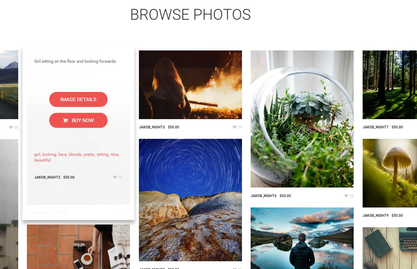
Shop
Bag
After the customer will hit the BUY NOW button, they will be able to find the products in the BAG. They will be able to change the amount of the products they want to buy. They can also delete the products from the basket if they decide they don’t want to buy them after all.
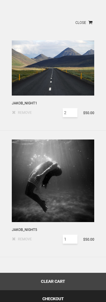
Bag with products example
They will also find there Clear Cart option to remove all the products at once.
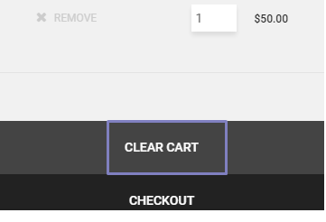
Clear Cart button
Here they will also find the checkout option that will send clients to the paypale page.
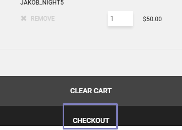
Checkout Button
Checkout
Here again they will find the information about the products they want to buy (ammount and price they will pay) . Also here all the customers will need to fill up all the needed information to be able to pay for the products using paypale account or log in into existing one.

Paypale
Was this article helpful ?
Preloader
In Test we are using Pace preloader.
HTML markup
No HTML markup needed.
ScreenShot

Loader
JavaScript
Files are bundled inside sella.min.js. and style.css files
Documentation and information about Pace can be found on THIS website.
Was this article helpful ?
Create pages Delimondo WP
To create a new Page follow the steps below:
- Step 1 – select Pages > Add New
- Step 2 – add Title
- Step 3 – add content – we recommend you to create page content using shortcode generator or by modifying demo content
- Step 4 – choose page attributes:
- Parent – if you want to create subpage
- Template – you can choose one of defined page templates: {templates}
- Page order
- Step 5 – choose navbar settings
- Step 6 – choose template settings
- Step 7 – click Publish to make your page public.
Page attributes
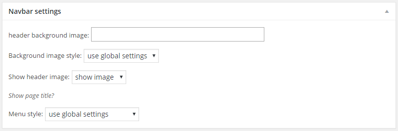
Navbar settings

Template settings
Learn more:
Was this article helpful ?
Socials
In Test you will be able to add the social icons on the right side of the main menu.

Social Position

Socials Customizer
-
Socials
You will find the section you can see below in the Customizer on the path Socials > Socials

Socials
Was this article helpful ?
Delimondo 2.0 Customizer
Test comes with advanced customizer, which allows to edit theme elements in one place. To use it navigate to Appearance > Customizer

Main Customizer Menu
It will display a panel with tabs corresponding to all theme sections, like:
- General
- Pages
- Navigation Bar
- Posts
- Portfolio
- Socials
- WooCommerce
- Site Identity
- Colors
- Header Image
- Background Image
- Menus
- Widgets
In General you can setup logos, copyright text and main theme settings

Main Settings
In Delimondo 2 – style section you can edit theme Motive Colors of the whole theme
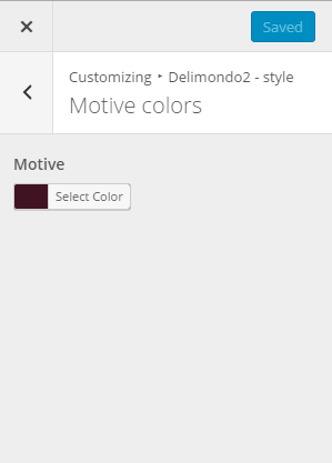
Color customize
The Other default colors for header text and background color can be changed in the Color section of the Customizer

Colors Customizer
Notice:
All changes done with customizer will be applied only once you click on
Was this article helpful ?
Pages
In Pages panel you are able to edit the general options for the Pages and the Map.

Pages Customizer
-
General
- Comments
- Show breadcrumbs
- Comment form
- Show titles on pages
- 404 page – Sub header
- 404 page – Header
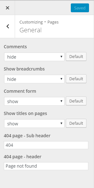
General
-
Map
- Show section header
- Section header image
- Section sub header
- Section header
- Enter location
- Map height
- Button label
- Top header
- Bottom header
- Top content
- Bottom content
- Map section background image
- Map ornament left
- Map ornament right
- Map ornament middle
- Show socials
- Show information text
- Hide information text
Map
Notice: – settings above are by default applied for all your pages. Though you can also customize them for each page separately with Header and Navbar settings – you will see this option during page content edition.
Header and navbar settings
Was this article helpful ?
Navigation Bar
In Test you have option to customize the menu of the theme using the options you can check below. You will find them in the Customizer on path Navigation Bar > General.
Navigation Bar

Navigation Bar Customizer
The General options in the Navigation Bar will let you set the background image for the Navigation Bar and choose from one of the 6 styles.
-
General
- Background image
- Background image repeat
- Navbar style

General Customizer
Was this article helpful ?
Posts
In Test you have option to customize the Posts pages the options below.
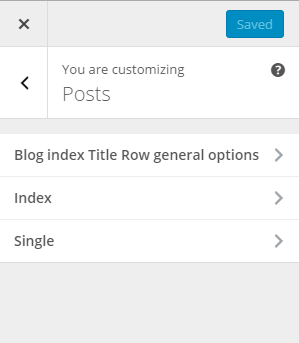
Post Customizer
It will display a panel with tabs corresponding to Posts sections, like:
- Blog index Title Row general options
- Index
- Single
-
Blog index Title row general options:
Here you will be able to set the options for the Blog Title.
- Blog header
- Blog subheader
- Blog header image

Blog Indext Title Row General options
-
Index settings:
Using this options of the customizer you can set several options deciding how your blog page will be display.
- Blog title
- Blog sub title
- Post detail button label
- Date
- By label
- on label
- tags label
- Date
- By label
- On label
- Tags label
- Date
- Show featured media on blog index
- Title / quote author
- Post text
- Author link
- Show read more button?

Index
-
Single options:
This options will affect the look of the single post page.
- Date
- Tags
- Categories
- Show posts index page title
- Date
- Show featured media on single post
- Title / quote author
- Content
- Author link
- Comments
- Comment form
- Comment form header
- Tag cloud
- Categories
- Show share box
- Share header
- Share annotate
- Pagination
- Previous post label
- Comment reply label
- Comment Form submit label
- Comment Form name placeholder
- Comment Form email placeholder
- Comment Form website placeholder
- Comment Form message placeholder
- Latest posts header
- Latest posts slider link label
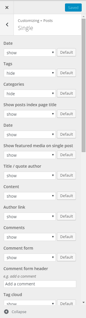
Single
Was this article helpful ?
WooCommerce
In Test you have option to customize the WooCommerce pages using the options you can check below. You will find them on path Customize > WooCommerce
It will display a panel giving you option to show or hide Title row on Shop index
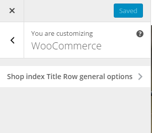
WooCommerce
-
Show index Title row general options:
- Show titles on shop index
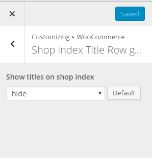
Shop index title row
Was this article helpful ?
Header Image
In Test you have option to customize the Header Image pages using the options you can check below. You will find the on path Customize > Header Image
It will display a panel with tabs corresponding to all theme sections, like:
Header Image Customizer
Was this article helpful ?
Java Script Components
JavaScript files:
- datetime-picker
- gmaps
- jquery.isotope.min.js – http://isotope.metafizzy.co/
- lightgallery.js – http://sachinchoolur.github.io/lightGallery/demos/
- MENU-EFFECT
- paypal-html-shop – more information about this plugin you will find HERE
- progressBar
- selectize.min.js
- shop-locator – more information about this plugin you will find HERE
- slick.js – http://kenwheeler.github.io/slick/
- jquery.min.js – https://jquery.com/
- skrollr.min.js – http://prinzhorn.github.io/skrollr/
- datepicker
- selectize.min.js – https://brianreavis.github.io/selectize.js/
- paypal-html-shop – more information about this plugin you will find HERE
- progressBar
- slick.js – http://kenwheeler.github.io/slick/
- helpers.js
- bootstrap.min.js – http://getbootstrap.com/getting-started/
- browser.min.js – https://github.com/gabceb/jquery-browser-plugin
- device.min.js – https://github.com/borismus/device.js/tree/master/build
- jquery.appear.js
- jquery.placeholder.min.js – https://github.com/mathiasbynens/jquery-placeholder
- main.js
Screenshot

Was this article helpful ?
CSS files and structure
If you would like to edit the color, font, or style of any elements, you would do the following:
|
1 |
#primaryContent a {color: #someColor;} |
If you find that your new style is not overriding, it is most likely because of a specificity problem. Scroll down in your CSS file and make sure that there isn’t a similar style that has more weight.
I.E.
|
1 |
#wrap #primaryContent a {color: #someColor;} |
So, to ensure that your new styles are applied, make sure that they carry enough “weight” and that there isn’t a style lower in the CSS file that is being applied after yours.
Colors
The theme includes a css file wich you can use to edit the colors.
You just need to add the corresponding CSS file to the head of the page like this:
|
1 2 3 4 5 |
<head> (..) <link rel="stylesheet" type="text/css" href="css/motive.css"> (..) </head> |
Icons
We’ve included 360+ font icons.
Awesome Icons – http://fontawesome.io/icons/
HTML markup:
|
1 2 |
<!-- Awesome Icons --> <i class="fa fa-cog"></i> |
CSS Files & Structure
We’ve included 2 files.
bootstrap.css contains Bootstrap 3 Library.
style.css file contains general styles.
style.less
- variables
- mixins
- animate
- slick
- selectize
- global
- utili
- lightgallery
- lg-transitions
- date-picker
- shop-locator
- navbar
- footer
- buttons
- contact-form
- toggleables
- tooltip
- typography
Was this article helpful ?
Accordion
HTML markup example
|
1 2 3 4 5 6 7 8 9 10 11 12 |
<div id="1" role="tablist" aria-multiselectable="true" class="panel-group ct-accordion-dark"> <div class="panel panel-default"> <div role="tab" id="header-1" class="panel-heading"> <h4 class="panel-title"><a aria-controls="collapse-1" aria-expanded="true" data-parent="#1" data-toggle="collapse" href="#collapse-1" role="button">When the product will be available in shops worldwide?</a></h4> </div> <div id="collapse-1" role="tabpanel" aria-labelledby="header-1" class="panel-collapse collapse"> <div class="panel-body"> <p>Our plan is to release the device around Q3 2017. We know it is a lot of time but at the same moment we want to deliver the best possible quality</p> </div> </div> </div> </div> |
Screenshot

Accordion Open and Closed
JavaScript
Bootstrap Documentation for Accorion can be found Here.
Was this article helpful ?
Icon Box
You can easily change what icon will be displayed in box by changing icon class. Here you will find full set of icons.
Test have 4 varations of icon boxes that are using the classes you can see below.
- .ct-iconBox–type1
- .ct-iconBox–type2
- ct-iconBox–type4
- ct-iconBox–type5
HTML markup example
|
1 2 3 4 5 6 |
<div class="ct-iconBox ct-iconBox--type1"> <div class="ct-iconBox-icon"><i class="fa fa-shield"></i> </div> <h6 class="ct-iconBox-title">Durable</h6> <p class="ct-iconBox-description">For special tasks</p> </div> |
Screenshot
Icon box ver.1
HTML markup example
|
1 2 3 4 5 6 |
<div class="ct-iconBox ct-iconBox--type2"> <div class="ct-iconBox-icon"><i class="fa fa-shield"></i> </div> <h6 class="ct-iconBox-title">Durable</h6> <p class="ct-iconBox-description">For special tasks</p> </div> |
Screenshot
Icon box ver.2
HTML markup example
|
1 2 3 4 5 6 |
<div class="ct-iconBox ct-iconBox--type4"> <div class="ct-iconBox-icon"><i class="fa fa-shield"></i> </div> <h6 class="ct-iconBox-title">Durable</h6> <p class="ct-iconBox-description">For special tasks</p> </div> |
Screenshot
Icon box ver.4
HTML markup example
|
1 2 3 4 5 6 |
<div class="ct-iconBox ct-iconBox--type5"> <div class="ct-iconBox-icon"><i class="fa fa-shield"></i> </div> <h6 class="ct-iconBox-title">Durable</h6> <p class="ct-iconBox-description">For special tasks</p> </div> |
Screenshot
Icon box ver.5
Was this article helpful ?
Person Box
HTML markup
|
1 2 3 4 5 6 7 8 9 10 11 12 |
<a href="#" class="ct-personBox"> <div class="ct-personBox-image"> <img src="../assets/images/demo-content/drone/person-image-1.jpg" alt="" /> <div class="inner"> <div class="inner-table"> <div class="inner-cell"><span class="ct-personBox-nameHidden">Jack</span> </div> </div> </div> </div> <h6 class="ct-personBox-name">Jack</h6> </a> |
Screenshot

Person box example
Was this article helpful ?
Divider section
In Test we have 2 versions of Divider sections.
- Default
- Currency
Default
HTML markup
|
1 2 3 4 5 6 7 8 9 10 11 12 13 14 15 16 17 18 19 20 21 22 23 24 25 |
<section id="next-section-1" class="ct-dividerSection ct-dividerSection--motive ct-call-to-action--type1 ct-u-padding-both-60"> <div class="inner"> <div class="container"> <div class="row"> <div class="col-sm-12"> <div class="ct-dividerSection--left"> <div class="ct-iconBox ct-iconBox--type3 ct-iconBox--white media"> <div class="media-left"> <img src="../assets/images/demo-content/drone/icon-2.png" alt=""> </div> <div class="media-body"> <h4 class="ct-iconBox-title">pre-Order Now For $299</h4> <p class="ct-iconBox-description">Get free gift and become our special member</p> </div> </div> </div> <div class="ct-dividerSection--right text-right"><a href="" class="btn-group btn-group--separated"><span class="btn btn-dark btn-separated">Purchase now</span><span class="btn btn-dark btn-separated"><i class="fa fa-shopping-cart"></i></span></a> <a href="" class="btn-group btn-group--separated"><span class="btn btn-white btn-separated">Read more</span><span class="btn btn-white btn-separated"><i class="fa fa-caret-right"></i></span> </a> </div> </div> </div> </div> </div> </section> |
Screenshot

Default
Currency
HTML markup
|
1 2 3 4 5 6 7 8 9 10 11 12 13 14 15 16 17 18 19 20 21 22 23 24 25 26 27 28 29 30 31 32 33 34 35 36 37 38 39 40 41 |
<section class="ct-dividerSection ct-dividerSection--currency ct-dividerSection--motive ct-call-to-action--type1 ct-u-padding-both-70"> <div class="inner"> <div class="container"> <div class="row"> <div class="col-sm-12 text-center-lg"> <div class="ct-dividerSection--left"> <div class="ct-iconBox ct-iconBox--type3 ct-iconBox--white media"> <div class="media-body"> <h4 class="ct-iconBox-title">Order Now</h4> <p class="ct-iconBox-description">Get free gift and become our special member</p> </div> </div> </div> <div class="ct-dividerSection--right"> <form action="" class="ct-addToCart ct-contactForm form-inline ct-contactForm--white"> <div class="form-group"> <input type="text" placeholder="Piece" value="" required class="form-control input-required-value"> <div class="ct-addToCart-logic"><span class="ct-input-increment"><i class="fa fa-plus-circle"></i></span><span class="ct-input-decrement"><i class="fa fa-minus-circle"></i></span> </div> <input type="hidden" id="required-value" value="0"> </div> <div class="form-group"> <select> <option value="Black">Black</option> <option value="Purple">Purple</option> <option value="Yellow">Yellow</option> <option value="Green">Green</option> <option value="White">White</option> </select> </div> <div class="form-group"> <button type="submit" class="btn-group btn-group--separated"><span class="btn btn-dark btn-lg btn-separated">add to cart</span><span class="btn btn-dark btn-lg btn-separated"><i class="fa fa-shopping-cart"></i></span> </button> </div> </form> </div> </div> </div> </div> </div> </section> |
Screenshot

Currency
Was this article helpful ?
Testimonials
The best way to adversize your company is to let your customers speak for you. And we have two types of this element! In Test
— Slider
HTML markup
|
1 2 3 4 5 6 7 8 9 10 11 12 13 14 15 16 17 18 19 20 21 22 23 24 25 26 27 28 29 30 31 32 33 34 35 36 37 38 39 40 41 42 43 44 45 46 47 48 49 50 51 52 53 54 55 56 57 58 59 60 61 62 63 64 65 66 |
<div class="ct-testimonials"> <div class="ct-testimonials-slider ct-dots--type1 ct-dots--positionBottomOffset"> <div class="item"> <div class="ct-testimonial"> <div class="ct-testimonial-icon"><i class="fa fa-commenting-o"></i> </div> <p class="ct-testimonial-text">Nam a diam tincidunt, condimentum nisi et, fringilla lectus. Nullam nec lectus eu erat tempus pulvinar.</p> </div> </div> <div class="item"> <div class="ct-testimonial"> <div class="ct-testimonial-icon"><i class="fa fa-commenting"></i> </div> <p class="ct-testimonial-text">Praesent sed ipsum vitae erat volutpat tempor vitae non quam. Nunc ut quam ante. Vestibulum convallis nisi eleifend ultricies tincidunt. Cras ac lectus a erat fermentum commodo. Suspendisse potenti</p> </div> </div> <div class="item"> <div class="ct-testimonial"> <div class="ct-testimonial-icon"><i class="fa fa-commenting-o"></i> </div> <p class="ct-testimonial-text">Phasellus sit amet ultrices odio. Quisque euismod vehicula lacus et cursus. Quisque fringilla consequat porta. Fusce sodales porttitor.</p> </div> </div> <div class="item"> <div class="ct-testimonial"> <div class="ct-testimonial-icon"><i class="fa fa-commenting"></i> </div> <p class="ct-testimonial-text">Integer euismod luctus sapien, tempor vehicula est condimentum ac. Morbi eleifend neque eu orci semper volutpat. Pellentesque dolor justo, facilisis in diam gravida, scelerisque mattis velit.</p> </div> </div> <div class="item"> <div class="ct-testimonial"> <div class="ct-testimonial-icon"><i class="fa fa-commenting-o"></i> </div> <p class="ct-testimonial-text">Nam a diam tincidunt, condimentum nisi et, fringilla lectus. Nullam nec lectus eu erat tempus pulvinar.</p> </div> </div> </div> </div> <div class="ct-testimonials-slider-nav-thumbnails"> <div class="item"> <div class="ct-testimonial-thumbnailItem"> <h6 class="ct-testimonial-author">Jeffrey Kendrick</h6><span class="ct-testimonial-authorDescription">Manager @ Crisppi</span> </div> </div> <div class="item"> <div class="ct-testimonial-thumbnailItem"> <h6 class="ct-testimonial-author">Stan wallis</h6><span class="ct-testimonial-authorDescription">CEO @ SoftySoft</span> </div> </div> <div class="item"> <div class="ct-testimonial-thumbnailItem"> <h6 class="ct-testimonial-author">Jane honda</h6><span class="ct-testimonial-authorDescription">actress</span> </div> </div> <div class="item"> <div class="ct-testimonial-thumbnailItem"> <h6 class="ct-testimonial-author">Ben Gobama</h6><span class="ct-testimonial-authorDescription">Ben Gobama</span> </div> </div> <div class="item"> <div class="ct-testimonial-thumbnailItem"> <h6 class="ct-testimonial-author">Jeffrey Kendrick</h6><span class="ct-testimonial-authorDescription">Manager @ Crisppi</span> </div> </div> </div> |
Screenshot

Testimonial
Was this article helpful ?
Contact Form
All needed files are in /form directory.
To configure form just edit form/config.php and change e-mails to your own :
|
1 2 |
$to = "mail@example.com"; $from = "mail@example.com"; |
That’s it!
HTML markup
|
1 2 3 4 5 6 7 8 9 10 11 12 13 14 15 16 17 18 19 20 21 22 23 24 25 26 27 28 29 30 31 32 33 |
<form action="../assets/form/send.php" method="POST" class="validateIt ct-form ct-form--with-inner"> <div class="row ct-u-margin-bottom-20"> <div class="col-md-4"> <div class="inner-group"> <div class="form-group"> <input type="text" placeholder="Name *" id="contact_name" required="required" class="form-control form-control-light input-lg"/> <label for="contact_name" class="sr-only">Name *</label> </div> <div class="form-group"> <input type="text" placeholder="Email *" id="contact_email" required="required" class="form-control form-control-light input-lg"/> <label for="contact_email" class="sr-only">Email *</label> </div> </div> </div> <div class="col-md-8"> <div class="form-group"> <textarea placeholder="Your message *" id="contact_message" rows="5" required="required" class="form-control form-control-light ct-u-margin-both-0"></textarea> <label for="contact_message" class="sr-only">Your message *</label> </div> </div> </div> <div class="row"> <div class="col-sm-8 text-left"><span class="ct-u-color--gray ct-u-font-family-secondary ct-u-font-style--italic center-block ct-u-margin-top-15">Fields marked with * are mandatory</span></div> <div class="col-sm-4"> <div class="row"> <div class="col-xs-5"><a class="btn btn-link"><i class="fa fa-close"></i>clear</a></div> <div class="col-xs-7"> <button class="btn btn-motive btn-square">send message</button> </div> </div> </div> </div> </form> |
Screenshot

Contact form
Options (can be changed in HTML) :
- Mail Subject – just change value in :
- Success Message – change successMessage div content
- Error Message – change errorMessage div content
Was this article helpful ?
Lightgallery
It is a really nice way to present images on your website
HTML marker (example)
|
1 2 |
<div id="ct-gallery" class="ct-gallery ct-js-gallery ct-gallery--col5 lightGallery"><a href="assets/images/demo-content/portfolio-big-image.jpg"> </div> |
Screenshot

Lightgallery
JavaScript
|
1 2 3 4 5 |
$('.lightGallery').each(function() { $(this).lightGallery({ thumbnail:true }); }); |
Lightgallery Documentation can be found here. Files are bundled inside sella.min.js & style.css
Was this article helpful ?
Section Header
In Test we have one varsion of this element that can be created using this markup below
HTML markup
|
1 2 3 4 |
<div class="ct-sectionHeader ct-sectionHeader--typeDarken ct-sectionHeader--subtitleItalic text-center"> <h3 class="ct-sectionHeader-title">Features</h3> <h4 class="ct-sectionHeader-subtitle">We were developing our drone for 3 years. After many prototypes we are ready to show you nothing less than perfection.</h4> </div> |
Screenshot

Section header
Was this article helpful ?
Slider
This is the default markup with classes you must use if you want to create a slick slider.
HTML markup
|
1 2 3 4 5 |
<div class="ct-slick ct-js-slick"> <div class="item">...</div> ... <div class="item">...</div> </div> |
— Main Slider
If you want to achieve slider looking like the one on our demo page use this markup example
HTML markup
|
1 2 3 4 5 6 7 8 9 10 11 12 13 14 15 16 17 18 19 20 21 22 23 24 25 26 27 28 29 30 31 32 33 34 35 36 37 38 |
<div data-items="1" data-dots="true" data-height="100%" data-draggable="false" data-arrows="false" class="ct-js-slick ct-slick--parallaxMode ct-u-displayTable ct-dots--type1 ct-dots--positionBottom"> <div data-parallax="50" data-background="../assets/images/demo-content/drone/slider-item-3.jpg" class="item text-center"> <div class="item-inner"> <div class="ct-pageHeader ct-pageHeader--type1"> <img src="../assets/images/demo-content/drone/logo-brand.png" class="ct-pageHeader-image"> <h1 class="ct-pageHeader-title ct-u-color--white">Aerial Views<span class="ct-u-colorMotive">Unleashed Now</span></h1> <div class="btn-group ct-u-margin-top-30"><a href="#" class="btn btn-accient">Buy now for $299</a><a href="#next-section-1" data-scroll="#next-section-1" class="btn btn-transparent btn--withIcon btn--motiveColor">See why to Buy<i class="fa fa-caret-right"></i></a> </div> </div> </div> </div> <div data-parallax="50" data-background="../assets/images/demo-content/drone/slider-item.jpg" class="item"> <div class="item-inner"> <div class="ct-pageHeader ct-pageHeader--type2"> <img src="../assets/images/demo-content/drone/logo-brand.png" class="ct-pageHeader-image"> <h1 class="ct-pageHeader-title ct-u-colorMotive ct-u-font-weight--700">High Durability</h1><a href="#" class="btn btn-accient ct-u-margin-top-25">Buy now for $299</a> </div> </div> </div> <div data-parallax="50" data-background="../assets/images/demo-content/drone/slider-item-2.jpg" class="item"> <div class="item-inner"> <div class="ct-pageHeader ct-pageHeader--type3"> <div class="media"> <div class="media-left"> <img src="../assets/images/demo-content/drone/logo-brand.png" class="ct-pageHeader-image"> </div> <div class="media-body"> <h1 class="ct-pageHeader-title ct-u-color--white">Stands for<span class="ct-u-colorMotive">Quality</span></h1> </div> </div> <div class="btn-group ct-u-margin-top-40"><a href="#" class="btn btn-accient">Buy now for $299</a><a href="#" class="btn btn-transparent btn--withIcon btn--white">See why to Buy<i class="fa fa-caret-right"></i></a> </div> </div> </div> </div> </div> </div> |
Screenshot

Main slider
JavaScript
|
1 2 3 4 5 6 7 8 9 10 11 12 13 14 15 16 17 18 19 20 21 22 23 24 25 26 27 28 29 30 31 32 33 34 35 36 37 38 39 40 41 42 43 44 45 46 47 48 49 50 51 52 53 54 55 56 57 58 59 60 61 62 63 64 65 66 67 68 69 70 71 72 73 74 75 76 77 78 79 80 81 82 83 84 85 86 87 88 89 90 91 92 93 94 95 96 97 98 99 100 101 102 103 104 105 106 107 108 109 110 111 |
$slick.each(function () { var $this = $(this), // Items Settings ctslidesToShow = parseInt(validatedata($this.attr("data-items"), 1), 10), // Non Responsive slides_xs = parseInt(validatedata($this.attr("data-items-xs"), ctslidesToShow), 10), slides_sm = parseInt(validatedata($this.attr("data-items-sm"), slides_xs), 10), // Default Item from smaller Device; slides_md = parseInt(validatedata($this.attr("data-items-md"), slides_sm), 10), // Default Item from smaller Device; slides_lg = parseInt(validatedata($this.attr("data-items-lg"), slides_md), 10), // Default Item from smaller Device; ctaccessibility = parseBoolean($this.attr("data-accessibility"), true), ctadaptiveHeight = parseBoolean($this.attr("data-adaptiveHeight"), false), ctautoplay = parseBoolean($this.attr("data-autoplay"), false), ctarrows = parseBoolean($this.attr("data-arrows"), true), ctcenterMode = parseBoolean($this.attr("data-centerMode"), false), ctdots = parseBoolean($this.attr("data-dots"), false), ctdraggable = parseBoolean($this.attr("data-draggable"), true), ctfade = parseBoolean($this.attr("data-fade"), false), ctfocusOnSelect = parseBoolean($this.attr("data-focusOnSelect"), false), ctinfinite = parseBoolean($this.attr("data-infinite"), true), ctmobileFirst = parseBoolean($this.attr("data-mobileFirst"), true), ctpauseOnHover = parseBoolean($this.attr("data-pauseOnHover"), true), ctpauseOnDotsHover = parseBoolean($this.attr("data-pauseOnDotsHover"), false), ctswipe = parseBoolean($this.attr("data-swipe"), true), ctswipeToSlide = parseBoolean($this.attr("data-swipeToSlide"), true), cttouchMove = parseBoolean($this.attr("data-touchMove"), true), ctuseCSS = parseBoolean($this.attr("data-useCSS"), true), ctvariableWidth = parseBoolean($this.attr("data-variableWidth"), false), ctvertical = parseBoolean($this.attr("data-vertical"), false), ctrtl = parseBoolean($this.attr("data-rtl"), false), ctasNavFor = validatedata($this.attr("data-asNavFor")), ctappendArrows = validatedata($this.attr("data-appendArrows")), ctprevArrow = validatedata($this.attr("data-prevArrow"), '<button type="button" class="slick-nav slick-prev"></button>'), ctnextArrow = validatedata($this.attr("data-nextArrow"), '<button type="button" class="slick-nav slick-next"></button>'), ctcenterPadding = validatedata($this.attr("data-centerPadding"), '50px'), ctcssEase = validatedata($this.attr("data-cssEase"), 'ease'), cteasing = validatedata($this.attr("data-easing"), 'linear'), ctlazyLoad = validatedata($this.attr("data-lazyLoad"), 'ondemand'), ctrespondTo = validatedata($this.attr("data-respondTo"), 'window'), ctslide = validatedata($this.attr("data-slide")), ctanimations = validatedata($this.attr("data-animations"), true), ctedgeFriction = parseInt(validatedata($this.attr("data-edgeFriction"), 0.15), 10), ctinitialSlide = parseInt(validatedata($this.attr("data-initialSlide"), 0), 10), ctautoplaySpeed = parseInt(validatedata($this.attr("data-autoplaySpeed"), 5000), 10), ctslidesToScroll = parseInt(validatedata($this.attr("data-slidesToScroll"), 1), 10), ctspeed = parseInt(validatedata($this.attr("data-speed"), 300), 10), cttouchThreshold = parseInt(validatedata($this.attr("data-touchThreshold"), 5), 10); $this.slick({ slidesToShow: ctslidesToShow, // Number of slides to show accessibility: ctaccessibility, // Enables tabbing and arrow key navigation adaptiveHeight: ctadaptiveHeight, // Enables adaptive height for single slide horizontal carousels. autoplay: ctautoplay, // Enables Autoplay autoplaySpeed: ctautoplaySpeed, // Autoplay Speed in milliseconds arrows: ctarrows, // Prev/Next Arrows asNavFor: ctasNavFor, // Set the slider to be the navigation of other slider (Class or ID Name) appendArrows: ctappendArrows, // Change where the navigation arrows are attached (Selector, htmlString, Array, Element, jQuery object) prevArrow: ctprevArrow, // Allows you to select a node or customize the HTML for the "Previous" arrow. nextArrow: ctnextArrow, // Allows you to select a node or customize the HTML for the "Next" arrow. centerMode: ctcenterMode, // Enables centered view with partial prev/next slides. Use with odd numbered slidesToShow counts. centerPadding: ctcenterPadding, // Side padding when in center mode (px or %) cssEase: ctcssEase, // CSS3 Animation Easing dots: ctdots, // Show dot indicators draggable: ctdraggable, // Enable mouse dragging fade: ctfade, // Enable fade focusOnSelect: ctfocusOnSelect, // Enable focus on selected element (click) easing: cteasing, // Add easing for jQuery animate. Use with easing libraries or default easing methods edgeFriction: ctedgeFriction, // Resistance when swiping edges of non-infinite carousels infinite: ctinfinite, // Infinite loop sliding initialSlide: ctinitialSlide, // Slide to start on lazyLoad: ctlazyLoad, // Set lazy loading technique. Accepts 'ondemand' or 'progressive' mobileFirst: ctmobileFirst, // Responsive settings use mobile first calculation pauseOnHover: ctpauseOnHover, // Pause Autoplay On Hover pauseOnDotsHover: ctpauseOnDotsHover, // Pause Autoplay when a dot is hovered respondTo: ctrespondTo, // Width that responsive object responds to. Can be 'window', 'slider' or 'min' (the smaller of the two) slide: ctslide, // Element query to use as slide slidesToScroll: ctslidesToScroll, // Number of slides to scroll speed: ctspeed, // Slide/Fade animation speed swipe: ctswipe, // Enable swiping swipeToSlide: ctswipeToSlide, // Allow users to drag or swipe directly to a slide irrespective of slidesToScroll touchMove: cttouchMove, // Enable slide motion with touch touchThreshold: cttouchThreshold, // To advance slides, the user must swipe a length of (1/touchThreshold) * the width of the slide useCSS: ctuseCSS, // Enable/Disable CSS Transitions variableWidth: ctvariableWidth, // Variable width slides vertical: ctvertical, // Vertical slide mode rtl: ctrtl // Change the slider's direction to become right-to-left // Responsive Breakpoints // end Responsive Breakpoints }); // end slick initialize $this.slick('setOption', 'responsive', [{ breakpoint: $width_lg, settings: { slidesToShow: slides_lg } }], true) $this.slick('setOption', 'responsive', [{ breakpoint: $width_md, settings: { slidesToShow: slides_md } }], true) $this.slick('setOption', 'responsive', [{ breakpoint: $width_sm, settings: { slidesToShow: slides_sm } }], true) $this.slick('setOption', 'responsive', [{ breakpoint: $width_xs, settings: { slidesToShow: slides_xs } }], true) |
Slick Custom Tweaks
New Responsive data-attributes for ease of use:
- data-items-xl
- data-items-lg
- data-items-md
- data-items-sm
- data-items-xs
Slick Documentation can be found here. Files are bundled inside sella.min.js & style.css
Was this article helpful ?
Navigation
Navigation is really important part of the theme. In Test we have 3 variations of it. The menu markup also contains search bar.
- Default navigation
- Navbar wide navigation
- Navbar white
- Navbar dark
— Default navigation
HTML markup
|
1 2 3 4 5 6 7 8 9 10 11 12 13 14 15 16 17 18 19 20 21 22 23 24 25 26 27 28 29 30 31 32 33 34 35 36 37 38 39 40 41 42 43 44 45 46 47 48 49 50 51 52 53 54 55 56 57 58 59 60 61 62 63 64 65 66 67 68 69 70 71 |
<nav data-height="80" class="navbar navbar-default navbar-desktop navbar--animated navbar-top"> <div class="container"> <div class="row"> <div class="col-sm-12"> <div class="navbar-header"> <a href="index.html" class="navbar-brand"> <img src="../assets/images/demo-content/drone/distrupt-logo-dark.png" alt=""> </a> </div> <ul class="navbar-buttons list-unstyled list-inline pull-right"> <li><a href="" class="btn-group btn-group--separated"><span class="btn btn-xs btn-accient btn-separated">Order now</span><span class="btn btn-xs btn-accient btn-separated"><i class="fa fa-shopping-cart"></i></span></a> </li> </ul> <ul role="menu" class="nav navbar-nav ct-navbar--fadeIn"> <li class="nav-item dropdown"><a>Home</a> <ul role="menu" class="dropdown-menu"> <li class="nav-item"><a href="index3.html">Smartwatch</a> </li> <li class="nav-item"><a href="index.html">Drone</a> </li> <li class="nav-item"><a href="index5.html">Smartphone</a> </li> <li class="nav-item"><a href="index2.html">Beacon</a> </li> <li class="nav-item dropdown-submenu"><a href="index4.html">Vr mask</a> <ul role="menu" class="dropdown-menu"> <li class="nav-item"><a href="#">Submenu 1</a> </li> <li class="nav-item"><a href="#">Submenu 2</a> </li> <li class="nav-item"><a href="#">Submenu 3</a> </li> <li class="nav-item"><a href="#">Submenu 4</a> </li> </ul> </li> </ul> </li> <li class="nav-item"><a href="#">Features</a> </li> <li class="nav-item"><a href="#">Product</a> </li> <li class="nav-item dropdown"><a>Pages</a> <ul role="menu" class="dropdown-menu"> <li class="nav-item"><a href="services.html">Services</a> </li> <li class="nav-item"><a href="shop-locator.html">Shop locator</a> </li> <li class="nav-item"><a href="press-kit.html">Press kit</a> </li> <li class="nav-item"><a href="404.html">404 page</a> </li> <li class="nav-item"><a href="faq.html">FAQ</a> </li> <li class="nav-item"><a href="investors.html">Investors</a> </li> <li class="nav-item"><a href="privacy-policy.html">Privacy Policy</a> </li> <li class="nav-item"><a href="terms-conditions.html">Terms & conditions</a> </li> </ul> </li> <li class="nav-item"><a href="about-us.html">About us</a> </li> <li class="nav-item"><a href="contact-us.html">Contact</a> </li> </ul> </div> </div> </div> </nav> |
Screenshots

Default navigation
— Navbar wide navigation
HTML markup
|
1 2 3 4 5 6 7 8 9 10 11 12 13 14 15 16 17 18 19 20 21 22 23 24 25 26 27 28 29 30 31 32 33 34 35 36 37 38 39 40 41 42 43 44 45 46 47 48 49 50 51 52 53 54 55 56 57 58 59 60 61 62 63 64 65 66 67 68 69 70 71 72 73 74 75 76 77 78 79 80 81 82 83 84 85 86 87 88 89 90 91 92 93 94 95 96 |
<nav data-background="#ffffff" data-height="80" class="navbar navbar-default navbar-fixed navbar-desktop navbar-wide"> <div class="navbar-header"> <a href="index.html" class="navbar-brand"> <div class="inner"> <img src="../assets/images/demo-content/drone/distrupt-logo-dark.png" alt=""> </div> </a> <ul class="ct-socials ct-socials--motive list-unstyled list-inline"> <li><a href="#" data-toggle="tooltip" data-placement="bottom" title="Facebook"><i class="fa fa-facebook"></i></a> </li> <li><a href="#" data-toggle="tooltip" data-placement="bottom" title="Twitter"><i class="fa fa-twitter"></i></a> </li> <li><a href="#" data-toggle="tooltip" data-placement="bottom" title="Pinterest"><i class="fa fa-pinterest"></i></a> </li> </ul> <div class="ct-contactBox"><a href="tel:123456789"><span class="ct-contactBox-top">Call us now:</span><span class="ct-contactBox-number">0 123 456 7890</span></a> </div> <div class="ct-iconBox ct-iconBox--small media ct-contactBox--responsive"> <a href="tel:123456789"> <div class="media-left"> <div class="ct-iconBox-icon"><i class="fa fa-phone"></i> </div> </div> </a> </div> <div class="ct-iconBox ct-iconBox--small media"> <a href="shop-locator.html"> <div class="media-left"> <div class="ct-iconBox-icon"><i class="fa fa-map-marker"></i> </div> </div> <div class="media-body"> <h6 class="ct-iconBox-title">Locate <br> our shop</h6> </div> </a> </div> </div> <div class="ct-search-link"><a href="#"><i class="fa fa-search"></i></a> </div> <ul role="menu" class="nav navbar-nav ct-navbar--fadeIn"> <li class="nav-item dropdown"><a>Home</a> <ul role="menu" class="dropdown-menu"> <li class="nav-item"><a href="index3.html">Smartwatch</a> </li> <li class="nav-item"><a href="index.html">Drone</a> </li> <li class="nav-item"><a href="index5.html">Smartphone</a> </li> <li class="nav-item"><a href="index2.html">Beacon</a> </li> <li class="nav-item dropdown-submenu"><a href="index4.html">Vr mask</a> <ul role="menu" class="dropdown-menu"> <li class="nav-item"><a href="#">Submenu 1</a> </li> <li class="nav-item"><a href="#">Submenu 2</a> </li> <li class="nav-item"><a href="#">Submenu 3</a> </li> <li class="nav-item"><a href="#">Submenu 4</a> </li> </ul> </li> </ul> </li> <li class="nav-item"><a href="#">Product</a> </li> <li class="nav-item"><a href="#">Experience</a> </li> <li class="nav-item dropdown"><a>Pages</a> <ul role="menu" class="dropdown-menu"> <li class="nav-item"><a href="services.html">Services</a> </li> <li class="nav-item"><a href="shop-locator.html">Shop locator</a> </li> <li class="nav-item"><a href="press-kit.html">Press kit</a> </li> <li class="nav-item"><a href="404.html">404 page</a> </li> <li class="nav-item"><a href="faq.html">FAQ</a> </li> <li class="nav-item"><a href="investors.html">Investors</a> </li> <li class="nav-item"><a href="privacy-policy.html">Privacy Policy</a> </li> <li class="nav-item"><a href="terms-conditions.html">Terms & conditions</a> </li> </ul> </li> <li class="nav-item"><a href="about-us.html">About us</a> </li> <li class="nav-item"><a href="contact-us.html">Contact</a> </li> <li class="nav-item"><a href="#">Order now</a> </li> </ul> </nav> |
Screenshot
Navbar whide
— Navbar white
HTML markup
|
1 2 3 4 5 6 7 8 9 10 11 12 13 14 15 16 17 18 19 20 21 22 23 24 25 26 27 28 29 30 31 32 33 34 35 36 37 38 39 40 41 42 43 44 45 46 47 48 49 50 51 52 53 54 55 56 57 58 59 60 61 62 63 64 65 66 67 68 69 70 71 |
<nav data-height="80" class="navbar navbar-default navbar-light navbar-desktop navbar--animated navbar-top"> <div class="container"> <div class="row"> <div class="col-sm-12"> <div class="navbar-header"> <a href="index.html" class="navbar-brand"> <img src="../assets/images/demo-content/smartphone/logo-light.png" alt=""> </a> </div> <ul class="navbar-buttons list-unstyled list-inline pull-right"> <li><a href="" class="btn-group btn-group--separated"><span class="btn btn-xs btn-transparent btn--white btn-separated">Order now</span><span class="btn btn-xs btn-transparent btn--white btn-separated"><i class="fa fa-shopping-cart"></i></span></a> </li> </ul> <ul role="menu" class="nav navbar-nav ct-navbar--fadeIn"> <li class="nav-item dropdown"><a>Home</a> <ul role="menu" class="dropdown-menu"> <li class="nav-item"><a href="index3.html">Smartwatch</a> </li> <li class="nav-item"><a href="index.html">Drone</a> </li> <li class="nav-item"><a href="index5.html">Smartphone</a> </li> <li class="nav-item"><a href="index2.html">Beacon</a> </li> <li class="nav-item dropdown-submenu"><a href="index4.html">Vr mask</a> <ul role="menu" class="dropdown-menu"> <li class="nav-item"><a href="#">Submenu 1</a> </li> <li class="nav-item"><a href="#">Submenu 2</a> </li> <li class="nav-item"><a href="#">Submenu 3</a> </li> <li class="nav-item"><a href="#">Submenu 4</a> </li> </ul> </li> </ul> </li> <li class="nav-item"><a href="#">Features</a> </li> <li class="nav-item"><a href="#">Product</a> </li> <li class="nav-item dropdown"><a>Pages</a> <ul role="menu" class="dropdown-menu"> <li class="nav-item"><a href="services.html">Services</a> </li> <li class="nav-item"><a href="shop-locator.html">Shop locator</a> </li> <li class="nav-item"><a href="press-kit.html">Press kit</a> </li> <li class="nav-item"><a href="404.html">404 page</a> </li> <li class="nav-item"><a href="faq.html">FAQ</a> </li> <li class="nav-item"><a href="investors.html">Investors</a> </li> <li class="nav-item"><a href="privacy-policy.html">Privacy Policy</a> </li> <li class="nav-item"><a href="terms-conditions.html">Terms & conditions</a> </li> </ul> </li> <li class="nav-item"><a href="about-us.html">About us</a> </li> <li class="nav-item"><a href="contact-us.html">Contact</a> </li> </ul> </div> </div> </div> </nav> |
Screenshot
Navbar whide
— Navbar dark
HTML markup
|
1 2 3 4 5 6 7 8 9 10 11 12 13 14 15 16 17 18 19 20 21 22 23 24 25 26 27 28 29 30 31 32 33 |
<nav data-height="80" class="navbar navbar-dark navbar-fixed navbar-desktop"> <div class="container"> <div class="row"> <div class="col-sm-4"> <ul class="list-unstyled list-inline ct-socials--rounded"> <li><a href="#"><i class="fa fa-facebook"></i></a> </li> <li><a href="#"><i class="fa fa-twitter"></i></a> </li> <li><a href="#"><i class="fa fa-instagram"></i></a> </li> </ul> </div> <div class="col-sm-4"> <div class="navbar-header"> <a href="index.html" class="navbar-brand"> <img src="../assets/images/demo-content/beacon/distrupt-logo-light.png" alt=""> </a> </div> </div> <div class="col-sm-4"> <ul role="menu" class="nav navbar-nav"> <li class="ct-productCart-link"><a href="#"><i class="fa fa-shopping-cart"></i></a> <div class="ct-productCart"> </div> </li> <li class="nav-item-toggle"><a href="#"><i class="fa fa-bars"></i></a> </li> </ul> </div> </div> </div> </nav> |
Screenshot

Navbar dark
Was this article helpful ?
Buttons
In Test you will find several variations of sizes and colors for buttons. Using the class you see down below you will be able to set the size of the button and its color.
- Size
- btn-lg
- btn-sm
- btn-xs
- Color Full
- group–separated
- motiveColor
- default
- primary
- success
- info
- warning
- dark
- accent
- white
- Color Open
- transparent
HTML markup
|
1 2 |
<button class="btn btn-motive btn-lg">Read More</button> <a href="#" class="btn btn-motive btn-lg">Read More</a> |
Screenshot examples
- accent/transparent

accent & transparent buttons
- group–separated( dark,default)

dark & default buttons
Was this article helpful ?
Preloader
In Test we are using Pace preloader.
HTML markup
|
1 2 3 4 5 6 7 8 9 10 11 12 13 14 |
<div class="ct-preloader"> <div class="ct-preloader-inner"> <div class="ct-preloader-logo"> <img src="../assets/images/demo-content/drone/distrupt-logo-dark.png" alt=""> <h6 class="ct-preloader-title">Please wait, loading...</h6> <div class="loading"> <div class="loading-line"></div> <div class="loading-break loading-dot-1"></div> <div class="loading-break loading-dot-2"></div> <div class="loading-break loading-dot-3"></div> </div> </div> </div> </div> |
This HTMl is added to the body of the HTML
|
1 2 3 |
<body> preloader </body> |
ScreenShot

Loader
JavaScript
|
1 |
$('.ct-preloader').fadeOut('slow'); |
You will find this code on path ../assets/js/main.js
Was this article helpful ?
Background Image
In Test you have option to customize the Background Image using the options you can check below. You will find the on path Customize > WooCommerce
It will display a panel with tabs corresponding to all theme sections, like:

Background Images Customizer
Was this article helpful ?
What is Menu card?
It is used in Test shortcode that will give you option to show all the products they can find in your restaurant or shop. This shortcode don’t need Woocommerce plugin to work so it will be a wonderfull solution for anyone who want to show the products but don’t want to seel them on the website, or to just show them in a fancy way on the page!

Menu card
Was this article helpful ?
Creating Menu Card
To create a Menu card on one of you pages you’ll need to use Menu card Shortcode.
How to Add Menu card?
- Step 1 – go to the Pages > Add New in WP Dashboard

Create new page
- Step 2 – choose Menu Card from the visual composer elements. If you have problems with finding it use the search option.

Adding Menu Card
- Step 3 – choose options in Menu card Settings: You’ll be able to select from several options, which will help you to customize your Menu card.
- Filters – let you choose if you want to filter the products by the categories or not.
- Categories custom order – set custom order of the categories.
- Category order by – choose the order of the categories (by name, slug or Id).
- Category order – order of the categories (ascending, descending).
- Product order by – choose by what the product order will be shown (date, price, date, order by last modified date, random, slug, Id).
- Product order – order in which the categories will be shown (ascending, descending).
- Currency – the currency you want to use for the product prices.
- Limit – number of food elements on the page
- Custom class – adding custom class allows you to set diverse styles in css to the element. Type in name of class, which you defined in custom style css. You can add as much classes as you like.
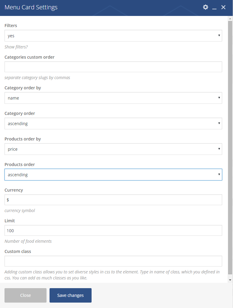
Menu Card Settings
Remember to save the changes after you’ re done.
Was this article helpful ?
Creating Menu card Item
Before setting Menu card on your page you have to create items. In this few easy steps you will be able to create item without any problems!
- Step 1 – Please go to the Restaurant in the Dashboard of your WordPress.
- Step 2 – Click Add New to create a new item.
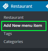
Creating new Menu item
- Step 3 – Create the content of your product. To do That you will need to set:
- Title of the product.
- Main content – you can put there all the information about the products you want.
- Price – set the price of the product.
- Menu categories – you can choose from what you’ve already created or make a new one by clicking on Add new menu Category or by going to Restaurant > Categories and create whatever categories you need.
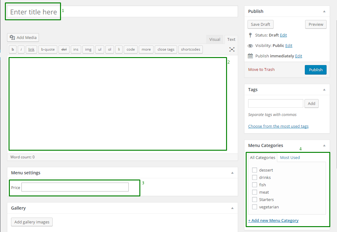
Creating Menu item
When you work is done alway remember to make sure that you save all the changes.
Was this article helpful ?
Creating Event Item
here you will find some useful information how to set an Event item on your own.
- Step 1 – go to the Events in the Dashboard of your WordPress. There you’ll find several options that will help you create your events. Here are the most interesting ones:
- Events – you will be able to check out already existing events.
- Add New – here you will be able to create New Event.
- Tags
- Venues – will let you set the adresses of your events.

Event options
- Step 2 – Choose Add New. This way you will start creating your own Events by filling up this several options like:
- Enter Title – set the title of the event.
- Editor area – here you can put some text according to the created event.
- The Event Calendar – here you can set needed information for users like time & date of the event, location and all the information you want.

The Event Calendar
- Event Options – choose one of the options for the event.
Was this article helpful ?
Event Calendar
Test Events can be easly created with the use of Event Calendar.
This plugin does not use any shortcode. The only thing you need to do is to activate this plugin. All the needed content will be downloaded with the 1-Click Demo.
If you are searching for more information about this plugin check out Knowledgebase.
Was this article helpful ?
Event
For the Event in Test we are using The Event Calendar plugin. If you are searching for more information about it check the creators Knowledgebase page.
How to create Event Page ?
The Event page is generated from the slug /event/ in the menu that you will find on path Appearance > Menus
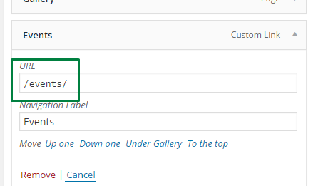
Creating Event Page
Event page basic information
- Event Page generated by the plugin and there is no options to change the position of the Event element on the page
- Test is suporting 3 views of the Event page that can be switched by the users of the page
- List
- Month
- Day
Was this article helpful ?
Team Shortcode
In Test you will find Team shortcode made specifically for this theme, which will let you show team members on your page.
How to use Team shortcode?
- Step 1 – go to the Pages > Add New in WP Dashboard
Create new page
- Step 2 – choose Team from the visual composer elements. If you have problems with finding it use the search option.
Event Shortcode
- Step 3 – choose options in Team Settings. You will be able to decide how this shortcode will act on your website.
- Show socials
- Limit – set limit of the Team members on the page
- Custom class – Adding custom class allows you to set diverse styles in css to the element. Type in name of class, which you defined in css. You can add as much classes as you like.
- Skip X elements – Allows to skip X elements from collection.
- Order – Set the order in which the items will be showing up.
- Order by – Order in which data should be fetched.
- Post id
- Excluded posts id
- Post slug – Filter by slug
- Post parent id – Filter by Parent ID
- Category name – Name of category to filter
- Tag name (slug) – Comma separated values: tag1,tag2 To exclude tags use ‘-‘ minus: -mytag will exclude tag ‘mytag’
- Keyword search – Show item with certain keyword
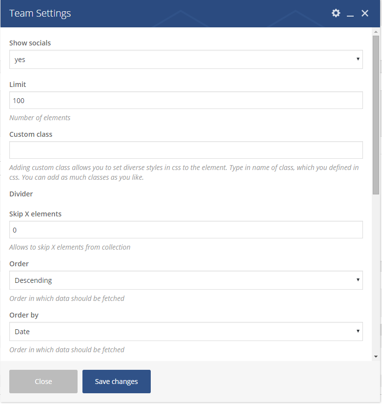
Team Settings
Remember to save the changes after you will done.

Team shortcode
Was this article helpful ?
Event Shortcode
In Test you will find made specifically for this theme Event shortcode that will let you show unlimited ammount of the Events you created.
How to Events shortcode?
- Step 1 – go to the Pages > Add New in WP Dashboard
Create new page
- Step 2 – choose Events from the visual composer elements. If you have problems with finding it use the search option.

Events Shortcode
- Step 3 – choose options in Event Settings. You will be able to set to options to decide how this shortcode will act on your website.
- Read more labe – Set the dext that you want to be shown in the button under each event
- Limit – set the limits of the Events shown on the page.

Event Settings
Remember to save the changes after you will done.
This shortcode is taking the Events from the Events section id the dashboard. If the date of the Event will be same as the actual day date it’s style will be changed to active.

Events
Was this article helpful ?
Recent Posts
In Test you will find made specifically for this theme Recent Posts shortcode that will let you show the latest posts on your page.
How to use Recent posts shortcode?
- Step 1 – go to the Pages > Add New in WP Dashboard
Create new page
- Step 2 – choose Team from the visual composer elements. If you have problems with finding it use the search option.
Event Shortcode
- Step 3 – choose options in Event Settings. You will be able to set to options to decide how this shortcode will act on your website.
- Total limit – total limit of the posts on the page.
- Post visible – number of posts that will be shown before show more posts.
- Product order by – order by what this posts will be shown on the page (title, price, date, order by last mofified date … )
- Products order – order in which the posts will be shown (descending or ascending)
- Show sticky post

Recent Posts
Remember to save the changes after you will done.

Example of recent posts
Was this article helpful ?
How to use different markers on the same map?
Creating new reference:
To achieve this you need to go to the shop-locator.js file. There you will find displayMarkers function. You will need to add there an extra reference for the .json file
|
1 |
icon: markerTable.icon |
Just like you can see on this image below:

adding reference
Now you can add different marker for each place you want to show on your map.
Adding markers:
Just go to the .json file where you are keeping all the json marker and add new field with the path to the image you want to use:

adding new field
Please remember: All of the locations in the .json file need to have icon field with the path to the image.
Was this article helpful ?
CSS files and structure
If you would like to edit the color, font, or style of any elements, you would do the following:
|
1 |
#primaryContent a {color: #someColor;} |
If you find that your new style is not overriding, it is most likely because of a specificity problem. Scroll down in your CSS file and make sure that there isn’t a similar style that has more weight.
I.E.
|
1 |
#wrap #primaryContent a {color: #someColor;} |
So, to ensure that your new styles are applied, make sure that they carry enough “weight” and that there isn’t a style lower in the CSS file that is being applied after yours.
Colors
The theme includes a css file wich you can use to edit the colors.
You just need to add the corresponding CSS file to the head of the page like this:
|
1 2 3 4 5 |
<head> (..) <link rel="stylesheet" type="text/css" href="css/motive.css"> (..) </head> |
Icons
We’ve included 360+ font icons.
Awesome Icons – http://fontawesome.io/icons/
HTML markup:
|
1 2 |
<!-- Awesome Icons --> <i class="fa fa-cog"></i> |
CSS Files & Structure
We’ve included 2 files.
bootstrap.css contains Bootstrap 3 Library.
style.css file contains general styles.
style.less
1. Font Awesome
2. Typography
3. Buttons
4. Form
5. Menu
6. Widget
7. Footer
8. Slick
9. Icon BOx
10. Price table
11. Testimonials
12. Warning section
13. Coupons
14. Careers section
15. About Us
16. Light Gallery
17. Date picker
18. Utilities
Was this article helpful ?
Javascript Components
JavaScript files:
- jQuery
- slick carousel http://kenwheeler.github.io/slick/
- light gallery http://sachinchoolur.github.io/lightGallery/
- datapicker bootstrap https://bootstrap-datepicker.readthedocs.org/en/latest/
- isotope http://isotope.metafizzy.co/
- browser js
- device js
Screenshot

Was this article helpful ?
Navigation
Navigation is really important part of the theme. In Test we have one version of the navigation bar. The menu markup also contains search bar.
- Default Navigation
HTML markup
|
1 2 3 4 5 6 7 8 9 10 11 12 13 14 15 16 17 18 19 20 21 22 23 24 25 26 27 28 29 30 31 32 33 34 35 36 37 38 39 40 41 42 43 44 45 46 47 48 49 50 51 52 53 54 55 56 57 58 59 60 61 |
<nav class="navbar ct-u-backgroundLightGray hidden-xs"> <div class="container ct-navbar-container"> <div class="row"> <ul class="navbar-left ct-u-paddingBoth20 col-lg-9"> <li class="active"><a href="index.html"><span>Home</span></a></li> <li class="dropdown"><a href="#" data-toggle="dropdown" class="dropdown-toggle"><span>About us</span><span class="caret"></span></a> <ul class="dropdown-menu"> <li><a href="about-us.html">Who we are</a></li> <li><a href="history.html">Our history</a></li> <li><a href="team.html">Meet the team</a></li> <li><a href="reviews.html">Reviews</a></li> <li><a href="careers.html">Careers</a></li> </ul> </li> <li class="dropdown"><a href="#" data-toggle="dropdown" class="dropdown-toggle"><span>Services</span><span class="caret"></span></a> <ul class="dropdown-menu"> <li><a href="services_overview.html">Services overview</a></li> <li><a href="preventive_maintenance.html">Preventive Maintenance</a></li> <li><a href="oil_change.html">Oil Change</a></li> <li><a href="tires.html">Tires & Tire Repair</a></li> <li><a href="brakes.html">Brakes & Brake Repair</a></li> <li><a href="mufflers.html">Mufflers & Exhaust</a></li> <li><a href="steering.html">Steering & Suspension</a></li> <li><a href="batteries.html">Batteries, Starters & Charging</a></li> <li><a href="climate.html">Climate Control</a></li> <li><a href="belts.html">Belts & Hoses</a></li> <li><a href="engine.html">Engine Cooling</a></li> <li><a href="check_engine.html">Check Engine Light</a></li> <li><a href="lights.html">Lights, Wipers & Accessories</a></li> </ul> </li> <li><a href="appointments.html"><span>Appointments</span></a></li> <li><a href="coupons.html"><span>Coupons</span></a></li> <li><a href="faq.html"><span>Faq</span></a></li> <li class="dropdown"><a href="#" data-toggle="dropdown" class="dropdown-toggle"><span>Blog</span><span class="caret"></span></a> <ul class="dropdown-menu"> <li><a href="blog.html">Blog</a></li> <li><a href="blog-post.html">Single post</a></li> </ul> </li> <li><a href="contact.html"><span>Contact us</span></a></li> </ul> <button class="btn-search ct-tablet-searcher"><i class="fa fa-search"></i></button> <div class="col-lg-3 ct-parent ct-desktop-searcher"> <div class="ct-navSearcher ct-child" style="width: 491px;"> <form class="navbar-form navbar-form--default pull-left" role="search"> <div class="form-group"> <button class="btn-search"><i class="fa fa-search"></i></button> <input type="text" class="form-control empty ct-u-backgroundDarkGray" id="iconified" placeholder="Search"> </div> </form> </div> </div> </div> </div> </nav> |
Screenshots

Default navigation
Was this article helpful ?
Accordion
Accordions are useful when you want to hide and show large amount of content
HTML markup
|
1 2 3 4 5 6 7 8 9 10 11 12 13 14 |
<div id="accordion" class="panel-group"> <div class="panel panel-default"> <div class="panel-heading"> <h4 class="panel-title"> <a class="" data-toggle="collapse" data-parent="#accordion" href="#collapseTwo">How do I know which auto service to trust?</a> </h4> </div> <div id="collapseTwo" class="panel-collapse collapse in"> <div class="panel-body"> <p>Praesent auctor velit nec libero volutpat, vel pellentesque arcu tincidunt. Phasellus nec nisi imperdiet, tincidunt mi et, rhoncus nisl. Nullam sed leo ut lacus aliquam venenatis ut vestibulum felis. Nulla bibendum diam eu tortor faucibus molestie. Pellentesque venenatis rhoncus volutpat. Fusce ut sodales est, turpis. Donec eget feugiat est lacus tincidunt gravida quis felis rhoncus.</p> </div> </div> </div> </div> |
Screenshot

Accordion
Was this article helpful ?
Isotope
To create a isotope item please used the HTML markup from below
HTML markup
|
1 2 3 4 5 6 7 8 9 10 11 12 |
<figure class="grid-sizer grid-item ct-isotope-item" style="position: absolute; left: 0%; top: 0px;"> <div class="ct-isotope-item-inner"> <div class="ct-isotope-item__media"> <a href="preventive_maintenance.html"><img src="assets/images/gallery-01.jpg" alt="Gallery Item"></a> <div class="ct-isotope-item__inner"> <a href="preventive_maintenance.html"><h3 class="ct-services-header"> Preventive maintenance </h3></a> </div> </div> </div> </figure> |
Screenshot

Isotope item
JavaScript
|
1 2 3 4 5 6 7 8 9 10 11 12 13 14 15 16 17 18 19 20 21 22 23 24 25 26 27 28 29 30 31 32 33 34 35 36 37 38 39 40 41 42 43 44 45 46 47 48 49 50 51 52 53 54 55 56 57 58 59 60 |
$(window).on('load', function() { /* Isotope */ var isotope_gallery = function() { var isotope_filter, isotope_load; if ($().isotope) { isotope_gallery = $('.ct-isotope-gallery'); isotope_filter = $('.ct-isotope-filtering button'); isotope_load = $('#load-more'); isotope_gallery.isotope({ itemSelector: '.ct-isotope-item', percentPosition: true, masonry: { columnWidth: '.grid-sizer' } }); isotope_filter.on(clickEvent, function() { var filter_value, that; that = $(this); isotope_filter.removeClass('is-active'); that.addClass('is-active'); filter_value = that.attr('data-filter'); return isotope_gallery.isotope({ filter: filter_value }); }); return isotope_load.on(clickEvent, function() { var load_name, load_page, response, that; that = $(this); load_name = that.attr('data-load-name'); load_page = parseInt(that.attr('data-load-page')); response = ''; $.ajax({ type: 'GET', url: load_name + load_page + '.html', async: false, success: function(value) { response = value; return isotope_gallery.isotope('insert', $(response)); }, complete: function() { return $.ajax({ type: 'GET', url: load_name + (load_page + 1) + '.html', async: false, error: function() { return that.parent().remove(); } }); } }); return that.attr('data-load-page', load_page + 1); }); } }; isotope_gallery(); }); |
Isotope Documentation can be found here Files are bundled inside main.js & style.css
Was this article helpful ?
Blog Posts
In Test we have 4 types of blog posts you can created using this markups:
Blog Image
HTML markup
|
1 2 3 4 5 6 7 8 9 10 11 12 13 14 15 16 17 18 19 |
<article class="ct-blog-post ct-blog-post--image ct-u-paddingTop40 ct-u-paddingBottom80"> <div class="ct-blog-post--media"> <img src="assets/images/blog_img1.jpg" alt=""> </div> <div class="ct-blog-post--body"> <div class="ct-blog-post--description"><h6>Posted by Richard on February 15, 2015 in Images, 4 comments</h6> </div> <div class="ct-blog-post--title"><h1><a href=""></a><a href="blog-post.html">Car hacks to instantly improve every drive</a></h1></div> <div class="ct-blog-post--content"><p>Aliquam dui magna, viverra sit amet lobortis id, fermentum dictum nisi. Nam maximus ullamcorper posuere mollis. Aliquam pharetra ante et velit commodo, et bibendum ante venenatis. Phasellus commodo velit nisl, non tempus lacus faucibus. In neque elit, mattis non purus eu, accumsan at massa id tincidunt. Morbi in varius mi, nec ullamcorper erat.</p> </div> </div> <a href="blog-post.html" class=""><h6 class="ct-fw-700 text-uppercase ct-linkHeader">Read more<i class="fa fa-caret-right"></i></h6></a> </article> |
Screenshot

Blog image
Blog Simple
HTML markup
|
1 2 3 4 5 6 7 8 9 10 11 12 13 14 15 16 17 18 19 20 21 22 |
<article class="ct-blog-post ct-u-paddingTop40 ct-u-paddingBottom80"> <div class="ct-blog-post--media"> </div> <div class="ct-blog-post--body"> <div class="ct-blog-post--description"><h6>Posted by Richard on February 12, 2015 in News and updates, Leave a comment</h6> </div> <div class="ct-blog-post--title"><h1><a href="blog-post.html">Spring is right around the corner: how to get your vehicle ready for warmer weather</a></h1> </div> <div class="ct-blog-post--content"><p>Aliquam interdum dolor et sapien semper scelerisque. Suspendisse neque turpis, venenatis eget porta cursus, cursus at justo. Nullam id ipsum vitae turpis pellentesque faucibus. Nulla consequat arcu vel iaculis ultricies. Cras bibendum maximus libero eget malesuada. Mauris pretium tellus in neque pharetra, vitae fermentum mi dignissim. Vivamus nulla sem, commodo at consequat nec.</p> </div> </div> <a href="blog-post.html" class=""><h6 class="ct-fw-700 text-uppercase ct-linkHeader">Read more<i class="fa fa-caret-right"></i></h6></a> </article> |
Screenshot

Blog simple
Blog Gallery
HTML markup
|
1 2 3 4 5 6 7 8 9 10 11 12 13 14 15 16 17 18 19 20 21 22 23 24 25 26 27 28 |
<article class="ct-blog-post ct-blog-post--gallery ct-u-paddingTop40 ct-u-paddingBottom80"> <div class="ct-blog-post--media"> <div class="row"> <div class="col-lg-4 text-center ct-u-paddingBottom30"><img src="assets/images/blog_img2.jpg" alt=""></div> <div class="col-lg-4 text-center ct-u-paddingBottom30"><img src="assets/images/blog_img3.jpg" alt=""></div> <div class="col-lg-4 text-center ct-u-paddingBottom30"> <img src="assets/images/blog_img4.jpg" alt=""></div> </div> <div class="row"> <div class="col-lg-4 text-center ct-u-paddingBottom30"><img src="assets/images/blog_img5.jpg" alt=""></div> <div class="col-lg-4 text-center ct-u-paddingBottom30"><img src="assets/images/blog_img6.jpg" alt=""></div> <div class="col-lg-4 text-center ct-u-paddingBottom30"><img src="assets/images/blog_img7.jpg" alt=""></div> </div> </div> <div class="ct-blog-post--body"> <div class="ct-blog-post--description"><h6>Posted by Richard on February 7, 2015 in Gallery, Images, 2 comments</h6> </div> <div class="ct-blog-post--title"><h1><a href="blog-post.html">Buying a used vehicle? What to look for</a></h1> </div> <div class="ct-blog-post--content"><p>Fusce vel tristique nunc. Aenean tempus, diam quis laoreet gravida, lectus sem lobortis orci, id ultricies turpis metus in arcu. Proin ullamcorper diam fringilla mi volutpat convallis. Sed tortor orci, lacinia ut leo quis, congue varius est. In hac habitasse platea dictumst. Etiam pulvinar pellentesque lorem, vel tempus purus vestibulum vitae. Maecenas lorem convallis consectetur.</p> </div> </div> <a href="blog-post.html" class=""><h6 class="ct-fw-700 text-uppercase ct-linkHeader">Read more<i class="fa fa-caret-right"></i></h6></a> </article> |
Screenshot

Blog gallery
Blog Video
HTML markup
|
1 2 3 4 5 6 7 8 9 10 11 12 13 14 15 16 17 18 19 20 21 22 23 |
<article class="ct-blog-post ct-blog-post--video ct-u-paddingTop40 ct-u-paddingBottom80"> <div class="ct-blog-post--media"> <div class="embed-responsive embed-responsive-16by9"> <iframe class="embed-responsive-item" src="//www.youtube.com/embed/ePbKGoIGAXY"></iframe> </div> </div> <div class="ct-blog-post--body"> <div class="ct-blog-post--description"><h6>Posted by Richard on February 3, 2015 in Videos, 1 comment</h6> </div> <div class="ct-blog-post--title"><h1><a href="blog-post.html">What is a Car Inspection?</a></h1> </div> <div class="ct-blog-post--content"><p>Aliquam dui magna, viverra sit amet lobortis id, fermentum dictum nisi. Nam maximus ullamcorper posuere mollis. Aliquam pharetra ante et velit commodo, et bibendum ante venenatis. Phasellus commodo velit nisl, non tempus lacus faucibus. In neque elit, mattis non purus eu, accumsan at massa id tincidunt. Morbi in varius mi, nec ullamcorper erat.</p> </div> </div> <a href="blog-post.html" class=""><h6 class="ct-fw-700 text-uppercase ct-linkHeader">Read more<i class="fa fa-caret-right"></i></h6></a> </article> |
Screenshot

Blog video
Was this article helpful ?
Short Info Box
Not all of the important information need to be long! With Test we presents you short info box !
HTML markup
|
1 2 3 4 5 6 |
<div class="about-desc"> <h4>Skills</h4> <h6>Pellentesque posuere luctus . Aenean dictum mollis dignissim. Pellentesque interdum dictum quam, vitae finibus tortor condimentum sed. Donec egestas tincidunt hendrerit.</h6> </div> |
Screenshot

Short info box
Was this article helpful ?
Person Box
If you want to show people you are working with this is a good solution
HTML markup
|
1 2 3 4 5 6 7 8 9 10 11 |
<div class="media person-box"> <a href="team.html"> <div class="media-left"> <img class="media-object" src="assets/images/person1.jpg" alt="person"> </div> <div class="media-body ct-fw-700"> <h3 class="media-heading">Gregory Evans</h3> <h6>Owner</h6> </div> </a> </div> |
Screenshot

Person box
Was this article helpful ?
Team Box
If you want to show some basic information about your co-workers team box is the best solution.
HTML markup
|
1 2 3 4 5 6 7 8 9 10 11 12 13 14 15 16 17 18 19 |
<div class="team-box"> <div class="caption-box"> <div class="caption upper"> <h4>James Strasser</h4> <h6>Automotive & Small engine technician</h6> </div> <img src="assets/images/team.jpg" alt=""> </div> <div class="caption-box"> <div class="caption upper"> <h4>Anne Simmons</h4> <h6>Office manager</h6> </div> <img src="assets/images/team.jpg" alt=""> </div> </div> |
Screenshot

Team box
Was this article helpful ?
Reviews with infinite scroll and isotope
HTML markup
|
1 2 3 4 5 6 7 8 9 10 11 12 13 14 15 16 17 18 19 20 21 22 23 24 25 26 |
<div class="ct-isotope-container ct-u-paddingBoth50"> <div class="grid ct-isotope-gallery" style="position: relative; height: 1132px;"> <figure class="grid-sizer grid-item ct-isotope-item" style="position: absolute; left: 0%; top: 0px;"> <div class="ct-isotope-item-inner"> <div class="ct-isotope-item__media"> <div class="ct-testimonials ct-testimonials--sideMenu ct-u-paddingBottom70"> <div class="ct-testimonials-box"> <div class="ct-testimonials-text"> <h3>Julie D. <img src="assets/images/stars.png" alt="stars" class="pull-right"> </h3> <h6>Feb 21, 2015</h6> <h5>Cras pharetra nunc ac magna pulvinar, id porttitor leo suscipit. Gravida urna sit amet accumsan imperdiet. Aenean facilisis ut tellus ut viverra. Vestibulum magna magna, ultricies condimentum non!</h5> </div> </div> </div> </div> </div> </figure> </div> <div class="text-center ct-u-paddingBoth30"> <button id="load-more" class="btn btn-black" data-load-name="review" data-load-page="1">Load more reviews</button> </div> </div> |
and other “reviews” will be loaded from other html file. Example full html file named review1.html [important]:
|
1 2 3 4 5 6 7 8 9 10 11 12 13 14 15 16 17 18 19 20 21 22 23 24 25 26 27 28 29 30 31 32 33 34 35 36 37 38 39 40 41 42 43 44 45 46 47 48 |
<figure class="grid-item ct-isotope-item"> <div class="ct-isotope-item-inner"> <div class="ct-isotope-item__media"> <div class="ct-testimonials ct-testimonials--sideMenu ct-u-paddingBottom70"> <div class="ct-testimonials-box"> <div class="ct-testimonials-text"> <h3>Gerald Schwartz <img src="assets/images/stars.png" alt="stars" class="pull-right"> </h3> <h6>Jan 31, 2015</h6> <h5>Nulla porta auctor nunc non lacinia. Aliquam tempus mauris at sem mattis, nec varius neque scelerisque. Integer ornare, massa vulputate mattis dapibus, erat metus suscipit augue, placerat fringilla arcu elit at est.</h5> </div> </div> </div> </div> </div> </figure> <figure class="grid-item ct-isotope-item"> <div class="ct-isotope-item-inner"> <div class="ct-isotope-item__media"> <div class="ct-testimonials ct-testimonials--sideMenu ct-u-paddingBottom70" > <div class="ct-testimonials-box"> <div class="ct-testimonials-text"> <h3>Edward C. <img src="assets/images/stars.png" alt="stars" class="pull-right"> </h3> <h6>Feb 7, 2015</h6> <h5>Class aptent taciti sociosqu ad litora torquent per conubia nostra, per inceptos himenaeos.</h5> </div> </div> </div> </div> </div> </figure> <figure class="grid-item ct-isotope-item"> <div class="ct-isotope-item-inner"> <div class="ct-isotope-item__media"> <div class="ct-testimonials ct-testimonials--sideMenu ct-u-paddingBottom70"> <div class="ct-testimonials-box"> <div class="ct-testimonials-text"> <h3>Barry Balderston <img src="assets/images/stars.png" alt="stars" class="pull-right"> </h3> <h6>Jan 9, 2015</h6> <h5>Ut ac nibh quis mauris imperdiet hendrerit. Nunc quis risus rutrum, blandit ex at, vulputate nunc. Nunc maximus feugiat porttitor. </h5> </div> </div> </div> </div> </div> </figure> |
JavaScript
|
1 2 3 4 5 6 7 8 9 10 11 12 13 14 15 16 17 18 19 20 21 22 23 24 25 26 27 28 29 30 31 32 33 34 35 36 37 38 39 40 41 42 43 44 45 46 47 48 49 50 51 52 53 54 55 56 57 58 59 60 |
$(window).on('load', function() { /* Isotope */ var isotope_gallery = function() { var isotope_filter, isotope_load; if ($().isotope) { isotope_gallery = $('.ct-isotope-gallery'); isotope_filter = $('.ct-isotope-filtering button'); isotope_load = $('#load-more'); isotope_gallery.isotope({ itemSelector: '.ct-isotope-item', percentPosition: true, masonry: { columnWidth: '.grid-sizer' } }); isotope_filter.on(clickEvent, function() { var filter_value, that; that = $(this); isotope_filter.removeClass('is-active'); that.addClass('is-active'); filter_value = that.attr('data-filter'); return isotope_gallery.isotope({ filter: filter_value }); }); return isotope_load.on(clickEvent, function() { var load_name, load_page, response, that; that = $(this); load_name = that.attr('data-load-name'); load_page = parseInt(that.attr('data-load-page')); response = ''; $.ajax({ type: 'GET', url: load_name + load_page + '.html', async: false, success: function(value) { response = value; return isotope_gallery.isotope('insert', $(response)); }, complete: function() { return $.ajax({ type: 'GET', url: load_name + (load_page + 1) + '.html', async: false, error: function() { return that.parent().remove(); } }); } }); return that.attr('data-load-page', load_page + 1); }); } }; isotope_gallery(); }); |
Screenshot

Reviews with infinite scroll and isotope
Was this article helpful ?
Job Box
Present your offer with clean and simple tables by just adding this HTML markup:
HTML markup
|
1 2 3 4 5 6 7 |
<div class="ct-jobBox"> <h6>Feb 9, 2015</h6> <h4>B-level mechanical technician</h4> <a class="btn btn-black btn-sm" href="job_offer.html">apply now</a> </div> |
Screenshot

Job box
Was this article helpful ?
Fancy Contact Form
All needed files are in /form directory.
Remember to includeon page.
To configure form just edit form/config.php and change e-mails to your own :
|
1 2 |
$to = "mail@example.com"; $from = "mail@example.com"; |
That’s it!
HTML markup:
|
1 2 3 4 5 6 7 8 9 10 11 12 13 14 15 16 17 18 19 20 21 22 23 24 25 26 27 28 29 30 31 32 33 34 35 36 37 38 39 40 41 42 43 44 45 46 47 48 49 50 51 52 53 54 55 56 57 58 59 60 61 62 63 64 65 66 67 68 69 70 71 72 73 74 75 76 77 78 79 80 81 82 83 84 85 86 87 88 89 90 91 92 93 94 95 96 97 98 99 100 101 102 103 104 105 106 107 108 109 110 111 112 113 114 115 116 117 118 119 120 121 122 123 124 125 126 127 128 129 130 131 132 133 134 135 136 137 138 139 140 141 142 143 144 145 146 147 148 149 150 151 152 153 154 155 156 157 158 159 160 161 162 163 164 165 166 167 168 169 170 171 172 173 174 175 176 177 178 179 180 181 182 183 184 185 186 187 188 189 190 191 192 193 194 195 196 197 198 199 200 201 202 203 204 205 206 207 208 209 210 211 212 213 214 215 216 217 218 219 220 221 222 223 224 225 226 227 228 229 230 231 232 233 234 235 236 237 238 239 240 241 242 243 244 245 |
<form action="assets/form/send.php" method="POST" data-email-subject="My Rota" class="ct-js-validate ct-formAppointment"> <div class="form-header"><h4 class="text-uppercase">Personal information</h4></div> <div class="form-group"> <label for="full_name" class="col-sm-2 control-label short-label">Your full name <span>*</span></label> <div class="col-sm-10"> <input type="text" class="form-control ct-input" id="full_name" placeholder="" data-placeholder="Your full name" name="field[]" required="required"> </div> </div> <div class="form-group"> <label for="email" class="col-sm-2 control-label short-label">Email address <span>*</span></label> <div class="col-sm-10"> <input type="email" class="form-control ct-input" id="email" placeholder="" data-placeholder="Email address" name="field[]" required="required"> </div> </div> <div class="form-group"> <label for="phone_number" class="col-sm-2 control-label short-label">Phone number<span>*</span></label> <div class="col-sm-10"> <input type="text" class="form-control ct-input ct-input--short" data-placeholder="Phone number" id="phone_number" placeholder="" name="field[]" required="required"> </div> </div> <div class="form-header"><h4 class="text-uppercase">Vehicle information</h4></div> <div class="form-group"> <label for="year" class="col-sm-2 control-label short-label">Year<span>*</span></label> <div class="col-sm-10"> <select class="form-control ct-input ct-input--short" id="year" data-placeholder="Year" name="field[]" required="required"> <option>2011</option> <option>2012</option> <option>2013</option> <option>2014</option> <option>2015</option> </select> </div> </div> <div class="form-group"> <label for="make" class="col-sm-2 control-label short-label">Make<span>*</span></label> <div class="col-sm-10"> <select class="form-control ct-input" data-for="model" id="make" data-placeholder="Make" name="field[]" required="required"> <option>Volkswagen</option> <option>Toyota</option> <option>Honda</option> <option>BMW</option> <option>Mercedes</option> </select> </div> </div> <div class="form-group"> <label for="model" class="col-sm-2 control-label short-label">Model<span>*</span></label> <div class="col-sm-10"> <select class="form-control ct-input" data-target="model" data-for="submodel" id="model" disabled="" data-placeholder="Model" name="field[]" required="required"> <option value="" disabled="" selected="">Select model...</option> <option>1</option> <option>2</option> <option>3</option> <option>4</option> <option>5</option> </select> </div> </div> <div class="form-group"> <label for="submodel" class="col-sm-2 control-label short-label">Submodel</label> <div class="col-sm-10"> <select class="form-control ct-input" id="submodel" data-target="submodel" data-placeholder="Submodel" disabled="" name="field[]"> <option value="" disabled="" selected="">Select submodel...</option> <option>1</option> <option>2</option> <option>3</option> <option>4</option> <option>5</option> </select> </div> </div> <div class="form-group"> <label for="mileage" class="col-sm-2 control-label short-label">Mileage</label> <div class="col-sm-10"> <select class="form-control ct-input" id="mileage" data-placeholder="Mileage" name="field[]"> <option value="" disabled="" selected="">Select mileage...</option> <option>1</option> <option>2</option> <option>3</option> <option>4</option> <option>5</option> </select> </div> </div> <div class="form-header"><h4 class="text-uppercase">Appointment information</h4></div> <div class="form-group "> <label for="waiting" class="col-sm-2 control-label">Waiting or Drop off <span>*</span></label> <div class="col-sm-10"> <select class="form-control ct-input ct-input--medium" id="waiting" data-placeholder="Waiting or Drop" name="field[]" required="required"> <option value="" disabled="" selected="">Select an option...</option> <option>Waiting</option> <option>Drop off</option> </select> </div> </div> <div class="form-group"> <label for="date" class="col-sm-2 control-label short-label">Date <span>*</span></label> <div class="col-sm-10"> <input type="text" class="form-control ct-input ct-input--short datepicker" data-placeholder="Date" id="date" placeholder="" name="field[]" required="required"> </div> </div> <div class="form-group "> <label for="time" class="col-sm-2 control-label short-label">Time<span>*</span></label> <div class="col-sm-10"> <select class="form-control ct-input ct-input--short" id="time" data-placeholder="Time" name="field[]" required="required"> <option value="" disabled="" selected="">Select time...</option> <option>1</option> <option>2</option> <option>3</option> <option>4</option> <option>5</option> </select> </div> </div> <div class="form-header"><h4 class="text-uppercase">Services requested</h4></div> <div class="form-group"> <div class="container"> <div class="row"> <div class="col-md-1 col-xs-12 label-services"> <label class="label-checkbox">Services <span>*</span></label> </div> <div class="col-md-3"> <ul> <li><label class="checkbox-inline"> <input type="checkbox" value="" data-placeholder="Preventive maintenance" name="field[]"> Preventive maintenance </label></li> <li><label class="checkbox-inline"> <input type="checkbox" value="" data-placeholder="Oil change" name="field[]"> Oil change </label></li> <li><label class="checkbox-inline"> <input type="checkbox" value="" data-placeholder="Brakes & Brake repair" name="field[]"> Brakes & Brake repair </label></li> <li><label class="checkbox-inline"> <input type="checkbox" value="" data-placeholder="Tires & Tire repair" name="field[]"> Tires & Tire repair </label></li> <li><label class="checkbox-inline"> <input type="checkbox" value="" data-placeholder="Mufflers & Exhaust" name="field[]"> Mufflers & Exhaust </label></li> <li><label class="checkbox-inline"> <input type="checkbox" value="" data-placeholder="Steering & Suspension" name="field[]"> Steering & Suspension </label></li> <li><label class="checkbox-inline"> <input type="checkbox" value="" data-placeholder="Batteries, Starters & Charging" name="field[]"> Batteries, Starters & Charging </label></li> </ul> </div> <div class="col-md-3"> <ul> <li><label class="checkbox-inline"> <input type="checkbox" value="" data-placeholder="Engine cooling" name="field[]"> Engine cooling </label></li> <li><label class="checkbox-inline"> <input type="checkbox" value="" data-placeholder="Climate control" name="field[]"> Climate control </label></li> <li><label class="checkbox-inline"> <input type="checkbox" value="" data-placeholder="Check engine light" name="field[]"> Check engine light </label></li> <li><label class="checkbox-inline"> <input type="checkbox" value="" data-placeholder="Belts & Hoses" name="field[]"> Belts & Hoses </label></li> <li><label class="checkbox-inline"> <input type="checkbox" value="" data-placeholder="Lights, Wipers & Accessories" name="field[]"> Lights, Wipers & Accessories </label></li> <li><label class="checkbox-inline"> <input type="checkbox" value="" data-placeholder="Other" name="field[]"> Other </label></li> </ul> </div> </div> </div> </div> <div class="form-group"> <label for="desc" class="col-lg-2 col-md-2 col-sm-12 control-label">Describe service request</label> <div class="col-lg-10 col-md-10 col-sm-12"> <textarea class="form-control ct-input ct-input--wide" id="desc" data-placeholder="Describe service request" placeholder="" name="field[]"> </textarea> </div> </div> <div class="btn-group ct-u-paddingBoth20"> <button type="submit" class="btn btn-accent">schedule it now</button> </div> <div role="alert" class="successMessage alert alert-success alert-dismissible"> <button type="button" data-dismiss="alert" aria-label="Close" class="close"><span aria-hidden="true">×</span> </button> Your Email has been sent successfully. </div> <div role="alert" class="errorMessage alert alert-danger alert-dismissible"> <button type="button" data-dismiss="alert" aria-label="Close" class="close"><span aria-hidden="true">×</span> </button> Ups, something went wrong. </div> </form> |
Java Script
|
1 2 3 4 5 6 7 8 9 10 11 12 13 14 15 16 17 18 19 20 21 22 23 24 25 26 27 28 29 30 31 32 33 34 35 36 37 38 39 40 41 42 43 44 45 46 47 48 |
$(document).ready(function () { var dfor = $('[data-for]'), dtarget = $('[data-target]'); dfor.each(function(){ var that = $(this); that.change(function(){ if(that.val()) { var index = -1, dataFor = that.attr("data-for"), counter = -1; dtarget.each(function(){ var thiz = $(this), target = thiz.attr("data-target"), ind = target.indexOf(dataFor); counter++; if(ind > -1) { index = counter; return false; } }); if(index > -1) { $(dtarget[index]).prop('disabled', false); } } }); }); //datapicker var datapicker = $('.datepicker'); if(datapicker.length) { datapicker.datepicker({ format: 'mm/dd/yyyy' }); } }); |
Screenshot

Fancy contact form
Options (can be changed in HTML) :
- Mail Subject – just change value in :
- Success Message – change successMessage div content
- Error Message – change errorMessage div content
Was this article helpful ?
Pricing table
Present your prices by just adding this simple HTML markup:
HTML markup
|
1 2 3 4 5 6 7 8 9 10 11 12 13 14 15 16 17 18 19 20 21 22 23 24 25 26 27 28 29 30 31 32 33 34 35 36 37 38 39 |
<article class="ct-pricingBox ct-u-backgroundWhite" data-height="555" style="min-height: 555px;"> <div class="ct-pricingBox-header text-center ct-fw-700"> <h3>Great savings</h3> <h1 class="text-uppercase ct-u-marginBoth10">15<span>%</span> off</h1> <h4>any service (excludes tax) with student ID</h4> </div> <div class="ct-pricingBox-desc"> <h5>Brakes, Exhaust, Fluids, Factory maintenance service, Suspension, Wheel alignments, Belts, Hoses, Headlamps, Bulbs & more.</h5> </div> <div class="ct-pricingBox-logo"> <div class="media"> <div class="media-left"> <img class="media-object" src="assets/images/logo.png" alt="logo"> </div> <div class="media-body"> <h6 class="ct-fw-400">Must present coupon. Most cars. Discount off regular price. Consumer pays all tax. One coupon per total invoice. Not valid with other offers.</h6> </div> </div> </div> <div class="ct-pricingBox-btn text-center"> <div class="btn-group ct-u-paddingBoth10"> <button type="button" class="btn"><img src="assets/images/print.png" alt="print"> </button> <button class="btn btn-accent">Print this coupon</button> </div> </div> <div class="ct-pricingBox-footer ct-fw-400"> <h6 class="pull-left">Expires 11/16/2015</h6> <h6 class="pull-right">BD724NA</h6> </div> </article> |
Screenshot

Pricing tables
Was this article helpful ?
Pagination
To add pagination, use the simple HTML markup:
HTML markup
|
1 2 3 4 5 6 7 8 9 10 11 |
<div class="ct-pagination pagination-centered"> <ul> <li class="pull-left"><a href="#"><i class="fa fa-caret-left"></i> prev page</a></li> <li class="ct-pagination--numbers"><a href="#">1</a></li> <li class="active ct-pagination--numbers"><a href="#">2</a></li> <li class="ct-pagination--numbers"><a href="#">3</a></li> <li class="disabled ct-pagination--numbers"><a href="#">...</a></li> <li class="ct-pagination--numbers"><a href="#">12</a></li> <li class="pull-right"><a href="#">next page <i class="fa fa-caret-right"></i></a></li> </ul> </div> |
Screenshot

Pagination
Was this article helpful ?
Sliders
— Basic slider markup
HTML markup
|
1 2 3 4 5 |
<div class="ct-slick ct-js-slick"> <div class="item">...</div> ... <div class="item">...</div> </div> |
–Main Slider
HTML markup
|
1 2 3 4 5 6 7 8 9 10 11 12 13 14 15 16 17 18 19 20 21 22 23 24 25 26 27 28 29 30 31 32 33 34 35 36 37 38 39 40 41 42 43 44 45 46 47 48 49 50 51 52 53 54 55 56 57 |
<div class="ct-slick ct-js-slick"> <div class="ct-slick ct-js-slick ct-mainSlider ct-slick-arrow--type1 ct-slick-dots--type1" data-autoplay="false" data-arrows="true" data-dots="true" data-items="1" data-height="550"> <div class="item" data-background="assets/images/background-1.jpg" data-height="550"> <div class="item-inner container"> <div class="row"> <div class="col-lg-5 col-md-6 col-sm-8 col-xs-10 slider-header"> <h1 class="ct-fw-700">We’ll have you up and running in no time</h1> </div> </div> <div class="row"> <div class="col-lg-5 col-md-6 ct-u-marginTop10"> <a href="about-us.html" class="btn btn-white btn-slider--motive">Learn how</a> <span>or</span> <a href="appointments.html" class="btn btn-white">Make appointment</a> </div> </div> </div> </div> <div class="item" data-background="assets/images/background-1.jpg "> <div class="item-inner container"> <div class="row"> <div class="col-lg-5 col-md-6 col-sm-8 col-xs-10 slider-header"> <h1 class="ct-fw-700">We’ll have you up and running in no time</h1> </div> </div> <div class="row"> <div class="col-lg-5 col-md-6 ct-u-marginTop10"> <a href="about-us.html" class="btn btn-white btn-slider--motive">Learn how</a> <span>or</span> <a href="appointments.html" class="btn btn-white">Make appointment</a> </div> </div> </div> </div> <div class="item" data-background="assets/images/background-1.jpg"> <div class="item-inner container"> <div class="row"> <div class="col-lg-5 col-md-6 col-sm-8 col-xs-10 slider-header"> <h1 class="ct-fw-700">We’ll have you up and running in no time</h1> </div> </div> <div class="row"> <div class="col-lg-5 col-md-6 ct-u-marginTop10"> <a href="about-us.html" class="btn btn-white btn-slider--motive">Learn how</a> <span>or</span> <a href="appointments.html" class="btn btn-white">Make appointment</a> </div> </div> </div> </div> </div> ... </div> |
Screenshot

Main slider
Slick Documentation can be found here Files are bundled inside style.css and main.js
Was this article helpful ?
Light Gallery
HTML markup
|
1 2 3 4 5 6 7 8 9 10 11 12 13 14 15 16 17 18 19 20 21 22 23 24 25 26 27 28 29 30 31 32 33 34 35 36 37 38 39 40 41 42 43 44 45 |
<div class="ct-js-lightGallery"> <a href="assets/images/pic_1.jpg"> <div class="item"> <div class="item-inner"> <img src="assets/images/pic_1.jpg" alt=""> </div> </div> </a> <a href="assets/images/pic_2.jpg"> <div class="item"> <div class="item-inner"> <img src="assets/images/pic_2.jpg" alt=""> </div> </div> </a> <a href="assets/images/pic_3.jpg"> <div class="item"> <div class="item-inner"> <img src="assets/images/pic_3.jpg" alt=""> </div> </div> </a> <a href="assets/images/pic_4.jpg"> <div class="item"> <div class="item-inner"> <img src="assets/images/pic_4.jpg" alt=""> </div> </div> </a> <a href="assets/images/pic_5.jpg"> <div class="item"> <div class="item-inner"> <img src="assets/images/pic_5.jpg" alt=""> </div> </div> </a> <a href="assets/images/pic_6.jpg"> <div class="item"> <div class="item-inner"> <img src="assets/images/pic_6.jpg" alt=""> </div> </div> </a> </div> |
Screenshot

Light gallery
LightGallery Documentation can be found here. Files are bundled inside main.js & style.css
Was this article helpful ?
Map with single marker
HTML markup
|
1 |
<div data-address="Tattersalls Ln, Melbourne" class="ct-googleMap ct-js-googleMap ct-u-backgroundLightBlack"></div> |
JavaScrip
|
1 2 3 4 5 6 7 8 9 10 11 12 13 14 15 16 17 18 19 20 21 22 23 24 25 26 27 28 29 30 31 32 33 34 35 36 37 38 39 40 41 42 43 44 45 46 47 48 49 50 51 52 53 54 55 56 57 58 59 60 61 62 63 |
<script id="googleMap" type="text/javascript" src="https://maps.googleapis.com/maps/api/js?"></script> and inside main.js // Google map // ------------------------------------------------------------------------------------------------------------------------------------------------------------------------------------------- var mapSelector = $(".ct-js-googleMap"); if(mapSelector.length) { var marker_address = mapSelector.attr("data-address"); var map, bounds, marker, mapStyle, marker_icon; mapStyle = [{ "featureType": "administrative", "elementType": "labels.text.fill", "stylers": [{"color": "#444444"}] }, {"featureType": "landscape", "elementType": "all", "stylers": [{"color": "#f2f2f2"}]}, { "featureType": "poi", "elementType": "all", "stylers": [{"visibility": "off"}] }, { "featureType": "road", "elementType": "all", "stylers": [{"saturation": -100}, {"lightness": 45}] }, { "featureType": "road.highway", "elementType": "all", "stylers": [{"visibility": "simplified"}] }, { "featureType": "road.arterial", "elementType": "labels.icon", "stylers": [{"visibility": "off"}] }, {"featureType": "transit", "elementType": "all", "stylers": [{"visibility": "off"}]}, { "featureType": "water", "elementType": "all", "stylers": [{"color": "#425a68"}, {"visibility": "on"}] }] map = new google.maps.Map(mapSelector[0], { center: new google.maps.LatLng(0, 0), mapTypeId: google.maps.MapTypeId.ROADMAP, //MapTypeId.ROADMAP, MapTypeId.SATELLITE, MapTypeId.HYBRID, MapTypeId.TERRAIN styles: mapStyle, scrollwheel: false, draggable: true, zoom: 16 }); bounds = new google.maps.LatLngBounds(); var geocoder = new google.maps.Geocoder(); geocoder.geocode({'address': marker_address}, function (results, status) { if (status === google.maps.GeocoderStatus.OK) { var image = 'assets/images/marker_icon.png'; marker = new google.maps.Marker({ position: new google.maps.LatLng(results[0].geometry.location.lat(), results[0].geometry.location.lng()), map: map, icon: image }); bounds.extend(marker.position); map.setCenter(results[0].geometry.location); } else { alert('Geocode was not successful for the following reason: ' + status); } }); } |

Map
Was this article helpful ?
Buttons
In Test you will find several variations of sizes and types of buttons
- Size
- btn-sm
- btn (only)
- btn-lg
- types
- btn-success
- btn-danger
- btn-warning
- btn-info
- btn-primary
- btn-default
- btn-motive
HTML markup example
|
1 |
<a href="#" class="btn btn-motive">Button</a> |
Screenshot

Buttons
Was this article helpful ?
Countdown
HTML markup
|
1 2 3 4 5 6 7 8 9 10 11 12 13 14 15 |
<div id="ct-countdown" class="ct-countdown" data-countdown-to="06/20/2016 15:19:50"> <h6>Countdown to the next event</h6> <div><span class="ct-countdown__days">89</span> <div class="ct-countdown__text">Days</div> </div> <div><span class="ct-countdown__hours">04</span> <div class="ct-countdown__text">Hours</div> </div> <div><span class="ct-countdown__minutes">09</span> <div class="ct-countdown__text">Minutes</div> </div> <div><span class="ct-countdown__seconds">48</span> <div class="ct-countdown__text">Seconds</div> </div> </div> |
Countdown accepts the following format: MM/DD/YYYY HOURS:MINUTES:SECONDS
Screenshots

Countdown
Was this article helpful ?
Icon Box
Our Icon Boxes are using Font Awesome 4.5 icons. All of them can be find HERE. Test have two variations of this element
- Left variation ( can be set with the use of ct-icons__left class style)
- Right variation ( can be set with the use of ct-icons__right class style)
— Left variation
HTML markup
|
1 2 3 4 5 |
<div class="ct-icon-box ct-icon-box__left"> <div class="ct-icon-box__icon"><i class="fa fa-gg-circle"></i> </div> <h6 class="ct-icon-box__heading">Fresh killer design</h6> </div> |
Screenshot
Right variation
— Right variation
HTML markup
|
1 2 3 4 5 |
<div class="ct-icon-box ct-icon-box__right"> <h6 class="ct-icon-box__heading">Fresh killer design</h6> <div class="ct-icon-box__icon"><i class="fa fa-paint-brush"></i> </div> </div> |
Screenshot
Left variation
Was this article helpful ?
Counters
With Test counters you will be able to show some numbers !
HTML markup
|
1 2 3 4 5 |
<div class="ct-icon-box ct-icon-box__left"> <div class="ct-icon-box__icon"><i class="fa fa-gg-circle"></i> </div> <h6 class="ct-icon-box__heading">Fresh killer design</h6> </div> |
Screenshot

Counters
Was this article helpful ?
Product
HTML markup
|
1 2 3 4 5 6 7 8 9 10 11 12 13 14 15 16 |
<div class="ct-product-box"> <div class="ct-product-box__inner"> <div class="ct-product-box__image"> <img src="assets/images/demo-content/product-1.jpg" alt="Sporta Predator RX6" class="ct-product-box__img"> </div> <div class="ct-product-box__heading"> <div class="ct-product-box__title">Sporta Predator RX6</div> <div class="ct-product-box__price"><span class="ct-product-box__price--default">$ 2999</span> </div> </div> <div class="ct-product-box__footer"><a href="#" data-toggle="tooltip" title="" class="ct-product-box__button ct-product-box--tooltip" tabindex="0" data-original-title="Additional information about current item"><i class="fa fa-info"></i></a> <a href="#" class="ct-product-box__button ct-product-box__wishlist" tabindex="0"><i class="fa fa-heart-o"></i> </a><a href="#" class="ct-product-box__button ct-product-box__button--wide" tabindex="0">Add to cart</a> </div> </div> </div> |
Screenshot

Product
This element will be fully working only with the use of the jQuery Paypal HTML Shop that is part of the Test
Was this article helpful ?
Isotope gallery
With this markup you will be able to create beautiful and responsive isotope gallery.
HTML markup
|
1 2 3 4 5 6 7 |
<div class="ct-isotope-gallery"> ... <figure class="ct-isotope-item"> <img src="assets/images/example-image.jpg" alt="example" /> </figure> ... </div> |
The first item should have a class isotope-grid-sizer
Screenshot

Isotope gallery
Was this article helpful ?
Action Link
With the use of Action link you will be able to send users of Test to some interesting places on your website.
HTML markup
|
1 2 3 4 5 6 7 8 9 |
<div class="ct-action-link__wrapper"> <a href="#" class="ct-action-link"> <span class="ct-action-link__text-left">please click here</span> <span class="ct-action-link__icon"> <i class="fa fa-calendar-o"></i> </span> <span class="ct-action-link__text-right">to see more events</span> </a> </div> |
Screenshot

Action link
Was this article helpful ?
Icons
Icons used in the Test are Font Awesome 4.5 icons. All of them can be find HERE.
HTML markup
|
1 2 3 |
<div class="ct-icon"> <i class="fa fa-search"></i> </div> |
Screenshot
Icons
Was this article helpful ?
Socials
With the use of Font Awesome 4.5 icons you will be able to have clean and simple Test social media buttons. They come with two variations
- dark (can be created with the use of ct-socials–dark style class)
- bigger (can be created with the use of ct-socials–bigger style class)
This classes should be added to the <ul> </ul> of the Socials markup to get the same effect as on demo example
HTML markup
|
1 2 3 4 5 6 7 8 9 10 11 12 13 14 |
<ul class="ct-socials"> <li class="ct-socials__item--facebook"> <a href="https://www.facebook.com/createITpl"><i class="fa fa-facebook"></i></a> </li> <li class="ct-socials__item--twitter"> <a href="https://twitter.com/createitpl"><i class="fa fa-twitter"></i></a> </li> <li class="ct-socials__item--instagram"> <a href="#"><i class="fa fa-instagram"></i></a> </li> <li class="ct-socials__item--linkedin"> <a href="#"><i class="fa fa-linkedin"></i></a> </li> </ul> |
Screenshot example

Social buttons
Was this article helpful ?
Page Headers
HTML markup
|
1 2 3 4 5 6 7 8 9 10 11 12 13 14 15 16 17 18 |
<header class="ct-page-header ct-u-scratches--bottom ct-u-scratches--inner ct-u-background--black"> <div class="inner"> <div class="container"> <div class="row"> <div class="col-sm-4"> <h1 class="ct-page-header__title">About us</h1> </div> <div class="col-sm-8"> <ul class="breadcrumb"> <li><a href="#">home</a> </li> <li>About Us</li> </ul> </div> </div> </div> </div> </header> |
Screenshot

Page headers
Was this article helpful ?
Progress Bars
The best way to show the progress of your work simply use one of the progress bars markups. Test have two variations
- Progress bar
- Circular progress bar
— Progress Bar
HTML markup
|
1 2 3 4 5 6 7 |
<div class="ct-progress-bar"> <span class="ct-progress-bar__title">Repairs</span> <span class="ct-progress-bar__percent">75%</span> <div data-percent="75%" class="ct-progress-bar__line"> <span></span> </div> </div> |
Screenshot

Progress bar
— Circular Progress Bar
HTML markup
|
1 2 3 |
<div data-percent="75" class="ct-circular-progress"> <h5 class="ct-circular-progress__title">repairs</h5> </div> |
Screenshot

Circular progress bar
Was this article helpful ?
Service Box
HTML markup
|
1 2 3 4 5 6 7 8 9 10 11 |
<div class="ct-service-box"> <div class="ct-service-box__icon"><i class="fa fa-rocket"></i> </div> <h3 class="ct-service-box__title">Custom shop</h3> <p>Lorem ipsum dolor sit amet, consectetur adipiscing elit. Proin nibh augue, suscipit a, scelerisque sed, lacinia in.</p> <div class="ct-counter-box"> <div class="ct-counter-box__number"><span>2277</span> </div> <h3 class="ct-counter-box__heading">Customs made<br>so far</h3> </div> </div> |
Screenshot

Service box
Was this article helpful ?
Contact Box
HTML markup
|
1 2 3 4 5 6 7 8 9 |
<div class="ct-contact-box media"> <div class="ct-contact-box__left media-left"> <div class="ct-contact-box__icon"><i class="fa fa-futbol-o"></i> </div> </div> <div class="ct-contact-box__body media-body media-middle"> <h3 class="ct-contact-box__title media-heading">Help & Support<a href="mailto:support@example.com">support@example.com</a></h3> </div> </div> |
Screenshot

Contact box
Was this article helpful ?
Map
HTML markup
|
1 2 3 4 |
<div id="ct-map"></div> // Script Tag <script src="https://maps.googleapis.com/maps/api/js"></script> |
JavaScript
|
1 2 3 4 5 6 7 8 9 10 11 12 13 14 15 16 17 18 19 20 21 22 23 24 25 26 27 28 29 30 31 32 33 34 35 36 37 38 39 40 41 42 43 44 45 46 |
// When the window has finished loading create our google map below google.maps.event.addDomListener(window, 'load', gmapinit); function gmapinit() { var drag; if (device.mobile() || device.tablet()) { drag = false; } else { drag = true } // Basic options for a simple Google Map // For more options see: https://developers.google.com/maps/documentation/javascript/reference#MapOptions var mapOptions = { // How zoomed in you want the map to start at (always required) zoom: 11, draggable: drag, scrollwheel: false, disableDefaultUI: true, // The latitude and longitude to center the map (always required) center: new google.maps.LatLng(40.6700, -73.9400), // New York // How you would like to style the map. // This is where you would paste any style found on Snazzy Maps. styles: [{"featureType":"all","elementType":"labels.text.fill","stylers":[{"saturation":36},{"color":"#000000"},{"lightness":40}]},{"featureType":"all","elementType":"labels.text.stroke","stylers":[{"visibility":"on"},{"color":"#000000"},{"lightness":16}]},{"featureType":"all","elementType":"labels.icon","stylers":[{"visibility":"off"}]},{"featureType":"administrative","elementType":"geometry.fill","stylers":[{"color":"#000000"},{"lightness":20}]},{"featureType":"administrative","elementType":"geometry.stroke","stylers":[{"color":"#000000"},{"lightness":17},{"weight":1.2}]},{"featureType":"landscape","elementType":"geometry","stylers":[{"color":"#000000"},{"lightness":20}]},{"featureType":"poi","elementType":"geometry","stylers":[{"color":"#000000"},{"lightness":21}]},{"featureType":"road.highway","elementType":"geometry.fill","stylers":[{"color":"#000000"},{"lightness":17}]},{"featureType":"road.highway","elementType":"geometry.stroke","stylers":[{"color":"#000000"},{"lightness":29},{"weight":0.2}]},{"featureType":"road.arterial","elementType":"geometry","stylers":[{"color":"#000000"},{"lightness":18}]},{"featureType":"road.local","elementType":"geometry","stylers":[{"color":"#000000"},{"lightness":16}]},{"featureType":"transit","elementType":"geometry","stylers":[{"color":"#000000"},{"lightness":19}]},{"featureType":"water","elementType":"geometry","stylers":[{"color":"#000000"},{"lightness":17}]}] }; // Get the HTML DOM element that will contain your map // We are using a div with id="map" seen below in the <body> var mapElement = document.getElementById('ct-map'); // Create the Google Map using our element and options defined above var map = new google.maps.Map(mapElement, mapOptions); // Let's also add a marker while we're at it var marker = new google.maps.Marker({ position: new google.maps.LatLng(40.6700, -73.9400), map: map, icon: 'assets/images/marker.png' }); } |
Screenshot

Map
Was this article helpful ?
Feature Box
HTML markup
|
1 2 3 4 5 6 7 8 9 10 |
<div class="ct-feature-box media"> <div class="media-left"> <div class="ct-feature-box__icon"><i class="fa fa-truck"></i> </div> </div> <div class="media-body media-middle"> <h3 class="media-heading">Free delivery</h3> <p>Lorem ipsum dolor sit amet, consectetur adipiscing elit. Proin nibh augue, suscipit.</p> </div> </div> |
Screenshot

Feature box
Was this article helpful ?
Super Header
HTML markup
|
1 2 3 4 |
<div class="ct-super-header"> <h1>-50%<small>On all products<br>mega sporta sale</small></h1> <div class="clearfix"></div><a href="#" class="btn btn-motive" tabindex="0">Browse Products</a> </div> |
Screenshot

Super header
Was this article helpful ?
Contact Form
All needed files are in /form directory.
Remember to includeon page.
To configure form just edit form/config.php and change e-mails to your own :
|
1 2 |
$to = "mail@example.com"; $from = "mail@example.com"; |
That’s it!
You can create contact form with a use of:
- Input
- Textarea
- Submit button
–Input
HTML markup
|
1 2 3 4 |
<div class="form-group"> <input type="text" placeholder="Name" id="name" name="field[]" required="required" class="form-control"> <label for="name" class="sr-only">Name</label> </div> |
–Textarea
HTML markup
|
1 2 3 4 |
<div class="form-group"> <textarea placeholder="Your Comment" id="comment" rows="4" required="required" name="field[]" class="form-control"></textarea> <label for="comment" class="sr-only">Your Comment</label> </div> |
–Submit button
HTML markup
|
1 2 3 |
<button type="submit" class="btn btn-motive"> Add Comment </button> |
Screenshot

Contact form
Options (can be changed in HTML) :
- Mail Subject – just change value in :
- Success Message – change successMessage div content
- Error Message – change errorMessage div content
Was this article helpful ?
CSS files and structure
If you would like to edit the color, font, or style of any elements, you would do the following:
|
1 |
#primaryContent a {color: #someColor;} |
If you find that your new style is not overriding, it is most likely because of a specificity problem. Scroll down in your CSS file and make sure that there isn’t a similar style that has more weight.
I.E.
|
1 |
#wrap #primaryContent a {color: #someColor;} |
So, to ensure that your new styles are applied, make sure that they carry enough “weight” and that there isn’t a style lower in the CSS file that is being applied after yours.
Colors
The theme includes a css file wich you can use to edit the colors.
You just need to add the corresponding CSS file to the head of the page like this:
|
1 2 3 4 5 |
<head> (..) <link rel="stylesheet" type="text/css" href="css/motive.css"> (..) </head> |
Icons
We’ve included 360+ font icons.
Awesome Icons – http://fontawesome.io/icons/
HTML markup:
|
1 2 |
<!-- Awesome Icons --> <i class="fa fa-cog"></i> |
CSS Files & Structure
We’ve included 2 files.
bootstrap.css contains Bootstrap 3 Library.
style.css file contains general styles.
style.less
1. Animate CSS
2. Slick
3. Selectize
4. Countdown
5. Magnific Popup
6. Isotope
7. Pace
8. Circular Progress Bar
9. Utilities
10. Typography
11. Navbar
12. Buttons
13. Icons
14. Socials
15. Action Link
16. Sliders
17. Form
18. Widgets
19. Sidebar
20. Footer
21. Boxes
22. Cart
23. Wishlist
24. Blog
25. Breadcrumbs
26. Headers
27. Mobile Menu
28. Blockquote
29. Pagination
30. Team
31. Lists
32. Coming Soon
33. Progress Bar
34. Map
35. Contacts
Was this article helpful ?
Contacts
With the use of Font Awesome 4.5 icons you will be able to have clean and simple Test Contact information.
HTML markup
|
1 2 3 4 5 6 7 8 9 10 11 12 13 14 15 16 17 18 19 20 21 22 23 24 25 26 27 |
<div class="ct-contacts"> <div class="media"> <div class="media-left"><a href="#"><i class="fa fa-home"></i></a> </div> <div class="media-body"><a href="https://goo.gl/qdPJHL" class="media-title ct-u-color--accent">121 King Street, Melbourne<br> Victoria 3000 Australia</a> </div> </div> <div class="ct-u-padding-top-20"></div> <div class="media"> <div class="media-left"><a href="#"><i class="fa fa-phone"></i></a> </div> <div class="media-body"><a href="11234567890" class="ct-u-color--accent">+1 123 456 7890</a> </div> </div> <div class="media"> <div class="media-left"><a href="#"><i class="fa fa-envelope-o"></i></a> </div> <div class="media-body"><a href="mailto:example@example.com">example@example.com</a> </div> </div> <div class="media"> <div class="media-left"><a href="#"><i class="fa fa-globe"></i></a> </div> <div class="media-body"><a href="www.example.com" target="_blank">www.example.com</a> </div> </div> </div> |
Screenshot example

Contact
Was this article helpful ?
Navbar
HTML markup
|
1 2 3 4 5 6 7 8 9 10 11 12 13 14 15 16 17 18 19 20 21 22 23 24 25 26 27 28 29 30 31 32 33 34 35 36 37 38 39 40 41 42 43 44 45 46 47 48 49 50 51 52 53 54 55 56 57 58 59 60 61 62 63 64 65 66 67 68 69 70 71 72 73 74 75 76 77 78 79 80 81 82 83 84 85 |
<nav class="ct-menu"> <div class="navbar navbar-fixed text-center navbar-default"> <div class="container-fluid"> <form class="ct-search form-group"> <input id="navbar-search" placeholder="Search..." required="required" name="field[]" class="form-control" /> <label for="navbar-search" class="sr-only">Search...</label> <button type="submit"><i class="fa fa-search"></i> </button> </form> <div class="navbar-header"> <a href="index.html" class="navbar-brand"> <img src="assets/images/demo-content/page-logo.png" alt="Sporta Logo"> </a> </div> <ul class="ct-socials list-inline list-unstyled pull-left"> <li class="ct-socials__item--facebook"><a href="https://www.facebook.com/createITpl"><i class="fa fa-facebook"></i></a> </li> <li class="ct-socials__item--twitter"><a href="https://twitter.com/createitpl"><i class="fa fa-twitter"></i></a> </li> <li class="ct-socials__item--instagram"><a href="#"><i class="fa fa-instagram"></i></a> </li> <li class="ct-socials__item--linkedin"><a href="#"><i class="fa fa-linkedin"></i></a> </li> </ul> <ul class="ct-menu-icons pull-right"> <li class="ct-search-toggle"><a href="#" class="ct-icon"><i class="fa fa-search"></i></a> </li> <li class="ct-wishlist-dropdown"> <a href="#" class="ct-icon"> <div class="ct-wishlist-number">0</div><i class="fa fa-heart-o"></i> </a> <div class="ct-wishlist"></div> </li> <li class="ct-cart-dropdown"> <a href="#" class="ct-icon"> <div class="ct-cart-number"></div><i class="fa fa-shopping-cart"></i><i class="fa fa-cart-arrow-down"></i> </a> <div class="ct-cart"></div> </li> <li class="ct-mobile-toggle"><a href="#" class="ct-icon"><i class="fa fa-bars"></i><i class="fa fa-times"></i></a> </li> </ul> <ul class="nav navbar-nav navbar-right"> <li role="presentation" class="dropdown nav-item"><a data-toggle="dropdown" href="index.html" role="button" aria-haspopup="true" aria-expanded="false" class="dropdown-toggle">Home<span class="caret"></span></a> <ul class="dropdown-menu"> <li><a href="index.html">Home</a> </li> <li><a href="index-shop.html">Shop</a> </li> <li><a href="index-parallax.html">Parallax</a> </li> </ul> </li> <li class="nav-item"><a href="about-us.html">About Us</a> </li> <li class="nav-item"><a href="services.html">Services</a> </li> <li role="presentation" class="dropdown nav-item"><a data-toggle="dropdown" href="sample-page.html" role="button" aria-haspopup="true" aria-expanded="false" class="dropdown-toggle">Pages<span class="caret"></span></a> <ul class="dropdown-menu"> <li><a href="sample-page.html">Sample Page</a> </li> <li><a href="sample-left-sidebar.html">Left Sidebar</a> </li> <li><a href="sample-right-sidebar.html">Right Sidebar</a> </li> </ul> </li> <li class="nav-item"><a href="#">Features</a> </li> <li role="presentation" class="dropdown nav-item"><a data-toggle="dropdown" href="blog.html" role="button" aria-haspopup="true" aria-expanded="false" class="dropdown-toggle">Blog<span class="caret"></span></a> <ul class="dropdown-menu"> <li><a href="blog.html">Blog</a> </li> <li><a href="blog-single.html">Single Post</a> </li> </ul> </li> <li class="nav-item"><a href="#">Shop</a> </li> <li class="nav-item"><a href="contact.html">Contact Us</a> </li> </ul> </div> </div> </nav> |
If you do not want a fixed navbar, remove class navbar-fixed
Screenshots

Navbar
Was this article helpful ?
Main Slider with Thumbnails
HTML markup
|
1 2 3 4 5 6 7 8 9 10 11 12 13 14 15 16 17 18 19 20 21 22 23 24 25 26 27 28 29 30 31 32 33 34 35 36 37 38 39 40 41 42 43 44 45 46 47 |
<div id="slick-main" data-arrows="false" data-dots="false" data-height="70%" data-draggable="false" data-fade="true" class="ct-slick ct-js-slick ct-slick--main ct-u-background--accent"> <div data-background="assets/images/demo-content/slider-bg-1.jpg" class="ct-header tablex item ct-u-mask"> <div class="container"> <div class="row"> <div class="col-sm-3 hidden-xs"> <img src="assets/images/demo-content/logo-1.png" alt=""> </div> <div class="col-sm-9 ct-u-padding-top-40"> <h1>Extreme Hardware for extreme warriors<small>we at sporta are working with passion<br><span>our hardware is made to last</span></small></h1><a href="#" class="btn btn-motive">About Us</a> <a href="#" class="btn btn-default-o">Our Services</a> </div> </div> </div> </div> <div data-background="assets/images/demo-content/slider-thumb-2.jpg" class="ct-header tablex item ct-u-mask--darker"></div> <div data-background="assets/images/demo-content/slider-thumb-3.jpg" class="ct-header tablex item ct-u-mask--darker"></div> <div data-background="assets/images/demo-content/slider-thumb-4.jpg" class="ct-header tablex item ct-u-mask--darker"></div> <div data-background="assets/images/demo-content/slider-thumb-1.jpg" class="ct-header tablex item ct-u-mask--darker"></div> </div> <div class="container ct-u-background--accent"> <div data-arrows="true" data-items-md="4" data-items-sm="3" data-items-xs="2" data-asNavFor="#slick-main" data-focusOnSelect="true" class="ct-slick ct-js-slick ct-slick--thumbs"> <div class="item"> <div class="inner"> <img src="assets/images/demo-content/slider-thumb-1.jpg" alt=""><span>1. Extreme Passion</span> </div> </div> <div class="item"> <div class="inner"> <img src="assets/images/demo-content/slider-thumb-2.jpg" alt=""><span>2. Best Weapons</span> </div> </div> <div class="item"> <div class="inner"> <img src="assets/images/demo-content/slider-thumb-3.jpg" alt=""><span>3. Strong Warriors</span> </div> </div> <div class="item"> <div class="inner"> <img src="assets/images/demo-content/slider-thumb-4.jpg" alt=""><span>4. Huge Tribe</span> </div> </div> <div class="item"> <div class="inner"> <img src="assets/images/demo-content/slider-thumb-1.jpg" alt=""><span>1. Extreme Passion</span> </div> </div> </div> </div> |
If you do not want a fixed navbar, remove class navbar-fixed
Screenshots

Main slider with thumbnails
Was this article helpful ?
Team Box
HTML markup
|
1 2 3 4 5 6 7 8 9 10 11 12 13 14 15 16 |
<figure class="ct-team-box"> <a href="team-1.html" class="ct-team-box__media mfp-ajax"> <img src="assets/images/demo-content/team-1.jpg" alt="Mike" class="ct-team-box__image"> <button type="button" class="btn btn-accent ct-team-box__button">View Full Profile </button> </a> <h4 class="ct-team-box__name">Mike</h4> <ul class="ct-socials list-inline list-unstyled"> <li class="ct-socials__item--facebook"><a href="https://www.facebook.com/createITpl"><i class="fa fa-facebook"></i></a> </li> <li class="ct-socials__item--twitter"><a href="https://twitter.com/createitpl"><i class="fa fa-twitter"></i></a> </li> <li class="ct-socials__item--instagram"><a href="#"><i class="fa fa-instagram"></i></a> </li> </ul> </figure> |
Screenshots

Team box
Was this article helpful ?
Team Popup
HTML markup
|
1 2 3 4 5 6 7 8 9 10 11 12 13 14 15 16 17 18 19 20 21 22 23 24 25 26 27 28 29 30 31 32 33 34 35 36 37 38 39 40 41 42 43 44 45 46 47 48 49 50 51 52 53 54 55 56 57 58 59 60 61 62 63 |
<div class="ct-team-ajax"> <div class="row"> <div class="col-md-5"> <img src="assets/images/demo-content/team-1.jpg" alt="John Smithers" /> </div> <div class="col-md-7"> <header> <h4>John Smithers<a href="11234567890">+1 (123) 456-7890</a><small>co-founder</small> </h4> <ul class="ct-socials list-inline list-unstyled"> <li class="ct-socials__item--facebook"><a href="https://www.facebook.com/createITpl"><i class="fa fa-facebook"></i></a> </li> <li class="ct-socials__item--twitter"><a href="https://twitter.com/createitpl"><i class="fa fa-twitter"></i></a> </li> <li class="ct-socials__item--linkedin"><a href="#"><i class="fa fa-linkedin"></i></a> </li> </ul> </header> <p>Lorem ipsum dolor sit amet, consectetur adipiscing elit. Proin nibh augue, suscipit.</p> </div> </div> <div class="row"> <div class="col-md-5"> <h4>I can help you with</h4> <ul class="ct-team-ajax__list ct-list"> <li>general inquiries</li> <li>business partnerships</li> <li>wholesale</li> <li>endorsement</li> <li>event organisation</li> <li>warranty</li> <li>we can simply hang on</li> </ul> </div> <div class="col-md-7"> <form> <h4>Drop me a line</h4> <div class="row"> <div class="col-sm-6"> <div class="form-group"> <input type="text" placeholder="Name" id="ajax-name" name="field[]" required="required" class="form-control" /> <label for="ajax-name" class="sr-only">Name</label> </div> </div> <div class="col-sm-6"> <div class="form-group"> <input type="email" placeholder="Email" id="ajax-email" name="field[]" required="required" class="form-control" /> <label for="ajax-email" class="sr-only">Email</label> </div> </div> <div class="col-sm-12"> <div class="form-group"> <textarea placeholder="Message" id="ajax-message" rows="4" required="required" name="field[]" class="form-control"></textarea> <label for="ajax-message" class="sr-only">Message</label> </div> </div> </div> <button type="submit" class="btn btn-motive">Send Message </button> </form> </div> </div> </div> |
Screenshots

Team popup
Was this article helpful ?
External Documentations
The following sources and files have been used to build up this theme
Was this article helpful ?
jQuery Paypal HTML Shop
Was this article helpful ?
Gallery
Test comes with extended Galleries options, which allow you to manage all galleries and image in one place. Galleries are custom post types, where you can add multiple images, which then can be used for the
Creating Gallery
To create new Gallery, navigate to Galleries > Add New
Add new Gallery
For new gallery you can define:
- Title (required),
- Tags (optional),
- Images (recommended),
No doubt, the most important are images. Here you can Upload new images from you computer or select images from Media library – one or multiple (hold CTRL or SHIFT to select more that one image).

Gallery with images
For every gallery you can:
- reorder images with drag and drop tool,
- remove images from gallery with x sign
- add new images from media library or computer.
After every modification click on Update to keep your changes saved.
Slider Gallery
You can present your images as a simple slider. From the list select Slider. When you click a tab Custom Gallery in a slider settings you’ll see option to select a gallery, which should be displayed as a slider.
Notice: you have three options for images in Select:
- none – image won’t be displayed,
- select all – all images from the gallery will be displayed (all changes, such as adding/removing image, will be applied in slider gallery),
- custom select – only selected images will be displayed.
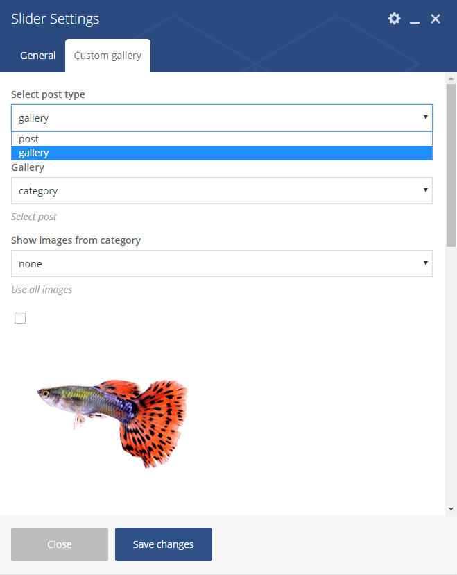
Slider gallery
Was this article helpful ?
Galleries
Test comes extended Galleries options, which allow you to manage all galleries and image in one place. Galleries are custom post types, where you can add multiple images, which then can be used almost everywhere on your page.
Creating Gallery
To create new Gallery, navigate to Galleries > Add New
Add new Gallery
For new gallery you can define:
- Title (required),
- Tags (optional),
- Images (recommended),
The most important are of course images. You can Upload here new images from you computer or select images from Media library – one or multiple (hold CTRL or SHIFT to select more that one image).

Gallery with images
For every gallery you can:
- reorder images with drag and drop tool,
- remove images from gallery with x sign
- add new images from media library or computer.
After every modification click on Update to keep your changes saved.
Slider Gallery
You can present your images as simple slider. From available components list select Slider. In tab Custom Gallery in slider settings you will see option to select gallery, which should be displayed as slider.
Notice: you have three Select options for images:
- none – image won’t be displayed,
- select all – all images from the gallery will be displayed (all changes which you will do for gallery, like adding/removing image will be applied in slider gallery),
- custom select – only selected images will be displayed.

Slider gallery
Image Grid
Another shortcode to display images uploaded to galleries in Image Grid – it works analogously to Slider element, but instead of slides, images are displayed in 1, 2, 3 or 4 columns.

Image grid
Portfolio Gallery
We didn’t forget also about standard gallery – which displays featured images of all created Portfolio Items (Portfolio Items > Add New). You can display it with Gallery element.
You will find here number of settings to change:
- Portfolio type
- Columns number
- Filter (if Masonry portfolio type used)
- Title
- Category – If you want to display items from only one category
- Blog index button text
- Limit

Portfolio gallery
Was this article helpful ?
Gallery shortcode
Test comes with extended shortcode, which allow you to show all of yours galleries in one place. using this shortcode you will have acess to several option to set:
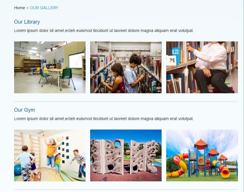
Gallery
- Columns (3 or 4) set the number of images show for each gallery
- Before date – text set before the date
- Before author – text set before author
- Limit – number of galleries show on the page
- Show meta? (yes/no)
- Show description? (true/false)
- Show author? (true/false)
- Show title? (true/false)
- Custom class – adding custom class allows you to set diverse styles in css to the element
- Skip X elements – allows to skip X elements from collection
- Order – order in which data should be fetched
- Order by – order in which data should be fetched
- Post id
- Exclude post id
- Post slug – filter by slug
- Post parent id – filter by Parent ID
- Category name – name of category to filter
- Tag name (slug)
- Keyword search
Was this article helpful ?
Galleries
Test comes extended Galleries options, which allow you to manage all galleries and image in one place. Galleries are custom post types, where you can add multiple images, which then can be used almost everywhere on your page.
Creating Gallery
To create new Gallery, navigate to Galleries > Add New
Add new Gallery
For new gallery you can define:
- Title (required),
- Tags (optional),
- Images (recommended),
The most important are of course images. You can Upload here new images from you computer or select images from Media library – one or multiple (hold CTRL or SHIFT to select more that one image).

Gallery with images
For every gallery you can:
- reorder images with drag and drop tool,
- remove images from gallery with x sign
- add new images from media library or computer.
After every modification click on Update to keep your changes saved.
Header gallery
Each page has number of options to change header appearance. For the header you can select images with Parallax or Kenburns effect, background Video or Simple image.
If you would like to display images as Kenburns , you can do it with one of Galleries. Just select, which Gallery should be display here.
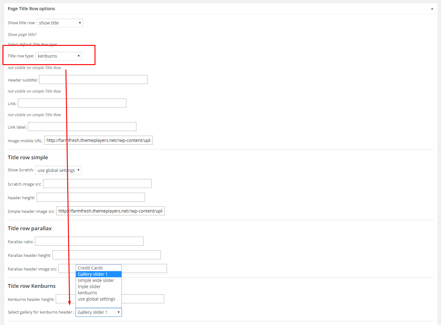
Header gallery
Slider Gallery
You can present your images as simple slider. From available components list select Slider. In tab Custom Gallery in slider settings you will see option to select gallery, which should be displayed as slider.
Notice: you have three Select options for images:
- none – image won’t be displayed,
- select all – all images from the gallery will be displayed (all changes which you will do for gallery, like adding/removing image will be applied in slider gallery),
- custom select – only selected images will be displayed.

Slider gallery
Was this article helpful ?
Import demo content
The fastest and easiest way to import our demo content is to use our Theme Options 1-click Demo Importer. Our importer will import all pages and posts, several sample sliders, widgets, theme options, assigned pages, and more. We recommend this approach on newly installed, fresh WordPress installation.
1-Click Demo import will not replace content like posts, pages, portfolio, etc. It will also not delete current menus but configure our demo menus, it will replace theme options. So if you have created posts, pages or portfolio content before import, there is no need to be afraid of losing them.
To import our demo content, please see the steps below:
- Step 1 – install and activate plugins listed in Recommended Plugins message
Recommended plugins
and WooCoomerce plugin if you would like to use shop functionalities.
- Step 2 – setup Media thumbnails sizes in Settings > Media to our recommended values:
- Thumbnail size: {thumbnail_size}
- Medium size: {medium_size}
- Large size: {large_size}
If you are using WooCommerce product images sizes in WooCoomerce > Settings > Products
- Step 3 – navigate to Appearance > Theme Options > General – 1-click Demo Import
- Step 4 – click the Import demo content button with multipage or onepager version.
1 click to import demo content
- Step 5 – it can take a few minutes to import everything. Please be patient and wait for it to complete. Once it loads, you will see message indicating success.
Learn more:
Common errors with “1-Click Demo Import”
Was this article helpful ?
Installation via Administration Panel
If Test files are downloaded from your Themeforest account, you can start an installation using WordPress administration panel.
Once you’ve logged in to your administration panel go to Appearance > Themes. Depending on your version of WordPress, you’ll see Add New or two other tabs: Manage Themes and Install Themes.
Themes section
Here you can find instructions how to proceed with 3.9.0 and lower versions of WordPress.
If you’re using newer version, follow steps below to install the theme:
-
- Step 1 – click on
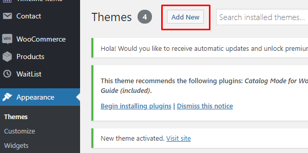
Add New
- Step 2 – choose Upload Theme option to upload .zip file

Upload theme
- Step 3 – choose {theme}.zip from you computer.
- Step 4 – once file is chosen click Install Now

Install theme now
- Step 5 go to Appearance > Themes and Activate Test
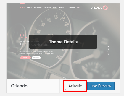
- Step 6 – After activating Test, you will be sent to Theme Installation Instruction steps. By following this steps you will be asked to install required plugins, activate them, import demo content (required) and install sample of WPL content.
- Step 1 – click on
Common Install Error: Are You Sure You Want To Do This?
If you get the following question message when installing Test.zip file via WordPress, it means that you have an upload file size limit. Install the theme via FTP or call your hosting company and ask them to increase the limit.
Was this article helpful ?
Woocommerce options
In WooCommerce panel you are able to edit the following options:
- Social icons settings:
- show/Hide
- Single product layout:
- standard,
- full-width

Single product page options
Was this article helpful ?
Generating and using API key in theme
Google Maps V3 no longer supports keyless access so you need to get a key for every (referrer-)domain which has never had a Google Map on it before. You can generate new API key or use the one you’ve already created.
How to generate my API key?
To generate API key you just need to click GET A KEY and follow the directions.
Alternatively, follow these steps to get an API key:
- Go to the Google API Console.
- Create or select a project.
- Click Continue to enable the API and any related services.
- On the Credentials page, get a Browser key (and set the API Credentials).
- Note: If you have an existing Browser key, you may use that key.
- To prevent quota theft, secure your API key following these best practices.
- (Optional) Enable billing. See Usage Limits for more information.
In the Google API Console, you can also look up an existing key or view a list of enabled APIs.
For more information on using the Google API Console, see API Console Help.
Where I should add the generated API key ?
Depending on the theme you are uisng, this option can be find in the Theme options section in the WordPress Dashboard or in the Customizer of the theme.
If the theme you bougth is customized with the use of the Customizer:
The API key can be added in the Customizer on path Google Maps API > Config

Adding API key in Customizer
If the theme you are using is custimze with use of the Theme option in WordPress Dashboard:
The API key can be added in the Theme Options section on path Appearance > Theme Options > General > Main

Adding API key in theme options page
Was this article helpful ?
Max Mega Menu Common issue
When you are using the Max Mega Menu plugin in Test for the first time the mobile menu isn’t showng up? The issue could be:
- Disabled Max Mega Menu
Go to the Appearance > Menu and in The Max mega Menu Settings check if the Enable option is selected.
max Mega Menu Settings
- Responsive Breakpoint
Go to the Mega Menu > Menu Themes and check if the Responsive Breakpoint of the menu is set to 767px
MMM Responsive Breakpoint
Was this article helpful ?
Theme Setup

Content structure
Major Test content structure can be divided in six sections:
- Main navbar
- Newsletter
- Latest Posts
- Brands
- Widgets
Main Navbar
Main Navigation can be created with help of the Theme Customizer. More information of the options used for creating the menu you will find in the Main Navbar section of this documentation.
Page Content
There are several types of pages included in Test for example:
- Tours & Events
- Member page
- Testimonials
- Our Distributors
- Blog
is generated from custom post types created in sections: Events, Team Members, Testimonials, Distributors
Pages with standard content for example:
- About us
- What we grow
- Distributors
are created with Visual Composer elements.
About us page

About Us page

About us – shortcodes content
‘What we grow?’ page

What we grow page

What we grow – shortcode content
How to create items that will be show in the Produce Availability Shortcode you will find in the create item for this page.
Distributors page

Distributors map

Distributor content – shortcode content
Newsletter

Newsletter
Newsletter is on of the elements tha will be wisible on all Default Template pages. This element is created with the use of Contact 7 plugin. If you find using this plugin difficult please check the documentation created by the authors of this plugin.
Look of the Newsletter can be customized via Customizer > Pages > Newsletter options.

Newsletter
Newsletter:
- Show newsletter box,
- Select newsletter Contact Form – Choose contact form you want to use
- Newsletter input title,
- Background ratio,
- Background height,
- Background image,
- background image mobile
Latest Posts

Latest Posts
Simillar to Newsletter will be visible on Default template pages. The latest options can be only shoiw or hide on the site, there is no option to customize them on the site.

Latest Posts
Brands

Brands
Brands option will let you show the logos of the companys you are working with. This section will be shown on all pages created with the use of the default template.
This section can be customize in the Customizer, just go to the Pages > Brands

Brands
To create gallery:
All the information how to create a gallery you will find in the Galleries part of the documentation.
Footer and post footer section (Widgets)

Footer and Post footer
The Footer and post Footer of the theme can be set in Test via Content of the sidebar can be setup via Widgets section.

Footer widgets
On demo page in Main Navigation Sidebar you’ll find the following widgets:
CT – copyright
CT – Simple Gallery Widget
Custom Menu
Was this article helpful ?
About page
This is a default template page with two type shortcodes used in the content.
About Us page
Shortcode used for the content:
- Section Header
- Header level
- Header: choose the header text
- Custom class
- Info box
- Header: choose header for the created info box
- Content: content of the shortcode
- Type: you can choose the position of the image
- Image: you can add your own image in the Info box
- Custom class
The header content can by customize with the use of Page title row options that can be found on the bottom of the page.

Page title row options
Was this article helpful ?
Creating Tours & Events page
This page is generated using Event Template. Event template display created Events.

Tours & Events content
Events item are custom post types, which can be created via Events section.
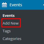
Add new Event item
Event items
For new Event item you can define:
- Title (required),
- Tags (optional),
- Categories (optional),
- Order attribute (optional),
- Featured Images (recommended),
- Gallery(optional),
- Events settings(optional),
- Date,
- Time,
- Location,
- Button URL,
- Button label,
- URL to map,
- Description
- Socials-meta
All Event product can be displayed on page with Event Template, which can be defined in pages options.
You can setup the way of displaying menu via Appearance > Customize section.
Was this article helpful ?
Testimonials
This page is generated using Testimonial Template. Testimonial Template display created Testimonials.
Information how to create Testimonial item you will find in THIS section of the theme.
Information how to custom this page you will find HERE.
The header content can by customize with the use of Page title row options that can be found on the bottom of the page.
Page title row options
Was this article helpful ?
Using Product CSV Import Suite
After updating the plugin to version 2.1 WooCommerce Product Size Guide is compatible with Product CSV Import Suite
Using CSV you will be able to export the content of your size guide items and then open them using office software like Open Office or Microsoft Exel.
After opening the file you will be able to change the content of imported tables by (for example) attaching products to new categories.
Below you can check step-by-step instruction how to use this new feature from exporting product Size guide tables to importing them after adding your custom changes.
DOWNLOADING PRODUCT FILE
1.Go to WooCommerce > CSV Import Suite and in Export Products tab choose Export Products – this way you will get .csv file with all of the product information.

Exporting Size Guide content
2. Open the .csv file using office software you have installed on your computer.
3. Please find AO columnt with the meta:_ct_selectsizeguide here you will find which products ( you will find products name in first column ) are attached to which size guide (ID numbers in the meta:_ct_selectsizeguide)

AO column
ADDING SIZE GUIDE TO PRODUCT
To add size guide to product you need to get the Size Guide ID to do that please:
1. Go to the Size guides and choose the size guide you want to add by choosing Edit

Choose SG
2. In the SizeGuide slug you will find a number – this is the ID we are looking for!

Size Guide ID
3. Go back to the downloaded file and add the ID to the product you want to use this Size Guide and save the changes in the file.

Adding new ID
IMPORT CHANGES
1. The last step is Importing the files with your changes – Go to WooCommerce > CSV Import Suite and in Import Products tab choose Import Products
2. Choose the option Choose File and add the file with your changes

Adding the file
3. Hit the Upload file and import button and it is done!
Was this article helpful ?
Visual Composer for FoodTruck
Test can be easily customized with Visual Composer.
Simply drag and drop elements to build your page content. We prepared components which will help you determine main structure of the webpage – easily set up backgrounds, colors and styles for whole sections as well as lots of various smaller components which you can freely put wherever you want.
You arleady created your site using FoodTruck shortcodes instead of visual composer? – Please check How to convert old shortcodes to VC
How to start?
We recommend you to use row as essential element of page structure.

Row
You can edit following row attributes:

Click pen to open edition tools
- Row stretch:
- Default
- Strech row
- Strech row and content
- Strech row and content (no paddings)
- Foodtruck full width 100% – we reccomend to use this version of row instead of Strech row and content (no paddings) for better performance of the page.

Foodtruck Full Width 100% Row option
- Foodtruck wide style – recommended to use when creating three boxes section like on BurgerLover home page

ThreeBoxes section BurgerLover
- Column gap
- Header alignment
- Full height row
- Equal height
- Contet position – the position can be set to Default, Top, Middle and Bottom
- Use Video background – use YT video as a background of this section
- Parallax – use Parallax as a background
- Css Animation
- Row ID – if you want to use section for scroll-to-section navigation
- Disable Row
- Extra class name – add extra class name for
- Additional inline style – if you want add inline custom CSS styles for element
Once your section row is created you can choose number of columns in section, their width and optionally offset value.

Section grid
If you want to create full_width element you need to choose 1 column greed in section and set it as full_width element.

Click pen to edit column

Full width column
Once you set up your section – you can put inside it as many components as you want.
Learn more:
For more information about Visual Composer, please check articles below:
How to install Visual Composer
Visual Composer demo
Visual Documentation
Was this article helpful ?
Converting content to VisualComposer
From version 5.0 and greater {theme} is compatible with Visual Composer Plugin.
As a new user of this theme you don’t need to convert the theme content – Foodtruck 1-click demo content will create the pages using VC shortcodes.
If you created your site some time ago this is how your Page shortcode looks like:

Old Foodtruck Shortcode
To convert old shortcodes to Visual composer shortcodes please go to Appearance > Theme Options > General – Visual Composer

VC converter
Option no.1
As you can see on the image above you can choose to convert:
- post – check to convert all created post content
- page – check to convert all the page content
- product – check to convert all the WooCommerce plugin product content
- ct_size_guide – check to convert all the SizeGuide plugin item content
- view360 – check to convert all created View360 items content
- ct_product – check to convert content of the Menu items
- event – check to convert content of the Event items content
- faq – check to convert faq items content
- timeline – check to convert timeline items content
After checking all the types you want to convert hit the Click to convert selected. When the process is finished you can go back to your pages and start using Visual Composer to custom your pages 🙂
Option no.2
Using this option you are able to convert pages or single shortcodes. You just need to:
- Copy the shortcodes from your post (make sure you don’t cut part of the shortcode)
- Paste the shortcode to the textarea of the converter
- Hit the Click to convert contents button.
- After you will have converted shortcodes you can copy and past the code.

Visual Composer code
- Switch from Classic Mode to Backend Editor and Voilà! You are now using Visual Composer shortcodes. Now you can click Update to save the changes.

VisualComposer Shortcode
Remember that this option will be working for Foodtruck content only!
This conversion will not work for different themes shortcodes.
Was this article helpful ?
Gallery columns don’t fit in the row
After converting your site or by creating the gallery from scratch this is how the effect of your work can look like:

Broken gallery
This problem can be solve easily by going to the Column Settings and by removing from the first column in General Tab col-sm-6 that is added to the Extra class name as you can see below:

Removing extra class name
Was this article helpful ?
Creating Header
The header can be created in each Section on the page by adding in the Section Settings text to the Header (2).

Adding heder
The header have 9 styles that can look different depending on the theme flavor you will be using. You can also choose to don’t use any of the style for the header by choosing the blank option (1).

Header style
Header styles (Burger Lover):

Header style
Curved_header to yes

Curved header
Creating two part header (Seabreeze)

Two part hader
Two part header like the one you can find in Seabreeze flavor, can be created by adding to header text vertical bar in place where you want the text to break.

Adding vertical bar
Was this article helpful ?
Adding Promo Codes
Before using Promo Codes remember to enable this option by setting promo_codes to true. When the option is enabled the field will be visible in the Shopping Cart.

Enabled Promo Code option
You can define new Promo Codes using following markup:
|
1 2 3 4 5 6 7 8 9 |
<script> $('body').ctshop({ promo_codes: 'true', promo_values: { 'discount30%': '30%', 'discount300$': 300, }, }); </script> |
| Promo Codes (examples) | Discount value | DESCRIPTION |
| “discount30%” | “30%” | Customer will get discount equal to 30% of the full price |
| “discount300$” | 300 | Customer will get discount equal to 300 in the currency which is used in the shop |
Creating promotional codes you need to remember that the codes that your clients will use, need to be a string value in the script.
The discount value for the Promo Codes can be set as a string (it has to end with %) or as a number.
Was this article helpful ?
Adding Wishlist
In {Plugin} you have two options to show the wishlist option for your products
DEFAULT:
By adding this default markup to your product page:
|
1 |
<div class="ct-wishlist"></div> |

Default Wishlist
INSIDE SMALL CART:
By activating small cart wishlist (when small cart wishlist is activated default option for the wishlist even if added will be ignored)
|
1 2 3 4 5 6 7 8 9 |
<script> $('body').ctshop({ display_small_cart: 'true', small_cart_options: { wishlist: 'true', scroll: 'true', }, }) </script> |

Wishlist in small cart
Was this article helpful ?
Shipping Options
Before using Shipping Options remember to enable this option by setting shipping_options to true. When the option is enabled the field will be visible in the Shopping Cart like in the image below.

Shipping option in cart
You can defined new Shipping Options with the following markup:
|
1 2 3 4 5 6 7 8 9 10 |
<script> $('body').ctshop({ shipping_option: 'true', shipping_types: { "Standard Mail": 20, "Express Mail": 50, "Next Day Delivery": 100, }, }); </script> |
| Shipping option | Cost | DESCRIPTION |
| “Standard Mail” | 20 | To the prices for products in cart will be added 20 in the currency which is used in the shop |
| “Express Mail” | 50 | To the prices for products in cart will be added 50 in the currency which is used in the shop |
Was this article helpful ?
Theme Flavours (Delimondo 2.0)
As you can see on our Demo page Test comes with {variations} variations.
To switch between the flavours follow this steps:
- Step 1: Activate the Customize option by going to Appearance > Customize
- Step 2: In Customize go to Delimondo 2.0 – style option > Motive colors
- Step 3: Choose the flavour you want to use and save changes

Choosing theme variation
And it’s ready to customize! In analogous way you can install every child theme.
Was this article helpful ?
Food Truck Overview
Below you can find our general project overview. We believe that this will help you start your page setup and make things much easier.
Check our table of descriptions below. On the left you will find elements, sections or groups and on the right we put certain place, where you can edit it. Page content elements can be created through shortcodes. Underneath you will find descriptions how to find proper shortcode in Shortcode Generator.
General overview
What element is that? – Where I can edit this?
| 1. | Header socials | Appearance > Theme Options > Socials | |
| 2. | Left menu | Appearance > Menus //create a new menu and with Theme Location: Sticky left | |
| 3. | Logo | Appearance > Theme Options > General – Standard logo | |
| 4. | Right menu | Appearance > Menus //create a new menu and with Theme Location: Sticky right | |
| 5. | Google Map | Shortcodes > Contact > Google maps // wrap it [third_column][..][/third_column] to receive the same map width | |
| 6. | Photo | Shortcodes > Images > Full Width Photo // wrap it [third_column][…][/third_column] to receive the same map width | |
| 7. | Tweets | Shortcodes > Contact > Twitter | |
| 8. | Blackboard | Shortcodes > Boxes > Blackboard // wrap it [third_column][…][/third_column] to receive the same map width | |
| 9. | Chapter header | Shortcodes > Chapter // Parameters: header_style=”1″ bg_image_src=”1″ | |
| 10. | Chapter content – product slider | Shortcodes > Sliders > Product slider // at the bottom of slider item additional shortcode: Boxes > Price tag | |
| 11. | Header – top line | Shortcodes > Typography > Header // parameters: style=”2″ line=”top” top_line_style=”1″ bottom_line_style=”1″ | |
| 12. | Header content | Header style 2 | |
| 13. | Header | Shortcodes > Typography > Header // parameters: style=”4″ | |
| 14. | Products | Shortcodes > Product > Products // parameters: tag=”recommended” limit=”3″ | |
| 15. | Header – bottom line | Shortcodes > Typography > Header // parameters: level=”4″ line=”bottom” | |
| 16. | Menu chapter | Shortcodes > Chapter // chapter is divide to three columns with following structure:[third_column][…][/third_column]
[third_column][…][/third_column] [third_column][…][/third_column] |
|
| 17. | Menu item | Shortcodes > Product > Menu // parameters: cat_name=”starters” category_image=”sandwich” | |
| 18. | Menu item | Shortcodes > Product > Menu // cat_name=”beverages-2″ category_image=”drink” | |
| 19. | Header – bottom line | Shortcodes > Typography > Header // parameters: level=”4″ line=”bottom” | |
| 20. | Event | Shortcodes > Boxes > Event box // parameter: slug=”breafast-club-chelsea-center” // to add multiple events use: Shortcodes > Events | |
| 21. | Events chapter | Shortcodes > Chapter // parameters: id=”events” top_margin=”80″ header=”JUST STOP ..” header_style=”1″ bg_image_src=”3″ | |
| 22. | Easy box | Shortcodes > Boxes > Easy box // divided to two columns:
[half_column][paragraph][/half_column] [half_column][polaroid_slider][/half_column] // Shortcodes > Sliders > Polaroid Slider |
|
| 23. | Story chapter | Chapter parameters: id=”story” ornament=”yes” chapter_pattern_style=”2″ background_image_repeat=”yes” header=”WHO IS …” header_style=”1″ bg_image_src=”4″ // image parameters: alt=”logo-inline” align=”center” | |
| 24. | Gallery chapter | Chapter parameters: id=”gallery” bg_image_attachment=”scroll” top_margin=”75″ chapter_pattern_style=”2″ header=”THE GALLERY” header_style=”1″ bg_image_src=”5″ | |
| 25. | Gallery group | Shortcodes > Gallery > Gallery group | |
| 26. | Header with link | [header level=”4″ style=”3″ line=”bottom” bottom_line_style=”1″] STUMBLED BY AND TAKE A GOOD SHOT OF US? [link email=”true” link=”mail@truck.food”]PLEASE SEND IT TO US[/link] [/header] |
|
| 27 | Chapter contact with Easy box | Chapter parameters: id=”contact” top_margin=”75″ chapter_pattern_style=”2″ header=”WE WOULD ….” header_style=”1″ bg_image_src=”6″]
Easy box style=”full” |
|
| 28 | Contact form | Shortcodes > Contact > Contact form // available parameters: [contact_form header=”Email Us” label_name=”Name” label_email=”E-mail” label_message=”Message” placeholder_name=”enter name” placeholder_email=”enter e-mail address” placeholder_message=”your message” buttontext=”Send” success=”Thank you!” fail=”An error occured. ” mailto=”mail@mail.com” subject=”subject” easy_box=”no”]
//wrap in [five_twelfths_column][…][/five_twelfths_column] to get the same form width |
|
| 29. | Newsletter slider | Shortcodes > Contact > Newsletter // available parameters: [newsletter header=”Our newsletter” placeholder_email=”your email adress” buttontext=”Send” success=”Thank you!” fail=”An error occured. ” mailto=”mail@mail.com” subject=”subject” class=”custom-class”]content[/newsletter]
//wrap in [five_twelfths_column][…][/five_twelfths_column] to get the same form width |
|
| 30. | Google map | Shortcodes > Contact > Google map // parameters: location=”Marine Ave. New York, NY” custom_marker=”Burger Road.1224, Marine Ave. New York, NY” |
Footer Structure
Footer elements
Was this article helpful ?
Max Mega Menu
Enabling Max Mega Menu for Theme Location
Test navigation menu can be built with Max Mega Menu plugin, which allows you to create expanded Mega Menu.
Once plugin is activated, you can go to the Appearance > Menus > Create a New Menu or used one created before.
On the left hand you should see a Max Mega Menu Settings box like the one below. Check the “Enable” checkbox and choose from the Theme option “{MegaMenu_Style}” and click Save, your menu will now be converted into a Mega Menu for the relevant Theme Location and will be using style dedicated for Test

Max Mega menu Settings
The basic setup for Max Mega Menu has been completed!!
If you are looking for more information about using Max Mega Menu plugin please go to the official Max Mega Menu Documentation site.
Was this article helpful ?
Create pages Test WP
To create a new Page follow the steps below:
- Step 1 – select Pages > Add New
- Step 2 – add Title
- Step 3 – add content – we recommend you to create page content using Visual Composer or by modifying demo content
- Step 4 – choose page attributes:
Page attributes
- Parent – if you want to create subpage
- Template – you can choose one of defined page templates:
Template settings
- Page order
- Step 5 – click Publish to make your page public.
Learn more:
Was this article helpful ?
Revolutions Slider
Test is fully compatible with Revolution slider version that comes with Theme package avaliable on Envato Market
{rev_example}
How to install plugin?
Revolution Slider is included in Test package – so you don’t have to do anything more than click install and activate.
Creating a new Slider
Information hot to create custom Slider can be find in Plugin Documentation.
Common questions:
How to update the plugin when it was packaged with your theme?
Was this article helpful ?
Estato Plugin
Plugin dedicated for Estato WordPress Theme that will allow you number of custom features like:
- Portfolio items
- FAQ items
- Testimonials
- Estato WP Custom Visual Composer shortcodes
- Estato WP shortcodes for WPL
Was this article helpful ?
Visual Composer
Test can be easily customized with Visual Composer.
Simply drag and drop elements to build your page content. We prepared components which will help you determine main structure of the webpage – easily set up backgrounds, colors and styles for whole sections as well as lots of various smaller components which you can freely put wherever you want.
How to start?
We recommend you to use row as essential element of page structure.

Row

What we grow page
You can edit following row attributes:
Click pen to open edition tools
– General tab –
- Row stretch:
- Default
- Strech row
- Strech row and content
- Strech row and content (no paddings)
- Column gap – Gap between columns.
- Full height row – If checked Yes, row will be set to full height.
- Equal height – If checked Yes, column height will be equal to the longest column height.
- Content position – the position of the content can be set to Default, Top, Middle and Bottom.
- Use Video Background – If checked, video will be used as row background.
- Parallax – Use Parallax as a background.
- CSS Animation – How the content of the row is animated.
- Row ID – If you want to use section for scroll-to-section navigation.
- Disable row – If checked, the row won’t be visible on the public side of your website.
- Extra class name – Add extra class name for the row.

General Tab of Row Settings
– Design Option – How the row would look/designed.
- Border color
- Border style
- Border radius
- Background
- Box Controls

Design Tab of Row Settings
Once your section row is created you can choose number of columns in section, their width and optionally offset value.
Section grid
Learn more:
For more information about Visual Composer, please check articles below:
How to install Visual Composer
Visual Composer demo
Visual Documentation
Was this article helpful ?
Creating Blog post for Test
No matter which method you use to display your blog posts, first thing you need to do is create them.
Test offers several blog post types:
- Standard
- Aside
- Image
- Video
- Audio
- Quote
- Link
- Gallery
Post formats
Follow the steps below to create a blog post
- Step 1 – navigate to Blog Posts in your WordPress admin.
- Step 2 – click on Add New to make a new post. Create a title and insert your post content in the editing field. You can use any of our shortcode elements inside the post.
 Add New PostIf you want to use some additional fields, choose them from screen options at the top of the screen.
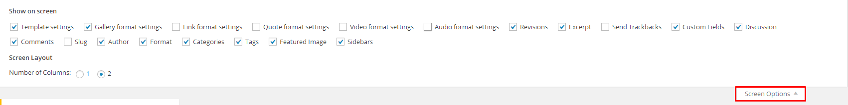
Screen Options
- Step 3 – add Categories from the right side. To assign it to the post, check the box next to the Category name.
- Step 4 – add Tags from the right side. Type the name of the tag in the field, separate multiple tags with commas.
- Step 5 – for a single image, click the Featured Image box, select an image and click Set Featured Image.
- Step 6 – for a Gallery, use Image Gallery (VisualComposer element) , each image will be a slide in the gallery slideshow. Gallery can be created by adding images from Media gallery or by adding Externa links of the images that will be used.
- Step 7 – for a Video post, use Vide Player (VisualComposer element) and paste the direct video url from Youtube, Vimeo or Dailymotion and more.
- Step 8 – for Audio post, use Vide Player (VisualComposer element) and paste the direct video url from Soundcloud, Mixcloud and more.
- Step 9 – for Quote use WordPress Blockquote option (Shift + Alt + Q)
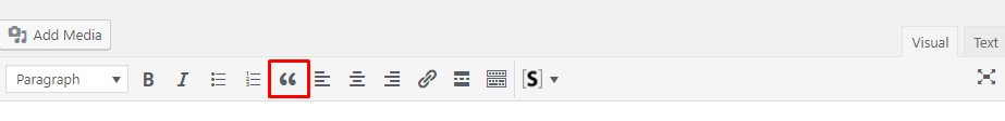
- Step 10 – for Link use WordPress Insert/edit link (Ctrl + K) option

- Step 11 – create an excerpt – Excerpts are optional hand-crafted summaries of your content that can be used in your theme. Learn more about manual excerpts
Excerpt
- Step 9 – once you finished, click Publish to save the post.
Was this article helpful ?
Menu setup
Depending on which version of content arrangement you choose, you can create onepager or multipage navigation menu.
To create navigation menu dedicated to multipage websites, please follow the steps below:
- Step 1 – Navigate to Appearance > Menus
Manage your menus
- Step 2 – Click on create a new menu, enter menu Name and click on Create Menu button
Add new menu
- Step 3 – From the right side choose pages that you want to add to your menu and click on Add to Menu. Once menu items are added, you can reorder or nest them via drag and drop tool. Remember to click Save Menu when you finish to keep your changes saved.
Add Page to menu
- Step 4 – You can easily rename every menu item in item details.
Rename your menu items
- Step 5 – Optionally you can add to menu other items, like Links or Categories
- Step 6 – Check your menu as Main menu to set one of available location.

Primary navigation
- Main Menu – will be visible on top of each page
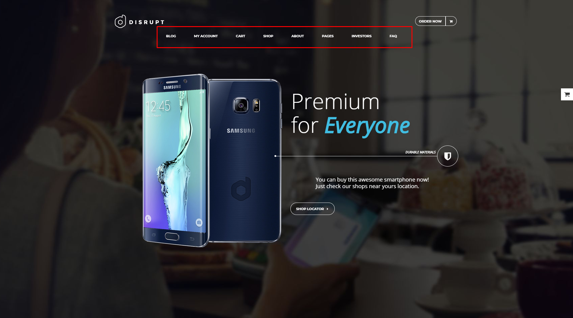
Main menu Example
- Mobile menu – this menu will be visible on mobile devices (in Test this menu is created without MaxMegaMenu plugin)
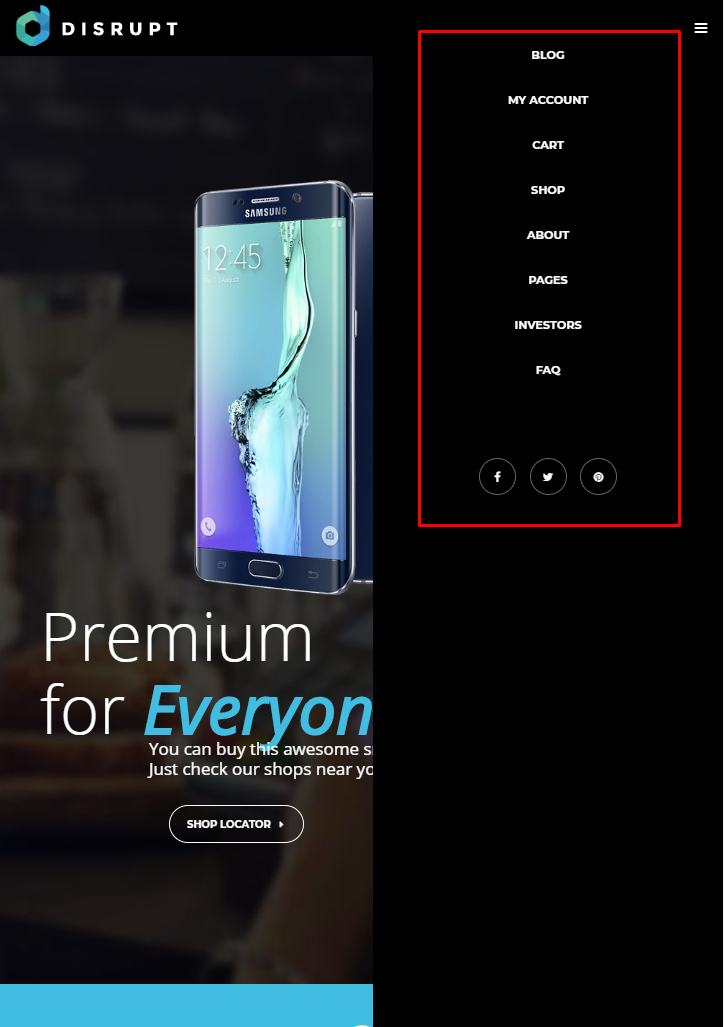
Mobile menu example
- Main Menu – will be visible on top of each page
- Step 7 (optional) – Enable Max Mega Menu for Theme Location
Max Mega menu Settings
- Step 8 – Always click Save Menu after providing any changes
Menus can be also shown in widgets section of Dashboard. After creating the menu you want to use, go to Appearance > Widgets and set the menu on your site using Custom Menu widget like in the example below.
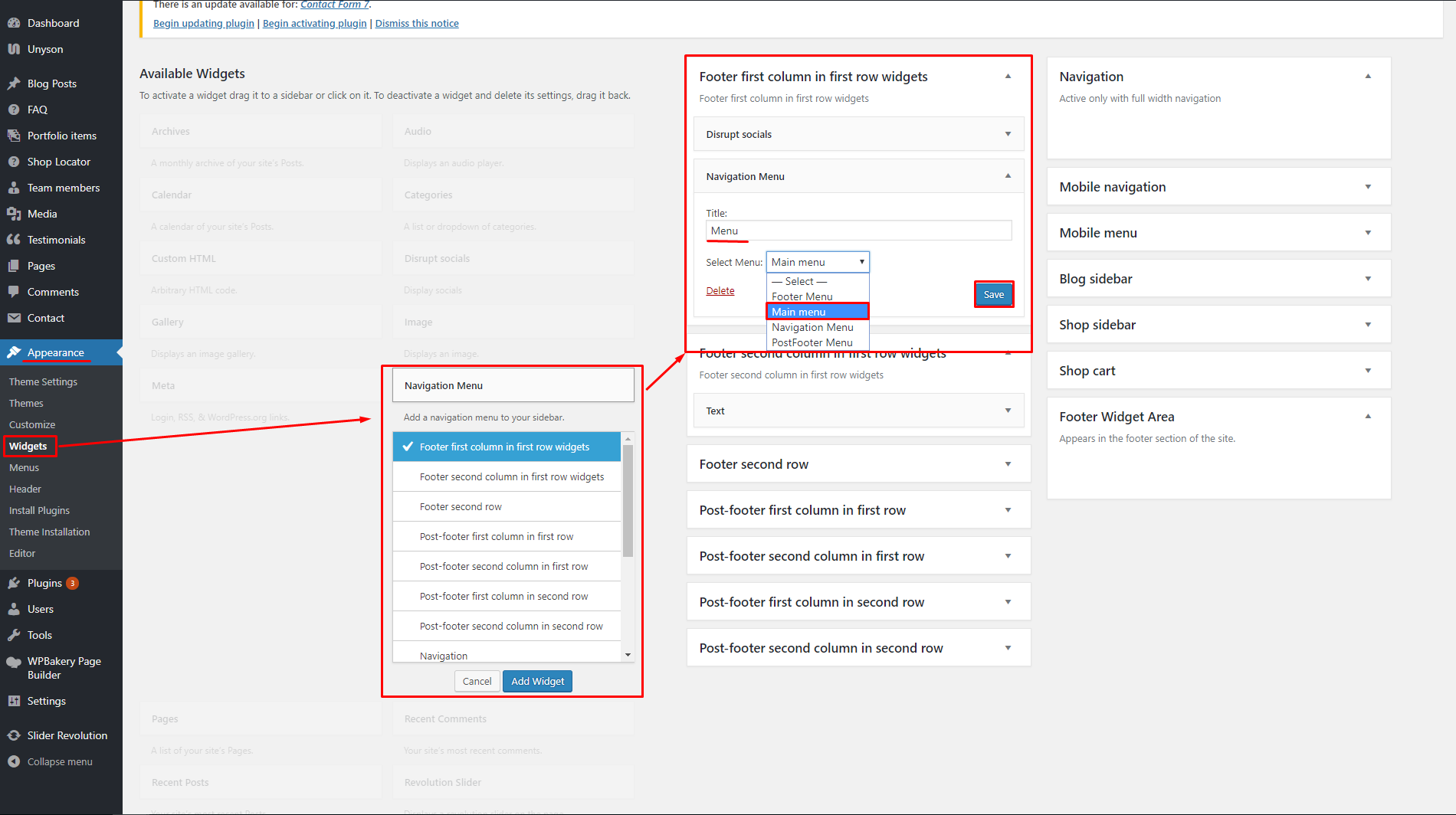
Set menu as a widget
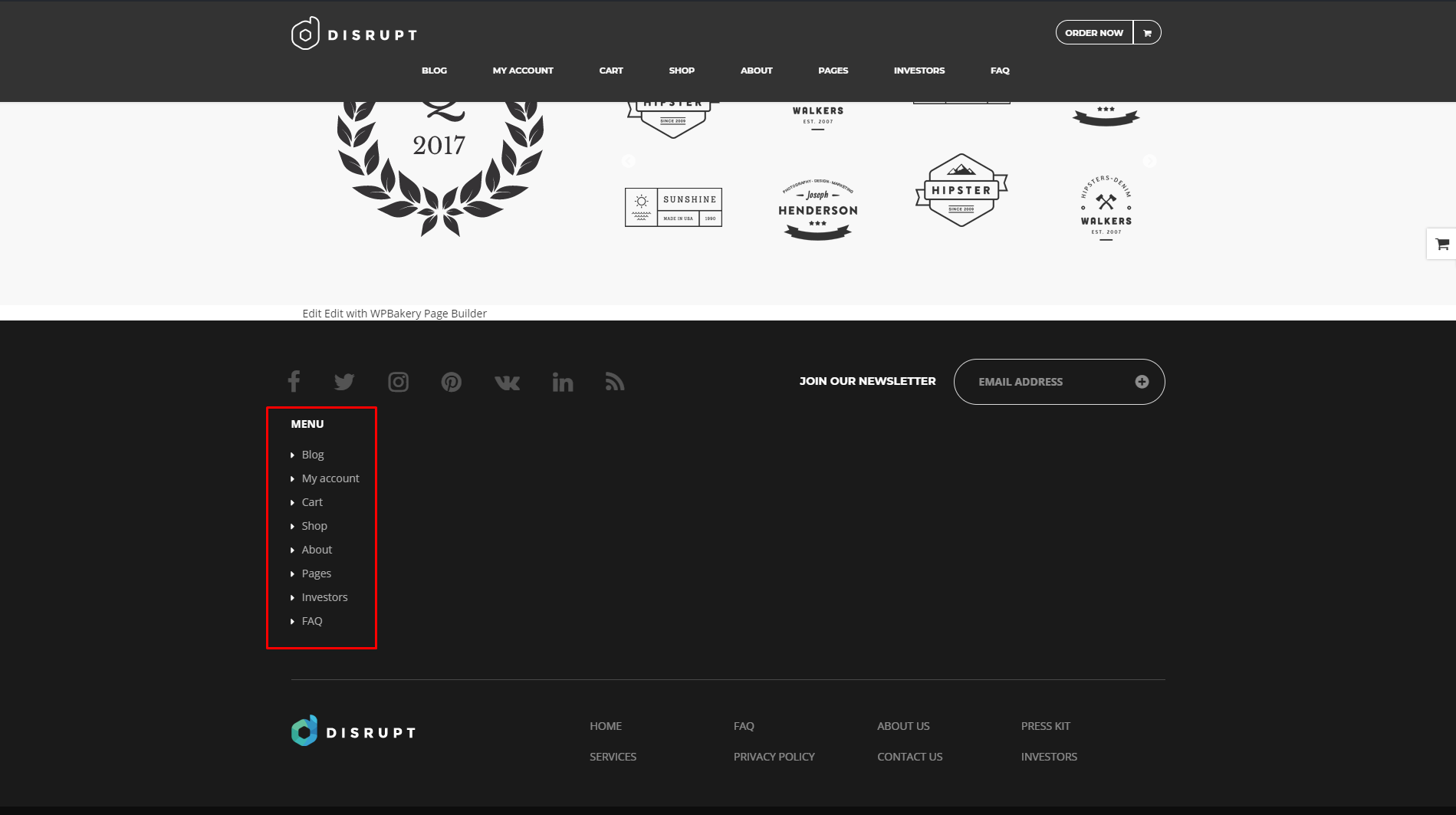
Menu added to the site via widget
Was this article helpful ?
Estato Customize
Test comes with an advanced customizer, which allows to edit most of the theme elements in one place. If you want to use it, navigate to Appearance > Customize

Test Customizer
It will display a panel with tabs corresponding to all theme sections, such as:
- Style
- Widgets
- Header
- Footer
- Blog
- Single blog post
- Portfolio
- Faq
- Template pages
- Properties page
- Single agent page
- Agent page
You will also find the main style settings:
- General
- Colors
- Header Image
- Background Image
In General you can turn off/on preloader on the site, check onepager option if you want to have onepager site (more info about onepager site HERE).

General settings
In Test Color section you can choose colors used in the theme

Color settings
In Header Image section you can edit logo on the site

Header Image settings
Customize option will also give you option to set image as a background for the theme:

Background Image settings
Notice:
All changes made with customizer will only be applied when you click on
Was this article helpful ?
Onepager setup Test
Test has the ability to make one page site with a scrolling to sections menu. Most sites are traditionally setup with individual pages, each page with its own content. One page site allows you to put all the content on one page, and the menu items will link to each different section of the page. Think of it as a full site but all on one page. Please read below for information on how to set this up.
Create A New Page With Your Content And Anchor Points
-
- Step 1 – Navigate to the Pages section of your admin and click Add New.
- Step 2 – Create page with all sections. Each section should begin with [chapter] shortcode or any other html element with unique id, for example :
123456[chapter id="work"](...) content (...)[chapter id="services"](...) content (...)[chapter id="about"](...) content (...) - Step 3 – 2. In Appearance > Menus create new main menu (using Custom Links option), where URL will be section id with “/#” sign, for example : /#services or /#about.
Add new menu item
Item details
And your onepager menu is ready. Remember to choose Theme Location Primary Navigation to your menu.
Creating your Onepager Menu you can also use Max Mega Menu plugin to be able to recreate the style of the menu used on Estato WP demo site. More information about this plugin you will find HERE.
Was this article helpful ?
Header

Header settings
In Header content tab you can define the following settings:
- Header behavior
- Scroll Up Both
- Scroll Up Menu
- Scroll Up TopBar
- Fixed both – Menu & TopBar – menu and TopBar fixed to the top when scrolling
- Hide Menu – menu hidden when scrolling, TopBar will be fixed to the top
- Fixed Menu – menu fixed to the top when scrolling (if TopBar is displayed it will be hidden after scrolling)
- Header type
- Equal TopBar and Navbra
- Small TopBar, big NavBar
- TopBar – Check if you want to display TopBar

TopBar section
- TopBar motive – choose color TopBar pattern
- Light motive
- Dark motive
- TopBar motive – choose to display login on text in TopBar
- Text
- Login option
- Text in TopBar – write text to display in TopBar
- E-mail adress in TopBar – add e-mail adress that will be visible in the TopBar

E-mail adress in TopBar
- Search in TopBar

Search option avaliable in TopBar
- Bottom line – check Yes if you want to display bottom line
- Border at menu – check Yes if you want to show border at top menu
- Button in NavBar – add or hide button

Button in TopBar
- Button title – add text visible in the button
- Button link – add link to were you want the button to lead to
- Open link in new window – check Yes to display button link in new window
Notice:
All changes made with customizer will only be applied when you click on
Was this article helpful ?
Footer
In Footer content tab you can define the following settings:

Footer settings

Footer section
- Footer display – check Yes if you want to display footer

Footer – 4 columns/dark motive
- Footer color
- Light Motive

Footer Light motive
- Dark Motive
- Light Motive
- Background image – set background image for footer.
- Number of footer columns
- One column
- Two columns
- Three columns
- Four columns
- Post footer display – check Yes if you want to display post footer on site

Post Footer – 2 columns
- Number of post footer columns (will work only if the Post footer display opion will be checked)
- One column
- Two columns
Notice:
All changes made with customizer will only be applied when you click on
Was this article helpful ?
Index Blog page

Blog settings
In Blog content tab you can define the following settings for Blog Index page.:

Blog Index
- Display blog sidebar – Check Yes if you want to display sidebar with widgets on blog page.

Blog Index page – sidebar right
- Place to display sidebar – Chose place for blog sidebar
- Left side
- Right side
- Display breadcrumbs – Check Yes if you want to show them on the top of the blog page

Breadcrumbs from Blog index page
- Display head section blog – Check Yes if you want to display head section on the blog page

Head section for Index page
- Head section type
- Parallax
- Video
- Ken Burns
- Mobile background image – select the image that will be displayed on mobile devices
- Background image – select image to display in head section
- Second background image – this image will be visible only if the Ken burnshead section type will be selected
- Third background image – this image will be visible only if the Ken burnshead section type will be selected
- Head height
- Parallax ratio
- Video url – will only work when the head section type is set to Video
- Video file type
- Mp4 direct link
- Webm direct link
Notice:
All changes made with customizer will only be applied when you click on
Was this article helpful ?
Single blog post

Single Blog post settings
In Blog content tab you can define the following settings for Blog single page.:

Single blog pages
- Display blog sidebar – Check Yes if you want to display sidebar with widgets on blog page.

Single blog post – sidebar right
- Place to display sidebar – Chose place for blog sidebar
- Left side
- Right side
- Display breadcrumbs – Check Yes if you want to show them on the top of the blog page

Breadcrumbs from Blog single post
- Display head section in blog – Check Yes if you want to display head section on the blog page

Head for Blog Single post section
- Head section type
- Parallax
- Video
- Ken Burns
- Mobile background image – select the image that will be displayed on mobile devices
- Background image – select image to display in head section
- Second background image – this image will be visible only if the Ken burnshead section type will be selected
- Third background image – this image will be visible only if the Ken burnshead section type will be selected
- Head height
- Parallax ratio
- Video url – will only work when the head section type is set to Video
- Video file type
- Mp4 direct link
- Webm direct link
- Tags after post – check Yes if you want to show tags after post
- Social share – check Yes if you want to show social share
- Social share – check social icons you want to show on your post page
- Post author info – check Yes if you want to show information about the author of this post
- Display comments after post
Notice:
All changes made with customizer will only be applied when you click on
Was this article helpful ?
Portfolio

Portfolio settings
In Portfolio content tab you can define the following settings for Portfolio Index page.:

Portfolio Index page
- Display sidebar – check Yes to display sidebar
- Place to display sidebar
- Left side
- Right side
- Display breadcrumbs – check Yes if you want to display breadcrumbs in top of the page

Breadcrumbs from portfolio index page
- Display head section – check Yes if you want to display header in top of the page

Head Section from Portfolio Index
- Head section type
- Parallax
- Video
- Ken Burns
- Mobile background image – select the image that will be displayed on mobile devices
- Background image – select image to display in head section
- Second background image – this image will be visible only if the Kenburns head section type will be selected
- Third background image – this image will be visible only if the Kenburns head section type will be selected
- Head height
- Parallax ratio
- Parallax vertical offset
- Parallax horizontal offset
- Video url – will only work when the head section type is set to Video
- Video file type
- Mp4 direct link
- Webm direct link
Notice:
All changes made with customizer will only be applied when you click on
Was this article helpful ?
Import demo content
The fastest and easiest way to import our demo content is to use Theme Options 1-click Demo Importer. It will import all pages and posts, several sample sliders, widgets, theme options, assigned pages, and more.
We recommend this approach on a newly installed WordPress. It will replace the content you currently have on your website. However, we create a backup of your current content in (Tools > Backup). You can restore the backup from there at any time in the future.

Backup option
To import our demo content, please follow the steps below:

Theme installation instructions
- Step 1 – install and activate plugins listed in Theme installation instructions message {woo_compatibility}
- Step 2 – in dashboard go to Unyson and make sure that Backup & Demo Content extansion is activate
{unyson_extansion} - Step 4 – navigate to Tools where after activating the Unyson extansion Demo content Install option will be avaliable
{unysone_import_path} - Step 5 – choose import option you want to use from avaliable options {unysone_import}
- Step 6 – wait untill the content will be installed

Installing new content
Importing can take a few minutes. Please be patient and wait for it to complete. Once it will be loading, you will see message with indicating progress.
Was this article helpful ?
FAQ
In Faq content tab you can define the following settings for Faq page.:

Faq settings

Faq Index page
- Display breadcrumbs – check Yes if you want to display breadcrumbs in top of the page

Breadcrumbs from index faq page
- Display head section in faq – check Yes if you want to display header in top of the page

Head section for index
- Head section type
- Parallax
- Video
- Ken Burns
- Mobile background image – select the image that will be displayed on mobile devices
- Background image – select image to display in head section
- Second background image – this image will be visible only if the Kenburns head section type will be selected
- Third background image – this image will be visible only if the Kenburns head section type will be selected
- Head height
- Parallax ratio
- Parallax vertical offset
- Parallax horizontal offset
- Video url – will only work when the head section type is set to Video
- Video file type
- Mp4 direct link
- Webm direct link
- Faq page title – create title for main FAQ page
- Faq page slug – create FAQ page slug (remember to rebuild permalinks after changing it)
Notice:
All changes made with customizer will only be applied when you click on
Was this article helpful ?
Unyson plugin
Getting started
Unyson is a framework for WordPress that facilitates development of a theme. This framework was created from the ground up by the team behind ThemeFuse from the desire to empower developers to build outstanding WordPress themes fast and easy. This documentation is heavily modified by createIT to ensure all custom extensions are well documented.
This documentation assumes you have a working knowledge of WordPress. If you haven’t, please start by reading WordPress Documentation.
Minimum Requirements
- WordPress 4.0 or greater
- PHP version 5.2.4 or greater
- MySQL version 5.0 or greater
Installation
Unyson is included in Test package – so you don’t have to do anything more than click install and activate.
You can also install the plugin manually:
- Upload the unyson folder to the /wp-content/plugins/ directory
- Activate the Unyson plugin through the ‘Plugins’ menu
- Configure the plugin by going to the Unyson menu and activating the following extensions:
- Custom options type
- Estato FAQ
- Estato Portfolio
- Visual Composer
- Estato Testimonials
- Estato Plugin

Unyson Extensions
License
The licenses for most software are designed to take away your freedom to share and change it. By contrast, the GNU General Public License is intended to guarantee your freedom to share and change free software. Unyson inherits the General Public License (GPL) from WordPress.
Was this article helpful ?
Available Sidebars
While widget areas typically occur in webpage sidebars, a theme can place widget areas in many places on a page. For example, besides the usual sidebar locations, the Test theme has a widget area in the footer of every page.
The content of the sidebars will depend on what widgets are added to that said sidebar. You can add by dragging a widget inside the sidebar to which you want that widget to show.

Sample on adding widget to sidebar
To add a widget on other areas on the page other than the sidebars, you can use the Wigetised Sidebar element. Just set the type of sidebar you would like to show.

This is a list of sidebars available for Test
- Primary Sidebar
- Page Sidebar
- Header left column
- Footer column 1
- Footer column 2
- Footer column 3
- Footer column 4
- Post Footer column 1
- Post Footer column 2
- Blog Sidebar 1
- Single sidebar 1
- Property Show Bottom
- Profile Show Top
- Property Listing Top
- Profile Listing Top
- WPL Hidden
- Property Listing Bottom
- Footer Widgets Area
- Max Mega Menu Widgets
These are sample images for the sidebars:

Header left column

Blog sidebar 1

Footers
Was this article helpful ?
Activating plugins
Test comes with number of custom features like:
- Portfolio items
- FAQ items
- Testimonials
- Test custom shortcodes
- SASS compiler
For the correct operation of Test you have to install and activate them for Test:
After activating Test you will also get the information about all of theplugins that you should or can install and activate for the full experience of the Theme. You can find this information on path Appearance > Theme Installation.
Also the information about all required plugins that should be installed and activated you will find in WordPress dashboard on path Appearance > Theme Installation
Theme installation instruction
With these plugins your custom post types will be saved in your admin panel, even if you change your WordPress theme.
Notice: Plugin must be installed and activated right after you install and activate the Test – otherwise you might be encountered problems with correct theme functioning.
Install plugin
Was this article helpful ?
Realtyna WPL Basic – Test
What is WPL?
WPL (WordPress Property Listing) is a great plugin for real estate agents and agencies. It is the most feature-rich, flexible, scalable and extendable WordPress plugin for creating Real Estate websites / portals.
Test Compability
Test comes with the Realtyna WPL Basic version but the theme is also fully compatible with the WPL Pro version. HERE you can check all the differences betwen WPL Basic and WPL PRO version to decide if you want to use the bundled version or rather buy the Pro version of the plugin.
Plugin installation
WPL is one of the requested to insall plugin and it should be installed after you install and activate the Test – otherwise you might be encountered problems with correct theme functioning. After it installation this plugin will be automatically activated.
Due to plugin bug it need to be activated individually
Reinstalling the plugin:
If you are using multisite or you are having blog on your site and want to reset the site you won’t be able to correctly activate WPL plugin then. To use the plugin again you will need to reinstall the plugin, to do so please go to the plugins folder in your WordPress and remove the plugin folder from there. After doing that you will be able to install and use this plugin again.
How does the WPL shortcode wizard work?
WPL has a feature for generating shortcodes automatically based on your configuration. You can find it on the WordPress editor:

WPL shortcode wizard
After clicking on the [W] icon, you will see the below wizard:

WPL View options
This wizard can generate Property Listing, Property show (single property page), Profile/Agent Listing, Profile/Agent Show, My Profile and the Widget Shortcode (PRO members). You can select one of these shortcodes using the “View” option.

Configure options
Each Shortcode (“View” option) has its own configuration form. You can set the configuration form if needed and click on “insert” to see the generated shortcode into your post/page content.

Add Shortcode to WordPress editor
If you are using VisualComposer plugin to use the WPL shortcodes on page, you can add them to the Text block shortcode:

Visual Composer view
Available shortcodes
- Property Listing allows you to show the list of properties to site visitors with pagination, sort options. You can add different types of property listings: a menu for showing sale properties or rental properties, specify the default page size and default sort type, etc
- Property Show allows you to add property to your site page.
To check all available listings, please navigate to WPL > Listing Manager page in your admin panel. Click Edit next to the listing you would like to add:
Edit Properties
- Profile/Agent Listing is used for creating a profile listing view. It is used to list the agents. Enter the following settings to shortcode wizard: Layout, User Type, Target Page, Page Size, Order by and Order settings
- Profile/Agent Show is used to display the profile of a specific user/agent.
- Select Profile/Agent Show from the View drop down.
- Set up layout by selecting option from Layout drop down.
- On the next step choose user you would like to add to the page.
- Select target page for your user link:
- My Profile is used to display the profile form of a user/agent in frontend. Select My Profile from the View drop down. Click Insert button. In order to change profile information, open WPL > My Profile page in your WordPress admin panel. Here you can change agent name, upload photo, change contact details.
Was this article helpful ?
Avaliable Templates
What are Test Templates?
If you are not interested in downloading the whole content via Unyson demo import, but still want to use some of the pages from the demo you can use the VisualComposer Templates option.
How to use them?
- Create new page going to Pages > Add New
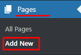
Add New Page
- Go to Visual Composer Backend Editor and choose Templates option.
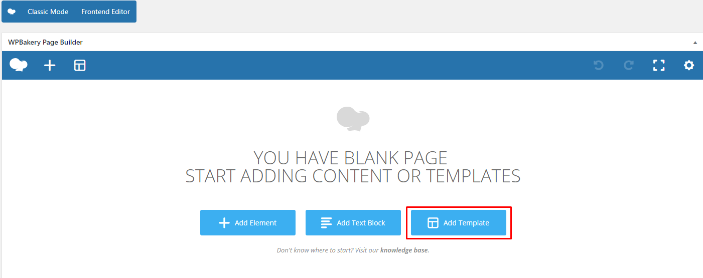
Templates options
- Choose from My Template tab one of the templates you want to use and click add template

Avaliable templates
- The Template content will be added to the page. Now you can click Publish and it’s done! Or you can start editing content of your page.
Avaliables Types
- Contatc Us
- Home V1 – Portal slider
- Home V2 – Portal Map
- Home V3 – Portal Map (Light)
- Home V4 – Real Estate Agency
- Home V5 – Property Slider
- Home V6 – Simple Onepager
- Home V7 – Onepager Video
- Home V8 – Side Map
- Privacy Policy
- Terms and Conditions
Template avaliable via slug
a) Maintenance – can be used by creating empty page with maintance slug

Was this article helpful ?
Faq item
Creating FAQ Item:
To create new FAQ elements, navigate in WordPress dashboard to FAQ > Add New

Add new Faq item
For new FAQ item you can define:
- Title – add FAQ question,
- Editior container – add answer for the question,
- FAQ Categories (optional) – assign to arleady existing category or add new one.

Creating FAQ item
Creating FAQ Categories
Categories are very convenient way to organize your faq items, that can be added to more than just one category.
To create new FAQ category, navigate in WordPress dashboard to FAQ > Faq Categories

Add new Faq Category
For new FAQ item you can define:
- Name
- Slug
After every modification click on Update to keep your changes saved.

FAQ category
Was this article helpful ?
Portfolio item
Creating Portfolio Item:

Portfolio item
To create new Portfolio elements, navigate in WordPress dashboard to Portfolio items > Our projects

Add New Portfolio item
For new Portfolio item you can define:
- Title,
- Editior container (images visible on portfolio item page) – content visible in the Editior container is added with use of
 option,
 - Portfolio Categories (optional) – assign to arleady existing category or add new one.
- Tags (optional)
- Featured Image (viisble on ‘Our Projects’ page)
- Portfolio setings
- Client
- Client website
- Details
- Start date
- End date
- Multilangual Content Setup – check box to make ‘Portfolio items’ translatable (Avaliable only when WPML plugin is in use)
After every modification click on Update to keep your changes saved.

Creating Portfolio Item
Creating Portfolio Categories
Categories are very convenient way to organize your porfolio items, that can be added to more than just one category.
To create new Portfolio category, navigate in WordPress dashboard to Portfolio items > Portfolio Categories

Creating new Portfolio Categories
For new FAQ item you can define:
- Name
- Slug
FAQ category
After every modification click on Update to keep your changes saved.
Was this article helpful ?
Realtyna Information
Data structure – dodaje: Pola do bazy danych takie jak:
-Property types można dodawac nowe – http://prntscr.com/el1myq (Category sa dodawane do search boxa i do nowego property) http://prntscr.com/el1o8l
– Listing type: metoda oddania mieszkania komuś http://prntscr.com/el1oc9 http://prntscr.com/el1omn
– Unit Manager: http://prntscr.com/el1p5i Unit type takie jak $ czy cm.
-Sort options: Czym sortujemy (to jest wykorzystywane w Shortcode listingu)
-Room types: dodajesz nową pozycje do bazy danych – typ pokojów (wykorzystywane przy tworzeniu nowego property) http://prntscr.com/el1q42
———————————–/—————————————————————–
Flex – to wszystko jest wykorzystane przy tworzeniu nowego property lub usera .
————————?————————————–
Add listing – https://todo.createit.pl/projects/124?modal=Task-5136-124
Location – dodajemy nowe stany/państwa i tak dalej
————————?————————————–
Customowe: ustawienie realtyny
————————/————————————-
Activity Manager: – typy listingów
————————?————————————–
Notyfication – ? (DOKUMENTACJA)
————————?————————————–
User menager– pokazuje wszystkich userów: – Tworzymy ich do Userów: http://prntscr.com/el1ubh Dodawanie opcji usermagerowi: http://prntscr.com/el1v1w
My profile – profil osoby zalogowanej (mój)
————————?————————————–
Listing manager – to-do
————————?————————————–
http://karolinajestnajlepsza.pinky.createit/wordpress/ – wszystko to sa customowe shortcody do Realtyny
http://karolinajestnajlepsza.pinky.createit/wordpress/property-page-v1/26-Villa-Oklahoma-4-Bedrooms-2-Bathrooms-USD20000/ – nasz shortcide: Property show (p)
http://karolinajestnajlepsza.pinky.createit/wordpress/properties-page-listing/ – Propoerties search http://karolinajestnajlepsza.pinky.createit/wordpress/properties-page-listing/ + Agents listing
Mieszkanko nowe: http://prntscr.com/el1z5l
http://prntscr.com/el1y9h
Was this article helpful ?
Test custom shortcodes for WPL
With Test comes many custom shortcodes for VC that are used to show content created in WPL plugin. Below you will find short information about this VisualComposer elements:
Agency Box

Agency Box look
This element have single tab with option to customise the way how the agency box will be shown. This item let you show all the information and the logo used by the Agency.

Agency box Settings
General
- ID – it can be checked in WPL in User Manager section by:
- a) Choose User Manager from WPL section

Going to User Manager
- b) Copy one of the WPL’s user id to the Agency box Settings

Avaliable ids
- a) Choose User Manager from WPL section
- Style – choose the style of the element
- Light

Light version
- Dark

Dark version
To set the background Parallax image for this element please go to the General tab in Row Settings option and add the image via Image option (2) from your Media Library, Set the Parallax type to Simle (1) and set Parallax speed to 1.5 (3)

Row Settings
- Light
Agents listing

Agents listing look
This element have two tabs with option to customise the way how the multiplies profiles of the agents will be visible on the site.

Agents Listing Settings
General
- Title – set the title for this section
- Image Width – set the width of the image
- Image Height – set the width of the image
- CSS Class – add custom css class
Sort and limit
- Order by
- First Name
- Country
- State
- Properties count
- Order – set the order of the agents
- Ascending
- Descending
- Limit – set limit of the agents visible on the site
Profile Box

Profile Box – Dark

Profile Box Settings
This type of element will let you show all the information about the WPL User chosen by its id. Profile Box have avaliablw two options to custom this element:
General
- Default profile id – it can be checked in WPL in User Manager section by:
- a) Choose User Manager from WPL section
Going to User Manager
- b) Copy one of the WPL’s user id to the Profile box Settings
Avaliable ids
- a) Choose User Manager from WPL section
- Style – this element have 2 avaliable styles:

Profile Box – Light
- Dark
- Light – this version is using white color for the font and borders, so it won’t be visible on default VC Row background. The background of this element can be changed by
- a) Click on Edit Row option

Edit Row options
- b) Go to General tab and choose background color via Background option to make the text visible
-

Item Settings for Row
- c) In General Tab, set Row stretch to Stretch row to make the background color full width
-

Row Settings
- a) Click on Edit Row option
Properties map with searchbox

Properties map with searchbox

Properties map with searchbox Settings
This element have sigle tab with option to customise the way how the map will be shown on the site:
Map
- Custom map Style – use one of custom maps styles avaliable on Snazzy Maps site (this option is not compatible with Map Type control)
- Custom map height – enter map height (in pixels or leave empty for responsive map)
- Zoom value – set custom zoom value, eg. 10. Please note the map will automatically expand to show all markers.
- Map Type control
- Theme default
- Roadmap
- Satellite
- Hybrid
- Terrain
- Scale control – choose between Yes/No
- Google Maps search control – choose between Yes/No
- My position control – choose between Yes/No (Works only with https)
- Use custom markers for this map – choose between Yes/No
- Use custom markers for this map – choose between Yes/No. This way you can add your own custom markers from Media library. Another way to add your custom markers is via Realtyna. This markers can be added on path WPL > Data structure > Listing Types. You will be able to add there your own markers and assing them to Listing type

Using Realtyna markers
By Properties map element you will display a map with markers showing all of the estate locations. The information of the location can be added on path WPL > Add Listing > Adress Map by changing location of the marker. You can also edit the location of already existing property by going to WPL > Listing Managere > Edit > Adress Map.

Setting Location of property
Properties map

Properties map

Properties map Settings
This element have 2 tabs with option to customise the way how the map will be shown on the site:
General
- Custom map Style – use one of custom maps styles avaliable on Snazzy Maps site (this option is not compatible with Map Type control)
- Custom map height – enter map height (in pixels or leave empty for responsive map)
- Zoom value – set custom zoom value, eg. 10. Please note the map will automatically expand to show all markers.
- Map Type control
- Theme default
- Roadmap
- Satellite
- Hybrid
- Terrain
- Scale control – choose between Yes/No
- Google Maps search control – choose between Yes/No
- My position control – choose between Yes/No (Works only with https)
Icons
- Use custom markers for this map – choose between Yes/No. This way you can add your own custom markers from Media library. Another way to add your custom markers is via Realtyna. This markers can be added on path WPL > Data structure > Listing Types. You will be able to add there your own markers and assign them to Listing type
Using Realtyna markers
By Properties map element you will display a map with markers showing all of the estate locations. The information of the location can be added on path WPL > Add Listing > Adress Map by changing location of the marker. You can also edit the location of already existing property by going to WPL > Listing Managere > Edit > Adress Map.
Setting Locations of property
Properties mini listing
Give you option to show list of properties created in WPL plugin on path WPL > Listing Manager

Latest listing transparent

Properites mini listing settings
This element have 4 tabs with option to customise the way how the list of the properties will be shown:
General
- Title (avaliable for Latest listing and Latest listing transaprent)
- Template

Property mini listing templates
- Mini listing (1)
- Latest listing (2)
- Latest listing transparent (3)
- View more text – add link that for View more
- View more link – add link that for View more
- CSS class – add custom css class you want to use to style this element
Filter Properties
- Kind (only avaliable option: Property)
- Listing – choose which listing will be shown
- All
- For sale
- Fo Rent
- Vacation rental
- You can add your own custom
- Property type – choose visible types
- All
- Office
- Apartment
- Land
- Villa
- You can add your own custom
- Listing IDs (Comma Separated) – add which properties will be shown based on the ID
- Random – randomize visible list
- Only Featured – choose between Yes/No
- Only Hot Offer – choose between Yes/No
- Only Open House – choose between Yes/No
- Only Foreclosure – choose between Yes/No
Sort and Limit
- Order by – give you option to order the list by:
- Add date
- Listing ID
- Built up Area
- Price
- Pictures
- Order
- Ascending
- Descending
- Number of properties – set number of visible properties visible on single page
Buttons
- Enabled – choose between Yes/No
- Title – button visible inside the button
- Link
- Size – avaliable 4 button sizes
- Default
- Extra small
- Small
- Large
- Style – avaliable 8 buttons style
- Estato Default
- Estato Primary
- Estato Success
- Estato Info
- Estato Warning
- Estato Danger
- Estato Dark
- Estato Link
- Transparent Estato Style – choose between Yes/No
- Custom CSS class – add custom css class you want to use to style this element
Properties listing

Properties listing example
Give you option to show list of properties created in WPL plugin on path WPL > Listing Manager

Properties listing settings
This element have 4 tabs with option to customise the way how the list of the properties will be shown:
General
- Title – set title for the list
- Type listing view – choose between two views:
- Grid

Grid
- List

List
- Grid
- CSS Class – add custom css class you want to use to style this element
- View more text – change text that will be shown for view more link
- View more link – add link that for View more
- Columns count in grid view – set number of columns avaliable for grid view
- Show additional options
- Sort options and pagination
- Sort options
- Pagination
- None
- Boxes size
- Big
- Small
Filter Properties
- Kind (only avaliable option: Property)
- Listing – choose which listing will be shown
- Property type – choose visible types
- Listing IDs (Comma Separated) – add which properties will be shown based on the ID
- Random – randomize visible list
- Only Featured – choose between Yes/No
- Only Hot Offer – choose between Yes/No
- Only Open House – choose between Yes/No
- Only Foreclosure – choose between Yes/No
Sort and Limit
- Order by – give you option to order the list by:
- Add date
- Listing ID
- Built up Area
- Price
- Pictures
- Order
- Ascending
- Descending
- Number of properties – set number of visible properties visible on single page
Properties search

Properties search
With this element used on your site you will be able to search for the estates avaliable on your site. Below you will find information how to customize this elements.
This element isn’t customizable via Visual composer, all the changes to this element can be added by WPL options that can be found on path Appearance > Theme Settings > Searchbox

Avaliable search fields
For Searchbox you will be able to set:
- Title – title visible for your searchbox
- Kind – type of item it will be search from
- Layout – choose from two of avaliables layouts
- default
- simple
- Target page – set the target page in which the Search will be looking for the estates
- Css Class – you can add custom css class that can be used for adding custom style for this element

Search Fields configuration
After clicking View Fields option in the main section (1) you will see all the fields that will be visible in the Searchbox. To customize the look of this element you can remove (2) already added fields, add new one (3), choose type of data (4) you can use and range of the data (5). At the end when you are happy with all the fields you used you can change order (6).
All the changes you will made will be saved automatically.
Was this article helpful ?
Template pages
In Template pages content tab you can define the following settings for template pages: Terms & Conditions, Private Policy, Contact Us:

Template pages settings

Faq Index page
- Display breadcrumbs – check Yes if you want to display breadcrumbs in top of the page

Breadcrumbs from index faq page
- Display head section in template pages – check Yes if you want to display header in top of the page

Head section for index
- Head section type
- Parallax
- Video
- Ken Burns
- Mobile background image – select the image that will be displayed on mobile devices
- Background image – select image to display in head section
- Second background image – this image will be visible only if the Kenburns head section type will be selected
- Third background image – this image will be visible only if the Kenburns head section type will be selected
- Head height
- Parallax ratio
- Parallax vertical offset
- Parallax horizontal offset
- Video url – will only work when the head section type is set to Video
- Video file type
- Mp4 direct link
- Webm direct link
Notice:
All changes made with customizer will only be applied when you click on
Was this article helpful ?
Single property page
In Single property page content tab you can define the following settings for Single Property element: 

Single property page Customizer

Property single page
- Display breadcrumbs – check Yes if you want to display breadcrumbs in top of the page

Breadcrumbs from agent single page
- Display head section – check Yes if you want to display header in top of the page

Head section for property single agent page
- Head section type
- Parallax
- Video
- Ken Burns
- Head section title – Title to display in head section.
- Mobile background image – select the image that will be displayed on mobile devices
- Background image – select image to display in head section
- Second background image – this image will be visible only if the Kenburns head section type will be selected
- Third background image – this image will be visible only if the Kenburns head section type will be selected
- Head height
- Parallax ratio
- Parallax vertical offset
- Parallax horizontal offset
- Video url – Will only work when the head section type is set to Video
- Video file type
- Mp4 direct link
- Webm direct link
- Displays infos – Displays the information about the Images/Video if there is any.
- Publish info – display info about publish date

Publish info
- Update info – check Yes if you want to show update date

Update info
- Report abuse link – check Yes if you want to show abuse link

Report abuse link
- Report Abuse page – choose page to which user will be send, after clicking ‘report abuse’ link
Notice:
All changes made with customizer will only be applied when you click on
Was this article helpful ?
Single agents pages

Single agents page settings
In Single Agent page content tab you can define the following settings for Agents Index page.:

Agent single page
- Display breadcrumbs – check Yes if you want to display breadcrumbs in top of the page

Single agent’s breadcrumbs
- Display head section – check Yes if you want to display header in top of the page

Head section from agent single page
- Head section type
- Parallax
- Video
- Kenburns
- Mobile background image – select the image that will be displayed on mobile devices
- Background image – select image to display in head section
- Second background image – this image will be visible only if the Ken burnshead section type will be selected
- Third background image – this image will be visible only if the Ken burnshead section type will be selected
- Head height
- Parallax ratio
- Parallax vertical offset
- Parallax horizontal offset
- Video url – will only work when the head section type is set to Video
- Video file type
- Mp4 direct link
- Webm direct link
Notice:
All changes made with customizer will only be applied when you click on
Was this article helpful ?
Homepage Settings
In Static Front Page content tab you can define which of the created Pages will be used as a site Home page and which page will be used as a Blog page (avaliable for static page option).

Homepage Settings
- Front page display
- Your latest posts – latest posts will be shown on the Front page
- A static page – Home page and Blog index page will be chosen from list of static pages.
- Front page – avaliable if A static page option is chosen, set page that will be shown as a Front page
- Posts page – avaliable if A static page option is chosen, set page that will be shown as a Posts page
Notice:
All changes made with customizer will only be applied when you click on
Was this article helpful ?
Calculator landing page
In Calculator landing page content tab you can define the following settings for Calculate Loan template page.:

Calculator landing page settings
- Background image – Image for background in landing page
- Section height
- Background image for second column – Image for second column in landing page
- First title

First title text example
- Second title

Second title text example
- Text – text use for landing page

Text example
Notice:
All changes made with customizer will only be applied when you click on
Here you will find information how to create contact form visible on this site.
Was this article helpful ?
Faq Page

FAQ page
Frequently Asked Questions (FAQ) of Test is generated by the theme from Faq items. This type of page can be created by going to Appearance > Customize > Faq and adding there the slug and title the page will use.
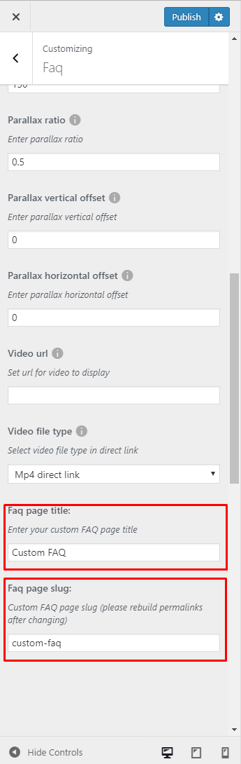
Adding Faq slug and title
Was this article helpful ?
Single portfolio
In Single portfolio content tab you can define the following settings for single portfolio page.:

Single Portfolio settings

Portfolio single page
- Display sidebar – check Yes to display sidebar
- Place to display sidebar
- Left side
- Right side
- Display breadcrumbs – check Yes if you want to display breadcrumbs in top of the page
- Display head section – check Yes if you want to display header in top of the page
- Head section type
- Parallax
- Video
- Ken Burns
- Mobile background image – select the image that will be displayed on mobile devices
- Background image – select image to display in head section
- Second background image – this image will be visible only if the Kenburns head section type will be selected
- Third background image – this image will be visible only if the Kenburns head section type will be selected
- Head height
- Parallax ratio
- Parallax vertical offset
- Parallax horizontal offset
- Video url – will only work when the head section type is set to Video
- Video file type
- Mp4 direct link
- Webm direct link
Notice:
All changes made with customizer will only be applied when you click on
Was this article helpful ?
Creating portfolio page
Portfolio page of Test is built using Visual Composer. Theme is supporting 3 version of this page:
- 3 Columns
- 4 Columns
- 6 Columns
The Visual Composer Backend editor of the page look like this:

Portfolio page in Backend editor
Adding row
Row Settings: After adding new Row to the page in the General option please change Row stretch option to Stretch row and content as on example below:

Row Settings – General
after switching to Design Options Tab set padding and border value for this element and add Background image (optional)

Row Settings – Design Options
Content
- Text Block – Go to general tab and Add content to the Text tab:
1<h3 style="text-align: center;"><span style="color: #ffffff;">OUR PROJECTS</span></h3>
Text Block settings
- Post Masonry Grid – Set options as below if you wish to recreate the look of ‘our Projects’ from Test:
- General

General tab
- Data source – Ct-portfolio (setting this option images will be taken from Portfolio item),
- Total items – choose number of elements that will be visible on the site,
- Display Style – Show all,
- Show filter – Yes
- Grid elements per row – choose 3, 4 or 6 Elements per row,
- Gap – 30px
- Initial loading animation – Default
- Extra class name – add ct-vcMasonryGrid–portfolio class to have the same style of the portfolio like on Test demo
- Data Settings – no changes added
- Filter

Filter
- Filter by – Portfolio Categories(ct-portfolio-taxonomy),
- Style – Filled
- Default title – All,
- Alignment – Center,
- Color – Sky,
- Filter size – Large
- Item Design

Item Design
- Grid element template – Masonry grid: Overlay with rotation
- Design options

Design options
- Css box – margin-bottom: 20px;
- General
Page Attributes
To be able to use Customize options dedicated for Portfolio page, please choose Our projects from Template.

Portfolio template
Was this article helpful ?
Contact forms
Contact forms in Test are created with the use of Contact Form 7 Plugin. Below you will find information how to recreate Contact forms used in our theme by adding the correct markup for the Form section of this plugin.

Contact form markup added to Form
If you never before used this plugin I suggest you to check Getting Started with ContactForm 7.
Calculate Loan
This contact form come with two color versions, than can be achieved by adding custom css class to Inner column Settings in VisualComposer when creating page with form:

Adding custom class
- Dark version (with custom class ct-contact-claculatorFormContainer)

Calculator loan dark
- Light version (no custom class)

Calculator loan light
Calculator can be recreated by using this markup for contact form:
|
1 2 3 4 5 6 7 8 9 10 11 12 13 14 15 16 17 18 19 20 21 22 23 24 |
<div class="ct-contact-form"> <h3 class="ct-formTitle ct-contactPage"> Calculate Loan </h3> <label> Property Price ($) [text* propertyprice] </label> <label> Percent Down [text* percentdown] </label> <label> Terms (Months) [text* terms] </label> <label> Interest Rate in % [text* Rate] </label> [submit "Calculate My Mortage"] </div> <script> document.addEventListener( 'wpcf7mailsent', function( event ) { location = location.href + '/calculate-loan/'; jQuery('.wpcf7-response-output').remove(); }, false ); </script> |
Feel Free to Contact Us

Feel free to contact us
To recreate this contact form please use:
|
1 2 3 4 5 6 7 8 9 10 11 12 13 14 15 16 17 18 19 |
<div class="ct-contactForm-main"> <h3 class="ct-formTitle"> Feel Free To Contact Us </h3> <img class="ct-formImage" src="/wp-content/themes/estato/theme/assets/images/demo-content/questions.jpg"> <label> Name [text* your-name] </label> <label> Email [email* your-email] </label> <label> Phone [text phone] </label> <label> Message [textarea your-message class:ct-contactForm-main--message] </label> [submit "Send Message"] </div> |
Newsletter

Newsletter form
To recreate this Newsletter form please use:
|
1 2 3 4 5 6 7 8 9 |
<div class="ct-contact-form ct-newsletter ct-newsletter--page"> <h3 class="ct-formTitle ct-contactPage"> Join our newsletter </h3> <label><span class="sr-only"> Your Email (required)</span> [email* your-email placeholder "Your E-mail Address"] </label> <p class=text-right> [submit class:btn class:btn-primary class:btn-transparent--border class:ct-u-text--motive class:text-capitalize "Subscribe"] </p> </div> |
Newsletter-footer
This is a contatc form that will let you recived e-mails from user that want to Subscribe your site.

Footer contact form
To show your contatc form in footer, go to Appearance > Widgets by adn you can add there ContactForm7 shortcode to Text widget

Adding footer contact form
To recreate the look of this contact form please use this markup:
|
1 2 3 4 5 6 7 8 9 10 11 |
<div class="ct-newsletter text-right"> <span class="text-uppercase ct-u-text--white ct-fw-600">Join our newsletter</span> <label><span class="sr-only"> Your Email (required)</span> [email* your-email placeholder "Your E-mail Address"] </label> [submit class:btn class:btn-primary class:btn-transparent--border class:ct-u-text--motive class:text-capitalize "Subscribe"] </div> |
Send us a Message

Contact form on map
Markup used for this contact form:
|
1 2 3 4 5 6 7 8 9 10 11 12 13 14 15 16 17 |
<div class="ct-contact-form"> <h3 class="ct-formTitle ct-contactPage"> SEND US A MESSAGE </h3> <label> Name [text* your-name] </label> <label> Email [email* your-email] </label> <label> Phone [text phone] </label> <label> Message [textarea your-message] </label> [submit "Send Message"] </div> |
To display this contact form on a map, you need to create two Rows Like on the image below.

Creating section
and add :
- ct-contact-map–Container custom class for Google map Row
- ct-contact-formContainer ct-contact-multiPage custom class for Contact form Row

Adding custom CSS class
Was this article helpful ?
Creating Agent single page (Agent’s profile)
On Agent page you can show information about one of your property agents and all estates attached to them with the use of single WPL shortcode.
Creating Agent profile:
By default, WordPress users are not WPL users. This provides you better managerial supervision for distinguishing between the agents and the basic users such as subscribers, authors, etc.
You can activate users in WPL simply by going to WPL > Use Manage and then clicking on the “Tick” or “Plus” icon. For specifying user access and limits you should click on the “Edit” icon, change the settings and save it.

Activate User in WPL
If you don’t know how to create a new WP user account please check this link.
Each agent has their own profile page and they can edit the information to be shown on the “Agent Activities” or “Listing Details” page. Uploading a profile picture and company logo is highly recommended so it is good to request that your agents upload their pictures.

Agent’s profile settings
Do not forget to click on the finalize button after filling the profile page.
Was this article helpful ?
Theme Settings
Theme Settings is an option that will allow you to set basic options that can be crucial when creating your Estate page. Theme Settings can be found in Dashboard on path Appearance > Theme Settings that contains 3 Tabs:

Theme Settings
– General –
- Cut property descriptions after x character – The limit for the number of characters used in the description for a property.

General tab
– Pages –
- Agent Profile page – allow you to choose Agent profile page and extra style it with Customise options
- Agent listing page – allow you to choose Agent listing page and extra style it with Customise options

Pages tab
– Searchbox – option that will allow you to set the searchbox.
- Title – set title for the Searchbox
- Kind – set the kind from the avaliables options
- Layout – layout type (only simple avaliable)
- Target page – page where this searchbox will be shown
- CSS Class – add custom class to style the element

Searchbox tab
How to configure the Searchbox for Test
To configure the Searchbox, follow these steps:
-
- Step 1 – Navigate in Dashboard to Appearance > Theme Settings > Searchbox tab.
- Step 2 – Click the View Fields buttton, the Search Fields Configurations will pop-up.

Searchbox Tab
- Step 3 – Here you will see all the fields that will be visible in the Searchbox.

Fields in the Searchbox
- Step 4 – To customize the look of this element you can:
- Remove already added fields – Click on the X button on top of the field that you want to remove.

Remove
- Add new one – Click on the tabs on top to choose the categories of fields you want to add. You can see the fields at the bottom. Drag the field that you want and drop it at the center.

Add New Fields
- Choose type of data – The data type of what the field will use to search.

Data Type
- Add range of the data – This could be used if the data type option is numerical. Setting the range in number.

Data Range
- Remove already added fields – Click on the X button on top of the field that you want to remove.
- Step 5 – You have the option to change the order of the fields at the right side by drag and drop.
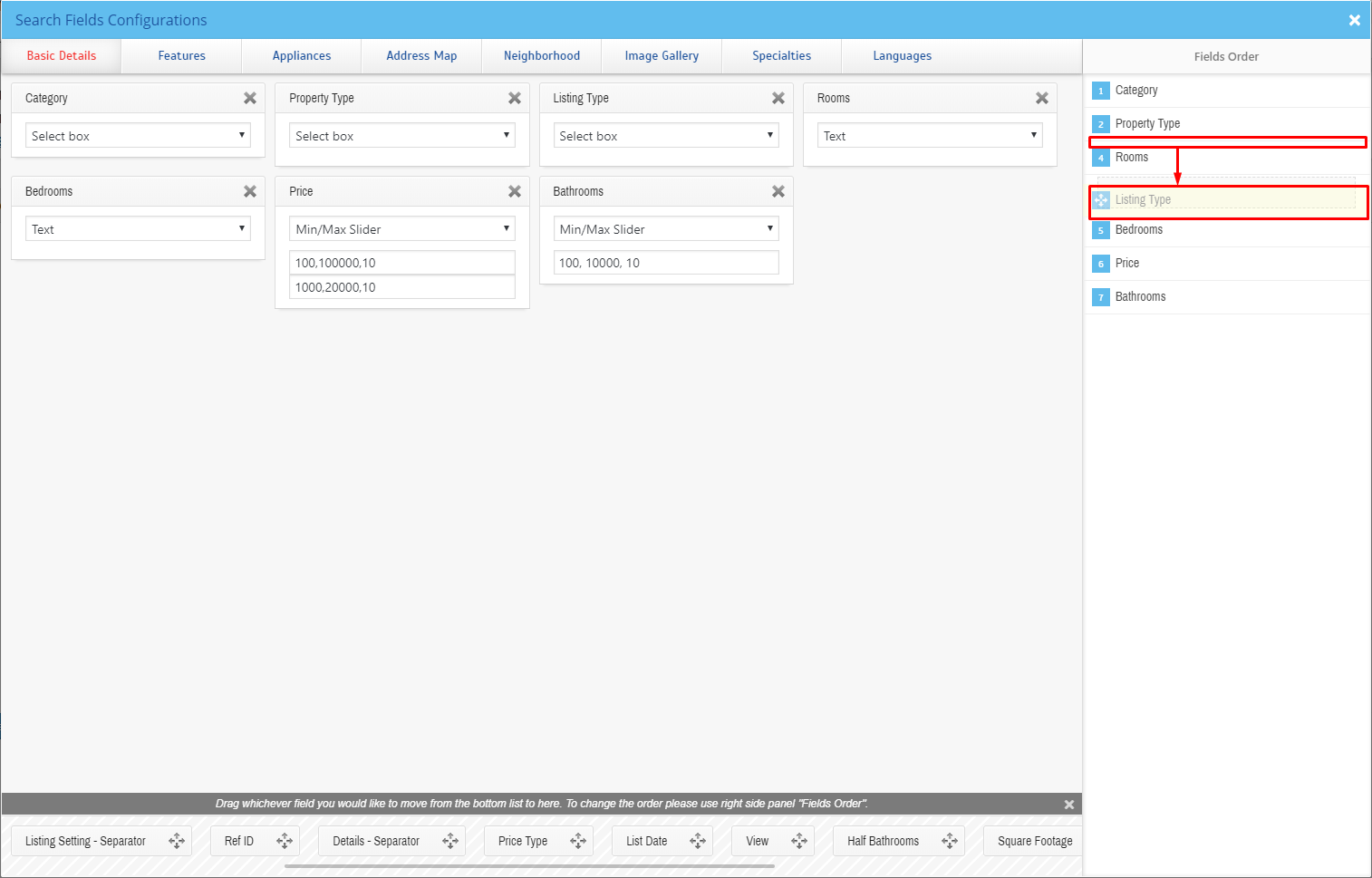
Fields Order
All the changes you will make will be saved automatically.
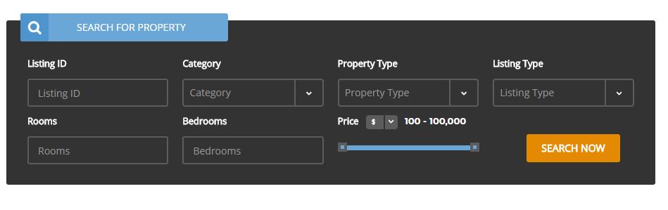
Was this article helpful ?
Test custom shortcodes
With Test comes many custom shortcodes for VC that are used to show content created in Test. Below you will find short information about this VisualComposer elements:
Button for Estato
This theme come with VC item that gave you option to create buttons that can be used in the theme.

Buttons for Estato
Icon Box for Estato

Icon Box example
Below you will see all the avaliable options that can or need to be set to use IconBox for Estato element on page:

Icon Box for Estato Settings
General
- Number of icons – you can set here number of icons visible in row (1, 2, 3, 4). We recommend to use one Pricing tables for Estato element in single row to get the best effect using this element.
- Motive – choose color style used for this element
- Dark
- Light
- Title – Set the title for this element

Icon Box for Estato Settings
Column 1, Column3, Column 3, Column 4 (number of columns tab depends on the nuber of tables set in General tab)
- Title
- Icon
- Description

Icon Box for Estato settings
Button (add button under Icon Boxes)
- Buttn enable
- Button title
- Button link
- Button size
- Button style
- Trabsparent Estato Style for button? – check Yes to tur on the option
- Custom CSS class for button
Create Icon Box example like on the Icon Box example image:
To create a Icon Box section with a background static image:
- Step1: Create a row section

Add Row section
- Step2 : Choose the Edit row option (1) and in the General tab add the background image (2) from Media library gallery.

Adding background image
- Step3: Add Icon Box For Estato by clicking
 in Row and choosing it from Add Element options

Adding Icon Box for Estato
- Step4: Set the shortcode options as you wish.
Remember to Update the changes on the page to save them.
Image carousel

Image carousel example
Below you will see all the avaliable options that can or need to be set to use Image carousel for Estato element on page:

Image carousel Settings
General
- Title
- Display navigation – check Yes to show the navigation of the carousel
- Items count – number of images that wil shown at once on the desktop (this option will not work the mobile version of the carousel)
- Pagination – check Yes pagination to show it.
- Autoplay – check Yes to show pagination
- Images – add images from Media Library or Upload Files from your computer
Latest Posts

Latest Posts
You can custom this element using options from the settings option below.

Latest Posts settings
General
- Title
- Limit
- Custom class
- Order
- Ascending
- Descending
- Order by
- Date
- ID
- Author
- Title
- Slug
- Modifier
- Order by parent id
- Random order
- Order by Page order

Latest Posts settings
Button
- Button enabled
- Button title
- Button link
- Button size
- Default
- Extra Small
- Small
- Large
- Button style
- Estato Default
- Estato Primary
- Estato Success
- Estato Info
- Estato Warning
- Estato Danger
- Estato Dark
- Estato Link
- Transparent Estato Style for button? – check Yes to remove button background color
- Custom CSS class for button
Promo Section

Promo section
Creating your own promo section you can choose options as below:

Promo Section settings
General
- Background color
- Image
- Promo text
- Promo text color

Promo Section settings
Button 1, Button 2, Button 3
- Button enabled – check Yes to show the button
- Button title
- Button link
- Button size
- Default
- Extra Small
- Small
- Large
- Button style
- Estato Default
- Estato Primary
- Estato Success
- Estato Info
- Estato Warning
- Estato Danger
- Estato Dark
- Estato Link
- Transparent Estato Style for button – check Yes to remove button background color
- Custom Css class for button
How to achieve full width Promo Section:
- Step1: Create a row section
Add Row section
- Step2 : Choose the Edit row option (1) and in the General tab set the Row strech option (2) to Strech row and content.
-

Row stretch options
- Step3: Add Promo Section item to the row and set the options as you wish.

Add Promo Section
Remember to Update the changes on the page to save them.
Pricing tables for Estato

Pricing tables for Estato
Below you will see all the avaliable options that can or need to be set to use Pricing tables for Estato element on page:

General
- Title – here you can set the title visible over the tables
- Number of tables – you can set here number of tables visible in row (1, 2, 3, 4). We recommend to use one Pricing tables for Estato element in single row to get the best effect using this element.
Column 1, Column3, Column 3, Column 4 (number of columns tab depends on the nuber of tables set in General tab)

Pricing tables for Estato Settings
- Title (1)
- Value (2)
- Subvalue (3)
- Tag (4)
- Features (5)
- Button enabled (6) – check Yes to show button
- Button title
- Button link
- Button size
- Default
- Estra Small
- Small
- Large
- Button style
- Estato Default
- Estato Primary
- Estato Success
- Estato Info
- Estato Warning
- Estato Danger
- Estato Dark
- Estato Link
- Transparent Estato style for button? – check Yes option if you want the transparent style
- Custom CSS class for button – set your custom class to style the button

Below you will see all the avaliable options that can or need to be set to use Twitter in your Test template:

Twitter settings
- Title – set the title for header
- Simple style?
- No
- Yes
- username – twitter username
- customer key
- customer secret
- token
- token secret
- limit – limit of visible tweets
- Tweets per slide
- follow us button – follow us button label (leave blank to hide it)
- new window? – Yes/No
- parse url
- plain text
- short link
- display link
- parse media
- plain text
- short link
- display link
- expened link
- parse url id? – Yes/No
- parse hashtag? – Yes/No
- embed images? – Yes/No
- size of embeded images?
- thumb
- small
- medium
- large
- tweet length limit
- cache results for X seconds – cache Twitter feeds for better performance
The information how to generate twitter keys and tokens can be find here.
Create Twitter section with background image
To create a twitter account with a background static image:
- Step1: Create a row section
Add Row section
- Step2 : Choose the Edit row option (1) and in the Design Options tab add the background image (2) from Media library gallery.
-

Adding background image
- Step3: Add Twitter item to the row and set the options as you wish.
-

Adding Twitter
Remember to Update the changes on the page to save them.
Scroll Sections

Terms & Conditions
This item will let you create a page menu to let the user move between the section page.

Scroll Section Settings
The only option avaliable in settings is Section names that will let you create menu links for custom sections. This shortcode is used on Terms & Conditions page of Estato WP theme.
To recreate this look on your own follow these few easy steps:
Step1: Add row to your page and change the Row Layout to 1/4 + 3/4. This way you will be able to add Scroll Section and the content to different columns and set them next to each others.

Row Layout
Step2: Add any content you want to the columns on the right.

Adding content
Step3: Add an ID to each Inner Row Settings section you want your menu to be able to move to. Remeber: Each created ID must be unique, and it is valid as w3c specification: link (Must not have spaces)

Adding Row ID
Step4: Add Scroll Section Settings item to the columns on the right and for the Section names use the same names as the one used for the Row’s id.

Add Section Names
Remember: to make this element work correctly you must copy the exact same names as used in the ID and add them in the same order as they are set in the right section.
FAQ

Faq page created with the use of shortcode

FAQ Settings
FAQ shortcode will let you show all the created FAQs items on the site. This version of FAQ don’t have menu like the one created via Customize options, but it will let you add other content on the same site unlike the customize one.
Testimonials slider

Testimonial slider
Testimonial slider will gave you an option to show people testimonials on your site
How to create testimonial?
To create testimonial go to Testimonials > Add New where you will be able to create a new item.

Creating new testimonial item you will be able to add followig:

Creating testimonial item
- Title (A)
- Content (B)
- Author (C)
- Name
- Company
- Featured Image (D)
After adding all infortmation to testimonial item remember to click the Update buton.
Adding Testimonial Slider

Testimonial slider Setting
Testimonial slider settings:
- Style of slider
- Additional title – check Yes if you want to display title
- Title
- Order
- Ascending
- Descending
- Order by
- Date
- ID
- Author
- Title
- Slug
- Modifier
- Order by parent id
- Random order
- Order by Page order
- Limit – set the limit of the testimonials visible on the site (not more than 6)
How to achieve the look of this section like on Test demo:
To create testimonial slider from the demo follow steps below:
- Step1: Create a row section
Add Row section
- Step2 : Choose the Edit row option (1) and in the General tab set the Row strech option (2) to Strech row and content.
-
Row stretch options
- Step3: Go to Design Options tab and set Background color of choice. The one used in our demo is: #60a7d4
-

Choose background color
- Step4: Add Testimonial slider item to the row and set the options as you wish.

Add testimonial slider
Remember to Update the changes on the page to save them.
Was this article helpful ?
Creating Property page
Property pages created via Test will give you option to show page containing all the needed information about your property like property description, features, appliances, address map and much more. Below you will find information how you can create this pages on your own.

Property page Version 2
Both of Property pages visible on Test demo (Version 1 and Version 2), can be divided into two Estato elements Single Property and Property mini listing. Here we will concentrate on all the information what option need to be set to recived same look on the page. If you wish to find more information about the Test shortcodes using information from WPL plugin please check Custom Realtyna shortcode section, where you will find more information about Single Property and Property mini listing elements.
Property page version 1
This version contains full width map with the slider of the property’s image and sidebars.

Version with Sidebar
To create this variation of the page follow steps below:
- Step1: Go to Pages > Add New and create new page and make sure that the Template you are using is Default Template, or use already created page that is using the same Template.

Page Attributes
- Step2: Create a row section on your page.

Add Row section
- Step2: Add Single Property (1) element to the row and in the Settings options set ID (2) of the property you want to show (where to find ID?) and choose Full width map as a Property template (3).
-

Adding Single Property
- Step3 : Create a second row like before but this time in General tab set Strech row for Row strech (1) option. For Design Options add 40px for top margin (2) and set the Background (3) color to: #f3f3f3
-

Row stretch options

Design Options
- Step4: Add Properties mini listing element to row. After accessing Properties mini listing Go to the General (1) tab and set Latest listing transparent as a Template (2) for this element. with this Template option you can also add Title (3) that will be visible on the site.

Add Properties mini listing
-

Adding mini listing Settings
Remember to Update the changes on the page to save them.
Property page version 2

Full width map version
This version of the property contains full width map with the slider of the property’s image. To create this variation of the page follow steps below:
- Step1: Go to Pages > Add New and create new page and make sure that the Template you are using is Default Template, or use already created page using the same Template.

Page Attributes
- Step2: Create a row section on your page.
Add Row section
- Step2: Add Single Property (1) element to the row and in the Settings options set ID (2) of the property you want to show (where to find ID?) and choose Full width map as a Property template (3).

Adding Single Property Settings
- Step3 : Create a second row like before but this time in General tab set Strech row for Row strech (1) option. For Design Options add 40px for top margin (2) and set the Background (3) color to: #f3f3f3
-
Row stretch options
Design Options
- Step4: Add Properties mini listing element, to the just created row. After accessing Properties mini listing go to the General (1) tab and set Latest listing transparent for Template (2) for this element.

Property mini listing Settings
Remember to Update the changes on the page to save them.
Where to find ID?
The ID that can be used for Single Property element can be found in WPL on path WPL > Listing Manager where you will find list of all the estate added to the WPL. After choosing the property you want to show click  After entering Add/Edit Property you will find Listing ID that can be used in the Single Property Element.

Searching for ID
Was this article helpful ?
Activating plugins
Test comes with number of custom features like:
- Backup & Demo content
- FAQ,
- Portfolio,
- Breadcrumbs,
- Team,
- Testimonials
- Shop Locator
For the correct operation of Test you have to install and activate them for Test:
- Disrupt plugin
- Unysone
- WPBakery Visual Composer
- Revolution Slider
- Contact Form 7
- Woocommerce
After activating Test you will also get the information about all of theplugins that you should or can install and activate for the full experience of the Theme. You can find this information on path Appearance > Theme Installation.
Also the information about all required plugins that should be installed and activated you will find in WordPress dashboard on path Appearance > Theme Installation
Theme installation instruction
With these plugins your custom post types will be saved in your admin panel, even if you change your WordPress theme.
Notice: Plugin must be installed and activated right after you install and activate the Test – otherwise you might be encountered problems with correct theme functioning.
Install plugin
Was this article helpful ?
Disrupt Customize
Test comes with an advanced customizer, which allows to edit most of the theme elements in one place. If you want to use it, navigate to Appearance > Customize
Customizer
It will display a panel with tabs corresponding to all theme sections, such as:
- Navigation
- Blog
- Single blog post
- Shop
- Portfolio
- Footer
- Widgets
You will also find the main style settings:
- General
- Page Head
- Header Image
General
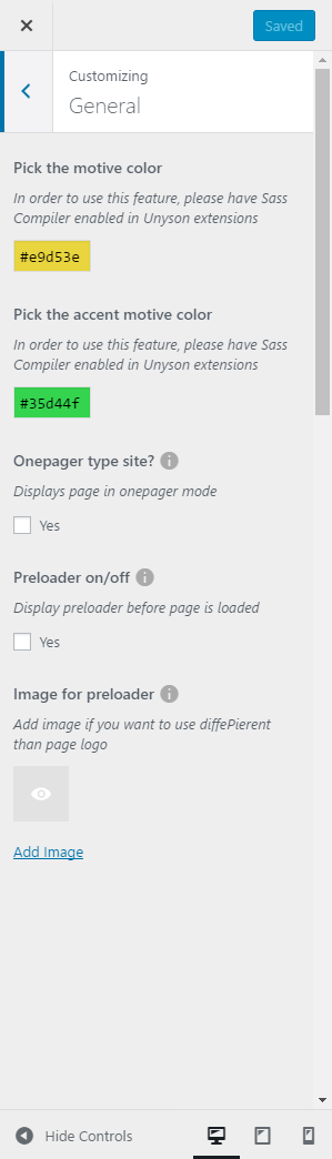
General settings
This style setting customize option will let you to:
- Choose the motive and accent motive color for your theme
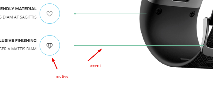
motive and accent motive color
- Check onepager option if you want to have onepager site (more info about onepager site HERE)
- You can choose if you want to use a preloader and what Image will be visible when the page will be loading.

Loading example
Header Image
In Header Image section you can edit logo on the site
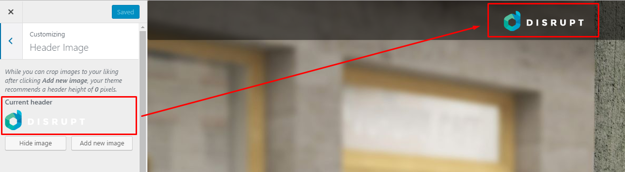
Header image settings
Notice:
All changes made with customizer will only be applied when you click on
Was this article helpful ?
Disrupt custom shortcodes
With Test comes many custom shortcodes for VC that are used to show content created in Test. Below you will find short information about this VisualComposer elements:
Button for Disrupt
This theme come with VC item that gave you option to create buttons that can be used in the theme.
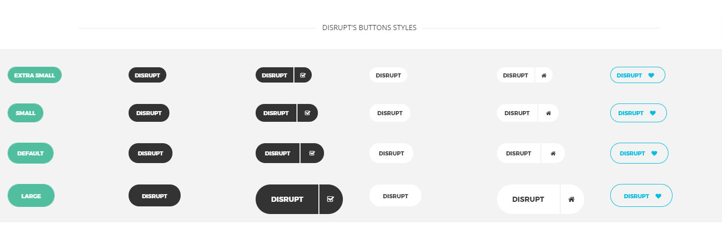
Disrupt buttons
This item contains many variation that will let you create button that will suit you best.
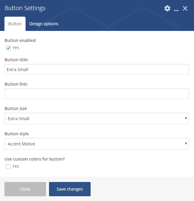
Button Settings
Button
- Button enabled – check Yes to enabled the button
- Button title
- Button link
- Button size
- Default
- Extra Small
- Estato Success
- Small
- Large
- Button style
- Accent Motive
- Dark
- Dark Separated
- White
- White Separated
- Transparent
- Use Custom colors for button – check Yes to be able to choose button text and button background custom color
Contact Box

Contact Box
You can customise this element with options visible below:
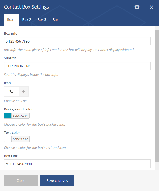
Contact Box Settings – Boxes
Box 1, Box 2, Box 3
- Box info – add the bar information
- Subtitle – add subtitle text
- Icon
- Background color
- Text color
- Box Link – add link to the box
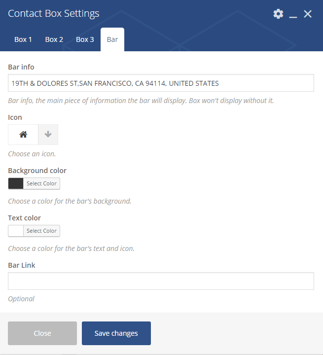
Contact Box Settings – Box
Bar
- Bar info – add the bar information
- Icon
- Background color
- Text color
- Bar Link – add link to the bar (optional)
Styled Google Maps
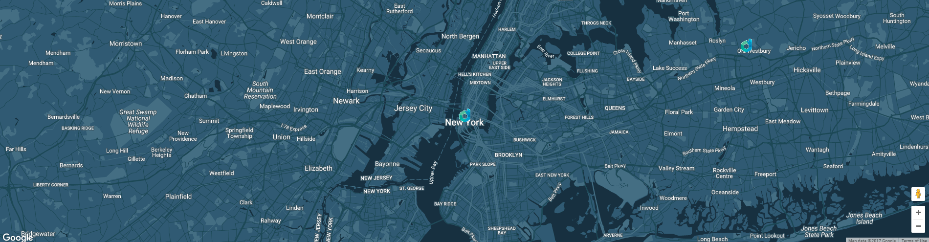
Styled Google Maps
You can customise this element with options visible below:
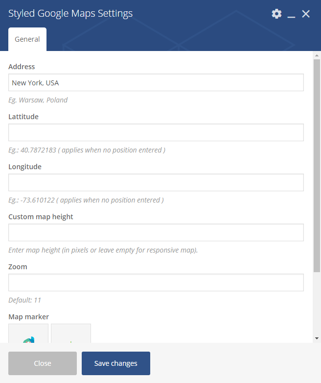
Styled Google Maps Settings
General
- Address – set adress of the marker on the map
- Lattitude
- Longitude
- Custom map height – set height of the map
- Zoom
- Map Market – set image for the marker
- Map style code – use style from snazzymaps for the map.
Icon Box
Icon Box
Icon Box Settings
General
- Title
- Subtitle
- Number of icon rows: (1 or 2 )
- Style
- Icon color
- Icon title color
- Icon subtitle color
Icon Box Settings 2
First Row Icons, Second Row Icons (avaliable 6 in each row)
- Icon 1
- Title 1
- Description 1
- Description uppercase 1 – Check Yes to make all the description text uppercase
Image carousel

Image carousel
You can customise this element with options visible below:
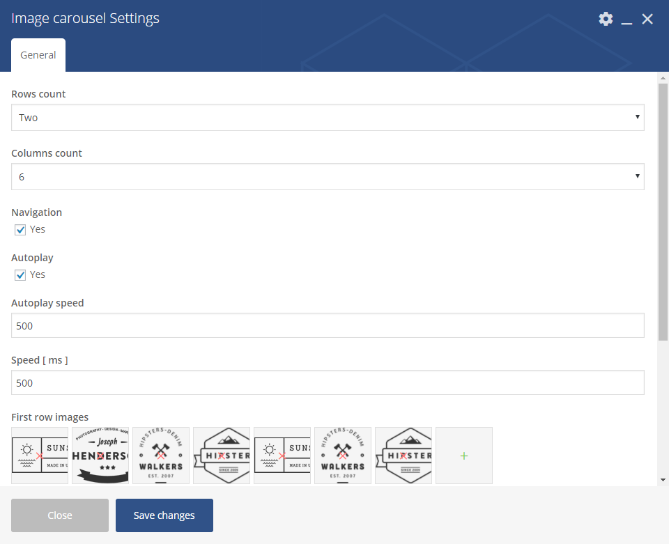
Image carousel settings
General
- Layout
- One
- Two
- Columns count – from 1 to 10
- Navigation – check Yes to show navigation
- Autoplay – check Yes to turn on autoplay
- Autoplay speed – set delay for the autoplay in (ms)
- Speed [ms]
- First row images – choose image for the first row
- Images labels – set the label for each image (visible after hover)
Image Features

Image Features
You can customise this element with options visible below:
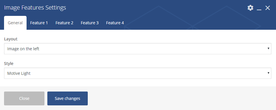
Image Features settings – General
General
- Layout
- Image on the left
- Image on the right
- Style
- Motive Light
- Motive Dark
- White
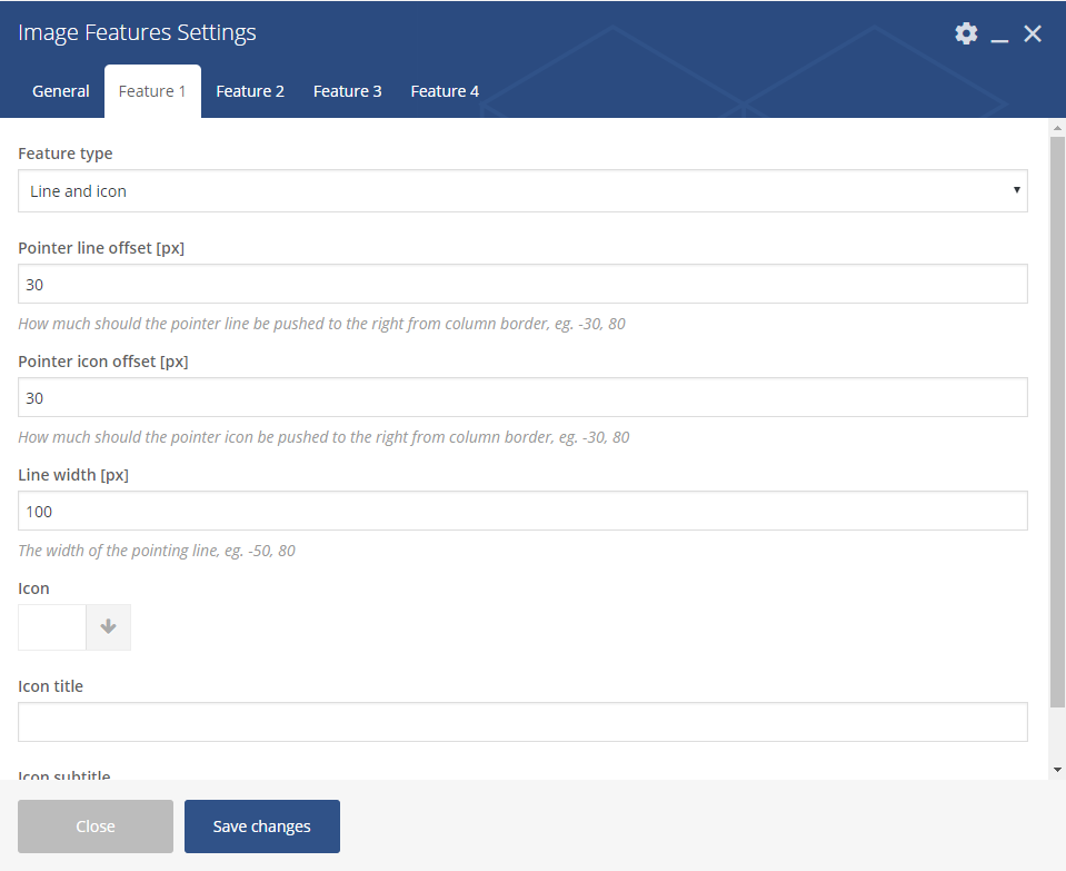
Image Features settings
Feature 1, Feature 2, Feature 3, Feature 4
- Feature type
- None (skip this feature)
- Text
- Line
- Icon
- Line and icon
- Button
- Pointer line offset
- Pointer icon offset
- Line width
- Icon
- Icon title
- Icon subtitle
Image gallery
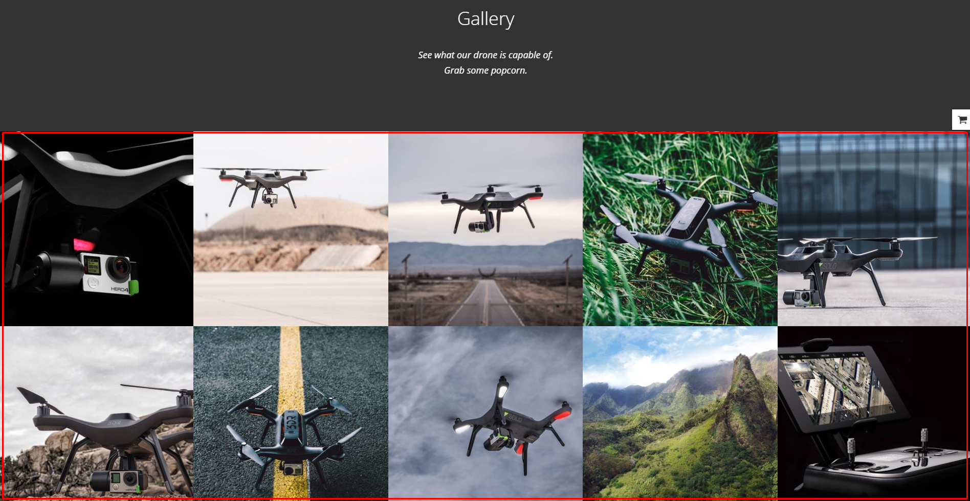
Image gallery
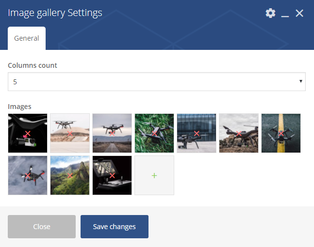
Image Gallery Settings
General
- Columns count – choose how many images will be added to single column (from 1 to 5)
- Images – choose the images from the ones added to Media Gallery
Link to section

Link to Section
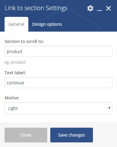
Link to Section Settings
General
- Section to scroll to
- Text label
- Motive
- Light
- Dark
- Motive
Promo Icons
Promo Icons
You can customise this element with options visible below:
Promo Icons settings – General
General
- Style
- Transparent
- Vertical
- Horizontal
- Custom CSS class – add custo class to style the element
Promo Icons settings – Icons
Icon 1, Icon 2, Icon 3, Icon 4, Icon 5, Icon 6
- Icon – set the icon for the button
- Image – set the backgroun for the icon box
- Icon color
- Icon text color
- Button enabled
- Button title
- Button link
- Button size
- Button style
- Button icon – avaliable for separated style buttons only
- Use custom colors for button? – check Yes if you wish to create button with custom colors
- Button text custom color
- Button background custom color
Promo Section

Promo Section with e-mail input
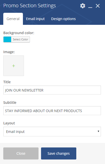
Promo Section Settings
General
- Background color
- Image
- Title
- Subtitle
- Layout
- Buttons
- Email input
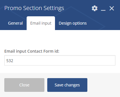
Promo Section Settings 2
Email input (when Email input chosen in Layout option)
- Email input Contact Form id
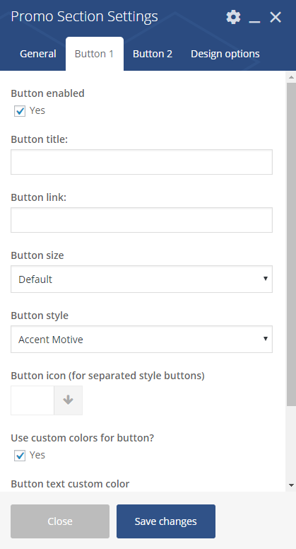
Promo Section Settings 3
Button 1, Button 2 (when Buttons input chosen in Layout option)
- Button enable – Check Yes to enable
- Button title
- Button link
- Button size
- Default
- Extra Small
- Estato Success
- Small
- Large
- Button style
- Accent Motive
- Dark
- Dark Separated
- White
- White Separated
- Transparent
- Button icon (for separated style buttons)
- Use custom colors for button? – Check Yes to use
- Button text custom color
- Button background custom color
Where to find Email input Contact Form ID?
Open the settings page for Contact Form 7, and then open the contact form you want to add. Each contact form has its own shortcode. Just copy the ID from the contatc form and use for Email input Contact Form id.

Contact form ID
Disrupt Socials
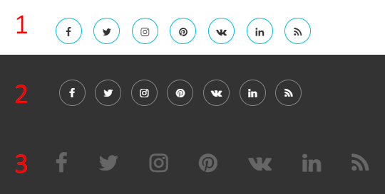
Disrupt Socials
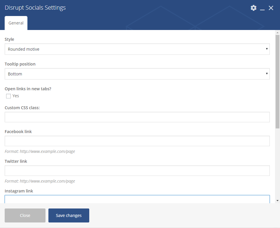
Disrupt Socials Settings
General
- Style
- Rounded motive
- Runded black
- Footer motive
- Tooltip position
- Bottom
- Top
- Right
- Left
- Hidden tooltip
- Open links in new tabs? – check Yes to enable the option
- Custom CSS class – add custom css class to style the Socials
- Facebook link, Twitter link, Instagram link, Pinterest link, Vkontakte link, Linkedin link, Rss linkn – add full link address to your social account
List
List
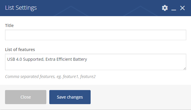
List Settings
- Title
- List of features – create a list of features by adding them with a comma separated
Video
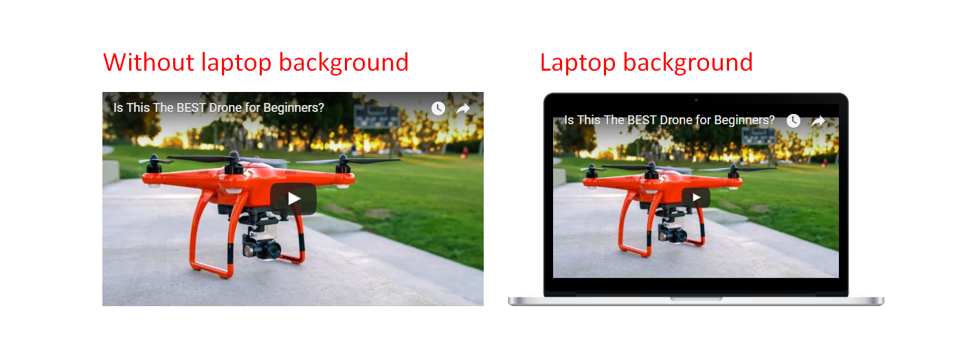
Video
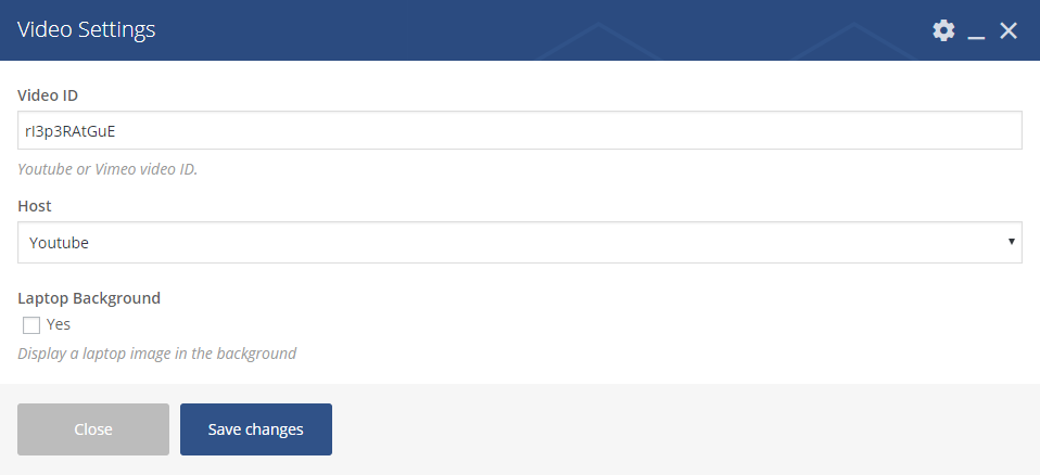
Video Settings
- Video – add the ID of the video you want to show on your site
- Host – choose between Youtube and Vimeo video
- Laptop Background – check yes if you want the video to be shown in a laptop background
Where to find ID of your Video?
-
- Youtube – It is very simple to find your YouTube video ID. First, go to the YouTube webpage. Look at the URL of that page, and at the end of it, you should see a combination of numbers and letters after an equal sign (=). This is the code you need to enter into your YouTube stack.

- Vimeo
- To find your Video ID, go to the Vimeo page and find the video you want to put on your website.
- Once it is loaded, look at the URL and look for the numbers that come after the slash (/).
- This number is the Video ID and what you will use in your stack settings.
- Youtube – It is very simple to find your YouTube video ID. First, go to the YouTube webpage. Look at the URL of that page, and at the end of it, you should see a combination of numbers and letters after an equal sign (=). This is the code you need to enter into your YouTube stack.
Woo Promo Section

Woo Promo Section
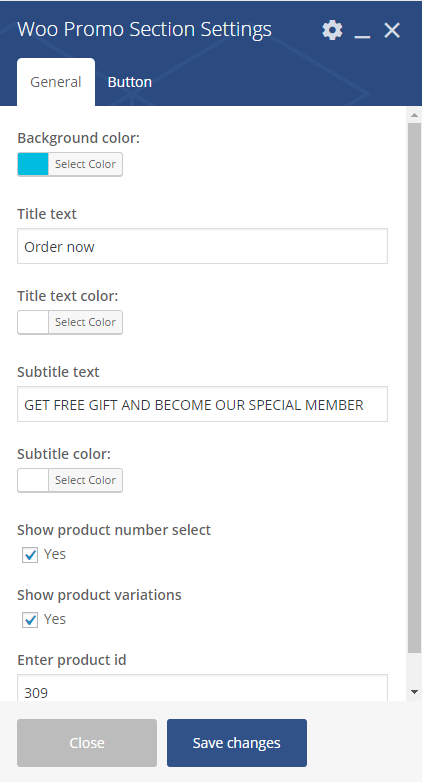
Woo Promo Section Settings
General
- Background color
- Title text
- Title text color
- Subtitle text
- Subtitle text
- Show product number select – Check Yes to show
- Show product variations – Check Yes to show
- Enter product id
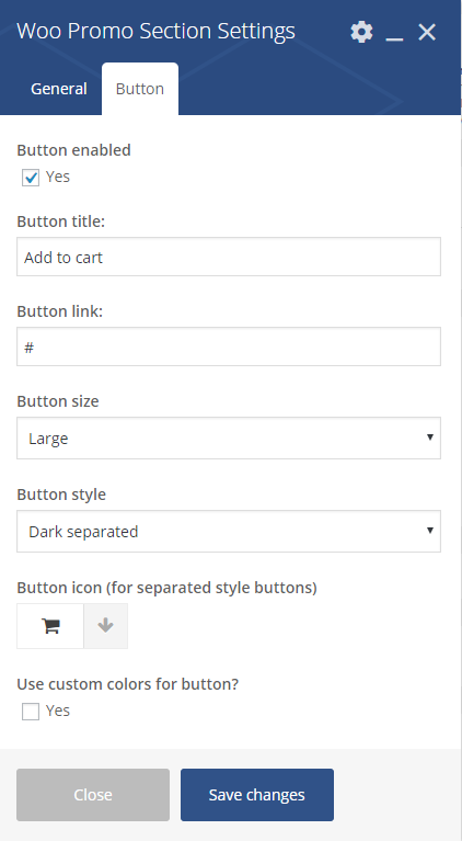
Woo Promo Section Settings 2
Button
- Button enabled
- Button title
- Button link
- Button size
- Defaukt
- Extra Small
- Small
- Large
- Button syle
- Accent motive
- Dark
- Dark separated
- White
- White separated
- Transparent
- Button icon (for separated style buttons)
- Use custom color for button – Check Yes to show
- Button text custom color: (avaliable only when Use custom color for button is checked)
- Button backgroun custom color: (avaliable only when Use custom color for button is checked)
Where to find product ID?
A WooCommerce Product ID is sometimes needed when using shortcodes, widgets and links. To find the ID, go to  and hover over the product you need the ID for. The product ID number is displayed.
Product with ID
FAQ
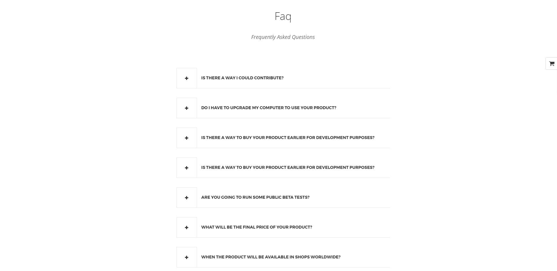
Faq
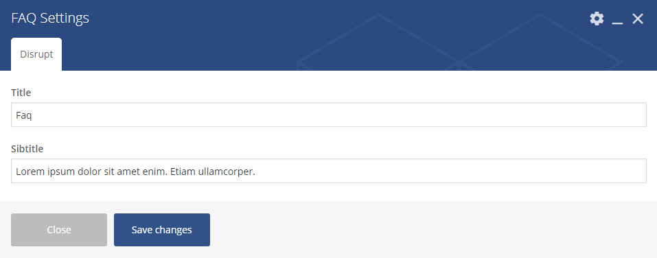
Faq Settings
Disrupt
- Title
- Subtitle
Shop locator
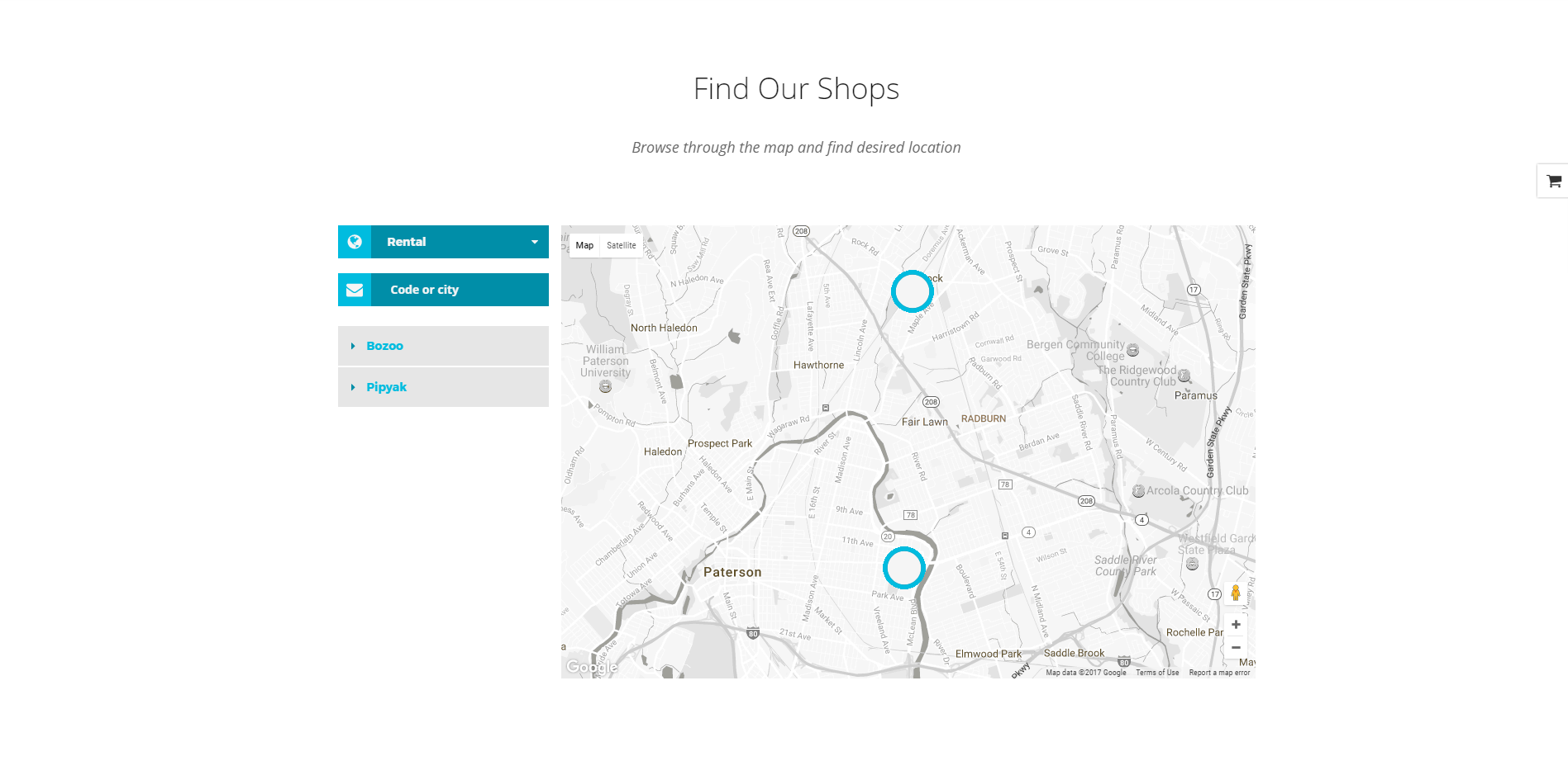
Shop Locator
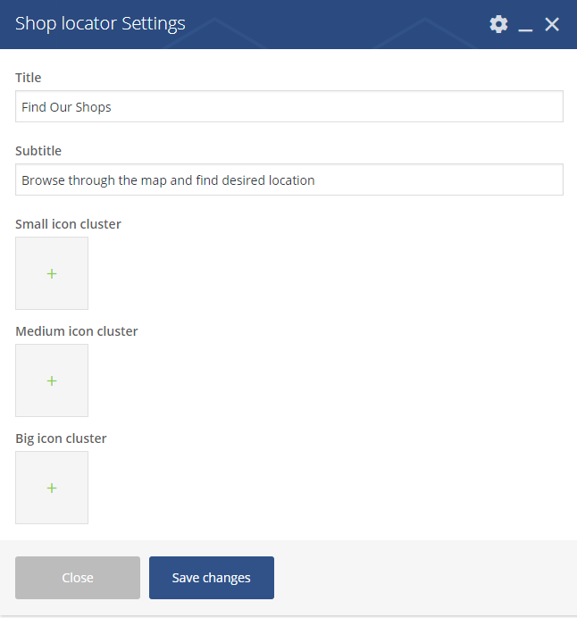
Shop Locator Settings
Avaliable option that can be set via this shortcode:
- Title
- Subtitle
- Small icon cluster
- Medium icon cluster
- Big icon cluster
Team display
Testimonial slider
Was this article helpful ?
Page Header
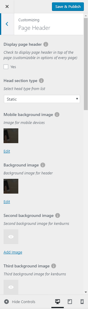
Page header
In Test page header section you can custom your site by all the avaliables options like:
- Display page header – let show page header on all of the pages
- Display page header in main page (avaliable only when Display page header is checked)
- Display breadcrumbs (avaliable only when Display page header is checked)
- Head section type – you will be able to choose from:
- Static
- Parralax
- Video
- Kenburns
- Mobile background image
- Background image
- Second background image
- Third background image
- Head height
- Parallax ratio
- Video url
- Video file type
This customize option will let you set global options for the header of your site pages taht can be accessed from  . They will only work when in pages the Header Options section will be set to Head settings: Use global customizer settings. Also you can set header options for each of the pages by the Head settings instead.
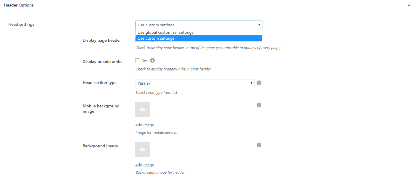
Header options settings for single page
Was this article helpful ?
Footer
In Footer content tab you can define the following settings:
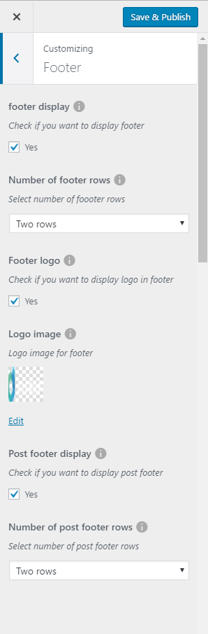
Footer settings
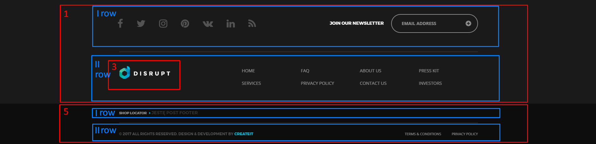
Footer and pos footer
- Footer display – check Yes if you want to display footer section on the website
- Number of footer rows – choose the number of rows visible in the footer section (One row, Two rows)
- Footer logo – check if you want to display logo in footer
- Logo image – set the logo
- Post footer display – check yes you want to display post footer
- Number of post footer rows – choose the number of rows visible in the post footer section (One row, Two rows)
Notice:
All changes made with customizer will only be applied when you click on
Was this article helpful ?
Index Blog page
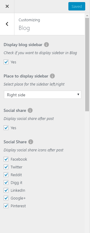
Blog settings
In Blog content tab you can define the following settings for Blog Index page.:
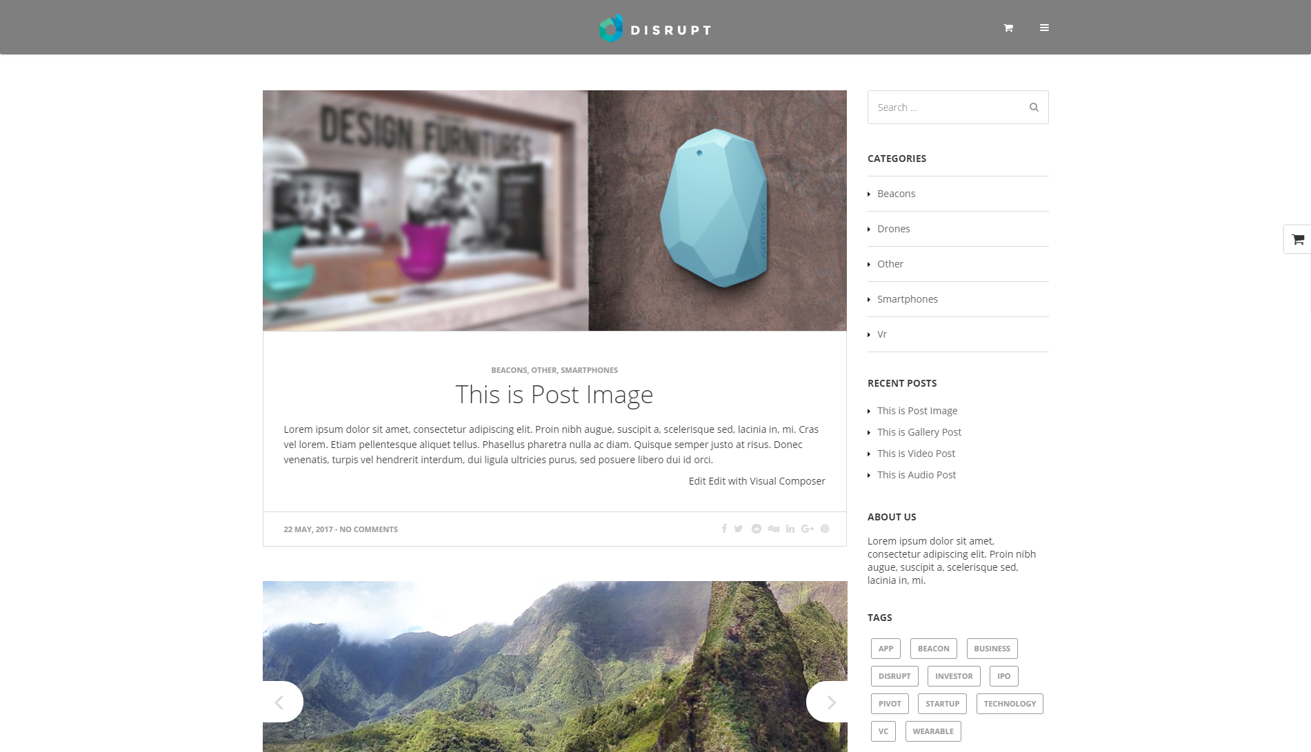
Blog Index
- Display blog sidebar – Check Yes if you want to display sidebar with widgets on blog page.
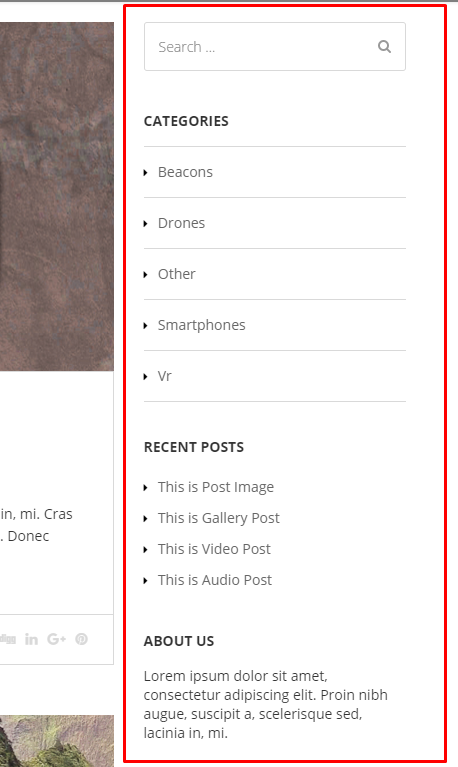
Blog Index page – sidebar right
- Place to display sidebar – Chose place for blog sidebar
- Left side
- Right side
- Social share – Check Yes to display social share icons after post, that will let you share post on this social platforms
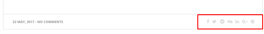
Socials visible after post
- Social Share – avaliable social share icons you can use
- Digg it
- Linkeding
- Google +
Notice:
All changes made with customizer will only be applied when you click on
Was this article helpful ?
Single blog post
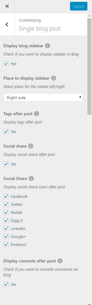
Single blog post settings
In Blog content tab you can define the following settings for Blog single page.:
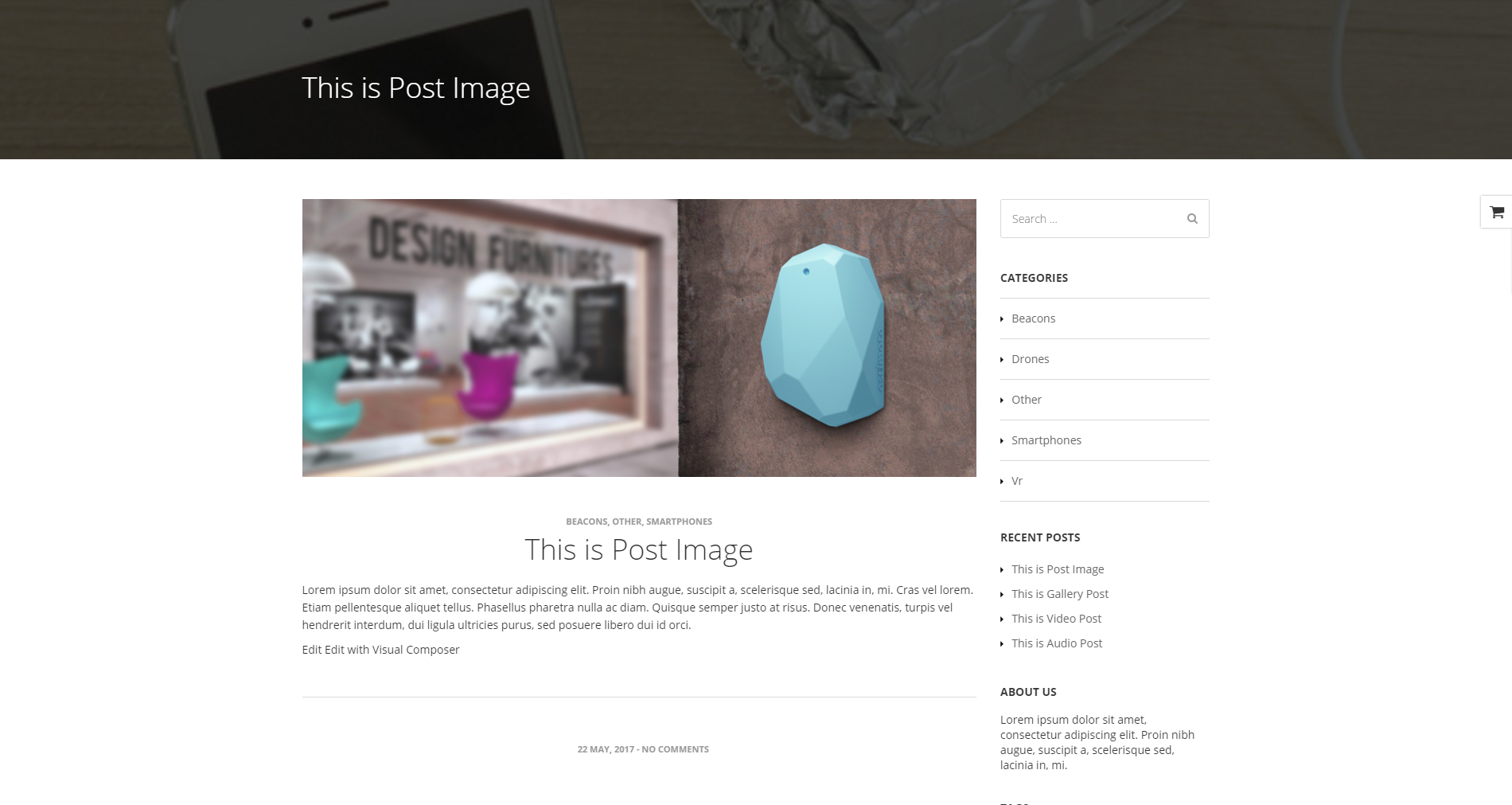
Single blog page
In Single blog post content tab you can define the following settings for Blog Index page.:
- Display blog sidebar – Check Yes if you want to display sidebar with widgets on blog page.
Blog Index page – sidebar right
- Place to display sidebar – Chose place for blog sidebar
- Left side
- Right side
- Tags after posts – Check Yes to display tags after post
- Social share – Check Yes to display social share icons after post, that will let you share post on this social platforms

Socials visible after post
- Social Share – avaliable social share icons you can use
- Digg it
- Linkeding
- Google +
- Display comments after post – Check Yes if you want to activate comments on blog
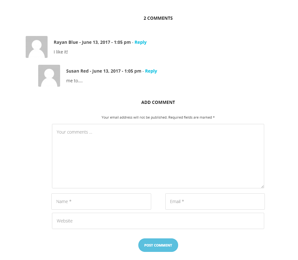
Display comment section
Notice:
All changes made with customizer will only be applied when you click on
Was this article helpful ?
Shop
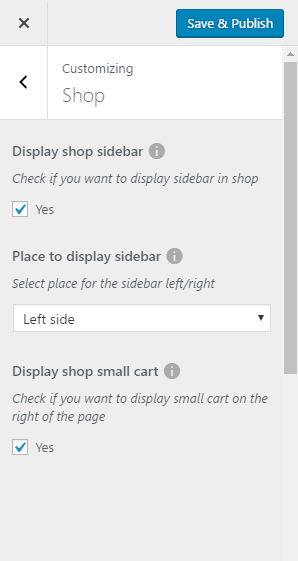
Shop settings
In Shop content tab you can define the following settings for shop page.:
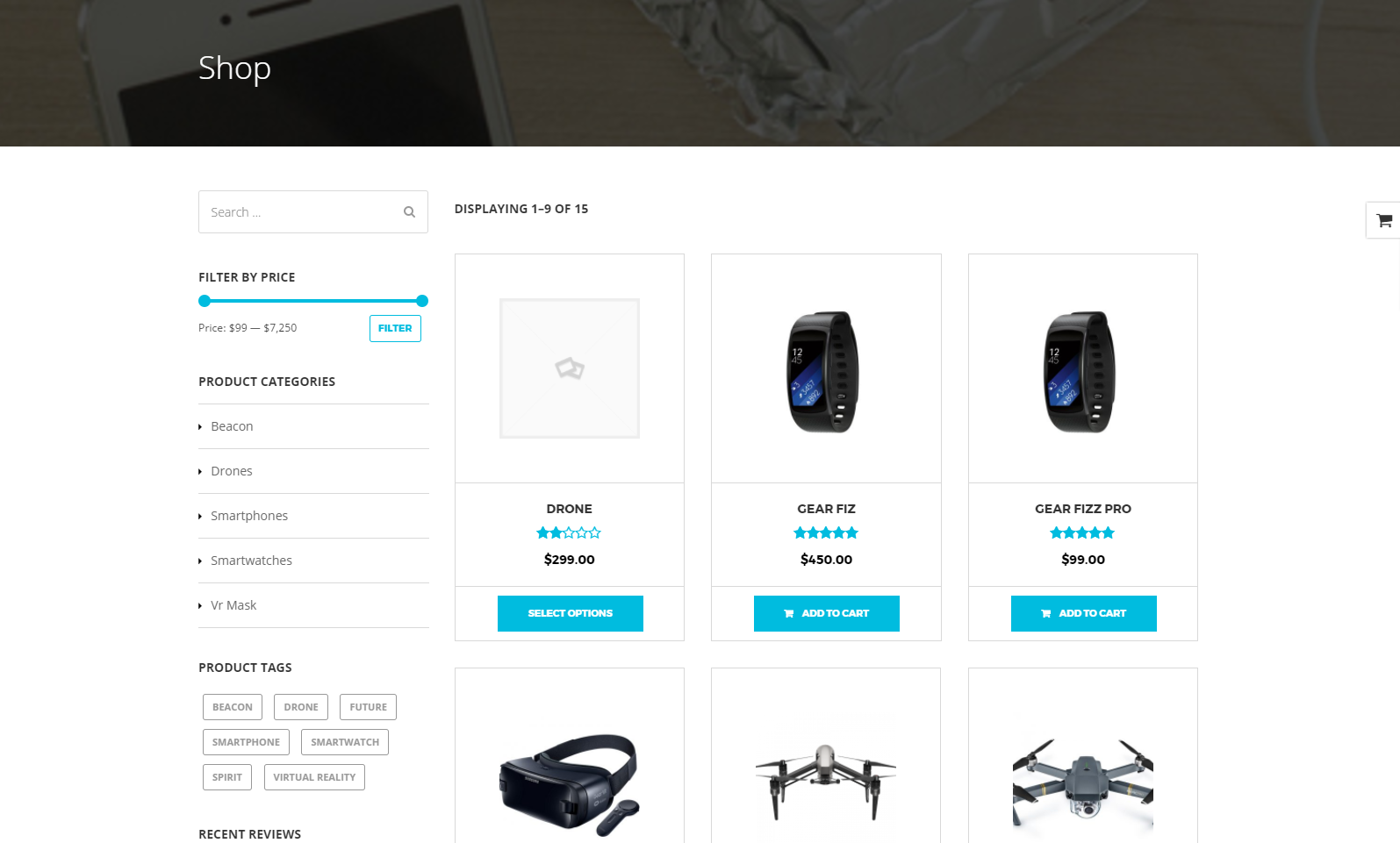
Shop Index page
- Display shop sidebar – check Yes to display sidebar
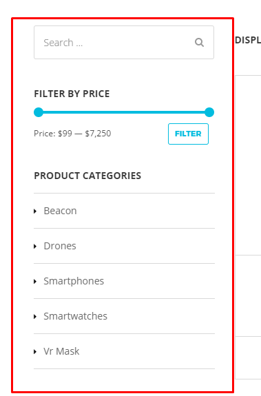
Shop sidebar
- Place to display sidebar
- Left side
- Right side
- Display shop small cart – check Yes if you want to display shop small cart
Small shop cart (activate)
Notice:
All changes made with customizer will only be applied when you click on
Was this article helpful ?
Portfolio
Portfolio settings
In Portfolio content tab you can define the following settings for Portfolio Single page.:
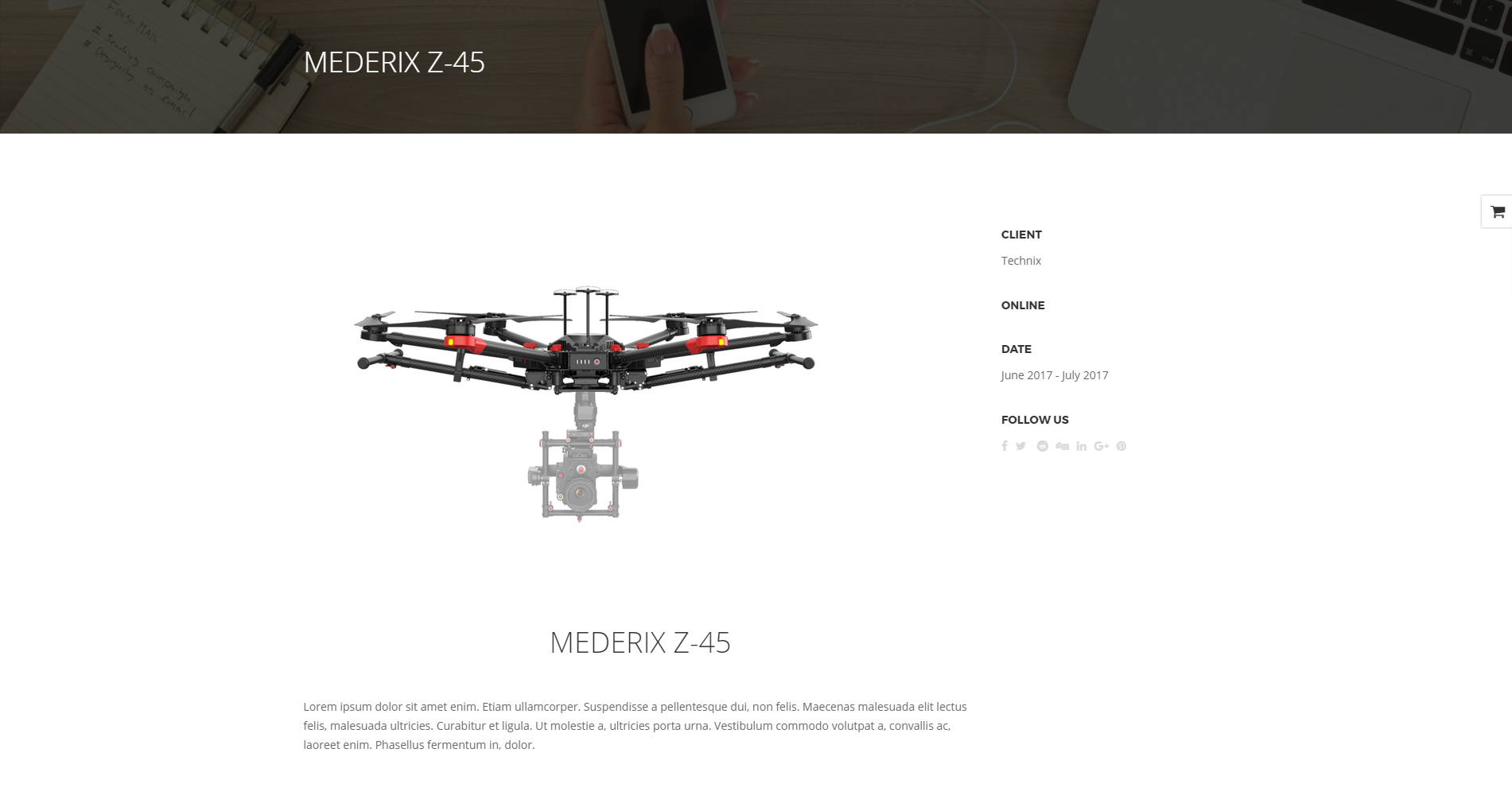
Portfolio Single page
- Display portfolio sidebar – check Yes to display sidebar
- Place to display sidebar
- Left side
- Right side
- Social share – Check Yes to display social share icons after post, that will let you share post on this social platforms

Portfolio socials
- Social Share – avaliable social share icons you can use
- Digg it
- Linkeding
- Google +
Notice:
All changes made with customizer will only be applied when you click on Save & Publish button
Was this article helpful ?
Disrupt’s forms
Contact forms in Test are created with the use of Contact Form 7 Plugin. Below you will find information how to recreate Contact forms used in our theme by adding the correct markup for the Form section of this plugin.
Contact form markup added to Form
If you never before used this plugin I suggest you to check Getting Started with ContactForm 7.
Contact form
Contact form
Contact form can be recreated by using this markup for contact form:
|
1 2 3 4 5 6 7 8 9 10 11 12 13 14 15 16 17 18 19 20 21 22 23 24 25 26 27 28 29 30 31 32 |
<div class="ct-contactForm validateIt"> <div class="row"> <div class="col-sm-4"> <div class="form-group">[text* your-name class:form-control placeholder "Name"]<label for="cf-name" class="sr-only">Name*</label></div> </div> <div class="col-sm-4"> <div class="form-group">[email* your-email class:form-control placeholder "Email Adress"]<label for="cf-email" class="sr-only">Email address*</label> </div> </div> <div class="col-sm-4"> <div class="form-group">[text website class:form-control placeholder "Website"]<label for="cf-website" class="sr-only">Website</label> </div> </div> </div> <div class="row"> <div class="col-sm-4"> <div class="form-group">[text phone-no class:form-control placeholder "Phone No"]<label for="cf-phone" class="sr-only">Phone no</label></div> </div> <div class="col-sm-8"> <div class="form-group">[text* meeting-subject class:form-control placeholder "Meeting Subject*"]<label for="cf-subject" class="sr-only">Meetings subject*</label> </div> </div> </div> <div class="row"> <div class="col-sm-12"> <div class="form-group">[textarea* message 10x1 class:form-control placeholder "Message*"]<div class="ct-contactForm-requiredMessage">*Marked fields are mandatory</div> <button type="submit" class="btn btn--withIcon">Send message<i class="fa fa-caret-right"></i></button> <label for="cf-message" class="sr-only">Message*</label> </div> </div> </div> </div> |
Footer – newsletter

Footer newsletter
To recreate this contact form please use:
|
1 2 3 4 5 |
<div class="form-group"> <label> JOIN OUR NEWSLETTER </label> <span class="inner">[email* your-email class:form-control placeholder "Email address"] <button type="submit"><i class="fa fa-plus-circle"></i></button></span> </div> |
In our demo this form is added to the Footer second column in first row widgets via adding this contatc form shortcode to text widget as you can see on the image below:
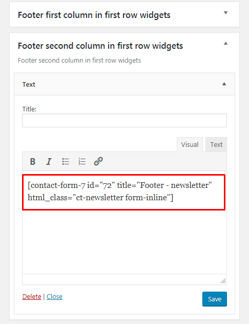
Adding contact form to widget
Promosection – newsletter
This contact form can be recreated by using PromoSection shortcode. More information about it, you will be able to find in the Disrupt custom shortcodes section by adding there Contact form ID.
Adding ID to Promo Section shortcode

Promosection newsletter
To recreate this Newsletter form please use for the contact form:
|
1 2 3 |
<div class="form-group"> <span class="inner">[email* your-email class:form-control placeholder "Email address"]<button type="submit"><i class="fa fa-plus-circle"></i></button></span> </div> |
Was this article helpful ?
Disrupt Plugin
Plugin dedicated for Disrupt WordPress Theme that will allow you number of custom features like:
- portfolio items,
- faq items,
- testimonials,
- Disrupt WP custom VisualComposer shortcodes
- Disrupt WP shortcodes for WPL
Was this article helpful ?
Unysone plugin
Getting started
Unyson is a framework for WordPress that facilitates development of a theme. This framework was created from the ground up by the team behind ThemeFuse from the desire to empower developers to build outstanding WordPress themes fast and easy. This documentation is heavily modified by createIT to ensure all custom extensions are well documented.
This documentation assumes you have a working knowledge of WordPress. If you haven’t, please start by reading WordPress Documentation.
Minimum Requirements
- WordPress 4.0 or greater
- PHP version 5.2.4 or greater
- MySQL version 5.0 or greater
Installation
Unyson is included in Test package – so you don’t have to do anything more than click install and activate.
You can also install the plugin manually:
- Upload the unyson folder to the /wp-content/plugins/ directory
- Activate the Unyson plugin through the ‘Plugins’ menu
- Configure the plugin by going to the Unyson menu and activating the following extensions:
{extension}
Unyson Extensions (example)
License
The licenses for most software are designed to take away your freedom to share and change it. By contrast, the GNU General Public License is intended to guarantee your freedom to share and change free software. Unyson inherits the General Public License (GPL) from WordPress.
Was this article helpful ?
Opal Hotel Room Booking
Opal Hotel Plugin is a user-friendly booking plugin built with woocommerce that allows you to integrate a booking/reservation system into your WordPress website.
Under this link you find documentation how to use the plugin: Opal Hotel Room Booking documentation
Was this article helpful ?
Activating plugins
Test comes with number of custom features like:
{custom_features}
For the correct operation of Test you have to install and activate them for Test:
{plugin_list}
After activating Test you will also get the information about all of theplugins that you should or can install and activate for the full experience of the Theme. You can find this information on path Appearance > Theme Installation.
Also the information about all required plugins that should be installed and activated you will find in WordPress dashboard on path Appearance > Theme Installation
Theme installation instruction
With these plugins your custom post types will be saved in your admin panel, even if you change your WordPress theme.
Notice: Plugin must be installed and activated right after you install and activate the Test – otherwise you might be encountered problems with correct theme functioning.
Install plugin (example)
Was this article helpful ?
Siver Customize
Test comes with an advanced customizer, which allows to edit most of the theme elements in one place. If you want to use it, navigate to Appearance > Customize
Customizer
It will display a panel with tabs corresponding to all theme sections, such as:
- Navigation
- Blog
- Single blog post
- Shop
- Portfolio
- Footer
- Widgets
You will also find the main style settings:
- General
- Page Head
- Header Image
General
General settings
This style setting customize option will let you to:
- Choose the motive and accent motive color for your theme
motive and accent motive color
- Check onepager option if you want to have onepager site (more info about onepager site HERE)
- You can choose if you want to use a preloader and what Image will be visible when the page will be loading.
Loading example
Header Image
In Header Image section you can edit logo on the site
Header image settings
Notice:
All changes made with customizer will only be applied when you click on
Was this article helpful ?
Siver custom shortcodes
With Test comes many custom shortcodes for VC that are used to show content created in Test. Below you will find short information about this VisualComposer elements:
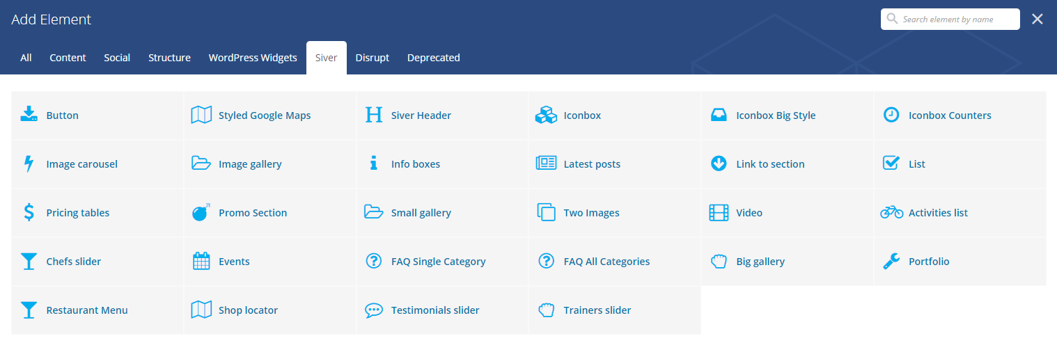
Siver avaliable shortcodes
Button Siver
This theme come with VC item that gave you option to create buttons that can be used in the theme.
Siver buttons
This item contains many variation that will let you create button that will suit you best.
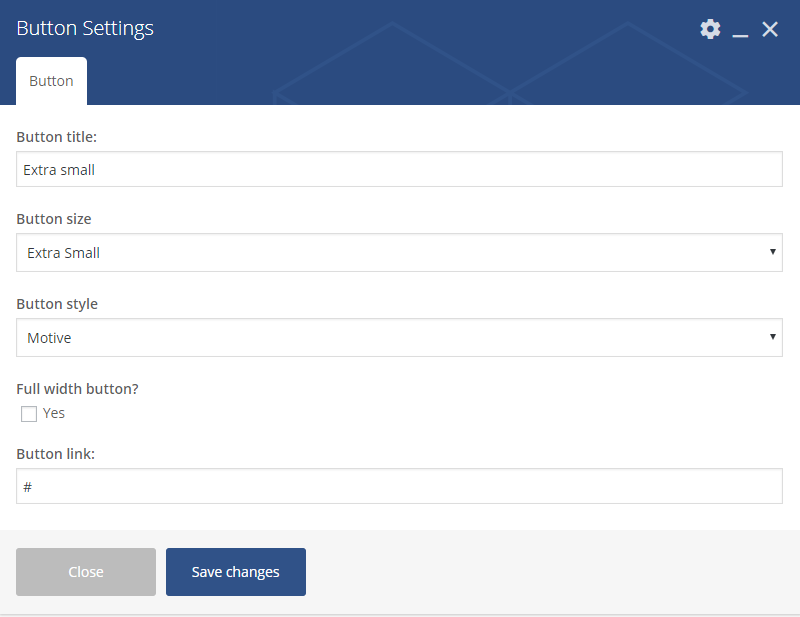
Button settings
Button
- Button title – set the text that will be visible in the button
- Button size
- Default
- Extra Small
- Estato Success
- Small
- Large
- Button style
- Motive
- Motive dark hover
- Motive transparent
- Motive transparent, dark text
- Light
- Light dark hover
- Light transaprent
- Light transparent, dark text
- Full width button? – check Yes to make the button full width
- Button link
Styled Google Maps Settings
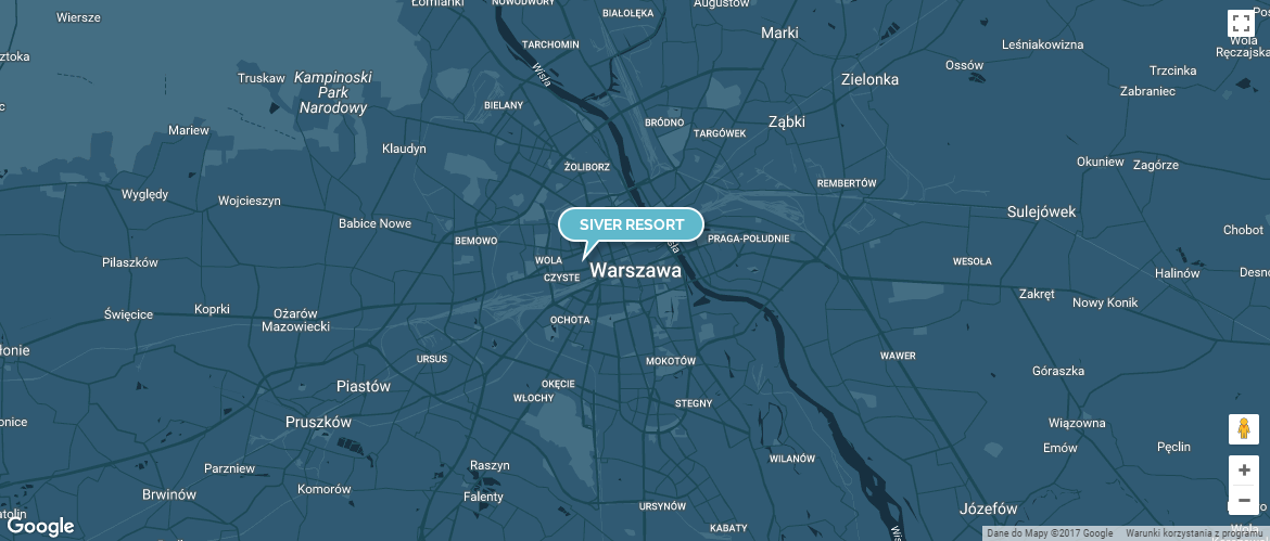
Styled Google maps settings
You can customise this element with options visible below:
Styled Google Maps Settings
General
- Adress – set the adress of the location you want to show on your map via map marker
- Lattitude – will work only when Adress will not be set
- Longitude – will work only when Adress will not be set
- Custom map height – set custom height of the map (px)
- Zoom – set the zoom of the map (by deafult it is set to 11)
- Map marker – add the image that will be used as a marker on the map
- Map style code – use style from snazzymaps for the map.
Siver Header

Siver Header
You can customise this element with options visible below:
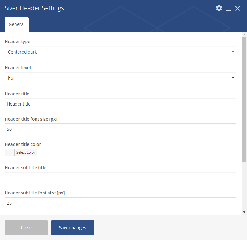
Siver Headers settings
General
- Header type – set the type of the header. The colors that are part of this type will work only when there will be no color set in the settings
- Center dark
- Center light
- Left aligned – light
- Left aligned – dark
- Left aligned type 2 – light
- Left aligned type 2 – dark
- Header level – set the level use for header
- h1
- h2
- h3
- h4
- h5
- h6
- Header title
- Header title font size (px)
- Header title color
- Header subtitle title
- Header subtitle font size (px)
- Header subtitle color
- Header top margin (px)
- Header bottom margin (px)
Iconbox
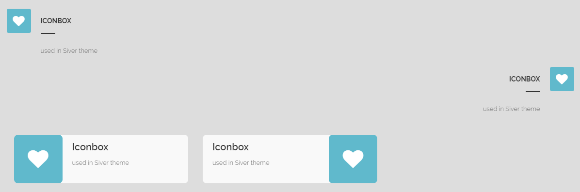
Iconbox
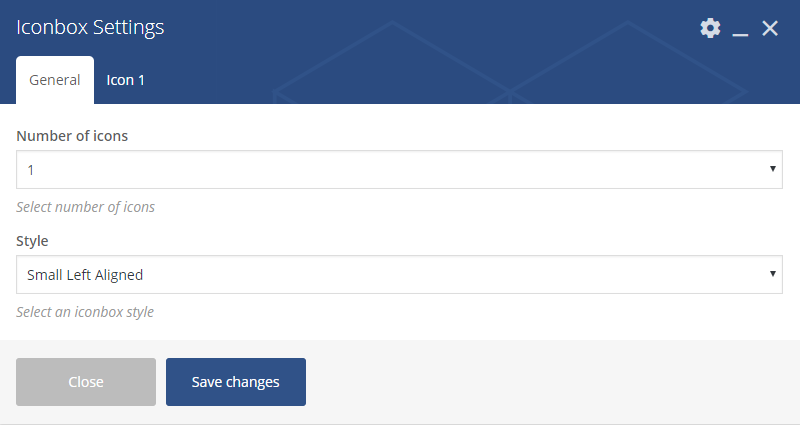
Iconbox settings
General
- Number of icons – it can be set from 1 to 4
- Style
- Small Left Aligned
- Small Right Aligned
- With Background Left Aligned
- With Background Right Aligned
Icons 1 (you can set the number of icons to 4)
- Title – set the title used in the iconbox
- Text – enter a subtitle
- Icon – choose an icon that will be used for the iconbox
Iconbox Big Style
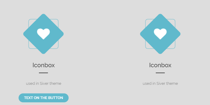
Iconbox big style
WIP
You can customise this element with options visible below:
Image carousel settings
General
- Layout
- One
- Two
- Columns count – from 1 to 10
- Navigation – check Yes to show navigation
- Autoplay – check Yes to turn on autoplay
- Autoplay speed – set delay for the autoplay in (ms)
- Speed [ms]
- First row images – choose image for the first row
- Images labels – set the label for each image (visible after hover)
Image Features
Image Features
You can customise this element with options visible below:
Image Features settings – General
General
- Layout
- Image on the left
- Image on the right
- Style
- Motive Light
- Motive Dark
- White
Image Features settings
Feature 1, Feature 2, Feature 3, Feature 4
- Feature type
- None (skip this feature)
- Text
- Line
- Icon
- Line and icon
- Button
- Pointer line offset
- Pointer icon offset
- Line width
- Icon
- Icon title
- Icon subtitle
Image gallery
Image gallery
Image Gallery Settings
General
- Columns count – choose how many images will be added to single column (from 1 to 5)
- Images – choose the images from the ones added to Media Gallery
Link to section
Link to Section
Link to Section Settings
General
- Section to scroll to
- Text label
- Motive
- Light
- Dark
- Motive
Promo Icons
Promo Icons
You can customise this element with options visible below:
Promo Icons settings – General
General
- Style
- Transparent
- Vertical
- Horizontal
- Custom CSS class – add custo class to style the element
Promo Icons settings – Icons
Icon 1, Icon 2, Icon 3, Icon 4, Icon 5, Icon 6
- Icon – set the icon for the button
- Image – set the backgroun for the icon box
- Icon color
- Icon text color
- Button enabled
- Button title
- Button link
- Button size
- Button style
- Button icon – avaliable for separated style buttons only
- Use custom colors for button? – check Yes if you wish to create button with custom colors
- Button text custom color
- Button background custom color
Promo Section
Promo Section with e-mail input
Promo Section Settings
General
- Background color
- Image
- Title
- Subtitle
- Layout
- Buttons
- Email input
Promo Section Settings 2
Email input (when Email input chosen in Layout option)
- Email input Contact Form id
Promo Section Settings 3
Button 1, Button 2 (when Buttons input chosen in Layout option)
- Button enable – Check Yes to enable
- Button title
- Button link
- Button size
- Default
- Extra Small
- Estato Success
- Small
- Large
- Button style
- Accent Motive
- Dark
- Dark Separated
- White
- White Separated
- Transparent
- Button icon (for separated style buttons)
- Use custom colors for button? – Check Yes to use
- Button text custom color
- Button background custom color
Where to find Email input Contact Form ID?
Open the settings page for Contact Form 7, and then open the contact form you want to add. Each contact form has its own shortcode. Just copy the ID from the contatc form and use for Email input Contact Form id.
Contact form ID
Disrupt Socials
Disrupt Socials
Disrupt Socials Settings
General
- Style
- Rounded motive
- Runded black
- Footer motive
- Tooltip position
- Bottom
- Top
- Right
- Left
- Hidden tooltip
- Open links in new tabs? – check Yes to enable the option
- Custom CSS class – add custom css class to style the Socials
- Facebook link, Twitter link, Instagram link, Pinterest link, Vkontakte link, Linkedin link, Rss linkn – add full link address to your social account
List
List
List Settings
- Title
- List of features – create a list of features by adding them with a comma separated
Video
Video
Video Settings
- Video – add the ID of the video you want to show on your site
- Host – choose between Youtube and Vimeo video
- Laptop Background – check yes if you want the video to be shown in a laptop background
Where to find ID of your Video?
-
- Youtube – It is very simple to find your YouTube video ID. First, go to the YouTube webpage. Look at the URL of that page, and at the end of it, you should see a combination of numbers and letters after an equal sign (=). This is the code you need to enter into your YouTube stack.
- Vimeo
- To find your Video ID, go to the Vimeo page and find the video you want to put on your website.
- Once it is loaded, look at the URL and look for the numbers that come after the slash (/).
- This number is the Video ID and what you will use in your stack settings.
- Youtube – It is very simple to find your YouTube video ID. First, go to the YouTube webpage. Look at the URL of that page, and at the end of it, you should see a combination of numbers and letters after an equal sign (=). This is the code you need to enter into your YouTube stack.
Woo Promo Section
Woo Promo Section
Woo Promo Section Settings
General
- Background color
- Title text
- Title text color
- Subtitle text
- Subtitle text
- Show product number select – Check Yes to show
- Show product variations – Check Yes to show
- Enter product id
Woo Promo Section Settings 2
Button
- Button enabled
- Button title
- Button link
- Button size
- Defaukt
- Extra Small
- Small
- Large
- Button syle
- Accent motive
- Dark
- Dark separated
- White
- White separated
- Transparent
- Button icon (for separated style buttons)
- Use custom color for button – Check Yes to show
- Button text custom color: (avaliable only when Use custom color for button is checked)
- Button backgroun custom color: (avaliable only when Use custom color for button is checked)
Where to find product ID?
A WooCommerce Product ID is sometimes needed when using shortcodes, widgets and links. To find the ID, go to and hover over the product you need the ID for. The product ID number is displayed.
Product with ID
FAQ
Faq
Faq Settings
Disrupt
- Title
- Subtitle
Shop locator
Shop Locator
Shop Locator Settings
Avaliable option that can be set via this shortcode:
- Title
- Subtitle
- Small icon cluster
- Medium icon cluster
- Big icon cluster
Team display
Testimonial slider
Was this article helpful ?
Siver forms
Contact forms in Test are created with the use of Contact Form 7 Plugin. Below you will find information how to recreate Contact forms used in our theme by adding the correct markup for the Form section of this plugin.
Contact form markup added to Form
If you never before used this plugin I suggest you to check Getting Started with ContactForm 7.
Page contact
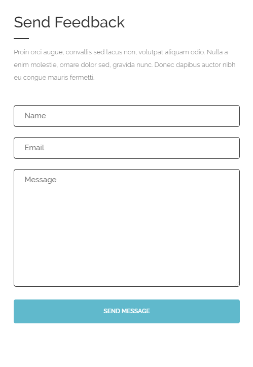
Contact form
Contact form can be recreated by using this markup for contact form:
|
1 |
<div class="form-group text-right"><span class="inner"><label class="sr-only"> Your Name </label> [text* Name placeholder "Name"]<label class="sr-only"> Your Email </label> [email* email placeholder "Email"]<label class="sr-only"> Message </label> [textarea* Email placeholder "Message"]<br><button type="submit" class="btn btn-motive--darkHover btn-full">Send Message</button></span></div> |
Footer – newsletter
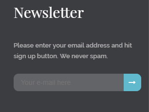
Footer newsletter
To recreate this contact form please use:
|
1 |
<div class="form-group"><label> Please enter your email address and hit sign up button. We never spam.</label><span class="inner">[email* your-email placeholder "Your e-mail here"]<button type="submit"><span class="fa fa-long-arrow-right" aria-hidden="true"> <span class="sr-only">Submit</span></span></button></span></div> |
In our demo this form is added to the Footer second column in first row widgets via adding this contatc form shortcode to text widget as you can see on the image below:
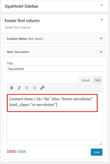
Adding contact form to widget
Was this article helpful ?
Creating new property in admin panel
Below you will learn how to create a new Property item in {theme}
-
- To start creating this element please go to WPL > Add listing in your WordPress Dashboard.
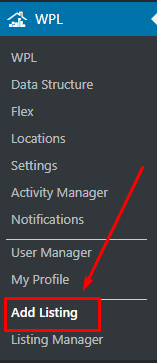
Add lisitng
- Choose Basic Details and add there information about the new property like title, description, type, price, number of rooms, etc. Information like Meta description and Meta keywords will be added automatically.
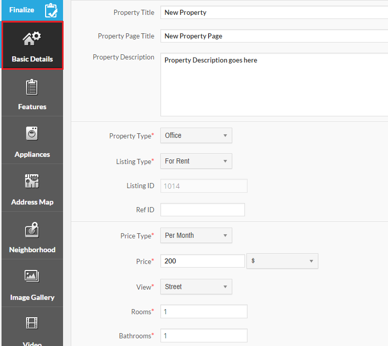
Adding basic information about the property
- The next step will be moving to Features tab where you can add your property features like additional rooms, jacuzzi or swimming pool.
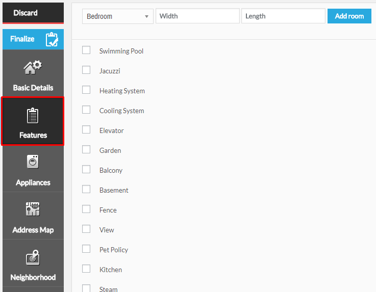
Features details
- In Appliances, specify all the appliances that are avaliable for your property like Refrigirator or TV.
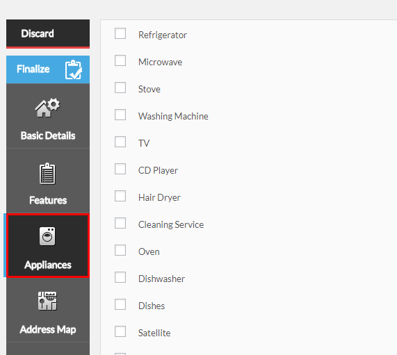
Appliances checklist
- Moving to Adress Map you will be able to add the property address that then will be shown on the map.
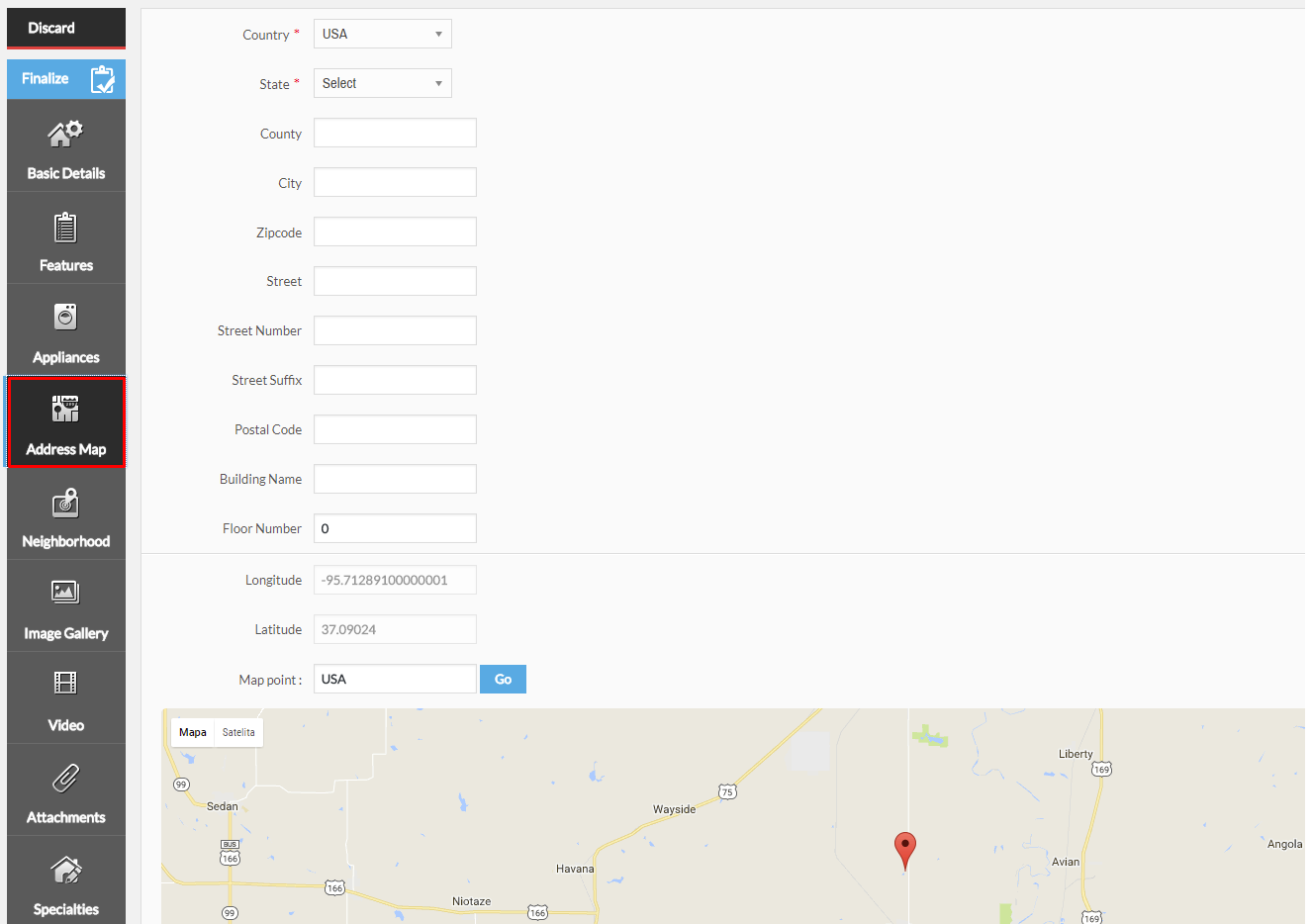
Adress Map
- If you want to add information what is in the property neighbourhood in the Neighbourhood section.
- You can show how the property look by adding images in Image Gallery.
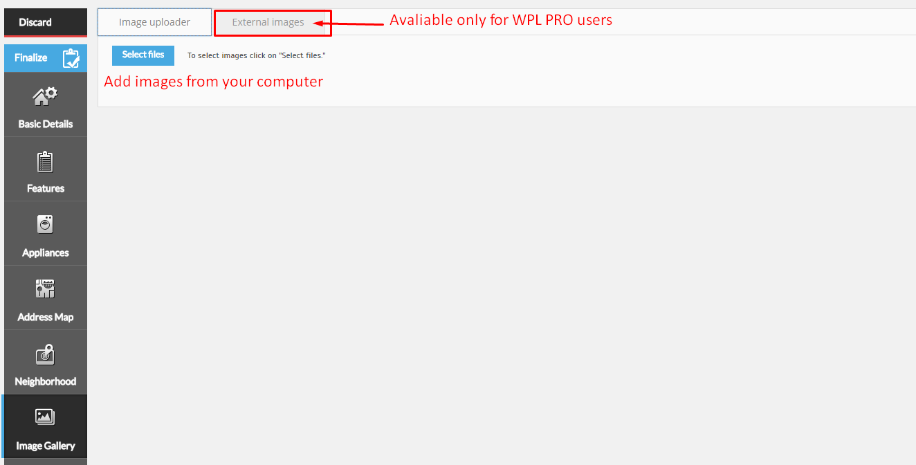
- If you wish to attach any files or video please go to Video and Attachments tabs
- You can also select options from the Spacialties tab
- To start creating this element please go to WPL > Add listing in your WordPress Dashboard.
After all the information are added click on Finalize, so all the changes will be saved. To check the result on your website Properties page.
Finalize
Was this article helpful ?
Installation via Administration Panel
If Test files are downloaded from your Themeforest account, you can start an installation using WordPress administration panel.
Here you can find instructions how to proceed with 4.7.0 and lower versions of WordPress.If you’re using newer version, follow steps below to install the theme:
- Step 1 – Once you’ve logged in to your administration panel, go to My Sites > Network Admin.

Network Admin
- Step 2 – Then click on Themes > Add New, you will be directed to a page where you can choose available themes.

Add New Theme
- Step 3 – Once directed to the page, on the upper left side of the screen click on Upload Theme button.
- Step 4 – Choose the {theme}.zip file from your computer, then click Install Now.

Upload Theme and Install
- Step 5 – Click on My Sites then go to Appearance > Themes and Activate Test.

Activate Estato
- Step 6 – After activating Test, you will be sent to Theme Installation Instruction steps. By following this steps you will be asked to install required plugins, activate them, import demo content (required) and install sample of WPL content.

Theme Installation Instructions
Common Install Error: Are You Sure You Want To Do This?
If you get the following question message when installing Test.zip file via WordPress, it means that you have an upload file size limit. Install the theme via FTP or call your hosting company and ask them to increase the limit.
Was this article helpful ?
Import demo content
The fastest and easiest way to import our demo content is to use the Theme Options Demo Content Install. It will import all pages and posts, several sample sliders, widgets, theme options, assigned pages, and more.
We recommend this approach on a newly installed WordPress. It will replace the content you currently have on your website. However, we create a backup of your current content in (Tools > Backup). You can restore the backup from there at any time in the future.

To import our demo content, please follow the steps below:
- Step 1 – Install and activate plugins listed in Theme Installation Instructions message.
- Step 2 – In Dashboard go to Unyson and make sure that Backup & Demo Content Extensions is activated.

- Step 3 – Navigate to Tools > Demo Content Install, where after activating the Unyson Extensions, Demo Content Install option will be available.

- Step 4 – Choose the import option you want to use from the available options.
- Step 5 – Wait until the content will be installed.

Importing can take a few minutes. Please be patient and wait for it to complete. Once it will be loading, you will see message with indicating progress.
Properties Listing Demo
Demo Properties Listing is not automatically added by the demo.

For you to get the demo Properties Listing, follow these steps:
- Step 1 – Navigate your Dashboard to WPL > Settings and look for Sample Properties.

- Step 2 – Click on the Add Sample Properties button to add sample properties. Wait until download is finished.
- Step 3 – Once the loading icon is gone, the download is done. You will see the sample properties in WPL > Listing Management.

Was this article helpful ?
Creating Testimonials
To create a Testimonial go to Testimonials > Add New, where you will be able to create a new Testimonials item.

When creating a new Testimonials item you will be able to add the following:

- A) Title
- B) Content
- C) Author
- D) Featured Image
After adding all of the information to the Testimonials item, remember to click on the Publish button.
Was this article helpful ?
Create pages in Test WP
To create a new Page in Test follow the steps below:
- Step 1 – In Dashboard, navigate to Pages > Add New. You will be directed to a page where you can add details on the page.

- Step 2 – Add the Title of the page.
- Step 3 – Add content – we recommend you to create page content using Visual Composer or by modifying demo content.

- Step 4 – Choose page attributes.

- Parent – If you want to create this page as a subpage.
- Template – You can choose one of defined page templates
- Order – The order of the page.
- Step 5 – After adding all the contents of the page, click on the Publish button.
Was this article helpful ?
Create Page using Visual Composer
When using Visual Composer to add content, you have 2 Editor options, the Backend Editor and Frontend Editor.

Backend Editor

Frontend Editor
In adding contents to the page, there are many options to choose from. Some of the options are:
- Elements – You will be able to choose elements that are needed and used on the page.

- Text Block – This is where you add Text to the page.

- Template – Use a premade template for the layout of the page.

- Row – An area where you can add elements.

Was this article helpful ?
Create Blog post for Test
No matter which method you use to display your blog posts, first thing you need to do is create them.
Test offers several blog post formats:

Follow the steps below to create a blog post:
- Step 1 – Navigate to Blog Posts > Add New on the Dashboard.

- Step 2 – Create a title and insert your post content in the editing field. You can use any of our shortcode elements inside the post. If you want to use some additional fields, choose them from Screen Options at the top of the screen.

- Step 3 – Add Blog Categories on the right side. Categories are meant for broad grouping of your posts, think of these as general topics. Categories are hierarchical, so you can add sub-categories. Sub-categories are made when a Category is added to a Parent Category . To assign it to the post, check the box next to the Category name.

- Step 4 – To add Tags, write the Tags at the textbox below the Blog Categories. Tags are meant to describe specific details of your posts. They are the micro-data that you can use to micro-categorize your content. Tags are not hierarchical. Type the name of the tag in the field, separate multiple tags with commas.

- Step 5 – For a single image, click the Featured Image box, select an image and click Set Featured Image.

To add more than one image, use Image Gallery (Visual Composer element) , each image will be a slide in the gallery slideshow. Gallery can be created by adding images from Media gallery or by adding External links of the images that will be used.

- Step 6 – To post video, use Video Player (Visual Composer element) and paste the direct video URL from Youtube, Vimeo or Dailymotion and more.
- Step 7 – to post audio, use Video Player (Visual Composer element) and paste the direct audio URL from Soundcloud, Mixcloud and more.

- Step 8 – For Quotation, use WordPress Blockquote option (Shift + Alt + Q)

- Step 9 – For Links, use WordPress Inser/edit link (Ctrl + K) option

- Step 10 – Create an excerpt – Excerpts are optional hand-crafted summaries of your content that can be used in your theme. Learn more about manual excerpts.
- Step 11 – Once finished, click Publish to save the post.
Was this article helpful ?
Create Portfolio Page
Portfolio page of Test is built using Visual Composer. Theme is supporting 3 version of this page:
- 3 Columns
- 4 Columns
- 6 Columns
The Visual Composer Backend editor of the page look like this:

To create a new portfolio page follow the steps below:
- Step 1 – Create new page, then add row using the Visual Composer.

- Step 2 – Click on Edit this row icon in the row created, then the Row Settings will pop-up. Under General tab, change the Row stretch to Stretch row and content.

- Step 3 – After, click on Design Options tab, where set padding and border values for this element can be changed and add Background image (optional).

- Step 4 – Click on the Add Element icon at the center of the row created. Add a Text Block inside the row, the Text Block Setting will pop-up.

- Step 5 – In the Text Block Setting’s General tab, Click on the Text tab under Text. Delete the default content in the Text Block and replace it with :
1<h3 style="text-align: center;"><span style="color: #ffffff;">OUR PROJECTS</span></h3>
Then save changes.
- Step 6 – Set options as below if you wish to recreate the look of ‘our Projects’ from Estato:
Add a Post Masonry Grid inside the same row from Add Elements, the Post Masonry Grid Setting will pop-up.
- Step 7 – Change the following information in Post Masonry Grid Setting.

General Tab
- Data source – Ct-portfolio (setting this option images will be taken from Portfolio item)
- Total items – choose number of elements that will be visible on the site
- Display Style – Show all
- Show filter – Yes Grid elements per row – choose 3, 4 or 6 Elements per row
- Gap – 30px
- Initial loading animation – Default
- Extra class name – add ct-vcMasonryGrid–portfolio class to have the same style of the portfolio like on Test demo

Item Design Tab
- Grid element template – Masonry grid: Overlay with rotation

Design Options Tab
- Css box – margin-bottom: 20px
Was this article helpful ?
Portfolio Item
Create Portfolio Item
Portfolio item
To create new Portfolio item, navigate in WordPress dashboard to Portfolio items > Add New
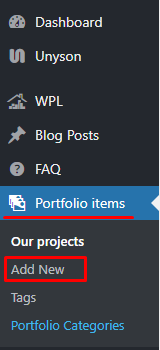
For new Portfolio item you can define:
- Title,
- Editor container (images visible on portfolio item page) – content visible in the Editor container is added with use of option,
- Portfolio Categories (optional) – assign to already existing category or add new one.
- Tags (optional)
- Featured Image (visible on ‘Our Projects’ page)
- Portfolio settings
- Client
- Client website
- Details
- Start date
- End date
- Multilingual Content Setup – check box to make ‘Portfolio items’ translatable (Available only when WPML plugin is in use)
After every modification click on Update to keep your changes saved.
Creating Portfolio Item
Creating Portfolio Categories
Categories are very convenient way to organize your porfolio items, that can be added to more than just one category.
To create new Portfolio category, navigate in WordPress dashboard to Portfolio items > Portfolio Categories
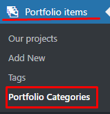
Creating new Portfolio Categories
For new FAQ item you can define:
- Name
- Slug
FAQ category
After every modification click on Update to keep your changes saved.
Was this article helpful ?
Create FAQ Item
Frequently Asked Questions (FAQ) of Estato is generated by the theme from FAQ items.
To create a new FAQ item, navigate in WordPress dashboard to FAQ > Add New.

For new FAQ item you can define:
- Title – The FAQ’s question should be written as the title.
- Editor container – where the answers for the question is added.
- FAQ Categories (optional) – assign to preexisting category or add a new one.

- Once done, click on Publish button.
Was this article helpful ?
Create Agent Single Page (Agent’s Profile)
On Agent page you can show information about one of your property agents and all estates attached to them with the use of single WPL shortcode.
By default, WordPress users are not WPL users. This provides you better managerial supervision for distinguishing between the agents and the basic users such as subscribers, authors, etc.
You can activate users in WPL simply by going to WPL > User Manager and then clicking on the “Tick” or “Plus” icon. For specifying user access and limits you should click on the “Edit” icon, change the settings and save it.

Activate User in WPL
If you don’t know how to create a new WP user account please check this link.
Each agent have their own profile page and they can edit the information to be shown on the “Agent Activities” or “Listing Details” page. Uploading a profile picture and company logo is highly recommended so it is good to request that your agents upload their pictures.
Agent’s profile settings
Do not forget to click on the finalize button after filling the profile page.
Was this article helpful ?
Creating New Property in Admin Panel
To create a new Property item in Test, follow the steps:
Note: All information that has an (*) is required.
- Step 1 – To start creating this element, please go to WPL > Add listing in your WordPress Dashboard. The page Add/Edit Property will show.
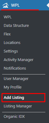
- Step 2 – In the Basic Details tab, add the information about the new property that will be useful and important. Information like Meta description and Meta keywords will be added automatically.

- Step 3 – In the Features tab, add the property features.

- Step 4 – In the Appliances tab, specify all appliances that are available in the property.

- Step 5 – In the Address Map tab, add the property’s address that will be shown on the map.
- Step 6 – The Neighbourhood tab is where you can add information about the important landmarks in the property’s neighbourhood.
- Step 7 – You can add images of the property in the Image Gallery tab.
 Add details about the image that is added for the property.
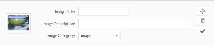
- Step 8 – If you wish to attach a video or file, go to Video and Attachments tabs. You can also select options from the Specialties tab.

- Step 9 – After all the information are added click on Finalize, so all the changes will be saved.

Was this article helpful ?
Listing Manager
In the Listing Manager, you can Edit, Publish, Delete Temporarily, Restore, and Delete Permanently a Property Listing.
-
Edit
To edit Listing Information, follow the steps:
Step 1 – Navigate to WPL > Listing Manager in your WordPress Dashboard. The page Property Manager will show.

Step 2 – Choose the Property Listing that you would like to change the information and click the Edit button.

Step 3 – The Add/Edit Property page will show. You can Edit the information that you want to change. After changing all the information, click Finalize to save.

-
Published
The Published button is to change a status of a listing from Unpublished to Published.

-
Trash
The Trash button can change a listings status to Unpublished and store it in a Recycle Bin like state where you have the option to Restore the said listing.

-
Purge
The Purge button can delete the listing permanently.
Was this article helpful ?
Where to find Listing ID
The Listing ID that can be used to locate a Property Listing is found in WPL > Listing Manager where you can find the list of all the properties added to the WPL.

Choose the Property Listing that you want to show and click the Edit button. The Add/Edit Property page will show.

In the Add/Edit Property page you will find Listing ID in the Basic Details tab.

Was this article helpful ?
Creating Property Page
Property pages created via Test will give you options to show a page containing all the needed information about your property.
The Property page visible on Test demo, can be divided into two Test elements Single Property and Property mini listing. Here we will concentrate on all the needed information and what options to be set to receive the same look on the page.
If you wish to find more information about the Test shortcodes using information from WPL plugin please check Test Custom shortcode for WPL section, where you will find more information about Single Property and Property mini listing elements
Below you will find information on how to create this pages on your own:

- Step 1 – Go to Pages > Add New and create a new page, make sure that the Template you are using is Default Template, or use already created page that is using the same Template.

- Step 2 – Create a row section in the page, then add a Single Property element inside the row.

- Step 3 – Click on the Edit Single Property option and the Single Property Settings will pop-up.

- Step 4 – In the Single Property Settings, set the Listing ID of the property that will be shown in the page and set the Property template to Full width map. To find the Listing ID, click here.

- Step 5 – Create a second row, click on the Edit this row option on the 2nd row created. In the General tab, change the Row Stretch to Stretch row.

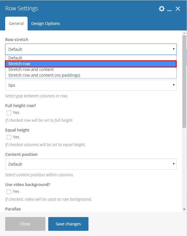
- Step 6 – In the Design Options tab, add 40px for top margin and set background color to: #f3f3f3

- Step 7 – Add a Properties mini listing element inside the 2nd row. The Properties mini listing Settings will pop-up. In the General tab, set the Template to Latest listing transparent. A Title can also be added in this element option where it is visible on the site.

- Step 8 – After doing the steps, click on Publish button to save the page.
Was this article helpful ?
Create Page with Multiple Listing

To create a page with Multiple Listing the same as the sample above, follow steps:
- Step 1 – Create new page by navigating to Pages > Add New.

- Step 2 – Create row then change Custom Layout of the row to 1/2 + 1/2.

- Step 3 – In the left side row, add a Properties Search element.

- Step 4 – In the same row, add a Properties Listing element. The Properties listing Settings will pop-up.

- Step 5 – In the Properties listing Settings, set the Type listing view to List and add a Title for the list, then click Save changes button to save.

- Step 6 – Now on the right side row, add a Properties map element. The Properties map Settings will pop-up.

- Step 7 – In the Properties map Settings, you can change the details inside the settings. In the Icon tab you have the option to change the icon for the Map marker.

- Step 8 – Once steps are done, click Publish to save the page.
Was this article helpful ?
Translating {Plugin} to Different Languages using WPML Plugin
To use this option, you need to have installed (WordPress Multilingual Plugin) WPML plugin, which you can buy here.
This plugin isn’t part of the {Plugin} bundle, to use this function you must have the WPML plugin.
Translating Text Content
To be able to fully integrate the translation functionality of WPML plugin:
- Once you have installed the WPML plugin, go to WPML > Translation Management. Choose the Multilingual Content Setup tab and click on Use the translation editor radio button then save.
Multilingual Content Setup tab
- Scroll down and look for Custom Fields Translation. Click Show system fields to show all available fields.
- Look for the Size Guide custom field. Then click the Translate radio button beside the custom field.
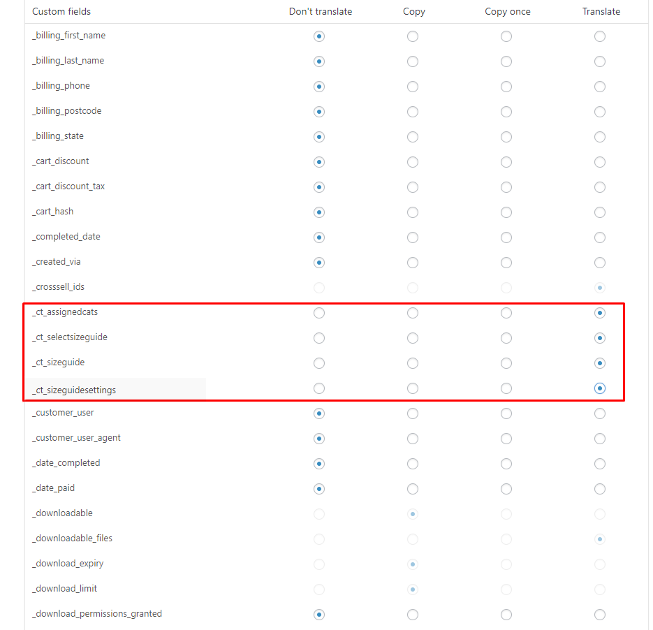
Custom Fields
Custom fields will show when activated/used in the site.
- When you have done all this, go to WooCommerce > WooCommerce Multilingual. You will see all the products available. Choose a product and click on the Plus Sign (+) on the language you would like to add a translation to.
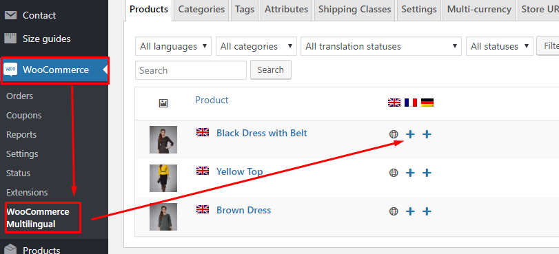
WooCommerce > WooCommerce Multilingual
- You will see the Original (English) version of the text content of the product item and an area to add the translation of the language you chose.
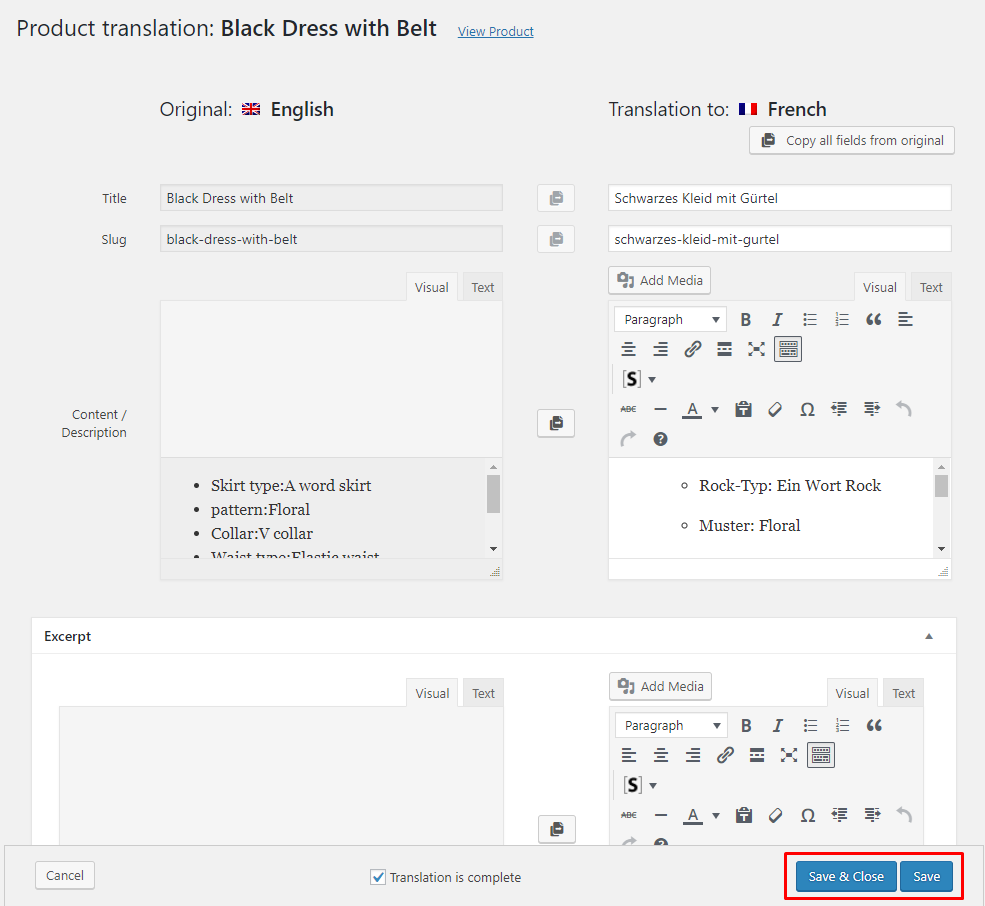
Product Translator
- Add the translation as you see fit, then click the Save button.

Sample

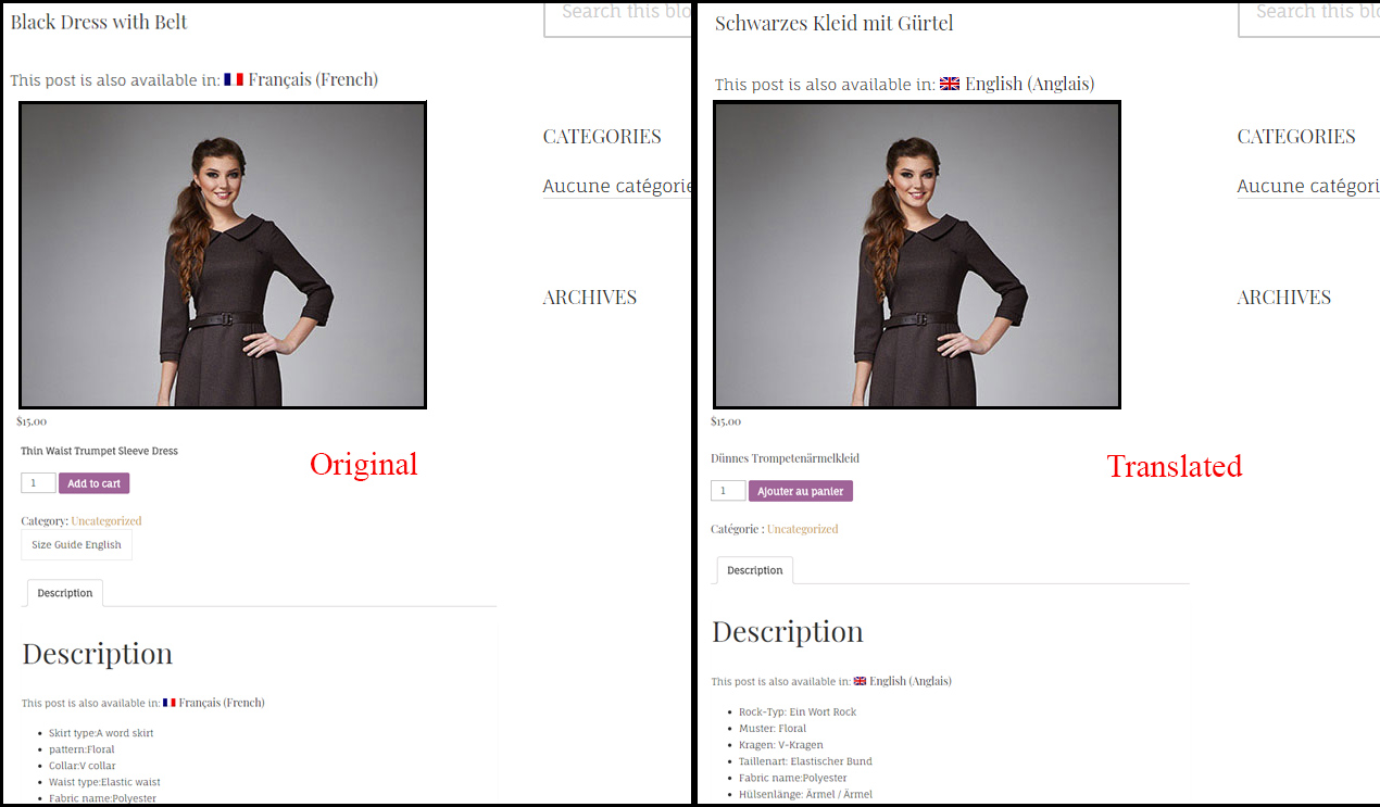
How translate the button
Adding separate size guide label with different languages can be integrated to this plugin.
To make a {Plugin} Label with a different language, follow the steps:
- Step 1 – In WooCommerce > Settings > Size guide settings, Add the label that will be used for the {Plugin} button/link. This will be used later to label what language is going to be used.

- Step 2 – In WPML > String Translation, look for the button/link associated with the {Plugin}, then set the labels for other languages used in the theme.

- Step 3 – Once done, click on Save. The result would be like this:


Was this article helpful ?
Create Sample of Shortcode Elements
Create Sample Icon Box
To make Icon Box the same as below, follow these steps:

- Step 1 – Create a row section.
- Step 2 – Click on Edit Row option, in the Design Options Tab add the background image from the Media Library.

- Step 3 – Add Icon Box for Test element inside the row created using the Add Element option.
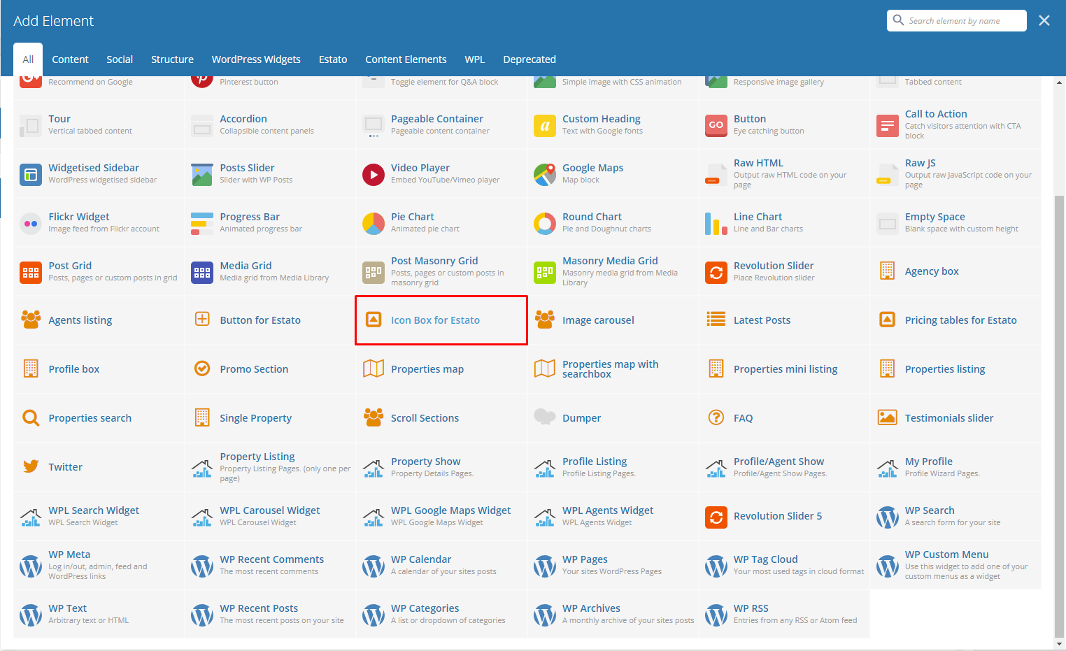
- Step 4 – Set the elements options as you wish.
- Step 5 – Once satisfied with the result, click on Publish button to save.
Create Sample Promo Section
To make a full width Promo Section, follow these steps:
- Step 1 – Create a row section. Click on the Edit Row option, the Row Settings will pop-up. In the General Tab change the Row stretch to Stretch row and content.

- Step 2 – Add Promo Section element inside the row created.

- Step 3 – Set the options as you like.
- Step 4 – Once satisfied with the result, click on Publish button to save.
Create Sample Twitter Section with Background Image
To create a Twitter Section with a static background image, follow these steps:
- Step 1 – Create a row section then click on the Edit row option.
- Step 2 – In the Design Options tab of the Row Settings, add the background image from the Media Library or Upload an image.

- Step 3 – Add Twitter Element to the row and set options as needed.
- Step 4 – Once satisfied with the result, click on Publish button to save.
Create Sample Scroll Sections

To create a Scroll Section the same as the one above, follow these steps:
- Step 1 – Add row to your page and change the Row Layout to 1/4 + 3/4. This way you will be able to add Scroll Section and the content to different columns and set them next to each other.

- Step 2 – Add any content you want to the columns on the right.

- Step 3 – Add an ID to each Inner Row Settings section you want your menu to be able to move to. Remember: Each created ID must be unique, and it is valid as w3c specification: link (Must not have spaces)

- Step 4 – Add Scroll Section Settings item to the columns on the right and for the Section names use the same names as the one used for the Row’s id.
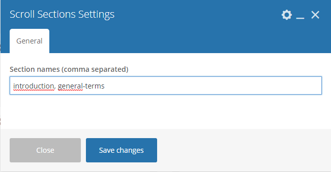
- Step 5 – Once satisfied with the result, click on Publish button to save.
Remember: to make this element work correctly you must copy the exact same names as used in the ID and add them in the same order as they are set in the right section.
Create Sample Testimonial slider

To recreate the same slider on your own, follow these steps:
- Step 1 – Create a row section, then click on the Edit row option.

- Step 2 – In the General tab, set the Row stretch option to Stretch row and content.

- Step 3 – Go to Design Options tab and set the Background color of your choice. The one used in our demo is : #60a7d4

- Step 4 – Add Testimonial slider element inside the row created. Set the options as you like.
- Step 5 – Once satisfied with the result, click on Publish button to save.
Was this article helpful ?
Test Custom Shortcodes
With Test comes many custom shortcodes for (Visual Composer) VC that are used to show content created in Test. Below you will find short information about this Visual Composer elements:
-
Button for Test

- This theme comes with VC element that give you the option to create buttons that can be used in the theme.
- These are how the buttons using the Button for Test element looks like:

-
Icon Box for Test
Below you will see all the available options that can/need to be set to use Icon Box for Test element on a page:
- – General Tab –
- Number of icons – you can set here number of icons visible in row (1, 2, 3, 4). We recommend to use one Pricing table for Test element in single row to get the best effect using this element.
- Motive – Choose color style used for this element: Light or Dark
- Title – Set the title for this Icon Box.

- – Columns Tab – (number of columns tab depends on the number of icons set in General tab)
- Title – Title for the icon inside the Icon Box.
- Icon – Choose an Icon to present.
- Description – Description of the icon.

- – Button Tab – (Add Button under Icon Boxes)
For sample in creating Icon Box, see “Create Sample Icon Box” below.
-
Image Carousel

Below you will see all the available options that can/need to be set to use Image carousel for Test element on page:
- Title – Title for the Image Carousel in the page.
- Display navigation – Check Yes to show the navigation of the carousel.
- Items count – Number of images shown at once on the page (this option will not work on the mobile version of the carousel)
- Pagination – Check Yes pagination to show it.
- Autoplay – Check Yes to make the carousel move automatically.
- Images – Add images to be shown in the carousel from the Media Library or Upload Files from your computer.

Remember to Publish/Update the changes on the page to save them.
-
Latest Posts

This will show the latest posts posted in the blog. You can custom this element using options from the Latest Posts settings as shown below:
– General Tab –
-
- Title – Title for the posts.
- Limit – Number of blog posts inside the Latest Posts.
- Custom class
- Order – How the posts order looks.
- Ascending
- Descending
- Order by – How the posts are ordered.

– Button Tab –
Remember to Publish/Update the changes on the page to save them.
-
Promo Section
To create your own promo section, you can choose options as below:
– General Tab –
-
- Background color – Set the background color of the Promo Section.
- Image – Image for the promo.
- Promo text – Describing the promo.
- Promo text color – Text color of the Promo Text.

– Buttons Tab – (Maximum of 3 buttons which can be disabled if not used.)
Remember to Publish/Update the changes on the page to save them.
For sample in creating Promo Section, see “Create Sample Promo Section” below.
-
Pricing Tables for Estato

Below you will see all the available options that can/need to be set to use Pricing tables for Test element on page:
– General Tab –
-
- Title – Set the title visible above the pricing tables.
- Number of tables – You can set the number of tables visible in row (1, 2, 3, 4). We recommend to use one Pricing tables for Estato element in single row to get the best effect using this element.

– Columns Tab – (number of Columns tab depends on the number of tables set in General tab)
-
- Title – Title of the pricing listed.
- Value – Value of the pricing listed.
- Subvalue – Another value to compare with the value of the listing.
- Tag – A tag to make it unique.
- Features – Descriptions and features of the item listed.
- Button enabled – check Yes to show button.
- Button title – Title of the button inside the listing.
- Button link – Where the button is linked.
- Button size – Button attribute.
- Button style – Button attribute.
- Transparent Test style for button? – Check Yes option if you want the transparent style.
- Custom CSS class for button – Set your custom class to style the button.

Remember to Publish/Update the changes on the page to save them.
-
Twitter

Below you will see all the available options that can or need to be set to use Twitter in your Test theme:
Twitter Settings
-
- Title – set the title for header
- username – twitter username
- customer key
- customer secret
- token
- token secret
- limit – limit of visible tweets
- Tweets per slide
- follow us button – follow us button label (leave blank to hide it)
- new window? – Yes/No
- parse url
- parse media
- parse url id? – Yes/No
- parse hashtag? – Yes/No
- embed images? – Yes/No
- size of embedded images?
- tweet length limit
- cache results for X seconds – cache Twitter feeds for better performance.

The information how to generate twitter keys and tokens can be found here.
Remember to Publish/Update the changes on the page to save them.
For sample in creating Twitter Section with Background, see “Create Sample Twitter Section with Background Image” below.
-
Scroll Section

This element will let you create a page menu to let the user move between the section page.

The only option available in Scroll Sections Settings is Section names that will let you create menu links for custom sections. This element is used on Terms & Conditions page of Test WP theme.
Remember to Publish/Update the changes on the page to save them.
For sample in creating Scroll Sections, see “Create Sample Scroll Sections” below.
-
FAQ

FAQ element will let you show all the created FAQs Items on the site. This version of FAQ doesn’t have a menu like the one created via Customise options, but it will let you add other contents on the same site unlike the customise one.

Remember to Publish/Update the changes on the page to save them.
-
Testimonials slider

Testimonial slider will gives you an option to show people Testimonial Items that are made on your site.
Testimonial slider Settings
-
- Style of slider – This would depend on the style/color of the background of this slider.
- Additional title – Check Yes if you want to display title.
- Title – Title of the slider.
- Order – The order in which the testimonials are shown.⦁ Order – The order in which the testimonials are shown.
- Order by – The order of the testimonial that are shown.
- Limit – Number of testimonials shown.

Remember to Publish/Update the changes on the page to save them.
For sample in creating Testimonial slider on a page, see “Create Sample Testimonial slider” below.
Was this article helpful ?
Test custom shortcodes for WPL
With Test comes many custom shortcodes for (Visual Composer) VC that are used to show content created in WPL plugin. Below you will find short information about this Visual Composer elements:
-
Agency Box
This element have a single tab with options to customise the way the agency box will be shown. This element lets you show all the information and the logo used by the Agency.

– Agent ID – it can be checked in WPL in User Manager section by navigating to: WPL > User Manager . Copy one of the WPL’s user Id to the Agency box Settings.


– Style – choose the style of the element: Light or Dark
-
Agents Listing

This element have two tabs with options to customise the way how the multiple profiles of the agents will be visible on the site.

– General Tab –
- Title – set the title for this section
- CSS Class – add custom css class

– Sort and Limit-- Order by – Set the order of the agents.
- Order – Set how the order of the agents are shown.
- Limit – Set limit of the agents visible on the site

Sample Agent Listing
-
Profile Box

This element will let you show all the information about the WPL User chosen by its ID. Profile Box have two available options to customise this element.

– Default profile id – it can be checked in WPL in User Manager section by navigating to: WPL > User Manager . Copy one of the WPL’s user Id to the Agency box Settings.
– Style – choose the style of the element: Light or Dark
-
Properties map with searchbox

This element will let you show all the information about the WPL User chosen by its ID. Profile Box have two available options to customise this element.

- Custom map Style – Use one of custom maps styles available on Snazzy Maps site (this option is not compatible with Map Type control).
- Custom map height – Enter map height (in pixels or leave empty for responsive map).
- Zoom value – Set custom zoom value, eg. 10. Please note the map will automatically expand to show all markers.
- Map Type control
- Scale control – Choose between Yes/No
- Google Maps search control – Choose between Yes/No
- My position control – Choose between Yes/No (Works only with https)
- Use custom markers for this map – choose between Yes/No. This way you can add your own custom markers from Media library. Another way to add your custom markers is via Realtyna. This markers can be added on path WPL > Data structure > Listing Types. You will be able to add there your own markers and assing them to Listing type.

By Properties map element you will display a map with markers showing all of the estate locations. The information of the location can be added on path WPL > Add Listing > Address Map by changing location of the marker. You can also edit the location of already existing property by going to WPL > Listing Manager > Edit > Address Map.

-
Properties mini listing

This element gives the option to show a mini list of properties created in WPL plugin on path WPL > Listing Manager.This element have 4 tabs with options to customise how the list of the properties will be shown.

– General Tab –- Template – 1) Mini listing 2) Latest listing 3) Latest listing transparent
- View more text – Add text that’s for View more.
- View more link – Add link that’s for View more.
- CSS class – Add custom CSS class you want to use to style this element.

– Filter Properties –- Kind (only available option: Property)
- Listing – choose which listing will be shown
- Property type – choose visible types
- Listing IDs (Comma Separated) – add which properties will be shown based on the ID
- Agent id – the id of the agent assigned.
- Only Featured – choose between Yes/No
- Only Hot Offer – choose between Yes/No
- Only Open House – choose between Yes/No
- Only Foreclosure – choose between Yes/No

– Sort and Limit –- Order by – Gives you option on the order of the listing.
- Order – Gives you the option on how the listing is shown.
- Number of properties – Set number of properties visible on a single page.
– Buttons –
- Enabled – Choose between Yes/No
- Title – Button visible inside the button
- Link – Set a link for the button.
- Size – Button sizes
- Style – Buttons style
- Transparent Test Style – Choose between Yes/No
- Custom CSS class – Add custom CSS class you want to use to style this element
- Template – 1) Mini listing 2) Latest listing 3) Latest listing transparent
-
Properties listing

This element gives the option to show list of properties created in WPL plugin on path WPL > Listing Manager.
This element have 3 tabs with options to customise how the list of the properties will be shown.

- – General –
- Title – Set title for the list.
- Type listing view – Choose between two views : Grid or List

Grid

List
- CSS Class – Add custom css class you want to use to style this element
- View more text – Change text that will be shown for view more link
- View more link – Add link that for View more
- Columns count in grid view – Set number of columns avaliable for grid view
- Show additional options
- Boxes size
- – Filter Properties –
- Kind (only available option: Property)
- Listing – Choose which listing will be shown
- Property type – Choose visible types
- Listing IDs (Comma Separated) – Add which properties will be shown based on the ID
- Agent id
- Random – Randomise visible list
- Only Featured – Choose between Yes/No
- Only Hot Offer – Choose between Yes/No
- Only Open House – Choose between Yes/No
- Only Foreclosure – Choose between Yes/No
- – Sort and Limit –
- Order by – Gives you option on the order of the listing.
- Order – Gives you the option on how the listing is shown.
- Number of properties – set the number of properties visible on a single page.
-
Properties search

With the use of this element on your site, you will be able to search for estates available on your site. Below you will find information how to customise this elements.
This element isn’t customisable via Visual composer, all the changes to this element can be added by WPL.
For more information on How to Customize the Searchbox, click here.
Was this article helpful ?
Onepager setup in Test


To create a Onepager site using Test, follow these steps:
- Step 1 – Navigate to the Pages section of your Dashboard and click Add New.
- Step 2 – In the new page, use the Backend or Frontend editor to create a row.

- Step 3 – Use the row in making sections in the section menu. Click on the Edit this row option in every row section you create and look for Row ID. The Row ID will serve as the anchor of the menu. Make sure that the ID is unique to that row.

- Step 4 – You can change the General and Design Options as you see fit for your site.
- Step 5 – Add the contents in the rows. You can add Text and Elements inside the rows. Click on Publish button to save.

You can see in the sample above that each row has different Row IDs.
- Step 6 – Set this page as the Front Page by navigating to Settings > Reading > Front page display. Click on A static page option then select the page for the onepager then click on the Save Changes button.

- Step 7 – To make the Menu for the Onepager, navigate in the Dashboard Appearance > Menus. Look for create a new menu, add the Menu Name then click on the Create Menu button.

- Step 8 – You will see options on what to put inside your new menu. Look for Custom Links in the options. If you don’t see that option, at the upper-right side of the page you will see Screen Options option, click on that and you will see options with check boxes. Check the box beside Custom Links.

- Step 9 – Using the Custom Links option, write the row section’s Row ID inside the URL textbox and the name of the link inside the Link Text textbox. Then Click on the Add to Menu button. After adding all the navigation menu, Click on Save Menu to save.


- Step 10 – Click on the Manage Locations option, change the Main menu to the menu that was made for the onepager. Click on the Save Changes to save.
- Step 11 – Go back to the Edit Menu option, Look for the Max Mega Menu Settings then check on Enable and change Theme option to EstatoStyle Onepager. Change other options as you see fit then click the Save Menu button.

Was this article helpful ?
How to Update Bundled Plugins
Bundled Plugins are plugins that comes with the theme when you buy it. Since the plugins are bundled with the theme, updates for the plugins are provided once the theme itself is updated.
Update a Bundled Plugin
When you update a theme and a plugin needs to be updated, you will see a notice at the top that a plugin could be updated.

You can also check for updates in your Dashboard by navigating to Plugins > Installed Plugins.

Follow these steps to update:
- Step 1 – Update the theme first in the Dashboard by navigating to Appearance > Themes then update the theme.
- Step 2 – Once the theme is updated, check if there are available updates for the plugins.
- Step 3 – If there are updates available, you will see a notification on top of the page or go to Plugins > Installed Plugins and follow the instruction to install updates.
Update Error for WPBakery Page Builder and Revolution Slider plugins (Update package not available)
If you get this error, try these troubleshooting methods first:
- Go to Appearance > Installed Plugins, refresh the page and try again.
- If it doesn’t work, try disabling/deleting the plugin, this is to ensure that there aren’t any issue with plugin’s update. Once disabled/deleted, try to re-run/install the plugin.
- If you still get the error message that the update package is not available, its probably because your server permissions are set to strict and you’ll need to alter your server settings or update the plugins via FTP.
- If issue still persist, click here for support.
Automatic Updates
Automatic updates are done if the plugin is purchased separately from the plugin developer. There are premium features that you can get if you purchase the plugin from the developer.
However, it’s not required to purchase the plugin for the theme to work since the plugins are bundled with the theme.
Was this article helpful ?
How to Activate Purchased Plugins
This sample is for purchased WPBakery Page Builder(formerly Visual Composer):
- Step 1 – Navigate to Plugins > Installed Plugins.
- Step 2 – look for WPBakery Page Builder and click on Setting option.

- Step 3 – The WPBakery Page Builder Settings page will show, then look for the Product License tab.

- Step 4 – Click on the Activate WPBakery Page Builder button, you will be directed to another page. Follow the instructions to activate.
Was this article helpful ?
Support
All of our items comes with free support. Free support is limited to questions regarding the themes features or problems. We provide premium support for code customisation or third-party plugins.
For issues and concern, you can reach us through these support methods:
- E-mail – support@createit.pl
- Help Desk – Click here to go to our support website. Just click on the Submit Ticket button and follow instructions to create a ticket.
- Forum – Comment/Post on the product you have issues/queries in ThemeForest or CodeCanyon websites.
Before You Post on a Forum
We urge you to follow the steps below, before you post a new topic on the forum, to speed up your request. It’s in everyones interest and will benefit in making the entire forum more efficient:
- Step 1 – Always check the Documentation and the Knowledgebase Section. Most questions are already answered in those areas.
- Step 2 – If your question hasn’t been brought up on the forum, please post a new topic. Always be as specific as possible. Creating a topic requires entering the live URL to your home page or page that shows the issue in question. It also has bars for WP and FTP login info, which aren’t required, however, providing us with your login information can save a lot of time for both of us. Login credentials are securely stored and accessible only by our support staff.
- Step 3 – We usually answer questions in 24 hours on working days. However, if you don’t get any answer within 72 hours bump up your question or send us an e-mail.
For all support methods, you will receive confirmations and replies on your queries through e-mail or by tracking your ticket which you will also get through e-mail. To track your ticket, please click here.
Once we reply to your query, each ticket will be open for 7 days without a reply from you. On the 6th day without a reply, an e-mail will be sent to notify you of the ticket’s inactivity. To make the ticket active again, you simply need to reply or follow the steps in the e-mail. If you won’t make the ticket active within 7 days, on the 8th day the ticket will automatically be closed.
Our support hours: 10:00 AM – 6:00 PM UTC +1 on Monday to Friday.
Was this article helpful ?
Theme Translator
Each of our Themes could be translated by using translation editor like: Poedit.
To translate the theme, it will need a POT (Portable Object Template) file to work.
POT is generated from theme files and contain all phrases from the theme that can be translated to a different language.
*In Estato WP the file is called estato-theme.pot and the path to it is estato > language instead.

The translation editor will create PO (Portable Object) and MO (Machine Object) file from the theme POT file. The only file we are able to edit is the PO file.
In the PO file, we are saving both English and the translations for this phrases. All translations you created are added there. Saving the changes there will also update the MO file that is used by the theme.
How to translate theme using Poedit
-
- Copy the estato_theme.pot file from /wp-content/themes/estato-theme/language/. Paste it on the desktop of your computer.
- Using the Poedit application, open the PO file that is on the desktop.

-
- The PO file will be opened by Poedit application. Click on the “Create new translation” button to start creating your translation.

- The PO file will be opened by Poedit application. Click on the “Create new translation” button to start creating your translation.
-
- You will be ask what language to translate the file into, choose the language as to what you need.
- You will see at the Poedit application that at the left side are the Source Text (English words) and at the right side are the Translations.
- When you click on a word from the source text, at the very right side you will see Translation Suggestions for the word that was clicked.
- Click on the best of the suggested translations of the word. The suggested translation will show at the Translations side.

-
- Click on a word from the source text one by one and translate.
- Once done translating the words on the Source text, save the file.
- When saving a file, “ct_theme-” should be added to the default file name.

- Once saved, it will create a PO and MO file.
- Copy the PO and MO file to the WordPress language directory located at /wp-content/languages/themes/.

-
- In your WP, activate estato theme. Once activated, navigate your dashboard to Settings > General.
- You will see the General Settings of your site. To activate the translation, look for the Site Language and select the one that you like.

- After selecting the site language, click the Save Changes button and a loading icon will show. Once the loading icon disappear, the translation should be done.
For more information on how to translate a theme using Poedit, click this link.
Was this article helpful ?
Change image size in a single listing page
To change the size of the image shown in the single listing page:

Single Listing Page Sample before changing the size.
- Step 1 – In your Dashboard, navigate to WPL > Activity Manager. You will be directed to the Activity Manager page.

- Step 2 – In the Activity Manager page, you will see the all the activity created. Look for the Gallery of the listing, then click on the edit button.

- Step 3 – The Modify Activity will pop-up.

- Change the option of Resize to Yes.
- Change the Image width & Image height as you prefer.
Note: Resize must be set to Yes for the image to change its size.
- Step 4 – Once the changes are done, click on the Save button.

Sample Result After Image Size Change
Was this article helpful ?
Translate using the WordPress Settings
WordPress can change the language of the words that are found in the PO and MO files located in the language directory. If the words are not found in the PO and MO files, it will stay the same and won’t be translated.
To change WordPress language, navigate your WP Dashboard to Settings > General.

You will be directed to the General Settings page. In this page, you have options to change the format of the time, date, email, tagline, etc,.
To change the language, look for Site Language. Change the language to what you would like, then click Save Changes to save and a loading icon will show. Once the loading icon is gone, WP should have changed its language.

Was this article helpful ?
Translate WPL (Realtyna)
WPL already have language files in its folder. It can be found on this path: /wp-content/plugins/real-estate-listing-realtyna-wpl/languages.
You can find the PO and MO files of the available languages that WPL have provided.

To translate WPL in WordPress, copy the PO and MO file of the language you would like to use. Then Paste the file in the WP language folder, path: /wp-content/languages/plugins.

To active the language translation, follow Translate using WordPress Settings tutorial.
For Languages that are not found in the WPL Language Folder
If the language you would want to translate your WPL is not found in the WPL language folder, you can make a new PO and MO file using Poedit.
To use Poedit, follow these steps:
- Step 1 – Install Poedit software on your computer.
- Step 2 – Copy a PO file of the default language used by WPL (e.i. wpl-en_US.po), and rename it.
- Step 3 – Using the Poedit software, open the renamed PO file and then translate the strings.
- Step 4 – Once done translating the strings, save the file. Once saved, it will create a PO and MO file.
- Step 5 – Copy the new PO and MO file to the WordPress language directory, then change the language of WP to activate.
Was this article helpful ?
Pages for Test
In Pages panel you are able to edit the general options for the Pages and the Map.
Pages Customizer
-
General
- Comments
- Show breadcrumbs
- Comment form
- Show titles on pages
- 404 page – Sub header
- 404 page – Header
General
-
Map
- Show section header
- Section header image
- Section sub header
- Section header
- Enter location
- Map height
- Button label
- Top header
- Bottom header
- Top content
- Bottom content
- Map section background image
- Map ornament left
- Map ornament right
- Map ornament middle
- Show socials
- Show information text
- Hide information text
Map
Notice: – settings above are by default applied for all your pages. Though you can also customize them for each page separately with Header and Navbar settings – you will see this option during page content edition.
Header and navbar settings
Map Section Translation
To use this option, WPML Plugins must be activated. This plugin is not part of the theme plugin bundle package. Click this Link to get this plugin.
Activate the following plugins:
- sitepress-multilingual-cm
- wpml-string-translation
- wpml-translation-management
To add translation for the map of this theme using WPML, follow these steps:
- Step 1 – Navigate to WPML > String Translation page and scroll down the page. Just click “Translate texts in admin screens” to proceed.

- Step 2 – Look for “theme_mods_delimondo2” and click the text to expand its available option.

- Step 3 – In this demo, we will just translate the following text: show image and let’s get in contact. Just check the following and apply the changes.

- Step 4 – Click on the Apply button at the bottom of the page to save.
- Step 5 – After saving the changes, go to String Translation page.

- Step 6 – Choose admin_text_theme_mods_delimondo2.

- Step 7 – Click “translations” link and put the translated text then save your changes.

- Step 8 – Go to Home page and choose Polish (or the language you made a translation).

- Sample result

Was this article helpful ?
Translating SizeGuide to different language using POT file
POT is generated from plugin files and contain all phrases from the plugin that can be translated to a different language. The POT file for this plugin is ct-size-guide.pot, and it can be found on path /wp-content/plugins/ct-size-guide/lang/
The translation can be created by a translation editor like Poedit or one of the free to use WordPress plugins like Loco Translate. This way you will be able to create PO (Portable Object) and MO (Machine Object) file from the plugin POT file. But the only file we are able to edit is the PO file. In the PO file, we are saving both English and the translations for this phrases. All translations you created are added there. Saving the changes there will also update the MO file that is used by the plugin.
How to translate plugin using Poedit
-
Install a translation editor from this site Poedit on your computer.
-
Choose the ct-size-guide.pot file to translate.
- You will be asked what language to translate the file into. Choose the language you wish to translate to:
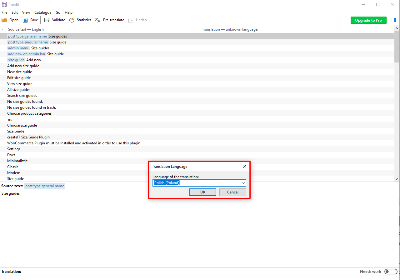
-
Click on a word from the source text one by one and translate.
-
Once done translating the words in the Source text, save the file.
-
When saving a file, ct-size-guide- should be added to the default file name.
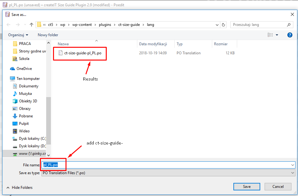
-
Once saved, it will create a PO and MO file.
-
Copy the PO and MO file to the WordPress language directory located at /wp-content/languages/plugins or /wp-content/plugins/ct-size-guide/lang
-
To activated the created translation please, navigate your dashboard to Settings > General.
-
You will see the General Settings of your site. To activate the translation, look for the Site Language and select the one that you like.
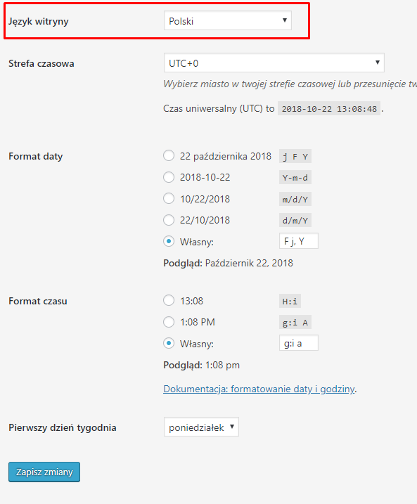
-
After selecting the site language, click the Save Changes button and a loading icon will show. Once the loading icon disappears, the translation should be done.
For more information on how to translate a plugin using Poedit, click this link.
How to translate plugin using Loco Translate
To translate the English text used in our SIze Guide plugin please follow steps below:
- Install and activate the plugin Loco Translate
- Then from your Dashboard Go to Loco Translate > Plugins where createIT Size Guide Plugin plugin can be chosen.
- Go to the Advanced tab and set there where you will be able to set the path to POT file: lang/ct-size-guide.pot click Save config button.
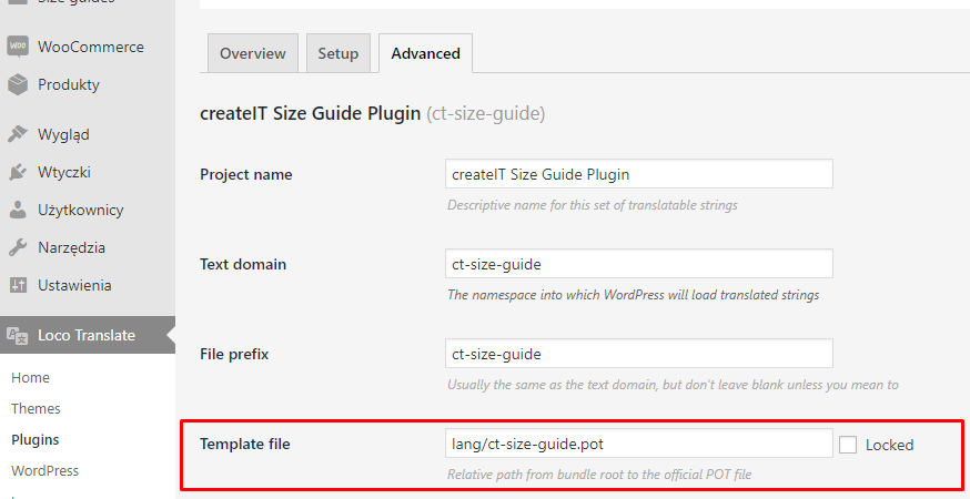
- Go back to Overview tab and click the + New language button.
- Then on the next screen, a Country dropdown list will appear, Select The language you want the texts to be translated. e,g: Polish and continue.
- On the next screen, all the English text strings that are inside the plugin will be listed. Select text string from the Source text list and then Add your translated text in the text area below and click save.
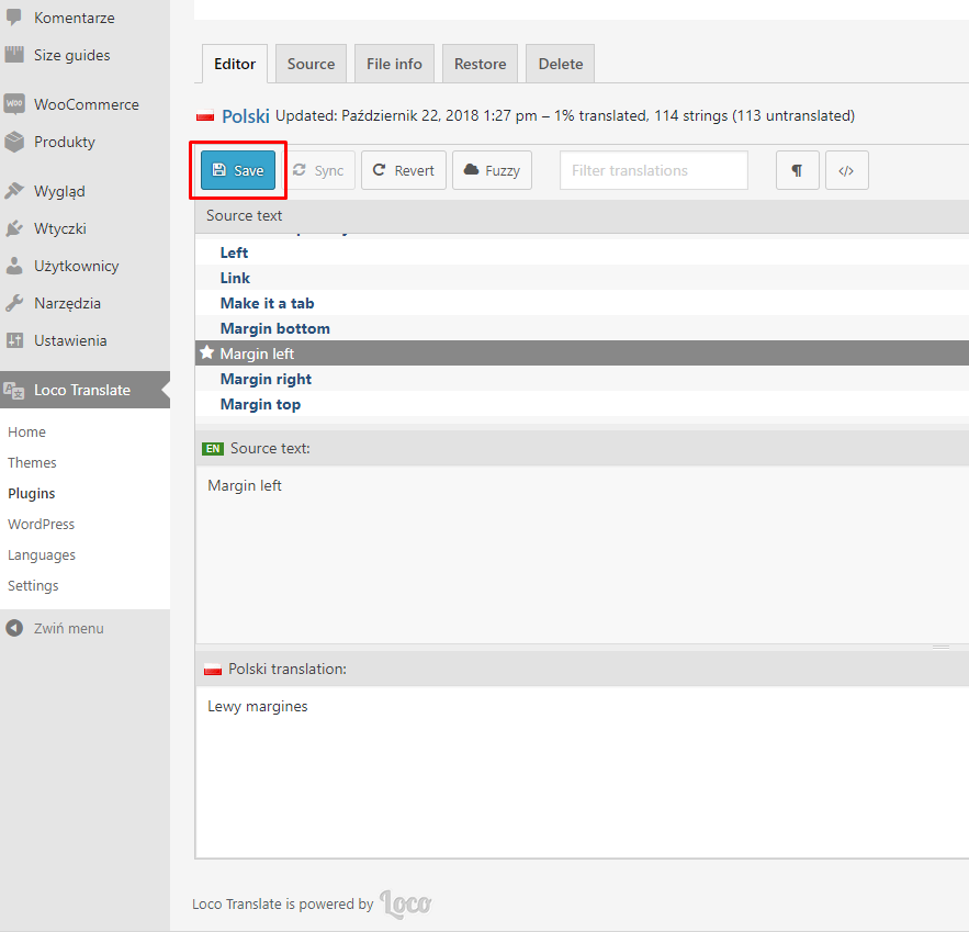
- To activate the created translation please, navigate your dashboard to Settings > General.
- You will see the General Settings of your site. To activate the translation, look for the Site Language and select the one that you like.
- After selecting the site language, click the Save Changes button and a loading icon will show. Once the loading icon disappears, the translation should be done.
For more information please follow created by developers Guides and Tutorials which can be found here: LINK.
Was this article helpful ?
Adding Size Guide to other pages.
From version 3.5 of the WooCommerce Product Size Guide, available is an option to add the SG tables outside the Single product page. It can be achieved by using Shortcode provided by the plugin.
These shortcodes can be found in the WordPress Dashboard on path Size guides > All size guides
Size guides shortcodes
If the page is using WPBakery Builder the shortcode can be added as a text in Text Block Settings.
where:
postid = 102 // Is the ID of the SG that will be used
button=true // This parameter allows to show the SG as a button (true) or will simply add the table to the page (false)
button_value =”” // When left empty the button will be named Button/link label + SG title. The user also can separately set the text for each button by adding the text between ” “
Was this article helpful ?